

Welcome back to the Divi 5 Mastery Course. In Part 13: Creating Interactive Off-Canvas Elements (Popups & More), we used Canvases and Interactions to add interactive UI to our coworking website. Now, it’s time to build with one of Divi 5’s most powerful dynamic content tools: the Loop Builder.
In this post, we’ll skip the traditional Blog module and build a custom Blog page using the Loop Builder, dynamic content, Flexbox, and the Pagination module. By the end, you’ll have a responsive Blog page with featured images, post titles, excerpts, metadata, Read More buttons, and pagination.
The final layout will also use the same Design Variables and Presets we created in Part 3 and Part 4, so it stays connected to the global design system.
Let’s get started.
Divi 5 Mastery Course Overview
| Part | Title | Visit |
|---|---|---|
| 1 | What To Prepare Before Building Your Divi 5 Website | Learn more |
| 2 | Exploring Every Aspect Of The Divi 5 Interface | Learn more |
| 3 | Creating A Divi 5 Global Design System With Design Variables | Learn more |
| 4 | Mastering Divi 5 Presets For Faster, More Consistent Web Design | Learn more |
| 5 | Building A Divi 5 Homepage From Scratch | Learn more |
| 6 | Building A Custom Header And Navigation In Divi 5 | Learn more |
| 7 | Building A Custom Footer In Divi 5 | Learn more |
| 8 | Using Divi 5’s Theme Builder To Create Global Website Templates | Learn more |
| 9 | Building The Core Inner Pages Of Your Divi 5 Website | Learn more |
| 10 | Mastering Flexbox In Divi 5 | Learn more |
| 11 | Mastering CSS Grid In Divi 5 | Learn more |
| 12 | Making Your Divi 5 Website Fully Responsive | Learn more |
| 13 | Creating Interactive Off-Canvas Elements (Popups & More) | Learn more |
| 14 | Mastering The Divi 5 Loop Builder | Learn more |
| 15 | Divi 5 Power User Workflow | Learn more |
| 16 | Auditing, Polishing, And Launching Your Divi 5 Website | Learn more |
What The Divi 5 Loop Builder Does
If you’ve worked with WordPress for any length of time, you’ve probably heard of the Loop. It is the WordPress mechanism that retrieves and displays content such as posts, pages, products, categories, authors, or custom post types.
In earlier Divi workflows, the Blog module was the fastest way to output a post feed. It still works well for simple blog layouts. However, it also comes with a fixed structure, so it is not always ideal when you want complete control over the repeated item design.
Divi 5’s Loop Builder gives you that control visually. Instead of styling a predefined Blog module layout, you can design the repeated item yourself with Divi elements, then connect each part of the layout to dynamic content.
Why The Loop Builder Matters
The Loop Builder is useful when you want a dynamic layout that still feels fully custom. You design one item, configure the query, and Divi repeats that design for each matching item.
Here are the main advantages:
- Custom layout control: Build the repeated item with Divi elements instead of being limited to one predefined module layout.
- Dynamic content fields: Pull in content such as featured images, post titles, terms, authors, publish dates, excerpts, and links.
- Flexible query options: Display posts, products, terms, users, menus, custom post types, and supported custom field data depending on your setup.
- Design system consistency: Use the same Design Variables and Presets from earlier parts of the course so every loop item matches the rest of the site.
- Theme Builder support: Use loops inside templates for archives, search results, product archives, and other dynamic views.
Prepare Your Site For The Loop Builder
Before we start building, make sure you have enough content to test the layout. A few minutes of preparation will make the Loop easier to preview, paginate, and refine.
Create Sample Blog Posts
Create at least 6 to 8 published blog posts. Each post should include a featured image, a title, an excerpt, and any relevant categories or tags you want to display.
If you do not have content yet, use a test-content plugin such as FakerPress to generate placeholder posts for the tutorial.
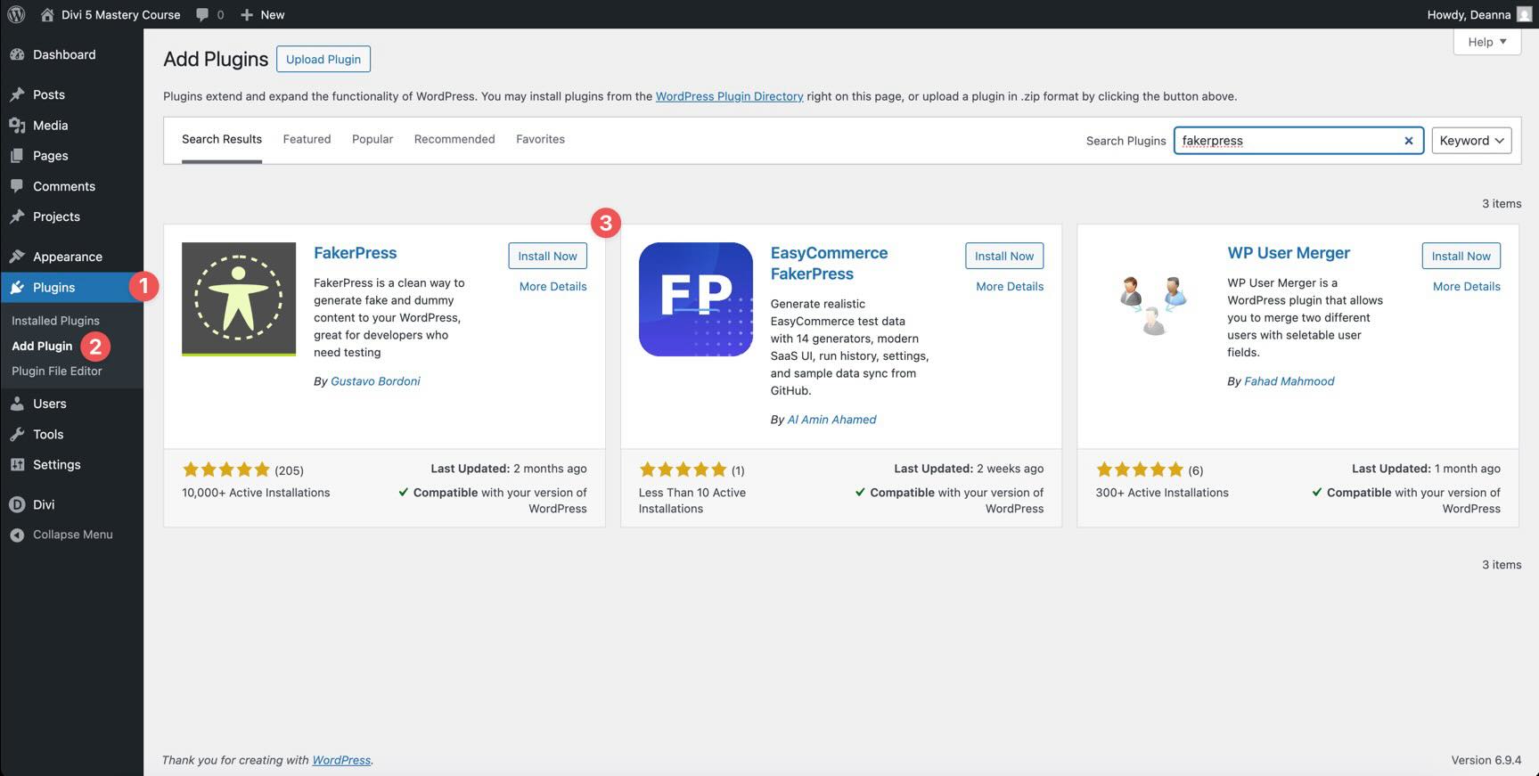
Having at least 6 posts gives the Loop Builder enough content to display and lets you test pagination and query changes later.
Create A Blog Page
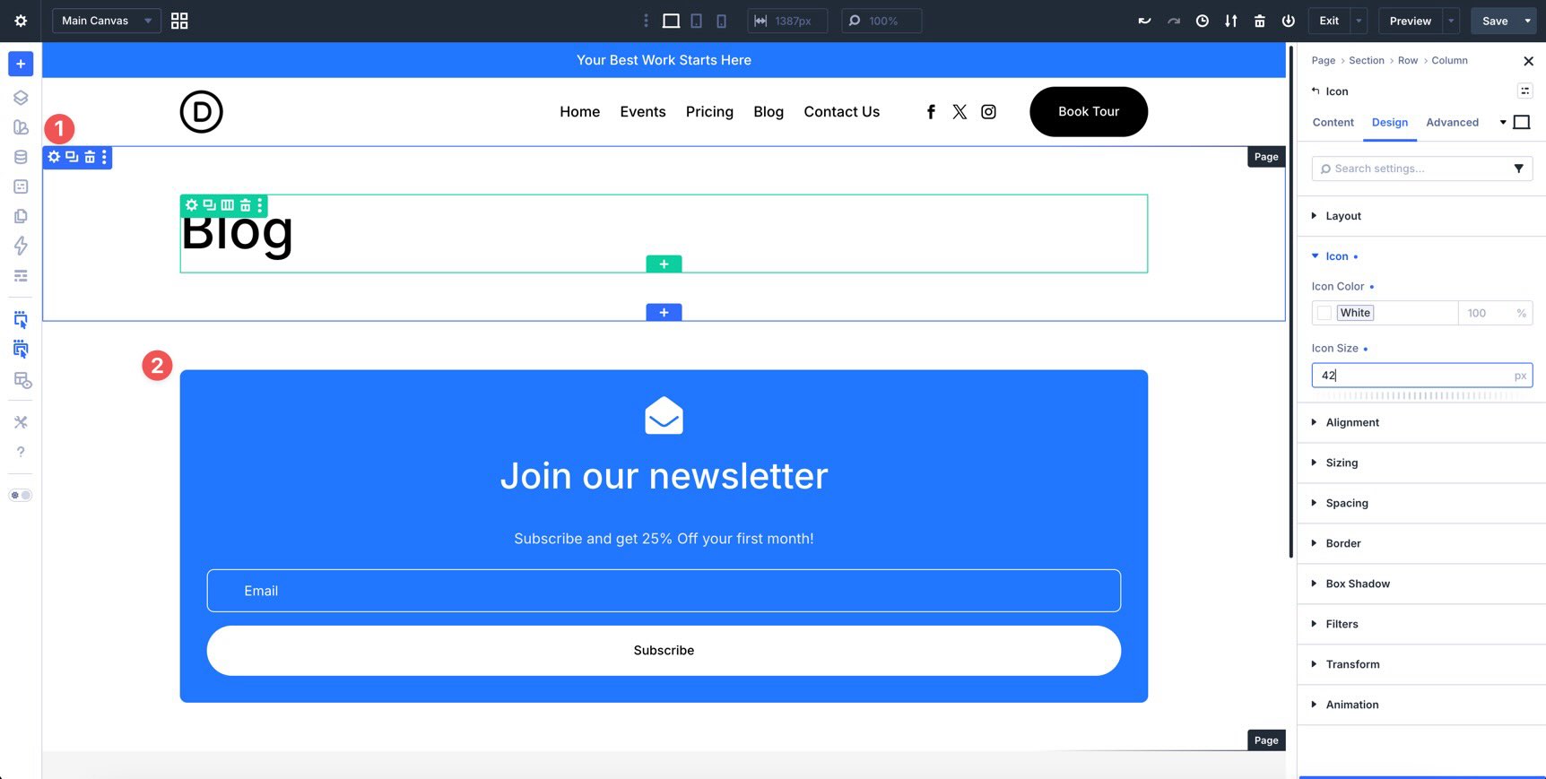
Create a new page named Blog. Publish the page and open it in the Visual Builder.
Add a Heading module and any introductory content you want above the loop. This gives the page a clear title before the dynamic post list begins.
Build A Blog Layout With The Loop Builder
In this section, we’ll create a custom Blog page that automatically displays posts in a repeated layout. The workflow has four main parts.
- Build one post-card layout.
- Turn that layout into a Loop element.
- Connect each module to dynamic content.
- Add pagination and responsive adjustments.
By the end of this tutorial, you’ll have a functional blog post Loop for the coworking website.
Step 1: Create The Row Structure
Before enabling the Loop, build the repeated item layout. Start by adding a new Section to the Blog page. Inside that Section, add a two-column Row.
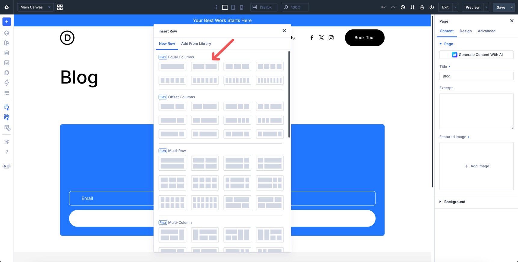
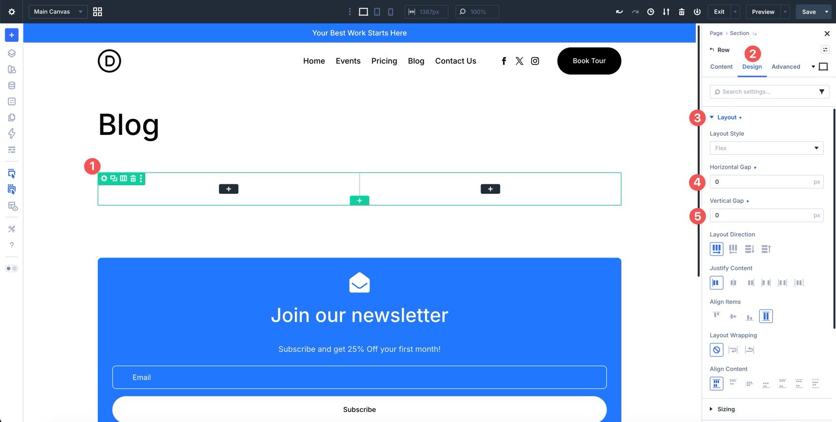
Open the Row settings. In the Design tab, expand the Layout option group. Set both Horizontal Gap and Vertical Gap to 0px.
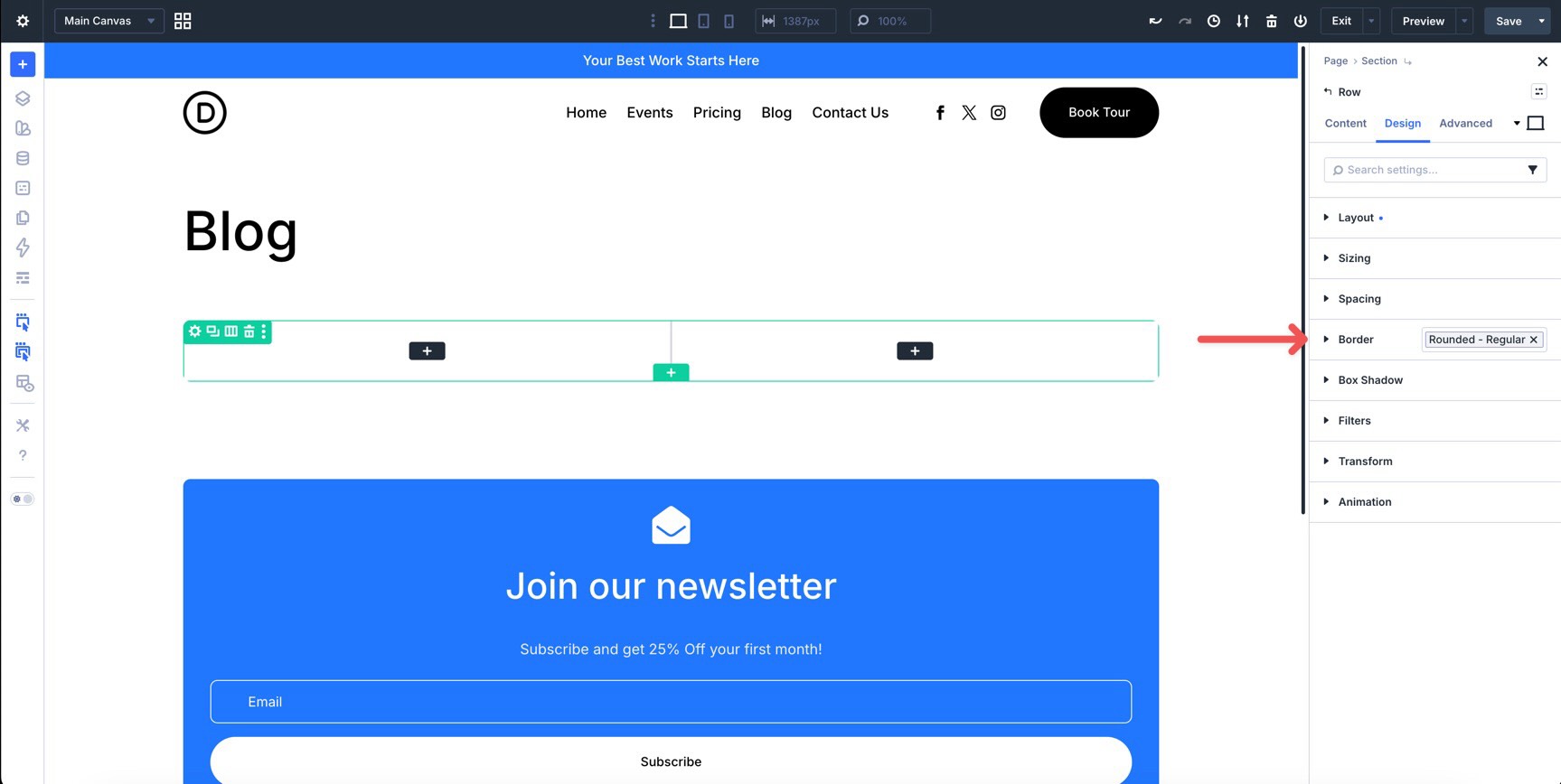
Next, apply the Rounded – Regular preset to the Row’s Border option group.
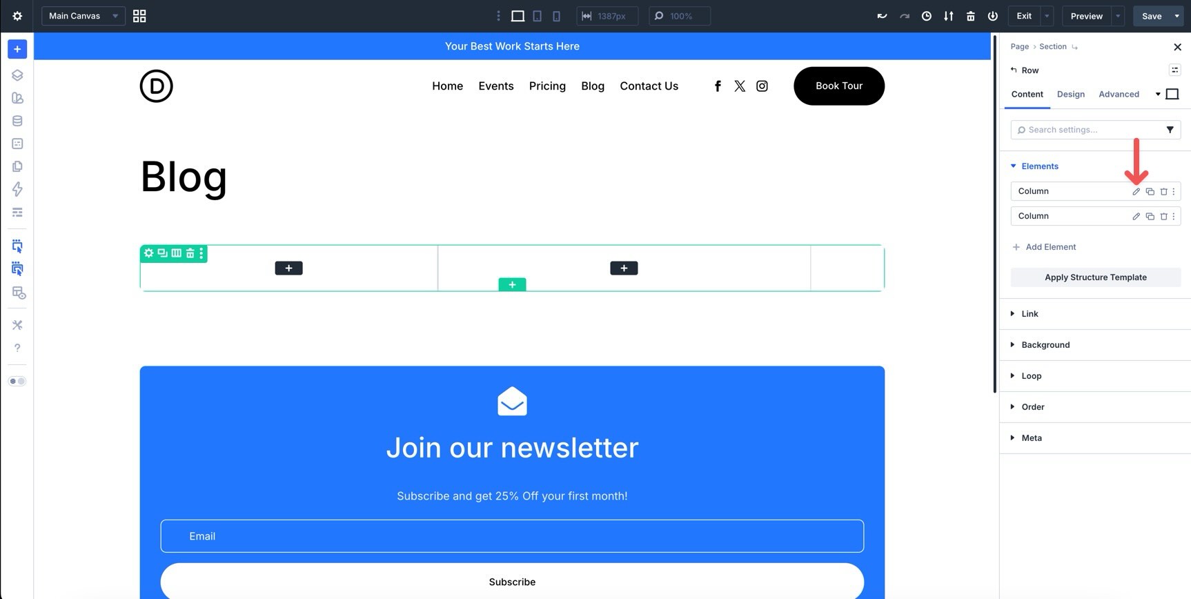
Now configure each Column. Click into the first Column to edit it.
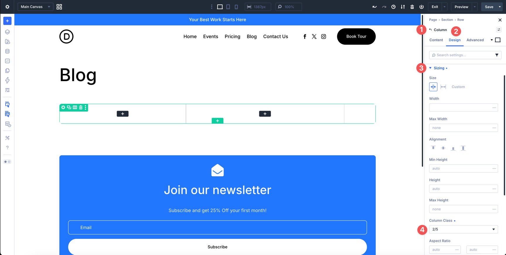
In the Design tab, expand the Sizing option group and set Column Class to 2/5.
Switch to the second Column. In the Design tab, expand the Layout option group. Apply the Spacing – XSmall variable to both the Horizontal Gap and Vertical Gap fields.
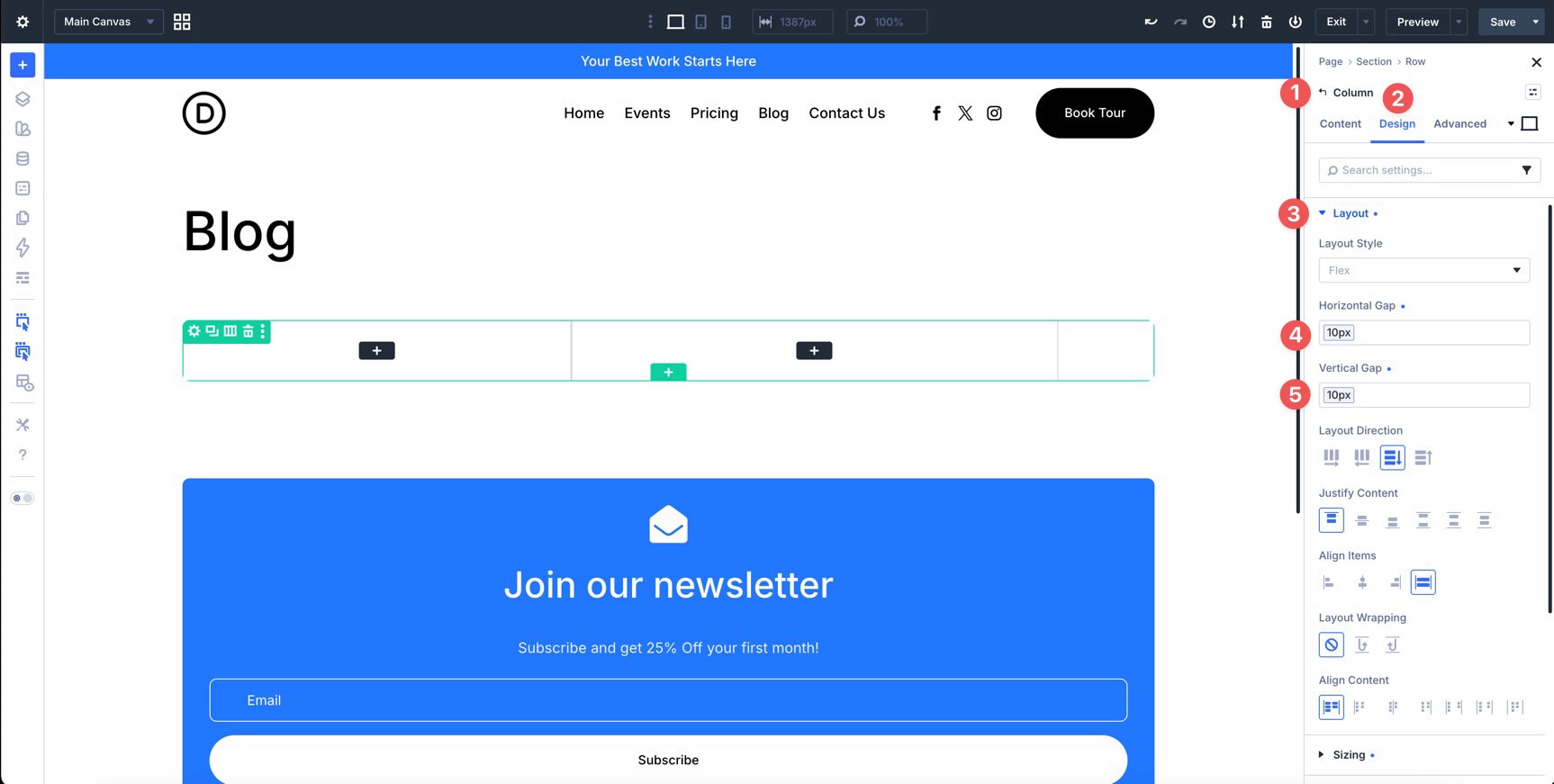
Still in the second Column, expand the Sizing option group and set Column Class to 3/5.
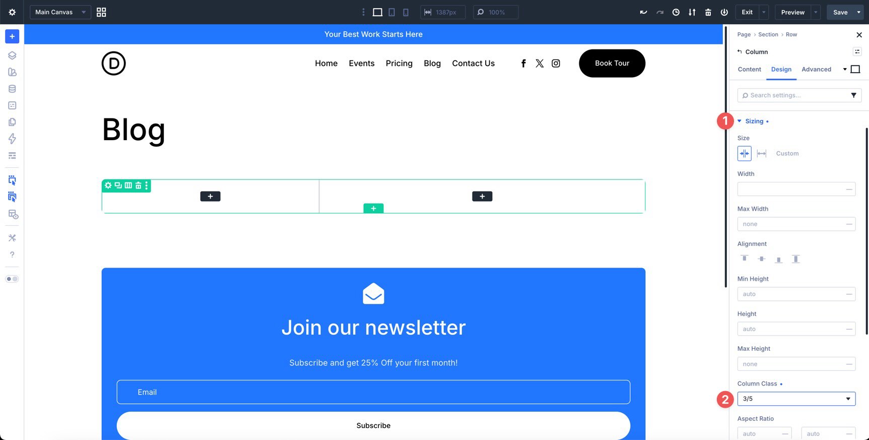
Next, expand the Spacing option group and apply the Spacing – Medium variable to all four Padding fields.
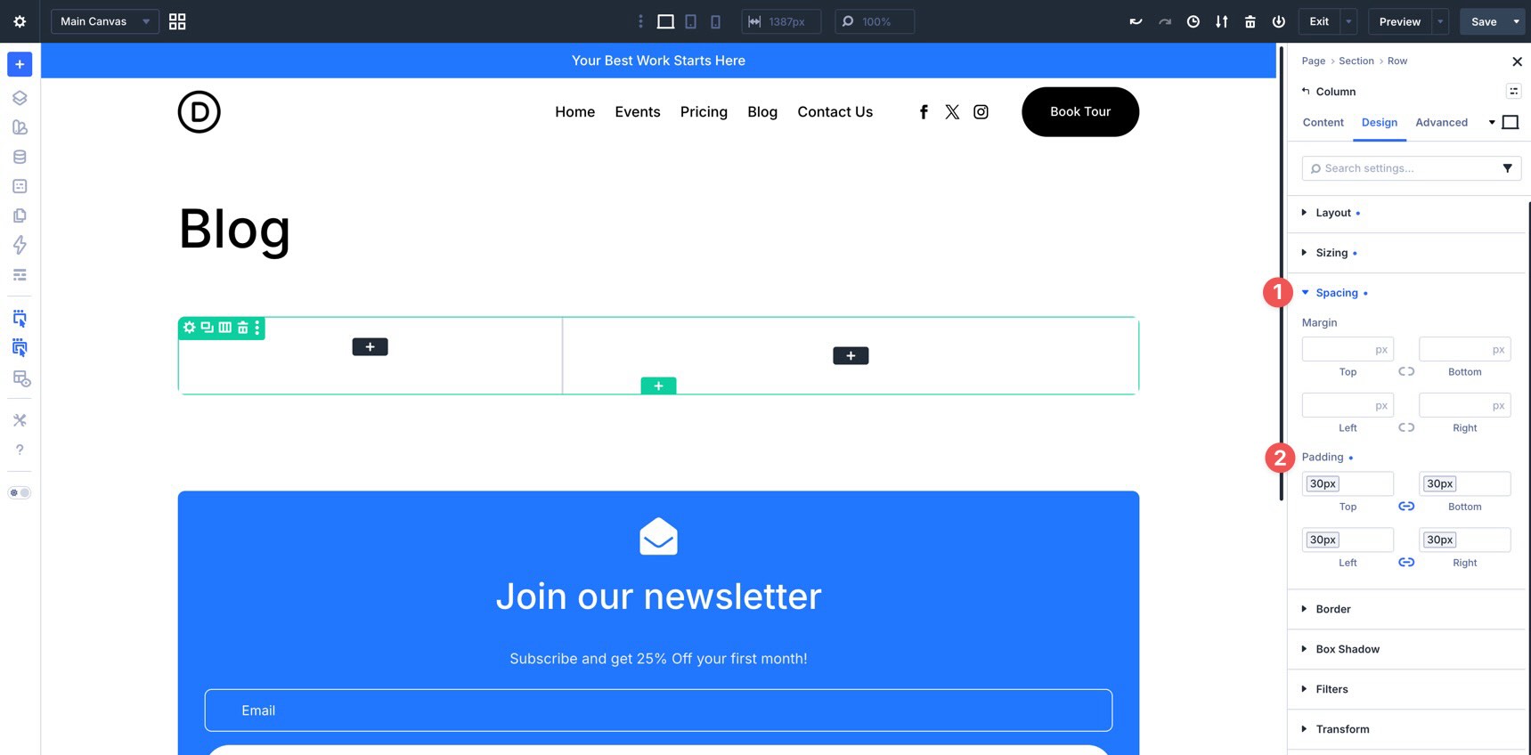
Finally, go to the second Column’s Content tab. Expand the Background option group and apply the Background – Light Gray color variable to the Background Color field.
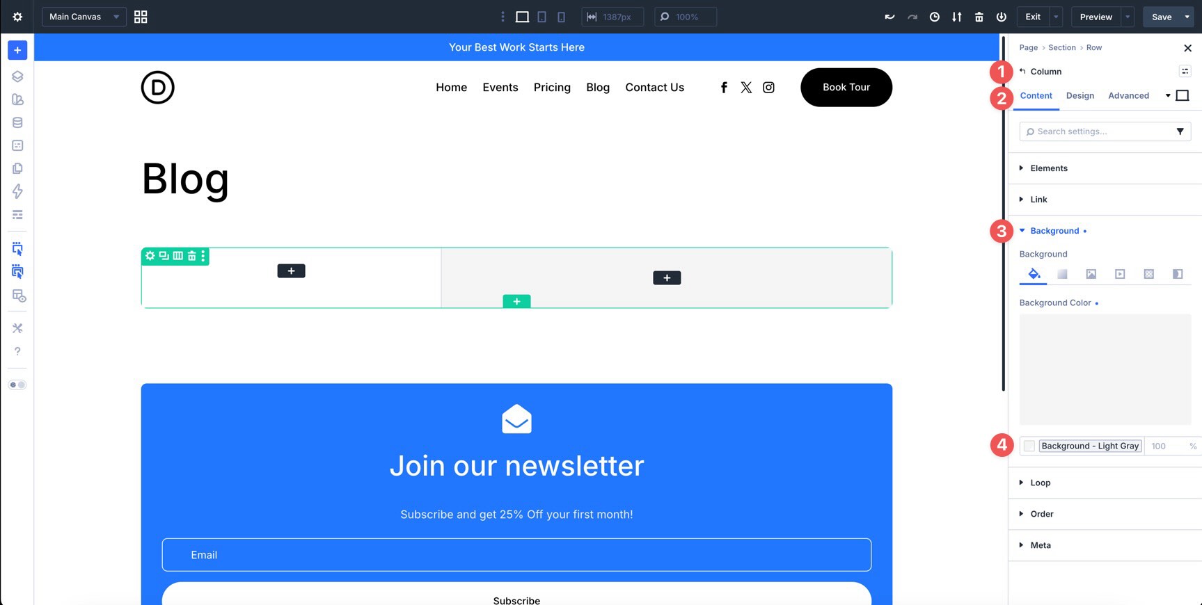
Step 2: Design The Repeated Post Item
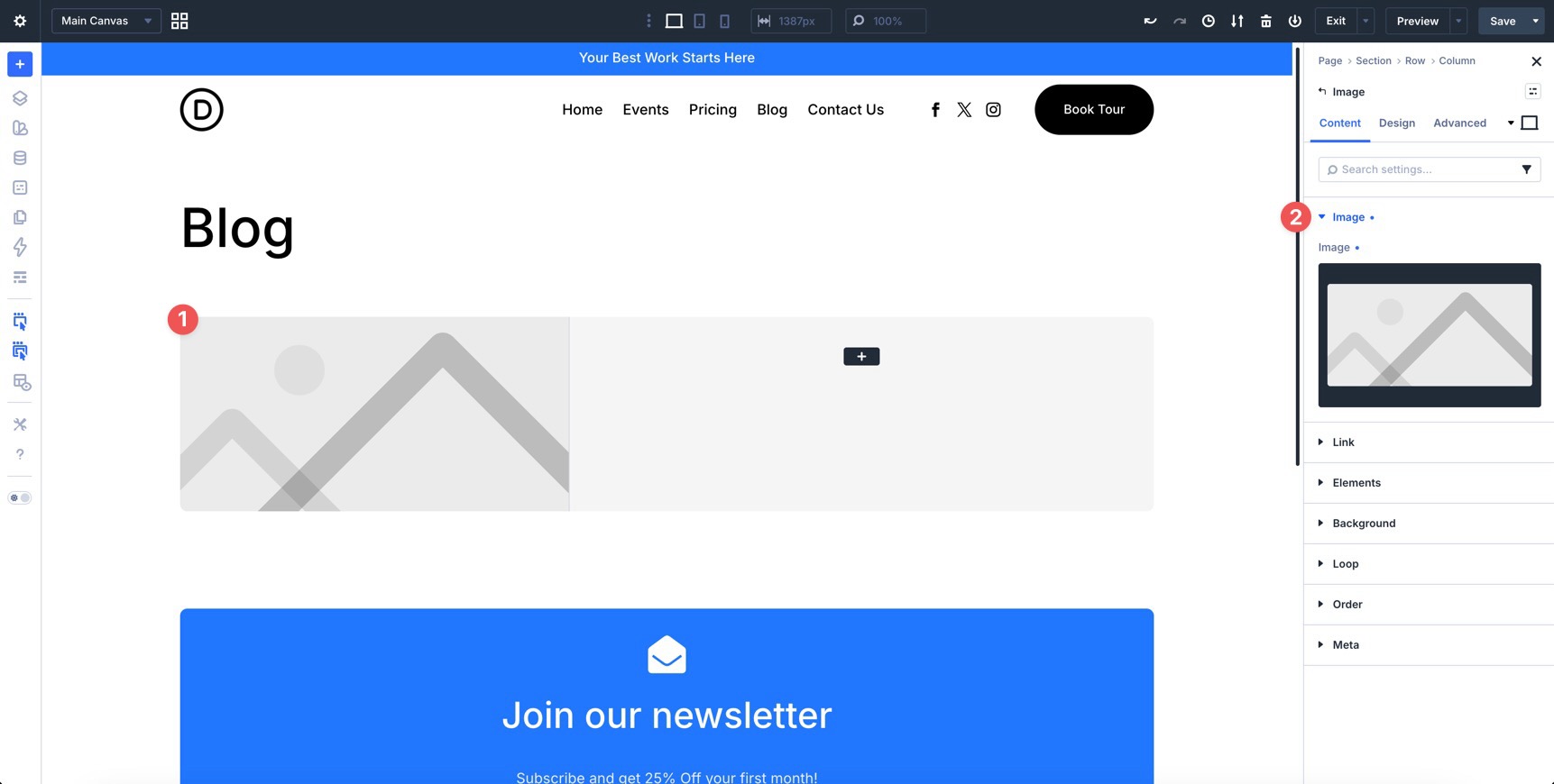
With the Row structure ready, design the post item that the Loop Builder will repeat. In the first Column, add an Image module.
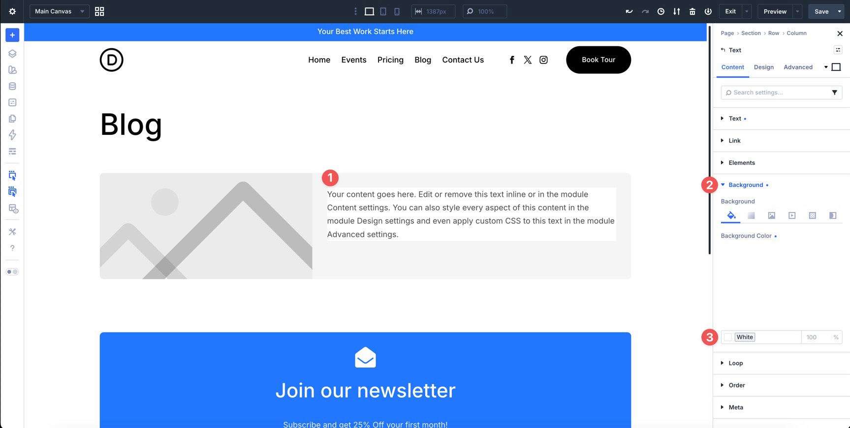
In the second Column, add a Text module. This will display the post terms. In the module’s Content tab, apply the White color variable to the Background Color field.
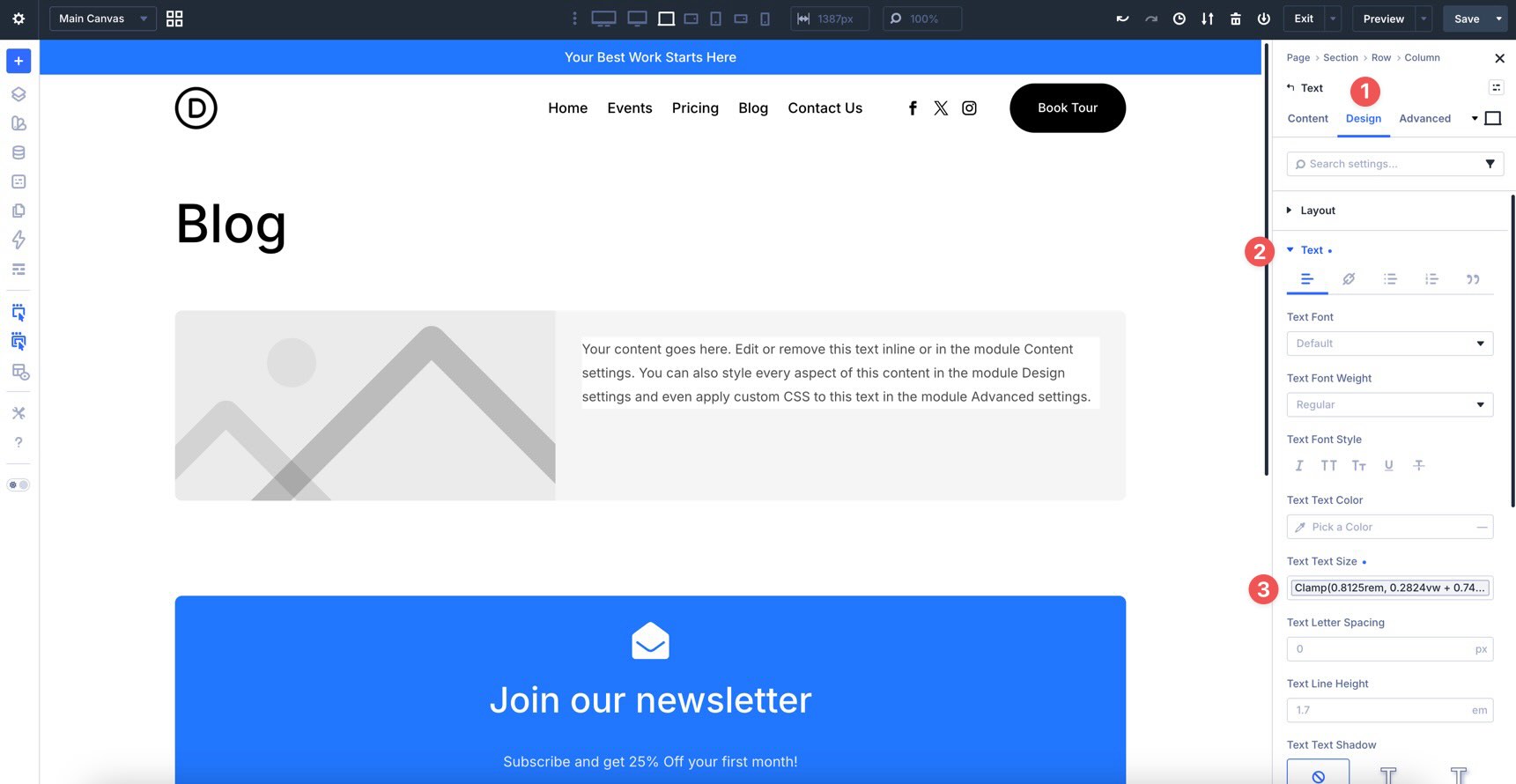
Switch to the Design tab, expand the Text option group, and apply the Body Small variable to the Text Size field.
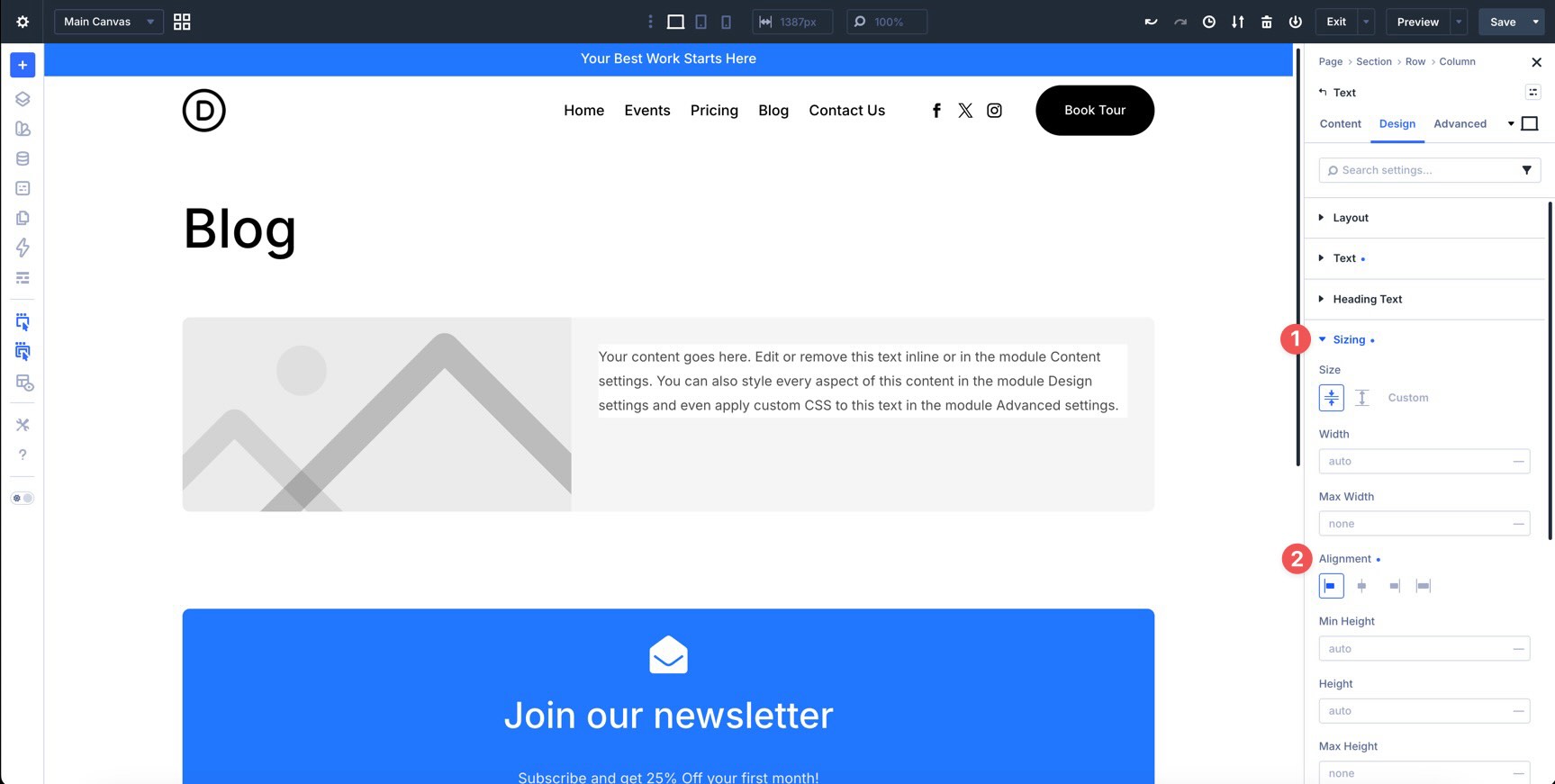
Expand the Sizing option group and set Alignment to Start.
In the Spacing option group, apply the Spacing – XSmall variable to the left and right Padding fields.
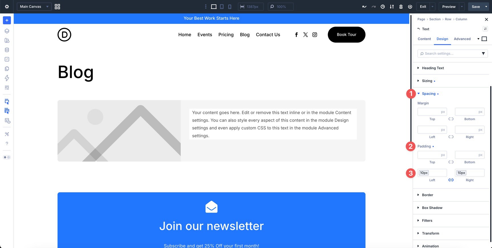
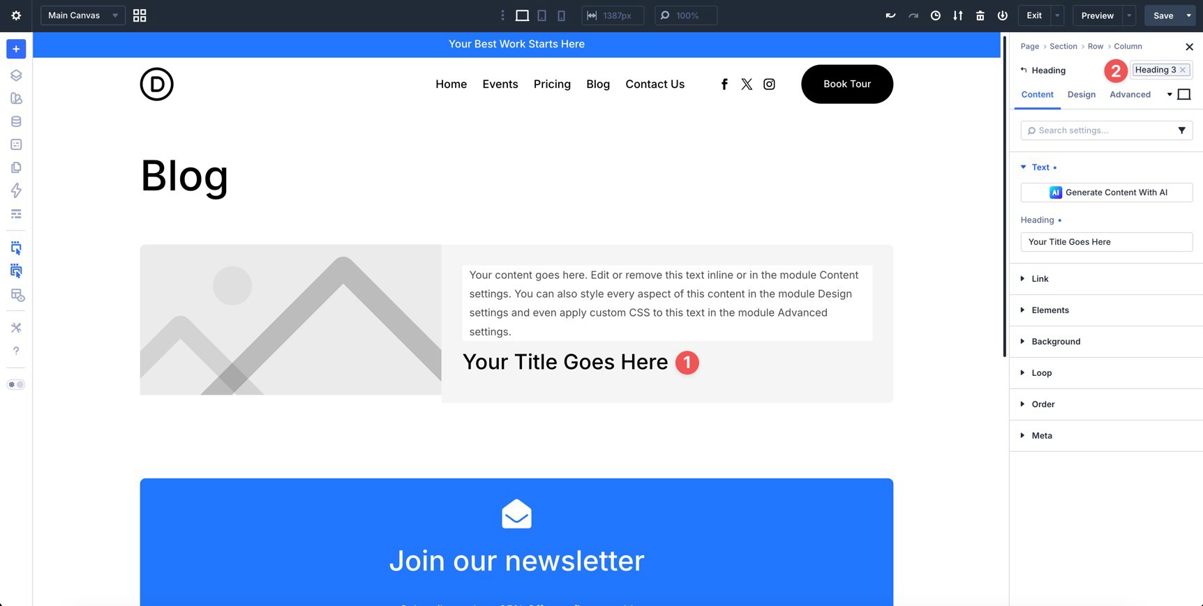
Below the Text module, add a Heading module and apply the Heading 3 preset.
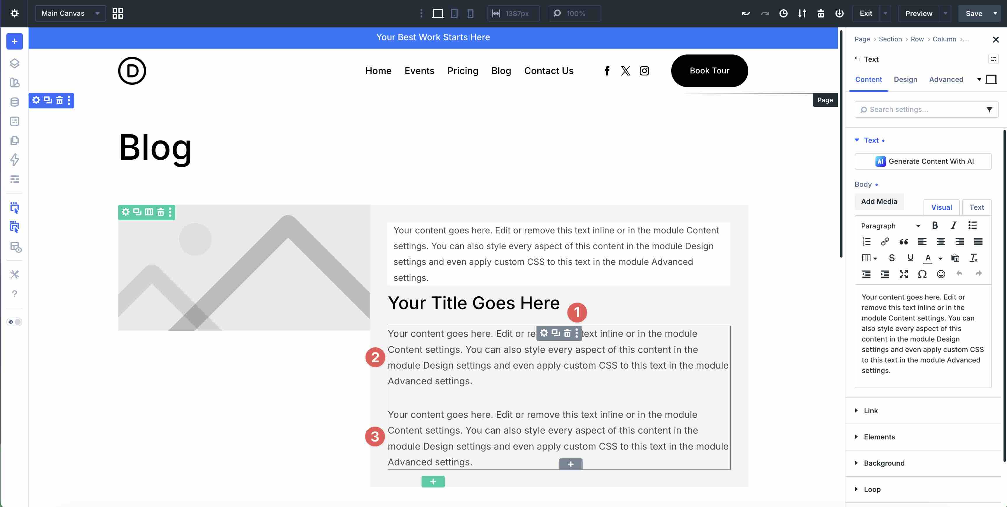
Next, add a Module Group below the Heading. Inside the Group, add two Text modules. These will display the author and publish date.
Open the Group settings. In the Design tab, expand the Layout option group.
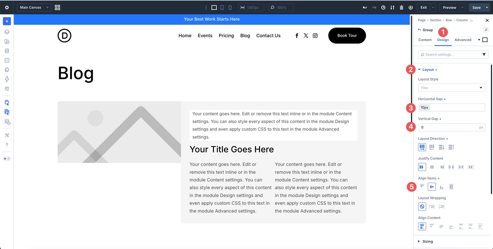
Then, expand the Sizing option group and set Alignment to Start.
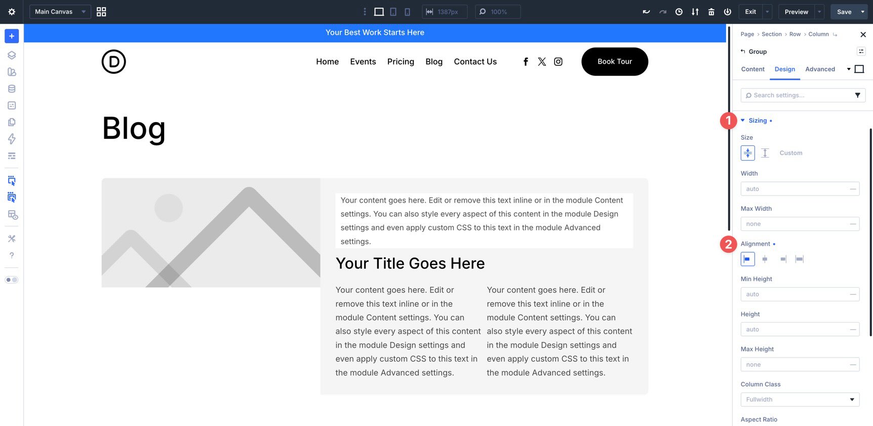
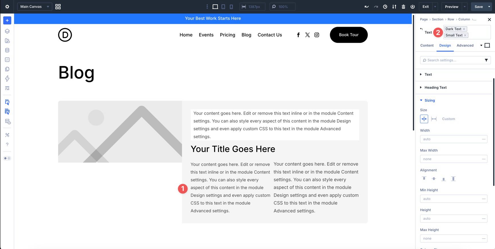
In the first Text module inside the Group, stack two presets: Dark Text and Small.
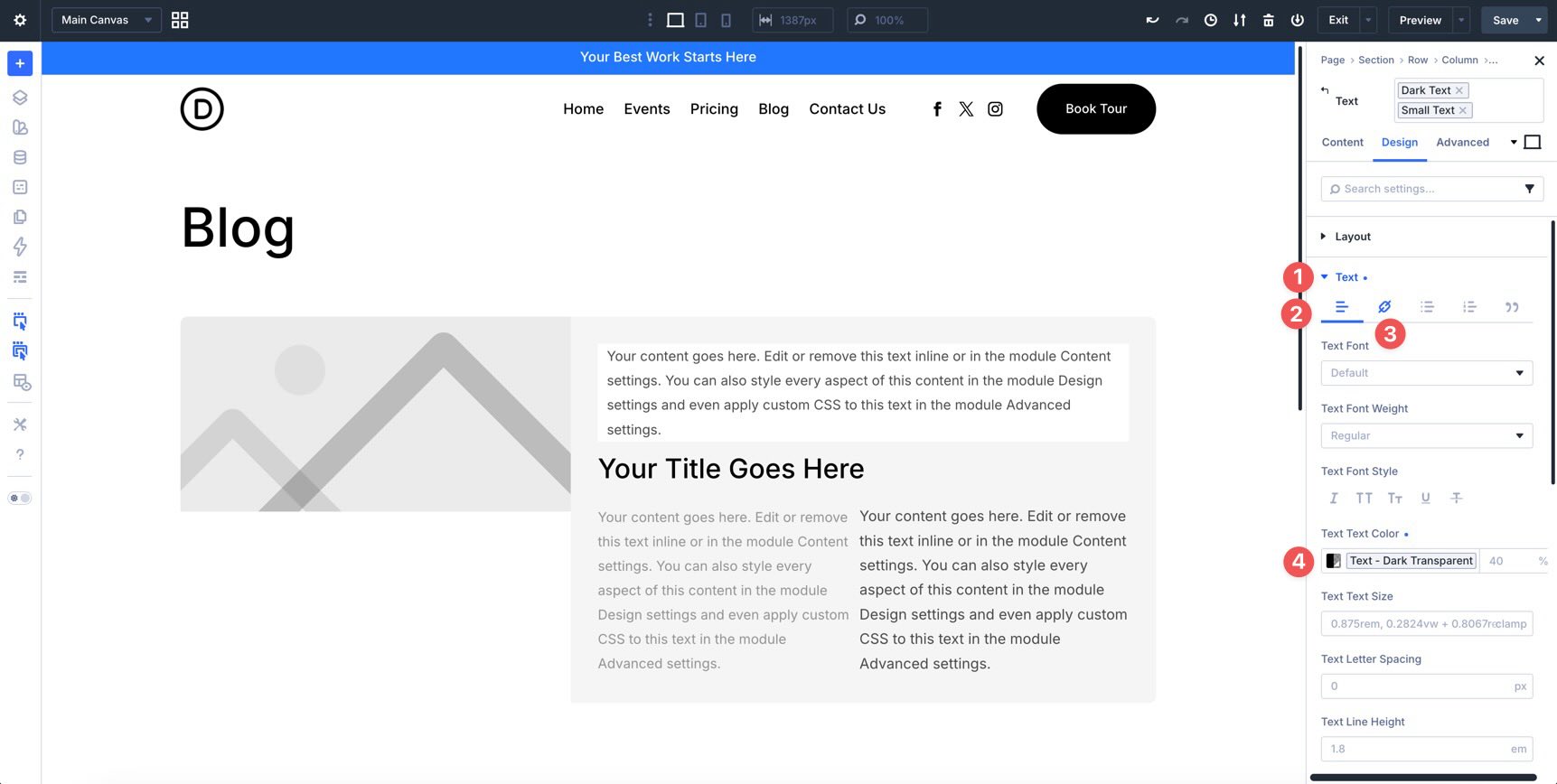
In that same Text module, go to the Design tab and expand the Text option group. In the Paragraph and Link tabs, apply the Text – Dark Transparent variable. Repeat the same color settings for the second Text module inside the Group.
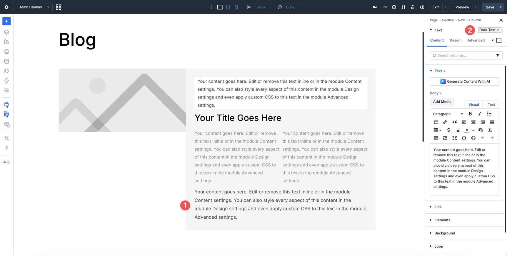
Below the Group, add another Text module and apply the Dark Text preset. This module will display the post excerpt.
Finally, add a Button module at the bottom of the second Column and apply the Text – Primary preset.
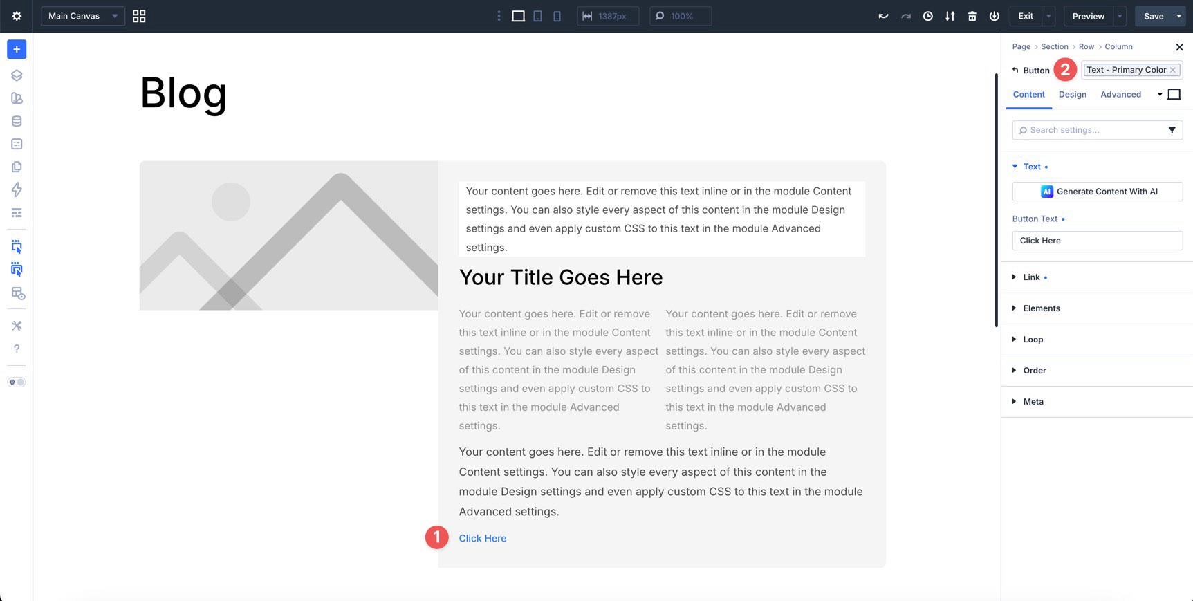
Step 3: Enable The Loop
Now, turn the Row into a dynamic Loop. Select the Row, go to the Content tab, expand the Loop option group, and enable Loop Element.
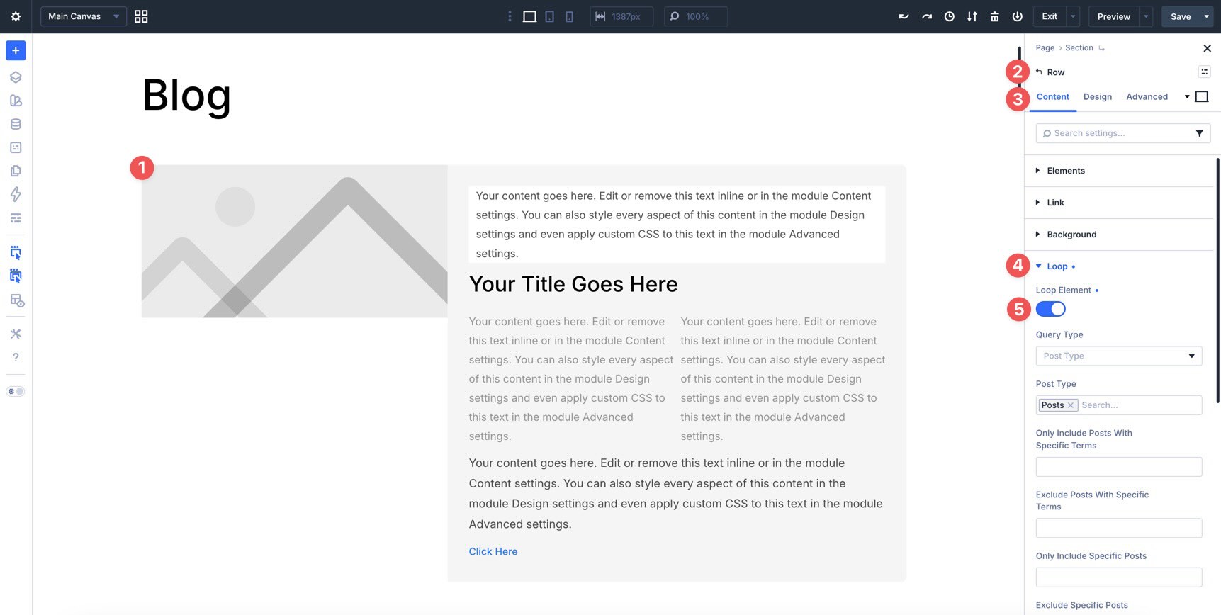
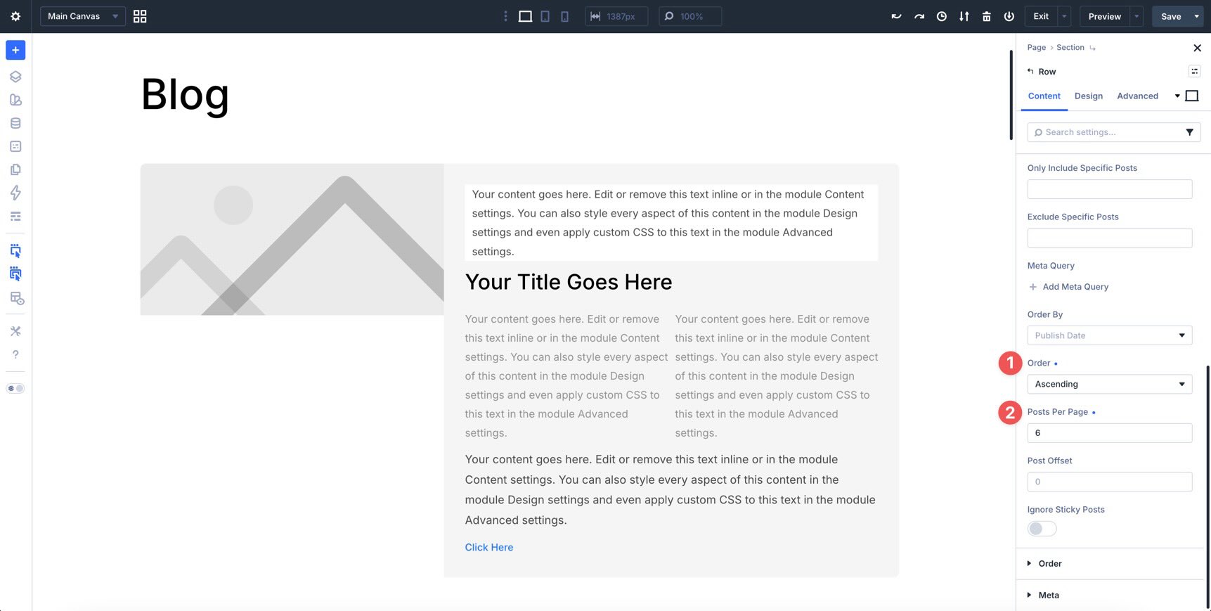
Next, configure the query. Set Order to Ascending. In the Posts Per Page field, enter 6.
If the loop is ordered by date, this displays six posts in oldest-first order. You can change the order later if you want the newest posts to appear first.
Step 4: Apply Dynamic Content Fields
With the Loop enabled, connect each module to the correct dynamic content field.
Select the Image module in the first Column. In the Content tab, hover over the Image field to reveal the Insert Dynamic Content icon. Then, choose Loop Featured Image.
Next, select the first Text module in the second Column and assign Loop Post Terms to the Body field.
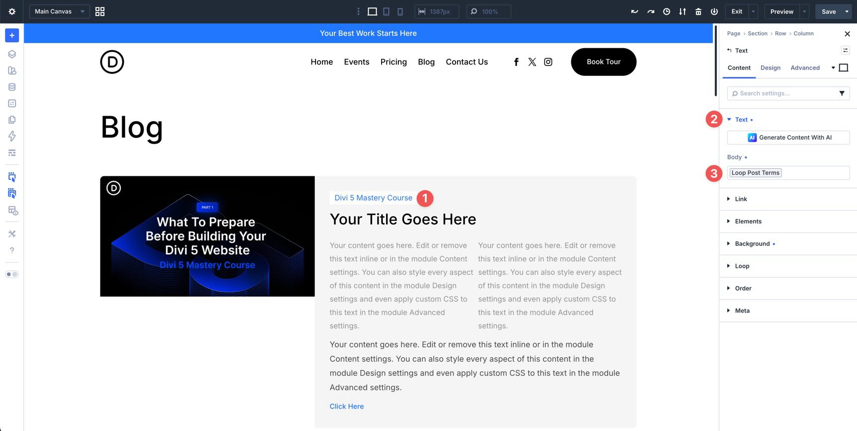
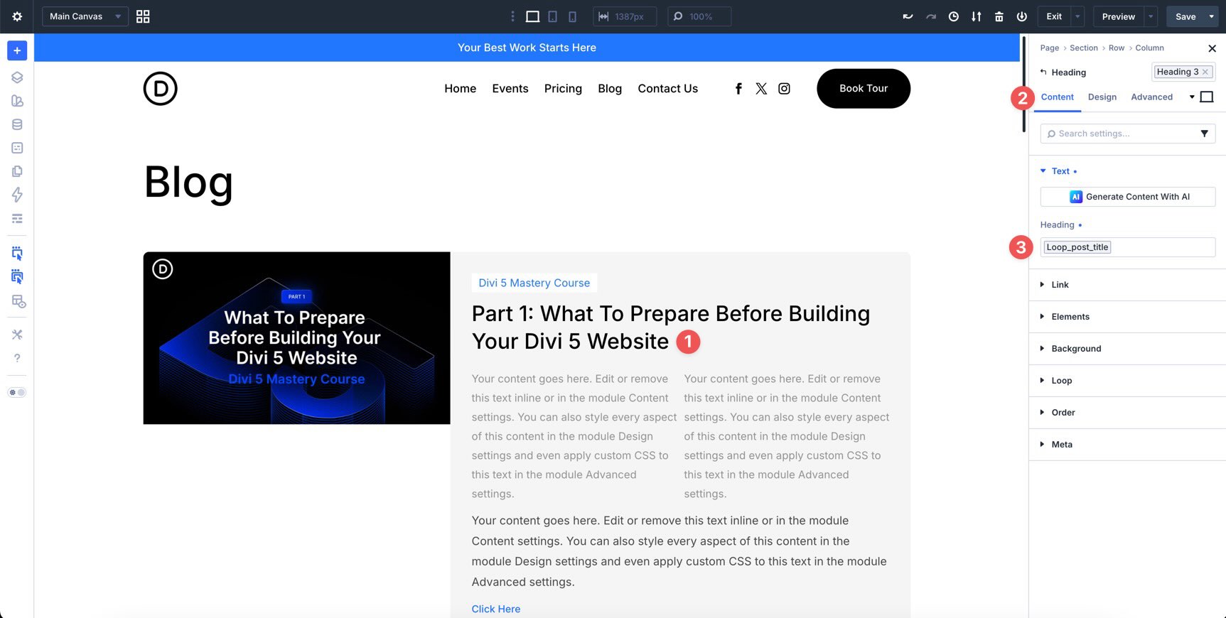
For the Heading module, assign Loop Post Title to the Heading field.
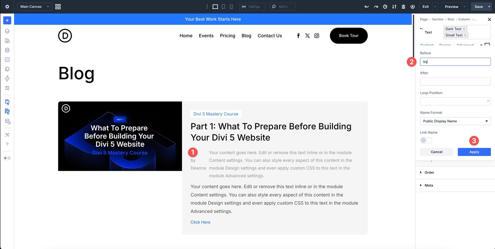
In the Group, select the first Text module. Apply Loop Author dynamic content, and enter by in the Before field so the output reads like an author byline.
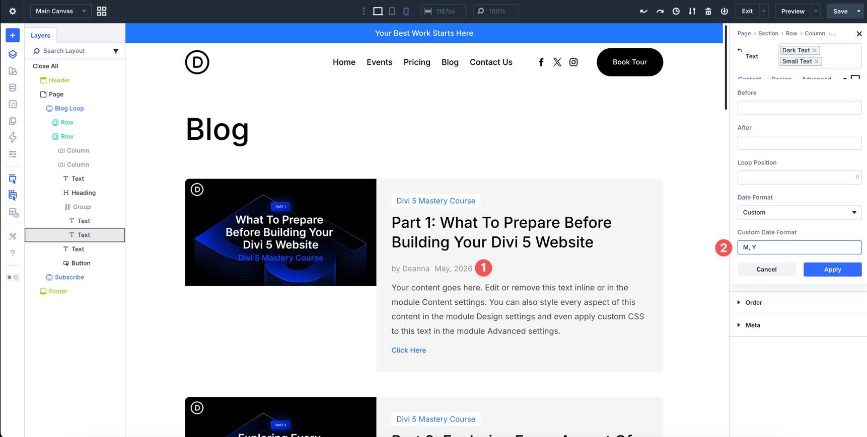
For the second Text module, select Loop Publish Date. In the Custom Date Format field, enter M, Y. This displays the post’s abbreviated month and year.
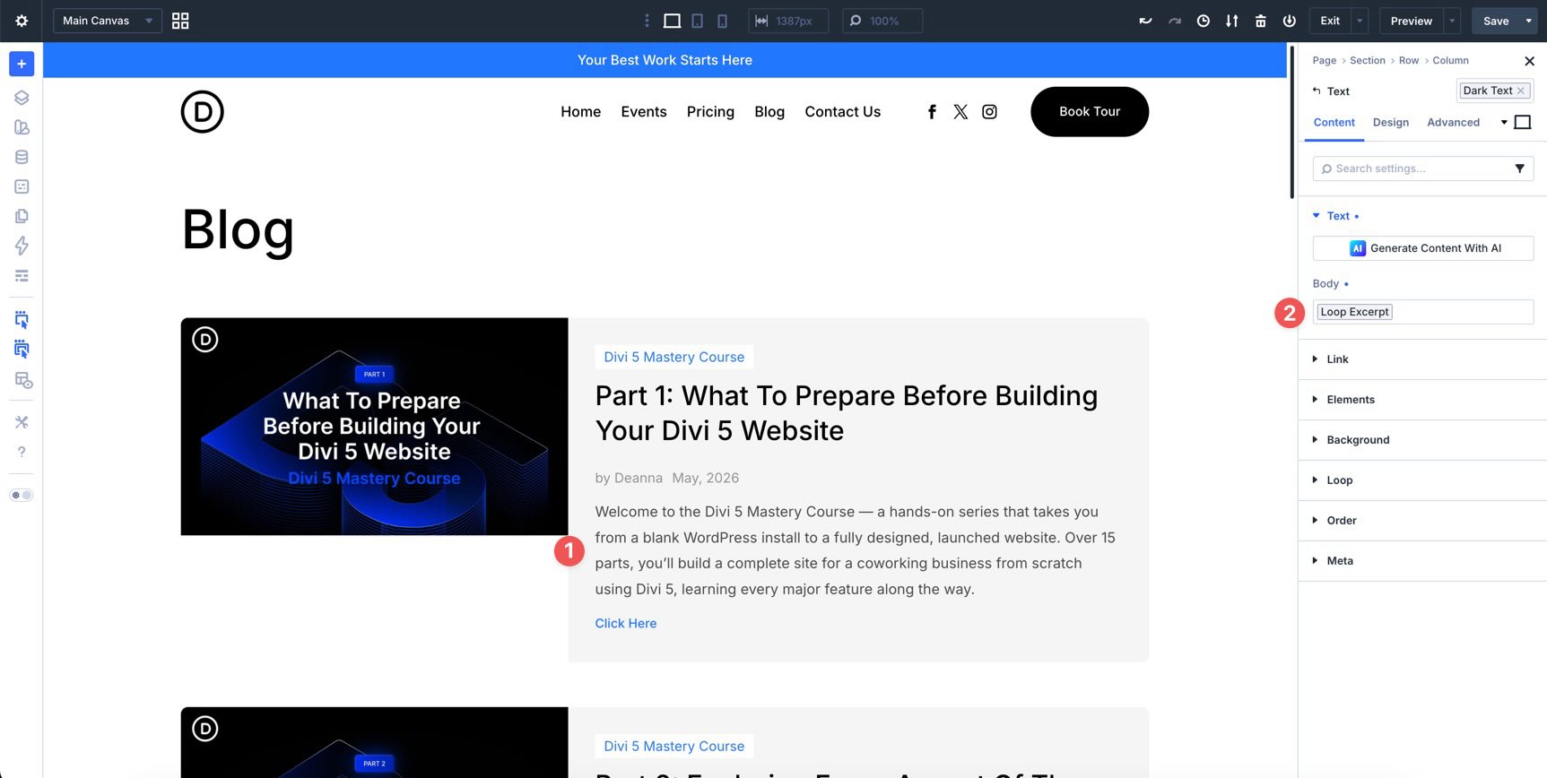
For the Text module below the Group, select Loop Excerpt.
Finally, set the Button Text to Read More and assign Loop Link to the Button Link URL field.
Scroll through the layout to confirm that the dynamic content loads correctly and that six posts are displayed.
Step 5: Add Pagination
Now that the Loop displays posts dynamically, give visitors a way to move through additional posts. Add a new single-column Row below the Loop Row, then add the Pagination module inside it.
In the Pagination module’s Content tab, make sure the correct Loop Row is selected as the Target Loop.
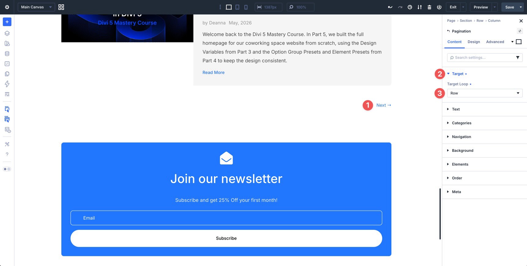
Preview the page and test the pagination on the front end.
Step 6: Make The Loop Responsive
The Flexbox-based layout gives the Blog page a strong responsive starting point. Still, it is worth reviewing the layout across Tablet and Phone breakpoints.
Check typography, spacing, image size, button placement, and how the two Columns stack on smaller screens. Use Customizable Responsive Breakpoints, Structure Templates, and the Responsive Editor for any targeted adjustments.
Start by enabling any additional breakpoints you want to test. Click the ellipsis menu to open the Breakpoints modal, where you can enable or disable Divi’s available breakpoints.
Cycle through each active breakpoint and look for spacing, alignment, and readability issues.
Apply A Structure Template
On lower breakpoints, simplify the Row structure so the post content stacks cleanly.
Switch to the Tablet breakpoint. Select the main Row that contains the Loop. Go to the Content tab, expand the Elements option group, and click the Apply Structure Template button.
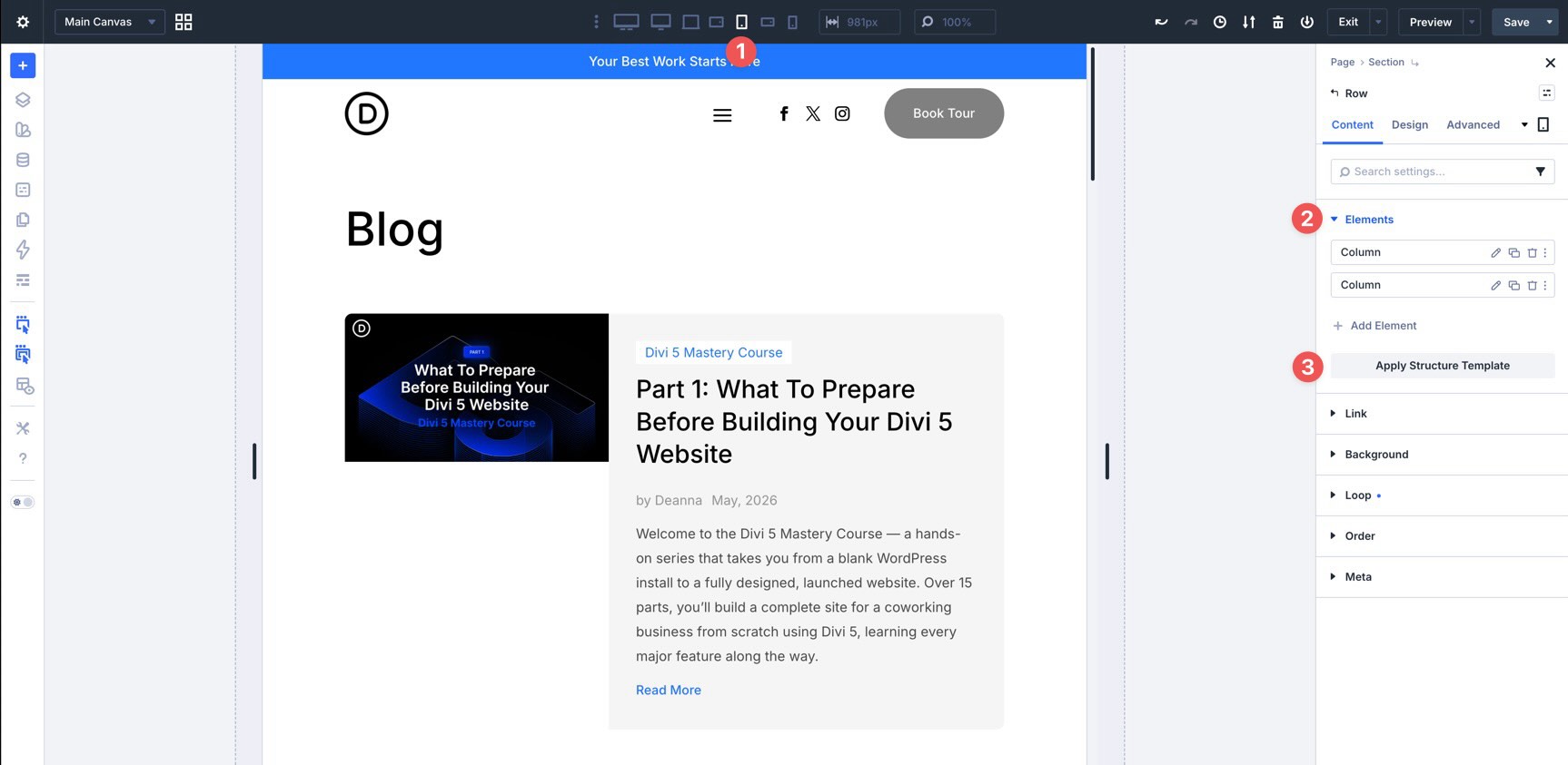
Choose a single-column structure. This converts the 2/5 + 3/5 desktop layout into a stacked layout on Tablet and smaller screens.
Use The Responsive Editor
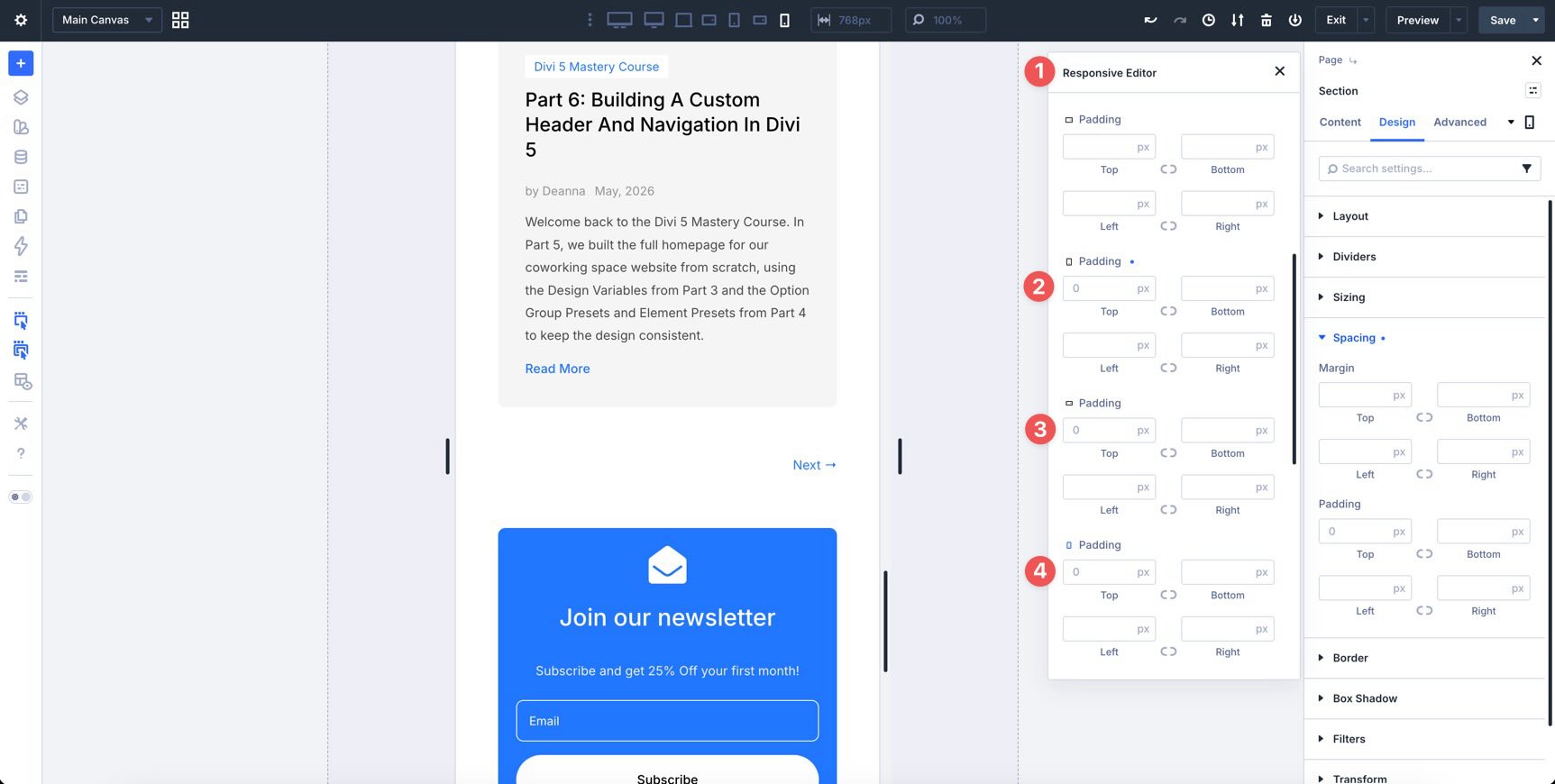
For targeted changes across breakpoints, use the Responsive Editor on any compatible setting.
For example, select the Section below the Loop. In the Design tab, expand the Spacing option group and hover near the Padding fields to reveal the Edit Responsive Values icon.
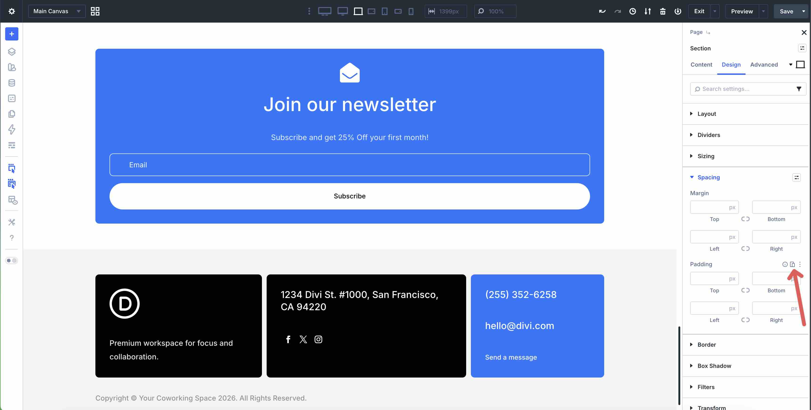
Click the icon to open the Responsive Editor panel. From there, adjust padding values for the breakpoints that need changes.
Use Loops In The Theme Builder
The Loop Builder also works inside the Theme Builder. Instead of rebuilding the same layout for every archive, you can create a template once and let it pull the correct content for the page being viewed.
This is useful for:
- Category archives: Show posts from the current category.
- Tag archives: Show posts from the current tag.
- Author archives: Show posts from the current author.
- Search results: Display results in a custom Loop layout.
- Product archives: Build WooCommerce archive layouts with custom product cards.
- Custom post type archives: Display projects, events, team members, or other custom content types.
In Part 8 of the Divi 5 Mastery Course, we built Theme Builder templates. The Loop Builder extends that workflow by giving you full control over the repeated archive item design.
How Theme Builder Loops Work
You can enable the Loop Builder on a Row, Column, Group, or supported module inside a Theme Builder template, just as you did on the Blog page.
When building archive templates, set the Query Type to Posts for Current Page. This lets the Loop display the correct content for the archive context, such as the current category, tag, author, or search results page.
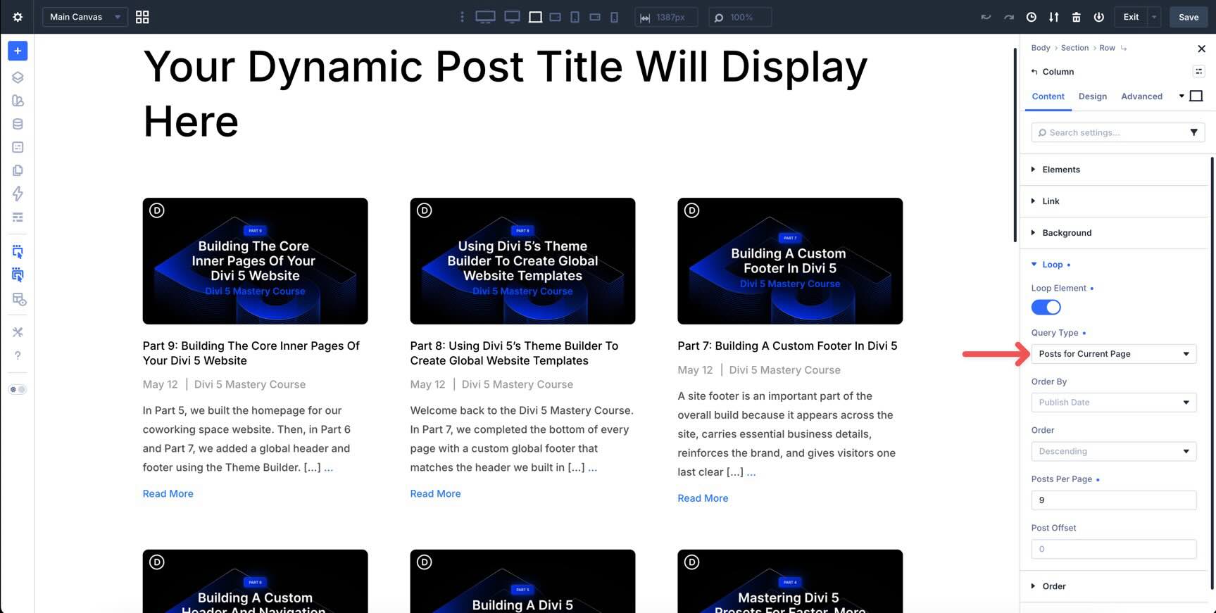
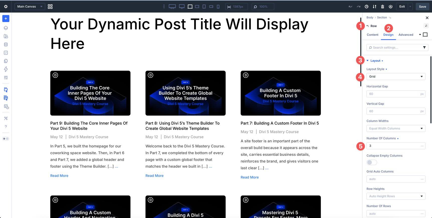
You can use Flexbox or CSS Grid to control the Loop layout. For example, use Grid for a card-based archive layout and Flexbox for stacked or horizontal list layouts.
The result is a custom dynamic archive layout that stays consistent with the rest of your site.
Best Practices And Tips
Now that you know how to build a Loop, here are a few guidelines to keep your layouts consistent, flexible, and easier to maintain.
Start With Design Variables And Presets
Build the repeated item with your Design Variables and Presets before enabling or finalizing the Loop. That way, every repeated item inherits the same typography, spacing, colors, borders, and button styles as the rest of the site.
If you plan to reuse the layout, save it to the Divi Library so you can start future loops from the same design.
Test Responsiveness Early
Flexbox and Grid give you a strong responsive foundation, but dynamic content can vary from post to post. Test your Loop on Tablet and Phone breakpoints with real titles, excerpts, categories, and featured images.
Use the Responsive Editor to fine-tune spacing, typography, image behavior, and column structure where needed.
Keep Accessibility In Mind
Use a clear heading hierarchy for post titles, such as H2 or H3 depending on the page structure. Make sure featured images have meaningful alt text in WordPress. Also confirm that links and buttons are easy to access by keyboard.
These details improve usability and help the layout work better for more visitors.
Build For Scalability
The same techniques used for this Blog page can power portfolios, shop product grids, team directories, event listings, menus, and custom post type archives.
When you build with reusable styles and a clear layout structure, future loops become much faster to create.
Download And Install The Files
To make things easier, we’ve created a Blog Loops In Divi 5.json file containing the Blog page layout from this tutorial. To use it, fill out the form below, save the file to your computer, and create a new page.
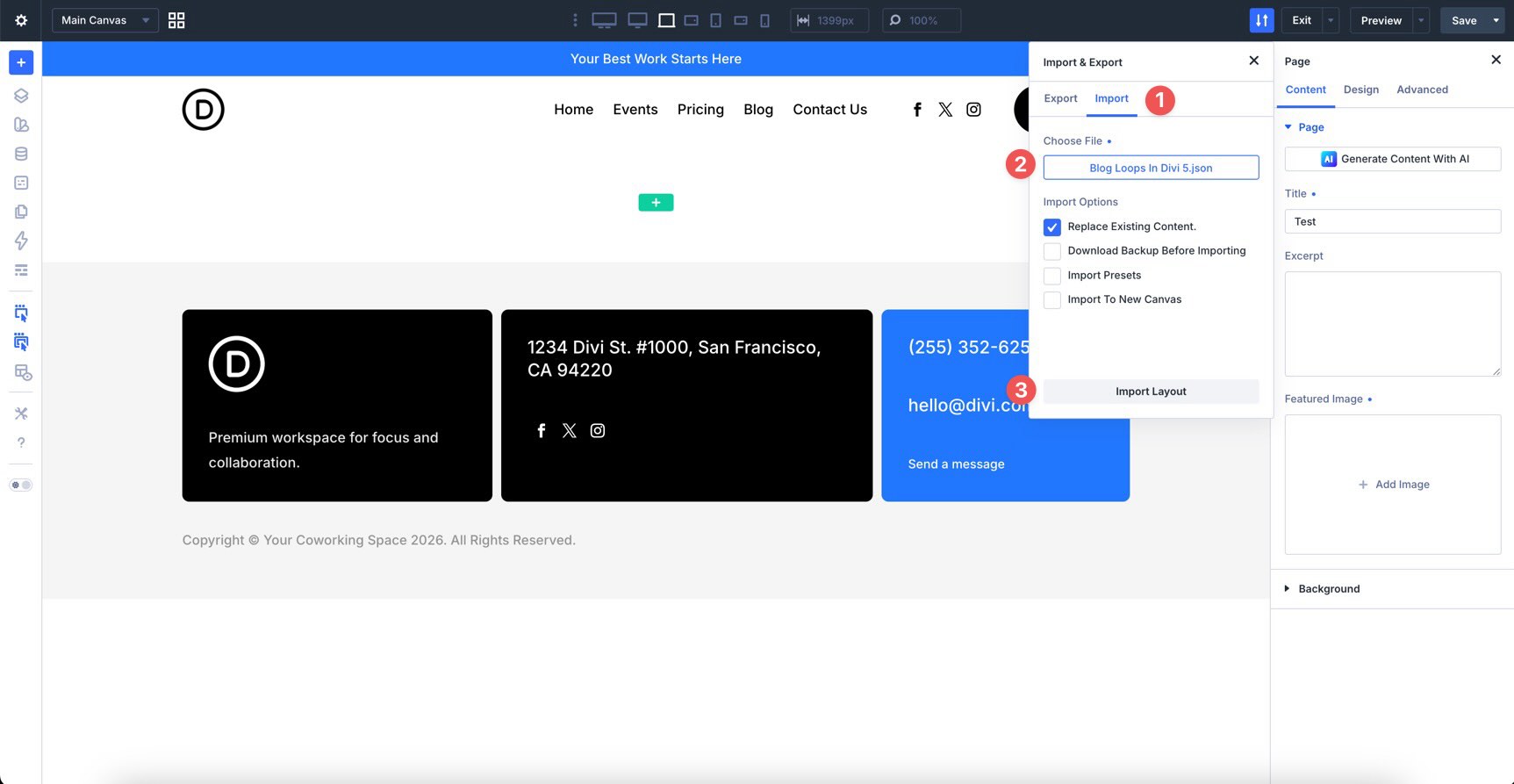
In the Builder Bar, click the Builder Settings icon and enable the Export & Import icon in the Top Bar.
Select the Export & Import icon, click the Import tab, and locate the JSON file on your computer. Once the file is loaded, click Import Layout to add the layout to the page.

What’s Coming Next
You now have a custom Blog page powered by the Loop Builder. You designed the repeated item, connected dynamic content, added pagination, and adjusted the layout for smaller screens.
The same approach can be used for other content types, such as a portfolio grid, masonry blog, product archive, event listing, or dynamic menu.
In Part 15 of the Divi 5 Mastery Course, we’ll move into advanced power-user workflows, including optimization techniques, time-saving shortcuts, and smarter ways to build faster in Divi 5. After that, Part 16 will focus on final polish before launch.
Until then, we’d love your feedback. Leave us a comment below or reach out on our social media channels.










It would be really useful if the Post ID was able to be accessed in the loop builder for links and attributes. That way you can connect 2 seperate loops via the id. For example a CPT of people displayed in blog grid style and you want to show their biographies in a popup. Because of z-indexing you can’t have the initial content and bios together in the same loop so there needs to be a connector and since the Post ID is unique it would be the best way of doing it.
Thank you for your input, Peter! 😊
We have submitted it as a formal feature request for consideration by our development team. 👍
Hello
I have a comment regarding your blog posts. When you include screenshots, it would be good if you could click on them to enlarge them, as they are very small, especially when viewing on a laptop.
As for the short videos, they’re fine, but again, whether on small or large screens, you have to zoom in to see them. And they play far too quickly.
I’ve been using the Divi theme for 8 years. And your new version means we need to undergo in-depth training, as there are so many new features that we need to get to grips with.
Kind regards
Thank you for the thoughtful feedback, and for using Divi for so many years. We really appreciate it!
That’s an excellent suggestion. We’ll pass this feedback along to our content team.
In the meantime, you can right-click an article image and choose Open Image in New Tab to view it at a larger size. That will help to see all the details. 👍