
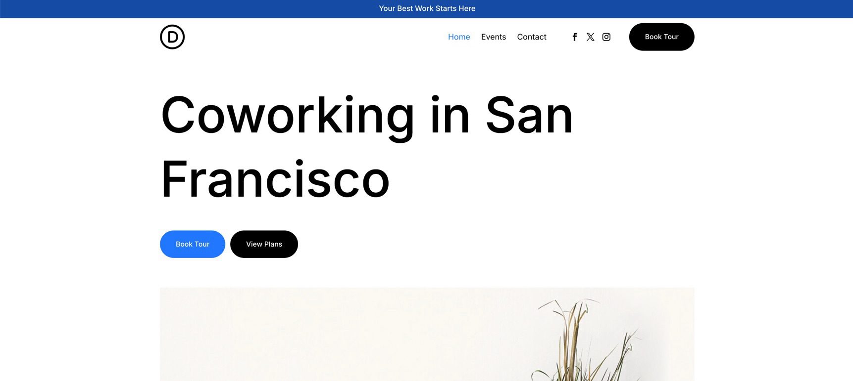
Welcome back to the Divi 5 Mastery Course. In Part 5, we built the full homepage for our coworking space website from scratch, using the Design Variables from Part 3 and the Option Group Presets and Element Presets from Part 4 to keep the design consistent.
Now, in Part 6, we’ll shift to the top of every page by creating a custom header and navigation in Divi 5’s Theme Builder. We’ll use Flexbox settings, presets, variables, and Interactions to build a responsive header that includes an announcement bar, logo, main navigation menu, social media links, and a call-to-action button.
We’ll also make the header global, so it appears consistently across the site. By the end of this post, your coworking website will have a polished, branded header that improves navigation and visually ties the site together.
Let’s get started.
- 1 Divi 5 Mastery Course Overview
- 2 Why You Need A Custom Header
- 3 Accessing The Theme Builder
-
4
How To Build A Custom Header And Navigation
- 4.1 Step 1: Setting Up The Header Container
- 4.2 Step 2: Adding The Announcement Bar
- 4.3 Step 3: Setting Up The Navigation Foundation
- 4.4 Step 4: Adding The Menu Module
- 4.5 Step 5: Adding Social Links
- 4.6 Step 6: Adding A CTA Button
- 4.7 Step 7: Creating Interactions
- 4.8 Step 8: Testing Responsiveness
- 5 Tips And Best Practices For Headers In Divi 5
- 6 Downloading And Installing The Files
- 7 Download For Free
- 8 What’s Coming Next
Divi 5 Mastery Course Overview
| Part | Title | Visit |
|---|---|---|
| 1 | What To Prepare Before Building Your Divi 5 Website | Learn more |
| 2 | Exploring Every Aspect Of The Divi 5 Interface | Learn more |
| 3 | Creating A Divi 5 Global Design System With Design Variables | Learn more |
| 4 | Mastering Divi 5 Presets For Faster, More Consistent Web Design | Learn more |
| 5 | Building A Divi 5 Homepage From Scratch | Learn more |
| 6 | Building A Custom Header And Navigation In Divi 5 | Learn more |
| 7 | Building A Custom Footer In Divi 5 | Learn more |
| 8 | Using Divi 5’s Theme Builder To Create Global Website Templates | Learn more |
| 9 | Building The Core Inner Pages Of Your Divi 5 Website | Learn more |
| 10 | Mastering Flexbox In Divi 5 | Learn more |
| 11 | Mastering CSS Grid In Divi 5 | Learn more |
| 12 | Making Your Divi 5 Website Fully Responsive | Learn more |
| 13 | Creating Interactive Off-Canvas Elements (Popups & More) | Learn more |
| 14 | Mastering The Divi 5 Loop Builder | Learn more |
| 15 | Divi 5 Power User Workflow | Learn more |
| 16 | Auditing, Polishing, And Launching Your Divi 5 Website | Learn more |
Why You Need A Custom Header
The default Divi header and the Menu module are useful starting points, but a custom header built in the Theme Builder gives you more control over layout, styling, responsiveness, and behavior. For example, you can create sticky headers, build custom navigation structures, use semantic HTML where appropriate, and decide exactly how the header changes across breakpoints.
Divi 5 also gives you more menu-building options than a traditional single Menu module approach. You can still use the Menu module for speed, which we’ll do in this tutorial. However, you can also build more advanced navigation with Link modules, Menu Loops, Dropdown modules, and Interactions when a project calls for it.
Using the presets and variables from earlier parts of the course helps the header match the homepage. Instead of manually recreating fonts, colors, spacing, and button styles, you can reuse the same design system. Then, when you update a shared preset or variable later, those changes can flow through the header wherever that preset or variable is used.
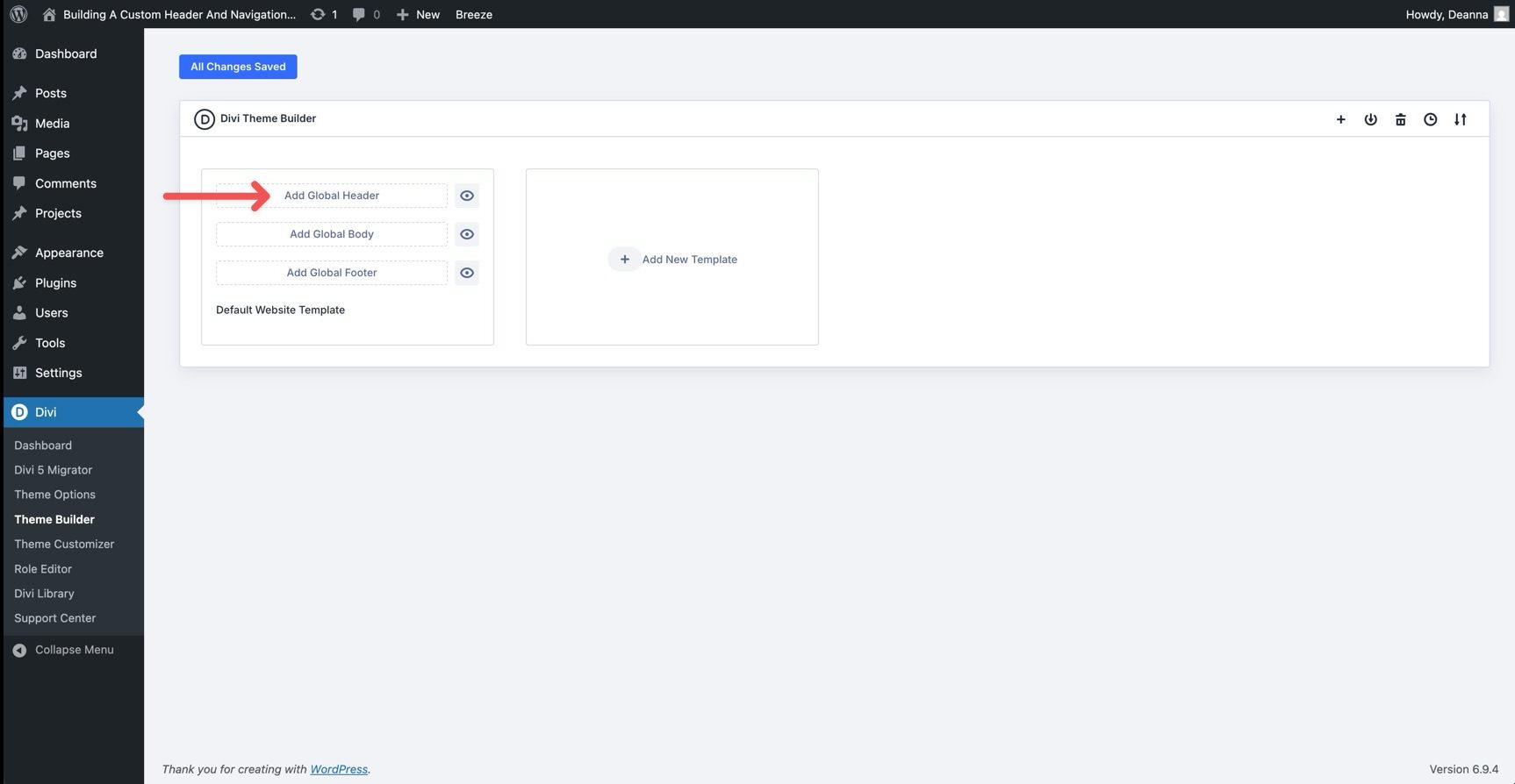
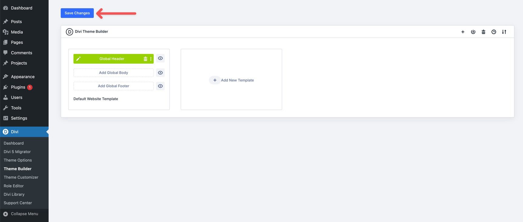
Accessing The Theme Builder
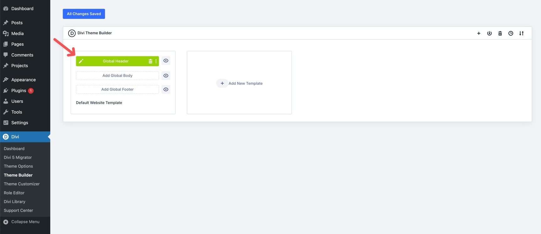
To begin, go to your WordPress dashboard and navigate to Divi > Theme Builder.
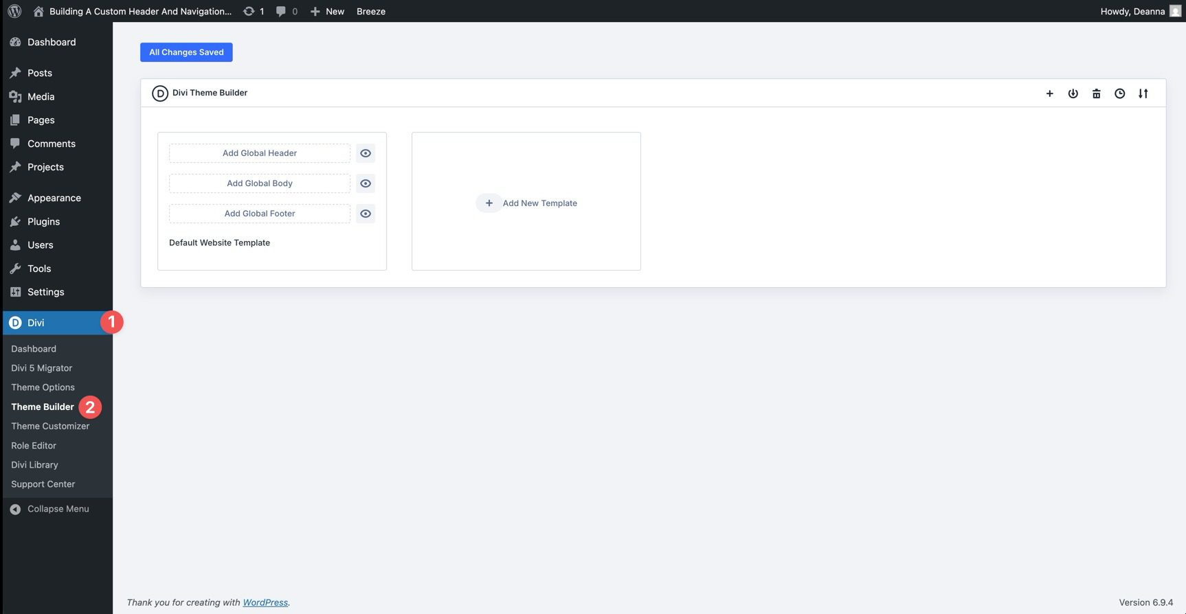
Under the Default Website Template, click Add Global Header. If you are starting from an existing placeholder, choose the option to build or edit the Global Header. This opens the Visual Builder with a canvas dedicated to the header layout.
In this section, we’ll build a custom header and navigation for the coworking website. We’ll use the Design Variables and Presets created in Parts 3 and 4, which will speed up the process and keep the header aligned with the rest of the site.
By the end, you’ll also understand the same workflow we’ll use for other global areas of the site, including the footer we’ll build in Part 7.
Step 1: Setting Up The Header Container
First, we’ll build the foundation of the custom header. This gives the navigation a clean, flexible structure using Divi 5’s Flexbox controls and the design system we already created.
Row Settings
Start by adding a single-column Row to the Canvas. In the Content tab, expand the Background option group and apply the Primary Color variable to the background field.
Next, switch to the Row settings’ Design tab. Expand the Layout option group and set Justify Content to Center.
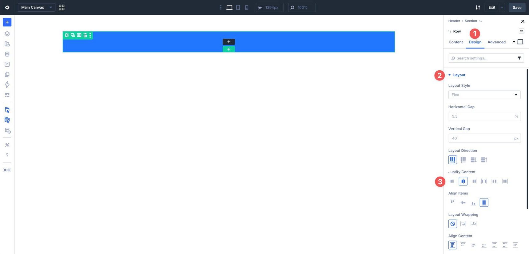
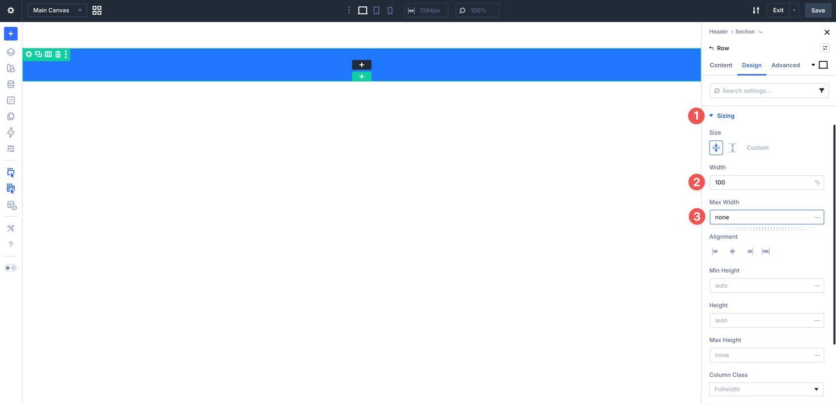
Expand the Sizing option group. Set Width to 100% and Max Width to None.
In the Spacing option group, locate the Padding fields. Use the Insert Dynamic Content icon to add the Spacing – XSmall variable to the top and bottom padding fields.
Column Settings
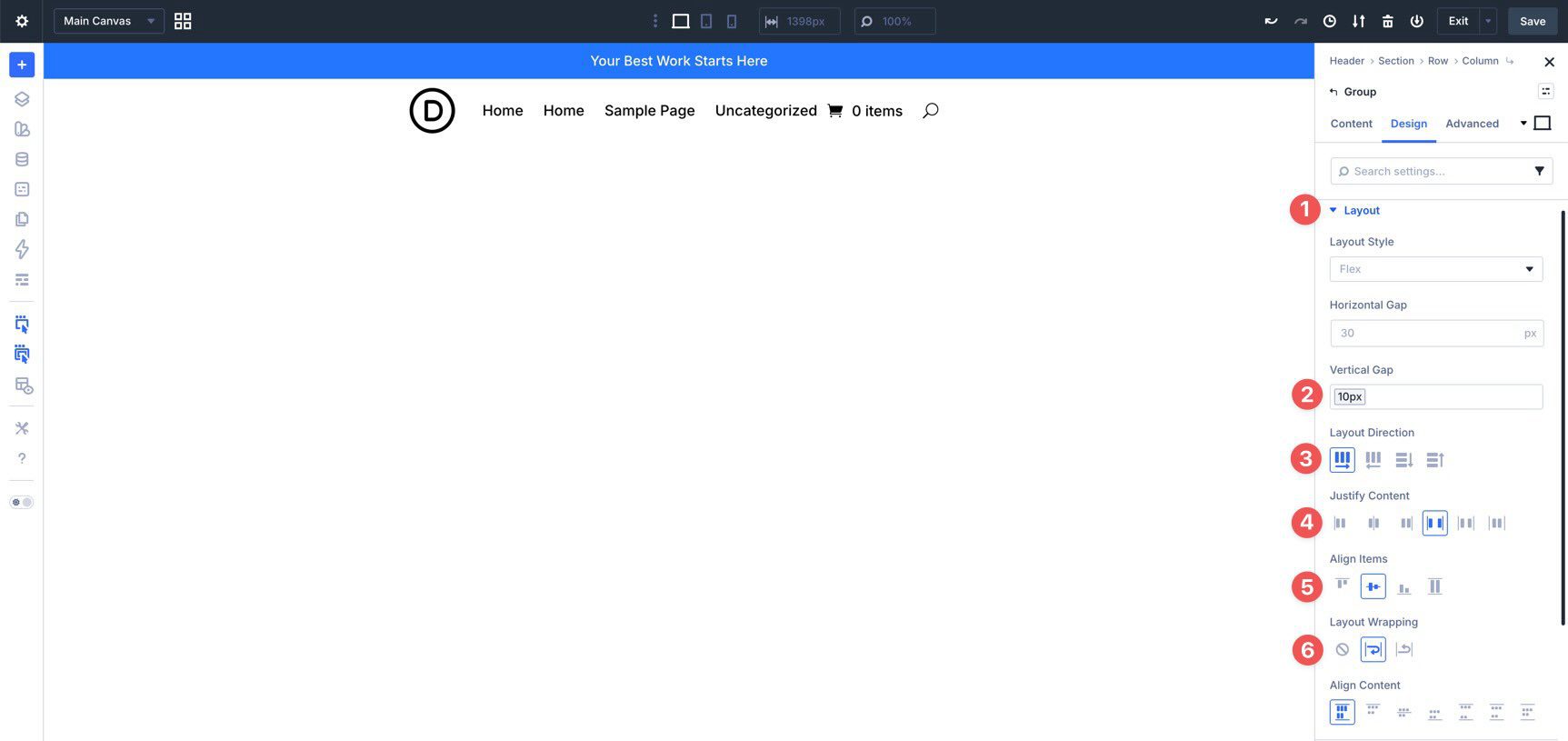
Now, adjust the Column settings for the Row. In the Row’s Content tab, expand the Elements option group and locate the Column. Click the edit icon, then open the Column’s Design tab and expand the Layout option group.
In the Horizontal Gap and Vertical Gap fields, insert the Spacing – XSmall variable using Divi’s dynamic content options.
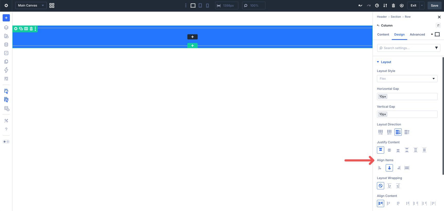
Finally, set Align Items to Center.
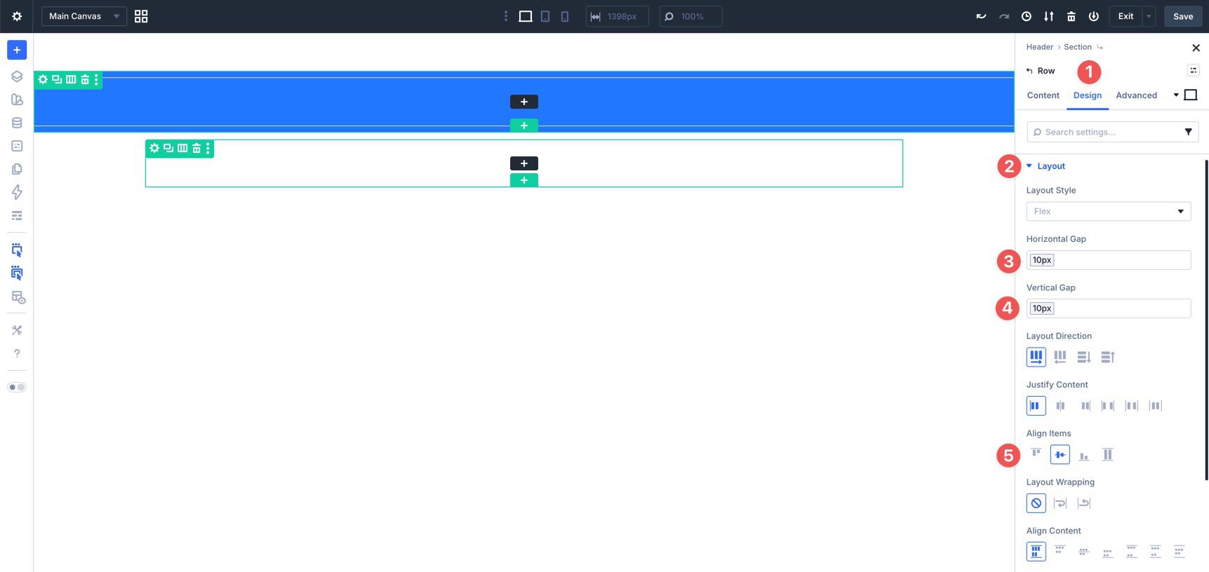
Next, add another single-column Row to the Section. Go to the Row’s Design tab and expand the Layout option group. Use the Spacing – XSmall variable to set the Horizontal Gap and Vertical Gap to 10px. In the Align Items field, select Center.
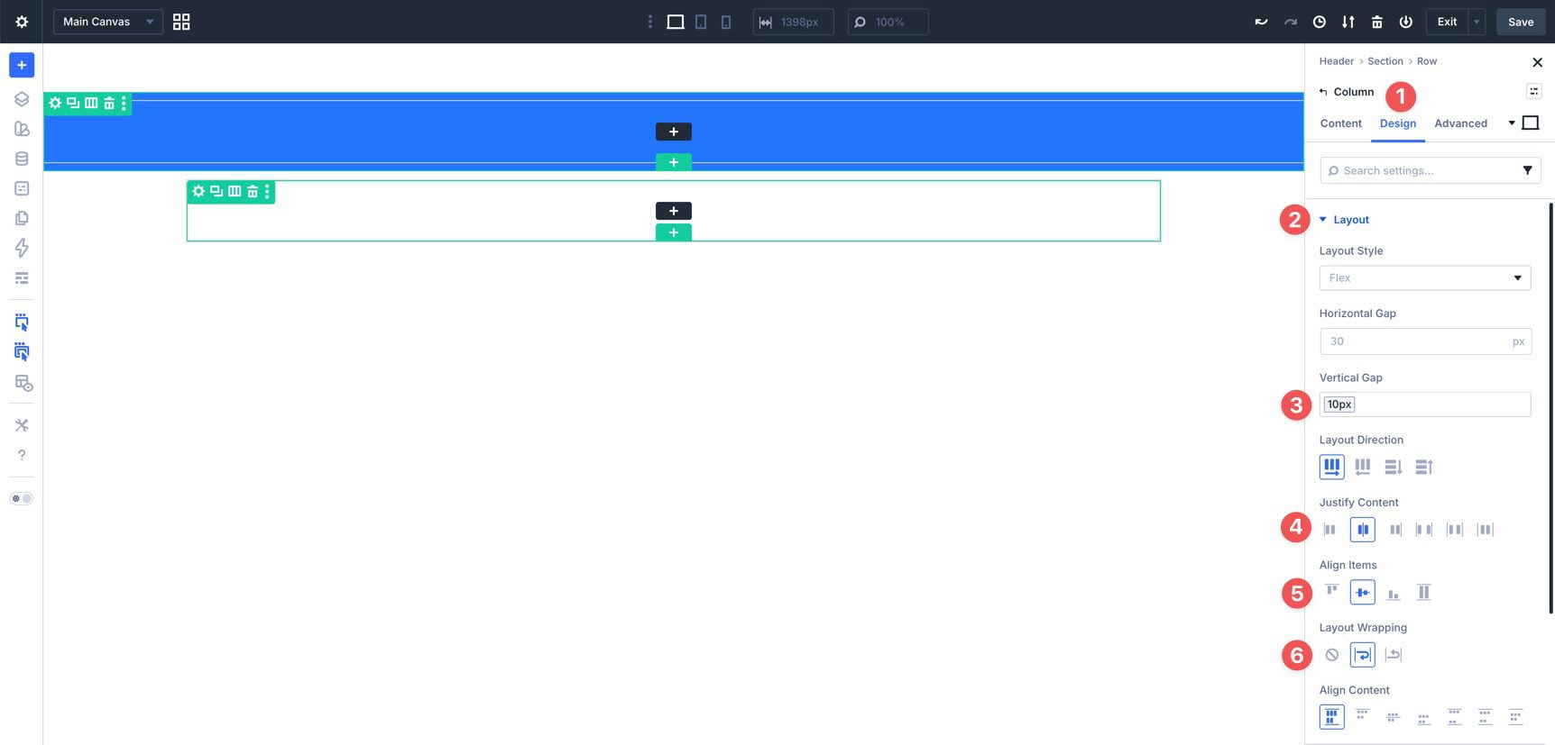
In the second Row’s Column settings, go to the Design tab and expand the Layout option group. Apply the Spacing – XSmall variable to the Vertical Gap field. Then, set Justify Content and Align Items to Center. Finally, set Layout Wrapping to Wrap.
Section Settings
Next, adjust the Section’s Flexbox settings and spacing. Click into the Section. Go to the Design tab and expand the Layout option group. Set the Vertical Gap to 10px.
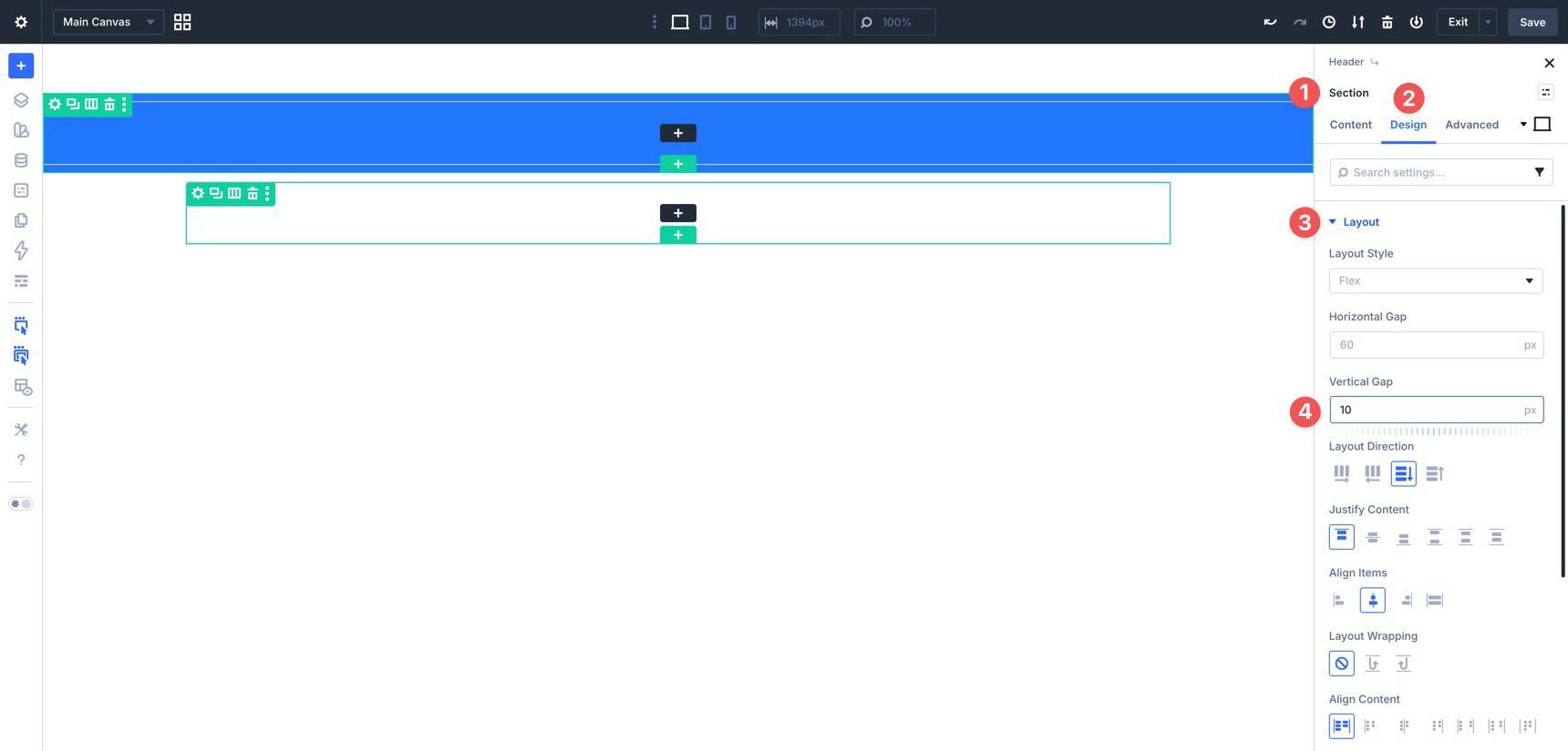
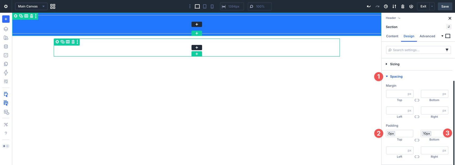
Expand the Spacing option group. In the Top Padding field, select the Border Width – Buttons variable to set the top padding to 0px. For the Bottom Padding field, select the Spacing – XSmall variable, which adds 10px of padding.
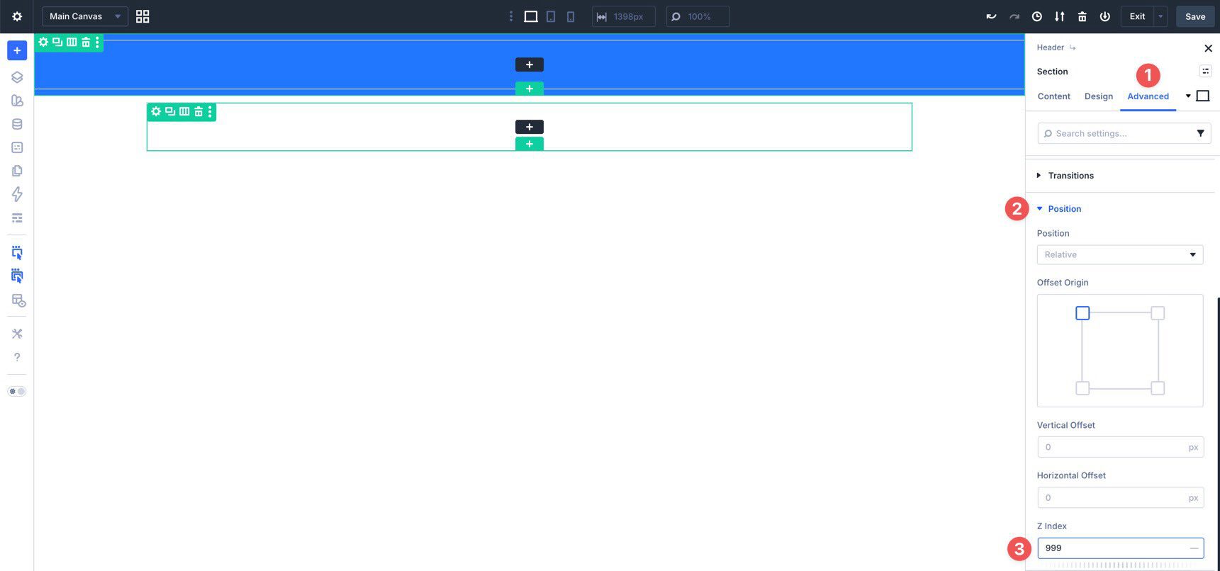
Go to the Advanced tab and expand the Position option group. Add 999 to the Z Index field. This helps keep the header above page content when it becomes sticky.
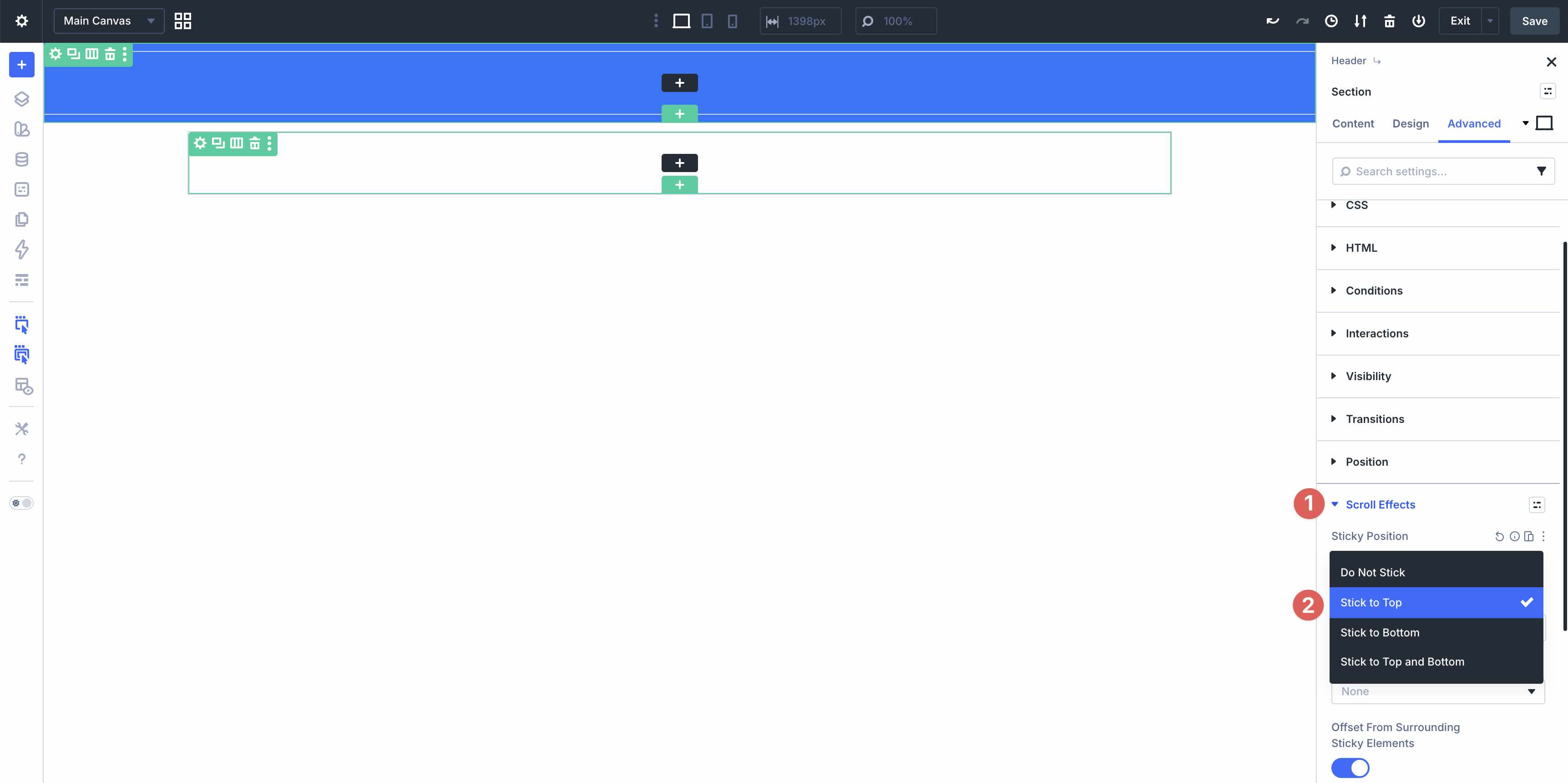
Finally, expand the Scroll Effects option group. Open the dropdown in the Sticky Position field and select Stick to Top. This keeps the header at the top of the viewport as visitors scroll.
Step 2: Adding The Announcement Bar
Before adding the main navigation, create the announcement bar. In the first Row you added earlier, click the black + icon to add a Heading module.
In the Heading module settings, click the Assign Presets button next to the module header.
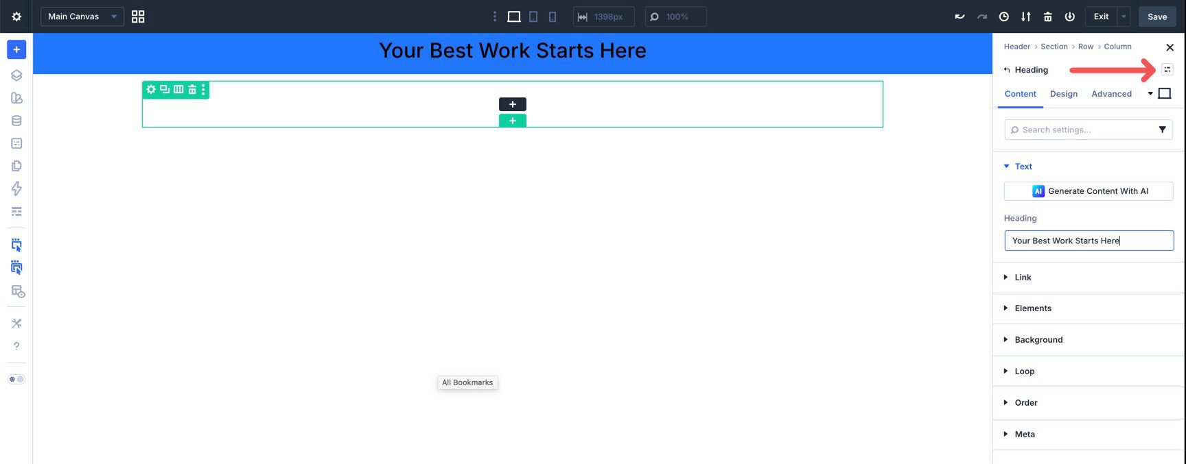
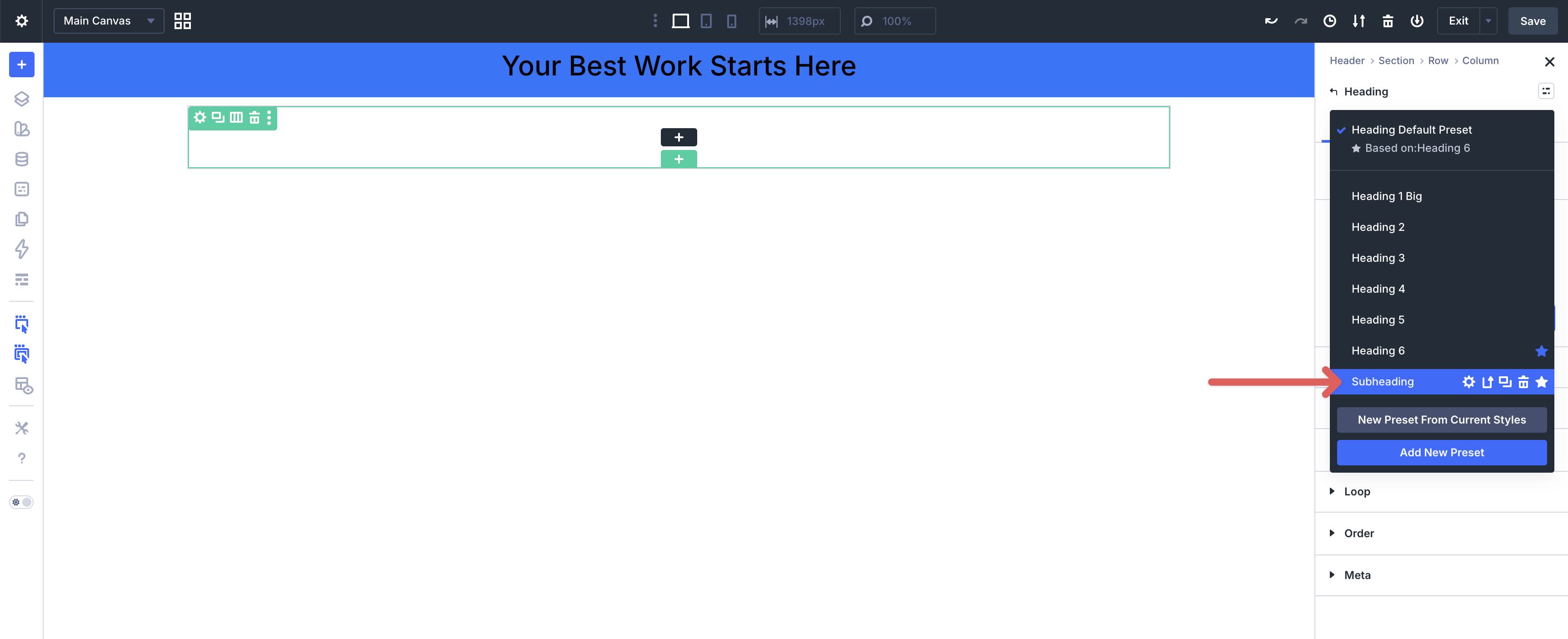
Choose the Subheading preset from the available options.
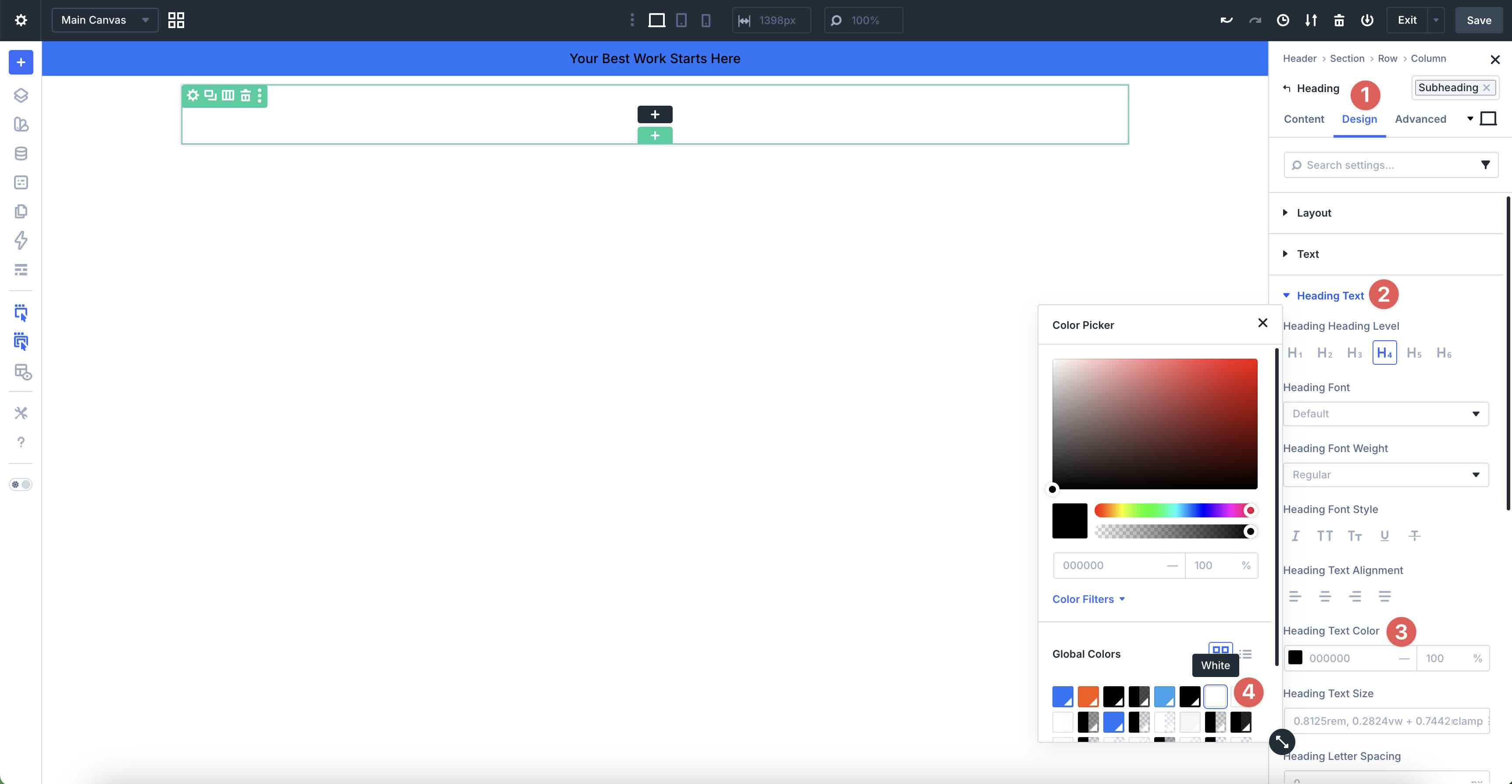
Go to the Design tab and expand the Heading Text option group. Click into the Heading Text Color field to open the color modal. Then, choose White from your global colors.
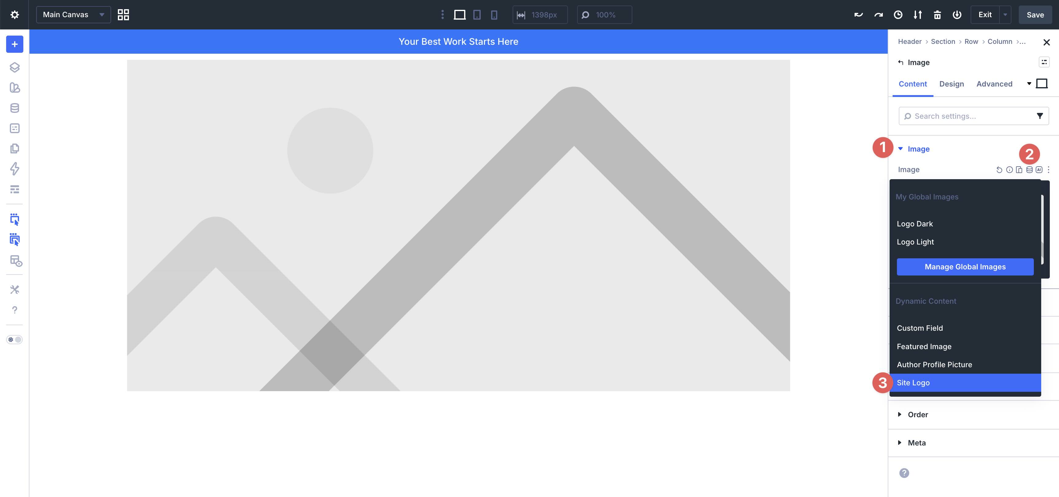
Before adding the logo and navigation links, add a Module Group to keep the main header elements aligned and spaced. Click the black + icon in the second Row to add a Group module. When the Insert Module or Row modal appears, add an Image module inside the Group.
In the Content tab of the Image module, expand the Image option group. Hover over the Image field and select the Insert Dynamic Content icon. Then, select Site Logo from the available options.
Note: If you have not assigned a logo in Divi > Theme Options, you can do that after the header is built.
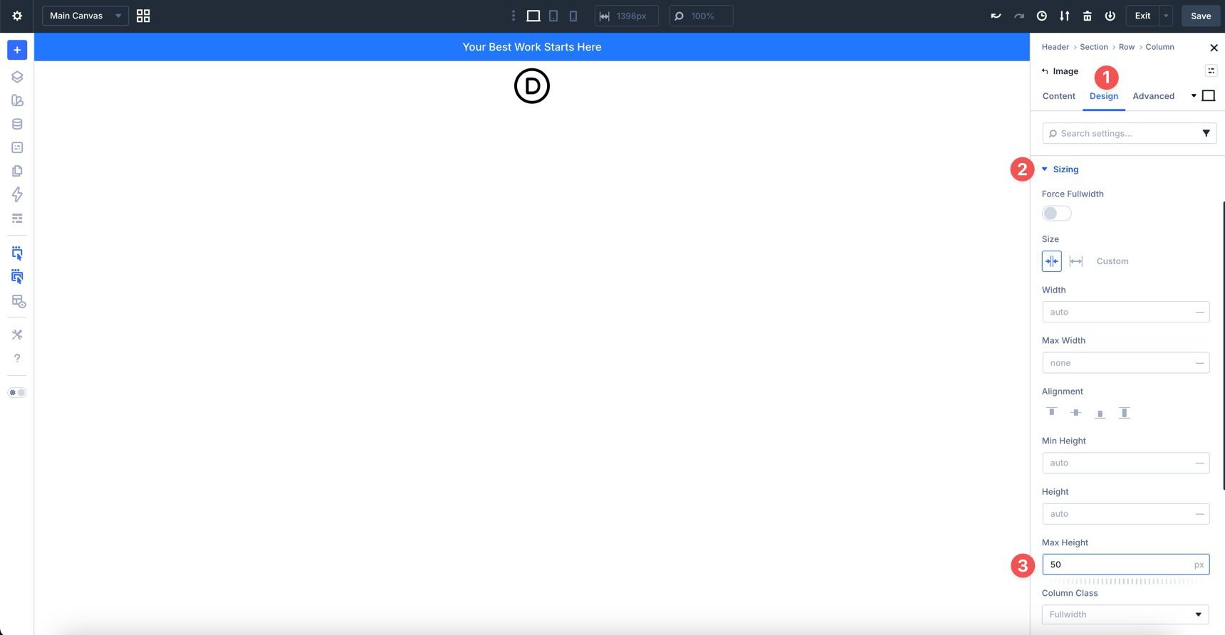
In the Design tab, expand the Sizing option group. In the Max Height field, add a value of 50px.
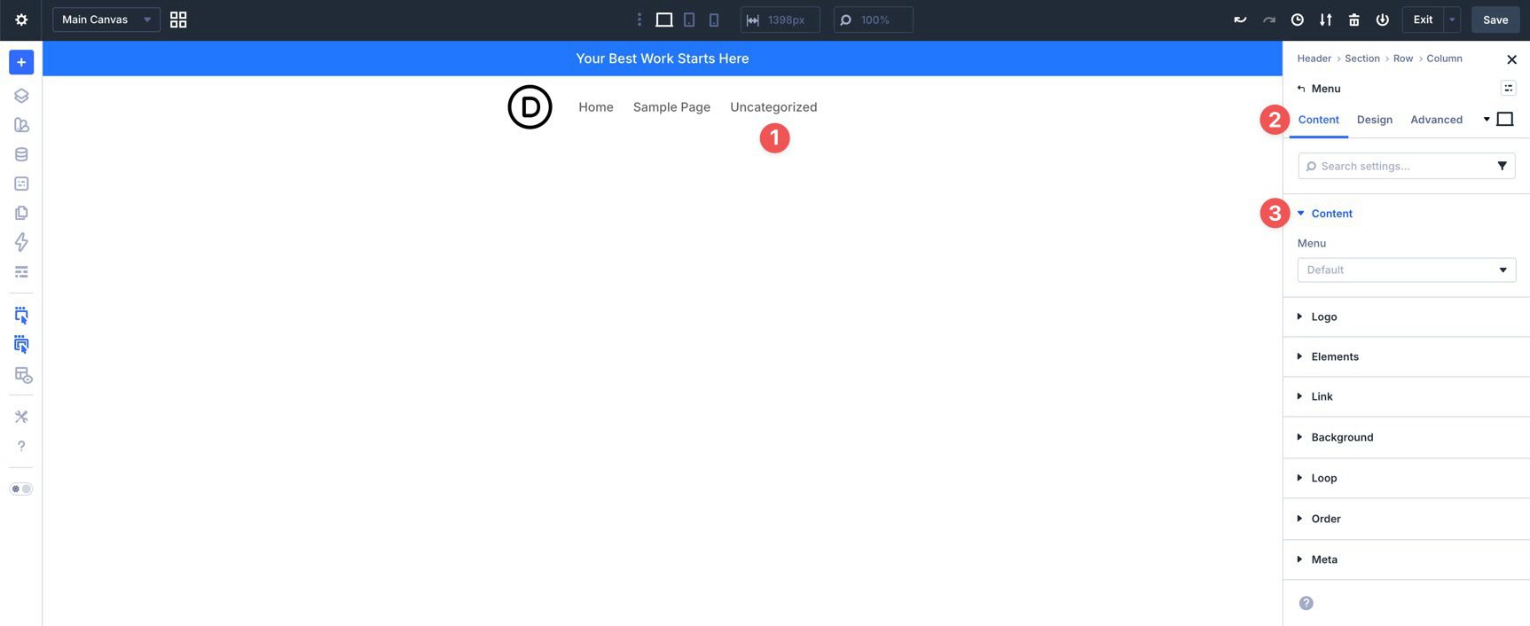
For speed and simplicity, we’ll use the Menu module to handle the main navigation links. This approach lets you quickly connect a WordPress menu and style it with the design system we already created.
Divi 5 also includes newer menu-building options, including Link modules with Menu Loops, Dropdown modules, and Interactions. Those tools are useful for fully custom navigation patterns, mega menus, slide-in menus, and other advanced setups. For this header, however, the Menu module keeps the workflow focused.
Add a Menu module to the Group. If you have already created a menu in the WordPress dashboard, select it in the Menu module’s Content tab under the Menu option group. If not, you can create the menu later and return to this setting.
In the Menu module header, click the Assign Presets icon. Choose Dark Text from the available options.
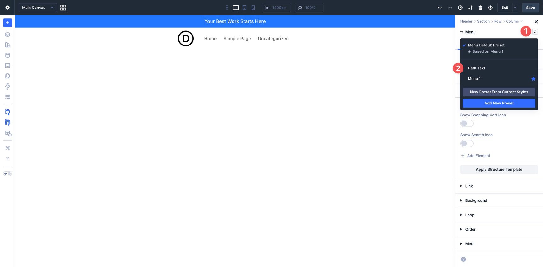
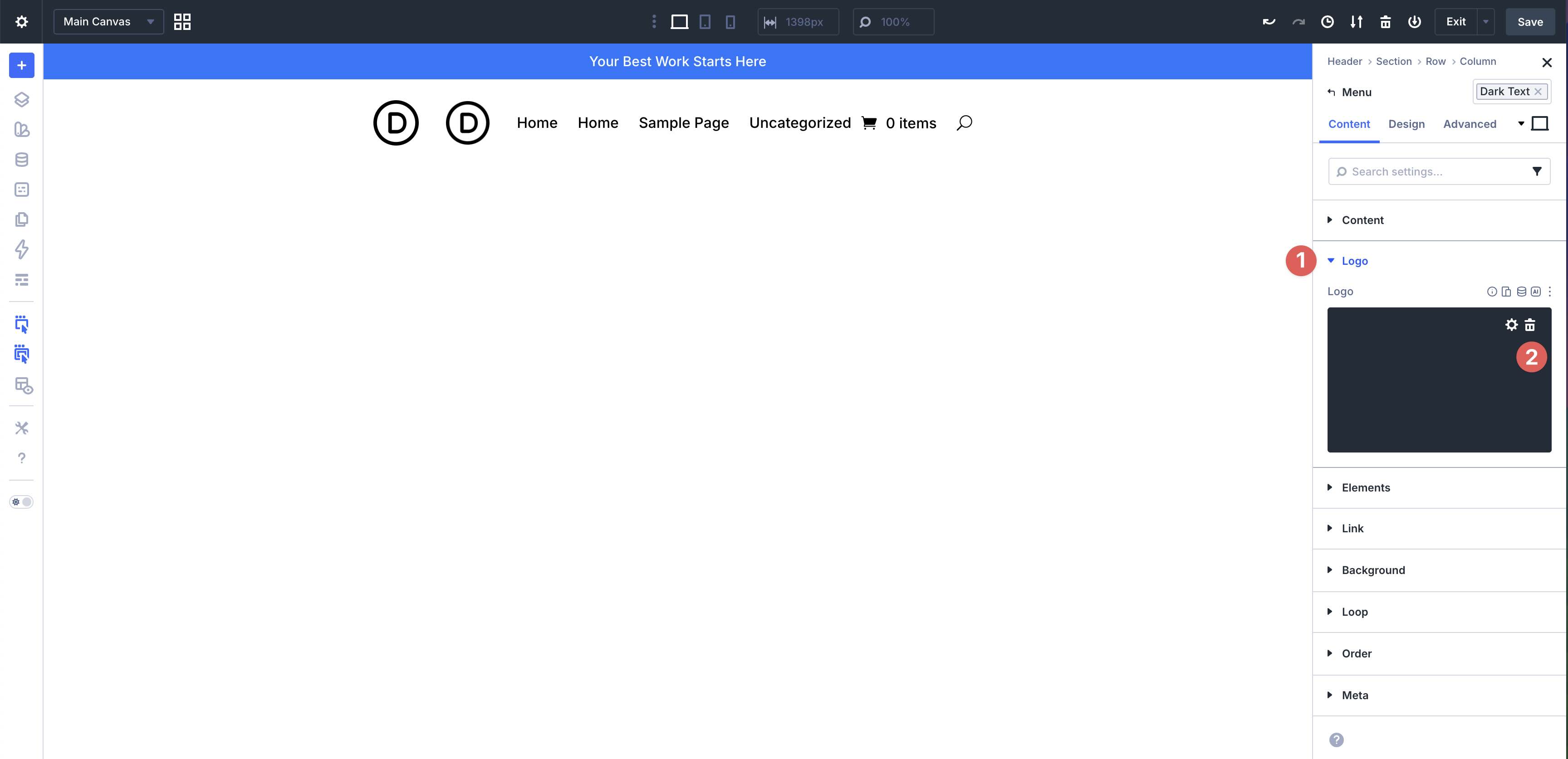
The Menu module can include a logo. Since we are using a separate Image module for the logo, remove the Menu module logo by expanding the Logo option group and clicking the delete icon.
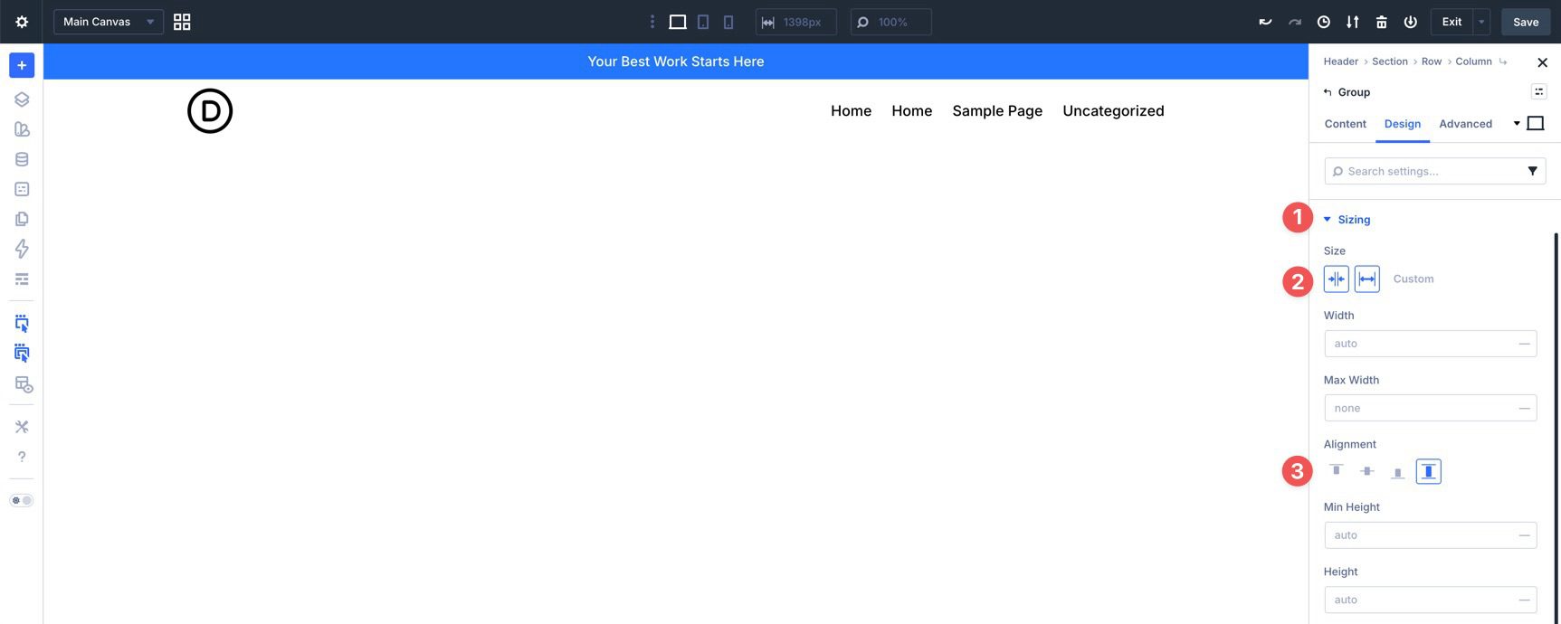
Before adding more modules, adjust the Group module’s Flexbox settings. Click into the Group and go to the Design tab. Expand the Layout option group and assign the Spacing – XSmall variable to the Vertical Gap field. Set Layout Direction to Row, Justify Content to Space Between, Align Items to Center, and Layout Wrapping to Wrap.
Finally, expand the Sizing option group. In the Size field, enable Grow to Fill. For the Alignment field, choose Stretch.
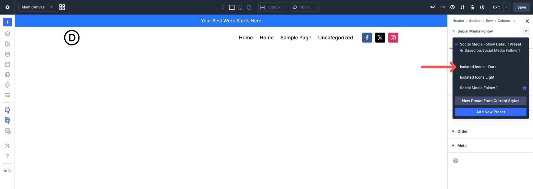
Next, add a Social Media Follow module to the navigation area outside the Group. In the Content tab, expand the Elements option group and add your Social Networks.
Return to the main Content tab for the Social Media Follow module. Click the Assign Presets icon in the module header and choose the Isolated Icons – Dark preset.
Next, edit each Social Network item in the Elements option group and assign an additional preset. Click the edit icon for the first Social Network.
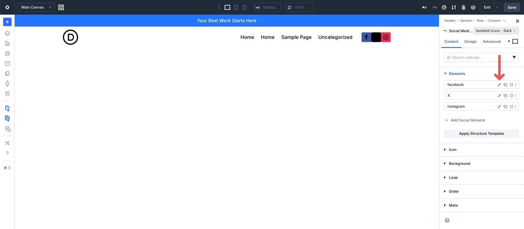
Click the Assign Presets icon and select the No Background preset.
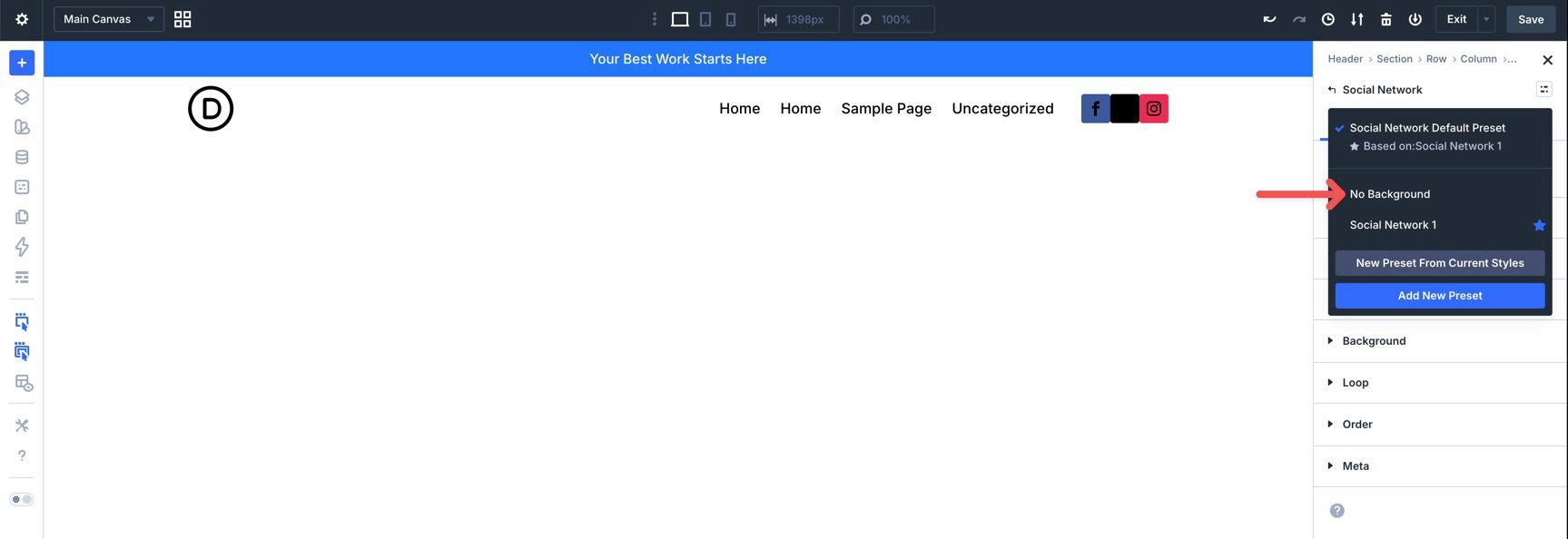
Repeat these steps for the remaining Social Network items.
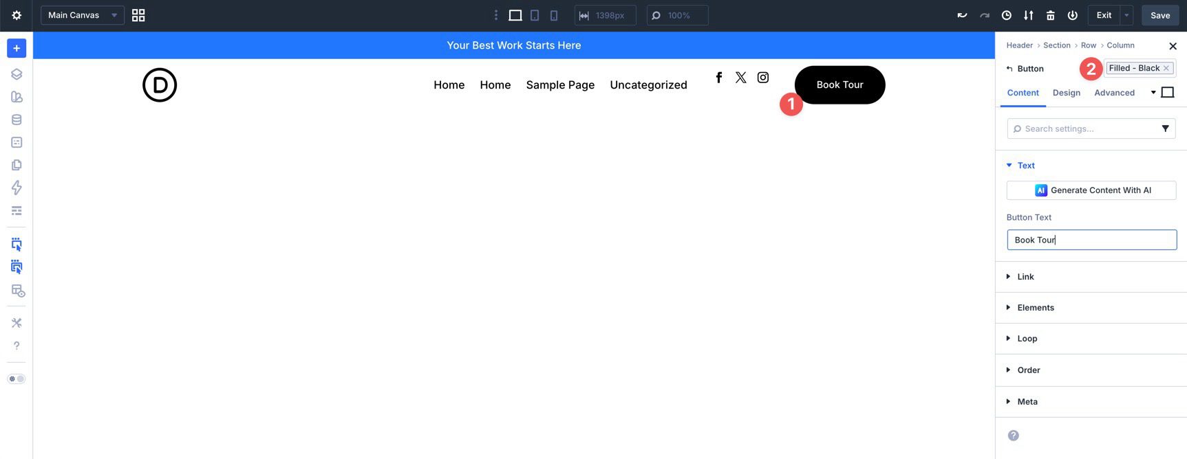
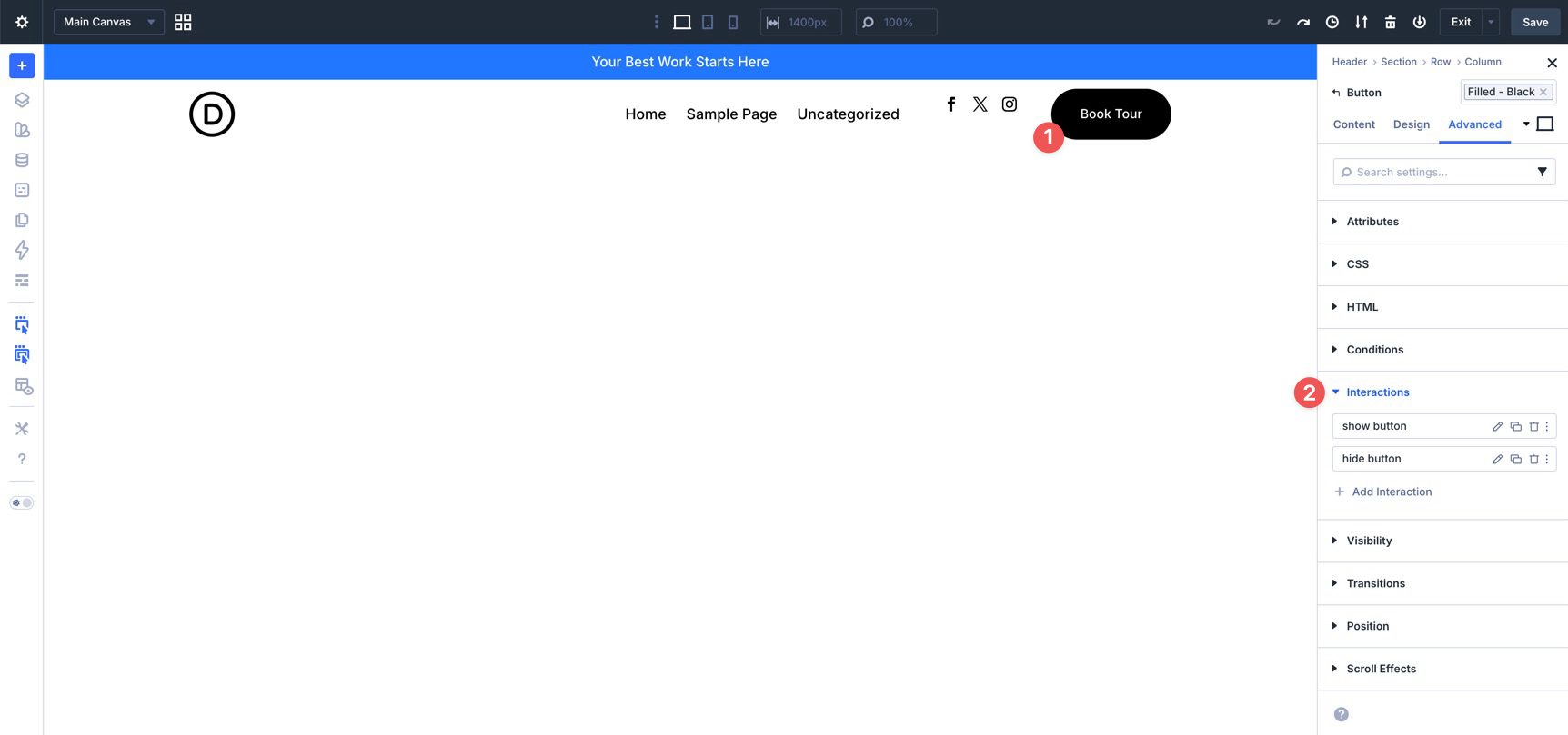
Finally, add a Button module to the navigation area. In the module header, click the Assign Presets icon and select the Filled – Black preset.
Step 7: Creating Interactions
Now that the main header elements are in place and styled with presets and variables, we can use Divi 5’s Interactions system to control how the header behaves across breakpoints.
In previous Divi workflows, you might have hidden elements on mobile using Visibility settings in the Advanced tab. That still works, but Interactions give you a more flexible way to show and hide elements when users enter specific breakpoints.
For this coworking header, we’ll hide the social media icons and CTA button on smaller screens while keeping the logo and menu visible. This keeps the mobile header simpler without removing the key navigation path.
Setting Up The Interactions
Select the Social Media Follow module and go to the Advanced tab. Expand the Interactions option group and click + Add New Interaction.
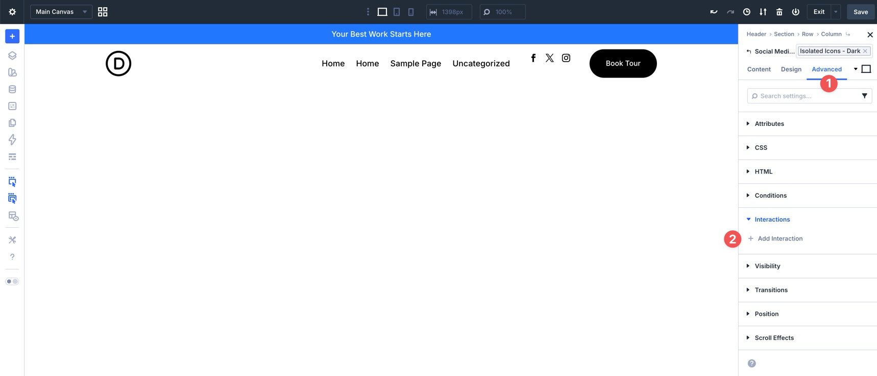
When the modal appears, choose Breakpoint Enter as the Trigger Event.
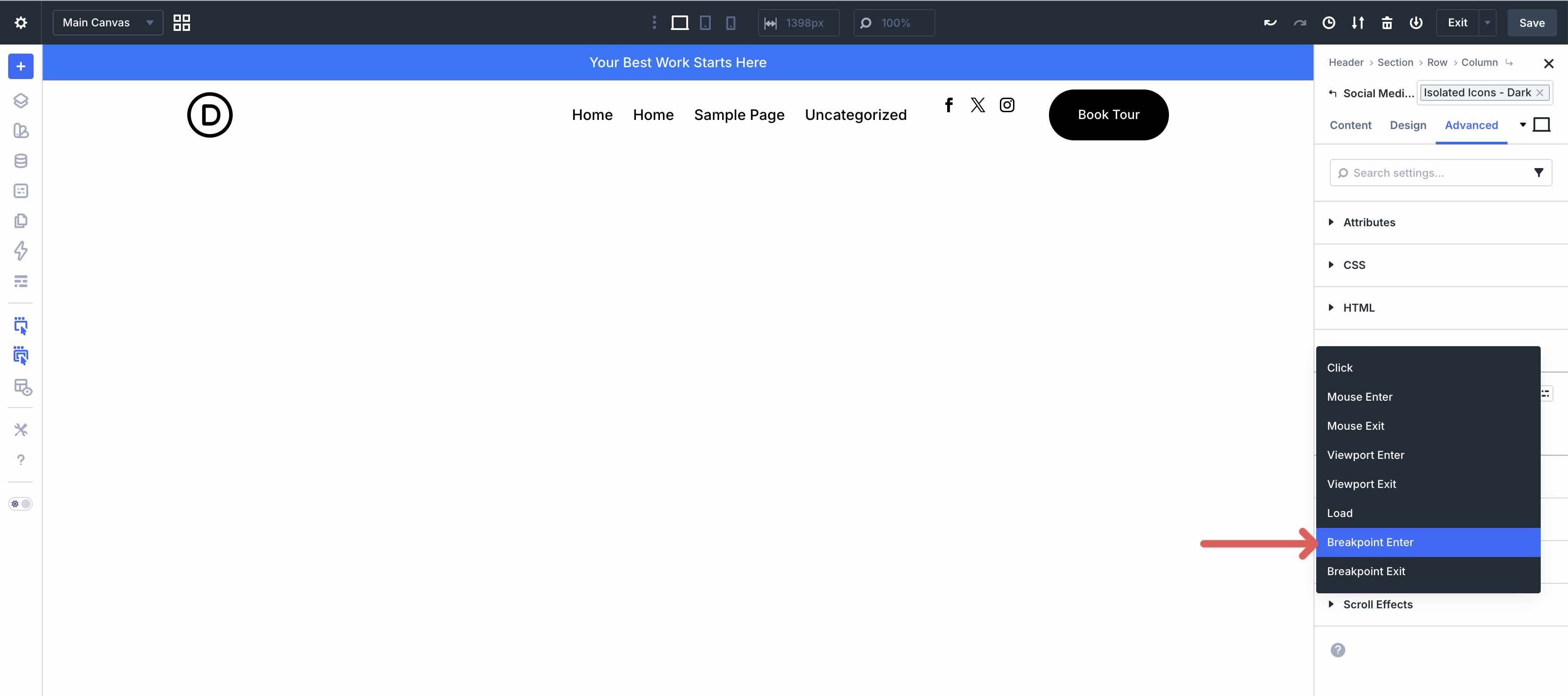
Assign an Admin Label. Then, set the Breakpoint to Tablet, choose Hide Element as the Effect Action, and select the Social Media Follow module as the Target Module.
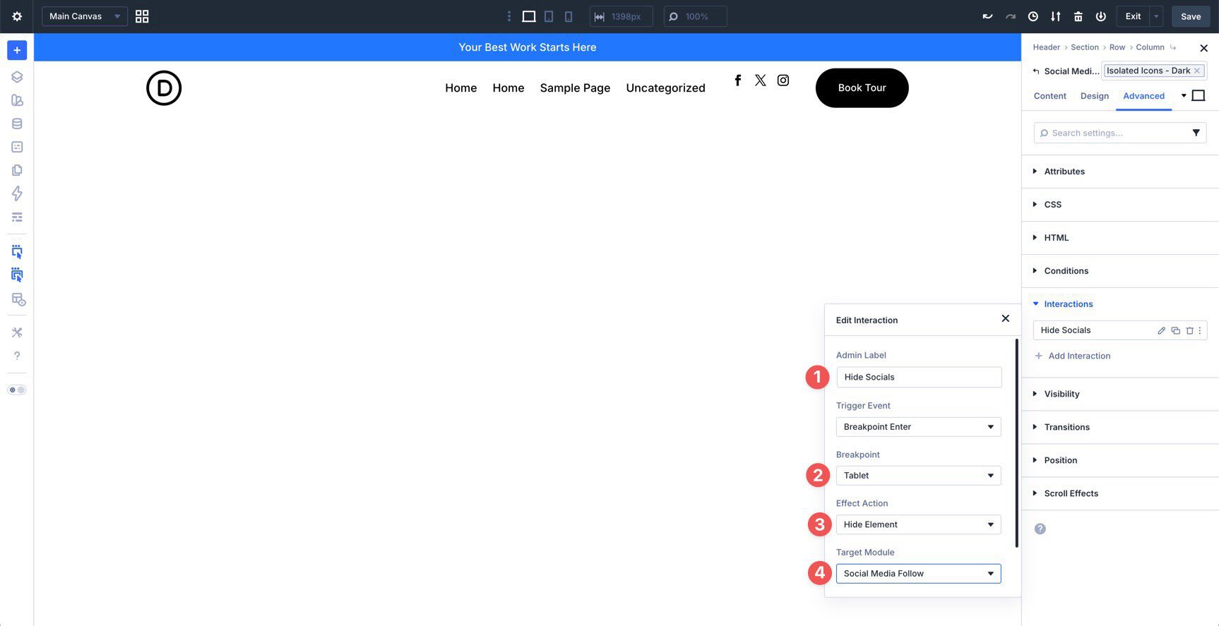
This Interaction hides the Social Media Follow module when the layout enters the Tablet breakpoint. However, we also need another Interaction to show the module again when the layout returns to Desktop.
Click + Add New Interaction. Select Breakpoint Enter again. This time, set the Breakpoint to Desktop and choose Show Element as the Effect Action. Keep the same Target Module.
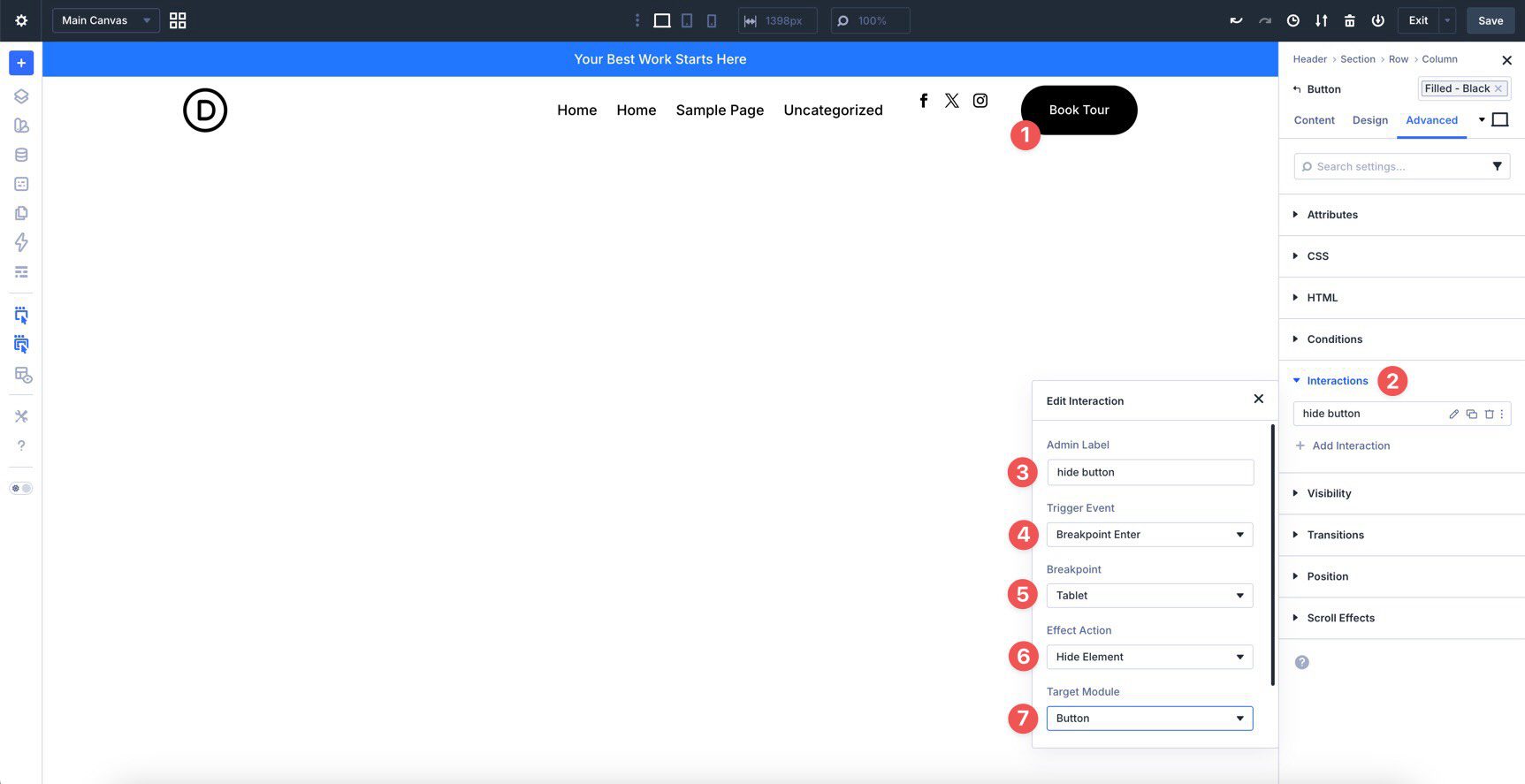
Next, create two more Interactions for the CTA Button. Create one Interaction to show the Button on Desktop and another to hide the Button at the Tablet breakpoint and below.
Step 8: Testing Responsiveness
Even though we built the header with Design Variables, presets, and Flexbox settings, it is still important to test how everything behaves across screen sizes. Fluid typography, flexible spacing, and wrapping layouts help, but real-world testing confirms that the header still looks polished and functions well on each breakpoint.
Divi 5 gives you two important tools for responsive work.
Customizable Responsive Breakpoints
Divi 5 supports customizable responsive breakpoints, which give you more control than a fixed desktop, tablet, and phone setup. You can use the default active breakpoints or enable additional ones when a design needs more precise control.
For this header, breakpoints help you decide exactly when the social links and CTA button should hide, when spacing should tighten, and when navigation needs more room. You can access and edit Customizable Responsive Breakpoints from the Top Bar.
Responsive Editor
The Responsive Editor in Divi 5 lets you edit values across enabled breakpoints directly inside the Visual Builder. Hover over a responsive-supported field in a module’s settings to reveal the Edit Responsive Values icon.
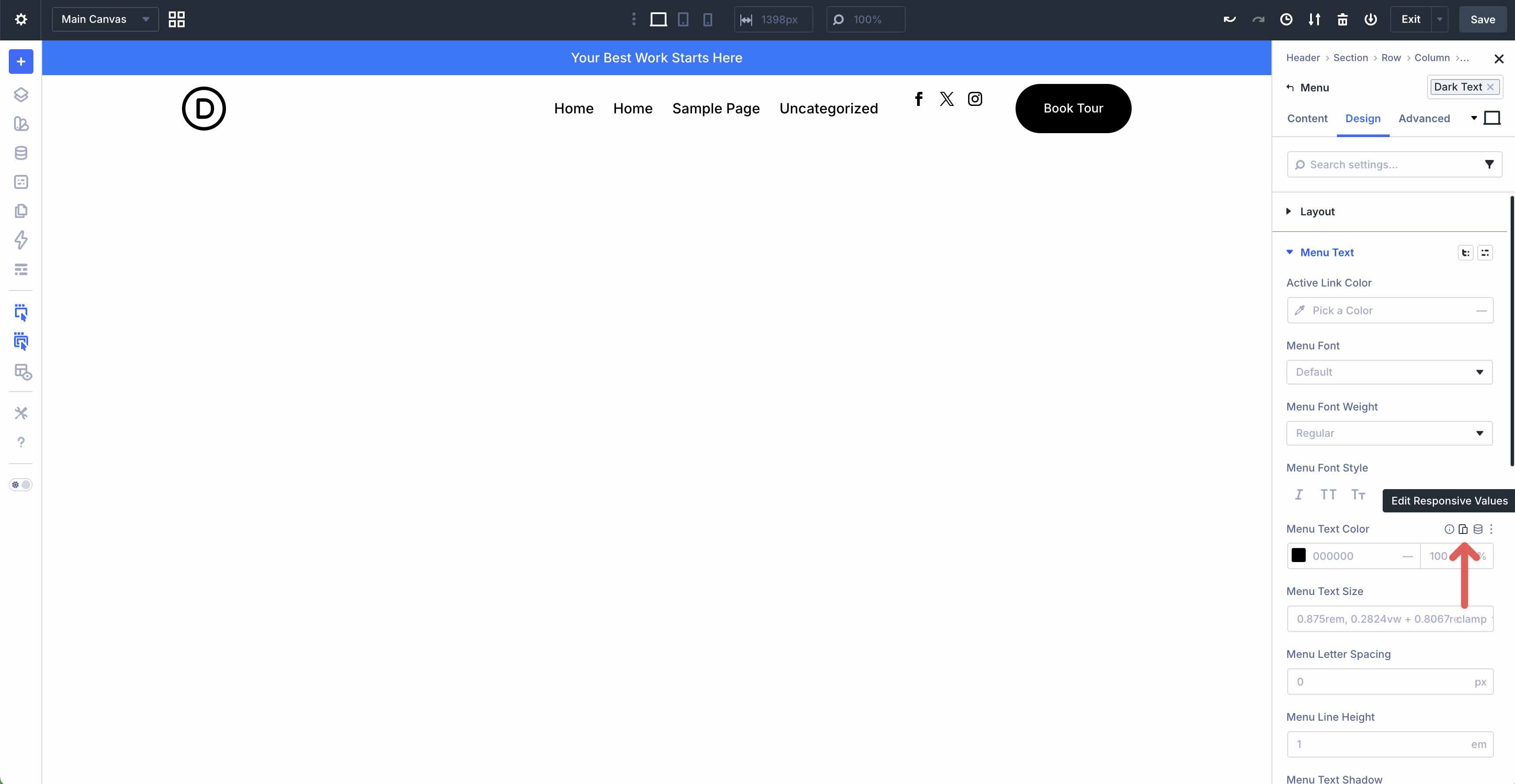
As you move through each breakpoint, the Visual Builder updates the canvas so you can edit values in context. This makes it easier to confirm that spacing, sizing, and visibility choices work across the header’s full responsive range.
Tips And Best Practices For Headers In Divi 5
Here are a few best practices to help you get more out of your custom header and keep the workflow efficient as the coworking website grows.
Preview In Context
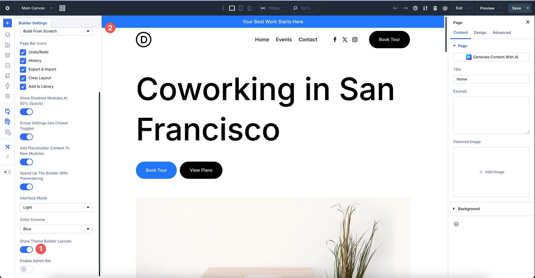
Divi 5 lets you edit Theme Builder areas while viewing them in context with page content. Instead of switching back and forth between the Theme Builder and a separate page preview, you can see how the header looks above the homepage or another page while you adjust spacing, alignment, and colors.
To enable this view, click the Builder Settings icon in the Builder Bar and turn on Show Theme Builder Layouts.
Global vs. Specific Headers
We created a Global Header in this tutorial so it appears across the entire site. This is usually the best starting point for a simple website because every page gets the same navigation structure by default.
Later, you can create more specific Theme Builder templates when certain pages, post types, or sections of the site need a different header.
Export Header Templates
It is a good idea to export your Theme Builder templates or header layout as a backup. You can do this directly from the Theme Builder interface. Having an export file makes it easier to restore the header, move it to another site, or share it with a team member.
Downloading And Installing The Files
To make things easier, we’ve created a JSON file you can import into the Theme Builder. Before importing the Global Header, it is best to define a WordPress menu in Appearance > Menus. If you have not created one yet, you can still import the template and assign the menu later.
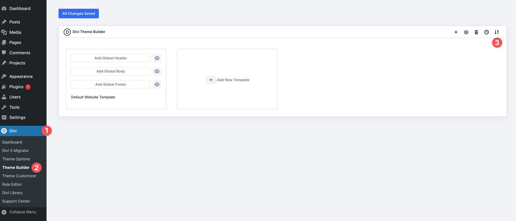
Navigate to Divi > Theme Builder. Then locate the Import & Export Templates icon at the top-right of the interface.
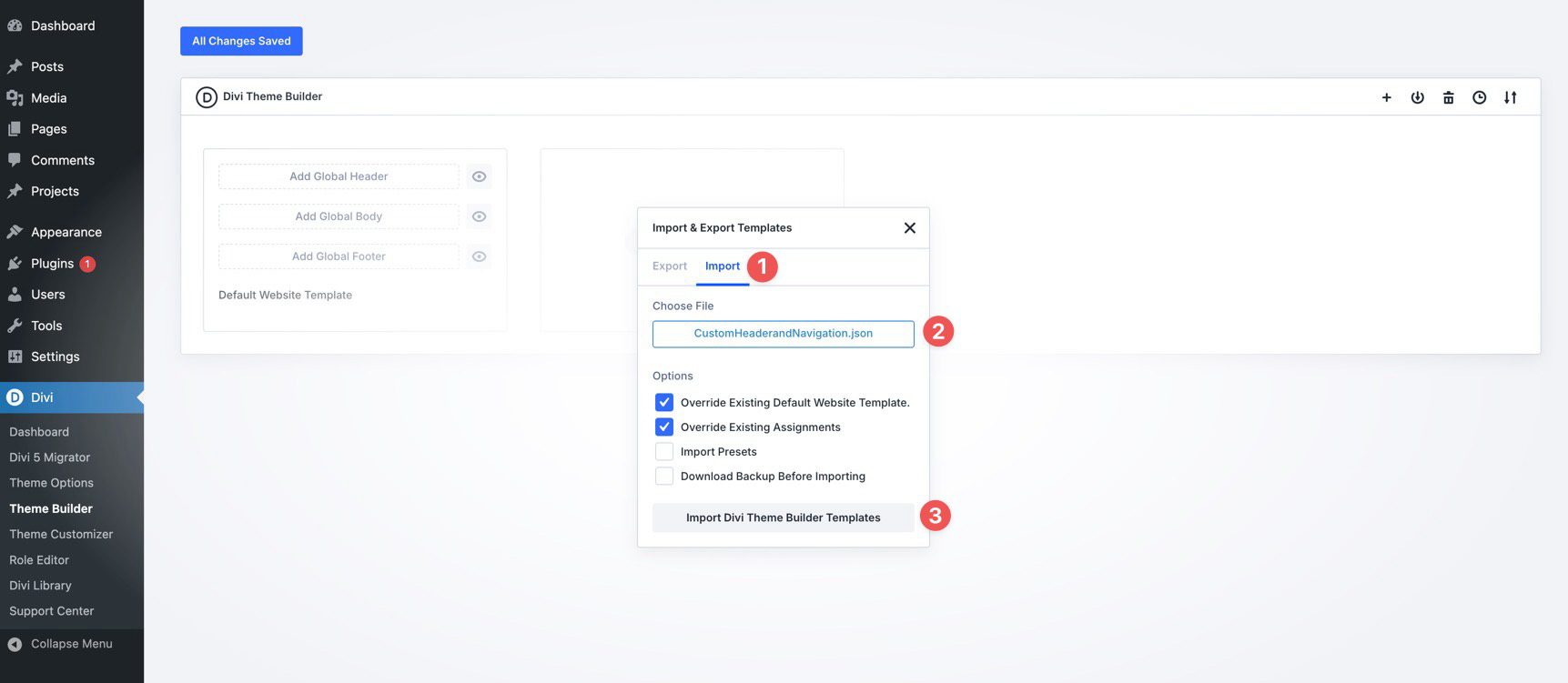
Click the Import & Export icon, select the Import tab, locate the CustomHeaderandNavigation.json file on your computer, and click Import Divi Theme Builder Templates.
Before opening the template, click the Save Changes button.
With the template saved, open the Visual Builder. Depending on your enabled Customizable Responsive Breakpoints, you may need to verify the breakpoints used in the imported Interactions.
Select the Social Media Follow module, go to the Advanced tab, and expand the Interactions option group. Verify that the correct breakpoints are assigned to the hide socials and show socials Interactions. Repeat the same check for the Button module’s show button and hide button Interactions.
That’s it. You’ve created a global header for the coworking website. To download the files, fill out the form below.

What’s Coming Next
With the custom header complete, the coworking website now has a strong navigational foundation that uses the same Design Variables and Presets we built in Parts 3 and 4.
In Part 7: Building a Custom Footer in Divi 5, we’ll create a matching global footer template using the same design system. You’ll learn how to build a functional footer with multiple columns, links, social icons, copyright text, and consistent styling.
If you have not downloaded the latest version of Divi 5 yet, now is a good time. The newest release gives you access to the features used throughout this course, including the Theme Builder workflow, Interactions, Flexbox controls, Customizable Responsive Breakpoints, and the Responsive Editor.


I follows this tutorial and when it comes to testing the breakpoints, there is an issue with the mobile menu dropdown. The group module that contains the image and menu is set to space between, so the image is on the left and the hamburger icon on the right. If you click the hamburger icon, the dropdown is only as wide as the icon, so the menu contents doesn’t fit. I can’t find a setting to fix this.
Also, there are some gaps in the tutorial where you need to apply a preset that wasn’t created in the previous tutorials and some images don’t match with the current step.
Theme Builder is great. But I’ve never can use it becouse most of my sites use Polylang for diferent languages and the Builder don’t have an option to create different headers or footers for each language. This would be a great and needed feature.