
Welcome back to the Divi 5 Mastery Course. In Part 3, we built a library of Design Variables for our coworking space website, including colors, fonts, numbers, images, text, and links.
Now, in Part 4, we’ll turn those variables into a reusable design system using Divi 5 Presets. You’ll learn how to create Option Group Presets and Element Presets, organize them in the Preset Manager, and use nested and stacked presets for greater flexibility.
Once those presets are in place, you can apply consistent styling across your site without rebuilding the same design decisions over and over. By the end of this post, you will have created the core presets needed for Part 5 of the course. Adding new sections and modules will take fewer clicks because the system will already be powered by the variables from Part 3 and the presets from this post.
Let’s get started.
Why Presets Matter
In Part 3, we created our Design Variables, which set the foundation for our design system. In this part, we’ll take the next step by turning those variables into reusable presets.
The design system in Divi 5 follows a clear hierarchy. Design Variables form the base layer. Then, Option Group Presets group related styles together, such as typography, spacing, borders, and buttons. Element Presets can then combine those groups into complete, ready-to-use elements. Finally, we use those presets to build pages and Theme Builder templates.
Creating presets now gives us a strong and consistent foundation for the entire website. You will build faster because you can apply a complete set of styles with a few clicks, rather than adjusting typography, spacing, colors, and borders for every module.
Just as importantly, everything stays consistent across the homepage, inner pages, Canvases, and templates. When you need to make changes, updates become easier. Revise a color, spacing value, or button style in one preset, and the update appears everywhere that preset is used.
Divi 5 Presets work with Design Variables and integrate directly with the Preset Manager, making it easier to review, edit, duplicate, organize, and reuse styles across the site.
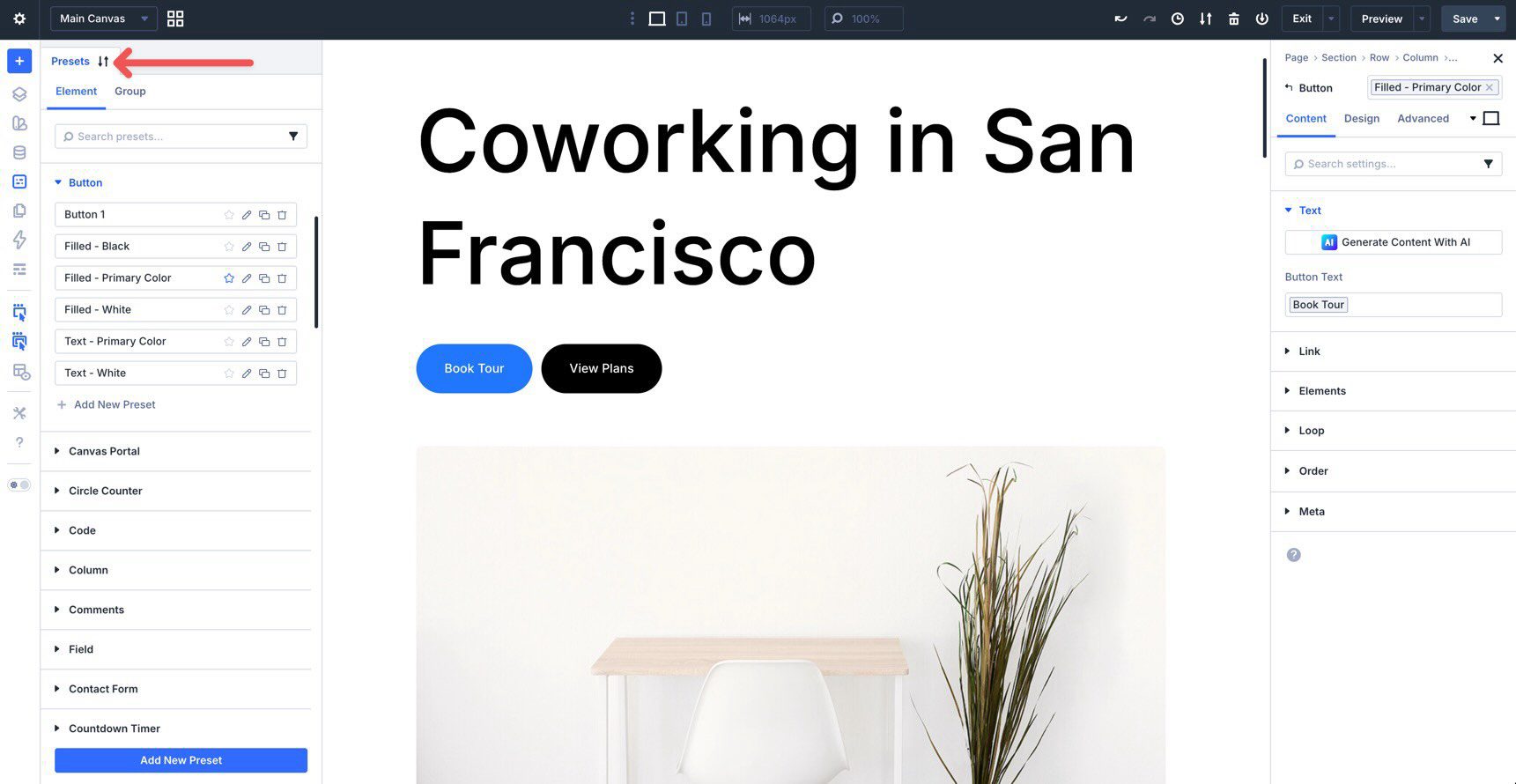
Opening The Preset Manager
Getting started with presets is simple. Open a page in the Visual Builder. Then, in the Builder Bar on the left side of the screen, click the Preset Manager icon.
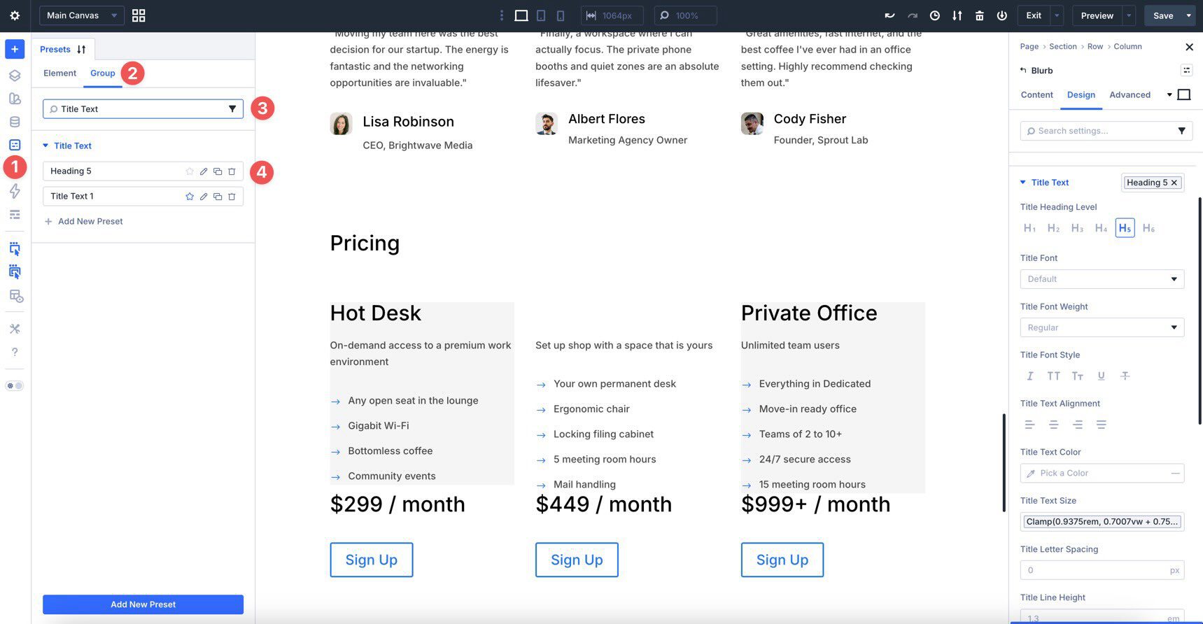
Once the Preset Manager opens, you can create, organize, edit, duplicate, delete, reorder, and set defaults for your preset styles. Presets are organized into two main areas: Elements and Option Groups.
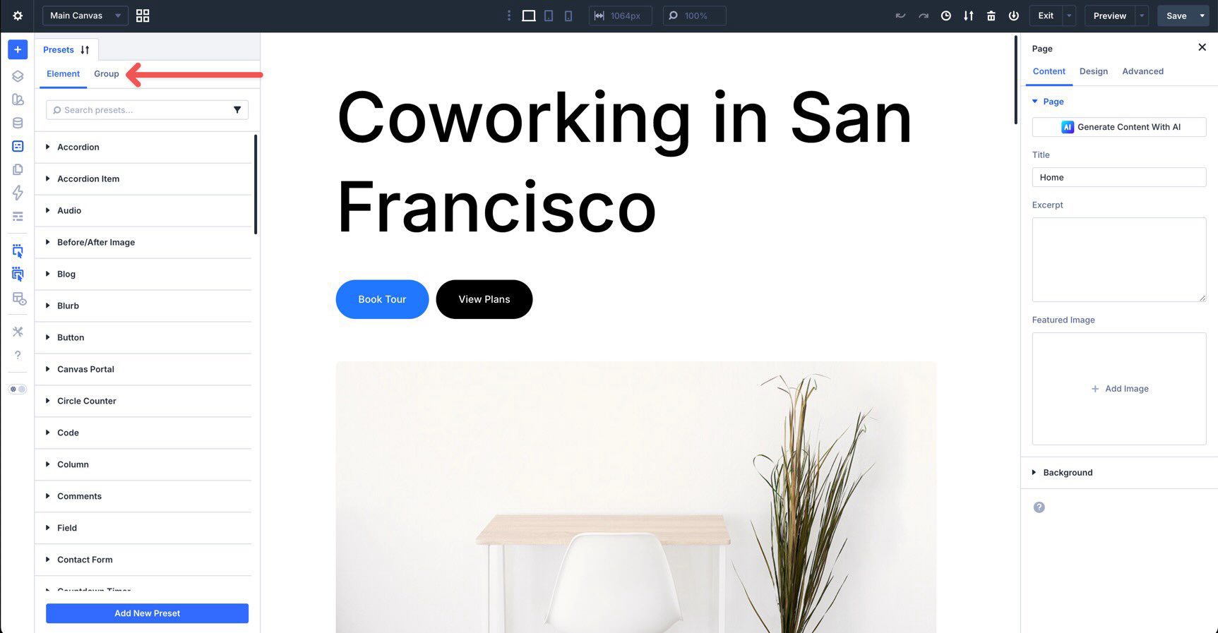
There is also a search and filter field, which helps you quickly find a specific element or option group as your preset library grows.
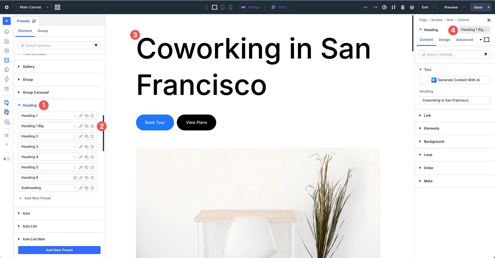
As you expand the menu for an element type, you’ll see the presets associated with that element. For example, expanding the Heading menu reveals the presets available for Heading modules. When a preset is assigned to a module, it appears next to the module title in the settings panel.
To edit a preset, click the edit button or pencil icon in the Preset Manager. This opens the Preset Preview, where you can review and adjust the preset before saving your changes. For example, when editing a heading preset, you can preview how the heading will look before committing the update. Once saved, those changes apply everywhere that preset is used.
Treat the Preset Manager as your main control center for presets. Instead of hunting through individual modules to manage shared styles, come here to create, edit, duplicate, reorder, and organize them. This keeps your design system easier to maintain as your website grows.
Over the next few sections, we’ll create Option Group Presets and Element Presets. Then, we’ll show you how to nest and stack them to build a flexible design system using the Design Variables from Part 3.
Option Group Presets
Option Group Presets let you save styles for a single option group and apply those styles wherever the same option group appears. Because they are modular, you can mix and match them without locking every design choice into one full module preset.
It is best to create Option Group Presets before building complete Element Presets. This approach gives you more flexibility. Instead of saving an entire button, card, or form as one fixed style, you can create separate presets for typography, spacing, borders, backgrounds, and buttons. Then, you can combine those presets in different ways depending on the context.
This mix-and-match workflow makes your design system more adaptable and easier to maintain as you build the homepage and inner pages of the site.
How to Create An Option Group Preset
Creating an Option Group Preset is straightforward, and the process becomes fast once you do it a few times. The basic workflow is the same for any option group: style an element, save the relevant option group as a reusable preset, and apply that preset wherever you need the same style again.
To make the concept practical, we’ll create presets for typography, spacing, borders, and buttons.
Typography Presets
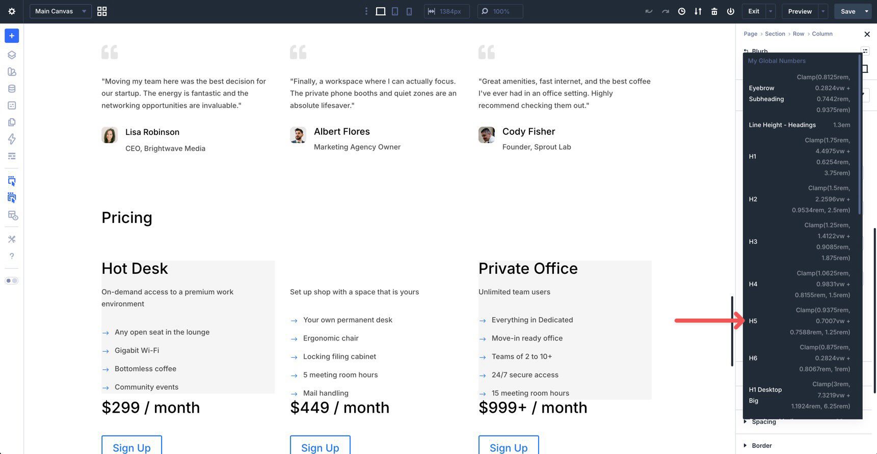
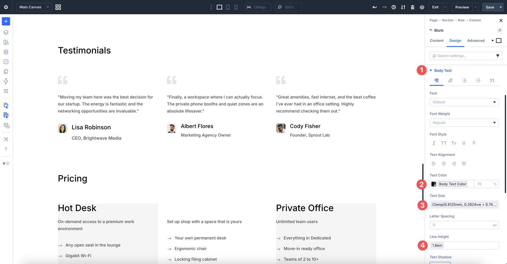
Because typography appears across nearly every page, we’ll start by creating Option Group Presets for headings and body text. These presets pull directly from the font choices and fluid Number Variables we created in Part 3, including the clamp() values for heading sizes.
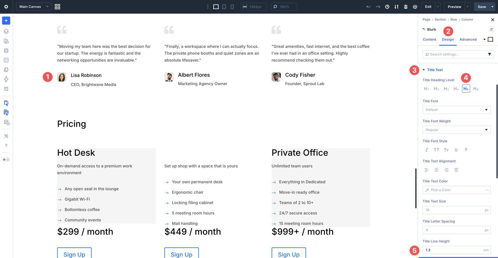
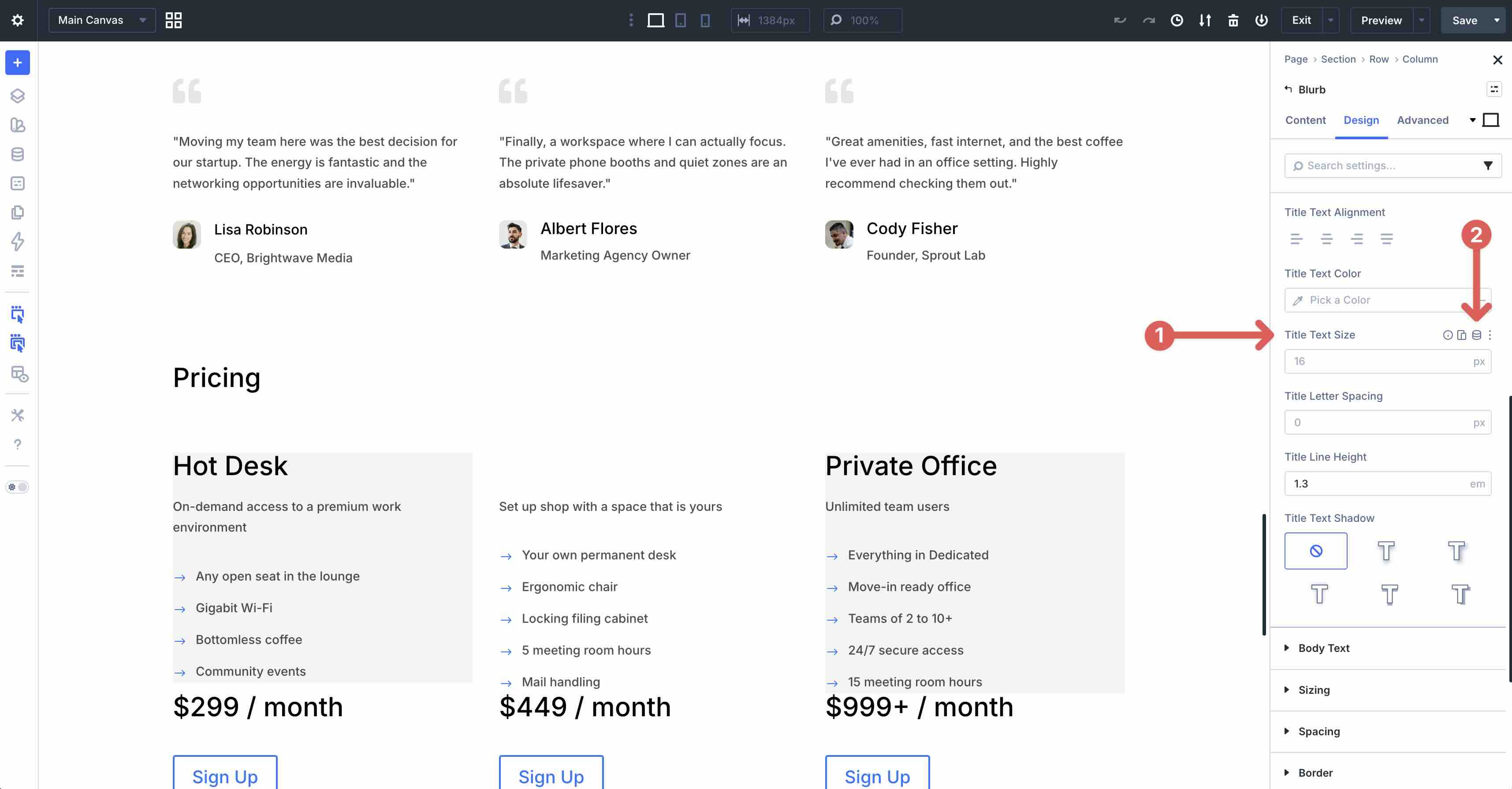
Begin by opening or creating a Blurb module on the Canvas. In the Design tab, expand the Title Text options. Set the Title Heading Level to H5. Then, set the Title Line Height to the Line Height – Headings variable, or enter 1.3em if you are following the value manually.
Next, hover over the Title Text Size field. Click the Insert Dynamic Content icon that appears.
When the My Global Numbers modal appears, locate the H5 variable and click it to insert the value into the field.
Now, save these styles as an Option Group Preset. Scroll back up to the Title Text header in the Design tab. Then, hover over the header to reveal the preset icon.
When the modal appears, select New Preset From Current Styles.
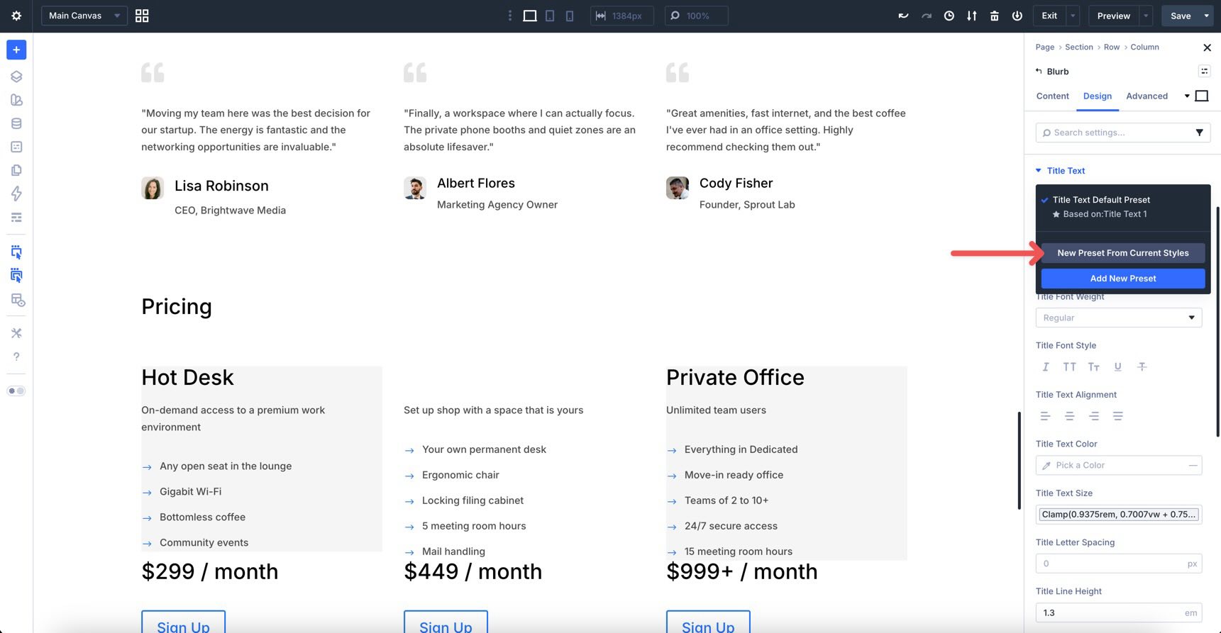
Name the preset Heading 5. Then, scroll down to verify the style settings and click Save Preset.
Once created, open the Preset Manager, go to the Option Groups area, search for Title Text, and you will see your new Option Group Preset listed.
You can also create a Small Text Option Group Preset for the Body Text of the Blurb by using the Body Small variable. This preset can then be applied to other modules that include the same Body Text option group.
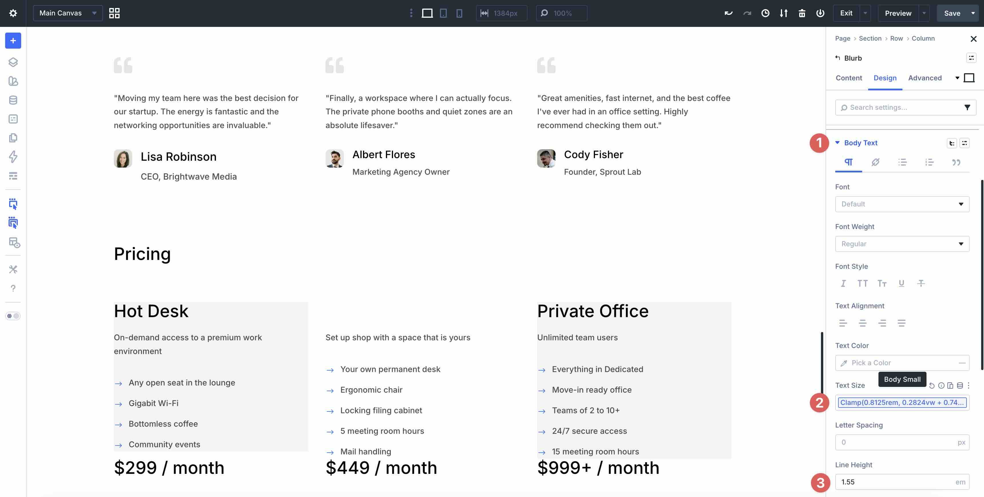
For more control, create a Dark Text Option Group Preset that sets the Body Text color using the Body Text Color variable, the line height using the Line Height – Body variable, and the text size using the Body Small variable.
Spacing Presets
Next, create Spacing Presets to maintain consistent rhythm across the site. These are especially useful for sections, rows, columns, groups, and modules.
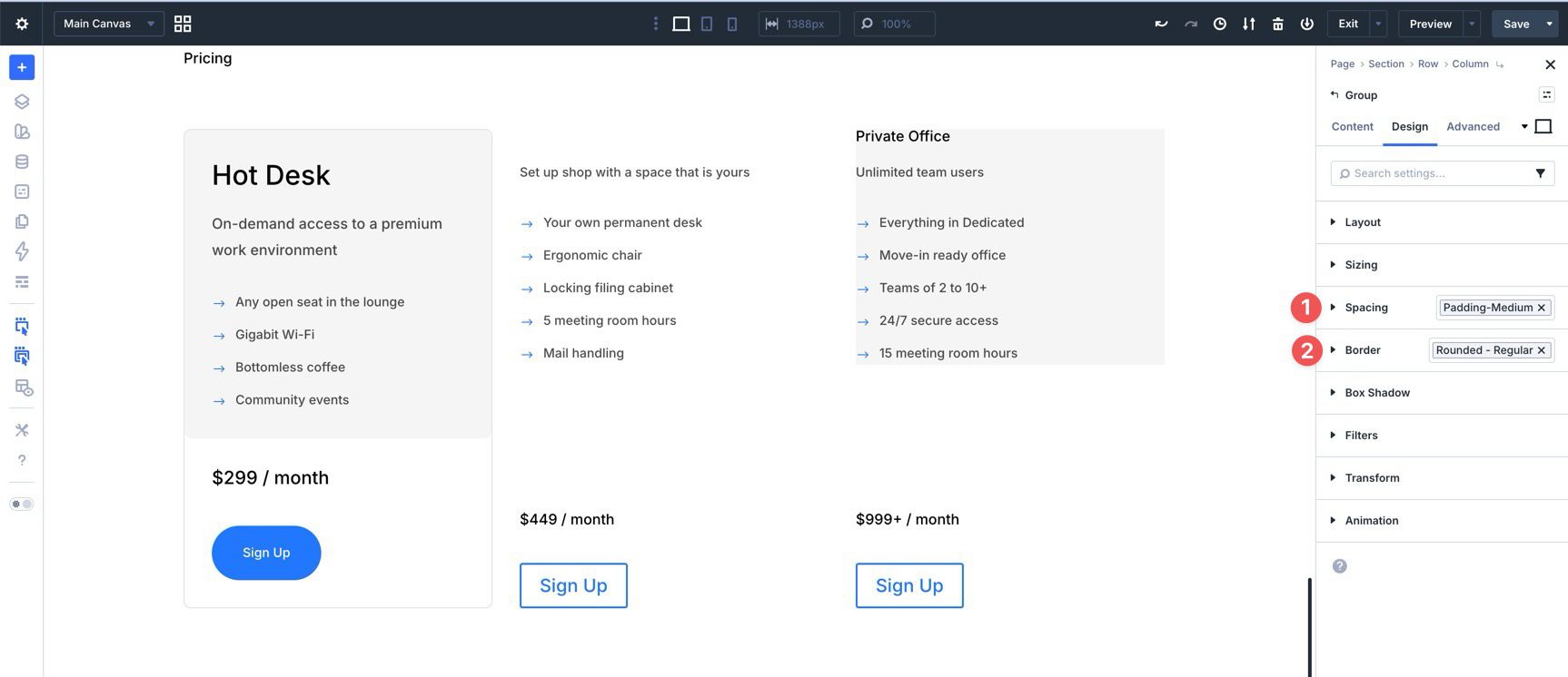
Click into the Column that contains the Blurb and go to the Design tab. Expand the Spacing option group. Using the Spacing – Medium variable, set 30px padding on all four sides.
Then, hover over the Spacing header to reveal the preset icon. Click it, choose New Preset From Current Styles, and name the preset Padding – Medium.
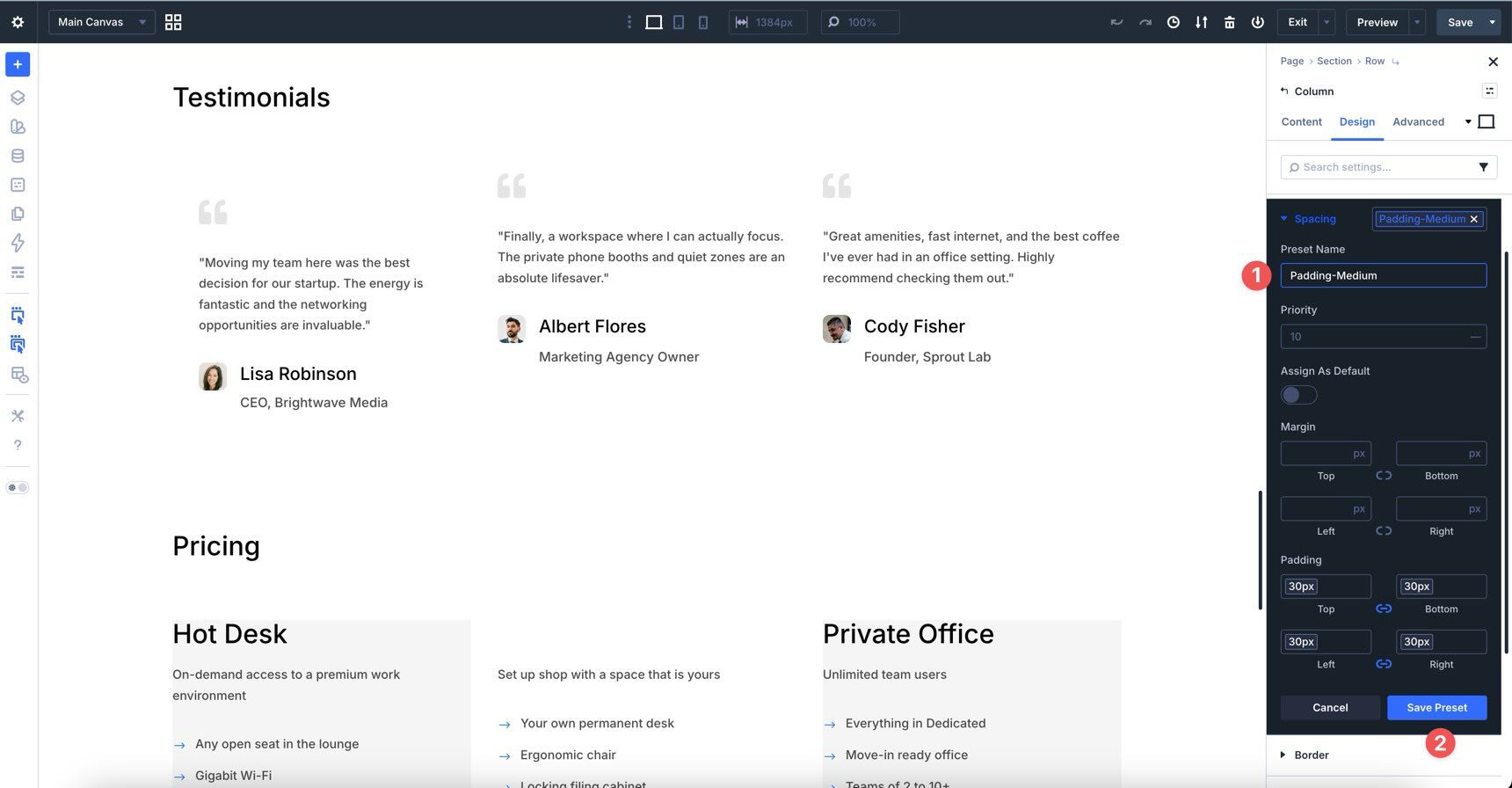
You can now apply this same preset to any element that includes a Spacing option group. As a result, content areas across the coworking website will share the same comfortable breathing room.
Border Presets
Border presets help give columns, images, groups, and other modules a clean, unified appearance.
In the same Column where we applied the spacing preset, expand the Border option group. Add an 8px Border Radius using the Rounded Corners – Regular variable. In the Border Width field, add a 1px Border Width using the Border Width variable. For the Border Color, assign the Border – Dark variable, which uses black as the base color with 12% opacity.
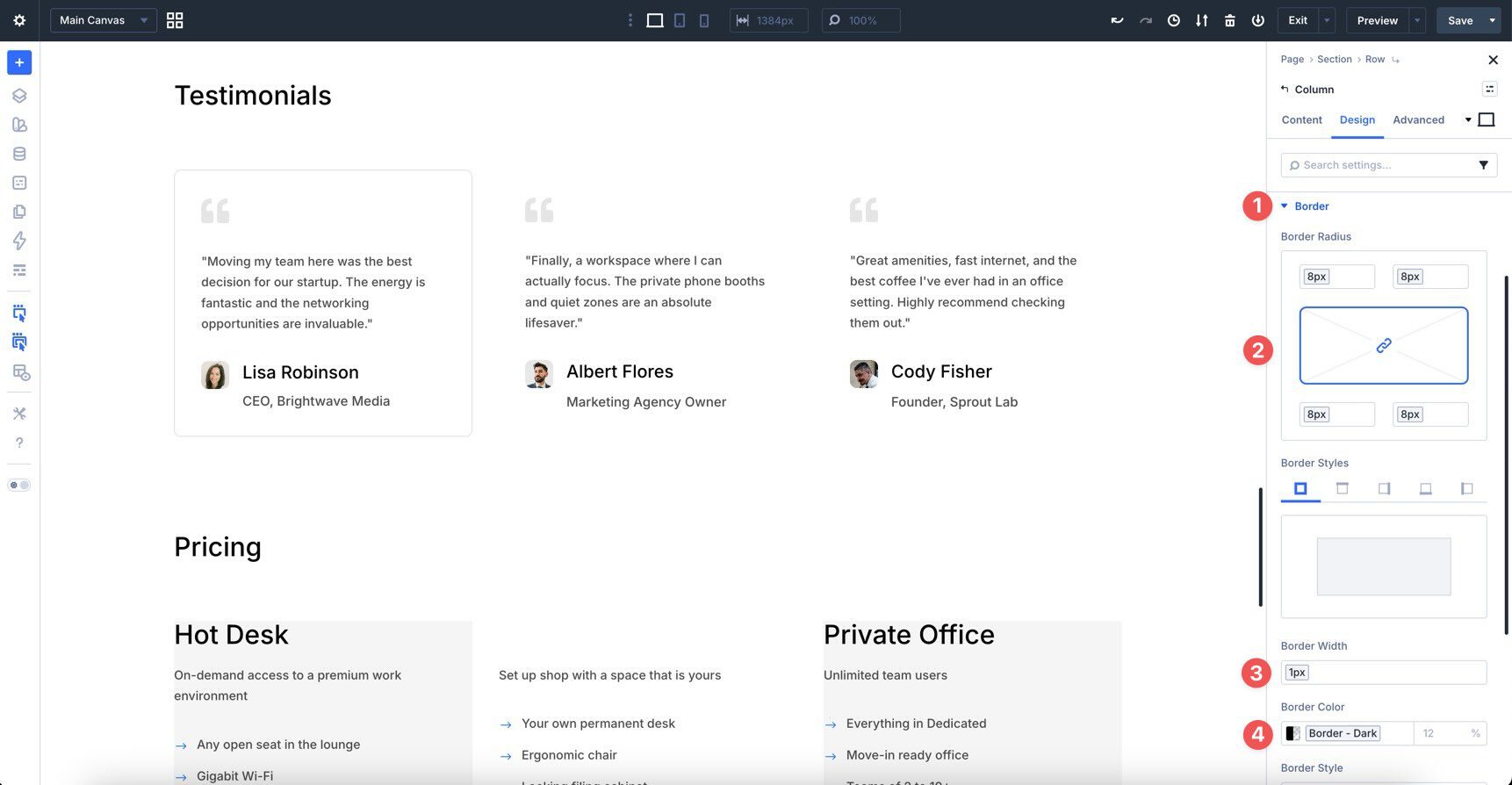
From there, create a new Option Group Preset for those styles and name it Outlined – Dark.
Button Presets
Buttons appear throughout a website, including hero sections, pricing tables, call-to-action sections, forms, and email opt-ins. Because buttons often live inside other modules, it is useful to create button styles as Option Group Presets.
Add an Email Opt-In module, or any module that contains a button. In the Design tab, expand the Button option group. Then, set the following values using the variables from Part 3:
- Background Color: Primary Color variable
- Border Radius: Rounded Corners – Buttons variable
- Border Width: Border Width – Buttons variable
- Button Text Color: White variable
- Button Text Size: Button Font Size variable
- Padding Top and Bottom: Button Vertical Padding variable
- Padding Left and Right: Button Horizontal Padding variable
Once the styles are set, create a new Option Group Preset and name it Filled – Primary Color.
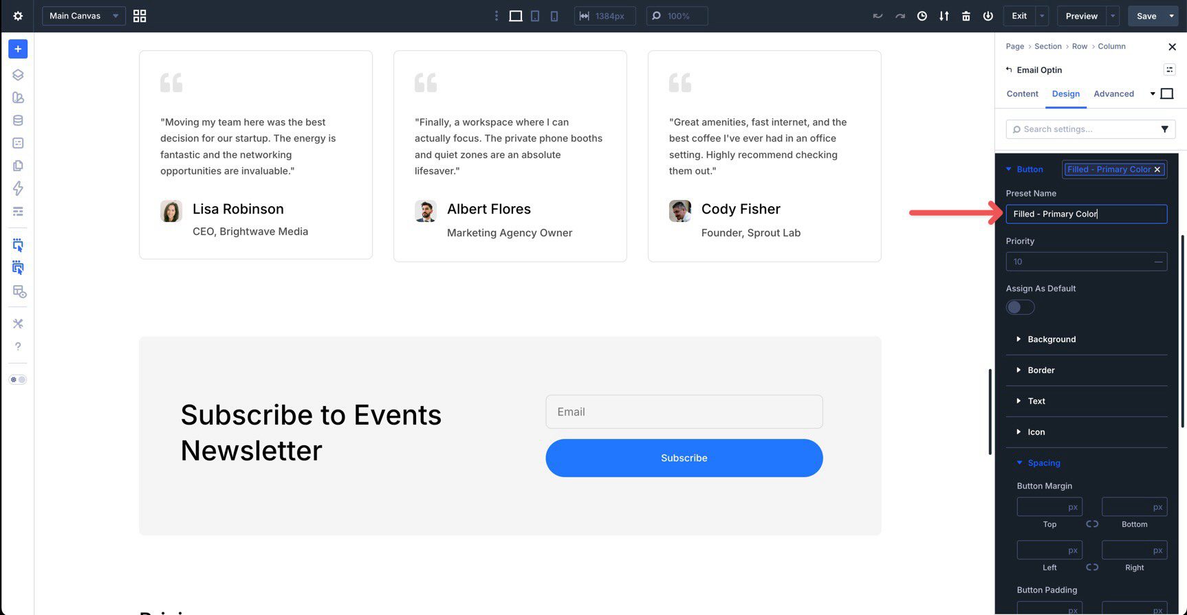
You can now apply this same Button Option Group Preset to any module that includes a button option group. This keeps button styling consistent across the entire site.
Core Option Group Presets To Create Now
Now that you know how to create Option Group Presets, build the essential ones you will use throughout the rest of the course. The table below serves as your checklist for the most important OGPs needed before moving on to Part 5 and building the homepage.
Use this table as your guide. For each preset, style the option group using the Design Variables we created in Part 3. Once these presets are in place, you will have a reusable style library ready for the coworking website’s homepage.
| Module/Option Group | Preset Name | Associated Variables | Values |
|---|---|---|---|
| Border | Top Border | Border Width Border - Dark | 1px #000000, 12% opacity |
| Border | Outlined - Dark | Rounded Corners - Regular Border Width Border - Dark | 8px 1px #000000, 12% opacity |
| Border | Rounded - Regular | Rounded Corners - Regular | 8px |
| Border | Bottom Border | Border Width Border - Dark | 1px #000000, 12% opacity |
| Spacing | Padding - Medium | Spacing - Medium | 30px |
| Spacing | Padding - Large | Spacing - Regular | 60px |
| Font Body | Dark Text | Text Color: Body Text Color Line Height: Line Height - Body Text Size: Body | #000000 1.8em clamp(0.875rem, 0.2824vw + 0.8067rem, 1rem) |
| Font Body | Small Text | Text Size: Body Small Line Height: Body Small Line Height | clamp(0.8125rem, 0.2824vw + 0.7442rem, 0.9375rem) 1.55em |
| Buttons (inside other modules) | Filled - Primary Color | Background: Primary Color variable Rounded Corners - Button Border Width - Buttons White Color variable Button Font Size Button Vertical Padding Button Horizontal Padding | #2176ff 500px 0px #ffffff 14px 16px 32px |
| Buttons (inside other modules) | Filled - Black | Background: Primary Color variable Rounded Corners - Button Border Width - Buttons White Color variable Button Font Size Button Vertical Padding Button Horizontal Padding | #000000 500px 0px #ffffff 14px 16px 32px |
| Buttons (inside other modules) | Filled - White | Background: White variable Rounded Corners - Button Border Width - Buttons Black Color variable Button Font Size Button Vertical Padding Button Horizontal Padding | #000000 500px 0px #000000 14px 16px 32px |
| Buttons (inside other modules) | Text - Primary Color | Background: White, 0% opacity Button Text Color: Primary Color variable Button Font Size | #ffffff #ffffff 14px |
| Buttons (inside other modules) | Text - White | Background: White, 0% opacity Button Text Color: White variable Button Font Size | #ffffff #2176ff 14px |
| Heading | Heading 1 | H1 variable | clamp(1.75rem, 4.4975vw + 0.6254rem, 3.75rem) |
| Heading | Heading 2 | H2 variable | clamp(1.5rem, 2.2596vw + 0.9534rem, 2.5rem) |
| Heading | Heading 3 | H3 variable | clamp(1.25rem, 1.4122vw + 0.9085rem, 1.875rem) |
| Heading | Heading 4 | H4 variable | clamp(1.0625rem, 0.9831vw + 0.8155rem, 1.5rem) |
| Heading | Heading 5 | H5 variable | clamp(0.9375rem, 0.7007vw + 0.7588rem, 1.25rem) |
| Heading | Heading 6 | H6 variable | clamp(0.875rem, 0.2824vw + 0.8067rem, 1rem) |
| Body Text | Dark Text | Body Text Color Body Line Height - Body | #000000, 70% opacity clamp(0.875rem, 0.2824vw + 0.8067rem, 1rem) 1.8em |
| Body Text | Small Text | Body Small Body Small Light Height | clamp(0.8125rem, 0.2824vw + 0.7442rem, 0.9375rem) 1.55em |
Element Presets
Option Group Presets let you save individual groups of styles. Element Presets take that idea one step further by saving the full design for a specific element type, such as a Button, Blurb, Image, Section, Row, Column, or Group module.
The main difference between an Option Group Preset and an Element Preset is scope. An Option Group Preset saves styles for one category, such as typography, spacing, border, or button design. It can be applied wherever that same option group exists. An Element Preset, on the other hand, saves the complete styling for one particular element type.
Element Presets are especially useful when they include nested Option Group Presets. For example, a Blurb Element Preset can include nested presets for title typography, body text, spacing, background, and border styling. This gives you the speed of applying a complete module design while keeping the smaller style decisions easier to update.
In the section below, we’ll create several key Element Presets that you will use when building the homepage and inner pages of the coworking website.
How to Create An Element Preset
Creating an Element Preset follows a similar process to creating an Option Group Preset, but with a broader scope. Instead of saving one group of styles, you save the complete styling for an entire element. This is useful when you want to apply a fully designed button, email opt-in, card, or section with a single click.
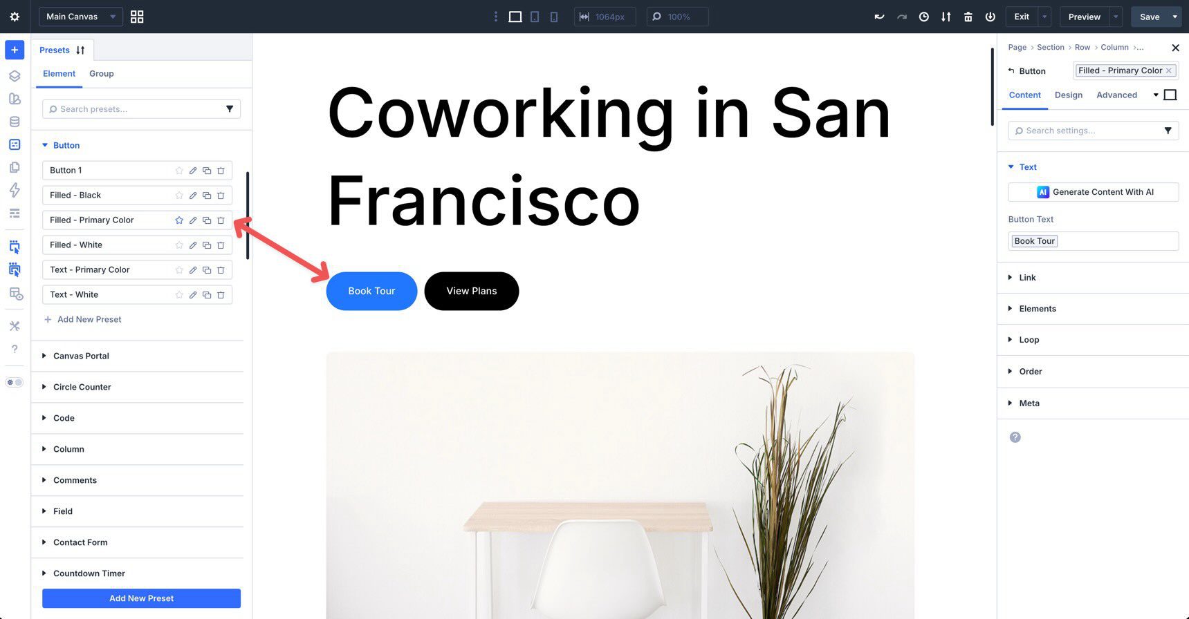
Primary Button Preset
Start by adding a Button module to the canvas. Apply the Filled – Primary Color Button Option Group Preset you created earlier. Go to the Design tab, find the Button option group, click the Preset icon, and apply the OGP.
Next, expand the Spacing option group. In the padding fields, use the Insert Dynamic Content icon to add the Button Vertical Padding and Button Horizontal Padding variables.
Once the button styling is complete, click the Preset icon in the Button module header and select New Preset From Current Styles. Name the Element Preset Filled – Primary Color and save it.
This Element Preset now includes the nested Option Group Preset, so future changes to the button’s shared styling can flow through every place this preset is used.
Email Opt-In Preset
In the previous section, we created an Option Group Preset for the button. Now, we’ll combine that button preset with additional OGPs to create an Element Preset for the full Email Opt-In module.
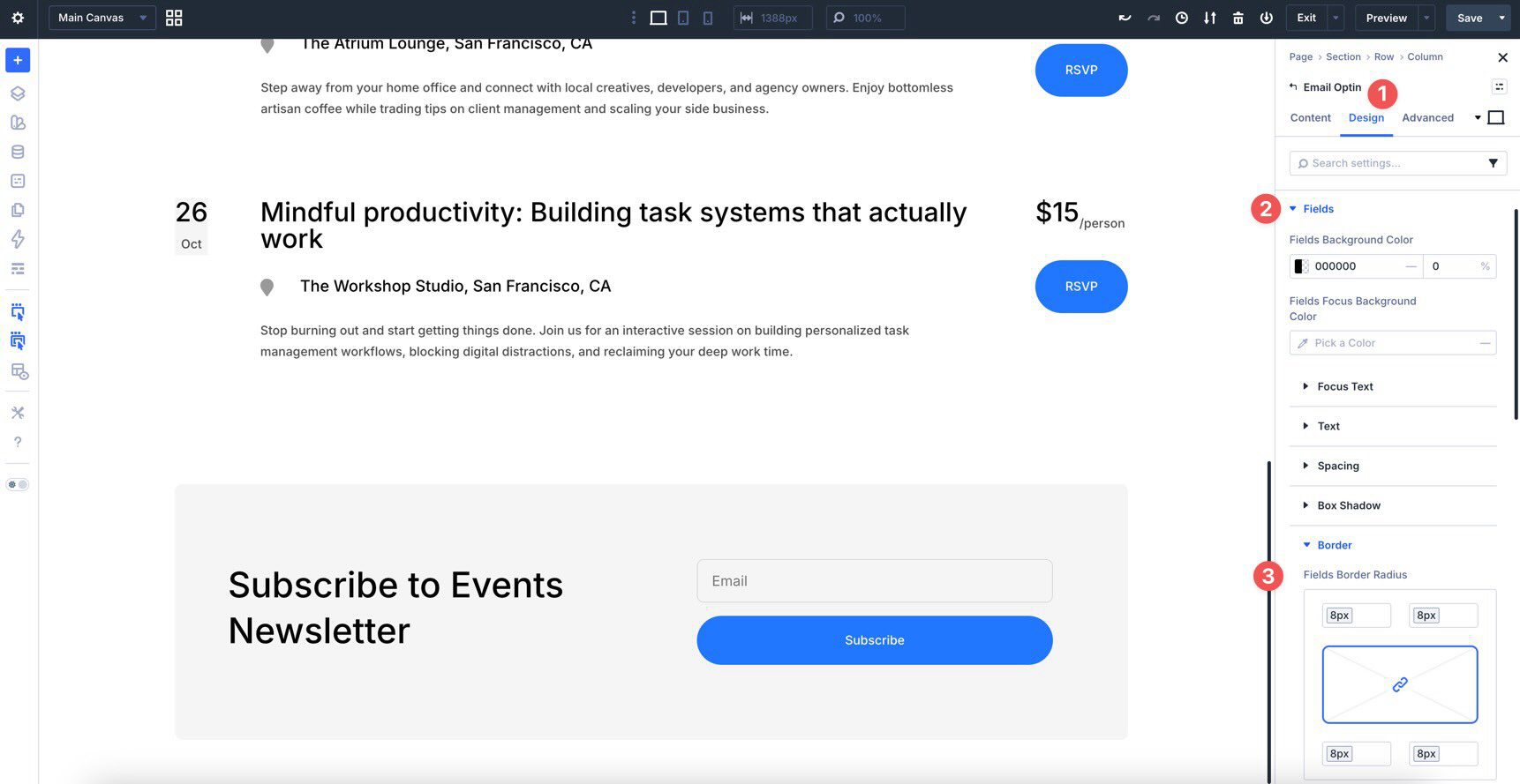
Open the settings for the Email Opt-In module. In the Design tab, create an Option Group Preset for the Title Text if you have not already created one. Next, expand the Fields option group and assign the Rounded Corners – Fields variable to the Fields Border Radius.
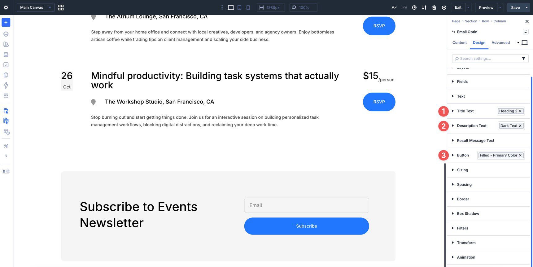
Next, add the Heading 2 Option Group Preset to the Title Text option group. Then, add the Dark Text OGP to the Description Text option group and the Filled – Primary Color OGP to the Button option group.
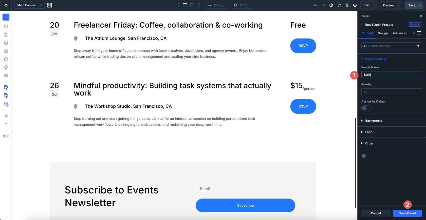
Finally, click the Preset icon in the module header, choose New Preset From Current Styles, and name the Element Preset Dark.
This preset now carries the title typography, description text, field styling, and button styling, making it easy to drop consistent email opt-in forms onto any page.
Module Group Presets
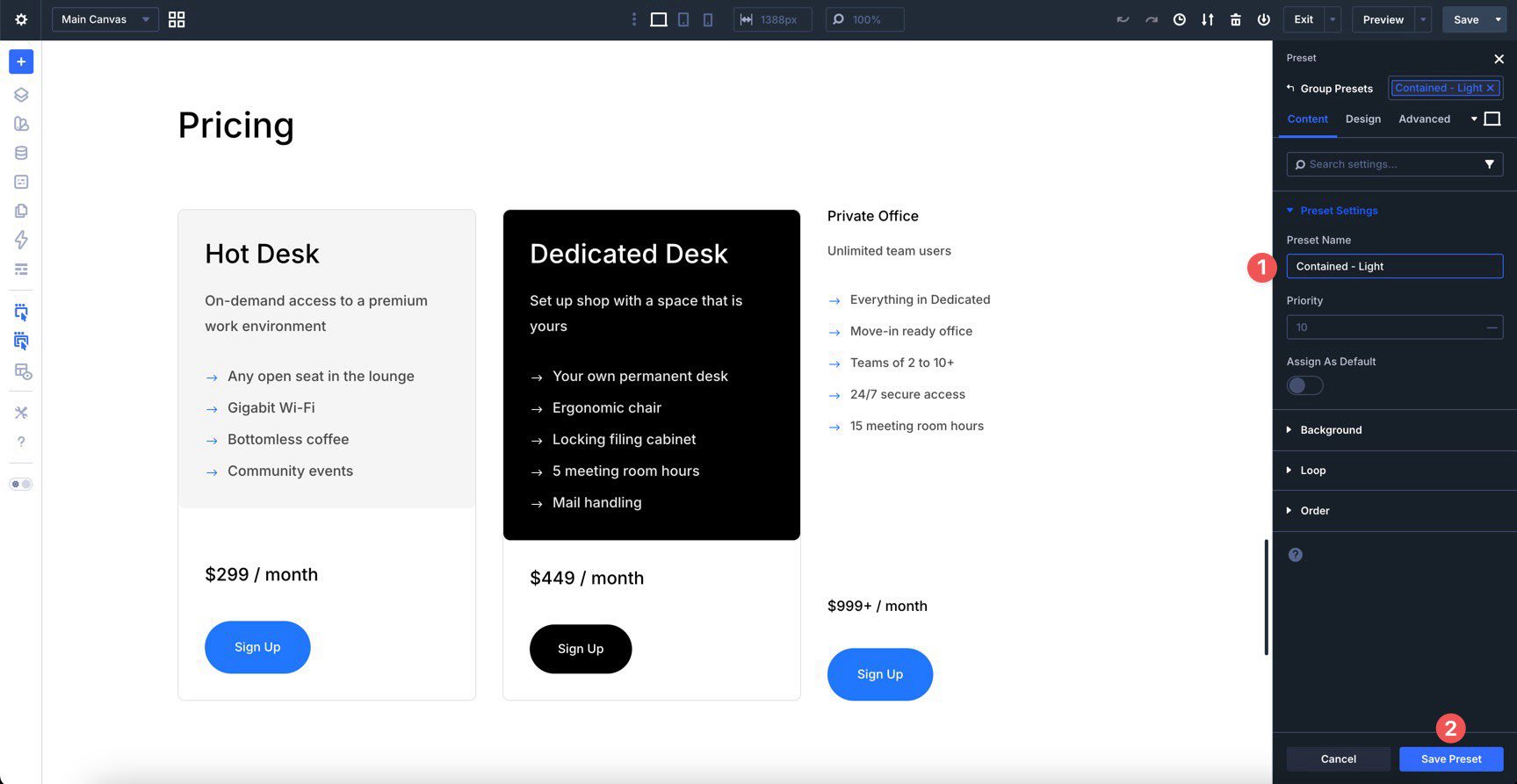
For reusable components like feature cards, pricing cards, or testimonial blocks, you can create an Element Preset for a Module Group. Add or open a Group module on the canvas and place the related modules inside it. In the Group module’s Content tab, open the Background option group and assign the Background – Light Gray color variable to the Background Color field.
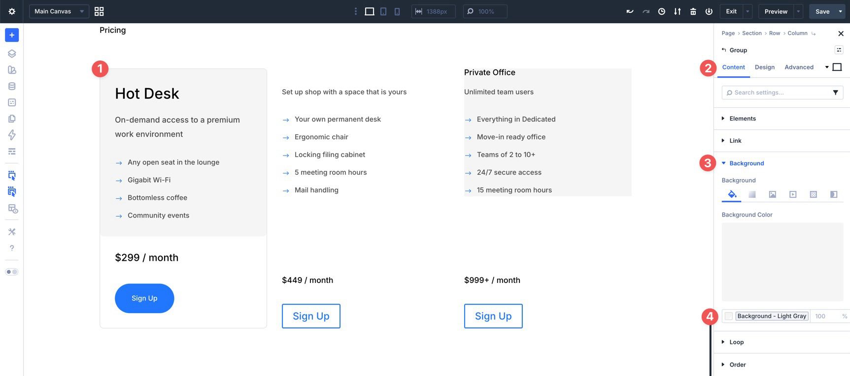
Apply the Padding – Medium Option Group Preset to the Spacing option group. Next, apply the Outlined – Dark preset, or your preferred rounded border preset, to the Border option group.
Now, click the Preset icon in the Group module header, create a new preset, and name it Contained – Light.
Once you create these Element Presets, your workflow becomes faster and more organized. The Primary Button, Email Opt-In, and Module Group presets all use nested Option Group Presets, which keeps the system modular and easier to maintain. When you update a nested Option Group Preset, that change can flow through every Element Preset that uses it.
Instead of manually styling each new module from scratch, you can now apply complete, consistent styles with just a few clicks.
Core Element Presets To Create Now
With a good understanding of how Element Presets work, use the table below as your checklist for the presets you’ll need to build the homepage in Part 5 of the Divi 5 Mastery Course.
For each Element Preset, use the listed Option Group Presets and associated Design Variables. Once these are in place, you will have a complete library of reusable components for the homepage. You will also be better prepared to create the header, footer, Theme Builder templates, and inner pages.
| Module | Preset Name | Option Group Presets | Variables |
|---|---|---|---|
| Heading | Heading 1 - Big | N/A | H1 Desktop Big: clamp(3rem, 7.3219vw + 1.1924rem, 6.25rem) Line-Height Headings |
| Heading | Heading 1 | N/A | H1: clamp(1.75rem, 4.4975vw + 0.6254rem, 3.75rem) Line-Height Headings |
| Heading | Heading 2 | N/A | H2: clamp(1.5rem, 2.2596vw + 0.9534rem, 2.5rem) Line-Height Headings |
| Heading | Heading 3 | N/A | H3: clamp(1.25rem, 1.4122vw + 0.9085rem, 1.875rem) Line-Height Headings |
| Heading | Heading 4 | N/A | H4: clamp(1.0625rem, 0.9831vw + 0.8155rem, 1.5rem) Line-Height Headings |
| Heading | Heading 5 | N/A | H5: clamp(0.9375rem, 0.7007vw + 0.7588rem, 1.25rem) Line-Height Headings |
| Heading | Heading 6 | N/A | H6: clamp(0.875rem, 0.2824vw + 0.8067rem, 1rem) Line-Height Headings |
| Text | Dark Text | N/A | Body Text Color (color) Body: clamp(0.875rem, 0.2824vw + 0.8067rem, 1rem) Line Height - Body |
| Text | Light Text | N/A | White (color) Body: clamp(0.875rem, 0.2824vw + 0.8067rem, 1rem) Line Height - Body |
| Text | Small Text | N/A | White (color) Body: clamp(0.875rem, 0.2824vw + 0.8067rem, 1rem) |
| Button | Filled - Primary Color | Filled - Primary Color | Button Vertical Padding Button Horizontal Padding |
| Button | Text - Primary Color | Text - Primary Color | Button Font Size Button Text Color: Primary Color variable |
| Button | Filled - Black | Filled - Black | Button Vertical Padding Button Horizontal Padding Black (color) |
| Button | Filled - White | Filled - White | Button Vertical Padding Button Horizontal Padding White (color) |
| Image | Rounded | N/A | Rounded Corners - Images |
| Video | Rounded | N/A | Rounded - Regular |
| Icon | Dark - Small - Contained | N/A | Color variable: White Spacing - XSmall |
| Icon | Dark - Small | N/A | N/A |
| Icon List | Light Text | N/A | Heading Text Light (color) Body: clamp(0.875rem, 0.2824vw + 0.8067rem, 1rem) |
| Blurb | Dark Text | Heading 5 Dark Text | Rounded Corners - Images |
| Blurb | Dense | Small Text | Body Small: clamp(0.8125rem, 0.2824vw + 0.7442rem, 0.9375rem) |
| Group | Contained - Light | Padding - Medium Rounded - Regular | Spacing - Medium Rounded Corners - Regular Background - Light Gray (color) |
| Group | Contained - Dark | Padding - Medium Rounded - Regular | Spacing - Medium Rounded Corners - Regular Black (color) |
| Countdown Timer | Light Text | Heading 3 Heading 1 | H3 H1 Line Height - Headings |
| Accordion | Dark Text | Heading 6 Dark Text | Black (color) Body Text Color (color) Body: clamp(0.875rem, 0.2824vw + 0.8067rem, 1rem) Line Height - Body |
Stacked Presets
Once you have created several Option Group Presets and Element Presets, you can take things further by stacking them. Stacked Presets let you apply multiple presets to a single element. This gives you more flexibility while keeping the underlying styles reusable and consistent.
A good way to see this in action is with a Blurb module, which is commonly used for features, services, and testimonials.
Start by adding or opening a Blurb module. If you used the table above to create the presets you need, stacking is easy. Click the Blurb module settings, then click the preset icon next to the module header. In the preset list, choose Dark Text.
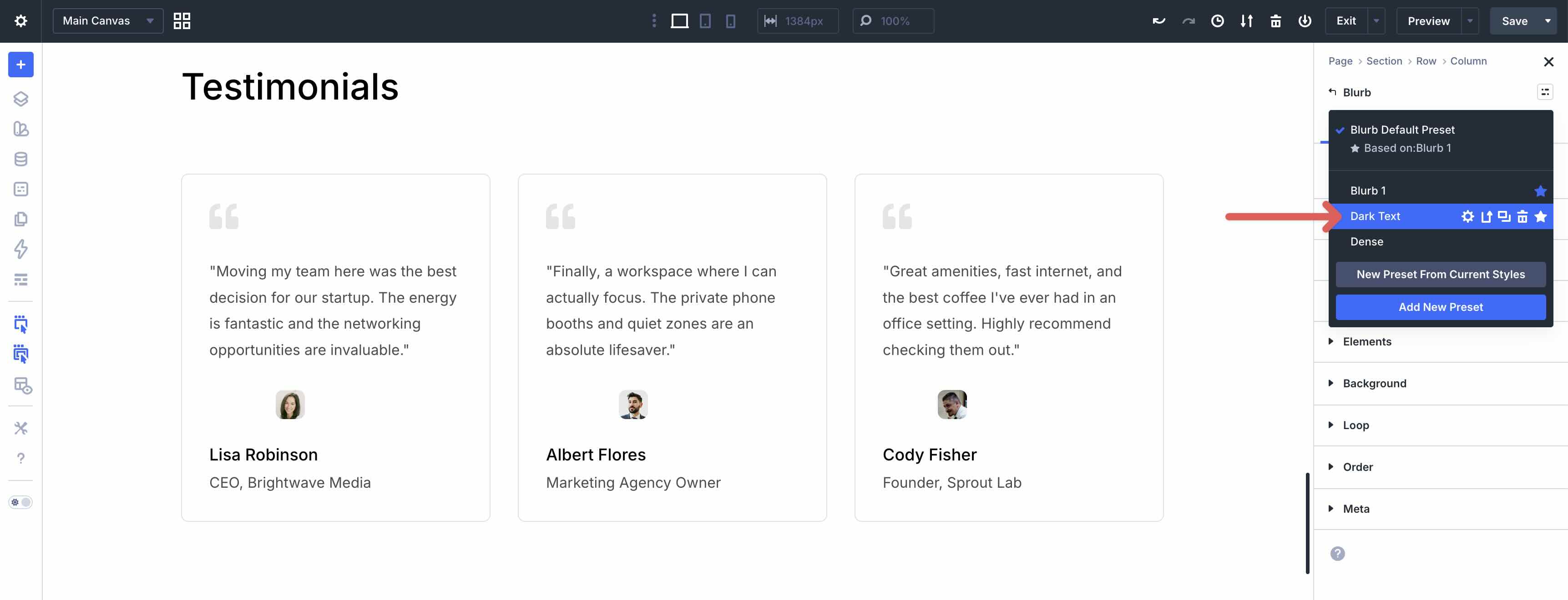
After the first preset is added, click it to open the preset options. This time, select the Dense preset. Divi 5 applies the styles from both presets to the same module.
You can stack multiple presets on the same element when each preset handles a different styling job. For example, you might stack:
- A spacing preset for padding.
- A border preset for rounded corners.
- Typography presets for title and body text.
- A background preset for a specific section context.
This approach improves workflow efficiency. Instead of manually adjusting several settings every time, you can build more complex modules by layering a few presets. Then, when you update one of the underlying presets, every module that uses that preset updates with it.
Tips And Best Practices
Here are a few best practices for getting the most out of your preset library.
Use Preset Preview
Use Preset Preview whenever you need to review a preset before saving changes. Clicking the pencil icon opens a preview panel where you can test the preset against sample content and different background colors. However, remember that saved changes are global. Once you save the preset, every element using it will reflect the update.
Set Default Presets
You can set default presets so new modules automatically inherit your preferred styles. To do this, open a module, select the applied preset in the module header, and click the star icon. This marks the preset as the default for that element type.
For example, set Filled – Primary Color as the default Button preset. Then, when you add a new Button module to the page, it will start with that preset already applied.
Name Presets For Easy Identification
Keep your presets organized with clear, consistent names. This makes it much easier to find the right preset as your library grows.
A simple naming system helps. Use role-based names for reusable design decisions, such as Heading 2, Dark Text, or Padding – Medium. Use component-based names for complete Element Presets, such as Contained – Light, Filled – Primary Color, or Email Opt-In – Dark.
Export Presets For Reuse
It is also a good idea to export your presets after building a reliable library. Exporting creates a backup and makes it easier to move your styling system to another site or share it with team members.
Download The Presets
To make things straightforward, we’ve created a JSON export file for you. Importing this preset library gives you a strong starting point before building the homepage in Part 5 of the Divi 5 Mastery Course.
This course assumes you have already created the Design Variables from Part 3. If your presets reference variables, make sure those variables are available on the site as well. That way, the imported presets can keep using the same colors, spacing values, typography sizes, and other shared design decisions.
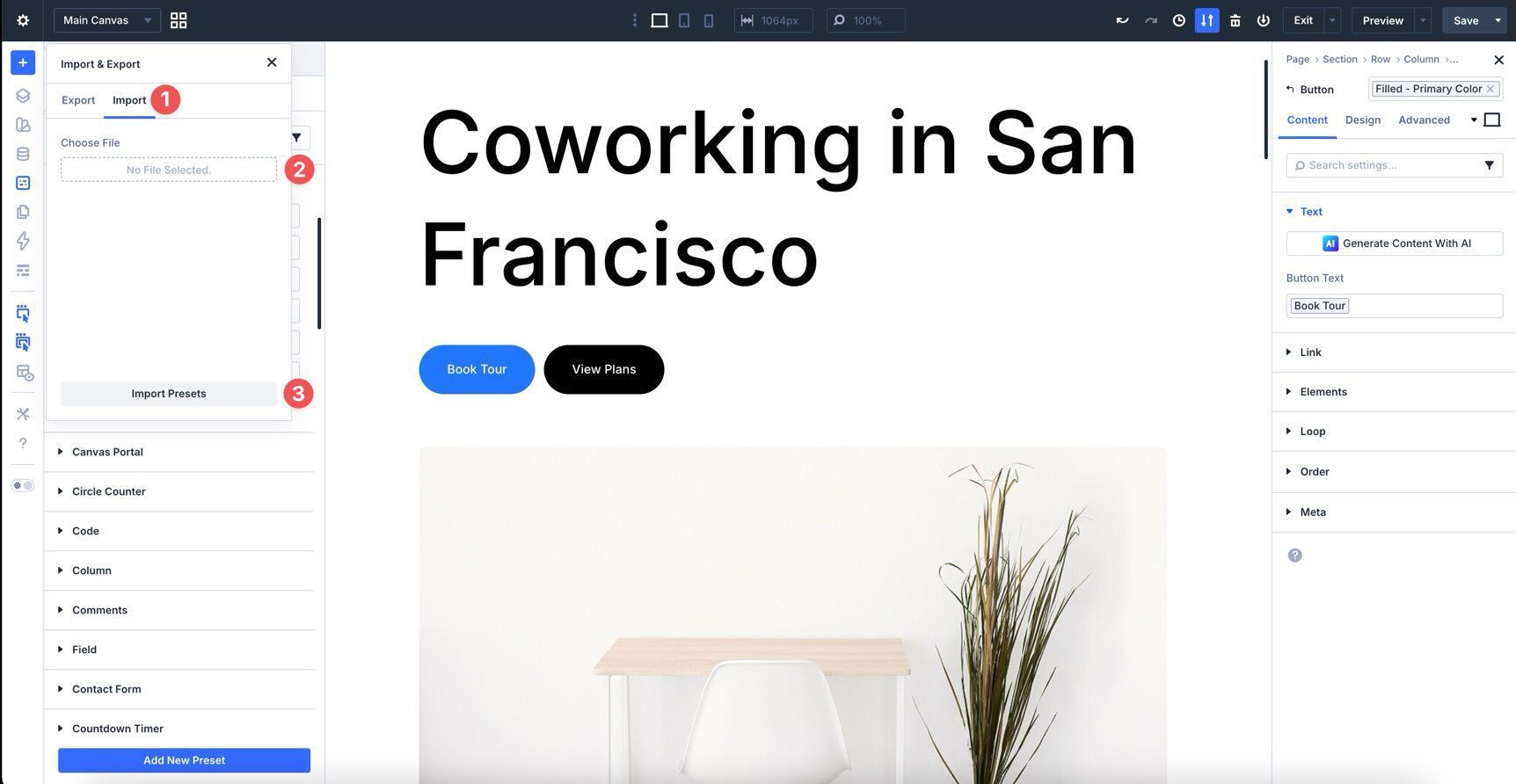
Before beginning the design phase, locate the JSON file on your computer. Open the Visual Builder, click the Preset Manager icon in the Builder Bar, and click the Import & Export Presets button in the Preset Manager header.
Select the Import tab, choose the JSON file from your computer, and click Import Presets.

What’s Coming Next
With your design system powered by Variables and Presets, you’re ready to start building pages. In Part 5: Building a Divi 5 Homepage From Scratch, we’ll use everything we’ve created so far to build the coworking space website’s homepage.
That build will include the hero section, features, pricing plans, testimonials, FAQs, and CTA. More importantly, we’ll build each section using the variables and presets already in place, so the design stays consistent from the first module to the final page.


Why is there no simple way to style all headings with one preset?
Heading Text and Title Text don’t behave the same way. One is intuitive (Heading Text), the other just feels broken.
Inserting a heading module, then changing the header level, then applying a specific preset for the header level doesn’t appear to be optimal.
Well, however you style them, you want control over the Heading Level separately from the styles so you can make sure you have an intuitive heading structure on your page (important for accessibility and SEO). Also, those modules work differently because they have different ways of assigning the heading structure (one needs to have all the heading options because you can enter multiple heading levels, and the other is more specific and works for one applied heading). But yes, we’re envisioning the best ways of creating a unified typography system, which is quite demanding in scope. We appreciate your thoughts and ideas.
Thanks for the walkthrough parts 1-4 (so far!) of how to get acquainted with Divi 5.
An indispensable resource, as Divi 4 and Divi 5 are as different as chalk and cheese 😉
I have one question. Re: DOWNLOAD THE PRESETS —”To make things straightforward, we’ve created a JSON export file for you…”
Is this ‘Divi-5-Launch-Freebie_Presets’ which is in the Divi 5 Design System download folder?
Thanks for the precision, and keep up the good work. Looking forward to mastering Divi 5 🙂
Hey Stewart, yes the download is a smaller version of the previously launched Divi 5 Design System. Except, that design system has a lot of templates included in it, whereas in this series, we are essentially teaching you how to build it yourself.
Does the download overwrite the presets we’ve created or is it an addition to those?
These would be added in addition to your current site’s presets.