
Today, we introduce the all-new flexbox-based layout system for Divi 5.
This is no minor update. It reinvents Divi, allowing you to build any layout structure, including responsive layout breakdown, custom module ordering, easy vertical alignment and element positioning, and much more.
No stone was left unturned, no option was forgotten—we did it all, and it’s best in class.
Check out the following video to see the new feature in action. 👇
Divi 5’s All-New Layout System
We reinvented Divi’s layout system and added many new row templates and layout options. You can create any layout using flexbox, nested rows, and module groups!
The new layout system makes controlling element positioning, spacing, wrapping, and ordering easy.
A Robust Selection Of New Flexbox Row Templates
You’ll first notice a selection of new row templates, including nested multi-row options. There’s so much more variation to be enjoyed!
You aren’t limited to these templates; they’re convenient pre-built examples. Once you dig into the settings panels, there are no guardrails; you can add as many columns as you want and give them any size you want, nesting rows within columns to create any layout.
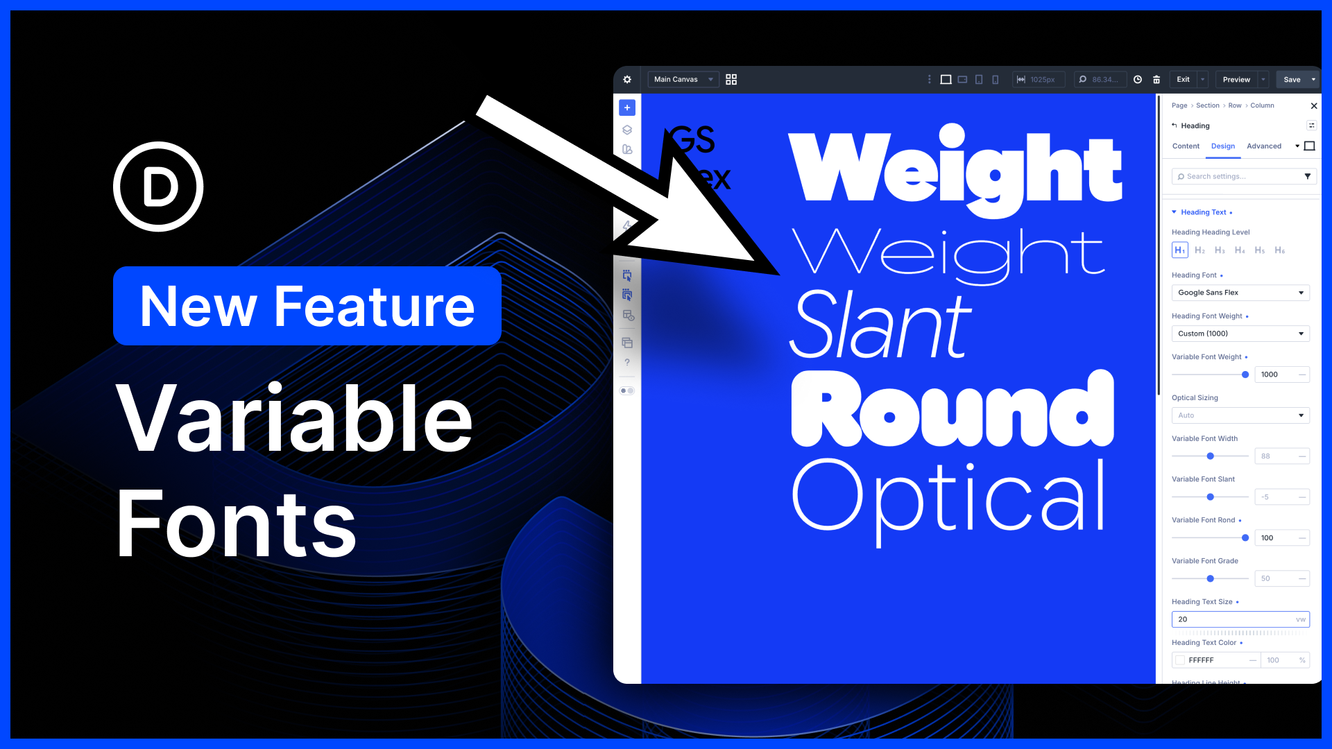
Flexbox Controls For Everything
New flexbox options are available for everything. You can control layout wrapping, direction, ordering, spacing, child element positioning, and more—no hacks, no JavaScript, no mess, just intuitive controls that work wonderfully.
Responsive Row Structures
Building responsive websites has never been easier.
At every breakpoint, you can assign different structures to a single row. It’s that simple, and Divi does it better than any other builder, allowing you to completely transform each device’s layout. You can also customize the size of columns on each device and adjust any flexbox setting.
Responsive Element Ordering
Responsive element ordering is a breeze.
You can easily change the direction in which elements flow on each device and the order of individual elements. You can completely change each device’s row structure, then re-order things optimally within that new structure.
Easy Child Element Positioning
Flexbox makes positioning elements within their parent containers much simpler.
You don’t need to use JavaScript or absolutely-positioned elements; for example, centering elements vertically within a column is just a click away.
Unifying the height of elements is just as simple. For example, it’s easy to make all columns in a row the same height, or all modules in a column the same height.
Deprecating Specialty And Fullwidth Sections
We deprecated specialty and full-width sections, greatly simplifying Divi’s structural elements (Existing full-width and specialty sections will continue working; we just removed the option to add new ones).
You can do it all (and more) with regular flexbox rows, so there is no need for different section types. Unique full-width modules have been renamed and made available in standard sections, giving you more flexibility.
Endless New Layout Possibilities
There are too many settings to cover and possibilities to explore, but one thing is clear: Divi’s layout system of the future is here, and building Divi websites will never be the same.
Before I wrap things up, let’s show a few creative layouts built with Divi’s new layout system. You can also download the layouts and check them out for yourself.
We Threw In A Few Surprises As Well
You’ll notice a few other surprise improvements in this update.
- Significant Speed Improvements – You’ll notice that the builder is way faster when editing large, complex layouts. With the introduction of infinitely nestable rows and new container elements, you now have the freedom to build very complex designs. With this update, we ensured the builder is still lightning fast, even when your layouts get crazy. It’s a night and day difference!
- New Column Options – All grid modules, such as the Gallery and Portfolio modules, have new column settings that let you control the column structure of the grid at every breakpoint.
- Fullwidth Module Renaming – The Fullwidth Header module has been renamed Hero, and the Fullwidth Portfolio module has been renamed Post Carousel. Both modules can now be used in standard sections.
- New Post Type Options for Post Carousel – The newly-named Post Carousel module has a new Post Type setting, allowing you to fill the carousel with posts of any type.
Try Divi 5 Today
Flexbox for Divi 5 is available today, and it’s one of many features coming to Divi this year.
You can follow along as we progress through the final release of Divi 5 and beyond, with updates every two weeks. Depending on your priorities, you can use Divi 5 now to build new websites or wait until we add more features, whatever works best for you.
As outlined in Divi 5’s original multi-phase release schedule, the Divi 5 Public Alpha is like “Divi 5 Lite.” It’s missing a few features and may not be suitable for existing websites, but it’s ready to be used on new websites if you prefer the experience to Divi 4.
We want you to try it, and if you love it, use it; when everyone loves it, we’ll make it official.
Have You Tried Interactions?
We recently released Interactions for Divi 5, a robust system for creating interactive elements such as popups and toggles, and creative scroll-based and mouse-movement-based effects. It’s not a pop-up builder; it’s an anything builder. Create a trigger, assign an effect, choose a target, and bring your custom interactions to life. There’s a link in the video description to learn more.
Watch this video for all the details. 👇
More Divi 5 Updates Are On The Way
2025 is the year of Divi 5. The tedious work is behind us. We built the super-fast foundation, and now it’s time for Divi to make its comeback.
If you’re here for the Divi comeback, do us a huge favor and let us know by liking this video and leaving a comment. It means a lot to us to see you cheering Divi on, and it’s essential to feed the algorithm and spread the word.
Don’t forget to follow us on YouTube and subscribe to the Divi newsletter so you never miss an update. I’ll see you soon for another Divi 5 feature announcement, which I promise will be right around the corner. 😁


I’m excited for the DIVI 5, but I’ve couple of questons in mind. I don’t know if that feature available or not, but please add the adjust spacing between the element directly just like Elementor has for cards and other grouped modules. they have individual controls for all group items along with styles, space between, background image with overlay without any tricks they just have simply on one click and I want lot more…
All containers have horizontal and vertical gap settings now. That’s part of the flex update.
Finally! It’s here!
Unfortunately, this is still buggy. I tried this on a fresh build and updating the column layouts on responsive breakpoints won’t change e.g on desktop, I’ve set a row as absolute but on tablet-wide I tried setting it to relative but it does not update. Hope we can get updates on this soon.
Make sure you take a look at your row’s flex wrap settings. If the row is set to no-wrap, then flexbox will keep all your columns in the same row no matter what width you give them.
Four columns with 50% width will become four columns with 25% width visually, because they aren’t allowed to wrap to the next row.
Nice. Finally. It was very limited your rows and columns options. Thanks for your efforts for improving Divi.
I’ve been playing with it and still have to get used to what each thing does. One thing I’m missing is how to make the columns equal heights in a row. There used to be a switch in the sizing and you could choose equal height. How would you do that now? I find it a breeze to be able to make them center aligned! Great new features!!
Sorry, but Flexbox is a mess at the moment. I’m thinking the wrong version has been issued.
Nice. This was definitely a need to have. Good job and congrats!
Hello team!
Congratulations for this. So, with this new version, will Divi meet the minimum accessibility and ADA compliance checker verification requirements for websites?
Best regards.
Andrés
I’ve created two websites with Divi 5 so far and have become familiar with the software. It’s truly remarkable how quickly you release new, fundamental features, which are also relatively error-free. Now it’s a real joy to work with Divi, to appreciate its performance, and to learn the new functions. It’s a lot to start with… but it’s also been a joy for a long time. Now I know the principle behind Flex Box and am absolutely thrilled with how you’ve implemented it. 5 out of 5 stars. Keep up the good work. Congratulations to the entire team from Germany!
Really a great facilitator for flexible website layout! Now I just have to start the beta phase so that my new projects can start with DIVI 5.0. Wasn’t it promised at the beginning of the work on DIVI 5 that first a complete conversion of the existing features would be programmed and only after completion new features would be added to DIVI 5?
Hey, Markus! We’re super glad to hear you’re excited about the latest Flexbox update, we are as excited to share it with the Divi community.
You are correct, in the early phase of Divi 5 development the immedate target was feature parity with Divi 4, however, the strategy has since been rethought. Our current development strategy is what we call “Divi 5 Feature Swap”. We explain it in detail here: The Divi 5 Feature Swap (Plus 200+ Fixes/Improvements).
This is such a game-changer! I’ve been building with Divi for a few years now, and the Flexbox layout system is exactly what we needed. It makes complex layouts so much easier to manage, especially for mobile responsiveness. I’ve already started using it on a new client site and the control it gives is incredible. Great job to the Elegant Themes team.
Finally!!! DIVI 5 is complete for us now.
Great update. But I am concerned about the size of dom elements.. Each element is wrapped in it’s own div. If we have moved toward class based system, or preset based design… why there are almost 6 to 7 divs for just putting a heading and a text widget… for each item there is a div… is there any plan to clean it up… Elementor is moving to v4, producing really clean code instead of divs rapper… Any thought…
It is a concern. But looking at the bigger WordPress picture, there are concerns there too about best practice and standards.
I don’t believe it! I was just fiddling the new fangled group today to get two text boxes in-line, using css flex of course… and then you drop this. And yes, one can already do grid via CSS. Being doing it for years.
The next trick will be to have bidirectional authoring of CSS and a proper class/selector set up… I hear there is an Etch thing doing this now.
Great, but what about Grid too?
Coming at a later date. Loop builder coming soon.
The most important release I’ve ever waiting !!! So game changer feature ! I’ll try it asap ! Thanks for the job Divi Team ! So excited !
Thats the same I think!!!