
Flexbox and Divi 5 are a powerful duo that enables Divi users to create stunning, responsive layouts. In this post, we’ll provide the ultimate guide to understanding and using every Flexbox setting to easily create flexible, responsive layouts.
Flexbox is at the heart of Divi 5’s revamped Visual Builder, allowing users to build stunning designs with unmatched control. Divi 5’s Flexbox Layout System makes complex layouts a breeze, from aligning content to building dynamic grids.
Let’s dive in.
What Is Flexbox?
Flexbox is a CSS layout model designed to make it easy to arrange, align, and distribute elements within a container, even when their sizes are dynamic. Unlike traditional CSS layouts that rely on floats or positioning, Flexbox offers an intuitive way to build flexible and responsive designs, making it a cornerstone of modern web development.
Subscribe To Our Youtube Channel
Key Concepts Of Flexbox
Flexbox operates around several fundamental concepts:
- Flex Container: The parent element that has display: flex or inline-flex applied, establishing the flex content. This container dictates how its children behave within the layout.
- Flex Items: The direct children of the flex container, which are arranged and aligned according to the container’s flex properties.
- Main Axis and Cross Axis: Flexbox operates along a main axis (either horizontal as a row or vertical as a column) and a perpendicular cross axis. The direction of the main axis can adapt to different modes, such as left-to-right-to-left, providing flexibility for global designs.
Flexbox In Divi 5: A New Era
Divi 5’s Flexbox Layout System is built into the Visual Builder, allowing Divi users to create responsive layouts with intuitive controls. These settings are primarily applied to sections, rows, columns, and Module Groups, allowing you to manipulate layout behavior visually without writing CSS. Flexbox makes it easy to align, reorder, and easily transform elements.
Accessing Flexbox In Divi 5
Accessing Flexbox in Divi 5 is straightforward and intuitive. Open the Visual Builder, add a new row, and head to the Design tab. You’ll find Flexbox settings under the Layout dropdown.
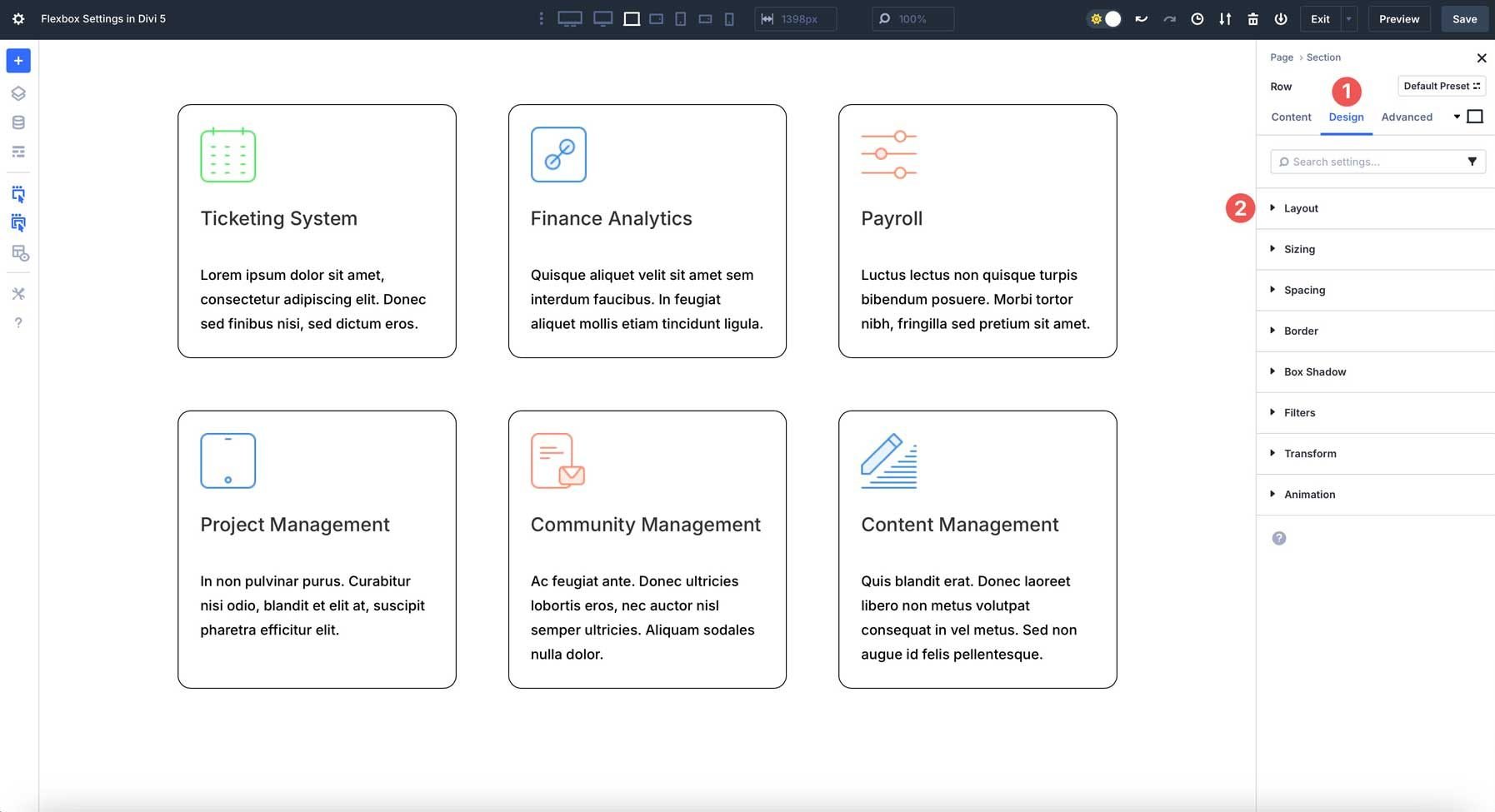
These settings are applied at the flex container level (sections, rows, etc.), controlling their flex items’ behavior. Divi’s interface displays settings through user-friendly options, making Flexbox easy for users of all skill levels.
Let’s walk through each setting so you can better understand how they work and how to use them to build layouts.
Detailed Breakdown Of Flexbox Settings In Divi 5
Below is a guide to every Flexbox-related setting in Divi 5. Each setting includes its purpose, available options, and practical use cases to help you apply them effectively.
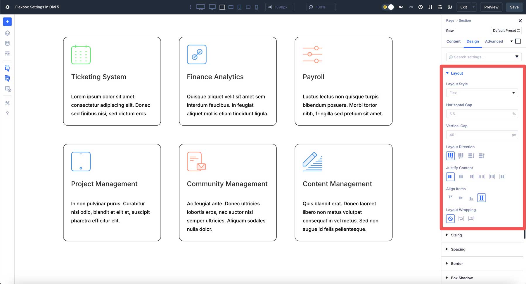
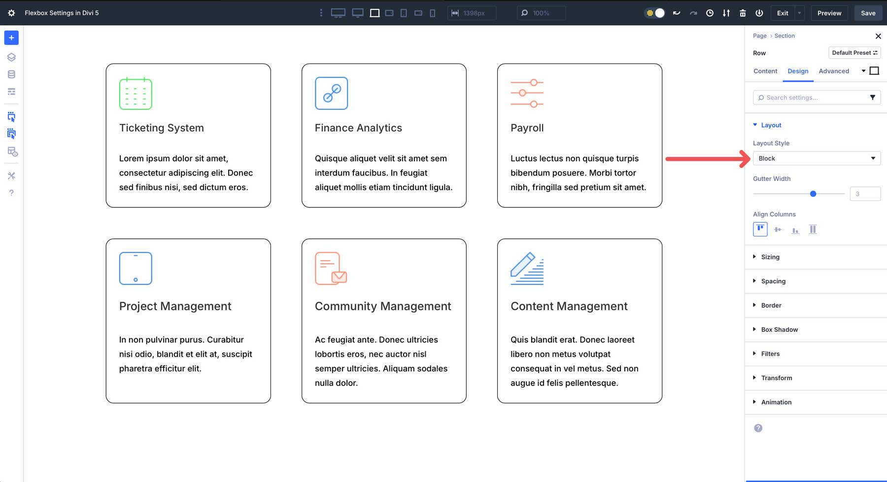
Layout Style
Flex is the default option in the Layout Style dropdown menu. When you set a container to Flex, it becomes a flex container. Its direct child elements (flex items) can then be flexibly aligned using CSS Flexbox properties.
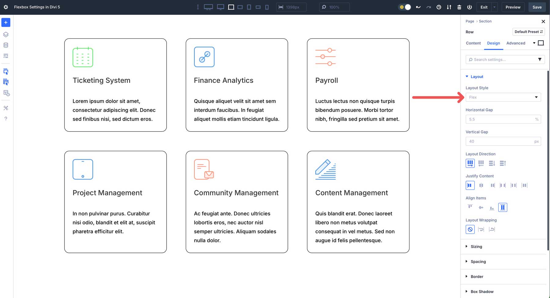
On the other hand, Block is the traditional way Divi handled layouts in the past. Elements within a block container are treated as block-level elements. This means they generally stack vertically, taking up the full available width of the parent container.
Horizontal & Vertical Gap
In Divi 5’s Flexbox settings, the Horizontal and Vertical Gap controls function as the CSS gap property. They provide an efficient way to add consistent spacing between the child elements within a container.
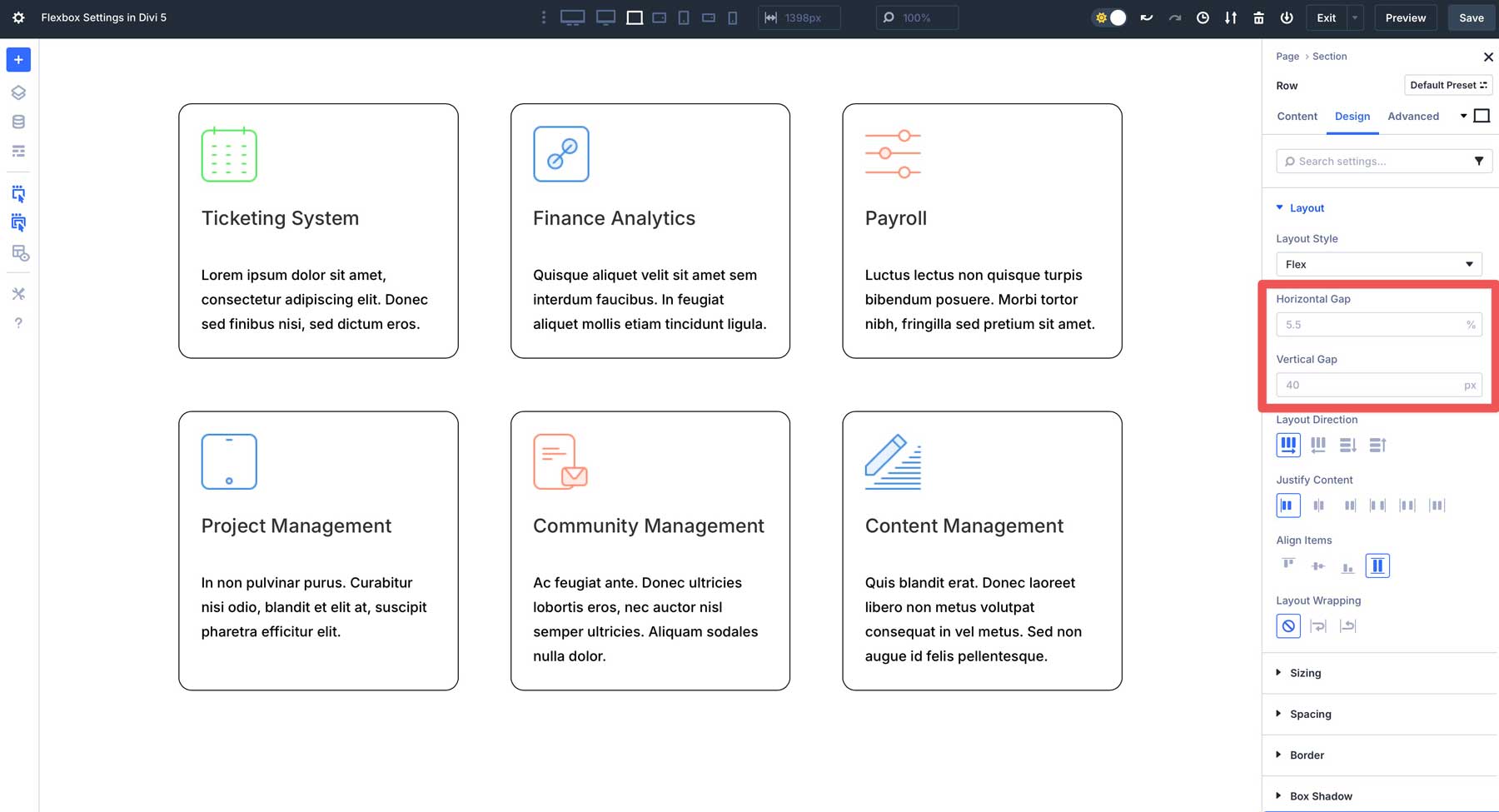
Horizontal Gap defines the space between flex items when they are arranged horizontally. In the example below, the horizontal gap creates the empty space between each column, but not on the outer edges of the flex container. By default, % is selected, but you can use any of Divi 5’s CSS properties here.
Vertical Gap defines the space between rows of items. This becomes incredibly important when you enable Layout Wrapping (more on that later). It also applies when the Layout Direction is set to column or column reverse.
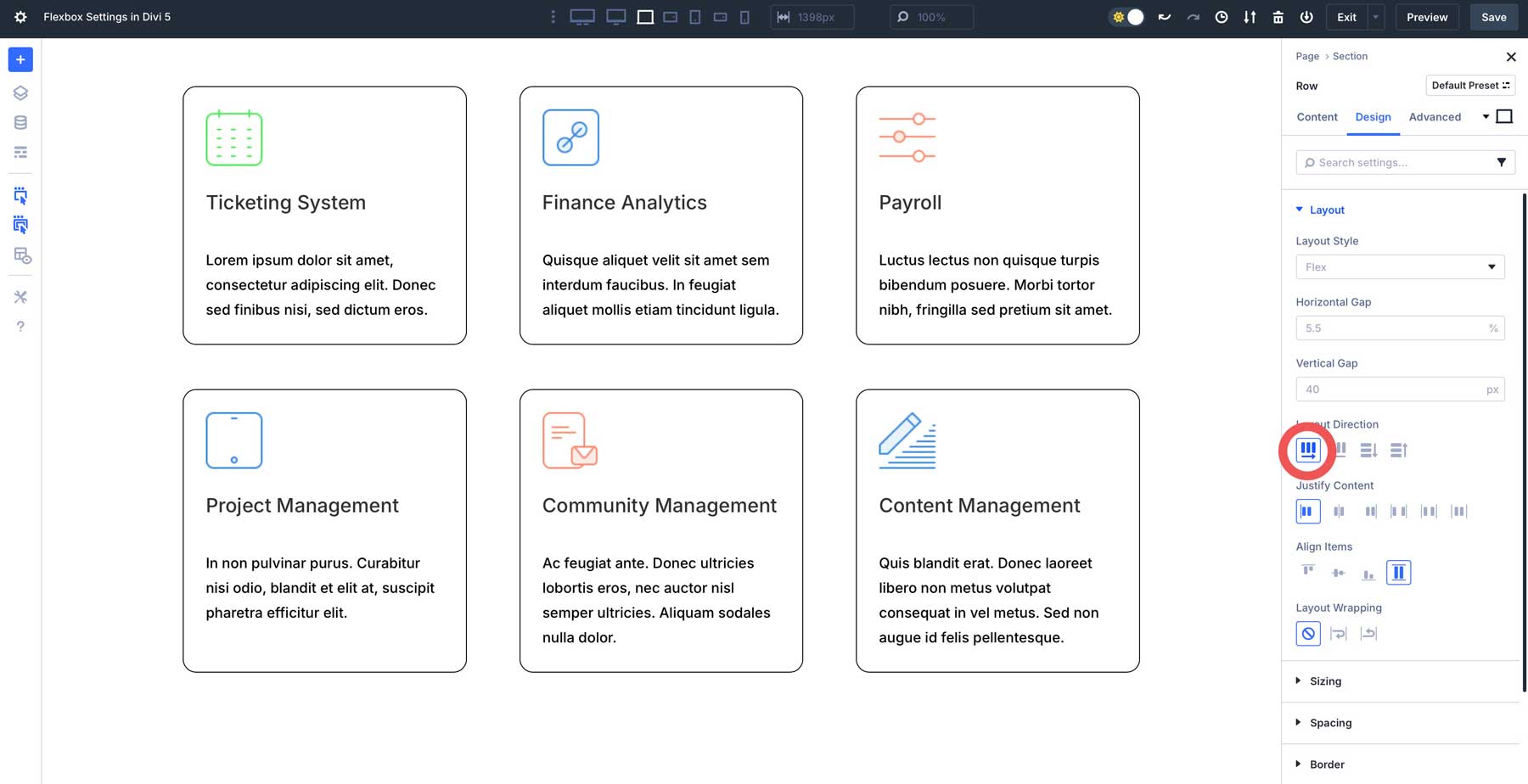
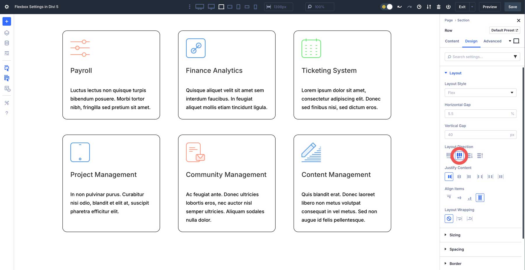
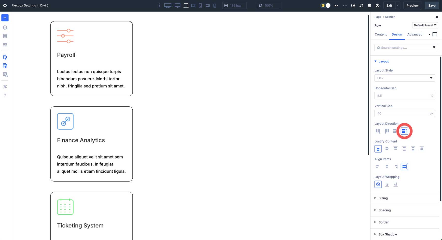
Layout Direction
The Layout Direction option in Divi 5 (flex-direction property in CSS) is one of the most fundamental controls. It determines the primary axis along which the child elements within the container will be arranged.
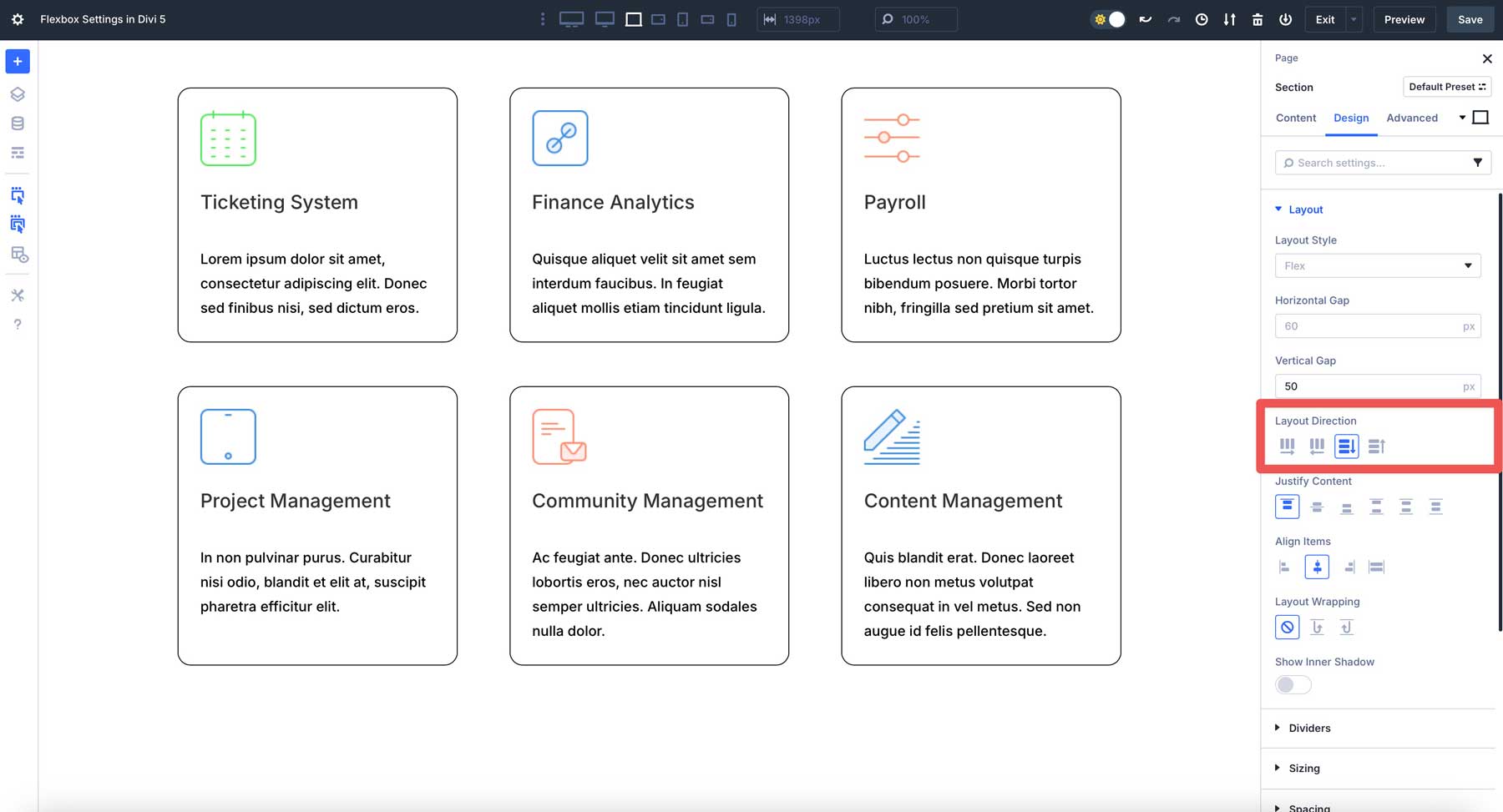
Think of it as setting up the flow of your content. There are four main choices: Row, Row Reverse, Column, and Column Reverse. Row is the most common setting. Flex items will arrange themselves horizontally, from left to right. It’s ideal for creating traditional horizontal column layouts, navigation menus, side-by-side elements, or any time you want items to flow across the page.
With Row Reverse, items still arrange horizontally, but in the opposite direction.
When you select Column, items will arrange themselves vertically, from top to bottom. This is a good option for stacking modules within a single column, creating vertical lists of content, or building layouts where elements need to flow downwards.
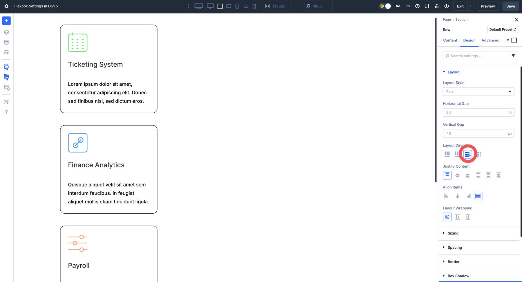
Column Reverse works the same as column, stacking items within a container vertically, but in reverse.
Justify Content
Divi 5’s Justify Content option (the justify-content property in CSS) controls the alignment of flex items along the flex container’s main axis.
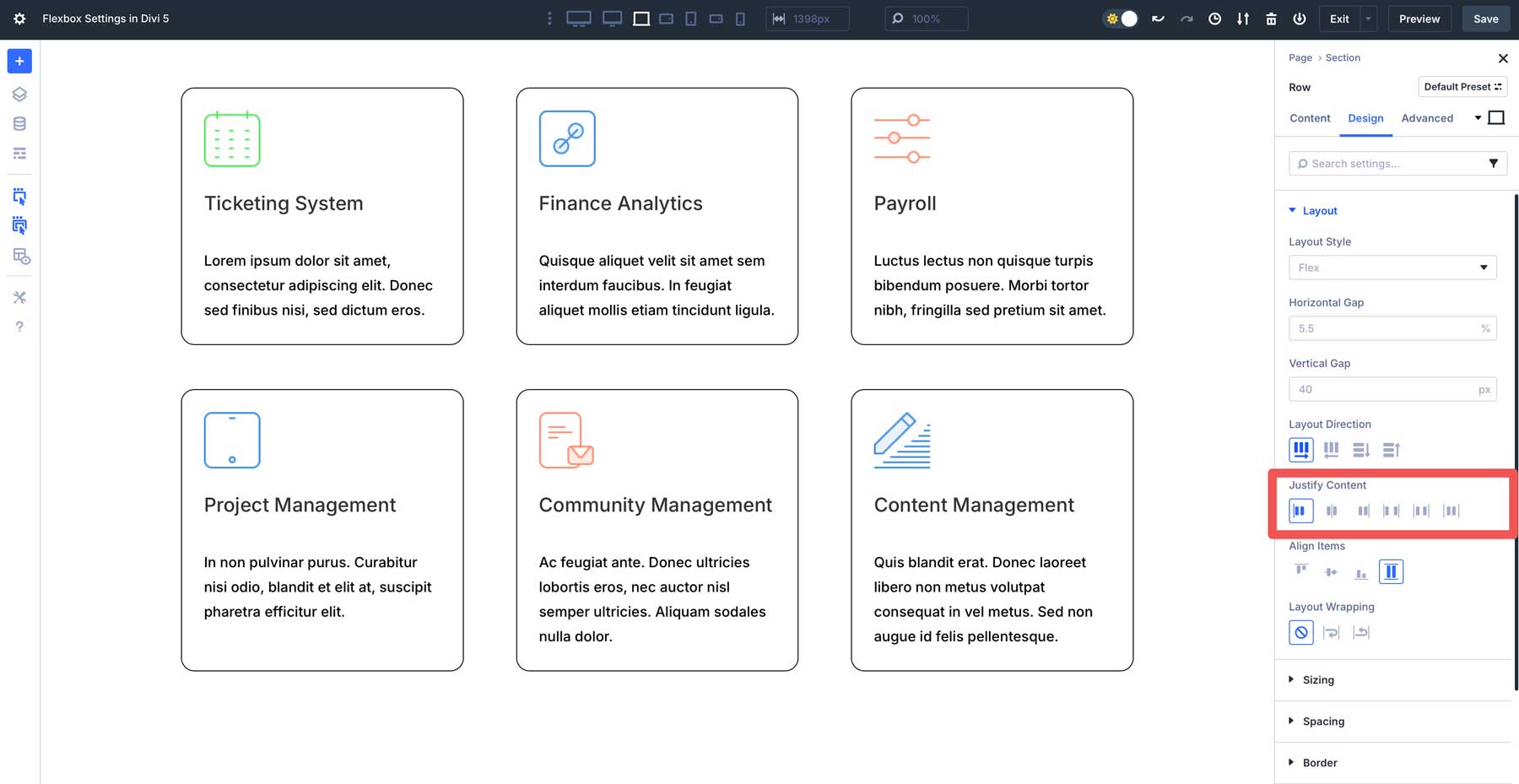
Options include Start (flex-start in CSS), which aligns items to the beginning of the main axis. Center aligns items to the middle of the main access. When you use Layout Direction > Row, items will center horizontally. If you use Layout Direction > Column, items will center vertically. End aligns items to the end (either right or bottom, depending on your Row or Column selection).
Use Space Between to evenly distribute items along the main axis. The first item aligns with Start, while the last aligns with the container’s end. Space Around distributes items evenly along the main axis, with equal space around each item. Finally, Space Evenly distributes items where the spacing between any two adjacent items and the space before the first and after the last item is the same.
Align Items
The Align Items options (the align-items CSS property) in Divi 5’s Flexbox settings control how flex items align along the flex container’s cross-axis. This option differs from Justify Content, which aligns items along the main axis.
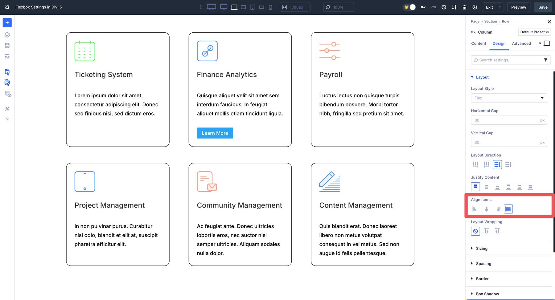
When you set Layout Direction to Row or Row Reverse, the cross-axis becomes vertical. This allows Align Items to control the vertical alignment of items within a row. If you set Layout Direction to Column or Column Reverse, the cross-axis is horizontal. Therefore, Align Items will control the horizontal alignment of the items within the column.
There are four main options, including Start, which aligns items to the beginning, Center, End, and Stretch, which stretches items to fill the full available space along the cross-axis of the container. An item with a specific height or width assigned will override the stretch.
Layout Wrapping
In Divi 5’s Flexbox settings, Layout Wrapping (flex-wrap CSS property) determines what happens when the flex items inside a flex container run out of space to wrap onto the next line when space gets tight. There are three options in Divi 5, including No Wrap, Wrap, and Wrap Reverse.
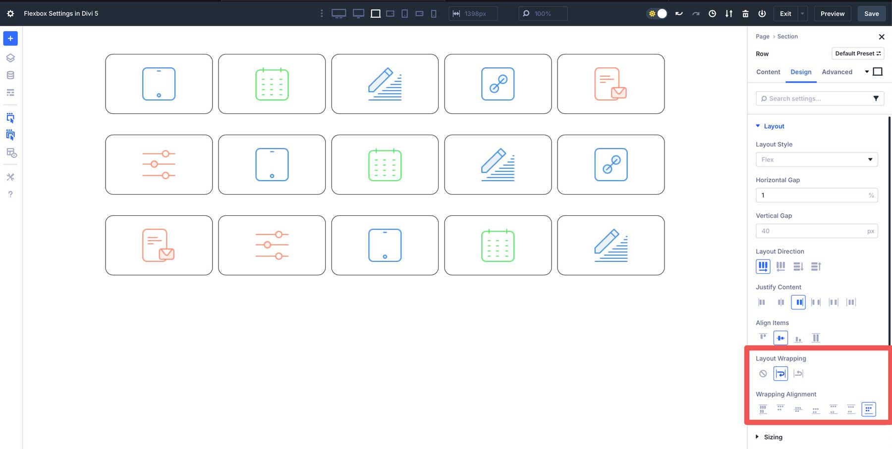
No Wrap is the default setting, which tells the flex container to try to fit all flex items onto a single line or column, regardless of available space. If the items are too wide to fit, they will overflow the container (extend beyond boundaries) or shrink to fit. Wrap allows elements to wrap onto a new line or column if they exceed the allotted space on the row. Wrap Reverse works similarly to wrap, but they do so in the opposite direction when it wraps to the next line.
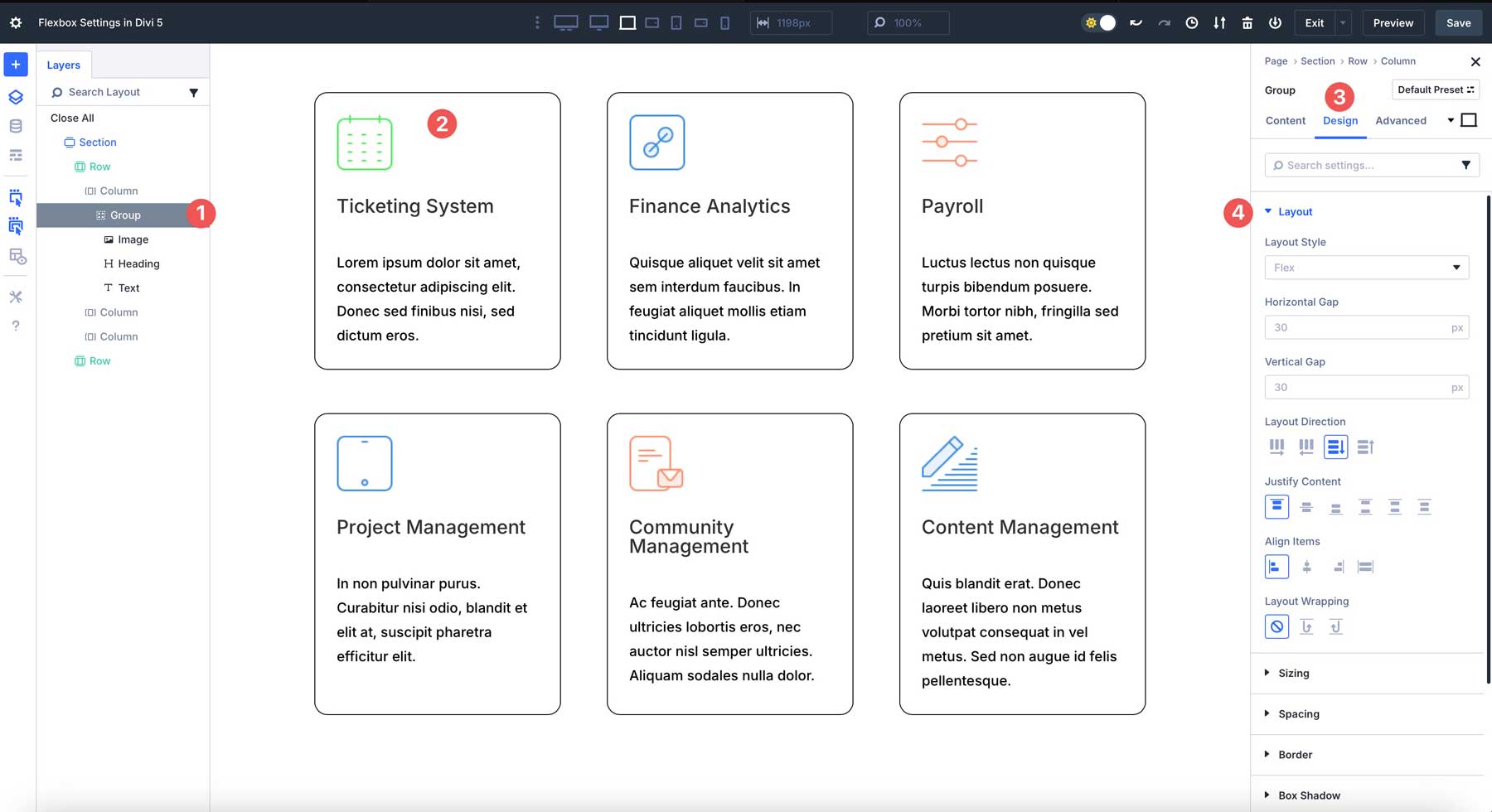
Flex Controls At The Module Level
In addition to having Flexbox controls at the section, row, and column levels, Divi 5 also gives you precise control over individual Divi modules. For example, when using a Group module, you can adjust spacing (gap), Layout Direction, and all of Divi 5’s other Flexbox settings.
Advantages Of Flexbox
Flexbox in Divi 5 isn’t just a technical upgrade. It provides a better way to build modern, responsive websites more easily and efficiently. By integrating Flexbox into the Visual Builder, Divi 5 allows users of all skill levels to harness the power of CSS without writing code. Here are some reasons why Flexbox is such an impactful upgrade from Divi 4:
Intuitive No-Code Layout Control
Divi 5 integrates Flexbox settings directly into the Visual Builder, letting you adjust alignment, spacing, and ordering with simple options. Whether you’re creating equal column heights or centering content vertically, Flexbox makes complex layouts easy.
Better Responsive Design
Divi 5’s Flexbox Layout System makes responsive design a breeze, thanks to customizable layout controls for desktops, tablets, and smartphones. Divi’s Change Column Structure option allows you to change the number of columns on tablets and smartphones, while leaving the layout’s column structure intact on desktops.
Flexbox + Nested Rows
Combining Nested Rows and Flexbox in Divi 5 allows you to easily build intricate, multi-level layouts. For example, you can create a row with columns containing its own row, enabling sophisticated designs like grids or layered content sections.
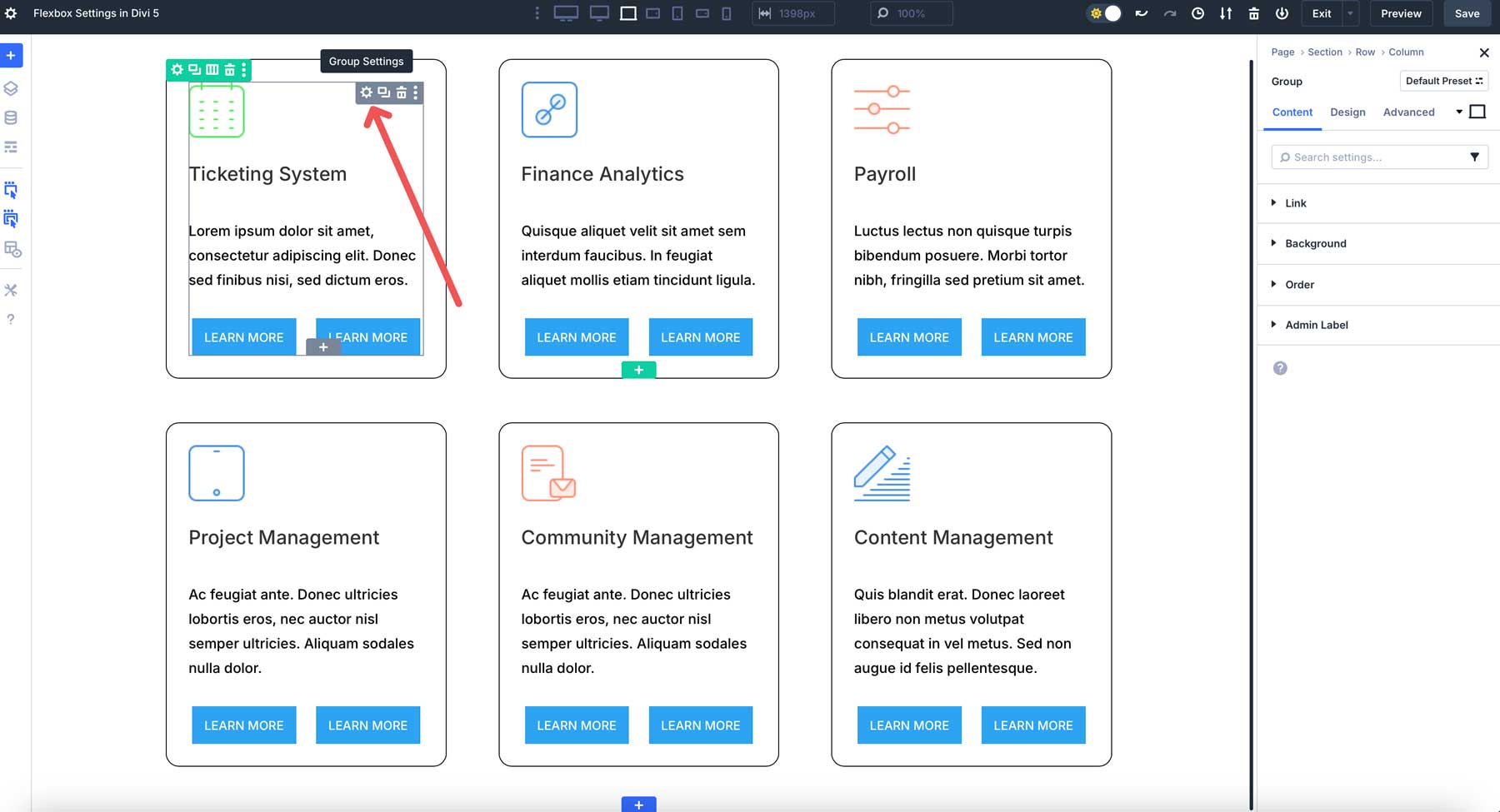
Flexbox + Module Groups
Module Groups in Divi 5 act as flex containers, allowing you to style and position group modules as a cohesive unit. This makes it simple to create dynamic sections, such as feature boxes or testimonial cards, that automatically adjust to content changes while maintaining consistent spacing and alignment.
Improved Performance & Simplicity
By replacing Divi 4’s specialty and fullwidth sections with a unified flexbox-based system, Divi 5 streamlines the design process, reducing complexity and improving performance. This means faster load times and a smoother editing experience, especially for large or content-heavy websites.
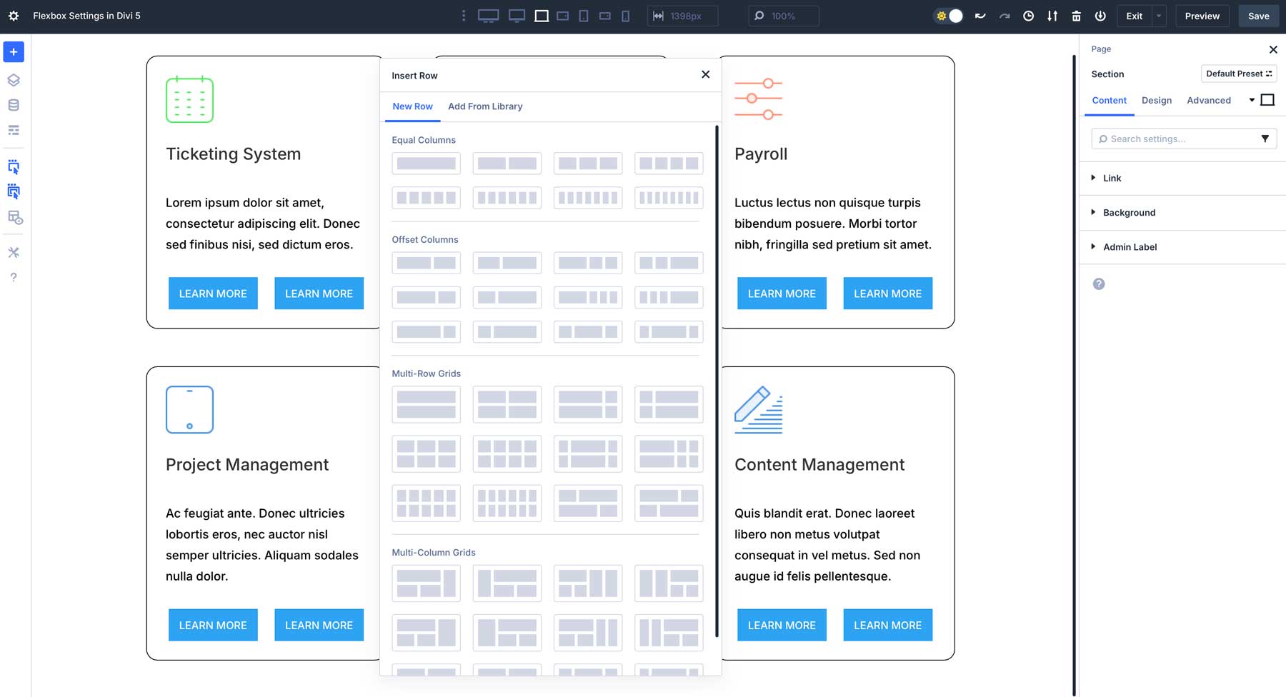
Prebuilt Flexbox Templates For Quick Starts
Divi 5 introduces new row templates that leverage Flexbox to provide predefined, flexible layouts like Equal Columns, Offset Columns, Multi-row Grids, and Multi-Column Grids. These templates inspire creativity, letting you jumpstart designs with fully customizable structures via Flexbox settings.
Future-Proof Design Workflow
As Divi 5 continues to evolve in its Public Alpha phase, its Flexbox Layout System positions Divi users at the forefront of modern web design. By mastering Flexbox now, you’re equipping yourself with the skills that align with industry standards, ensuring your websites remain adaptable to future updates.
Unlock Creative Potential With Flexbox In Divi 5
Flexbox in Divi 5 changes the way users build responsive, dynamic layouts. Divi 5 allows users to create stunning, modern websites without writing code by seamlessly integrating powerful CSS Flexbox properties into the Visual Builder. From intuitive alignment and spacing controls to advanced features like Nested Rows and Module Groups, the Flexbox Layout System simplifies complex designs while ensuring perfectly responsive layouts that look great on all devices.


Very very useful! Thanks.