
Skipping the process of assigning semantic wrappers can feel tempting. It often means building the page first, then going back to configure tags for each element, and repeating that work on every new section or page.
Divi 5 removes this friction by using presets. You can define semantic tags once at the default level, and every element you add afterward will automatically follow the correct HTML structure.
In this post, you will learn which preset settings to configure so your builds are semantically sound from the start, even before you begin creating pages. Have a look!
Every element on a webpage is wrapped in a tag. Some tags describe the type of content they contain. These are semantic tags. The word semantic means “relating to meaning,” so semantic tags add meaning to your markup.
Tags like header, nav, main, section, article, aside, and footer fall into this category. A header tag tells browsers this content functions as a header. A nav tag indicates navigation. An article tag marks content that stands alone, like a blog post. Each tag describes what is inside it, not just that something exists there.
Other tags serve as neutral wrappers that do not describe the content type. These generic containers hold elements together for styling or layout, but convey nothing to browsers about the page’s function or purpose.
And Why They Matter
Screen readers rely on semantic tags to help visitors move through your site with ease. When you label your sections properly, people can skip straight to what they need. They don’t have to wade through every element in order. Your markup becomes functional, not just visual.
Search engines read the same code. Their bots scan for semantic signals to figure out how your content connects and which parts carry the most weight. Clean tagging gives them a clear map of your site. They can’t see your layout or styling anyway, so the markup itself does the heavy lifting.
Divi 5’s Presets: A Powerful, Connected Design System
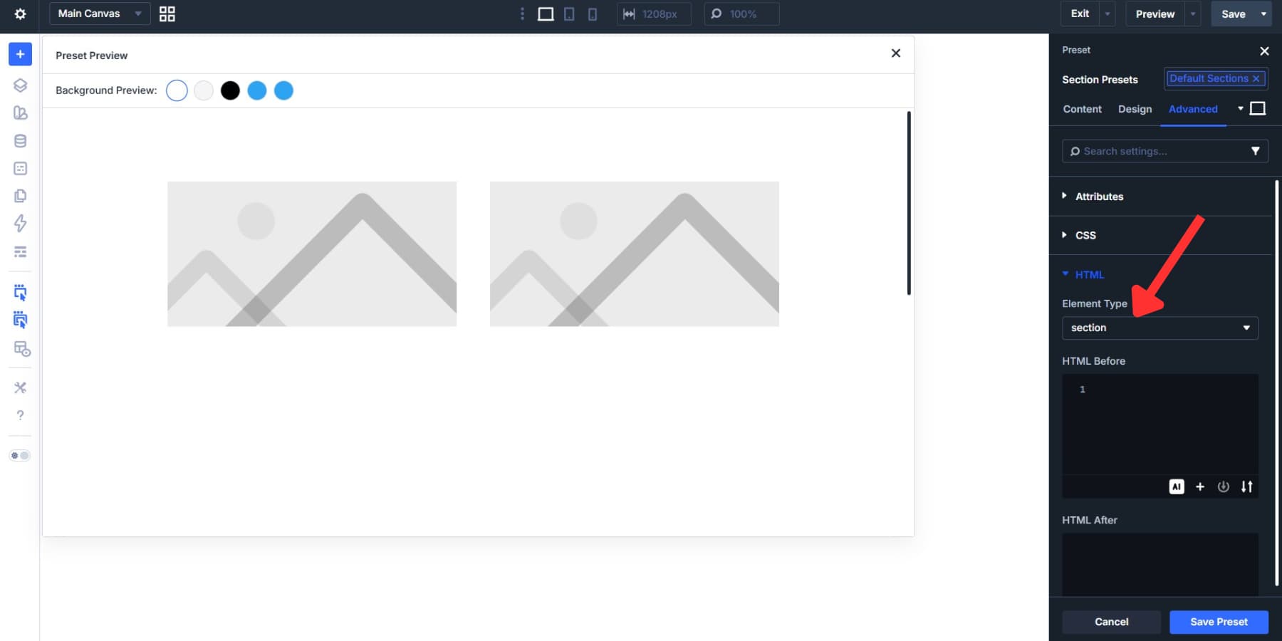
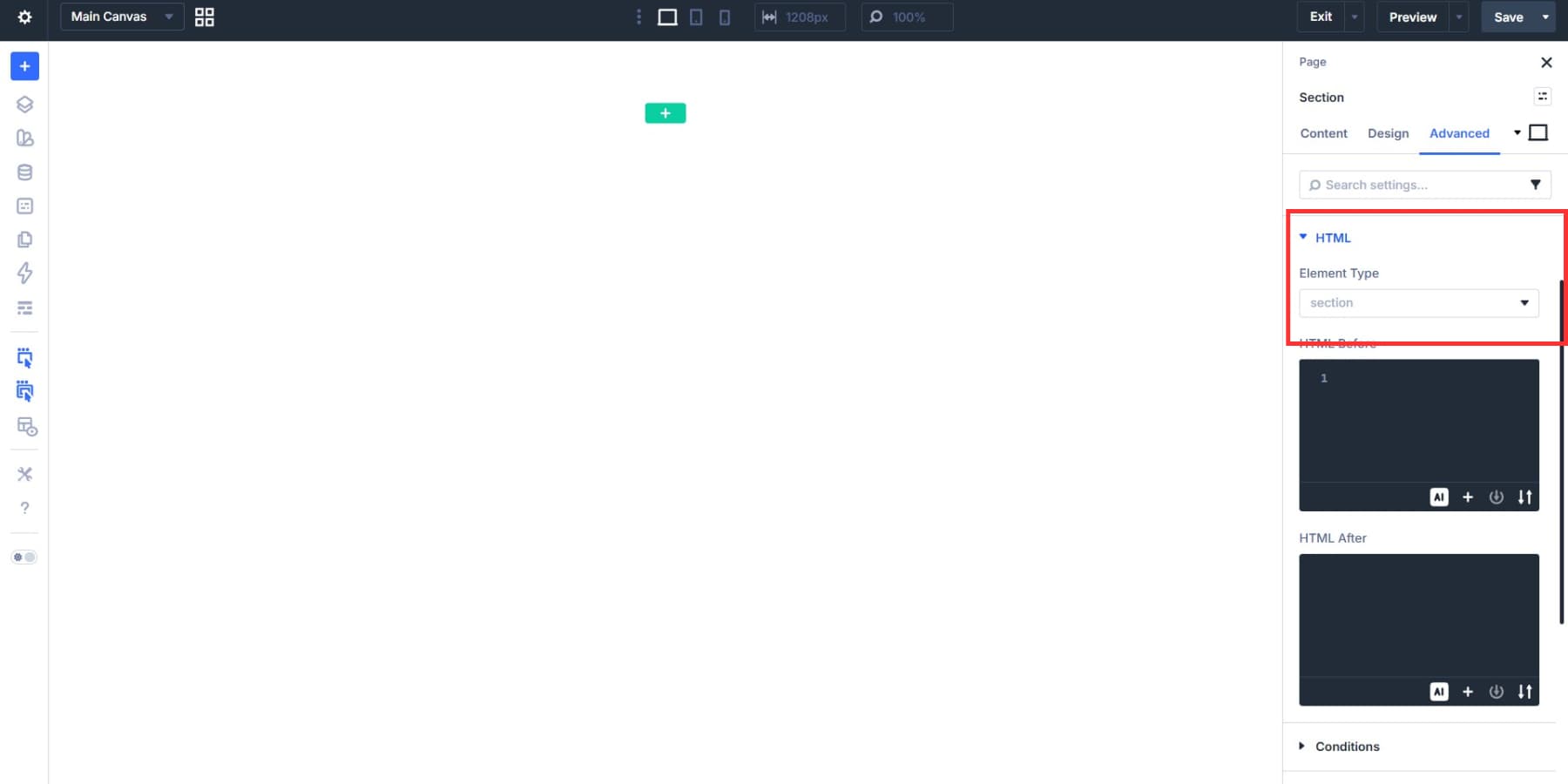
Divi 5 adds an HTML option group to the Advanced tab of every element’s settings, including sections, rows, columns, and modules. Open any element’s settings, and you can select an Element Type from semantic tags like header, nav, main, article, aside, footer, and more.
This setting replaces the default wrapper tag with the tag you choose, wherever needed. You can also bake those choices into presets, so every new element you create already has the correct Element Type attached. The preset system in Divi 5 has a specific structure, and knowing where semantic tags fit into that structure determines how well your workflow scales.
Here’s how Divi 5’s preset system works:
Option Group Presets And Element Presets
Option Group Presets form the backbone of Divi 5’s design system. Each one controls a single option group. You get presets for borders, shadows, text, animations, and interactions.
Save a border radius as one preset. That radius can pull from a Design Variable. Save a shadow setup as another preset. Now apply both to completely different spots on your site. A border preset you made for a column works the same way in a blurb or call to action.
Nothing ties these presets to one element type. They move freely anywhere the same option group exists. You can nest them, too.
Element Presets go deeper. They capture every style detail of individual elements, such as buttons or sections. They only work within matching modules. Save an Element Preset for a button, and you store it all. Colors, spacing, fonts, shadows, borders. Everything gets bundled together. Apply that preset to any button and your design stays consistent.
Element Presets can stack as well.
How They Work Together
This two-tier structure gives you flexibility. Option Group Presets let you control individual option groups with precision. Element Presets give you speed when you need complete designs ready to go. Element Presets can also reference Option Group Presets.
This creates a connected system. Consistency gets built in automatically.
Use a text option group preset in a blurb element. That same preset can style text in your accordions, tabs, and other elements. When you need to make changes, you update once. No need to hunt down and edit each element preset separately.
The Preset Manager
The Preset Manager gives you one workspace for your entire preset library. Click the icon in the sidebar to see every preset you’ve created, organized in a searchable, filterable list with both Option Group Presets and Element Presets.
Add new presets right from this panel, plus edit, duplicate, delete, reorder, or set defaults without hunting through individual elements on different pages.
This control saves time as your library grows. When you edit a preset here, a live preview appears next to your settings so you see exactly how changes look without touching your actual page content.
You can set the preview against different background colors from your site’s variables, catching contrast issues before they go live.
Presets already hold your visual styles: colors, spacing, typography. Adding semantic tags keeps your markup decisions alongside your design choices in one place.
This becomes relevant as sites grow. A 3-page portfolio might stay manageable, but a 50-page business site with multiple team members can fall apart quickly. Someone might wrap content in article tags, while another might skip them entirely. Semantic choices start being spotty, and pages end up inconsistent. Fixing it means manually checking every single instance.
Storing semantic tags in default presets solves this at the source. When you adjust something, you update the preset. The change flows to every element where the preset applies, and you get a single reference point for your entire markup structure.
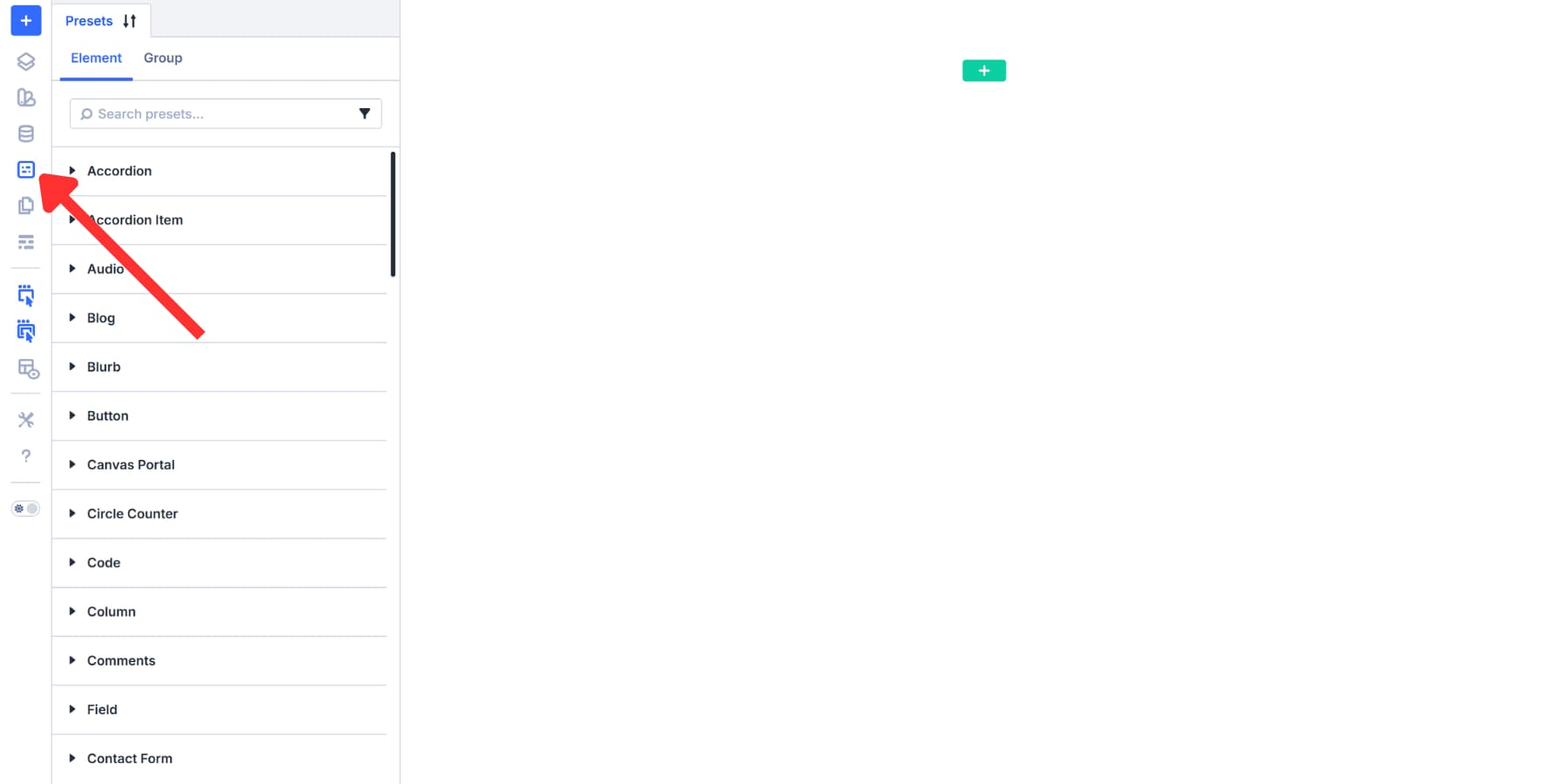
Let’s start by creating column presets, since columns are one of the most used elements. Click the Preset Manager icon in your sidebar. This opens a panel with two tabs: Elements and Groups.
Before You Make A Choice…
You can save a column’s semantic tag in two places: inside a Column Element Preset or as an HTML Option Group Preset. Both approaches work. The difference is in how reusable they are.
Element Presets are tied to a single element type. A Column Element Preset can include the HTML option group settings, including Element Type. That is convenient when one preset equals one complete column pattern. But if you want the same styled column to be used with different semantic wrappers (for example, sometimes main, sometimes aside), you end up duplicating the same column styling across multiple Column Element Presets just to change the Element Type.
Option Group Presets are reusable anywhere that the same option group exists. So if you create an HTML Option Group Preset that only sets Element Type, you can keep your column styling in one Column Element Preset, then layer the semantic wrapper choice on top by selecting a different HTML Option Group Preset when needed. That keeps the styling and the semantic wrapper independent, which is usually easier to maintain at scale.
Building Common HTML Option Group Presets For Columns
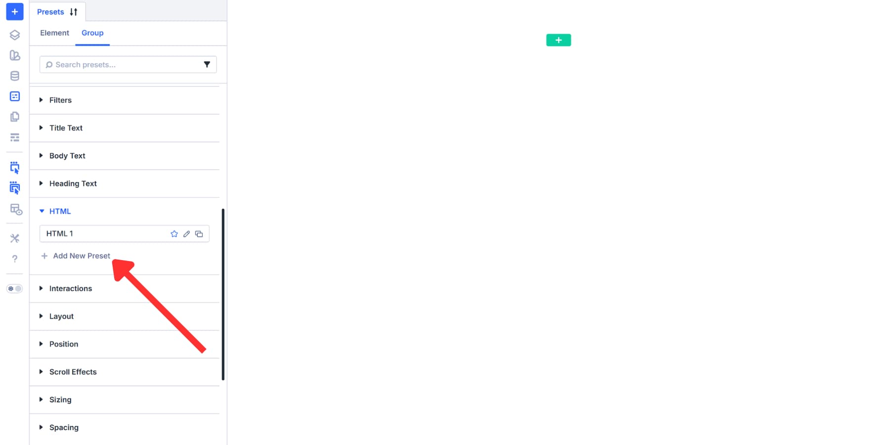
Go to the Groups tab. Search for “HTML” or scroll to find the HTML option group. Select it and click Add New Preset. The settings panel opens.
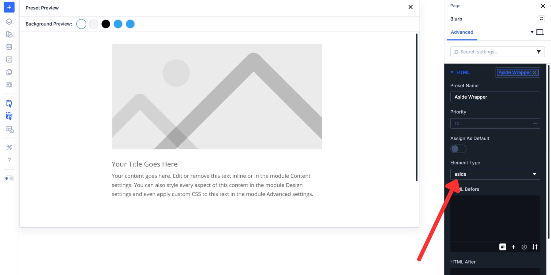
Set the Element Type dropdown to aside. Name this preset “Aside Wrapper” and save. This tag should be used for supplementary content like author bios, related posts, or promotional widgets that relate to, but stand separate from, the main story.
Consider adding presets for other common wrappers as well:
- Main Wrapper: Set Element Type to main. This identifies the primary content column. Use once per page for the core content that visitors came to see.
- Nav Wrapper: Select nav for columns containing menus, category lists, or site navigation links.
- Section Wrapper: Pick section for columns grouping related content under a theme. Product features or service listings fit here.
- Article Wrapper: Choose article for standalone content like blog posts, news stories, or product descriptions.
Now, you have presets ready for the five most common column tags.
We didn’t assign any of these as a default because each column on a page serves a different purpose. Setting one tag as default means every column you drop onto the page inherits the same wrapper, and most of them will be wrong. Incorrect semantic tags mislead screen readers and search engines the same way missing tags do. Apply these presets as needed.
Go back to the Element tab, find “column”, and create Element Presets for your columns. Add colors, spacing, borders, shadows, and more. The best workflow here is to create Option Group Presets for your styles and reference them, while also using Design Variables to keep values consistent across modules.
Configure Default Presets
Columns offer flexibility, so Option Group Presets work well there. There are instances where assigning a default Element Preset makes more sense. Let’s take a look.
Building A Preset For Sections
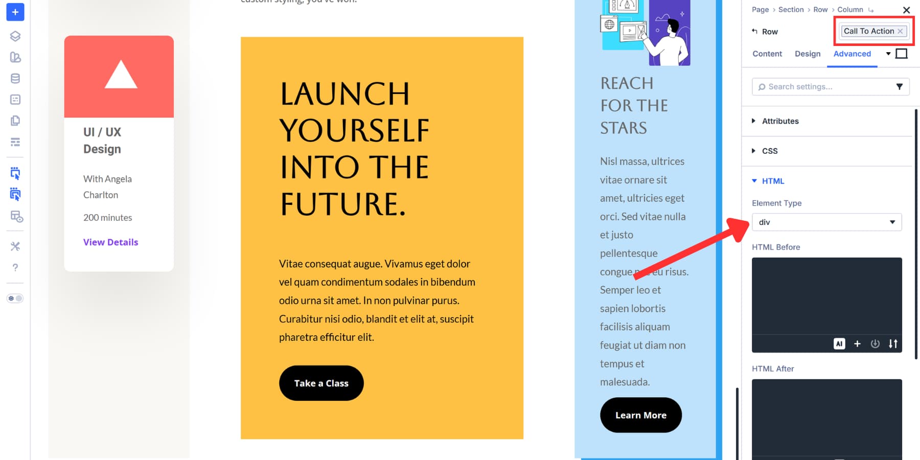
Start with sections. Open the Preset Manager and find Section under Elements.
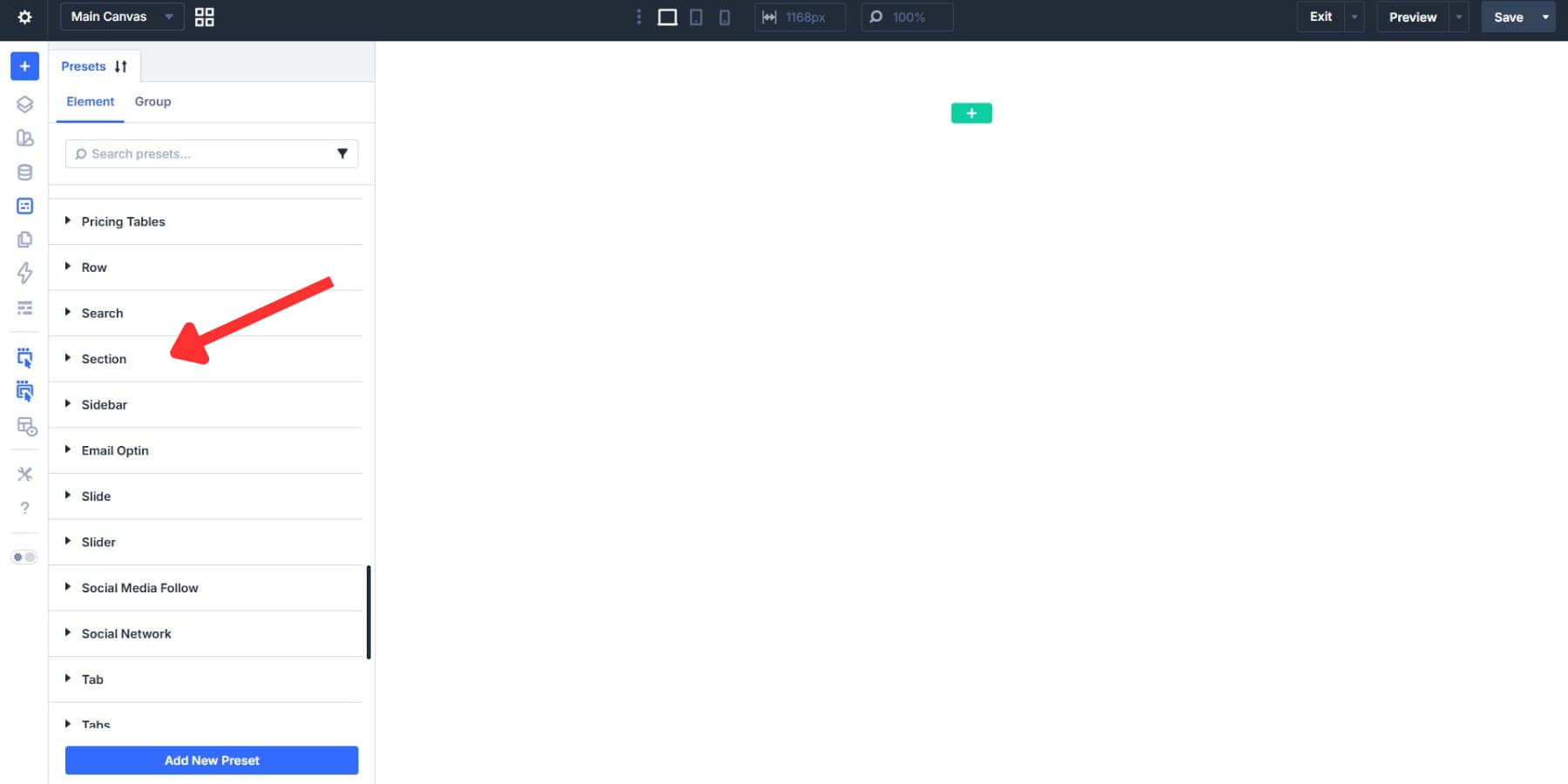
Click Add New Preset. Style it as needed, then go to the HTML option group and set Element Type to section.
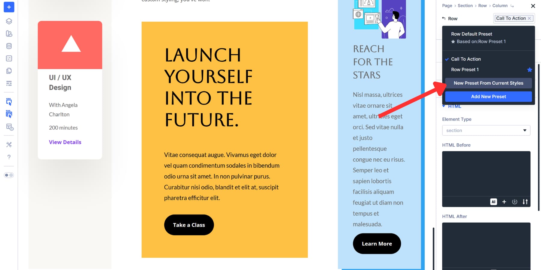
Toggle “Assign As Default” on and save.
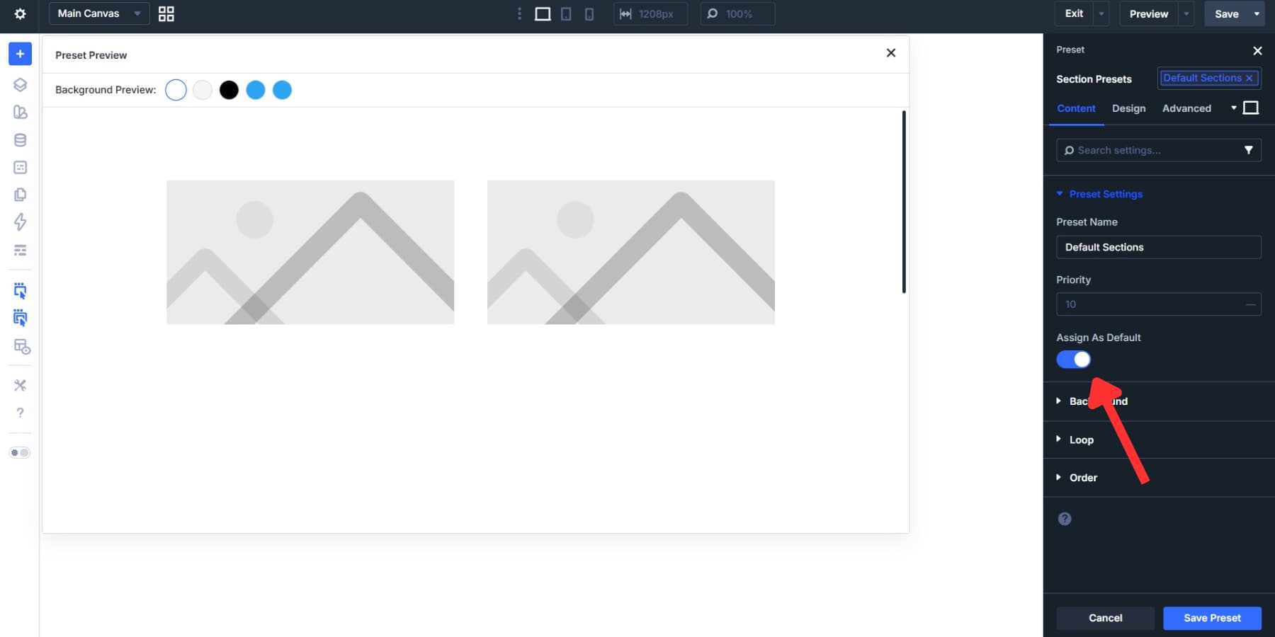
Now add a fresh section to any page. Open its Advanced settings, and the HTML option group already reads section. The tag is there before you place a single row or module inside it. That toggle makes a preset active rather than keeping it in your library.
If a particular section needs a different tag, just select one of the HTML Option Group Presets you created earlier from the HTML option group. That swap only affects the setting you changed. Everything else stays intact without breaking the system.
This approach maintains structure while still allowing customization. Build with presets as your foundation, then adjust specific elements when your design requires something different.
Adding HTML Tags For Icon Lists
Let’s walk through another example using an Icon List and Icon List Items:
Now, find Icon List under Elements in the Preset Manager. Click Add New Preset. This creates an Element Preset that captures everything about your icon list in a single place.
Style your list first. Set colors, spacing, and typography. Pick your icon style and size. Now add the HTML wrapper. Set Element Type to ul for an unordered list. This makes your list semantically correct by default.
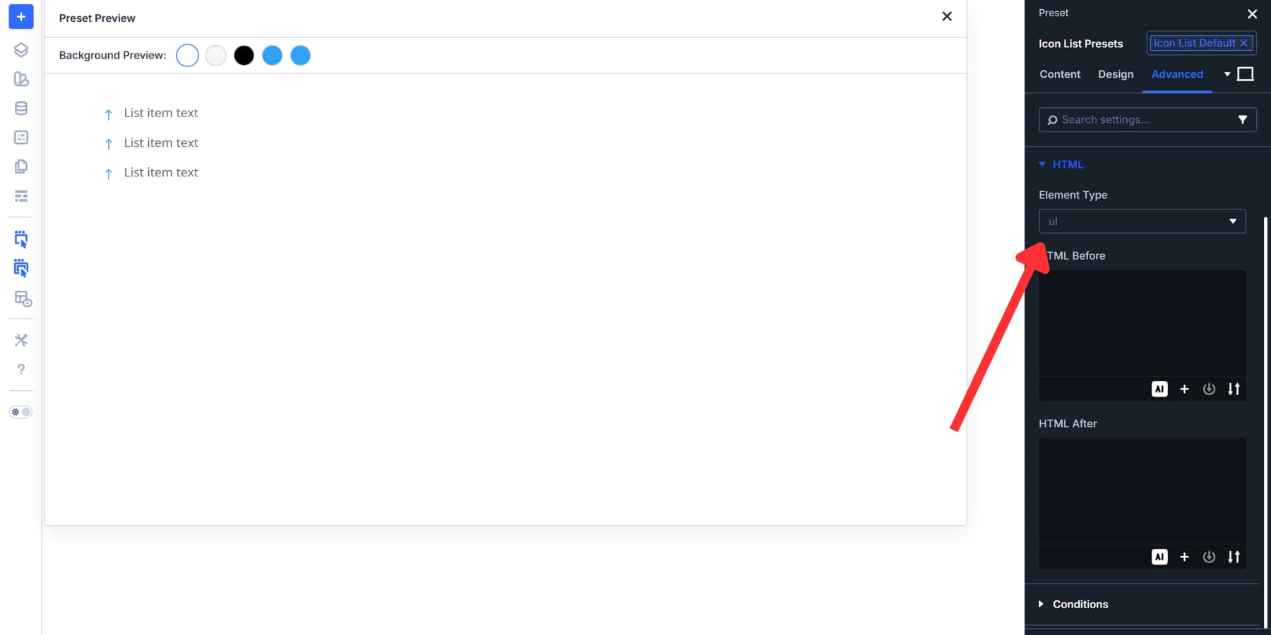
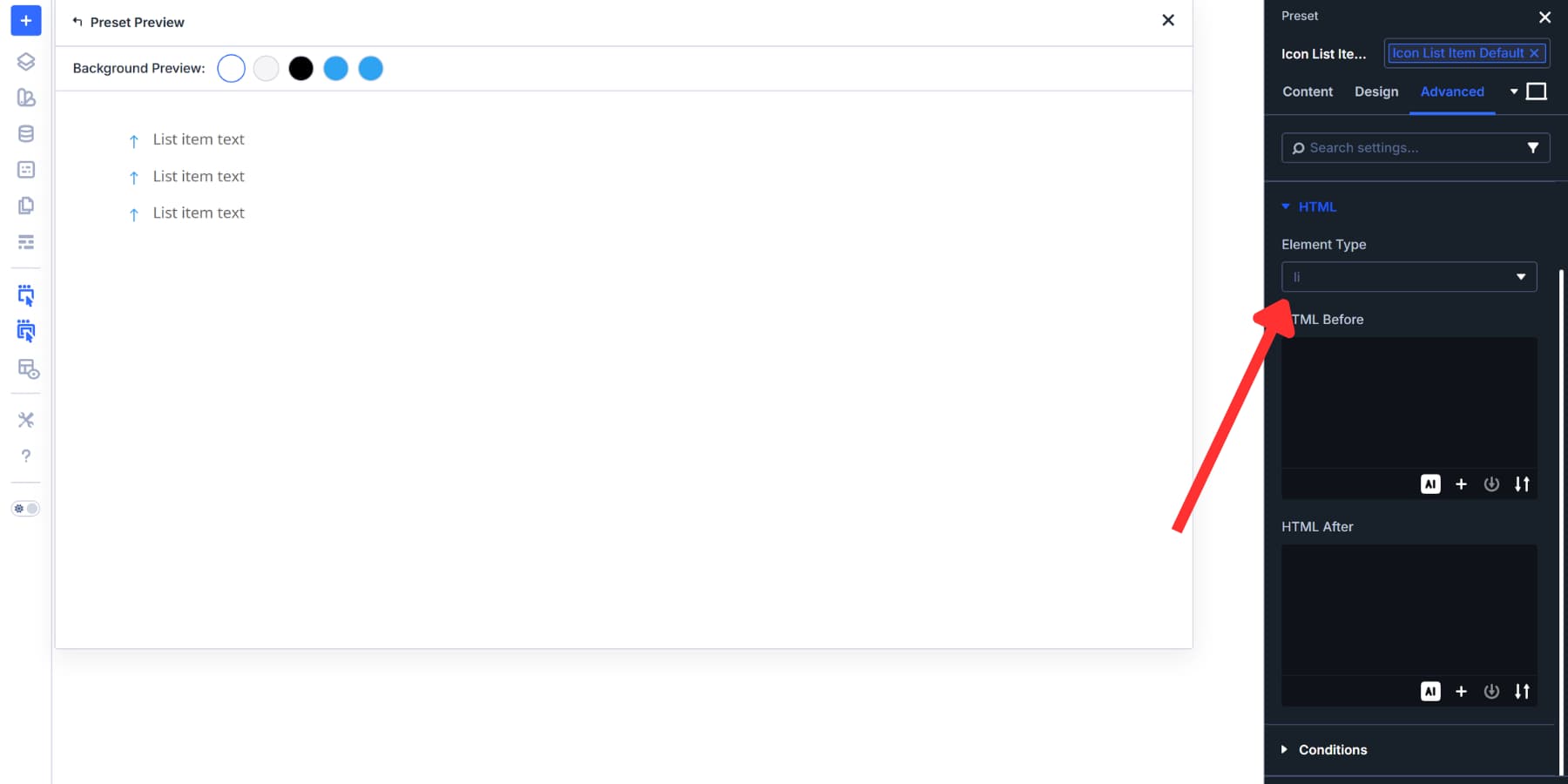
Then, find the Icon List Item in the Elements list. Click Add New Preset. This styles your individual list items. Set colors, spacing, and typography for the text. Pick your icon style and size.
Set Element Type to li since each item becomes a list item.
Before saving each preset, toggle “Assign As Default” on. Do this for the Icon List preset and again for the Icon List Item preset.
Now, add a brand new Icon List module to your page. Open its settings. The Element Type already reads ul. Open any list item, and the Element Type already reads li. Both tags are there before you configure anything. No dropdown opened. No option group touched.
Adding Accessibility Attributes
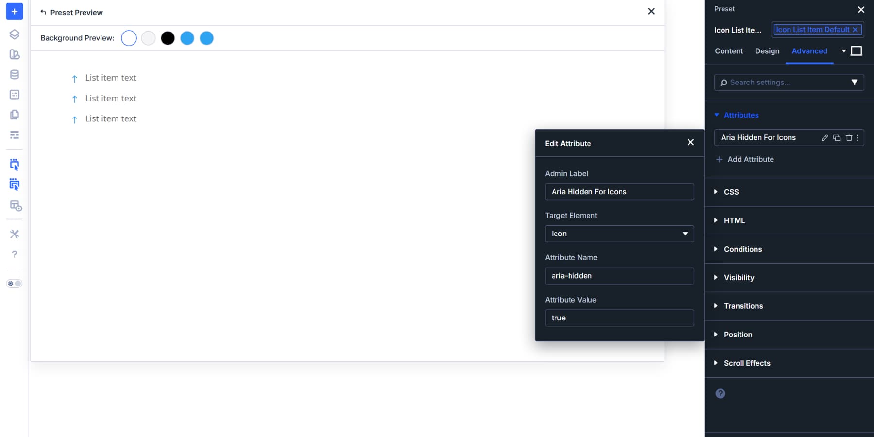
While you are there, under Attributes, click Add Attribute. Set Target Element to Image or Icon, Attribute Name to aria-hidden, and Attribute Value to true.
Icons in Icon Lists are usually decorative. They add visual interest but don’t convey meaning that screen readers need to announce. Hiding them keeps the experience cleaner for people using assistive technology.
In this case, we baked the wrappers (and attributes) directly into the Element Presets because you will rarely need anything beyond the wrapper and accessibility setup once they’re configured.
These tags are ideal defaults for the Icon List and Icon List Item, but we included the steps anyway as a helpful example of when to use Element Presets versus Option Group Presets.
Likewise, elements like Image and Button already use appropriate tags by default, and respectively, so their Element Presets should focus purely on visual styling instead. No Option Group Preset is required for those elements either, since proper tags are applied from the start.
Apply These Presets Across Your Site
Applying your presets works through two simple paths, depending on where you stored what:
For HTML wrapper Option Group Presets: go to Advanced > hover over the HTML option group > preset icon, and select your Option Group Preset.
To apply an Element Preset, click the preset selector at the top right of the settings panel and choose your Element Preset from the dropdown.
As we mentioned earlier, these presets aren’t fixed constraints. Everything remains adjustable. Apply an Element Preset, then swap out individual option groups within it for different effects. Or add custom values directly to specific settings. Either way, only the setting you touch changes. Everything else stays intact.
Creating Presets From Existing Parts
Maybe you built your site before thinking about semantic tags. The pages work fine, but everything still uses generic div wrappers. You can add proper markup to those existing elements and turn them into presets simultaneously.
Open any section, row, column, or module on your site. Go to Advanced settings and find the HTML option group. Set the Element Type to the right semantic tag for what that element does.
Once configured, hover over the HTML option group and click the preset icon that appears. Choose Create a new preset from your current settings. Name it clearly, like “Article Wrapper” or “Nav Column.”
The same works for Element Presets.
Extend HTML Wrappers To Multiple Elements
Maybe you set Element Type to aside on one column, then realized a few others across your page need the same semantic tag. Extend Attributes can apply that wrapper choice in a single action, rather than opening each element separately.
Right-click the HTML option group and select Extend Attributes.
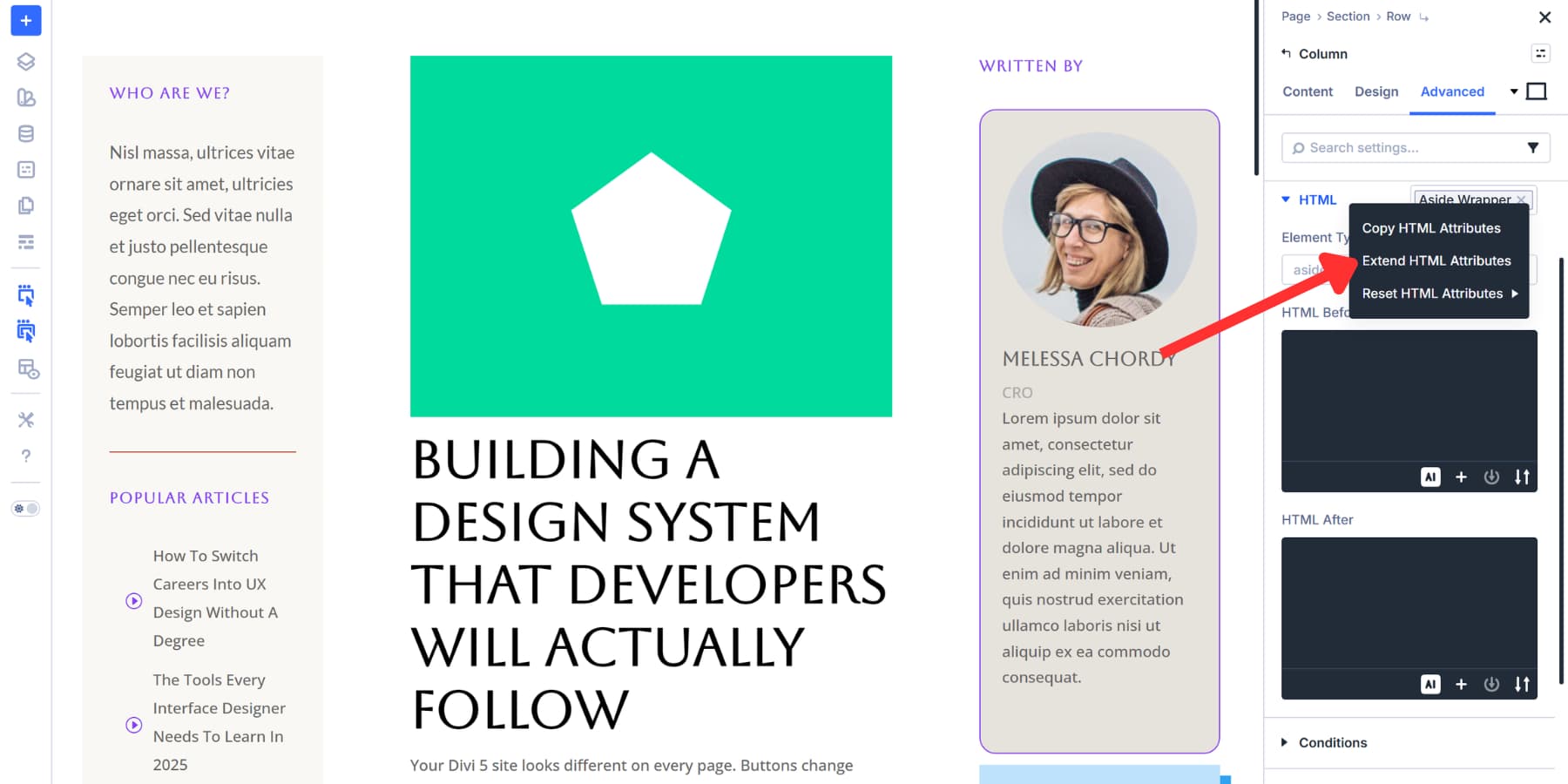
Set your scope to Entire Page, pick which element types to target, and click Extend Attributes. This extends the Element Type setting without touching any styling.
Every matching element inherits that semantic wrapper instantly. Use this when retrofitting sites or when you realize partway through a build that multiple elements need consistent markup. But if your presets already handle wrapper allocation properly, you won’t need this step at all.
Try Semantic Elements In Divi 5 Today!
Your site’s semantic foundation gets set before you place the first module. Default presets handle the markup work automatically, so every new element follows proper structure without extra steps.
You won’t need to retrofit anything later or manually check dozens of pages. And when you do need to, Divi 5 provides tools like Extend Attributes to help you apply consistent markup quickly.
Download Divi 5 and let presets do the heavy lifting while you build pages that work well for everyone who visits.


Leave A Reply