
Accordions and toggle content have traditionally required JavaScript to handle the interaction correctly. Modern HTML includes native elements that get you closer to a non-JavaScript version of that.
<details> and <summary> elements create functional disclosure widgets using nothing but a couple of simple elements. These elements handle expand/collapse behavior automatically, support keyboard interaction out of the box, and work without any extra JavaScript.
Divi 5’s Semantic Elements allow users to work with these native HTML elements (and many others) directly within the Visual Builder. You can construct toggles using Divi’s layout elements while outputting clean, semantic HTML that browsers understand natively. This post covers how to build a custom toggle using Divi 5’s Element Type settings, Divi design settings, and some simple CSS to make it all really smooth.
Understanding The Details And Summary Elements
The <details> element creates a disclosure widget that users can open and close. The <summary> element provides the clickable label that toggles visibility of the content enclosed within <details>. Everything inside <details> that isn’t the <summary> remains hidden until the user clicks to expand it.
Browsers render a small disclosure triangle next to the summary text. Clicking anywhere on the summary toggles the visibility of the remaining content. The element is keyboard-accessible by nature, and screen readers can announce the expanded or collapsed state via native semantics. That means you typically do not need ARIA to communicate the open or closed state, because the elements do that natively.
The <details> element also accepts an open attribute to display the content expanded by default. Adding a shared name attribute to multiple <details> elements groups them into an exclusive accordion where only one can be open at a time. This is a newer enhancement, so test if you need to support older browsers.
Building Toggles With Divi 5’s Semantic Elements
This approach uses Divi 5’s Element Type option to assign semantic HTML tags to containers and modules. The result is a toggle built entirely within the Visual Builder that outputs proper <details> and <summary> markup. This is not using the Toggle Module at all — just a Group and a couple of Text Modules.
Setting Up The Structure
The toggle requires three elements: a Group Module that becomes the <details> wrapper, a child element that becomes the <summary> label, and a sibling element that holds the collapsible content.
Add a Row to your page with a single-column layout. Inside that Column, add a Group Module. This Group will serve as the outer <details> container. Using a Group Module instead of the Column itself allows you to stack multiple toggles within the same Column.
Go ahead and style your heading if you need to make it easy to read.
Converting The Group To A Details Element
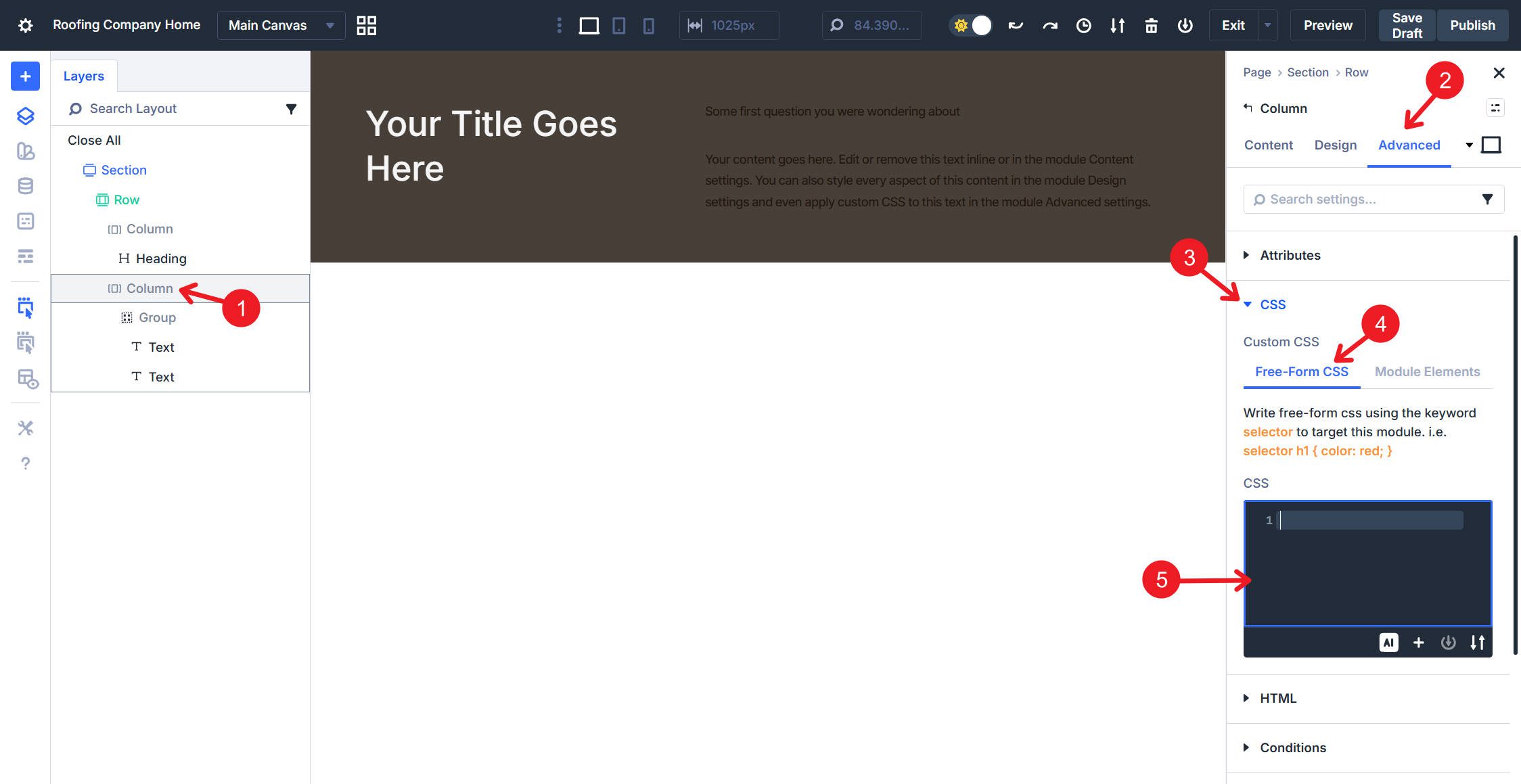
Click the Group Module to open its settings. Navigate to the Advanced tab and locate the HTML option group. Click the Element Type dropdown and select details from the available options.
This changes the Group’s HTML output from a generic <div> to a <details> element. The Group retains all its visual styling and layout capabilities while gaining the native toggle behavior.
Adding The Summary Element
Inside the Group, add a Text Module. This module will become the clickable toggle header. Open the Text Module settings and go to the Advanced tab. In the HTML option group, change the Element Type to summary. Return to the Content tab and enter your toggle header text. This text becomes the clickable label that users interact with to expand and collapse the toggle.
At this point, the toggle appears broken — no disclosure triangle, and clicking does nothing. Because we used a pre-existing module, some styles conflict with the browser-native detail and summary elements. However, we’ll be customizing the toggle ourselves anyway, so we’ll fix everything with custom CSS. This will give us more ways to style it.
Adding The Collapsible Content
Add another Text Module inside the same Group, positioned below the summary Text Module. This module holds the content that appears when the toggle is expanded. Leave the Element Type at its default of <div>. Enter the content you want to display when the toggle is opened. This can include formatted text, links, or any content the Text Module supports. You can also add additional modules (images, buttons, etc.).
Adding The Disclosure Chevron
Let’s add some basic styles to the Group, including a background color, padding (just on the top, left, and right, not the bottom), and a border radius.
Now onto the toggle. The toggle needs CSS to display a visual indicator. This CSS adds a chevron from Divi’s built-in icon font that sits after the summary text and flips 180 degrees when the toggle opens. Add it to the Column holding the toggles under Advanced > CSS > Free-Form CSS:
details > summary {
 list-style: none;
 cursor: pointer;
}

details > summary::-webkit-details-marker {
 display: none;
}

details > summary::after {
 content: "\33";
 font-family: "ETmodules";
 font-size: 24px;
 margin-left: 10px;
 transition: transform 0.3s ease;
 line-height: 1;
 display: flex;
 align-items: center;
 justify-content: center;
}

details[open] > summary::after {
 transform: rotate(180deg);
}

.et_pb_group > :not(summary) {
 padding-bottom: clamp(0.7rem, 0.6rem + 0.6vw, 1.1rem);
}
Let me explain each part of the code and show you what each does through successive videos.
First, we completely remove the default triangle used. We will use our own icon. Marker rendering and styling vary by browser, so this CSS removes them where supported and replaces them with a consistent icon. Divi includes a custom icon font called ETmodules. Instead of standard characters, this font maps specific keys to icons already loaded up via the Theme. Setting the font-family to “ETmodules” and the content to “\33” renders a downward-pointing chevron.
Now, in the <summary> Text Module, set display to Flex and set flex-direction to Row. While in Layout options, set Justify Content to Space Between. This keeps the text and chevron aligned on the same line, with the ::after pseudo-element placing the icon after the summary text, and pushes the text and icon to the edges.
The next part of the CSS is responsible for the animation when the toggle is clicked. We use a transform to rotate it 180 degrees when expanded, so the chevron points down when collapsed and up when open.
Lastly, there is CSS that selects all items within the group (except for anything wrapped in the <summary> tag) and applies bottom padding to each item. This automates assigning the padding after each child element, so you don’t have to do it manually.
Not necessary, but if you want to visually divide the summary from the content, add a bottom border to the summary Text Module. In the Design tab, go to the Border option group. Find the Bottom Border settings area and set its width to 1px. Move to the Spacing option group and set the bottom padding to clamp(0.7rem, 0.6rem + 0.6vw, 1.1rem).
And, if we wanted multiple toggles on this page, we can simply duplicate the group and adjust the content within.
Now, we can add an image underneath the second Text Module, just to show that multiple content types and modules can be used inside the toggle.
Practical Use Cases For HTML Toggles
Browser-native <details> and <summary> tags offer a lightweight, accessible solution for organizing content without the performance cost of JavaScript. While most commonly used for Frequently Asked Questions — often used for FAQ sections, and you can pair them with FAQ structured data if you are intentionally adding schema markup.
Suppose you need to hide dense technical specifications, warranty details, or “beginner-level” context in documentation so that advanced users can scan the page efficiently.
This Element combo also effectively manages screen real estate by tucking away spoilers and puzzle solutions, collapsing lengthy video transcripts or large code blocks in technical tutorials, and even simplifying mobile interfaces by housing complex e-commerce filters or navigation menus behind a clean, interactive label.
Try Semantic Elements In Divi 5 Today!
Divi 5‘s Semantic Elements feature lets you build with native HTML directly in the Visual Builder. The <details> and <summary> elements deliver accessible, JavaScript-free toggles that work in all modern browsers. If you were looking for a lighter-weight alternative to the Toggle Module, this is an excellent option for you now.
Try it on your next FAQ section or product page — the setup takes minutes, and the result is cleaner markup than any plugin can offer.


Modern indeed, but you still have “share on TWITTER” spread in this page…
This is alot of technical work…why is this not possible with the accordion module? It looks/acts like a single like the accordion module.
This was a post exploring the semantic possibilities newly released. For those interested in a deeper understanding of some web design principles, this is a great thought experiment and tutorial. There are always going to be multiple ways of doing things. Of course you can still use the Accordion Module, but we thought we’d show other possibilities that are now possible in Divi.