
Before Divi 5, building layouts that broke out of Divi’s standard column structures often meant nesting rows, writing custom CSS, or settling for a simpler design. Divi 5 changes that by bringing CSS Grid into the Visual Builder.
CSS Grid gives you precise control over two-dimensional layouts. Instead of only arranging items in a row or column, you can define rows and columns at the same time. Then, you can place child elements across that structure.
In Divi 5, layout-capable containers such as Sections, Rows, Columns, Groups, and supported nested Module containers can use Grid. Once a container is set to Grid, you can control key grid settings such as track counts, gaps, alignment, item placement, and rule-based offsets from the settings panel.
This is Part 11 of the Divi 5 Mastery Course. In this part, we’ll take one Row containing six Columns with content and styling already applied. Then, we’ll reshape it three different ways using row-level grid controls.
First, we’ll use a one-click Structure Template. Next, we’ll use a different Structure Template with Grid Offset Rules. Finally, we’ll use a Masonry template that combines a denser column structure with multi-property offset rules. After that, we’ll add responsive overrides at tablet and phone breakpoints.
The content and column-level styles stay the same. Only the Row-level Layout option group and Grid Offset Rules do the work.
By the end, you’ll know how to navigate Divi 5’s Grid settings, use Structure Templates, understand Grid Offset Rules, and adapt complex grids across breakpoints. Together with the Flexbox concepts from Part 10, CSS Grid gives you a stronger layout toolkit for building custom Divi 5 websites.
Divi 5 Mastery Course Overview
| Part | Title | Visit |
|---|---|---|
| 1 | What To Prepare Before Building Your Divi 5 Website | Learn more |
| 2 | Exploring Every Aspect Of The Divi 5 Interface | Learn more |
| 3 | Creating A Divi 5 Global Design System With Design Variables | Learn more |
| 4 | Mastering Divi 5 Presets For Faster, More Consistent Web Design | Learn more |
| 5 | Building A Divi 5 Homepage From Scratch | Learn more |
| 6 | Building A Custom Header And Navigation In Divi 5 | Learn more |
| 7 | Building A Custom Footer In Divi 5 | Learn more |
| 8 | Using Divi 5’s Theme Builder To Create Global Website Templates | Learn more |
| 9 | Building The Core Inner Pages Of Your Divi 5 Website | Learn more |
| 10 | Mastering Flexbox In Divi 5 | Learn more |
| 11 | Mastering CSS Grid In Divi 5 | Learn more |
| 12 | Making Your Divi 5 Website Fully Responsive | Learn more |
| 13 | Creating Interactive Off-Canvas Elements (Popups & More) | Learn more |
| 14 | Mastering The Divi 5 Loop Builder | Learn more |
| 15 | Divi 5 Power User Workflow | Learn more |
| 16 | Auditing, Polishing, And Launching Your Divi 5 Website | Learn more |
How CSS Grid Works
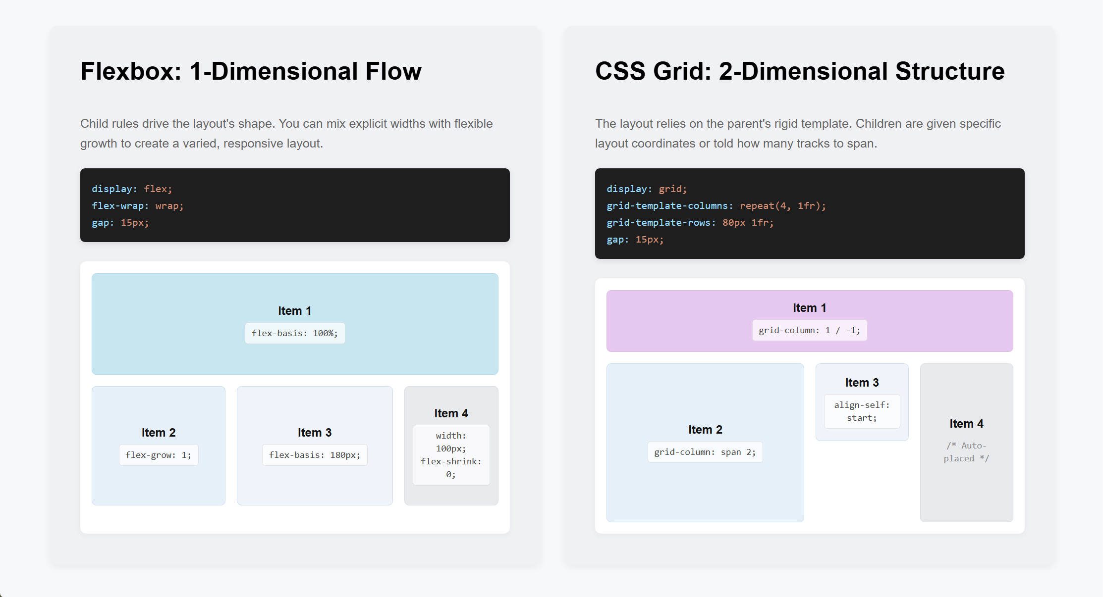
CSS Grid is a layout method built into modern browsers. While Flexbox arranges items mainly along one axis, either a row or a column, Grid arranges items in two dimensions at once.
You define the structure in the parent container. Then, its children fill that structure as grid items.
Parent And Child Controls
Two layers of control matter.
- The parent, or grid container, defines the structure. This includes how many columns and rows there are, how wide and tall each track is, the gap between tracks, and the default alignment of items inside the grid.
- Each child, or grid item, can override its own placement. A single item can span multiple cells, start at a specific column or row, or align differently from its siblings.
Divi 5 follows this same parent-and-child model. The Layout option group on the parent controls the grid structure. The Sizing option group on each child controls how that child sits inside the grid.
Once that mental model is clear, the settings become easier to predict. Parent settings define the grid. Child settings define how individual items behave inside it.
How To Set A Container To Grid
You will usually use Grid on containers such as Sections, Rows, Columns, and Groups. With Divi 5’s Nested Modules system, supported native modules can also act as layout parents and contain other modules or rows.
Grid layout settings are applied at the parent container level. They define the general rules for how the grid works and how child items respond to it.
Start With A Simple Grid
Let’s start by building something simple. Add a Section with a single-column Flex Row. Then, open the Row settings and change the Row from Flex to Grid.
Next, change the Row’s grid structure to a 6-column grid.
When working with Grid, it helps to separate two ideas. A grid column is part of the CSS Grid structure. A Divi Column is a Divi container element.
Adding grid columns in the Layout settings is not the same as adding Divi Columns to a Row. However, the two can work together.
Now, add six Divi Columns inside the Row. You now have six Divi Columns placed into six grid columns.
Next, change the grid structure from six columns to three columns. Notice how the same six Divi Columns flow into the new structure.
If you check the breakpoints, the 3-column grid remains in place unless you override it at a specific breakpoint.
This simple example shows the core Grid workflow. Define the grid structure at the parent level. Then, let the child elements flow into it.
Before moving further, let’s look at the main Grid settings Divi provides.
Row-Level Grid Settings: The Layout Option Group
When a Row is set to Grid, the Layout option group controls the grid structure. Here is a quick reference for the main settings.
- Horizontal Gap and Vertical Gap: Control spacing between grid columns and rows.
- Column Widths: Control how grid columns are sized, including equal widths or custom track sizing.
- Number of Columns: Defines how many columns the grid uses.
- Collapse Empty Columns: Helps with dynamic layouts where some grid cells may be empty.
- Grid Auto Columns: Sets the size of automatically generated columns when items are placed outside the defined grid.
- Row Heights: Controls how grid rows are sized, including auto-height rows or equal-height rows.
- Number of Rows and Grid Auto Rows: Provide row-based controls similar to the column controls above.
- Grid Direction: Controls how items auto-place through the grid, such as row direction or column direction.
- Grid Density: Controls whether the grid follows normal source order or backfills empty cells with later items when possible.
- Justify Content and Align Content: Position the overall grid inside the container when extra space is available.
- Align Items and Justify Items: Set the default alignment for items inside their grid cells.
- Offset Rules: Apply position-based layout rules to child items from the parent level. These are useful for asymmetric or repeating grid patterns.
Child-Level Grid Settings: The Sizing Option Group
Parent-level Grid settings define the grid. Child elements can still control how they occupy space inside that grid.
Click into one of the six Columns. Open the Design tab and expand the Sizing option group.
Below the standard Width, Height, and Module Alignment controls, grid item settings appear.
- Column Span and Row Span: Control how many grid tracks the item occupies. For example, setting Column Span to 2 makes the item span two grid columns.
- Column Start, Column End, Row Start, and Row End: Pin the item to specific grid lines. Use these when a span value is not precise enough, such as when an item needs to start at column 2 and end at column 5.
- Align Self and Justify Self: Override the parent’s default alignment for that item only.
These controls appear on direct children of a parent container set to Grid, including Columns, Groups, and modules. They are useful for asymmetrical layouts where one card occupies a larger hero block while the remaining cards sit in a tighter arrangement.
In this tutorial, we’ll mostly use Grid Offset Rules at the parent level instead of editing each child manually. That approach lets us create repeating layout patterns that continue to work even if more child items are added later.
However, when you have a fixed number of child elements, setting custom spans on the individual children can also work well.
Exploring What’s Possible With CSS Grid In Divi 5
CSS Grid is a logical way to control how child elements behave inside a container. As you saw above, the parent can define the overall grid while individual children can still break from the default pattern.
To focus on Grid, we’ll keep using the six-Divi-Column structure from the previous section. The content and general styles are already in place. Therefore, the examples below focus only on changing the grid layout.
Three Layout Variations
We’ll reshape the same content three ways:
- Variation 1: A simple grid created with one Structure Template.
- Variation 2: An alternating grid created with a Structure Template and Grid Offset Rules.
- Variation 3: A masonry-style grid created with multi-property offset rules and responsive overrides.
Variation 1: Apply A Structure Template
We have already seen how to change a Row to Grid and adjust the number of grid columns. The fastest way to get a working grid layout is to let Divi configure those settings with a Structure Template.
Switch to the Row’s Content tab. At the bottom of the Elements list, click Apply Structure Template.
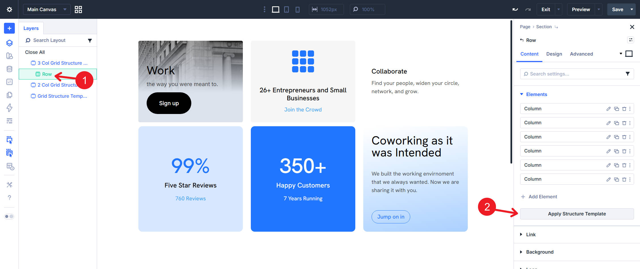
Choose a Multi-Row Template
You will see grouped templates, including preconfigured grid layouts. Look under Multi-Row, Masonry, and Sidebar. Each thumbnail represents a complete layout configuration, including the number of columns, gap values, and item placement rules.
Pick the third Multi-Row template. The Row updates to a 3-column grid with defaulted 60px Horizontal Gap and 60px Vertical Gap values.
Open the Row’s Design tab and check the Layout option group. You should see Layout Style set to Grid, Number of Columns set to 3, and the gap values applied.
This simple grid structure works well for service features, product loops, blog layouts, and other evenly spaced card layouts.
Variation 2: Use Grid Offset Rules
For the second variation, we’ll use a different Structure Template that creates an alternating pattern with Grid Offset Rules. These rules control which child items span extra columns.
In the Row’s Content tab, click Apply Structure Template again. Then, pick the eleventh Multi-Row template. The Row still uses three grid columns, but it adds offset rules that make certain child items span multiple column tracks.
Inspect The Offset Rules
Divi’s Structure Templates can include more than basic column counts. Some templates also include offset rules, which means you can apply a Grid layout and its repeating placement logic in a few clicks.
Now, let’s inspect the rules. Open the Row’s Design tab, expand the Layout option group, and find Grid Offset Rules. You should see two rules created by the Structure Template.
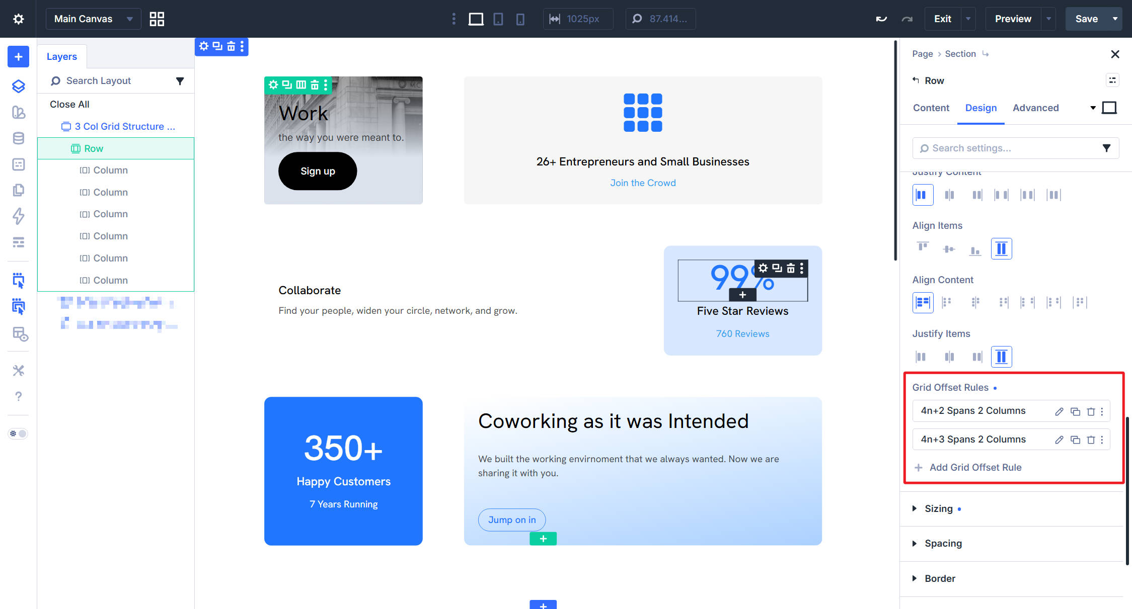
Rule 1: Span Every 4n+2 Item
The first rule uses these settings:
- Admin Label: Auto-generated from the rule settings, such as 4n+2 Spans 2 Columns.
- Target Offset: Custom nth-child Rule, with the pattern set to 4n+2. This matches the 2nd item, then every 4th item after that: 2, 6, 10, and so on.
- Offset Rule: Column Span. This tells Divi which grid property to change on the targeted items.
- Offset Value: 2. This makes each targeted item span two column tracks instead of one.
Read from top to bottom, the rule says: target items 2, 6, 10, and onward, and make each one span two column tracks.
That creates a repeating pattern where every fourth targeted item becomes wider on the right side of the grid.
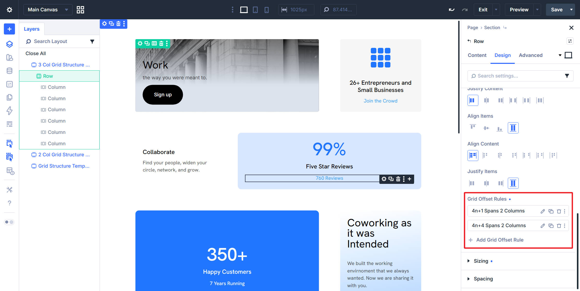
Rule 2: Span Every 4n+3 Item
The second rule does the same thing, but targets a different set of child items.
- Admin Label: Auto-generated from the rule settings, such as 4n+3 Spans 2 Columns.
- Target Offset: Custom nth-child Rule, with the pattern set to 4n+3. This matches the 3rd item, then every 4th item after that: 3, 7, 11, and so on.
- Offset Rule: Column Span. This changes the same grid property as the first rule, but for a different item pattern.
- Offset Value: 2. This makes each targeted item span two column tracks.
Together, the two rules create an alternating rhythm. The 2nd item in each group of four spans two columns. Meanwhile, the 3rd item in each group of four also spans two columns. The 1st and 4th items remain one column wide.
Invert The Pattern
If you wanted to invert the pattern and start with a larger item, you could change the rules to these patterns:
- First Rule: 4n+1 spans two columns.
- Second Rule: 4n+4 spans two columns.
Grid Offset Rules open up many layout possibilities because they let you create repeating asymmetric patterns from the parent container. Next, we’ll use a more complex grid structure.
Variation 3: Create A Masonry-Style Grid
The third variation uses a Masonry Structure Template and two Grid Offset Rules. This time, the rules target two different grid properties in the same layout: Row Span and Column Span.
In the Row’s Content tab, click Apply Structure Template and pick the second template under Masonry.
Inspect The Masonry Settings
The template applies several Layout settings. Open the Row’s Design tab to inspect them.
- Number of Columns: 4
- Offset Rules: Two rules, one for spanning across rows and one for spanning across columns.
The Offset Rules do most of the work in this layout.
Rule 1: Span Every 6n+1 Item Across Rows
The first rule uses these settings:
- Admin Label: Auto-generated from the rule settings, such as 6n+1 Items Span 2 Rows.
- Target Offset: Custom nth-child Rule, with the pattern set to 6n+1. This matches the 1st item, then every 6th item after that: 1, 7, 13, and so on.
- Offset Rule: Row Span. This changes how many row tracks the targeted item occupies.
- Offset Value: 2. This makes each targeted item take up two row tracks instead of one.
Read top to bottom, the rule says: target items 1, 7, 13, and onward, and make each one twice as tall. This creates the tall anchor item at the start of each group of six.
Rule 2: Span Every 6n+6 Item Across Columns
The second rule works on the other axis.
- Admin Label: Auto-generated from the rule settings, such as 6n+6 Items Span 2 Columns.
- Target Offset: Custom nth-child Rule, with the pattern set to 6n+6. This matches the 6th item, then every 6th item after that: 6, 12, 18, and so on.
- Offset Rule: Column Span. This changes how many column tracks the targeted item occupies.
- Offset Value: 2. This makes each targeted item span two column tracks instead of one.
The two rules work in different dimensions. The first stretches the first item in each group of six vertically. The second stretches the final item in each group of six horizontally.
If you duplicate the Divi Columns until you have 12 total items, you can see how the rules repeat every six child items.
Make The Masonry Layout Responsive
The masonry pattern works well on desktop, but a 4-column grid with larger anchor items can feel cramped on smaller screens. This is where responsive Grid settings become important.
Grid settings in Divi 5 can be adjusted across breakpoints. On tablet and phone, we can simplify the layout by overriding the desktop configuration.
Tablet Grid Settings
Switch the Visual Builder to Tablet view and open the Row’s Layout option group. Make two changes:
- Set Number of Columns to 2.
- Change the Offset Value on both Grid Offset Rules from 2 to 1 at the tablet breakpoint.
Setting Row Span to 1 on the 6n+1 rule and Column Span to 1 on the 6n+6 rule effectively neutralizes the desktop masonry effect on tablet.
The targeted items still match the rules. However, they span the same amount as every other item. The result is a cleaner 2-column grid where each item occupies the same amount of space.
Phone Grid Settings
Switch to Phone view and set Number of Columns to 1. If you have not overridden the tablet offset values again on phone, those tablet values will continue downward through Divi’s responsive inheritance.
Every item now stacks vertically in a single column.
A Structure Template gives you a strong starting point. The Layout option group exposes the settings the template applies. Since those settings can be adjusted across breakpoints, you can use more complex Grid layouts on desktop and simplify them for smaller screens.
Wrapping Up
CSS Grid in Divi 5 makes it easier to build layouts that would have been difficult to create with standard column structures alone. In this lesson, the same six Columns of content were reshaped three different ways using row-level Grid controls.
First, we applied a basic Structure Template. Then, we used a template with Grid Offset Rules. Finally, we created a masonry-style template with responsive overrides.
Where To Use This Next
You can extend the same approach in many directions. Containers can become grids. Structure Templates give you tested starting points. Grid Offset Rules turn position-based logic into reusable patterns that can continue working as more child items are added.
That last point is especially useful for dynamic content and Loop Builder layouts, where the number of items may change over time.
In Part 12: Making Your Divi 5 Website Fully Responsive, we’ll take everything built so far and refine it across breakpoints. That includes the Flexbox layouts from Part 10, the CSS Grid layouts from this part, typography, spacing, and templates.
The goal is to make the full site hold up from wide desktops to small phones.


Leave A Reply