
Most WooCommerce stores put real thought into their homepage and product pages, but the checkout often feels like a completely different site. Generic fields, uneven spacing, and a layout that looks out of the box can weaken trust at the exact moment a customer is deciding whether to complete their order.
Divi 5‘s dedicated Woo Checkout modules let you build a branded checkout layout visually, without relying on a single checkout shortcode. In this tutorial, we’ll build a clean, two-column checkout page from scratch using Divi 5, WooCommerce, and Design Variables.
Using Woo Modules In Divi 5
Divi has supported WooCommerce cart and checkout modules for years, so this workflow isn’t about replacing a shortcode-only process. The bigger shift in Divi 5 is that the Woo modules are rebuilt for Divi 5’s current Visual Builder, layout system, and performance-focused architecture, making them easier to place, style, and reuse inside custom WooCommerce templates.
Instead of treating checkout as one rigid block of WooCommerce output, Divi 5 lets you build the page from individual Woo modules. On the checkout side, you get dedicated modules for billing details, shipping details, additional order notes, the order summary, and payment. Each one can be placed, styled, spaced, and responsive-tuned independently.
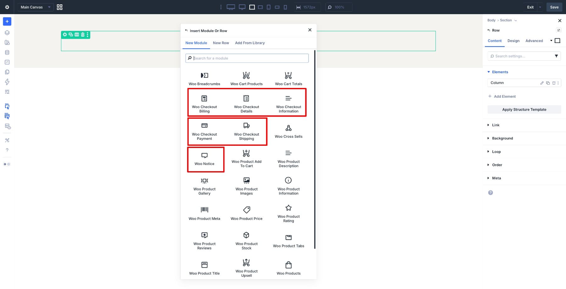
For cart pages, the suite includes modules for cart products, cart totals, and cross-sells. Together, Divi 5’s 25 Woo modules cover the main WooCommerce experience, from product pages and product archives to cart, checkout, and order-focused layouts.
Learn About Divi 5’s Woo Cart & Checkout Modules
Design Variables Keep The Checkout Consistent
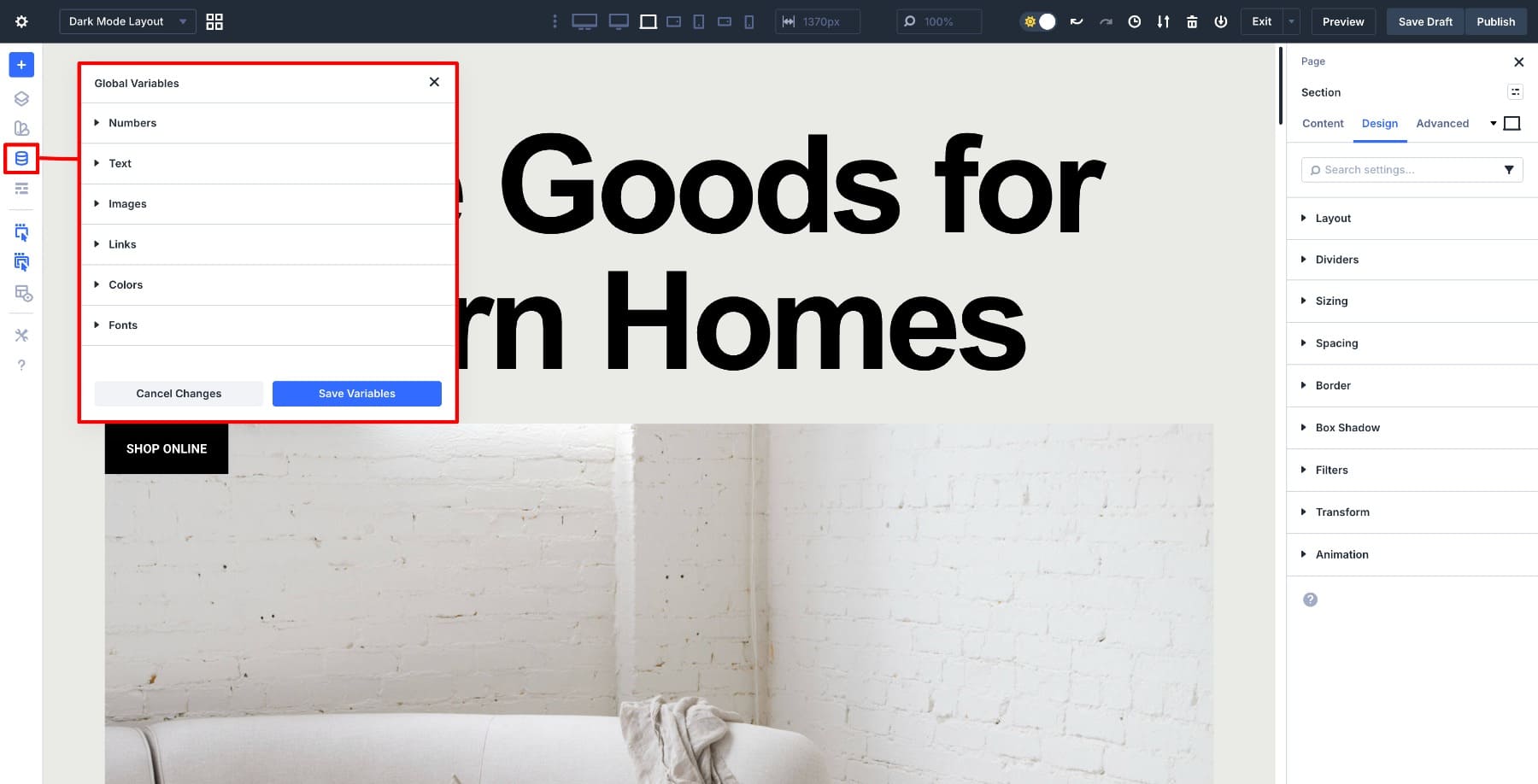
Before building the layout, set up Design Variables. In Divi 5, the Variable Manager lets you create reusable values for colors, fonts, numbers, text, images, and links. You can then apply those values to modules, presets, spacing controls, buttons, and other design settings throughout your site.
That matters for WooCommerce because a store usually has more than one important page: shop, product, category, cart, checkout, account, and sometimes promotional landing pages. Without shared design values, you end up matching colors, fonts, borders, and spacing manually across every template.
Design Variables give you a shared foundation. When you use the same primary color, border color, heading font, body font, and spacing values across your Woo modules, your checkout feels like part of the same store instead of a separate WooCommerce screen.
This is especially useful for checkout because the page includes many small details: labels, input fields, section headings, table rows, payment options, notices, and the final Place Order button. Variables help you make those details feel consistent without restyling every element from zero.
We’ll set these up in Step 2 before building the layout. Once they’re in place, the rest of the checkout design becomes faster to refine and easier to update later.
What We’re Building
We’ll build a clean, two-column checkout page with billing, shipping, and order notes on the left, and the order summary and payment section on the right. The Woo Checkout modules handle the WooCommerce functionality, while Design Variables keep the layout aligned with the rest of the store.
Before you start, add at least one product to the cart in a separate browser tab. Checkout modules are easier to evaluate when WooCommerce has real cart data to display.
1. Set Up Divi 5 And WooCommerce
Before building, make sure WooCommerce and Divi 5 are installed and active. In WooCommerce, add at least one product and confirm that your Cart and Checkout pages are assigned under WooCommerce > Settings > Advanced. WooCommerce needs those pages assigned so customers can reach the cart and checkout flow correctly.
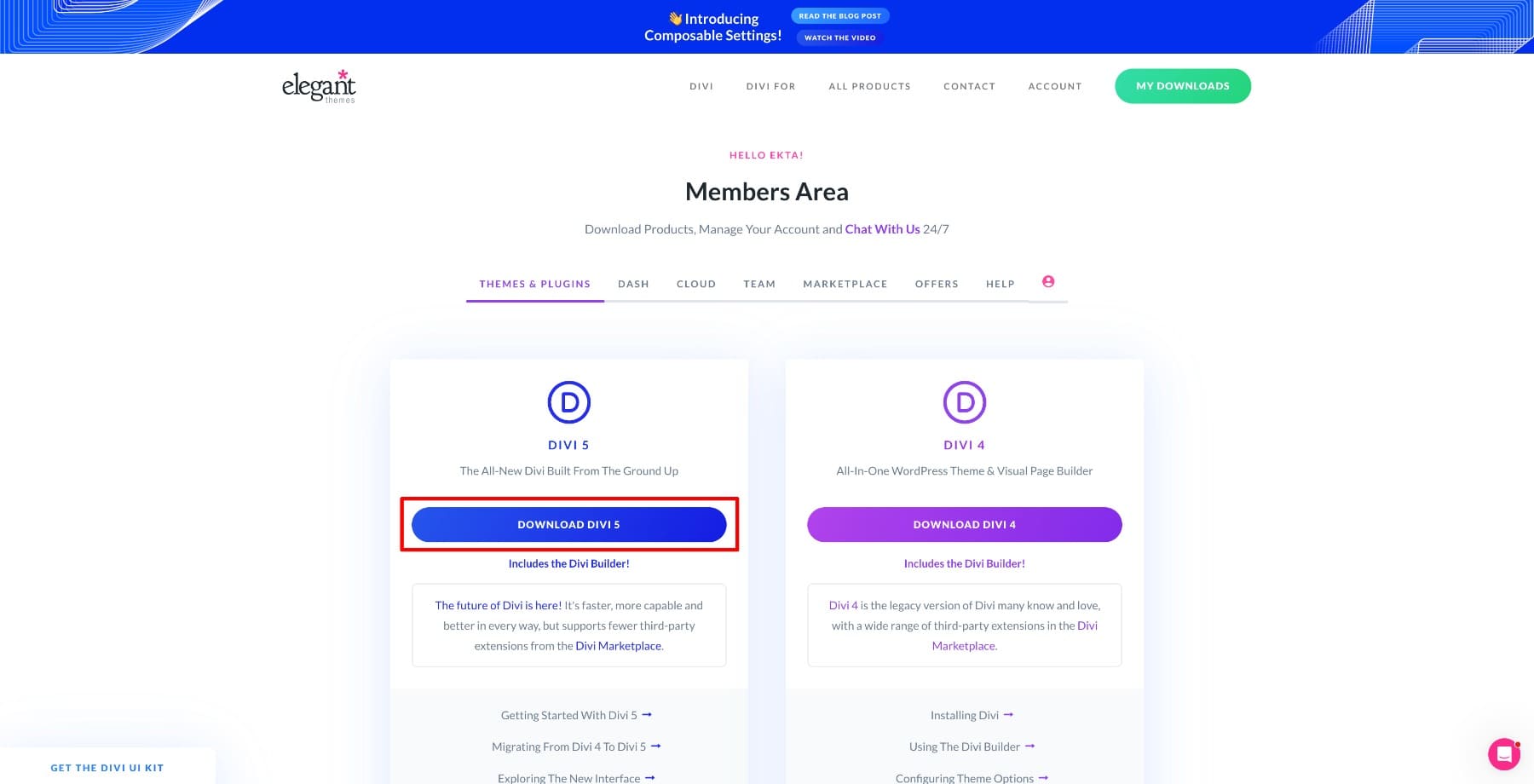
For Divi 5, download the theme from your Elegant Themes account.
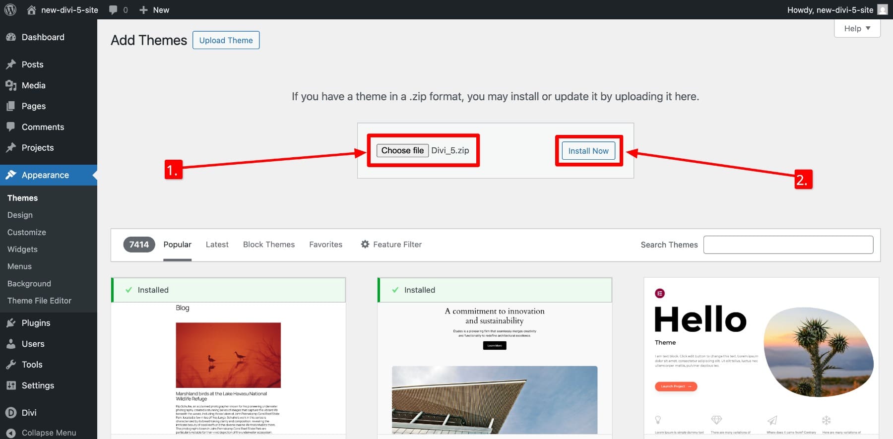
Then upload the zip file to Appearance > Themes > Add New > Upload Theme in your WordPress dashboard.
Activate Divi 5 and connect your Elegant Themes account so the site can receive updates.
Once Divi 5 is active, go to the Theme Builder. This is where you’ll create a dedicated WooCommerce Checkout template and build the page with individual Woo modules instead of a single fixed checkout layout.
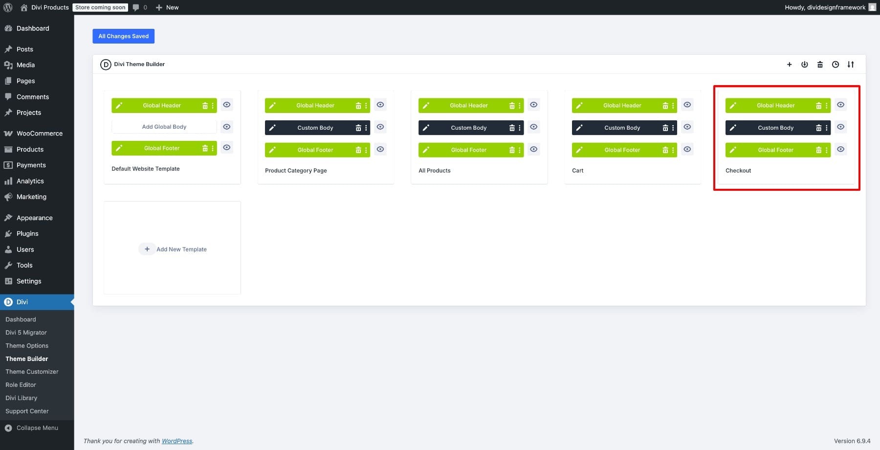
The screenshot below shows a Theme Builder setup after multiple WooCommerce templates have been assigned. Your site may only show the Checkout template at this point. If you’re building the rest of your WooCommerce templates too, follow this WooCommerce and Divi 5 guide.
2. Set Up Your Design Variables
Open the Visual Builder and click the Variable Manager icon.
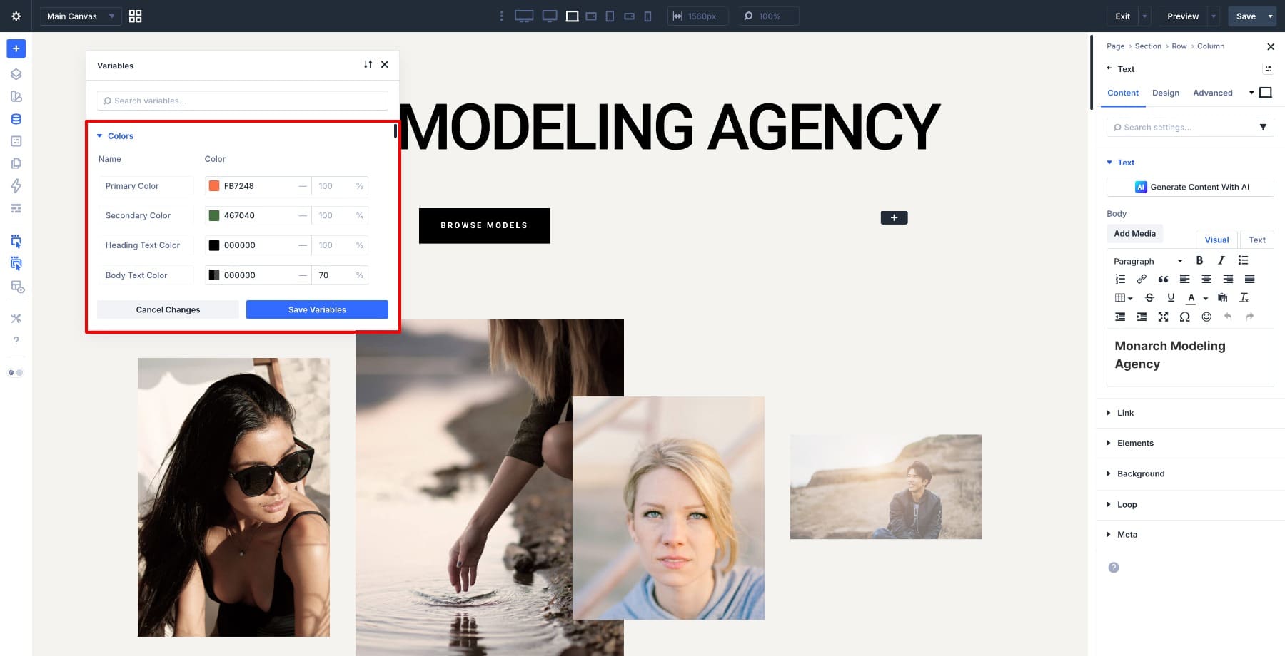
Start with your core color variables: a primary color for buttons and highlights, a background color for sections, a text color, and a border color for form fields.
Then create font variables for headings and body text. Keep the body font readable, and make sure labels, field text, and table content stay comfortable on mobile.
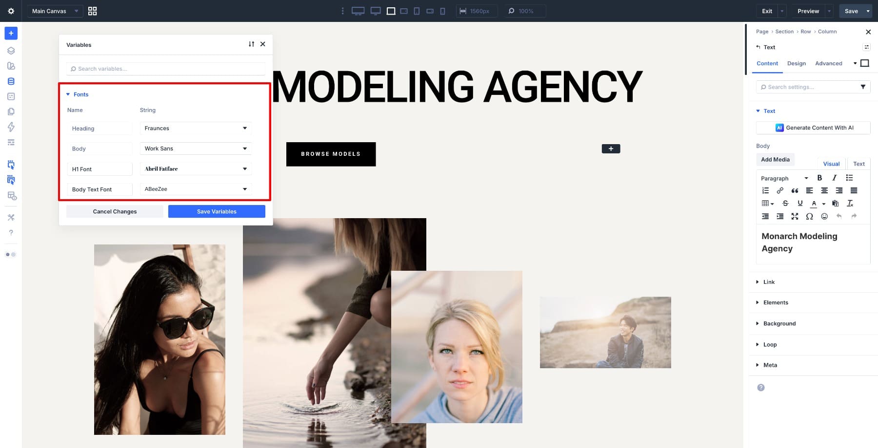
Finally, define number variables for spacing values such as section padding, field padding, row gaps, and module margins. These values are especially useful when you start adjusting the checkout layout across desktop, tablet, and mobile.
3. Create A Checkout Template
Go to Divi > Theme Builder from your WordPress dashboard. Click Add New Template > Build New Template.
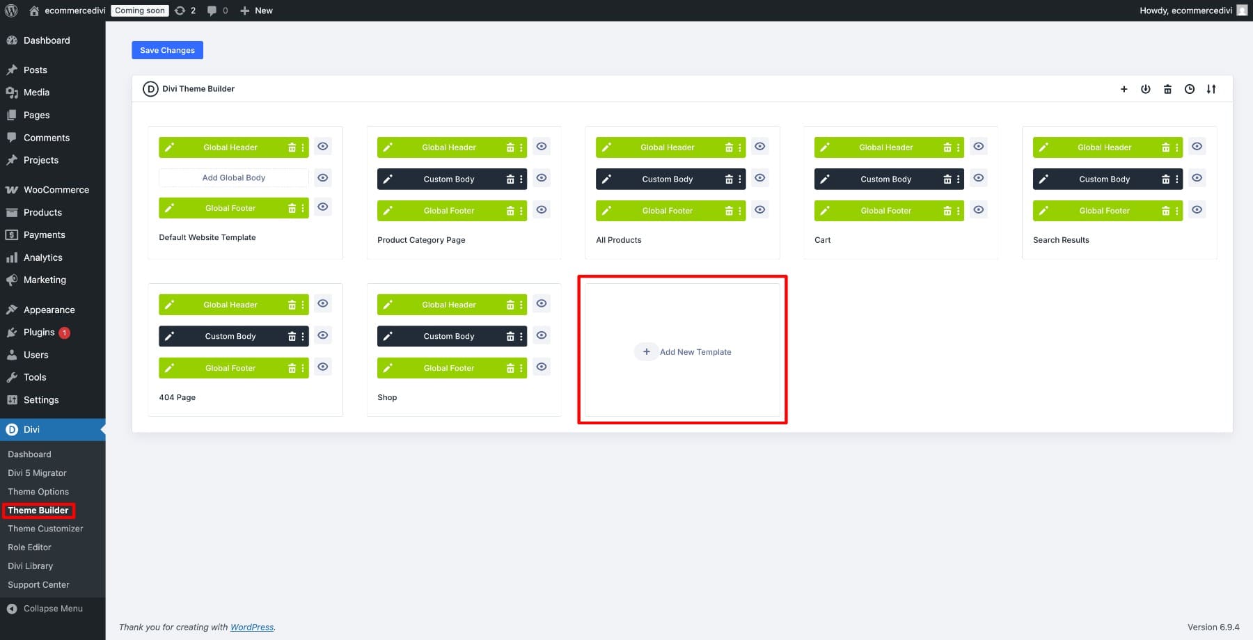
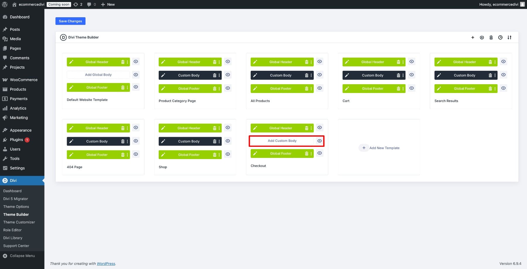
Scroll down to WooCommerce Pages, select Checkout, and click Create Template.
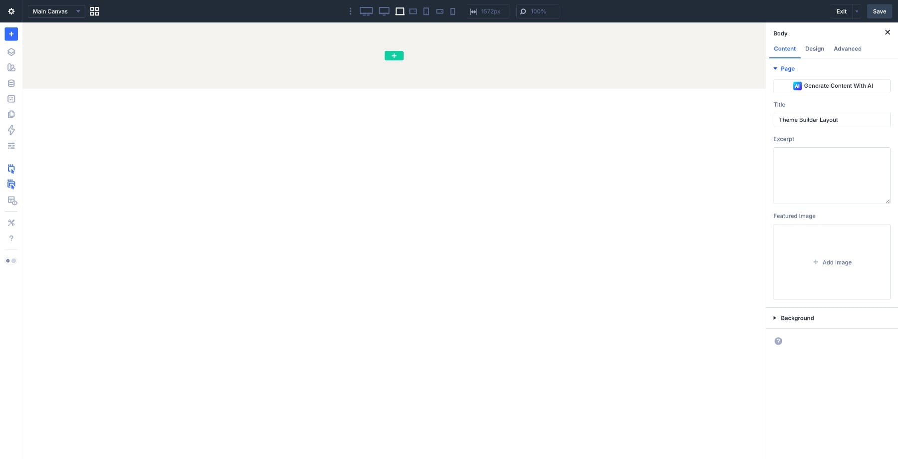
Next, click Add Custom Body and open it in the Visual Builder.
The canvas will open empty. In the next step, we’ll add the Woo Checkout modules that make up the full checkout layout.
4. Build The Checkout Layout
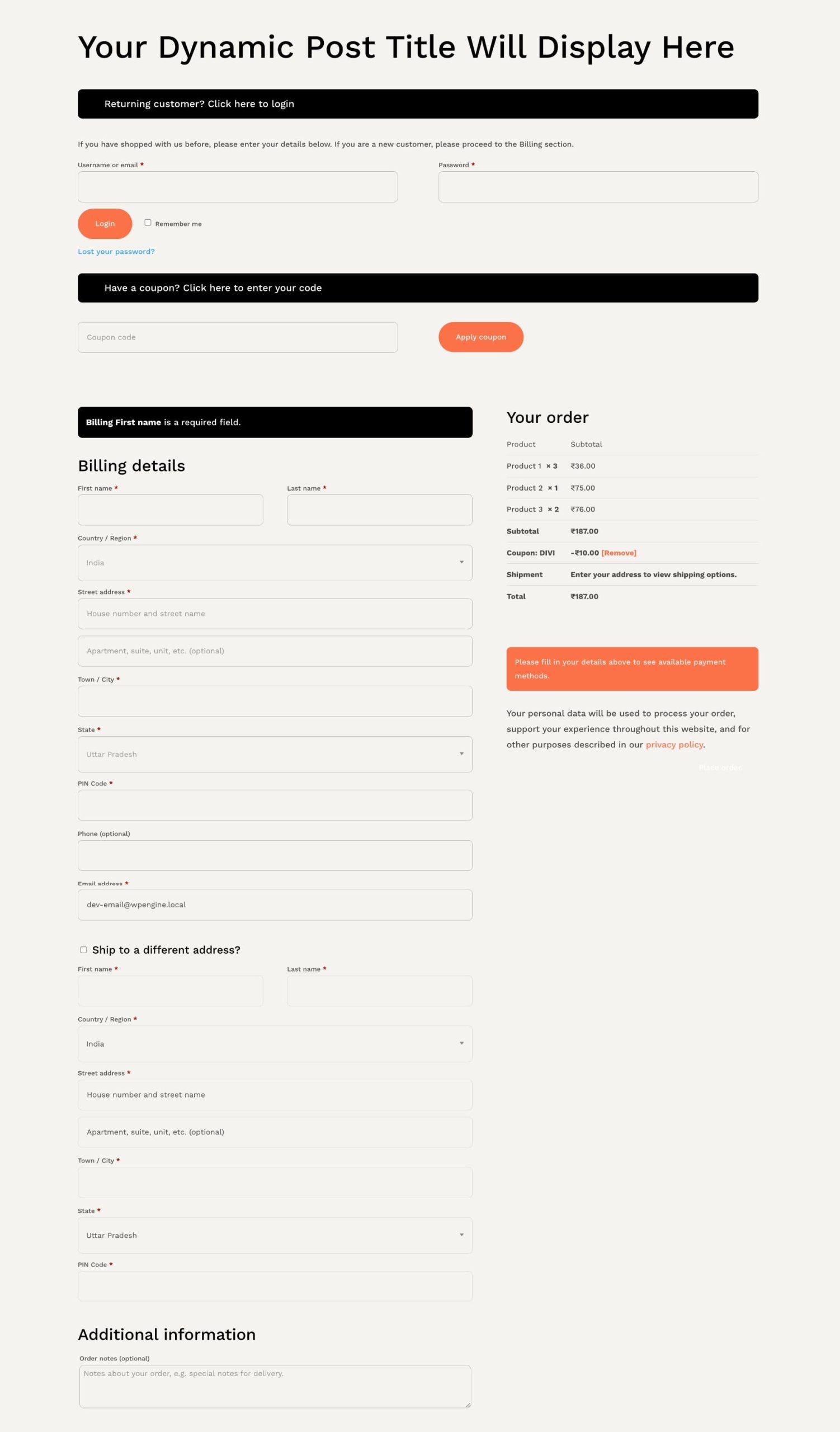
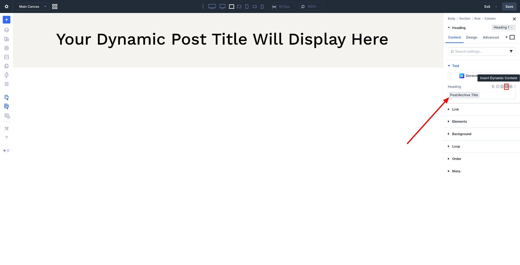
Start by adding a new section inside your checkout template, then add a single-column row. Inside it, add a Heading module. In the Content tab, find the Text > Heading field, hover over it, and click the Dynamic Content icon. Select Post/Archive Title so the page title pulls in automatically.
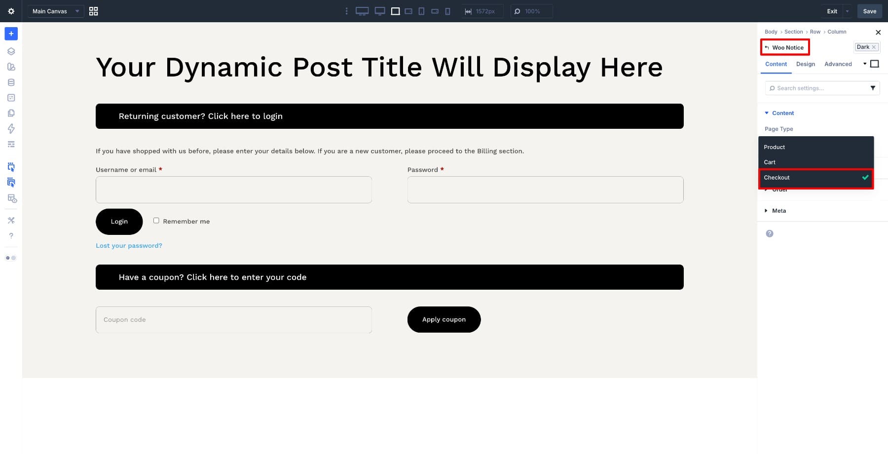
Next, insert the Woo Notice module and set the Page Type to Checkout in the Content settings. Keep this near the top so customers can see checkout-specific messages, validation errors, and coupon confirmations before they continue through the form.
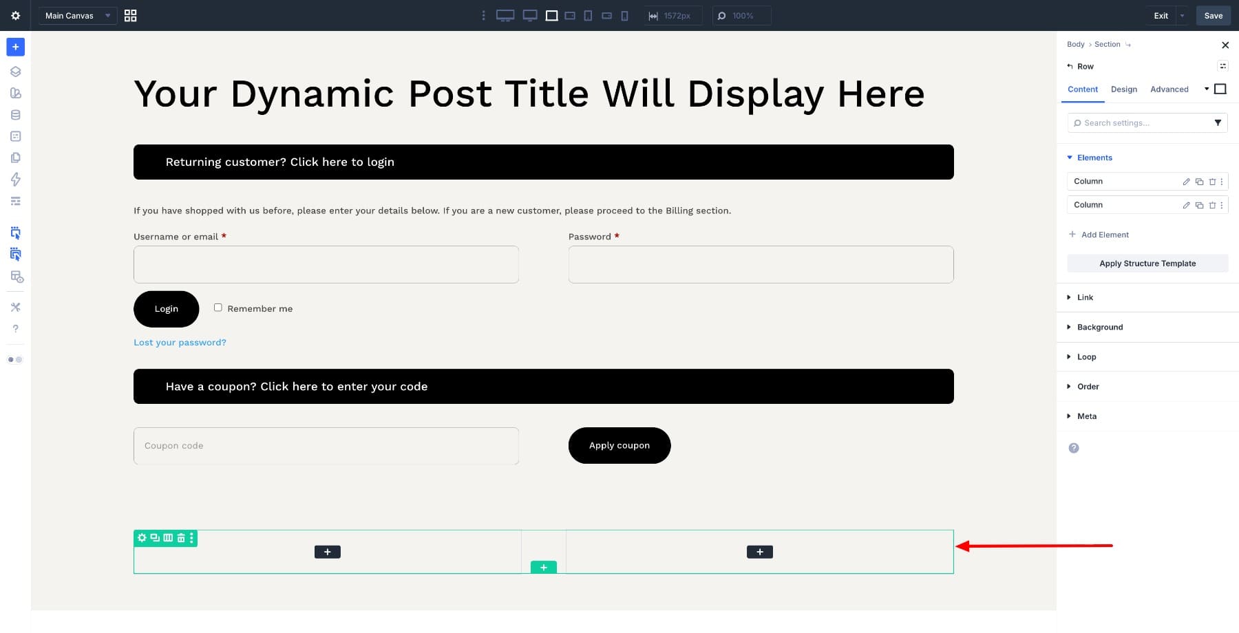
Now add a new row with two columns. The left column will hold customer information fields, and the right column will hold the order summary and payment section. This keeps form entry and order review visually separate, which makes the checkout easier to scan.
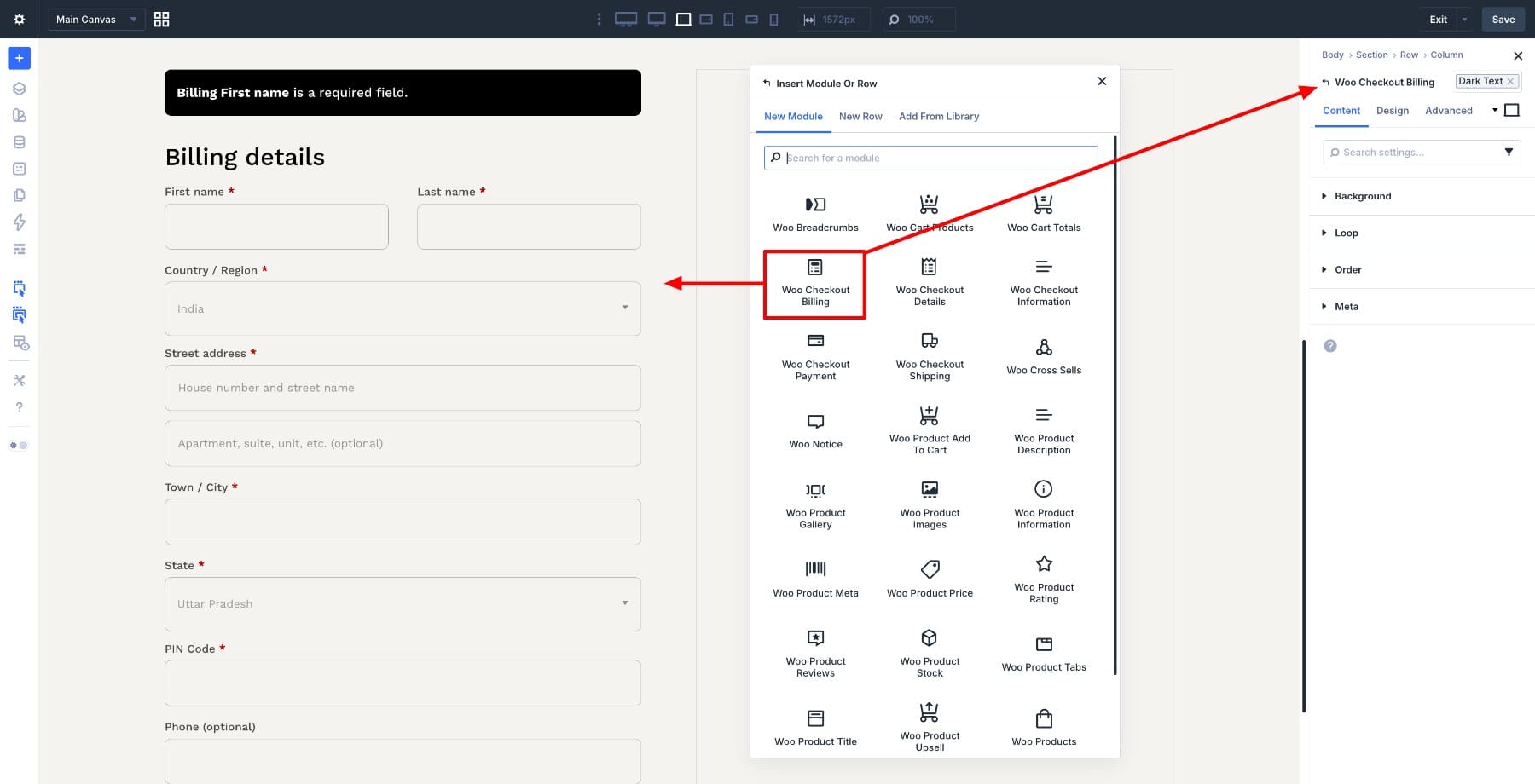
Click into the left column and add the Woo Checkout Billing module at the top.
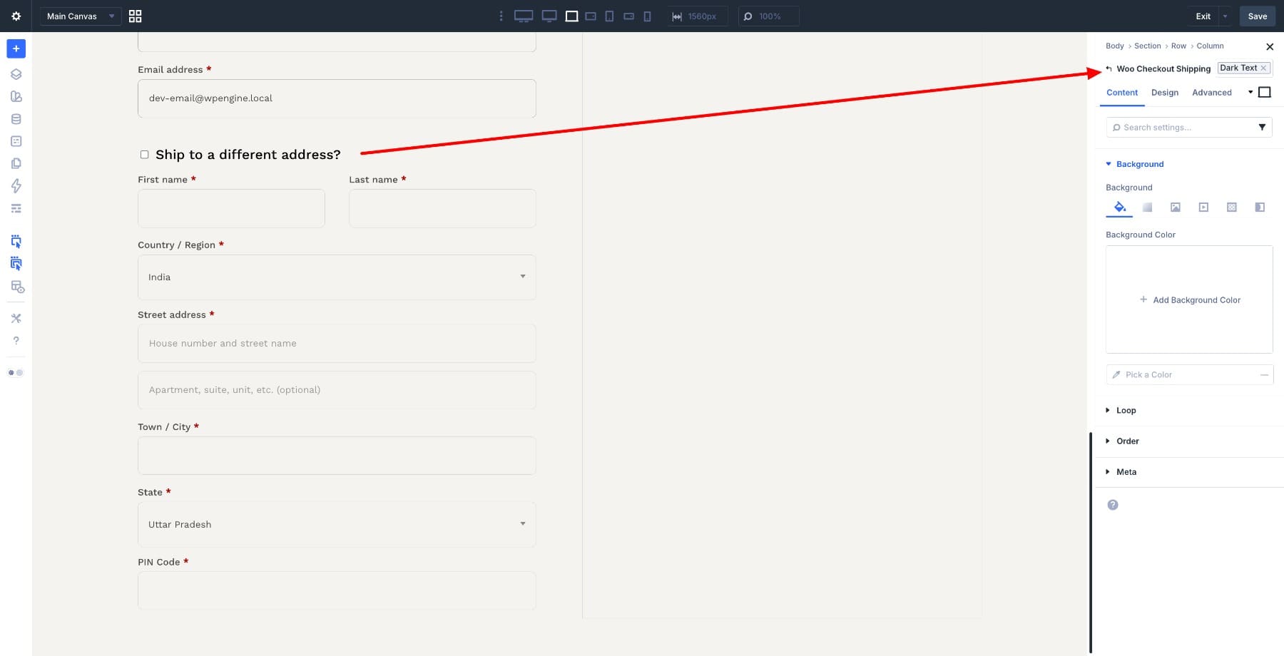
Below it, add the Woo Checkout Shipping module. If your store does not collect shipping details, you can leave this module out and keep the checkout shorter.
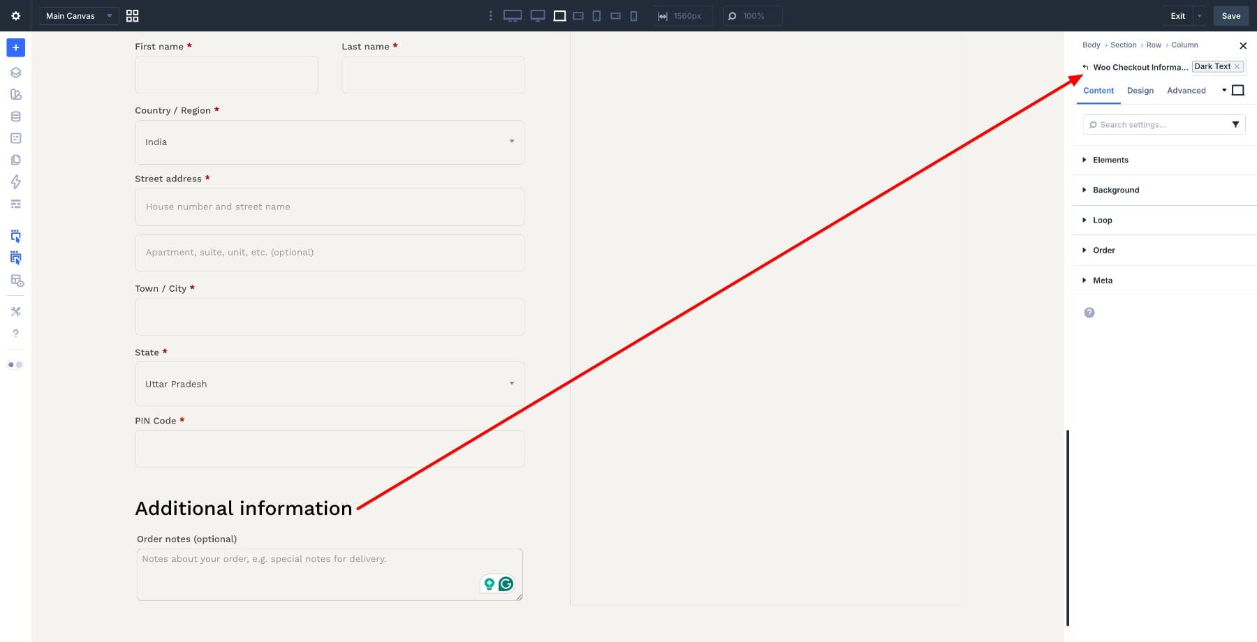
Then add the Woo Checkout Information module under the shipping section. This module handles optional order notes, so customers can add delivery instructions or other checkout details when needed.
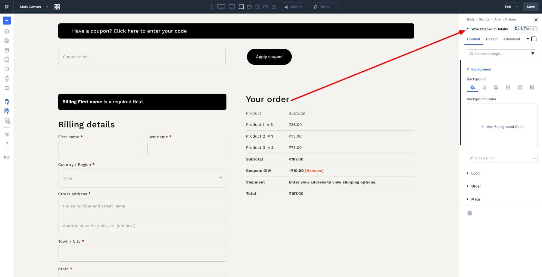
Move to the right column and add the Woo Checkout Details module at the top. This displays the order summary, including products, quantities, subtotal, and total.
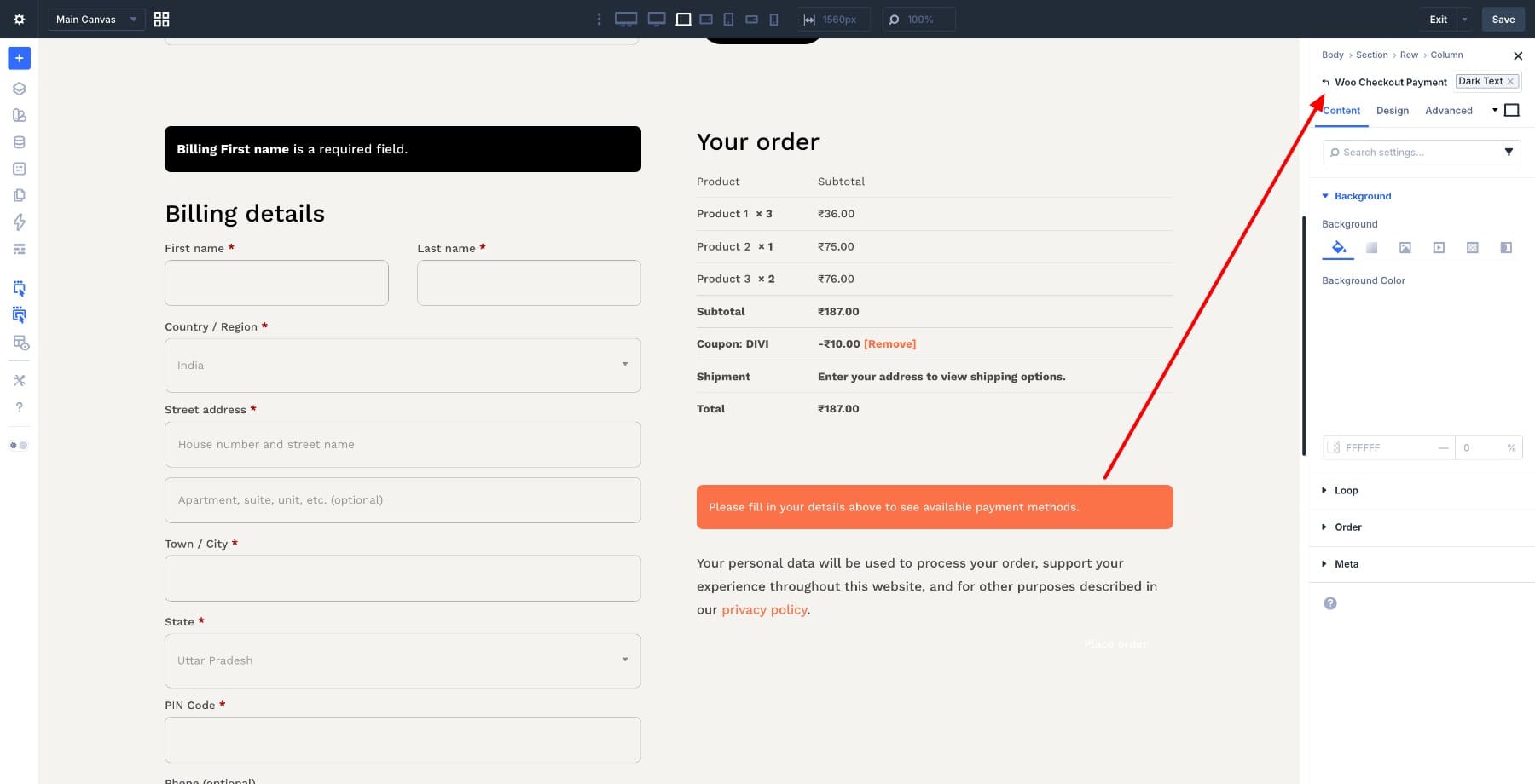
Below it, add the Woo Checkout Payment module. This is where WooCommerce displays available payment methods, payment form details, and the final Place Order action.
That’s the full checkout structure. With Design Variables already set, your colors, fonts, and spacing can now be applied consistently as you refine each module.
5. Refine The Layout And Style Each Module
With all modules in place, start with the two-column row. Open the row settings and adjust the column widths to around 60/40. Give the left column more room because customers spend more time entering billing, shipping, and order details there.
Then go to Design > Layout > Horizontal Gap and add space between the two columns so the form and order summary do not feel crowded.
Adjust the Vertical Gap as well to create consistent spacing between stacked modules. Then open the section settings and add top and bottom padding so the checkout area has breathing room.
Now go through each checkout module. Start with the Woo Checkout Billing module and open the Design tab. Review the label, field, text, spacing, border, and background settings. Use your variables where possible so the billing form matches the rest of the site.
Repeat the same process for the shipping and information modules. Keep field padding generous enough for mobile users, and make section titles easy to scan.
On the right side, style the Woo Checkout Details module as a clear order review box. A subtle background, border, or box shadow can help separate the summary from the rest of the form.
Then style the Woo Checkout Payment module. Make the payment options easy to read, leave enough room between radio buttons, and make sure the final Place Order button has the strongest visual weight on the page.
6. Improve Conversion Without Adding Distractions
A better checkout is not only about making it look branded. It should also remove unnecessary friction.
Start with the Woo Notice module. Style notices so errors, coupon confirmations, and important checkout messages are clearly visible. Use a background or border color that stands out, but keep it aligned with your design system.
Then review the Woo Checkout Payment module. The Place Order button should be the clearest call to action on the page. Avoid styling secondary actions, coupon notices, or login links in a way that competes with it.
A few WooCommerce settings outside Divi are worth checking before launch:
- Enable guest checkout if your store allows customers to order without an account.
- Only collect the fields you truly need for billing, delivery, taxes, and fulfillment.
- Make sure taxes, shipping costs, and totals are visible before the customer places the order.
- Confirm that your payment gateways display correctly inside the Woo Checkout Payment module.
- Add reassurance near payment, such as accepted payment methods, secure checkout copy, or a short returns note.
Keep this section practical. The goal is to make customers feel informed and confident, not to add more content to a page that should stay focused.
7. Optimize For Mobile And Save
Divi 5’s Flexbox layout controls make two-column layouts easier to adjust across screen sizes, but you should still review the checkout manually on tablet and mobile.
Switch to tablet and mobile views in the Visual Builder and check the full flow. The columns should stack cleanly, fields should be easy to tap, and the order summary should be readable without pinching or horizontal scrolling.
Pay special attention to:
- Field height and padding
- Label readability
- Spacing between checkout sections
- Payment method readability
- The Place Order button position and size
- Coupon and notice spacing
Once you’re satisfied, click the Save button in the Visual Builder.
Because this is a Theme Builder template, your changes apply to the assigned WooCommerce checkout page as soon as you save the template.
Before publishing the store or sending traffic to the checkout, place a test order. Check the full path from cart to checkout to order confirmation, including coupons, shipping rates, taxes, payment gateway behavior, confirmation emails, and the mobile layout.
Build Your Next Online Store In Divi 5
The checkout page is often the last WooCommerce page store owners customize, but it is one of the most important. By the time someone reaches checkout, they have already shown buying intent. The page should make the final step feel clear, trustworthy, and consistent with the rest of the shopping experience.
What you’ve built here is more than a styled form. It’s a branded checkout template made from individual Woo modules, supported by Design Variables that keep colors, fonts, spacing, and buttons consistent across your store.
From here, you can keep improving the experience as your store grows. Apply the same design system to your cart, product, shop, and account templates so every step of the WooCommerce journey feels connected.


I’d like to see Divi 5 set up a tutorial for a multi-step checkout system instead of using multiple modules on one page.