
A header layout is a structural problem before it is a visual one. The logo, navigation, icons, and CTA need a clear relationship. You need to decide where each item sits, how much space separates it, and what changes on smaller screens.
Flexbox solves that problem with layout rules. In Divi 5, those controls live inside the Visual Builder, so you can define the structure visually instead of writing custom CSS. Below, we will build two practical Flexbox headers and show how Divi 5’s menu, canvas, and interaction tools work together.
Flexbox In Divi 5
Flexbox is a CSS layout model for arranging items inside a container. Items can sit in a row, stack in a column, wrap, grow, shrink, and align.
In Divi 5, Flexbox is part of the core layout system. Sections, Rows, Columns, and Module Groups can act as flex containers. When an element becomes a flex container, its direct children become flex items. That direct-child relationship matters throughout this tutorial.
Core Flexbox Controls
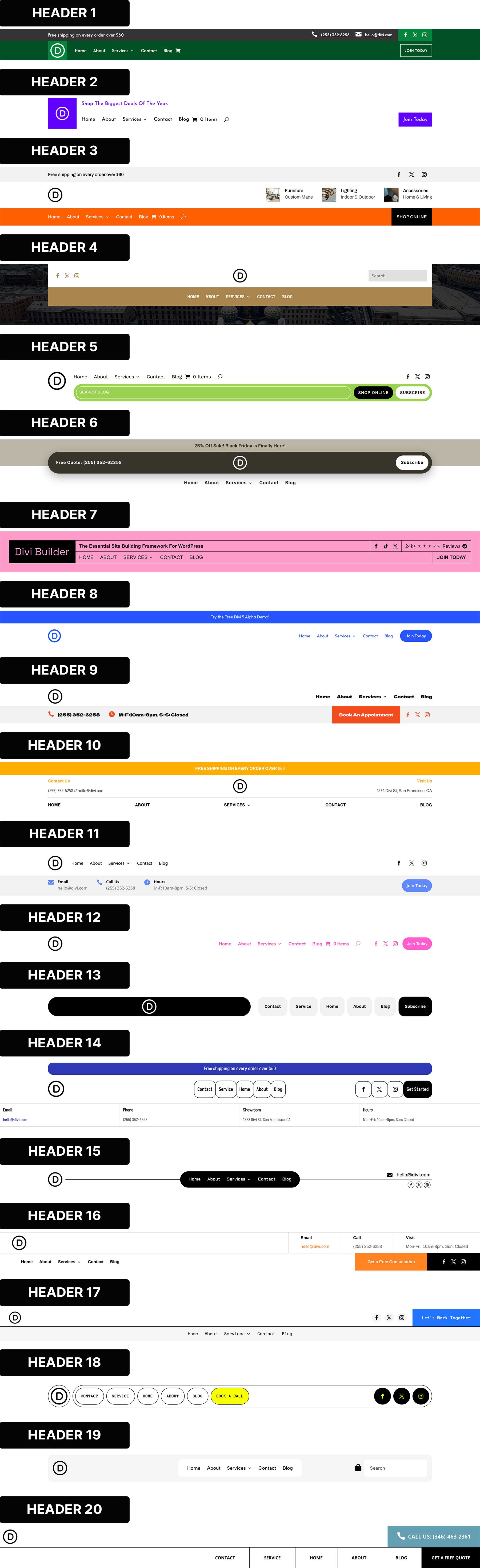
Divi 5 gives you visual controls for the most important Flexbox settings. You can set Layout Direction, Justify Content, Align Items, Layout Wrapping, Display Order, and Gap values. These settings help you control structure, spacing, and alignment without custom CSS.
These controls are responsive. A desktop row can become a mobile column, and items can change order at different breakpoints. That makes Flexbox ideal for headers because a wide navigation layout can turn into a compact mobile header without duplicate sections.
Why Use Flexbox For Headers
Headers usually need one-dimensional layout control. You might place a logo and menu in a row, or stack mobile menu items in a column. Flexbox handles those patterns well.
- Use Display Order to reorder items on smaller screens.
- Use Align Items: Stretch when columns need equal height.
- Use Grow To Fill when an item should use available space.
- Use Shrink To Fit when an item should stay compact.
- Use Gap settings instead of manual padding between modules.
- Use Layout Wrapping when items need to move onto a new line.
The most important rule is simple: Flexbox controls the direct children of a container. If several modules should behave like one item, place them inside a Module Group. That makes complex headers easier to manage.
More Divi 5 Features To Help You Build Better Headers
Flexbox handles the layout, but modern headers also need dynamic navigation, off-canvas menus, and global editing. These Divi 5 features help with that.
The Link And Dropdown Modules
A header without navigation is usually just branding. Divi 5’s Link Module gives you a flexible building block for custom menus. You can create links manually or use Menu Loops to pull items from an existing WordPress menu.
Using Menu Loops
With Menu Loops, one Link Module can repeat for each item in a selected menu. The menu text and URL can come from dynamic content, which keeps your WordPress menu as the source of truth. Add, remove, or reorder menu items in WordPress, and the looped navigation can update with it.
Using Dropdown Modules
The Dropdown Module builds on that system. Place a Dropdown Module inside a parent element, such as a Link Module, and Divi connects the dropdown behavior to that parent. The dropdown content area is flexible, so you can add simple links, rows, images, text, buttons, or full mega menu layouts.
Use Dropdown Modules with care inside looped menu items. A dropdown placed inside a loop can repeat with each looped item. For simple menus, the standard Menu Module is still useful. Use Link and Dropdown modules when you need more control.
Interactions And Canvases
A header often needs to show or hide something. It might open a mobile menu, search panel, form, or promo modal. Building those elements inside the main header can clutter the layout, so Canvases help keep them separate.
What Canvases Do
Every page has a Main Canvas for the primary layout. Divi 5 also lets you create detached Canvases, where a mobile menu, popup, slide-in panel, or staging area can live outside the main page structure.
Canvases can be local or global. A local Canvas belongs to one page, while a Global Canvas can be reused across the site. That makes Global Canvases useful for mobile menus because you can build the menu once and use it wherever the global header appears.
What Interactions Do
Interactions make detached elements interactive. You can add behavior in the builder without writing JavaScript. Choose a Trigger Event, such as click, hover, scroll, or viewport entry. Then choose an Effect Action, such as showing or hiding an element. Finally, choose the target element or container that receives the effect.
For headers, this is especially useful. A hamburger icon can show a mobile menu Canvas, and a close icon can hide it again.
Editable Theme Builder Areas
Headers do not exist in isolation. They sit above real page content, and that context matters. Logo size, spacing, contrast, and sticky behavior are easier to judge when the page is visible.
Editable Theme Builder Areas let you edit assigned headers, footers, body templates, and page content in one front-end builder session.
This helps when building headers because you can compare the header against the hero section below it and adjust spacing without leaving the page.
Global template changes apply everywhere that template is assigned, so review every breakpoint before publishing.
Before You Build: Plan The Header Structure
Before opening the Visual Builder, decide how the header should work on desktop, tablet, and mobile. Flexbox makes layout changes easier, but the build will still be cleaner if you know which elements belong together and which ones should move into a Canvas.
Map The Header Elements
Start by listing every item the header needs. Most headers include a logo, navigation, CTA, social links, search, cart icon, contact details, or business hours. Then decide which items are primary and which are secondary. Primary items should stay visible on desktop. Secondary items can move into the mobile menu or disappear at smaller breakpoints.
- Keep the logo visible on every breakpoint.
- Keep the main CTA visible on desktop when it supports the page goal.
- Move long navigation menus into a mobile Canvas.
- Move contact details, hours, and social icons out of the compact mobile header.
Group Items Before Styling Them
Flexbox works on the direct children of a container, which means structure matters before styling. If a logo and menu should move together, place them inside a Module Group. If three contact blurbs should stay together on the left side of a row, place them inside one group. Then Flexbox can treat that group as a single item.
- Use Module Groups for related header elements.
- Use Rows or Columns as the main flex containers.
- Use Gap settings for spacing between direct flex items.
- Avoid using padding as the main spacing system between modules.
Plan The Mobile Behavior
The mobile header should not be a squeezed version of the desktop header. It should be a simpler layout with fewer visible items. A good mobile pattern is a logo on one side and a hamburger icon on the other. The full navigation, CTA, and secondary links can live inside a Global Canvas.
- Use Display Order when items need a different mobile sequence.
- Use Visibility settings to hide desktop-only modules on mobile.
- Use a Global Canvas when the same mobile menu should appear sitewide.
- Use Interactions to show and hide the mobile menu Canvas.
Check The Details Before Publishing
Small header issues are easy to miss because headers appear on every page. Test the layout before publishing the global header.
- Check desktop, tablet, and phone breakpoints.
- Test widths between the default breakpoints.
- Confirm dropdowns and Canvases sit above page content.
- Set a clear Z Index for overlays, sticky headers, and dropdowns.
- Make sure hamburger and close icons have clear labels.
- Check that menu links, CTA links, cart links, and social links work.
Building A Flexbox Header In Divi 5
Now, let us build two headers from scratch. We will recreate two layouts from our free 20 Header Design Pack: Design #11 and Design #12.
Follow along step by step. You can also download the resources from this blog post to get a faster start.
Design #1: Three-Row Stacked Header
Some businesses need more than a logo and navigation. Clinics, law offices, agencies, and local service providers often need contact details visible right away. This layout uses a navigation row and a utility row. The utility row holds contact information and a CTA.
Setting Up The Header In The Theme Builder
Go to Divi > Theme Builder in your WordPress dashboard. Click Add Global Header, then Build Global Header. The Visual Builder will open.
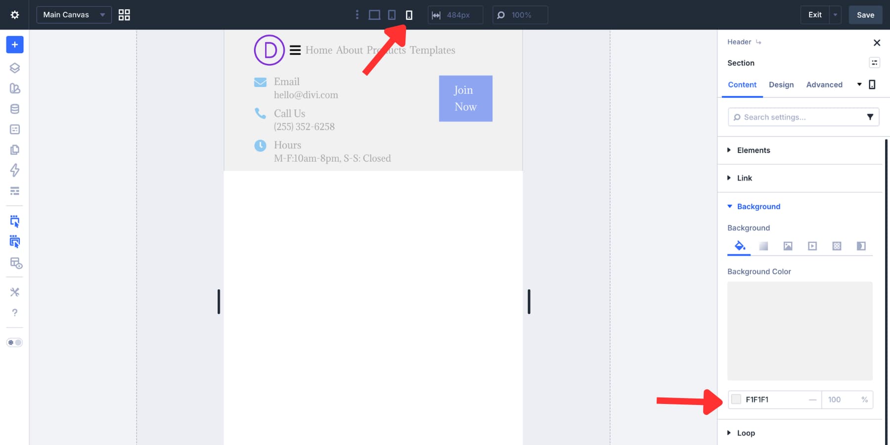
Open the section settings before adding modules. Go to Design > Layout and set the Vertical Gap to 0px. This keeps the header rows flush against each other.
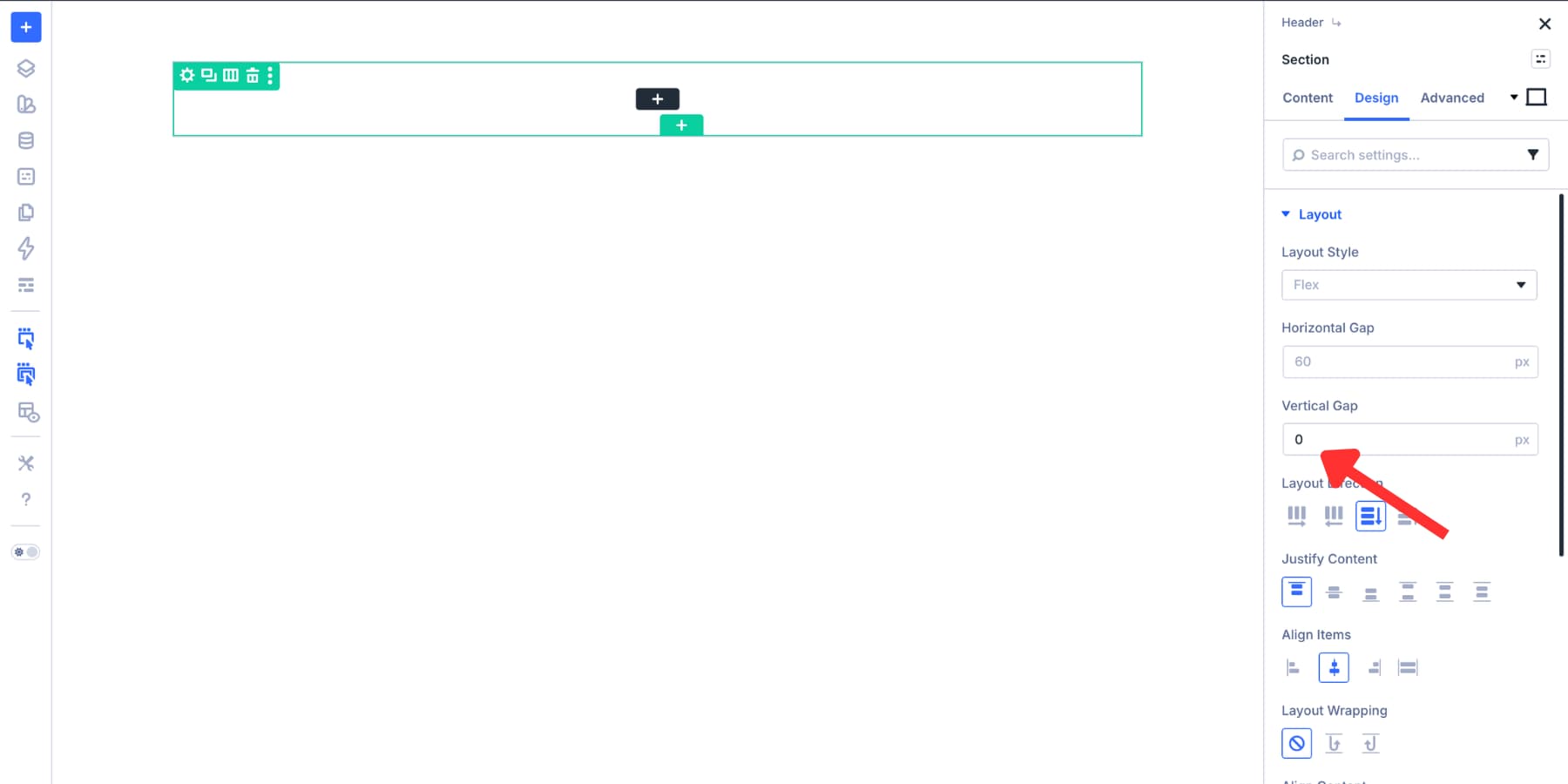
Next, go to Design > Spacing. Set the top and bottom padding to 0px. The outer section stays compact, while each row can still control its own spacing.
Adding The Header Rows
Start with the default single-column row inside the section. This row will hold the nested rows. Open the row settings and go to Design > Layout.
Set Layout Direction to Column, Justify Content to Start, Align Items to Stretch, and Vertical Gap to 0px. This stacks the nested rows vertically and keeps them edge-to-edge.
Set the row’s top and bottom padding to 8px. Next, duplicate the structure to create two stacked nested rows. The first row will hold the logo, navigation, and social icons. The second row will hold contact details and the CTA.
For the nested rows, set the Horizontal Gap to 2% and the Vertical Gap to 8px.
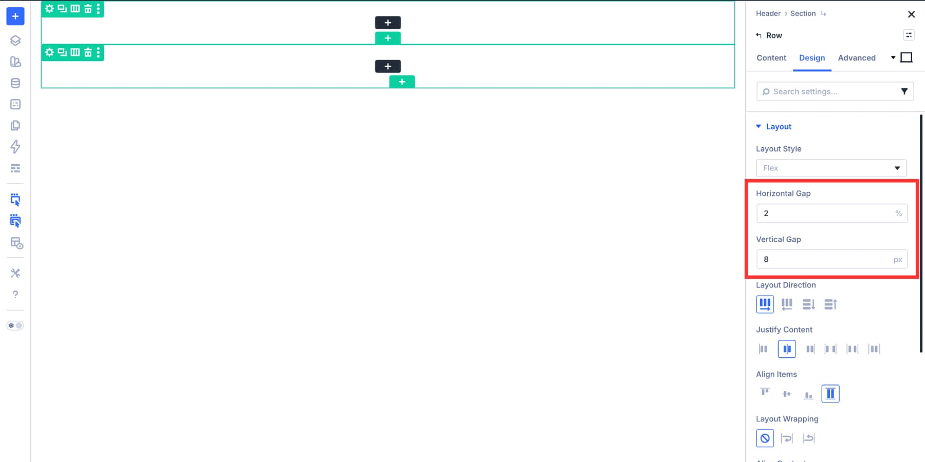
Apply the same alignment logic to the column inside the first row. This makes the modules easier to align.
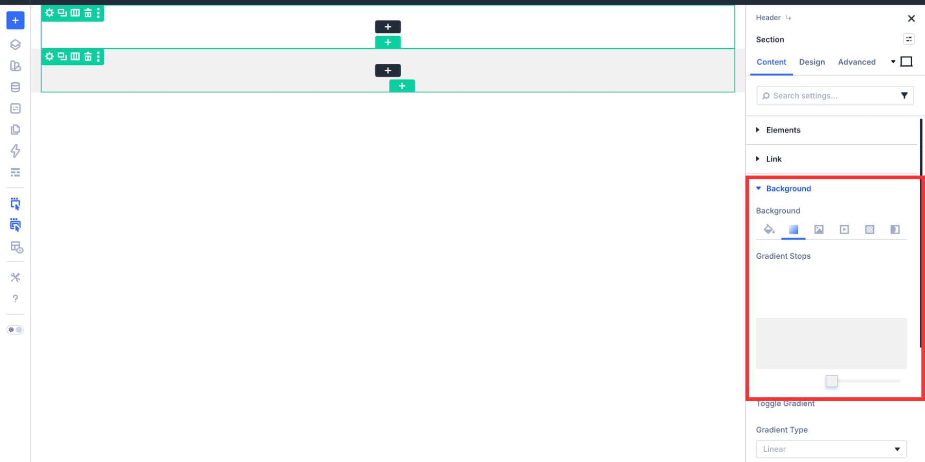
Creating The Two-Tone Background
Add a gradient background to the section. Set both color stops to the same point. This creates a sharp transition instead of a blended gradient. Use 50% for an even split, or adjust the stop if one row is taller than the other.
Building The Logo, Navigation, And Social Row
The first nested row has three parts: the logo, navigation, and social icons. Flexbox controls how those parts sit together.
Adding The Logo And Navigation Group
Add a Module Group for the logo and navigation cluster. A group is useful because Flexbox distributes direct children. When related modules sit inside a group, the group behaves as one flex item.
Inside the group, set Layout Direction to Row, Horizontal Gap to 2%, Justify Content to Start, and Align Items to Center.
Adding The Dynamic Logo
Add an Image Module for the logo. Instead of uploading a static logo, use the Site Logo dynamic tag. This connects the header logo to Divi > Theme Options > General, so future logo updates can be handled from one place.
Adding The Navigation Links
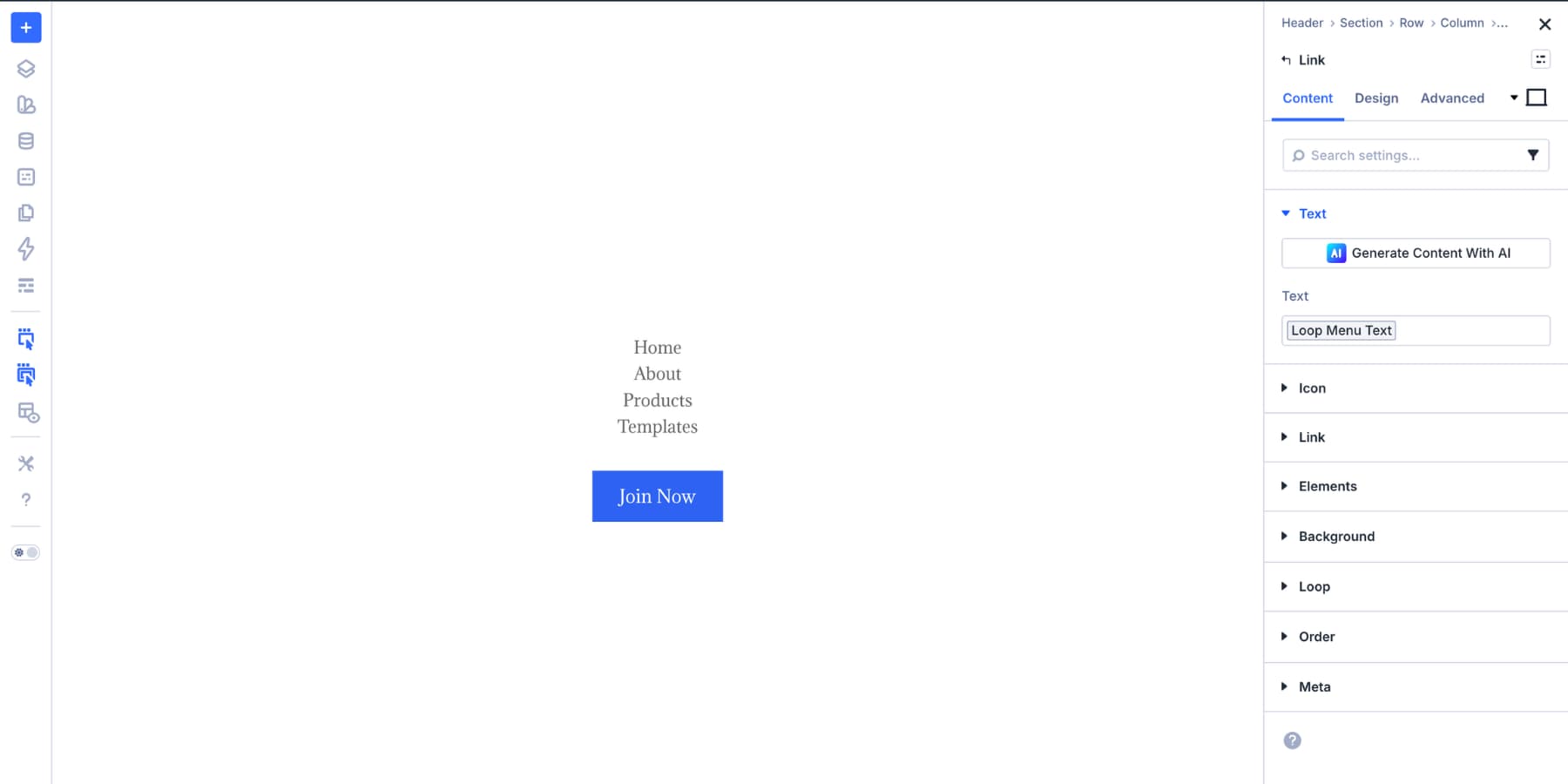
Add a Link Module inside the same group. Style the typography, spacing, and colors. Use Design Variables where possible so the menu stays consistent with the rest of the site.
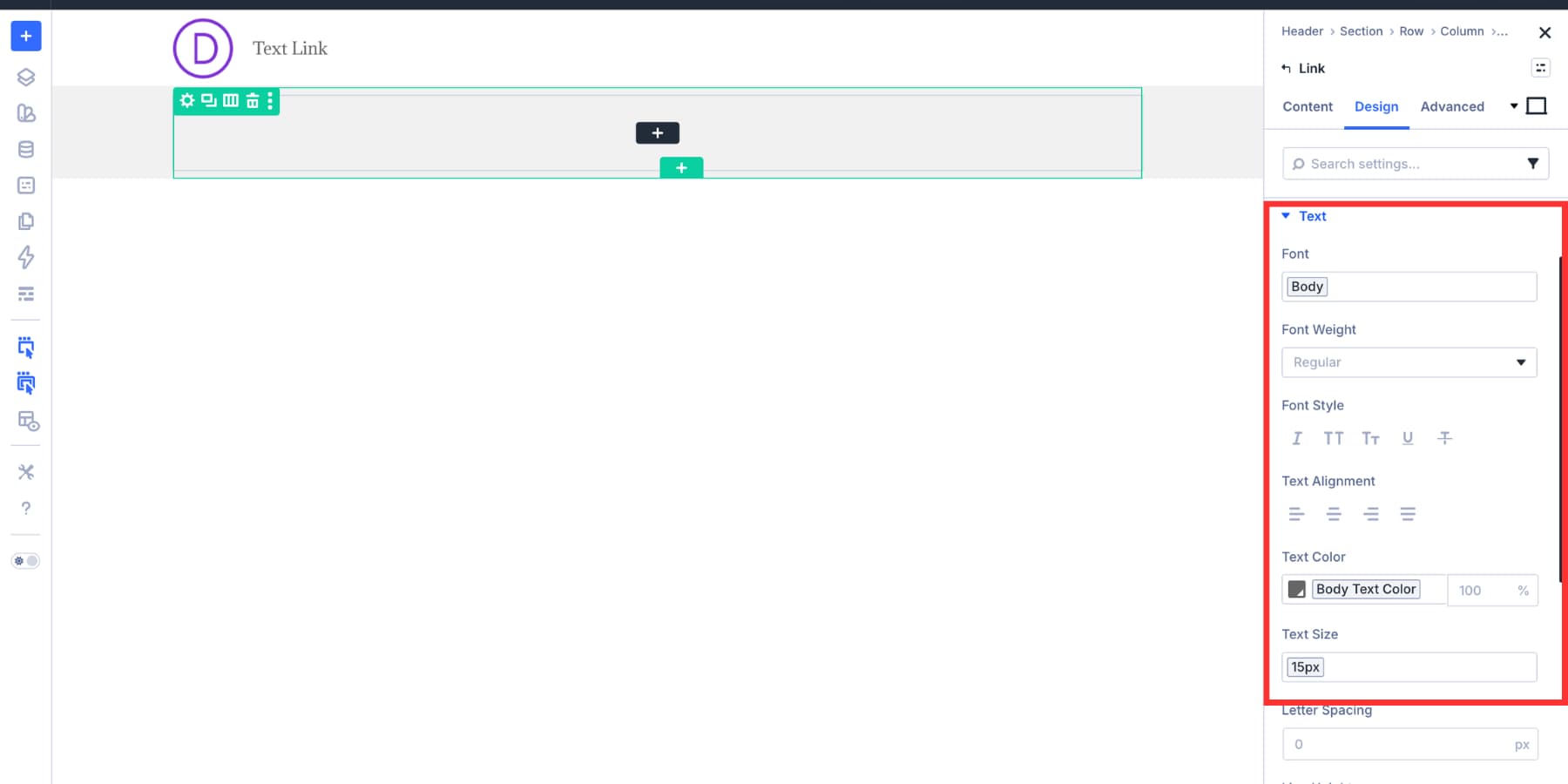
Turn on the Loop Element toggle. Set the Query Type to Menu, select the WordPress menu you want to display, and set the loop order to follow the menu order.
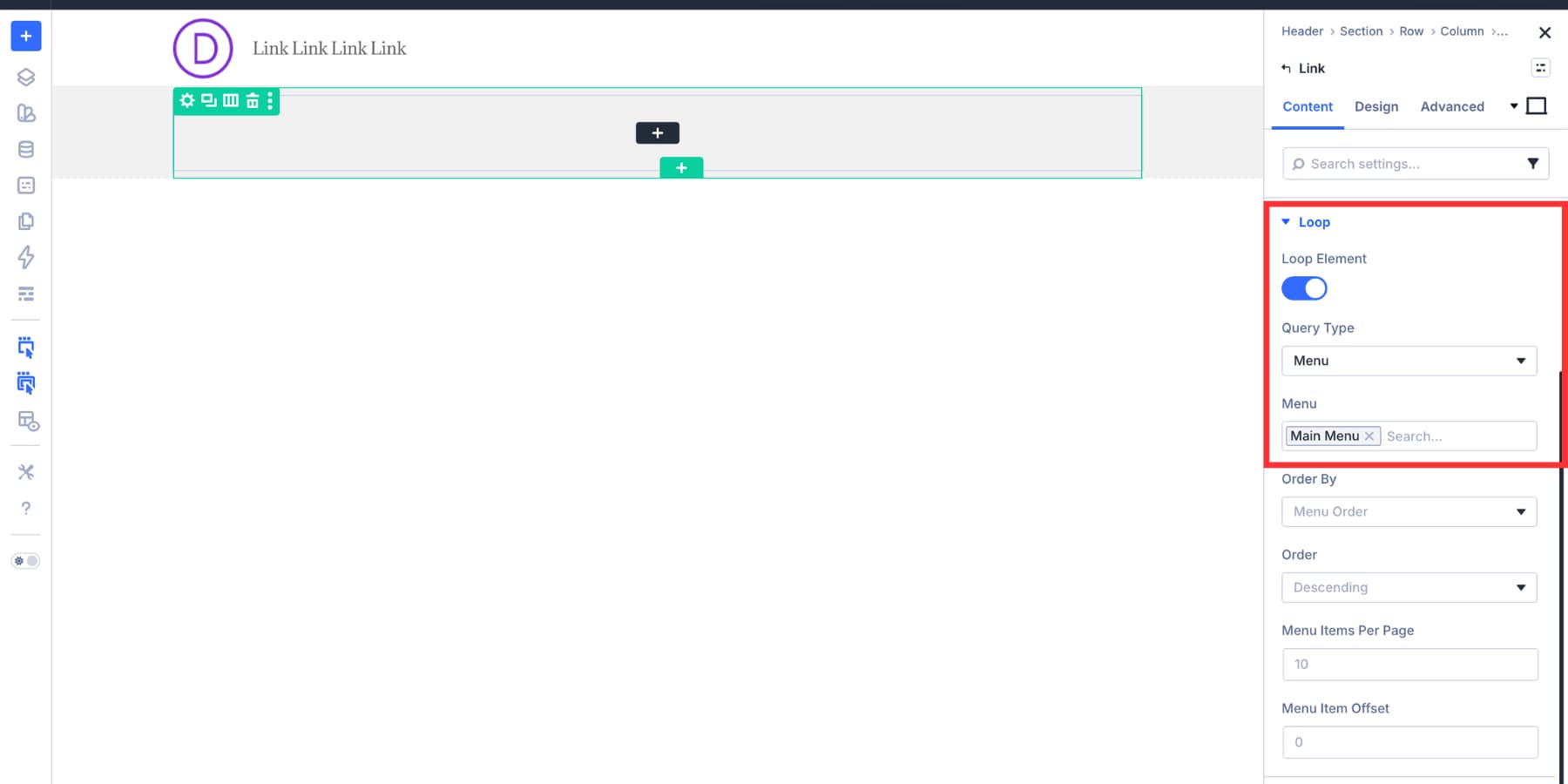
Apply the Loop Menu Text dynamic tag to the Link Module label. Then apply the Loop Menu Link dynamic tag to the Link URL. The first controls the visible label. The second sends each item to the correct page.
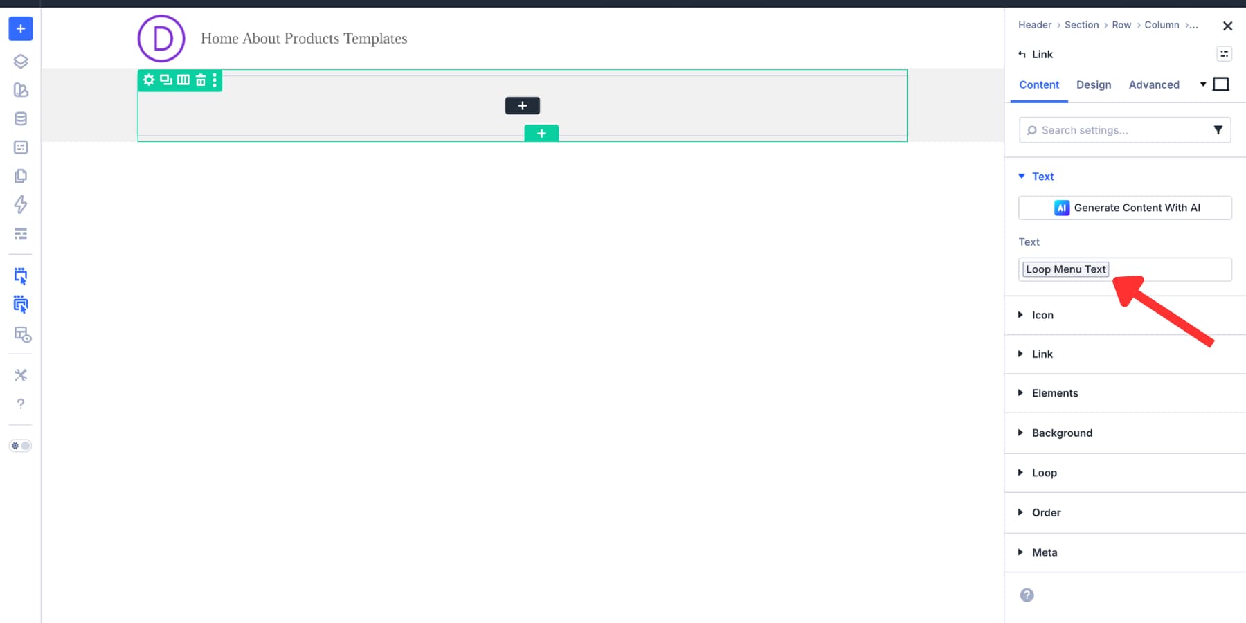
A Menu Module can build a simple navigation bar faster. Use a looped Link Module when you need more control.
Adding Social Icons
Add the Social Media Follow module to the row. Style the icon size, spacing, and colors to match the header’s navigation style.
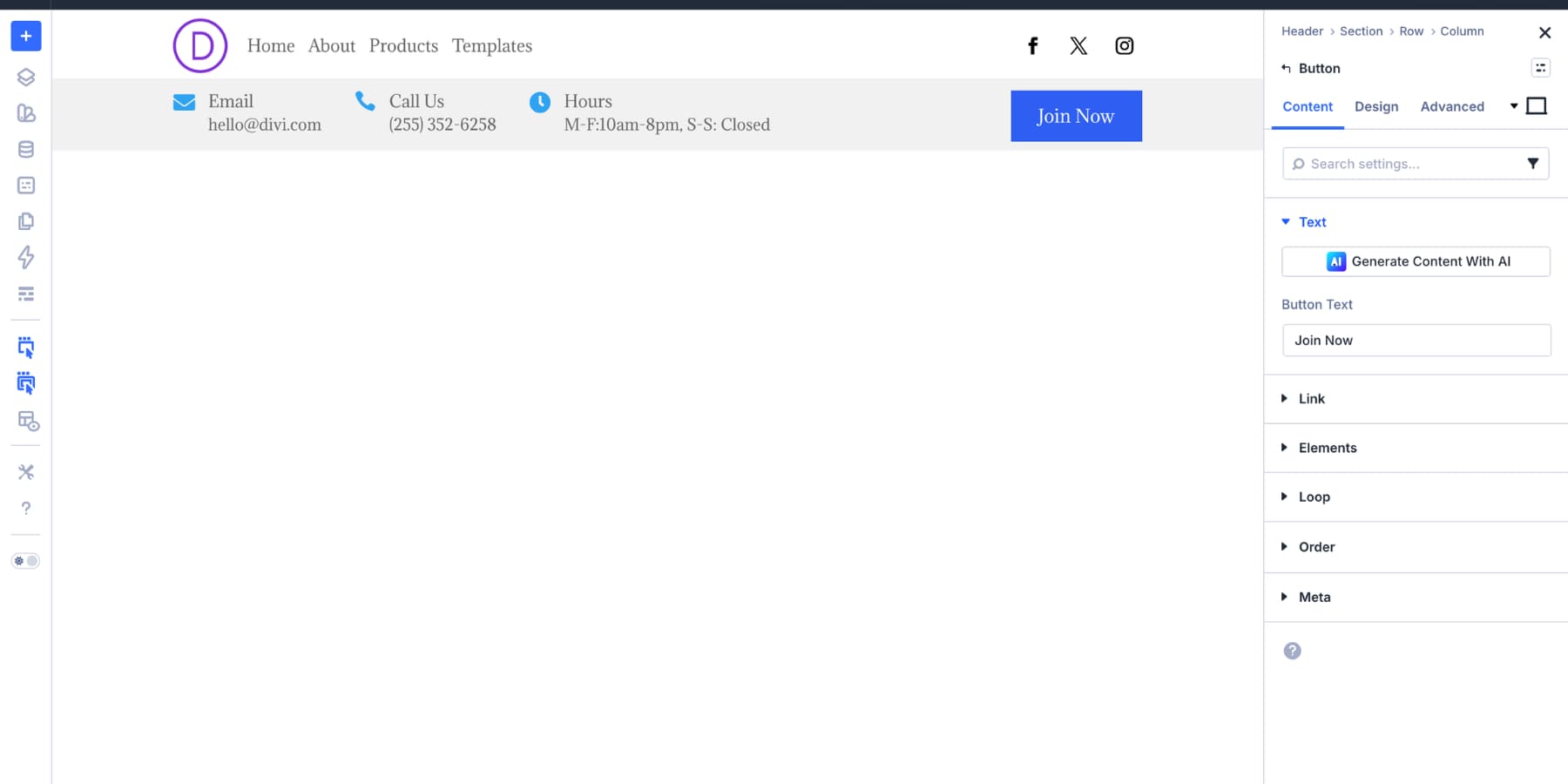
Building The Contact Info And CTA Row
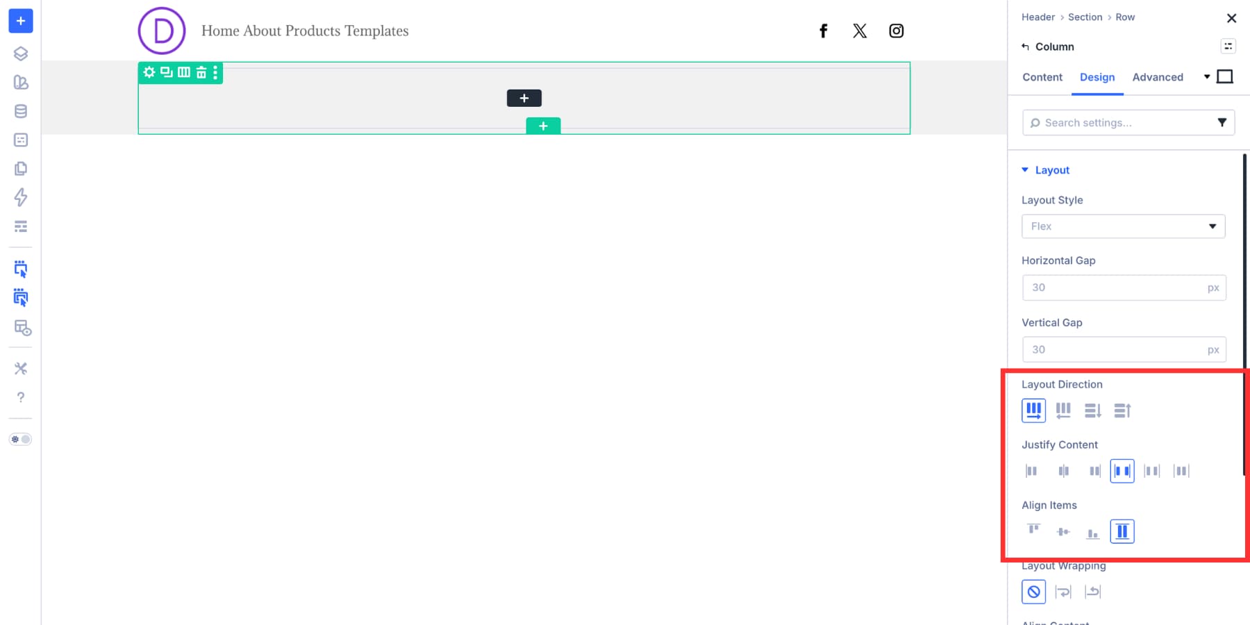
The second row has one job. It places contact details on the left and a CTA on the right. Set the row or column to Layout Direction: Row, Justify Content: Space Between, and Align Items: Stretch. This keeps both sides aligned across the row.
Building The Contact Details Group
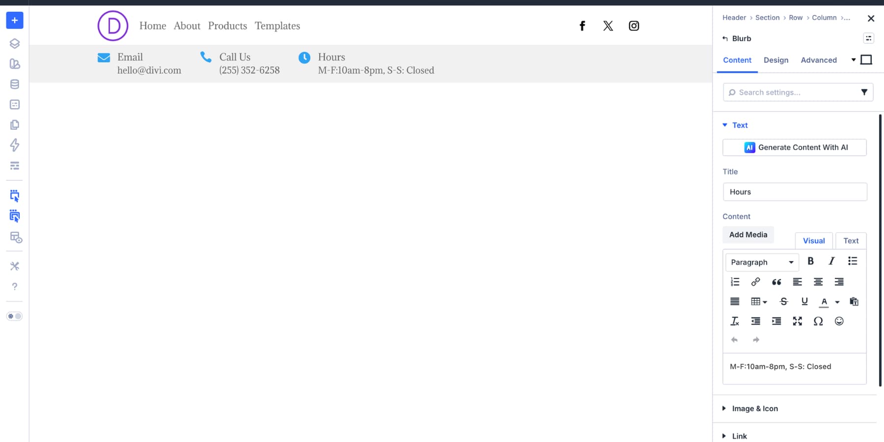
Place the contact details inside a Module Group. This matters because Space Between works on direct children. The contact group becomes one item on the left, and the button becomes the item on the right.
Inside the group, add a Blurb Module for each contact item. A Blurb works well because it includes an icon, title, and body content. For the first item, use an envelope icon, set the title to Email, and add the email address as the body content.
Under Design > Image And Icon, set Icon Placement to Left. Under Sizing, set the icon size to 20px.
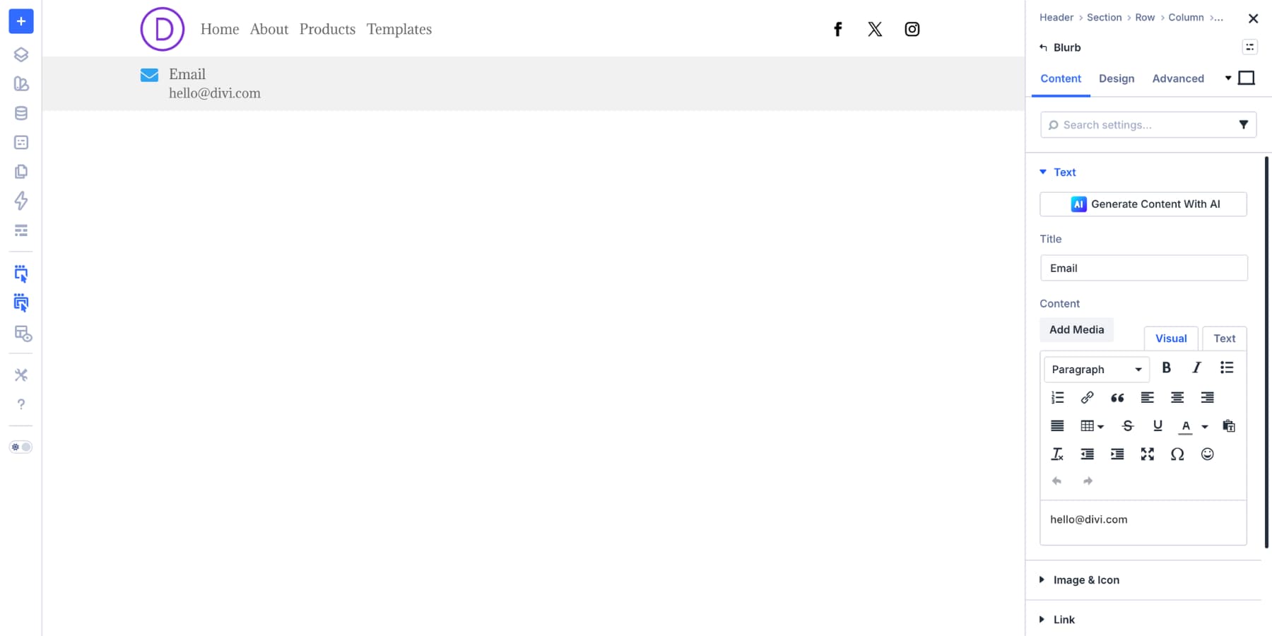
Duplicate the Blurb twice. Use the copies for the phone number and business hours, then swap the icon, title, and body content for each item.
Adding The CTA Button
Add the Button Module outside the contact details group. That placement is intentional. The contact group sits on the left, and the button sits on the right. With Space Between enabled, the CTA lands at the far edge of the row.
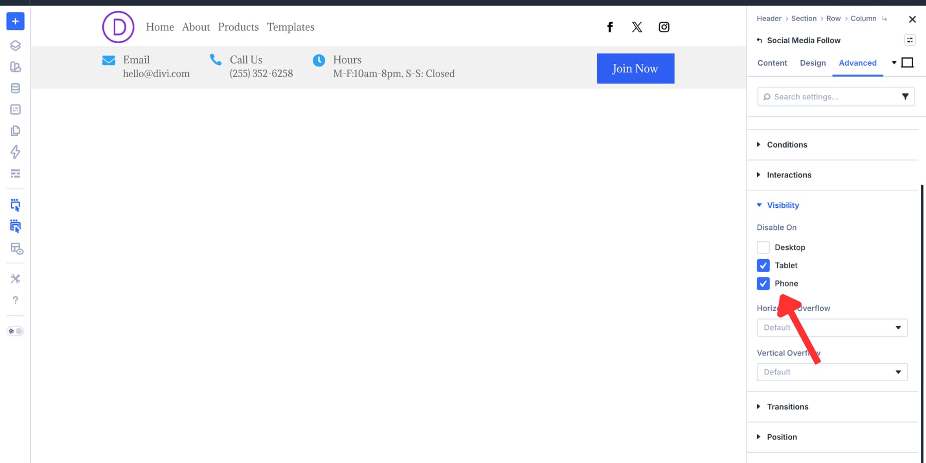
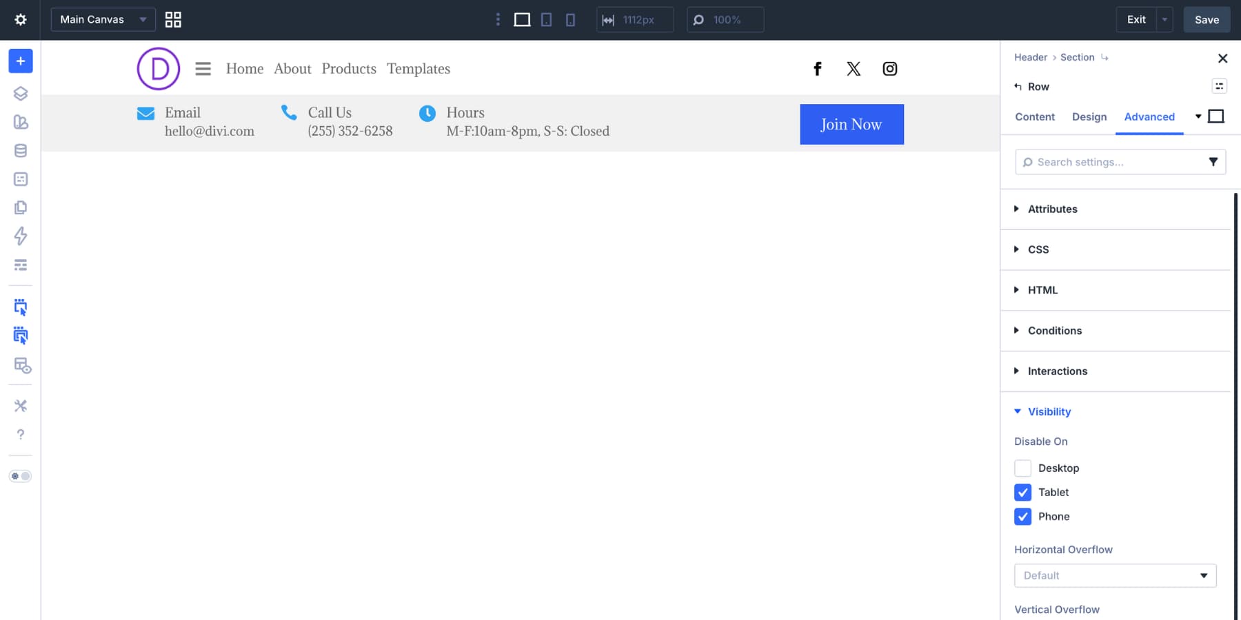
Making The Layout Responsive
The desktop header has more content than a mobile header should show. On smaller screens, keep the logo and hamburger visible, then move the full menu into a Canvas.
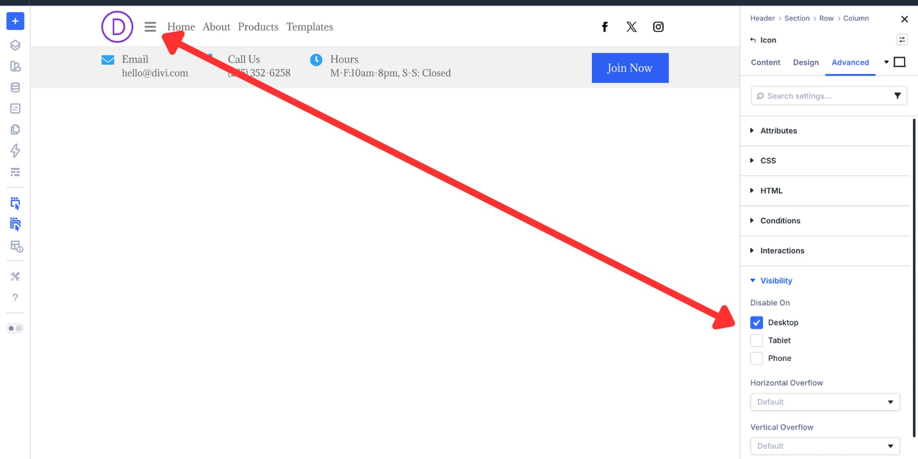
Hiding Desktop-Only Items
Hide the Link Module group and Social Media Follow module on mobile. Use Advanced > Visibility.
Add an Icon Module opposite the logo. Set it to a hamburger icon, style it to match the header, and hide it on desktop.
Hide the second nested row on mobile too. The contact and CTA strip takes too much space in a compact header.
Adjusting The Mobile Background
The gradient background no longer makes sense on mobile because it was only used to separate two visible rows. At the mobile breakpoint, replace the gradient with a flat background color.
The faded elements in the builder are hidden at the active breakpoint. This helps you confirm what is visible on mobile.
Setting Up The Mobile Navigation Canvas
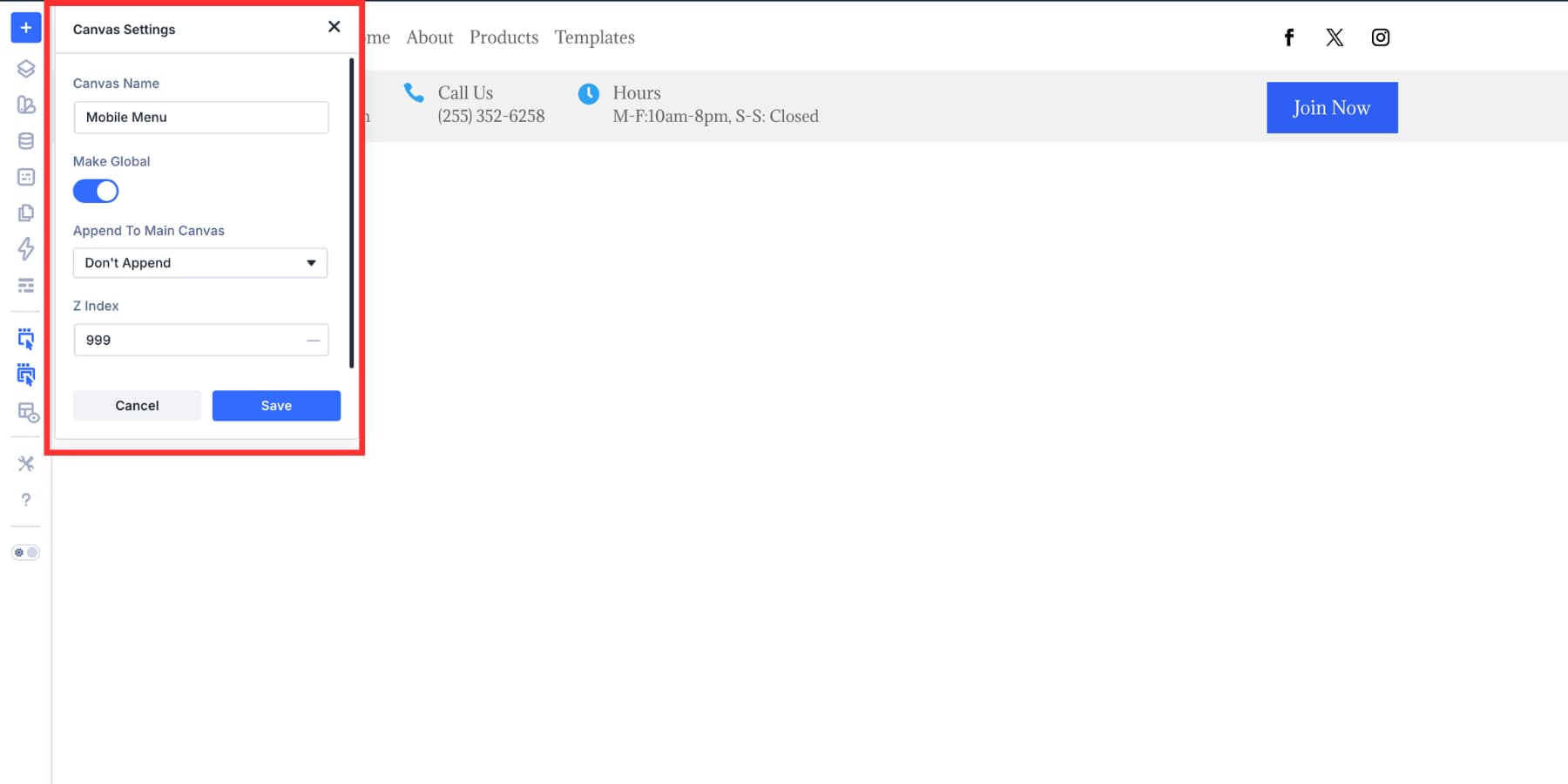
Create the mobile menu in a detached Canvas. Use the Canvas dropdown at the top of the Visual Builder, then add a new Canvas.
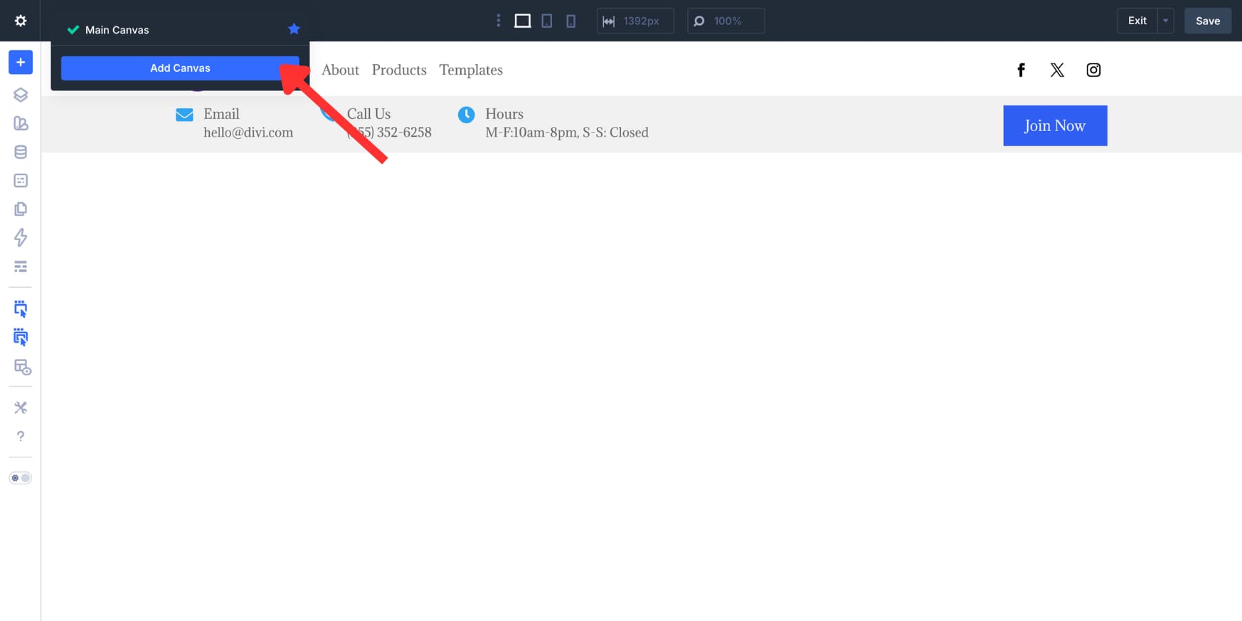
Name it clearly. Mobile Menu works well. Make it global if the same menu should appear across the site. Set the Z Index to 999 so it appears above the page layout.
Positioning The Canvas
Inside the Canvas, center the content. Set the column’s Justify Content and Align Items to Center. In the Canvas section, go to Advanced > Position and set Position to Fixed.
Set Offset Origin to Top Left and set both offsets to 0. This lets the Canvas cover the viewport instead of sitting in normal page flow.
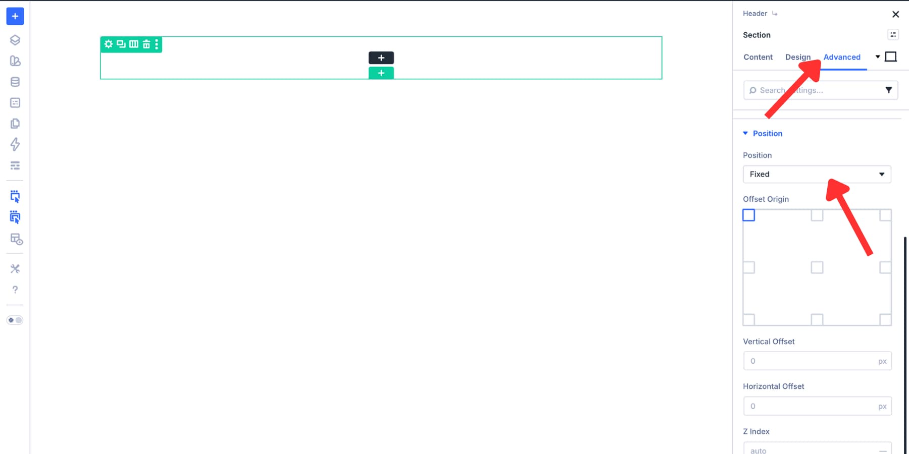
Go to Design > Sizing and set the height to 100vh. Use Flexbox alignment on the Canvas section or column to center the menu vertically and horizontally.
Adding The Mobile Menu Content
Copy the desktop navigation Module Group into the Canvas to save time. Set the group’s Layout Direction to Column so the menu items stack vertically.
Set the Column Class to Fullwidth where needed. Remove any desktop-only visibility settings, then add the CTA button below the menu.
You can also add phone, hours, or email details. Only include them if they help mobile visitors act faster. Keep the mobile menu focused.
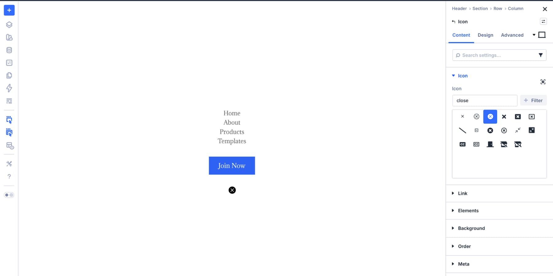
Adding The Close Icon
Add an Icon Module inside the Canvas and set it to a close icon.
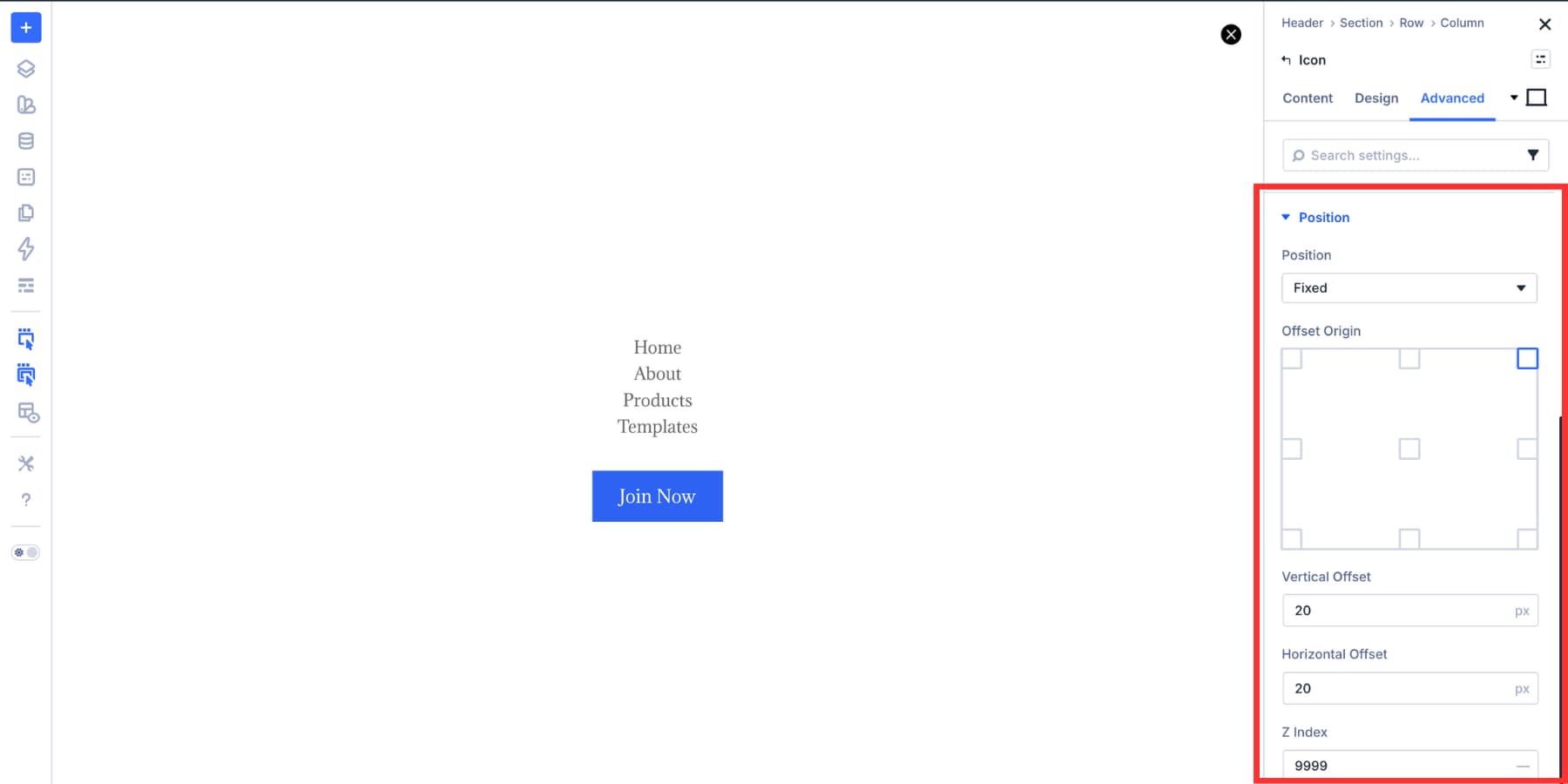
After styling the close icon, go to Advanced > Position. Set Position to Fixed, Offset Origin to Top Right, and both offsets to 20px. Set the Z Index to 999. This pins the close icon to the corner of the viewport.
When the Canvas is finished, go to the Canvas section’s Advanced tab. Disable it across all breakpoints under Visibility. This keeps it hidden on load until an Interaction shows it.
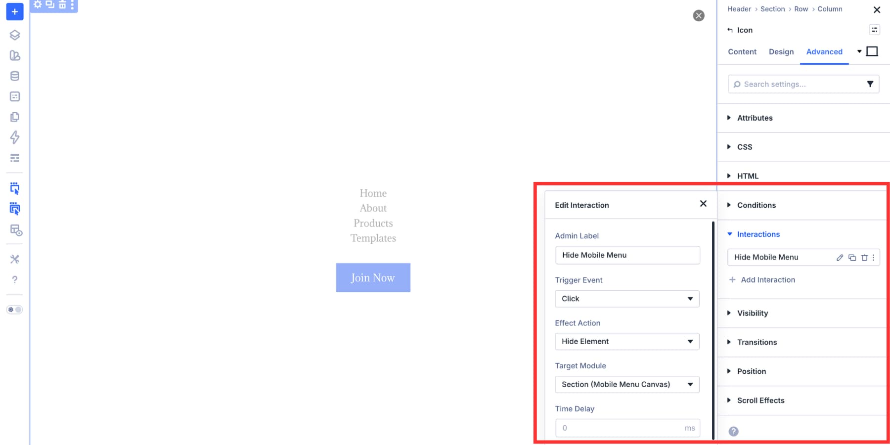
Wiring Up The Interactions
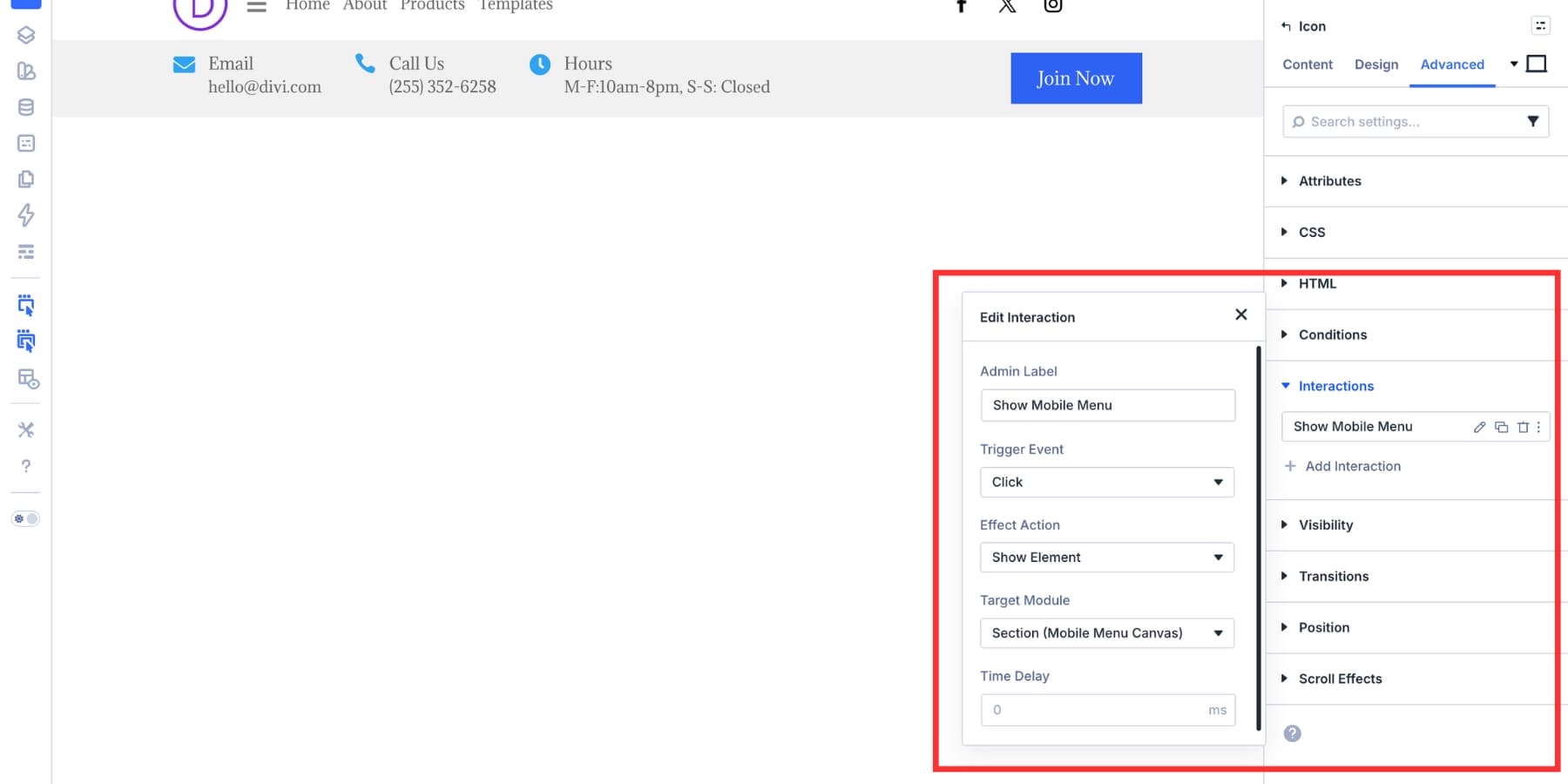
Select the hamburger icon and add an Interaction. Set the Trigger Event to Click, the Effect Action to Show Element, and the Target Module to the mobile menu Canvas section.
Select the close icon inside the Canvas and add the reverse Interaction. Set the Trigger Event to Click, the Effect Action to Hide Element, and use the same Canvas section as the target.
Optional Accessibility Cleanup
Give the hamburger and close icons clear labels. This helps visitors using assistive technology. If your build uses Divi 5’s semantic element options, set the navigation wrapper to nav.
Previewing The Finished Header
That is all it takes to build an advanced responsive header in Divi 5.
The result is maintainable. The navigation comes from WordPress, the logo comes from the Site Logo dynamic tag, the mobile menu lives in a Canvas, and the open and close behavior lives in Interactions. The spacing and alignment come from Flexbox, so no hidden duplicate sections are needed.
Not every site needs a utility bar. Some sites need a clean header that stays out of the way. This layout works well for SaaS products, portfolios, membership sites, and lightweight business sites.
The structure is simple. The logo and navigation sit on the left, and supporting actions sit on the right.
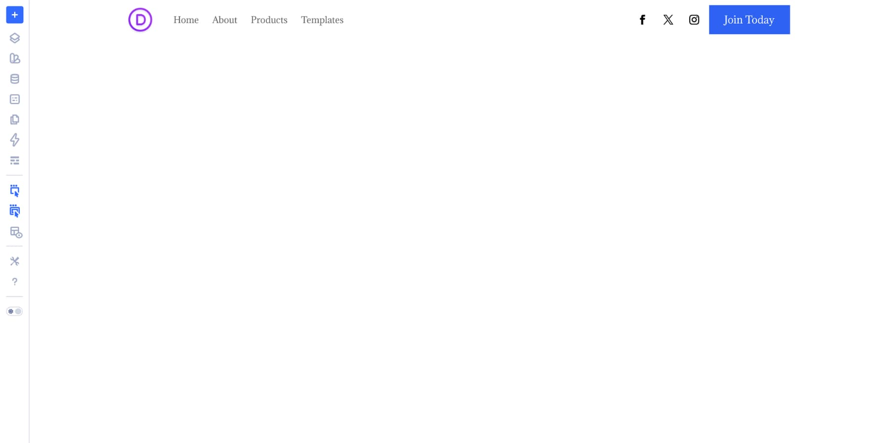
Adding A Two-Column Flexbox Row
The row uses a two-column layout. The wider left column holds the logo and navigation. The narrower right column holds supporting elements, such as search, cart, social icons, or a CTA.
For the row, set the Horizontal Gap to 2% and the Vertical Gap to 8px. Set Justify Content to Start and Align Items to Stretch. Stretch keeps both columns the same height, even when their contents differ.
Building The Left Column
Set the first column to Layout Direction: Row, Justify Content: Start, and Align Items: Center. Add the logo and navigation using the same setup from Design #1.
Add an Image Module connected to the Site Logo dynamic tag. Then add a Link Module using Menu Looping.
Building The Right Column
Set the second column to Layout Direction: Row and Align Items: Center. Use an 8px horizontal and vertical gap to keep the supporting actions evenly spaced.
Add Icon Modules for search and cart if the site needs them. Link the cart icon to the cart page for WooCommerce sites, and remove it for non-commerce builds. Then add the Social Media Follow module and Button Module side by side.
Adapt Your Design To Smaller Breakpoints
Similar to the first header, create a canvas with all the elements you want in your mobile menu: navigation, CTA buttons, and more. Likewise, add a close button. Then a hamburger icon next to your site logo while hiding everything else. And then put up interactions to connect all these pieces together.
The Possibilities Are Nearly Endless With Divi 5
The two headers look different, but the method is the same. Flexbox handles the layout. Link Modules and Menu Loops handle dynamic navigation. Canvases keep mobile overlays separate from the main header. Interactions handle the open and close behavior.
Each tool does its part. Because they are built into Divi 5, the workflow stays visual and maintainable. You are not stitching the header together with duplicate sections, CSS fixes, or hidden JavaScript snippets.
Divi 5 is available now. This kind of header workflow is where its layout and interaction improvements shine.


So when will the Menu Loop option actually work for WordPress menus that have submenu items? As far as I can see, the only usefulness of this feature would be to create megamenus or sidebar menus. It would be helpful to developers.