
Welcome back to the Divi 5 Mastery Course. In Parts 5–9, we built the coworking space website’s homepage, header, footer, global templates, and core inner pages. Then, in Parts 10–11, we strengthened those layouts with Flexbox and CSS Grid.
Responsiveness was part of the build all along, but this final pass is where we refine everything. The goal is to make the site feel polished across phones, tablets, desktops, wider screens, and the breakpoints in between.
In this part, we’ll audit the full site, fine-tune key layouts, use Divi 5’s responsive tools, and keep global consistency with your Design Variables and Presets. By the end, your site will be much closer to launch-ready.
Let’s dive in.
Divi 5 Mastery Course Overview
| Part | Title | Visit |
|---|---|---|
| 1 | What To Prepare Before Building Your Divi 5 Website | Learn more |
| 2 | Exploring Every Aspect Of The Divi 5 Interface | Learn more |
| 3 | Creating A Divi 5 Global Design System With Design Variables | Learn more |
| 4 | Mastering Divi 5 Presets For Faster, More Consistent Web Design | Learn more |
| 5 | Building A Divi 5 Homepage From Scratch | Learn more |
| 6 | Building A Custom Header And Navigation In Divi 5 | Learn more |
| 7 | Building A Custom Footer In Divi 5 | Learn more |
| 8 | Using Divi 5’s Theme Builder To Create Global Website Templates | Learn more |
| 9 | Building The Core Inner Pages Of Your Divi 5 Website | Learn more |
| 10 | Mastering Flexbox In Divi 5 | Learn more |
| 11 | Mastering CSS Grid In Divi 5 | Learn more |
| 12 | Making Your Divi 5 Website Fully Responsive | Learn more |
| 13 | Creating Interactive Off-Canvas Elements (Popups & More) | Learn more |
| 14 | Mastering The Divi 5 Loop Builder | Learn more |
| 15 | Divi 5 Power User Workflow | Learn more |
| 16 | Auditing, Polishing, And Launching Your Divi 5 Website | Learn more |
Divi 5 Responsive Tools You’ll Use Most
Divi 5 includes a focused set of responsive tools for editing layouts across different screen sizes. Since we used many of these while building the site in earlier parts, this section is a practical recap before the final audit.
Customizable Responsive Breakpoints
The Page Bar at the top of the Visual Builder gives you access to responsive controls. Divi 5 includes seven customizable responsive breakpoints: Phone, Phone Wide, Tablet, Tablet Wide, Desktop, Widescreen, and Ultra Wide.
Click the ellipsis in the responsive menu to reveal the available breakpoints.
Toggle on any extra breakpoints you want to target. For example, enable Phone Wide when you need more control between standard phone and tablet widths, or Ultra Wide when you want to check larger desktop displays.
Canvas Scaling
Start your audit on Desktop, then move to Tablet, and finish on Phone. When you need more precision, use the responsive width field to enter an exact width. You can also drag the edge of the Canvas to resize the preview and test how the design responds in real time.
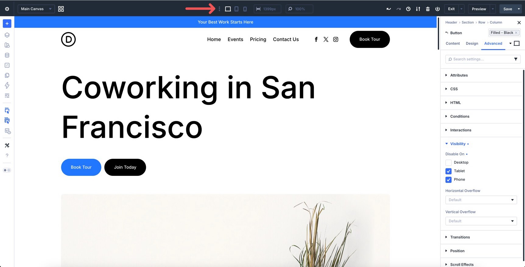
Responsive State Picker
When you select an element on the Canvas, the settings panel includes a state picker. Use it to choose which breakpoint or interaction state you are editing, such as Desktop, Tablet, Phone, Hover, Focus, Checked, Active, or Sticky.
This keeps responsive and state-based editing in one workflow. For this final pass, you’ll mostly use the responsive breakpoints, but it is also worth checking interactive states on buttons, forms, and sticky elements.
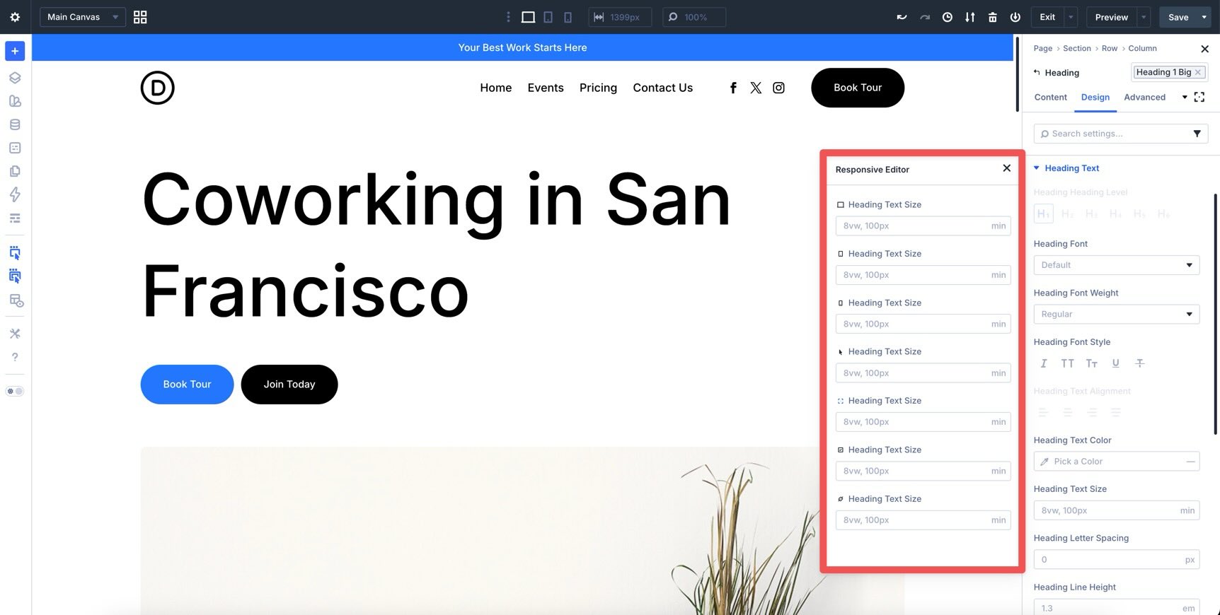
Responsive Editor
The Responsive Editor lets you review and edit values across breakpoints from one panel. Click the Edit Responsive Values icon next to a setting to open it.
From this panel, you can make precise adjustments without switching views repeatedly. This is useful for typography, spacing, alignment, column sizing, and other values that need small breakpoint-specific changes.
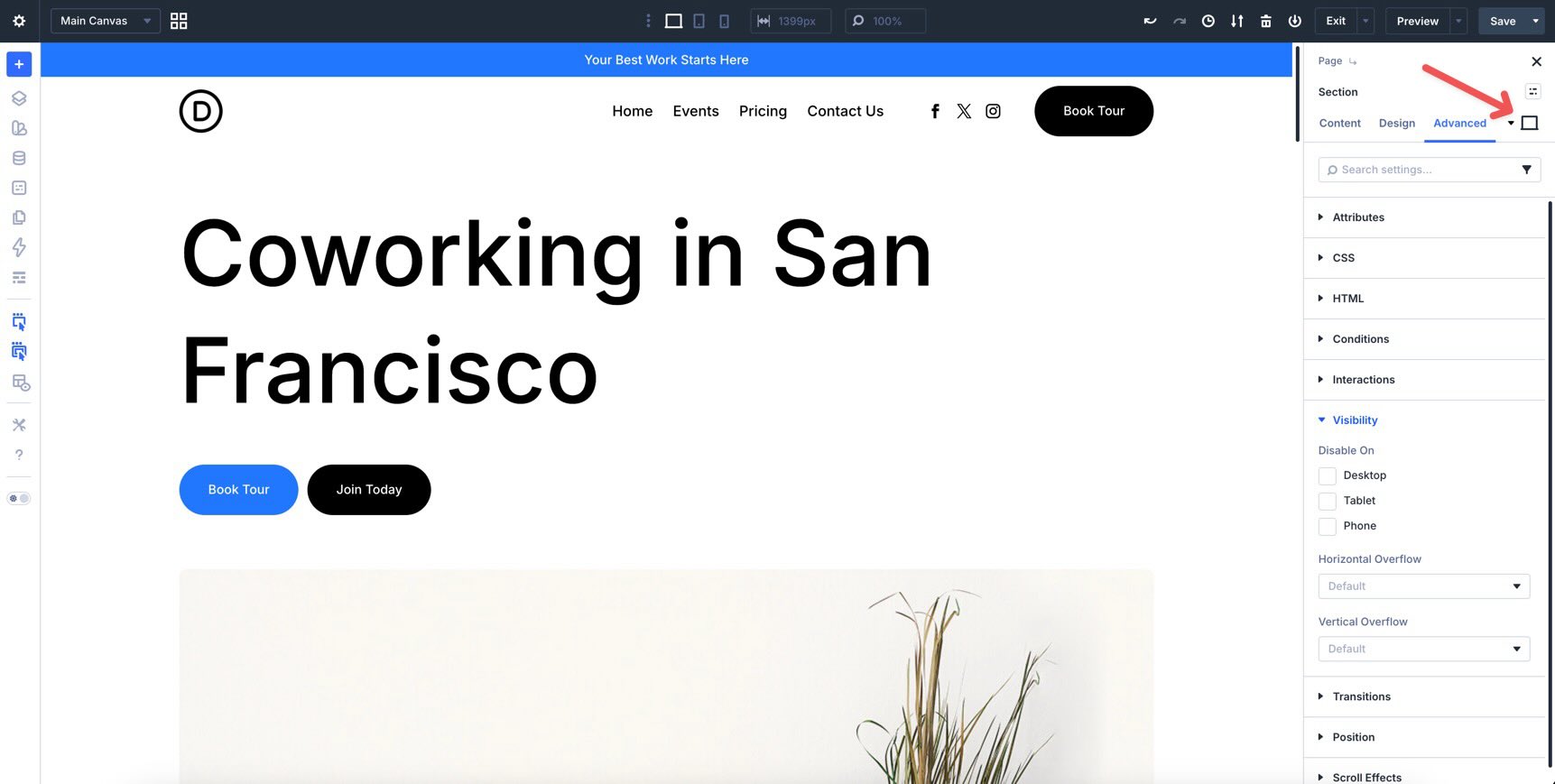
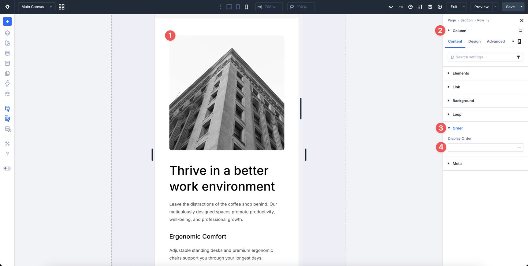
Structure Templates And Display Order
Structure Templates help you change column layouts per breakpoint. For example, a three-column desktop layout can become a single-column mobile stack without rebuilding the section manually.
The Display Order setting, found in each Column’s settings, lets you change the visual order of Columns on smaller screens without moving modules or relying on Visibility settings.
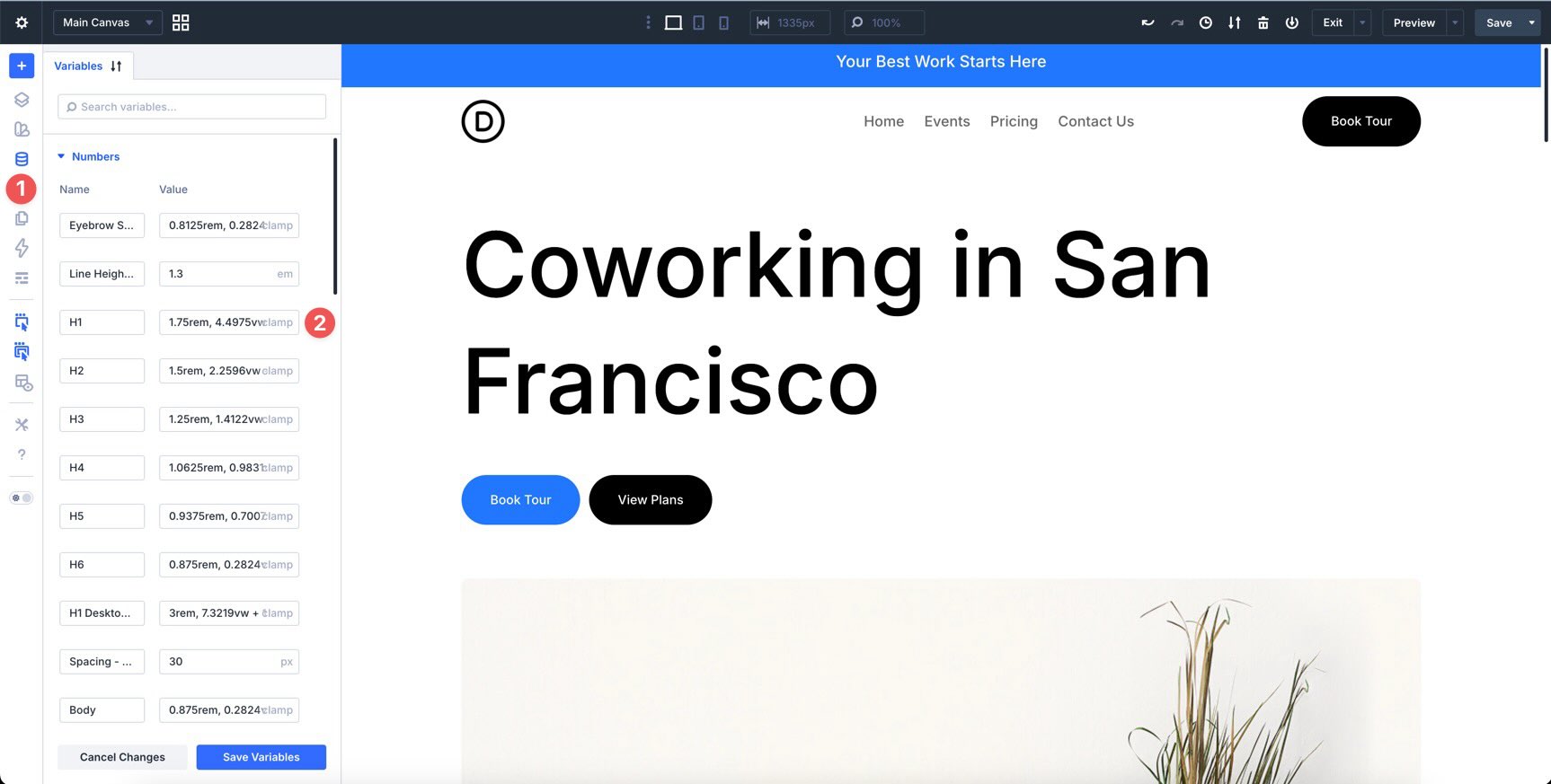
Design Variables
Your Design Variables from Part 3 help keep responsive design consistent. Because many typography and spacing values use fluid CSS functions like clamp(), much of the site already scales between breakpoints.
When a value needs to change everywhere, update the variable in the Variable Manager. That keeps related presets and modules connected instead of creating one-off responsive fixes.
Flexbox And CSS Grid
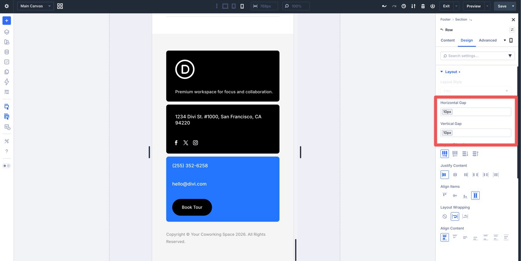
At the Row, Column, and Group level, Flexbox and CSS Grid give you control over how layouts adapt across breakpoints.
When using Flexbox, adjust Layout Direction, Layout Wrapping, Justify Content, Align Items, and Horizontal or Vertical Gap for each breakpoint as needed.

With CSS Grid, you can change the number of columns or rows and adjust grid item placement for different screen sizes.
Together with Presets and Design Variables, these layout systems make responsive changes easier to manage across the whole site.
The Recommended Responsive Workflow fFr Divi 5
Now that the tools are clear, it helps to follow a consistent audit process. A dedicated workflow keeps changes organized and prevents you from fixing the same issue in several different ways.
Start with the homepage because it sets most of the site’s visual patterns. Then, review the inner pages and reuse the responsive decisions you already made. After that, check your Theme Builder templates, especially the global header and footer.
Finally, use the Inspector and Layers panel to find inconsistencies and make quick updates to Variables, Presets, and repeated styles when needed.
Use A Desktop-First Review
For this site, use a desktop-first responsive review. Start on the Desktop breakpoint and confirm the base layout. Then, move to Tablet and make structural adjustments. Finally, finish on Phone, where spacing, stacking, and touch targets usually need the most attention.
This approach works well because the design system was built around fluid variables and reusable presets. Most adjustments should be small refinements rather than full rebuilds.
Use Builder View Tools
Use the Canvas resize handle to drag the right edge of the Canvas. This lets you test different widths without switching breakpoints for every minor check.
Turn on X-Ray Mode when adjusting spacing or structure. It outlines layout elements to make container boundaries clearer.
Use Wireframe Mode when you want a high-level view of the page structure, especially on long pages with many sections.
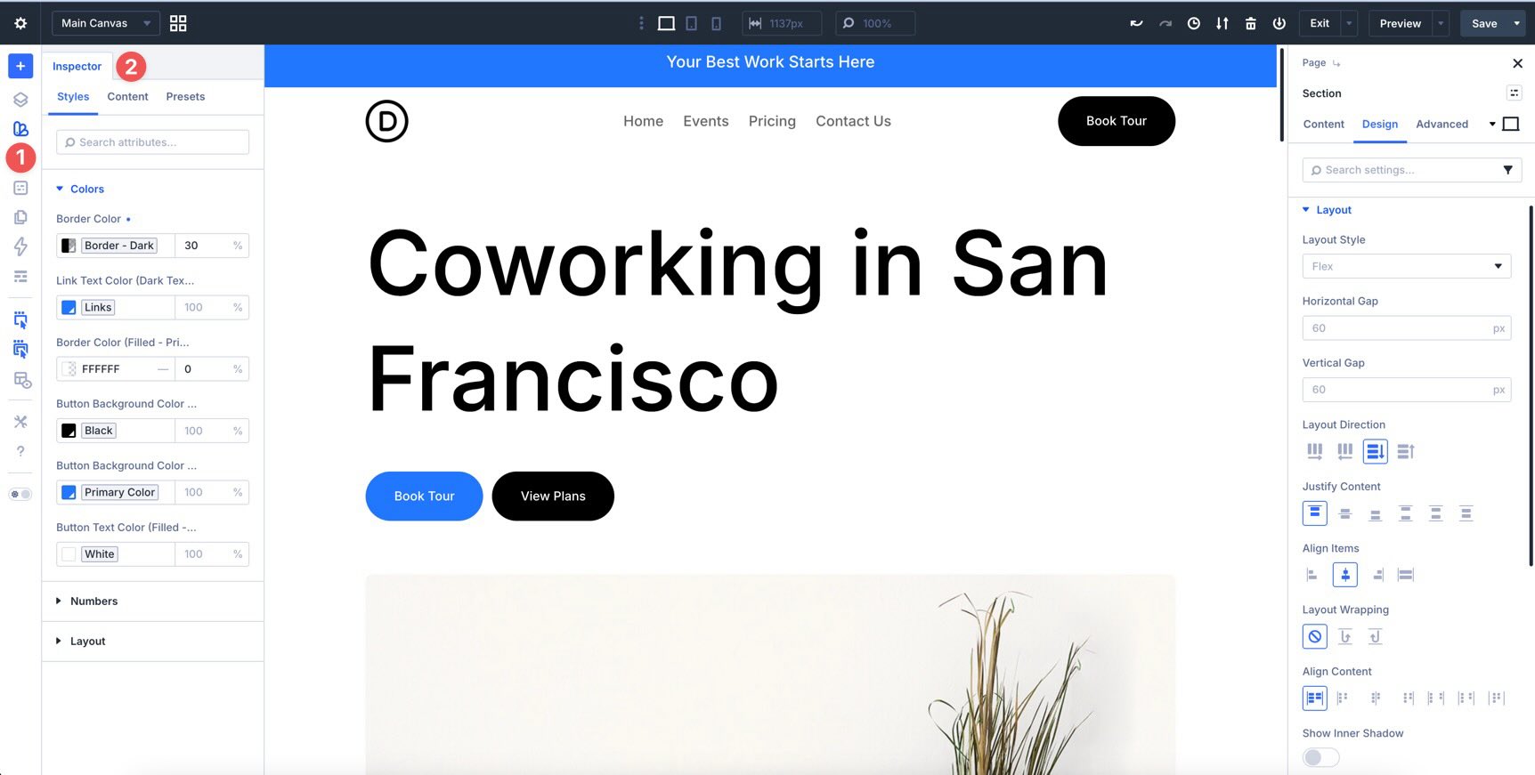
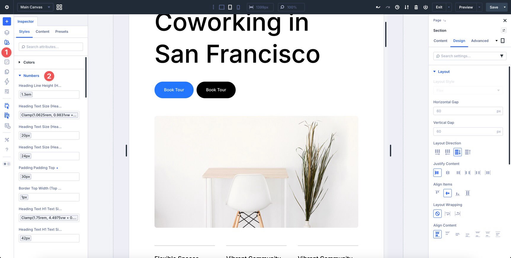
The Inspector is useful for bulk checks and repeated changes. For example, you can inspect a section and quickly review spacing, presets, and key style values across multiple elements.
Know Where To Make Responsive Changes
Knowing when to make a local change versus a global change is important.
Use local styles when the adjustment is specific to a single section. For example, the homepage hero might need slightly different mobile spacing than other sections.
Update Presets and Variables when the change should apply everywhere. For example, if every button needs different mobile padding, update the Button preset instead of changing each button manually.
After making a local change, ask whether it should be included in a Preset. If the answer is yes, save it and use Extend Attributes to apply it across the page where appropriate.
Refining The Homepage Responsiveness
Your homepage already has a strong responsive foundation from Part 5. At this stage, the goal is refinement, not rebuilding.
Focus on tightening spacing, improving typography, checking touch targets, and making sure each section feels intentional across breakpoints. Work from Desktop to Tablet to Phone, then add extra breakpoints only where the design needs them.
Hero Section
The hero is the first impression visitors get, so it deserves extra attention on smaller screens. Confirm that the main headline uses the H1 Big variable from Part 3 so it scales fluidly.
Then, use the Responsive Editor to fine-tune line height at Tablet and Phone sizes if the text feels too tight or too loose.
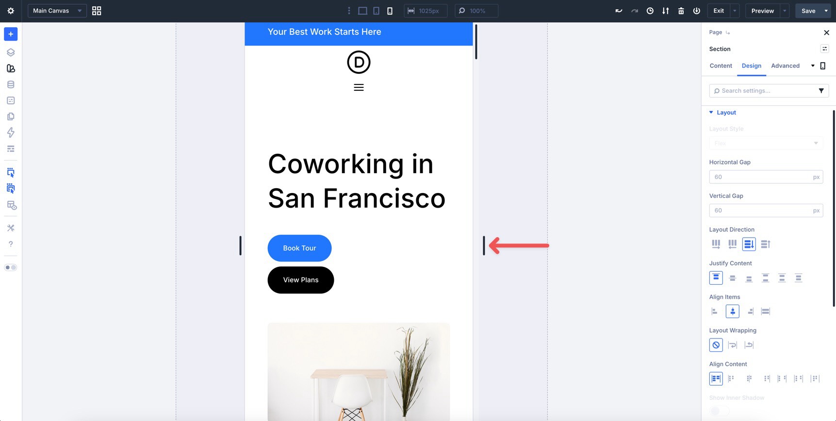
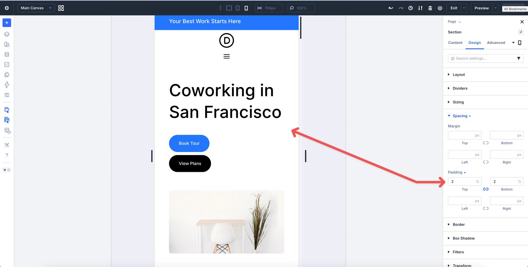
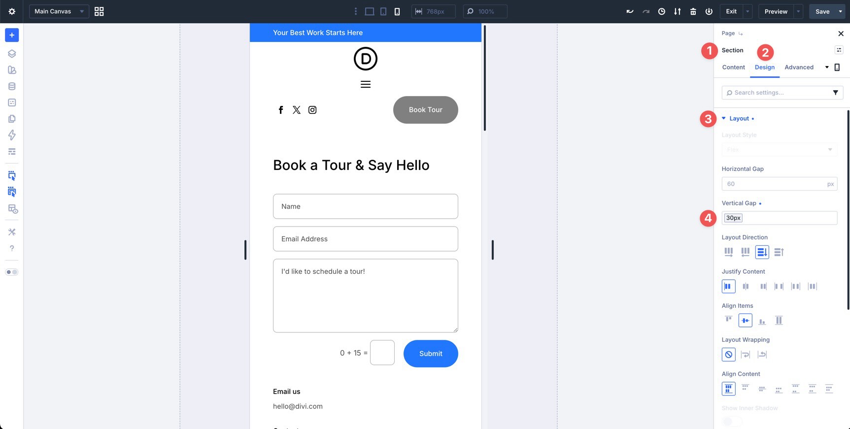
On Phone, you may want the two hero buttons to stack vertically. Switch to the Phone breakpoint, select the Group module containing the buttons, and change Layout Direction to Column. Make sure the Spacing – XSmall variable is applied so the buttons have enough separation.
The three-column row at the bottom of the hero should stack cleanly on mobile. Confirm that the alignment stays centered and the top borders remain visually balanced.
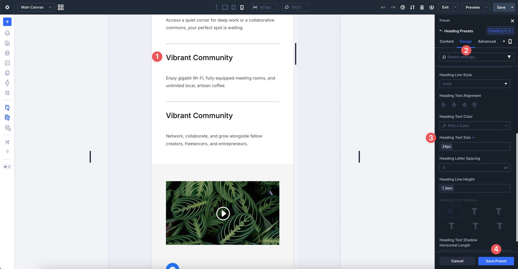
If the headings feel uneven on Tablet, update the Heading 4 preset. For example, apply an H4 Tablet variable to reduce the Heading Text Size to 20px.
Next, use the Responsive State Picker to select the Phone breakpoint. Change the Heading Text Size to the H2 Mobile variable, such as 24px, if that better fits the small-screen layout.
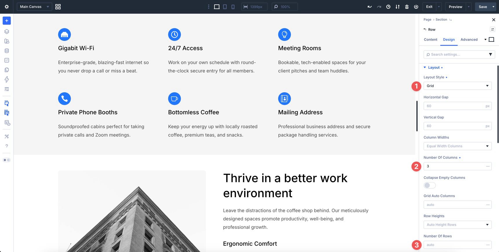
Features Grid Section
The first Features section relies on CSS Grid. Confirm that the Number of Columns changes from three columns on Desktop to two columns on Tablet and one column on Phone.
Then, tighten the Vertical Gap on mobile if the cards feel too spread out. Use the Spacing – Medium variable so the layout stays spacious without feeling loose.
Split Features Section
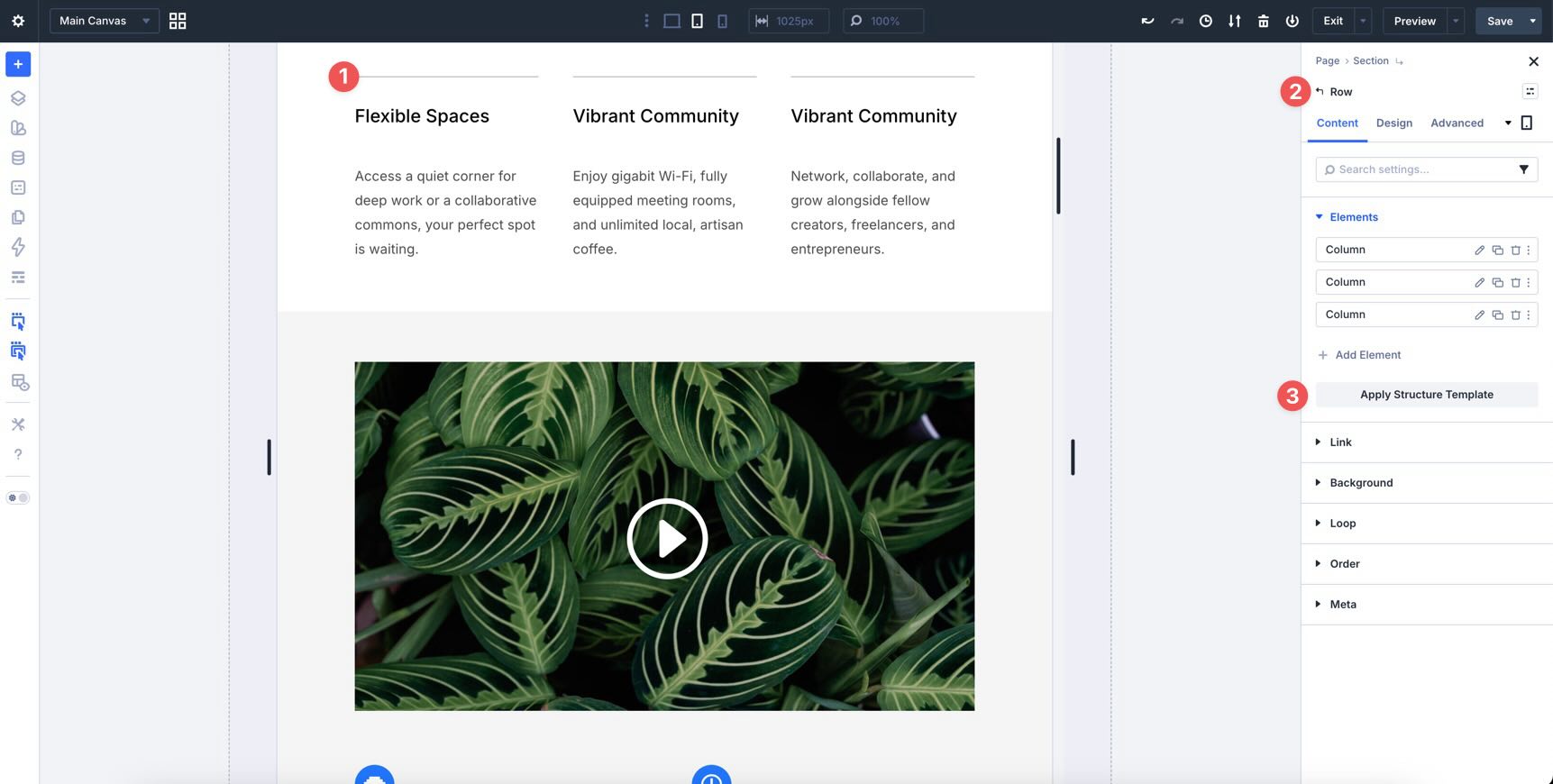
The second Features section uses a split layout. On Tablet, check whether the image and content stack cleanly.
Use the Apply Structure Template button in the Row’s Elements option group to switch the Row to a single-column layout at the Tablet breakpoint.
Once the Row becomes a single column on Tablet, the overall layout works better. However, you may notice extra white space on the right side of the supporting feature blocks.
Inside the second Column are three Module Groups. The first Group, which contains the introductory text, should remain full-width. The second and third Groups can sit side by side on Tablet instead of stacking with large gaps.
Create A Parent Group For The Supporting Blocks
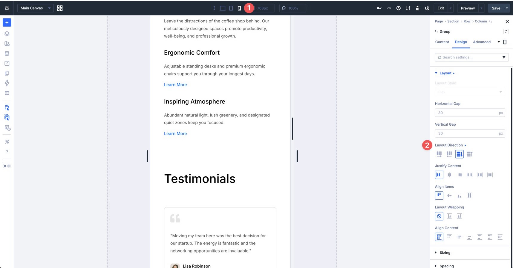
Add a new Module Group directly below the first Group. Then, drag the second and third Groups into this new parent Group.
Once the two supporting Groups are nested inside, change the new parent Group’s Layout Direction to Row on Tablet. This lets the two supporting blocks sit next to each other.
On the Phone breakpoint, switch that parent Group back to Column so the supporting blocks stack vertically and remain easy to read.
Review The Remaining Homepage Sections
After refining the hero and features sections, review the rest of the homepage. Check Testimonials, Pricing, Countdown, and FAQ for any remaining inconsistencies.
Pay close attention to spacing between elements, Row structure on smaller screens, button size, form size, and touch targets on Phone. Also, confirm that typography scales consistently with the rest of the page.
Most remaining sections should need little or no adjustment. Still, this final pass helps the homepage feel cohesive across all active breakpoints.
Ensuring Inner Pages Are Fully Responsive
The responsive patterns you refined on the homepage should carry into the rest of the site. Thanks to Design Variables, Presets, Flexbox, and CSS Grid, most inner pages should already feel consistent.
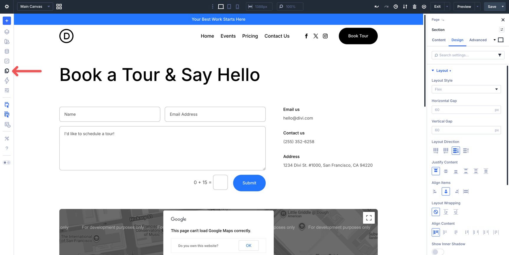
Your task here is to catch page-specific issues. Focus on the Contact and Events pages because they include unique elements such as forms, maps, event cards, countdowns, and email opt-ins.
Check The Contact Page
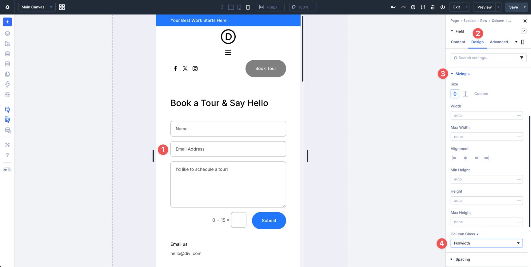
On the Contact page, make sure form fields stack properly on Tablet and Phone. With Divi 5’s form field options, you can control sizing at the field level.
While in Phone view, click into any field you want to adjust. In the Design tab, expand the Sizing option group, locate the Column Class field, and set it to Fullwidth.
At the Section or Row level, adjust the Vertical Gap between elements to reduce extra white space. For example, on the Contact page, select the first Section. Then, go to the Design tab, expand the Layout option group, and apply the Spacing – Medium variable to the Vertical Gap field.
Use Page Manager To Move Between Pages
To switch between pages without leaving the Visual Builder, click the Page Manager icon in the Builder Bar.
Page Manager gives you a high-level view of your pages and quick actions for moving through the site. When enabled, Speculative Prerendering can help speed up page-to-page transitions inside the builder by loading likely destinations in the background.
Check The Events Page
On the Events page, confirm that event cards collapse cleanly on Tablet and Phone. Check date blocks, event details, pricing, buttons, and alignment on smaller screens.
If the event card layout feels cramped, adjust the Row structure with a Structure Template, reduce column counts, or update Flexbox alignment and gap values at the relevant breakpoint.
Quick Inner Page Audit Checklist
Go through each inner page and ask:
- Do all multi-column Rows collapse properly using Structure Templates?
- Are buttons and touch targets large enough on mobile?
- Does typography scale consistently with the homepage?
- Are there any awkward gaps, cramped areas, or elements that are overflowing?
- Do forms, maps, countdowns, and opt-ins remain easy to use on Phone?
A focused pass through Tablet and Phone views is usually enough to bring the inner pages up to the same quality level as the homepage.
Perfecting Global Templates
Global elements like the header and footer appear across the site, so they need careful responsive design. Because these are built in the Theme Builder, improvements you make here can apply site-wide.
Thanks to editable Theme Builder areas, you can review headers, footers, body layouts, and page content together inside the Visual Builder.
Responsive Header
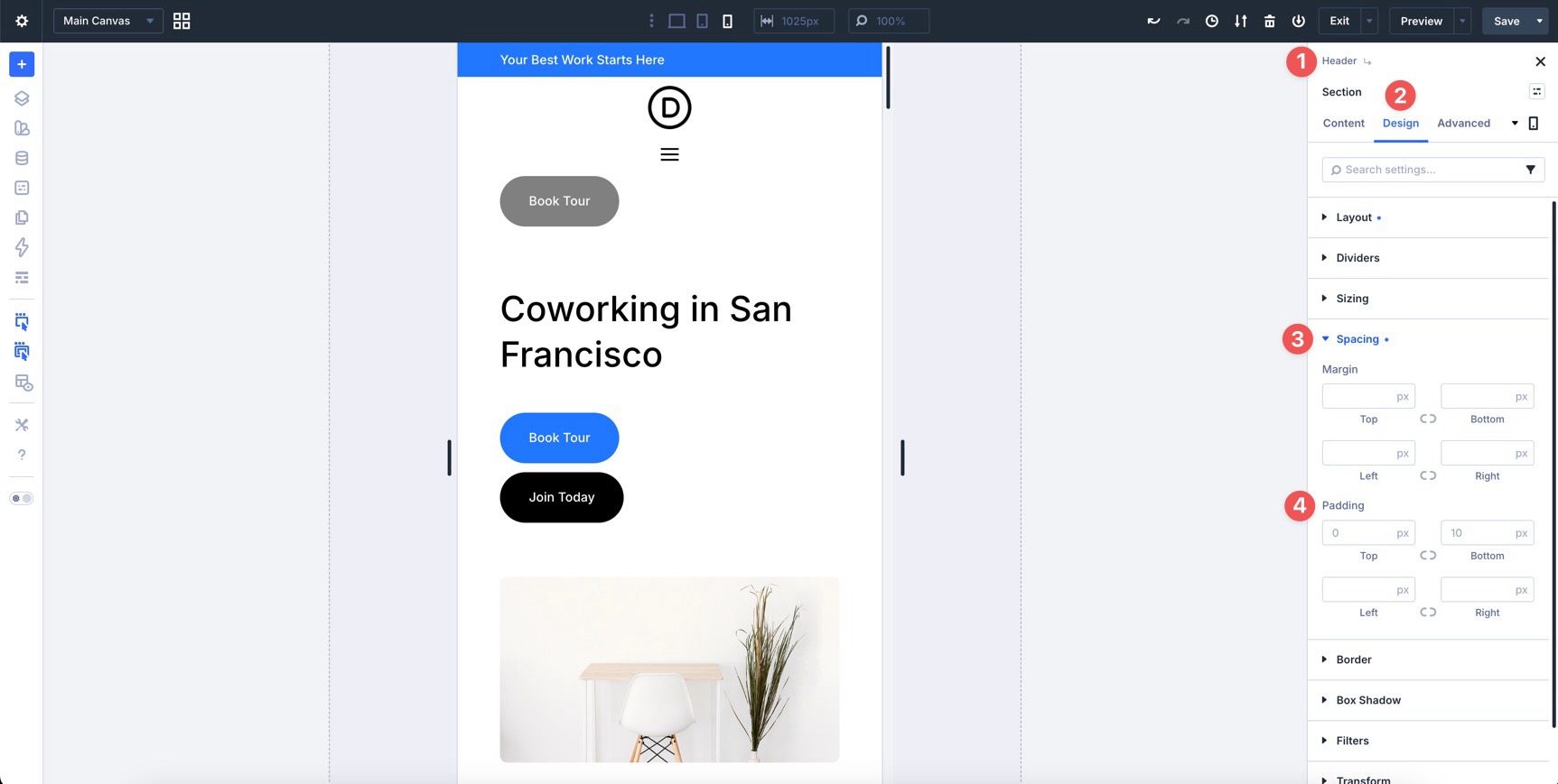
The header is one of the most important elements to get right on mobile. While in the Visual Builder, enable Show Theme Builder Layouts in the Builder Settings. This lets you see and edit the header and footer in context.
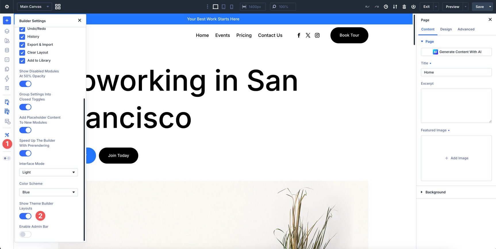
Make sure the logo scales appropriately. It should remain clear without taking too much vertical space on smaller screens. The main navigation should transition cleanly from the desktop layout to the mobile menu layout at Tablet and Phone breakpoints.
Fine-tune bottom padding on the sticky header if it takes up too much space on mobile.
For a cleaner preview, review disabled or hidden elements in Builder Settings. If disabled elements are dimmed at 50% opacity, turn that setting off temporarily when you want the preview to look closer to the final front-end output.
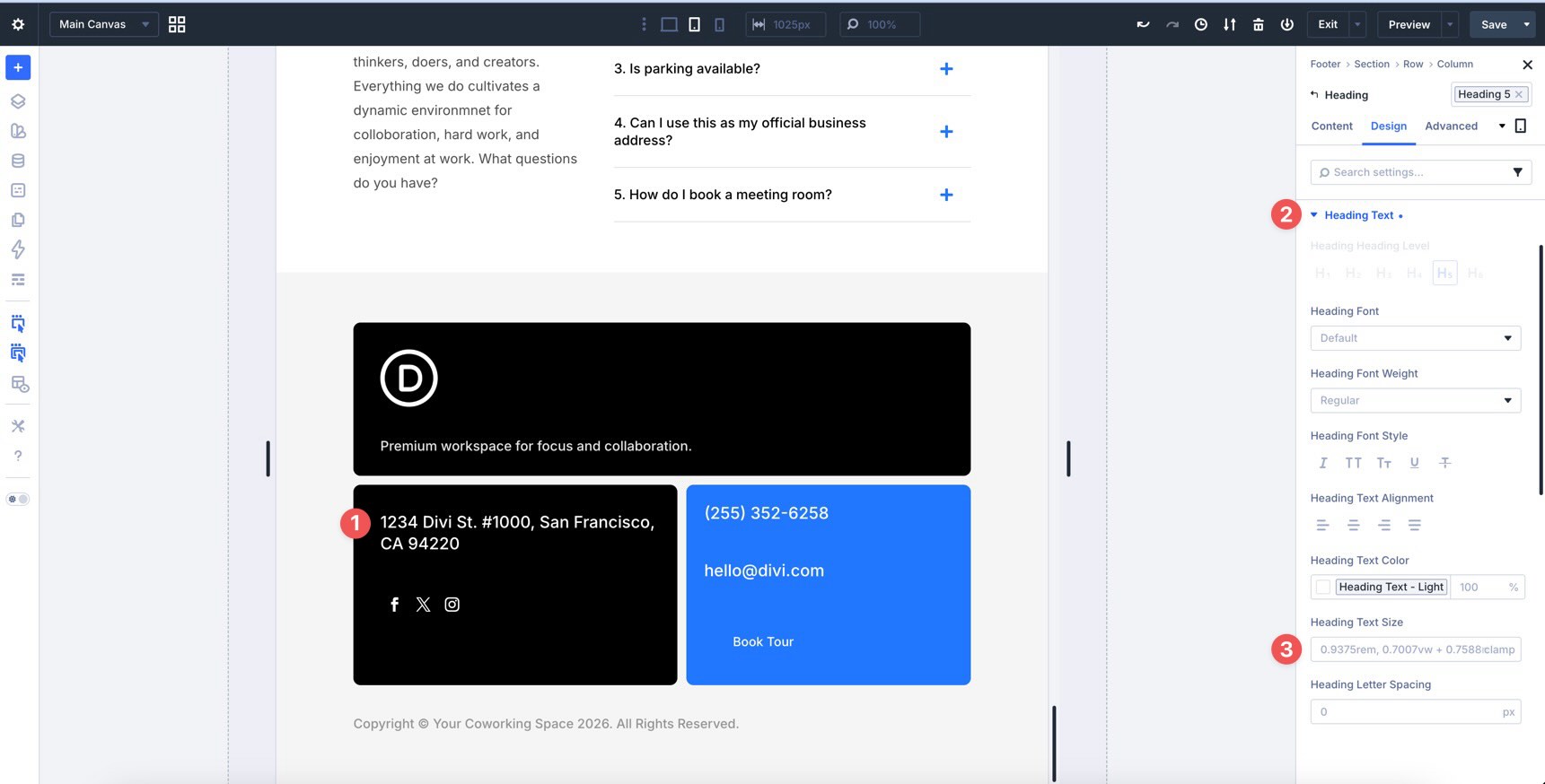
The footer is often the last section visitors see, so it should feel just as polished as the rest of the site. Adjust Column widths using the Column Class field in the Sizing option group so footer content flows logically on Tablet and Phone.
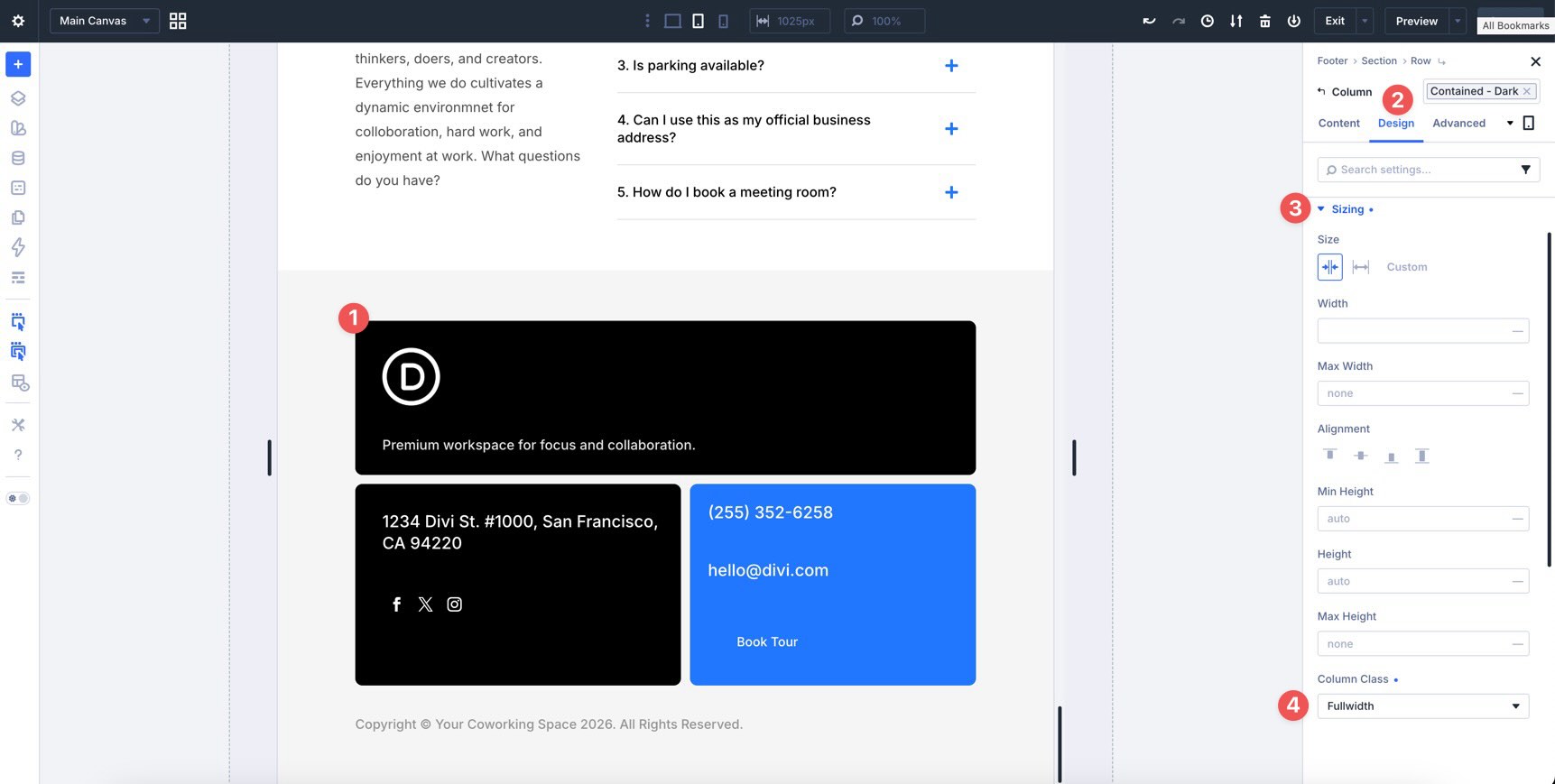
Use number variables to keep footer typography consistent with the rest of the design system.
Check the alignment of social icons and adjust spacing where needed.
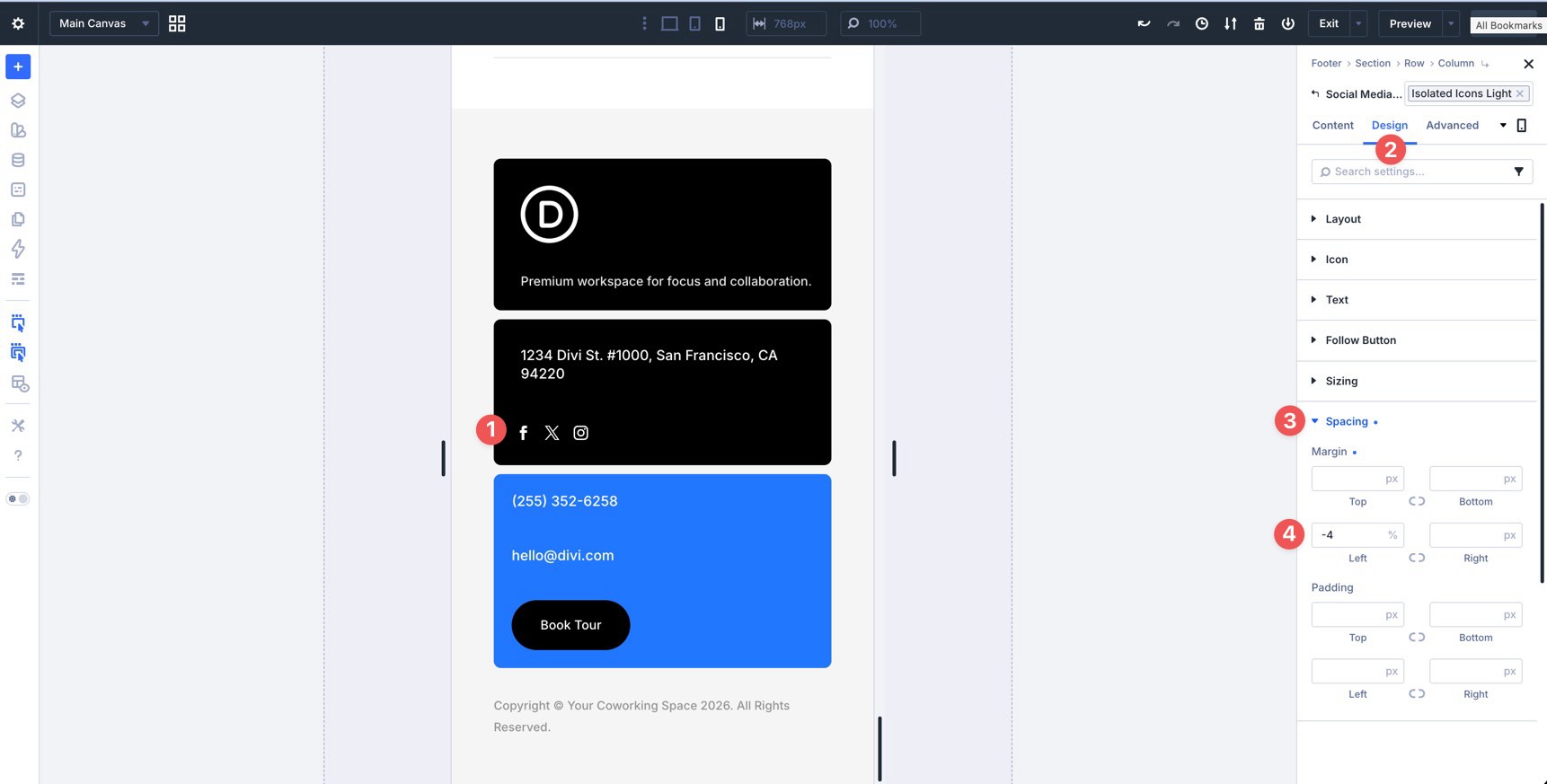
Finally, adjust the gap so the footer does not feel cramped or overly tall on smaller screens.
What’s Coming Next
Your coworking space website is now more consistently responsive across its key breakpoints. You refined the homepage, checked the Contact and Events pages, and reviewed the global header and footer.
You also completed the main Divi 5 workflow for this course: building a design system, applying presets, using Flexbox and CSS Grid, creating templates, and refining responsive behavior across the full site.
In Part 13: Creating Interactive Off-Canvas Elements, we’ll take things further by building interactive elements such as popups, slide-ins, and mega menus using Canvases and Interactions.
You are close to launching a polished website built entirely in Divi 5.


Leave A Reply