
Divi 5 recently integrated a CSS Grid system that adds a full range of grid capabilities inside the Visual Builder. This new feature in Divi 5 allows anyone to build complex, responsive layouts without writing code. The CSS Grid system stands out for its flexibility and control in creating designs that adapt seamlessly across all devices.
In this post, we’ll dive into what CSS Grid is, how Divi 5 integrates it into the Visual Builder, and how you can start using it to build stunning websites.
Let’s get started!
What Is CSS Grid?
CSS Grid is a native, two-dimensional layout system that changes web design by enabling users to create two-dimensional layouts, organizing content in rows and columns with precision and flexibility. Unlike older float-based layouts or single-axis Flexbox, Grid is two-dimensional and built into all modern browsers, making it a reliable, future-proof tool for crafting responsive and complex designs.
Subscribe To Our Youtube Channel
Think of CSS Grid like a spreadsheet: it provides a structured, yet versatile framework where you can place elements exactly where you want them.
What Is Divi 5’s CSS Grid System?
Divi 5‘s CSS Grid system integrates the power of custom CSS Grid into the Visual Builder, changing how users create sophisticated layouts. Users can easily build complex layouts by embedding CSS Grid into the Visual Builder. This integration builds on Divi’s legacy of user-friendly design, making it easier to create dynamic, modern websites that perform beautifully across all screen sizes.
The Core Components Of Divi 5’s CSS Grid
There are three main components of the CSS Grid system in Divi 5, including:
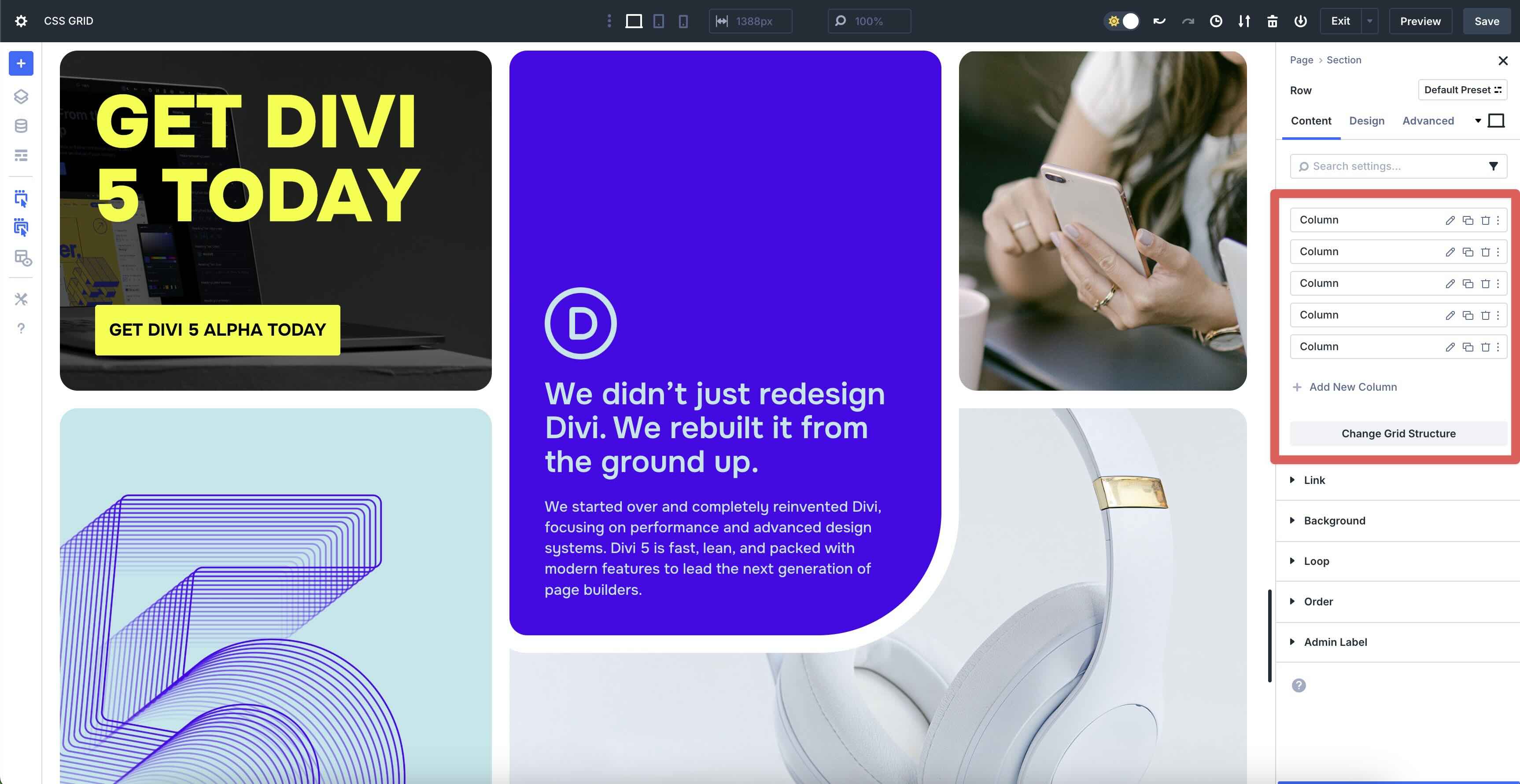
Grid Containers
In Divi 5, sections, rows, columns, and groups can serve as grid containers, forming the foundation of the grid structure. These containers define the layout’s framework, allowing you to set up rows and columns effortlessly. Divi 5 makes using CSS Grid easy.
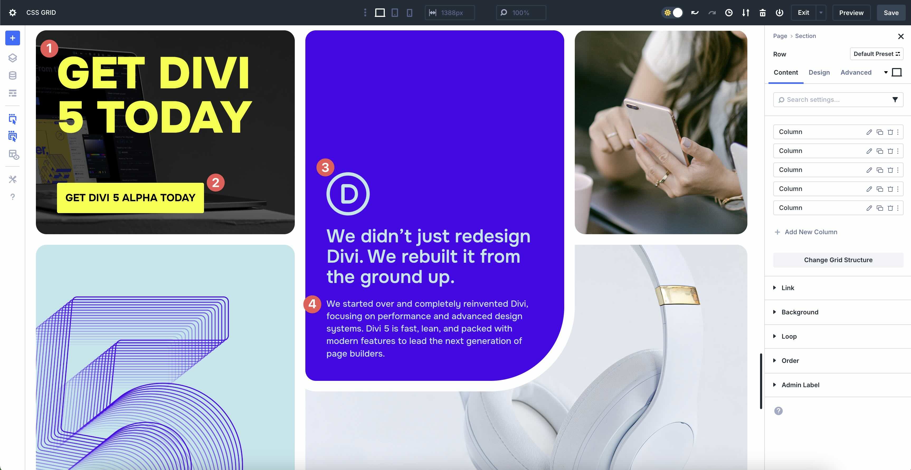
Grid Items
Child modules, such as Text, Images, Buttons, or any other Divi module, act as grid items. These elements can be placed and styled within the Grid, offering flexibility to arrange content creatively.
Customizable Properties
Users can adjust columns, rows, gaps, alignment, and responsive settings inside the Visual Builder. These controls let you define the Grid’s structure, spacing, and behavior across devices with simple clicks and sliders.
A Simple Visual Interface
Divi 5’s Visual Builder translates complex CSS Grid functionality into an intuitive, drag-and-drop interface. Users can configure grid settings using drop-down menus and visual previews, and Divi automatically generates clean, optimized CSS Grid code behind the scenes. This ensures that beginners can create professional layouts while developers retain the flexibility to dive deeper with custom adjustments.
Key Features
Divi 5 offers prebuilt grid templates with predefined column and row configurations, enabling users to jumpstart their designs with professional layouts.
Auto-placement simplifies the design process by automatically arranging grid items based on your settings, while explicit placement allows precise control over where each module sits within the Grid.
Divi 5 provides device-specific settings, ensuring grids adapt to mobile, tablet, and desktop screens with minimal effort.
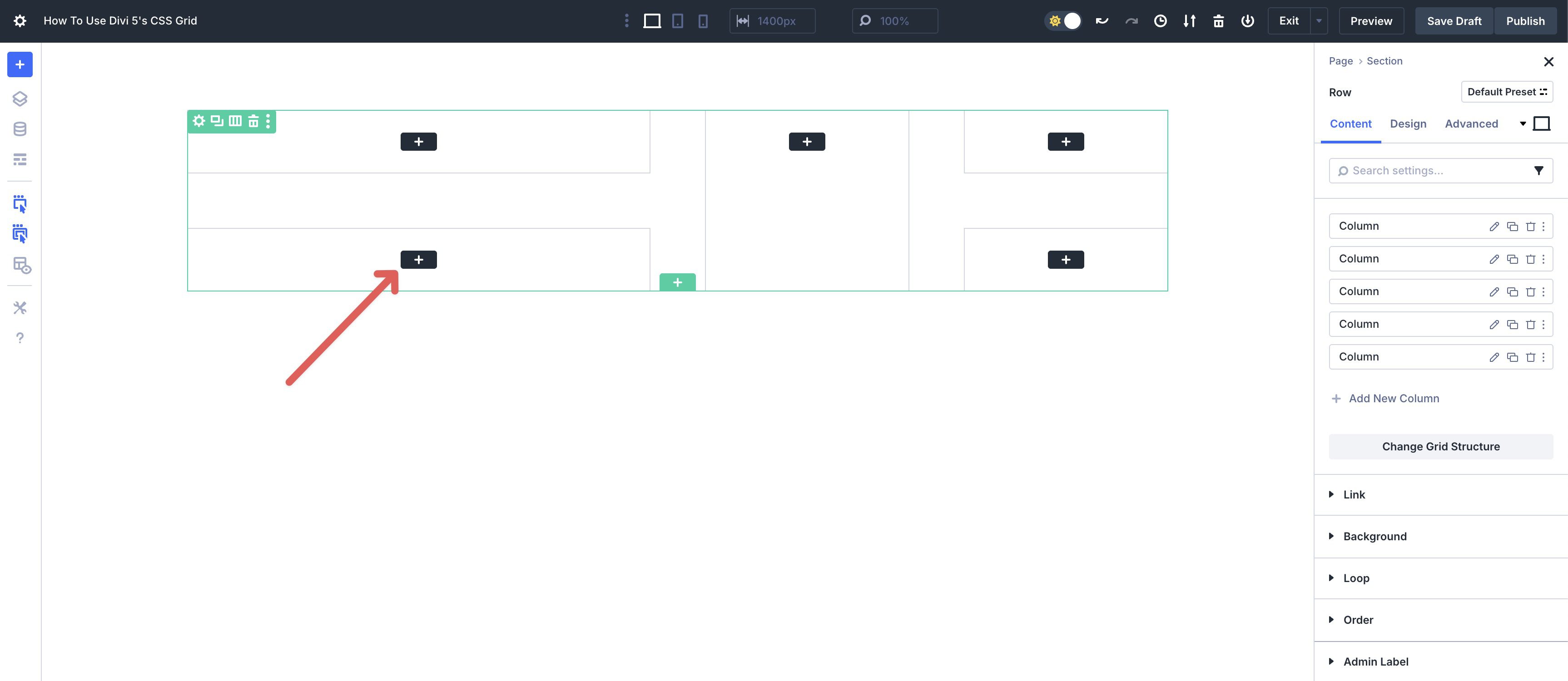
How To Use Divi 5’s CSS Grid
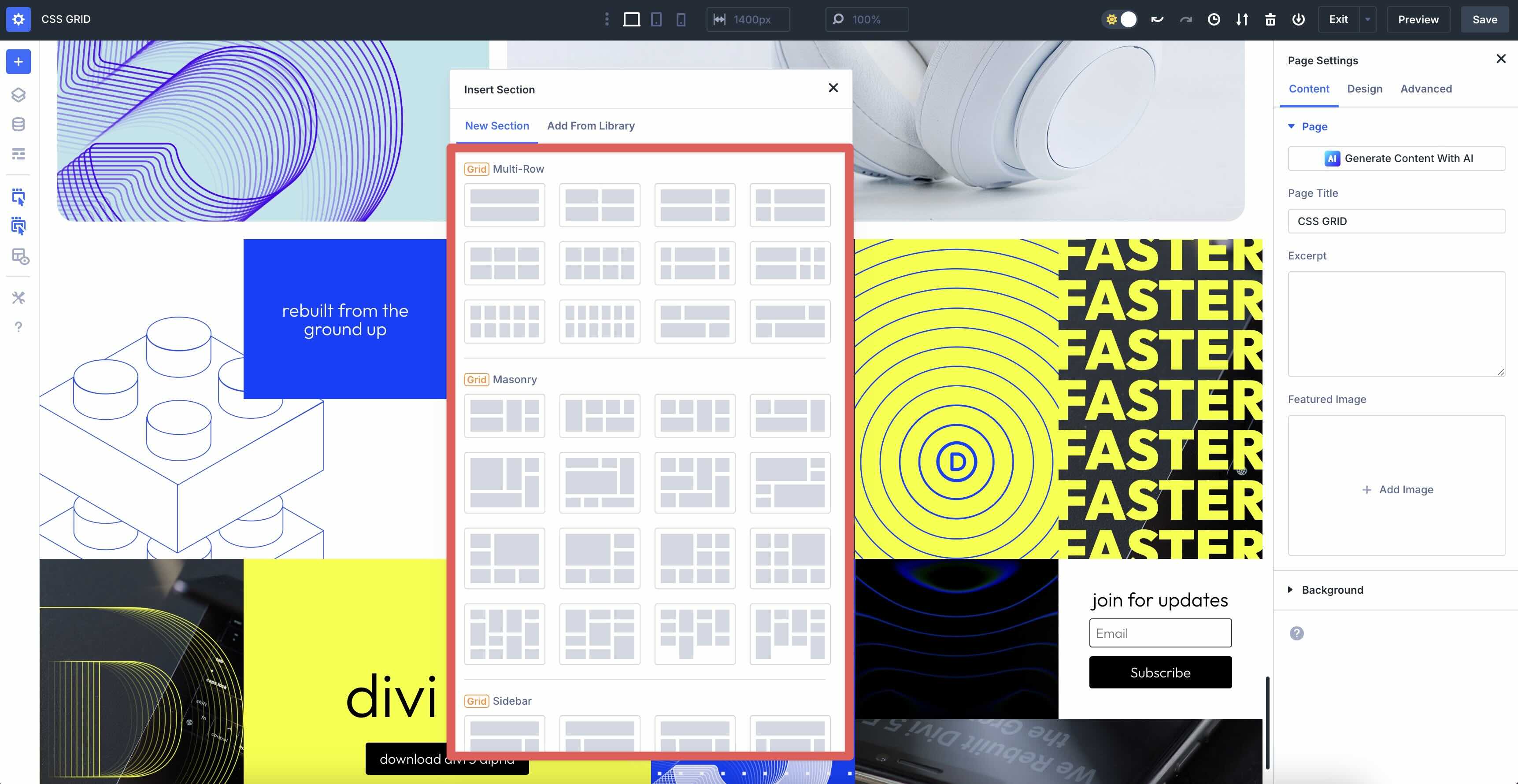
In this section, we’ll walk you through how Divi 5’s CSS Grid works and how to use it. Start by adding a new section to a page in Divi 5. When the Insert Section dialog box appears, you’ll notice that the row structures have changed. Now, you can choose between Flex containers and Grid containers.
Choose Grid when you need two-axis control (rows + columns). Use Flex for single-axis lists and simple stacks.
When choosing a Grid structure, you can add modules (child elements).
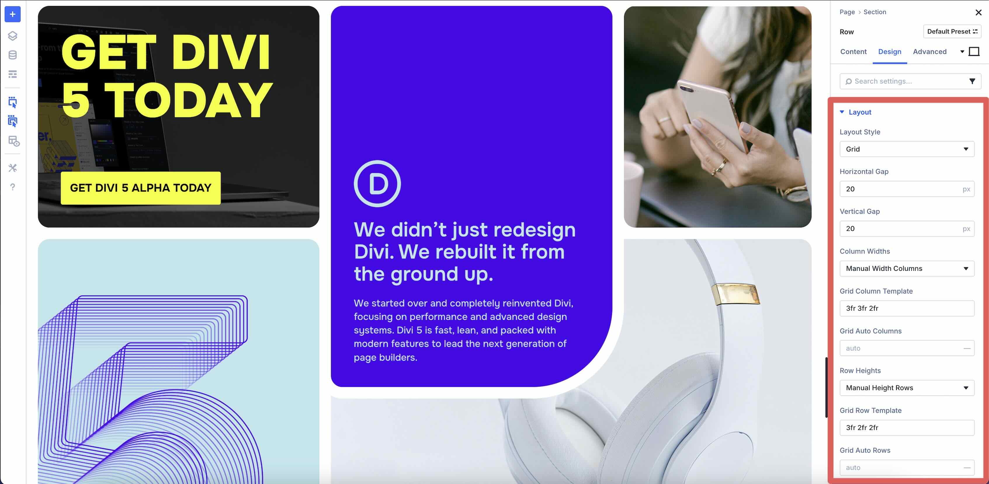
Grid Settings
Once the design is in place, you can use Divi’s CSS Grid settings to control how the layout functions. To help you understand how it all works, let’s walk through the different settings associated with CSS Grid.
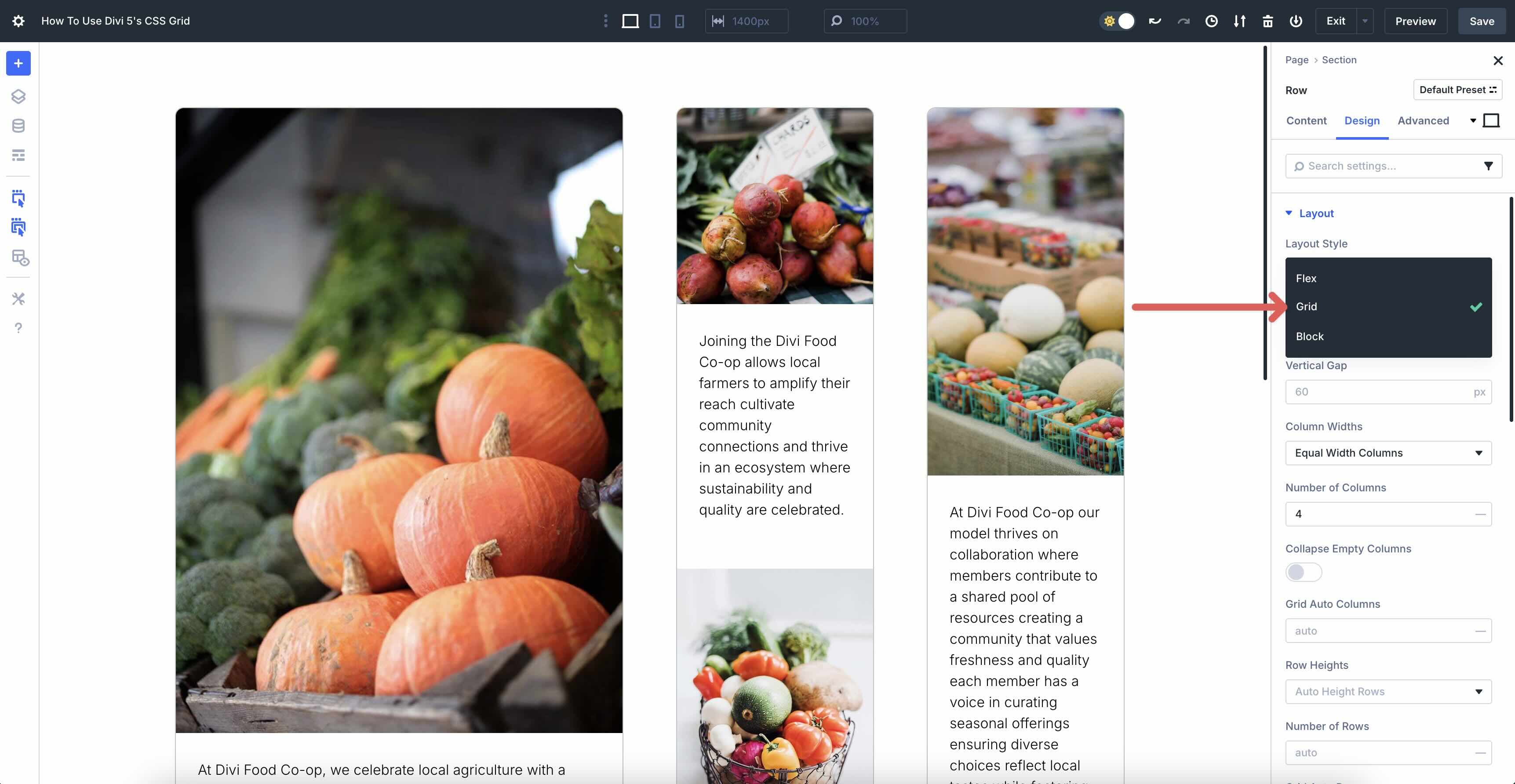
Layout Style
This allows you to choose the type of layout you want for your section. When you select a Grid structure, the Grid is automatically selected by default. Other options include Flex and Block.
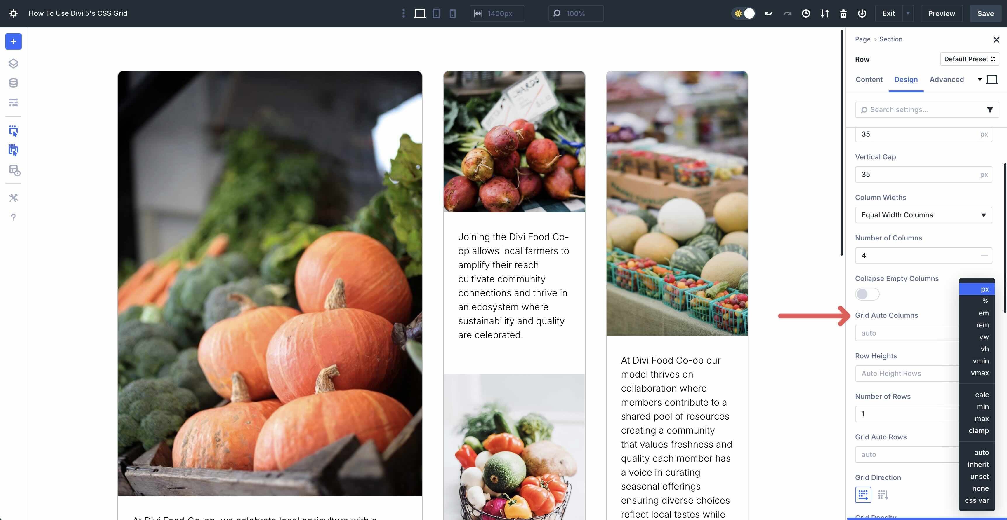
Horizontal Gap
Using the Horizontal Gap field, you can adjust the spacing between columns. It controls the amount of space between columns (in the row).
Vertical Gap
Similar to the Horizontal Gap field, this controls the amount of space between rows in the grid.
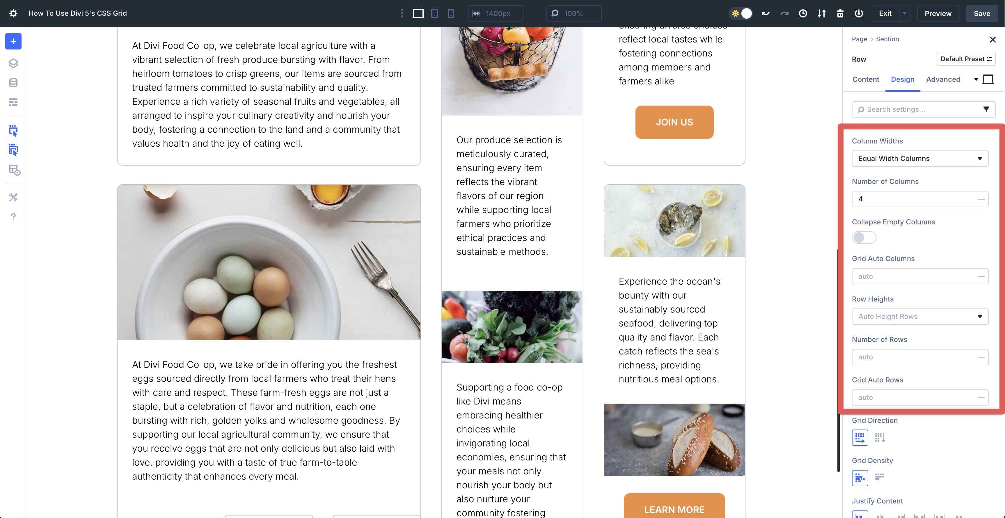
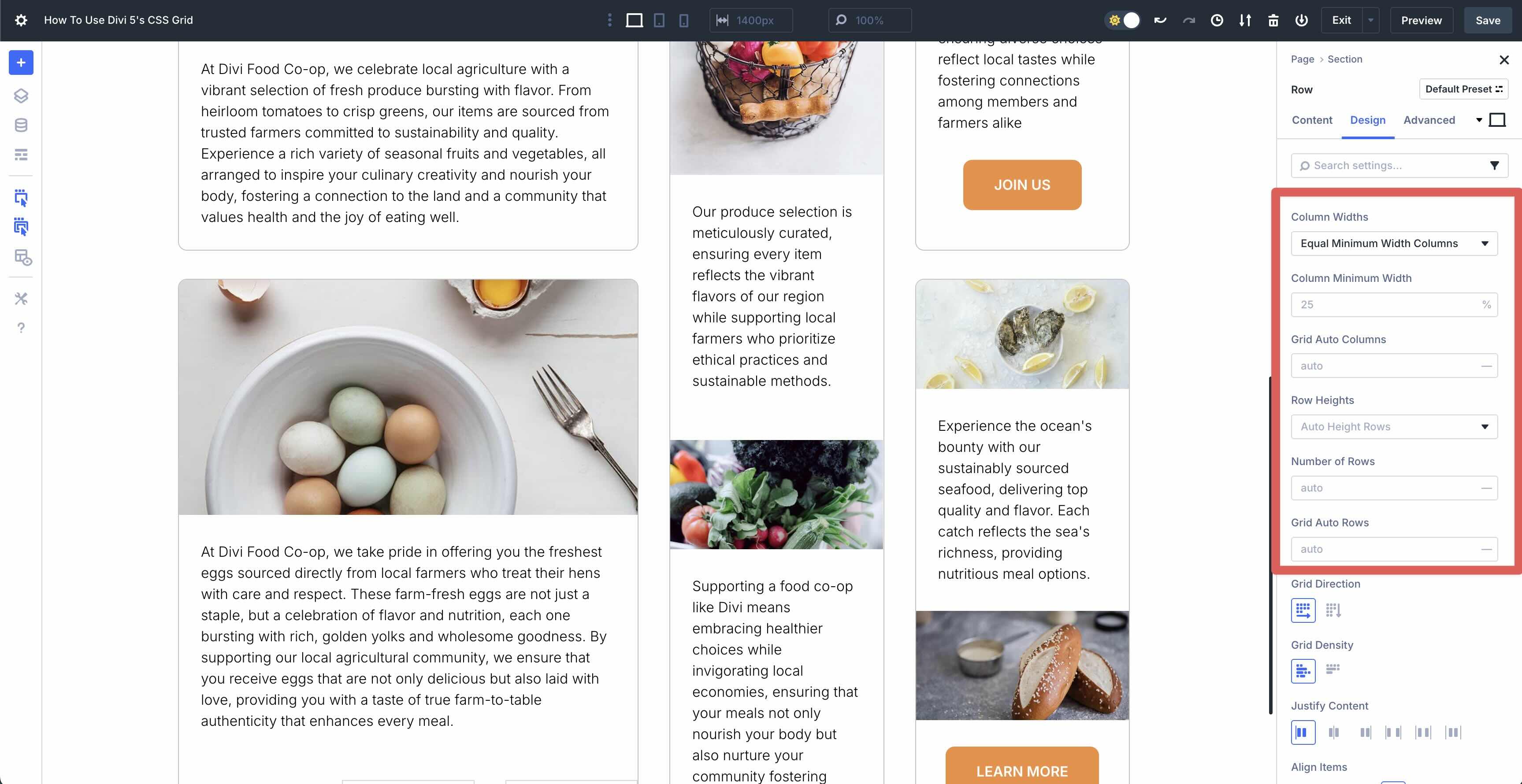
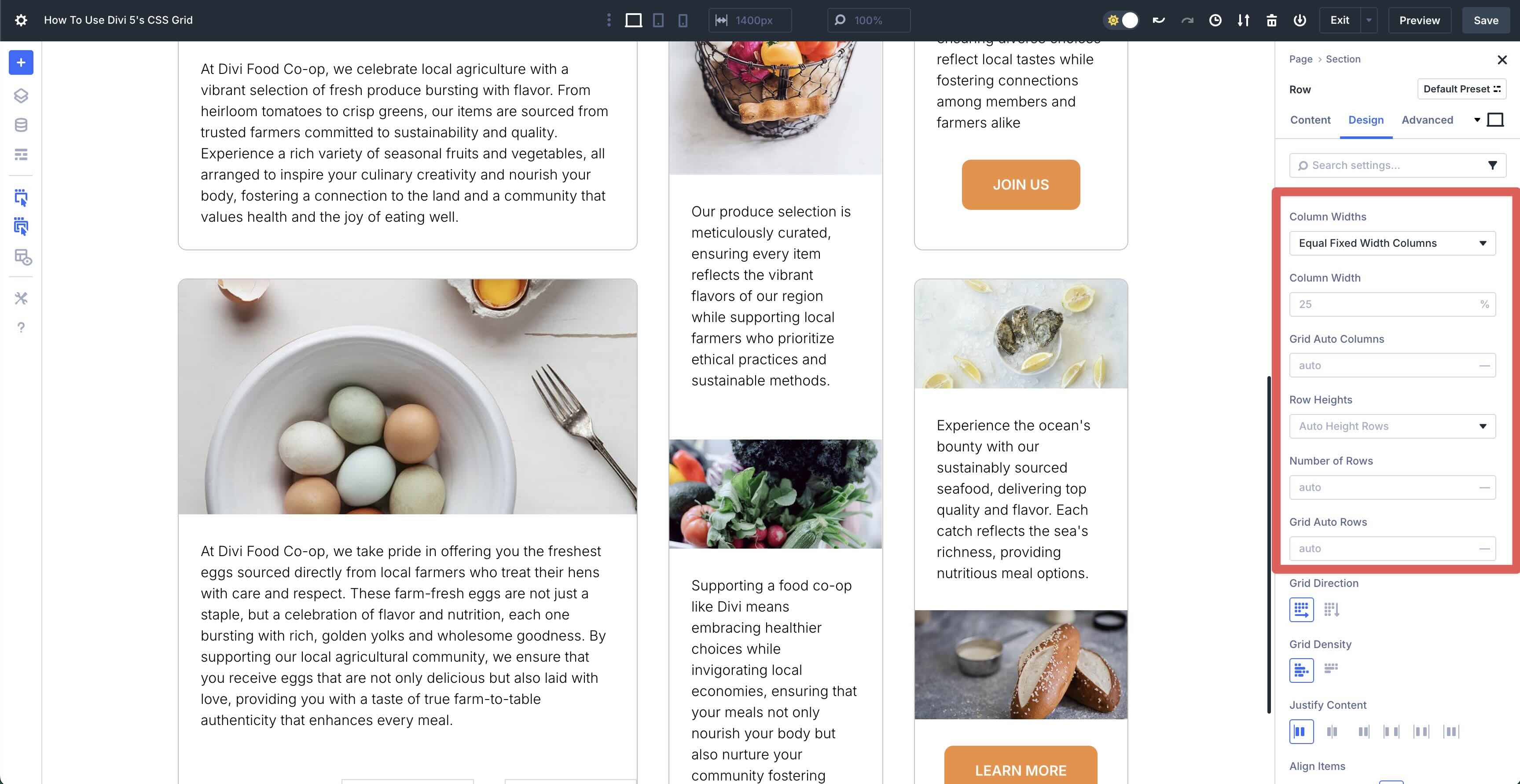
Column Widths
These settings allow you to control how columns behave. Equal Width Columns make all columns the same width. You can adjust the number of columns and collapse empty columns using this setting.
Equal Minimum Width Columns ensures all columns have the same minimum width but can grow to fill available space.
Equal Fixed Width Columns locks all columns to a specific width you can set, and they won’t change regardless of content.
When you select Auto Width Columns, each column’s width adjusts automatically based on its content. If one column has a wide image and another has short text, they’ll size themselves accordingly.

Finally, Manual Width Columns lets you set custom widths for each column individually, giving you full control. You can make one column wide and others narrow, creating an asymmetrical look.
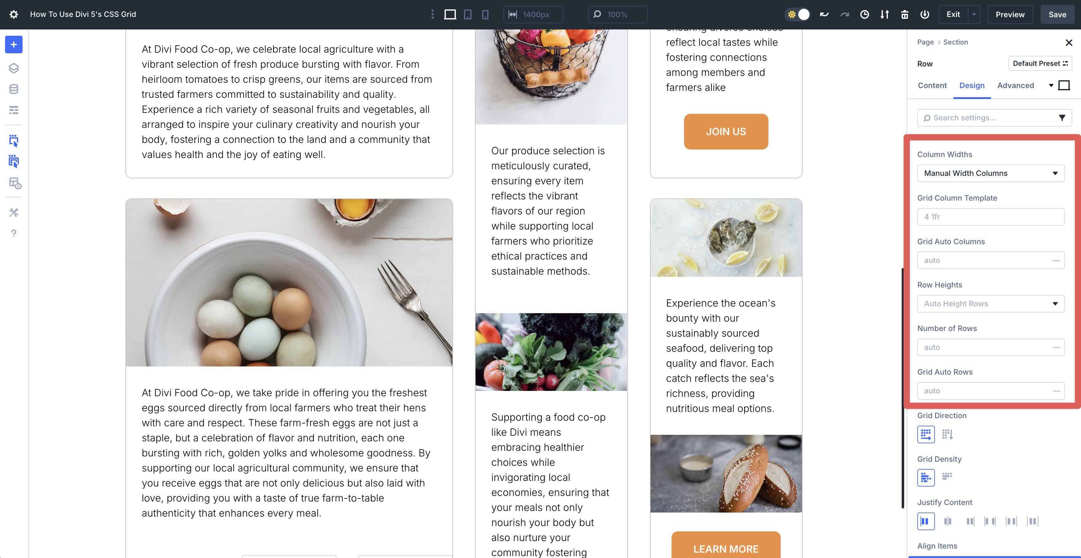
Grid Auto Columns
This works with any selection under Column Widths. It defines how extra columns (created automatically when content overflows) are sized. With auto, they match the content’s natural width. You can change it to a fixed value using any of Divi 5’s CSS units.
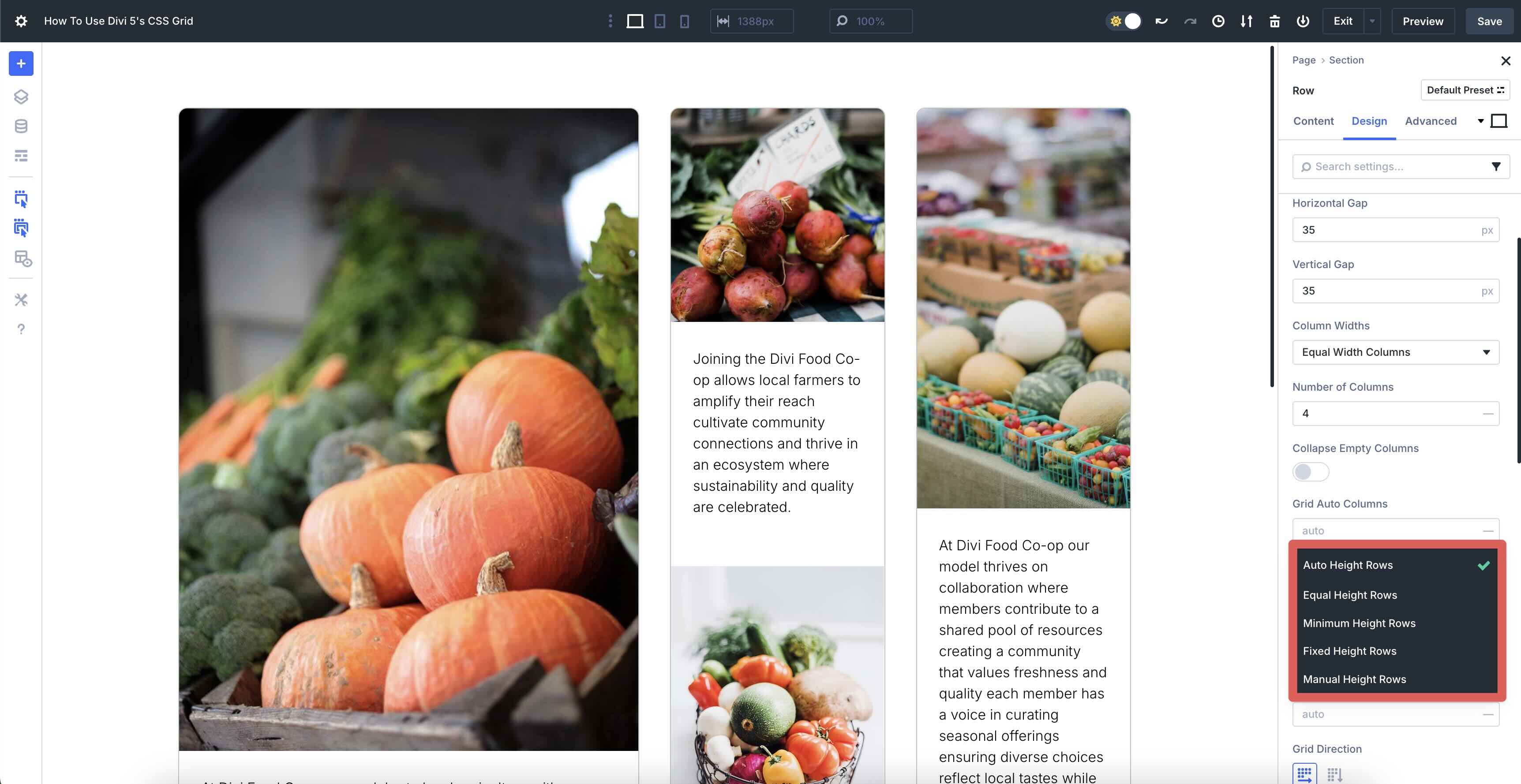
Row Heights
The Row Heights settings let you control how tall each row in your Grid is, giving you the flexibility to match your content or design vision. Just like columns define the width, rows determine the height. When choosing Auto Height Rows, rows automatically adjust their height based on the content inside them. This setting is perfect for layouts where content varies, like a blog with mixed post lengths or a gallery with different image sizes.
On the other hand, Equal Height Rows makes all rows the same height, regardless of their content. With Minimum Height Rows, you’ll set a minimum height for each row, but they can grow taller if needed. Fixed Height Rows locks each row to a specific height, and they won’t change, no matter the content. Finally, Manual Height Rows lets you set custom heights for each row individually, giving you full control over individual rows in your layout.
Number Of Rows
The Number of Rows settings allow you to define how many rows your Grid will have. This setting works within the Grid container and gives you control over the Grid’s vertical structure.
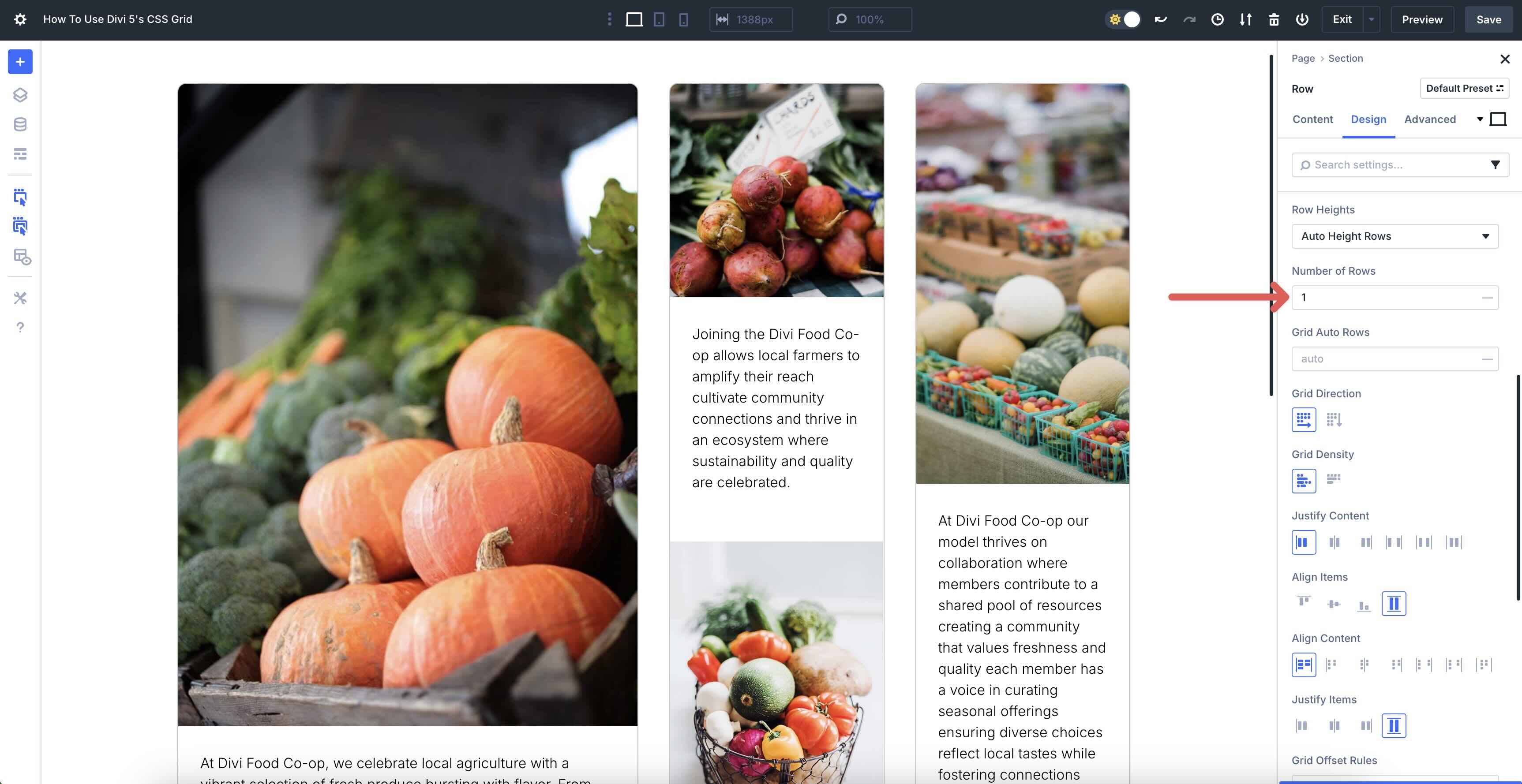
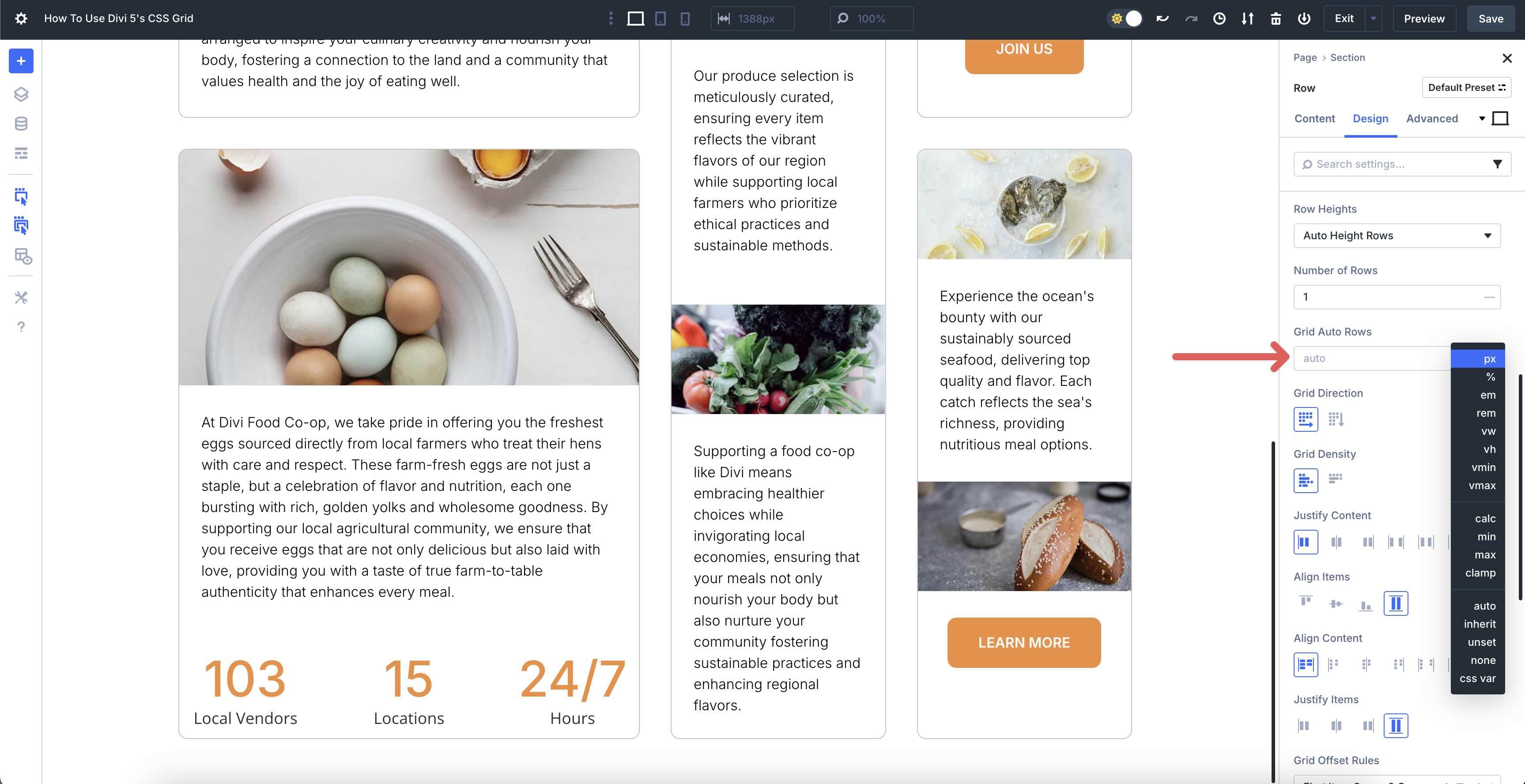
Grid Auto Rows
The Grid Auto Rows settings determine how the height of extra rows is handled when automatically created as you add more content beyond the predefined number of rows. These settings let new rows adjust their height based on the tallest content within them, making it ideal for dynamic layouts. You can customize it with a fixed height using any of Divi 5’s CSS units.
Grid Alignment Settings
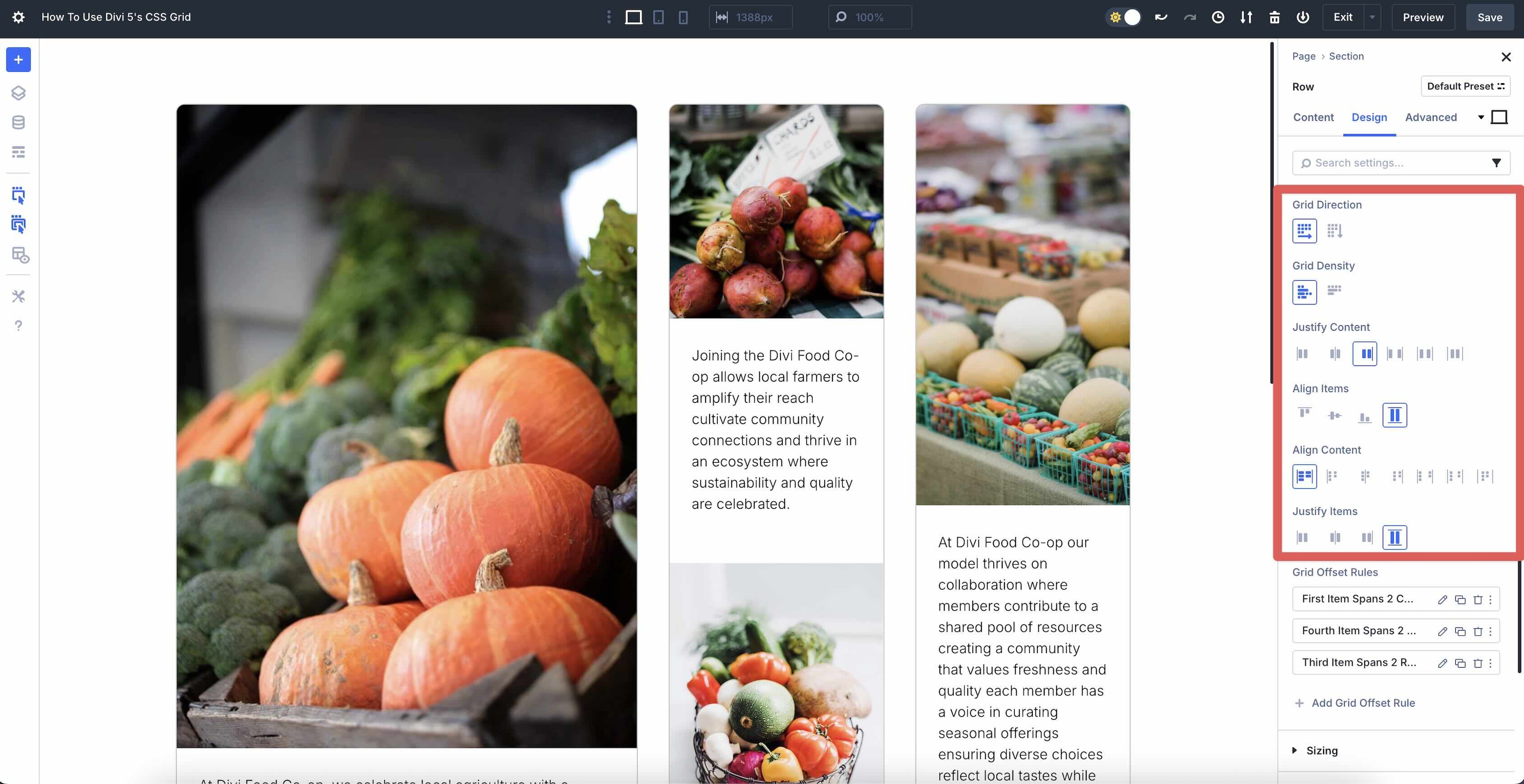
The settings under Grid Direction, Grid Density, Justify Content, Align Items, Align Content, and Justify Items help you control how your grid items are arranged and spaced within the Grid container.
- Grid Direction: This sets the order in which items fill the Grid, either Row or Column.
- Grid Density: Controls how auto-placed items fill empty space. Dense lets later auto-placed items backfill gaps if they fit; <em>Sparse</em> preserves natural order.
- Justify Content: Controls how the grid tracks are positioned along the inline axis (usually horizontal) inside the container. Start aligns the whole grid to the start, Center centers it, End aligns it to the end. Space-between, Space-around, and Space-evenly distribute tracks with gaps between/around/evenly.
- Align Items: This sets the vertical alignment of individual items within the Grid. Start aligns items to the top, Center to the middle, and End to the bottom. Stretch
makes items fill the full height of their row.
- Align Content: Controls how the grid tracks are positioned along the container’s block axis (usually vertical).
- Justify Items: You can align grid items within their cells horizontally. Stretch occupies the full width, Center or End shifts them to the middle or end, and Start aligns them all to the left.
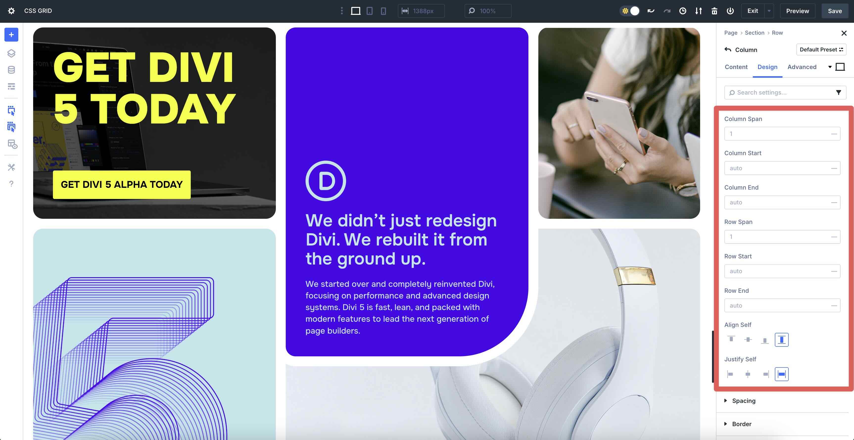
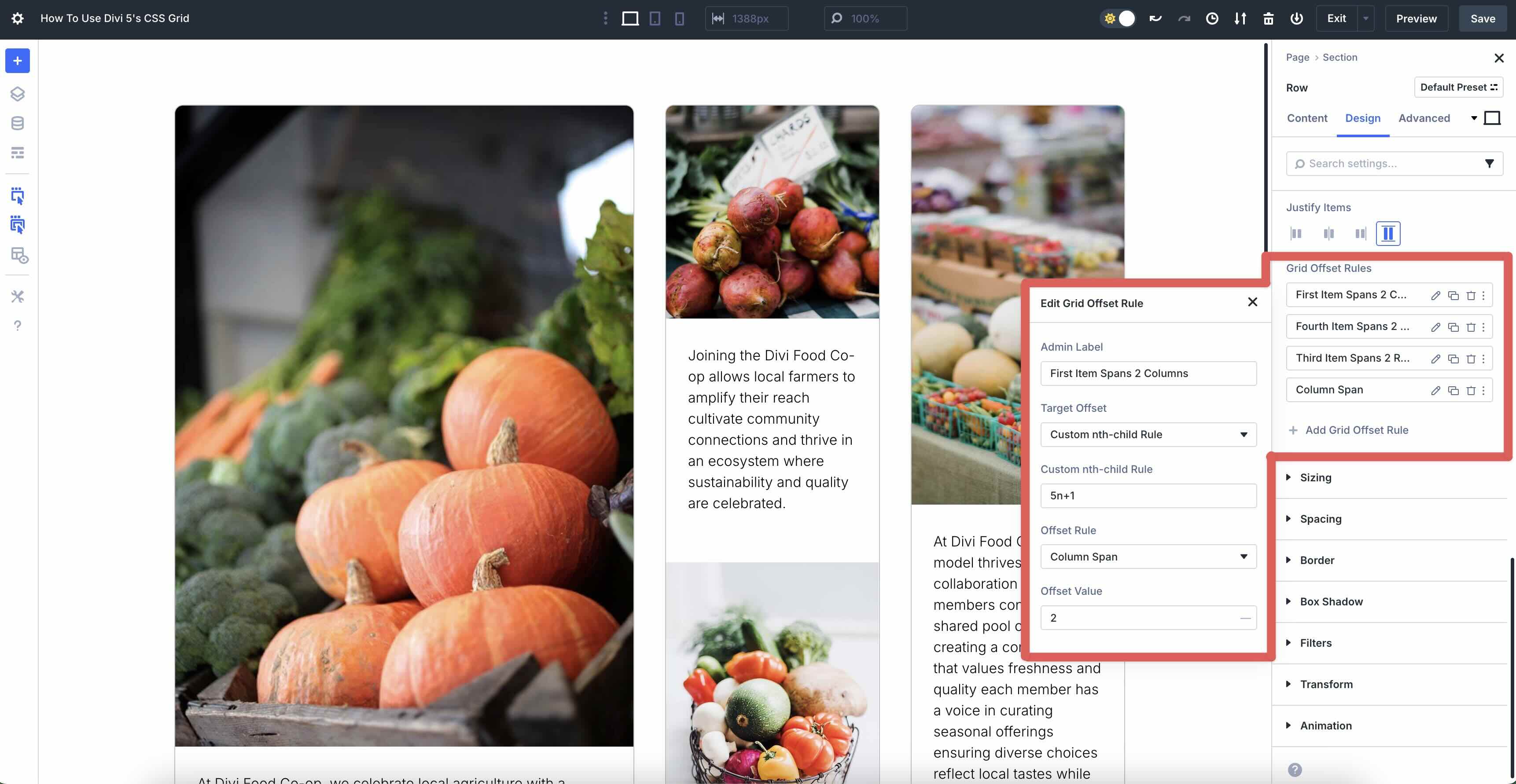
Grid Offset Rules
These rules allow you to customize the placement and size of specific Grid items within your layout, giving you precise control over how they span across rows and columns. In the image below, we’ve created an offset rule called First Item Spans 2 Columns. This means the first item stretches across two columns. Here’s the breakdown of each setting so you’ll grasp the concept:
- Admin Label: Allows you to add a name for easy identification
- Target Offset: Defines the rule type, using nth-patterns such as 5n+1 (every 5th item starting at 1).
- Offset Rule: Allows for control over the placement and size of specific grid items. In this example, it’s set to Column Span, which sets the number of columns an item should stretch across.
- Offset Value: This specifies the exact amount of space or span an item should cover or shift. In this example, the value is set to 2, telling Divi to allow this first grid item to occupy 2 columns of the Grid.
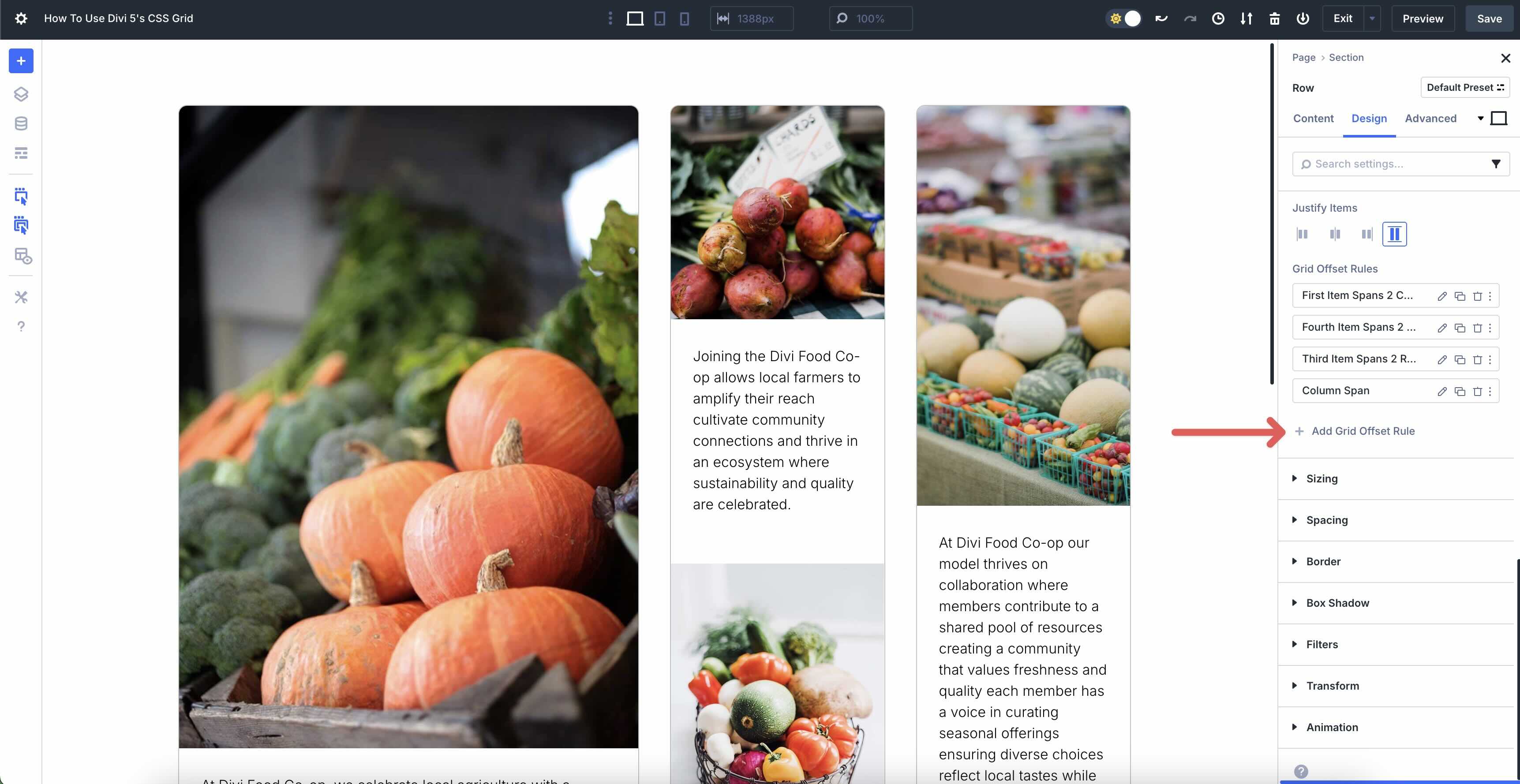
You can add as many offset rules as necessary by clicking the + Add Grid Offset Rule button.
Responsive Options
Divi 5 offers Customizable Responsive Breakpoints to style your CSS Grid layouts for smaller screens. While in a responsive breakpoint, such as a tablet, you can change the Column Span to control how many columns a design element should occupy. For example, in the Tablet breakpoint, you may want to set the span of a column to 3 so that it occupies 3 of the 4 columns for that breakpoint.
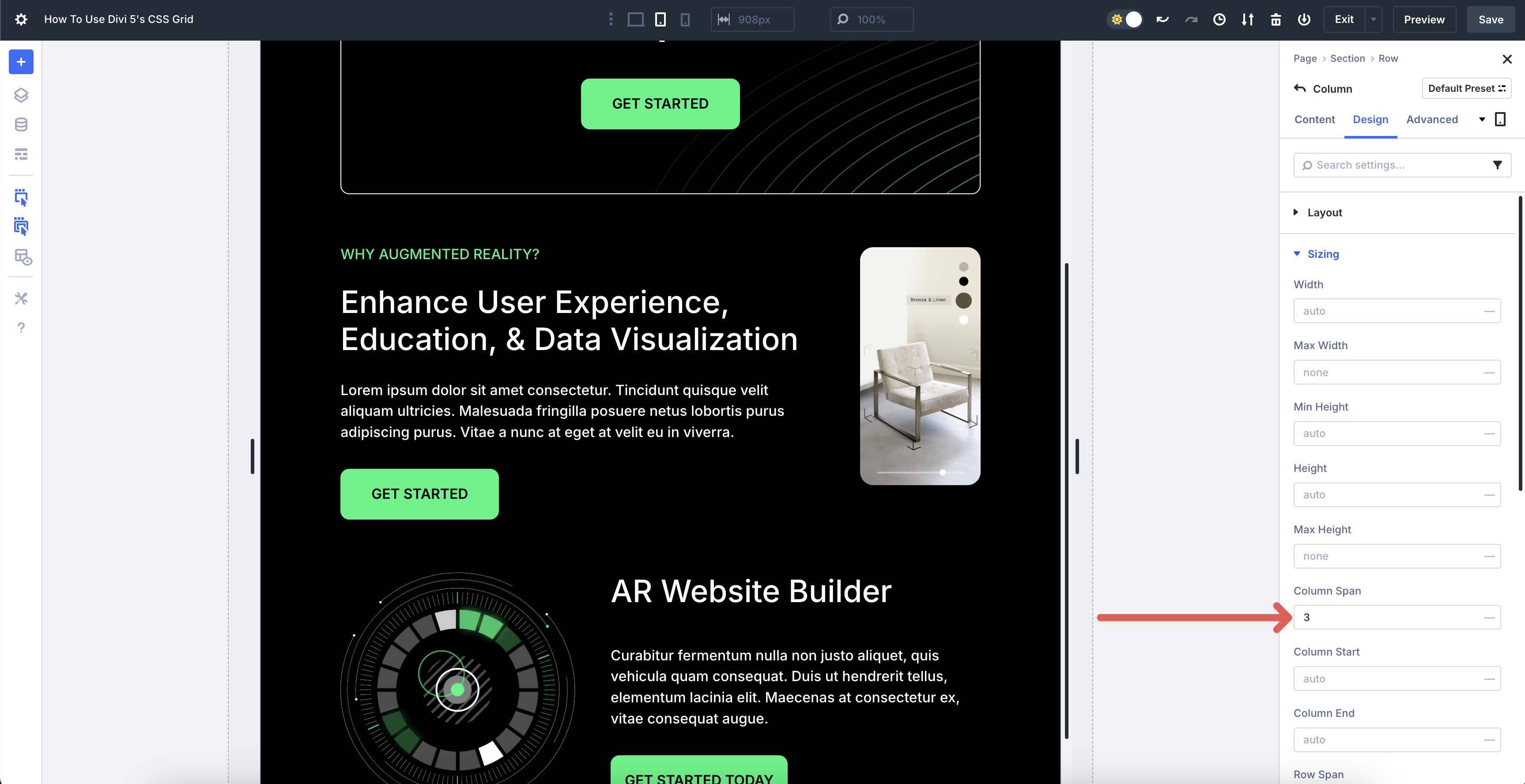
However, that column may look bad for the Phone breakpoint. Using Divi’s responsive settings, you can adjust the Column Span for every breakpoint, ensuring your layout looks flawless on every screen size.
CSS Grid Examples
Here are 3 practical examples of CSS Grids built with Divi 5 to inspire your designs. Each instance represents each type of Grid structure, including Masonry, Multi-Row, and Sidebar.
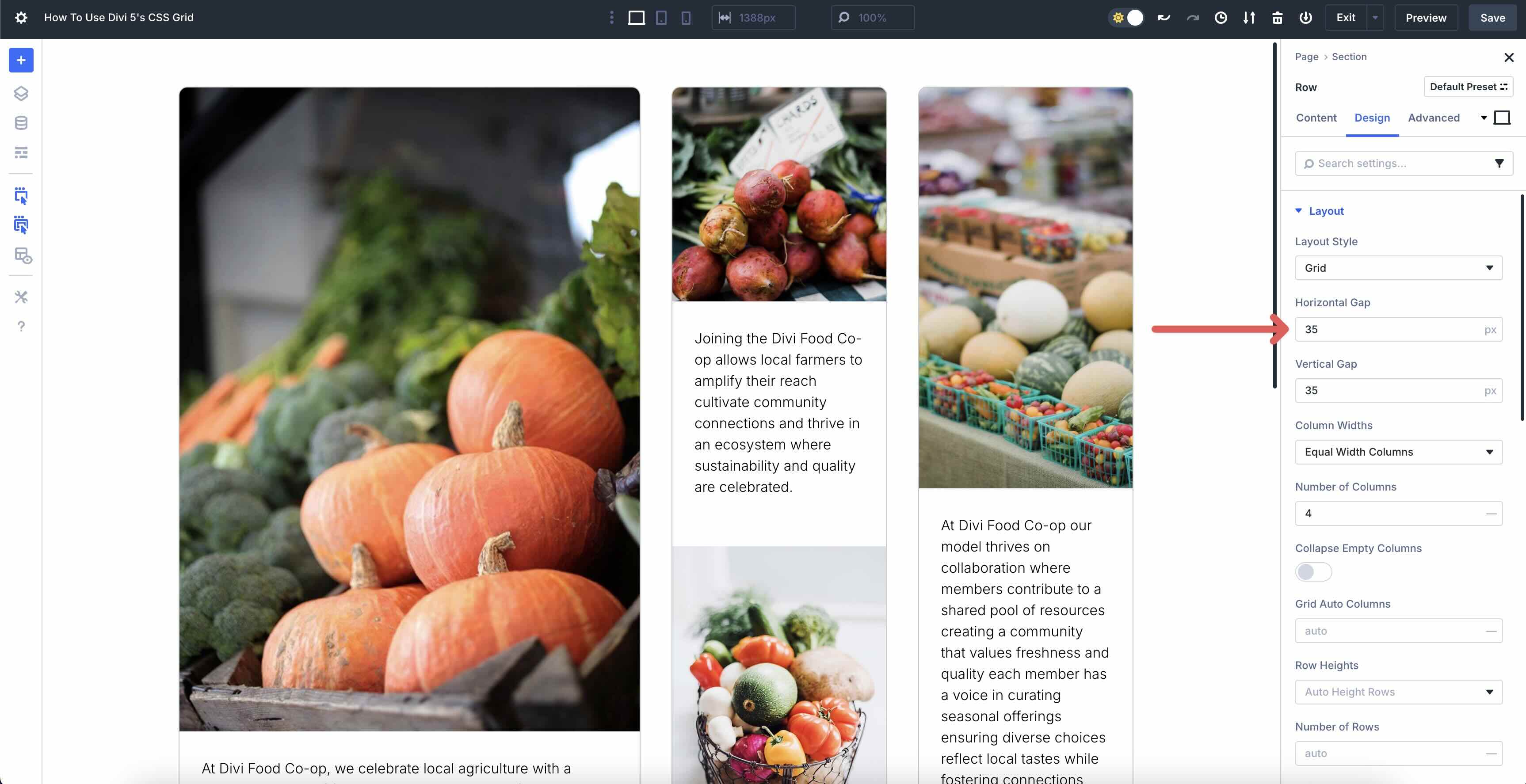
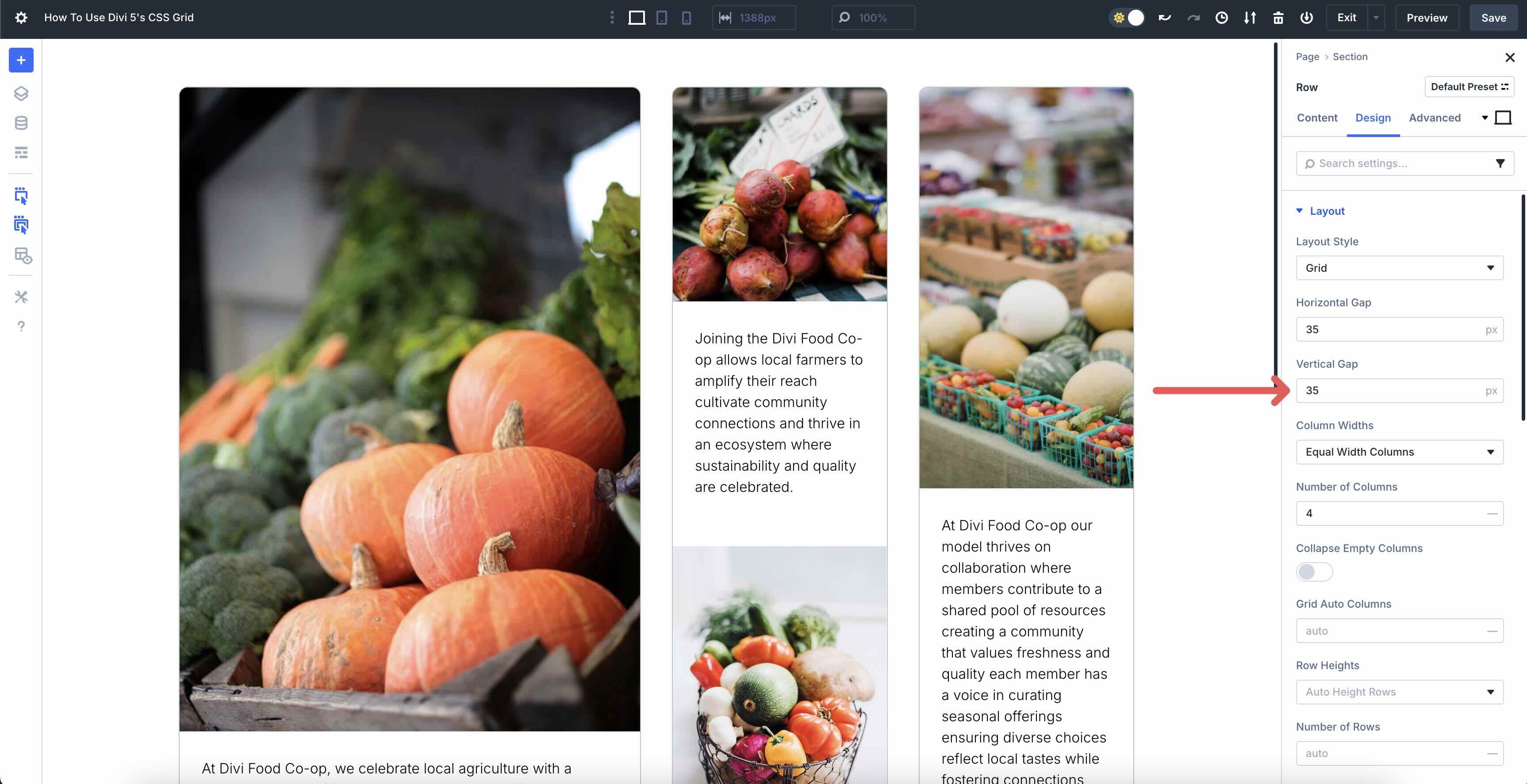
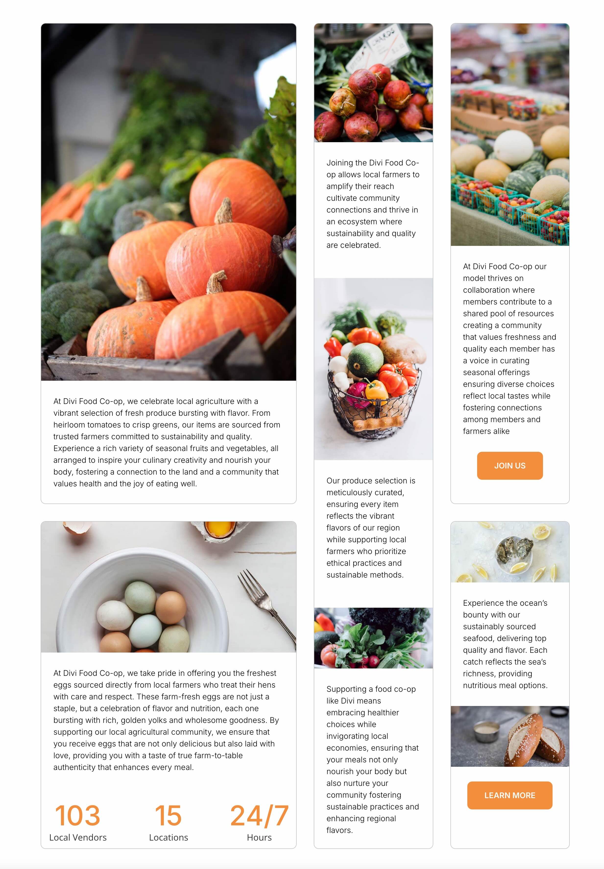
Masonry
In this example, we feature a food co-op in a 4-column layout. The layout uses Equal Width Columns with horizontal and vertical spacing (Gap) set to 35px. The number of columns is set to 4 with Auto Height Rows. We’ve also set Align Items and Justify Items to Stretch so that the layout is symmetrical, giving the layout a clean look.
Multi-Row
This layout has a 10px horizontal and vertical gap with Column Widths set to Manual Width Columns. We’ve specified a Grid Column Template of 1.25fr 1fr 1.5fr. The Grid is divided into three tracks. Each track’s size is proportional to its fractional unit (fr) value relative to the total:
- First track: 1.25fr takes up 1.25 / 3.75 (or ~33.33%) of the available space.
- Second track: 1fr takes up 1 / 3.75 (or ~26.67%) of the available space.
- Third track: 1.5fr takes up 1.5 / 3.75 (or ~40%) of the available space.
We’ve set each row to a fixed height.

We use a 4-column Sidebar layout to build our design in this example. We’ve used responsive tools to adjust the columns for smaller devices, set Column Widths to Equal Width Columns, and left all other settings at their defaults. We also added a Nested Row to the last column and used Divi’s Display Order settings to control how the columns display on Mobile devices.

Get Started With CSS Grid In Divi 5 Today
CSS Grid in Divi 5 allows Divi users to build precise layouts with unlimited customizations — all without code. From auto placement in pre-built row structures to fine-tuning offsets for asymmetrical grids, the flexible foundation for responsive, modern websites stands out. We encourage you to dive in, experiment with these settings on a new project, and share your thoughts in the comments below on our social media channels.
As we edge closer to the Divi 5 Beta Phase, please share your thoughts and any bugs you may find to help us transition into the next phase. We rely heavily on user feedback to help us make Divi 5 the best it can be.


Leave A Reply