
Search engines and assistive technologies rely heavily on your page’s HTML structure to understand what each part is for. When everything is wrapped in generic <div> elements, they get less structural context, which can make your content harder to interpret and navigate.
Using <main>, <section>, and <aside> can clarify your page structure and improve navigation for screen reader users. It also gives search engines a clearer context about which content is primary versus supporting.
So when should you use each one? In this post, we’ll break down how these elements work and how Divi 5 makes it easy to assign semantic elements to any part of your layout. Let’s get into it.
The Three Key Semantic Elements
Semantic HTML includes many elements that describe page structure and content roles, each with a specific purpose. The elements you’ll use most often for structure are <main>, <section>, and <aside>. Understanding what they do individually helps you structure pages correctly. We’ll look at how each element works and what it tells browsers about your content in this section:
Understanding The Section Element
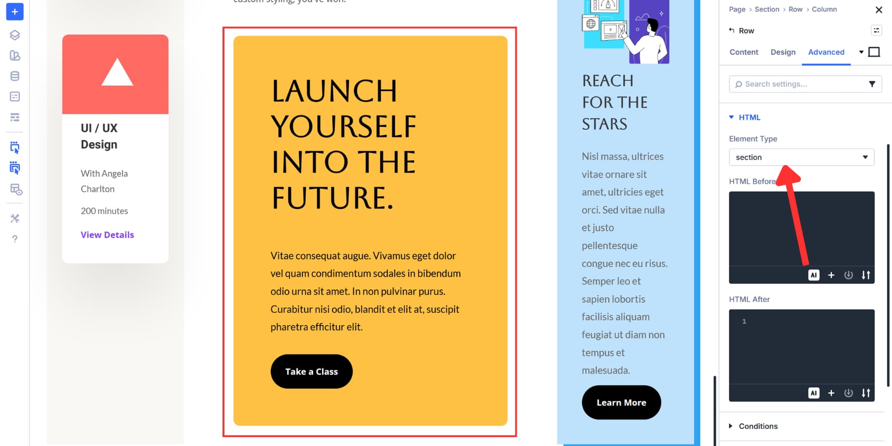
<section> groups related content into a distinct thematic region. Content on a page rarely exists as one continuous block. You’ve got an introduction, some background info, the main points, and a conclusion. Each of these can be grouped as its own <section>.
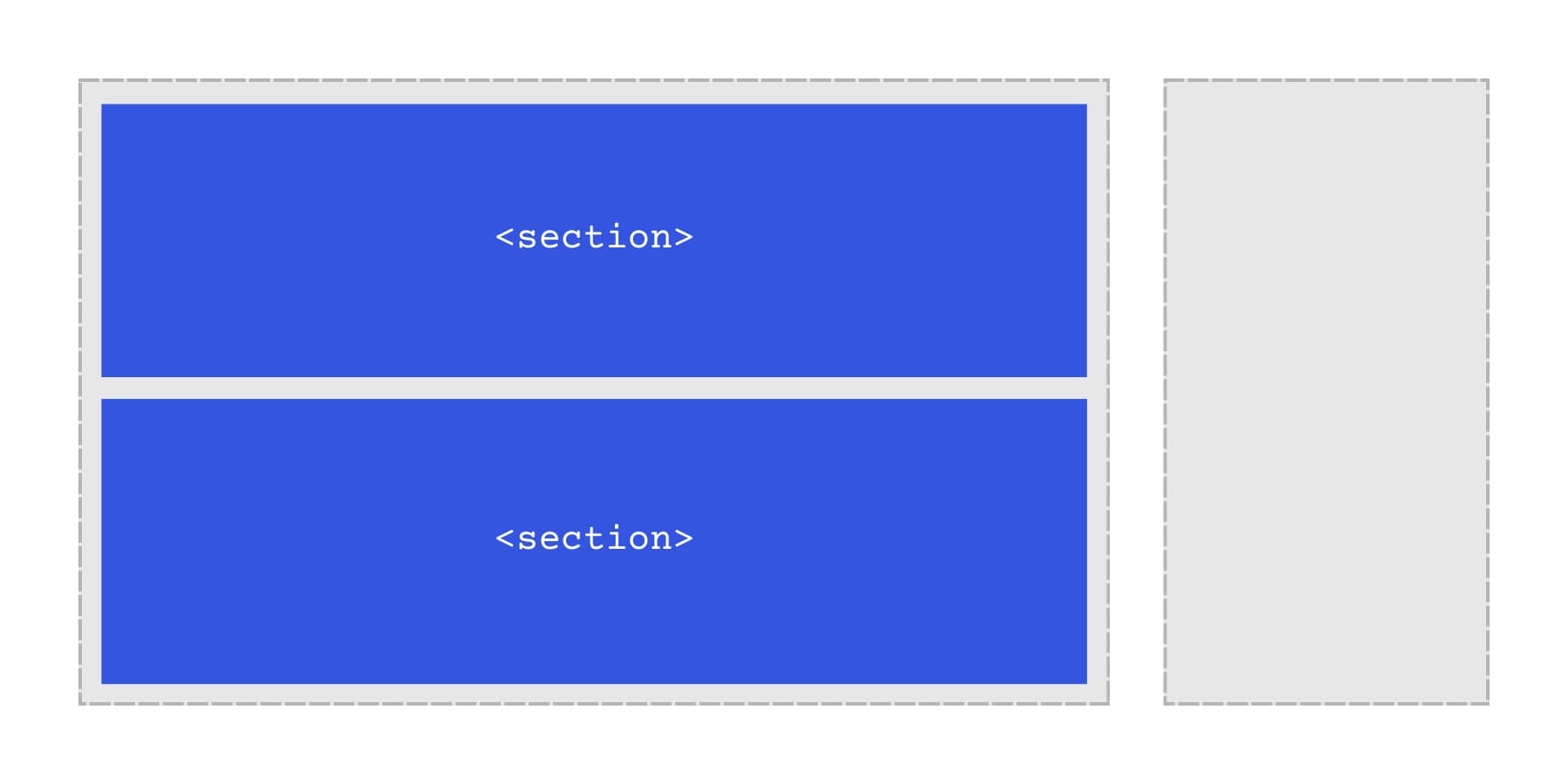
A <section> should represent a distinct topic on the page, and it should be identifiable in some way. In most cases, that means placing a heading inside the section so both people and assistive tech can understand what the section is about. If a visible heading doesn’t make sense for your design, you can still give the section an accessible name using aria-label or aria-labelledby.
When a <section> is labeled, users can navigate long pages by jumping between major topics instead of reading everything from top to bottom. If you’re only adding a wrapper for styling, spacing, or JavaScript hooks, a <div> is usually the better choice.
Long articles work well with sections. Product pages do too. Take a landing page: hero area at the top, features below that, testimonials after, and pricing at the bottom. Each one becomes its own <section> with its own heading. Clear structure for everyone.
Sections nest when you need them to. Keep nested sections aligned with your heading levels to keep the outline coherent. A chapter of content might contain three or four subsections, each with a subheading. Browsers and screen readers follow that hierarchy naturally, just as people flip through the chapters of a physical book.
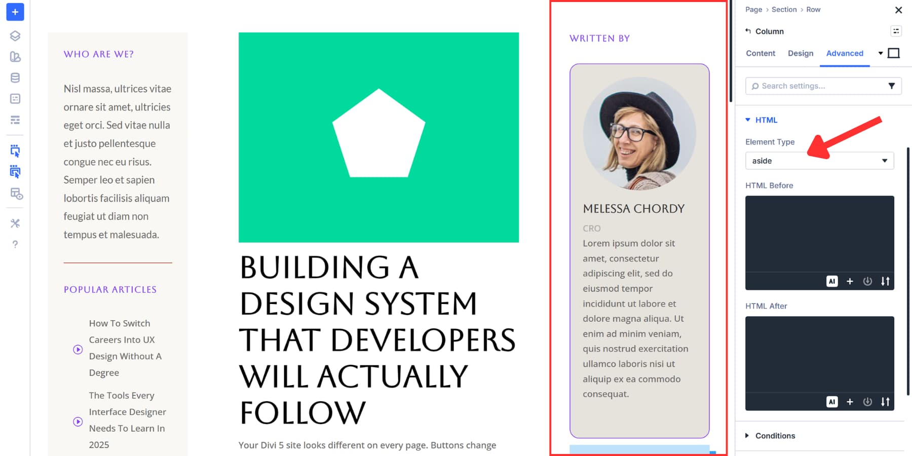
How To Use The Aside Element
<aside> marks content that relates to your page but stands separate from the main story. Sidebars work best here. Author bios, pullquotes, related posts, optional definitions or clarifications, and advertising blocks all belong in <aside> elements.
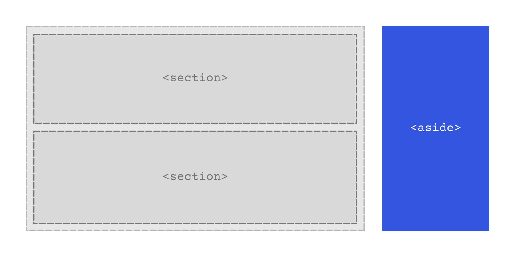
Here’s the test: if you deleted all the aside content, would your page still make sense? It should. A blog post works without a “recent articles” sidebar. A product page functions without a “you might also like” widget. Aside content adds depth, but isn’t required to understand what you’re reading.
Most screen readers treat <aside> elements as complementary, so users can jump to them from the navigation or skip them. Someone reading your article might ignore the sidebar. Someone else checks it first to see what else you’ve written. Both choices work.
You can drop an aside in the middle of your content or place it off to the side in your layout. An article might include an aside with a relevant statistic right between two paragraphs. Your page design might put a column of aside content next to everything else. Either setup works fine. What matters is that the aside content connects to the main content without being part of it.
What Is The Main Element
The <main> element wraps the primary content of your page. It tells browsers and screen readers where your actual content starts, separating it from navigation menus, sidebars, footers, and other elements that appear across multiple pages.
This container holds what someone came to your page to see. A blog post, product details, your portfolio, and a contact form. Whatever the page exists for goes inside <main>. Headers, footers, and site navigation stay outside.
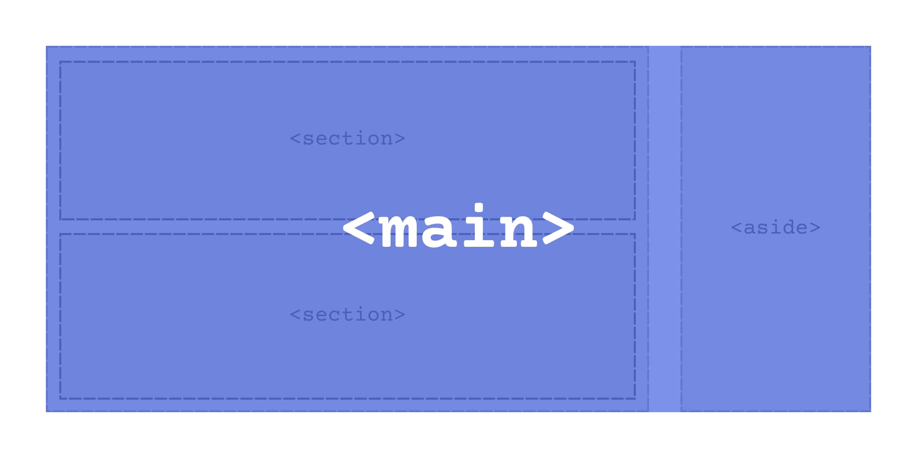
You can only use one <main> element per page, which keeps the structure clear. <main> should also not be nested inside <header>, <footer>, <nav>, <article>, or <aside>. Screen readers use <main> to help users skip repetitive navigation and jump straight to the primary content.
Search engines also take this element into account. Semantic structure can help search engines interpret which content is primary, but it doesn’t replace strong content or a clean heading structure.
The main element doesn’t change how your page looks. You still style everything with CSS the same way. But underneath, it creates a landmark in your HTML that makes your site work better for everyone navigating it.
Section vs Aside vs Main: The Key Differences
Choosing between these three tags gets easier when you focus on content relationships:
- <main> holds what your visitors came to see.
- <section> organizes distinct topics that should be labeled.
- <aside> contains supporting content the page still makes sense without.
Here’s a quick rundown to get a better idea:
| Element | What It Does | When To Use It | How Many Per Page |
|---|---|---|---|
| <main> | Marks your primary page content | Wrap the core content users came to see | One per page |
| <section> | Groups related content under a theme | When you have a distinct topic with its own heading | As many as you need |
| <aside> | Marks supplementary content | Content that relates to but stands separate from the main story | As many as you need |
<section> versus <div> usually comes down to whether the content is a distinct thematic grouping you want to label in the document structure. A heading is the common signal, but the bigger rule is: use <section> when the content forms a named topic area.
Aside works anywhere on your page, not just in sidebars. The deciding factor is independence. Pull the content out completely and check if your main narrative still flows and makes sense. Author bios work without reading the article. Related posts add value but aren’t required. Optional definitions or clarifications can support your content without being part of the core narrative. Visual placement doesn’t determine whether something should be an <aside>. The deciding factor is whether it complements the primary content.
Introducing Semantic Elements In Divi 5
Divi 5 puts semantic HTML controls right in the builder where you can actually use it. The tools are available in the same settings panels you’re already using to style everything else.
Modules and containers in Divi 5 include Element Type controls, so you can choose the most appropriate semantic wrapper for each part of your layout. The styling stays exactly the same. What changes is the code underneath, and what it tells browsers about your page structure.
This can improve accessibility by adding clearer landmarks and providing search engines with more structural context about your page. Screen readers use semantic tags to help people navigate your page more quickly. Search engines read them to understand how your content connects. Neither tool cares what your design looks like. They primarily care about your content and the structure your HTML communicates.
The workflow stays simple. Build your layout like normal, then decide what each piece represents semantically. <header> for your site header area. <nav> for menus. <article> for a self-contained post or entry. <footer> for footer content.
How To Change Element Types In Divi 5
Open any module or container settings. Head to the Advanced tab. You’ll spot an HTML option group near the top. That’s where Element Type lives.
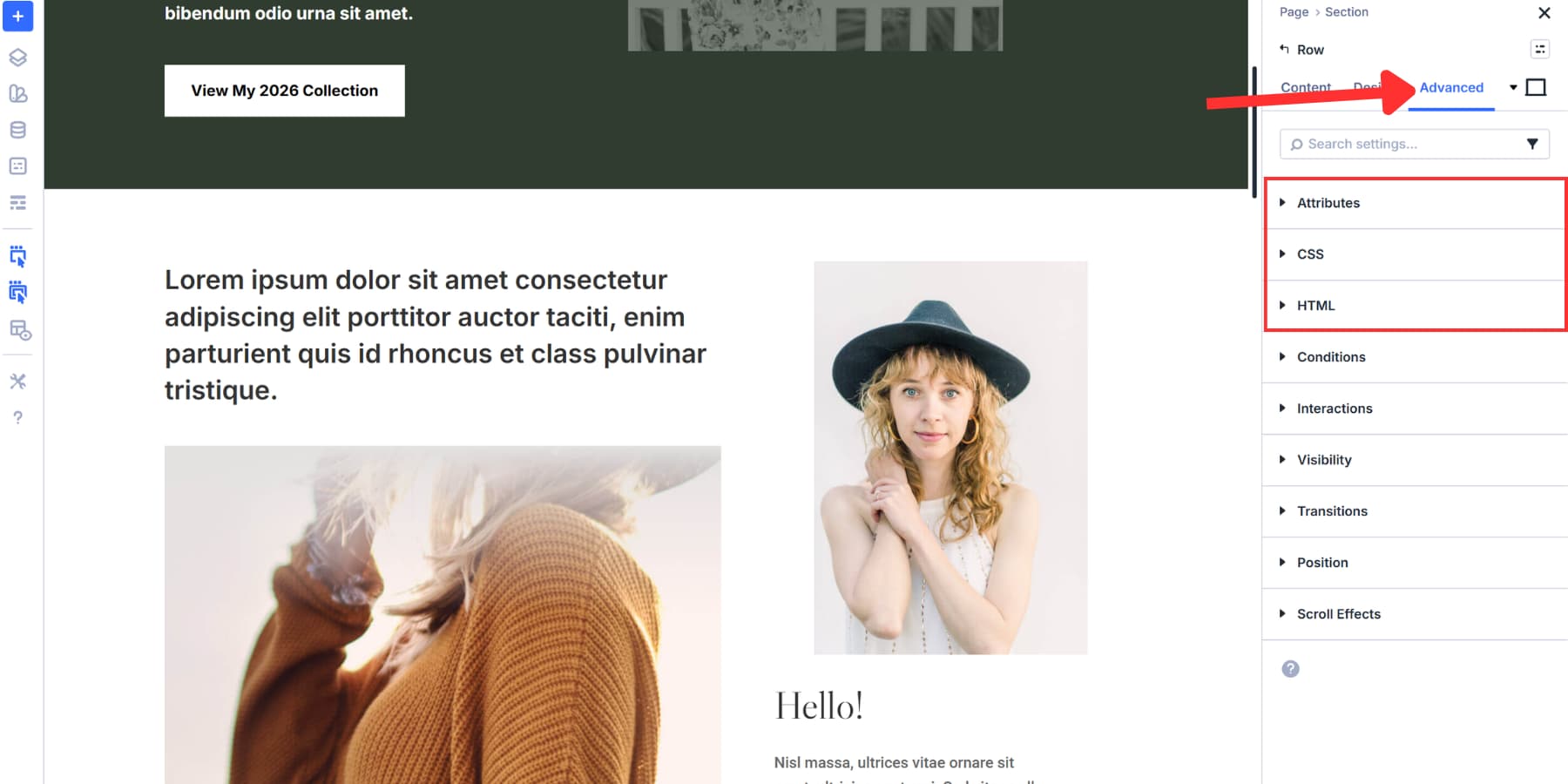
Click that dropdown and you’ll see every semantic tag available. Section, aside, main, header, footer, nav, article, button. The whole list sits right there.
Pick whatever matches what your content actually does. Your sidebar content becomes an aside. The site header becomes a proper header tag. Blog post wraps in an article element.
The visual design stays put. Nothing moves or changes color. Your layout remains exactly as you built it. The shift happens in the code underneath, where it actually matters for accessibility and search engines.
This works the same way whether you’re updating a single text module or restructuring an entire container. Build your design first, then assign meaning to each piece.
Using These Elements: Building A Blog Post Layout
Let’s take a look at how to use these wrappers practically. We are going to use this layout we created to demonstrate how to build a Holy Grail layout with Divi 5.
The center column holds the primary page content. Wrap that column in <main>, and (optionally) wrap the blog post itself in an <article> inside <main>.
The left sidebar contains “Who Are We?” text, a Popular Articles list, and Courses of the Month cards showing UI/UX Design offerings. All of that becomes an aside element. Someone could read the article without ever looking at those course cards or article links.

The right sidebar shows the author bio card for Melissa Chordy and the “Reach For The Stars” promotional section with an illustration. Another aside element. Both sidebars add value but aren’t required to understand the design system article.
Within the main content area, there could be several sections. For example, you can mark the call to action as a <section> if it represents a distinct topic with a label (usually a heading). If it’s only a styling wrapper, keep it as a <div>.
We can set all these element types in Divi 5 without touching code. Build the layout, then assign the proper semantic tag to each piece through the Advanced tab.
Try Semantic Elements In Divi 5 Today!
Clean semantic markup helps your pages make more sense to both people and machines. When your layout uses the right structural elements, screen reader users can navigate faster, and search engines get clearer context about what’s primary versus supporting.
With Divi 5, you can apply these semantic wrappers directly in the builder. Build your layout as usual, then choose the element type that matches each part’s function. No custom code required.


Hi! Thanks for the guide on Divi 5 semantic tags. After reading, I have a few specific questions regarding W3C standards that aren’t fully covered:
1. Section vs. Article: You suggest using for content blocks. However, for autonomous content like a project description or a post, wouldn’t be more semantically accurate according to W3C standards?
2. Document Outline: Regarding grouping ‘Introduction’ or ‘Conclusion’ in sections: Is this recommended even if they don’t have their own headings? I want to avoid my students creating a fragmented document outline.
3. Main & Aside Nesting: Regarding page architecture, does Divi 5 performance benefit from having the inside or outside the tag when dealing with global vs. contextual sidebars?
Thanks for clarifying these technical nuances!
Great question, Jon! 😊
Here’s the technically correct way to think about it:
1. Section vs. Article: Yes, for a self-contained item like a blog post, news post, project entry, or reusable card, “ is usually the better choice. The HTML spec defines `article` as content that is independently distributable or reusable, while `section` is for a thematic grouping within a page. Divi’s own article also notes `article` for a self-contained post or entry.
2. Intro/Conclusion without headings: A “ should generally have an accessible name, usually a heading. If a visible heading does not fit, you can use `aria-label` or `aria-labelledby` instead. If the block is just a wrapper and has no real topic label, a plain “ is usually better.
3. Main & Aside nesting / performance: From a performance standpoint, there is effectively no Divi 5 benefit to putting an `aside` inside or outside `main`; semantic tags do not change layout performance by themselves. The visual styling stays the same and the change is in the underlying structure for accessibility and search engines. So the decision should be semantic: put the `aside` inside `main` if it is contextual to that page’s primary content, and outside `main` if it is more global or repeated site chrome. Also, `main` should be used once and kept as the dominant page content landmark.
Hope this helps! 👍