
Responsive design often comes down to controlling how elements shift, wrap, and space themselves across different screens.
Divi 5 introduces Flexbox as its core layout system, giving you control over layout flow and alignment at the container level. While block-style layouts lock you into fixed columns and floats, Flexbox adjusts to available space, making responsive behavior more predictable.
In this post, we’ll look at how Flexbox works in Divi 5 and walk through a simple layout to show how these tools come together to create a clean, responsive design with fewer adjustments.
What Is Flexbox In Divi 5?
Flexbox is a modern way of arranging elements so they automatically adapt to available space. Think of it like organizing items on a shelf: you decide how they should sit, how much room they need, and what happens when you run out of space.
Rather than locking modules into fixed columns, Flexbox treats a section or container as a flexible space and gives you control over how its items should behave as the screen size changes.
This flexibility becomes especially useful when you’re building for multiple screen sizes. You no longer need to guess how elements will squeeze together on a tablet or worry about content overflowing on mobile. Flexbox handles those adjustments for you based on the rules you set at the container level.
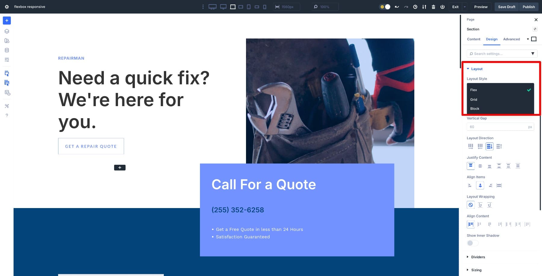
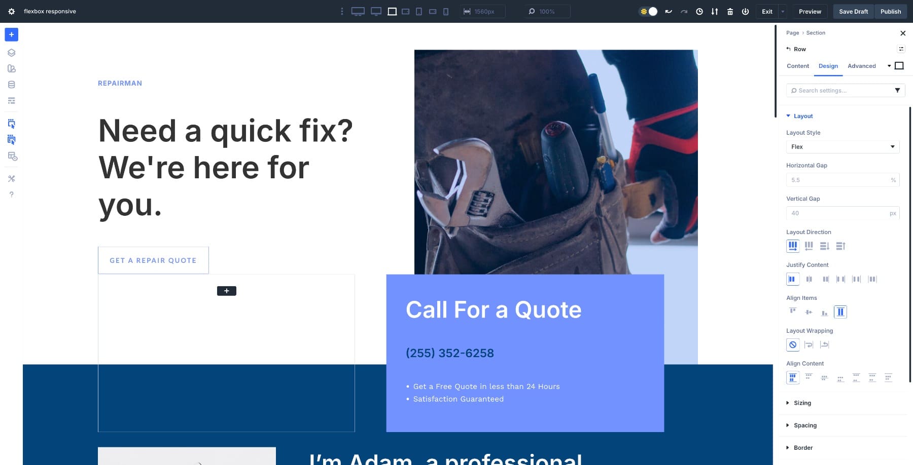
Divi 5 now includes Flexbox as a core layout system. When you set a section, row, or container to Flex, you’re turning it into a flex container, and the elements inside become flex items. You get to decide whether items sit side-by-side or stack vertically, how they align, how they wrap when space runs out, and how much space sits between them, all without custom CSS.
Subscribe To Our YouTube Channel
You can control Flex properties in Design > Layout > Layout Style settings.
New sections and rows you add are Flex by default (unless you choose a Grid-specific structure). Divi also lets you convert old layouts from Block to Flex, and it supports CSS Grid, which you can combine with Flex to create complex layouts.
Once you switch to Flex, new options appear. Here are the core controls:
- Layout Direction: Choose whether items flow horizontally in a row or vertically in a column. This sets the basic structure.
- Alignment Controls: Justify Content and Align Items let you control how items distribute space and align themselves within the container. Centering or spacing becomes easier without manual padding.
- Gap Settings: Control horizontal and vertical spacing using gap controls rather than adding margin or padding between individual modules.
- Wrap Behavior: Flexbox can automatically move items onto the next line when space becomes limited, preventing elements from squishing or overflowing on smaller screens.
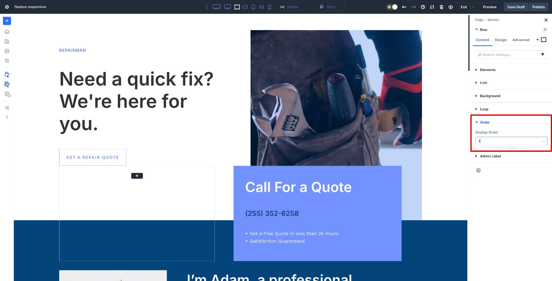
- Order Control: Change the visual order of elements for different devices without duplicating sections, which helps layouts stay logical on mobile.
This system also changes how you build rows. You can create a container and let Flexbox determine how items distribute themselves rather than choosing a predefined column layout upfront. Two elements might sit side-by-side on desktop and stack on mobile through container settings alone.
Flexbox works at the container level, so you can build layouts that respond to screen size naturally. This reduces the need for padding tweaks, duplicated modules, or complex CSS. Responsive behavior becomes a planned part of the layout rather than something you patch together later.
How Flexbox Makes Responsive Design Easier
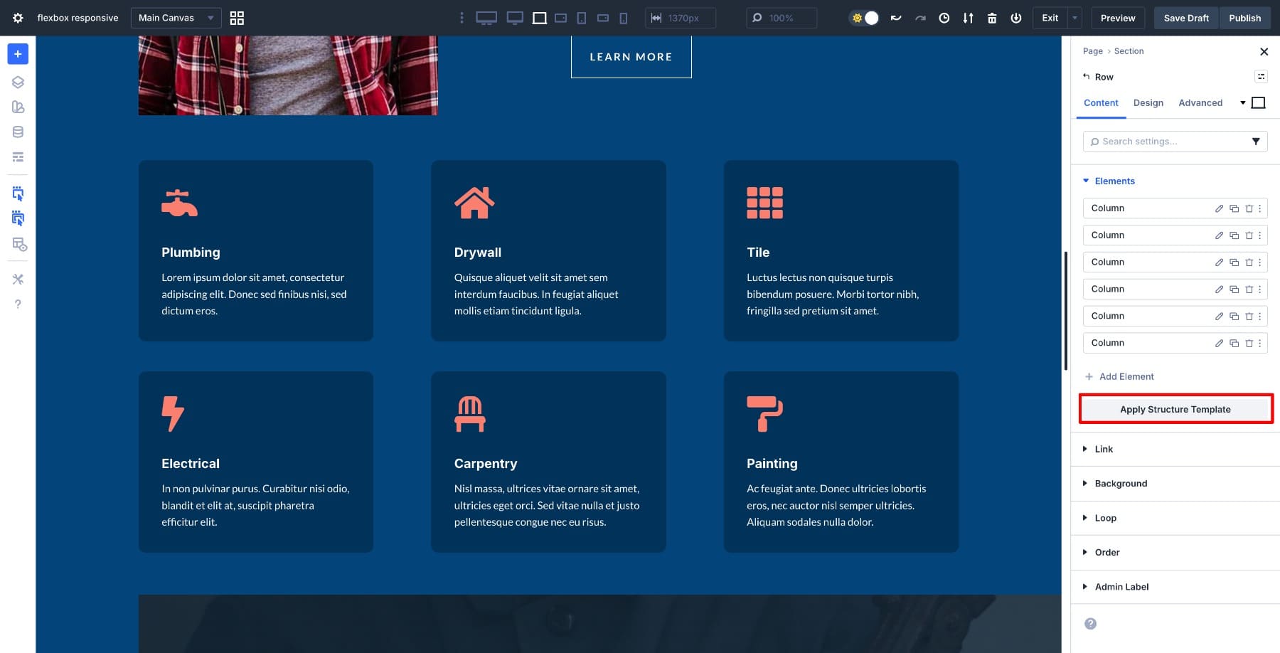
Divi provides predefined Flex Row Structures to simplify your design.
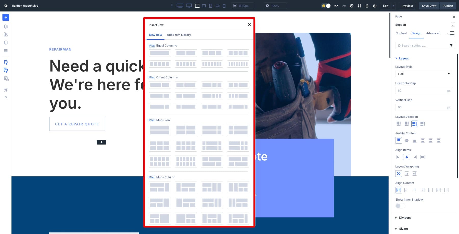
But you don’t need to start with a structure in mind. One of the biggest advantages of Flexbox in Divi 5 is that it removes the need for predefined column layouts. You can place modules inside a container and let Flexbox determine their layout based on the available space.
On large screens, items sit side by side. On smaller screens, they stack automatically without creating new rows or duplicating modules for mobile.
You also get control over how layouts shift at different breakpoints. A row can display items horizontally on desktop, then switch to vertical stacking for tablet or phone. Items can stay in a single row where space allows and wrap to multiple lines when things get tight. Since these controls live at the container level, you can adjust a single setting rather than editing individual modules.
Spacing works the same way. Flexbox uses gap controls for horizontal and vertical spacing, so you don’t have to tweak margin or padding on each module. This keeps layouts consistent and prevents spacing issues when the design changes on smaller screens. Layouts look intentional rather than patched together.
You can also use responsive Advanced Units (like %, clamp(), calc()) and the Responsive Editor to fine-tune for different breakpoints.
Reordering elements adds another layer of flexibility. You can change the visual sequence of modules on tablet or mobile without duplicating content or using visibility settings. This feature is particularly useful for hero sections, CTA rows, or any layout where you want images and text to switch positions on smaller screens.
Actively Switching Row Structures
Flexbox allows layouts to shrink, wrap, and adapt automatically, but Divi 5 also lets you manually choose how a row restructures on smaller screens using its Elements and structure controls.
Instead of relying only on automatic stacking, you can select a row and choose a preferred structure for each breakpoint. This lets you decide whether elements should remain side-by-side, wrap into multiple lines, or switch into a vertical stack on tablet or mobile.
For example, a three-column layout might work well on desktop. On tablet, you can choose a structure that groups items into two columns. On mobile, you can switch that same row to a single-column structure so content flows cleanly from top to bottom. The content stays intact, but the structure changes intentionally based on screen size.
This approach is especially useful when layouts need more control than Flexbox’s automatic behavior provides. Rather than hoping items stack in a usable way, you’re defining exactly how the row should reorganize at each breakpoint.
When To Switch Row Structures (And When Not To)
Being able to change row structures doesn’t mean every layout should change shape on every screen. The key is knowing when to let Flexbox adapt naturally and when to make a structural choice.
If a layout still reads clearly on smaller screens, wrapping is often enough. Items can stay in a row as long as space allows, then move naturally to the next line. This works well for feature grids, icon rows, and layouts where elements have equal importance.
Switch structures when the reading order or hierarchy needs to change. Desktop layouts are scanned horizontally, while mobile layouts are read vertically. In those cases, choosing a different mobile structure improves clarity.
It also helps to separate row structure from element order. Structure controls the layout shape. Order controls what appears first. You might stack a row vertically on mobile, then reorder elements so key content leads.
A common mistake is switching structures too aggressively. If spacing or wrapping solves the problem, forcing a single-column layout can make pages feel unnecessarily long. Use structure changes to solve specific layout issues, not as a default response to smaller screens.
Flexbox turns responsive design into a container-level decision rather than a module-by-module chore. You define how the content should behave, and the layout adapts accordingly. This reduces the need for custom CSS, device-specific workarounds, or trial-and-error spacing adjustments. Divi pairs these controls with customizable breakpoints and a responsive preview editor, so you can design layouts that scale cleanly from widescreen desktops to small phones.
Learn Everything About Divi 5’s Flexbox
Creating A Responsive Website Using Divi 5’s Flexbox
Creating a new layout with Flexbox in Divi 5 is straightforward. Every section and row you add is already set to Flex by default, so you can build your layout and refine it at different breakpoints without extra setup.
In this example, we’ll do the reverse. We’ll take an older block-based layout and convert it to Flex so you can see how the switch works and how to optimize it for responsive behavior.
1. Switch The Layout From Block To Flex
Open a Section’s settings, go to Design > Layout, and change the Layout Style from Block to Flex.
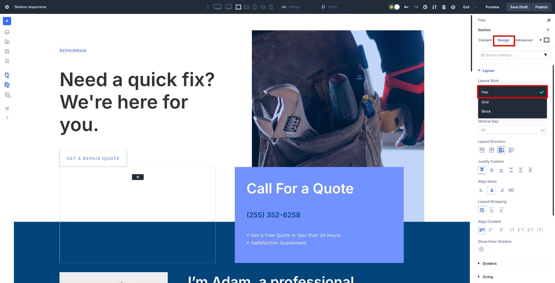
Once you make the switch, Divi turns the container into a flex container and the modules inside become flex items. New settings appear, including controls for direction, alignment, wrap, and gap. Repeat this process with every other section and row in your layout.
Nothing about your layout should visually break at this stage. You’re not rebuilding the structure or replacing modules. You’re shifting from a fixed-block model to a flexible one, giving you more control over how the layout behaves across different screens.
2. Adjust Flex Settings For Each Container
Once you’ve made the switch, review the layout. Pay attention to how elements sit next to each other, how much space they take up, and whether the row feels balanced. This quick audit helps you understand what needs refinement when you begin adjusting direction, alignment, and spacing.
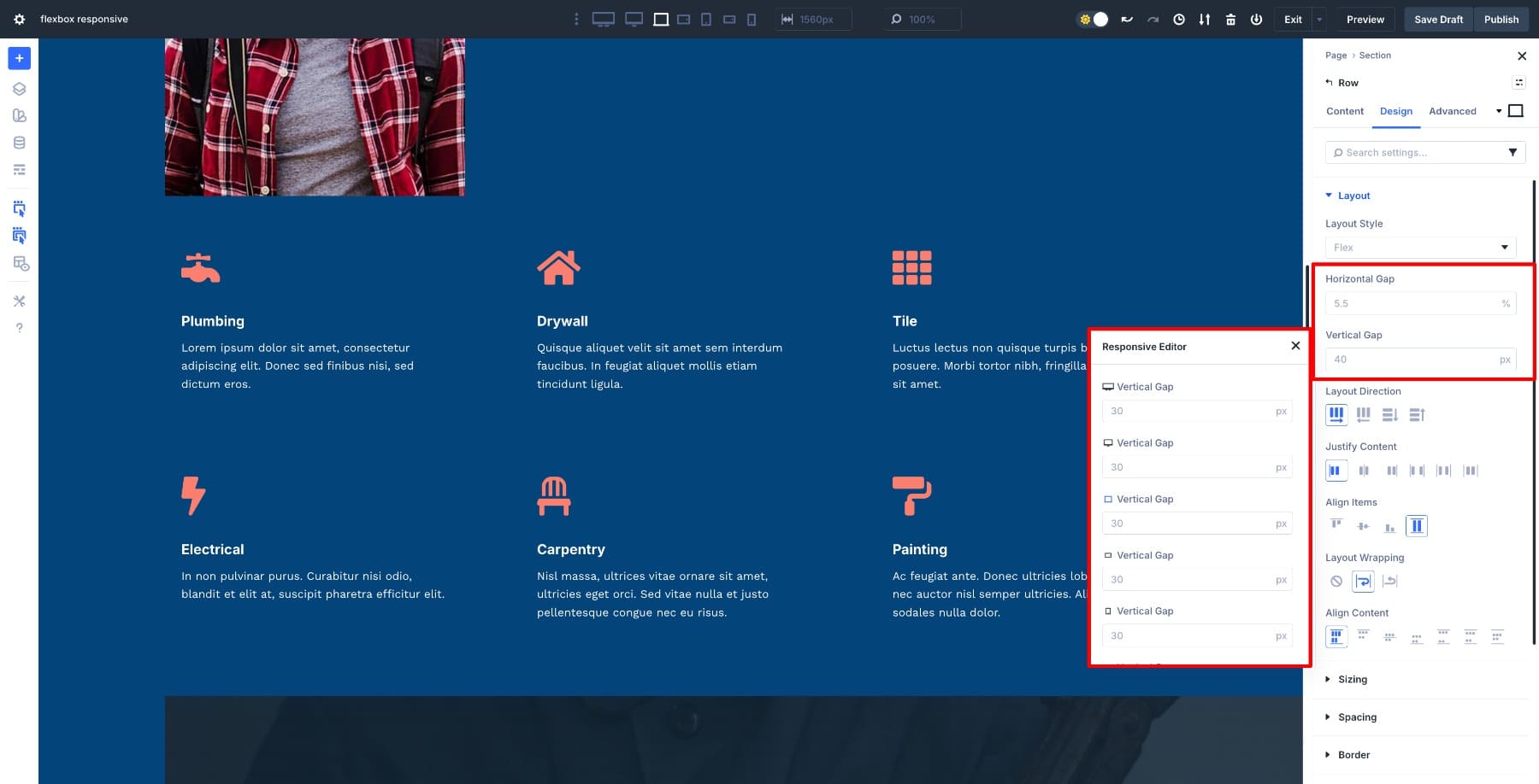
For example, this row feels too congested, so we’ll increase the Horizontal Gap to create breathing room between items. Switch the unit to percentage for more responsive spacing and fine-tune it until the layout feels balanced. This gives you consistent spacing without adding individual margins or padding on each module.
The footer shows an awkward gap between items. Adjust the Vertical Gap of the row’s first column to fix it.
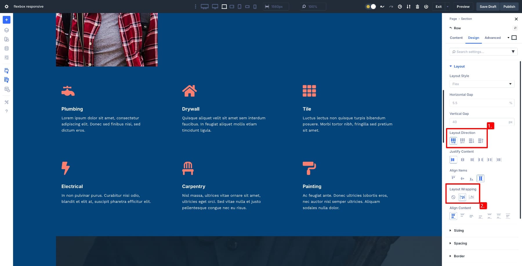
The footer also looks too crowded in mobile view. Switch the Layout Direction from row to column on mobile so items stack vertically, making the layout easier to read on smaller screens.
You can also change content alignment using Justify Content rather than dealing with padding and negative margins.
Layout Wrapping lets you control how items adjust based on different breakpoints and available screen sizes.
Once you finish converting and adjusting each section, review how the entire layout feels across breakpoints and note what still needs refinement before moving on.
3. Fine-Tune Layouts With Custom Breakpoints & Responsive Editor
With the core Flexbox structure in place, switch to different breakpoints to fine-tune the layout for various screen sizes. Divi 5 includes customizable breakpoints, so you’re not limited to desktop, tablet, and phone. You can adjust behavior for small phones, large tablets, or even ultrawide screens if your design needs it.
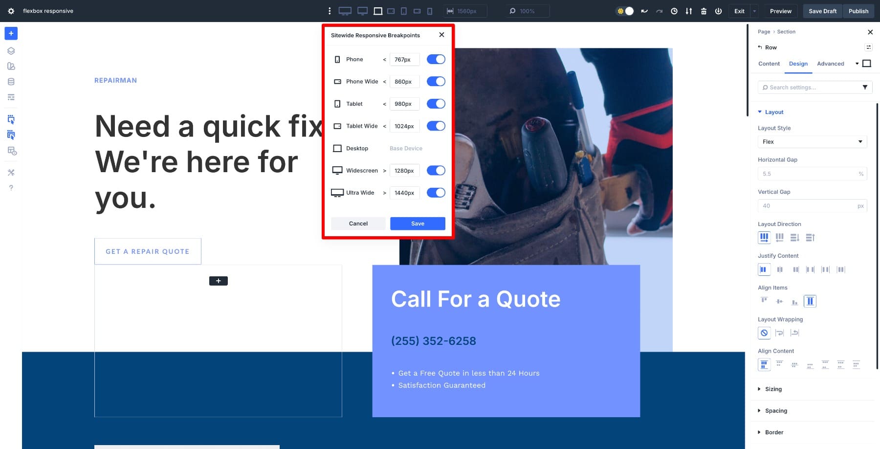
Use Flexbox settings at each breakpoint to refine direction, alignment, wrapping, and order. You might keep a horizontal layout on large tablets, but stack items earlier on smaller screens. Adjust layout behavior where it makes sense rather than forcing the same structure everywhere.
While you’re in a breakpoint view, you can also adjust other design settings responsively using the Responsive Editor. This includes heading size, padding, spacing, or alignment. Hover over any field and click the Responsive Editor icon to open a panel that lets you adjust values from one place without switching breakpoints.
This approach helps you create a layout that feels intentional on every screen without overriding settings on individual modules or writing custom CSS.
As you work through your layout, test how it behaves at in-between sizes, not just the standard breakpoints. Real users land on all kinds of screen widths, so checking those transitional moments helps catch awkward wrapping or spacing issues before they reach your audience.
Keep gap values consistent across similar containers to maintain visual rhythm, and use percentage-based units where spacing needs to scale proportionally. If you find yourself making the same adjustment across multiple sections, consider whether Option Group Presets or Design Variables would be more efficient.
Once you finish refining the layout across all relevant breakpoints, you’ll have a fully responsive design that adapts naturally rather than relying on duplicated sections or device-specific redesigns.
Build Responsive Layouts With Flexbox In Divi 5 Today!
Flexbox removes much of the guesswork that used to come with responsive design. By converting a layout to Flex in Divi 5, we adjusted spacing, direction, wrapping, and alignment directly from the container, refining everything across breakpoints without custom CSS or duplicate sections.
The layout adapted as the screen changed, and most adjustments happened once at the container level. Flexbox gives you a practical way to build responsive pages that behave predictably on tablet and mobile, with less manual work and fewer workarounds to maintain. Your layouts scale cleanly because you’ve defined how they should respond from the start, not patched them together after the fact.


Leave A Reply