")
Divi’s Menu module handles many navigation needs, but sometimes you want more options and control. Custom header designs, unique hover effects, or specific semantic HTML requirements can push you beyond what the Menu Module offers. Divi 5‘s semantic elements and HTML wrappers let you build navigation from scratch using basic modules while outputting valid, accessible HTML.
This tutorial demonstrates how to build a navigation menu using an Image Module for the logo, Text Modules for the text-based nav links, and a Button Module for a call to action. The result is a semantic <nav> structure with proper <ul> and <li> elements that browsers, screen readers, and search engines interpret correctly.
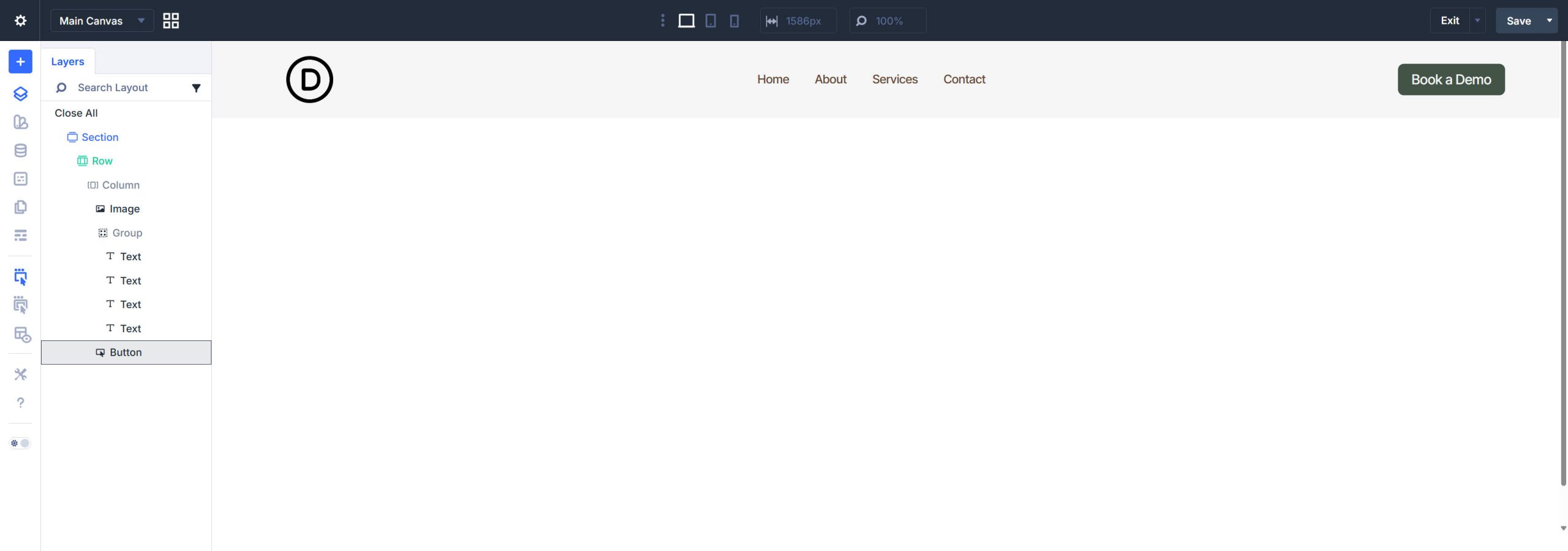
The Menu Module works for out-of-the-box navigation, but custom-built navigation offers advantages in specific scenarios. Using individual modules gives you access to their full styling options. You can use CSS Grid or Flexbox to control your own layout within the navigation (instead of the Menu Module’s predefined layout). You can also include a styled button as part of the navigation itself — semantically inside the <nav> element where it belongs — rather than floating outside it.
Divi 5’s semantic element settings make this a viable and legitimate technique. You control what HTML tags each module outputs, ensuring your custom navigation remains fully accessible and semantically correct.
The Target HTML Structure
The first thing to know about semantic structure is that there are valid ways of doing it. Invalid ways of implementing semantic elements and context are often worse than not attempting them at all. So, before building this in Divi, it is helpful to understand the HTML structure and rules you’re trying to mimic. Here is a simplified exemplar:
<header>
 <nav>
 <ul>
 <li>
 <a><img></a>
 </li>
 <li>
 <ul>
 <li><a>Home</a></li>
 <li><a>About</a></li>
 <li><a>Services</a></li>
 <li><a>Contact</a></li>
 </ul>
 </li>
 <li>
 <a>CTA Button</a>
 </li>
 </ul>
 </nav>
</header>
We will build this in Divi’s Theme Builder using a Global Header. Doing this automatically assigns the <header> tag for you.
From there, all navigation elements go inside a <nav> landmark. You know that an element needs to be inside the Navigation tag if it has a link (so that includes the logo and button, in this case). The outer <ul> contains three list items (<li>): the logo, a nested list of nav links, and the CTA button. Screen readers announce this as a navigation region, and the list semantics communicate the relationship between menu items. We have a sub-list using another <ul> for the text links, with each text link wrapped in a <li>.
Now, Divi modules have multiple layers. We will sometimes change a Module’s HTML element directly, but other times we need to add a semantic layer above it, so we will also use the Before and After HTML options. Using both of those options found in Advanced > HTML will be all we need for this simple navigation and menu to have proper semantic structure.
Step 1: Create the Container Structure
Open the Theme Builder and edit your Global Header template. Again, the Theme Builder automatically wraps header templates in a <header> element, so you don’t need to worry about that element.
Add the Section
There should be an empty Section already in the editor. This tutorial will just apply the bare minimum styles.
Set the Section’s top and bottom padding to your preferred value — we are using clamp(0.9rem, 0.8rem + 0.2vw, 1.1rem). Set the site gutter using left and right padding with something like clamp(24px, 6vw, 90px). We’re using Design Variables for both of these.
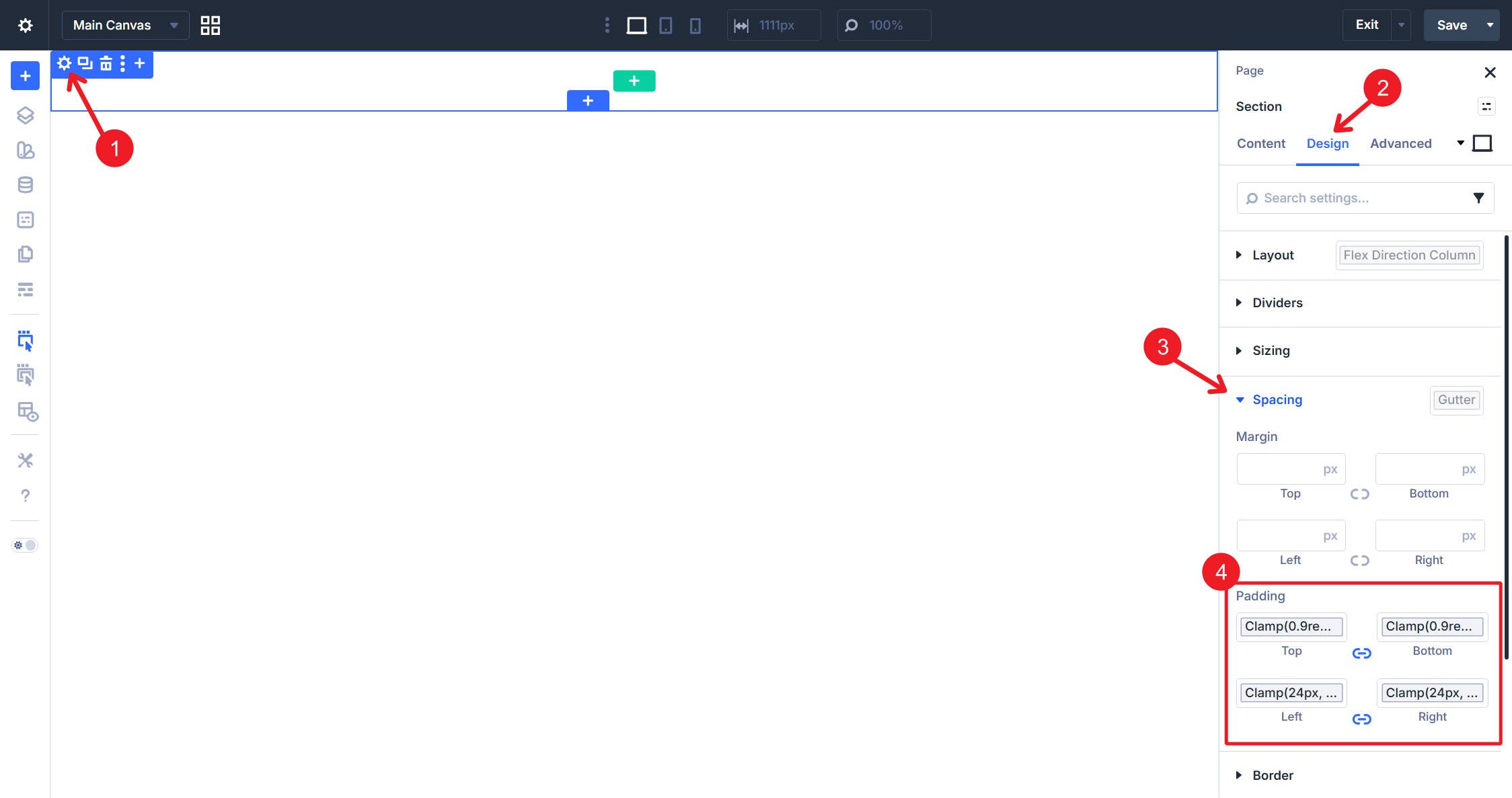
I will also add a background color.
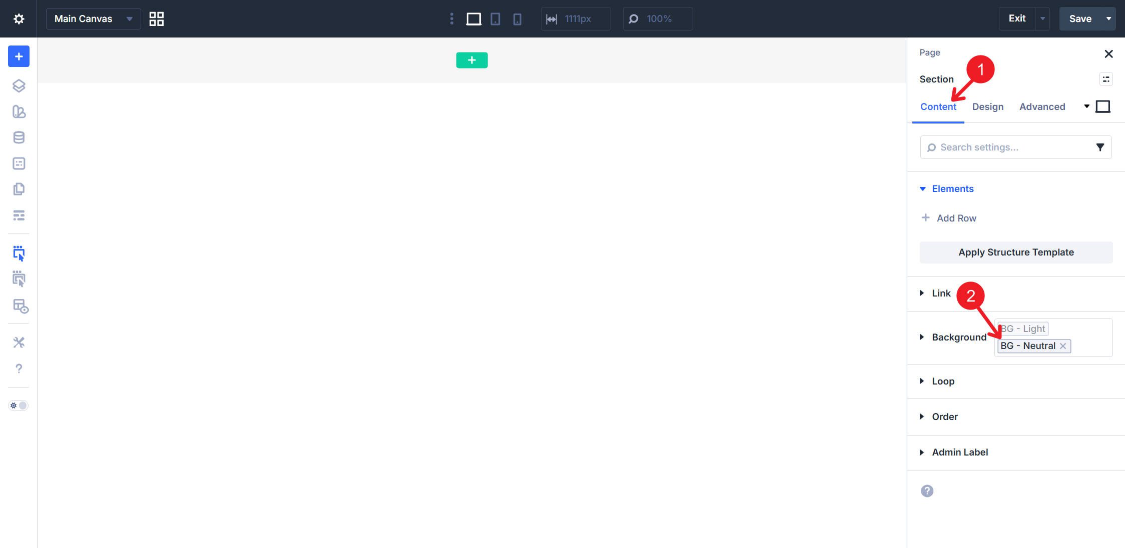
Add the Row
Add a Row inside the Section. This Row will later become the <nav> element. Select the single-column Flex Row.
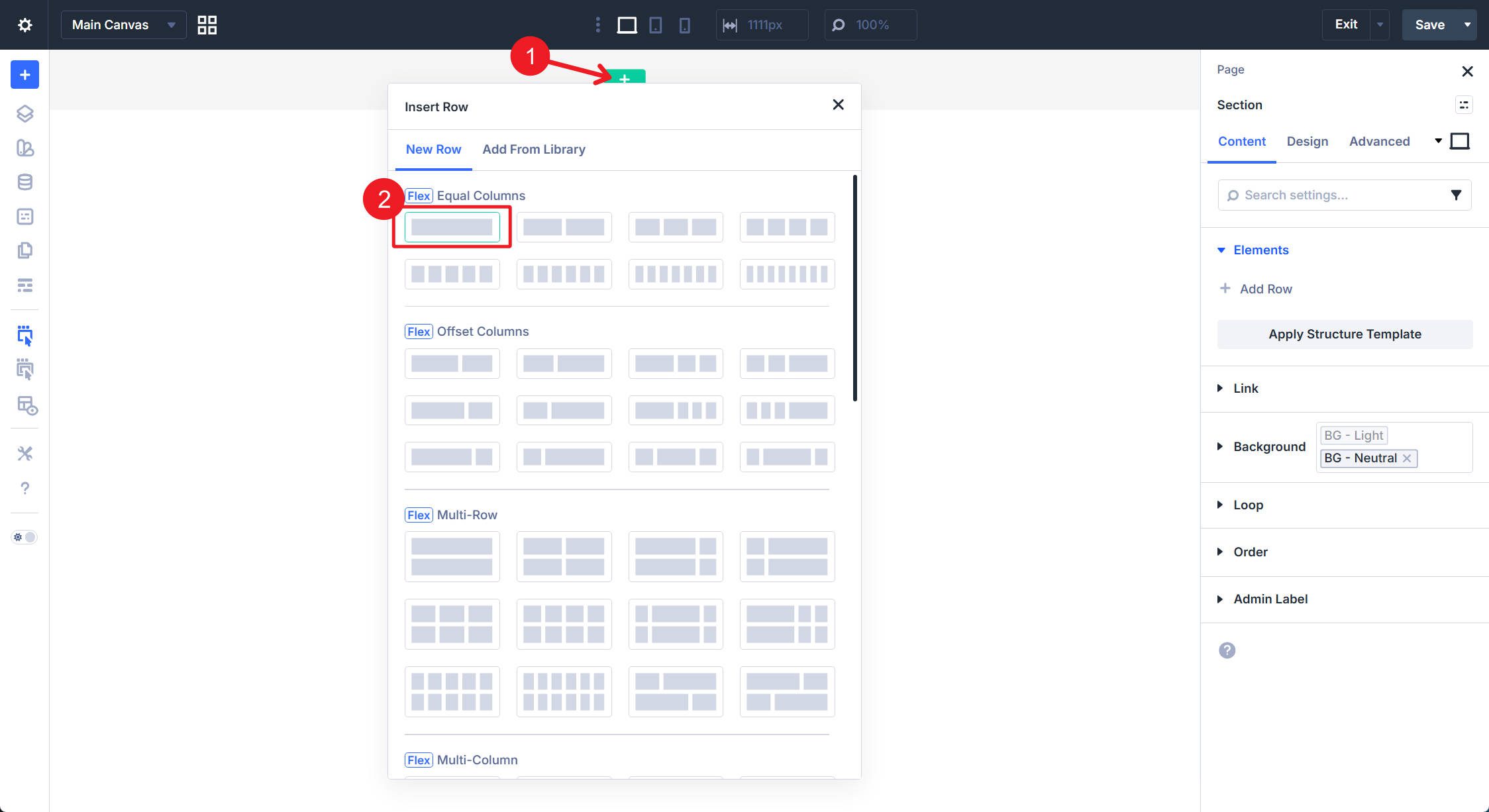
Add the Column
When adding a Row, the first Column will always be populated. Since we had a single-column layout select, this is the only column we need.
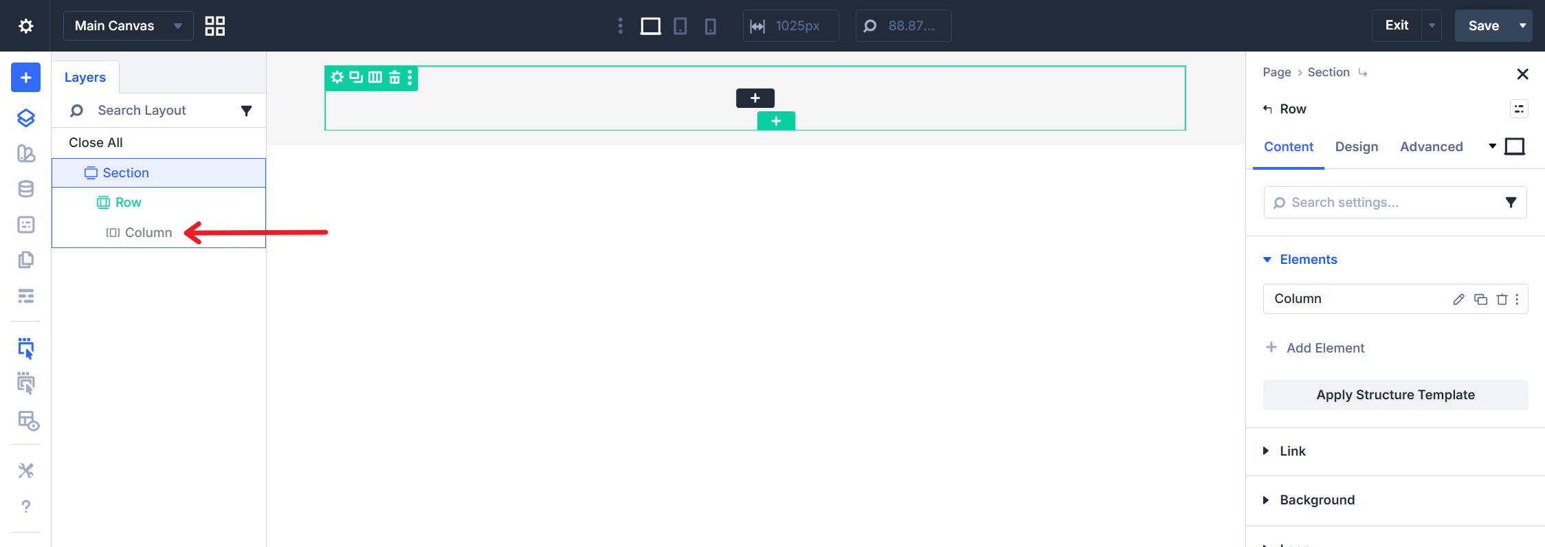
The Column will serve as the outer <ul> containing all navigation elements.
Step 2: Add the Modules
With the main containers in place, we now move on to adding the modules that will form the navigation elements.
Add the Logo (Image Module)
Add an Image Module as the first element in the Column.
Upload or select your logo image. Set the image’s Link URL to your homepage. This link is essential — without it, the logo won’t properly function as a navigation item.
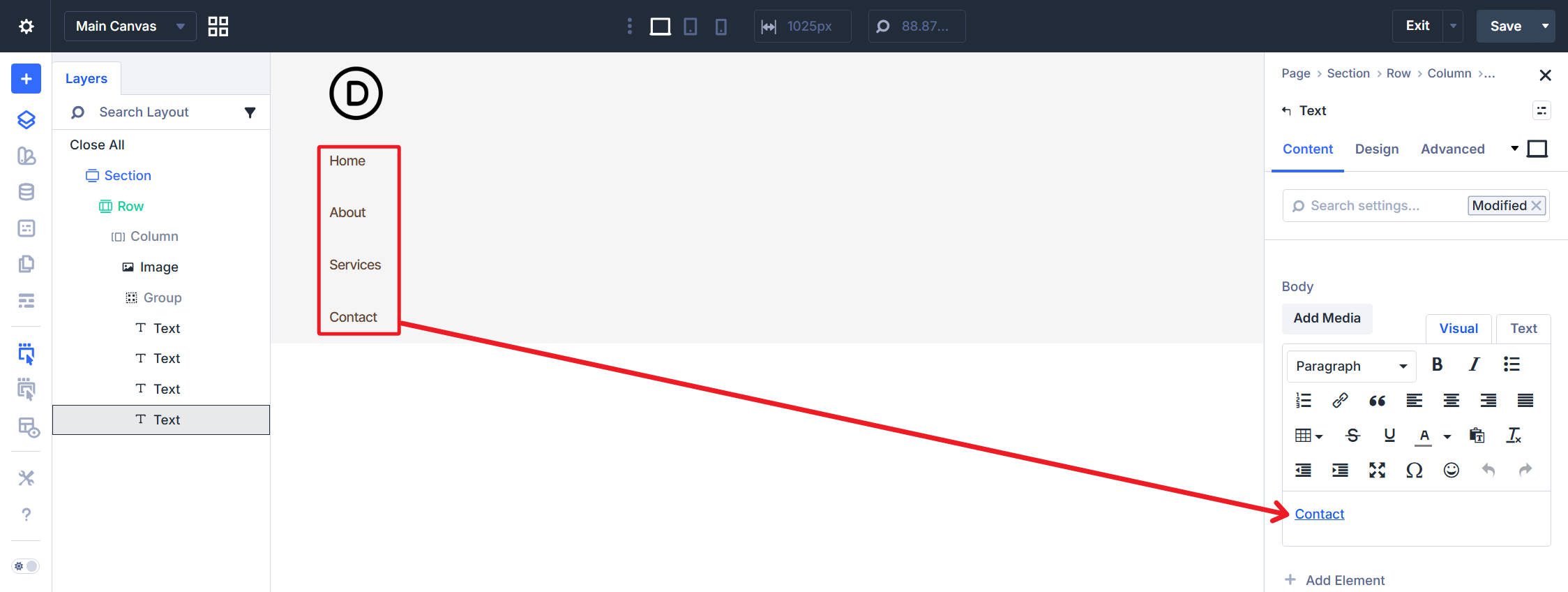
Add the Text Links (Group Module with Text Modules)
Add a Group Module after the Image inside the Column. The Group serves dual purposes: it visually groups the nav links and will later output the nested <ul> structure.
Inside the Group, add four Text Modules—one for each text navigation link. In each Text Module’s content field, add the link text and set the hyperlink in the Rich Text editor (Ctrl + K). Do not use the module’s Link option group; the anchor needs to be within the text content for proper semantic output.
Give each a unique text and link as you see fit.
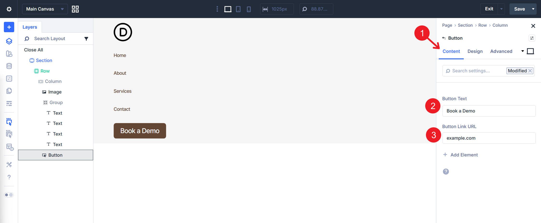
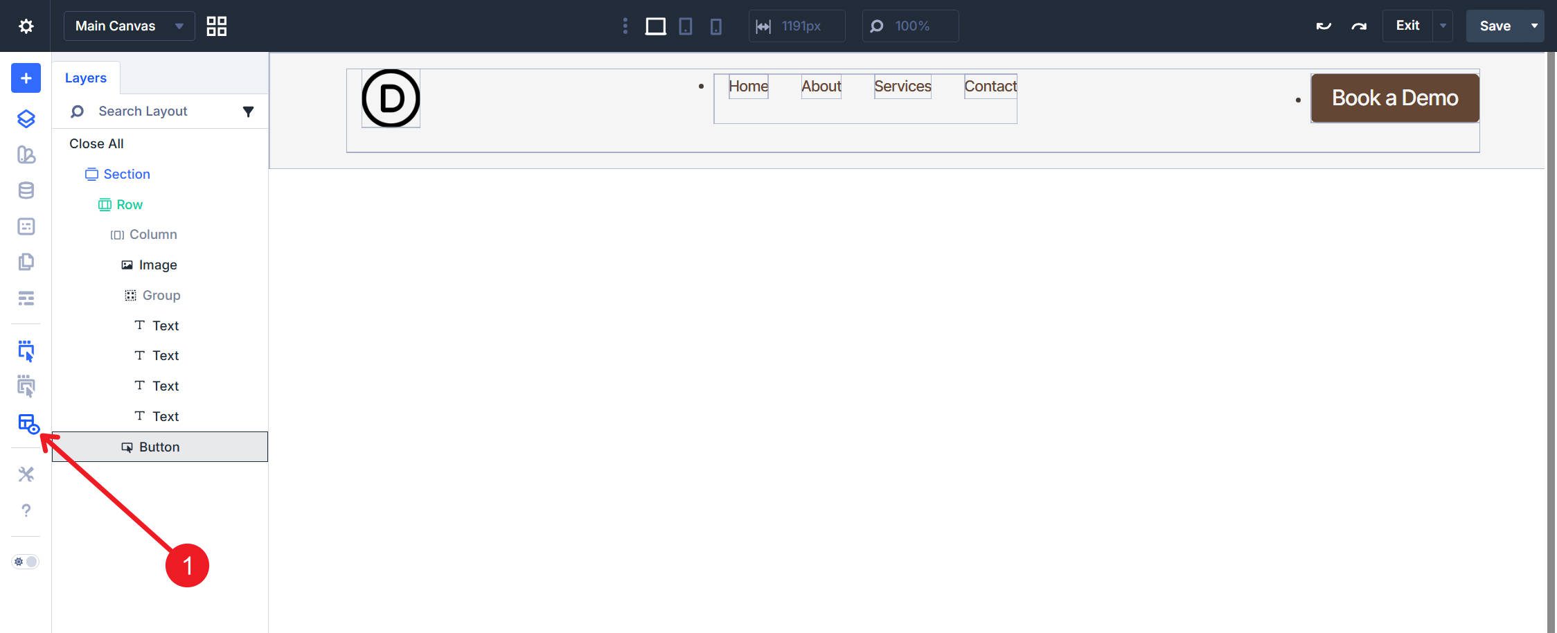
The last thing to add is a Button module inside the Column after the Group.
Set the Button Text and Button Link URL. You can also add any button styles you like.
Step 3: Configure Layout Settings
Now that all our structure and internal modules are in place, we need to adjust some Flexbox settings to arrange them horizontally.
Column Layout
Select the Column and open the Design tab. Under Layout, set Layout Direction to Row (horizontal) and set Justify Content to Space Between for logo-left, nav-center, button-right distribution. Also set Align Items to Center.
Group Layout
Select the Group Module and open the Design tab > Layout. Set Layout Direction to Row. Set Justify Content to Space Around and use an optional custom gap value for consistent spacing between nav links.
Step 4: Set Semantic Elements
The design and layout can really be whatever you want them to be. But now moving into Semantic structure, we’ll transform generic <div> elements into valid navigation HTML.
If you add any or rearrange the elements, the exact steps below might need to be tweaked. But assuming you are reasonably close to the structure outlined above, the steps below will give you a fully valid implementation.
Select the Row. Open the Advanced tab. Find the HTML option group and the Element Type dropdown. Change it from the default to <nav>. The Row now outputs as <nav class=”…”> instead of <div class=”…”>.
Column: Set to ul
Select the Column. In the Advanced tab > HTML option group, set Element Type to <ul>. The Column becomes the outer unordered list containing all navigation items.
It is also completely valid to use the <menu> Element type in this context if you want. This is a rare case where these two elements are semantically interchangeable in this context.
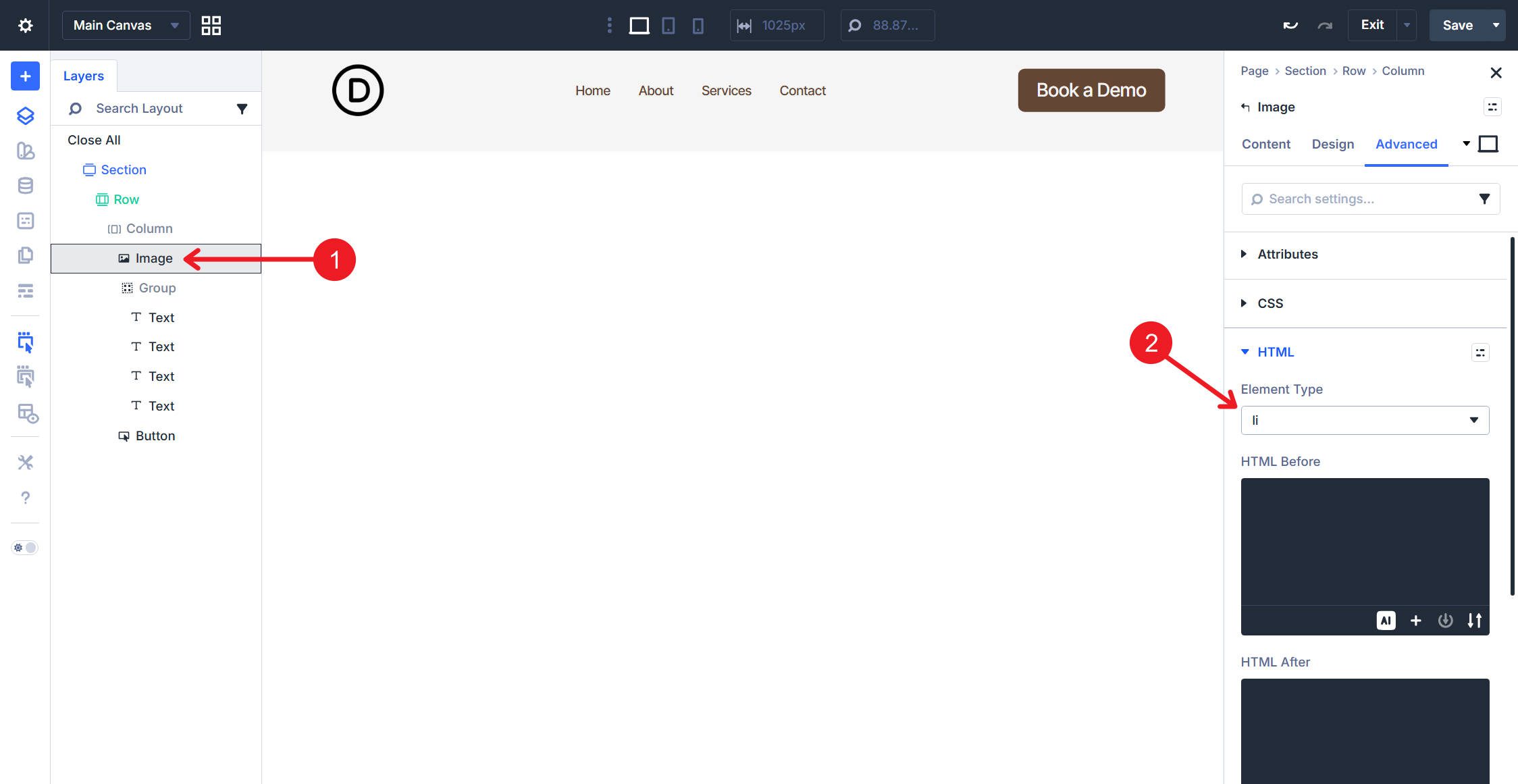
Image Module: Set to li
Select the Image Module. In the Advanced tab, set Element Type to <li>. The logo becomes a list item within the navigation list. Remember that the image/logo here needs to have a link.
Group Module: Set to ul with li Wrapper
The Group Module requires two semantic modifications. First, in the Advanced tab, find HTML Before and enter <li>. Find HTML After and enter </li>. This wraps the entire Group in a list item element. This ensures the parent <ul> (the Column) maintains a valid HTML structure with all of its direct children (which should be <li>).
Next, set the Element Type to <ul> — this makes the Group output as a nested unordered list. This is important when we reach the Text Modules within the Group.
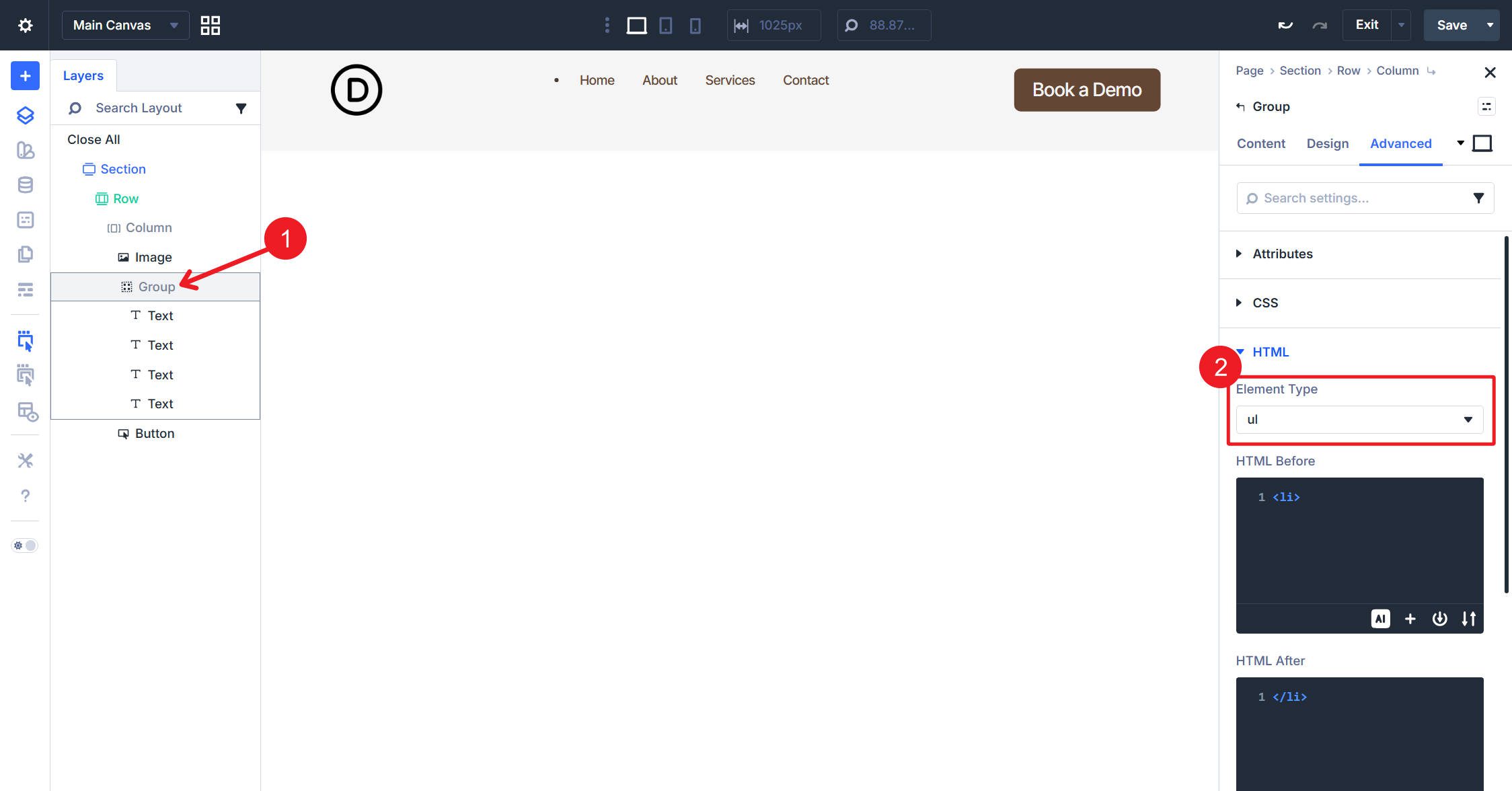
Important Note: Earlier, we mentioned that <menu> and <ul> are interchangeable. That is, in fact, true with the top-most <ul> or <menu>. However, since the Group Module is already nested within a <ul>/<menu>, we can’t use <menu> here and must use <ul>.
Text Modules: Set to li
Select each Text module inside the Group. Set Element Type to <li> for all four. Each nav link becomes a list item within the nested list.
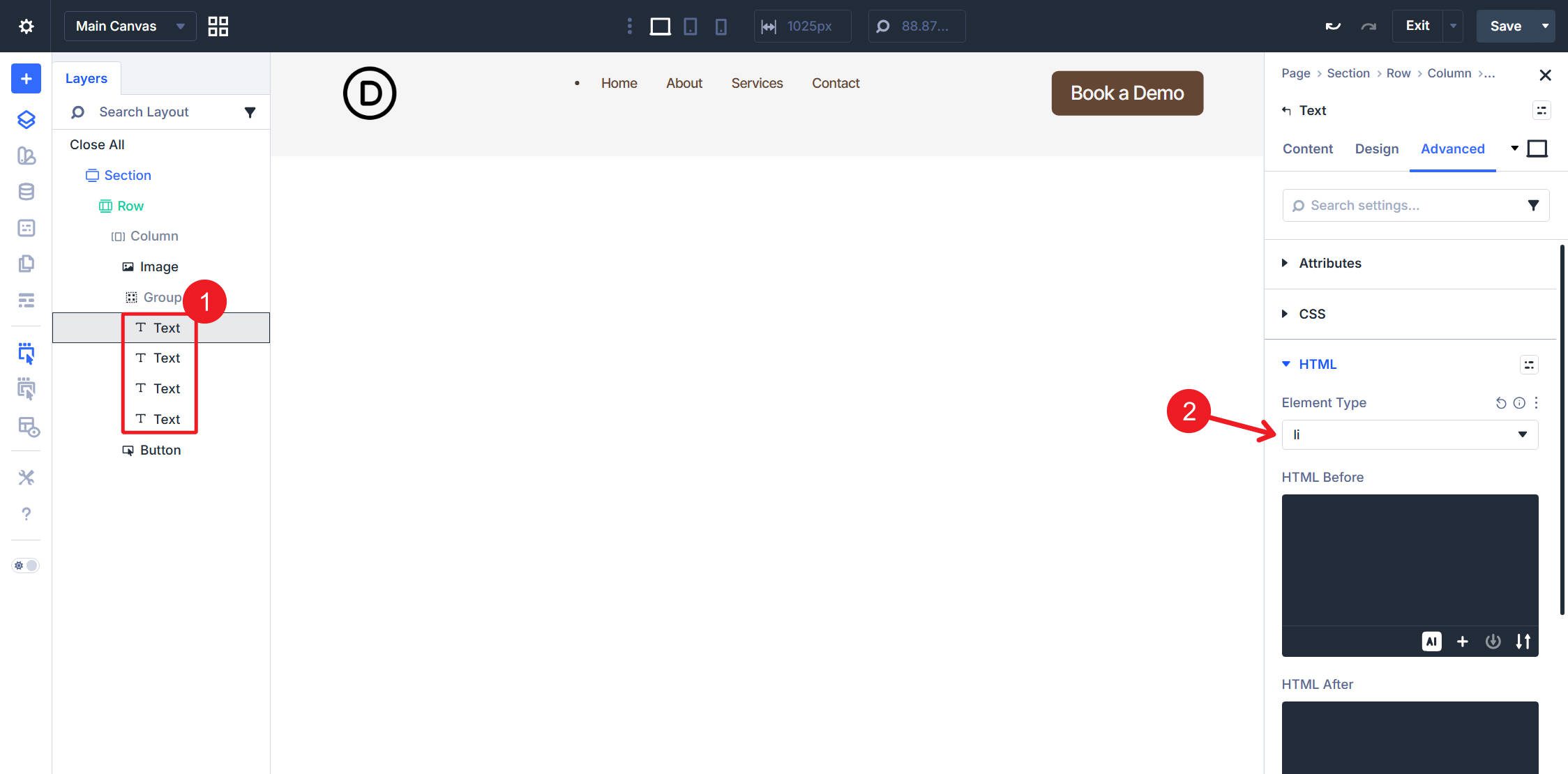
And because we added links to the text of each in the module’s Rich Text editor, they also have the necessary <a> tags.
Select the Button Module next. Divi automatically assigned the button an Element Type of <a>, and we want to keep this. However, we need to add <li> to HTML Before and </li> to HTML After.
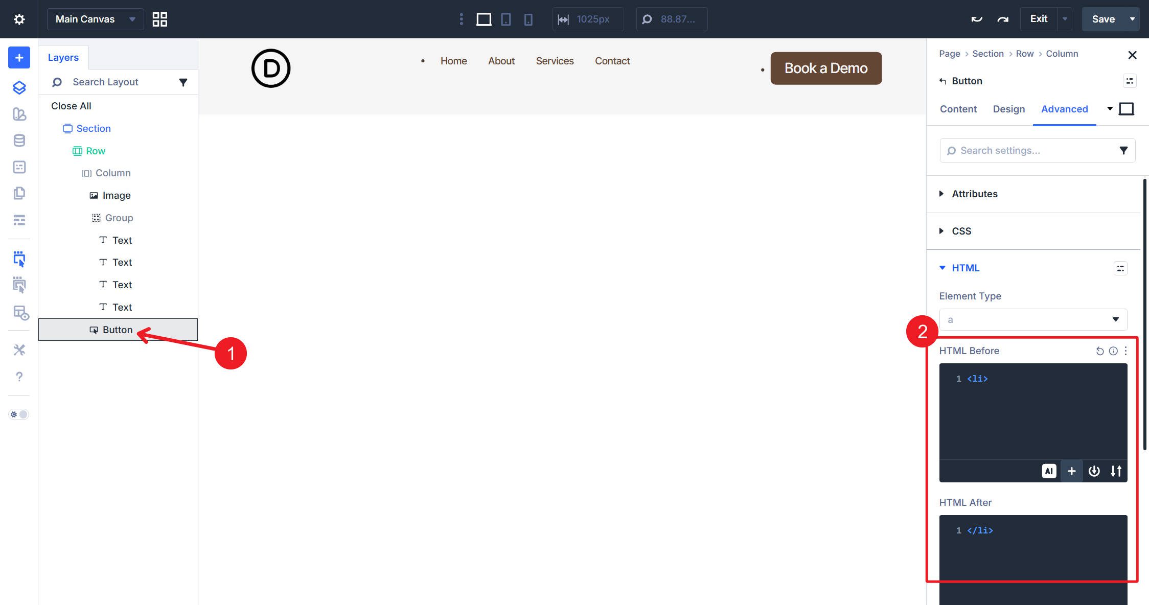
The button becomes a list item containing an anchor tag, matching the structure of other navigation elements.
Step 5: Configure Spacing
You probably see some list dots and off-center spacing. That is because, when introducing some of those HTML elements, we might have added undesired spacing to the layout. In particular, lists often apply default styling that we’ll counteract now.

The boxes here show some added spacing, while the arrows show list bullet points
You can turn on X-Ray Mode to get a sense of some of the added spacing.
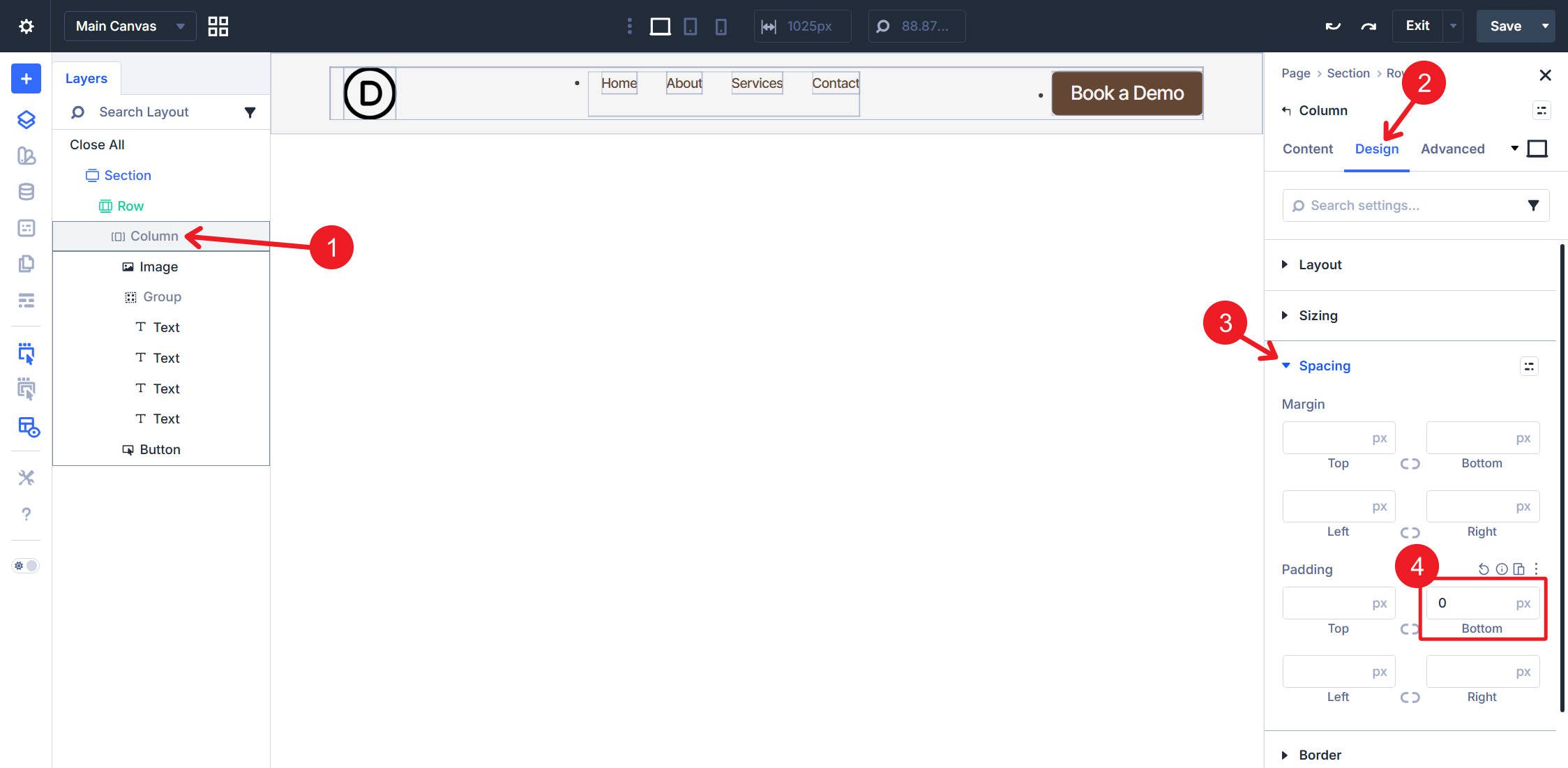
Column Spacing
Select the <nav> Column. In the Design tab under Spacing, set Padding Bottom to 0px.
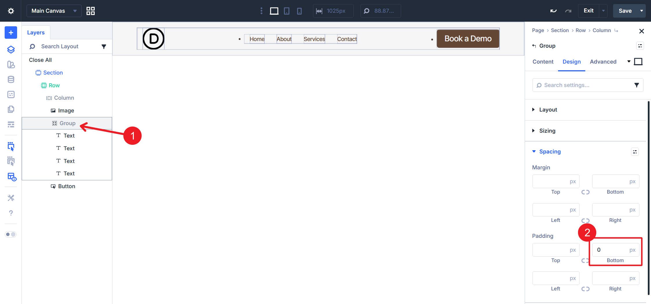
Group Spacing
Select the Group Module because we need to do the same thing. Set Padding Bottom to 0px.
Step 6: Add CSS Reset
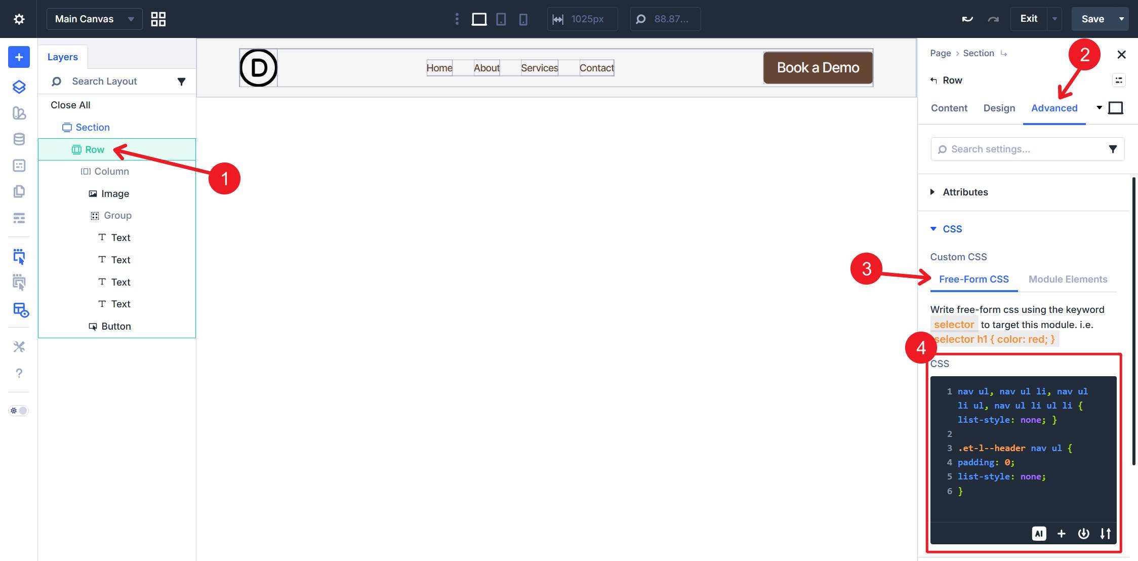
Having addressed the unwanted spacing, we can now quickly deal with the unwanted bullet points in the list elements. Select the Row and open the Advanced tab > CSS. In the Free-Form CSS field, add this CSS:
nav ul,
nav ul li,
nav ul li ul,
nav ul li ul li {
list-style: none;
}
.et-l--header nav ul {
padding: 0;
list-style: none;
}
The first part of this CSS removes list bullets from all list elements within the navigation. The second part removes the last bit of <ul> spacing that isn’t easily accessible in Divi’s spacing options.
At this point, you can turn off X-Ray Mode because our spacing is fixed.
Final Result
Save, then go to the front end of your site to view the header. The visual result matches a standard navigation layout: logo on the left, nav links in the center, CTA button on the right. The underlying HTML, however, is now semantically correct.

Inspect the element in the browser developer tools to see the structure:
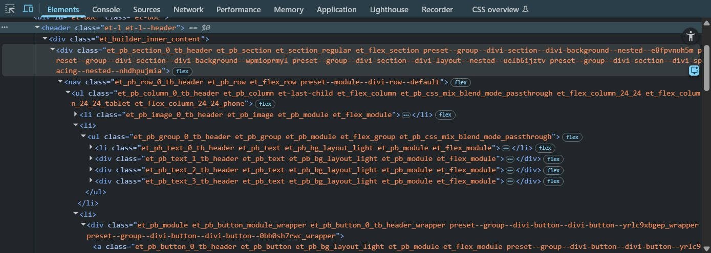
If you deviated from the structure and module makeup that we used in this tutorial, that is perfectly okay. However, the exact way you need to apply the nav, ul, li, and a tags might vary slightly. This can be challenging because few of us are experts in semantic structure.
What I’ve found helpful is copying the HTML of my header from my Browser’s DevTools and supplying it to my AI of choice.
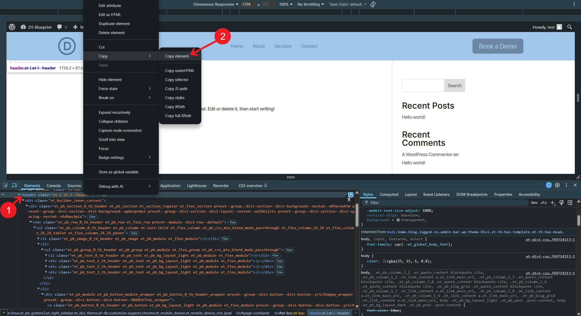
From there, ask whether the semantic structure is valid and what needs to change to make it valid. You can even give the AI the URL of this blog post so it can read up on some Divi 5 context and provide better instructions to help you reach your desired end result.
Start Building In Divi 5 Today!
Divi 5‘s semantic element controls unlock construction methods that previous versions of Divi couldn’t support. Building navigation from atomized modules is now possible, and with it, the assigning of semantic elements.
The Element Type setting, combined with HTML Before and HTML After fields, provides the control necessary to output valid HTML5 structures from any module combination. Building a navigation is one application — the same technique applies to building custom footers, sidebars, article layouts, and any component requiring specific semantic markup.
Divi users now have the tools to build accessible, semantic HTML without abandoning the Visual Builder workflow. The gap between “what Divi outputs” and “what valid HTML requires” has closed.


Am I correct in saying that by setting each Text module (i.e. menu link titles) manually, that when adding or removing pages to the site, a manual update needs to be made to the menu?
When using this exact method, yes. Though if you used a Menu Loop, and in your WP settings had “Automatically add new top-level pages to this menu” turn on, and the page you “added” was a top-level page, this could add it automatically for you.