
Photos tell better stories when they sit in clean, organized grids. In Divi 5, you can get there in two ways: use the Gallery Module for a fast, familiar setup, or use CSS Grid controls in the Visual Builder when you want more layout freedom. Grids handle the structure for you, and Divi gives you the design tools to turn a simple collection of images into a polished, responsive, and interactive design.
In this post, you’ll learn how to configure grid settings, style your images, and build galleries that look great on every device, including hover effects, captions, and reusable presets. Here’s the breakdown.
- 1 Grids In Divi 5
-
2
Building A Grid Gallery In Divi 5
- 2.1 Add The Grid To Your Page
- 2.2 Set Your Spacing
- 2.3 Select Your Images
- 2.4 Expand And Customize Your Grid
- 2.5 Adjusting Column Structure For Mobile
- 2.6 Add Interactivity And Save Time With Presets
- 2.7 Use Case: Creating A Fullwidth Gallery
- 2.8 Bonus: Using Grid Offsets To Build Interesting Galleries
- 3 Try Building Custom Galleries In Divi 5 Today!
Grids In Divi 5
CSS Grid controls rows and columns simultaneously, unlike Flexbox, which is designed for a single axis at a time (row or column). With a grid, you can manage both horizontal and vertical placement simultaneously.
Grid typically requires custom CSS and can be challenging to master. But not inside Divi 5. Divi 5 bakes CSS Grid directly into the Visual Builder.
Sections, rows, columns, module groups, and modules all function as grid containers, and any module you drop inside becomes a grid item that follows the grid structure.
Grid settings are responsive at every level. Most settings can be adjusted per breakpoint (desktop, tablet, phone). Adjust column counts on smaller screens or flip the grid direction entirely for mobile without affecting other breakpoints.
This is the system for the gallery we’ll build next. Everything happens through dropdowns, sliders, and number fields while Divi handles the CSS in the background.
Building A Grid Gallery In Divi 5
You’ve seen how grids work in Divi 5. Now we’ll use those same controls to build an actual grid gallery. The steps below show you how to configure each setting to turn your images into an organized layout. Let’s go!
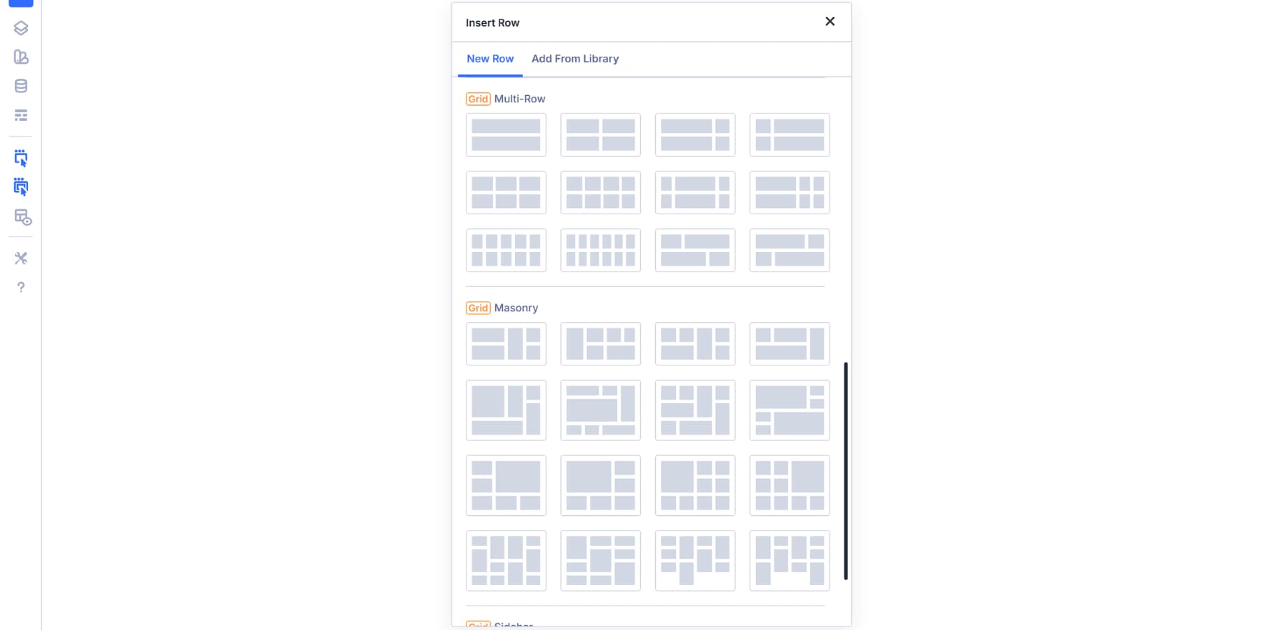
Add The Grid To Your Page
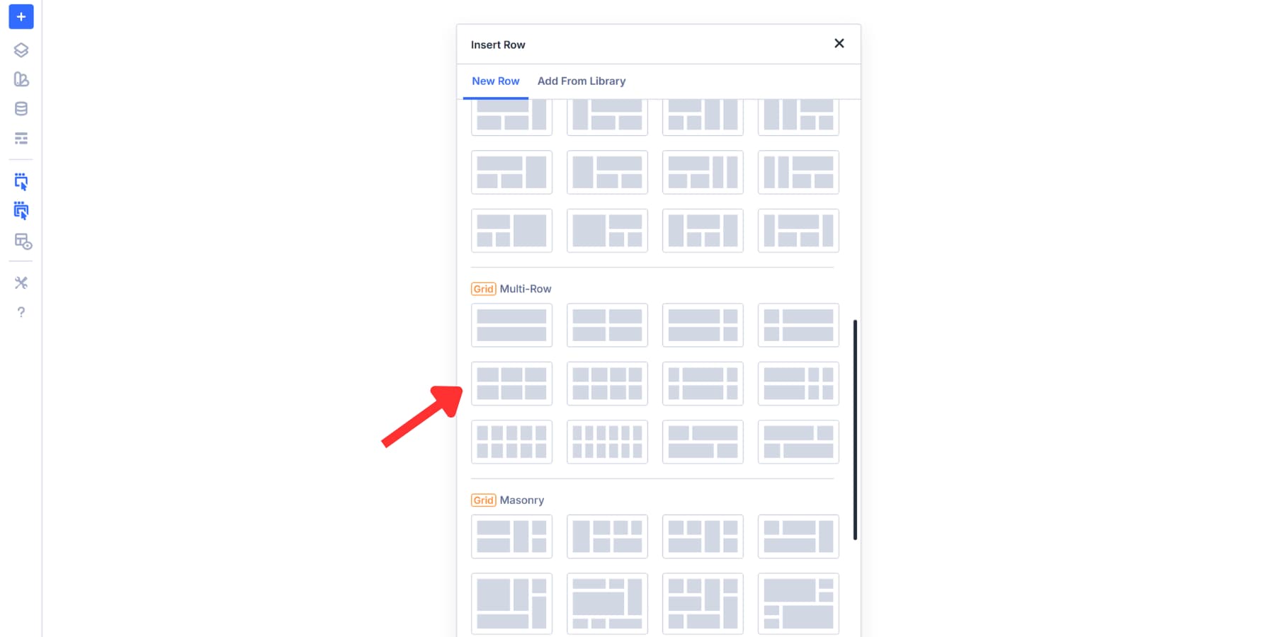
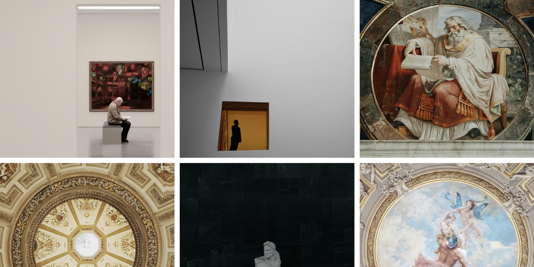
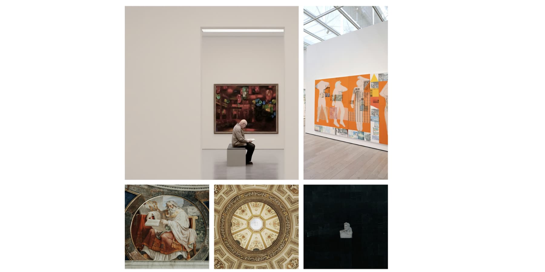
Click the blue + icon inside the page to add a new section. You’ll see a selection of grid layouts appear. Divi offers templates for common gallery styles you might need, such as:
- Masonry: Pinterest-style columns with varied item heights. Best for photography portfolios and mixed aspect ratios.
- Sidebar Style: Wide content area paired with narrower panels. Suitable for galleries with related content or filters.
- Portfolio Grid: Asymmetrical cells where featured items span multiple columns or rows. Creates rhythm without forcing uniform sizing.
We’re using the 2×3 multi-row preset for this tutorial. We’ll use this as a base and expand on how to make it more interesting later in the tutorial.
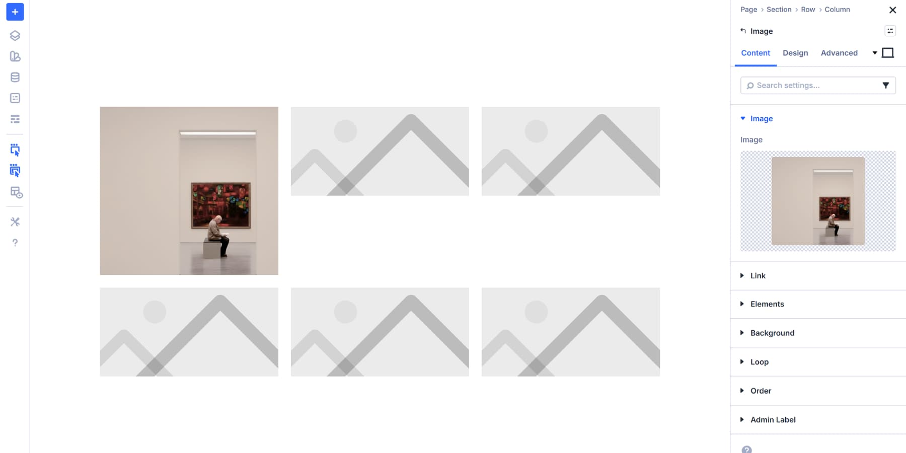
Once you select your preset, the grid structure appears on your canvas. Now add an Image module to each cell. Click the gray + icon inside a cell, and drop the Image module in. Repeat this for every cell in your grid.
Each Image module starts with a placeholder image. These help you visualize the gallery structure before you add your actual photos. You’ll see exactly how the layout works.
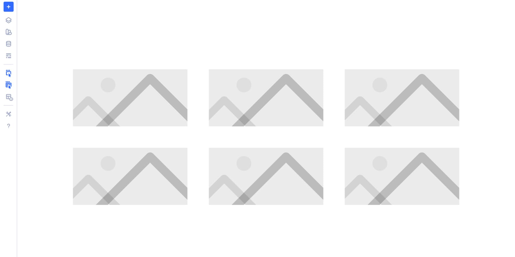
With all your placeholders in position, you’re ready to configure the grid spacing and column behavior.
Set Your Spacing
Open the Design tab of your grid row. Scroll down to find Horizontal Gap and Vertical Gap. These two settings control the breathing room between your images.
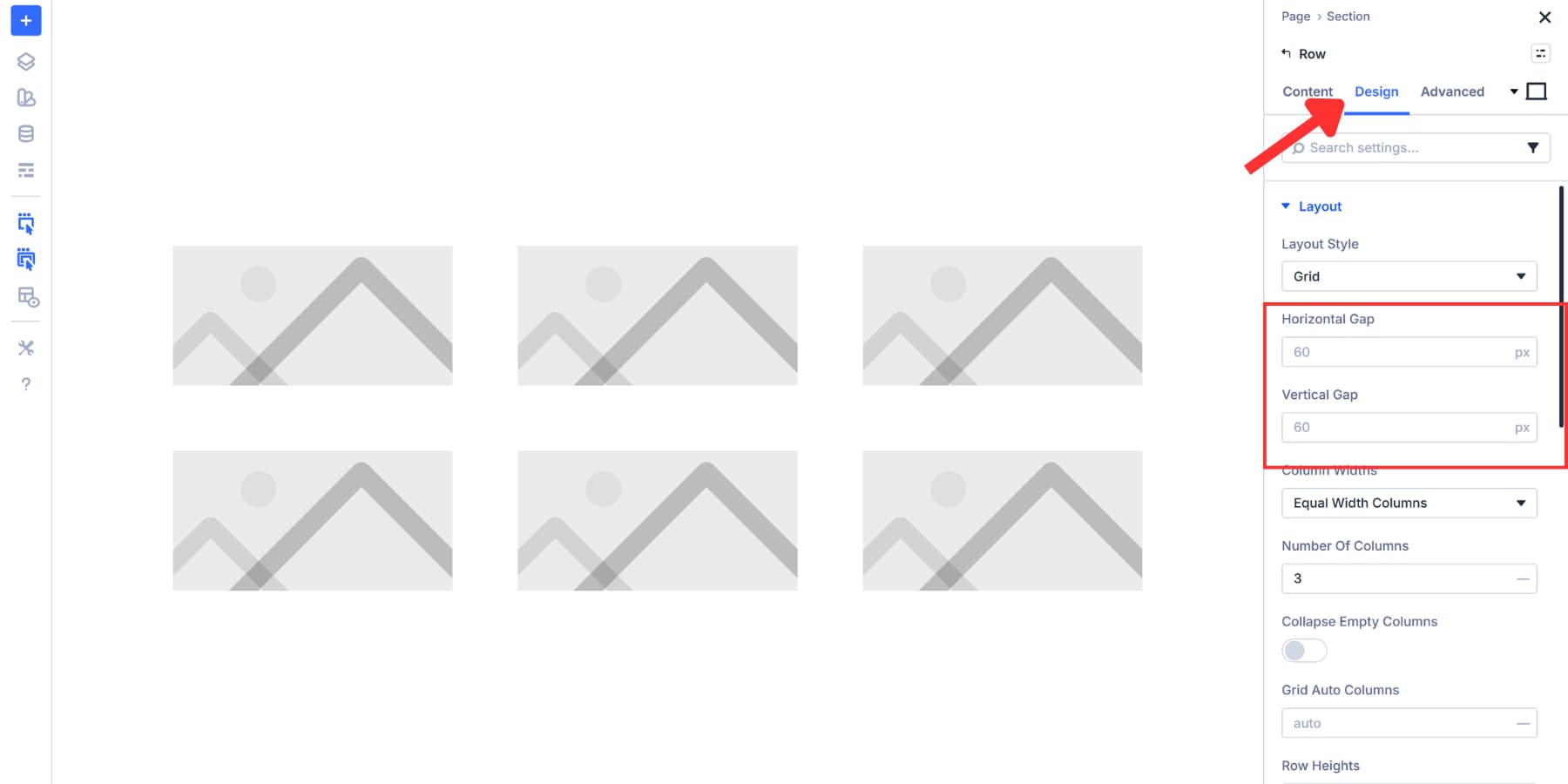
Gap values depend on what you’re building. Tighter gaps, around 5px to 10px, work well for portfolios and product catalogs where you want images to be close together. Medium gaps of 15px to 20px give a balanced feel for general galleries. Wider gaps of 30px or more are suitable for minimalist designs and editorial layouts, where each image requires space.
For this gallery, we’ll set both Horizontal Gap and Vertical Gap to 20px. This keeps the layout open without spreading things too far apart. The template already handles the layout logic, so we’re just setting gaps.
If you want tighter control over your spacing across the entire site, check out our guide on creating a gap-based spacing system with Divi 5. That post covers how to use Design Variables to manage spacing consistency site-wide.
Select Your Images
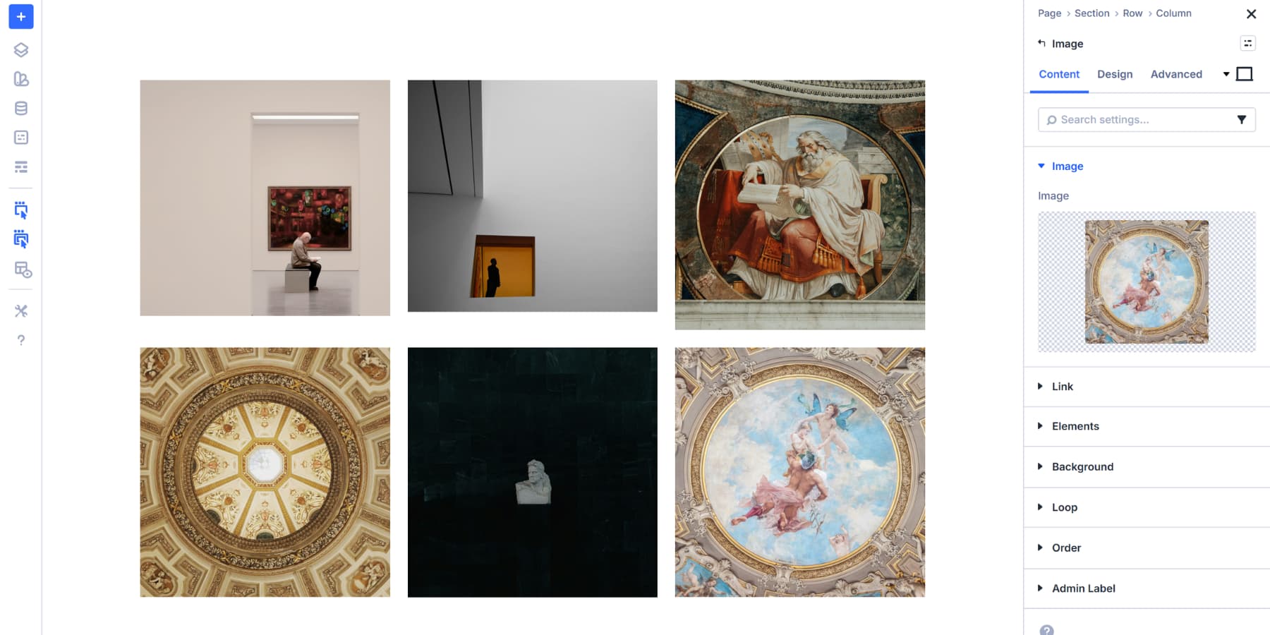
Each Image module in your grid currently shows a placeholder. Click any placeholder to open that module’s settings panel. You’ll see the Image option at the top of the Content tab.
Click that field to open the WordPress Media Library. Upload new files or pick from existing ones. Select your image and click the blue button to add it. The placeholder disappears, and your actual photo appears in that grid cell.
Repeat this process for every Image module in your grid. Click the placeholder, choose an image, and move to the next cell. Work through the grid systematically so you don’t miss any cells.
Once all placeholders are replaced with real images, your gallery takes shape. The grid structure you configured earlier keeps everything aligned and spaced consistently.
Expand And Customize Your Grid
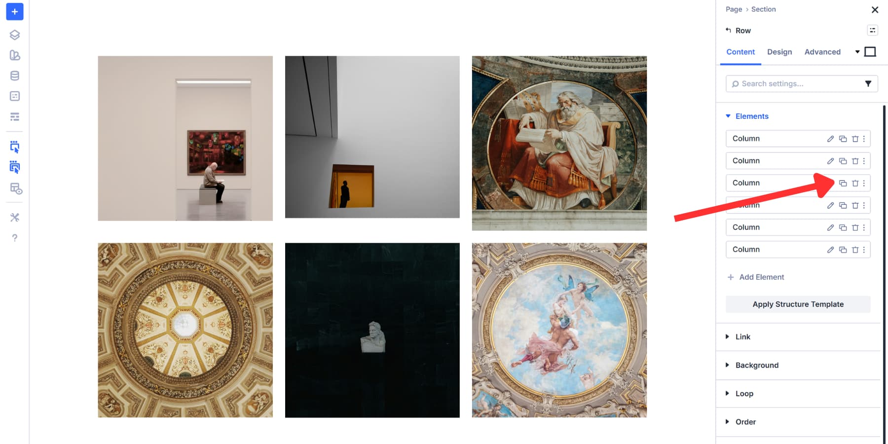
Your grid gallery can grow as your needs change. In your row settings, under the Element settings in the Content tab, select Add Element, then select a column. A new cell appears in your grid. Drop an Image module inside it.
You can also duplicate existing columns. In the same setting group, click on the duplicate icon. The new cell copies all the styling from the original, including any Image module settings. This speeds things up when you want consistent styling across multiple new images.
Advanced Grid Configuration Options
Most grid templates handle the layout work for you. The preset we selected creates a visual uniformity without needing manual adjustments. However, if you need a more distinguished look, you can choose another template and use the Layout settings, which offer options, especially when creating intricate galleries with Divi 5 grids.
Column Width and Row Heights let you override how the template sizes cells. Equal, Auto, Fixed, and Manual modes each handle sizing differently. The Align Items and Justify Items controls position items within cells. Grid Density determines whether the grid fills gaps automatically or preserves image order.
For a complete breakdown of every grid setting and how they work together, check out our post on understanding every grid setting in Divi 5.
Style Your Gallery Images
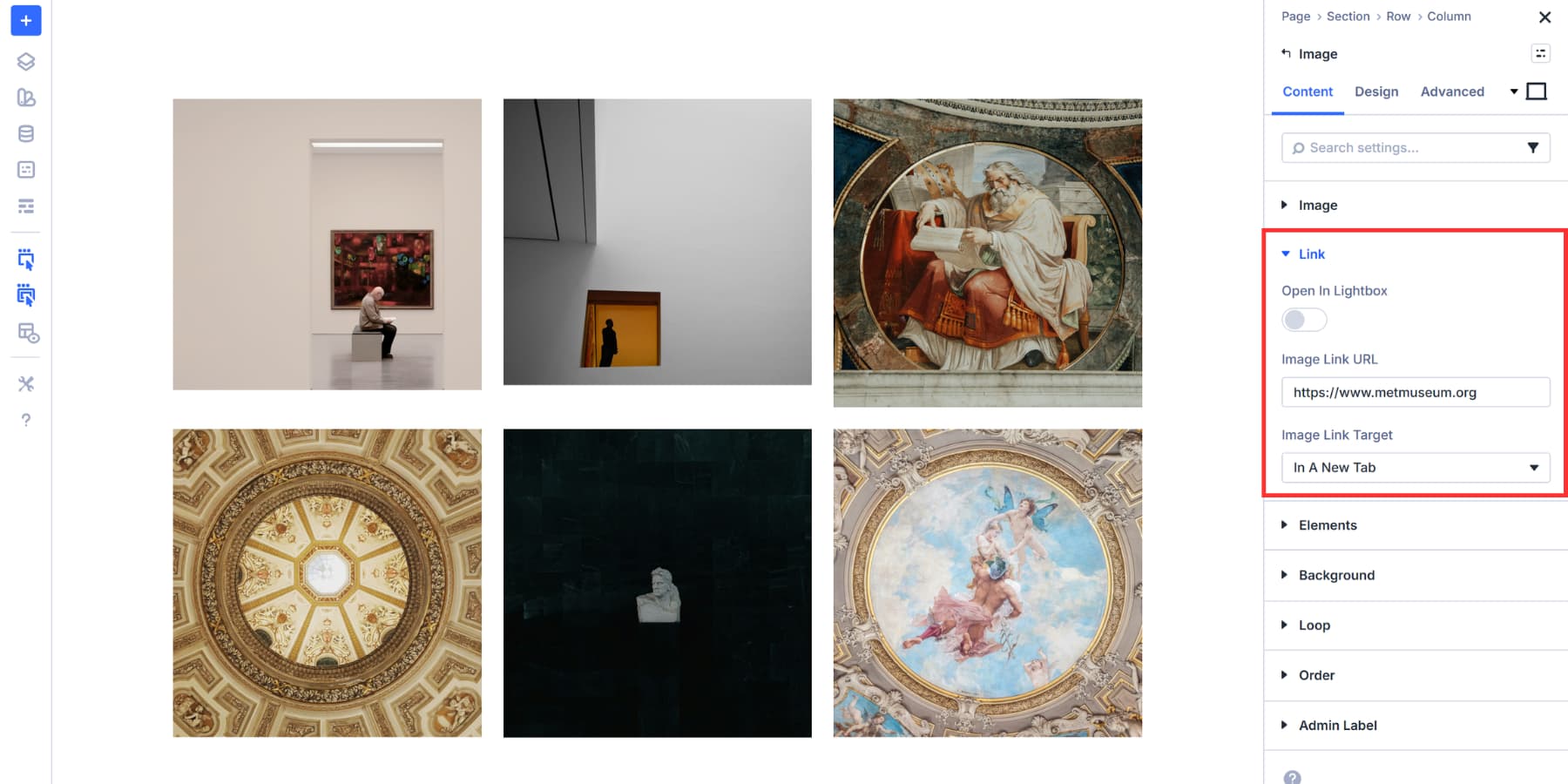
Each image in your grid can be linked, turning your gallery into a tool people actually use. Click any Image module, scroll to the Link option in the Content tab, and paste a URL. That image now opens a product page, blog post, portfolio piece, or any other destination you need visitors to go to. Linking images can turn a gallery into navigation, not just decoration.
You can also enable lightboxes for the images if needed.
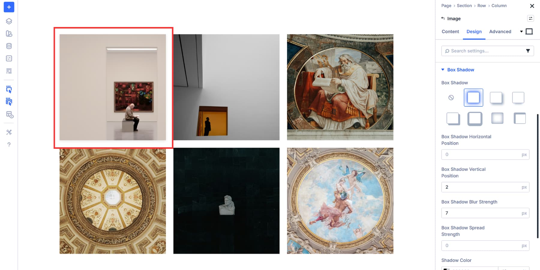
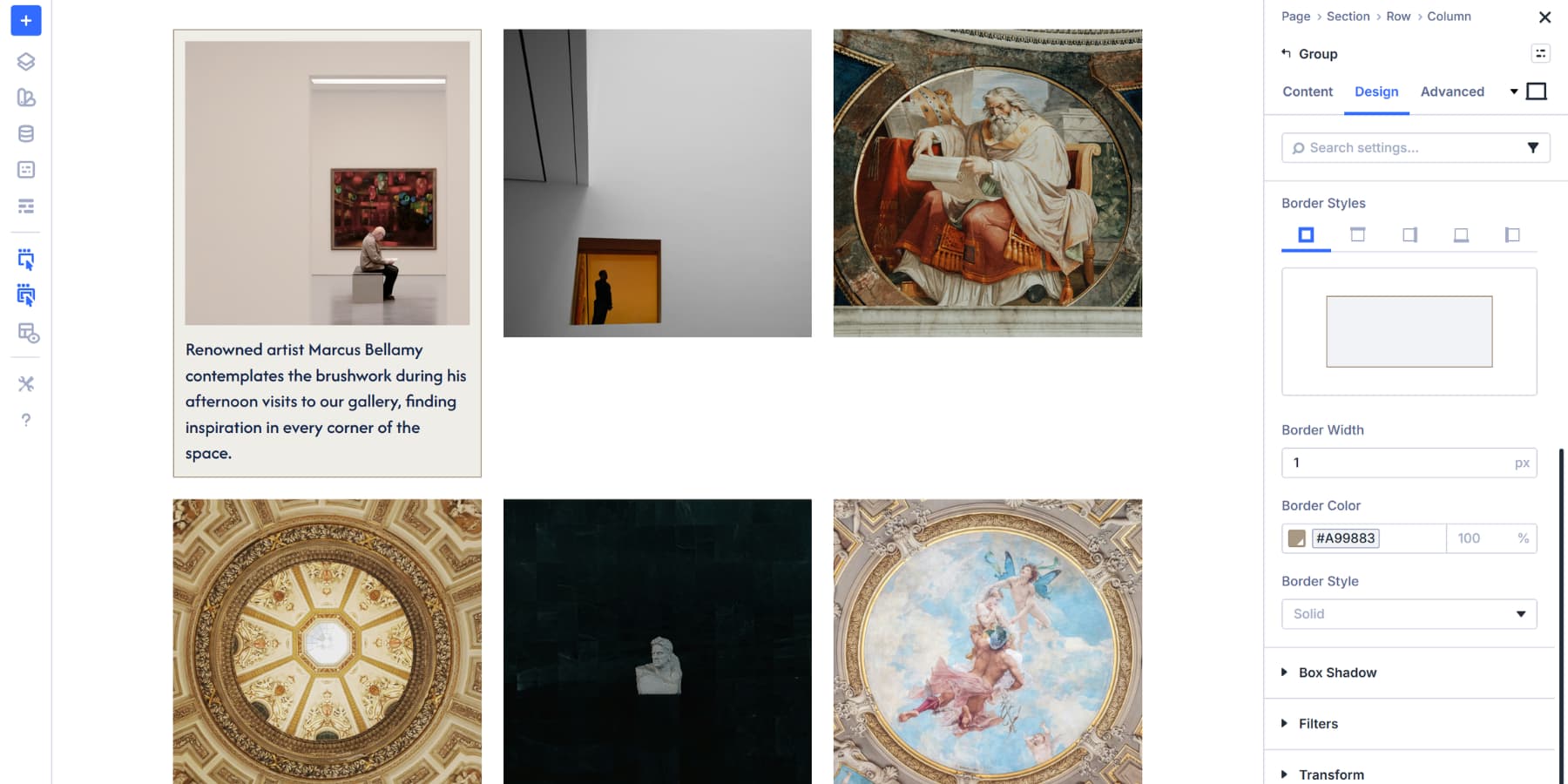
Beyond linking, the Design tab contains all the visual controls you need. Add borders to frame your images. Apply box shadows for depth.
Adjust the corner radius to soften sharp edges.
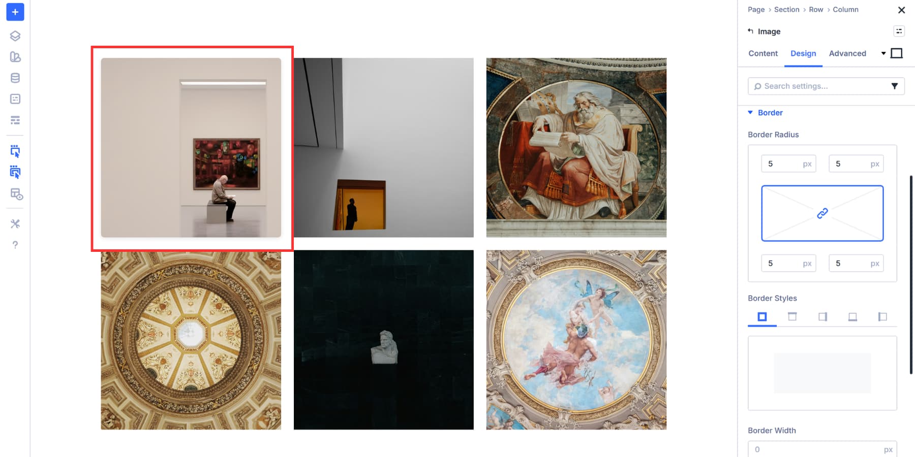
Apply filters like grayscale, blur, or saturation to match your brand aesthetic. All these settings sit under their respective option groups in the Design tab.
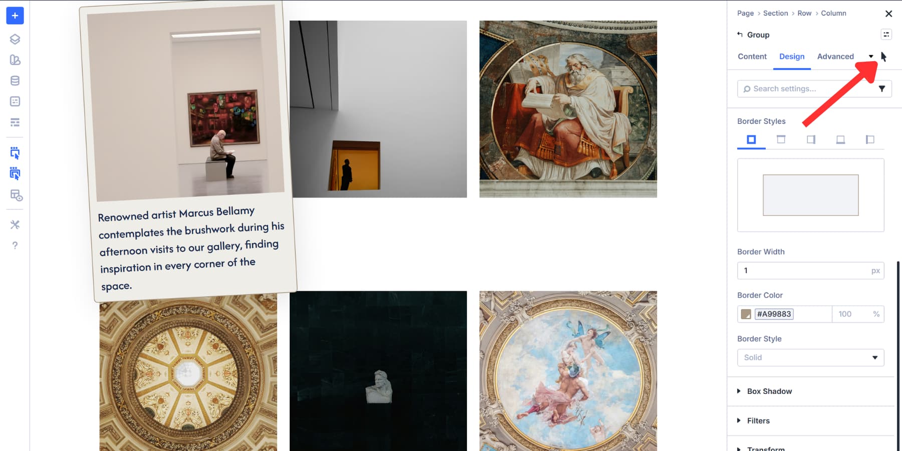
Hover effects add another layer of interactivity. Divi 5 lets you select the hover state from a dropdown menu within the settings panel.
Pick any design option you want to change on hover, select the hover state from the dropdown, and adjust those settings.
When someone moves their cursor over an image, it transitions between the default and hover states. A subtle border shift or shadow change might indicate to visitors that the image is clickable. You can also add a subtle transform scale for further highlighting.
Adjusting Column Structure For Mobile
Desktop screens handle four or five-column galleries easily. Phones don’t. Images shrink too small, text becomes unreadable, and visitors pinch to zoom rather than browse. Change Column Structure fixes this by rebuilding layouts at each breakpoint independently.
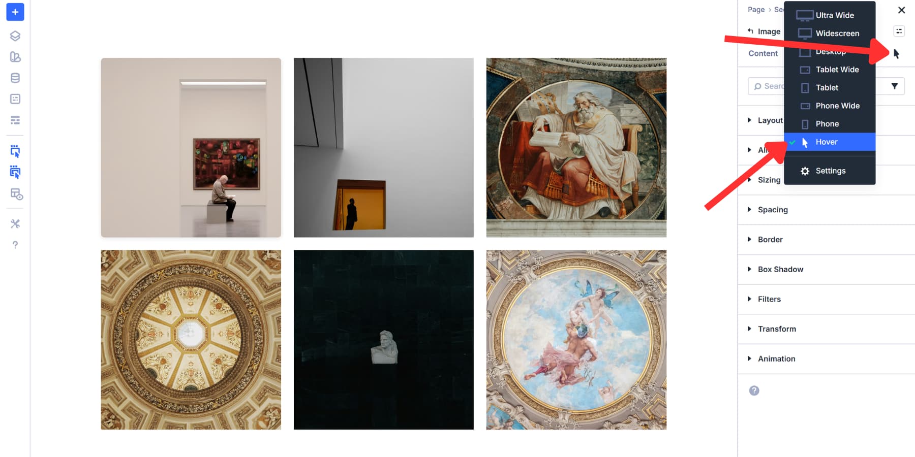
Open your row settings, go to the Content tab, and switch to the phone breakpoint using device icons in the Visual Builder toolbar.
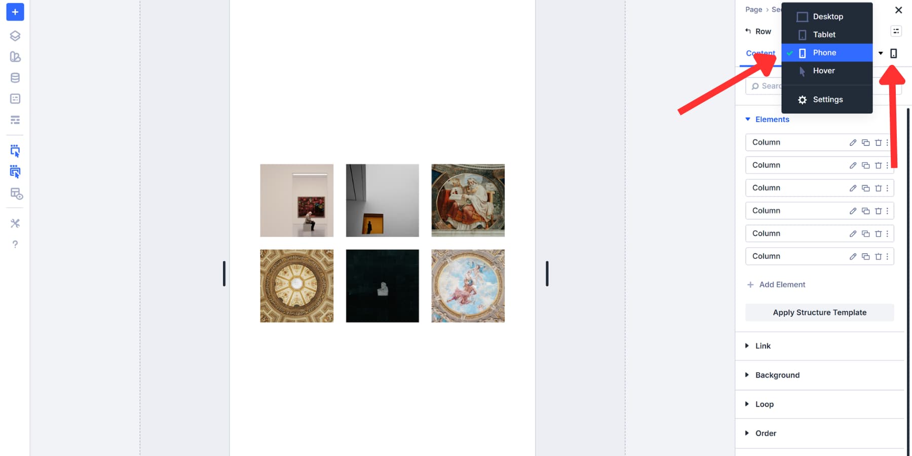
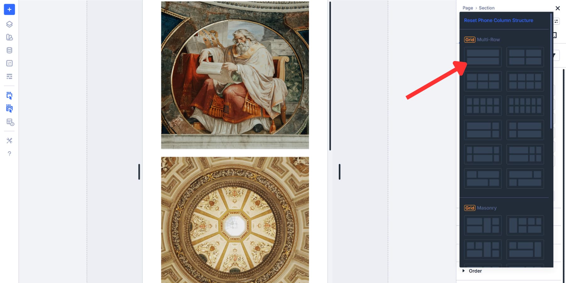
Click Change Column Structure. Choose a structure that keeps images readable on smaller screens.
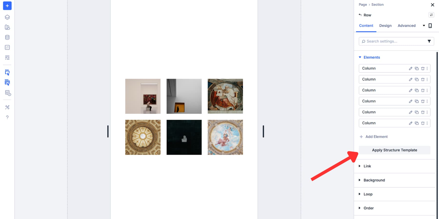
Choose a 1×1 structure. Your phone now uses that structure, while the desktop stays unchanged.
Common patterns work well across devices. Three-column rows on desktop galleries can be two on tablets and one on phones. Product catalogs often use 4→2→1, while portfolio work typically goes 3→2→1.
Test every breakpoint before publishing. Switch between device views to catch layout problems early.
Add Interactivity And Save Time With Presets
A gallery can improve your website’s user experience significantly if it serves a purpose, like showing relevant information, beyond just eye candy. So in this section, let’s go over how you can bring function to your gallery’s form:
Adding Labels With Module Groups
In this template, each grid cell is built using a Column, so you can place multiple modules inside. That means you can add multiple Image modules to a single cell if you want. Drop two or three images into a single column, and they’ll stack vertically within that grid cell.
Mix single-image cells with multiple-image cells to create interesting layouts. One cell might display a large hero image, while another shows three smaller product shots stacked together. You can also add other modules, such as text, buttons, and videos.
This flexibility lets you break away from rigid grid patterns. Your gallery remains organized, yet it doesn’t look like any other grid on the web.
But managing loose modules gets messy. When you move or duplicate a cell, each module sits independently. Duplicating or moving modules becomes more difficult because modules are managed individually. Styling becomes repetitive because you’re working with scattered elements. Module Groups fix this. They bundle multiple modules into a single container that moves, duplicates, and styles them as a single unit.
Click the gray + icon in any cell and select the Group module. Drag your existing Image module into the Group. Inside the Group settings, click Add Element, select the Text module, and type your caption and style your typography.
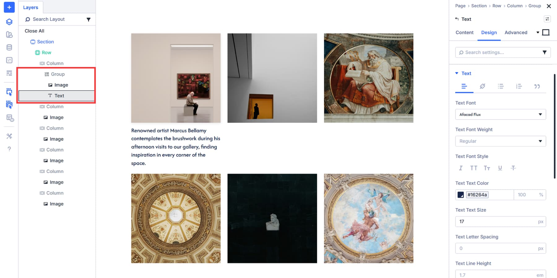
Add a background color, set padding to 10px, and adjust typography to match your gallery style. Now your image and label move together as one piece.
You are not limited to just text here. You can add buttons, icons, Blurbs, anything that you feel adds to your photos.
Adding Hover Reveal Effects With Interactions
However, having a bunch of text below your images can make the entire layout feel crowded and overwhelm your visitors with information overload. The best way to have both form and function is to stagger the information and reveal it only on action, such as a click or hover.
Doing this the usual way would require a lot of CSS and even JavaScript, but not with Divi 5. With Divi 5’s Interactions, you can easily build interactive elements like popups, toggles, reveals, and more in a few clicks, without coding or learning complex concepts. You define a trigger, choose an effect, and set a target. That’s all you need to build an interaction.
Using this as a principle, let’s build an interaction for your images that highlights and reveals information like captions, context, or attributes when your visitor hovers over it. Here’s how:
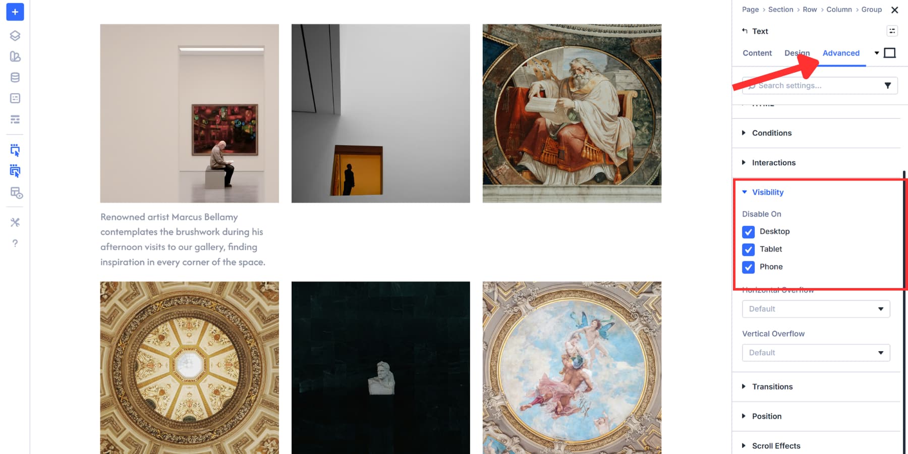
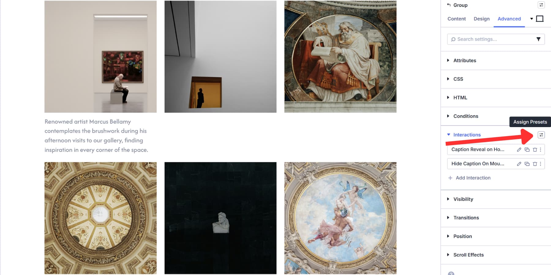
Label And Hide Your Text Element
For this example, we are keeping both the text added above and the background style. However, the background style is moved to the hover state, combined with transform effects, rather than the main style, because the hover style change will make the gallery stand out more.
Open the Text module inside your Module Group. Go to the Content tab and find Admin Label. Type something descriptive like “Gallery Caption” or “Marcus Bellamy’s Caption”. This label helps you target the text when setting up the interaction.
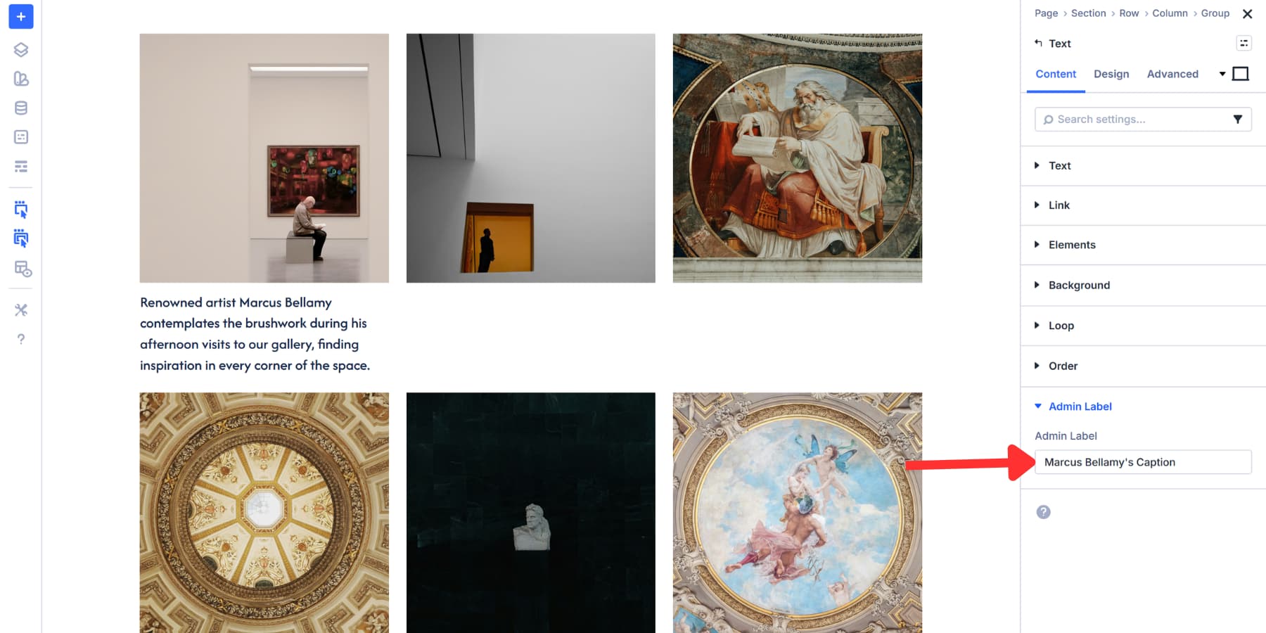
Still in the Text module, switch to the Advanced tab and open the Visibility settings. Turn it off for Desktop, Tablet, and Phone. The text disappears from view but remains in the code.
Create The Hover Interaction
Head to your Module Group settings. Open the Advanced tab, scroll, and add an Interaction. Label it something appropriate, like “Caption Reveal on Hover.”
Set Trigger Event to Mouse Enter. Under Effect Action, select Show Element. The Target Module dropdown appears, showing your Admin Labels. Select the text label you created earlier. Set Time Delay to 200ms for a smooth reveal.
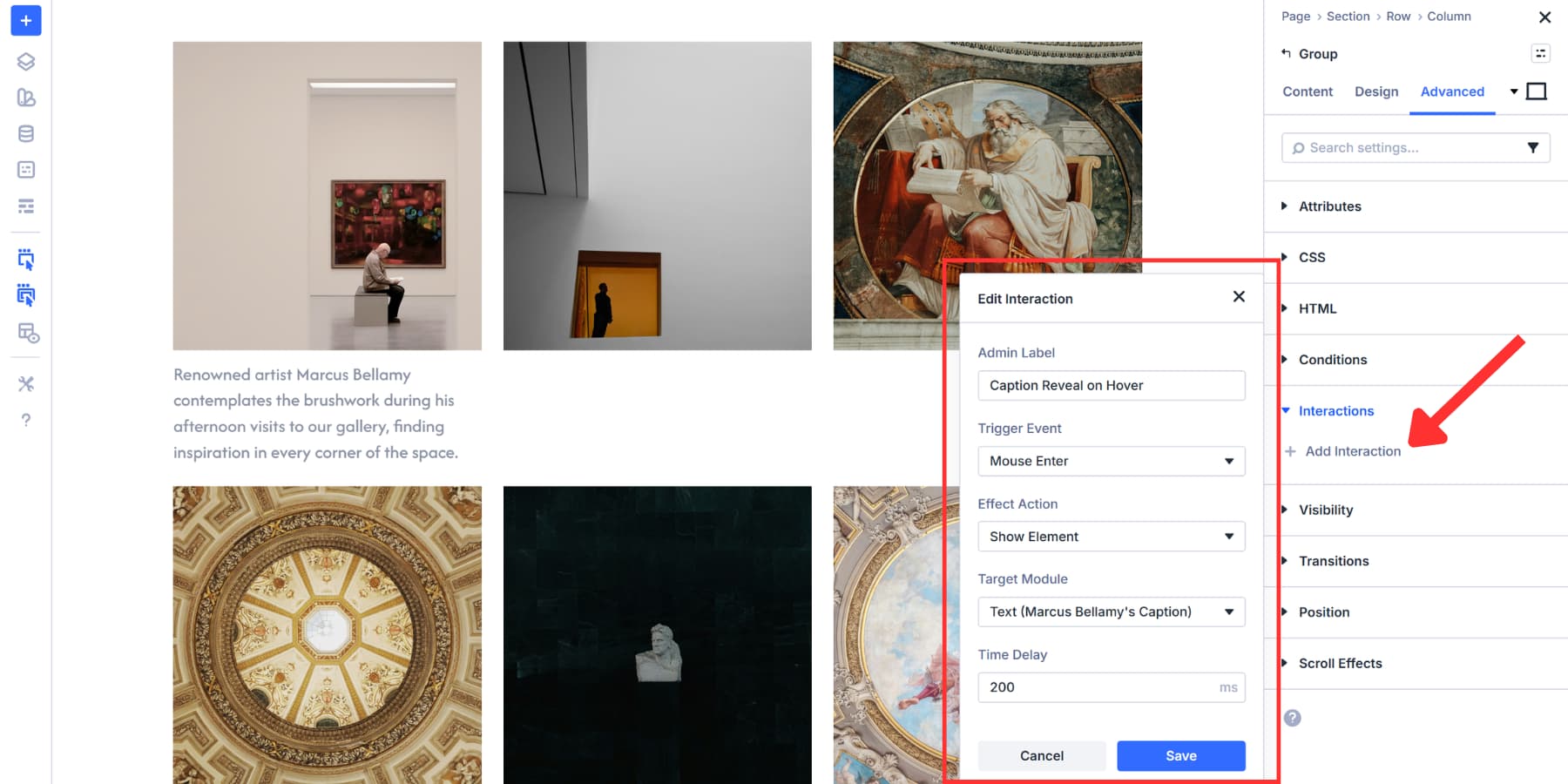
Add a second interaction using the duplicate button. Swap the label to “Hide Caption On Mouse Out”, Trigger Event to Mouse Exit, and the Effect Action to Hide Element. Leave the Target Module and Time Delay as is.

Now, hovering over any image beautifully shows the text content with effects that build curiosity. The same can be done to any other module you plan to add to your module group.
Save Time With Presets
Speaking of time saving, you don’t need to style every image individually. Once you have configured one image exactly as you want it, save those settings as an Element Preset or an Option Group Preset.
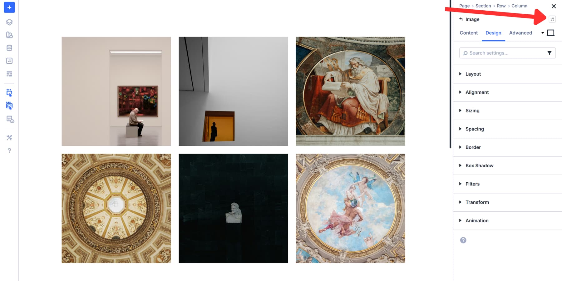
Click the preset icon at the top right of the Image module settings panel. Select New Preset From Current Styles, give it a name, and save.
Now every other image in your grid can use that preset. Open any Image module, click the preset icon, and select your saved preset from the list. All your styling applies instantly. That’s how Element Presets work. They capture an element’s settings so you can reuse them consistently.
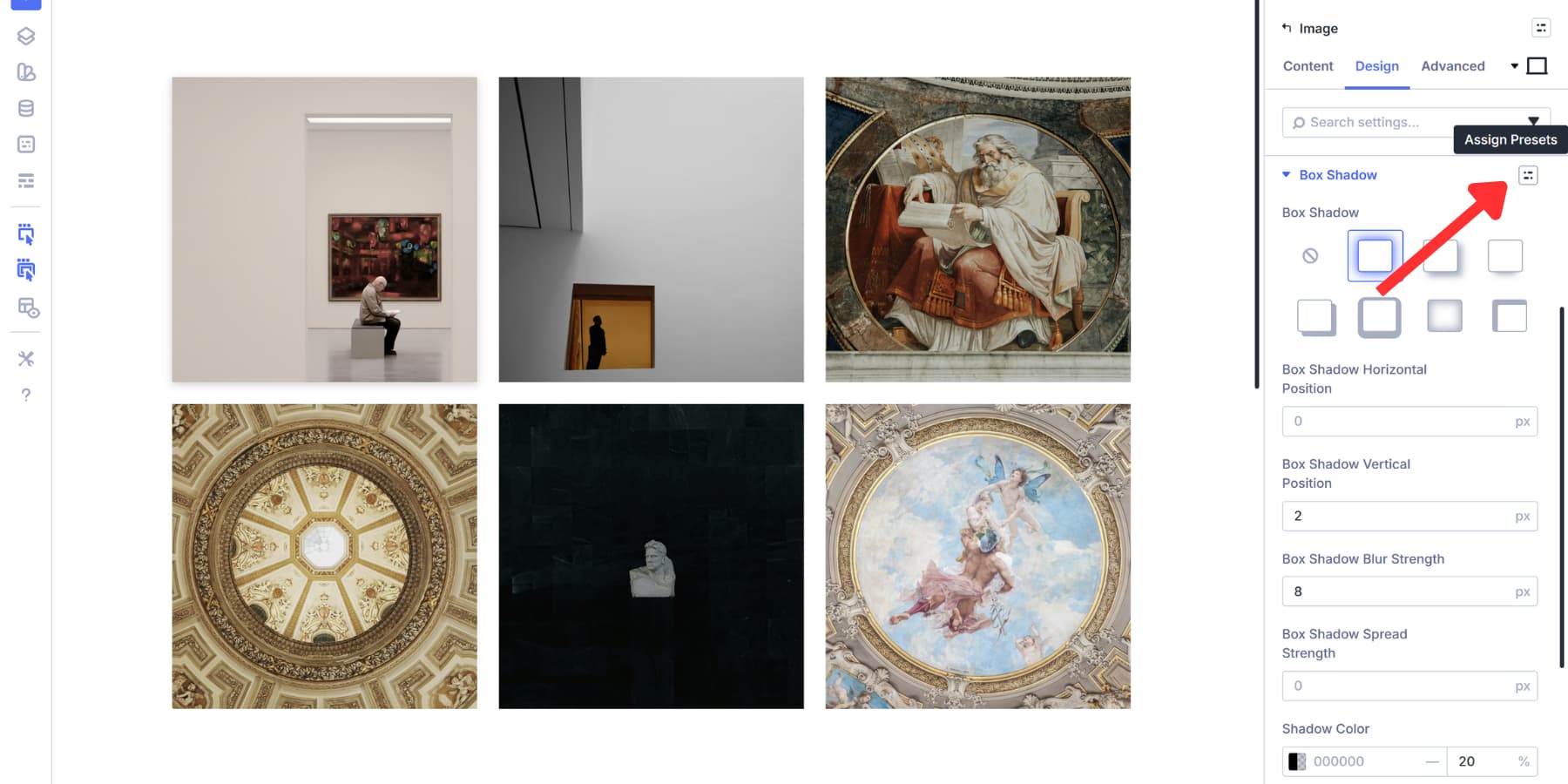
For more control, use Option Group Presets. These allow you to save specific styling groups, such as box shadows, borders, or filters, separately. Hover over any option group panel, like Box Shadow or Border, click the preset icon, and save just those settings.
This gets powerful when you mix them. Apply the same box shadow to all images using an Option Group Preset, but only add borders and corner radius to your center piece images. You’re not locked into styling everything the same way. Pick which elements get which styles without rebuilding from scratch each time.
You can also save Interactions as Option Group Presets to reuse in each item of your gallery, which can get tedious if done one by one. The setup remains the same: label and hide the text, open any column, go to Interactions, click the preset icon, and select your saved preset. Both hover interactions apply instantly. Just update the target elements.
Update either preset type globally later to change every linked image across your site. Style and set once, apply selectively, update everywhere when needed.
Use Case: Creating A Fullwidth Gallery
Now that you know how you can build a grid gallery using Divi 5, let’s stretch things out by building a Fullwidth Gallery.
This type of gallery spans the entire viewport, edge to edge. Fullwidth galleries work best when images need maximum breathing room. Photography portfolios gain impact when shots fill the screen without artificial boundaries. Fashion and lifestyle sites benefit from the immersive feel. Editorial layouts look more magazine-like when visuals fill the full width, among other things.
Setting this up takes just width adjustments and a gap decision. Here’s how to set it up:
Configure Widths
Start with your section. Open the section settings, go to the Design tab, and find Sizing. Set both Width and Max Width to 100%. This removes Divi’s default container restrictions, allowing the section to span the whole viewport.
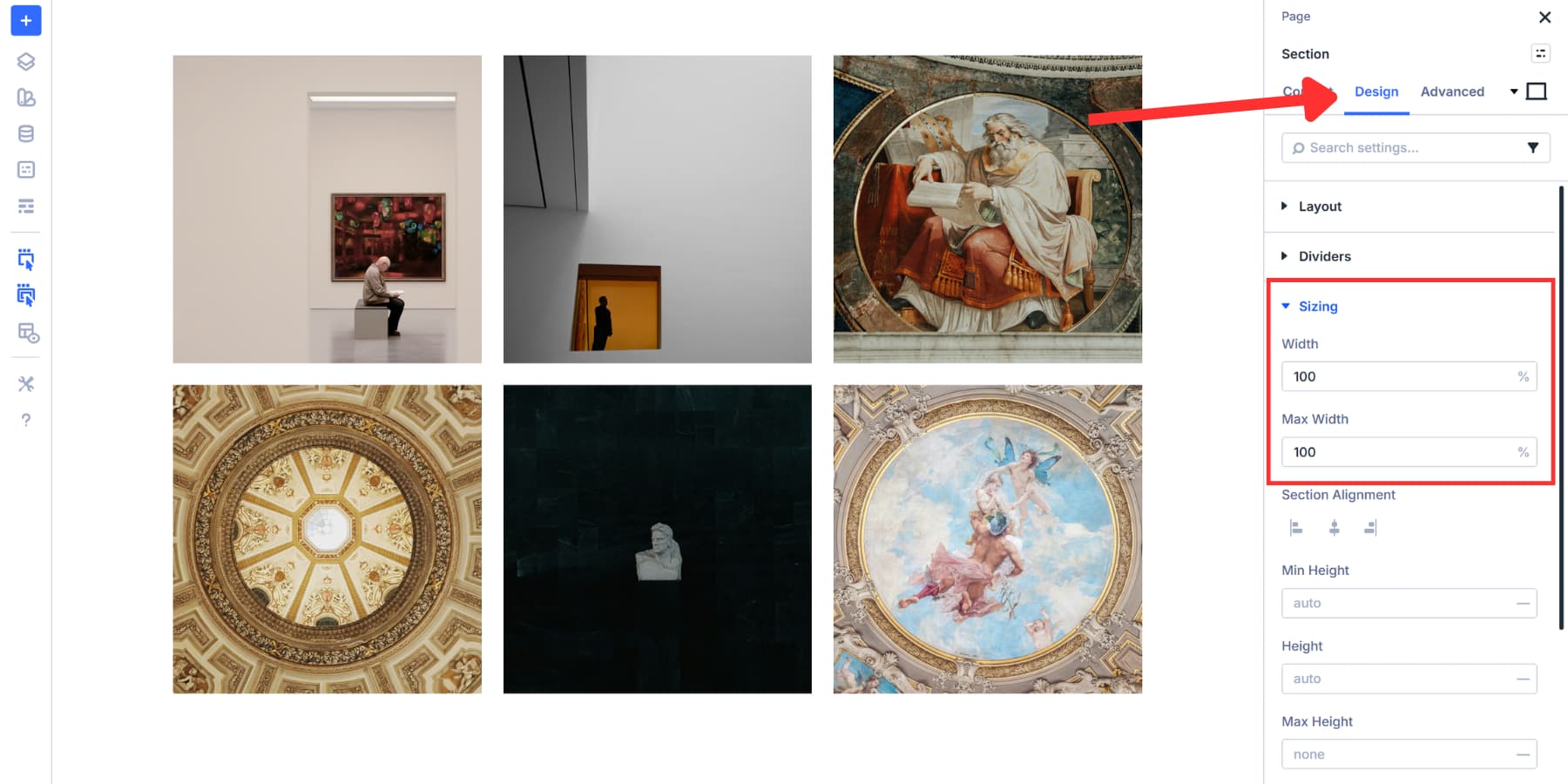
Then set the top and bottom padding of the section to 0.
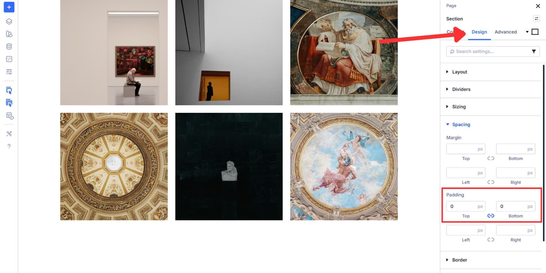
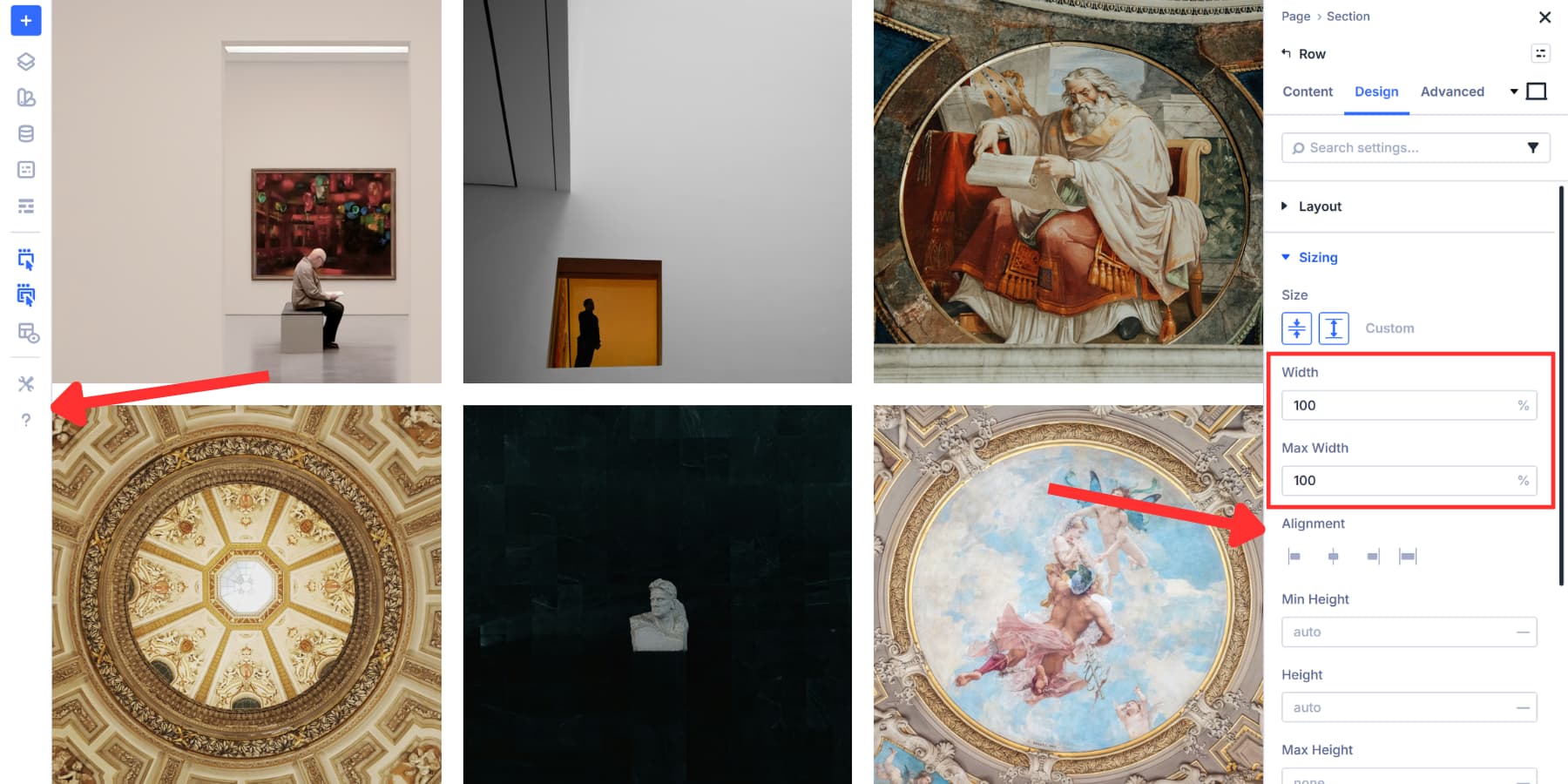
But the section alone won’t do it. Rows within sections have their own width constraints and padding, creating margins on both sides. Open your row settings, navigate to Design and Sizing, then set Width and Max Width to 100% there too.
Now, your gallery container stretches edge-to-edge. The section fills the viewport, and the row inside matches that width without any leftover margins.
Build A Gallery
The gallery building process stays the same as what we covered earlier. Here, we are using the same gallery we built above.
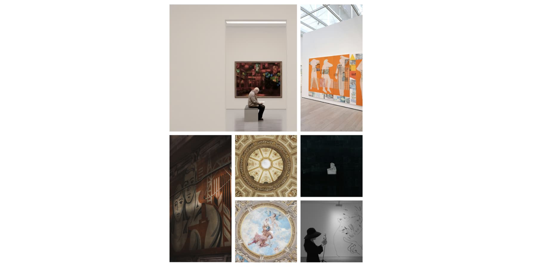
You can swap to any other template. A 3×3 grid works for smaller collections. 5×5 or 6×6 grids handle larger sets. If you’re building a photography portfolio or editorial gallery where visual variety matters more than uniformity, the Masonry templates give you that Pinterest-style flow.
If starting from scratch, click the blue + icon to add a section, and the template selector appears with all available grid layouts. After selecting your template, add Image modules and corresponding pictures to each cell. The fullwidth container you configured earlier handles the rest, stretching your gallery across the entire viewport.
Adjust Grid Cell Gaps
Go to the row settings, open the Design tab, and under Layout, set both Horizontal Gap and Vertical Gap to 0px. This removes all spacing so images touch edge to edge, creating a seamless wall of photos across the viewport. It works well for editorial layouts, collages, or any design that needs a continuous visual flow.
Zero gaps are optional. Small gaps between 5px and 10px suit product displays or architecture work where slight separation helps. Fashion lookbooks often use 10px to 15px to give images breathing room while keeping a fullwidth feel.
Gaps of 20px or more create a more gallery-style look, ideal for lifestyle or brand storytelling where each image stands on its own.
Bonus: Using Grid Offsets To Build Interesting Galleries
Those grid templates we showed you earlier all use Grid Offset Rules under the hood. Divi preconfigured those offset rules to match popular layout patterns like masonry grids and portfolio layouts, so you get professional results without touching any settings.
But you’re not limited to those prebuilt templates. The same offset system that powers those templates is Grid Offset Rules, which gives you control over which grid cell (or image in this case) breaks out of automatic placement. This lets you build layouts that match your specific needs, rather than adapting your content to fit a template.
Using this, we can make an image and cells span multiple columns or rows. Pin an image to an exact grid position. Let’s have a look at some of the examples you can build with offsets:
Highlighting Items At Intervals
Pattern-based targeting lets you emphasize specific images without manually configuring each one. Open your row settings and navigate to the Design tab. Scroll down to Layout and find Grid Offset Rules. Click the + icon to add a new rule.
The Admin Label field lets you name the rule for easy identification when managing multiple offset rules. Type something descriptive, such as “Feature Every Seventh,” so you can find it later.
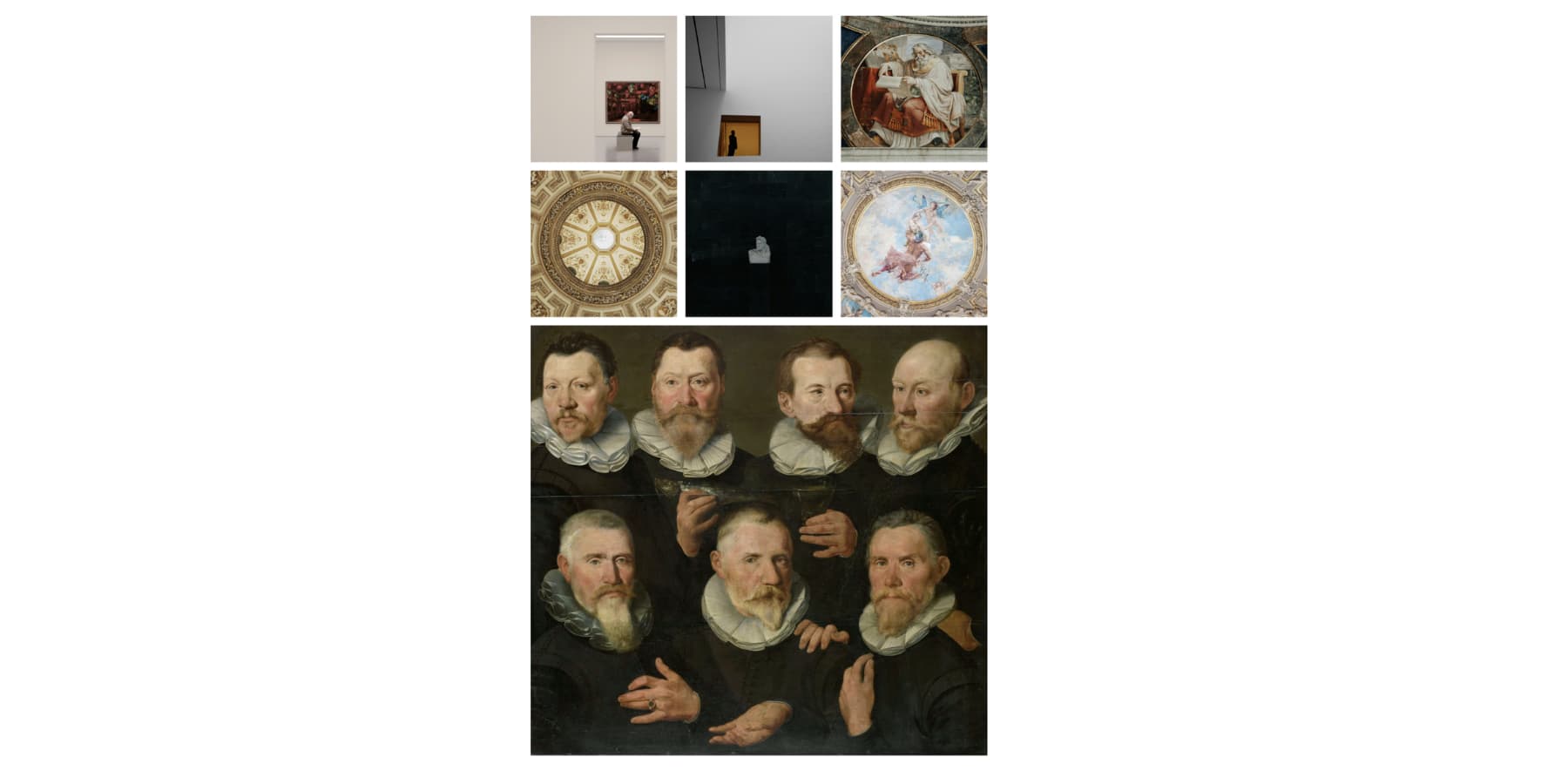
Set Target Offset to Every X Item from the dropdown. We are using Seventh as an example. This tells Divi to apply the rule to items 7, 14, 21, and so on as your gallery grows.
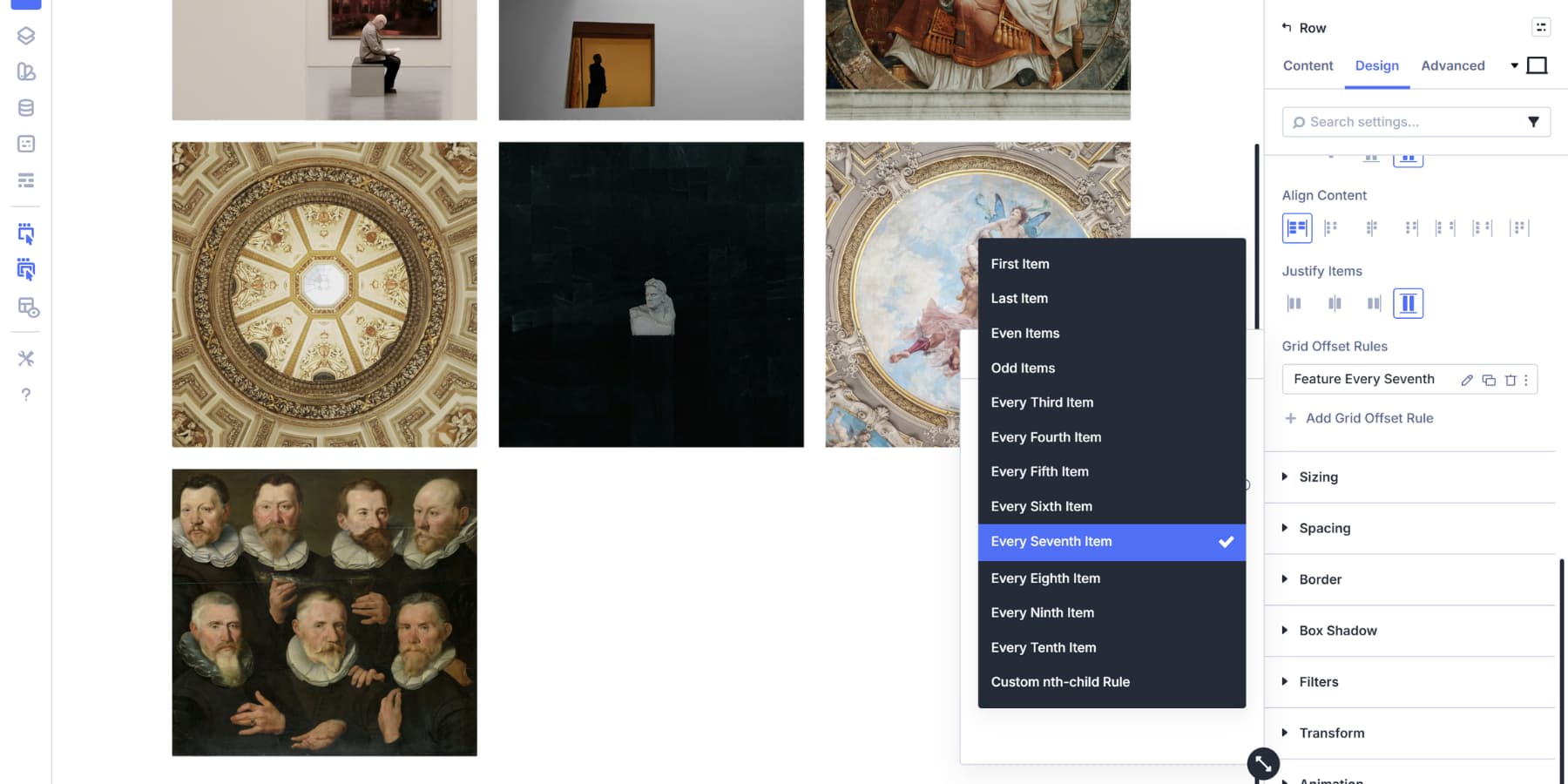
Set Offset Rule to Column Span. This controls how wide the targeted images become. We set the Offset Value to 3.
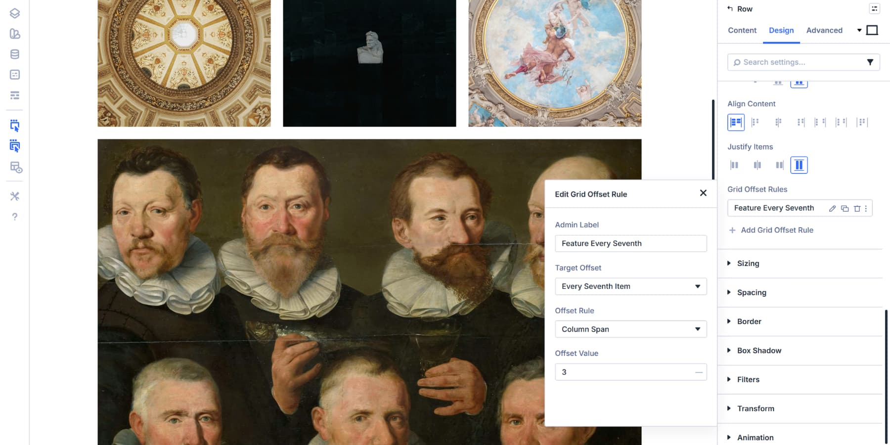
Every seventh item in this gallery spans three columns, creating a rhythm where featured images appear at regular intervals.
This pattern works well for product galleries that highlight bestsellers or new arrivals at consistent intervals. Change the interval number to match your content needs. Every Third Item creates more frequent highlights, while Every Tenth Item keeps them sparse.
Creating A Featured Image Layout
A featured image at the start of your gallery draws attention to your most important content. This works well for portfolio showcases where you want one hero shot followed by supporting images.
Add a new Grid Offset Rule. Set Target Offset to First Item, Offset Rule to Column Span, and Offset Value to 2. The opening image now takes up twice the width of regular gallery items.
This approach keeps your gallery organized while giving visual weight to the content that deserves it. The first item anchors the layout, and everything else flows naturally around it.
Building An Asymmetrical Gallery
Asymmetrical layouts create visual interest by breaking away from uniform grid patterns. Instead of every image sitting in identical cells, you mix different sizes to guide the viewer’s eye through your gallery. This works particularly well for creative portfolios, editorial layouts, and brand showcases where you want a more dynamic presentation.
Combine multiple offset rules that target different items. Start with your first rule: Target First Item, set Column Span to 2. This establishes your anchor point.
Add a second rule: Target Every Third Item, set Row Span to 2. Now every third image in your gallery stretches vertically, creating tall focal points that interrupt the horizontal flow.
This layered approach prevents your gallery from feeling formulaic. Visitors see variety without chaos because the underlying grid structure keeps everything aligned. The rhythm stays organized while looking spontaneous.
Adjust the interval numbers based on your gallery size. Smaller galleries need lower intervals to show the pattern. Larger galleries can use higher intervals without losing the effect.
Try Building Custom Galleries In Divi 5 Today!
Building grid galleries in Divi 5 gives you control over image placement and spacing without requiring code modifications. The grid system handles responsive behavior automatically, allowing you to focus on the visual design.
Moreover, beyond just building a basic gallery, you can give them many more functions with Interactions. All of this, without any coding. These same grid controls work across your entire site, so the skills you picked up here apply to any layout you build next.
Download it now and start applying these grids to your own projects.


I’d love to make a good image grid gallery. But do I have to make all the images the exact sizes to fit in the wider or narrower places? When I use the same image for all the spaces, I don’t get the wider or higher grids. How should I get that?
When I open a real gallery, I can browse all images with prev/next arrows or just by clicking the image. How can that be done in your example?