
Consistent spacing is the foundation of a polished, professional website. Instead of managing margins on individual elements one by one, you can rely on a single system that keeps layouts clean and balanced across your site.
With Divi 5’s new Design Variables and Flexbox features, you can now build a gap-based spacing system directly in the Visual Builder, no custom coding required. Let’s take a look!
Why Traditional Spacing Methods Fall Short
Margins and padding seem simple enough. Add some space here, adjust the padding there. But this approach can easily get messy. Here’s how it plays out in practice:
You set a 30px margin on one text block. Then you need space around a button, so you add 20px.
Another module needs breathing room, so you pick 40px. Each decision feels right in the moment, but you’re building a house of cards.
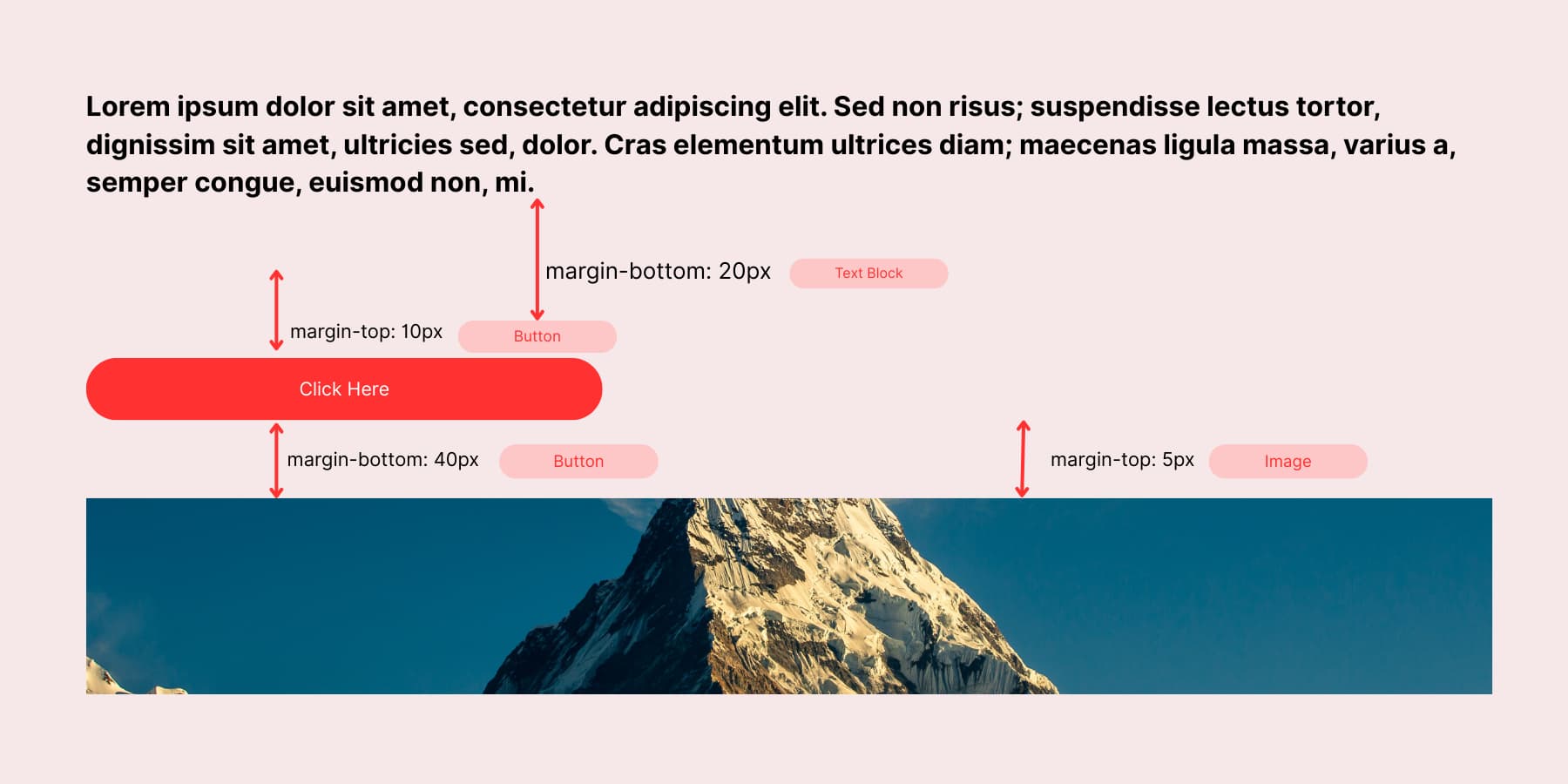
Switch to mobile, and everything might look disbalanced. Those carefully chosen pixel values don’t translate. Your spacing looks perfect on desktop, but out of balance on smaller screen sizes. So you create mobile-specific values, then tablet values.
Now you’re managing three different spacing systems. This split approach makes maintaining a consistent visual rhythm across your site tough.
How Gap Properties Make Spacing Simple
Gap properties work differently from traditional margins. You don’t apply spacing to each element individually. Instead, you set spacing rules on the parent container. The container handles spacing between all child elements automatically.
With Flexbox enabled, you get two gap controls: horizontal and vertical. Set the horizontal gap to 24px, and all child elements get 24px of space between them horizontally. Set the vertical gap to 15px, and stacked elements get 15px of vertical space.
This works for any content inside the flexbox container. Text modules, images, buttons, dividers, and whatever else you put in there get the same consistent spacing. You won’t need to dig through individual modules and adjust their margins separately; gap properties handle the spacing math.
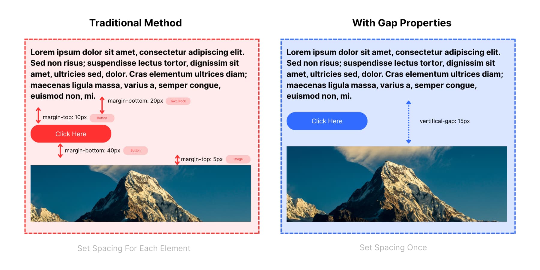
The traditional method makes random spacing choices: 10px here, 20px there, 40px somewhere else. These scattered values cause inconsistencies and make it hard to know which spacing applies. Gap properties remove guesswork by using one consistent rule for all elements.
This approach still has limitations. You still need to remember every value you used and apply it manually wherever you need it. You have to guess what values work where. Once you set those values, changing your mind means finding each one and replacing it manually, leaving room for errors and inconsistencies.
A gap-based spacing system with Flexbox and Design Variables is a much better approach.
How To Set Up Gap System In Divi 5
Building a gap-based spacing system sounds complex, but Divi 5 makes it surprisingly straightforward. You don’t need any coding knowledge or external frameworks. The Visual Builder handles everything through Design Variables and Flexbox controls. We’ll walk you through each step, from creating your spacing variables to saving reusable presets.
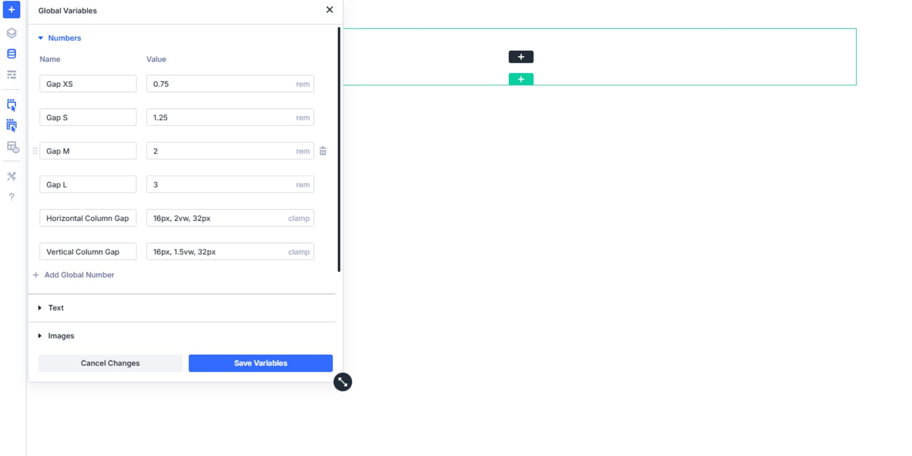
1. Create Spacing Variables
Divi 5 can store gap values inside the Visual Builder using Design Variables. You build your spacing system once and apply those values anywhere flexbox controls appear, no custom CSS functions are needed.
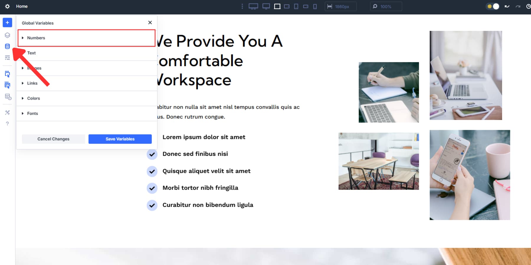
The Variable Manager can be found in the left sidebar of your Visual Builder. Click that icon, then open the Numbers tab where spacing variables can be added.
Here, you’ll create values that can be used throughout the site instead of hardcoded pixels. Several Design Variables are available; we won’t cover those in this post, but we have an excellent guide.
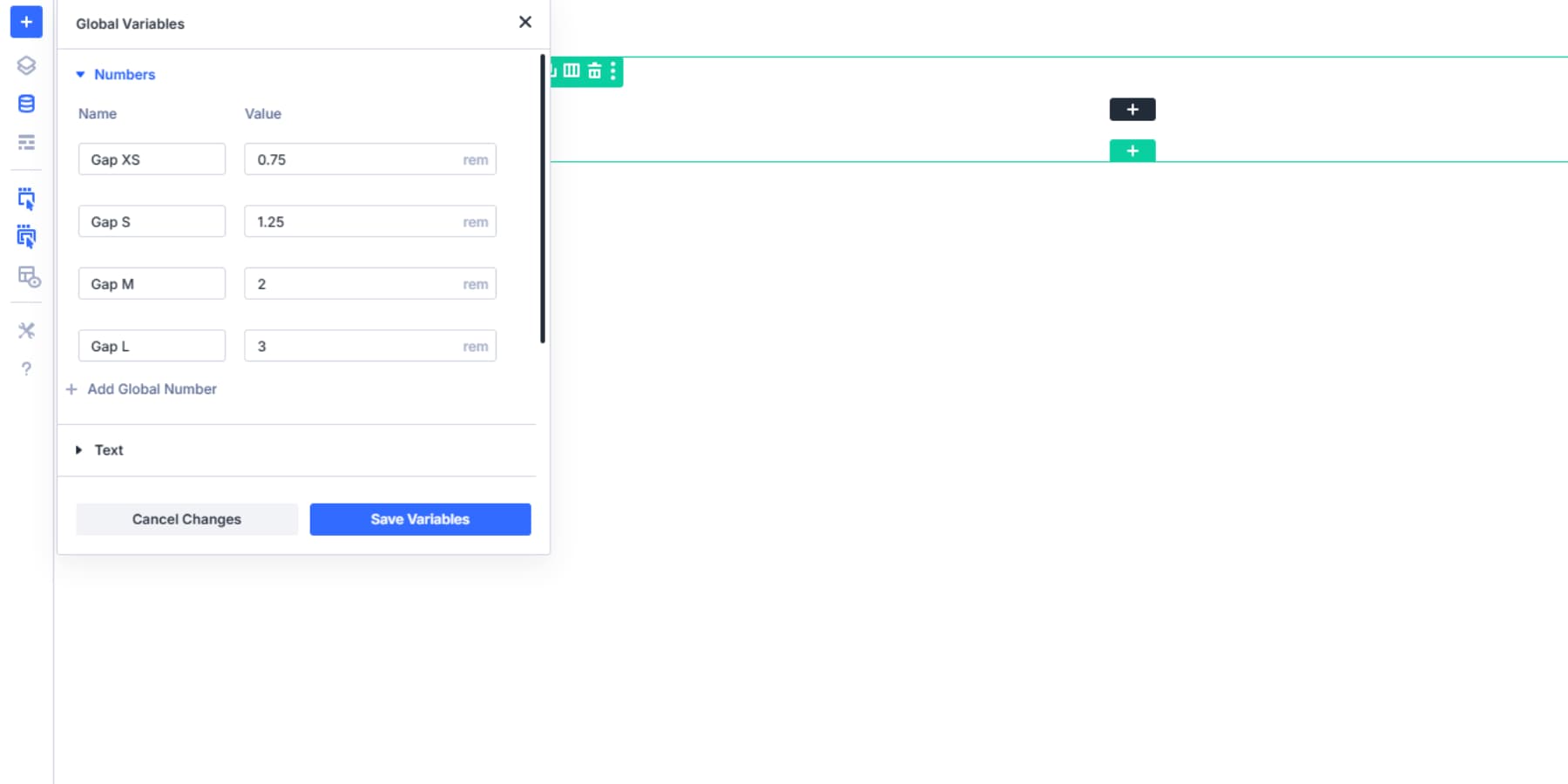
Start with your base spacing unit. Most designers work with 8-12px as their foundation, but you can choose 4px, 10px, or whatever fits your design rhythm. You can use advanced units here, apart from just pixels. For example, we are starting with REM instead of pixels (assuming the browser default 1rem = 16px):
- Gap XS: 0.75rem (~12px for tight relationships for columns with only icon and text)
- Gap S: 1.25rem (~20px for columns with text blocks)
- Gap M: 2rem (~32px for feature boxes, service columns)
- Gap L: 3rem (~48px for main content sections, sidebar layouts)
These labels aren’t fixed; you and your team can rename them as needed. You can also add more gap variables. Rem units scale with browser font settings, so visitors who increase text size get proportional spacing. This improves accessibility.
Use Clamps To Make Scalable Gaps
We can also use clamp(). We’ll explain briefly if you don’t know what a clamp() is. But first, consider adding the following to the number variables as well:
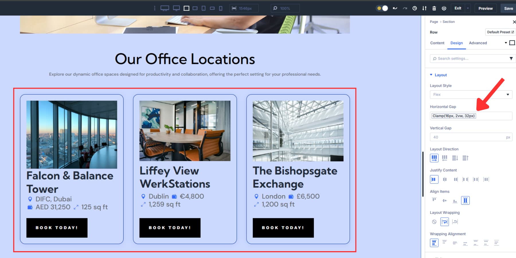
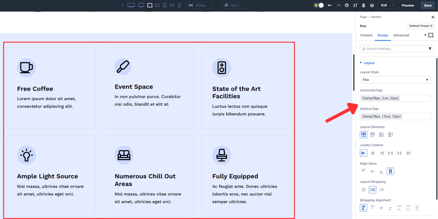
- Horizontal Column Gap: clamp(16px, 2vw, 32px) (for horizontal gaps between cards, features, etc.)
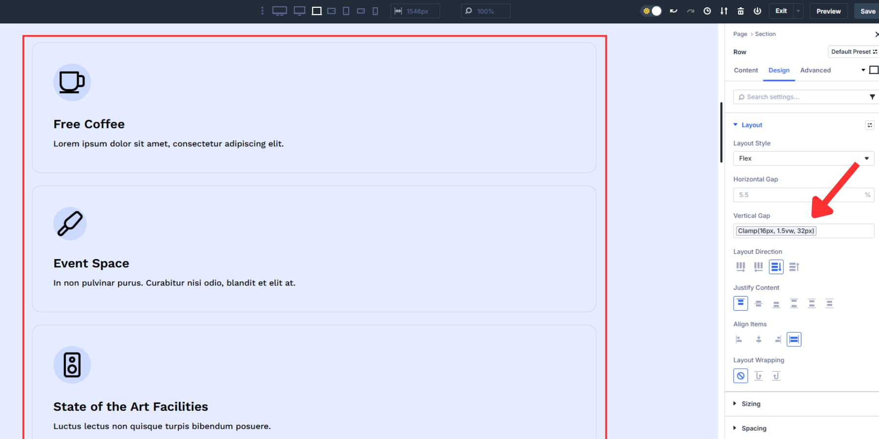
- Vertical Column Gap: clamp(16px, 1.5vw, 32px) (for vertical gaps between cards, features, etc.)
Clamp() is a safe CSS unit to use. You give three values: min, preferred, and max. The browser tries the preferred value, but if it’s too small, it uses the min, and if it’s too big, it uses the max.
For example, Horizontal Column Gap: clamp(16px, 2vw, 32px). The gap scales with screen width (2vw = 2% of viewport). It won’t go below 16px on small screens or above 32px on large screens. This keeps spacing balanced without breakpoints or media queries.
You can use any values. We picked this method because it’s easy to maintain, adapts to change, and produces more consistent results.
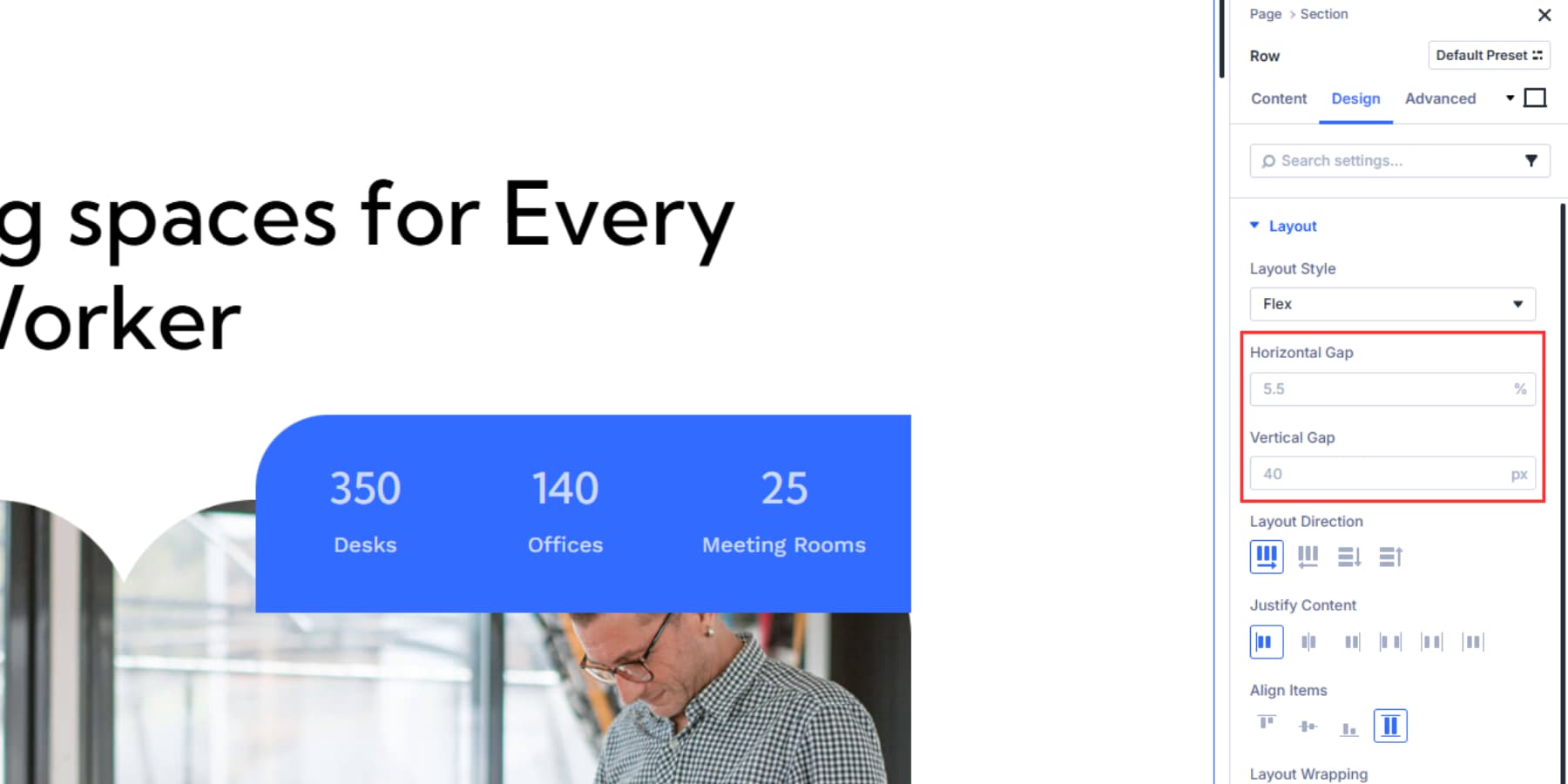
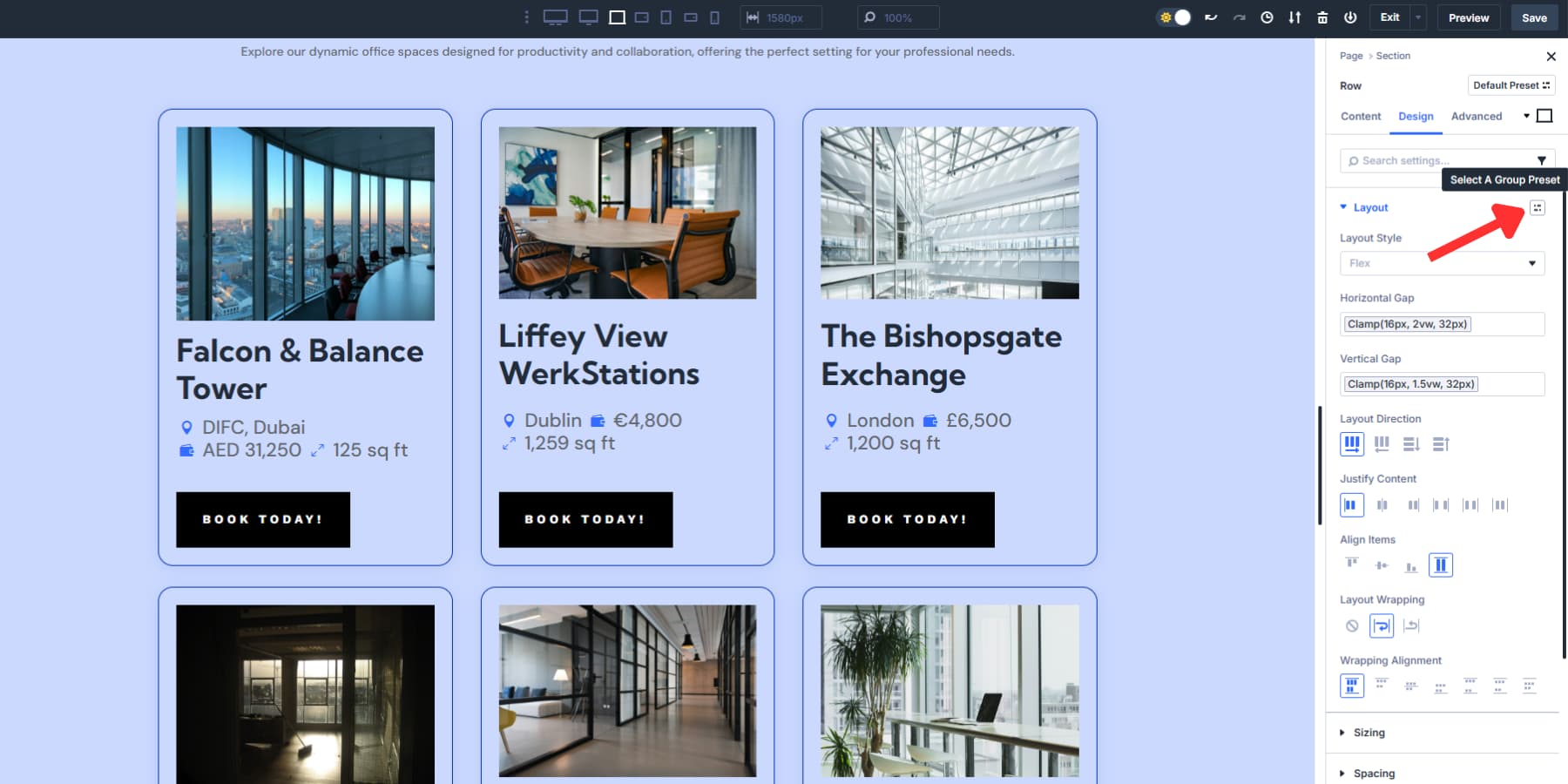
2. Enable Flexbox Layout On Your Sections
New sections use Flexbox by default. For older sites, convert a section by clicking the settings icon, opening the Design tab, choosing Layout Style under the Layout tab, and selecting “Flex.” Do the same for your rows and columns.
After enabling Flex, you get options like Justify Content for alignment and distribution. Align Items controls let you set how items behave when space runs out horizontally.
Here, you can spot the gap controls, which have separate horizontal and vertical sliders to set the spacing between columns or modules within a row.
3. Apply Gap Values Using Your Variables
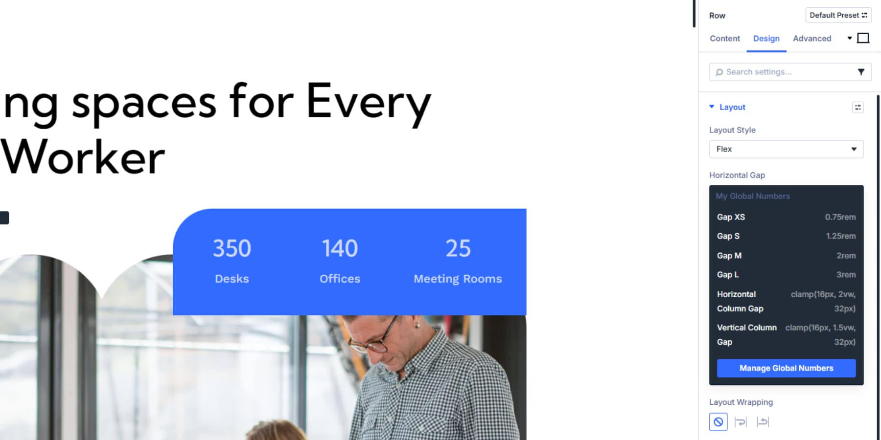
Once you set up your gap variables in Divi’s Variable Manager, applying them to Flexbox gap settings becomes straightforward through the dynamic content system. Navigate to your Layout settings and hover over the labels in the Horizontal or Vertical Gap fields to reveal the dynamic content icon.
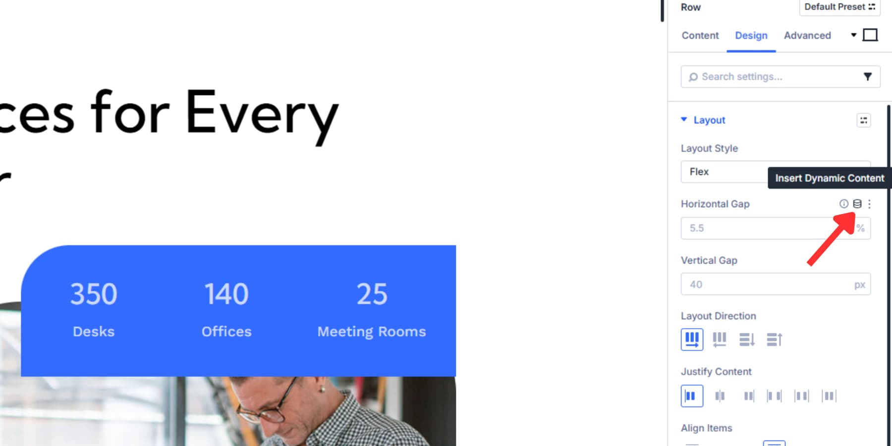
Click the dynamic content icon to open the variable selection dialog. Your saved gap variables appear in this menu.
As you may have noticed, we added two sets of gaps based on the context in which they would be used. Let’s take a deeper dive to understand why:
Clamp Gaps: Between Flex Columns
Your clamp gaps would work at the “container” level through Divi’s Flexbox settings.
Apply Horizontal Column Gap [clamp(16px, 2vw, 32px)] when you have columns arranged side by side, like three service cards in one row. Once selected, Divi automatically applies it to the gap setting. The field will display your variable name, confirming the connection. This creates proportional horizontal spacing between Column 1, Column 2, and Column 3 when the Layout Direction is set as a Row.
Apply Vertical Column Gap [clamp(16px, 1.5vw, 32px)] when your layout direction is set to column, stacking items vertically. This will space items proportionally from top to bottom when the Layout Direction is set as a Column.
When Columns with Row Direction wrap to multiple lines, like six cards arranged in three columns per row, apply both gaps. A horizontal gap spaces items within each row, while a vertical gap spaces the rows themselves.
Base Gaps: Content Within Rows
Your base gaps control the relationships between content pieces inside each column. When a heading is followed by a paragraph and a button in the same column, consider applying Gap XS (0.75rem) between them.
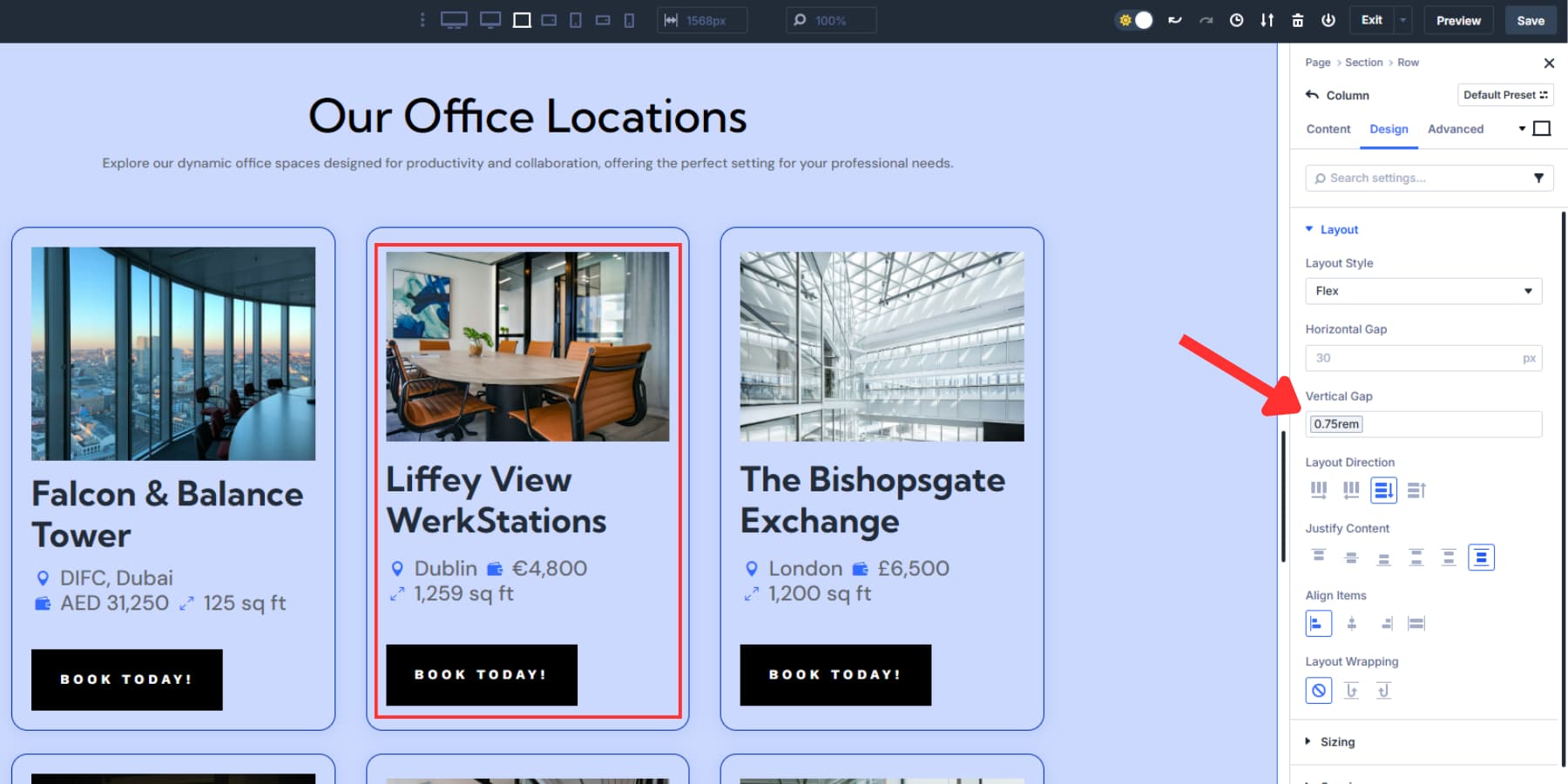
Consider using Gap S (1.25rem) for content groups with multiple text elements or Gap L (3rem) if you need significant spacing between two columns, especially if the column’s layout direction is set to a row.
The Design Variables Advantage
Design Variables have several benefits over typing values manually. Since labels can be contextual, they keep spacing consistent without memorizing pixel or rem values.
When you change the spacing philosophy, update a variable in the Variable Manager to update every gap used across the site.
This visual method also avoids spacing errors when team members enter different values. Gap variables create a common language for spacing, keeping layouts aligned with design standards you set. This is especially helpful on large projects with many contributors or after client handover when clients edit or add pages.
4. Set Up Responsive Gaps
Mobile phones have limited horizontal space. Your three-column service layout looks great on desktop, but becomes cramped and stiff to read on a 360px phone screen.
Divi 5 gives you seven customizable breakpoints to work with: Phone, Phone Wide, Tablet, Tablet Wide, Desktop, Widescreen, and Ultra Wide. Each breakpoint works independently. You can change layout direction, swap gap variables, or adjust alignment on mobile without messing up the desktop. This lets you target exact screen widths where your layout needs to change.
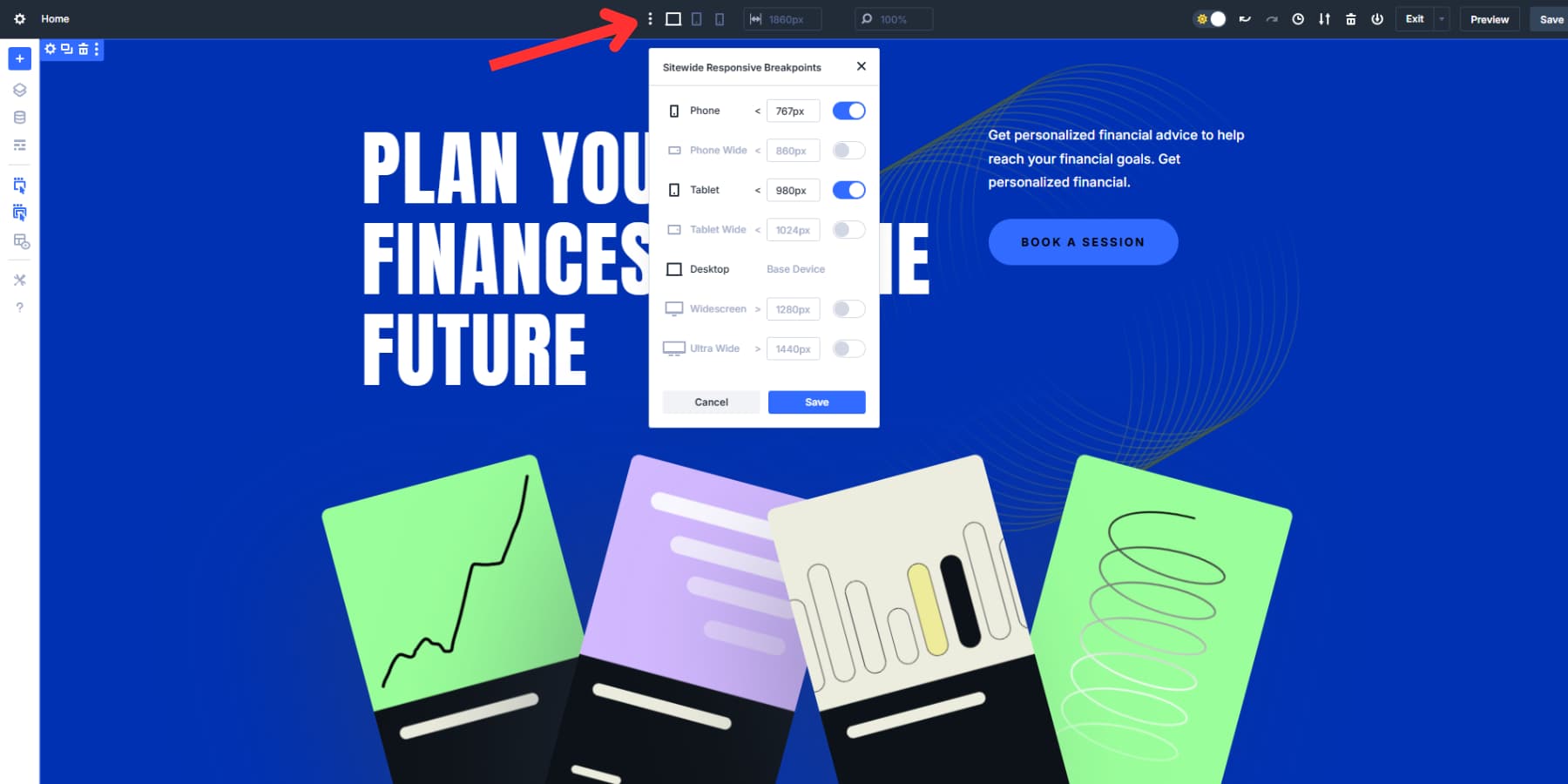
Switch to your Phone breakpoint and change Layout Direction from “Row” to “Column.” Clear out the horizontal gap option since your columns stack vertically instead of fighting for horizontal space.
The clamp-based vertical gap shrinks and grows automatically as the viewport width changes. On a small phone screen, 2vw equals about 7px, but the clamp won’t exceed the minimum of 16px. On a larger screen, 2vw might mean 18px, and on an even larger screen, 20px.
The spacing grows smoothly between these limits as the screen size changes. Without setting different values manually, you get tight spacing on mobile and generous spacing on desktop.
Base gaps may still need manual tweaks per breakpoint. Gap M might feel too tight on mobile. Switch to your mobile breakpoint and apply Gap L instead of the vertical gap option.
You can also create mobile-specific variables, such as “Gap Mobile S” or “Gap Mobile L,” and apply these to phone and tablet breakpoints. However, the basic base and clamp gaps work well in most cases.
5. Save Your Configuration As A Preset
Your gap system works well now. Design Variables give you control over spacing through the visual interface you’ve been working with. But setting up flexbox configurations over and over gets old fast. You have to adjust layout direction, alignment, and wrapping settings. Then you apply your gap variables to each new section. This process eats up time.
Option Group Presets fix this problem. It stores your complete flexbox setup, including layout direction, alignment, wrapping, justification, and both horizontal and vertical gaps that reference your design variables.
Once you configure all flexbox settings, hover over the Layout Style panel. You’ll see the Option Group Presets icon.
Click it and select “Create Preset From Current Styles.” Name it based on what the layout does: “Three Column Grid,” “Services Grid,” or “Card Display.”
The preset carries over the flexbox configuration to any container. It does not copy background colors, fonts, or other visual styling.
Apply your “Three Column Grid” preset to any row. It automatically sets up the same spacing, alignment, and wrapping behavior. Each Row or Column keeps its visual look while using the same layout structure.
You spend less time recreating setups you’ve already perfected. The visual identity stays unique to each section. The structural foundation remains consistent across your site. Your gap system stays fast to implement, and your proven layout patterns get reused efficiently.
Get Perfect Spacing Every Time With Divi 5
With Divi 5’s new Flexbox and Design Variables, consistent spacing becomes effortless. Gap controls balance layouts across devices, while variables ensure updates reflect throughout your site with a single change.
Instead of constant fixes, you get a clear system you can trust. Set your spacing once, reuse it everywhere, and focus on designing great experiences for your visitors.


Thanks for this!!
Thanks for the article, it would be great if you can also create a video for this. I have some troubles with how to implement it the right way 😉
Thanks for the feedback! We’ll definitely consider making a video tutorial to help with implementation soon. Meanwhile, feel free to ask any specific questions you have here!