 In CSS (And How To Use It)")
If you’ve ever tried making your site look good on both phones and giant monitors, you’ve seen how spacing breaks, fonts shrink drastically or scale excessively, and elements either overwhelm or disappear. To fix all that, you end up writing a long list of media queries for one layout. That’s where clamp() can help.
It’s a CSS function that simplifies setting sizes. Instead of defining multiple values at fixed breakpoints, it lets you set a minimum, a preferred, and a maximum so that your elements scale fluidly as the screen changes. The best part is that they stay within your defined limits, so there are no layout inconsistencies.
In this post, we’ll explain how clamp() works, why it can often be more efficient than media queries, and how Divi 5 lets you use it without writing a single line of code!
What Is clamp()
clamp() is a native function in CSS, used to define responsive values that adjust based on the screen size. Instead of hardcoding a single number, you give the browser a range to work with — you set a minimum value, a scalable preferred value, and a maximum value. These make your layout more flexible, and you don’t have to write multiple media queries for each screen size.
Let’s understand this with an example of a fluid font size that increases/decreases based on screen size.
font-size: clamp(40px, 7vw, 100px);
Here, the font size will never go below 40px, scale based on 7% of the viewport width, and stop growing once it reaches 100px.
Another big benefit of using clamp() is that, unlike media queries, it avoids the rigid jumps and keeps your styles more predictable and readable.
What do we mean by this? Let’s understand this by comparing clamp() with media queries.
Comparing clamp() & Media Queries
Media queries are another common way to adjust font sizes for different screen widths. Here, you define breakpoints at specific screen widths where your styles change. For example, you might assign one font size for desktop, another for tablet, and a third for mobile such that the font size changes only when the screen width hits each breakpoint.
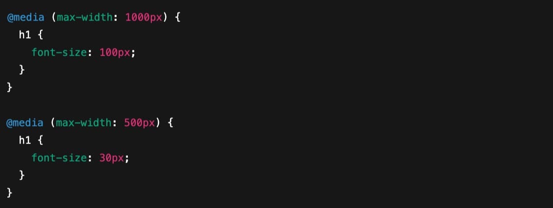
This method works, but it isn’t fluid. Between 1000px and 501px, the font size stays locked at 100px. The moment the screen reaches 500px, the font abruptly drops to 30px. This means no smooth transition, only a sharp change.
So if you want to make the scaling feel more natural, you have to add several breakpoints and manually adjust the font size at each one. That would make your code lengthy and bloated.
In contrast, clamp() saves you from abrupt transitions and lengthy code. In fact, it can be written in a single line: font-size: clamp(30px, 7vw, 100px).
This tells the browser to scale the font between 30px and 100px based on 7 percent of the viewport width. The font size adjusts fluidly across all screen sizes without abrupt jumps or the need for multiple breakpoints. You still define the limits, but the scaling in between is automatic and more consistent.
In live action, here’s how a comparison between the font resizing of media query breakpoints and clamp() looks:
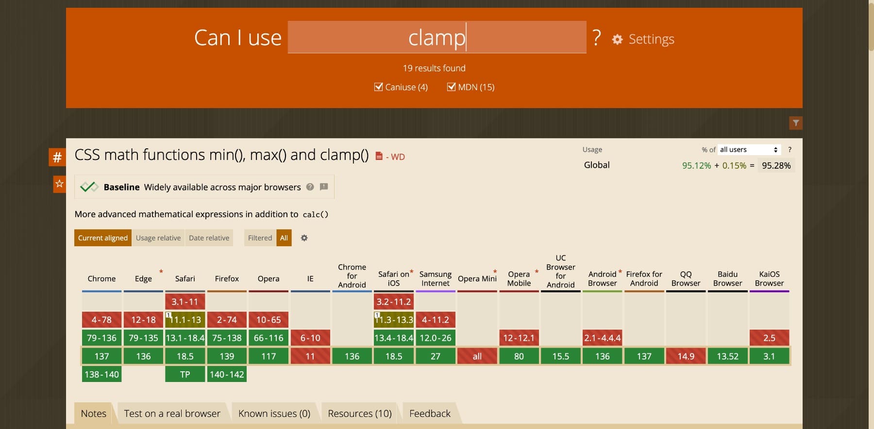
For responsive resizing, clamp() makes a noticeable difference. Rather than waiting for fixed screen widths to trigger style changes, it responds to every pixel in between. This keeps your code cleaner and your design more consistent across all devices. On top of that, it’s widely supported by most modern browsers, which means it’ll render well on these browsers, making it a reliable and practical replacement.
How clamp() Functions Behind The Scenes
clamp() takes three values that work together to scale any CSS property:
clamp(minimum, preferred, maximum)
Each part of the function has a specific role:
- Minimum value: The lowest possible value. The element will not scale below this point, no matter how small the screen is.
- Preferred value: This value scales based on the screen size. It’s usually set using relative units like vw or a calc() expression to allow free fluidity.
- Maximum value: The highest allowed size. Even on very large screens, the element won’t exceed this value.
When the browser calculates the final size, it evaluates the preferred value first. The browser uses the minimum if the screen size is small enough that the preferred value drops below the minimum. Similarly, if the screen is wide enough that the preferred value exceeds the maximum, it sticks with that.
This makes the behavior predictable. You always know your design will stay within your defined range, but you get flexible scaling between those limits. By setting minimum and maximum limits, clamp() ensures your elements scale fluidly but never too much. Just enough.
Choosing The Right Preferred Value
You might have noticed that the preferred value (the middle one) plays a bigger role in all this. It decides how elements scale.
First, it should not be a fixed value like clamp(40px, 80px, 120px) because in this case, the preferred value doesn’t scale at all. Since 80px already falls between the limit, the browser locks it in and ignores screen size changes. This results in a static value, which defeats the purpose of using clamp() in the first place.
Instead, the preferred value should always be relative, like in clamp(40px, 7vw, 120px). Here, 7vw responds to the viewport’s width, which allows the element to scale smoothly across screen sizes. The clamp function then ensures it never goes below 40px or above 120px, keeping the size responsive to 7% of the screen’s width.
You also need to consider the relative value’s size. For example, a smaller value like 2vw scales the element more gradually across screen sizes, whereas a larger value like 6vw causes faster scaling and reaches the maximum size sooner. To identify which scaling works for you, try the Fluid Type Scale Calculator. It lets you preview different values and export ready-to-use CSS.
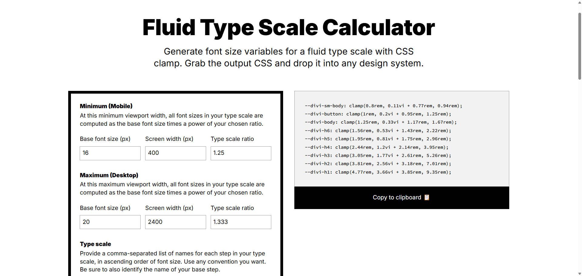
Note: The Fluid Type Scale Calculator outputs vi values. If you use the generated output in Divi, make sure to change the vi units to vw.
Different Types Of Units In clamp()
The units inside the clamp() affect how it behaves across devices. Here are all you can use:
| Unit | Based On | Best Used For | How It Works & Notes |
|---|---|---|---|
| px | Absolute pixel value | Minimum or maximum values | Fixed and predictable, not responsive |
| rem | Root font size (html element) | Accessible sizing for typography, spacing | Scales with user’s browser settings |
| em | Parent element’s font size | Context-specific spacing | Less predictable if nested styles vary |
| vw | 1% of viewport width | Preferred value in fluid scaling (font, width, spacing) | Responsive across screen sizes |
| vh | 1% of viewport height | Element height, hero sections | Use with caution for vertical content |
| % | Size of parent container | Width, padding, or layout dimensions | Relative to container, useful in layout-based scaling |
In most cases, developers use px for the minimum and maximum values and a fluid unit like vw for the preferred value. This gives the best balance between control and responsiveness.
However, you can also use relative units for min and max values, such as clamp(2rem, 4rem, 8rem). This makes your design more accessible and easier to scale if the root font size changes. It’s especially useful for users who adjust browser settings for readability.
clamp() In Divi 5
The clamp() function in CSS is incredibly useful, but only if you’re comfortable writing code. What about those who prefer building their websites visually without touching a stylesheet? Would you like to build fluid layouts using clamp() but without writing code?
If so, Divi 5’s Advanced Units can help.
Subscribe To Our Youtube Channel
Long story short, Divi 5 supports clamp() as an advanced unit across the builder, and it’s super easy to access them. Wherever you can enter a numeric value, such as font size, spacing, or section width, you’ll find the option to use clamp() directly.
Just click in the input field to select from the different advanced units available in Divi 5 (see the dark-colored list next to the heading text size), change the unit type, and define your minimum, preferred, and maximum values.
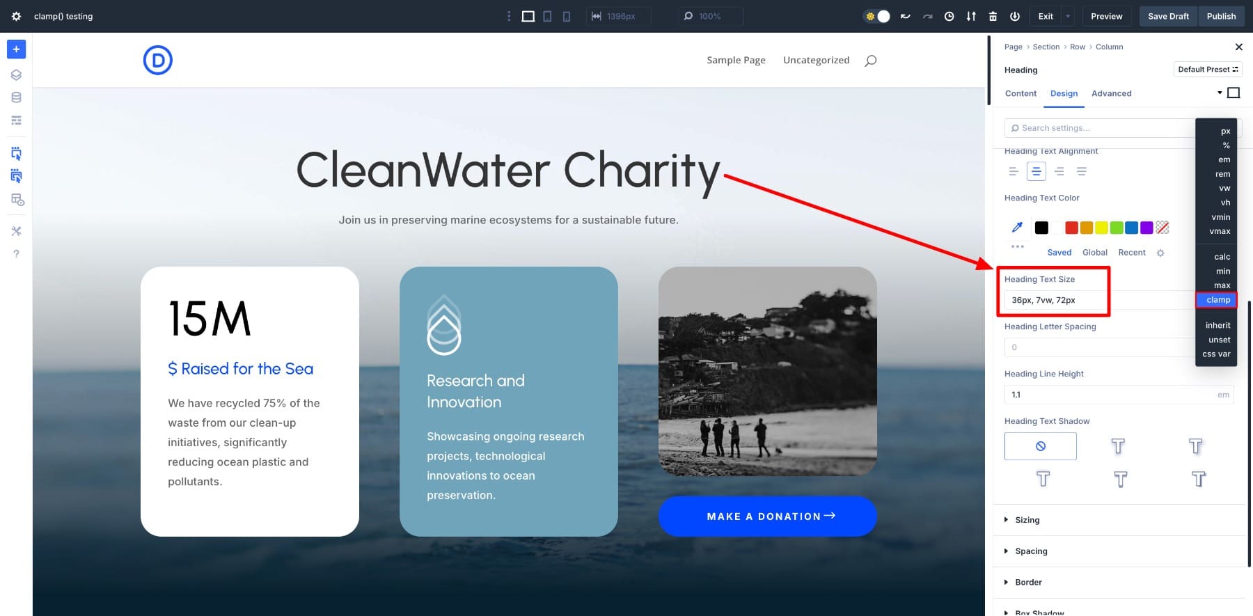
And that’s it! No coding or CSS at all — all you did was enter a clamp() value, and your heading became fluid just like that.
Divi 5 makes it easy to create fluid, responsive designs without writing custom CSS. You get all the flexibility of a clamp() with the simplicity of a visual editor. (Divi 5 supports many other advanced units, including clamp()).
Learn Everything About Divi 5’s Advanced Units
How To Use clamp() In Divi 5?
By now, you’ve seen how easy it is to use clamp() in Divi 5. You simply select the clamp() unit and add your preferred values. No custom code, no CSS files, just a clean, visual interface.
But what makes clamp() truly powerful inside Divi is not just the function itself. It’s what it works with.
Divi 5 is built around a modular design system. This means you can combine clamp() with other advanced features like Design Variables and CSS functions like calc() to make your layout not only responsive but also consistent and easy to scale. And that’s where it gets interesting — Divi 5 makes it easy to fit clamp() into your workflow.
clamp() Works With Design Variables
The best, most efficient way to use clamp() effectively in Divi 5 is to combine it with Design Variables.
Design Variables let you define global values (such as typography, colors, and even font sizes) so you can use them throughout your site to keep it consistent. You can also save clamp() values as Number Variables. This allows you to save responsive global values such that when you change them, all instances get updated at once.
For example, you define clamp() sizes for H1-H6 headings like this:
| Size Name | clamp() Function |
|---|---|
| H1 (Large) | clamp(2.1rem, 10vw, 10rem) |
| H1 | clamp(1.5rem, 5vw, 4.5rem) |
| H2 | clamp(1.425rem, 4vw, 3.25rem) |
| H3 | clamp(1.375rem, 3vw, 2.25rem) |
| H4 | clamp(1.25rem, 2vw, 1.75rem) |
| H5 | clamp(1.125rem, 1.75vw, 1.5rem) |
| H6 | clamp(1rem, 1.5vw, 1.25rem) |
| Body | clamp(0.875rem, 1vw, 1.125rem) |
| Small Body | clamp(0.75rem, 1vw, 1rem) |
| Button | clamp(0.875rem, 1vw, 1.125rem) |
And save them inside the Variable Manager in Divi Builder:
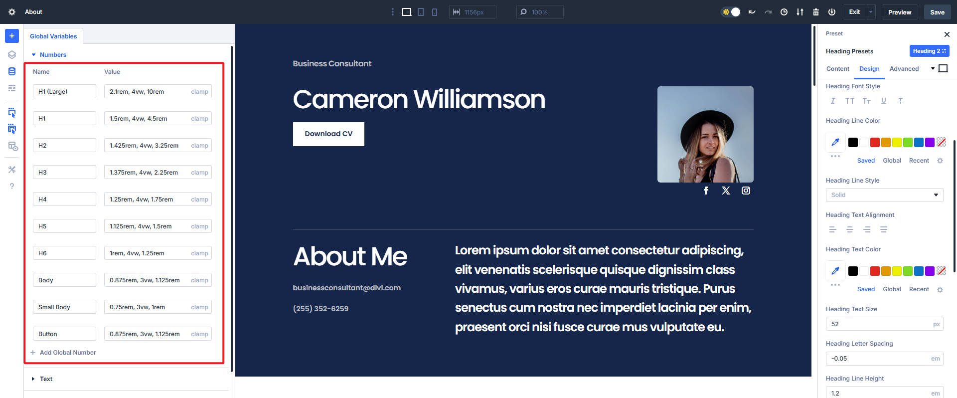
Then all your headings throughout the website will adapt based on your defined clamp() values.
Now, if you want to update the H3 size, just modify its number variable, and it will be updated everywhere you’ve used it. (Want to create your own typography system in Divi 5? Here’s a complete guide on managing fonts and font sizes using clamp() and Design Variables.)
This approach allows for centralized control, making it easy to update typography settings globally without manually adjusting each instance. By applying these clamp() variables through Option Group Presets, you streamline your design process.
clamp() Combines With calc()
You can also use the calc() function inside clamp() to fine-tune how your values scale. This is especially useful when you want to add a baseline size and then scale it more precisely with a relative unit like vw.
For example, font size: clamp(1rem, calc(0.75rem + 2vw), 2.5rem) uses calc() to add a stable base (0.75rem) and then scale it further with 2vw.
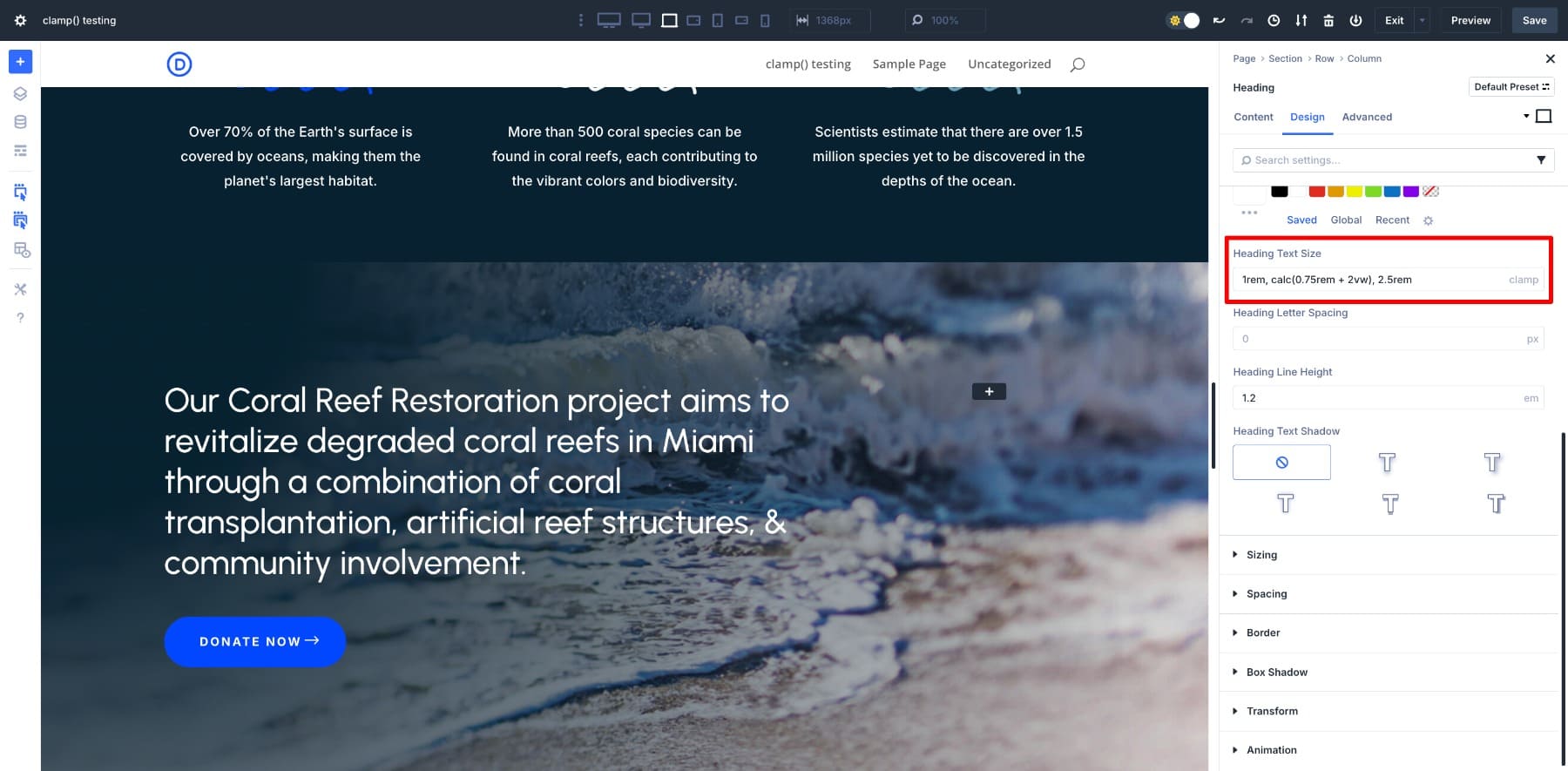
This allows the font to scale based on the viewport width, but also gives it a head start with a base font size. This is useful for maintaining legibility on smaller screens without needing multiple clamp variations. The calc() trick inside clamp() is perfect for anywhere you want that extra control over how things scale.
Practical Use Cases Of clamp()
Now let’s look at some common use cases of clamp() and how easy it becomes when you’re applying it with Divi 5:
1. Consistent Heading Sizes Across All Devices
Responsive typography is the best use case of clamp(). Since we had already defined our heading (H1-H6) sizes using clamp() in Design Variables, it’s time to see them in action.
We created this page using H5s for menu items. Then, we applied the H5 number variable to each of the H5’s heading text sizes. And as you can see, each heading fluidly scales across breakpoints.
The text remains clear, balanced, and visually consistent across all our defined responsive breakpoints.
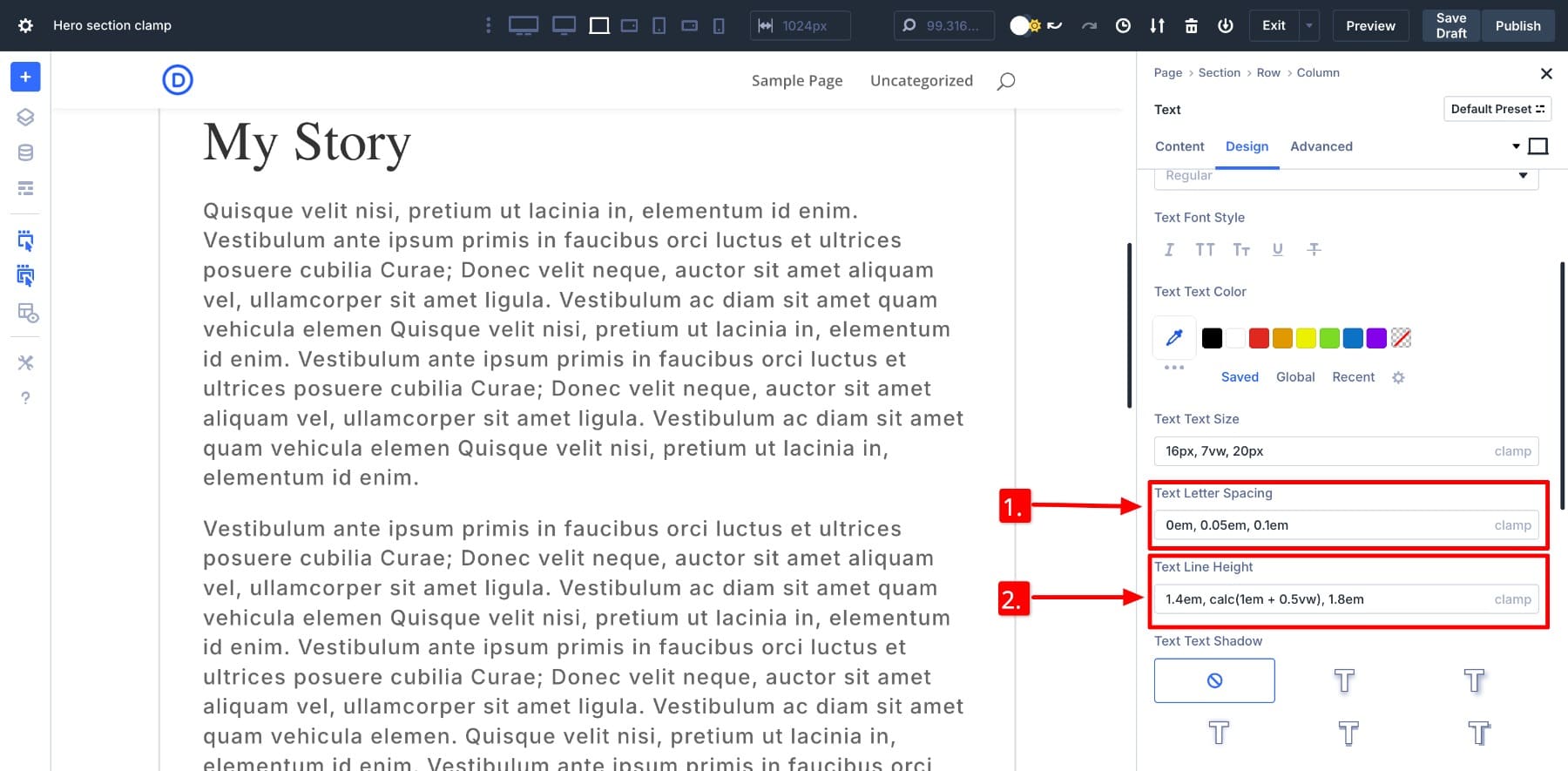
You can also use clamp() for line height and letter spacing. It helps maintain optimal readability by slightly increasing line gaps or spacing as the screen gets wider. A small change, but it would make long-form content feel more breathable.
2. Set clamp() Width For Paragraph Sections On Large Screens
Paragraphs are naturally easy to read on mobile, as short lines in compact screens make content digestible. However, on ultra-wide monitors, the readers will be forced to scan entire horizontal rows if a full-width section stretches the text too far. It feels like reading a billboard. The ideal line length of a sentence is around 50–75 characters, so if your website displays an endless sentence on a wide screen, you might lose the reader’s interest.
To fix this, set a responsive width such as clamp(300px, 65vw, 800px) to scale your paragraph to a fixed width (800px) so paragraphs appear readable even on wider screens.
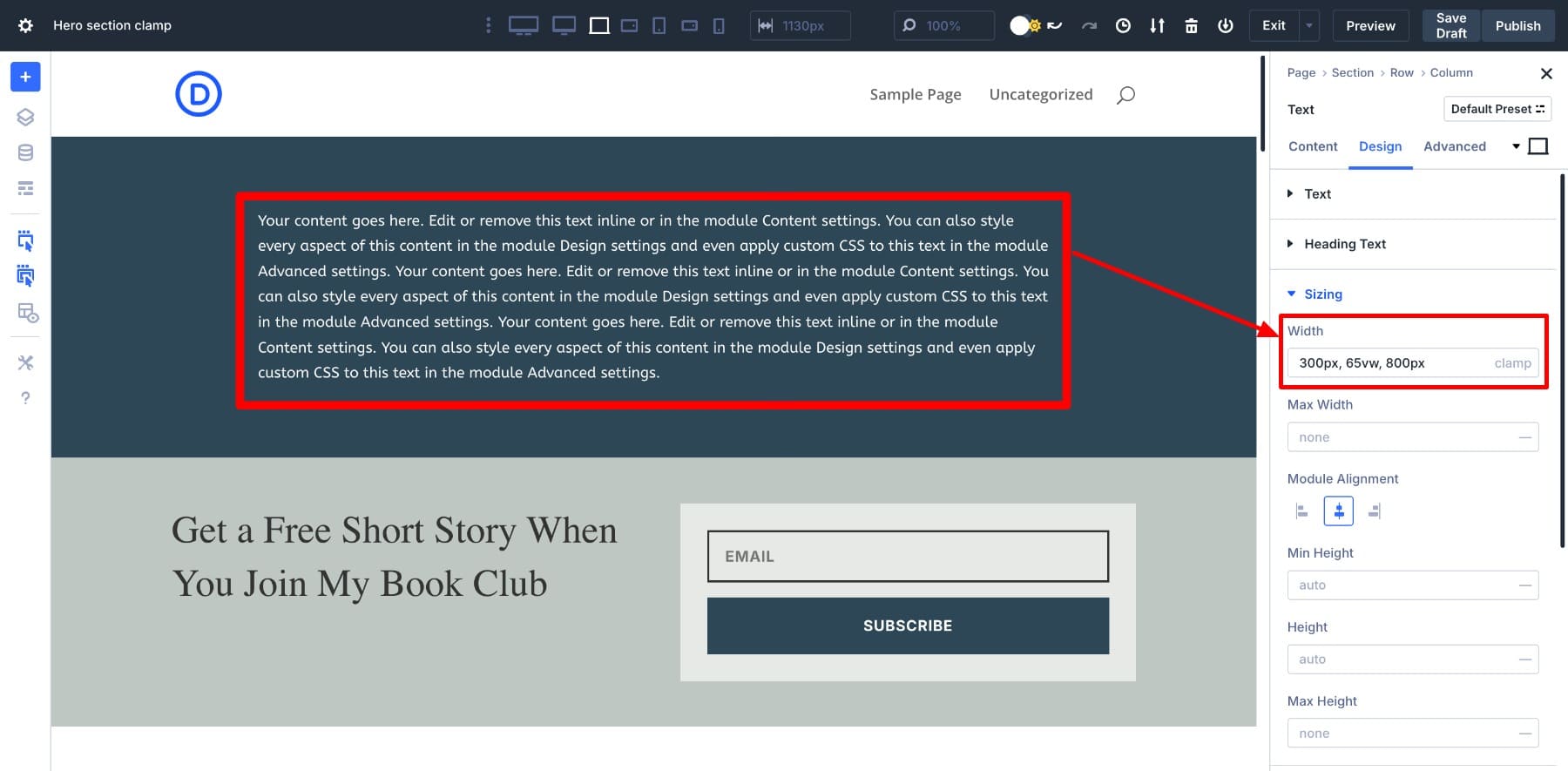
This is a perfect way to make your blog posts readable on wider screens.
3. Set clamp() Width For Single Or Featured Images
Similarly, single images (like featured images) can appear way too large on ultra-wide screens. It looks perfect on a tablet, but may stretch awkwardly on a 4K monitor, which can feel overpowering compared to the rest of the content.
To fix this, use a clamp-based image width like clamp(300px, 60vw, 1000px). It ensures the image grows fluidly with screen size but stops before it dominates the layout.
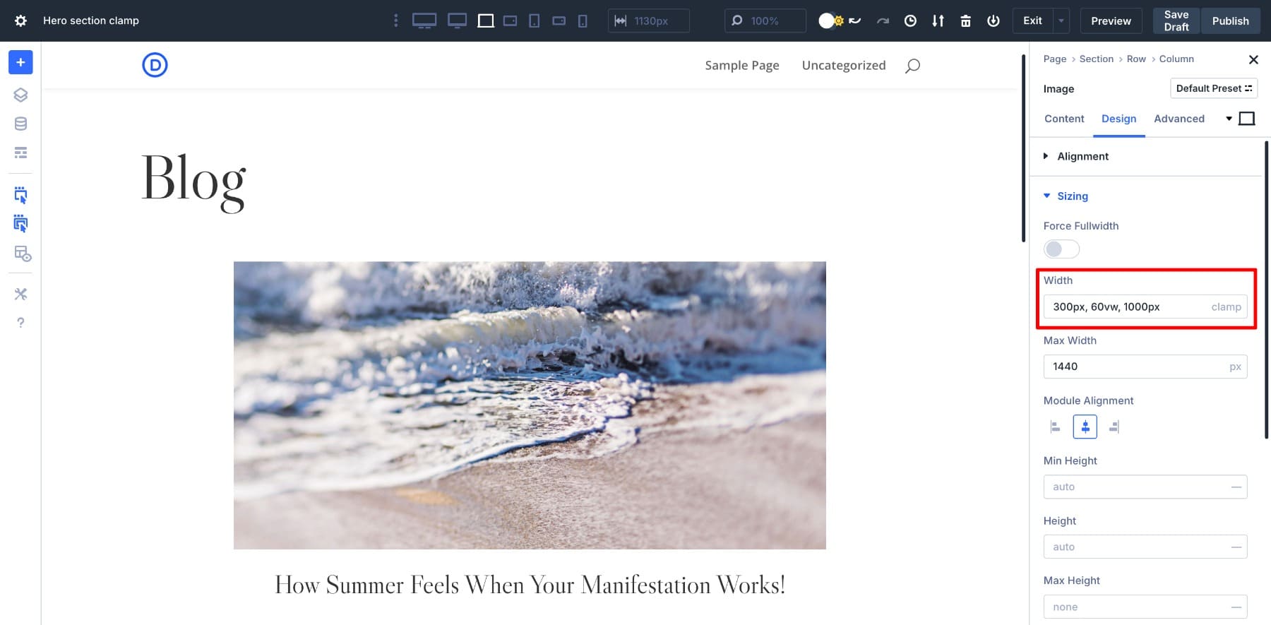
Or else, you can just set a clamp() width for the entire container row to ensure all elements (image, heading, and text) scale uniformly.
4. Add Fluid Padding & Margin With clamp()
Designers often get the spacing right for desktop, but it doesn’t always work well on smaller or very large screens. Fixed padding and margins don’t always adjust with screen size. That’s where clamp() becomes useful.
For example, a clamp(0.5rem, 2vw, 2rem) margin and a clamp(1rem, 3vw, 4rem) padding in an image gallery create spaces that start small and scale with the screen.
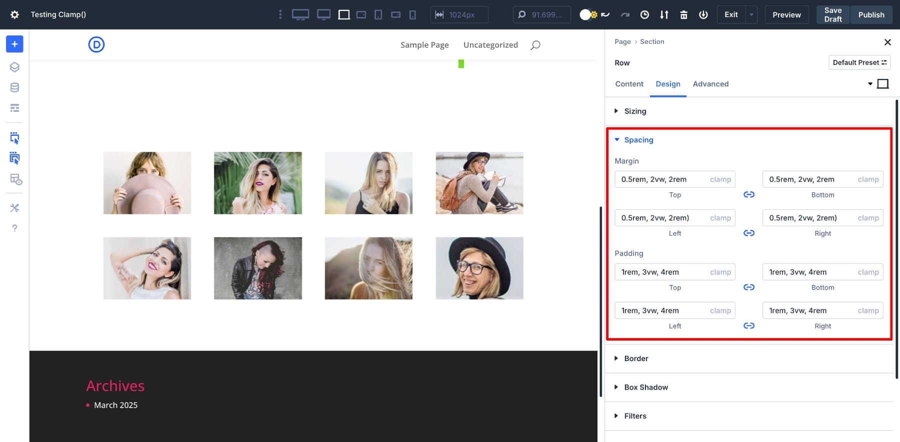
It gives your layout room to breathe on large screens and keeps things tight on mobile:
clamp() also helps scale padding smoothly around card layouts, image galleries, section containers, and text blocks, especially when you want intentional spacing without constant breakpoint tweaking.
5. Create Responsive Hero Sections That Scale Seamlessly
Using clamp(), you can make hero sections look perfect on every screen by defining hero heading, button padding, and subtitle spacing. We’ve saved these clamp() values as design variables to simplify their application. (But you would not want to fill out your Variable Manager by saving every minute detail.)
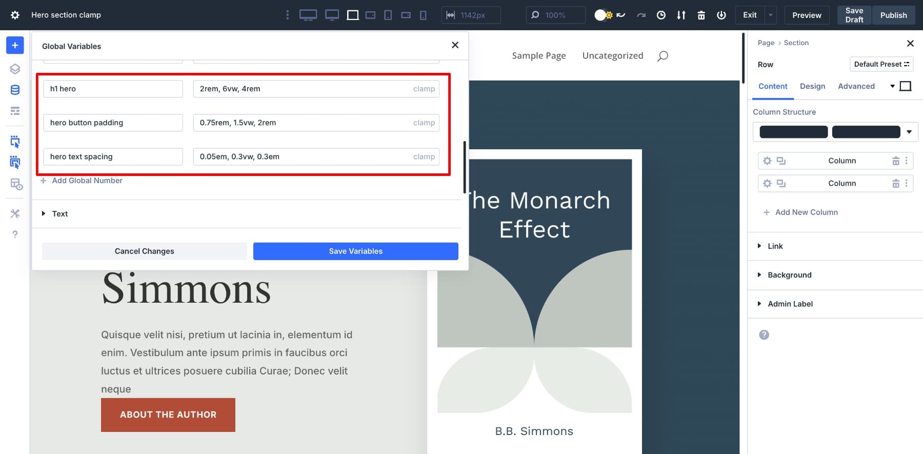
Applying those values is now easy.
Once saved, each will automatically adapt to screen size to give your hero section the perfect first impression on every device.
Design Pixel-Perfect Layouts Using clamp(), Without Writing A Single Line Of Code
Clamp () helps you design fluid, responsive layouts without relying on endless media queries. And with Divi 5, you don’t need to write a single line of code to use it. Whether you prefer coding or enjoy visual design, Divi’s advanced units make applying clamp() to fonts and spacing easier.
With powerful features like clamp() so easily accessible, wouldn’t you want to try Divi 5 out for yourself? Test different values, create your own responsive system, and see how flexible your layouts can become. And when you have a favorite clamp() trick, share it in the comments below! We’d love to see what you create.


I’ve started using Clamp for fonts and line spacing because I like the fluidity it provides; however, I’m having one major issue. With the old px method, if I decide I want to increase or decrease a font size after the fact, I can use the up/down arrows or enter a single px value to preview the change.
However, if I want to make size changes with Clamp, I have to go back to a calculator (such as the one you recommend) and rely on my memory of the original px values (the required input type). I can’t simply retrieve the original px values used from the module because the calculator outputs are in rem.
In short – unless I’m missing something – if I want to make a font a few px/rem larger, I basically have to start the whole calculation process over again.
Is there an easier way to make minor adjustments to Clamp? I can adjust the first and last rem values of Clamp – but that changes the vi/vw to ‘I don’t know what’ without the calculator.
Hey James. With Clamp, you actually have three independent values. So using the up/down arrows wouldn’t work because, unlike a single px value, there are multiple things to update. So, it doesn’t make sense in the context of clamp. Additionally, your middle value (preferred value) is typically using a completely different unit (so maybe rem for min and max but vw for the preferred value). All this makes it unhelpful to have up/down arrows in the field UI for clamp and min/max functions.
So, yes going back to a Fluid Typography calculator or manually adjusting the min/max/preferred values to your liking is what you should be doing. The good news is that this is a responsive way to do typography and lessens your work using the Responsive Editor and various breakpoints.