
Your site needs a header, a footer, and templates for blog posts, products, and other content types. Divi 5‘s Theme Builder gives you a single workspace to design all these global parts, with new features that let you fully control your entire website’s look and functionality.
This post walks you through using Theme Builder for the most common use cases, showing you how to get the most out of those new features.
If you want to follow along faster, grab our free Divi 5 Design System freebie first. It includes ready-made Theme Builder templates (headers, footers, and post layouts) wired to Design Variables, so you can customize the examples in this guide with your own brand styles in minutes.
What Is Divi’s Theme Builder
Most page builders let you design individual pages. Divi’s Theme Builder goes further. It gives you one workspace to design everything that repeats across your site, such as:
Subscribe To Our Youtube Channel
- Global Header: Your site’s main navigation area, shown across all pages. Build it once with your logo, menu, and call to action, then let it run site-wide.
- Global Footer: The bottom section of every page, covering links, copyright text, social icons, and newsletter signups.
- Blog Post Template: A layout that wraps every article you publish. Set up the hero area, content column, sidebar, and related posts section once, and every new post uses it automatically.
- WooCommerce Templates: Product pages, category pages, cart, and checkout all get their own templates. Build the exact layout your store needs using Divi’s full suite of WooCommerce modules, rather than settling for the default WooCommerce output.
- Custom Post Type Templates: If your site uses custom post types, whether for team members, events, testimonials, or portfolios, each one can have its own template with its own layout and content structure.
- 404 Page: A branded error page that matches the rest of your site instead of showing a generic WordPress fallback.
Why Use The Theme Builder
Building these repeatable sections of your site is very time-consuming. Change your logo, and you’re updating it ten times. That’s the problem Theme Builder solves. Change the header template once, and every page on your site reflects that change right away. Publish a new blog post, and it automatically inherits your blog template, no extra setup needed. The same goes for product pages, portfolio entries, team profiles, or any other content type your site uses.
This also matters for consistency. Pages styled individually tend to drift. Spacing gets slightly different here, and a font weight changes there. Templates prevent that. Every post, every product page, every landing page that uses a template stays visually aligned because they all pull from the same source.
Theme Builder And WooCommerce
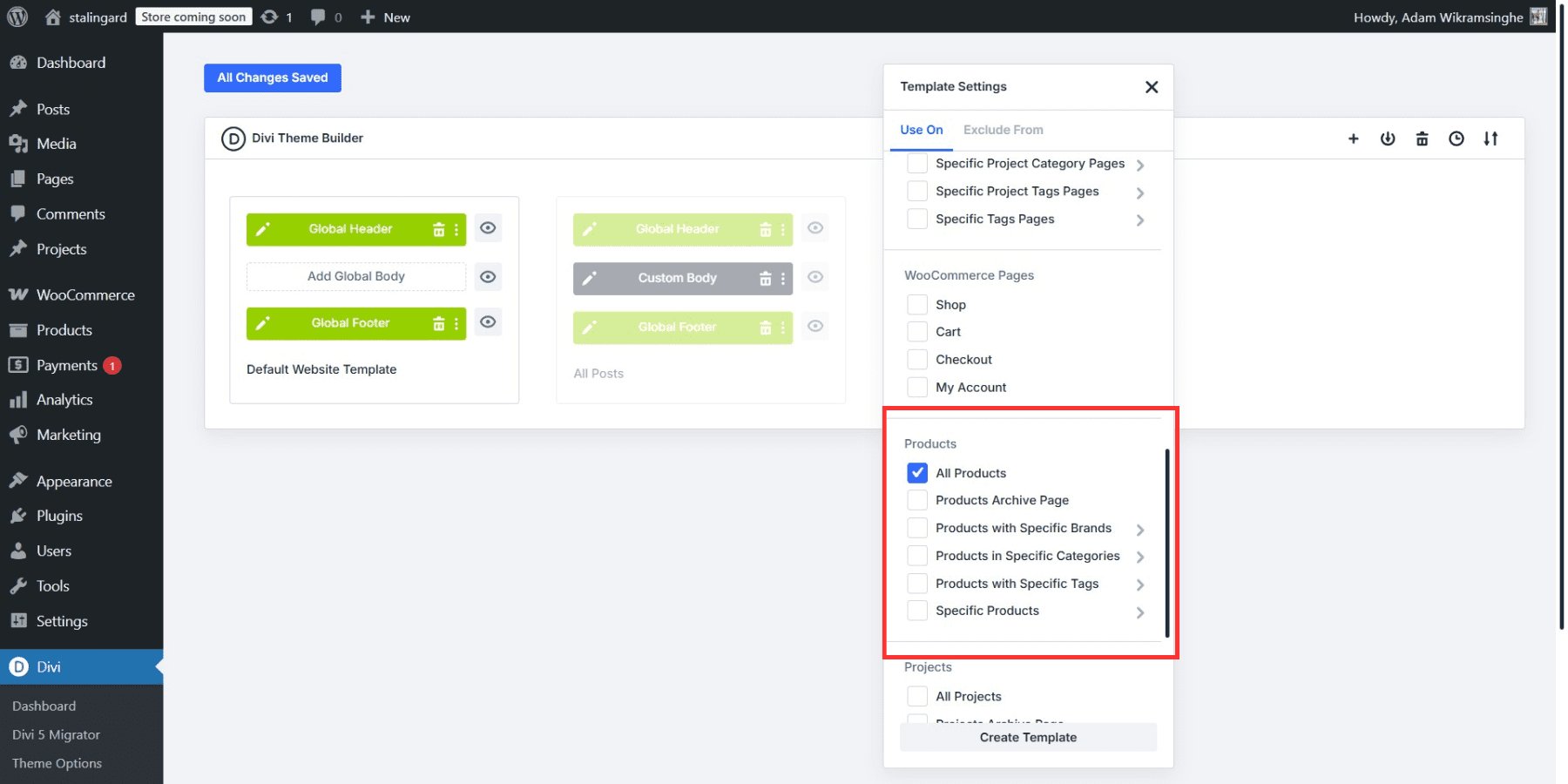
For stores running WooCommerce, this is where the default WooCommerce pages stop looking generic. Instead of accepting whatever layout WooCommerce generates, you build product page templates in Theme Builder using Divi’s WooCommerce modules, and every product inherits that layout automatically.
On a product page template, you place exactly the modules you need: Product Images, Product Title, Product Price, Add To Cart, Product Rating, Product Reviews, and more.
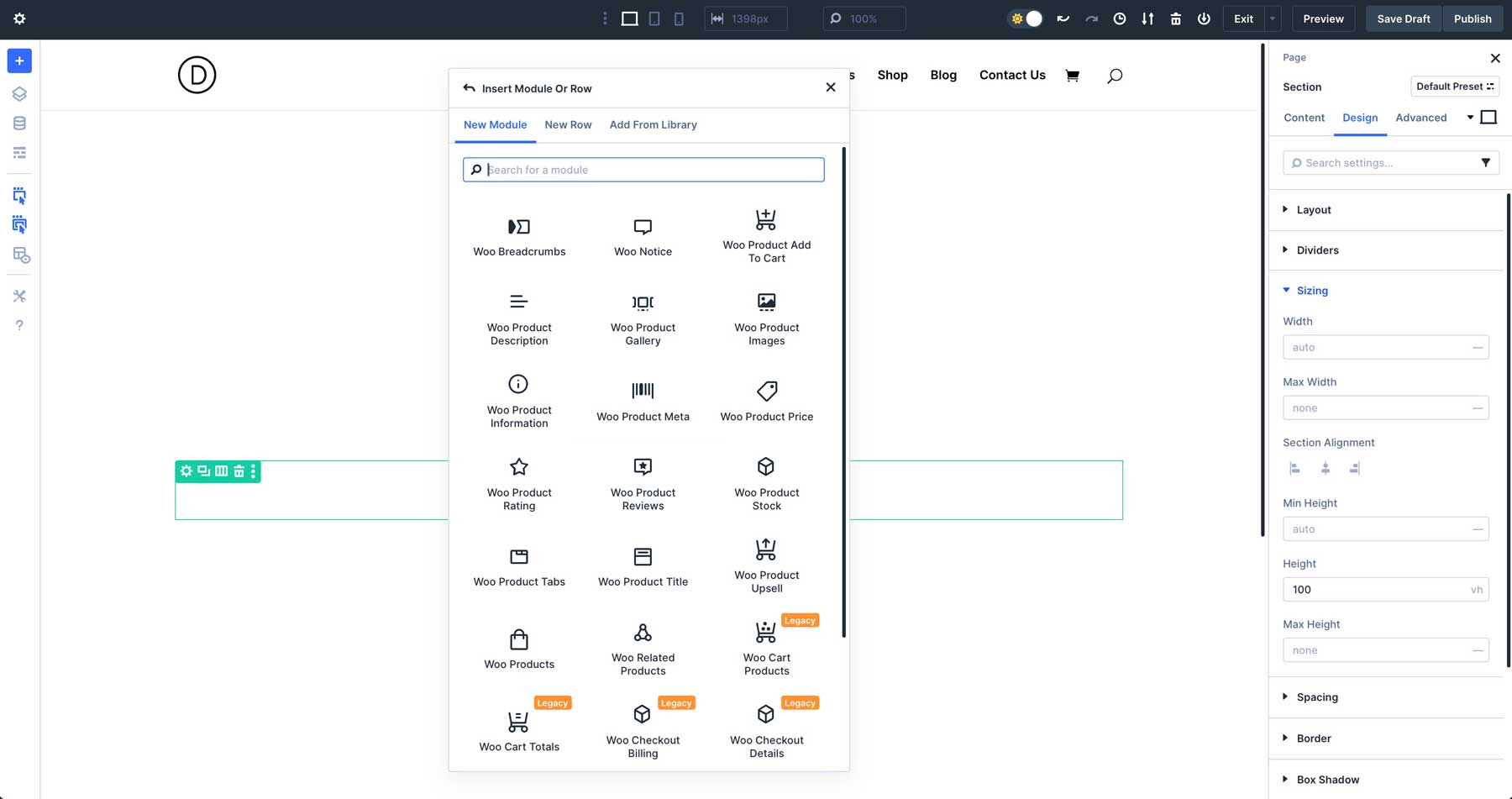
Each one is a standalone Divi module with the full range of design settings, allowing you to control layout, spacing, colors, and typography.
Category pages get the same treatment, whether that’s a straightforward grid with the Woo Products module or a fully custom product loop built with Loop Builder. Cart and checkout pages follow the same logic. Enable Divi on those pages, and you can build those WooCommerce page templates using Divi’s WooCommerce modules, rearranging and styling them to fit your brand.
You can get specific, too. Display one header on your homepage and a different one on shop pages. Build layouts for certain categories. Set conditions to show templates only on specific post types or exclude them from particular pages. Theme Builder adapts to whatever structure your site needs.
New Features To Build Your Website Components
Building templates gets better when you can dynamically pull content, organize components in clean workspaces, and update styling across multiple pages at once. Here are some of the key features we recently introduced:
| Feature | What It Does | |
|---|---|---|
| Flexbox | Build any layout structure with responsive breakdown, custom module ordering, and easy vertical alignment | Learn more |
| CSS Grid | Design complex grid layouts with precise control using templates or manual grid parameters | Learn more |
| Loop Builder | Display dynamic content like blog posts, products, and custom post types in fully customizable layouts. Also supports ACF fields, including repeaters! | Learn more |
| Preset-Based Design | Save and reuse complete module styles or individual option groups, then update all instances globally across your site | Learn more |
| Custom Attributes | Add any HTML attribute like alt text, aria labels, and data attributes to improve accessibility and functionality | Learn more |
| Semantic HTML Elements | Change any module's HTML element type to use semantic tags like nav, header, article, and button for better accessibility and SEO | Learn more |
| Design Variables | Create global defaults for fonts, colors, spacing, and typography that update across your entire site | Learn more |
| Canvases | Build menus, popups, and slide-in panels in separate workspaces that stay organized and out of your way | Learn more |
| Nested Modules | Place modules inside other modules with infinite nesting for complex, custom layouts | Learn more |
| Interactions | Create popups, toggles, scroll effects, and mouse interactions without writing code | Learn more |
Get A Head Start With Our Design System
Building from scratch takes time. Our Design System freebie gives you a ready-to-use foundation with pre-built Theme Builder templates for headers, footers, and common post type layouts, all wired up to Design Variables so you can swap in your brand colors and fonts site-wide in minutes.
You’ll find the Theme Builder templates inside the freebie package. Import them directly into Divi, and they appear in Theme Builder ready to edit. It’s a solid starting point if you’re building a new site or looking to study how a well-structured Theme Builder setup works.
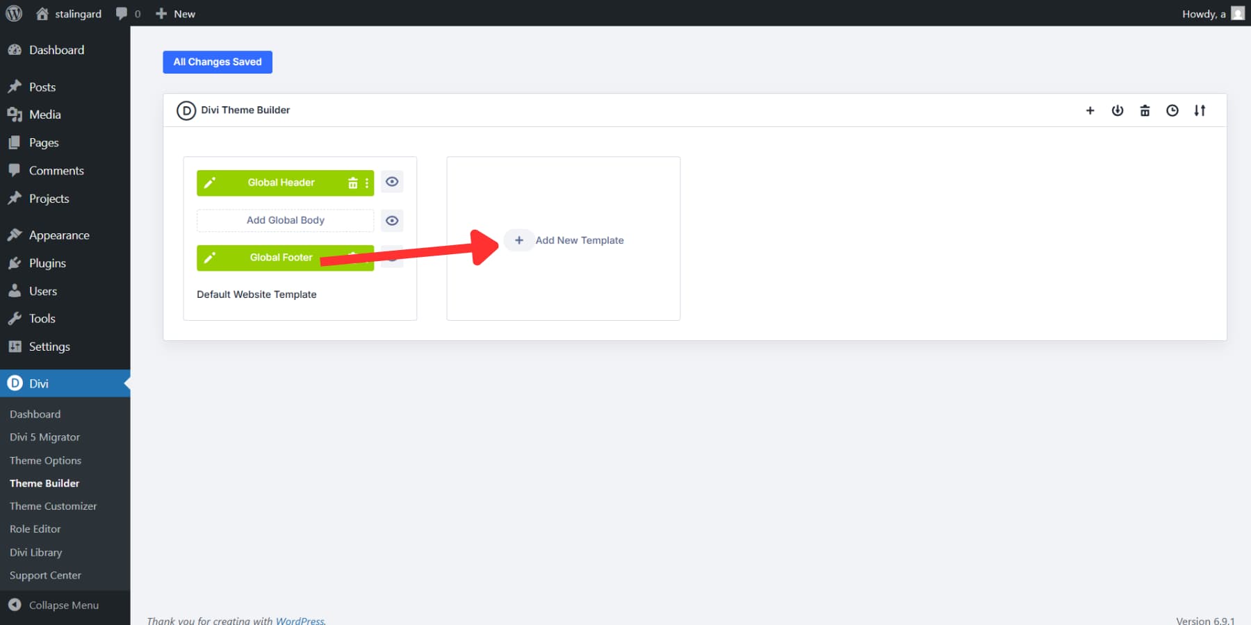
Using Theme Builder To Build Templates
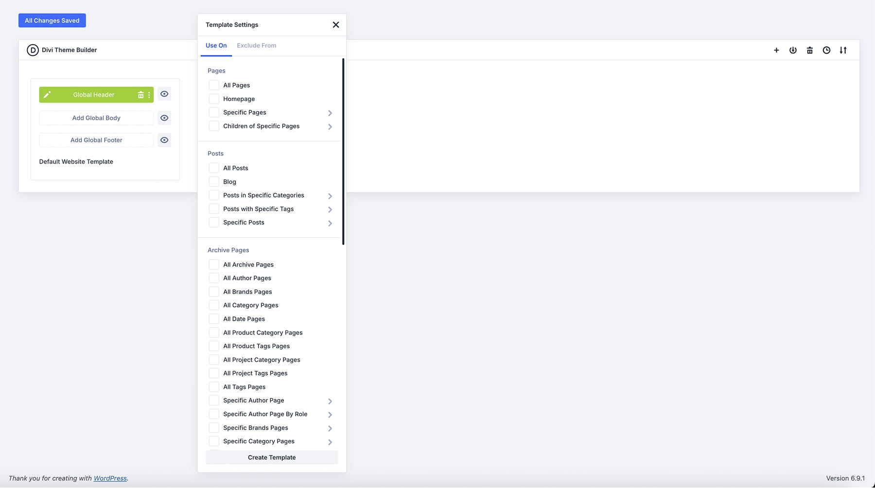
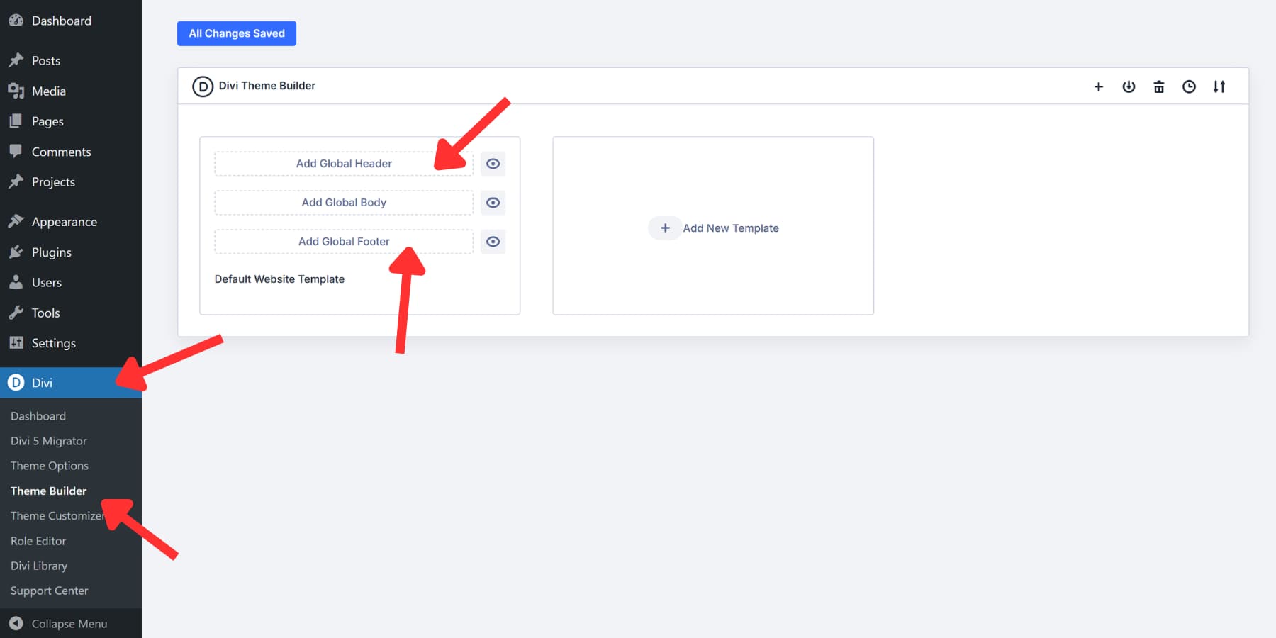
You can find Theme Builder in your WordPress dashboard at Divi > Theme Builder.
Headers and footers get their own buttons right at the top. For post types, click the Add New Template button. Building any of these works like any other page in Divi: the Visual Builder opens, you add modules, style them, and save.
With the basics covered, let’s build the most common parts of a typical WordPress website: a header, a footer, and a blog post template.
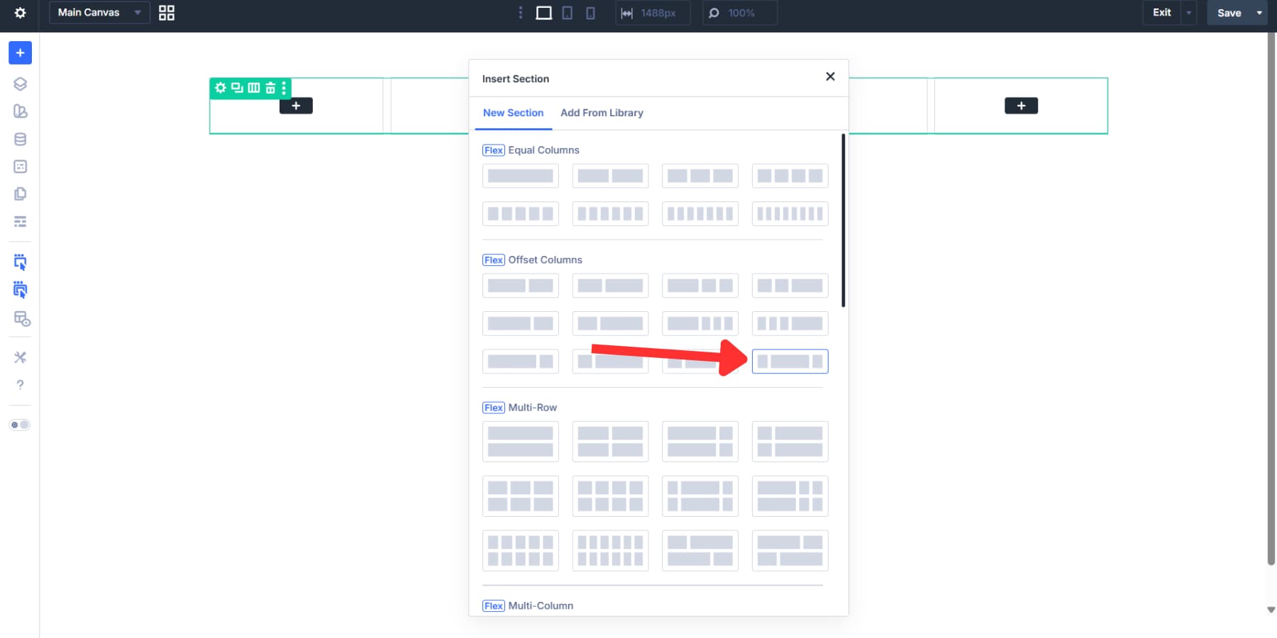
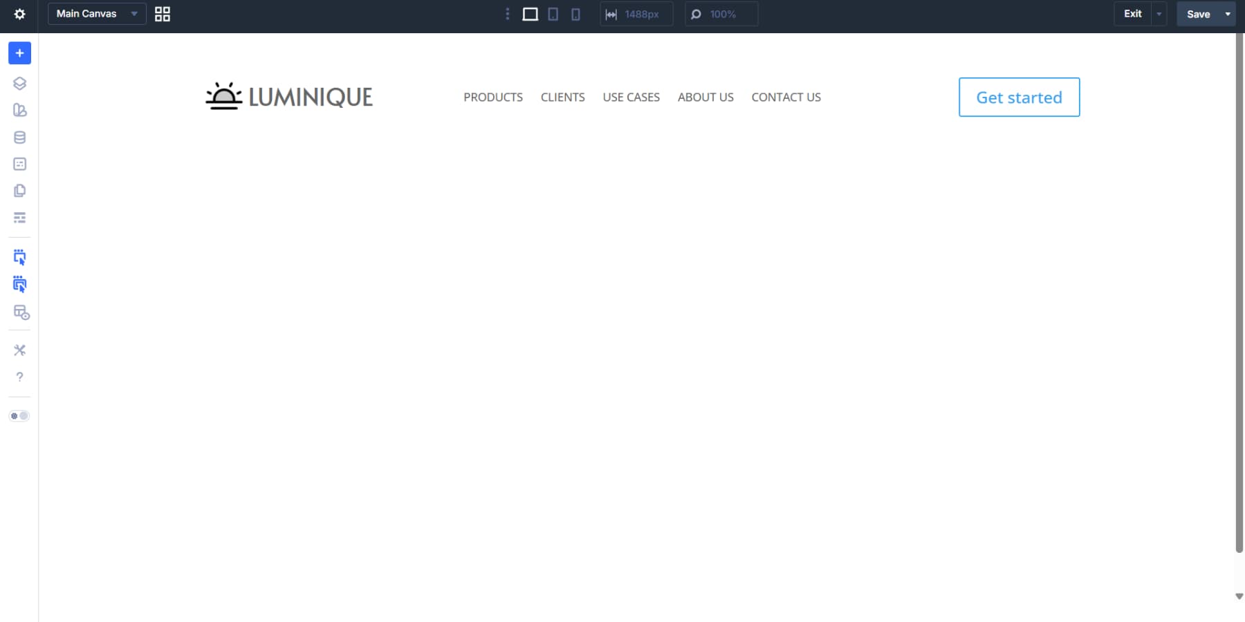
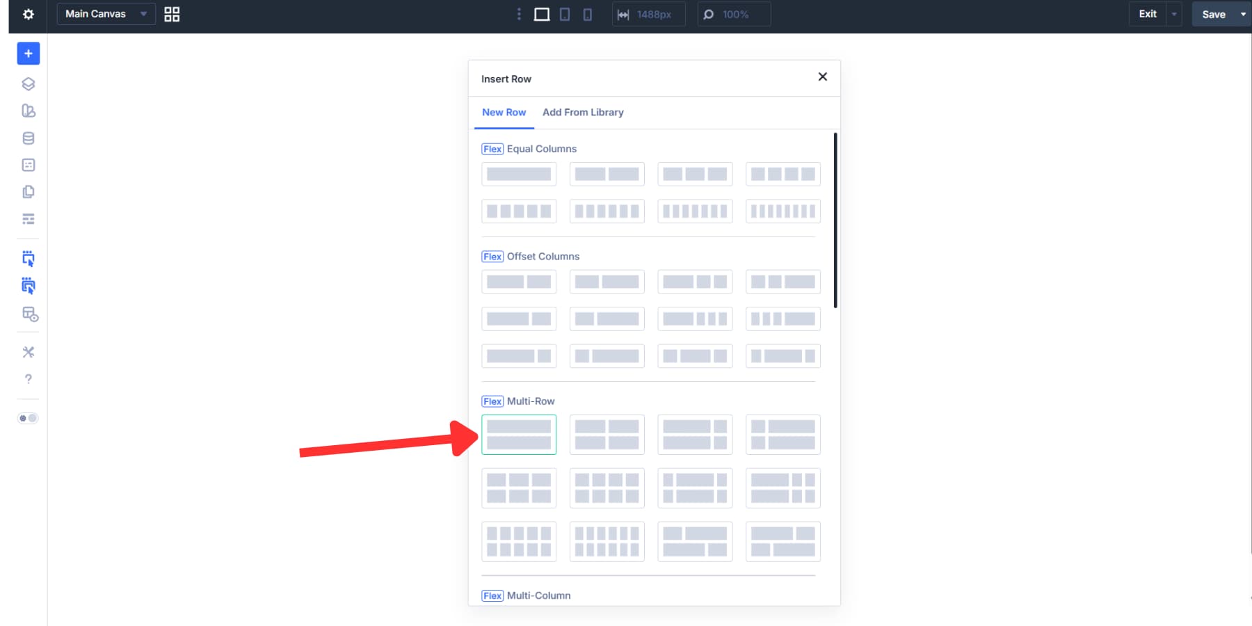
Building A Header
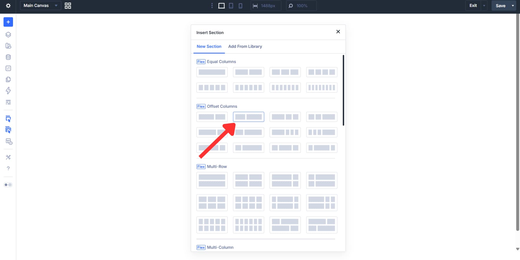
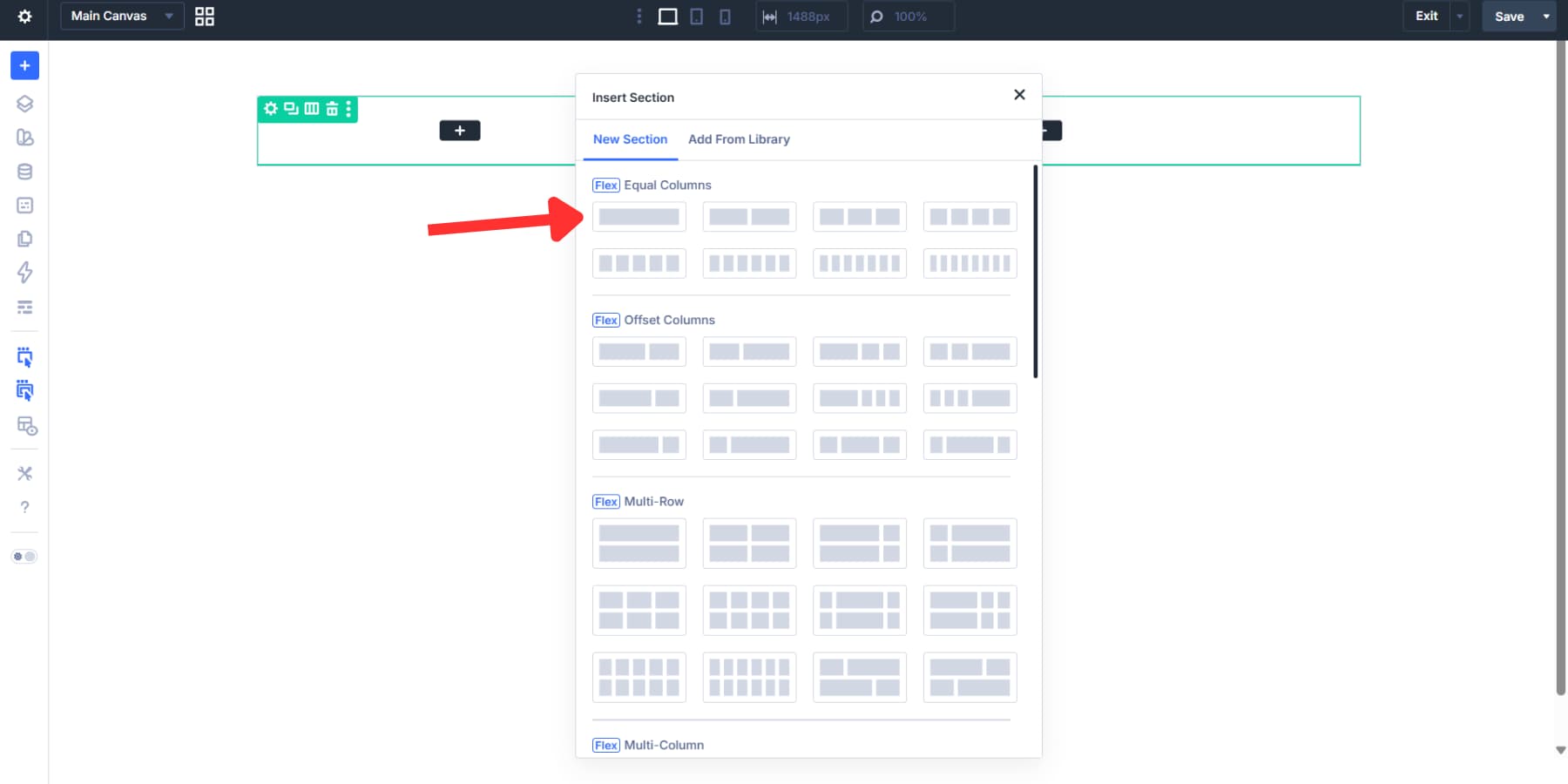
Click the Add Header button at the top of Theme Builder. The Visual Builder opens with a set of premade Flexbox templates. We’re selecting the three-column, wider middle column template under the Flex section. This creates three containers with the center one a bit wider than the others to handle the menu. You can use any layout that fits your needs.
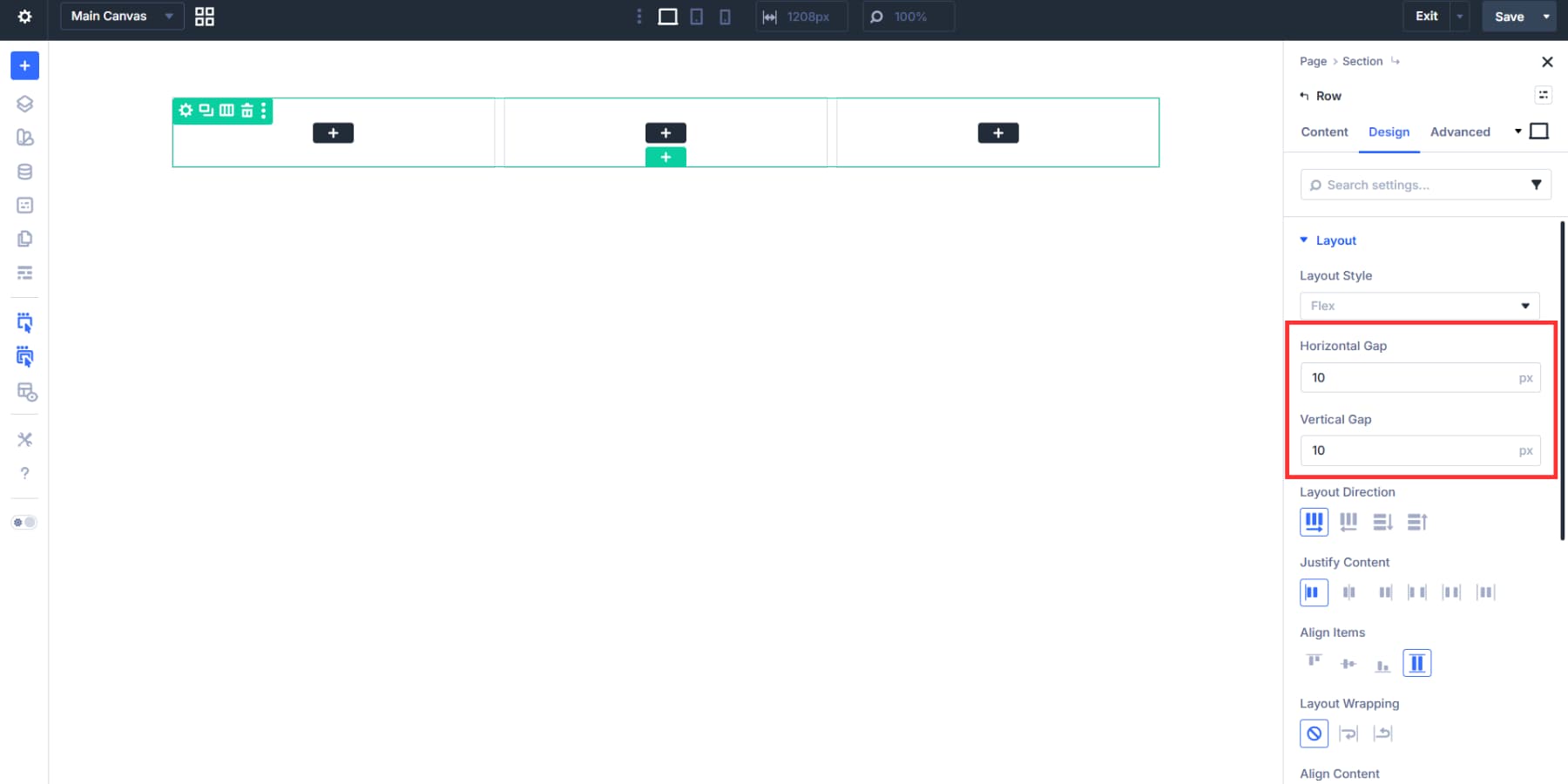
Configuring Flexbox
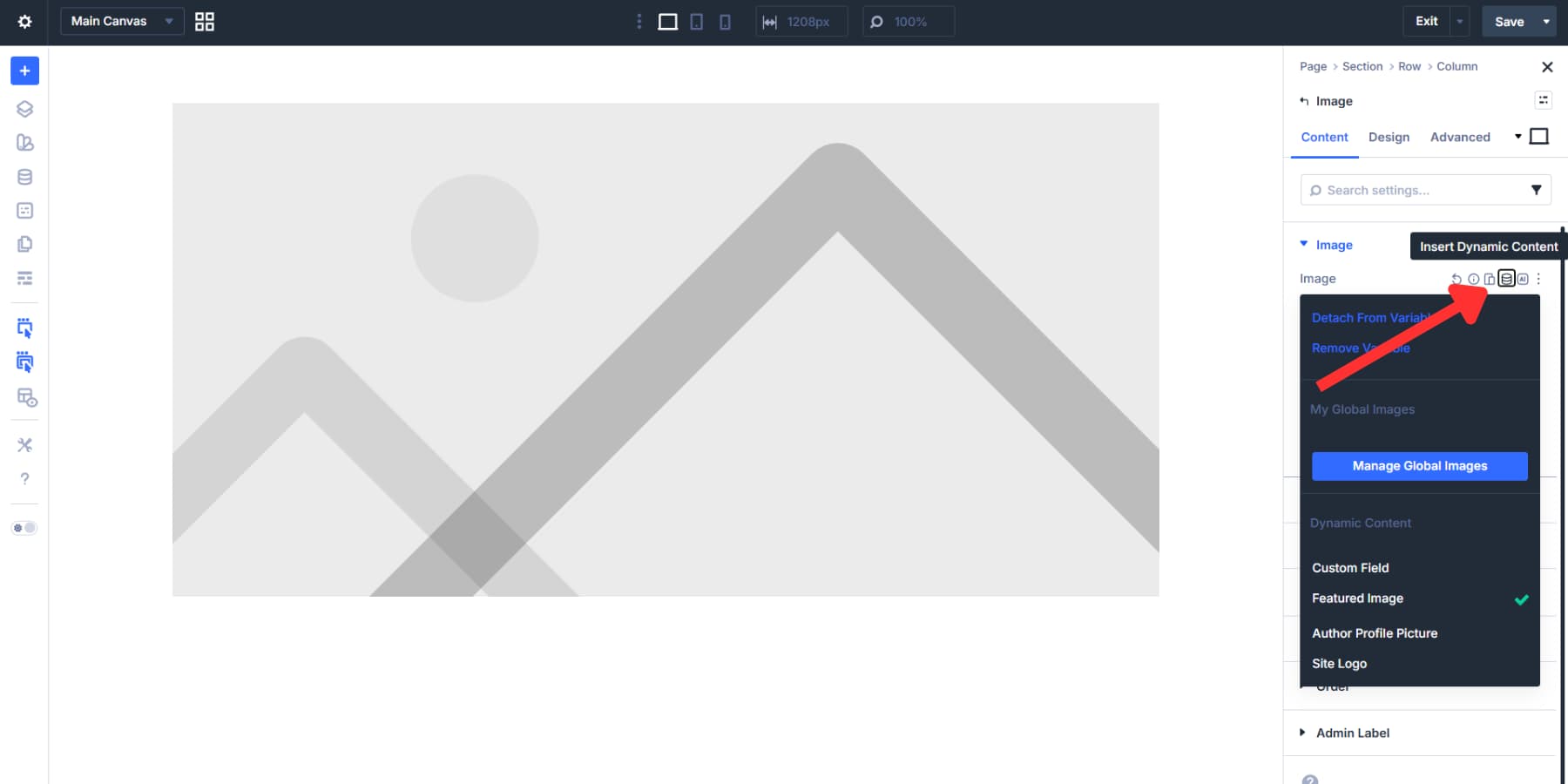
The template comes with Flexbox already configured, but you’ll want to adjust the gap to control spacing between your logo, menu, and button. Open the section settings, go to the Design tab, and find the Layout option group. The Gap field accepts static values like 10px or advanced units like rem, em, viewport widths, and clamp().
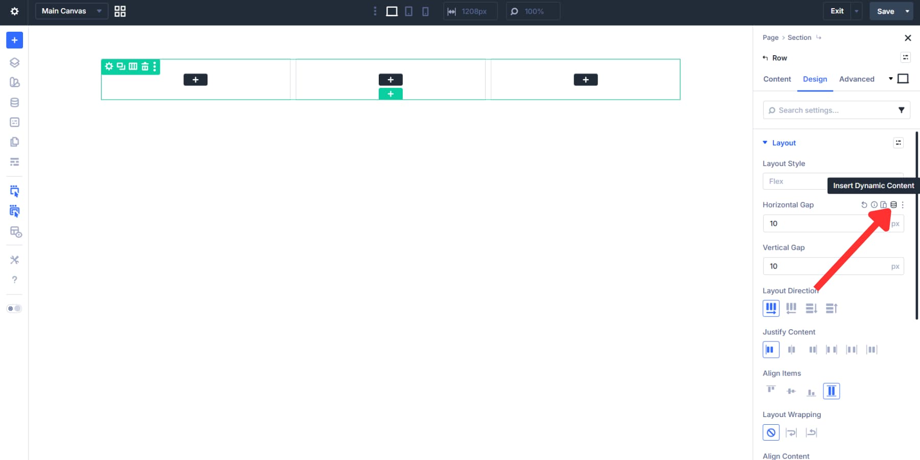
Rather than typing values by hand, pull them from your Design Variables. Click the dynamic content icon next to the Gap field and select your spacing variable.
This keeps your header spacing tied to your design system. For a full breakdown of every Flexbox option, check out our walkthrough. And for a gap-based responsive spacing system, we have a guide for that, too.
Adding An HTML Wrapper To The Header
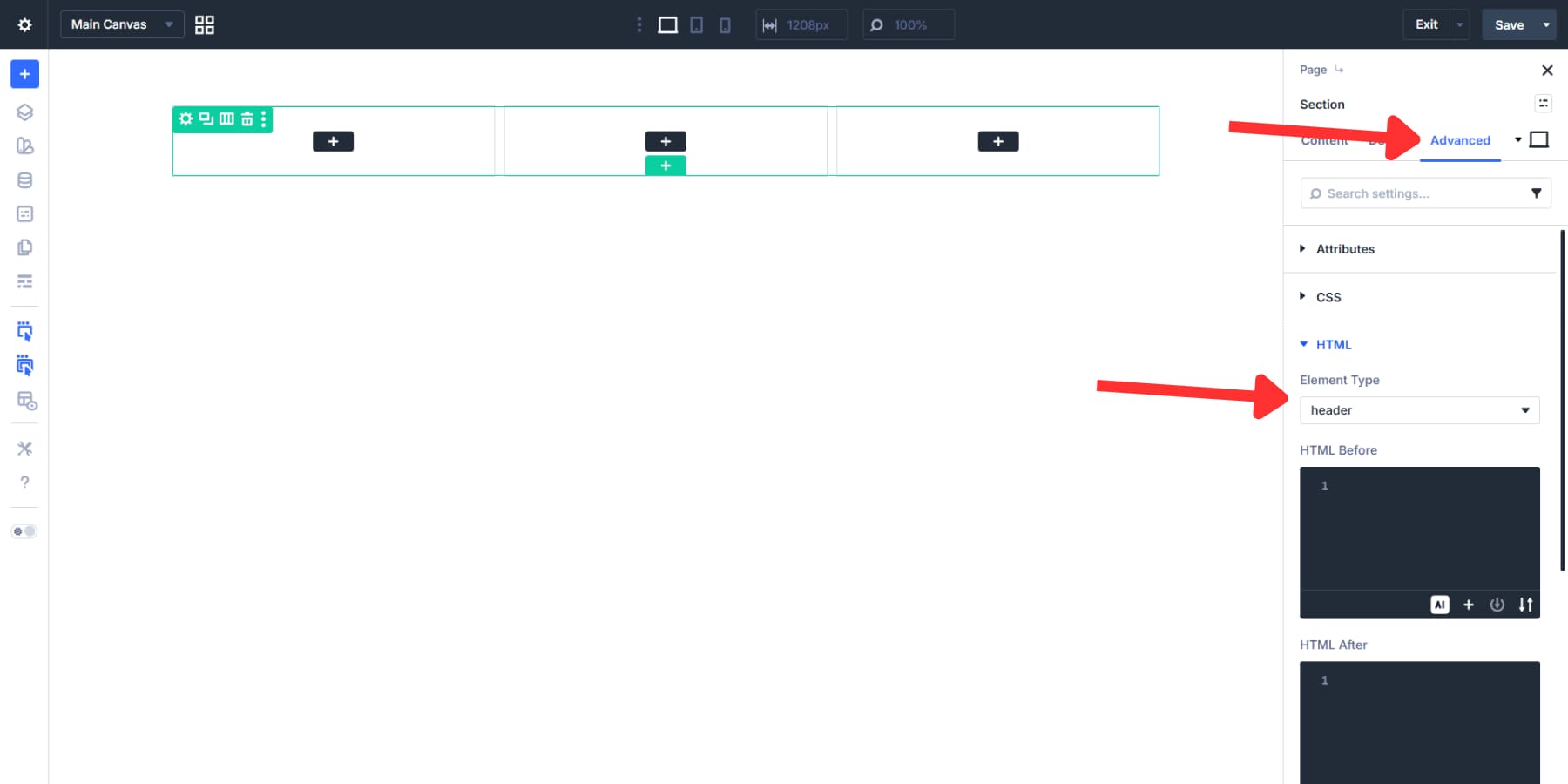
Your header section needs semantic structure. Screen readers and search engines should recognize this area as your site’s main header, not a generic container. This also helps assistive technologies give users a way to jump directly to navigation.
By default, Divi assigns a header element to the header section, so in most cases you won’t need to change anything. If you want to confirm it, open the section settings, go to the Advanced tab, and find the HTML option group, then verify that the Element Type is set to header.
Adding Elements And Styling The Header
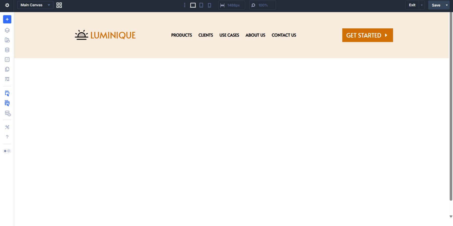
Let’s start by adding modules to the flexbox containers. We’re adding a Logo Module to the first column, a Menu Module to the second, and a Button Module to the third.
As mentioned above, Theme Builder components work exactly like the rest of your Divi pages, so proceed to style your header the usual way: background and element colors, fonts, hover effects, spacing, and more.
Styling can pull from Design Variables and presets. The Variable Manager lets you create color variables for brand colors, font variables for typography, and number variables for spacing. Applying these to the row and modules, rather than using fixed values, connects everything to a centralized system. You can even use presets to style elements to match the rest of your site.
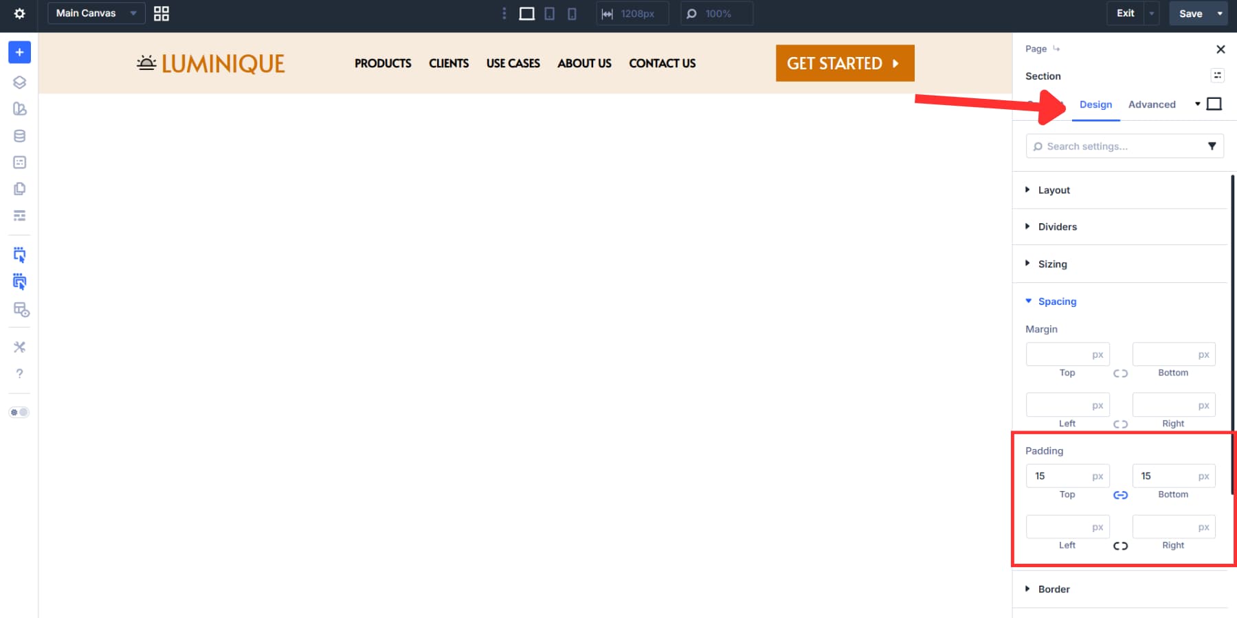
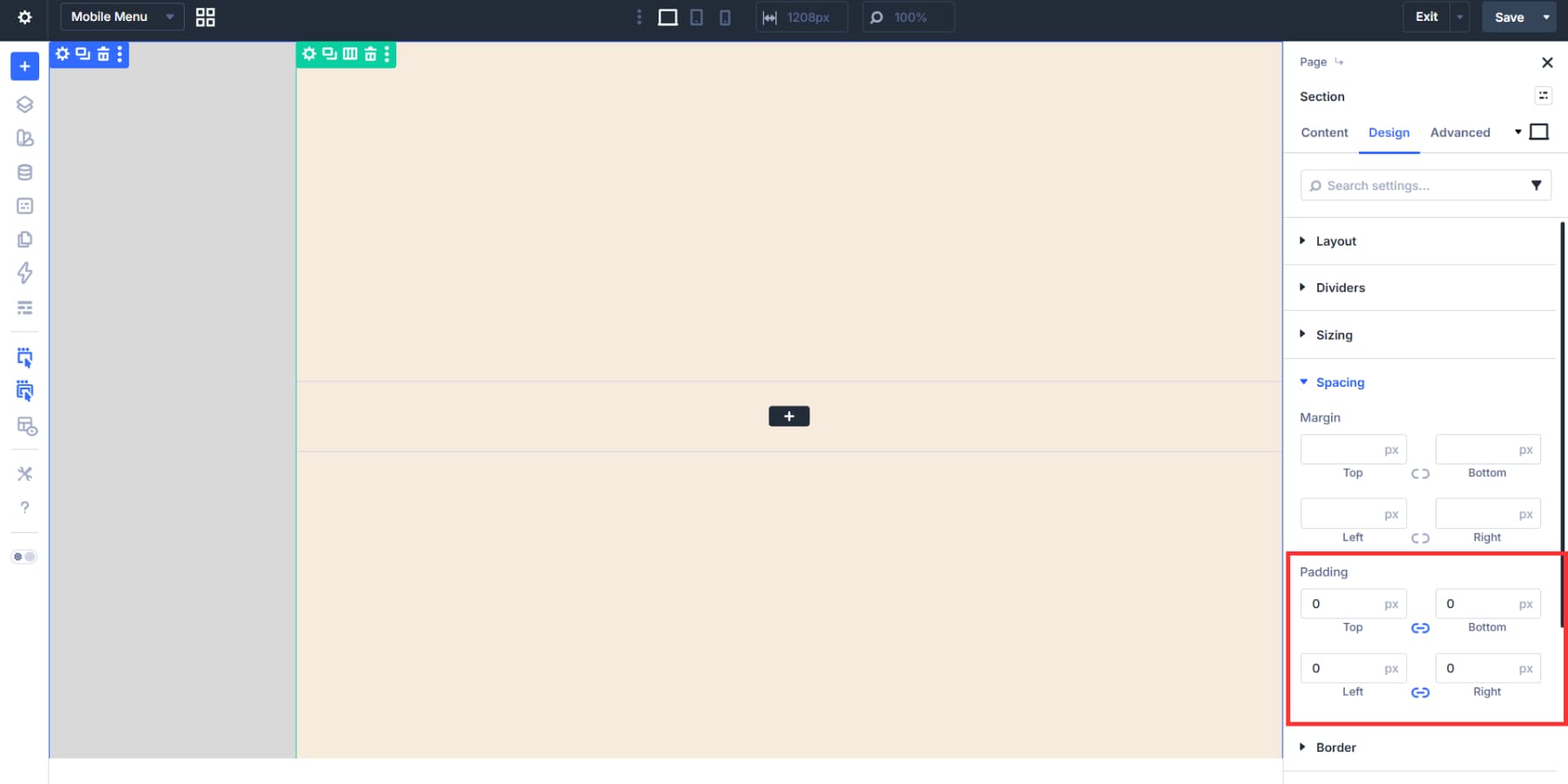
The section inherits Divi’s default padding, which gives the header a stately, open feel. Leave it as is if you like that look, or go to the section settings, Design > Spacing, and enter a custom padding value. We chose 15px for a condensed header.
Or to change this, go to the section settings Design > Spacing, and enter a custom spacing value under padding. We chose 15px for a condensed header.
If the width feels narrow, adjust it through the section’s Sizing options under Design. We went with the default.
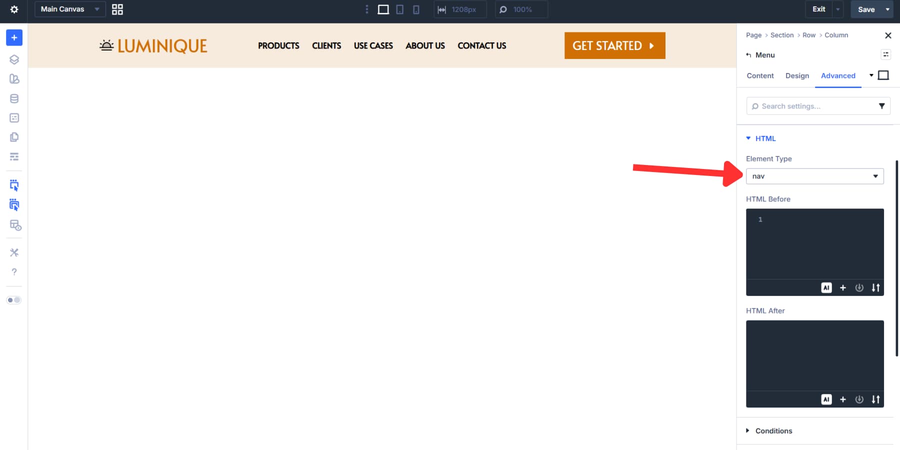
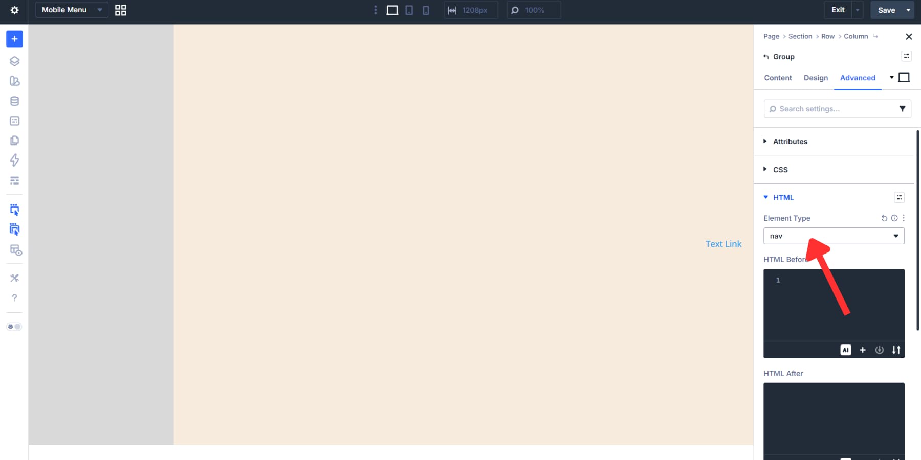
The menu needs the same semantic treatment. When you mark it as navigation, screen readers announce it as site navigation, and users can jump to or past it using keyboard shortcuts.
Open the Menu Module settings, go to the Advanced tab, and change Element Type to nav from the HTML options. That wraps the menu in a nav tag and clearly defines its purpose.
These settings barely scrape the surface of Divi 5’s potential. You can also build mega menus if needed. Here’s a quick guide to do so.
Making The Header Responsive
The Menu Module collapses into a hamburger menu by default on mobile. That works fine for most sites. But Canvases and Interactions let you build something more tailored if you want control over the animation, layout, and overall feel.
Creating A Mobile Menu Canvas
Click the Canvas dropdown at the top of the Visual Builder, next to your page title. Select Add Canvas, name it something like Mobile Menu, and toggle the global switch to enable this Canvas across your entire site.
Add a section and set its alignment to right using the flexbox settings.
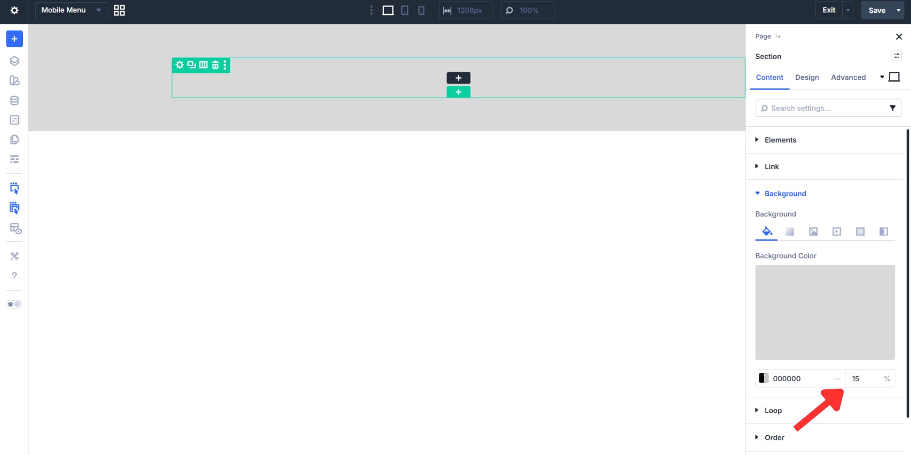
Do the same for the column, then apply a semi-transparent dark background to create an overlay that dims the page behind it.
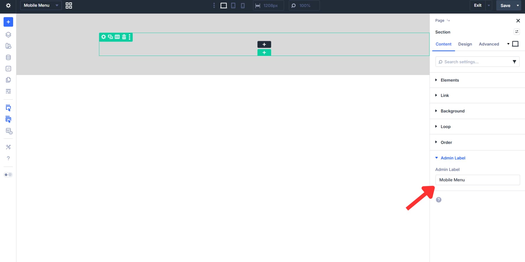
Label the section so it’s easy to find later.
Styling The Menu Row
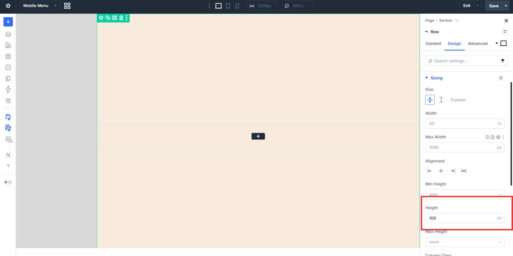
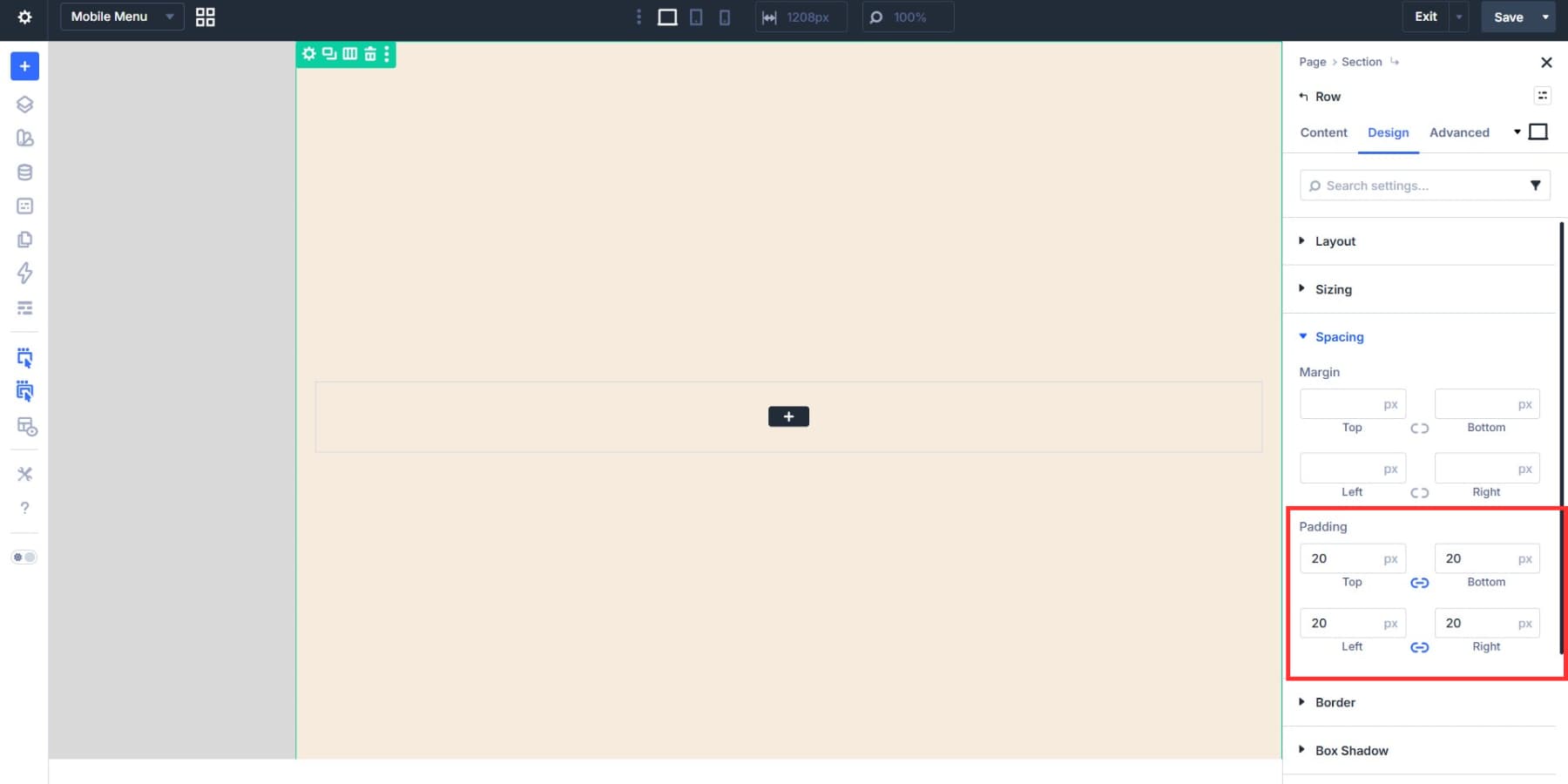
Add a background color to the row and set the height to 100vh on both the section and the row from the sizing tab, so the menu stays aligned when opened.
You may notice that spacing is off. First, set the section padding to 0.
Then add a subtle padding to the row itself. We’re going with 20px.
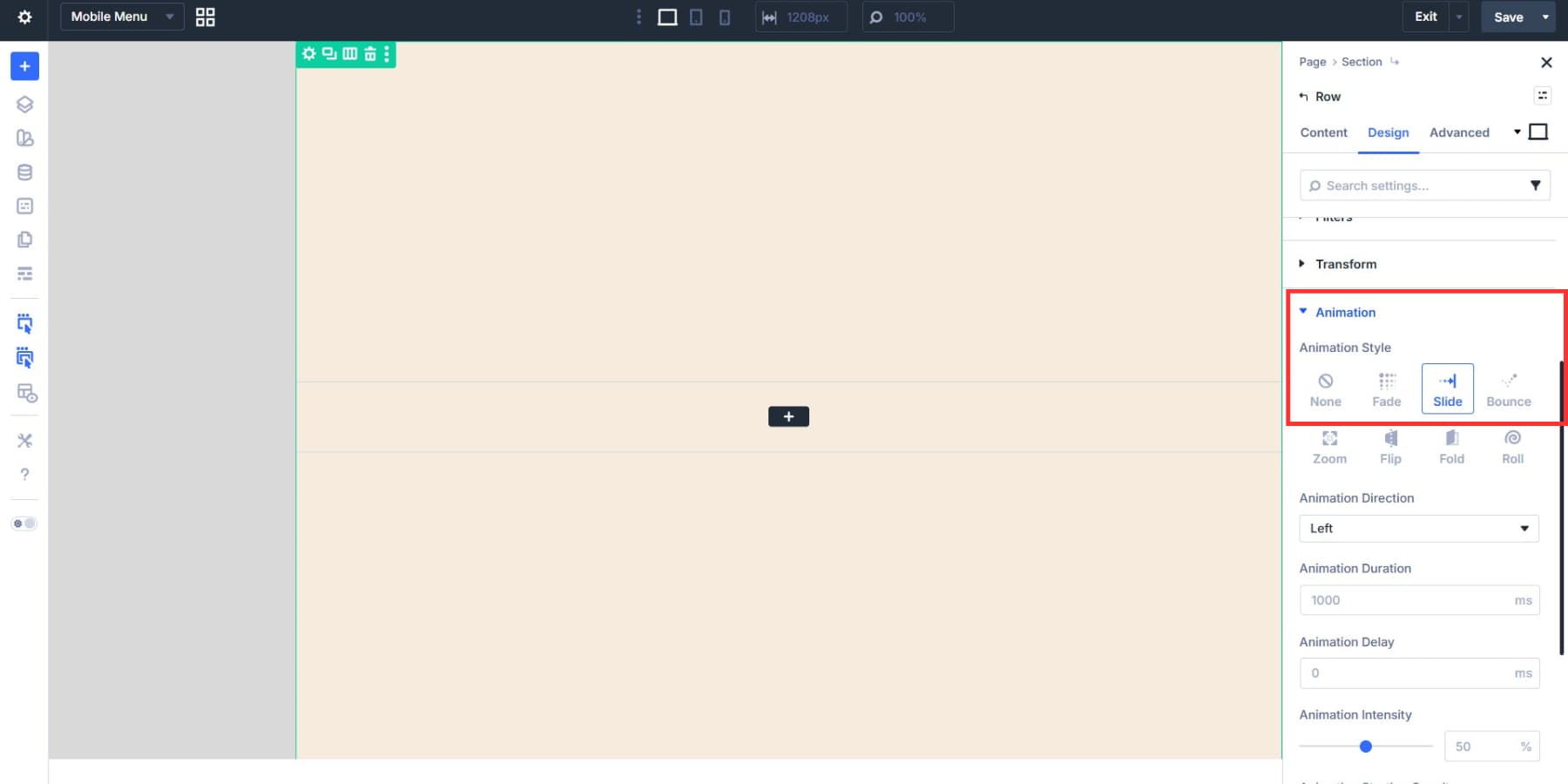
Optionally, set an entrance animation for a more immersive experience. For our example, we made the row slide in from the left from Design > Animation.
Creating A Vertical Menu
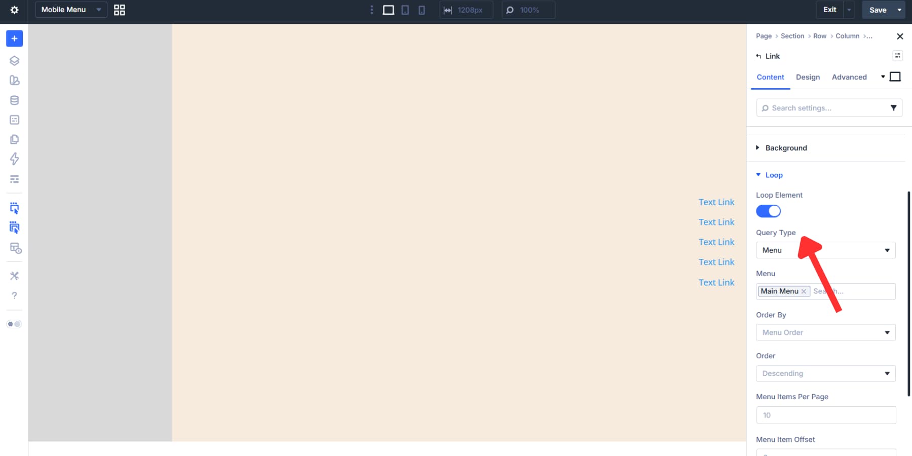
By default, the Menu in Divi is horizontally arranged. However, this basically defeats the purpose on a screen with limited horizontal space, like mobile phones. So, we are going to use Divi 5’s Loop Builder to build a vertical menu for mobile devices.
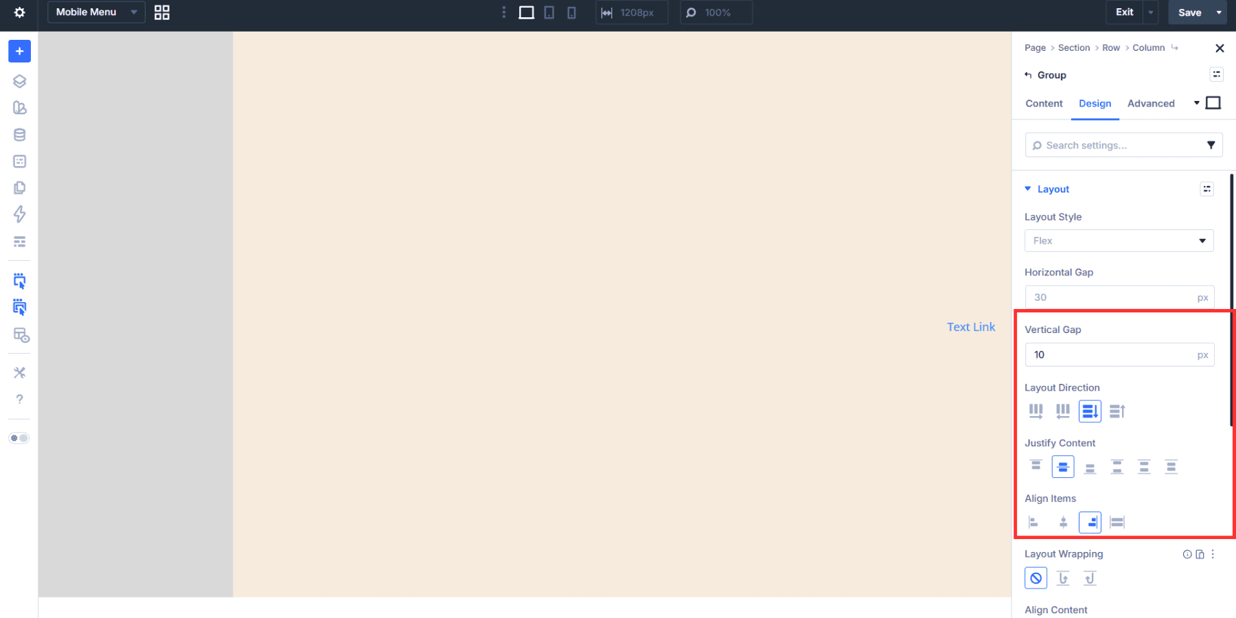
Add a Group to your menu column, then add a Link Module to the Module Group.
Go to Group Settings > Design > Layout, change the Layout Direction to Column, and adjust the vertical gap. We are going with 10px. These will set every menu item 10px apart for a compact look.
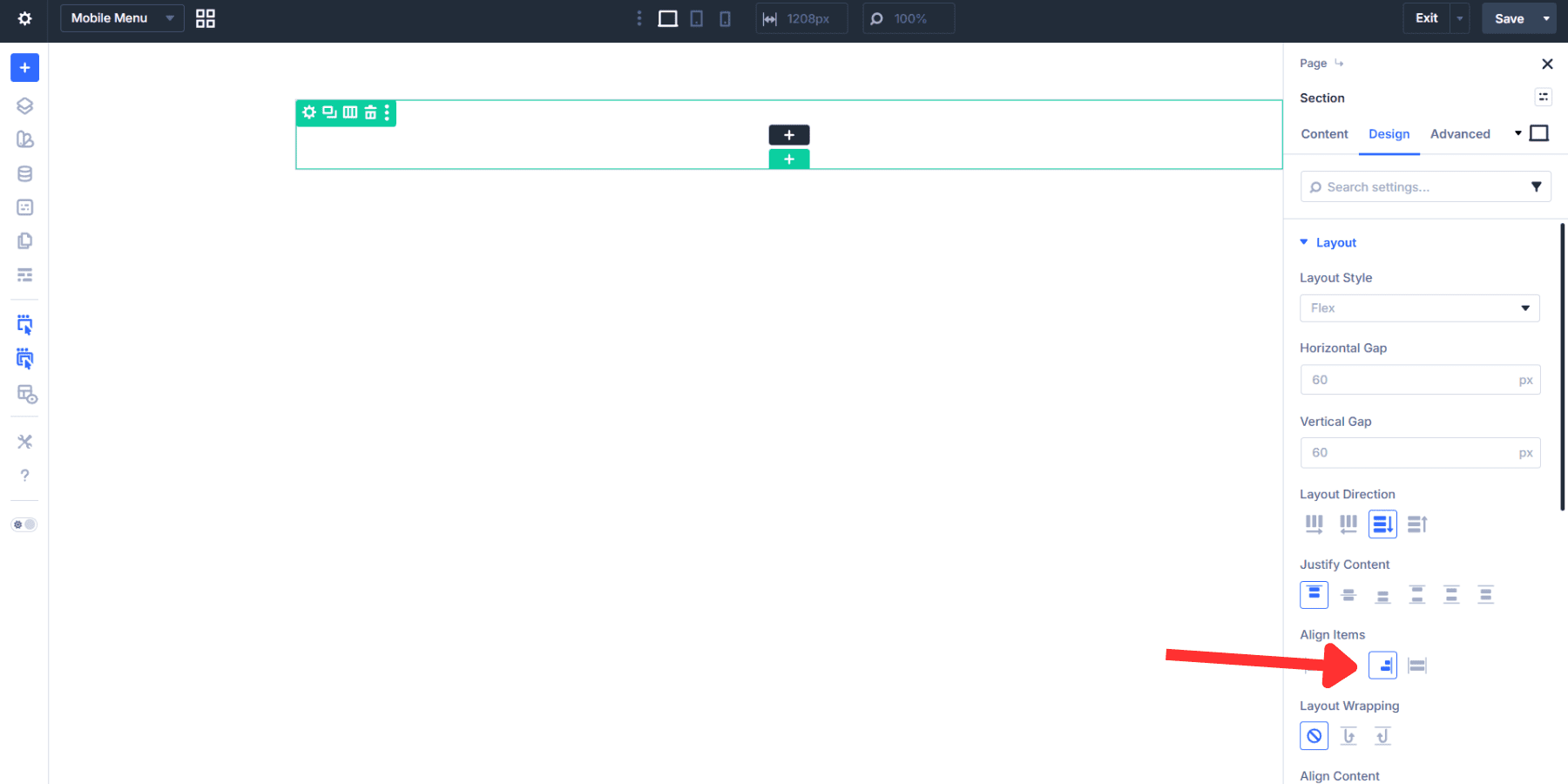
Likewise, set the Justify Content to Center and Align Items to End.
Next, set the HTML wrapper for this Module Group to nav.
Now, move on to the Link Module. Toggle the loop button, then choose Menu from the Query Type dropdown and select your menu.
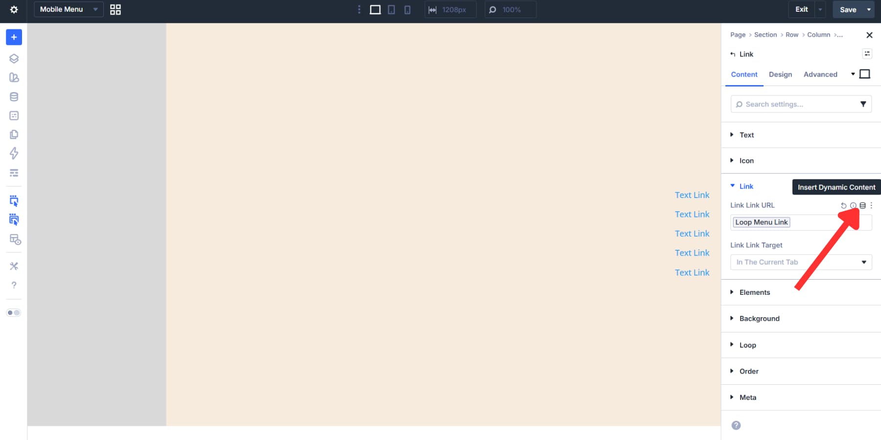
Then, go to the Link tab, click the Add Dynamic Content icon, and select Loop Menu Link.
Similarly, in the text field, select Loop Menu Text.
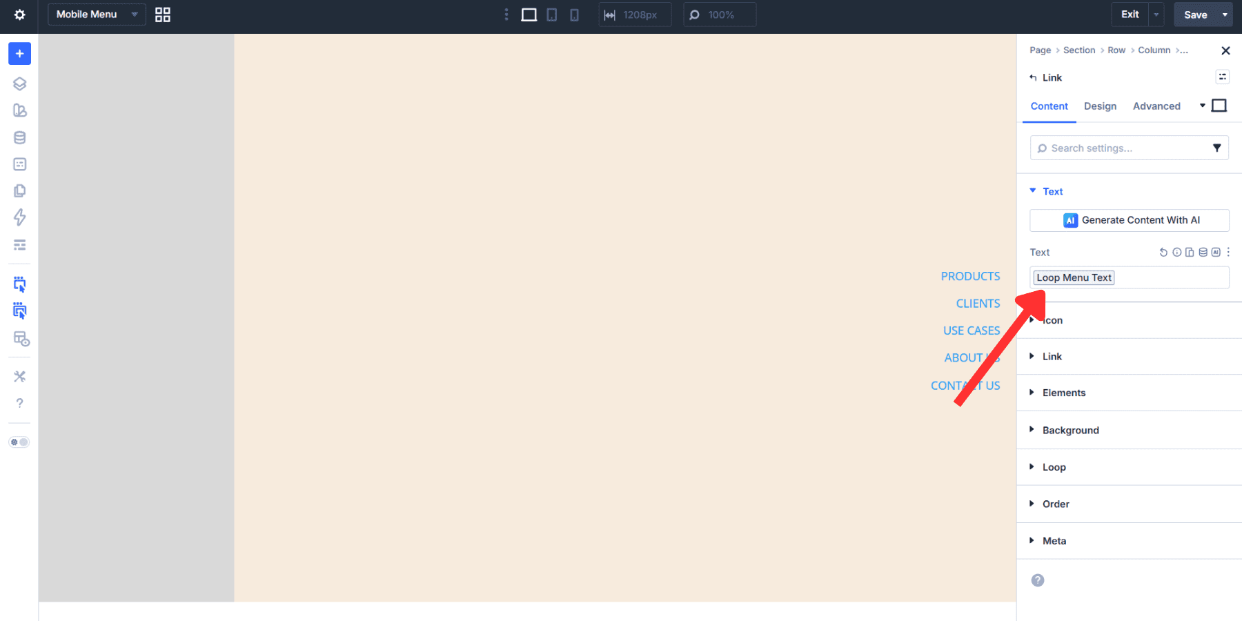
Finally, style the menu as you did with the desktop menu module.
Adding A Close Button For The Menu
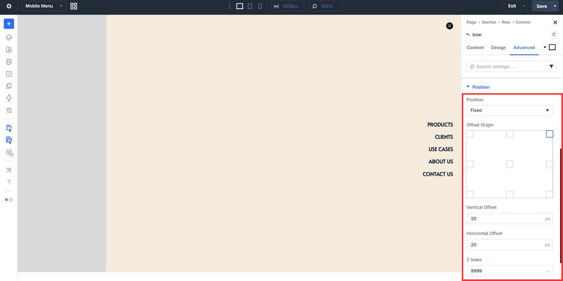
Add an Icon Module at the top with a close icon, style it, set its Element Type to button, and add an aria-label attribute with a value like “Close Menu” through the Advanced tab’s Attributes section.
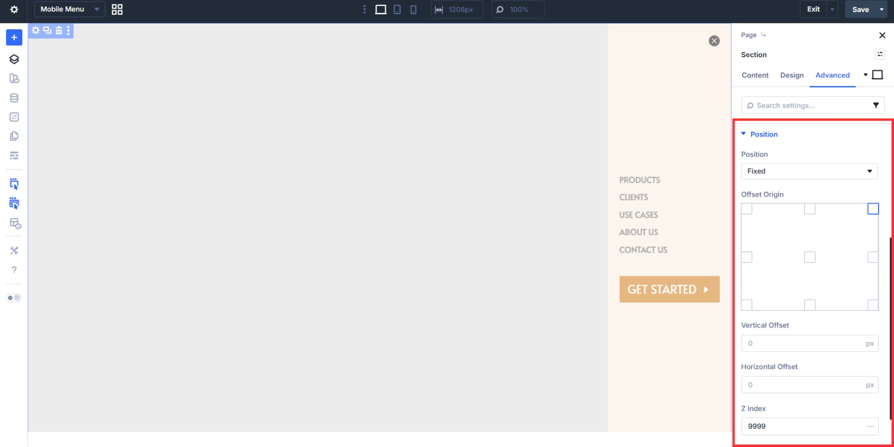
Now, in the Position settings, set the Position to Fixed, Offset Origin to top right, and set both offsets to 20px and the Z Index to 999. This ensures the icon always remains on top, with a 20px breathing space from the top-right corner, regardless of the container’s settings. The overlap with the menu will be fixed in the later steps.
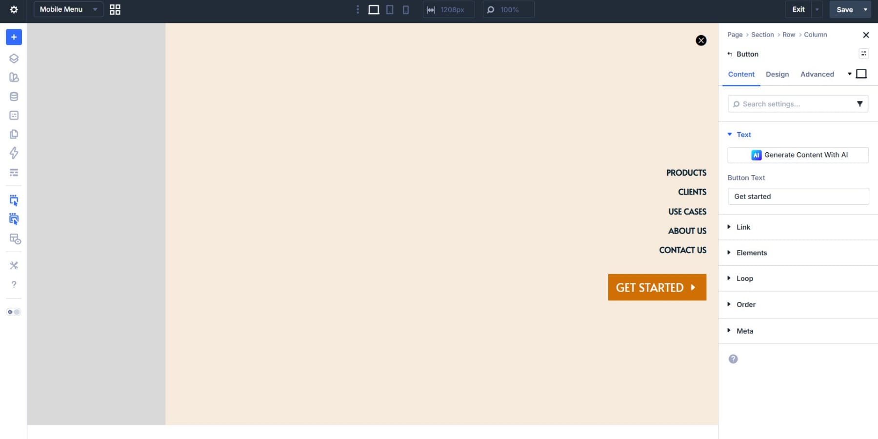
We also added a CTA button to the mix.
Preparing The Menu For The Trigger
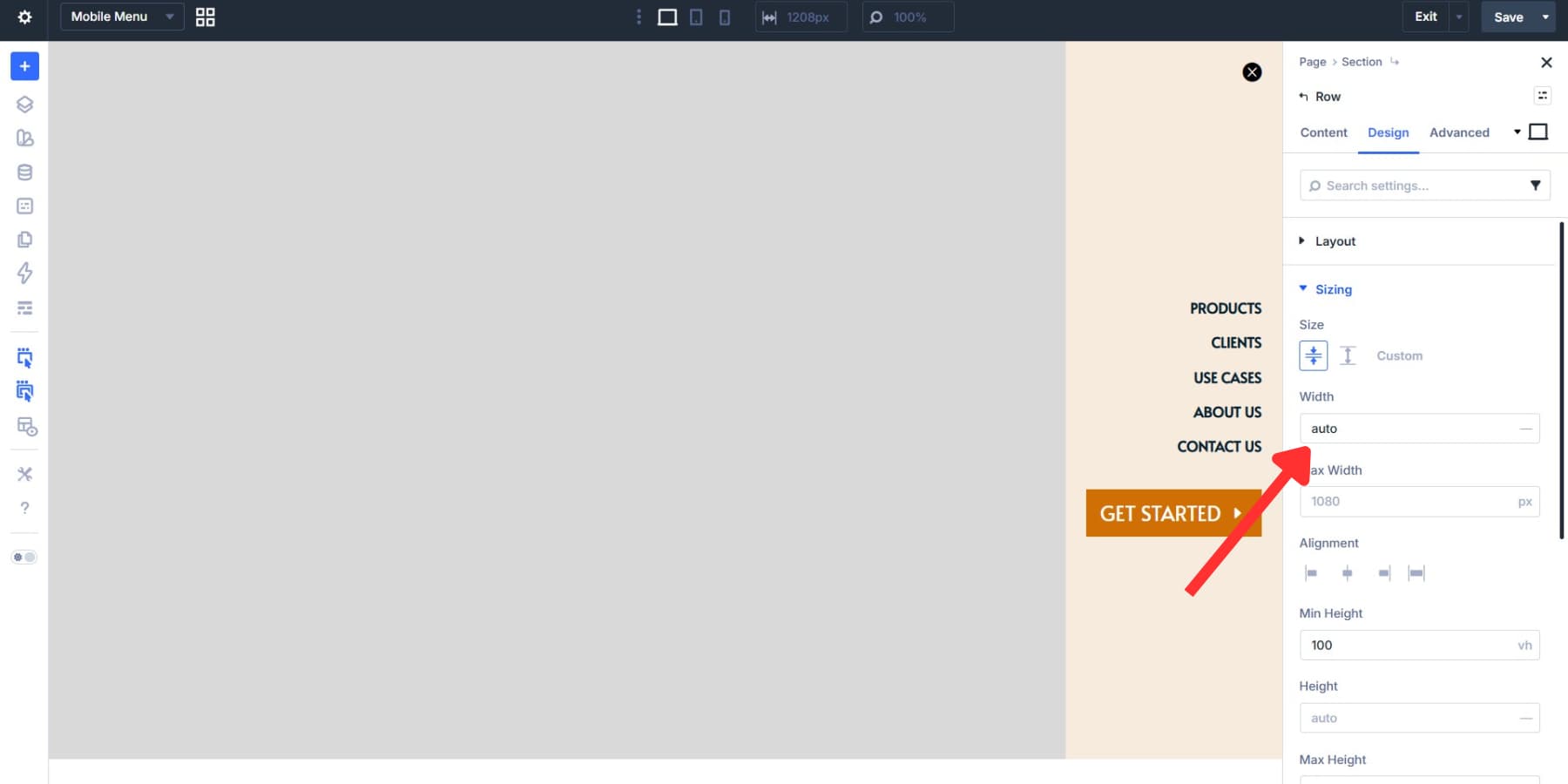
The row for the menu elements is too wide because it inherits Divi’s default settings. To fix this, go to the row’s sizing tab and set the width to auto. This gives the row a width equal to its content plus the padding.
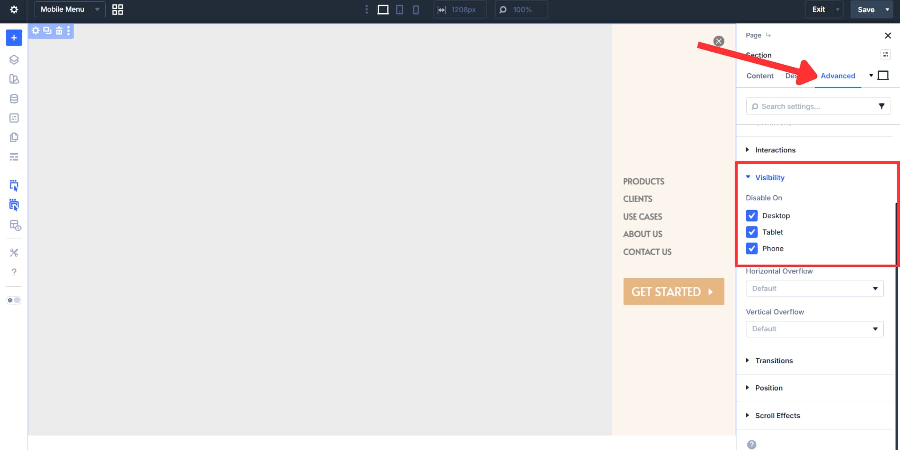
Lastly, go to section settings > Advanced > Visibility and hide this section for all devices. The menu should only appear when triggered.
Then go to the Position tab, change the position to fixed, the origin to top right, and set the Z Index to 999. This pins the section to the viewport and layers it above all other content.
Together, these two settings turn the menu canvas into a persistent menu that’s always on top of the rest of the page, giving it a true mobile menu feel.
Building The Menu Trigger
Switch to the main canvas. Hide the middle column’s Menu Module and the third column’s button on smaller screens using Visibility settings.
In the last column, add an Icon Module with a hamburger icon. Style it, set the Element Type to “button” and the aria-label attribute to “Open Menu.” Show this icon only on mobile and tablet, hiding it on desktop where the full menu already appears.
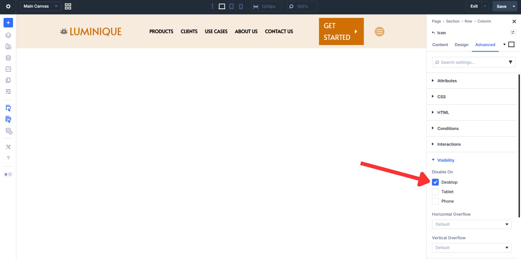
Setting Interactions To Trigger The Menu
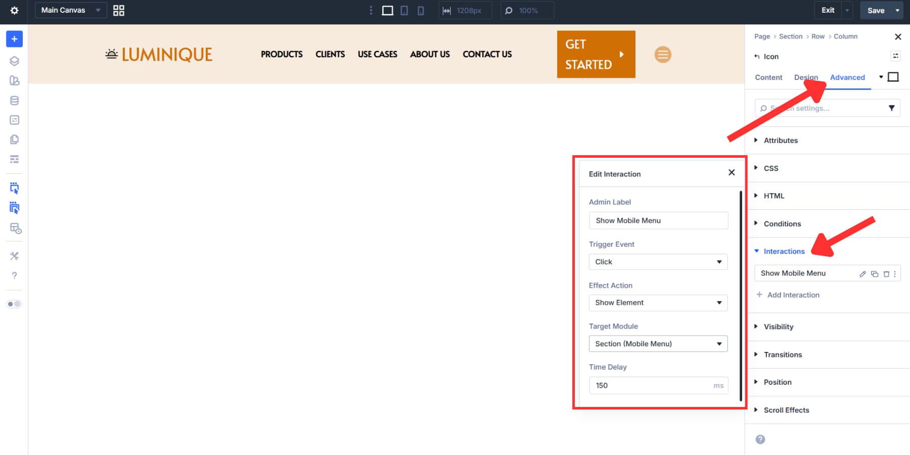
Now, we’ll use Interactions to set this icon as the trigger for our canvas mobile menu.
Go to the hamburger icon’s settings > Advanced > Interactions and add a new interaction with the following settings:
- Admin Label: Show Mobile Menu
- Trigger Event: Click
- Effect Action: Show Element
- Target Module: (The section we labeled in the Canvas)
- Time Delay: 150ms
This interaction will now trigger the menu opening on smaller devices.
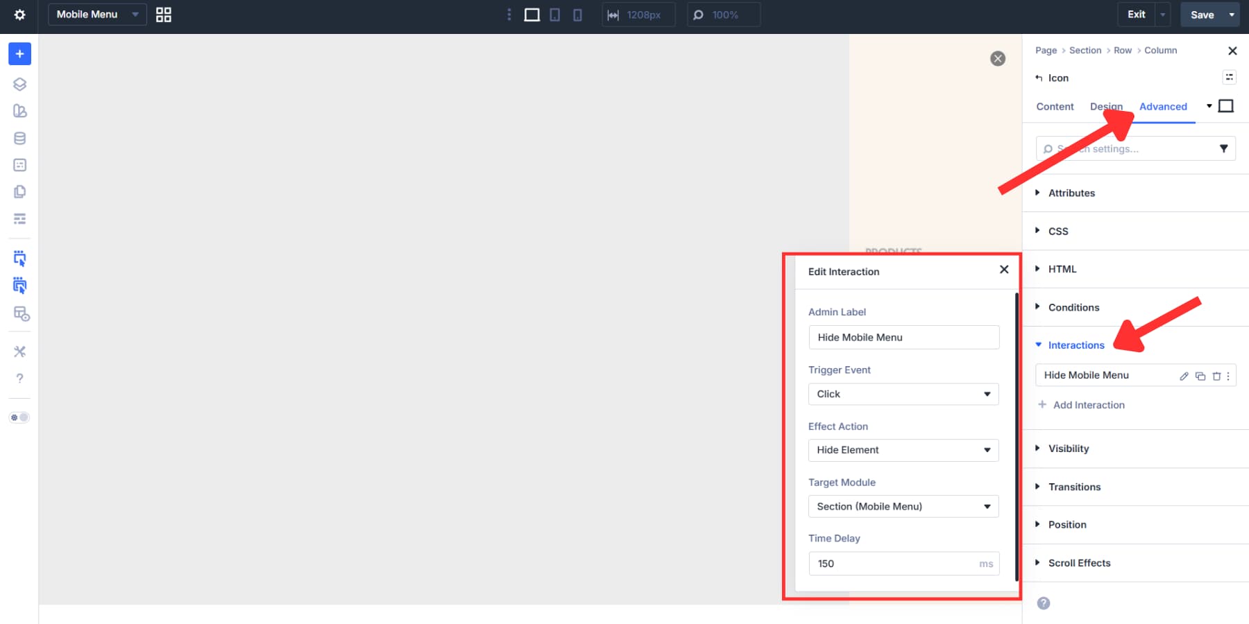
The close icon inside your Canvas gets its own interaction:
- Admin Label: Hide Mobile Menu
- Trigger Event: Click
- Effect Action: Hide Element
- Target Module: (The section we labeled in the Canvas)
- Time Delay: 150ms
With this simple setup, we now have a mobile-ready header that improves accessibility and SEO.
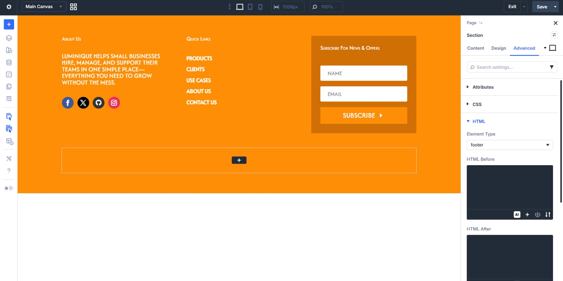
The setup mirrors the header, but the structure holds different content. We’re using a two-row flex template: the top row for main content, the bottom row for legal text and links.
Setting Up The Top Row
We will start by nesting a three-column flexbox inside the first row. This creates space for multiple content areas that sit side by side on larger screens and stack naturally on mobile.
The first column can hold a Text Module with company info, and a Social Media Follow Module can be placed below it.
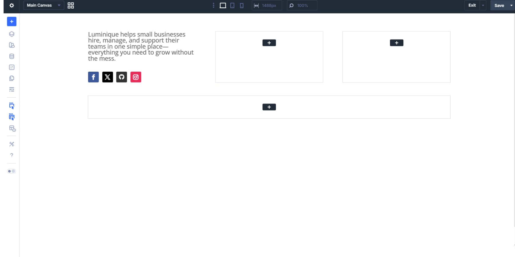
The second column works well for the vertical menu we made earlier in the header. The third column provides space for an Optin Module where visitors can subscribe.
Arrange them however your site needs, then style them accordingly: fonts, spacing, colors, borders, and backgrounds.
Adding Proper Markup For Footer & Its Bits
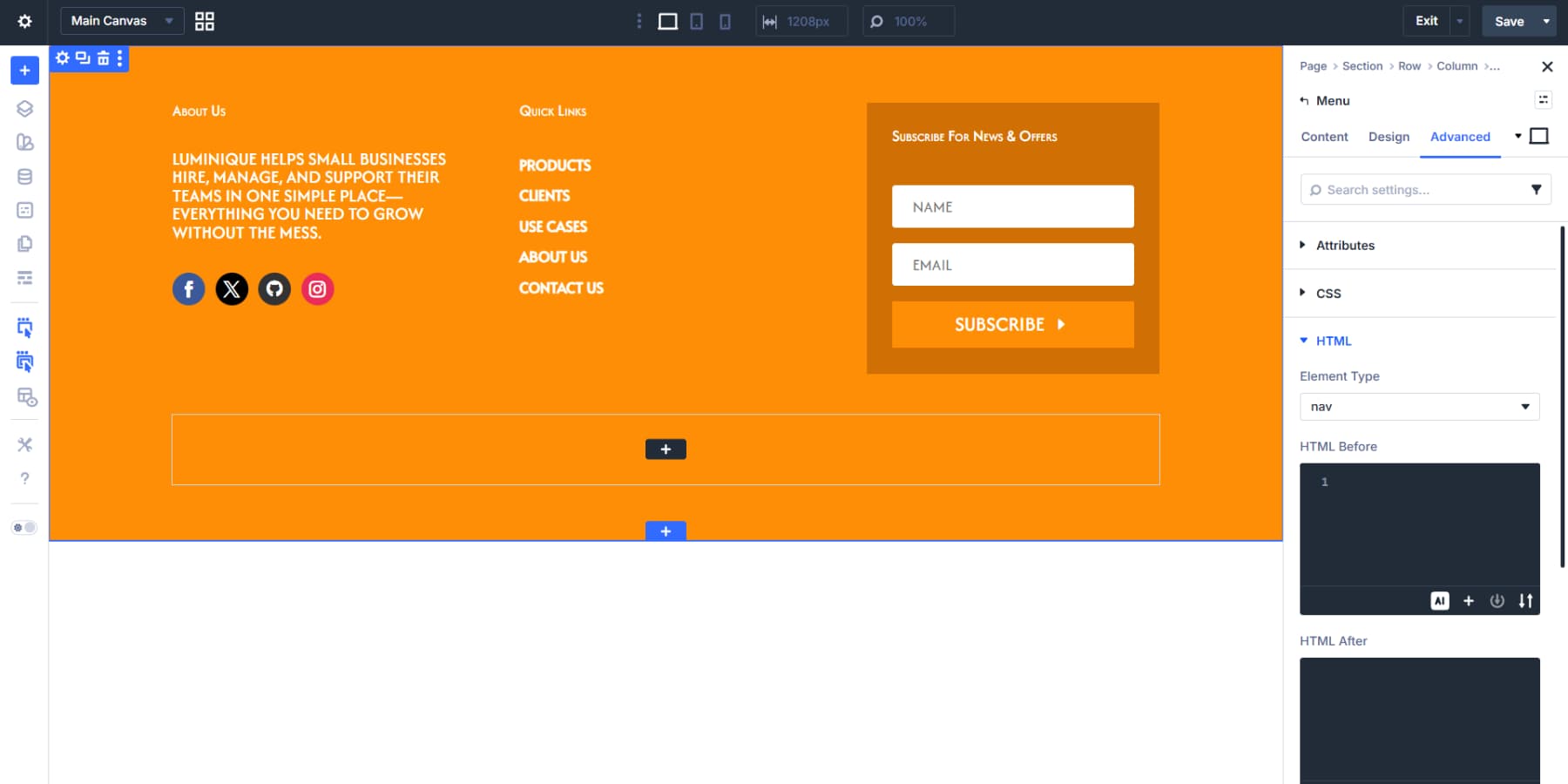
The footer needs the same proper markup we added to the header for accessibility and SEO. Open the section settings, go to Advanced > HTML, and change Element Type to footer. That wraps everything in a proper footer tag.
The Menu Module in your second column also needs its element type set to nav.
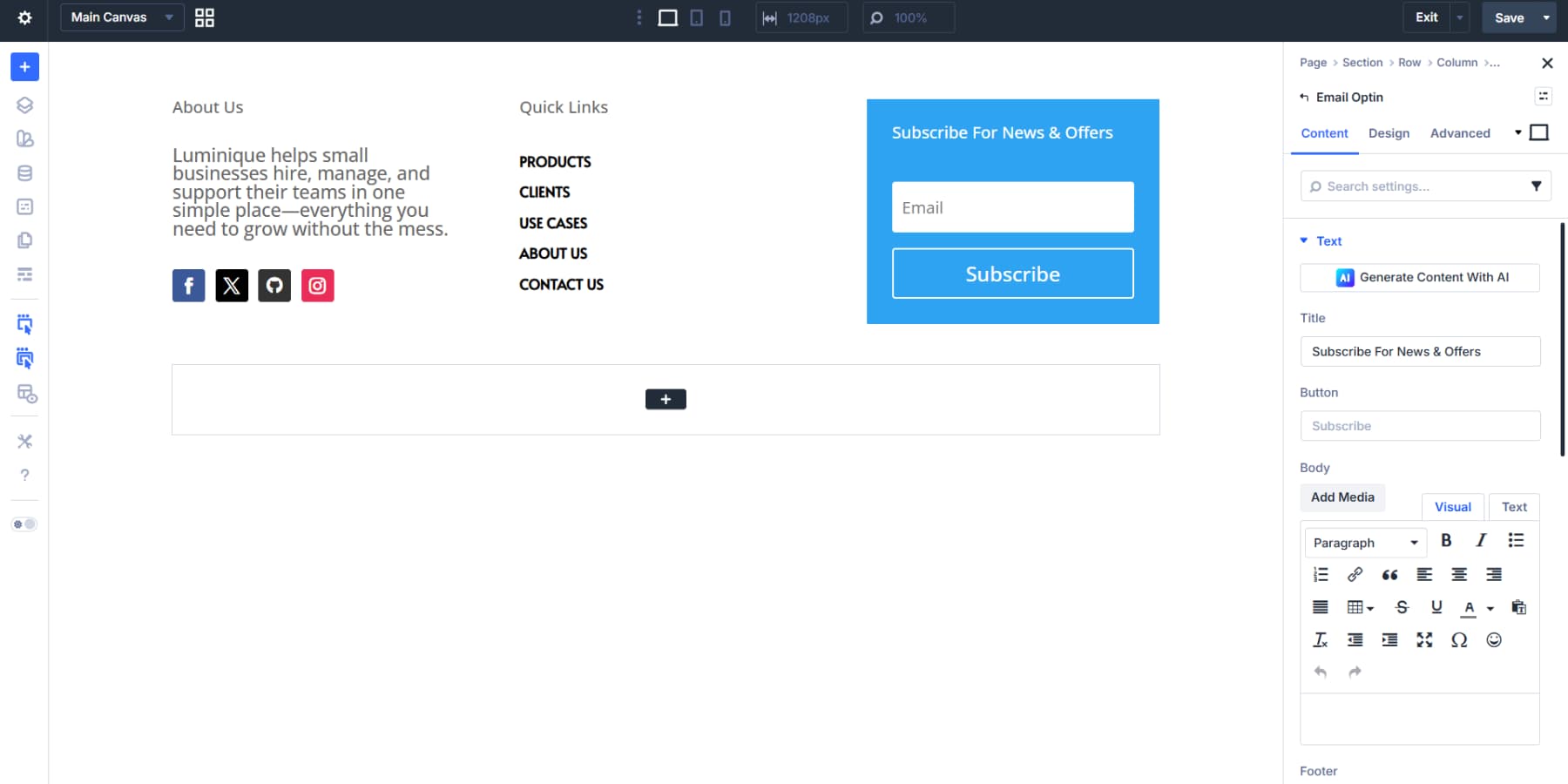
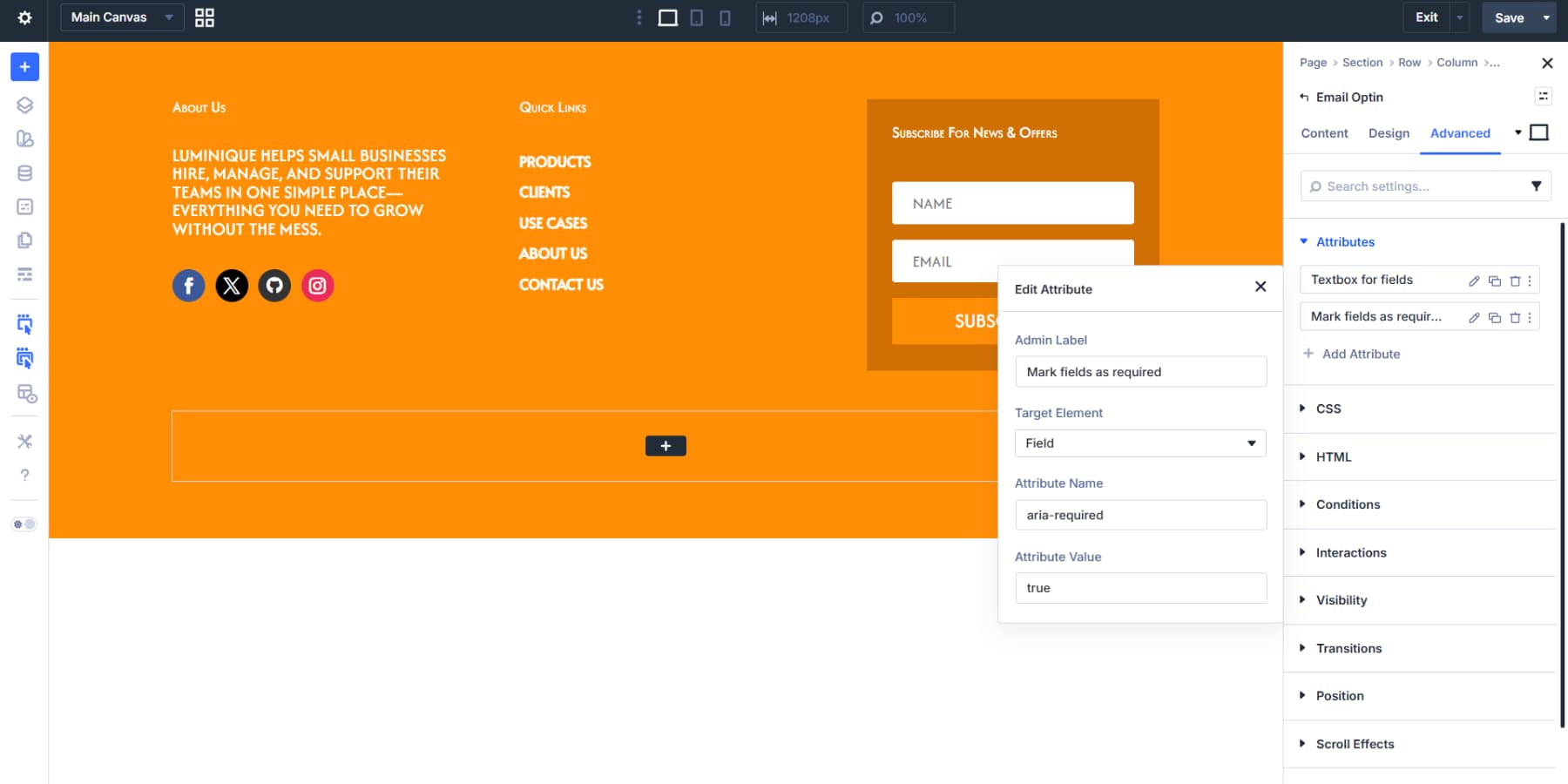
The Optin Module contains both an input field and a submit button, each needing its own accessibility attributes. Divi 5 lets you set attributes to any part of a module.
Click Add Attribute, select Field from the Target Element dropdown, set Attribute Name to role, and Attribute Value to textbox.

Then add another field attribute with aria-required set to true. This helps communicate required fields more clearly to assistive technologies.
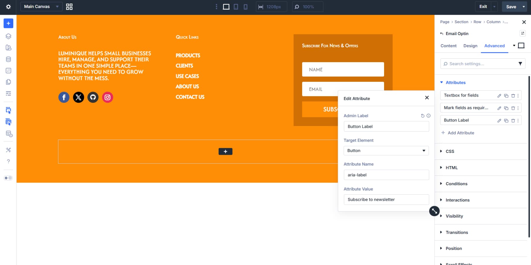
The Optin Module targets all fields at once. Other modules, like Contact Form, let you target individual fields separately. Add one more attribute: set Attribute Name to aria-label, target element to button, and the value to something like “Subscribe to newsletter.” This clarifies the button’s action without changing what appears on screen.
These adjustments make your footer accessible to everyone and help search engines parse your site structure correctly.
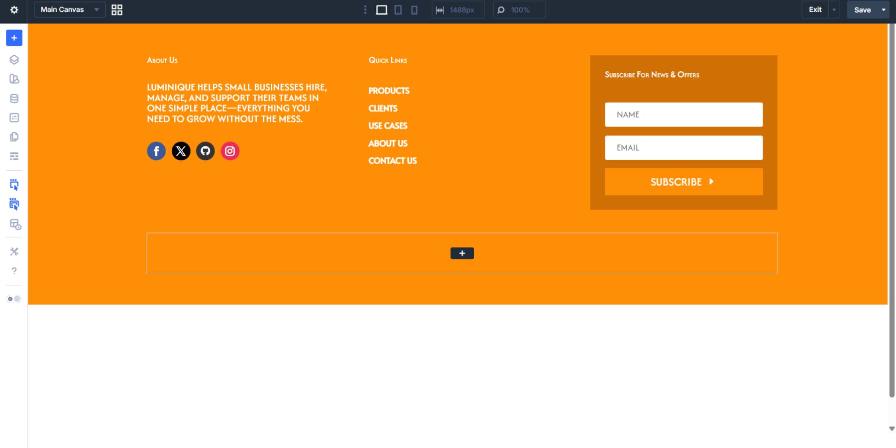
Setting Up The Bottom Row
The second row can hold a copyright notice or legal links. Rather than typing the year and updating it every January, Divi can pull the current year automatically using dynamic data.
A Text Module here works well. Click the dynamic data icon above the text field and select Date. Custom Format with Y in the format field pulls the current four-digit year. The Before field can hold a copyright symbol followed by a space, and the After field a space and your company name. The result updates itself each year.
Assembling A Blog Post Template
Blog posts need their own visual structure, separate from the header and footer that wrap them. A template that pulls content dynamically means each new post inherits the same layout without manual setup.
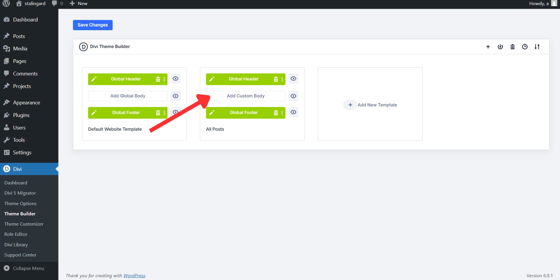
For this template, we’re building a body layout with a hero area, main content column, and sidebar. Click Add New Template.
Then, check the “All Posts” box and create a Template.
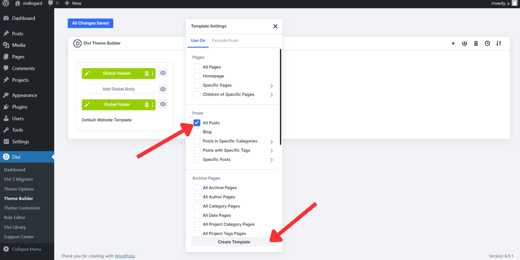
Then click Add Custom Body in the All Posts template. The Visual Builder should now open with a blank canvas.
Setting Up The Hero Area
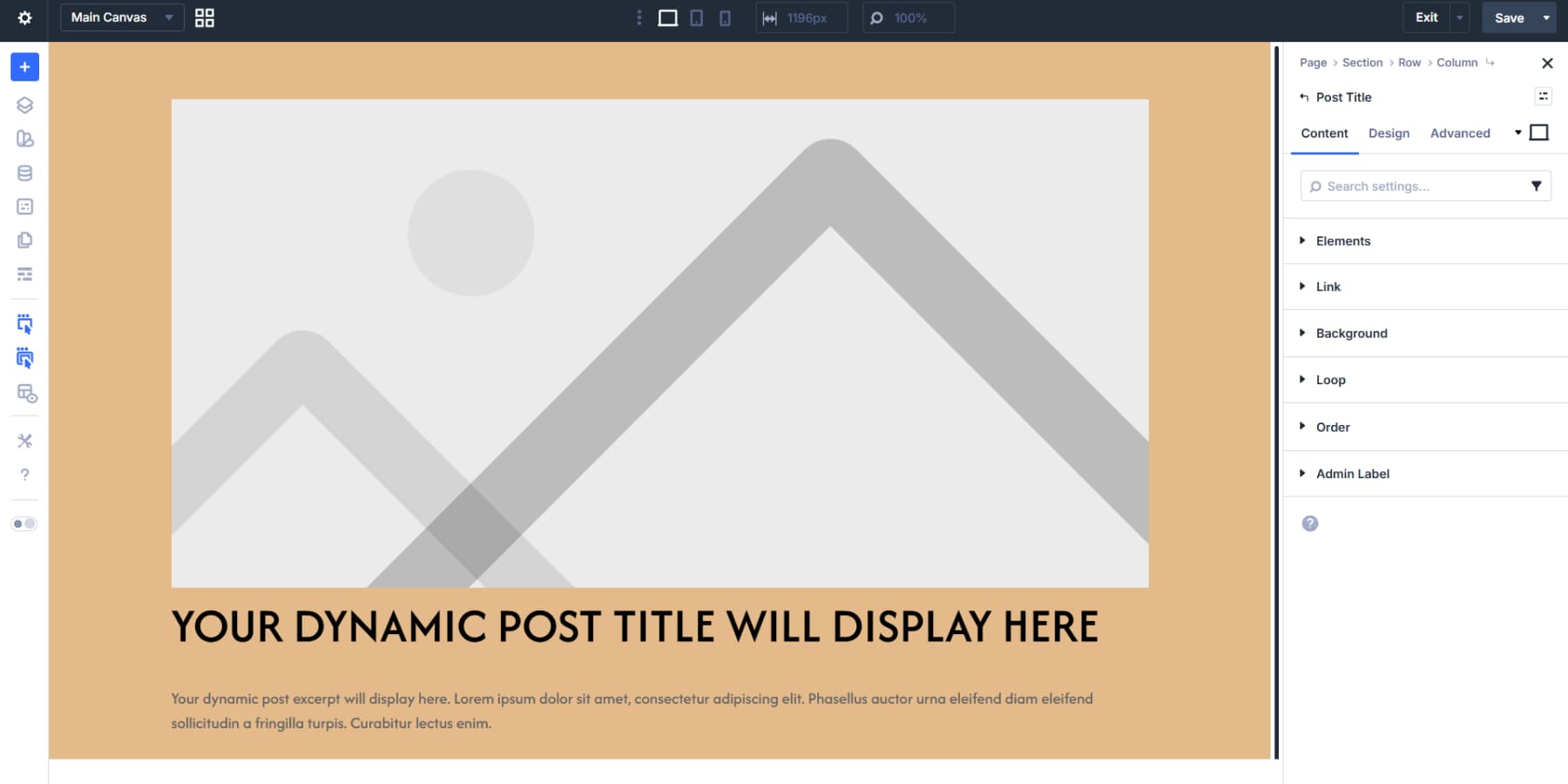
A section at the top works well as a hero area for the featured image and key post info. The Post Title module packages everything: title, featured image, author, and more, as a single component.
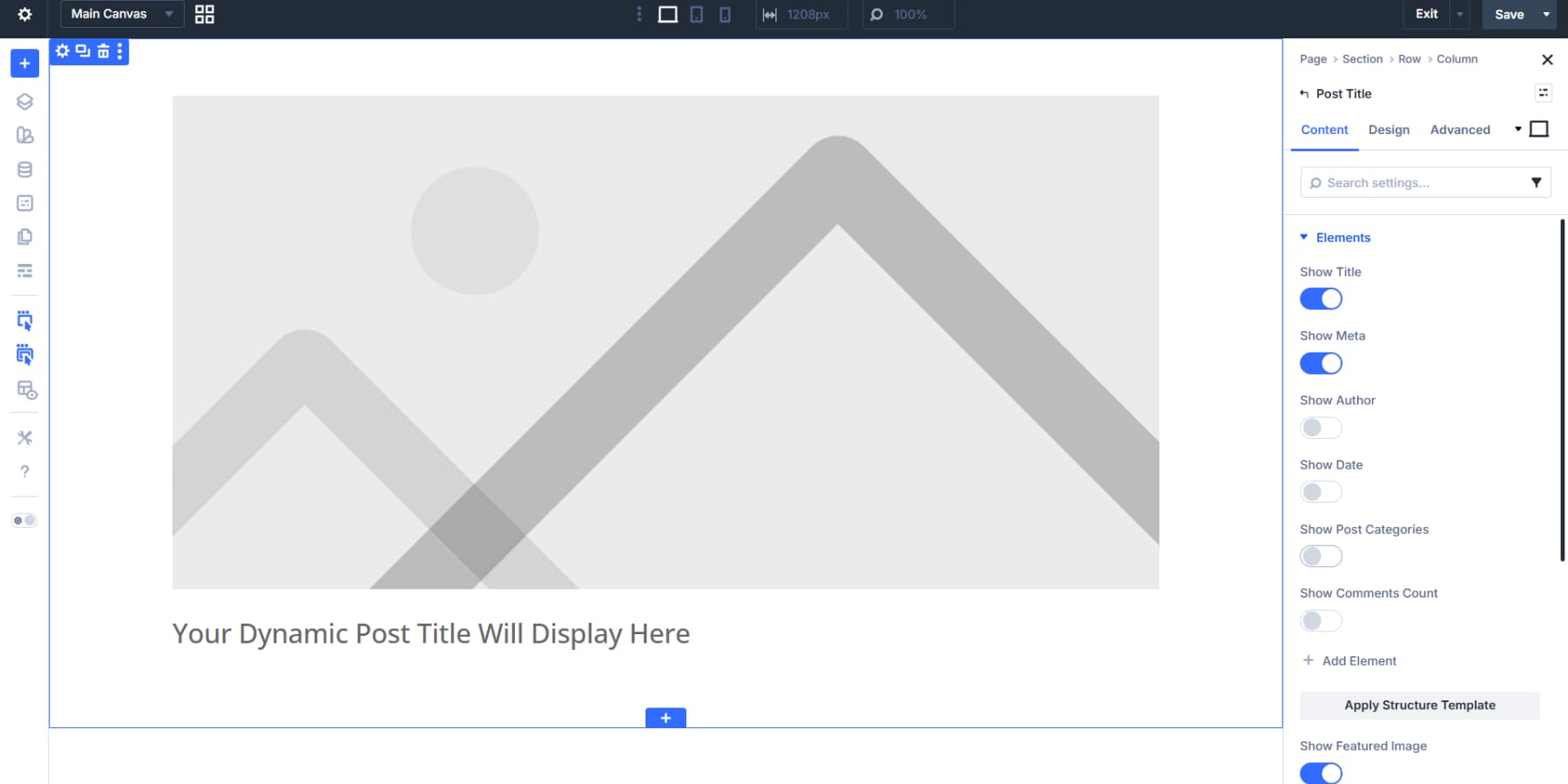
For more granular control, you can add each module yourself and connect it to the actual content using the dynamic content option.
Style it like any other Divi element: brand fonts, colors, and spacing.
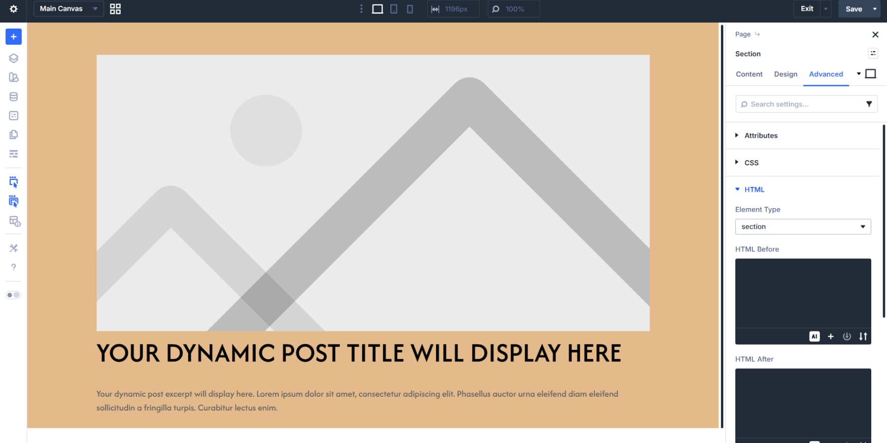
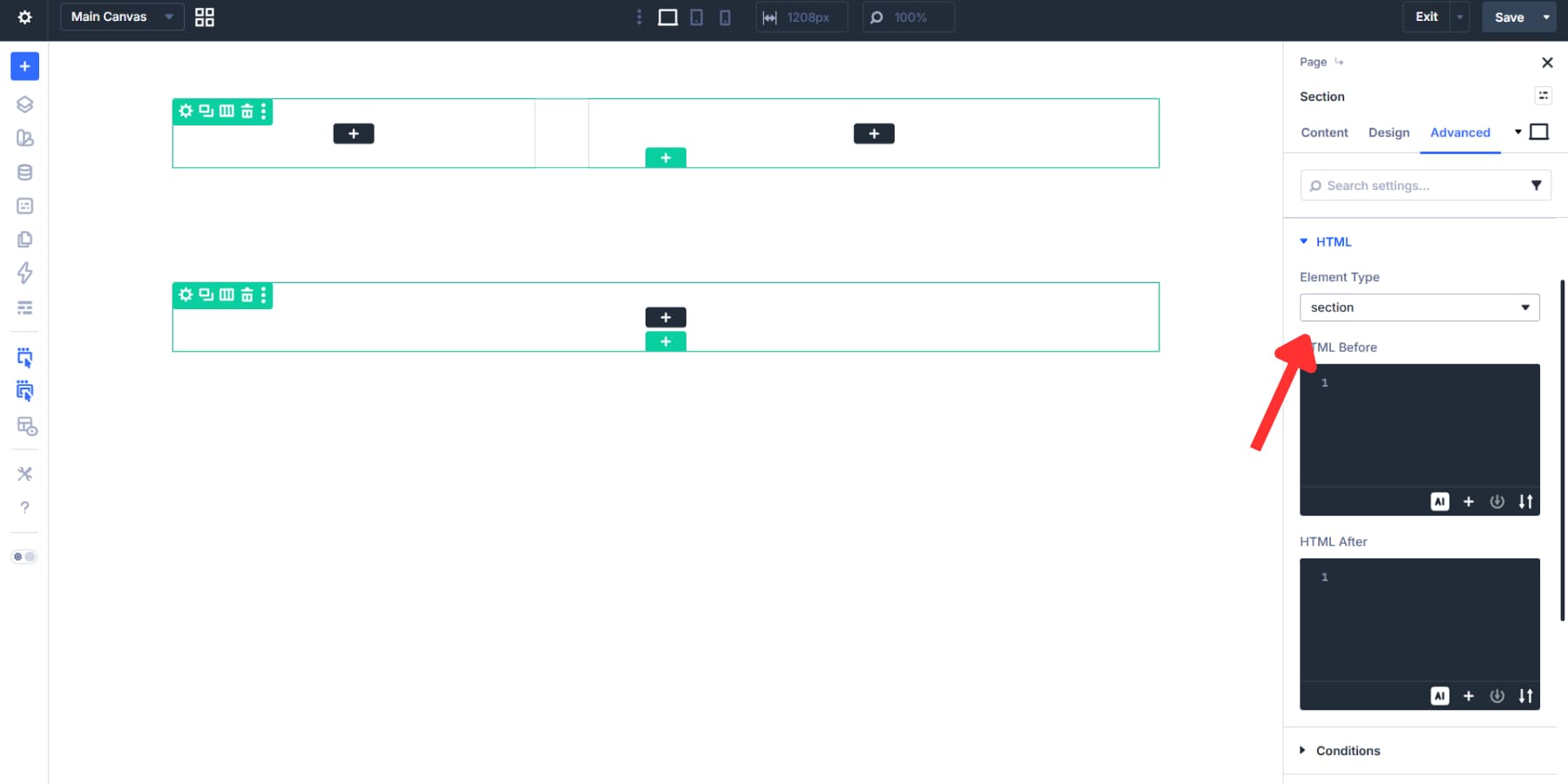
This section benefits from proper markup, too. Under Advanced > HTML, changing Element Type to section lets browsers and screen readers identify it as a distinct content area.
Building The Main Content Area
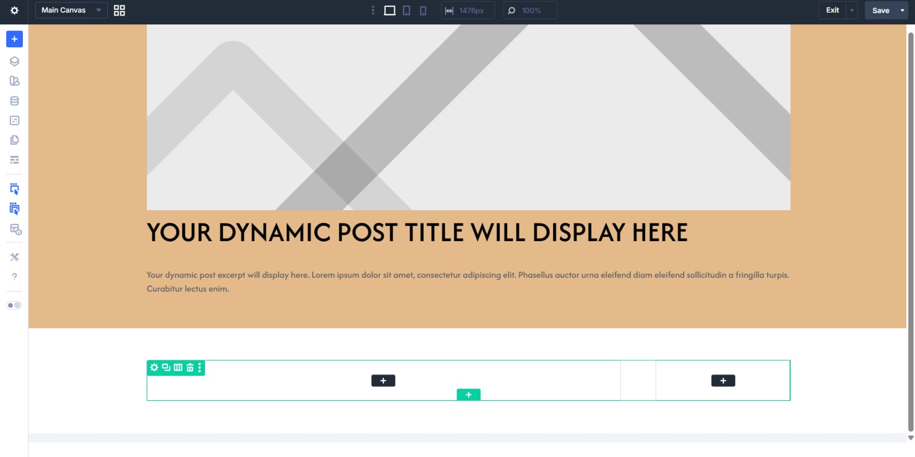
Below the hero, another section holds the article content and sidebar in a two-column layout. A 2/3 and 1/3 split gives readers room to focus on the article while keeping related content within reach.
The wider column can hold a Post Content Module. This pulls in whatever you write in the WordPress editor for each post: paragraphs, images, headings, and formatting all appear automatically. Style it accordingly.
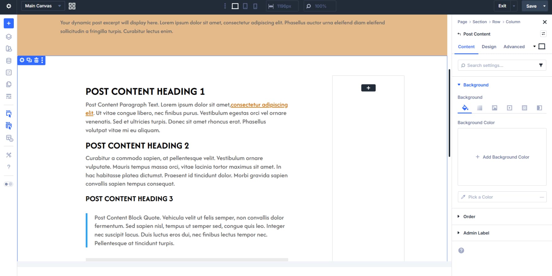
This column works well wrapped in a main element. That marks it as the primary content area, helping accessibility tools and search engines understand what visitors came to read.
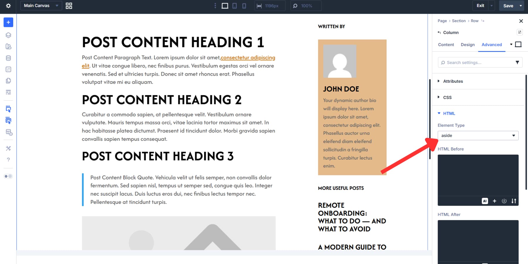
Creating A Dynamic Sidebar
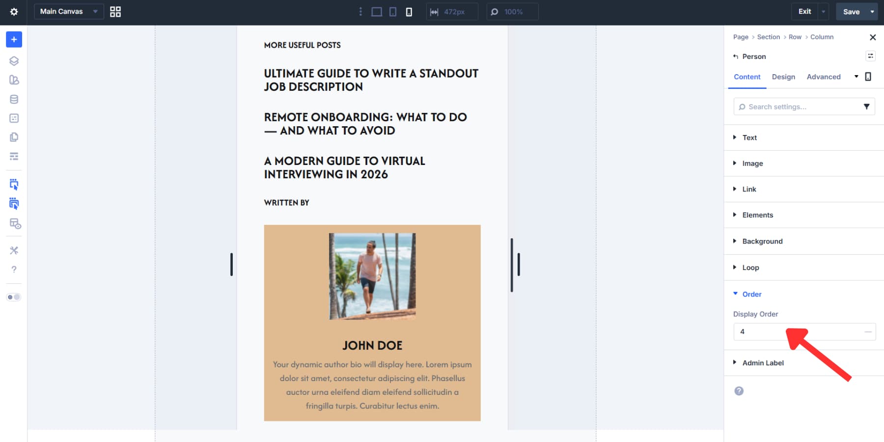
The narrower column becomes a sidebar. A Person Module with dynamic data for the post author fits well here.
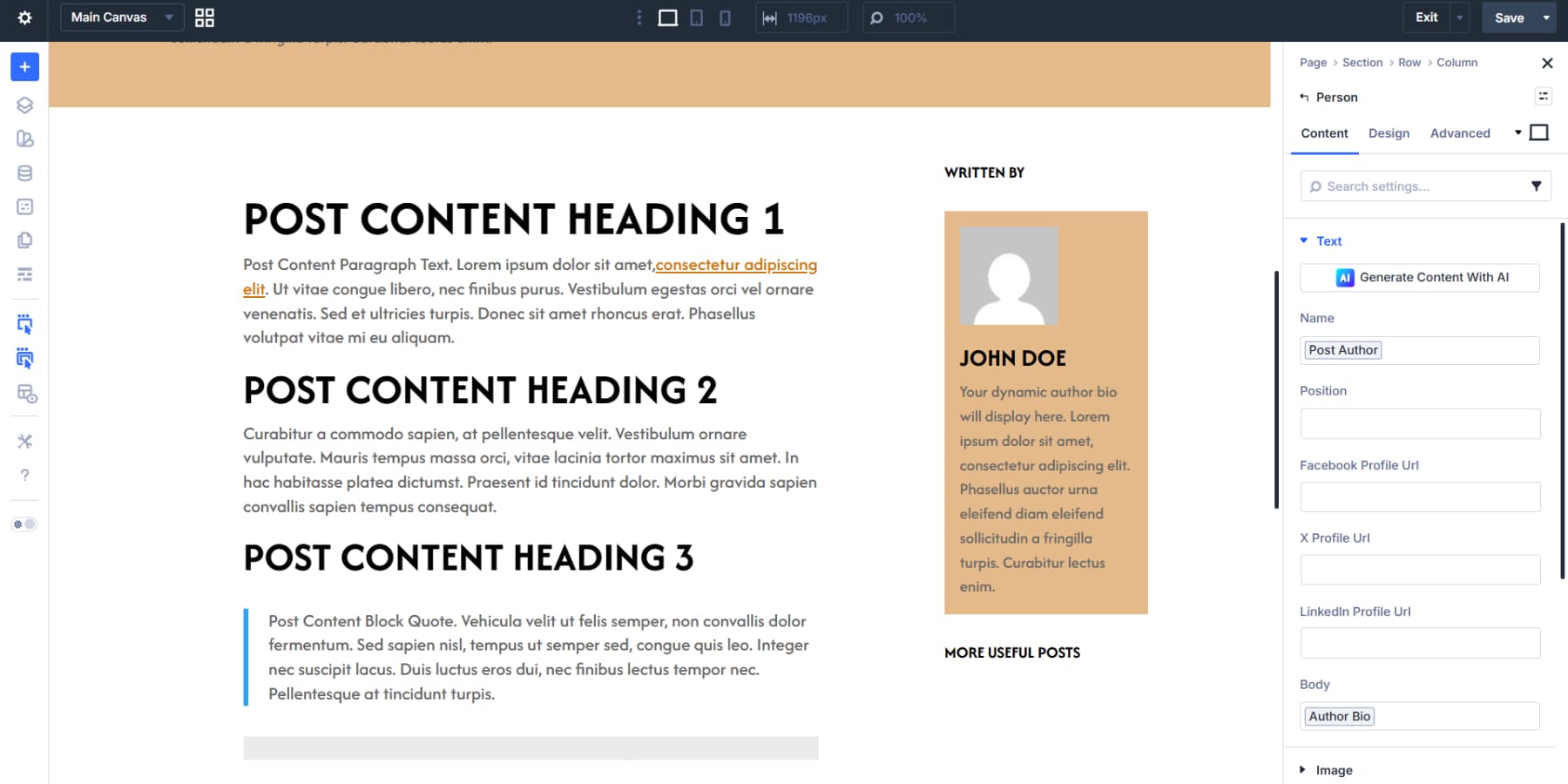
Below that, add a Title Module with a heading like “More Useful Posts” or “More From This Category,” then style it.
Then, a Title Module with the Loop Element toggle enabled can show recent articles. Set Query Type to posts and Post Type to posts. Posts Per Page determines how many articles appear, maybe 3 or 4, to keep the list manageable. Set the links using the relevant loop dynamic content options.
The sidebar column can be set to aside in the HTML settings. This marks the content as supplementary, separate from the main article but still related.
Adding A Related Posts Section
At the bottom, a new section with a two-row layout works well. Nest a four-column layout inside the second row, delete three columns, and keep one.
The first row can hold a centered title like “Recent Posts” or “You Might Like.”
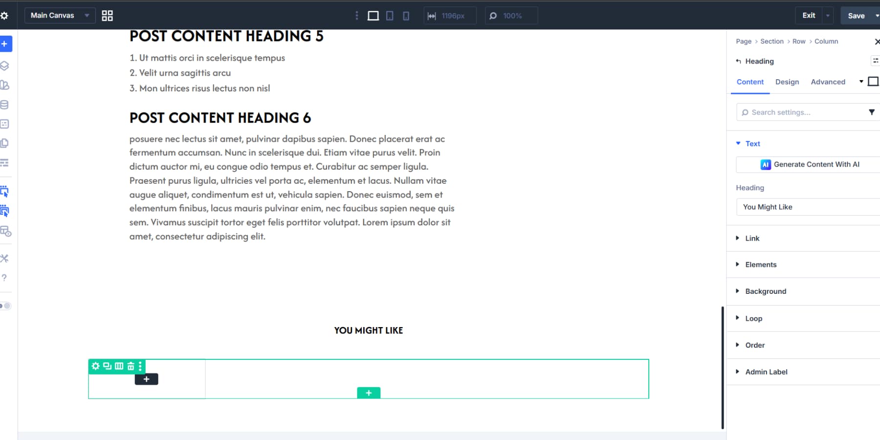
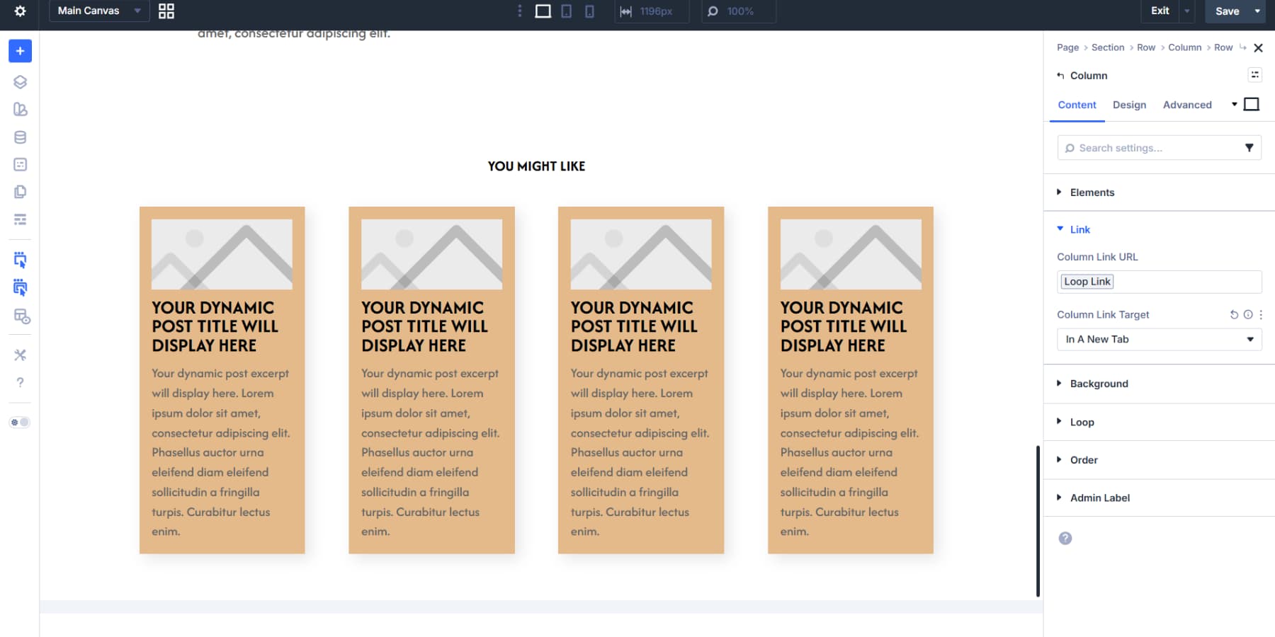
The Loop Element toggle on that column pulls in posts at your preferred count, ordered by date or popularity. Modules for the featured image, title, and excerpt connect to their dynamic Loop content tags.
Styling them as cards with borders, shadows, or backgrounds makes each preview clickable and distinct.
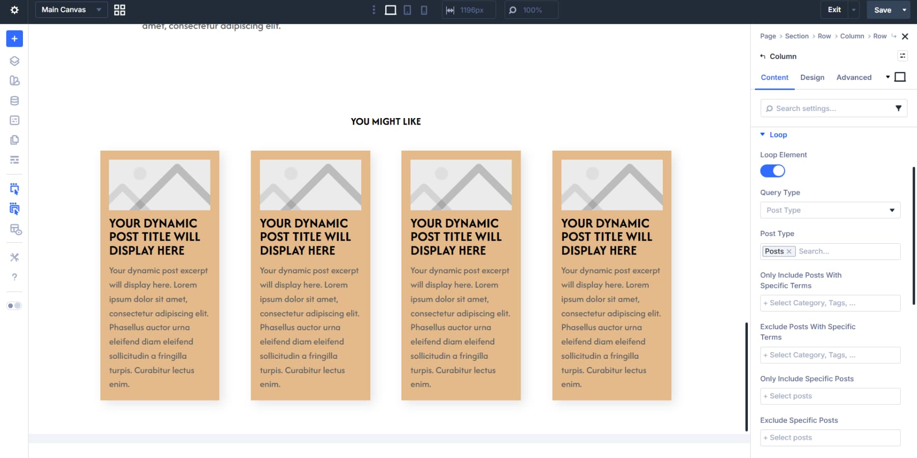
Also, enable the loop links for the column loop.
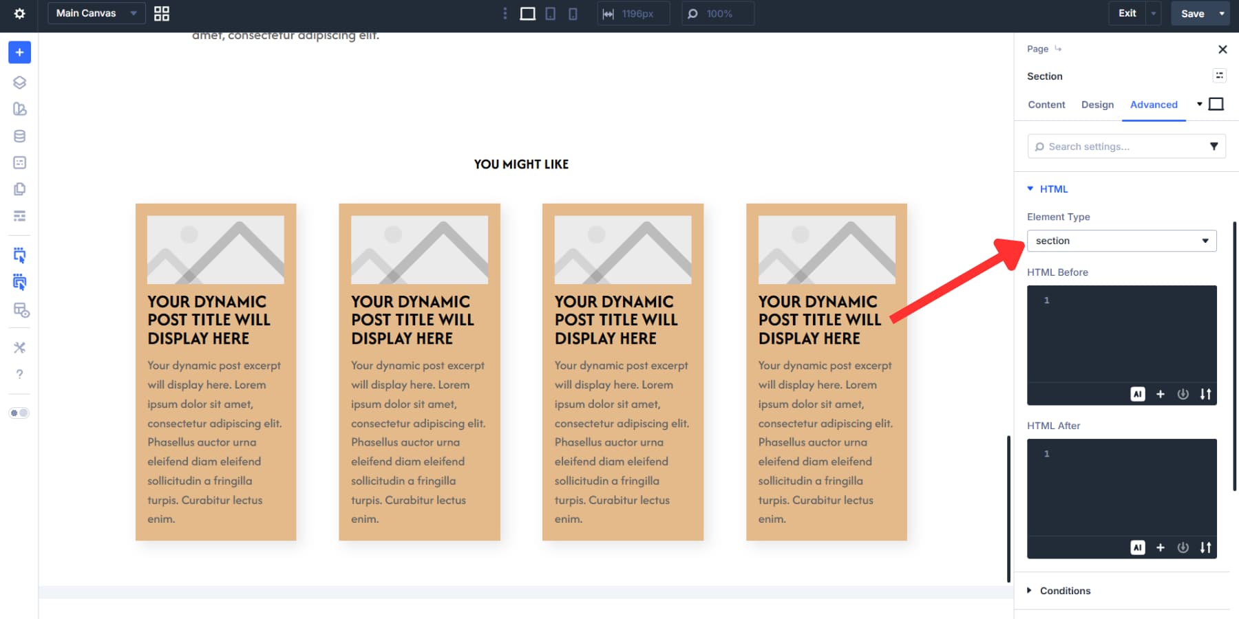
The element type for this section can be set to section in the HTML settings.
Write a new post, publish it, and this template renders everything automatically without touching the layout again. And when you make changes to the template, they update across every post.
Reordering Content For Mobile Devices
Desktop layouts don’t always translate well to smaller screens. Each module, column, and row has an Order setting in the content tab that controls stacking on different screen sizes.
Your blog template might show the author first, then related posts in the sidebar. Setting the related-posts items to orders 1 and 2 and the author items to orders 3 and 4 on mobile places related posts before the author bio for better engagement.
The Visibility settings pair well with this. A sidebar banner ad might work on desktop, but it clutters mobile screens. Hiding it on smaller breakpoints keeps things clean.
Footers follow the same logic. On smaller devices, four columns of links can be reordered so the newsletter signup appears first on phones, with legal links at the bottom.
Putting Together A Product Page
Click Add New Template in Theme Builder, then select All Products, then click Create Template. Once the template card appears, click Add Custom Body to open the Visual Builder with a blank canvas.
We’re adding two sections. The first uses a two-column layout with a 2/5 and 3/5 split. This is where all the core product content goes: images on one side, purchase details on the other.
The second section uses a standard single-row layout. That’s where upsells and related products will sit, separate from the main product info.
Set the first section’s Element Type to article under Advanced > HTML. A product is its own standalone piece of content, so the article element is the right call.
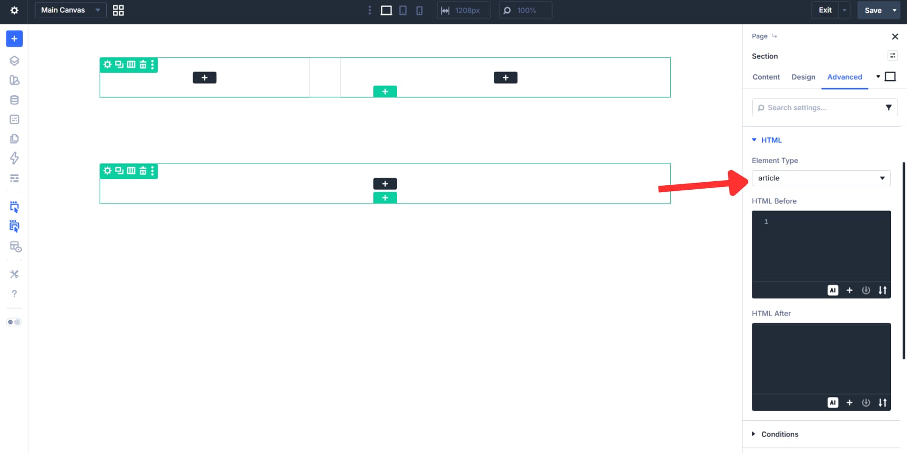
The second section gets the section Element Type, marking it as a distinct but related area of the page.
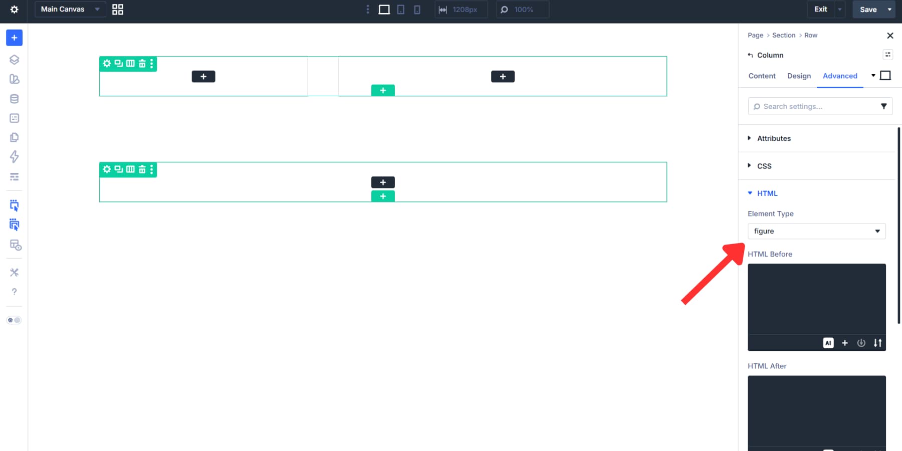
For the columns in the first section, the left column works well as a figure element because it contains the product imagery.
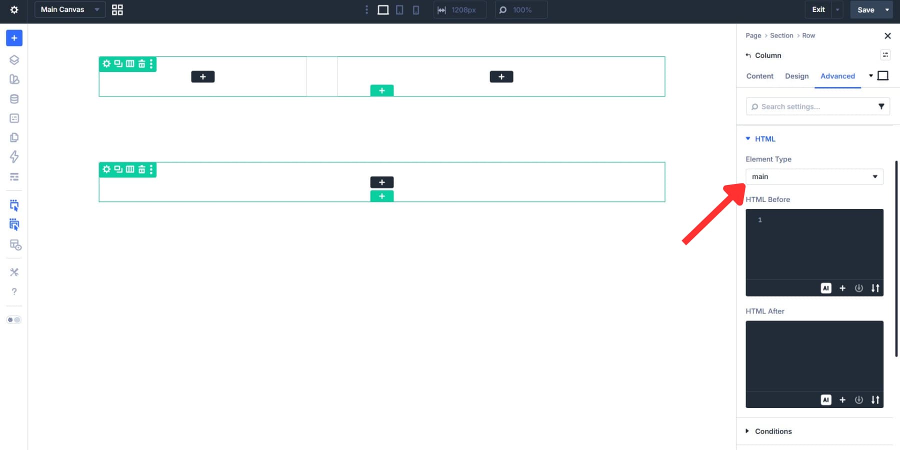
The right column, which carries the core purchase details, can be set to main.
Building The Product Layout
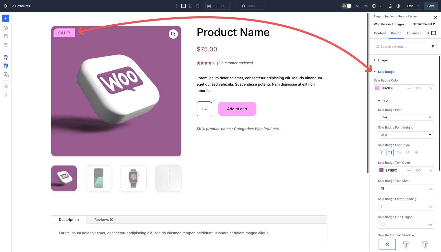
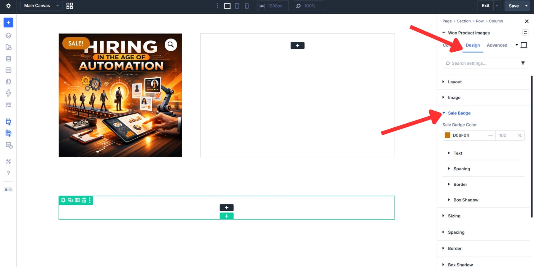
The left column holds the product imagery. Add the Product Images module here. Under the Content tab, expand the Elements dropdown to control what shows: the featured image, gallery images, and sale badge. Each has its own toggle.
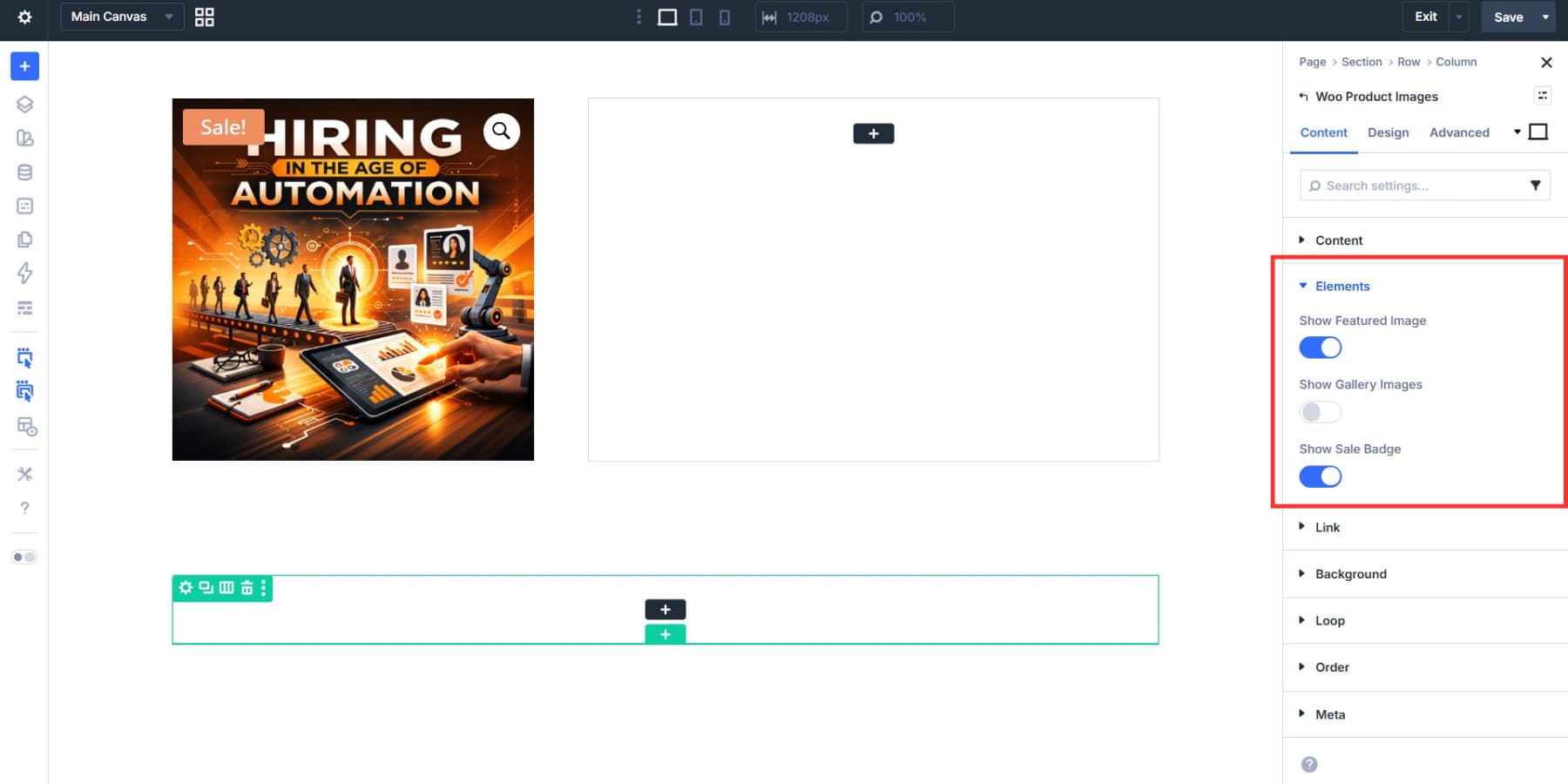
The Design tab’s Image dropdown covers full-width, borders, box shadows, spacing, and filters. The Sale Badge gets its own styling options too, including background color, text, and borders.
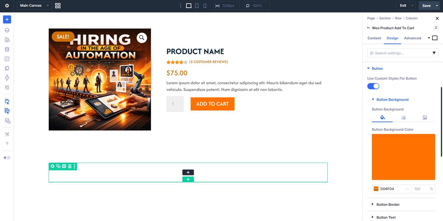
The right column is the purchase area. Adjust the column spacing and then stack your modules in the order you prefer. We are going with: Product Title, Product Rating, Product Price, Product Description, and Add To Cart. Style each module accordingly.
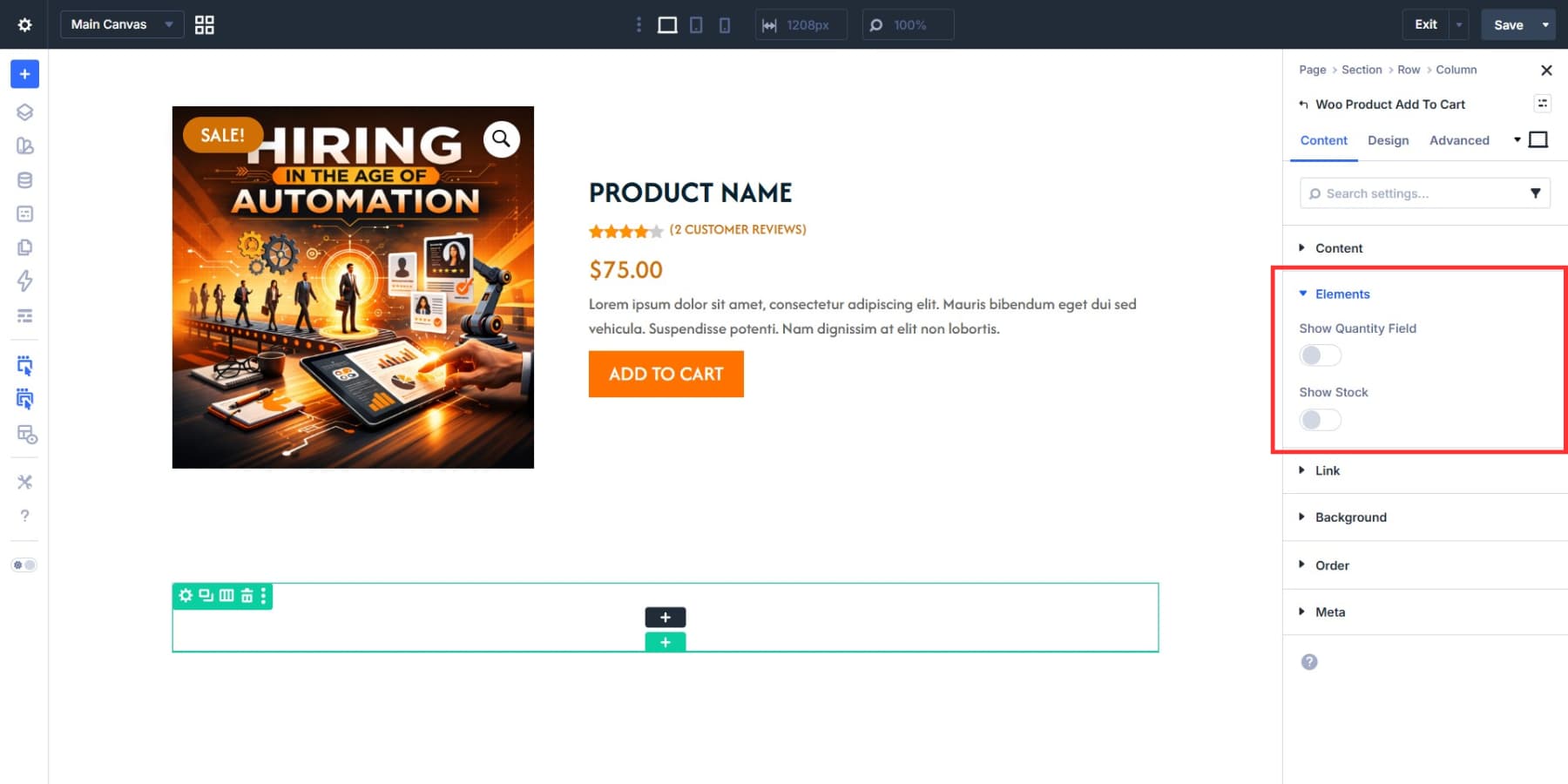
The Add To Cart module’s Elements toggles let you show or hide the quantity field and stock count.
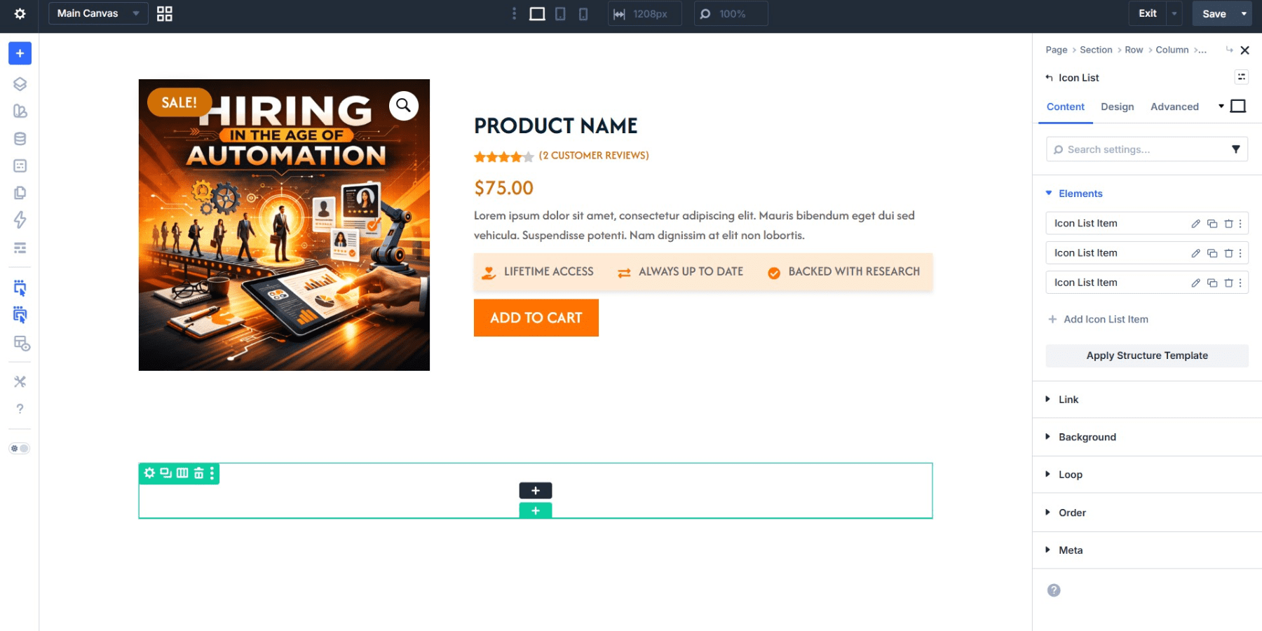
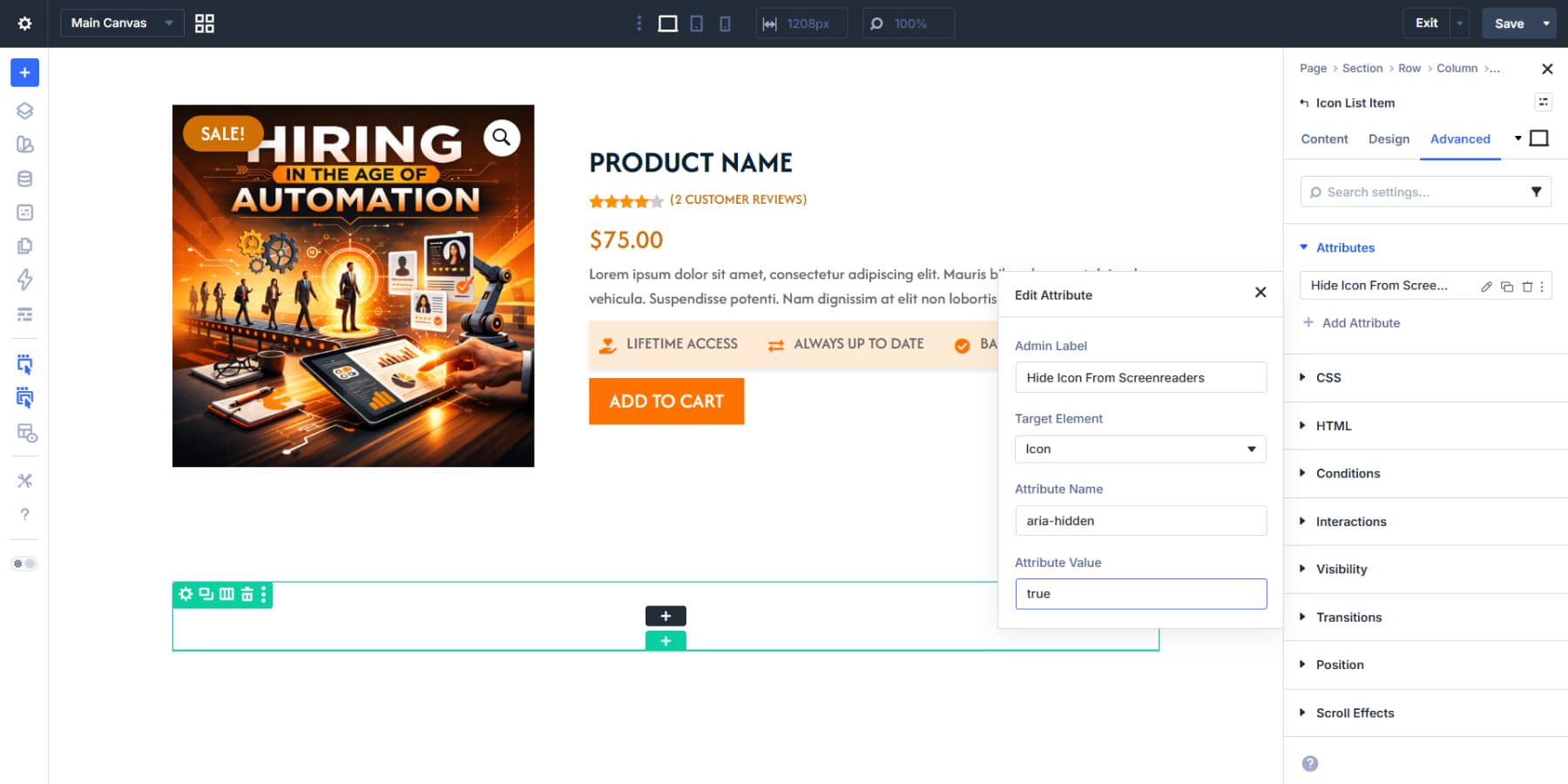
You may also consider adding an Icon List module for trust signals: secure payment, free returns, warranty info, and anything else your store offers. Style and align it as well.
The icons here are decorative since the text labels carry all the meaning. Select the List Icon item > Advanced > Attributes, target the Icon element, set Attribute Name to aria-hidden, and Attribute Value to true. Repeat for all list items. Screen readers will skip the icons and read the text directly.
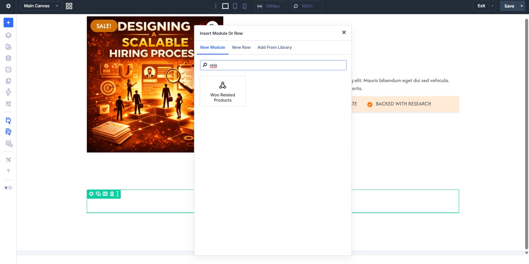
Showing Related Products
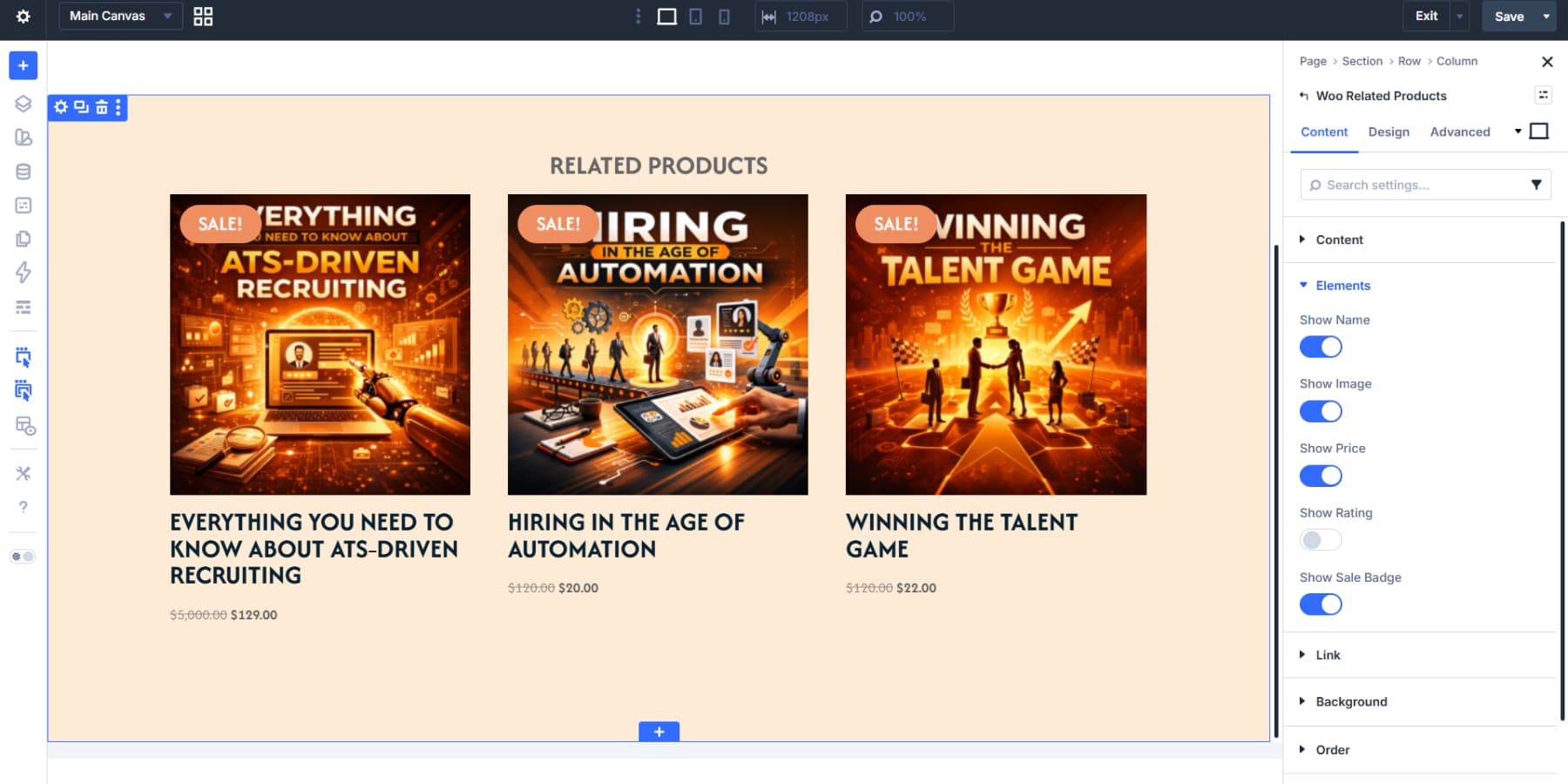
Add the Related Products module to the second section. The module pulls products that WooCommerce has already determined are related to the current product, based on shared categories and tags, with no query setup needed on your end.
The Content tab lets you control how many products appear, their order, and what elements should appear. The Design tab covers the full range of styling: image size, title typography, price text, button styles, and spacing. Style everything to match the rest of your template.
The Related Products module works for most websites. For more control over which products appear and how each card looks, Loop Builder lets you query the product post type and build the layout using any Divi module, just as we did for the related posts section in the blog template.
Use The Theme Builder In Divi 5 Today!
Divi 5‘s Theme Builder puts all your global components in one place. Build headers, footers, and content templates once, set where they appear, and they work across your entire site.
The combination of Loop Builder, Canvases, and Design Variables lets you set up templates that pull dynamic content, handle complex interactions, and maintain consistent styling across every page.
The templates you build here become the foundation for your entire site. You build the structure that everything else sits on, and getting it right here means less work everywhere else.


Leave A Reply