

Creating a reliable color system has always been one of the harder parts of web design. You start with a primary brand color, then manually build lighter values, darker values, muted variations, and transparent colors for backgrounds, borders, shadows, buttons, and hover states. The result often works at first, but it becomes harder to manage as the site grows.
Divi 5 changes that with the new Color Palette Variable Generator. Instead of building every color manually, you can start with one primary color and generate a connected color system using Divi 5’s relative HSL color system.
The generator creates reusable color variables inside the Variable Manager, so your colors are not just saved as static swatches. They become part of your site’s design system. When the base color changes, related colors can update with it, helping your palette stay consistent across modules, presets, and pages.
In this post, we’ll walk through what the Color Palette Variable Generator does, how to access it, how the settings work, and how to use the generated variables with presets for a scalable Divi 5 design system.
What Is Divi 5’s Color Palette Variable Generator?
Divi 5’s Color Palette Variable Generator is part of the larger Variable Generator. It helps you create a complete set of color variables from a primary color, then save those variables to the Colors group inside the Variable Manager.
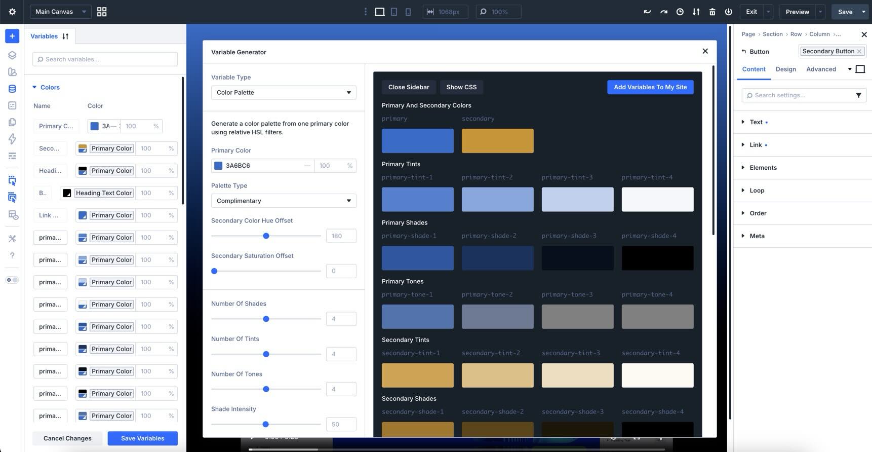
Instead of manually creating every related color, Divi uses relative HSL adjustments to generate connected colors based on your starting color. That matters because the relationships between colors stay intact. If you later edit the primary color, the related colors can follow the same logic instead of forcing you to rebuild the whole palette by hand.
The generator can create a full set of color variables, including:
- Primary And Secondary Colors: The core colors used as the foundation for the palette.
- Tints: Lighter variations that work well for backgrounds, cards, and subtle accents.
- Shades: Darker variations that work well for text, borders, and stronger accents.
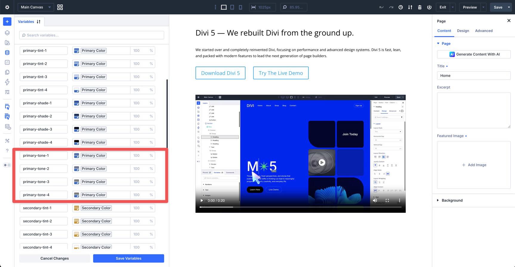
- Tones: More neutral variations that reduce saturation and help create calmer UI colors.
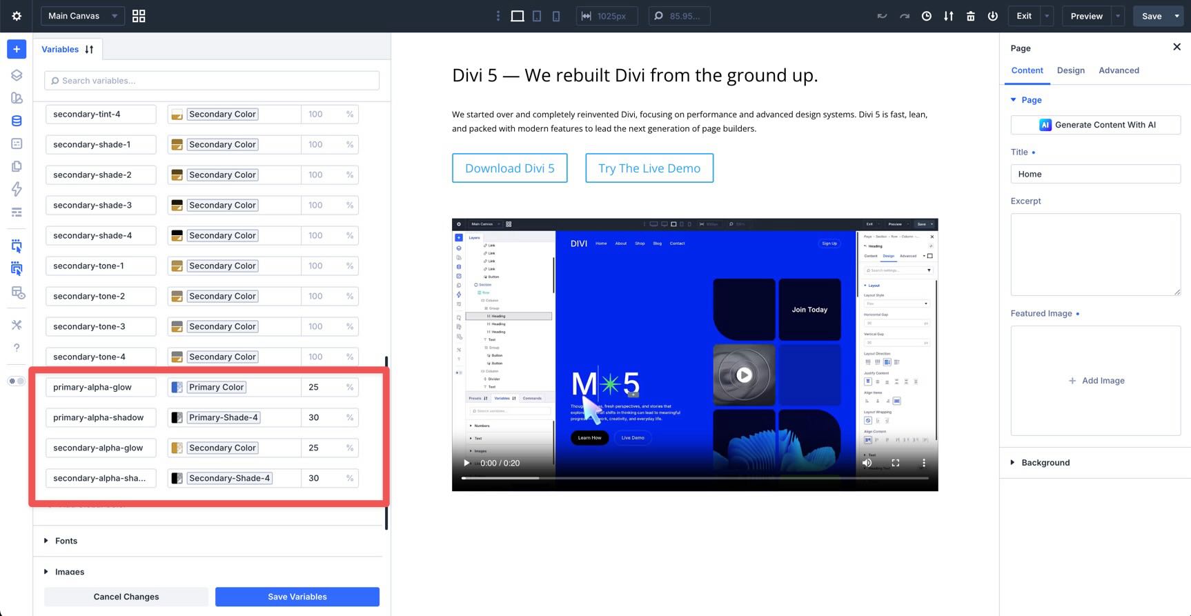
- Alpha Variants: Transparent versions that are useful for overlays, glows, shadows, and layered backgrounds.
These are saved as Design Variables, which means you can reuse them throughout Divi and update them from one central place.
Why It Matters
- Consistency: Your palette is built from connected values instead of disconnected one-off colors.
- Easier Updates: Edit the source color or generated variables in the Variable Manager instead of hunting through individual module settings.
- Faster Setup: Generate a broad color system in a few clicks, then refine it instead of starting from scratch.
- Better Design-System Workflows: Use the generated colors inside Element Presets and Option Group Presets so modules inherit the same color logic.
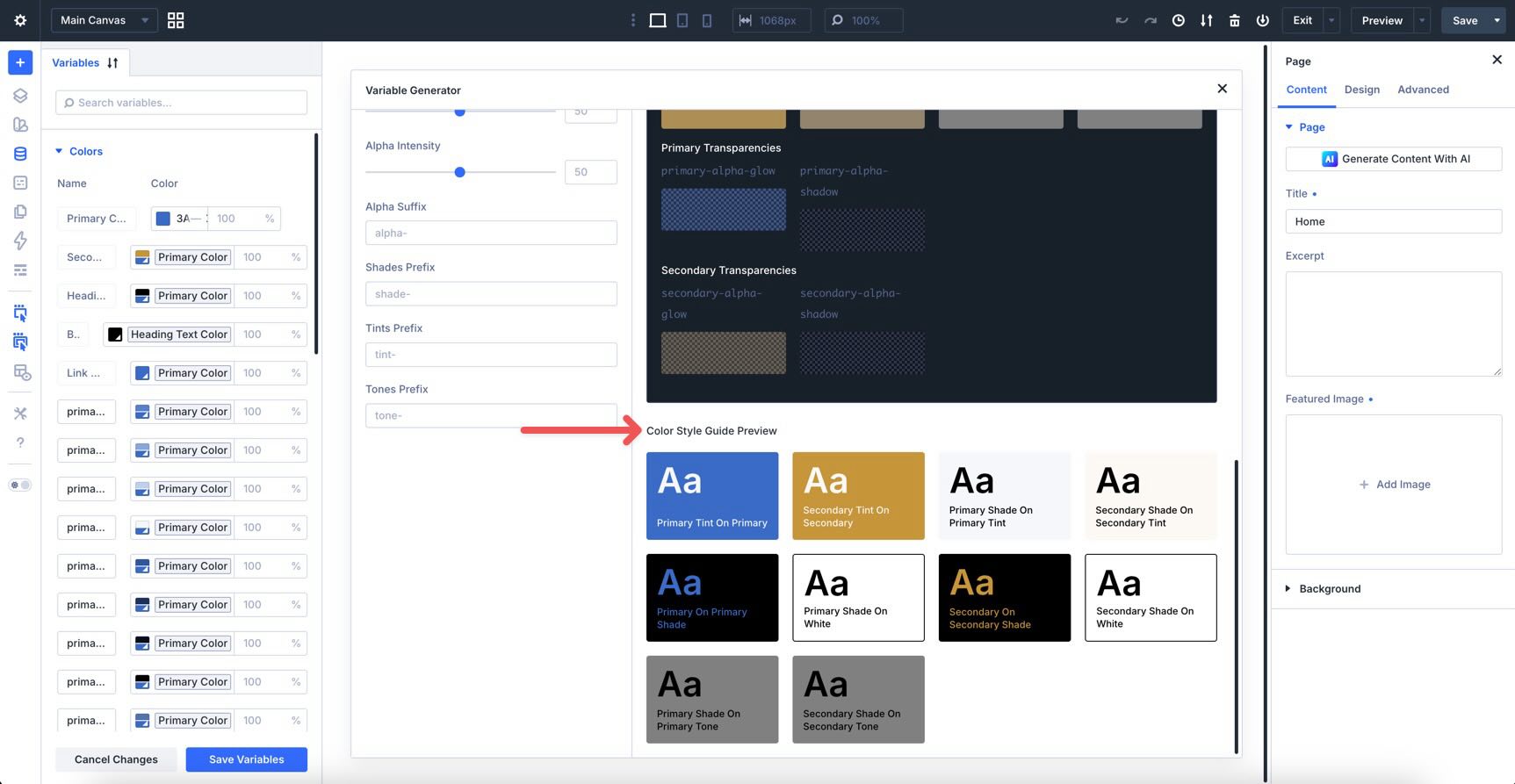
- Helpful Contrast Previewing: Use the Color Style Guide Preview to evaluate how text and background combinations work before applying them across the site.
Accessing And Using The Color Palette Generator
The Color Palette Variable Generator lives inside the Variable Manager in the Divi 5 Visual Builder. You do not need to leave the builder or write custom CSS to create the palette.
How To Access The Generator
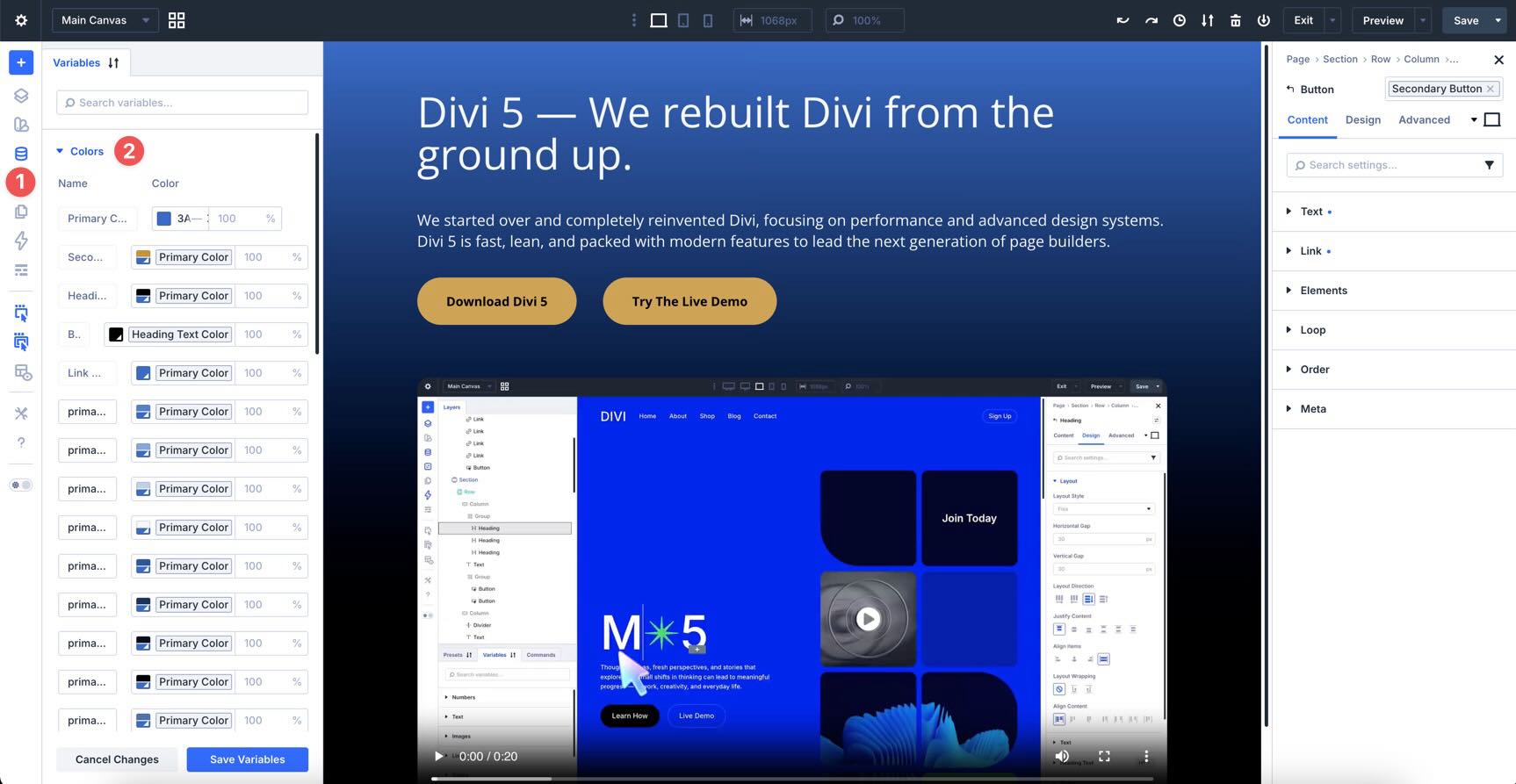
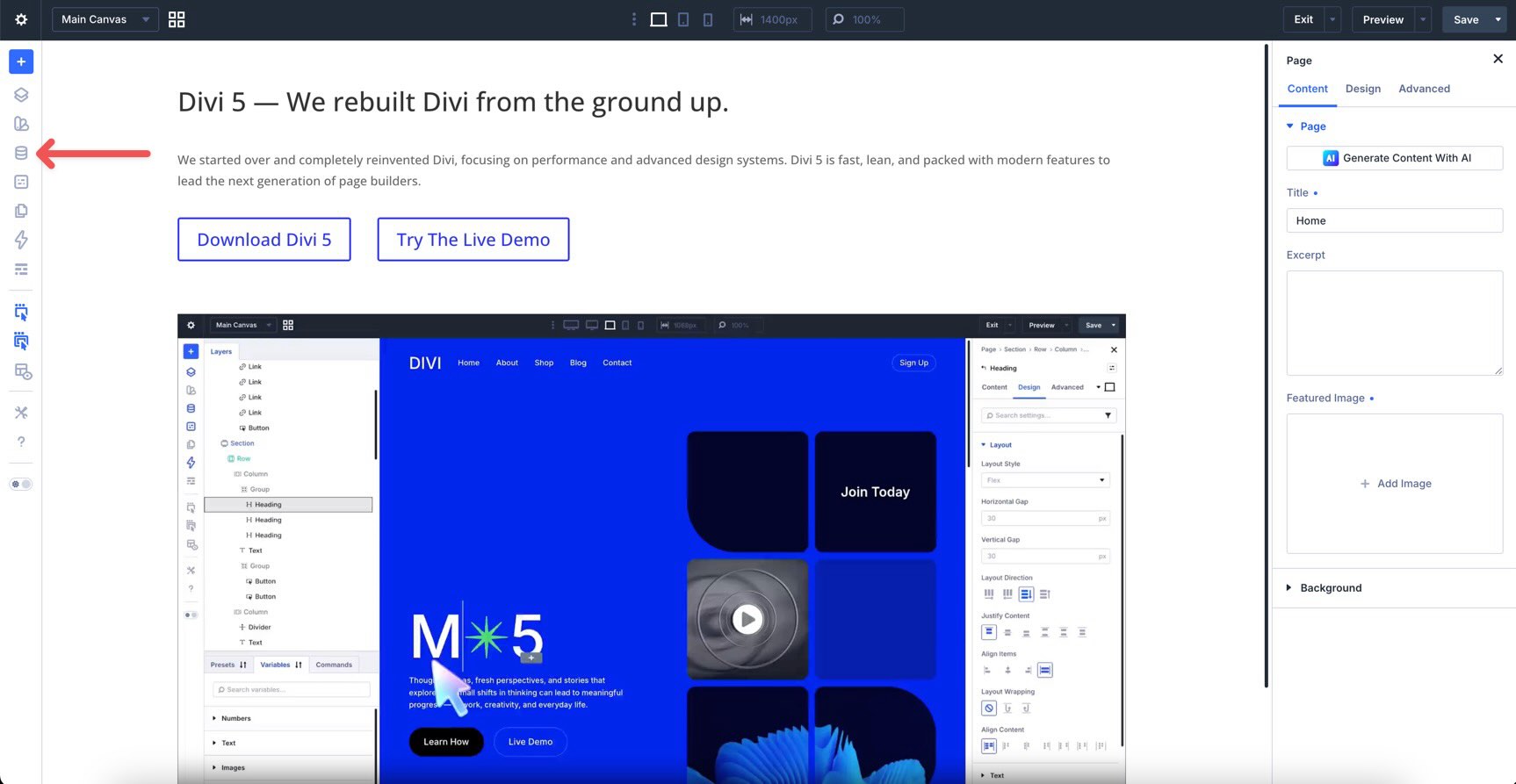
Open any page in the Visual Builder and click the Variable Manager icon in the left sidebar.
When the Variable Manager opens, hover over the Colors group to reveal the Generate Color Palette Variables icon.
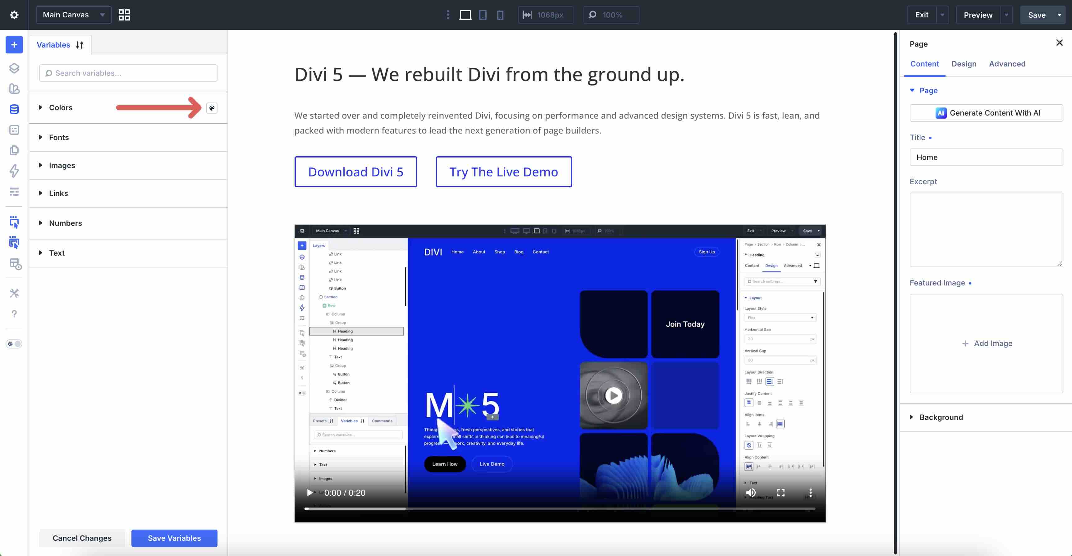
Click the icon to open the generator. The interface opens in a modal with controls on the left and a live preview on the right.
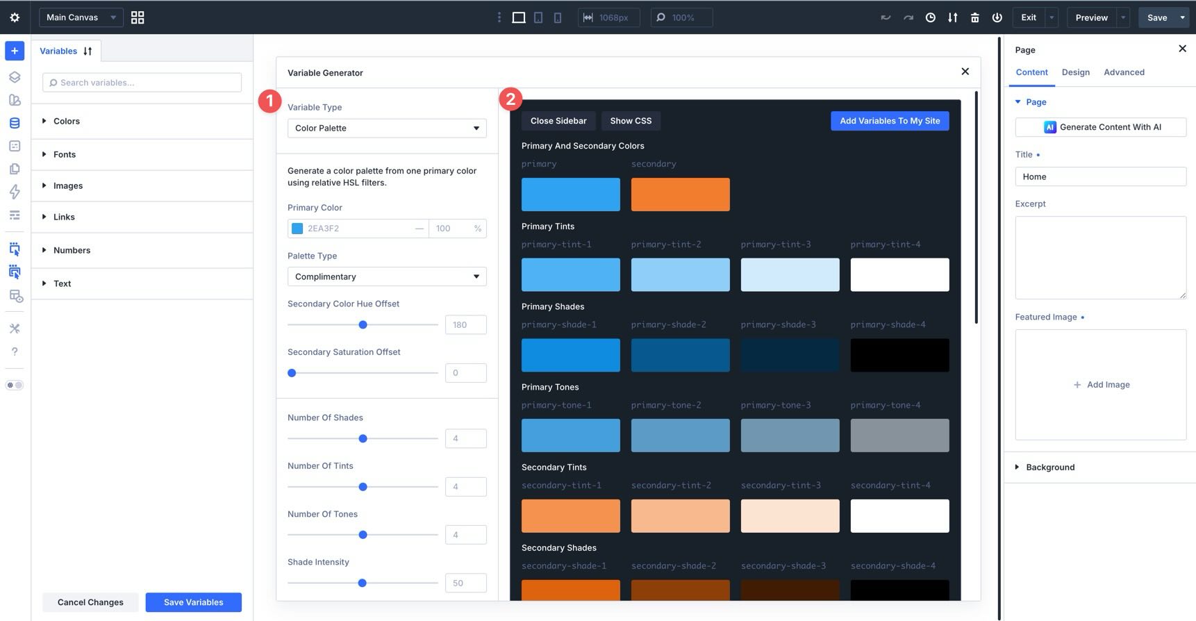
First Look At The Interface
The left sidebar contains the settings used to generate your palette. These include the primary color, palette type, secondary color offsets, shade, tint, and tone counts, intensity controls, alpha settings, and naming options.
The right side shows a live preview of the generated palette, including primary and secondary colors, tints, shades, tones, alpha variants, and a Color Style Guide Preview.
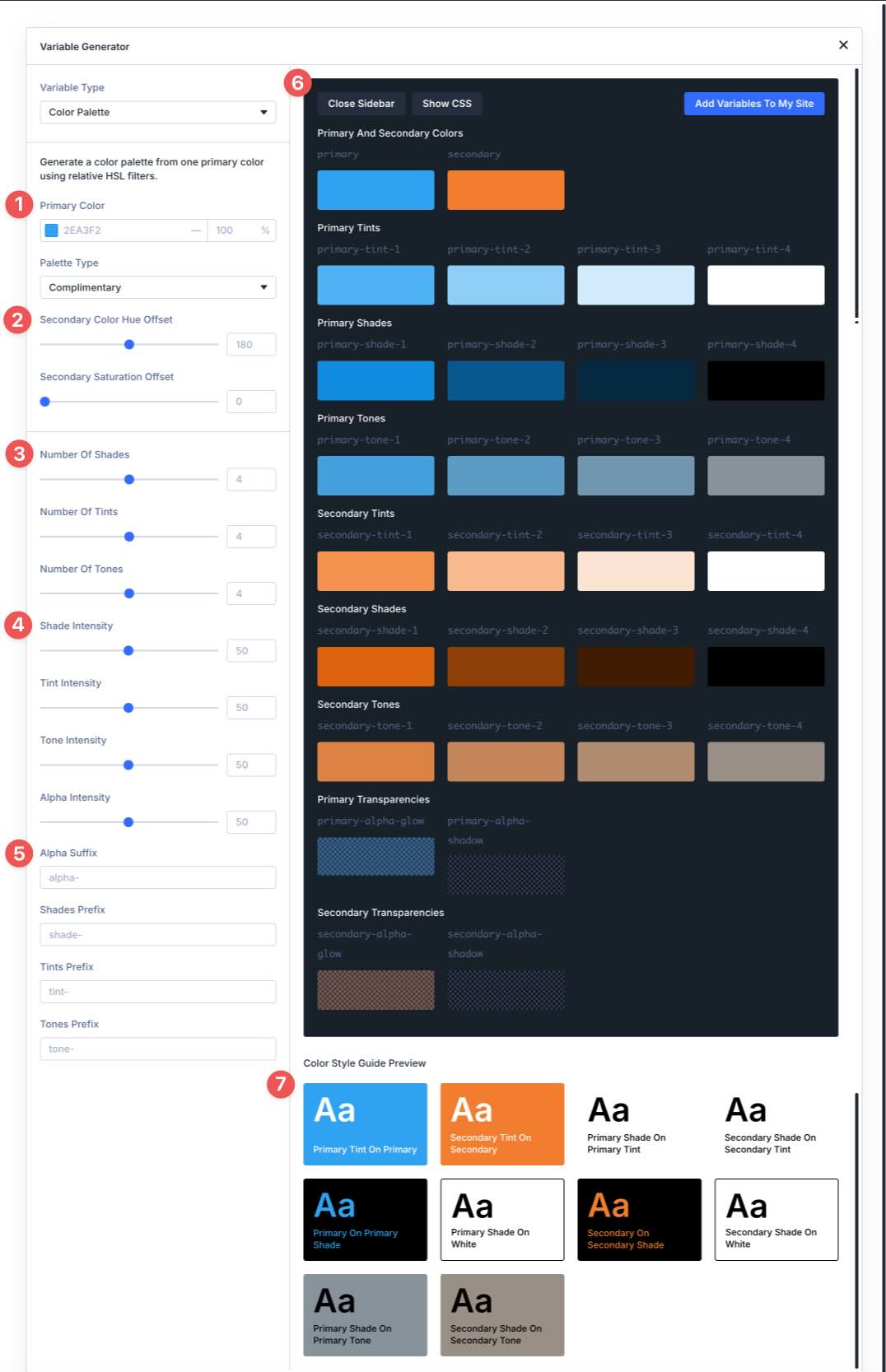
Quick Start For Beginners
For the fastest workflow, start with the default settings and choose a Primary Color.
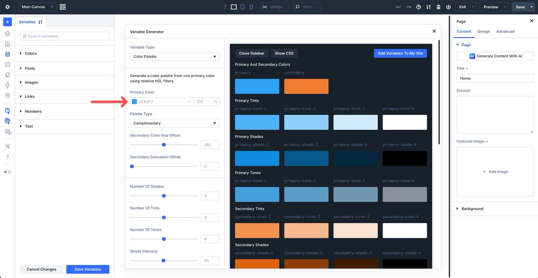
You can type a hex value manually or click the color preview to open the Color Picker.
Once you choose a primary color, click Add Variables To My Site. Divi will ask you to confirm before adding or replacing variables.
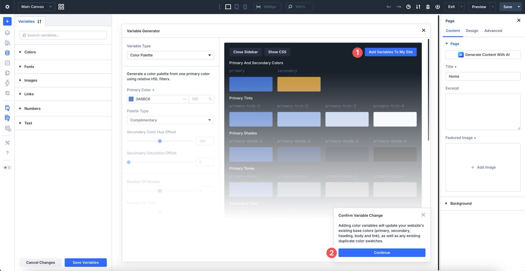
After confirmation, Divi adds the generated color variables to the Colors group in the Variable Manager. You can start using them in color fields throughout the builder right away.
Advanced Color Palette Settings
The default settings are useful when you need a fast starting point. The advanced settings give you more control over how the palette is generated, named, and previewed before you add it to your site.
Choosing A Palette Type
The Palette Type controls how the secondary color relates to your primary color. This is one of the fastest ways to change the mood of the entire palette.
Divi includes several harmony-based palette types:
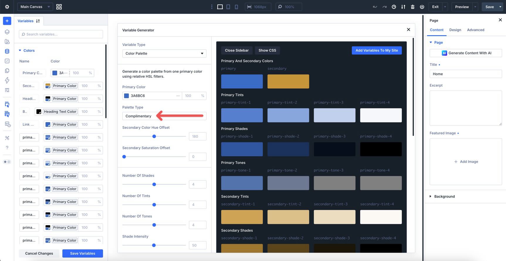
Complementary
Complementary palettes use colors from opposite sides of the color wheel. They create strong contrast and work well when you want a bold primary-and-accent relationship.
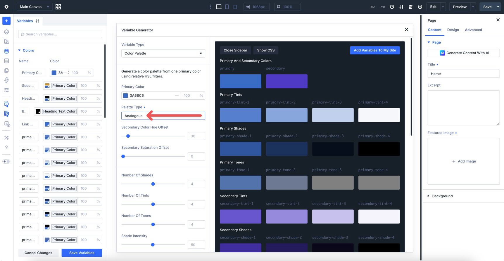
Analogous
Analogous palettes use colors that sit near each other on the color wheel. They tend to feel calmer and more cohesive because the hues are closely related.
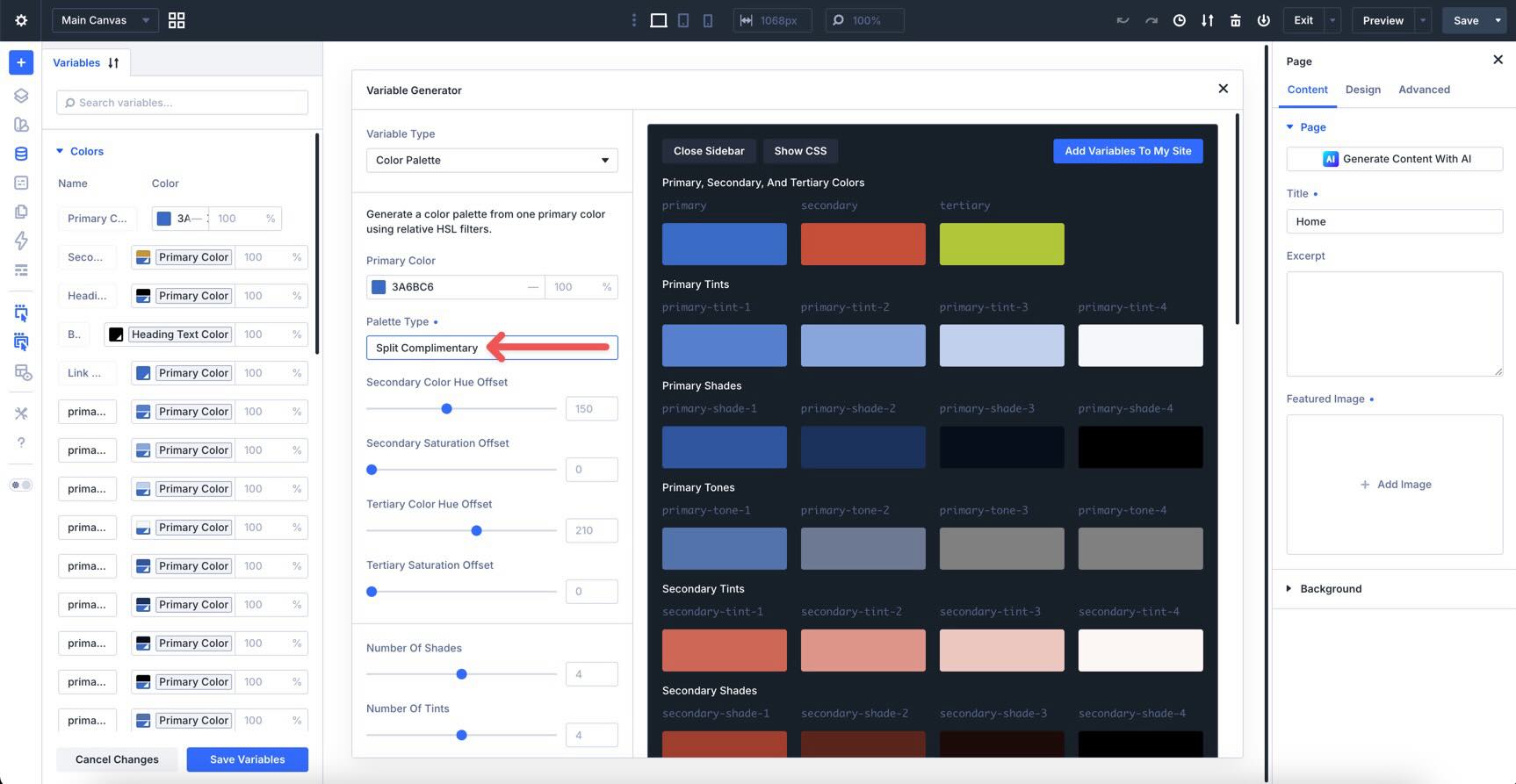
Split Complementary
Split complementary palettes use a base color and two colors near its complement. This gives you contrast without making the palette feel as intense as a direct complementary pairing.
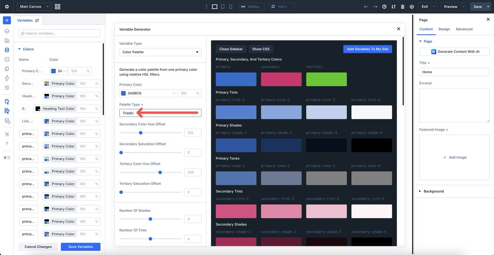
Triadic
Triadic palettes use three colors spaced evenly around the color wheel. They can feel vibrant and balanced when you need more than one accent color.
Tetradic
Tetradic palettes use four colors arranged as two complementary pairs. They can be useful for larger design systems, but they usually need more restraint so the design does not feel too busy.
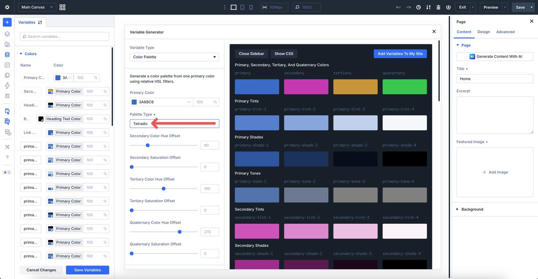
Use the live preview as you switch palette types. You can quickly compare how each relationship changes the balance between the primary color, secondary color, and generated variations.
Customizing The Color Palette
After choosing a palette type, use the advanced controls to refine the output. These settings help you decide how many variables to create, how strong the variations should be, and how the variables should be named.
Secondary Color Controls
Use Secondary Color Hue Offset to shift the secondary color around the color wheel. Use Secondary Saturation Offset to increase or reduce the vibrancy of the secondary color.
These controls are helpful when the generated relationship is close but not quite right for the brand. For example, you might start with a complementary palette, then adjust the hue or saturation until the secondary color better matches an existing logo or accent color.
Number Of Shades, Tints, And Tones
Use the Number Of Shades, Number Of Tints, and Number Of Tones controls to decide how many variations Divi generates for each category.
A larger palette gives you more flexibility, but it also gives you more variables to manage. For most sites, start with a focused set and only generate extra steps when you know you need them.
Intensity Sliders
The intensity sliders control how far each generated color moves from the base color.
Shade Intensity controls how dark the shades become. Tint Intensity controls how light the tints become. Tone Intensity controls how muted or neutral the tones become.
Keep these settings practical. Extreme intensity can create dramatic colors, but the most useful design-system variables are usually the ones you can apply repeatedly across backgrounds, text, borders, and interactive states.
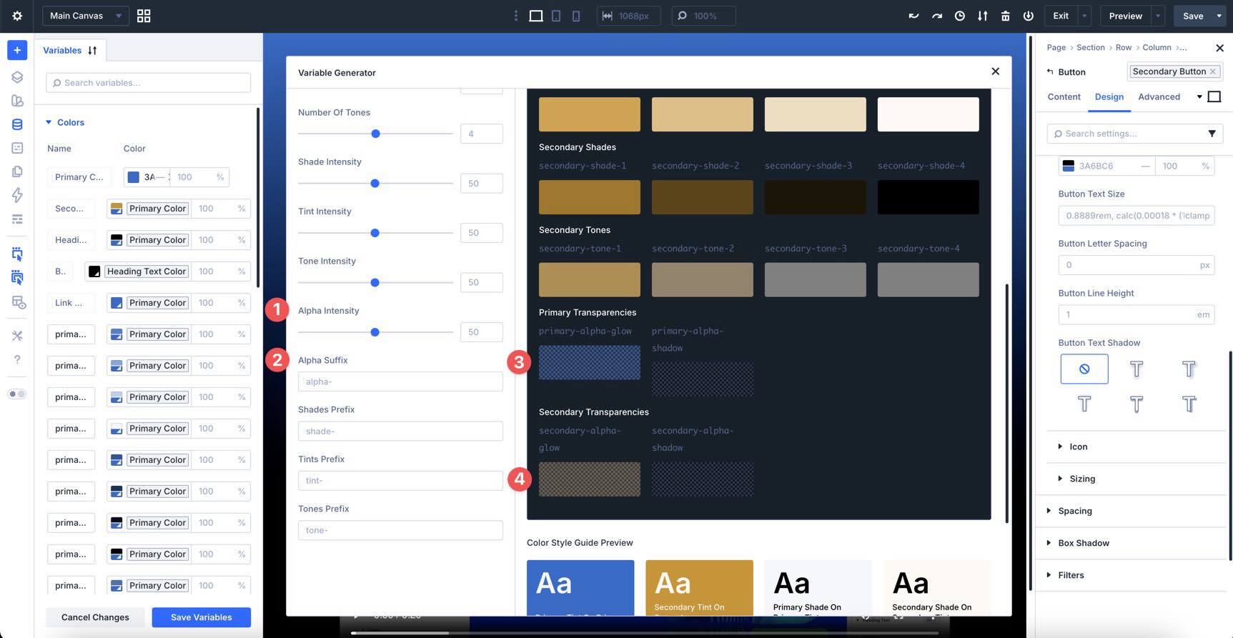
Alpha Variant Options
Alpha variants are transparent versions of your generated colors. They are useful for shadows, glows, overlays, subtle backgrounds, and layered visual effects.
Use Alpha Intensity to control the opacity range of the generated alpha variables. You can also customize the Alpha Suffix so the variable names match the naming convention you use across the rest of the site.
Custom Prefixes
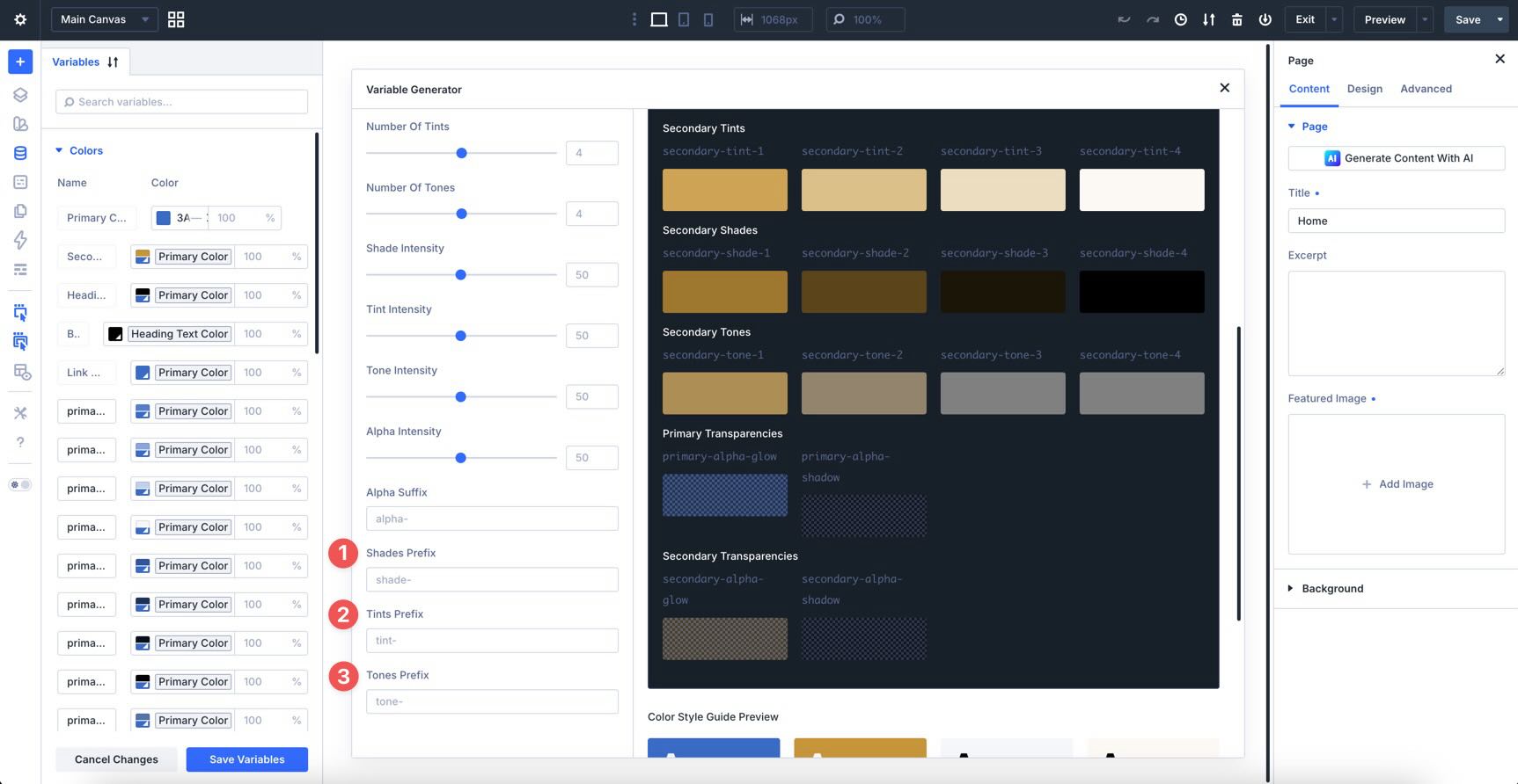
Use custom prefixes to make your variables easier to scan later. Clear names matter because variables are only useful if you can quickly recognize what they are for while designing.
For example, you might use names that separate primary tints from secondary tints, or names that make alpha variables easy to find when building overlays and shadows.
Live Preview
The live preview updates as you adjust the generator settings, so you can review the palette before committing it to your site.
At the bottom of the preview, the Color Style Guide shows text and background examples using the generated colors. Use it to catch combinations that feel too low-contrast, too saturated, or too visually heavy before you start applying the variables across real modules.
Understanding The Generated Variables
Once you add the palette to your site, Divi creates color variables in the Colors group. The exact set depends on your generator settings, but the structure generally follows the same logic.
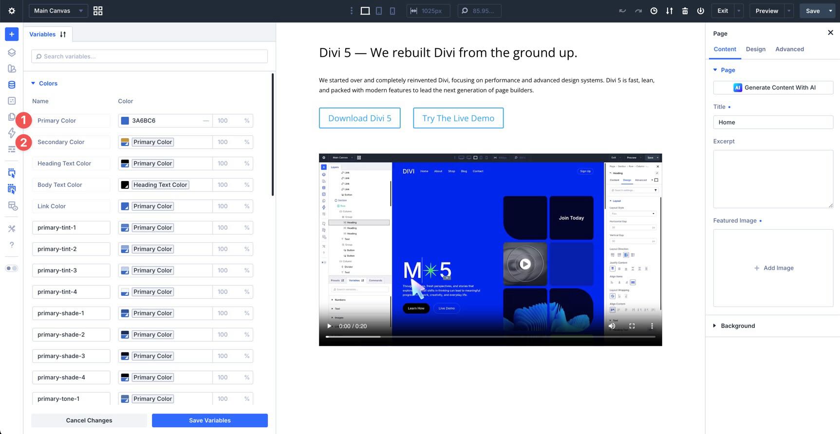
Primary And Secondary Colors
The primary and secondary variables are the foundation of the palette. The primary color is the starting point, and the secondary color is generated based on the palette relationship and offset settings.
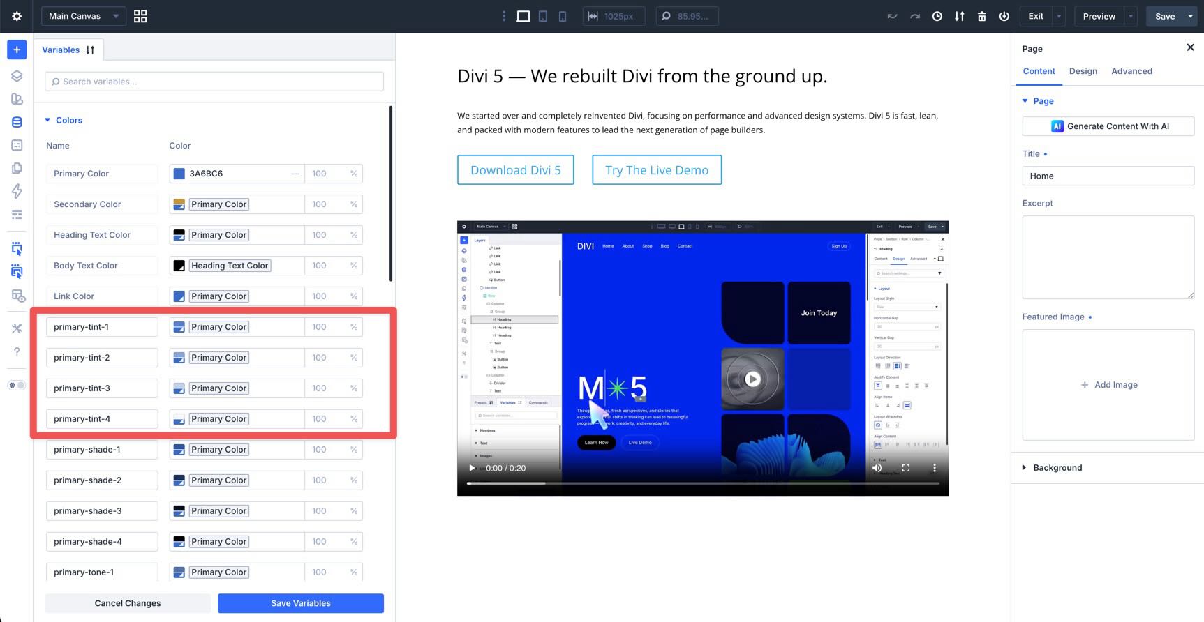
Tints
Tints are lighter versions of your primary and secondary colors. Use them for soft backgrounds, subtle section treatments, hover states, cards, and low-emphasis accents.
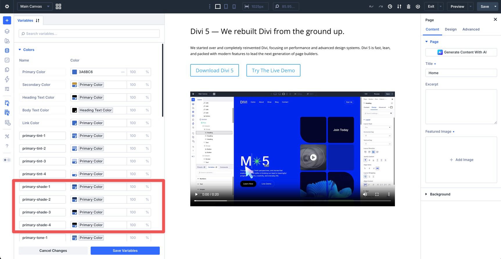
Shades
Shades are darker versions of your primary and secondary colors. Use them for text, borders, buttons, icon colors, and deeper accents.
Tones
Tones are more neutral versions of your colors. Use them when a pure tint or shade feels too saturated for interface elements, dividers, muted backgrounds, or supporting content areas.
Alpha Variants
Alpha variants include built-in transparency. Use them for overlays, shadows, glows, borders, background layers, and hover effects that need to feel connected to the same color system.
Applying Color Variables Across Your Site
After the palette is generated, the next step is to use those variables in real module settings. The goal is to replace one-off static colors with reusable values that can be managed from the Variable Manager.
In the Visual Builder, open any section, row, column, or module with a color field. For example, open the Content tab, expand Background, go to Background Gradient, and select + Add Background Gradient.
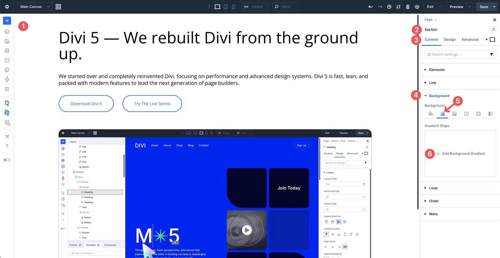
Divi will add a default gradient. Click each color stop and choose colors from your variable list instead of entering static color values manually.
Now the gradient is tied to your generated variables. If you edit those variables later, the design can update wherever those variables are used.
You can use color variables in color-related settings throughout Divi, including backgrounds, gradients, text, borders, overlays, buttons, forms, and other design controls that support variable values.
Using Color Variables With Presets
Color variables become much more powerful when you combine them with Presets. A variable stores the value. A preset decides where and how that value is used.
For example, you can style a Button module with a generated secondary color for the background, a light tint for the text color, and a darker shade for the hover state. Then you can save that styling as a preset instead of rebuilding it on every button.
There are two main preset workflows to use with generated color variables:
- Element Presets: Use these when you want the full module design to reuse your generated colors, such as a Button Preset, Blurb Preset, Heading Preset, or Call To Action Preset.
- Option Group Presets: Use these when you want to reuse a specific group of settings, such as a background, border, box shadow, text style, or button style, across different modules.
Assign the preset to other modules, and those modules will inherit the same color decisions.
This creates a layered system. The Variable Manager controls the actual colors. Presets control how those colors are applied. Individual modules only need one-off overrides when something truly needs to be different.
If your brand color changes later, edit the relevant variable in the Variable Manager. Modules and presets using that variable can update with it.
Tips And Best Practices
Start With A Strong Primary Color
The quality of the generated palette depends on the primary color you start with. Choose a color that represents the brand and has enough saturation and depth to generate useful lighter and darker variations.
Avoid starting with a color that is already too close to white or black. Very light colors may not leave enough room for useful tints, while very dark colors may limit the usefulness of darker shades.
Do Not Generate More Variables Than You Need
A large palette can look impressive in the preview, but too many variables can slow down decision-making. Start with the smallest useful system, then expand it only when you need more steps.
For example, a small site may only need a few tints, shades, tones, and alpha values. A larger site with multiple landing pages, product sections, and complex UI patterns may benefit from a wider range.
Check Contrast Before Publishing
Use the Color Style Guide Preview to review text and background combinations before applying the palette across the site.
The preview is helpful, but it should not be the only accessibility check. Test important text and background combinations with a dedicated contrast checker, especially for body text, buttons, navigation, forms, and calls to action.
Use Variables Inside Presets
Variables are most useful when they are part of your preset system. Instead of applying generated colors one module at a time, build presets that reference those variables.
For example, create a button preset that uses your secondary color, a card preset that uses a soft tint, and a border preset that uses a subtle alpha variant. Then use those presets wherever the same design pattern appears.
Combine Color Variables With Sizing Variables
The same Variable Generator also includes sizing workflows. Pair your color variables with generated sizing variables for spacing, font sizes, gaps, widths, borders, and radius values when building presets.
This gives your site a more complete design system. Color handles the visual language. Sizing variables handle rhythm, spacing, scale, and proportion.
Use Clear Naming Conventions
Take time to set useful prefixes before adding variables to your site. Clear naming makes variables easier to find later when you are working inside module settings.
A good naming system should help you understand the role of each variable at a glance. Names like primary-tint, secondary-shade, and primary-alpha are easier to understand than vague names that only make sense during the first setup.
Edit Existing Variables Carefully
Generated variables are global. That is the point, but it also means changes can affect many parts of the site at once.
Before changing a primary or secondary variable on a finished site, preview the most important pages and components. Check buttons, forms, headings, menus, overlays, cards, and any preset-driven sections that use the variable.
Create Better Color Systems In Divi 5
Divi 5‘s Color Palette Variable Generator makes color system creation faster, more connected, and easier to maintain. Instead of manually creating a collection of unrelated colors, you can generate a relative color palette from one primary color and save it as reusable variables.
Those variables become even more useful when combined with presets. Use variables to store the values, use presets to apply them consistently, and update the system from the Variable Manager when your brand or design direction changes.
The result is a cleaner workflow for building Divi 5 websites: fewer static colors, fewer repeated decisions, and a design system that is easier to adjust over time.










Leave A Reply