

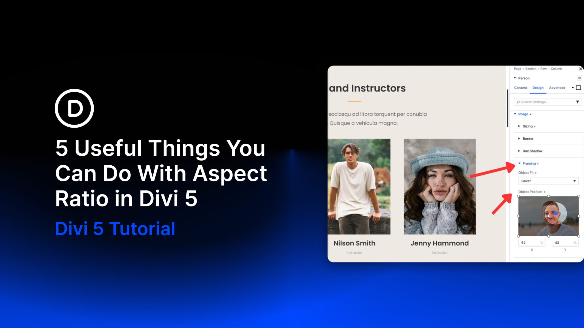
A layout can be carefully designed and still feel inconsistent once real content is added. Images arrive in different shapes. Team headshots come from different sources. Blog thumbnails, embeds, and dynamic content do not always reserve the space your layout expects.
That is where aspect ratio becomes useful. Instead of setting a fixed height, you define a relationship between width and height. The element can still resize across devices, but its proportions stay consistent.
Divi 5 gives you Aspect Ratio and Image Framing controls that make this easier to manage visually. You can use them on images, modules, containers, and sub-elements that expose the Sizing option group.
In this post, we’ll look at five practical ways to use Aspect Ratio in Divi 5 to create cleaner grids, better crops, steadier layouts, reusable shapes, and more consistent social feeds.
What Is The Aspect Ratio Setting In Divi 5?
The Aspect Ratio field lives in the Sizing option group inside the Design tab. You enter a ratio in width-to-height format, such as 16:9, 1:1, 4:5, or 21:9.
Divi then calculates the element’s height from its rendered width. As the container becomes narrower or wider across screen sizes, the height adjusts automatically to keep the same proportion.
That distinction matters. You are not locking an element to one fixed height. You are defining a proportion.
For example, a 16:9 element at 1200px wide renders at 675px tall. At 400px wide, it renders at 225px tall. The size changes, but the shape stays consistent.
Because Aspect Ratio is part of the Sizing group, it can apply beyond standalone images. With Composable Settings, you can also enable Sizing on supported module sub-elements. That means you can control the proportions of images, containers, buttons, grouped elements, post thumbnails, Person module images, and other supported design parts.
Why Aspect Ratio Matters
Without a ratio, an element’s height depends on its content, its container, or the original dimensions of the media inside it. That can work in a single section, but it becomes harder to manage across a full page.
A blog grid with mixed image uploads can become uneven. A team section can look messy when headshots use different crops. An embed can load late and push nearby content down the page.
Aspect Ratio gives the browser a clear rule: calculate the height from the current width. The layout stays more predictable on desktop, tablet, and phone.
It also helps when content comes from outside your control. If a client uploads a landscape image into a portrait card, or a loop pulls featured images with inconsistent dimensions, the element can keep its intended shape. Then Image Framing controls such as Object Fit and Object Position help decide how the image fills that frame.
5 Useful Ways To Use Aspect Ratio In Divi 5
Aspect Ratio is useful anywhere a layout depends on consistent proportions. The examples below cover common situations where inconsistent sizing can make a design feel less polished.
1. Standardize Images In A Blog Loop
Blog loops pull featured images from WordPress. Those images may not all share the same dimensions. One post might use a wide landscape image, another might use a portrait crop, and another might use a square graphic.
Without a shared ratio, the grid can become uneven.
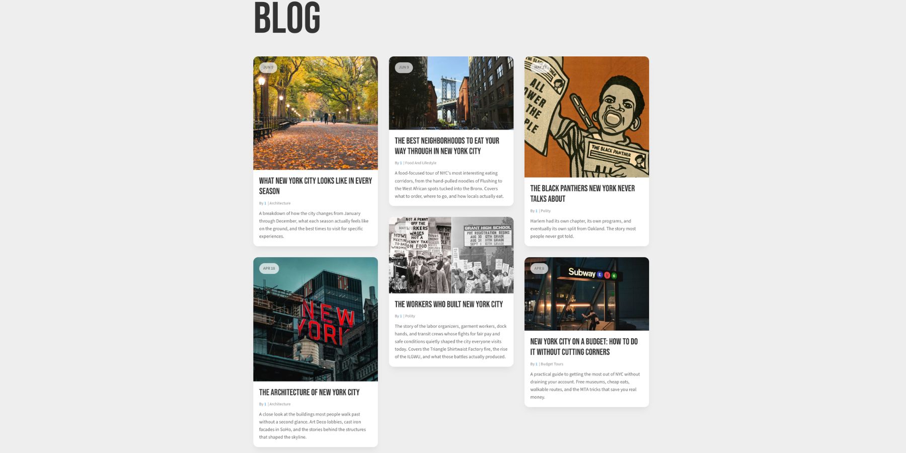
To fix that, open the image or image wrapper inside your loop layout. Go to Design, open Sizing, and set an Aspect Ratio.
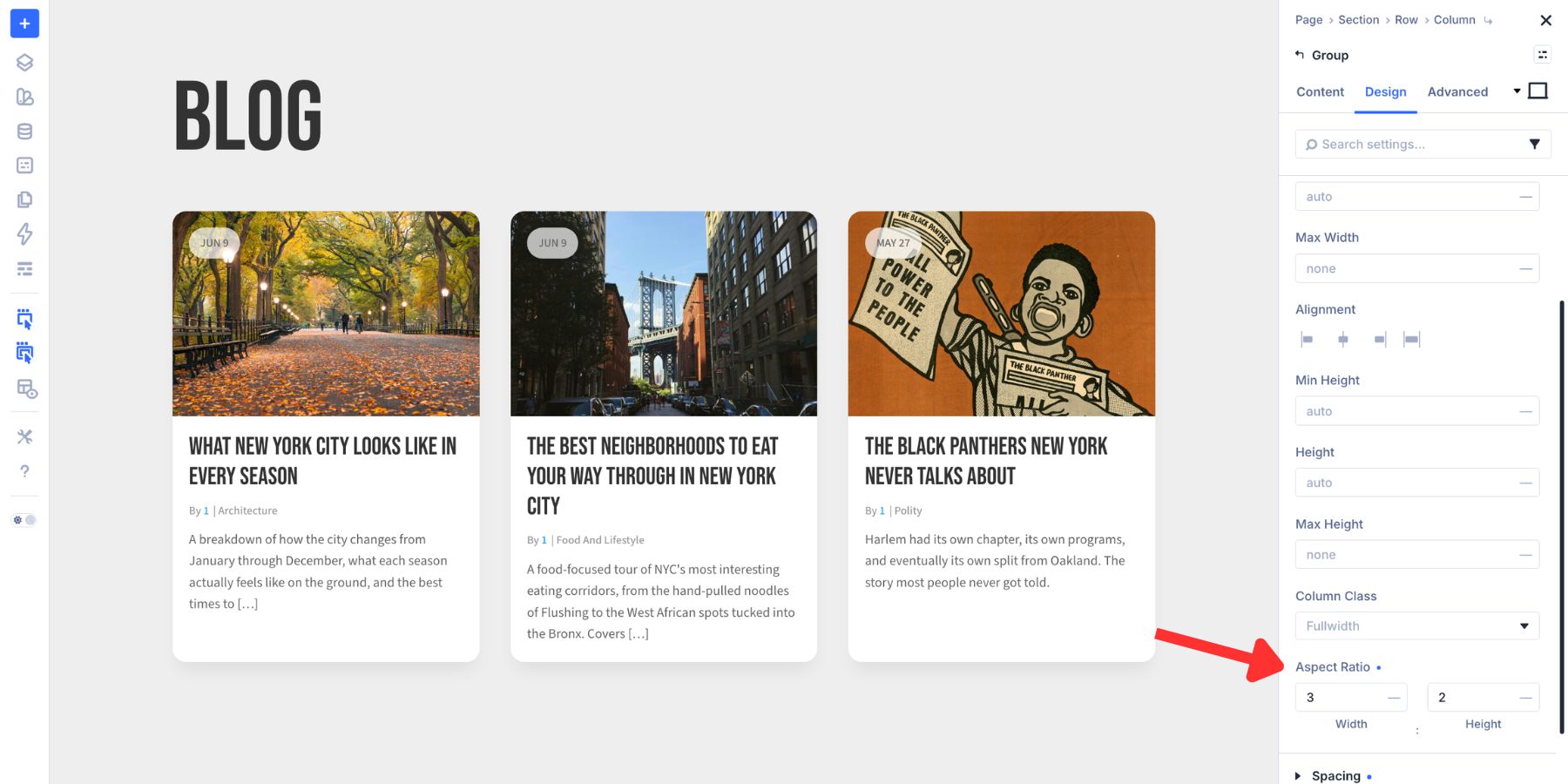
A 3:2 ratio works well for many blog grids because it feels editorial without becoming too wide. A 16:9 ratio works well for more media-style layouts. A 4:3 ratio gives images more height and can make cards feel more balanced when titles or excerpts sit below the image.
After the ratio is applied, the card shape belongs to the layout instead of the uploaded image. If images look stretched, use Image Framing controls and set Object Fit to Cover so the image crops into the frame instead of distorting.
2. Keep Team Headshots Uniform
Team photos rarely arrive in a consistent format. One person sends a square LinkedIn photo. Another sends a wide crop. Another uploads a phone image with extra space around the face.
If those images are used as-is, the team grid can feel uneven.
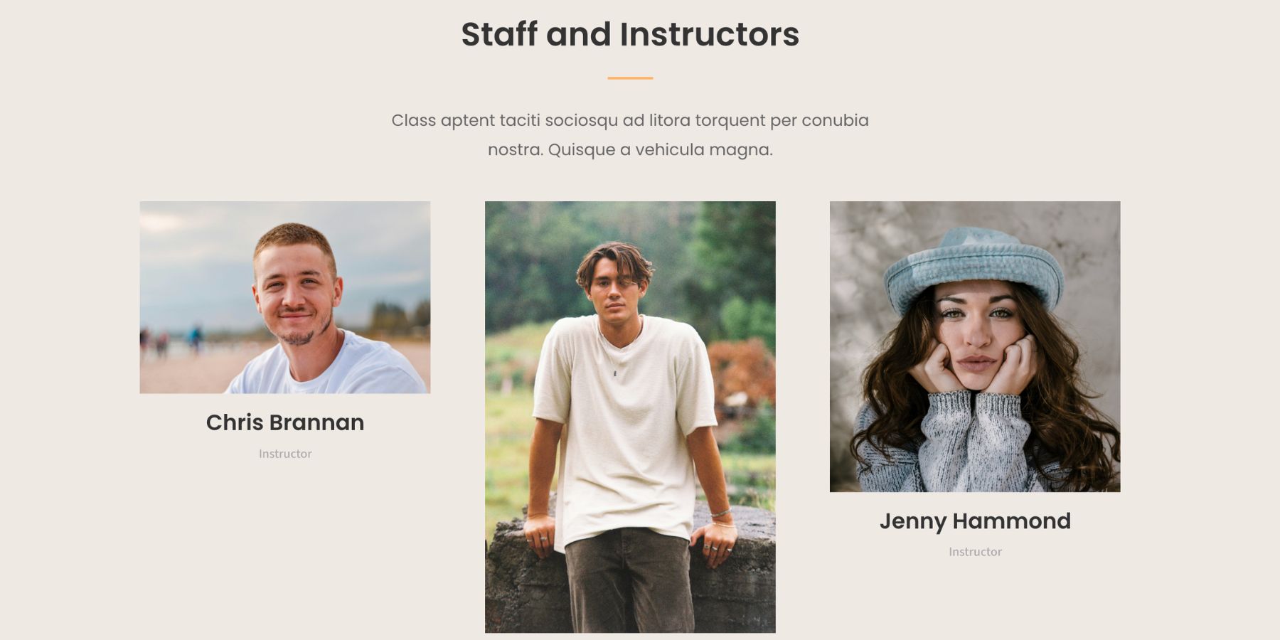
Open the Person module image settings, go to the Design tab, open the image-related Sizing controls, and set an Aspect Ratio.
For team pages, portrait ratios usually work best. Try 3:4 or 4:5. Both give the face enough room while keeping the cards aligned. If the design needs tighter rows, 4:5 often feels more compact.
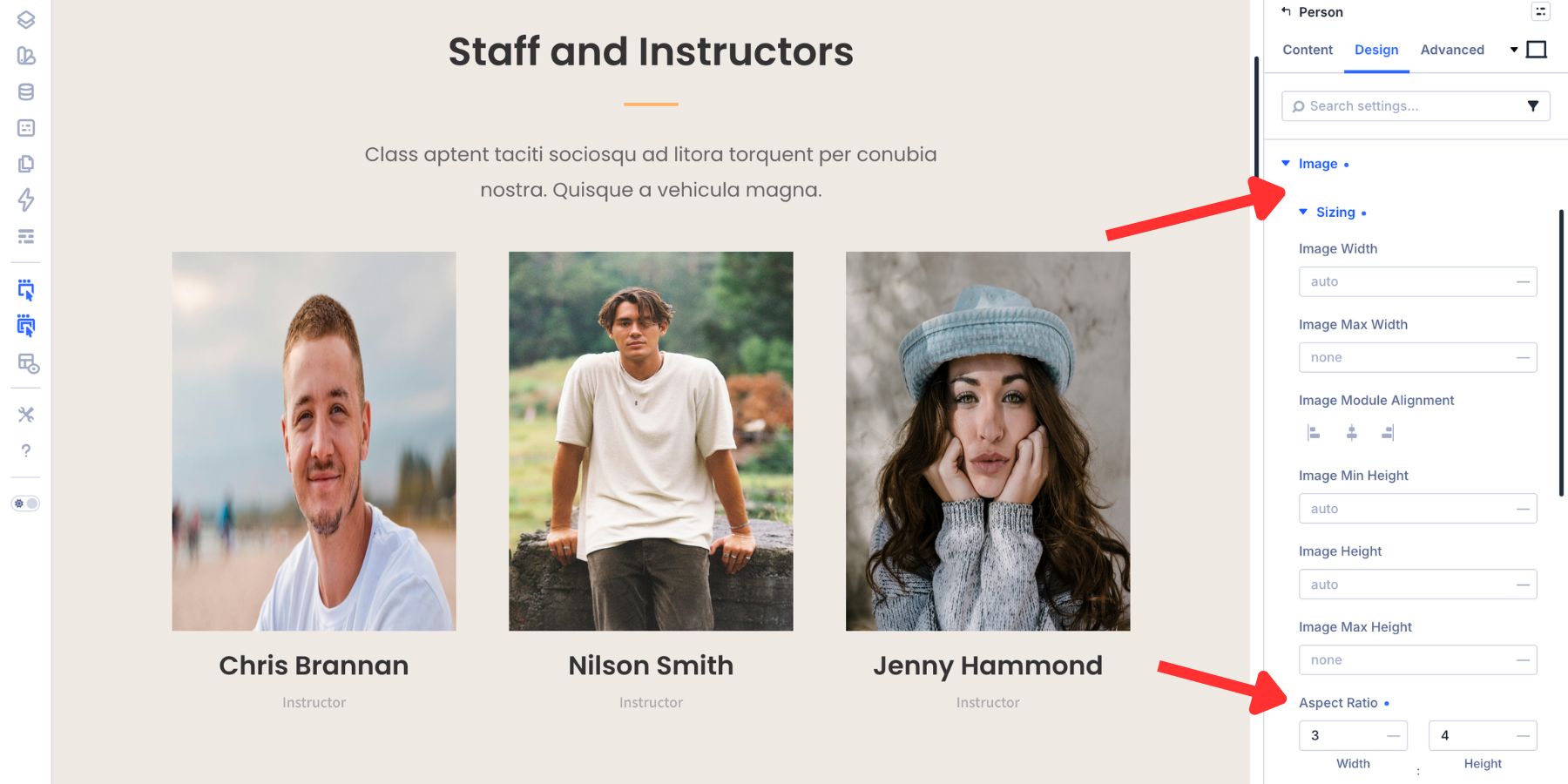
A ratio controls the frame. Framing controls how the image behaves inside that frame. If a headshot looks stretched, open Framing and set Object Fit to Cover. Then adjust Object Position to keep the face centered.
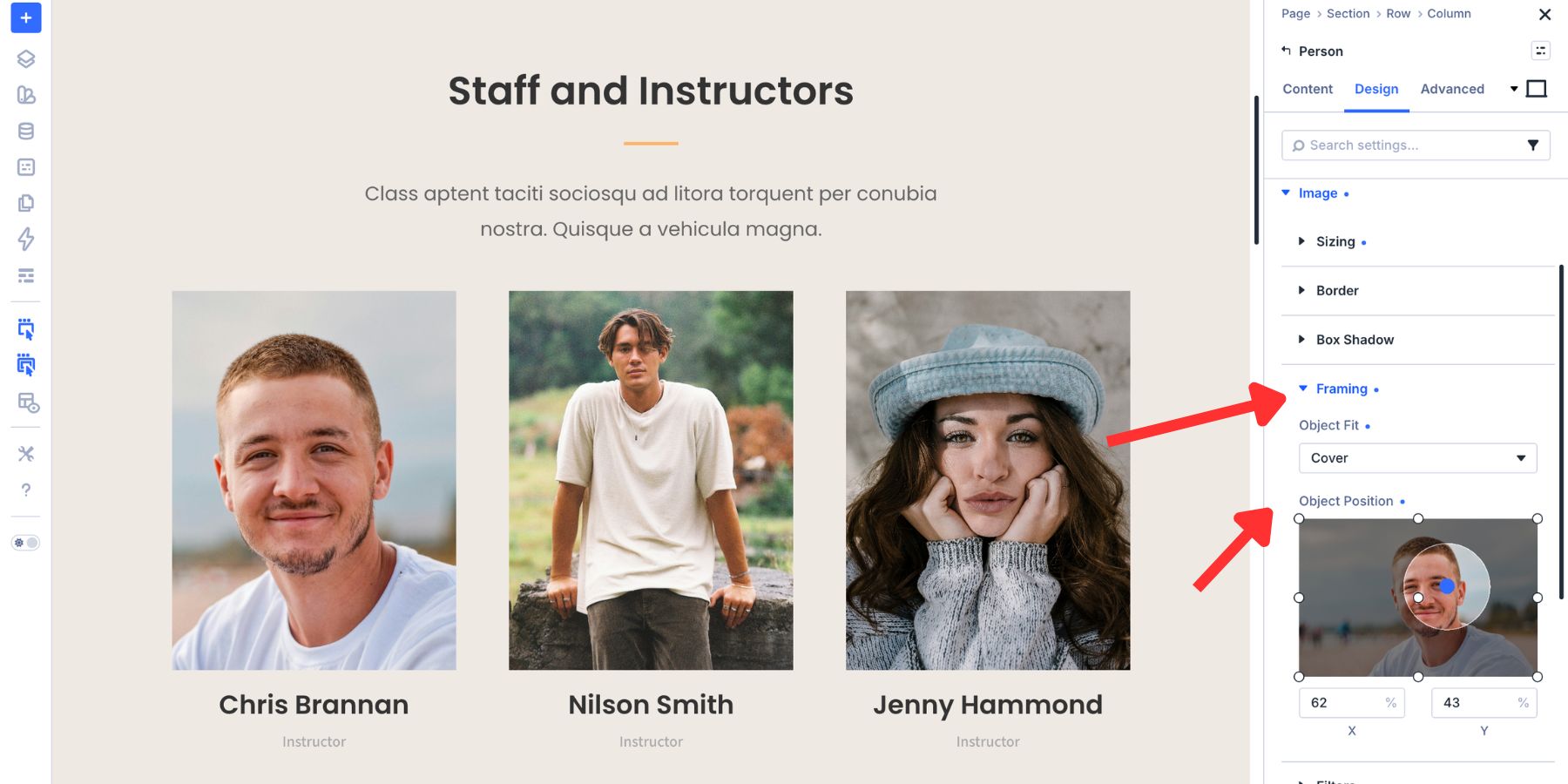
This gives every team member the same visual treatment even when the original image uploads are inconsistent.
If your team directory uses the Loop Builder, apply the ratio to the image inside the loop item. The same ratio then applies across every generated card.
3. Reduce Layout Shift Around Embeds And Dynamic Content
Layout shift happens when content moves after the page has started rendering. A video embed loads late. A map iframe appears after nearby text has already been drawn. A third-party form loads and pushes the next section down.
Google measures this kind of movement with Cumulative Layout Shift, or CLS, which is one of the Core Web Vitals metrics. A good CLS score is 0.1 or less, so reducing unexpected movement can improve the perceived stability of your page.
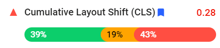
The problem is usually simple: the browser does not know how much vertical space to reserve before the embed or dynamic content loads.
Aspect Ratio can help by reserving space in advance. Set a ratio on the wrapper, row, column, or module that holds the content. The browser can then maintain that proportional space while the content loads.
This is useful for:
- YouTube or Vimeo embeds
- Google Maps embeds
- Third-party forms
- Ad slots
- Dynamic media blocks
For a YouTube video, 16:9 is usually the right ratio. For a map, you might choose 16:9, 4:3, or a custom ratio depending on the section design.
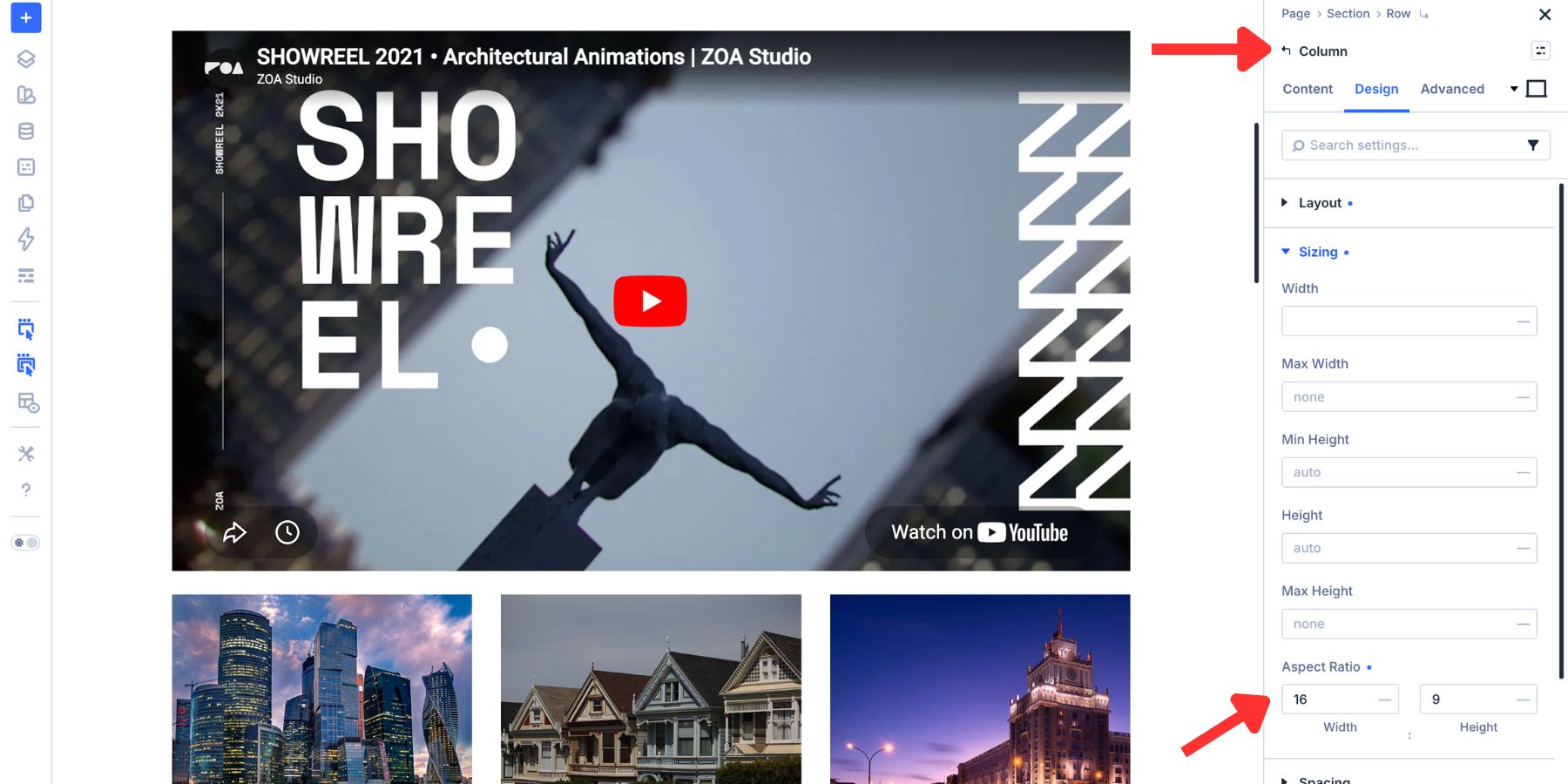
Aspect Ratio does not replace good performance optimization, but it gives your layout a more stable frame for content that may load after the initial page structure.
4. Build Proportional Geometric Decorations
Aspect Ratio is not only for media. It can also help you create proportional design shapes directly inside Divi 5.
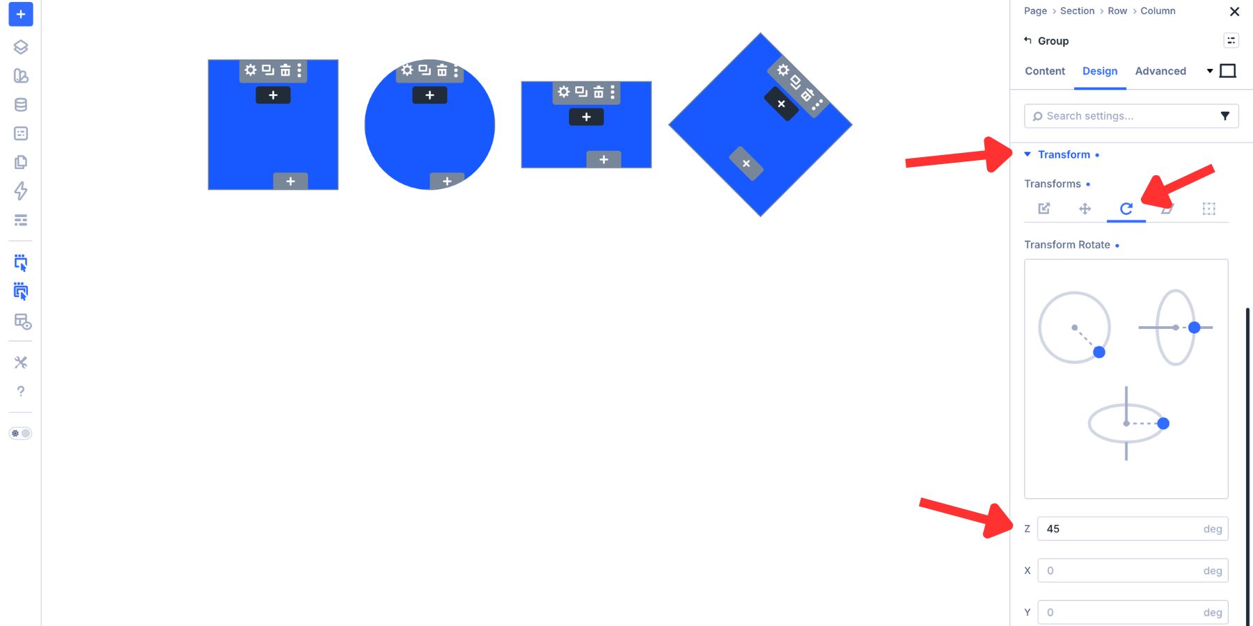
Instead of exporting simple decorative shapes from Figma or Photoshop, you can create them with a Group module. The shape comes from the relationship between Width, Aspect Ratio, Border Radius, and sometimes Transform.
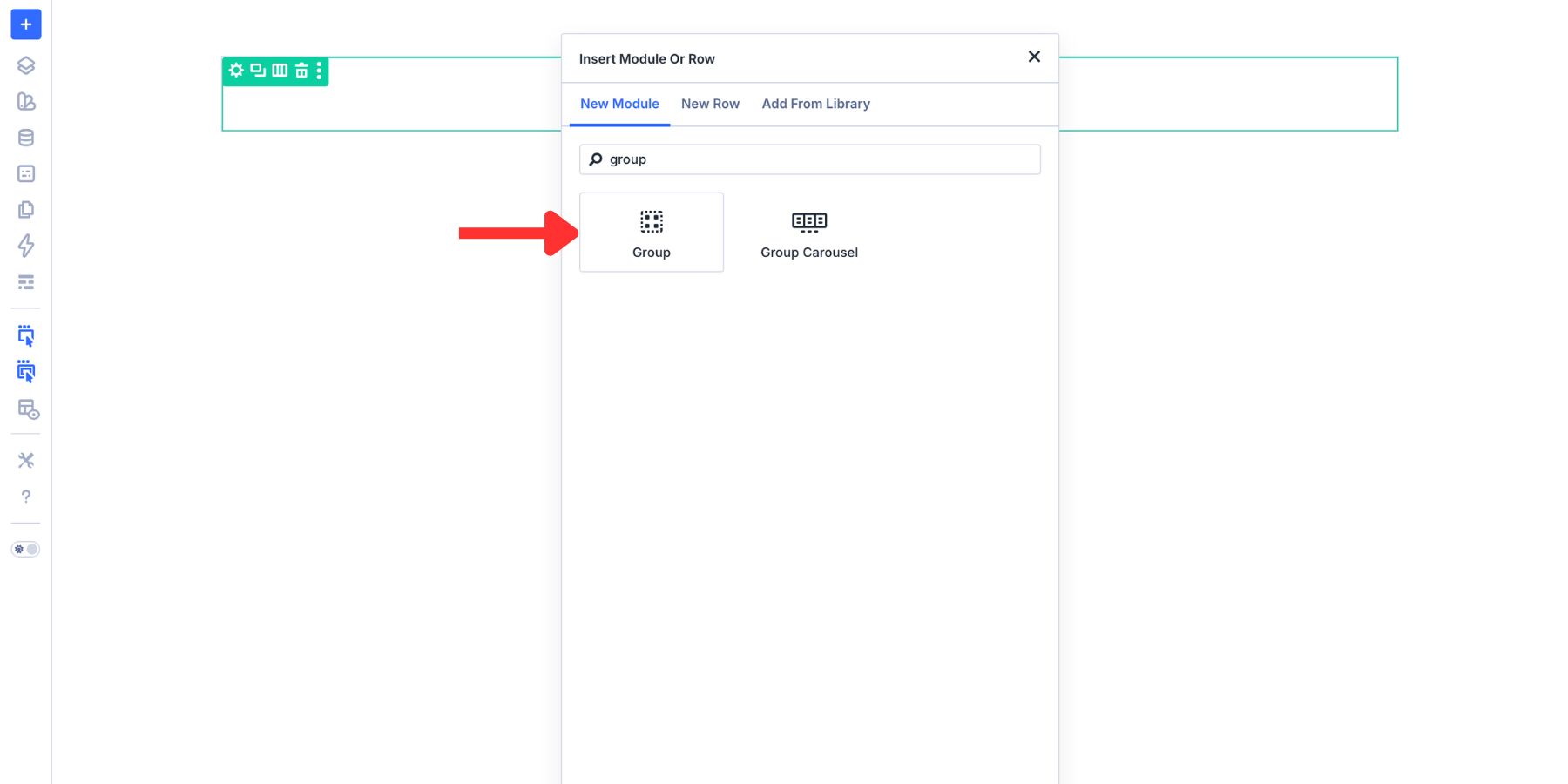
A square starts with a 1:1 Aspect Ratio under Design > Sizing. Set a width, such as 150px, and leave the border radius at zero.
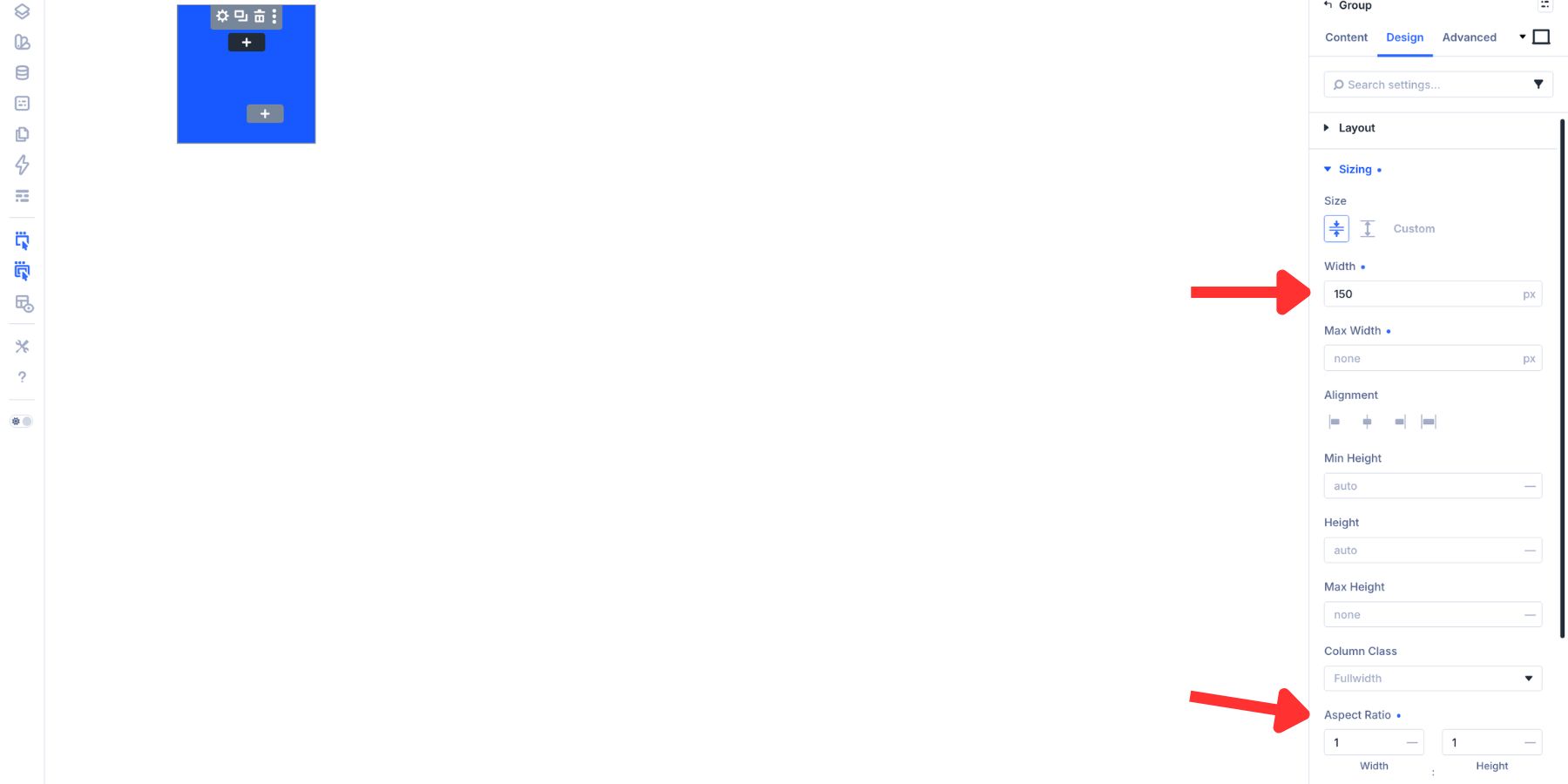
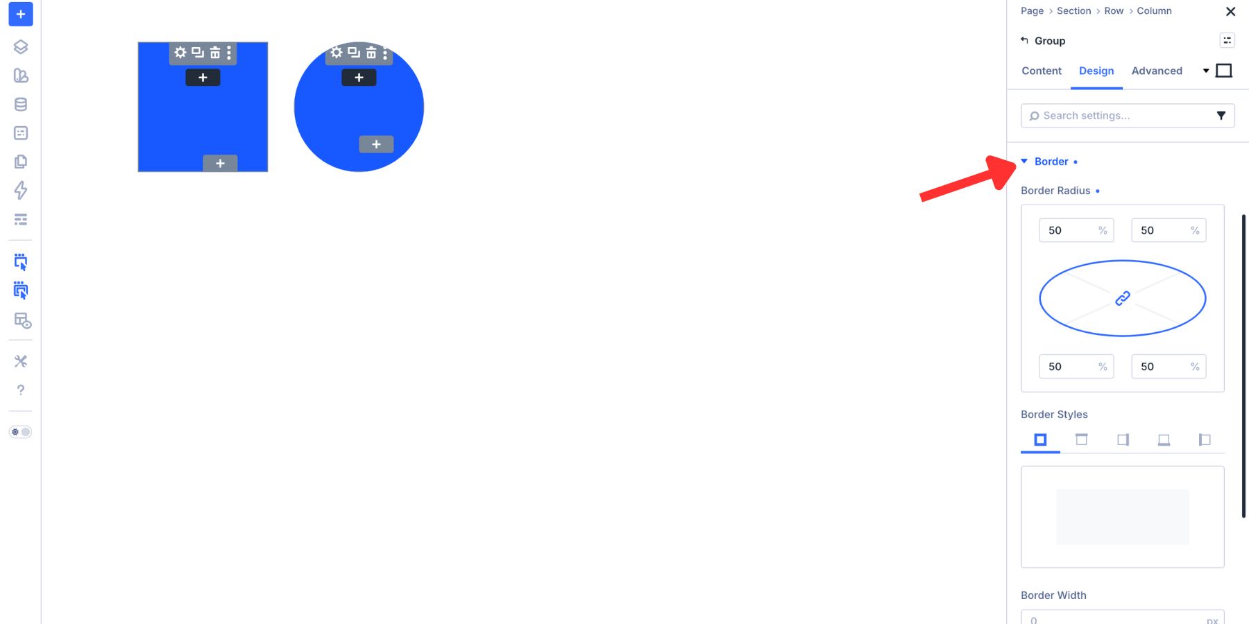
A circle uses the same 1:1 ratio with a 50% border radius under Design > Border.
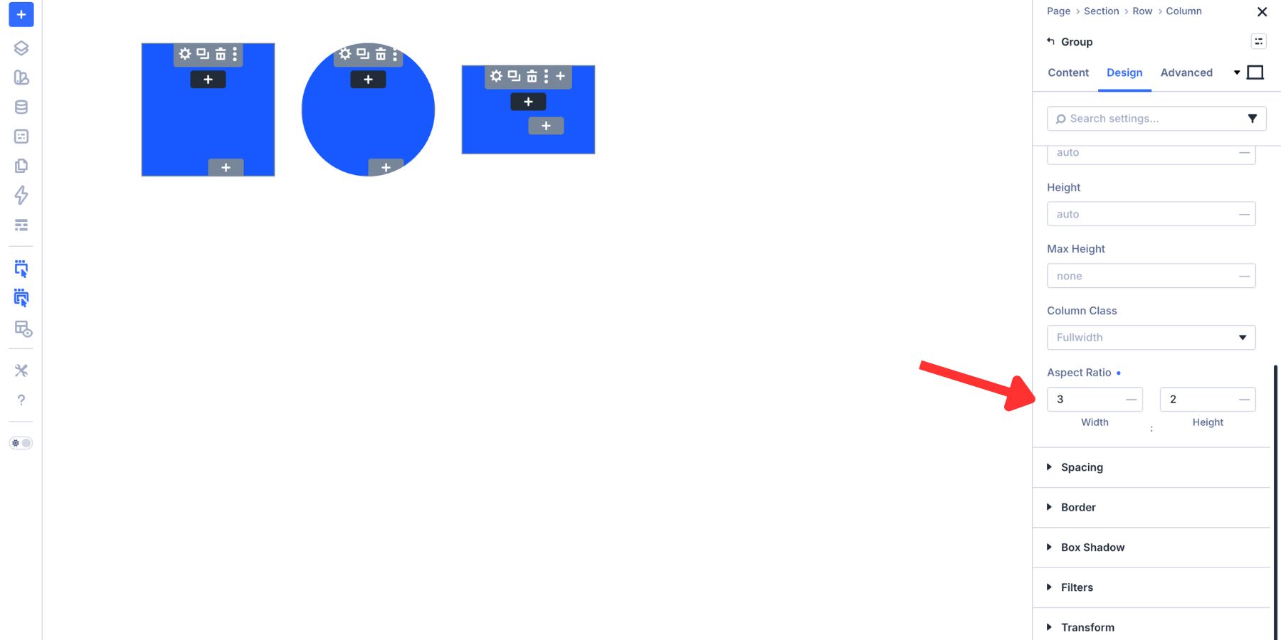
A rectangle uses a wider ratio, such as 3:2, with no border radius.
A diamond starts as a 1:1 square and adds a 45deg rotation under Advanced > Transform.
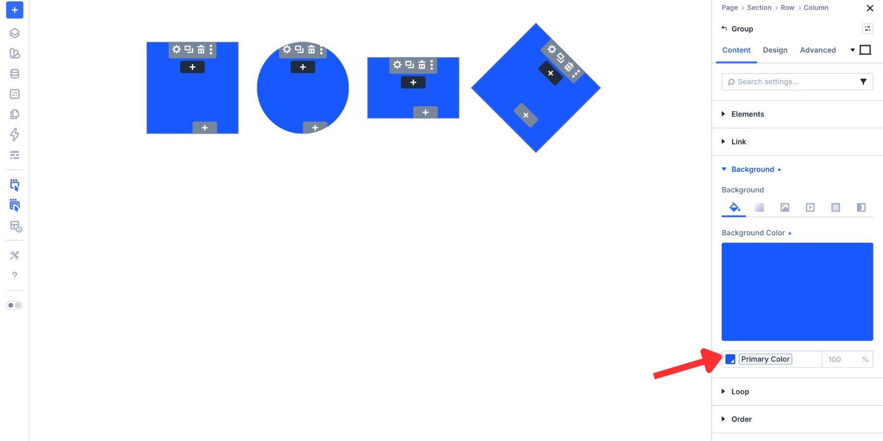
Connect the background color to a Design Variable so the shape follows your site’s color system.
You can also save the Sizing, Border, Background, or Transform decisions as Option Group Presets. That turns each shape into a reusable style instead of a one-off decoration.
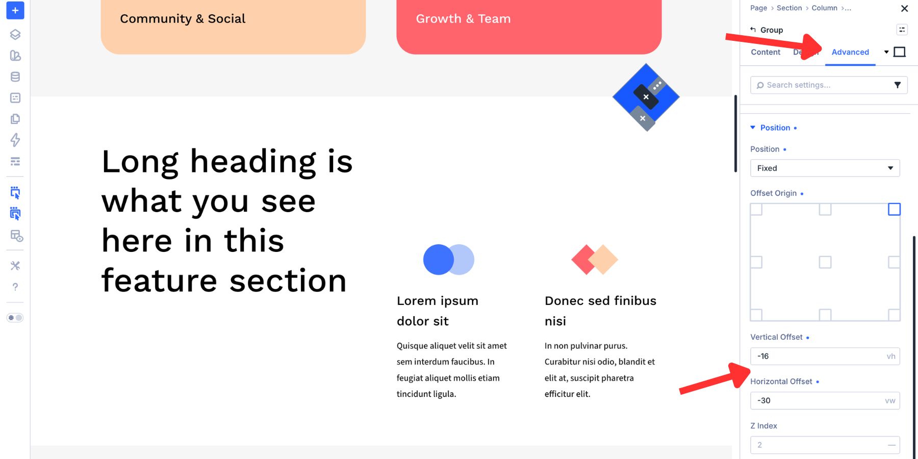
To place the shape, use the Position controls in the Advanced tab. Set the Position Type, choose an Offset Origin, and adjust the vertical and horizontal offsets. Use Z Index to control how the shape stacks behind or above nearby elements.
This keeps decorative elements editable inside the builder. You can resize them, recolor them, reposition them, and reuse them without opening an image editor.
5. Clean Up An Instagram Feed
The Instagram Feed module displays content from an external source. That means your feed may include portrait photos, landscape photos, square graphics, reels covers, and mixed crops.
A consistent ratio helps the feed feel like part of your page design instead of a stream of unrelated image sizes.
The Instagram Feed module uses a 1:1 image ratio by default, but you can change it. Open the module settings, go to the Design tab, open the Image option group, and adjust the Aspect Ratio field.
Use 1:1 for a classic square grid, 4:5 for a more editorial portrait feed, or 3:2 for a wider image treatment.
If the feed images need to crop into the frame, pair Aspect Ratio with Image Framing so the content fills the shape cleanly.
Best Practices For Aspect Ratio In Divi 5
Aspect Ratio is simple, but a few rules make it easier to use well.
- Use ratios by purpose: Try 16:9 for videos, 3:2 or 4:3 for blog cards, 4:5 for portraits, and 1:1 for square grids or icons.
- Pair ratios with Object Fit: If an image stretches after applying a ratio, use Object Fit instead of leaving the image distorted.
- Adjust Object Position: Cropping is not always centered correctly. Move the image position to keep the subject visible.
- Save reusable styles: Turn repeated image, sizing, and framing choices into presets when you use the same treatment across multiple modules.
- Check every breakpoint: Ratios scale automatically, but the surrounding layout, text, and spacing still need a quick responsive review.
- Do not force every element into one ratio: Choose ratios based on the content and the job that element performs.
Keep Your Divi 5 Layouts Consistent With Aspect Ratio
Aspect Ratio in Divi 5 is one of those settings that gets more useful as your site grows. A blog grid stays aligned. A team page looks more polished. Embeds reserve their space. Decorative shapes keep their proportions. Social feeds feel more intentional.
The context changes, but the logic stays the same: define the proportion once, then let the element scale from that rule.
Use Aspect Ratio with Image Framing, Design Variables, and Presets, and it becomes more than a sizing setting. It becomes part of your Divi 5 design system.










Thank you for introducing this to me. I actually spend lots of time wondering about images size , did not know where to beginning with . This article makes things clearer for me