


In Part 9 of our Mastering Flexbox series, we showed how Column Class works with Layout Wrapping, Gap, Justify Content, Align Items, and Display Order to create responsive multi-column layouts without reaching for CSS Grid for every pattern.
Over the course of this series, you’ve learned the core Flexbox controls, built equal-height cards with aligned buttons, explored Wrap vs. No Wrap, aligned content without spacers, reordered content for better mobile flow, applied key responsive techniques, created flexible button, menu, and link rows, switched repeated spacing from margin to Gap, and built responsive column patterns with Flexbox.
Now it’s time to bring those techniques together. In this final installment, we’ll turn the most useful lessons from the series into a practical set of best practices. These habits will help you keep your Divi 5 layouts easier to understand, more consistent across breakpoints, and simpler to maintain as content changes.
Let’s dive in.
- 1 Why Best Practices Matter In Divi 5 Flexbox
-
2
Best Practices And Tips For Flexbox
- 2.1 1. Use Gap For Repeated Spacing Between Related Items
- 2.2 2. Confirm The Parent Uses Flex Before Adjusting Flexbox Controls
- 2.3 3. Use Align Items > Stretch For Equal-Height Cards
- 2.4 4. Use Space Between, Then Add Grow To Fill When Needed
- 2.5 5. Build Responsive Grid-Like Layouts With Layout Wrapping + Column Class
- 2.6 6. Keep Column Class Combinations Simple
- 2.7 7. Use Structure Templates For Faster Responsive Column Changes
- 2.8 8. Use Fluid Gap Variables Or Reduce Gaps At Smaller Breakpoints
- 2.9 9. Reorder Content With Display Order Only When Necessary
- 2.10 10. Use Nested Modules For Tight Content Relationships
- 2.11 11. Start With A Logical Structure, Then Refine Across Breakpoints
- 2.12 12. Test Every Layout With Real, Variable-Length Content
- 2.13 13. Use Advanced Units And Design Variables To Reduce Responsive Overrides
- 2.14 14. Understand When Align Content Actually Works
- 2.15 15. Preserve Logical Source Order For Accessibility And Maintainability
- 2.16 16. Know When CSS Grid Is The Better Layout System
- 3 Putting It All Together
Why Best Practices Matter In Divi 5 Flexbox
If you’ve spent years building with Divi, some older layout habits can be hard to break. Adding margins to individual modules, using extra Divider modules for spacing, writing custom CSS for equal heights, duplicating sections for different devices, or relying on fixed layout workarounds may have been useful in older builds.
Divi 5’s Flexbox Layout System gives you native controls for many of those layout jobs. Gap, Layout Direction, Justify Content, Align Items, and Layout Wrapping work at the container level to control direct children. Other controls, such as Display Order, let you adjust the behavior of individual Flex items when needed.
The goal is not to use every Flexbox setting on every layout. It is to build a clear parent-child structure, apply each control at the right level, and add responsive overrides only where the design actually needs them.
What Are The Benefits Of A Strong Flexbox Workflow?
When spacing and alignment are handled from the appropriate parent container, related elements are easier to adjust as a group. One change to a Gap, alignment, or wrapping setting can affect multiple children without requiring the same edit on every module.
You can also reduce duplicated layout structures and avoid custom CSS for many common alignment, spacing, equal-height, wrapping, and responsive ordering patterns.
Just as importantly, reusable Flexbox sections become easier to understand when you revisit them later. A Row controls its Columns, a Column controls its modules, and a Module Group controls the related items inside it.
Best Practices And Tips For Flexbox
The controls you’ve learned throughout this series become much more useful when you apply them consistently. Here are the practices worth carrying into future Divi 5 builds.
One of the biggest workflow shifts in Divi 5 is moving repeated spacing decisions to the parent container. As we covered in Part 8, use Horizontal Gap and Vertical Gap when you want consistent spacing between direct child elements.
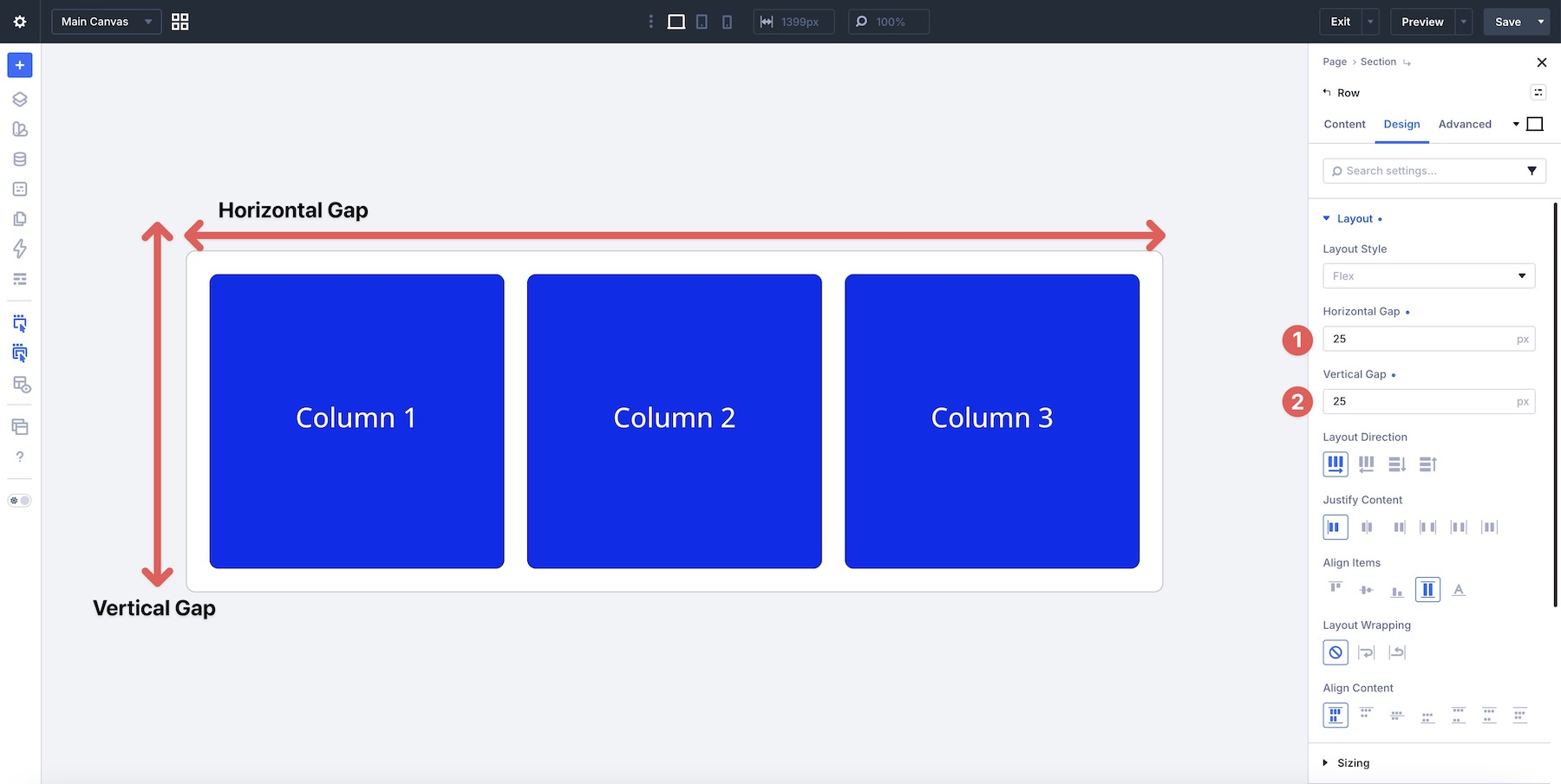
Apply Gap to the container that directly owns the items you want to space. That might be a Section, Row, Column, Module Group, or another element acting as a Flex container.
Gap creates spacing between the children instead of adding spacing to the outer edges of the group. This is especially useful when items wrap because you can control horizontal and vertical spacing from one parent.
Margin still has valid uses. Reach for it when you need outside spacing on one specific element, an intentional overlap, a one-off offset, or another effect that Gap cannot create on its own.
2. Confirm The Parent Uses Flex Before Adjusting Flexbox Controls
New Divi 5 containers use Flex as their default Layout Style, but legacy Divi 4 elements and migrated layouts may still use Block. If a Flexbox setting appears to have no effect, open the element’s Design tab, expand the Layout option group, and check the Layout Style first.
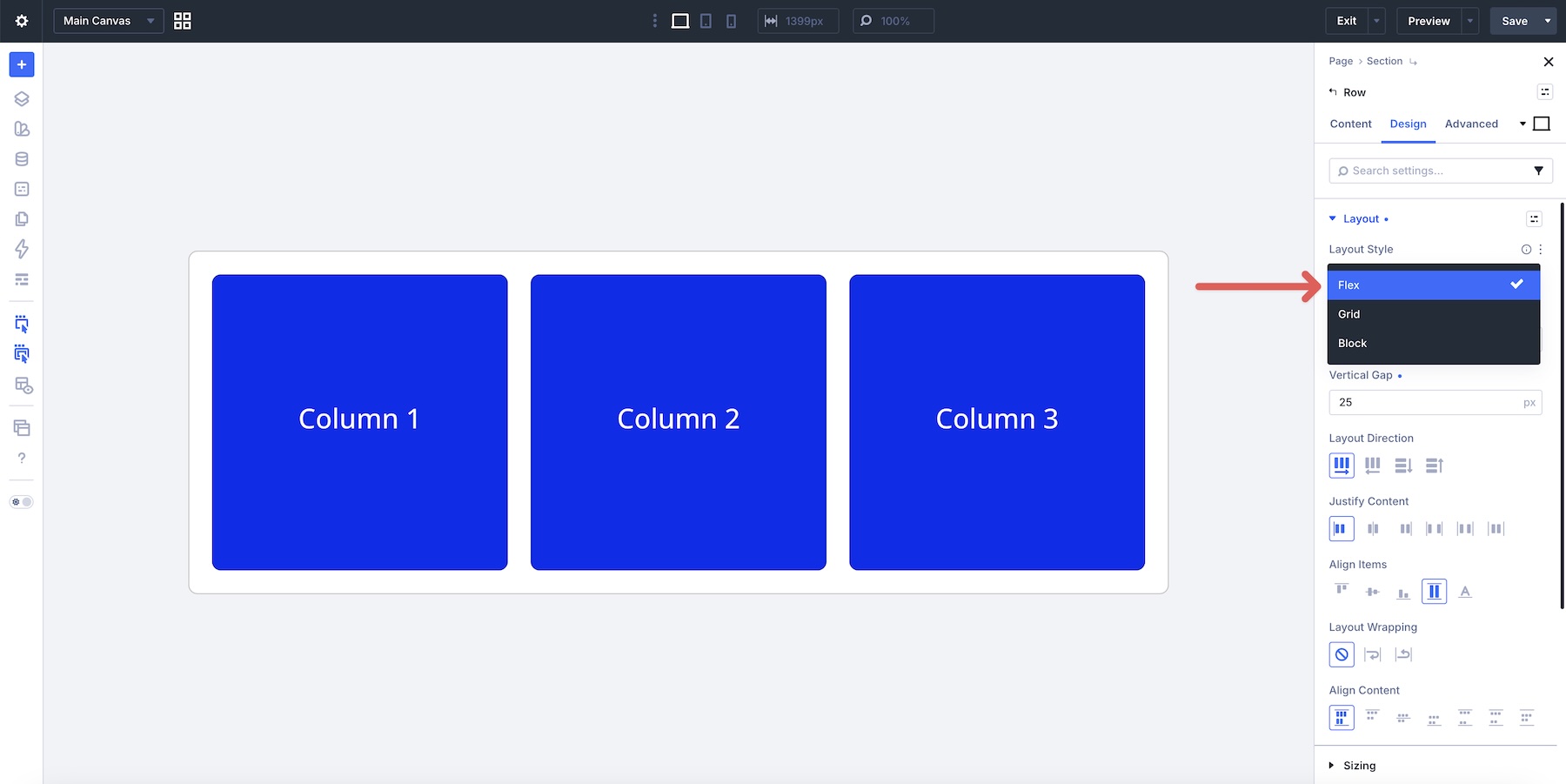
Just as important is choosing the correct container. Flexbox controls affect the direct children of the element you’re editing.
Apply them on a Row to control its Columns.
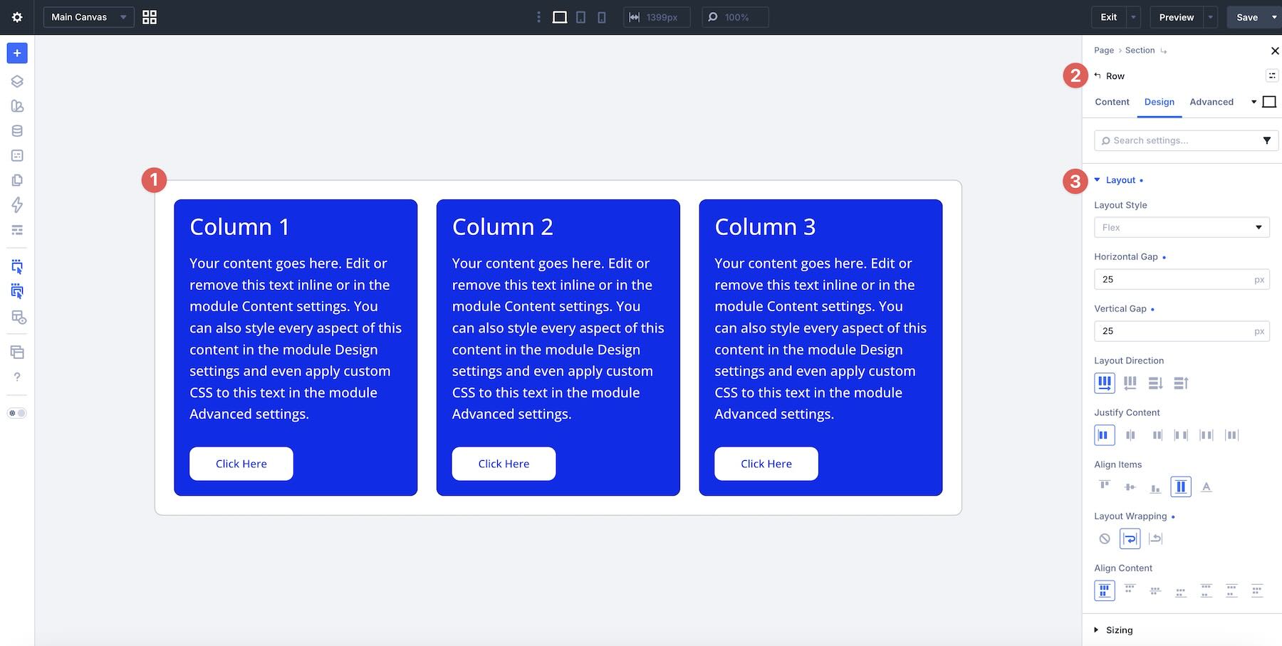
Apply them on a Column or Module Group to control the modules inside it.
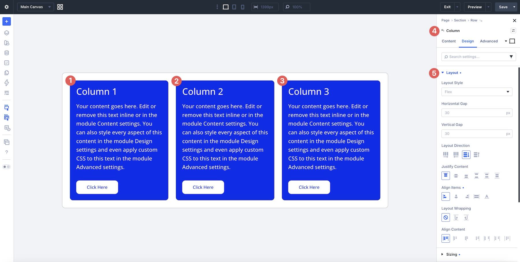
Use them on a Nested Module when you want to control its nested children.
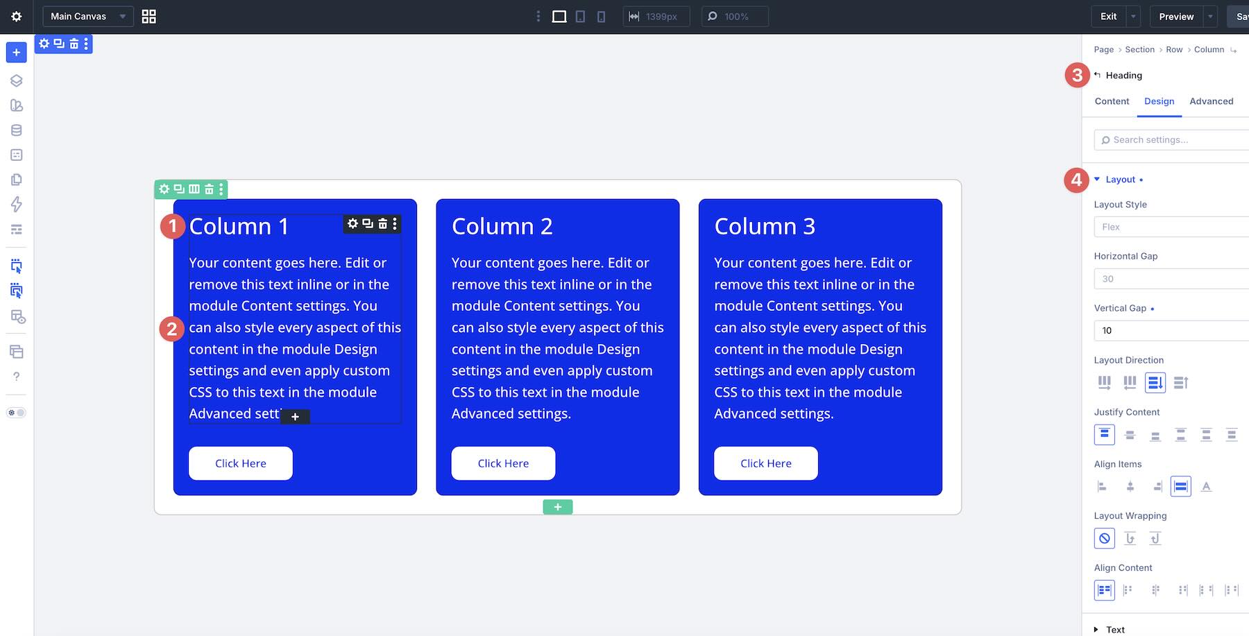
If a Gap or alignment setting is not affecting the elements you expect, ask one question first: Which element is the direct parent of the items I want to control?
3. Use Align Items > Stretch For Equal-Height Cards
When several cards sit on the same Flex line and need to share a consistent height, set Align Items > Stretch on their parent container. Stretch is the default Align Items value in Divi 5, but it is worth checking when an imported or customized layout behaves differently.
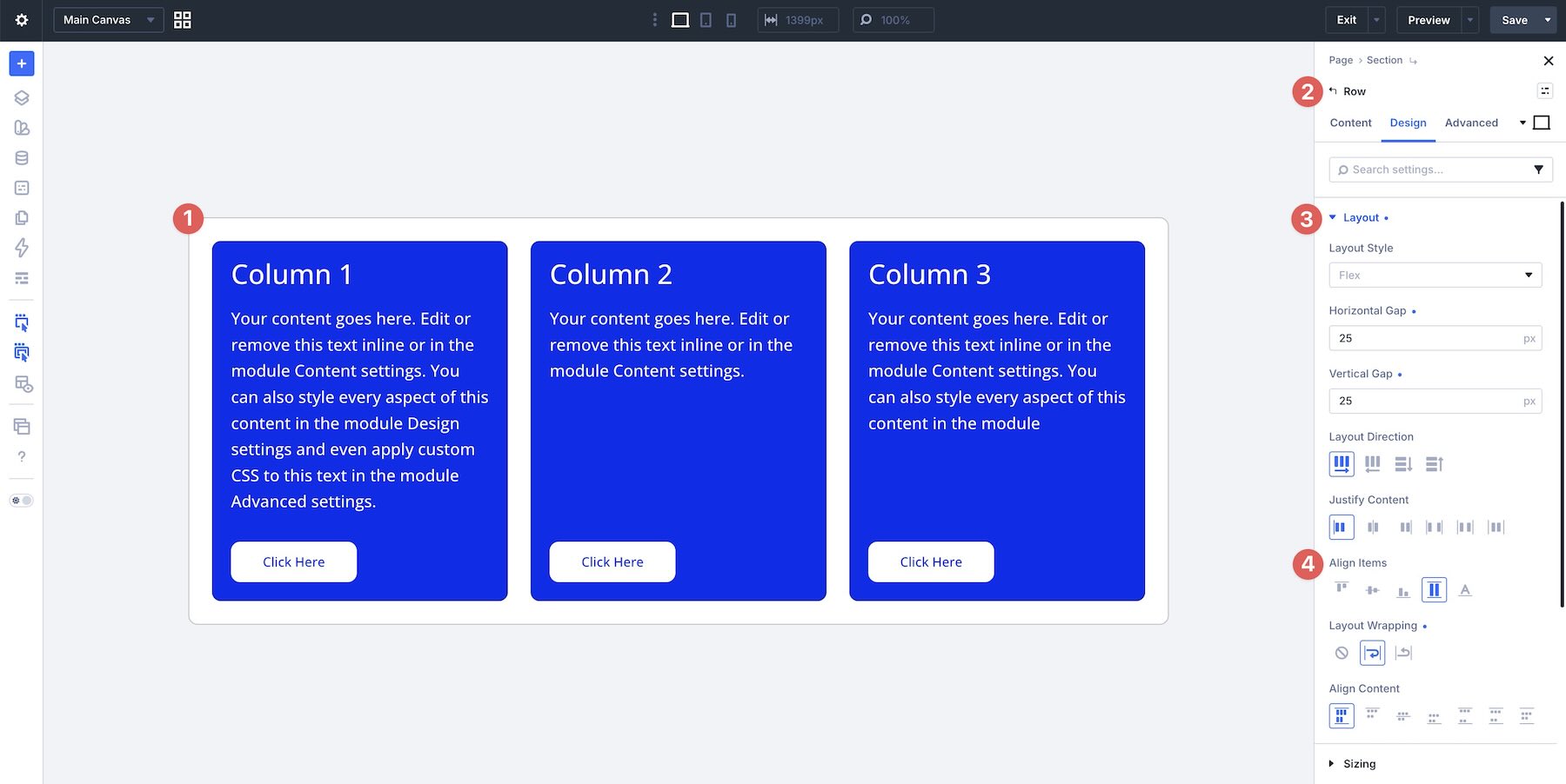
In a Row with a horizontal Layout Direction, Stretch works across the vertical cross axis. When the children’s sizing allows it, eligible Columns can expand to share the available height within the same Flex line.
This lets you avoid custom equal-height CSS and manual height values for many common card layouts.
When the Row wraps onto multiple lines, remember that each Flex line can have its own height. Stretch aligns items within their respective line rather than forcing every card across every wrapped line to match one universal height.
4. Use Space Between, Then Add Grow To Fill When Needed
For cards with a CTA that should sit near the bottom, start by making the card itself a vertical Flex container. Set its Layout Direction to Column, then apply Justify Content > Space Between.
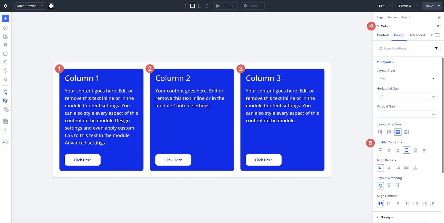
With a Column direction, the main axis runs vertically. Space Between can keep the upper content near the top while moving the final button or CTA toward the bottom of the card.
For straightforward cards, that may be enough. When variable-length content still creates uneven internal spacing, use Grow To Fill on the Text module or Module Group that should absorb the available space.
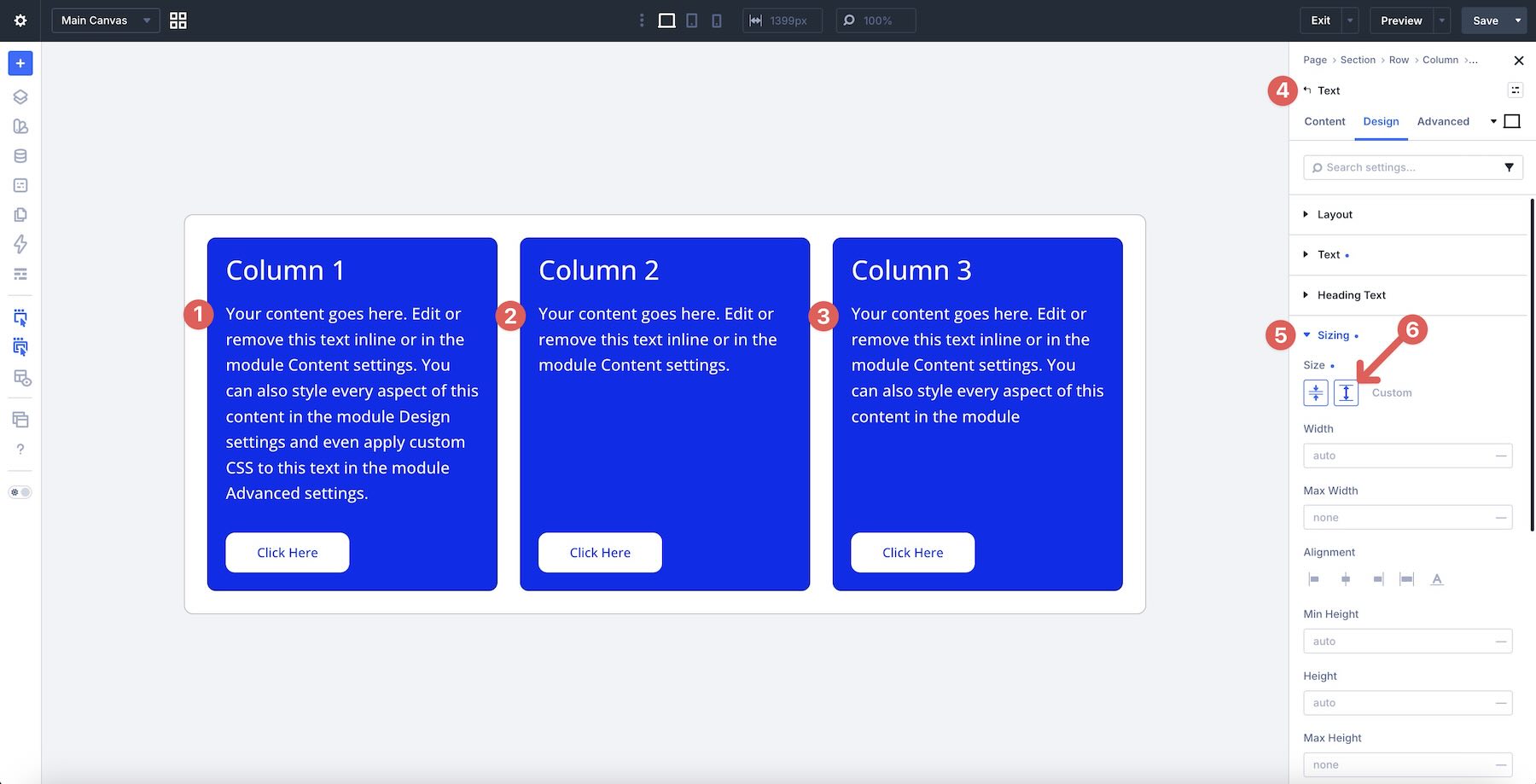
Grow To Fill is a supporting tool, not a requirement for every card. Use it when a specific content area needs to expand so the elements below it align more consistently.
5. Build Responsive Grid-Like Layouts With Layout Wrapping + Column Class
For many card grids and repeated column patterns, one Flex Row can handle multiple lines. Enable Layout Wrapping > Wrap on the Row.
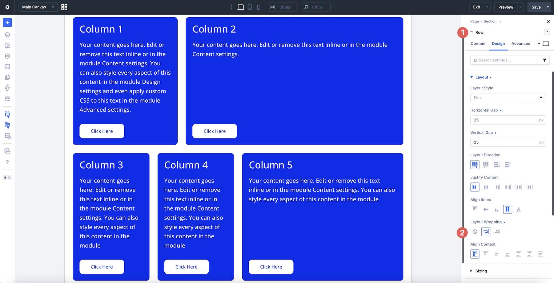
Then assign simple Column Class values such as 1/2, 1/3, 1/4, or 2/3 to the Columns inside it.
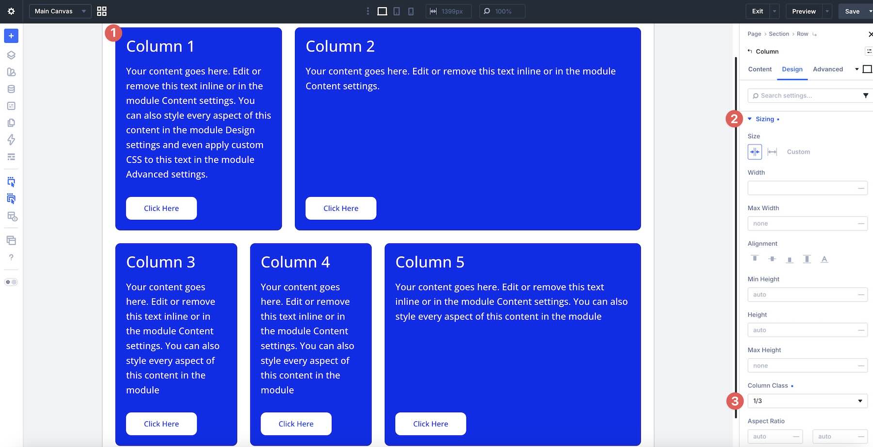
Columns remain on the same Flex line while their widths and Gap values fit within the available space. When they no longer fit, Wrap allows them to move onto additional lines while retaining their Column Class values.
This is a useful pattern for responsive card grids, feature sections, statistics, logo groups, and other layouts that need a natural one-dimensional flow across multiple lines.
6. Keep Column Class Combinations Simple
Column Class gives you plenty of flexibility, but simple fractions are usually easier to manage across breakpoints. Start with values such as 1/2, 1/3, 1/4, 2/3, or 3/4 when they suit the design.
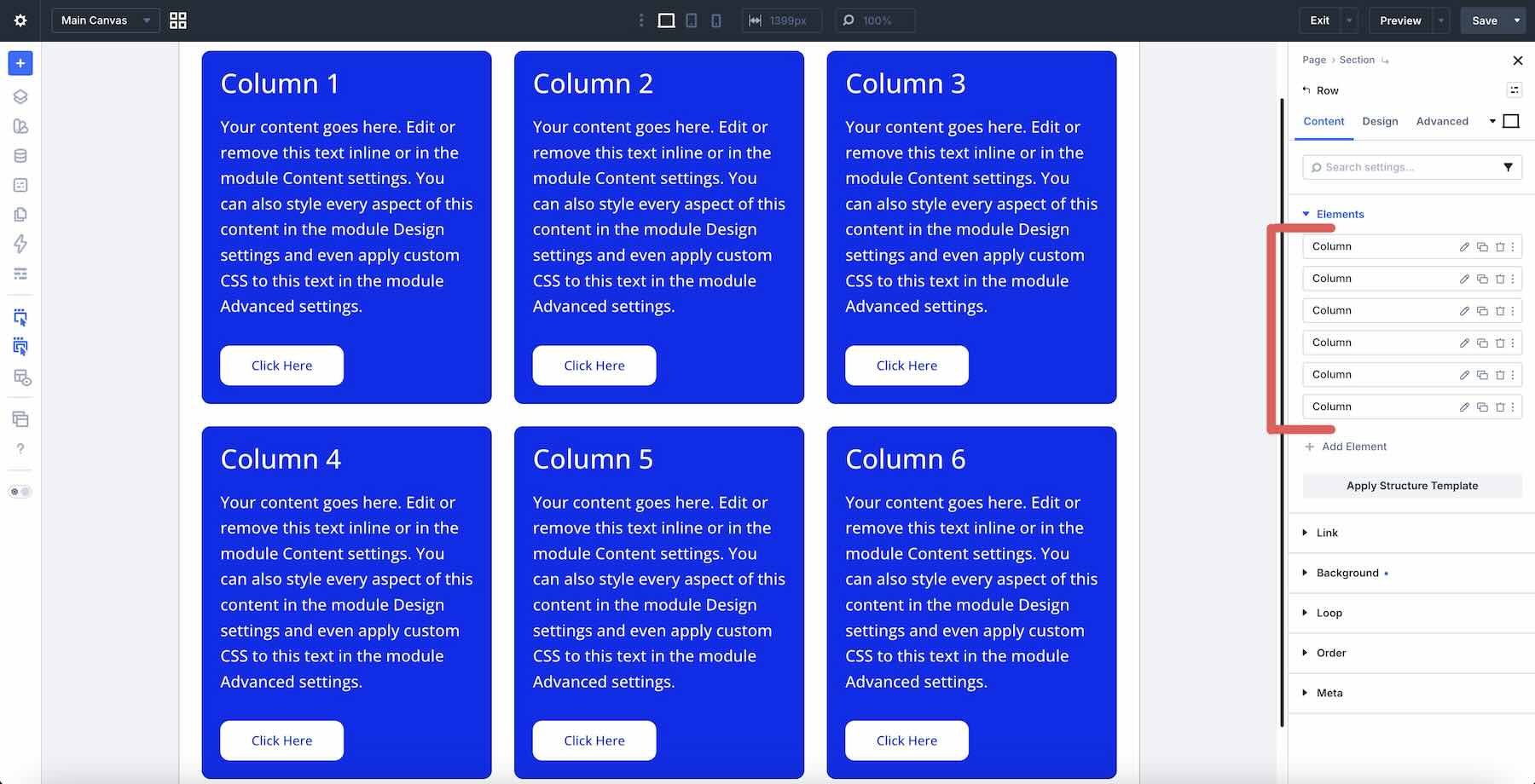
More complex combinations can still be useful, but they also create more relationships to reconsider when the layout moves to Tablet or Phone.
Starting with the simplest structure that achieves the design makes responsive adjustments easier to understand later.
7. Use Structure Templates For Faster Responsive Column Changes
When several Columns need the same structural change on Tablet or Phone, you do not always need to edit every Column Class individually.
Switch to the target breakpoint, open the Row’s Content tab, expand the Elements option group, and click Apply Structure Template.
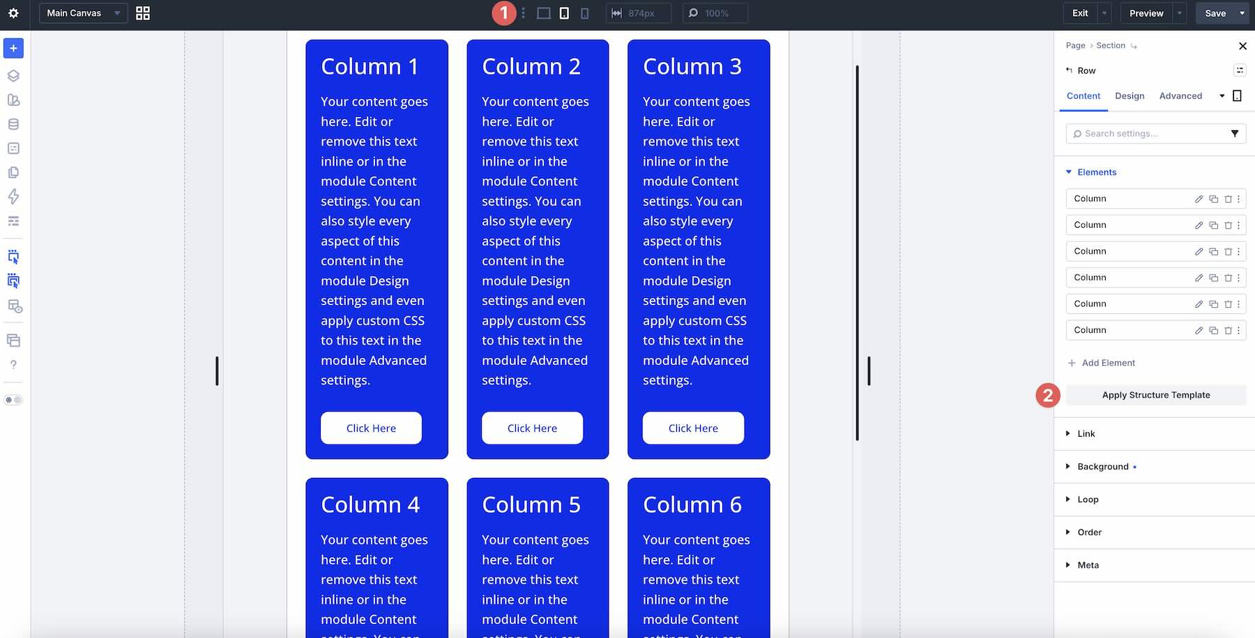
A Structure Template can update the Column Class arrangement for that breakpoint in one workflow. This is especially useful when a multi-column Desktop Row needs to become a simpler two-column or single-column structure on smaller screens.
Use Structure Templates when the Columns share a clear responsive pattern. If individual Columns need different sizing behavior, adjusting their Column Class values separately may still make more sense.
8. Use Fluid Gap Variables Or Reduce Gaps At Smaller Breakpoints
Spacing that feels balanced on Desktop can feel too generous after a layout wraps or stacks on Tablet and Phone. Review both Horizontal Gap and Vertical Gap as part of your responsive workflow.
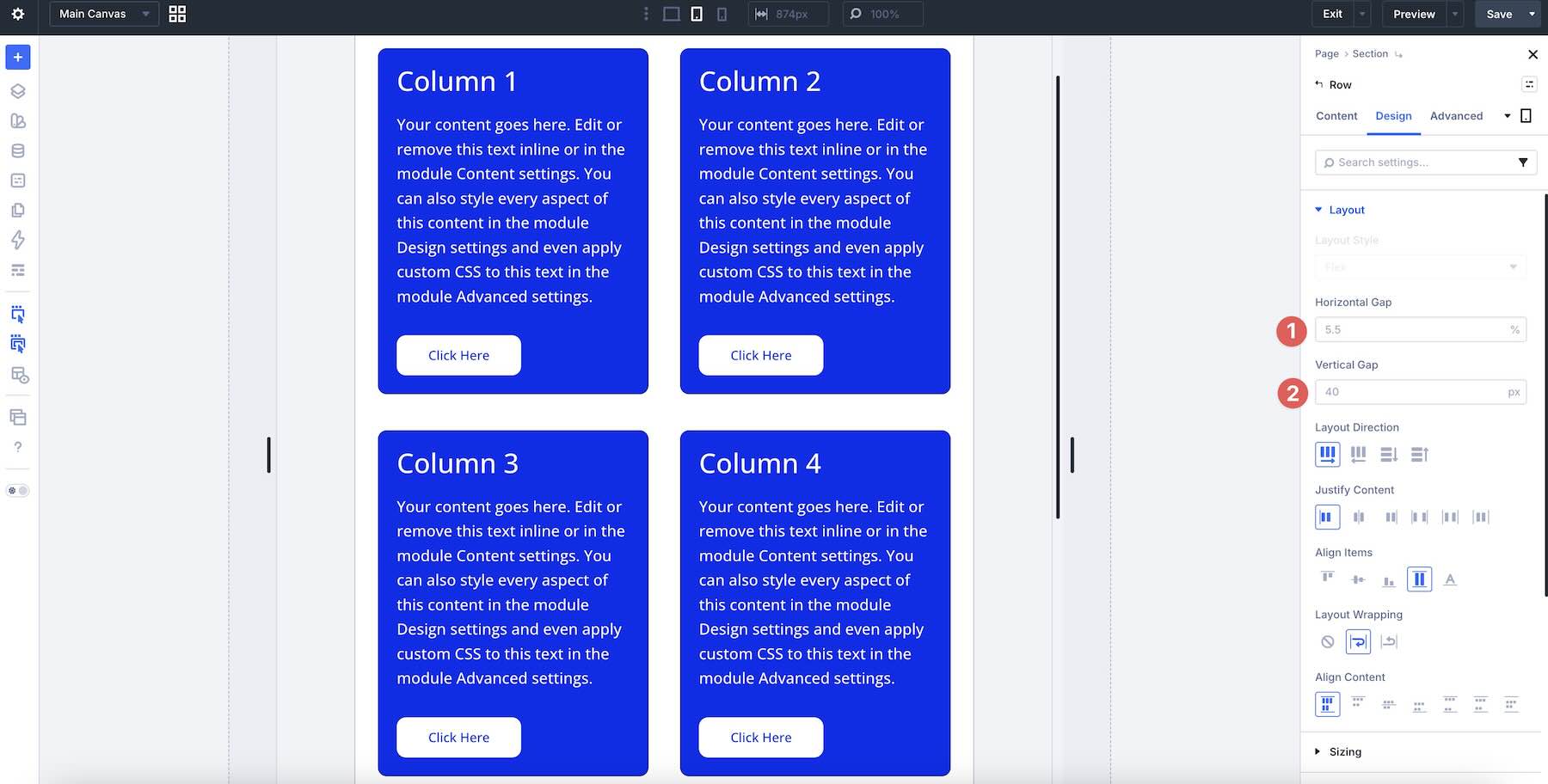
You can reduce Gap values manually at individual breakpoints, but Divi 5’s Variable Generator gives you another option. Generate a fluid Gap sizing system and save the resulting clamp-based values as Design Variables.
Assign those variables to Horizontal Gap or Vertical Gap, and the spacing can scale between defined minimum and maximum values as the viewport changes.
You can also enter your own clamp() values through Divi 5’s Advanced Units when you need a custom fluid relationship.
Fluid sizing can reduce repetitive breakpoint overrides, while structural changes such as Column Class, Layout Direction, or Display Order can still be adjusted independently when necessary.
9. Reorder Content With Display Order Only When Necessary
A Desktop layout may not always produce the best visual sequence on a smaller screen. Divi 5’s Display Order control lets you visually reposition Flex items at specific breakpoints, including by using values such as -1 to move an item earlier.
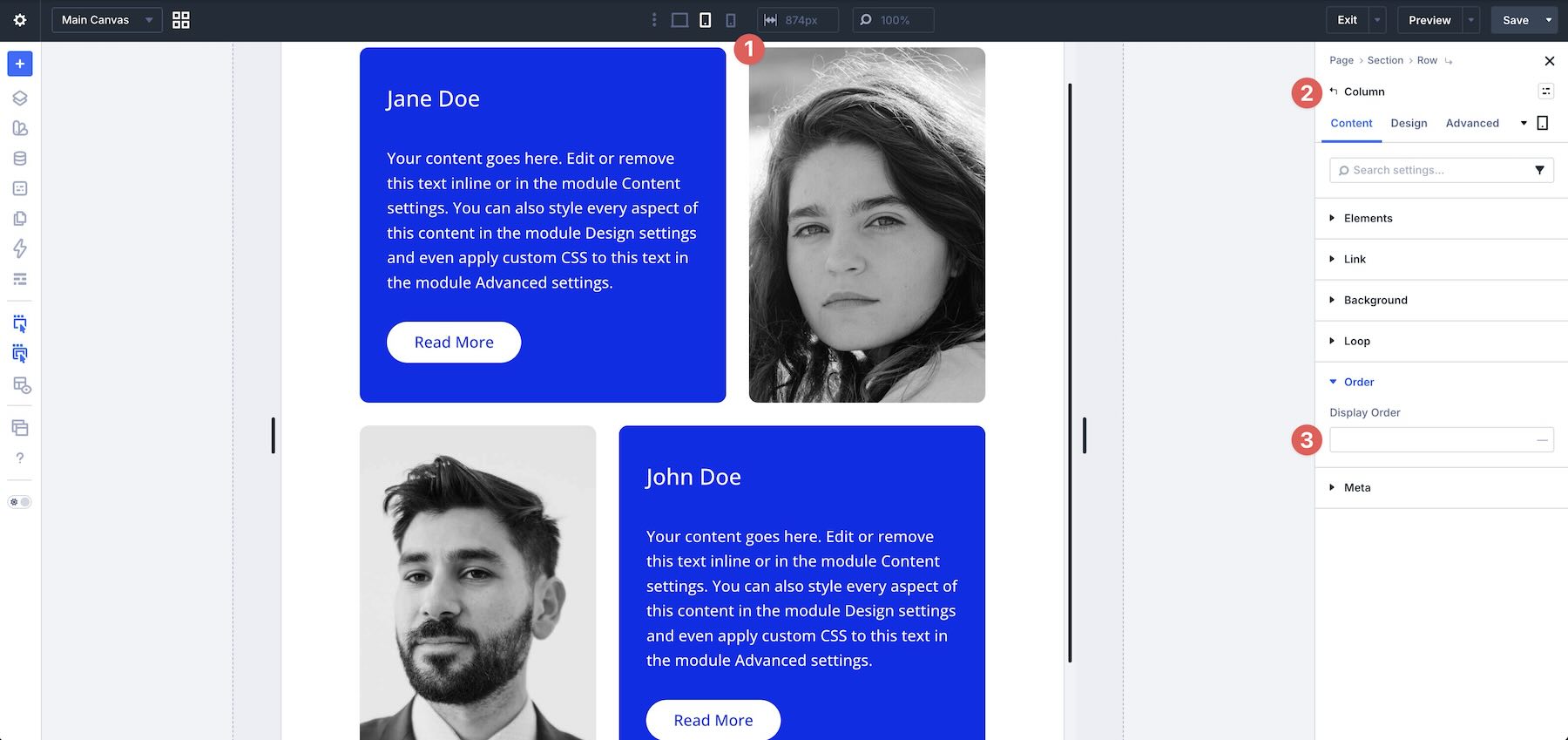
Use Display Order selectively. Start with a source order that already makes sense as a reading and interaction sequence, then add responsive ordering only where the visual hierarchy genuinely benefits from it.
Remember that visual Flexbox reordering does not necessarily change the document or keyboard navigation order. If interactive elements are reordered visually, test the live page with the keyboard to make sure focus still moves in a logical sequence.
10. Use Nested Modules For Tight Content Relationships
For closely related elements, such as a heading followed by supporting text, Nested Modules can give you another way to control their internal layout without introducing an additional outer container.
Open the parent module’s Content tab, expand the Elements option group, and add the child module inside it.
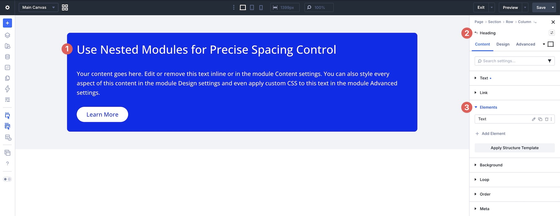
Once nested, open the parent module’s Design tab and use its Layout controls to manage the children. For example, a small Vertical Gap can control the relationship between a Heading and nested Text module from one place.
Nested Modules are useful when the elements genuinely belong together. Avoid unnecessary nesting when a simple Column or Module Group already provides the structure you need.
11. Start With A Logical Structure, Then Refine Across Breakpoints
Build the clearest source-order layout first. Keep the content hierarchy logical, the parent-child relationships understandable, and the initial Flexbox settings as simple as possible.
Then review the layout at Tablet and Phone and add responsive overrides only where the smaller viewport needs different behavior.
Fluid values from Advanced Units or the Variable Generator can reduce the number of breakpoint-specific adjustments needed for spacing and typography. Structural settings, such as Column Class, Layout Direction, Layout Wrapping, or Display Order, should still be adjusted when the layout needs a genuine structural change.
This keeps responsive behavior intentional instead of accumulating overrides simply because they are available.
12. Test Every Layout With Real, Variable-Length Content
Placeholder copy can hide layout problems. Short headlines, long headlines, multi-line descriptions, different button labels, and varied image dimensions can all expose wrapping, alignment, and spacing issues.
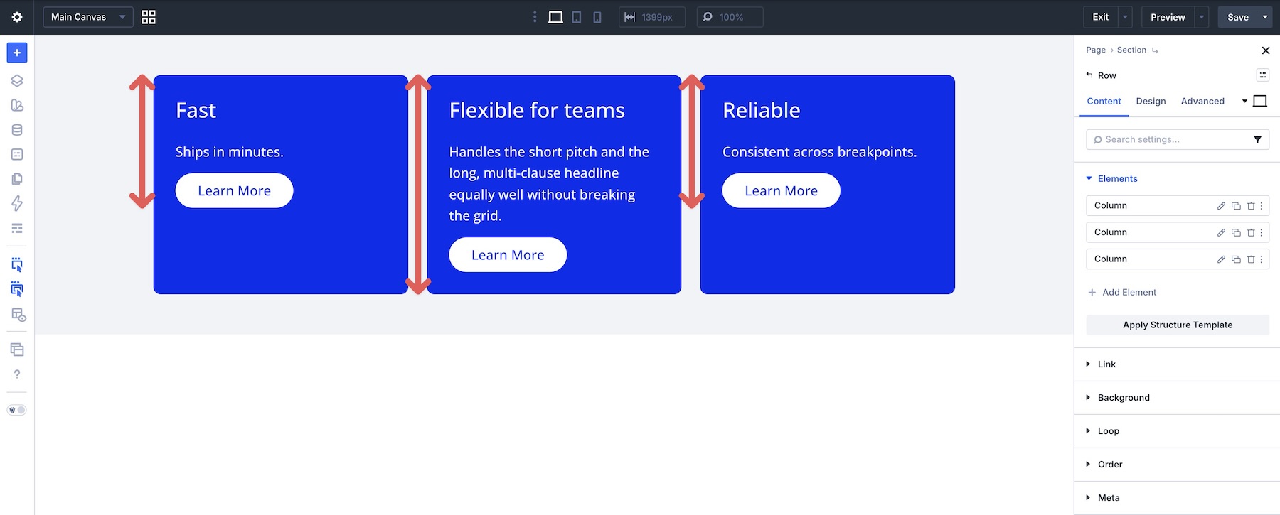
Test your Flexbox layouts with realistic content of different lengths before finalizing them. Pay particular attention to card heights, CTA alignment, wrapping, mobile stacking order, and whether longer text changes the intended hierarchy.
When variable content creates extra space inside cards, use Grow To Fill strategically on the element that should absorb that space.
Testing content variations early is much easier than correcting the layout after real content has already been added across the site.
13. Use Advanced Units And Design Variables To Reduce Responsive Overrides
Fixed values are not always the best choice for spacing and typography across very different viewport sizes. Divi 5’s Advanced Units support functions such as clamp(), while the Variable Generator can create fluid sizing systems for you.
For typography, you can use the Variable Generator’s Font Size > Fluid Scale (CSS Clamp) workflow to create a reusable type scale that grows between defined minimum and maximum values.
Store reusable sizing values as Design Variables so the same system can be applied consistently throughout the site.
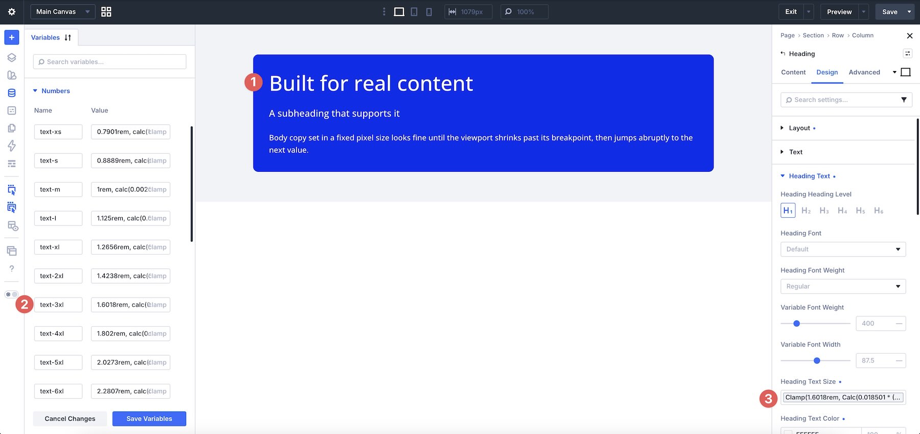
Fluid values are especially useful for settings that should scale gradually. Breakpoint-specific values are still useful when you need an intentional structural change rather than continuous scaling.
14. Understand When Align Content Actually Works
Align Content is different from Align Items. Align Items controls the items inside each Flex line, while Align Content controls how multiple Flex lines are distributed along the cross axis.
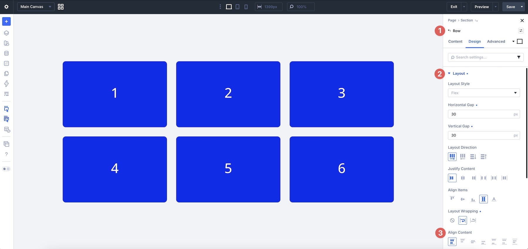
For Align Content to have a visible effect, the layout generally needs three things:
- Layout Wrapping must be set to Wrap or Wrap Reverse.
- The container must contain multiple Flex lines after the items wrap.
- The container must have extra space available along the cross axis, such as space created by a defined height or minimum height.
If the content stays on one Flex line, or the container simply grows to fit its content, changing Align Content may appear to do nothing.
When you need to distribute multiple wrapped lines inside a taller container, create the necessary cross-axis space first, then choose an Align Content value such as Start, Center, Space Between, or Space Evenly.
15. Preserve Logical Source Order For Accessibility And Maintainability
The source order of your elements still matters when using Flexbox. Whenever possible, structure content in a sequence that makes sense without relying on visual reordering.
Place headings before the content they introduce, keep related controls together, and make sure interactive elements follow a logical sequence.
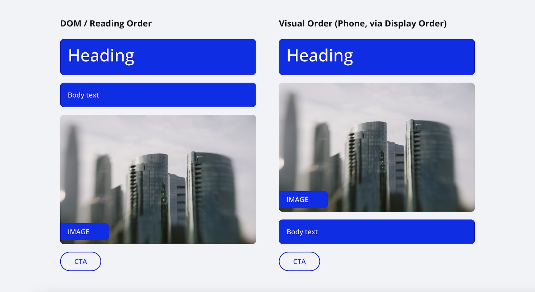
Display Order is useful for targeted responsive presentation changes, but it changes visual placement rather than automatically rewriting the underlying document order.
For small visual adjustments where the source sequence still makes sense, that can be appropriate. If you find yourself using many Display Order values to create an entirely different logical sequence, reconsider whether the underlying structure should change instead.
After reordering interactive content, test the published page with the Tab key and confirm that the focus sequence still makes sense relative to what visitors see.
16. Know When CSS Grid Is The Better Layout System
Flexbox is especially useful when content should flow primarily in one direction, distribute itself along an axis, wrap naturally, or reorder responsively.
CSS Grid is often the better choice when the layout depends on precise two-dimensional relationships between both rows and columns.
Use Grid when you need patterns such as irregular grid maps, precise row and column placement, spanning across multiple tracks, intentional offsets, or layouts where elements need to maintain defined relationships in both dimensions.
The goal is not to force every design into Flexbox. Divi 5 gives you both layout systems, so choose the one that best matches the structure you’re trying to create.
Putting It All Together
The strongest Divi 5 Flexbox layouts usually come back to a few core ideas: understand the parent-child relationship, use Gap for repeated internal spacing, use Stretch and Space Between where alignment needs it, add Grow To Fill only when a specific element should absorb available space, and combine Layout Wrapping with Column Class for flexible multi-line structures.
Use Structure Templates when multiple Columns need the same responsive change, use fluid Design Variables where values should scale continuously, and keep the underlying source order logical before adding visual reordering.
Most importantly, use Flexbox because it matches the layout problem, not simply because the controls are available. When a design needs true two-dimensional placement, switch to CSS Grid.
This brings our Mastering Flexbox series to a close. You can start again with Part 1, revisit the examples throughout the series, and apply the techniques to your own layouts.
Once Gap, parent-level controls, responsive structure, and clear Flexbox hierarchy become part of your normal workflow, complex layouts become easier to understand, adjust, and reuse.








Leave A Reply