

Someone looking for their first WordPress course has different needs from an experienced designer with an afternoon to spare. A course directory helps both visitors find something that fits when its filters reflect the questions they bring to the page.
In this tutorial, we’ll build a small web-design course directory with Divi 5 and Advanced Custom Fields (ACF). Visitors can choose a category, skill level, and duration, then open a matching course through its image or title. We’ll use native Divi settings throughout the build.
- 1 What We’re Building
- 2 What You’ll Need
- 3 1. Create The Courses Post Type
- 4 2. Add The Course Details Fields
- 5 3. Add The Sample Courses
- 6 4. Create The Directory Page
- 7 5. Build One Dynamic Course Card
- 8 6. Add The Three Course Filters
- 9 7. Adjust The Tablet And Phone Layouts
- 10 8. Test The Directory
- 11 Download The Course Directory Layout
- 12 Download For Free
- 13 Keep Your Course Directory Current
- 14 Build Your Course Directory With Divi 5
What We’re Building
Our example includes six fictional courses covering UI design, development, and WordPress. Each card shows an illustration, title, short description, level, and exact duration. Three labeled dropdowns sit above the cards, alongside a button that returns the directory to its unfiltered view.
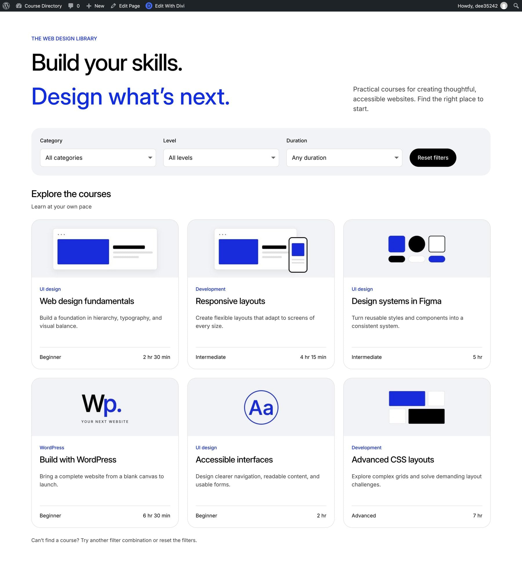
ACF stores each course’s details, while Divi’s Loop Builder repeats one card design for the course records. We’ll connect the dropdowns to that loop with the Post Filter module, giving us one card design to maintain as the directory grows.
The layout has three card columns on desktop, two on tablets, and one on phones. We’re building the directory page and linking its cards to individual course records. Designing a custom course-page template, delivering lessons, handling enrollment, taking payments, and tracking progress sit outside this example.
What You’ll Need
Activate ACF on a WordPress site running Divi 5, and check that the Post Filter module is available in the module picker. The example uses WordPress 7.1.3 with Divi 5.15.1 and ACF 6.8.10. Gather six course images and brief descriptions before adding the sample content.
Use a test site while you work through the tutorial. The downloadable files include the layout, ACF structure, sample data reference, and illustrations. Alternatively, use the download section to load the layout instead of building it from scratch.
1. Create The Courses Post Type
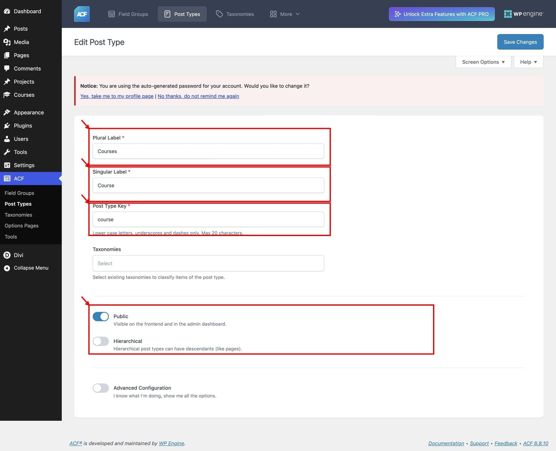
In the WordPress dashboard, go to ACF > Post Types > Add New. Set Plural Label to Courses, Singular Label to Course, and Post Type Key to course. Keep Public enabled and Hierarchical disabled.
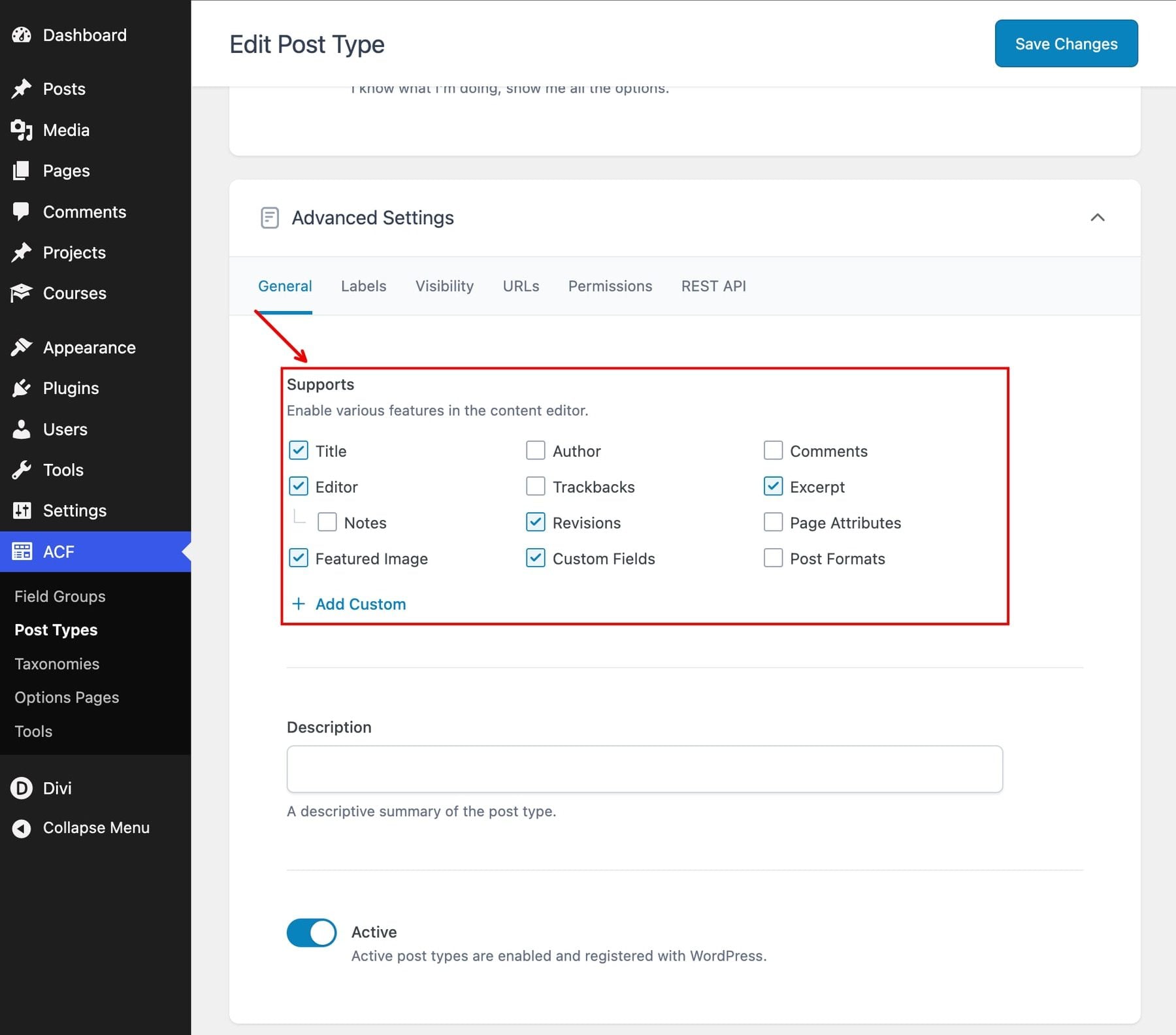
Next, open Advanced Configuration > General. Under Supports, enable the title, editor, excerpt, featured image, custom fields, and revisions.
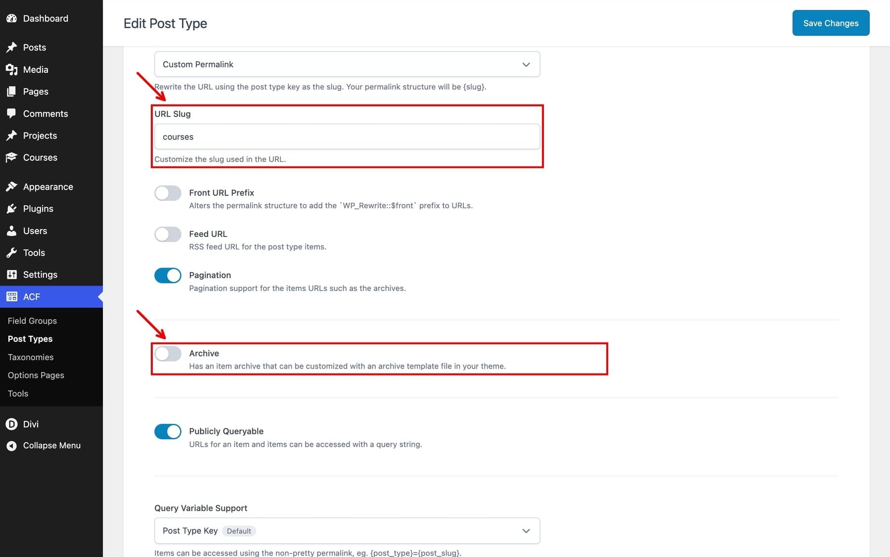
Open Advanced Configuration > URLs. Choose Custom Permalink to reveal URL Slug, then enter courses as the slug. Leave the archive disabled for this standalone directory.
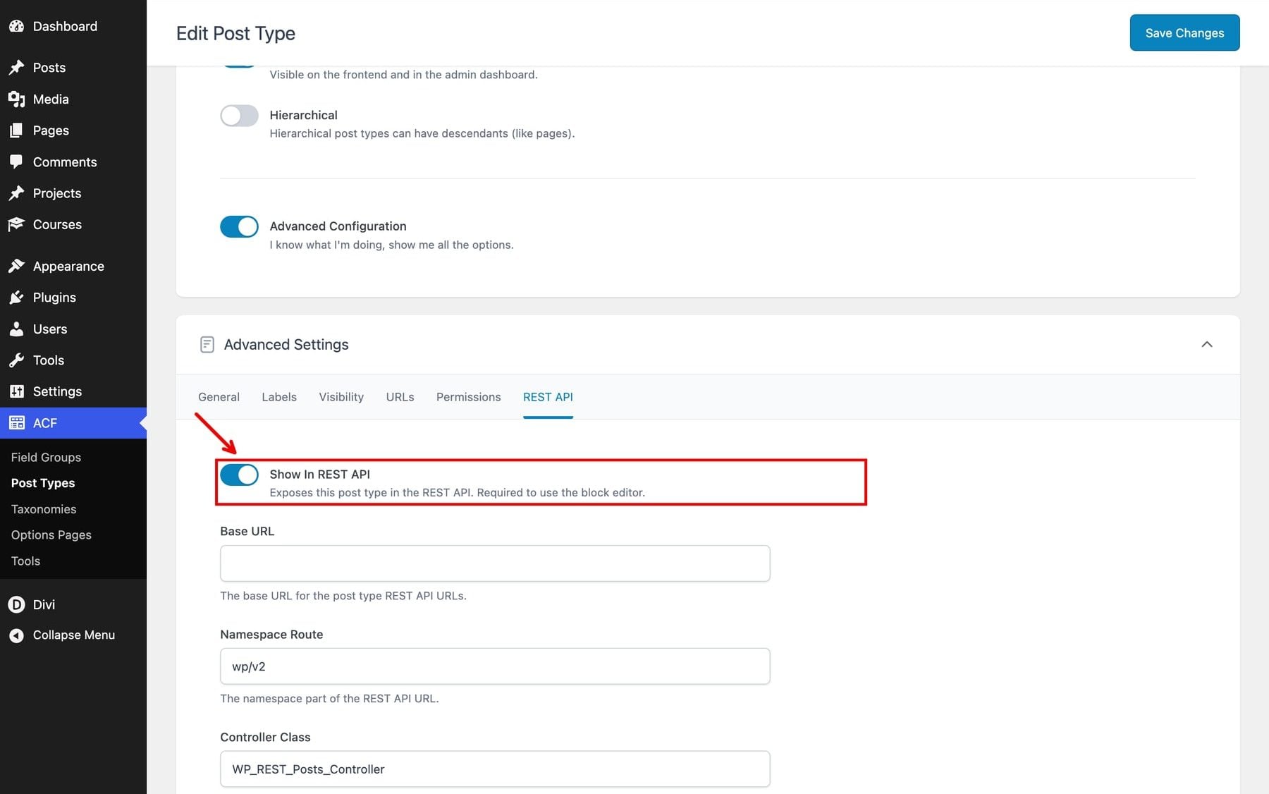
Finally, open Advanced Configuration > REST API and keep Show In REST API enabled, then save the post type.
You now have a Courses area in the dashboard. Its title, excerpt, and featured image supply the standard card content; the fields we add next hold the information used for filtering.
2. Add The Course Details Fields
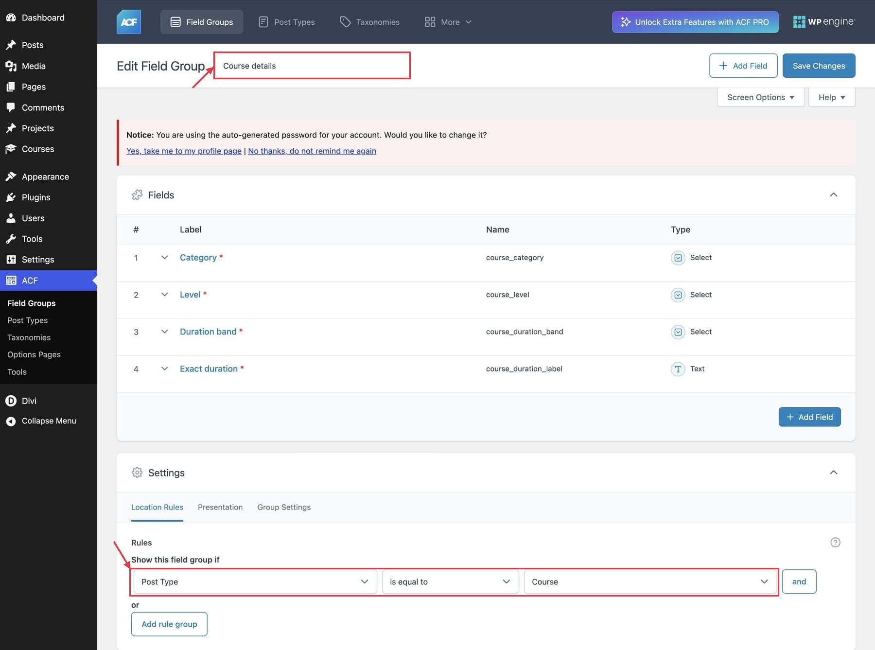
Go to ACF > Field Groups > Add New and name the group Course details. Under the group’s location rules, choose Post Type, Is Equal To, and Course. This places the fields on course editing screens.
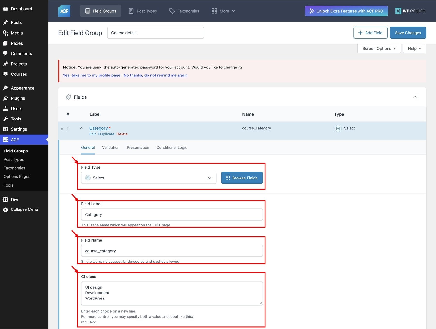
Add a Category field, choose Select, and use course_category as the field name. Enter UI design, Development, and WordPress as choices, one per line.
For this Select field, switch to Validation and enable Required.
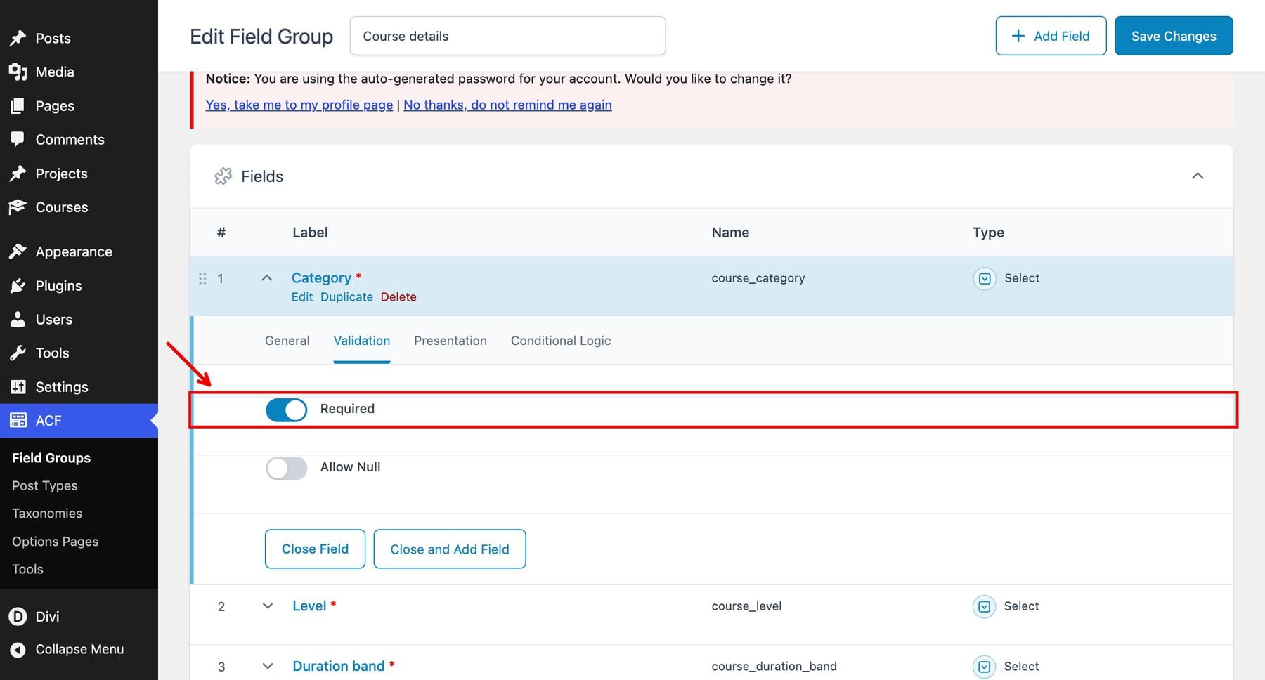
Return to General, set Return Format to Value, and leave Select Multiple disabled. Apply these General and Validation settings to Level and Duration band as well.
Next, add a Level Select field named course_level. Its choices are Beginner, Intermediate, and Advanced.
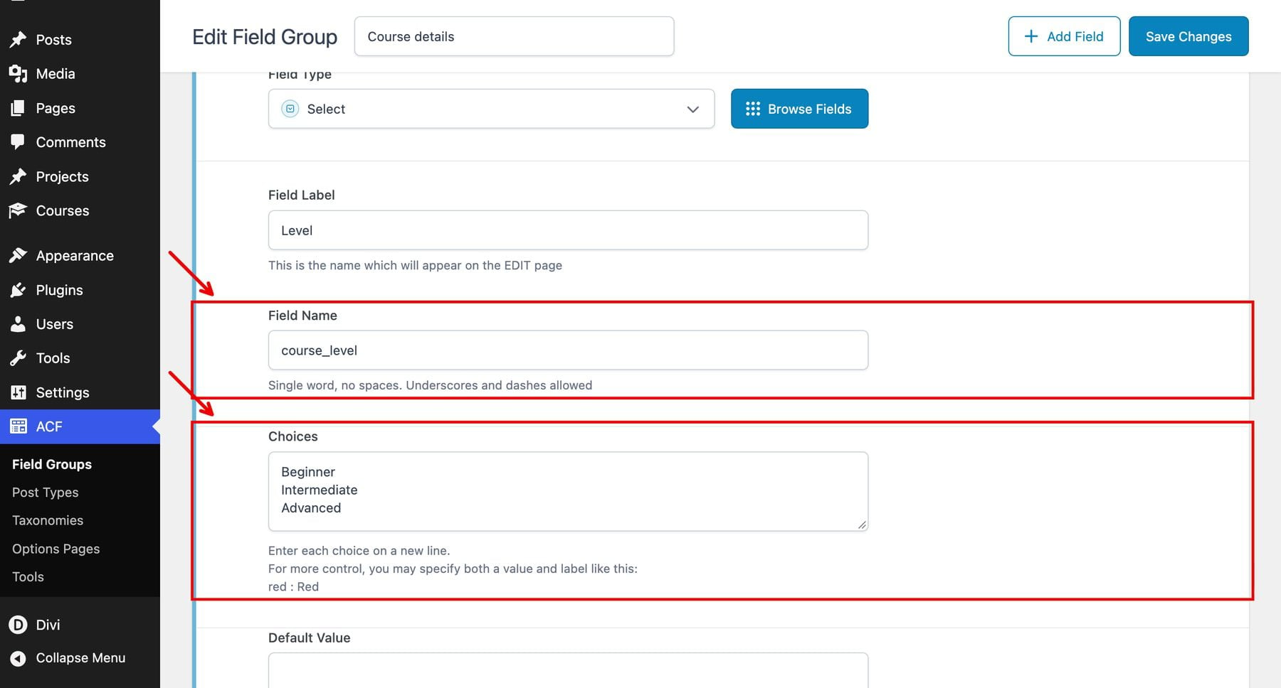
Add a Duration band Select field named course_duration_band. Its choices are Under 3 hours, 3–6 hours, and Over 6 hours. Keep their spelling consistent with the sample content.
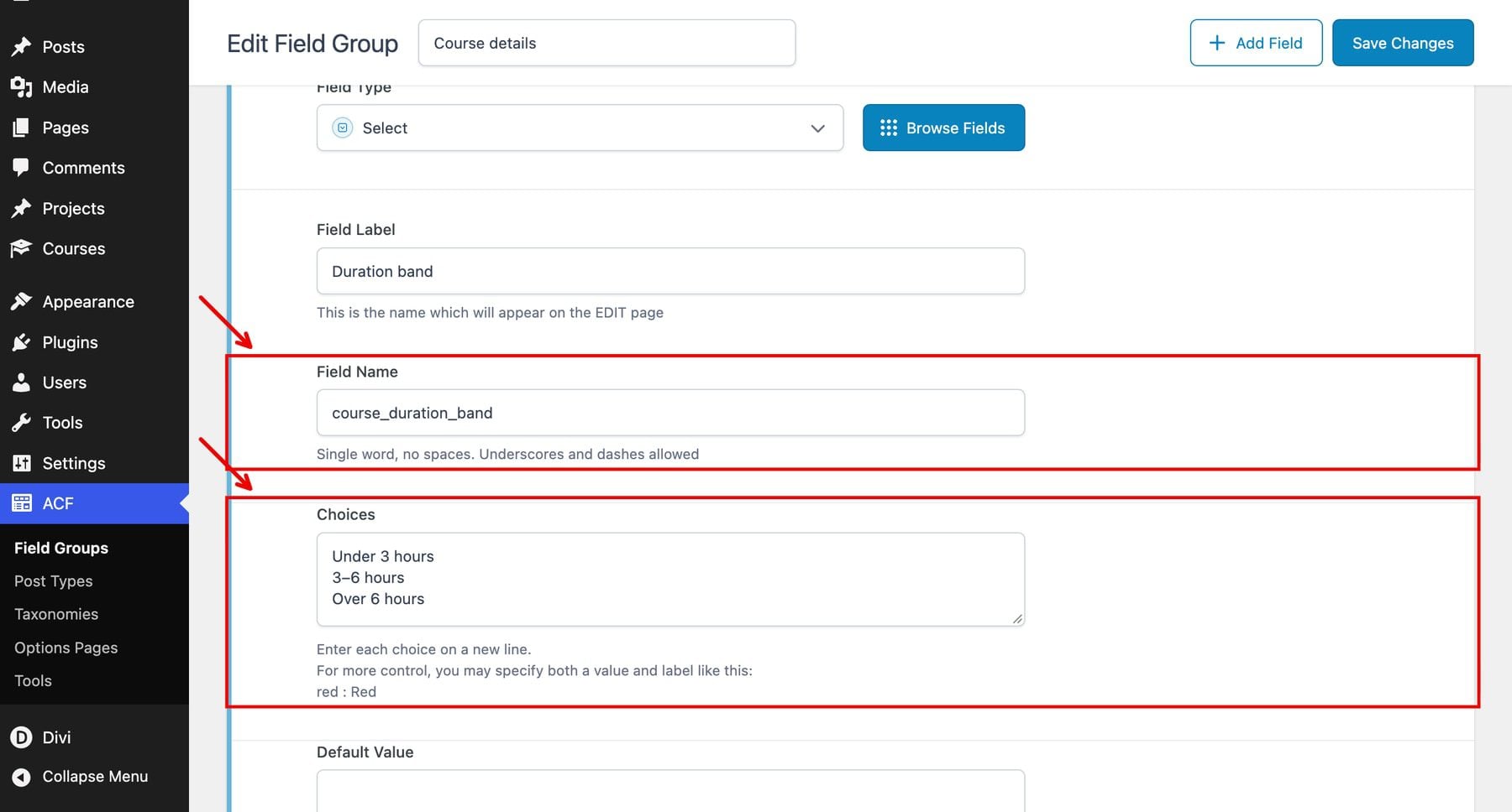
Finally, add an Exact duration Text field named course_duration_label. The General tab identifies the field’s type and name.
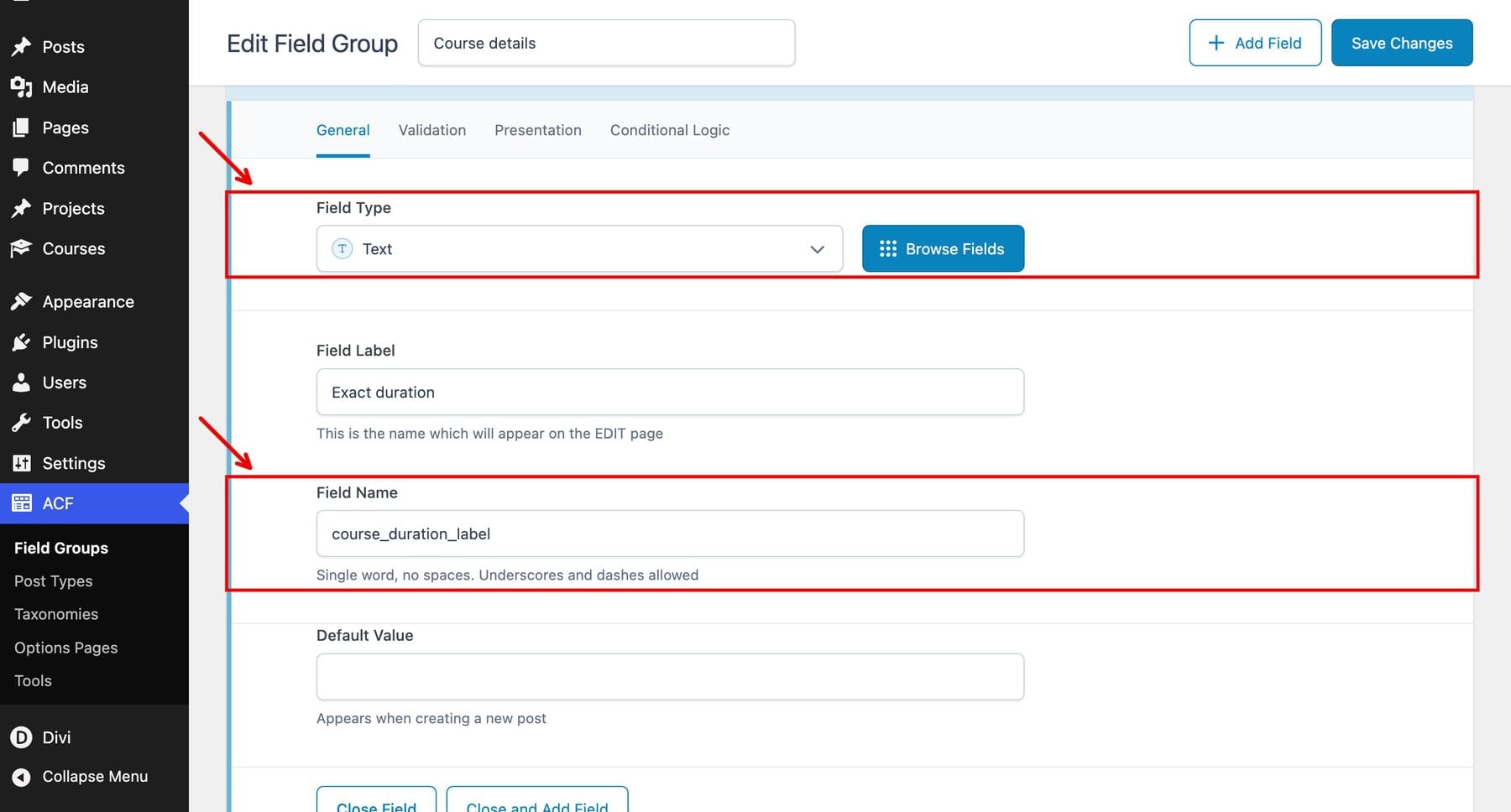
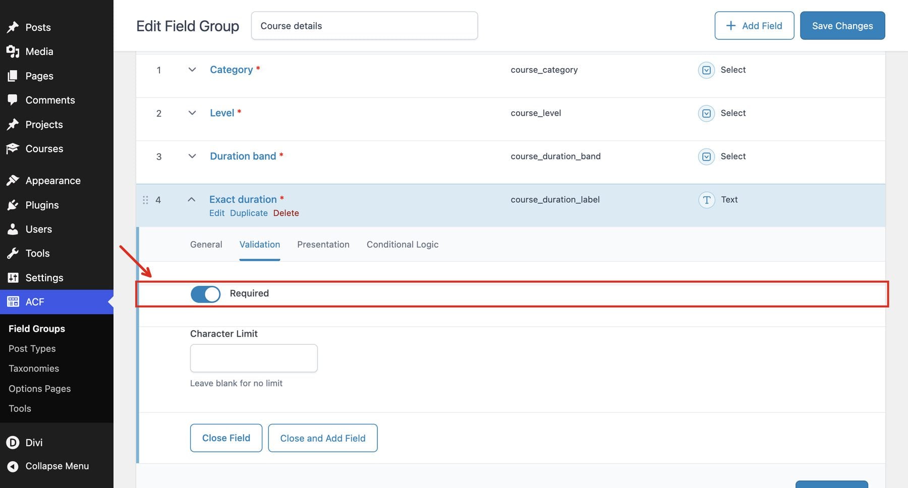
Open Validation and enable Required.
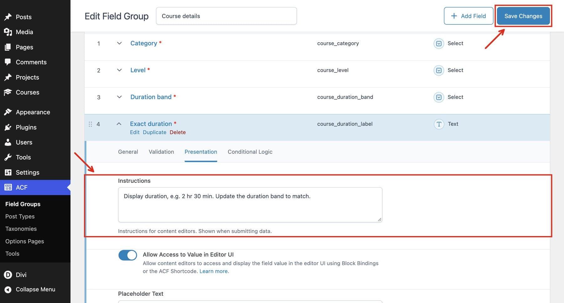
In Presentation > Instructions, remind editors to update the duration band whenever this value changes. Then save the field group.
Duration uses two fields because the dropdown matches a saved band. It does not calculate a range from text such as 2 hr 30 min. Assign courses shorter than three hours to Under 3 hours, courses from three through six hours to 3–6 hours, and longer courses to Over 6 hours.
3. Add The Sample Courses
In Courses > Add New, create the first course with a title, excerpt, and featured image. Fill in its four course fields, then publish it.
The Excerpt is a standard WordPress post setting, separate from the ACF Course details fields. Open the course editor’s post settings sidebar and use its Excerpt control to enter the short description used on the directory card.
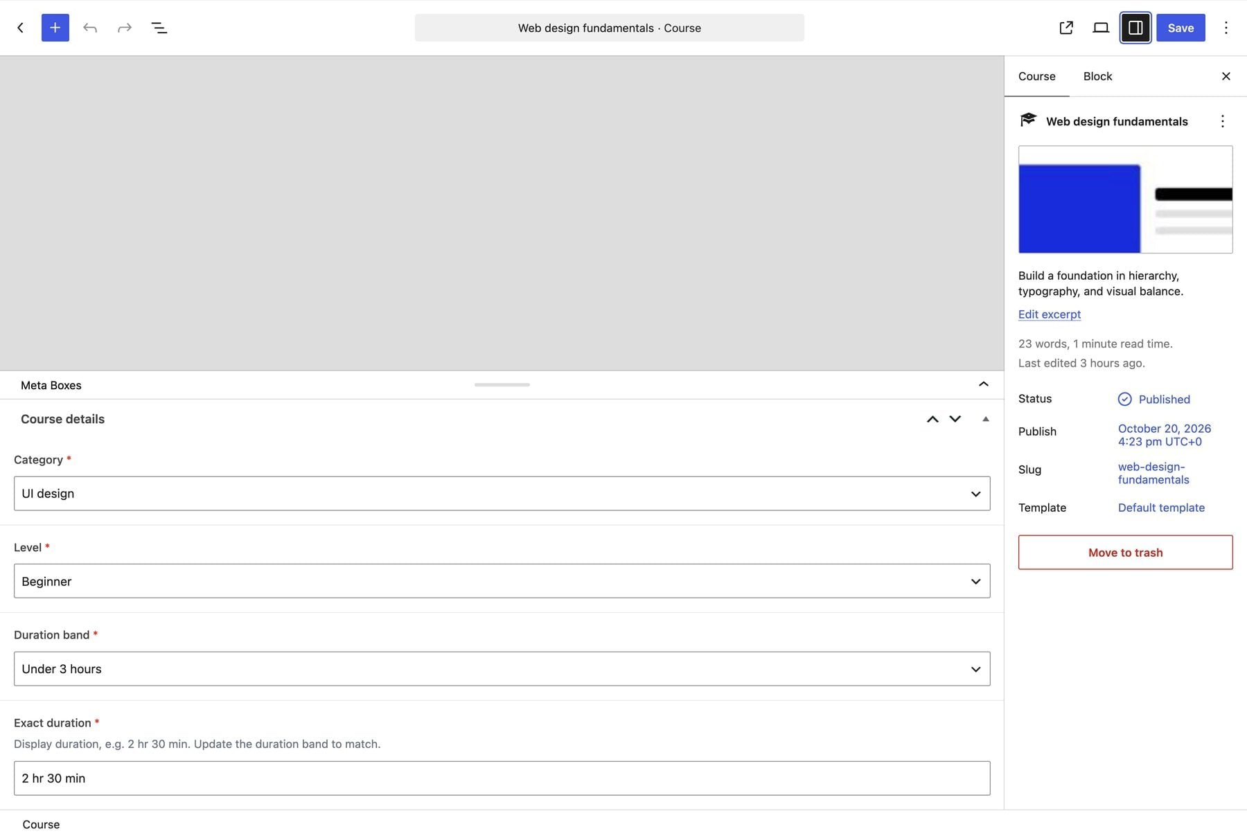
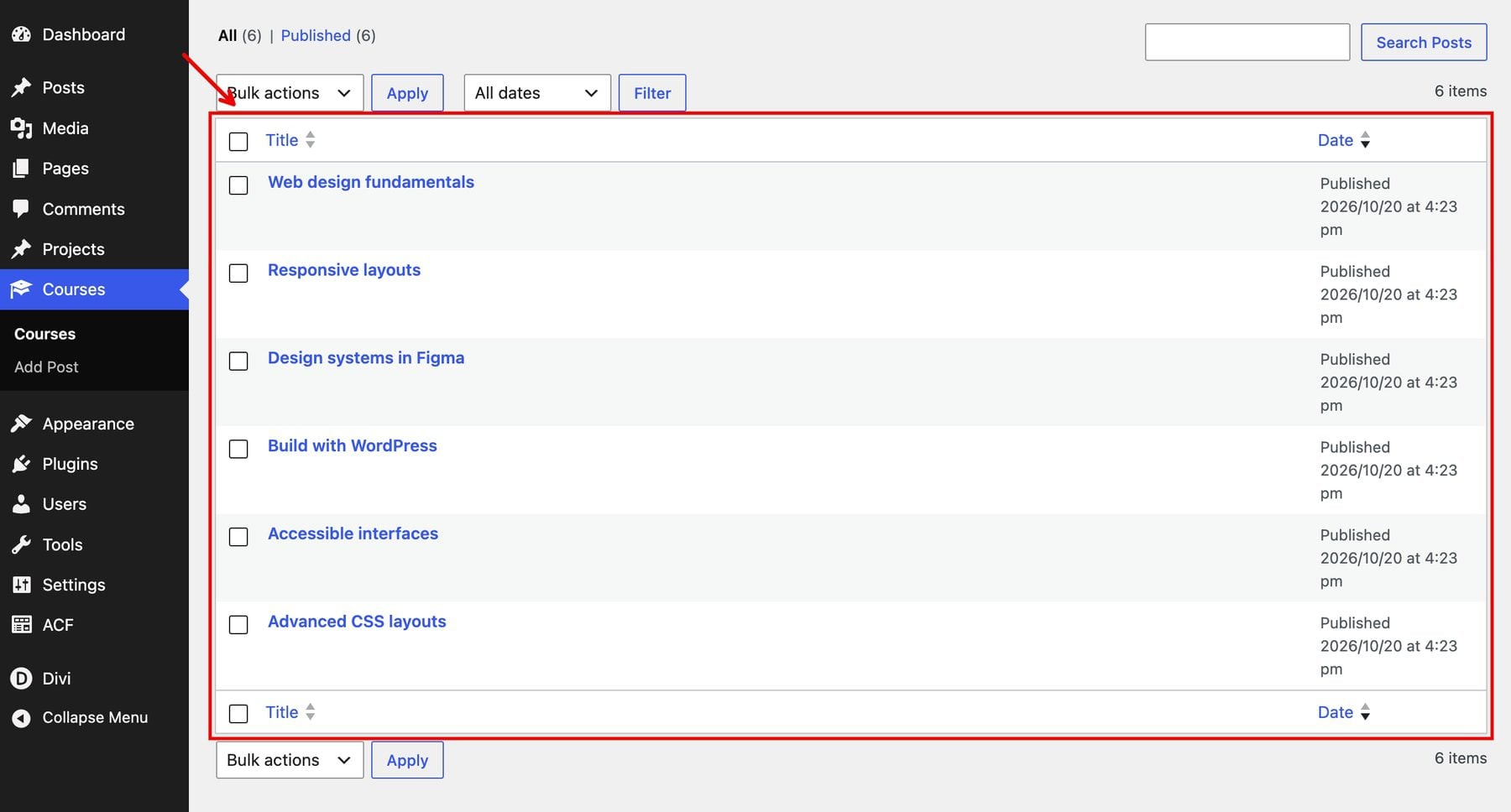
Repeat for the remaining courses, using these values to reproduce the example and its filter tests:
- Web design fundamentals: UI design; Beginner; Under 3 hours; 2 hr 30 min.
- Responsive layouts: Development; Intermediate; 3–6 hours; 4 hr 15 min.
- Design systems in Figma: UI design; Intermediate; 3–6 hours; 5 hr.
- Build with WordPress: WordPress; Beginner; Over 6 hours; 6 hr 30 min.
- Accessible interfaces: UI design; Beginner; Under 3 hours; 2 hr.
- Advanced CSS layouts: Development; Advanced; Over 6 hours; 7 hr.
The excerpt supplies each card’s short description. Keep it brief enough to scan alongside the title and metadata.
Add the information visitors should read on the individual course page to the main content editor. The excerpt and ACF fields populate the directory, but they do not automatically create a complete course-detail page. Without main content or a custom template, a course page may show only its title and featured image.
For the directory images, we’ll use each course’s title as dynamic alt text when configuring the Image module in section 5.
4. Create The Directory Page
Go to Pages > Add New and name the page Web Design Course Directory. Choose the Blank Page template for the standalone demo, then open Divi Builder and start with a regular section and a one-column row.
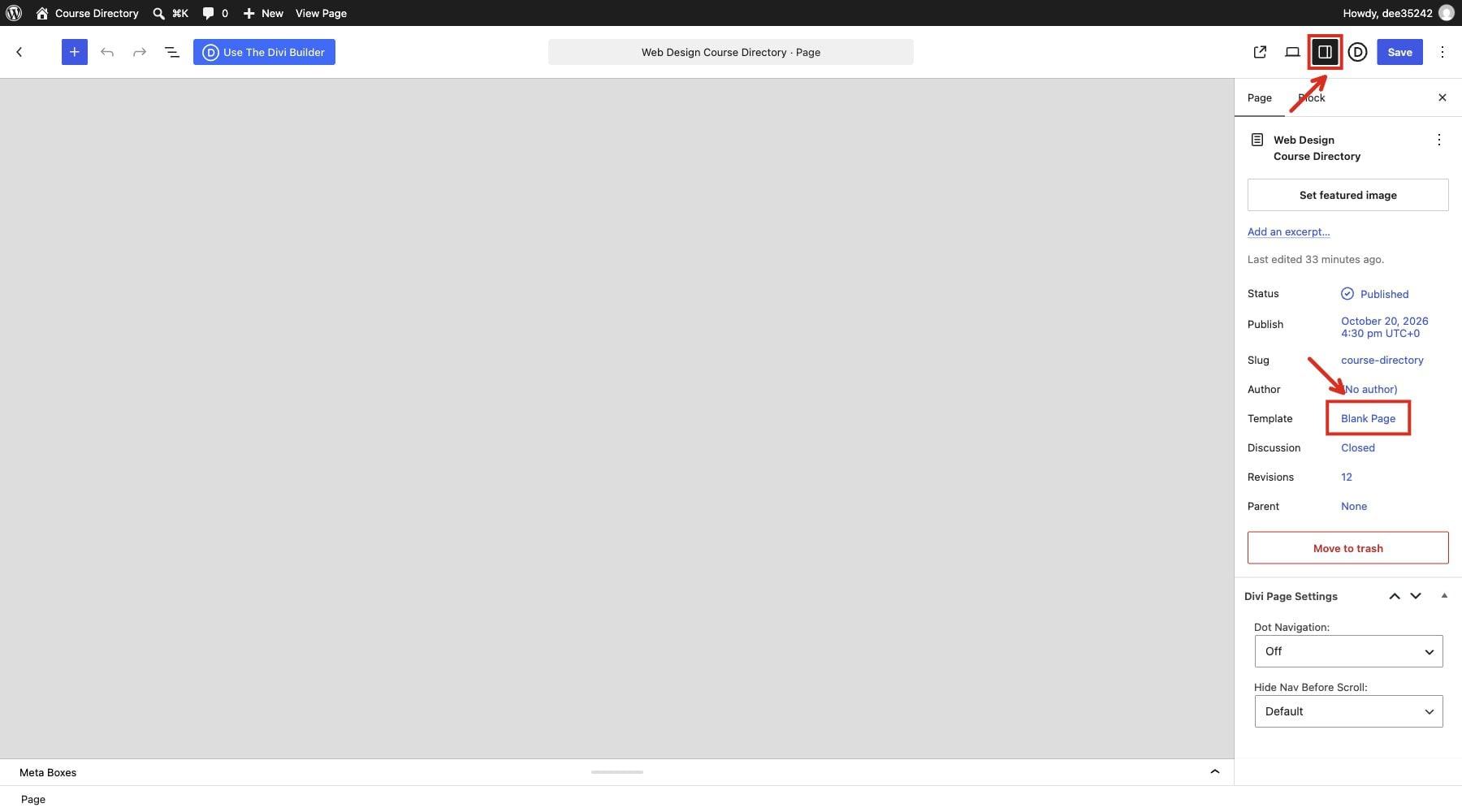
Find The Section And Row Settings
Click the stacked-layers icon in the left toolbar to open Layers, then double-click an element’s name to open its settings on the right. Choose Content, Design, or Advanced, then expand the named settings group.
Each settings image shows one native Builder view. Locate the selected element in Layers, then follow the open tab and settings group on the right. Red outlines identify the relevant controls.
You can name an element through Content > Meta > Element Label. In this demo, the Post Filter module is labeled Filter courses in Layers; its settings panel still identifies it as Post Filter.
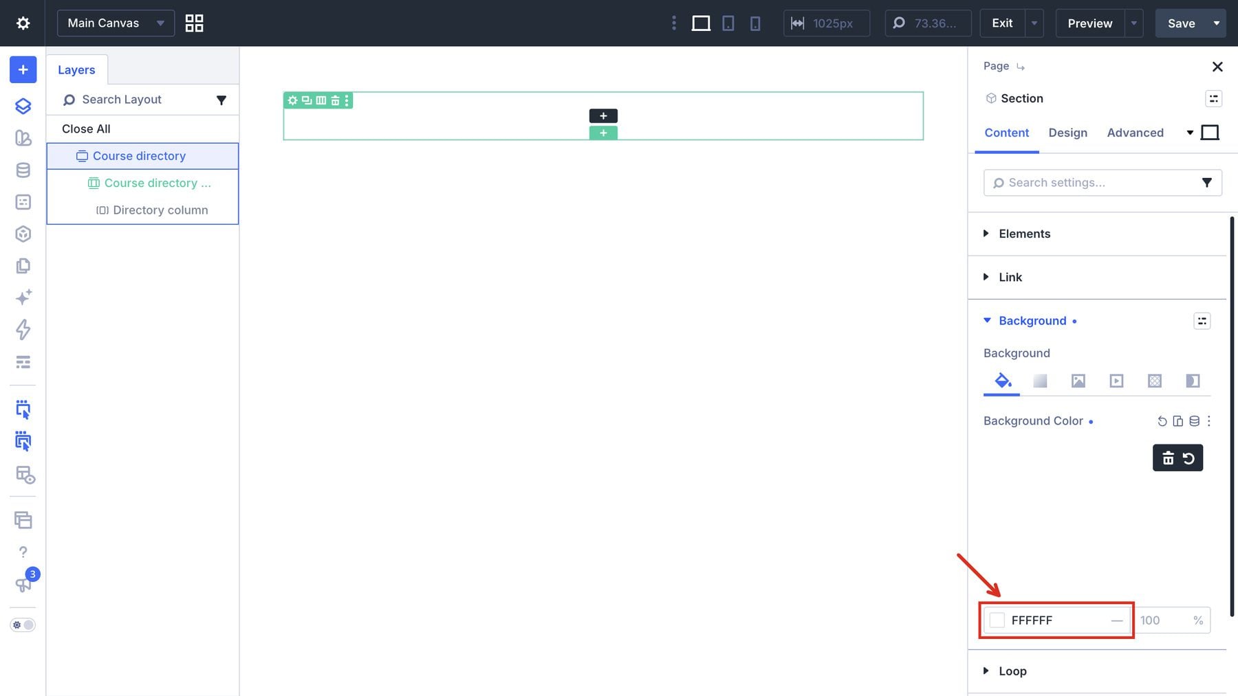
Double-click the section in Layers, then open Content > Background and use #ffffff.
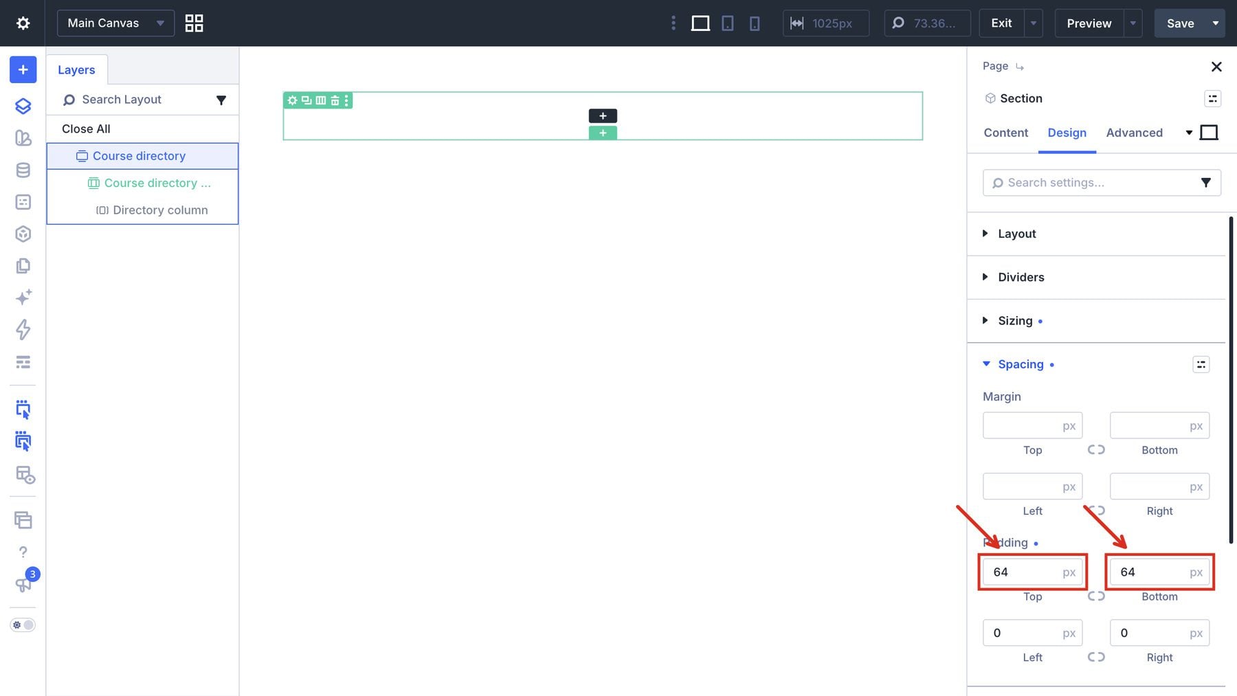
With the section selected, open Design > Spacing and set top and bottom padding to 64px and left and right padding to 0px.
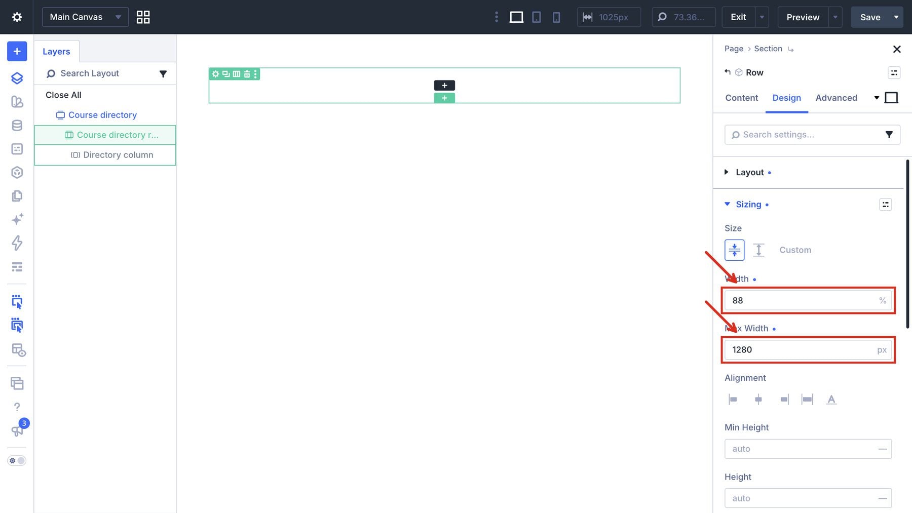
Select the row inside the section in Layers. Open Design > Sizing, set Width to 88% and Max Width to 1280px.
Open the row’s Design > Spacing settings and set its top and bottom padding to 0px.
Build The Directory Introduction
Inside the column, add a Text module for the small introductory label. Open Content > Meta and set Element Label to Library eyebrow. In that Text module, open Design > Text and set its font to Inter, weight 500, size 14px, and color #022eee.
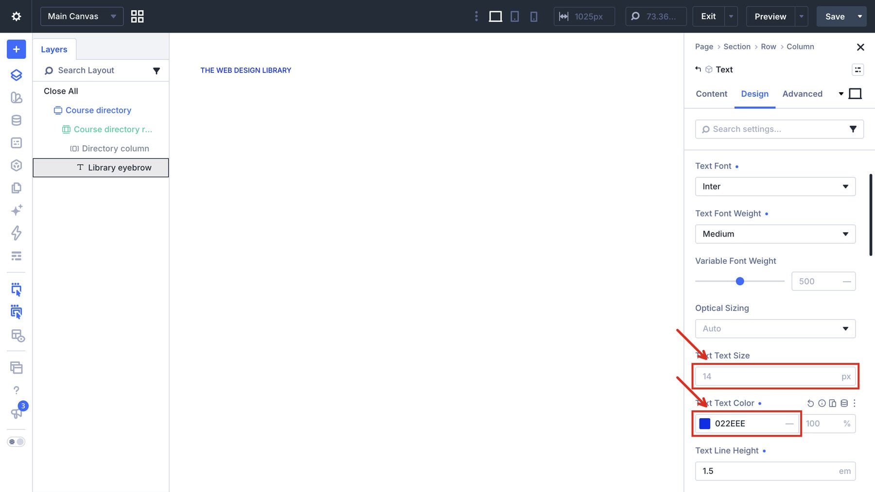
Open Design > Spacing and give Library eyebrow a 20px bottom margin.
Add a Group below it and label it Directory intro. With Directory intro selected, open Design > Layout and use a Flex row with a 28px horizontal gap and bottom alignment.
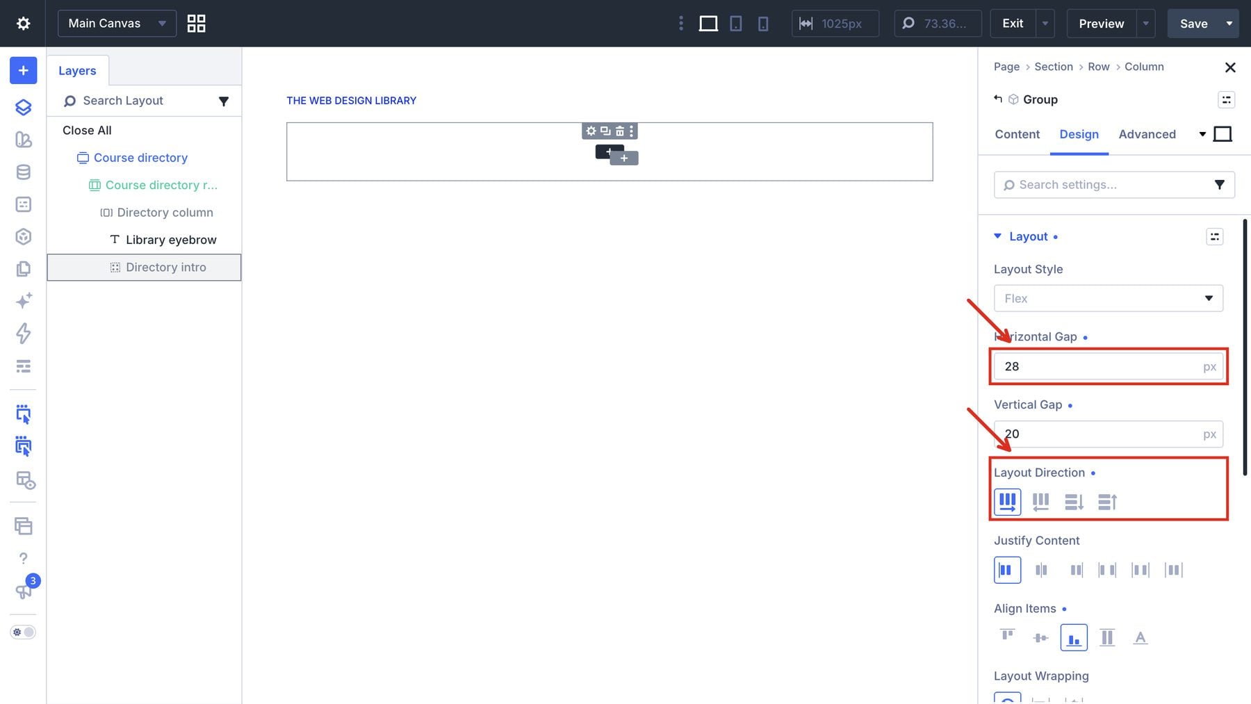
In Directory intro > Design > Spacing, use a 40px bottom margin.
Add a nested Hero text Group and a Text module beside it. Select Hero text in Layers and open Design > Sizing. Set its width to 68%.
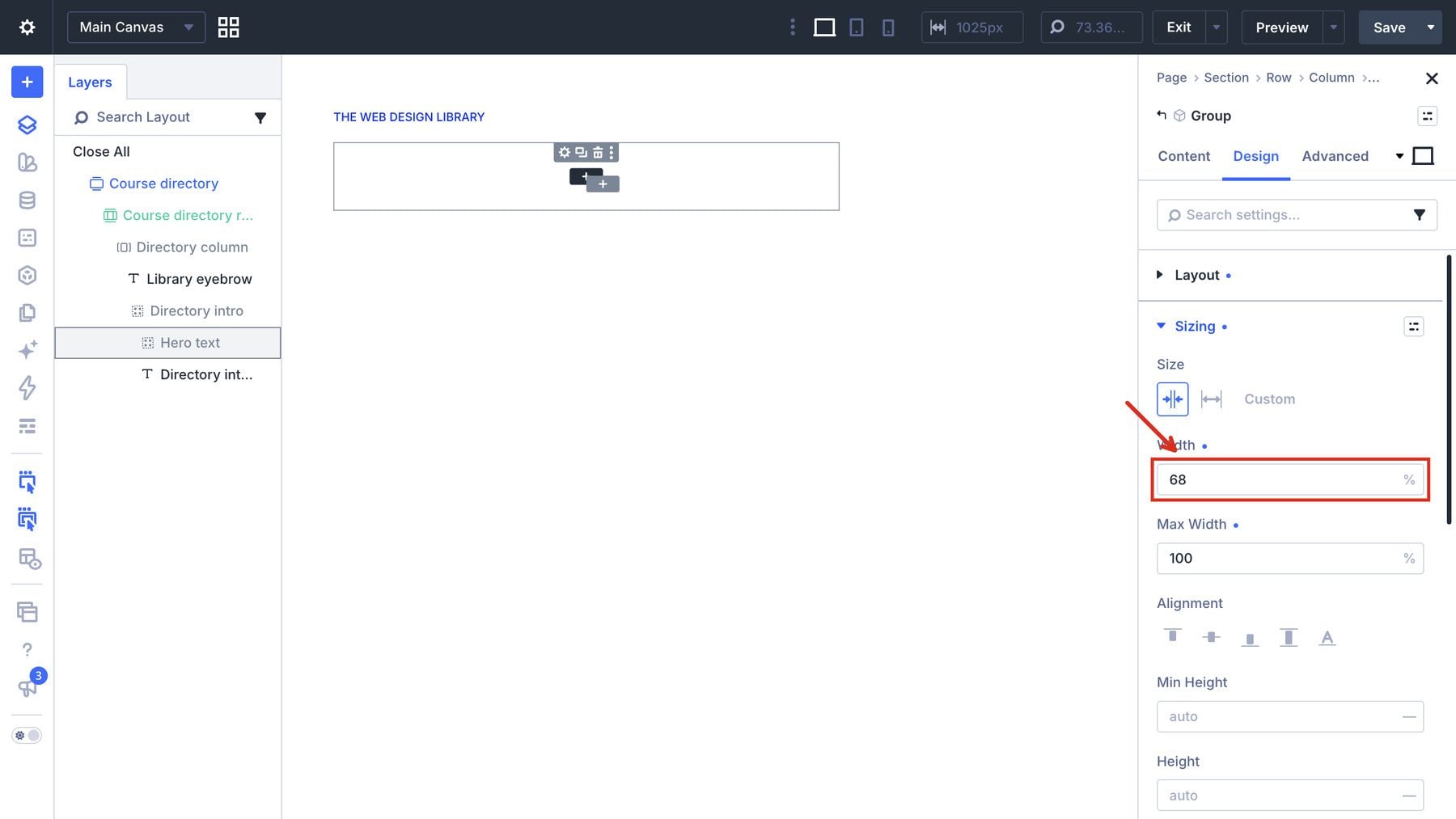
Select the adjacent introduction Text module and set its Design > Sizing > Width to 30%.
In Hero text, add an H1 Heading module for the main title. In the Heading module, open Design > Heading Text. Use Inter 500 at 64px, black text, 1.1em line height, and -0.03em letter spacing.
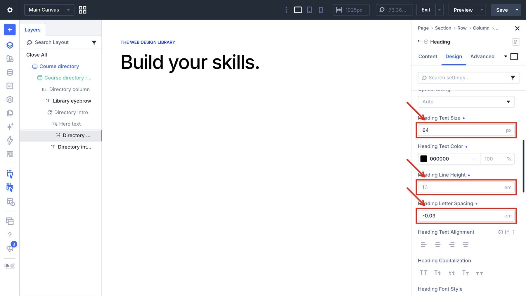
Add a Text module for the blue subtitle. Open its Design > Text settings and use Inter 500 at 64px and #022eee.
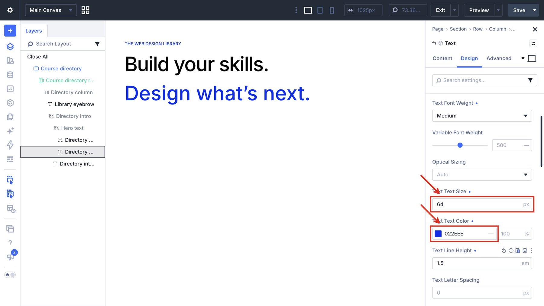
Select the adjacent introduction Text module. Add a short explanation of the directory and use its Design > Text settings to set the text size to 18px.
5. Build One Dynamic Course Card
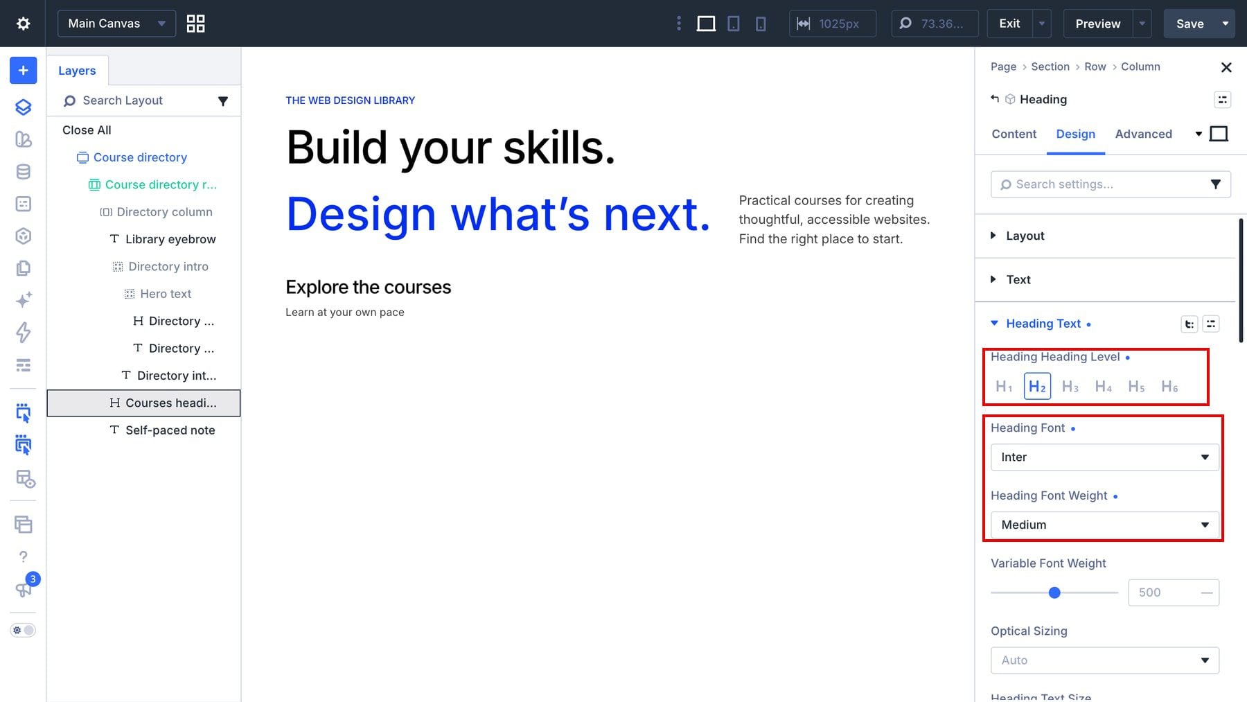
Below the introduction, add an H2 Heading module for the course-list heading and a Text module for a short supporting note. Select the Heading module and open Design > Heading Text for Inter 500, 26px, and black.
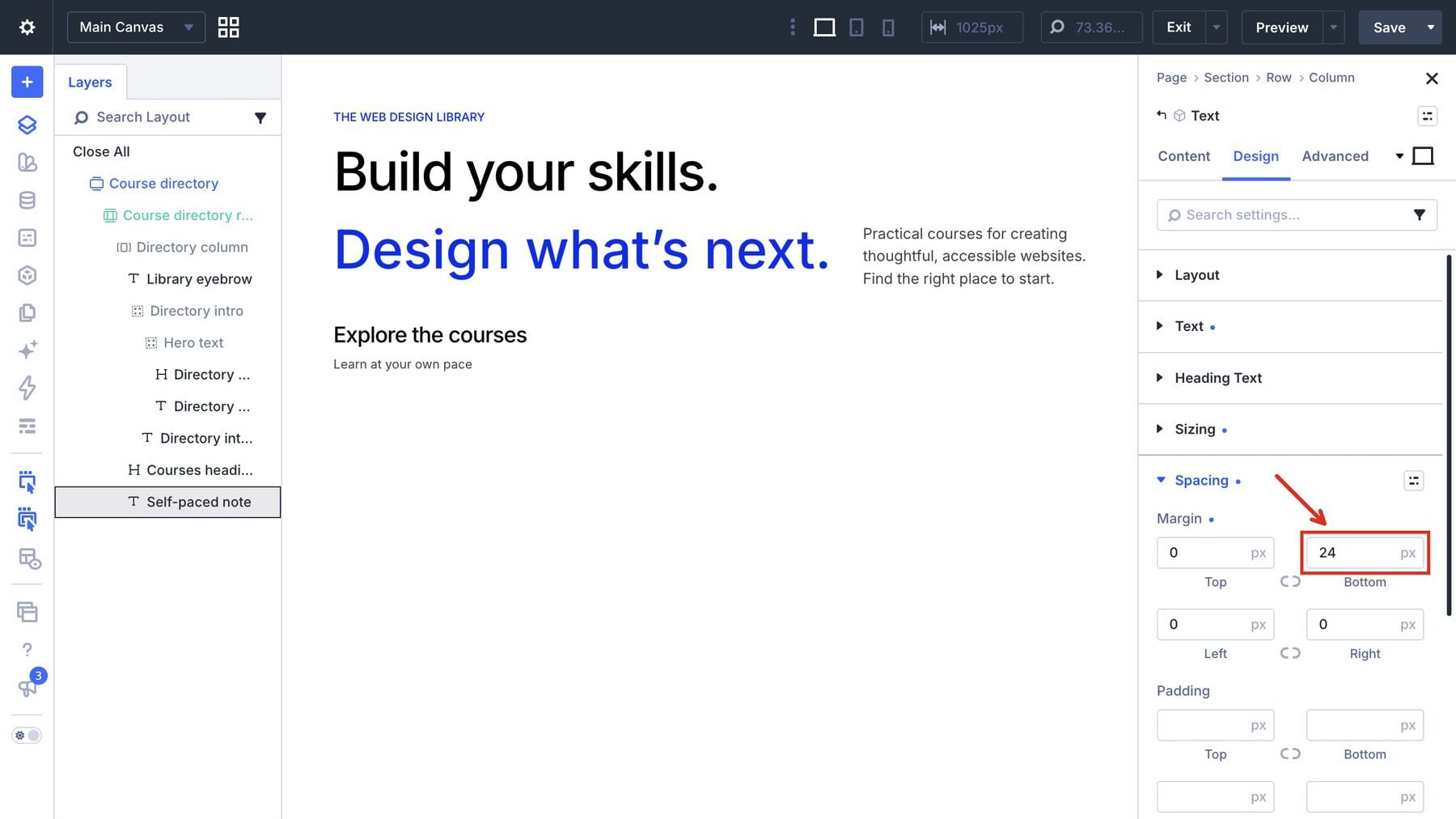
Select the note’s Text module and open Design > Text for 15px and rgba(0,0,0,0.75).
In each module’s Design > Spacing settings, keep the heading’s bottom margin at 0px and give the note a 24px bottom margin.
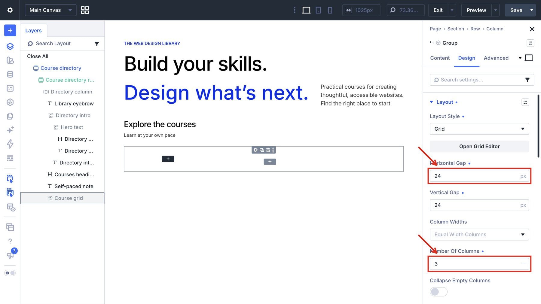
Add a Group beneath the note and label it Course grid. In Design > Layout, choose Grid, set Number Of Columns to 3, and use 24px horizontal and vertical gaps. Keep the default 100% width in Course grid > Design > Sizing; the image below shows the Layout settings.
Inside that grid, add a Group labeled Course card. In its Content > Loop settings, enable Loop Element, choose the post-type query, and select Courses. Give this Group a clear label so you can recognize it in the filter’s target list.
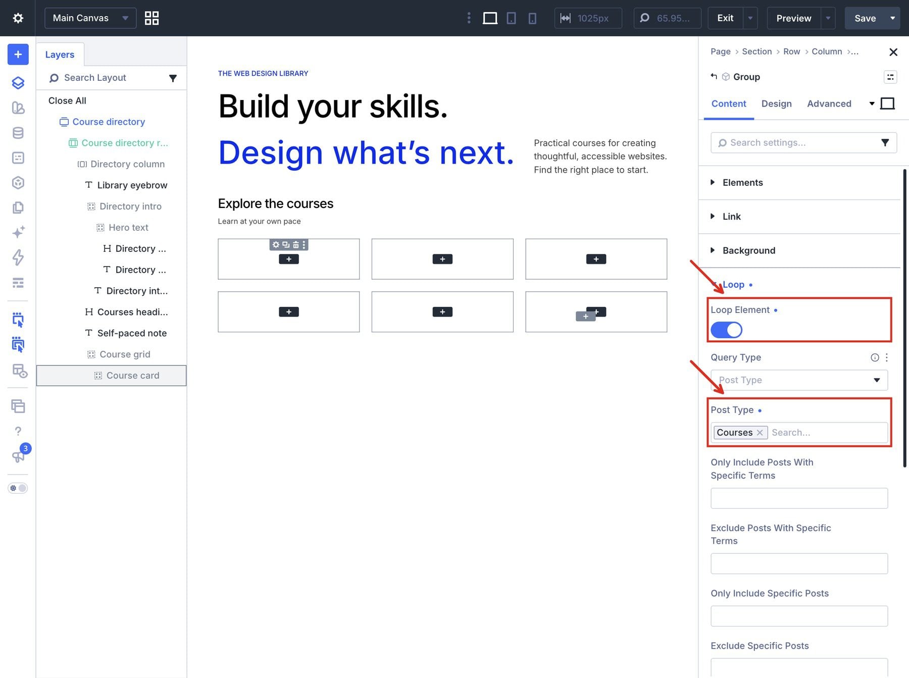
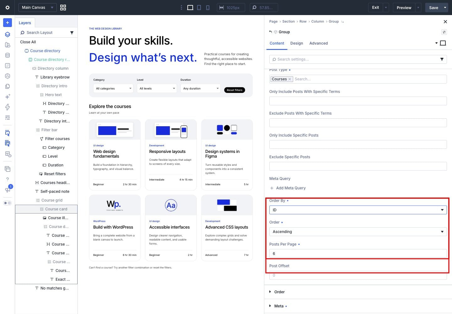
In the same Loop group, set Posts Per Page to 6, Order By to ID, and Order to Ascending so the sample courses stay in their creation order.
Style The Course Card
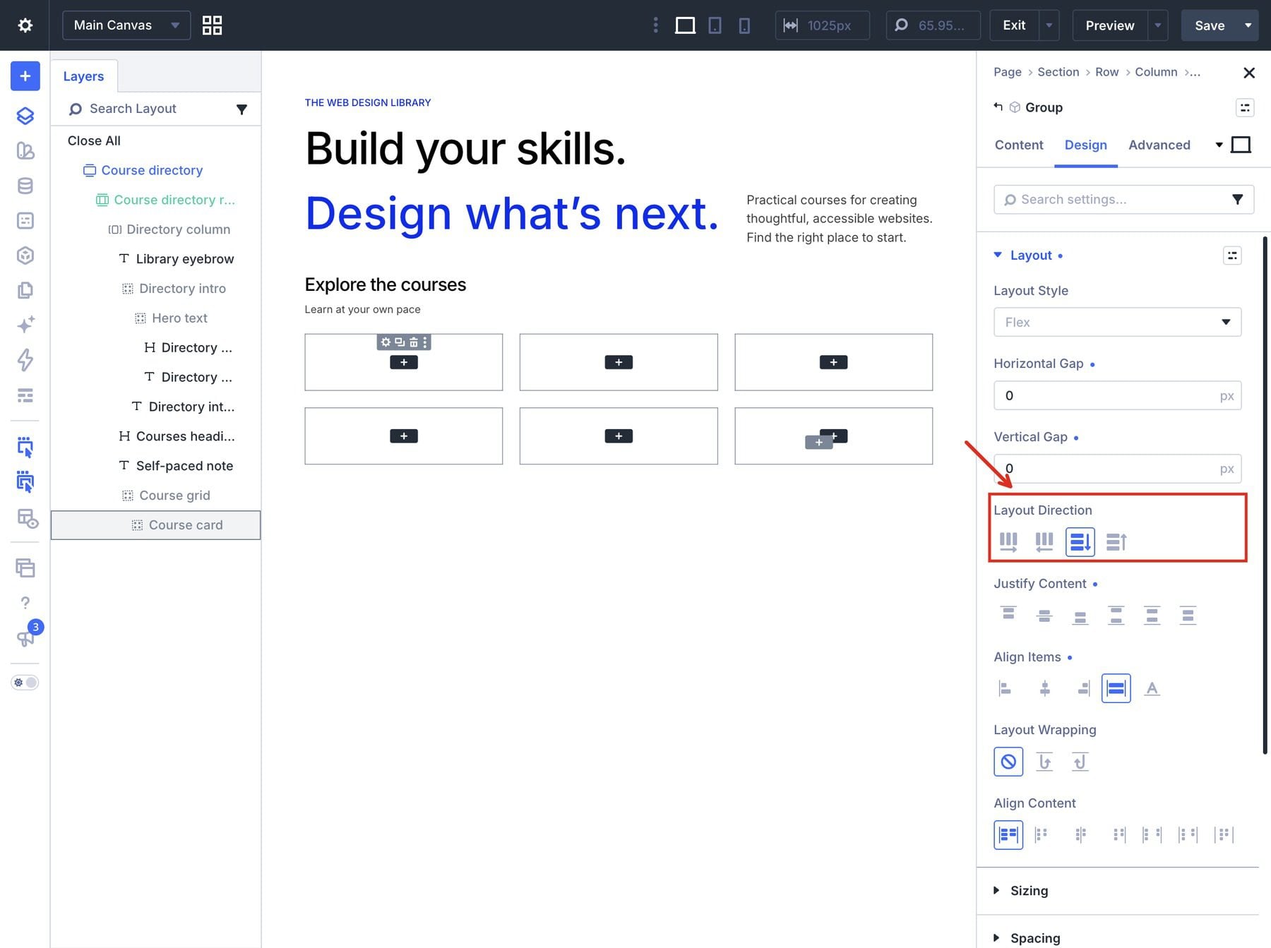
Select Course card and open Design > Layout. Use a Flex column, stretch alignment, no wrapping, and zero gaps.
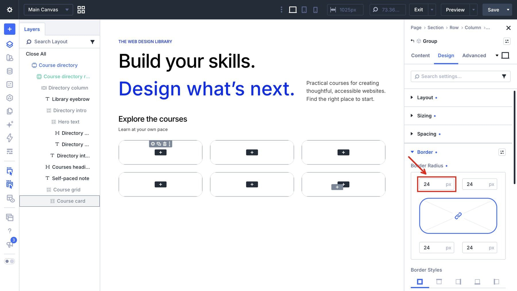
With Course card selected, open Content > Background and set its background to white. Under Design > Border, apply 24px rounded corners.
In the same Border group, apply a 1px solid border in rgba(0,0,0,0.12).
Connect The Card Content
Inside Course card, add an Image module. Select the Image module and open Content > Image. Open the Image field’s dynamic-content picker and choose Loop Featured Image.
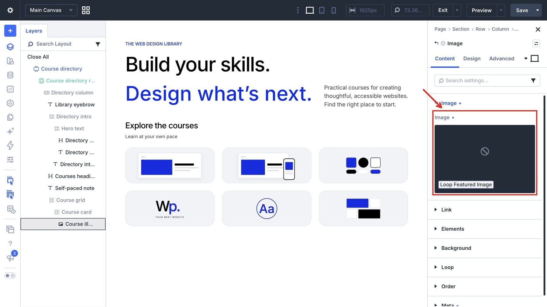
Leave the Image module’s Sizing settings at their defaults and check that the image fills the card.
For its alt text, open Advanced > Attributes and add an attribute. Enter alt as the attribute name, choose Image as the target element, and set Attribute Value through dynamic content to Loop Post Title. Each directory image will use its course title as its alt text.
Add a Group after the Image module and label it Course details. In Design > Layout, use a Flex column and explicitly set its horizontal and vertical gaps to 0px. We’ll control the space between its contents with module margins.
Open Design > Spacing and give Course details 22px padding on all sides. Fill this Group with the category, title, and excerpt modules described below.
Add The Category, Title, And Description
Add a Text module for the category. Open the category Text module’s Content > Text settings. In its dynamic-content picker, choose Loop Post Custom Field, then select Category (course_category) so each card displays its course’s value.
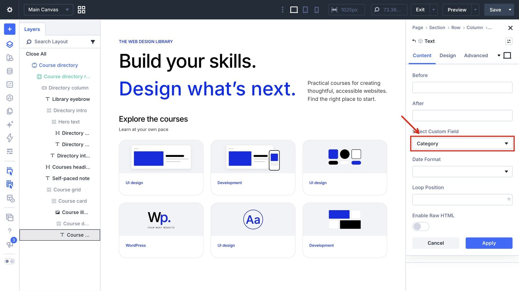
In that module’s Design > Text settings, use Inter 500, 13px, and #022eee.
Open the category module’s Design > Spacing settings and set its bottom margin to 10px.
Add an H3 Heading module. Open Content > Text and delete the module’s default heading text before inserting dynamic content. Then use the dynamic-content picker to choose Loop Post Title. The field should contain only the dynamic title, without the starter heading text beside it.
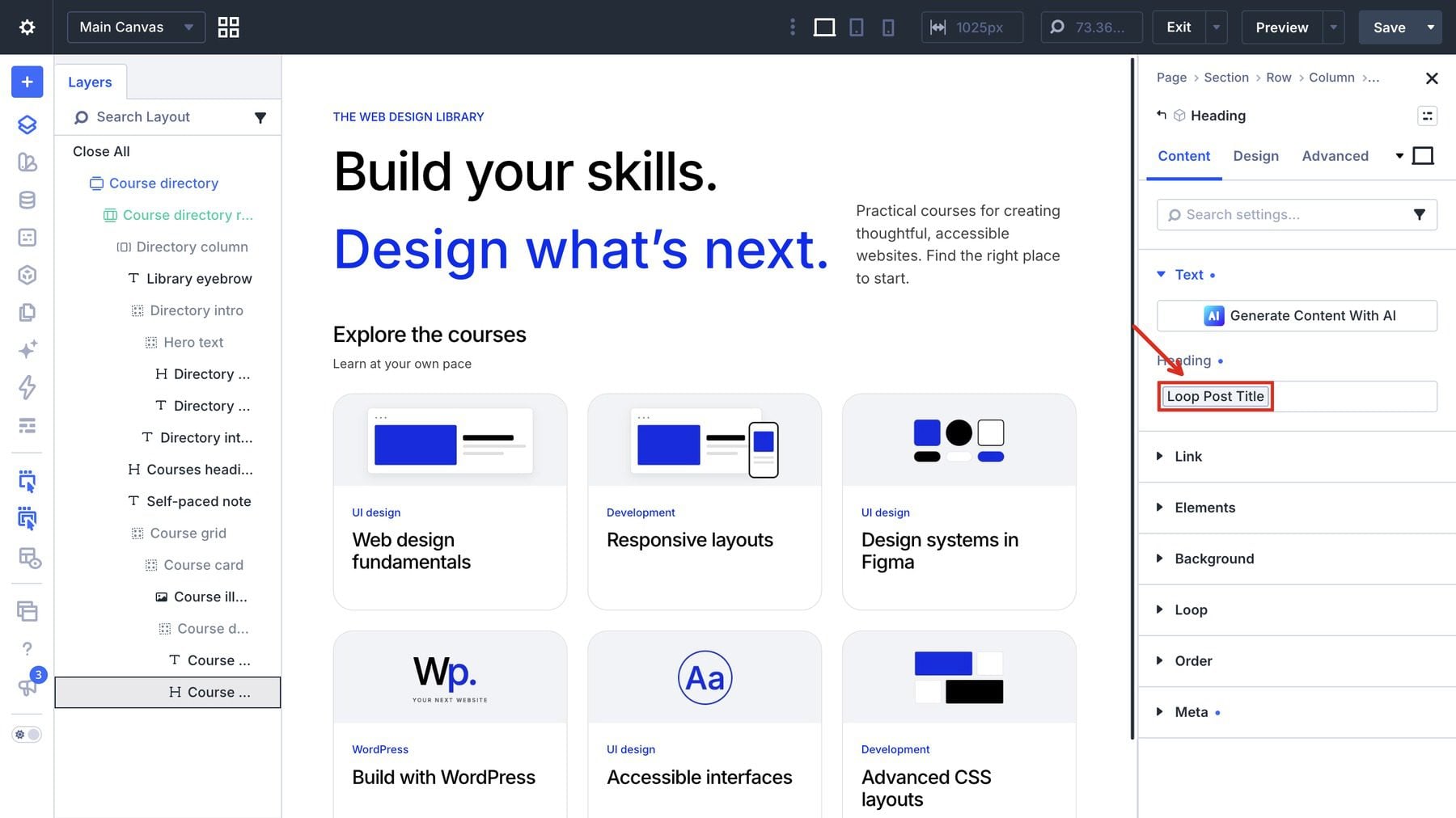
In the title module’s Design > Heading Text settings, use Inter 500, 23px, 1.15em line height, -0.03em letter spacing, and black text.
In its Design > Spacing settings, set its bottom margin to 12px.
Add a Text module for the description and open Content > Text. Replace its starter content through the dynamic-content picker with Loop Excerpt. Open its Variable Settings and set Number Of Words to 30.
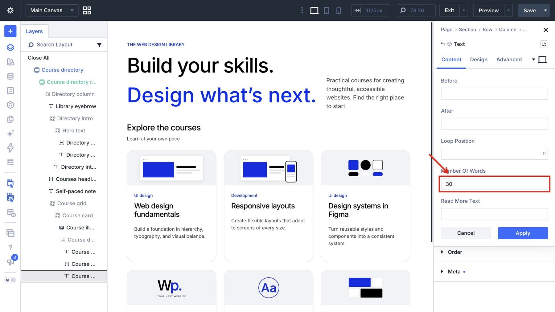
In the excerpt module’s Design > Text settings, use Inter 400, 15px, 1.5em line height, and rgba(0,0,0,0.75).
Open the excerpt module’s Design > Spacing settings and use a 20px bottom margin.
Finally, open its Design > Sizing settings and set Min Height to 72px.
Link The Image And Title To The Course
Dynamic image and title content do not automatically make the card clickable. Add the links separately so visitors can open the course represented by each loop item.
- Select the card’s Image module in Layers and open Content > Link.
- Leave Open in Lightbox disabled. Beside Image Link URL, open the dynamic-content picker.
- Under Loop Dynamic Content, choose Loop Link. Leave Before, After, and Loop Position empty, then click Apply.
- Keep Image Link Target set to In The Current Tab.
- Select the course-title Heading module and open Content > Link.
- For Module Link URL, open the dynamic-content picker and choose Loop Link. Leave the optional values empty and click Apply.
- Keep Module Link Target set to In The Current Tab.
Choose the link from Loop Dynamic Content so each repeated card opens its own course. A static course URL would send every card to the same destination.
These settings make the image and title clickable. The card’s category, description, and metadata remain supporting content.
Add The Level And Duration
For the metadata footer, add another Group inside Course details. With the footer Group selected, open Design > Layout. Use a Flex row with Space Between, wrapping enabled, and a 10px horizontal gap.
Open the footer Group’s Design > Spacing settings for 16px top padding.
Open its Design > Border settings and apply a 1px top border in rgba(0,0,0,0.12). Then add two Text modules for the level and exact duration.
For the first Text module, open Content > Text, use the dynamic-content picker to choose Loop Post Custom Field, then select Level (course_level).
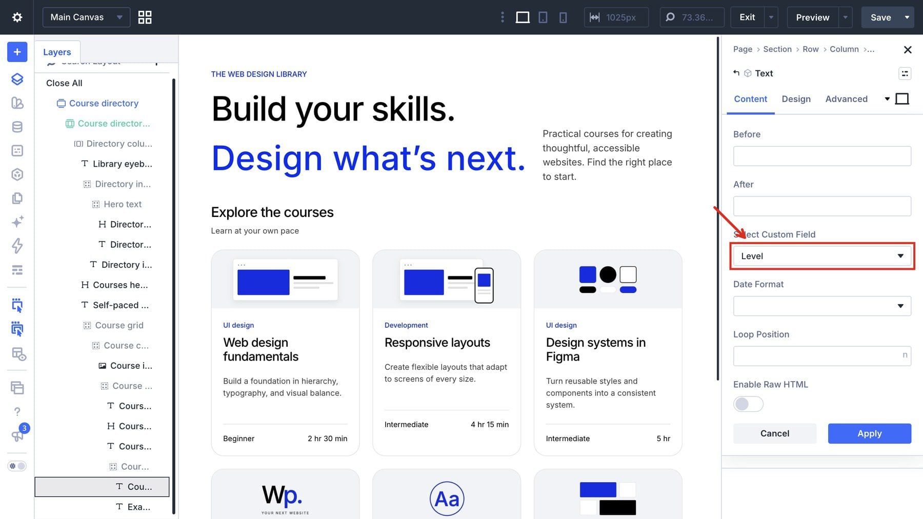
Repeat for the second Text module, choosing Exact duration (course_duration_label).
For the Level Text module, open Design > Text and use Inter 400, 14px, and black.
Apply the same typography to the Exact duration Text module.
You should see different course content repeated through the same card design. If every card shows the same text, reopen its dynamic-content setting and select the field from the loop’s course.
Below Course grid, add a Text module with guidance for visitors who cannot find a match. Explain that they can try another filter combination or use Reset filters. In Design > Text, use 14px text.
This guidance remains visible beneath the directory, including when Divi displays its standard empty-results message. That default message can include generic wording about a page not being found, so the additional text should clearly explain what visitors can do next.
Open the guidance module’s Design > Spacing settings and set its top margin to 24px.
6. Add The Three Course Filters
Between the introduction and the course-list heading, add a Group labeled Filter bar. Open its Content > Elements settings to add the filter module next.
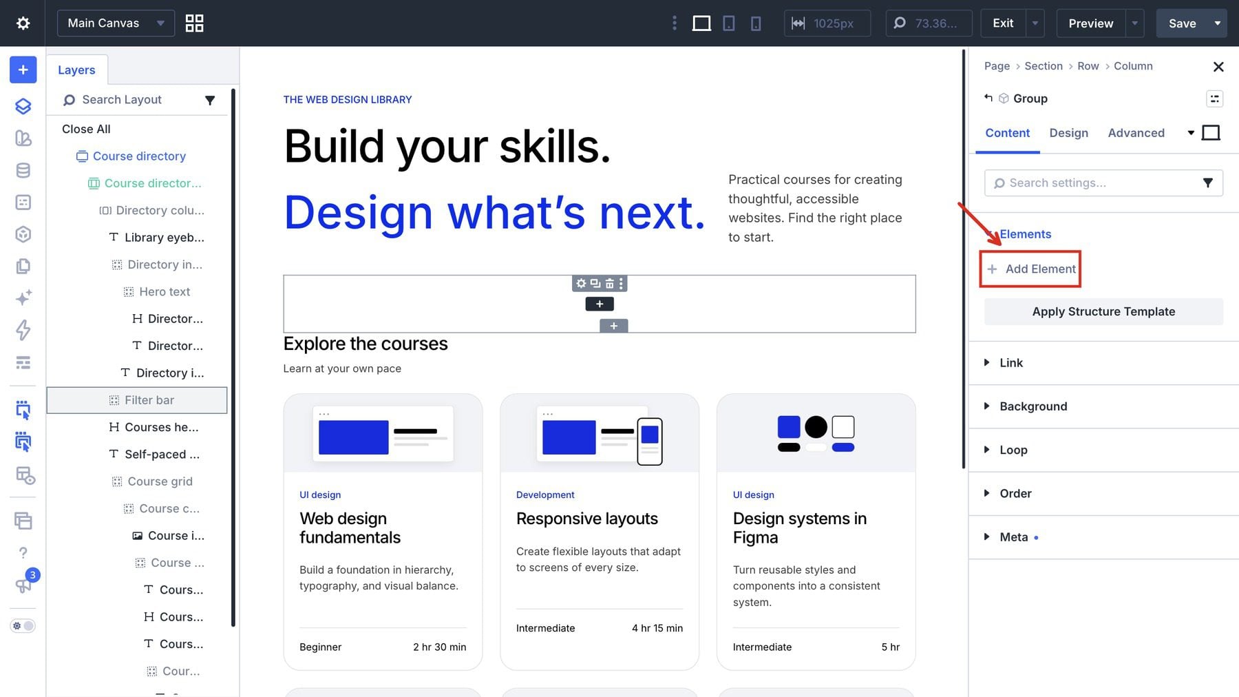
Place a Post Filter module inside Filter bar and label it Filter courses. Open Content > Target and choose Course card from Target Loop, set Apply Mode to Auto, and set Relation to And.
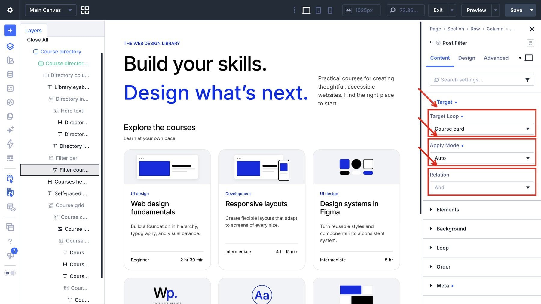
Auto applies each selection as it changes. And requires the course to match every active dropdown. Choosing UI design and Beginner therefore narrows the result to beginner UI-design courses.
Configure The Filter Items
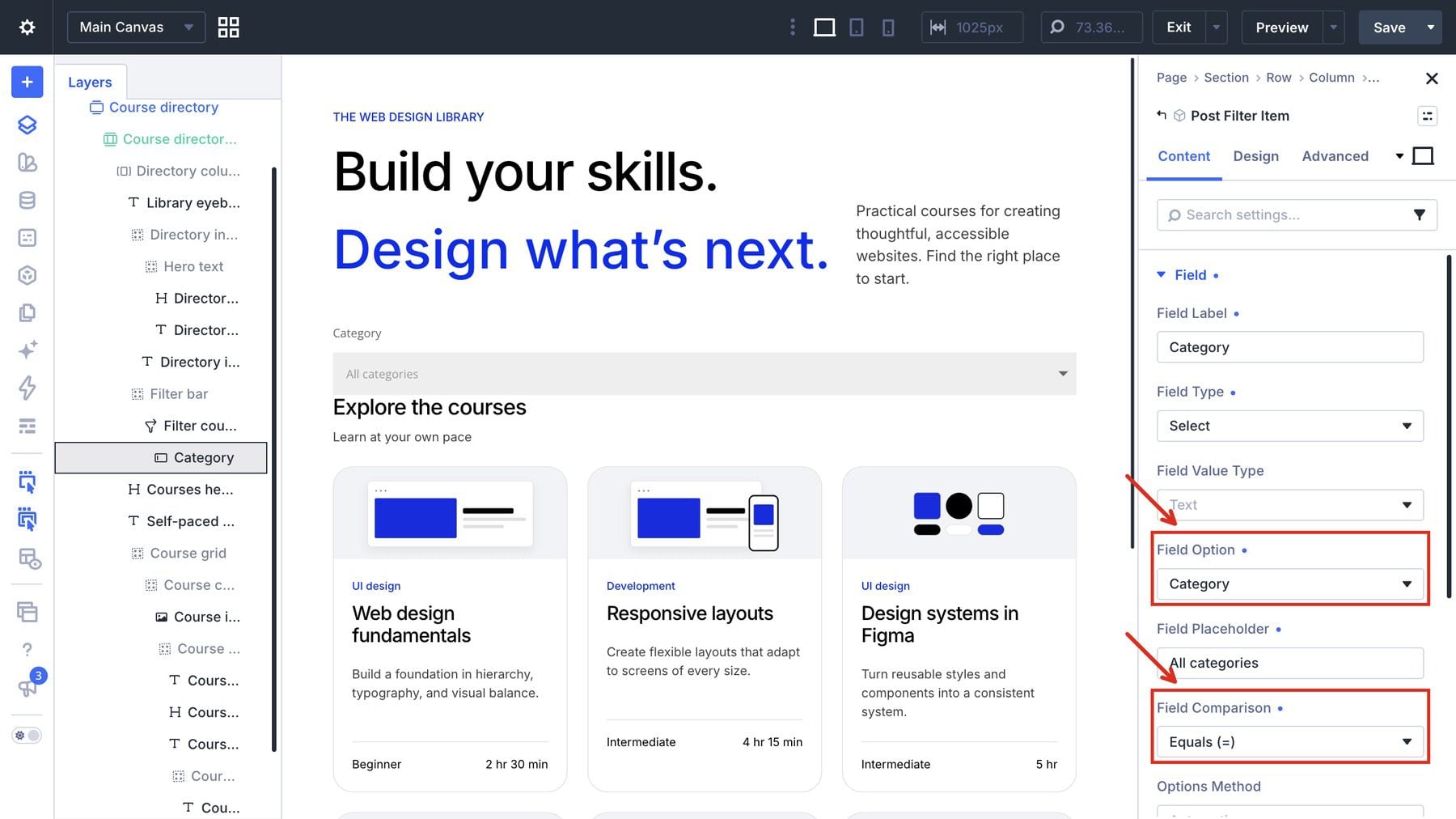
In the Post Filter module’s Content > Elements settings, remove the starter controls and add a Post Filter Item. Under the item’s Content > Field settings, configure Category as follows:
- Field Type: Select.
- Field Label: Category.
- Field Value Type: Text.
- Field Option: the ACF field Category (course_category).
- Field Comparison: equals (=).
- Options Method: Automatic.
- Field Placeholder: All categories.
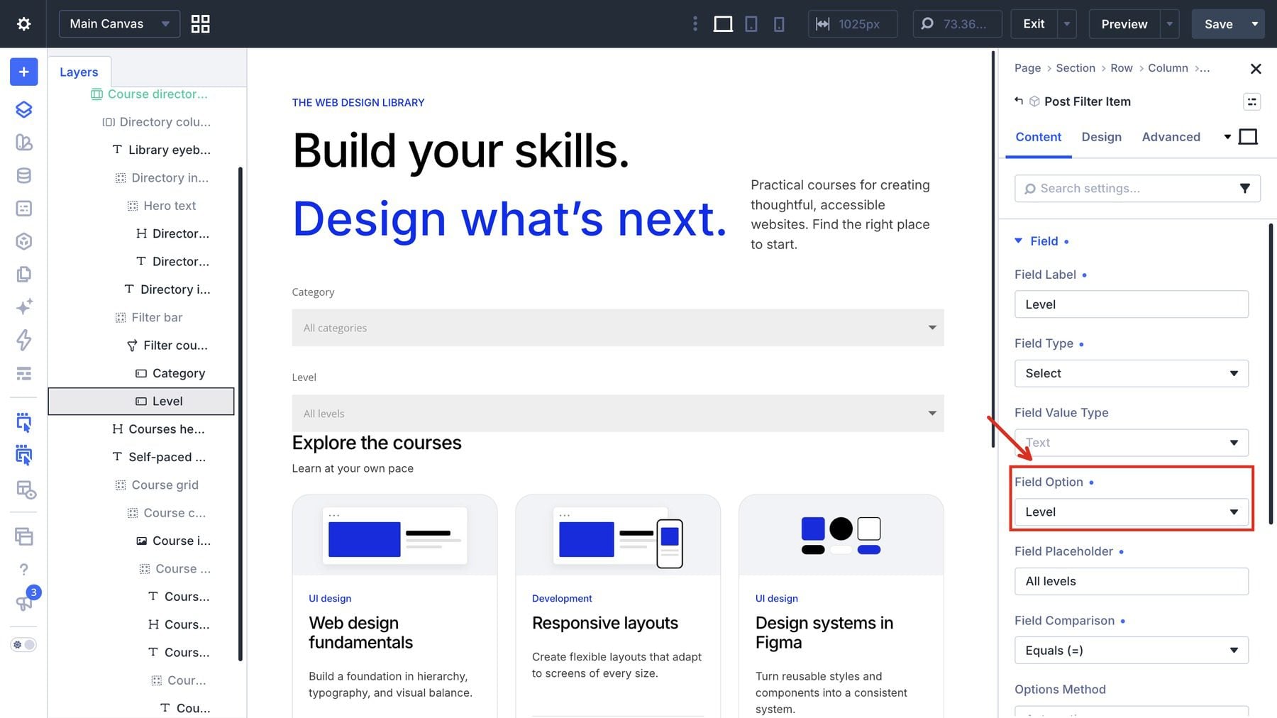
Duplicate Category to create the Level item. Choose Level (course_level), use Level as its label, and enter All levels as its placeholder. Keep the remaining field settings the same.
Duplicate an item again for Duration. Choose Duration band (course_duration_band), use Duration as its label, and enter Any duration as its placeholder. Keep the same Select, Text, equals, and Automatic settings.
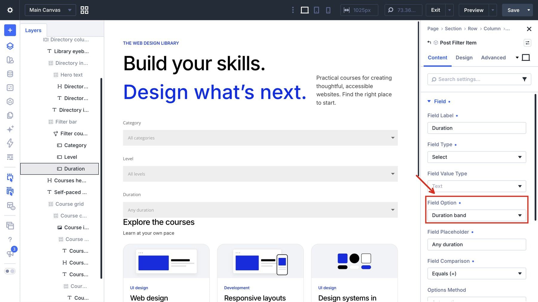
Because Automatic fills the dropdowns from stored field values, publish the sample courses before checking the controls.
If an option is missing after you add a new value, select the affected Category, Level, or Duration item in Layers. Open its Content > Field settings, find Options Method: Automatic, click Clear Cached Options, and reload the page. The Post Filter Item documentation explains the automatic and manual option settings.
Style The Filter Bar
Select Filter bar. In Content > Background, use #f2f3f7. Set the corner radius to 24px in Design > Border. In Design > Spacing, use 24px padding on all sides and a 36px bottom margin.
Select the parent Post Filter module. In Design > Layout, use a Flex row with No Wrap, a 20px horizontal gap, and a 16px vertical gap. Explicitly disabling wrapping keeps the third dropdown on the same desktop row.
For the Post Filter module’s width, use 82% in Design > Sizing, leaving room for Reset. Set each child filter item’s width to 33.333%.
Return to Filter bar > Design > Layout. Use a Flex row with bottom alignment and 20px horizontal and vertical gaps. The bar now holds three unstyled fields; Reset is added afterward.
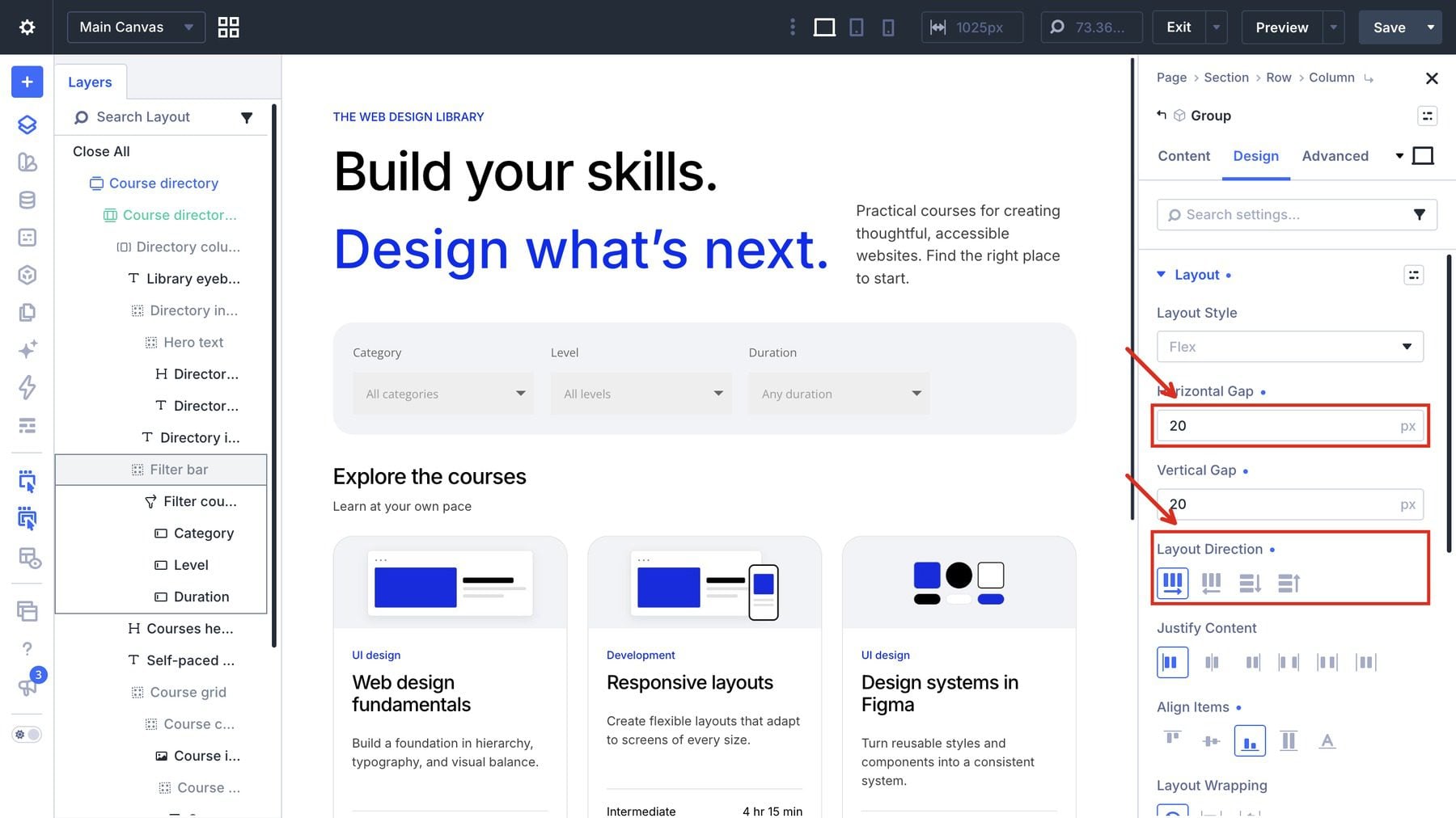
Style The Filter Fields
Under the parent module’s Design > Field > Input Text settings, use black Inter text at 16px for the values.
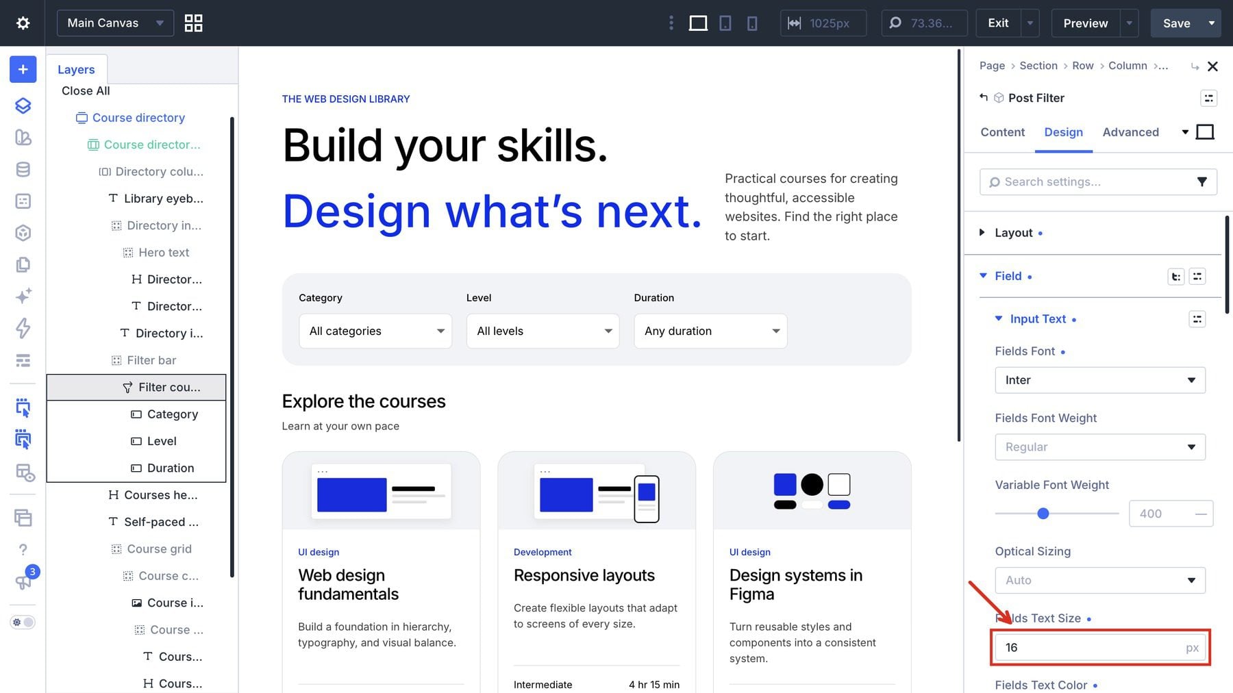
In the same Field group, use white backgrounds and set the label text to black Inter 500 at 14px. Set field padding to 12px vertically and 14px horizontally.
Still in Post Filter > Design > Field, open its Border controls. Apply 8px field corners and a 1px solid border in rgba(0,0,0,0.12).
With the Post Filter module selected, open the device/state menu at the upper right of its settings panel and choose Focus. In Design > Field > Border, use a 2px solid border in #022eee at 100% opacity. Afterward, return to Desktop.
Inside Filter bar, add a separate Button module beside Post Filter. In Content > Text, enter Reset filters. Open Content > Link for the button URL, then use its dynamic-content picker to choose Current Page Link. This resolves to the directory’s clean permalink.
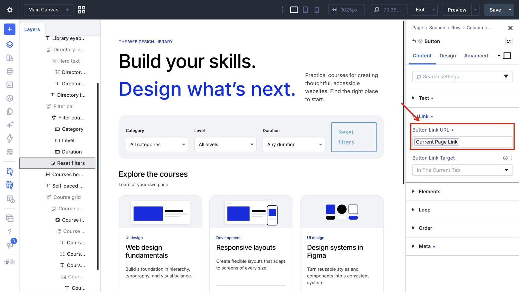
In the Reset Button module, open Design > Button > Text and use white Inter 500 text at 15px. Keep the icon disabled.
Under Button > Border, set the corner radius to 999px and the border width to 0px.
Open the Reset Button module’s Design > Button > Background controls and set the background to black. Then open the module’s Design > Spacing settings and use 14px padding vertically and 22px horizontally.
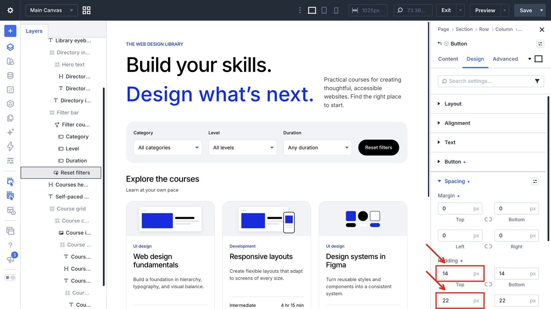
This button reloads the directory without the filtered query string. Because it clears all query parameters on this page, use this approach for the standalone directory shown here. It also avoids stale dropdown selections observed with the built-in Reset item after reloading a filtered view in the tested build.
7. Adjust The Tablet And Phone Layouts
Select Course grid and open Design > Layout. Open the responsive control for Number Of Columns. In its Responsive Editor, set Desktop to 3, Tablet to 2, and Phone to 1. The three device rows below show those values together.
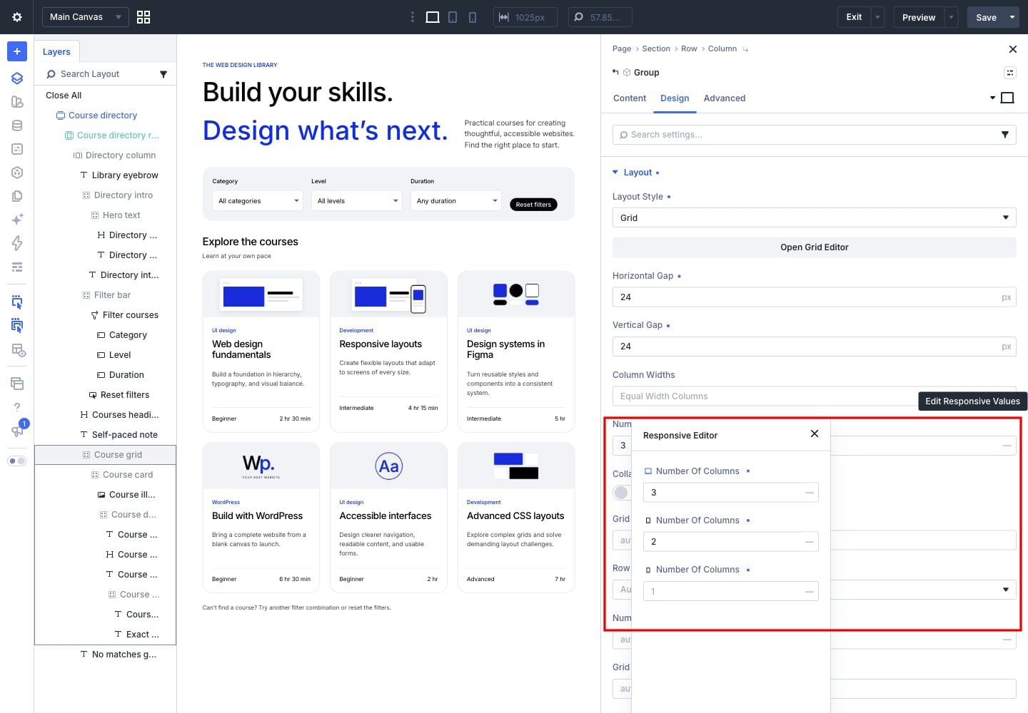
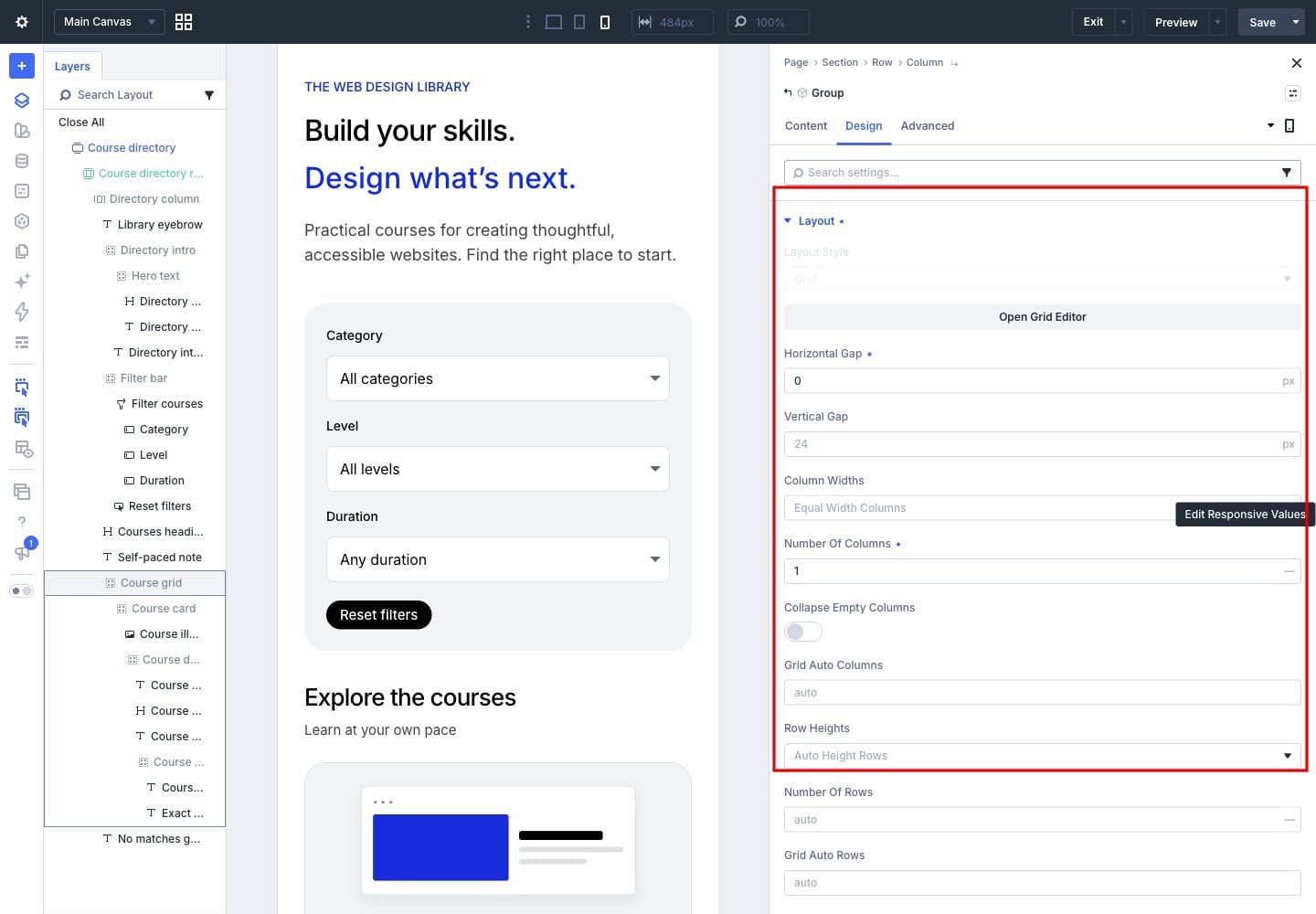
With the phone breakpoint selected, set the grid’s horizontal gap to 0px and retain its 24px vertical gap.
Set The Filter And Introduction Layouts
Select Filter bar and choose Tablet in the settings-panel device menu. In Design > Layout, use a Flex column and stretch alignment.
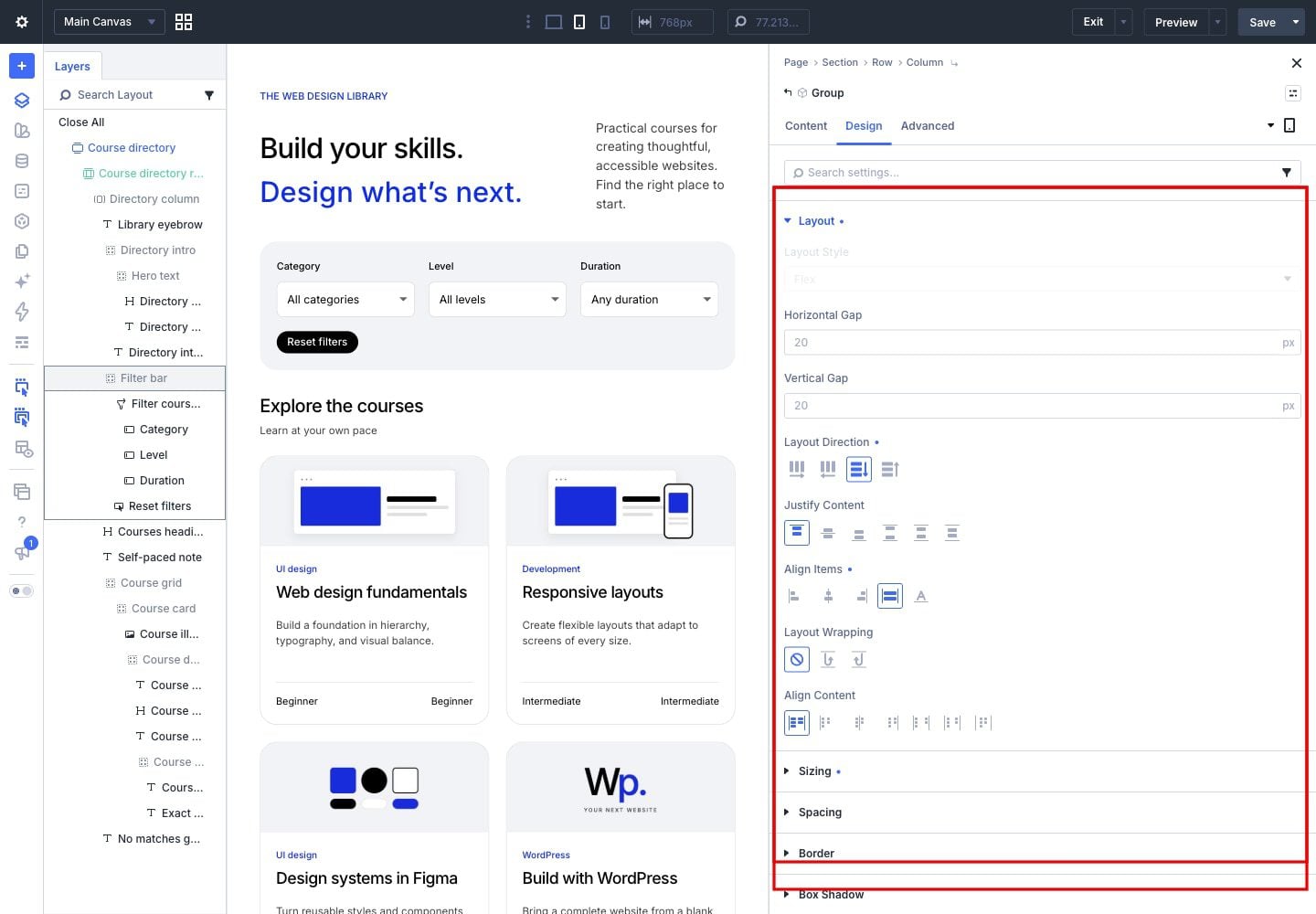
Select Post Filter and open Design > Sizing to set its Tablet width to 100%.
Select Post Filter and choose Phone. In Design > Layout, use a column.
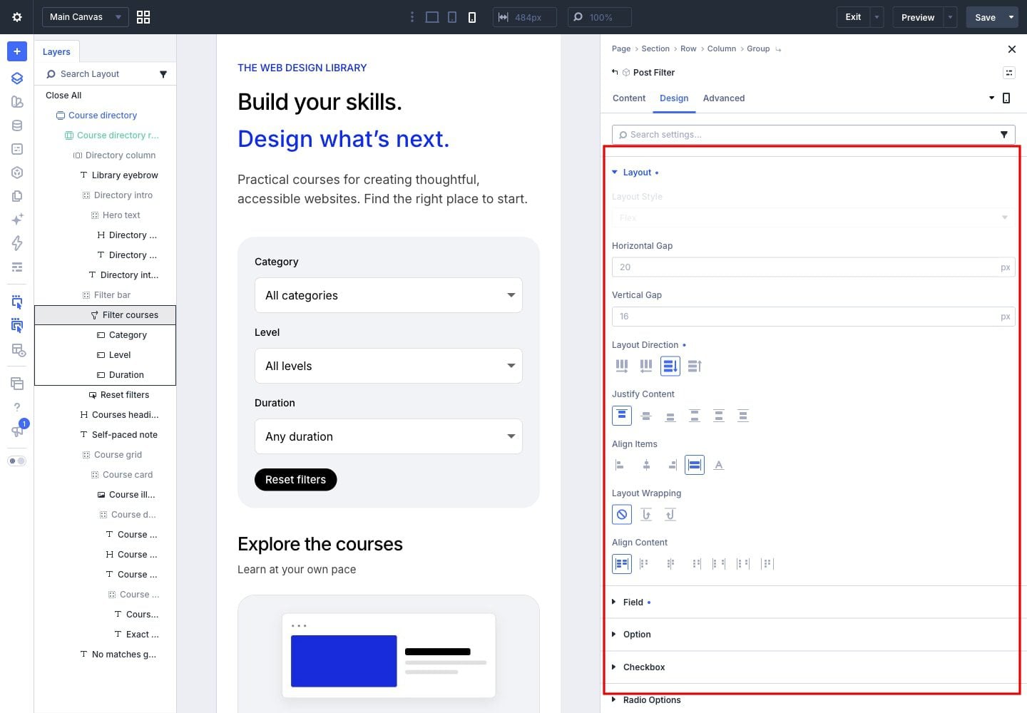
Select each child filter item and open Design > Sizing to set its Phone width to 100%.
Select Directory intro, choose Phone, and open Design > Layout to use a column.
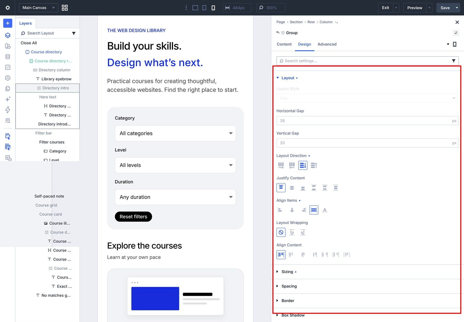
With Phone selected, open Hero text > Design > Sizing and set its width to 100%.
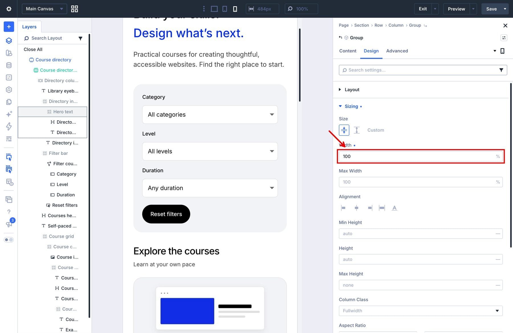
Repeat the 100% Phone width for the adjacent introduction Text module.
Select the main Heading module, open Design > Heading Text, and use the responsive control for its text size: 40px on tablet and 32px on phone. The screenshot shows the Phone value.
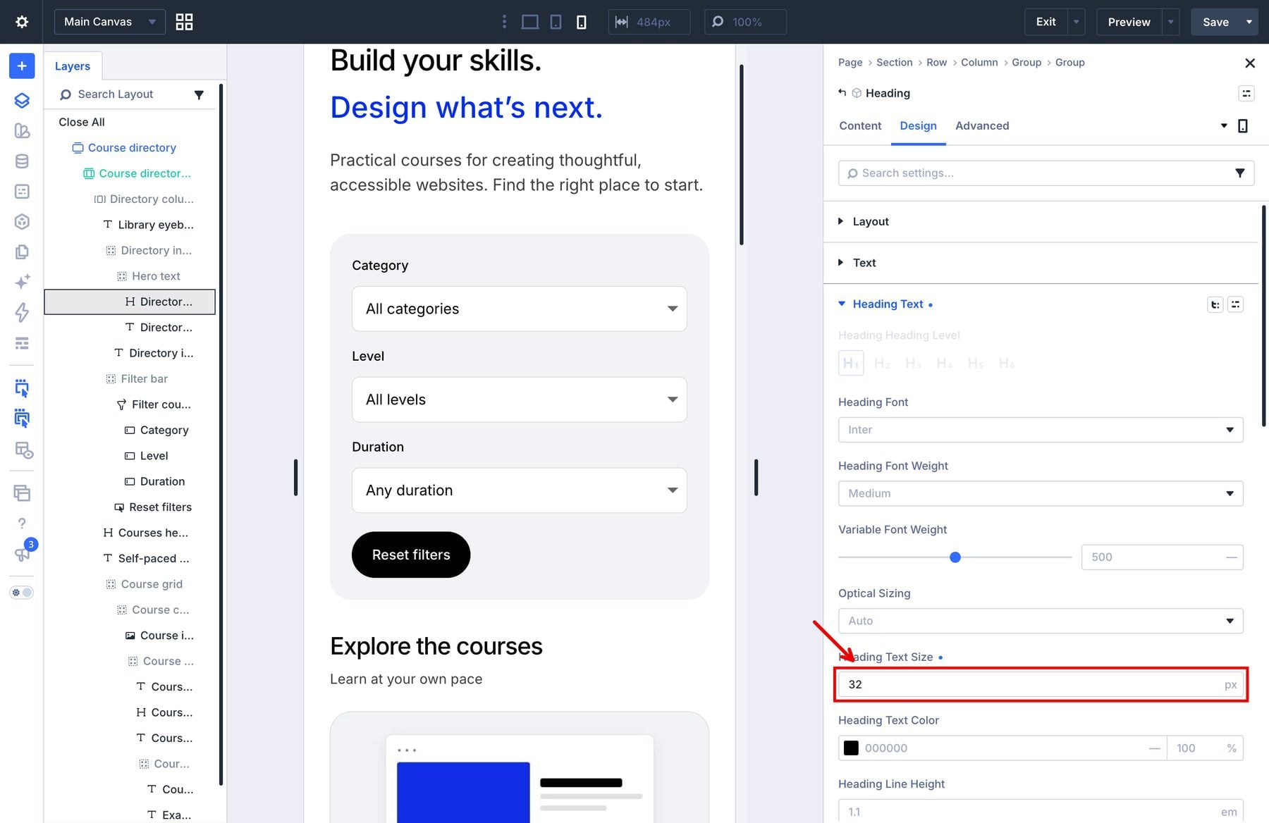
Repeat the 40px Tablet and 32px Phone text sizes in Design > Text for the blue subtitle Text module.
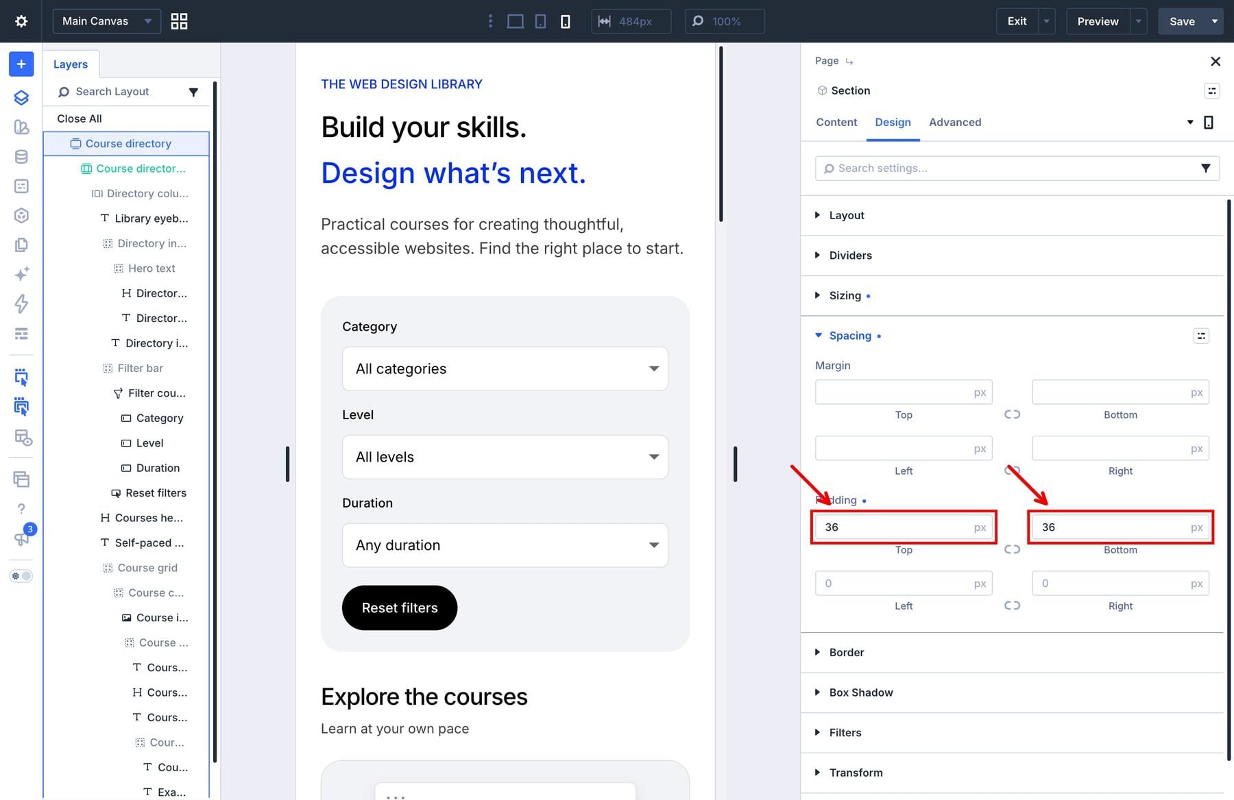
Select the section, choose Phone, and open Design > Spacing. Set top and bottom padding to 36px.
Save the page and check the frontend at desktop, tablet, and phone widths. The video below switches the native preview between desktop, tablet, and phone layouts. Labels should stay readable, cards should fit the screen, and the page should not scroll sideways.
Click Save in the Builder’s upper-right toolbar, wait for saving to finish, then click Exit.
8. Test The Directory
On the frontend, choose UI design. The clip shows Category changing from All categories to UI design and the three matching courses appearing. The open dropdown menu is not visible in this recording.
With UI design selected, add Beginner and Under 3 hours. Web design fundamentals and Accessible interfaces should remain. Reload the filtered page and confirm that the selected values and results persist.
Click Reset filters. All six courses and the three dropdown placeholders should return.
Choose Development, Intermediate, and 3–6 hours. Responsive layouts should be the only result. The continuous video shows these checks in order, including a scroll through the restored courses after Reset.
Check The Course Links
Click the remaining course’s title and confirm that it opens the Responsive layouts course page. Return to the directory, reset the filters, and open a different course through its image.
Repeat an image-link test after applying a filter. Confirm that the destination matches the course you clicked, rather than the first course in the loop or the directory itself.
Check the individual course page as well. Its main content should contain the information visitors need after leaving the directory. The directory’s card excerpt does not automatically become the body of that page.
Check Empty Results And Keyboard Focus
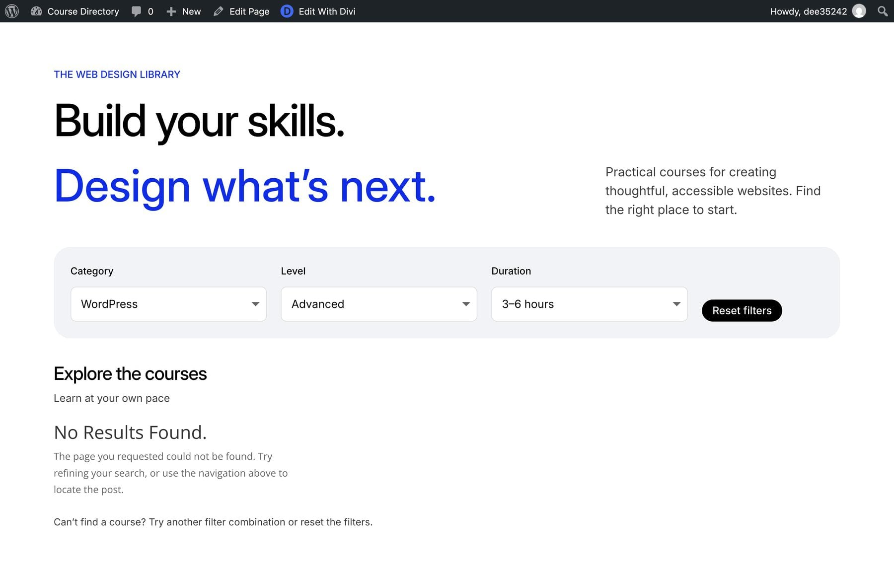
For an empty-result test, choose WordPress, Advanced, and 3–6 hours. No sample course matches that combination.
Divi displays its standard empty-results output, which can include No Results Found and generic wording about a page not being found. In this situation, the directory page is still available; the selected filters simply have no matching courses. Keep the explanatory guidance and Reset button available so visitors can recover.
Put keyboard focus on Category and press Tab to move to Level. Watch the blue outline move between those two controls in the clip.
Continue tabbing through Duration and Reset, and check that selections work without a mouse. The short clip demonstrates only Category-to-Level focus movement.
After resetting the directory, continue to a course image link and press Enter to check that it opens the matching course.
The filter combinations, filtered reload, Reset behavior, and responsive grid were checked in the manually built native demo. Course navigation was also checked through a title and an image after filtering. Run these checks again with your own content before making the directory available to visitors.
Download The Course Directory Layout
The download contains the Divi Library layout, an ACF structure export, a sample-course reference file, six course images, and a README with setup instructions.
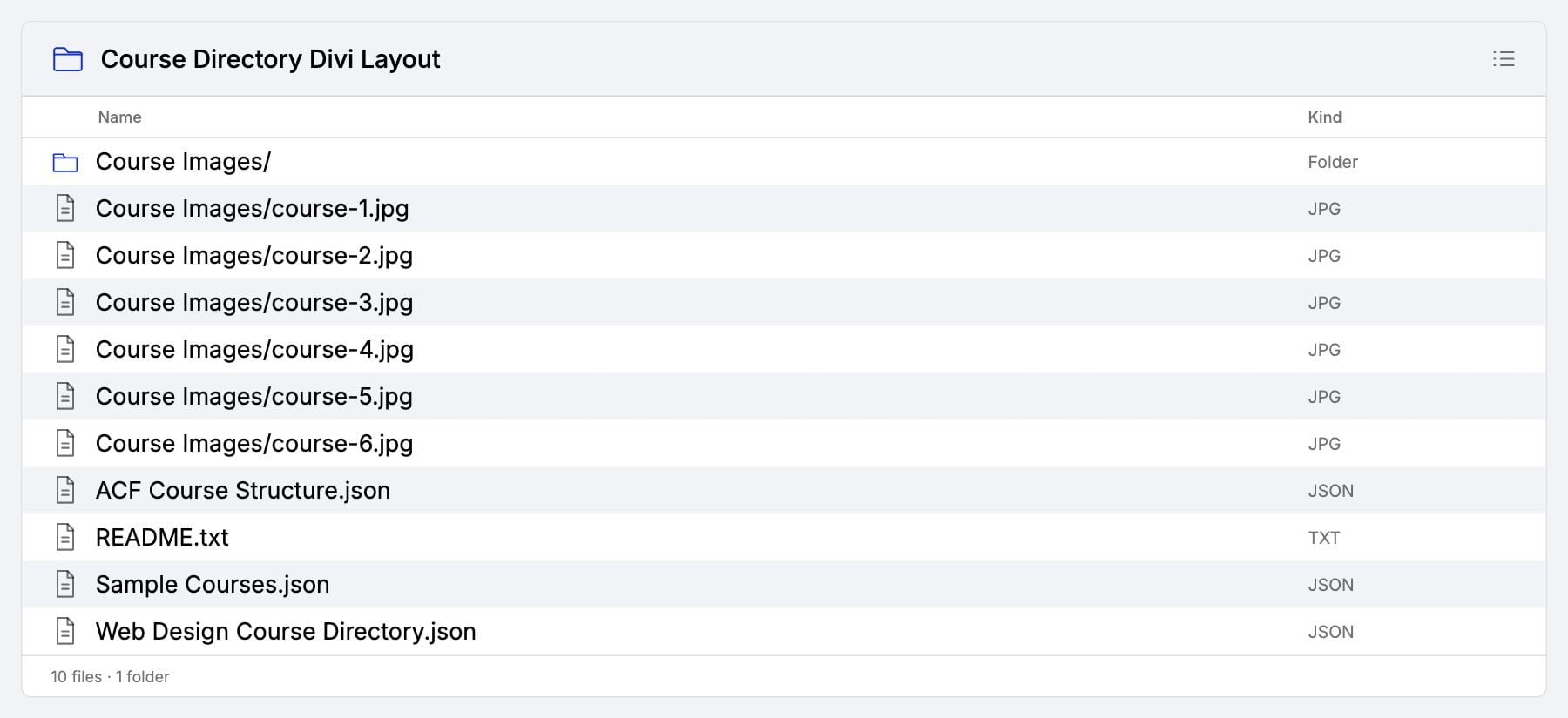
Because the layout needs the course post type, fields, and content to display its cards, unzip the archive and read README.txt before importing.
The ACF import is an alternative to creating the post type and fields manually in sections 1 and 2. If you have already completed those sections, keep your existing setup and skip the ACF import. Importing another registration with the same course post-type key can create a conflict.
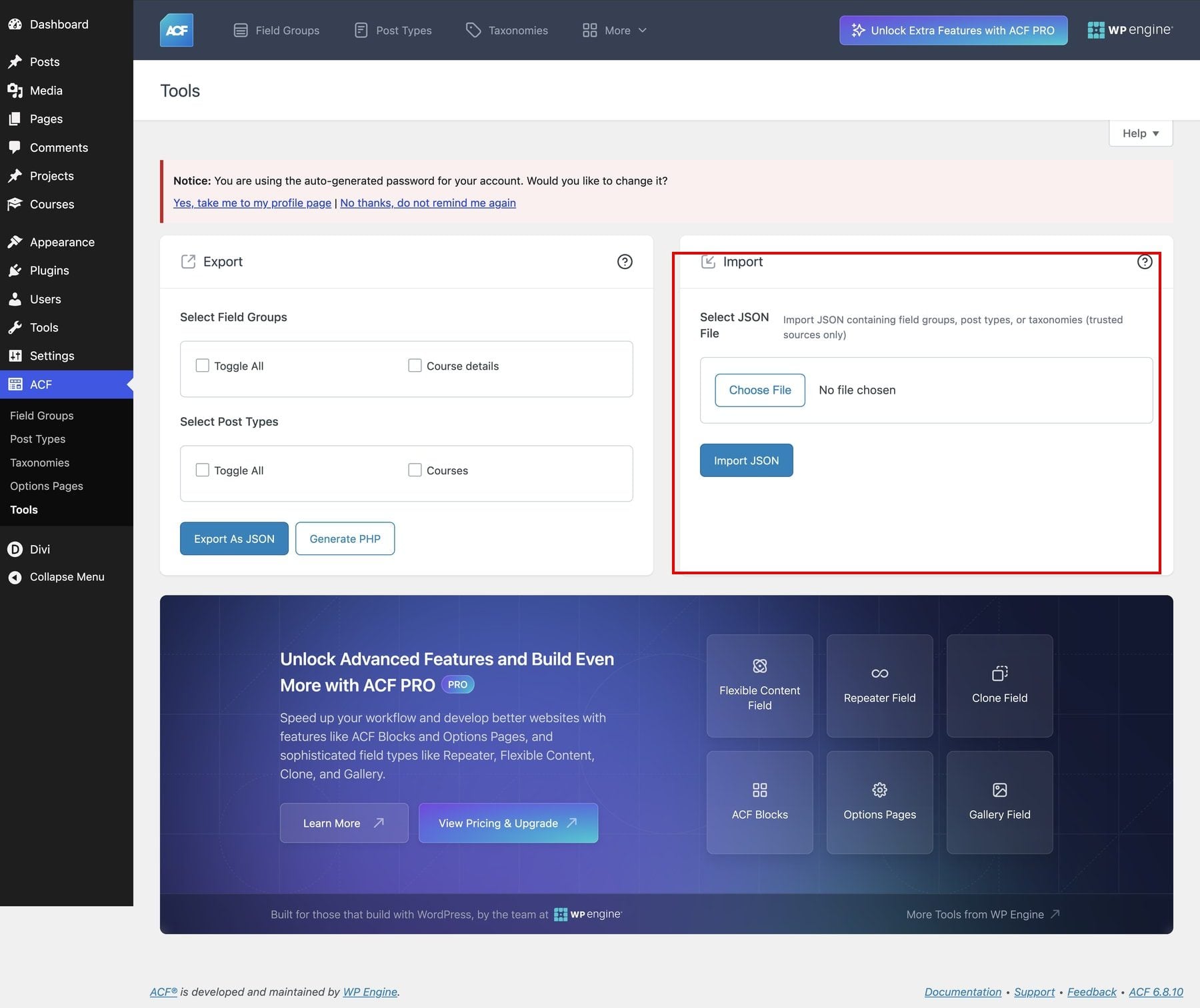
To use the supplied ACF structure on a site without that setup, open ACF > Tools. In the Import panel, choose ACF Course Structure.json and click Import JSON to register Courses and its Course details fields. Use the Import panel on the right; the checkboxes on the left belong to the separate Export controls.
Upload the images to your Media Library, then create each of the six course records manually using Sample Courses.json as a reference. This reference file is not a one-click WordPress content import. Use the course-entry example in section 3 for the fields, and add any course-page information to each record’s main content editor.
Import The Layout Into Divi
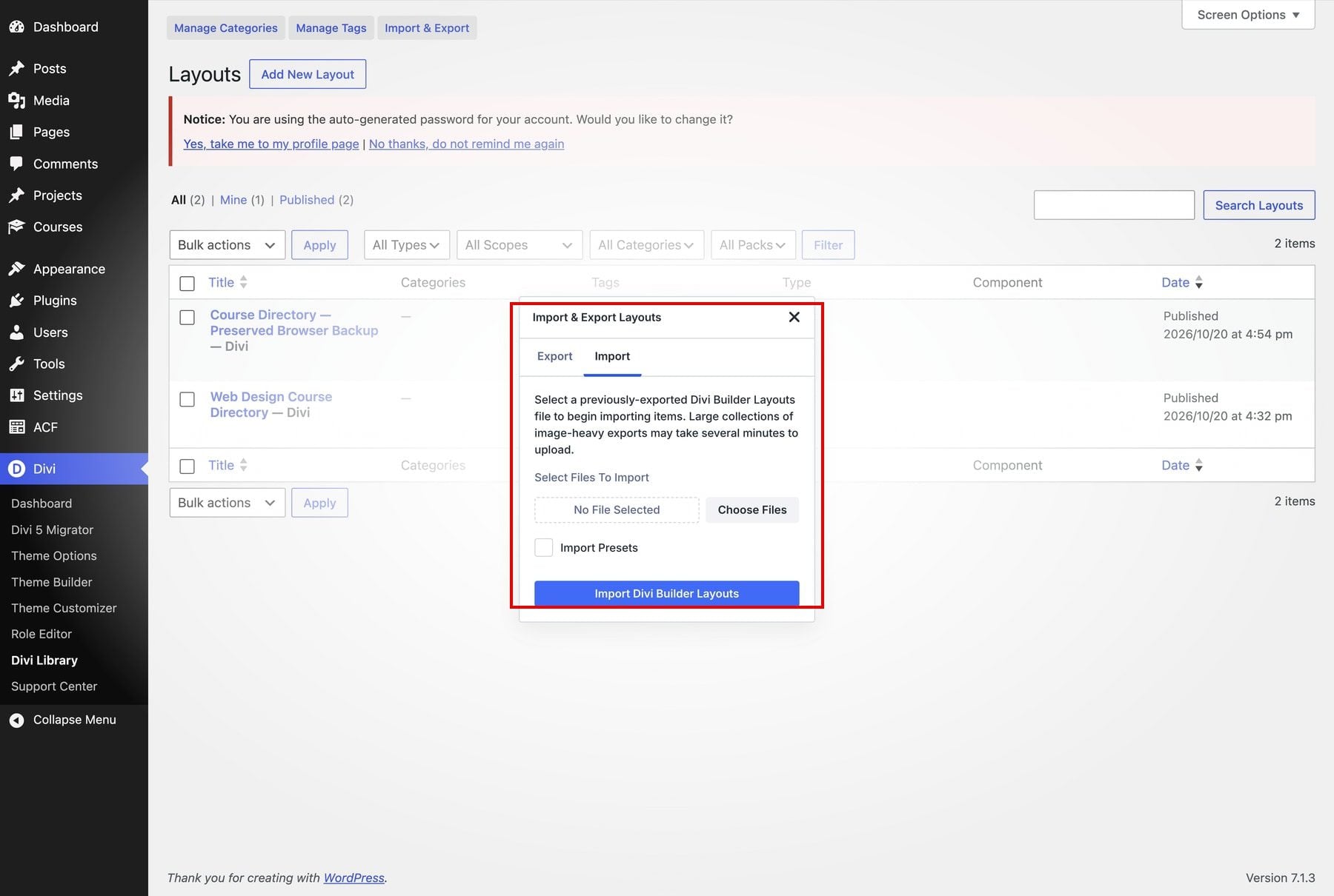
Open Divi > Divi Library > Import & Export > Import. Click Choose Files, select Web Design Course Directory.json, then click Import Divi Builder Layouts. The image shows the dialog before file selection.
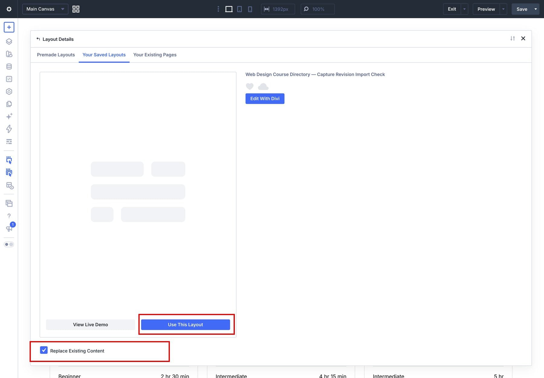
Create a directory page and open Divi Builder. In the Library picker’s Your Saved Layouts tab, select the imported Web Design Course Directory layout and click Use This Layout.
Use Replace Existing Content only on the new page whose content you intend to replace. The screenshot’s layout name includes a test-import suffix; select the layout you imported.
Check its dynamic fields and target loop. To make the course images and titles clickable, follow Link The Image And Title To The Course in section 5.
Save the page and repeat the filter and course-link tests above. Follow the content setup instructions when moving the layout to a different site.
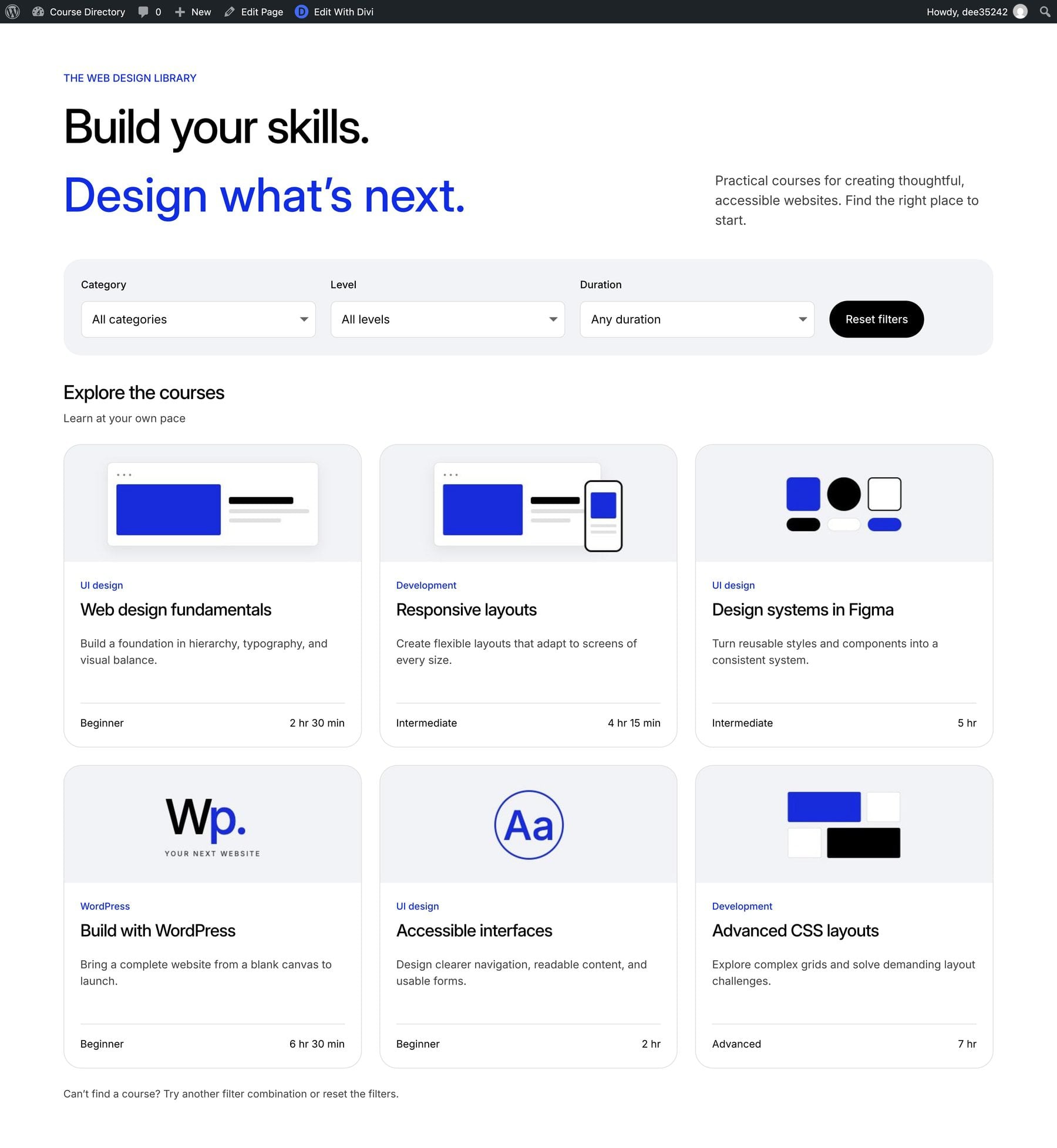
Use the files below to start with the design, then replace the sample descriptions and illustrations with your own course content.

Keep Your Course Directory Current
To add another course, create its record in Courses and fill in the same fields, keeping the exact duration and its band consistent. Follow the course-entry example in section 3.
The example shows up to six courses. For a larger catalog, select Course card in Layers and open Content > Loop > Posts Per Page. Increase that value to include all your entries; the image shows the example’s current value of 6. A paginated directory can be a later extension.
You can change the card design once in the loop and apply that presentation across the catalog. The same course fields continue to supply the dropdowns, giving visitors a way to find courses that match their subject, experience, and available time.
When adding or changing courses, check their links and destination content as well as their filter values.
Build Your Course Directory With Divi 5
With Divi 5, you can turn a collection of courses into a directory that helps visitors choose where to start. The Loop Builder keeps your course cards consistent, while the Loop Filter Modules let visitors narrow the selection by category, level, and duration.
Start with the downloadable layout or build the example step by step, then replace the sample content with your own courses. Before sharing your directory, check its filters, course links, and responsive layouts so visitors can find a suitable course and open its details.





Leave A Reply