

A coffee cup can feel like a quick stop or an invitation to stay. Its shape and weight contribute to that impression, alongside the words and colors around it.
The new Icon Manager in Divi 5 makes it easier to bring another icon family into a design. You can import SVGs into a collection and choose them from the icon picker while you build.
Here are three sections with four icon styles each. The design stays fixed throughout each comparison, from the type and copy to the spacing between cards. Watch the icons change, then try the same approach in the Visual Builder.
- 1 Four Icon Styles, Three Different Designs
- 2 1. Sunday House: A Softer Welcome
- 3 2. Outside People: Give The Cards Some Energy
- 4 3. Fix!: Carry The Same Style Across Sizes
- 5 Try Another Icon Set In The Visual Builder
- 6 Keep The Icons In Balance With The Type
- 7 Download The Three Layouts
- 8 Download For Free
Four Icon Styles, Three Different Designs
These examples cover three settings. A hotel’s amenity row, an adventure card, and a repair service’s process diagram give an icon different roles, so the examples below compare four families across all three:
- Font Awesome Solid: A bold baseline available among Divi’s included icons.
- Google Material Symbols Rounded: Rounded shapes with an extensive library of subjects.
- Phosphor Regular: A line-based style with room around its details.
- Lucide: A consistent outline family for another take on the same visual roles.
Font Awesome is separate from the original Elegant Icon Font included with Divi. The downloadable layouts use original ET icons as defaults. The comparisons also demonstrate separately imported SVGs.
The subjects vary between families. Lucide uses footprints for walking; Phosphor’s sailboat gives the water card a boating theme.
1. Sunday House: A Softer Welcome
Sunday House invites a slower pace. Its warm cream background, editorial headline, and postcard illustration set the mood before four small icons introduce coffee, walks, dining, and the evening.
Watch how the filled cup and moon hold more visual weight than their outlined alternatives. The headline and postcard remain in place as the four families rotate through the amenities row.
Watch the amenities row. The dense, solid icons establish a rhythm across the bottom of the section that remains easy to pick out beneath the much larger headline.
Phosphor Regular leaves more empty space inside the cup and other symbols. That gives the amenities a lighter presence alongside the delicate rules and serif typography. Material Symbols Rounded offers another interpretation of those familiar objects; Lucide introduces a different walking cue through footprints.
Here is the Phosphor version as a still. Notice the balance between the fine icon shapes and the stronger headings immediately beneath them.
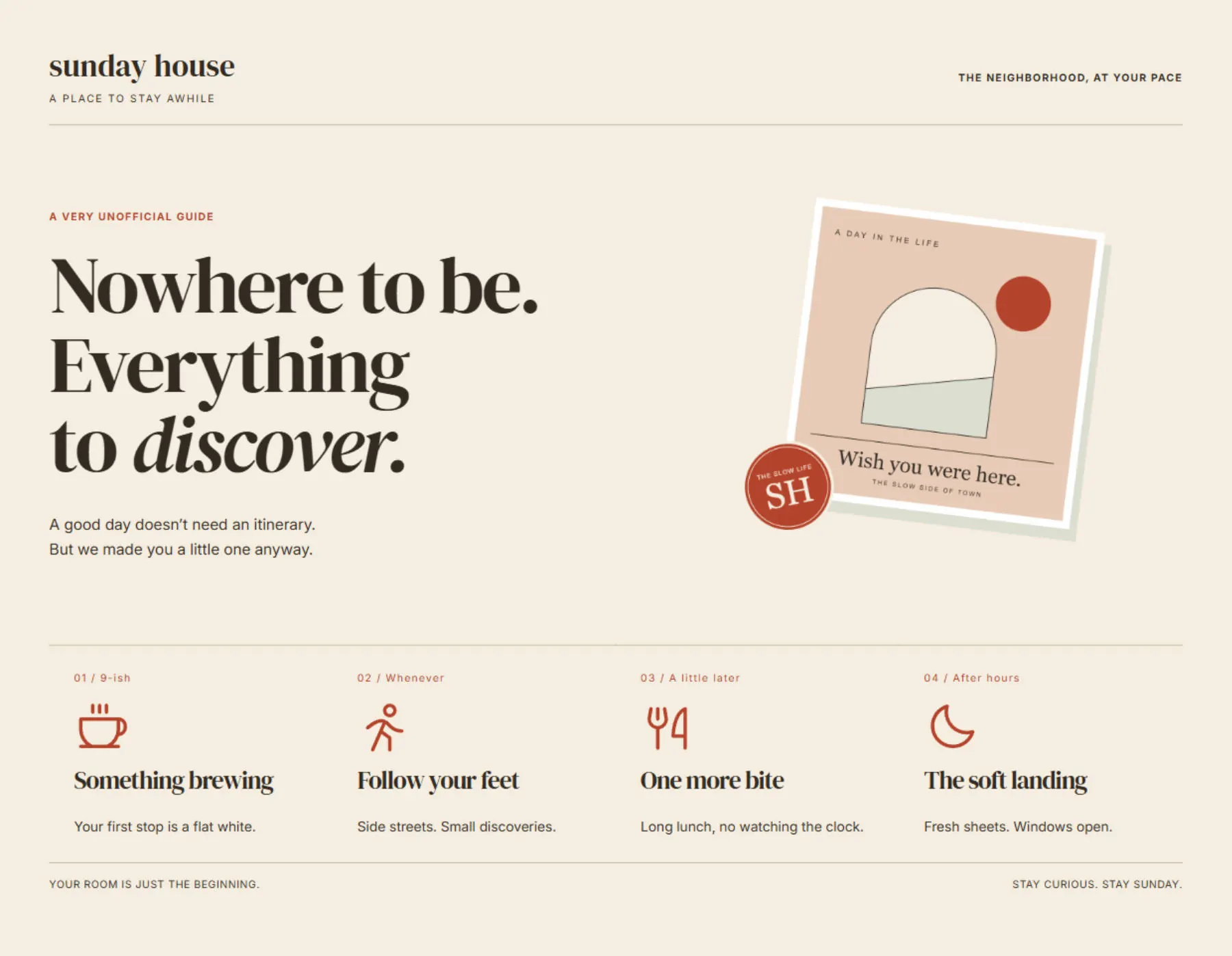
For a hospitality design, check whether the icons support the atmosphere you want. A small amenity row can carry useful information without competing with the main invitation.
2. Outside People: Give The Cards Some Energy
Outside People puts its icons in a louder setting. Lime, lavender, and cream cards sit against a dark background, with oversized symbols above condensed uppercase headings.
At this scale, the icon family becomes a major part of each card. Compare the solid mountain silhouette with the more open line drawings, then follow the cycling symbol through the sequence.
Font Awesome holds its own here. The large areas of dark ink give the mountain and bicycle enough presence to compete with the bright cards and forceful headings.
The color comes through. With open line drawings, more of each card’s surface remains visible inside the icon, which changes its balance against the large headline. Phosphor’s sailboat also turns a general water activity into a boating cue; choose the subject that fits your offering.
The solid version below shows how much of the composition those three symbols occupy. Judge your candidates in their actual cards, with the final labels in place.
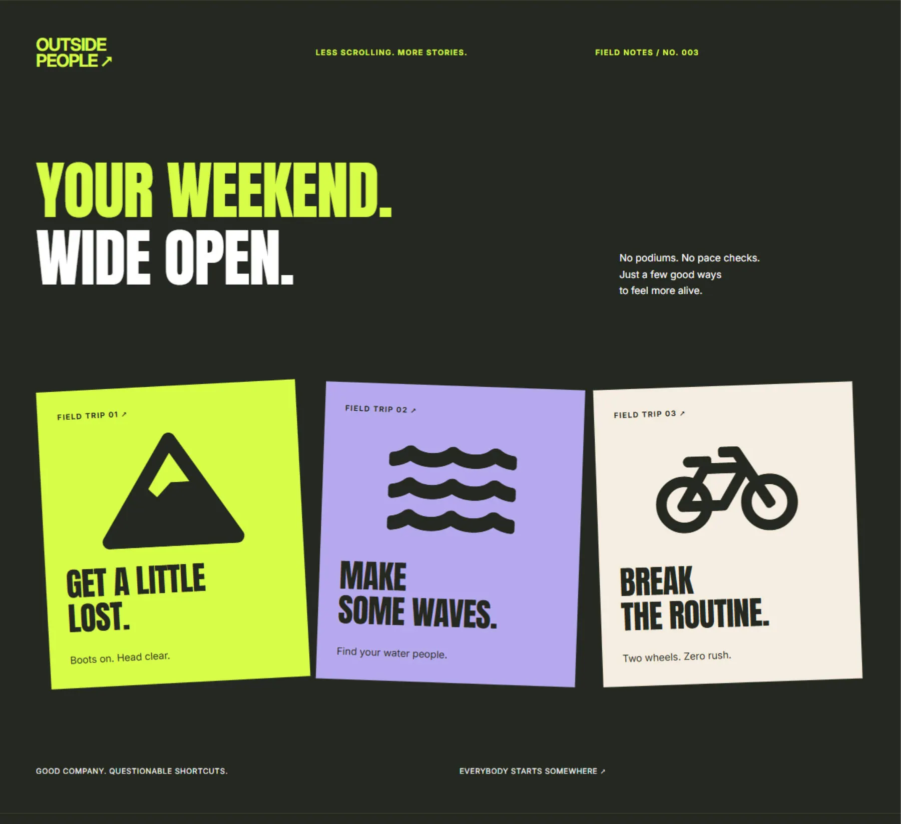
Keep the drawing style consistent across the row. Mixing a heavy mountain with a delicate bicycle can make one activity appear more important, even when the cards have equal space.
3. Fix!: Carry The Same Style Across Sizes
The repair section uses a wrench inside its large orange badge, then repeats the visual language in three job-sheet cards. Search, repair, and completion turn the service into an understandable sequence.
This example lets you judge a family at two sizes. Watch the hero wrench first, then compare the smaller icons in the cards beneath it.
The filled wrench gives the badge a strong center. An outlined wrench reveals more orange and makes the badge feel less dense, while the surrounding lettering stays unchanged.
In the cards, pay attention to the search icon’s handle and the space inside the wrench. Details that look attractive at hero size also need to remain legible in a smaller supporting role.
Lucide connects the badge to the process cards through the same outline treatment. See how the smaller wrench echoes the one above it.
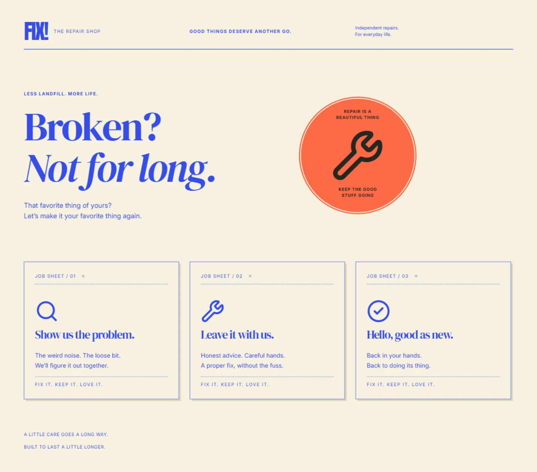
For a service business, the words still need to explain the process. An icon helps a reader scan the cards, while “Show us the problem” and “Leave it with us” supply the meaning.
Try Another Icon Set In The Visual Builder
You can repeat this comparison using the native Icon modules in Outside People. Start with a small collection containing the three symbols the cards need.
The SVGs In This Example
For the Phosphor version, use the Regular versions of Mountains, Sailboat, and Person Simple Bike. The collection uses one file for each card.
Google also offers SVG downloads through its Material Symbols library, and Lucide provides SVGs through its icon browser. Google’s symbols use Apache 2.0; Phosphor uses the MIT license. See Lucide’s license page for its ISC terms and notices for icons derived from Feather. Keep the applicable notices when using or redistributing assets.
Import The Collection
Begin on the Outside People page. In the Visual Builder, open an Icon module inside one of the activity cards and follow these steps:
- Under Content, open the Icon group and click the current icon preview.
- Click Icon Manager at the bottom of the picker.
- Click Import Icons, then Choose Icon Files, and select the three SVGs.
- Choose New Collection and enter a descriptive name, such as Outside People — Phosphor.
- Click Import and wait for the icons to appear in the collection.
The recording follows that upload through the actual Icon Manager. A project-specific collection name makes it easier to find when you return to the picker.
Change The Icons And Save
Return to the picker. Close the manager, open the module’s icon preview again, and filter to your new collection so only its three choices appear. Choose Mountains for the first card.
Open the second card’s Icon module and choose Sailboat from the same collection. Repeat with Person Simple Bike on the third card, then click Save.
Keep the design unchanged while judging the swap. Once the family feels right, use the module’s design settings to refine the size and color where needed.
Keep The Icons In Balance With The Type
An icon’s nominal size does not tell you how large it will look. A filled silhouette can feel heavier than a line drawing inside the same bounding box. Compare the row as a whole and make small optical adjustments after choosing the family.
Type can help, too. With a supported font, Divi’s variable font controls expose axes such as weight and width, while the accompanying text settings give you control over wrapping and capitalization. A tightly condensed heading and a broad serif heading may call for different icon weights.
The layouts use responsive values, including clamp(), through Divi’s own settings. Check your phone view. When the cards stack, large icons take on a different relationship to the heading beside or beneath them; our font sizing guide covers the type adjustments available.
Keep the labels visible. Where an icon only decorates equivalent text, it can be hidden from assistive technology so the information is not announced twice. An interactive icon needs an accessible name explaining its action; color alone should not supply that meaning.
For a standalone illustration that needs SVG-specific styling, Divi’s SVG module is another relevant option. These examples use Icon modules so the collection picker remains the central workflow.
Download The Three Layouts
The download contains Sunday House, Outside People, and Fix! as individual Divi Library JSONs, plus one combined Library export containing all three. Each layout uses native Divi modules and original ET icons by default, with no custom CSS.
No third-party icon files or custom icon collections come with the pack. Some default symbols are approximations: the outdoor cards use a compass, map, and location pin, for example. Import your chosen SVGs separately to reproduce the other styles above. The hotel’s decorative postcard image is included.
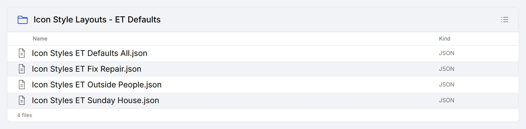
These are Divi Library exports. Our Library import and export guide explains how that format moves between websites.

Start with the design closest to your project and compare two icon families before changing anything else. When you can see the difference in context, choosing icons becomes a more deliberate design decision.




Leave A Reply