

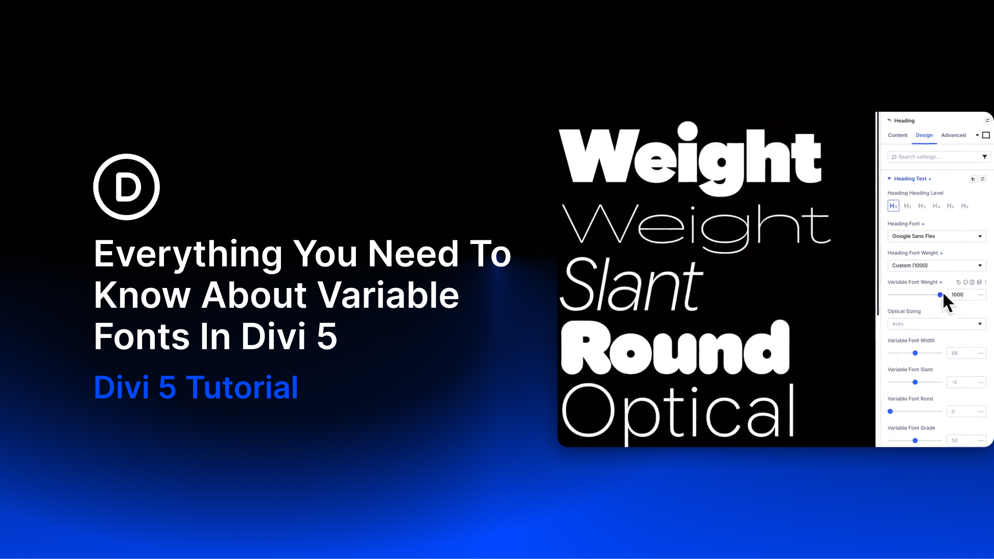
Variable fonts have been around for years, but most page builders still treat them like static fonts. You get a font picker, a weight dropdown, and maybe an italic toggle. The deeper controls these fonts are built for never make it into the visual workflow.
Those deeper controls are what make variable fonts worth using. A variable font can give you continuous control over weight, width, slant, optical size, grade, roundness, shape, and other axes depending on the typeface. Instead of choosing from a few fixed styles, you can fine-tune the font to fit the exact size, layout, and mood of the design.
Divi 5’s Variable Fonts update brings those controls into the Visual Builder. When you choose a supported Google variable font, Divi reads the font’s available axes and displays the matching controls in the relevant text option group. No custom CSS. No guessing which axes the font supports. No limiting a variable font to a basic weight dropdown.
In this guide, we’ll look at what variable fonts are, how they work in Divi 5, which controls you may see, how to use Font Variables, and how the new text styling options released alongside variable fonts give you more control over typography across your site.
What Are Variable Fonts?
Traditional fonts work like a menu. You get a fixed set of styles, such as Regular, Medium, Bold, and Italic, and each style usually exists as its own font file. If the exact style you want is not available, you either choose the closest one or fake the effect with browser rendering.
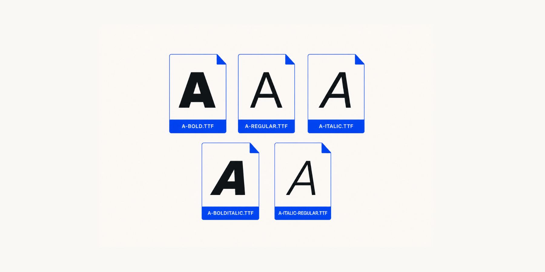
Variable fonts work differently. One font file can hold a full range of styles controlled through axes. An axis is a continuous range for a specific part of the type design. Common axes include Weight, Width, Slant, Italic, Optical Size, and Grade, but some fonts include more experimental controls for roundness, shape, casualness, monospace behavior, stroke contrast, and more.
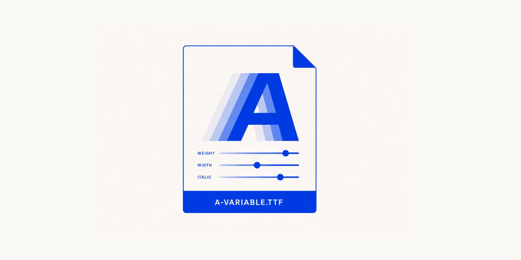
Weight makes the difference easy to understand. A static font might give you 400 and 700. A variable font might let you choose any value between 100 and 900. That means you can use 520, 575, 620, or whatever value actually works for the heading size, color, background, and surrounding layout.
Why Variable Fonts Matter
Variable fonts matter because typography is rarely solved by one fixed choice.
A heading at 700 might feel too heavy. At 500, it might feel too light. A variable font lets you land between those fixed stops and choose the exact value that feels right. That level of control is especially useful in hero sections, large headings, buttons, navigation, cards, and any layout where small typographic differences change the balance of the design.
Optical size is another useful example. Some variable fonts include an opsz axis, which adjusts the letterforms for different text sizes. Smaller text can become sturdier and easier to read, while larger display text can gain more contrast and personality. Instead of forcing one drawing of a typeface to work at every size, the font can adapt to the role it is playing.
There can also be a performance benefit. If one variable font replaces several separate static font files, you may reduce the number of font files needed for the design. That does not mean every variable font is automatically lighter than every static font setup, but it does mean a well-planned variable font system can give you more typographic range without loading a long list of separate styles.
Where To Find Variable Fonts
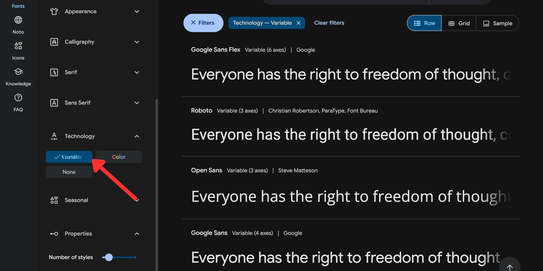
Google Fonts is the easiest place to start. Use the variable fonts filter to narrow the library to typefaces that include one or more variable axes. Here are our top 10 variable fonts you can use in Divi right now.
Static fonts show a fixed list of available styles. If the font only ships with Regular, Medium, and Bold, those are the choices you get.
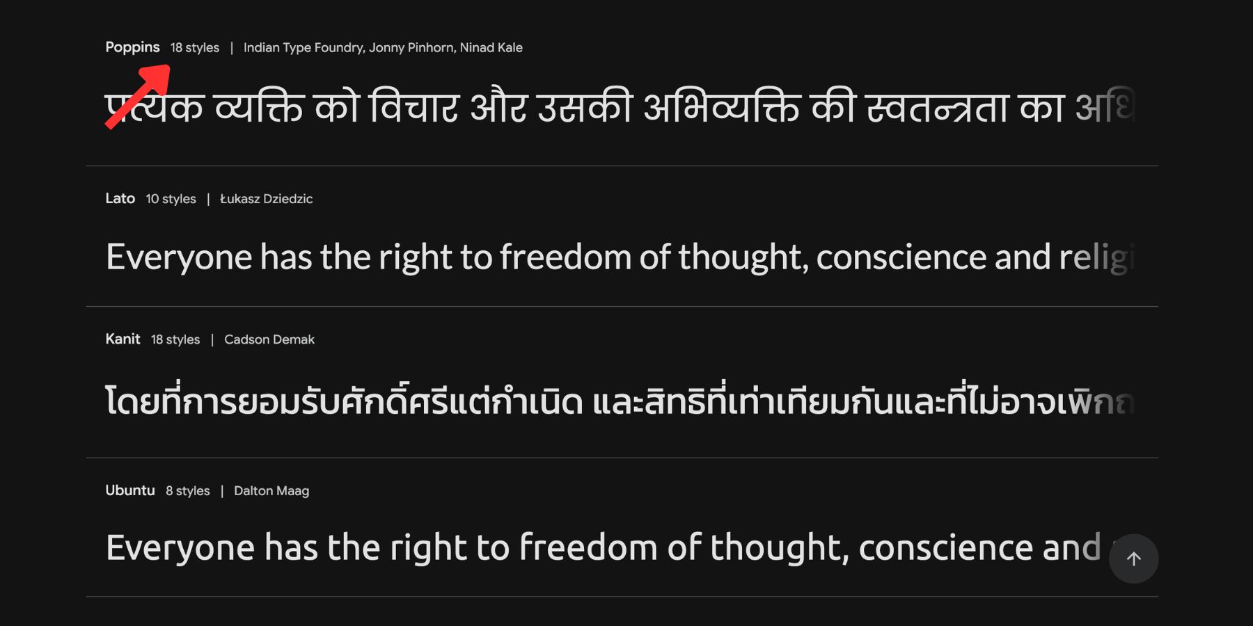
Variable fonts are marked clearly, and their detail pages show the axes they support. A font with only a Weight axis can still be useful, but a font with Weight, Width, Slant, Optical Size, Grade, or other custom axes gives you more room to shape the typography.
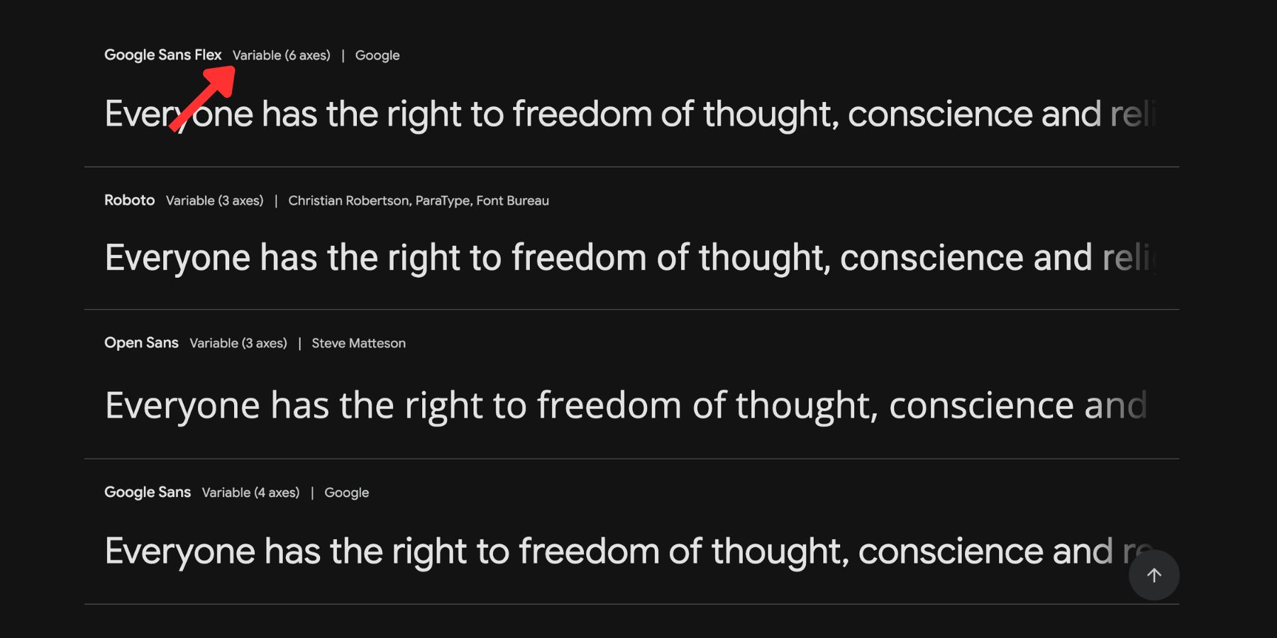
Before choosing a font, open its Google Fonts detail page and check what it actually supports. Two variable fonts can behave very differently. One might only adjust weight. Another might offer width, slant, grade, optical size, and custom design axes that make it much more flexible.
Introducing Variable Font Controls In Divi 5
Getting a variable font into Divi was never the hard part. The harder part was accessing the axes that make the font variable in the first place. Without dedicated controls, anything beyond basic weight often required custom CSS with font-variation-settings.
Divi 5 changes that by adding variable font controls directly to the Visual Builder. When you select a supported Google variable font, Divi reads the font file and displays the controls that apply to that font.
Those controls appear in text option groups inside the Design tab, such as Heading Text, Body Text, Title Text, Meta Text, and other module-specific text groups. You will usually see them below the standard font and font weight settings.
The important part is that the controls adapt to the font. A font with only a Weight axis may show one slider. A font like Roboto Flex, which supports several user-facing and parametric axes, can show a much larger set of controls. Divi does not show irrelevant controls for the sake of it. It surfaces what the selected font supports.
How To Use Variable Fonts In Divi 5
Using a variable font in Divi 5 starts the same way as using any other Google Font.
Open a module with text settings, go to the Design tab, open the relevant text option group, and choose a supported variable font from the font picker. Divi then displays the available variable font controls for that typeface.
For example, if you choose a variable font for a Heading Module, you may see controls for Variable Font Weight, Width, Slant, Optical Sizing, Grade, or other axes depending on the font. If the font does not support a certain axis, Divi will not show that control.
This makes the workflow much easier than writing CSS by hand. You can experiment visually, judge the result in context, and adjust the typography while looking at the actual layout.
The Variable Font Controls
The available controls depend on the font you choose. Some fonts keep things simple with one or two axes. Others expose a full set of design controls.
Here are the most useful controls to understand.
Variable Font Weight
The standard font weight dropdown gives you named stops: Thin, Light, Regular, Medium, Bold, Black, and so on. A variable font weight slider gives you the range between those stops.
The exact range depends on the font. Some fonts may run from 100 to 900. Others may use a narrower or wider range. Divi reads those limits from the font and sets the slider accordingly.
This is useful for fine-tuning hierarchy. You might want an H2 at 640 instead of 700, or a button label at 580 instead of 600. Small changes can make typography feel more balanced without changing the font family.
Optical Sizing
Optical sizing helps a typeface adapt to different sizes.
A font used at 14px has different needs than the same font used at 90px. Smaller text needs clarity and durability. Large display text can handle more contrast, detail, and personality. Fonts with an opsz axis can adjust for that difference.
In Divi 5, the Optical Sizing control appears when the selected font supports it. Turn it on, and the browser can use the font’s optical size behavior to match the current text size. Turn it off, and the font uses a single optical style across sizes.

Not every variable font includes an Optical Size axis. Roboto Flex is one example that does, but many fonts focus on other axes instead. Check the font’s supported axes before building your type system around optical sizing.
Variable Font Width
Weight changes stroke thickness. Width changes how much horizontal space the letters take up.
The wdth axis usually works around a neutral value of 100. Lower values make letters more condensed. Higher values make them wider and more open.
Width is different from letter spacing. Letter spacing adds or removes space between characters. Width reshapes the characters themselves. Condensed width settings can help long headings fit on fewer lines, while wider settings can make short hero copy, pull quotes, or editorial headings feel more expansive.
Variable Font Slant
Slant tilts the letterforms without necessarily switching to a separate italic design.
Italic is often a separate style with alternate letterforms. Slant is usually a continuous angle adjustment. In fonts that support it, the slnt axis lets you control how much the text leans.

This is useful when you want emphasis without committing to a full italic style. A slight slant can work well for labels, pull quotes, badges, captions, and display details.
Variable Font CRSV
Some fonts separate straight and cursive letterforms. The CRSV axis controls that behavior.
At one end, the font uses more mechanical or upright forms. At the other, it introduces cursive forms. In some fonts, a middle value can let the font switch behavior automatically based on slant.
This control is most useful with typefaces designed to separate slant and cursive behavior. It gives you more control over the tone of emphasized text without needing a completely different font.
Variable Font Element Shape And Expansion
Some variable fonts build letters from repeated elements, such as dots or blocks, rather than continuous strokes. In those fonts, axes like Element Shape and Element Expansion can change how those pieces look.
Element Shape can shift the element from sharper to rounder forms. Element Expansion can make the elements fill more or less of their grid cell, changing the visual density of the type.
These controls will only appear when the selected font supports them. They are not general-purpose typography settings, but they can create distinctive display effects when used on the right font.
Variable Font Rond
The Rond axis controls roundness.
When a font supports this axis, increasing the value can soften corners, terminals, and other letterform details. The same typeface can move from sharper and more technical to softer and friendlier without loading another font file.
This is best used deliberately. A small roundness adjustment can make a brand feel warmer. Pushing it too far can make the type look overly playful or less precise.
Variable Font Grade
Grade adjusts how dark or light the text appears without changing the space it occupies.
That is the key difference between Grade and Weight. Weight can change letter width, rhythm, and line breaks. Grade changes visual density while keeping the layout stable.
Grade is especially useful in dark mode, hover states, dense UI areas, and situations where text needs to feel slightly lighter or heavier without shifting the layout. Divi 5 shows this control when the selected font includes the GRAD axis.
More Variable Font Controls
Depending on the selected font, Divi 5 may display additional axes beyond the ones above. Each one targets a specific part of the typeface.
- Thin Stroke: Controls how light the thinner parts of letters appear.
- Thick Stroke: Controls how heavy the main strokes appear.
- Counter Width: Adjusts the space inside letters such as o, e, and n.
- Lowercase Height: Controls how tall lowercase letters sit on the line.
- Uppercase Height: Controls how tall capital letters appear.
- Ascender Height: Adjusts how high letters such as b, d, and h reach.
- Descender: Adjusts how low letters such as g, j, and p drop below the line.
- Figure Height: Controls how tall numbers appear relative to surrounding text.
- Mono: Shifts characters between proportional and fixed-width spacing.
- Casl: Shifts letterforms between a more structured style and a more casual, expressive one.
You do not need every axis on every project. The goal is not to move every slider. The goal is to understand which controls actually support your design system.
Tips And Best Practices For Using Variable Fonts
Variable fonts give you more control, but they also make it easier to over-style a site. These habits will help you use them with more structure.
Check The Axis Range Before Choosing A Font
Do not choose a variable font just because it is labeled variable.
Some fonts only include a Weight axis. Others include Weight, Width, Slant, Grade, Optical Size, and more. A narrow range can still be useful, but it may not give you the flexibility you expected.
Before committing to a typeface, open its detail page on Google Fonts and inspect the available axes. Check the weight range, but also look for width, slant, optical size, grade, or any custom axes that matter to the style you want to build.
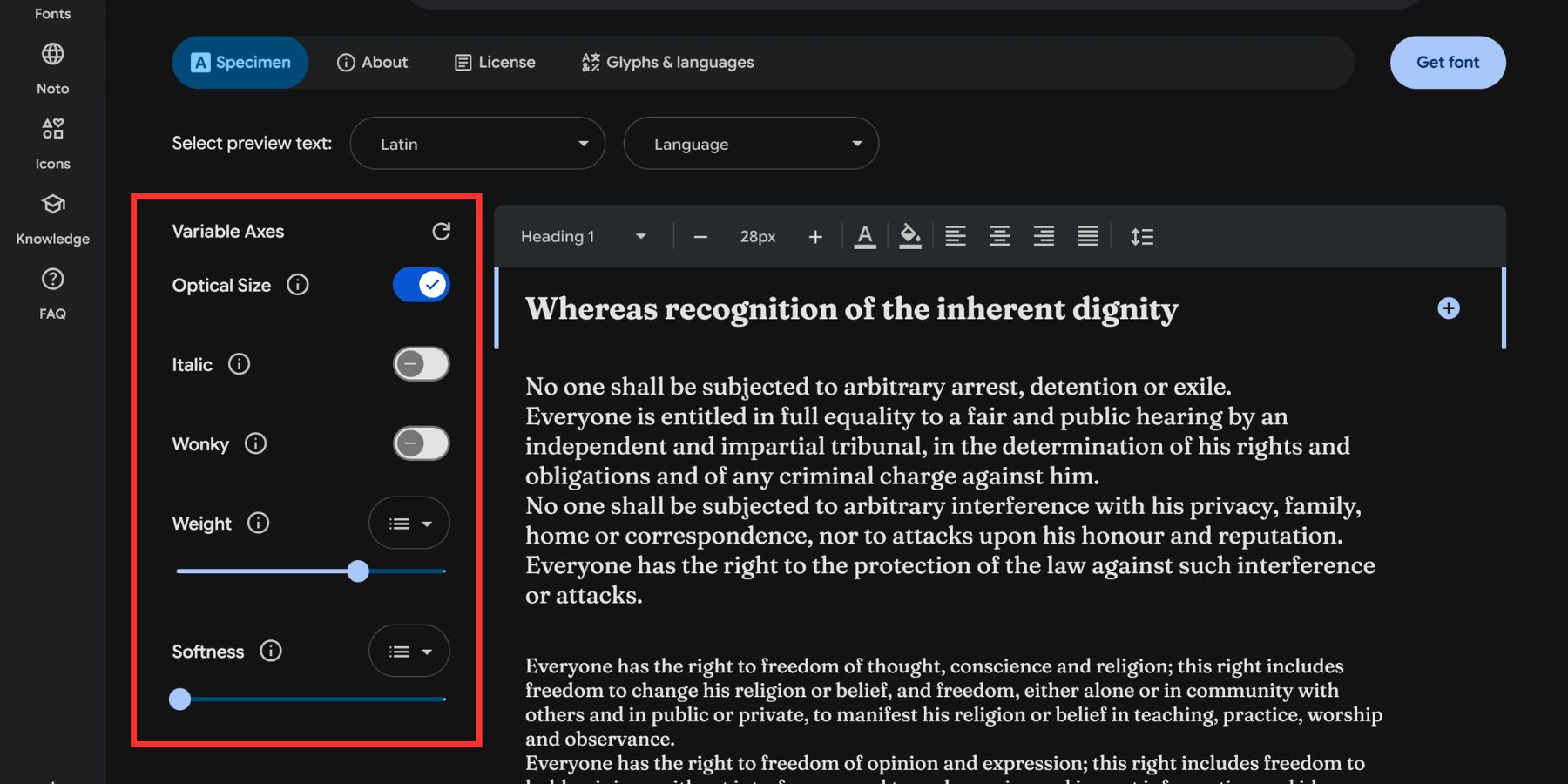
A font with fewer axes is not automatically worse. It may be exactly what a clean business site needs. But you should know what range you are getting before the font becomes part of the design system.
Use Fewer Axis Values Repeatedly
A good variable font system does not use a different weight, width, or slant value on every module. Pick a few deliberate values and reuse them. For example, you might use:
- Body Text: Weight 400
- Small Labels: Weight 520
- Navigation: Weight 560
- Section Headings: Weight 640
- Hero Headings: Weight 720 with a slightly wider width value
That keeps the system flexible without making it random. Variable fonts are most powerful when the added control supports consistency, not when every piece of text becomes its own experiment.
Save Your Fonts As Font Variables
Design Variables are reusable values managed in Divi’s Variable Manager. Font Variables work the same way. You can define a heading font, body font, or other reusable font choice once and reference it across your site.
Assign your variable fonts to Font Variables before building too much of the page. If the font needs to change later, you can update it in the Variable Manager instead of manually editing every module.
This is especially useful when variable fonts are part of a larger typography system. You can pair Font Variables with presets and number variables so font family, size, weight, line height, and spacing all stay easier to manage.
Use Advanced Units And The Variable Generator For Font Sizes
Variable fonts are built for flexibility, so they work best when the rest of your type system is flexible too.
Divi 5 font size fields accept more than pixel values. You can use units like rem, em, vw, or full CSS functions such as clamp(). A heading set in rem respects the browser’s base font size. A heading set with clamp() can scale fluidly between a minimum, preferred, and maximum size.
If you already have font size variables set up, you do not need to rebuild everything. Open the Variable Manager, find the relevant number variable, and replace the static value with a rem or clamp() value where appropriate. Every place using that variable can follow the updated sizing value.
Starting fresh is where the Variable Generator is useful. Open it from the Variable Manager, go to Numbers, and use the Fluid Sizing Variable Generator to create a responsive sizing scale.
The Fluid scale type generates clamp() values for each step in your type hierarchy, saving them as number variables you can reference across modules and presets. Fixed Responsive is useful when you want exact values at each breakpoint. Either way, the goal is a type scale that works across screen sizes, not just the canvas you designed on first.
Match The Axis To The Job
Different axes solve different problems.
Use Weight to refine hierarchy. Use Width when a heading needs to fit better or feel more expansive. Use Grade when the text needs to read lighter or heavier without changing layout width. Use Slant for controlled emphasis. Use Optical Size when the font supports it and the design includes both small text and large display type.
This keeps axis adjustments purposeful. You are not styling because a control exists. You are styling because the typography needs a specific correction.
Test Variable Font Settings Across Breakpoints
A value that looks perfect on desktop may feel too heavy, narrow, wide, or expressive on mobile.
Check large headings, buttons, navigation, and dense body copy across desktop, tablet, and phone views. Pay special attention to line breaks. Width and weight changes can affect how text wraps, especially in narrow containers.
If a display heading looks great on desktop but breaks awkwardly on mobile, adjust the font size, width, line height, or letter spacing for that breakpoint rather than forcing one value to work everywhere.
New Text Styling Options In Divi 5
Variable font controls were the headline of this update, but the same release also added several base-level text styling options across title and body font option groups.
These settings work with any font, not only variable fonts. Together, they reduce the need for custom CSS and make Divi 5’s typography system more complete.
- Text Columns: Split dense body copy into magazine-style CSS columns without placing text into separate containers. The copy flows naturally through the columns and can rebalance as content changes.
- Drop Caps: Style the first character of a text block from a dedicated Drop Caps tab in the body text option group. The surrounding copy wraps around the letter automatically.
- Text Direction: Use vertical text direction settings to stack text along a vertical axis for editorial labels, side text, and more experimental layouts.
- Stroke Position: Control whether text strokes sit centered or outside the letterform. Outside strokes help preserve the original weight of the type.
- Capitalization: Use dedicated capitalization controls, including lowercase and small caps options, without changing the typed text manually.
- Paragraph And List Spacing: Control spacing between paragraphs and list items directly from the body text option group.
- Hyphenation: Let long words break more naturally in narrow containers instead of overflowing or forcing awkward line breaks.
- Line Wrap Style: Choose how text wraps across lines, including modes that help balance lines or avoid awkward last-line breaks.
None of these require a variable font, but they pair well with variable typography. Variable font axes control the shape and behavior of the typeface itself. These text styling options control how text sits, wraps, flows, and reads inside the layout.
Practical Ways To Use Variable Fonts In Divi 5
Variable fonts are useful in many parts of a Divi 5 site, but they are strongest when tied to repeatable design roles.
For hero sections, use variable weight and width to make large headlines feel intentional. A slightly wider width can make short hero copy feel more premium, while a narrower width can help long headlines stay on fewer lines.
For navigation and buttons, use weight values between the usual named stops. A button label may feel better at 560 than at 500 or 600. Navigation may need a slightly stronger grade or weight so it reads clearly without becoming too bold.
For blog and editorial layouts, use optical sizing where supported and pair it with better line wrap, paragraph spacing, and Drop Caps. This gives long-form content more structure without relying on custom CSS.
For dark mode sections, use Grade when available. You can make text feel slightly lighter or heavier without changing its width, which helps preserve layout while improving readability.
For brand systems, use Font Variables, number variables, and presets together. Save the font family as a Font Variable, save reusable sizes as number variables, and use presets to apply consistent typography across headings, cards, buttons, forms, and navigation.
Typography In Divi 5 Now Has More Range
Variable fonts were always built to do more than a basic weight dropdown allows. Divi 5 brings that range into the Visual Builder by surfacing the axes each supported Google variable font provides. Weight, width, slant, optical size, grade, roundness, shape, and other controls can now become part of the visual design process without custom CSS.
The new text styling options released alongside variable fonts fill out the rest of the system. Text Columns, Drop Caps, Text Direction, Stroke Position, Capitalization, Paragraph/List Spacing, Hyphenation, and Line Wrap Style give you more control over how text sits and reads on the page.
Start with a variable font that fits the project, check its supported axes, save it as a Font Variable, build a flexible type scale, and use only the axis values your design actually needs. That is how variable fonts become a stronger typography system instead of just another set of sliders.











Leave A Reply