

Have you ever used a variable font before? A traditional font family gives you a fixed set of styles: maybe Light, Regular, Medium, and Bold. If you want something between Regular and Bold, you usually need another font file, and if that exact weight does not exist, you compromise.
Variable font support in Divi 5 changes that. A single variable font can contain a range of adjustable design axes, such as weight, width, slant, optical size, and sometimes more experimental controls like casualness, softness, grade, or monospace.
That gives you much more control over how typography feels across a website. Instead of forcing an H2 into 400 or 700, you can use a value like 535 if that balances better with your body text. Instead of swapping fonts for a compressed headline, you can adjust width. Instead of using the same display detail at every size, you can adjust optical size.
Below are ten strong variable fonts you can use in Divi 5, what each one lets you adjust, and where each one fits best in real web design projects.
- 1 1. Inter
- 2 2. Roboto Flex
- 3 3. Recursive
- 4 4. Fraunces
- 5 5. Source Serif 4
- 6 6. Newsreader
- 7 7. Onest
- 8 8. Bricolage Grotesque
- 9 9. Space Grotesk
- 10 10. Instrument Sans
- 11 What Kind Of Style Controls Do Variable Fonts Offer?
- 12 How To Use Variable Fonts In Divi 5
- 13 How To Choose The Right Variable Font
- 14 Build A Better Type System With Variable Fonts
- 15 Frequently Asked Questions About Variable Fonts
1. Inter
Inter is one of the most practical variable fonts for modern web design. It was designed for screens, which makes it a strong choice for interfaces, dashboards, SaaS sites, product pages, documentation, and any layout where readability matters at several sizes.
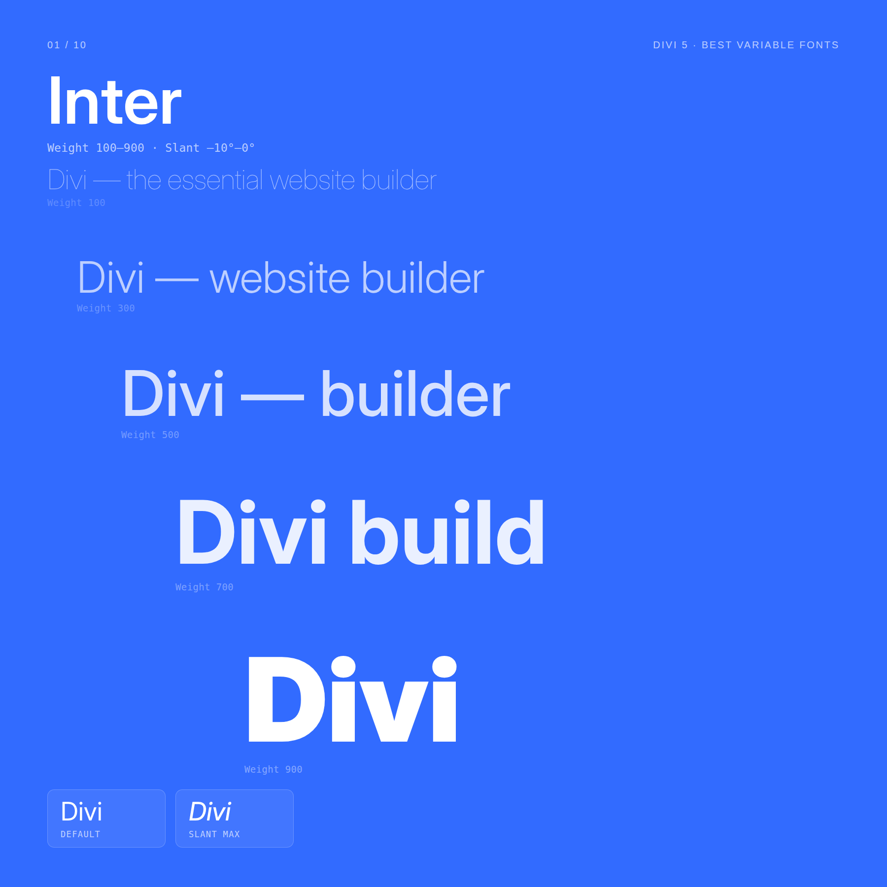
Two axes are especially useful:
- Weight: 100–900
- Slant: A controlled slant axis that lets you create angled text without relying on a fake skew effect.
Inter’s weight range makes it easy to build a full interface system from one family. Use lighter weights for captions, supporting labels, and dense UI text. Use medium weights for body copy and navigation. Use heavier weights for hero headings, feature titles, and callouts.
The Slant axis gives you a secondary voice without switching typefaces. A subtle slant can work well for pull quotes, badges, labels, or short emphasis text when italic styling would feel too traditional.
Best for: SaaS websites, dashboards, product interfaces, documentation, startup websites, and clean marketing pages.
2. Roboto Flex
Roboto Flex is one of the most flexible variable fonts in the Google Fonts library. It is built to show how far variable typography can go, with a wide set of axes that control not only weight and width, but also smaller typographic details.
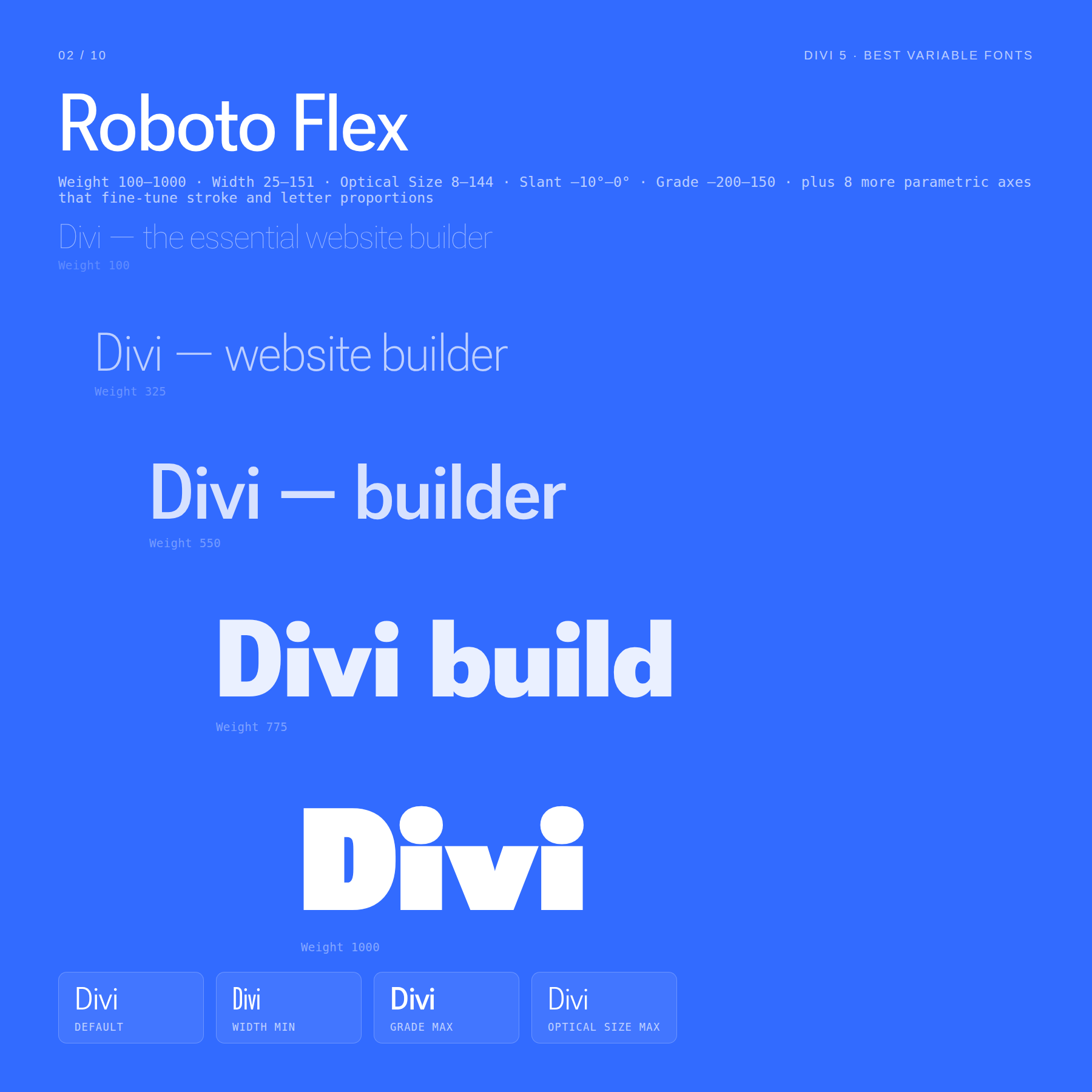
The most useful axes to understand are:
- Weight: 100–1000
- Width: Controls how condensed or extended the letters appear.
- Optical Size: Adjusts the design for smaller or larger text sizes.
- Slant: Adds angled letterforms.
- Grade: Changes visual density without changing the width of the text.
Grade is especially useful for interface design. You can make text feel slightly darker or lighter without changing the space it takes up, which helps when adjusting text for hover states, dark sections, or high-density UI areas.
Roboto Flex also includes parametric axes that fine-tune stroke thickness and letter proportions. You will not need those on every project, but they make the font unusually adaptable when you want one type system to handle many contexts.
Best for: complex design systems, app interfaces, dashboards, technical sites, accessibility-conscious UI work, and layouts that need precise type control.
3. Recursive
Recursive is one of the most interesting fonts on this list because it can shift personality dramatically without leaving the same font family.
It can behave like a clean sans-serif, a monospace code font, or a more casual display typeface depending on how you set its axes.
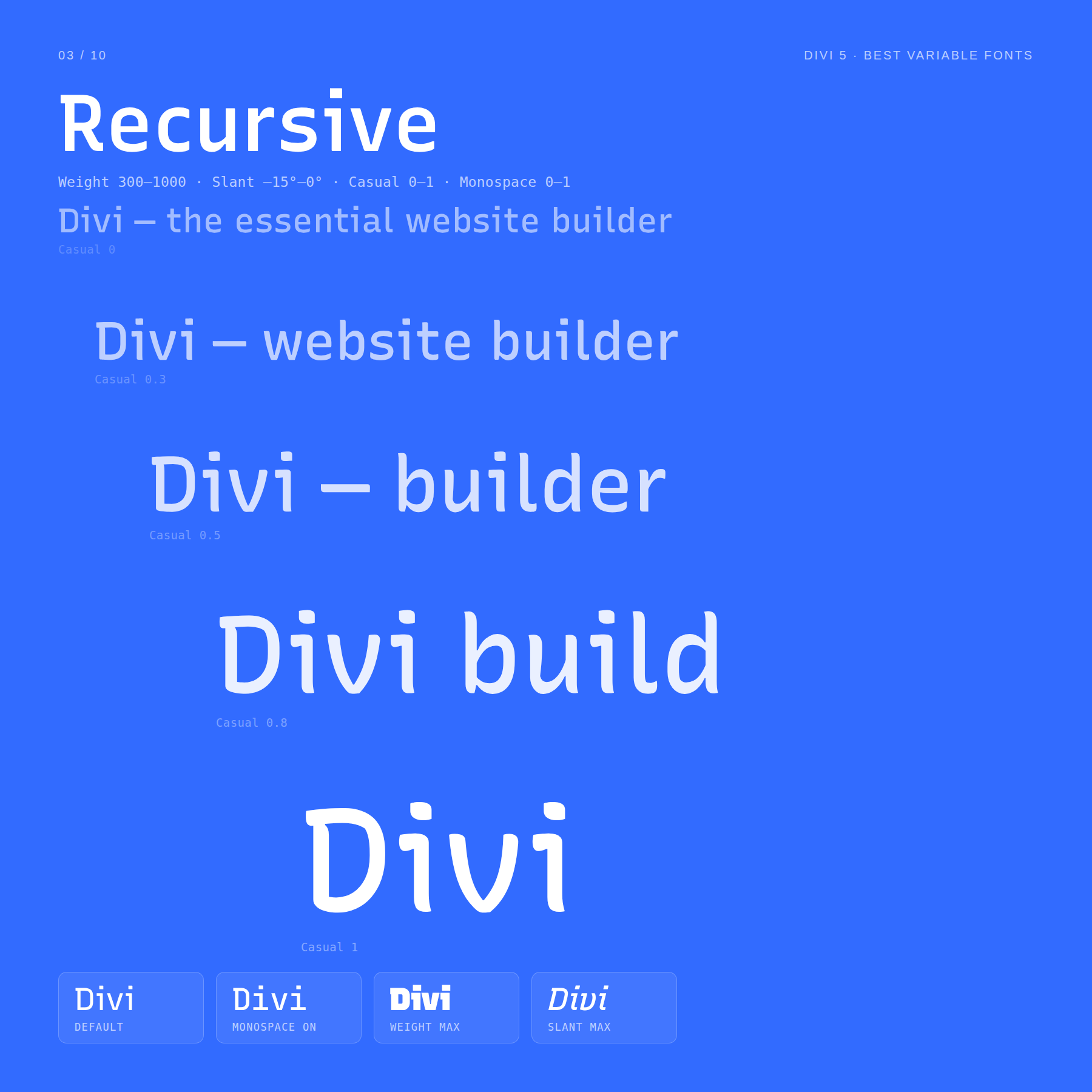
Four axes are especially important:
- Weight: 300–1000
- Slant: Adds angled emphasis.
- Casual: Moves the type from more formal to more expressive.
- Monospace: Moves the type from proportional spacing to fixed-width spacing.
At lower Casual values, Recursive can work as a structured sans-serif for interfaces and technical layouts. Increase Casual, and the same font becomes warmer, looser, and more expressive. Increase Monospace, and it starts to feel appropriate for code snippets, data labels, technical specs, or developer-facing content.
That makes Recursive useful when a site needs both a polished interface voice and a more playful or technical layer without importing separate fonts.
Best for: developer tools, documentation, tech portfolios, creative coding sites, educational platforms, and brands that need both UI clarity and personality.
4. Fraunces
Fraunces is a variable display serif with personality. It feels editorial, vintage, warm, and slightly eccentric, depending on how far you push its axes.
This is not the type of font you choose because you want neutrality. You choose it when a heading needs character.
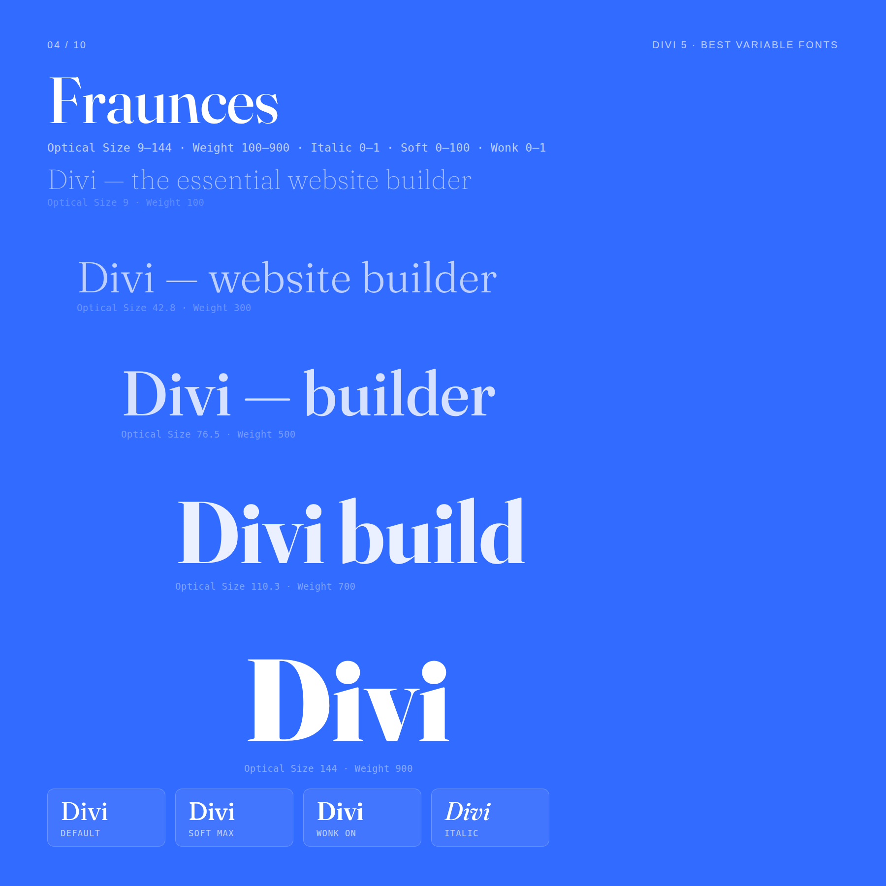
Five axes give Fraunces its range:
- Optical Size: 9–144
- Weight: 100–900
- Italic: Adds italic styling.
- Soft: Rounds and softens parts of the letterforms.
- Wonk: Adds intentionally irregular, quirky letterforms.
At moderate weights, Fraunces can feel refined and editorial. At heavier weights with higher Optical Size values, it becomes a bold display face for hero sections and campaign headlines.
The Soft axis can make the font feel warmer and more organic. The Wonk axis adds a more handmade, vintage, or expressive quality. Those controls make Fraunces especially useful for brands that want a serif with a distinct mood rather than a purely traditional feel.
Best for: editorial websites, food brands, lifestyle brands, boutique ecommerce, cultural projects, creative studios, and hero headings that need personality.
5. Source Serif 4
Source Serif 4 is a practical serif for long-form content. It has enough range for headings, pull quotes, and body copy, but it does not feel overly decorative.
That makes it a strong choice when you want a serif system that feels refined without distracting from the content.
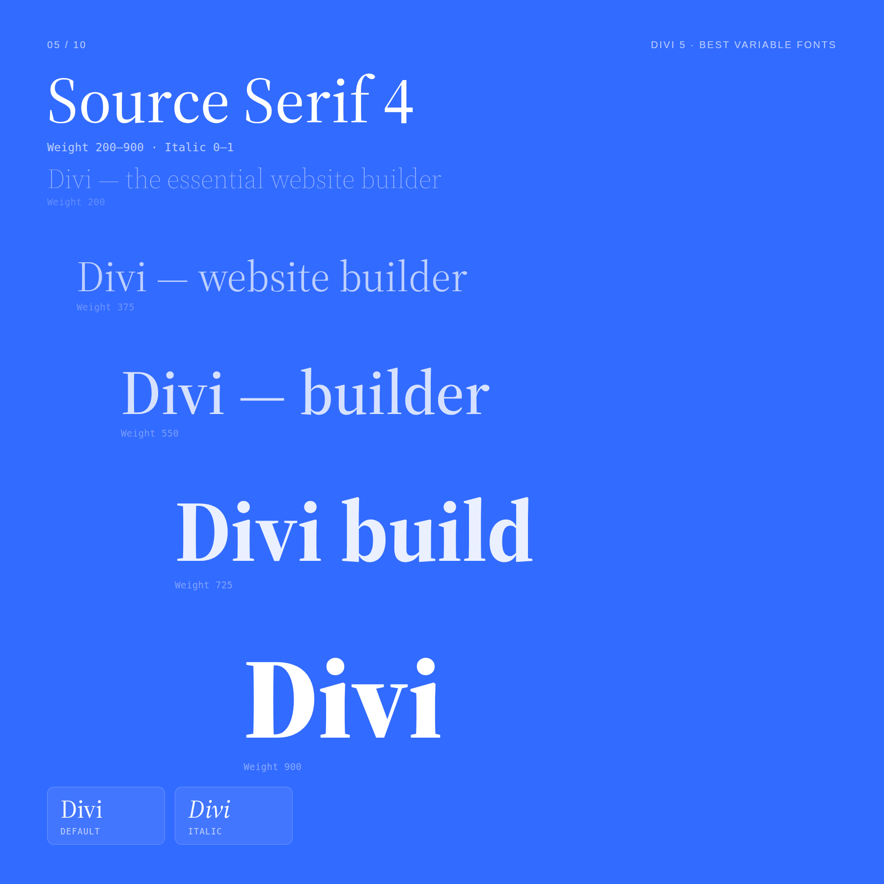
The main axes are:
- Weight: 200–900
- Italic: Adds italic styling for emphasis and editorial contrast.
The lighter end of the weight range works well for large pull quotes, elegant headings, or editorial hero sections. The heavier end can carry strong article titles, feature headings, and publication-style layouts.
Because the family stays consistent across the range, you can build a complete type scale from delicate to bold without mixing unrelated serif styles.
Best for: blogs, magazines, essays, editorial landing pages, course sites, and long-form content-heavy websites.
6. Newsreader
Newsreader is built for reading. It has the familiar rhythm of traditional editorial typography, but with variable controls that make it more adaptable across digital layouts.
It is a good choice when a website needs to feel serious, thoughtful, or publication-like.
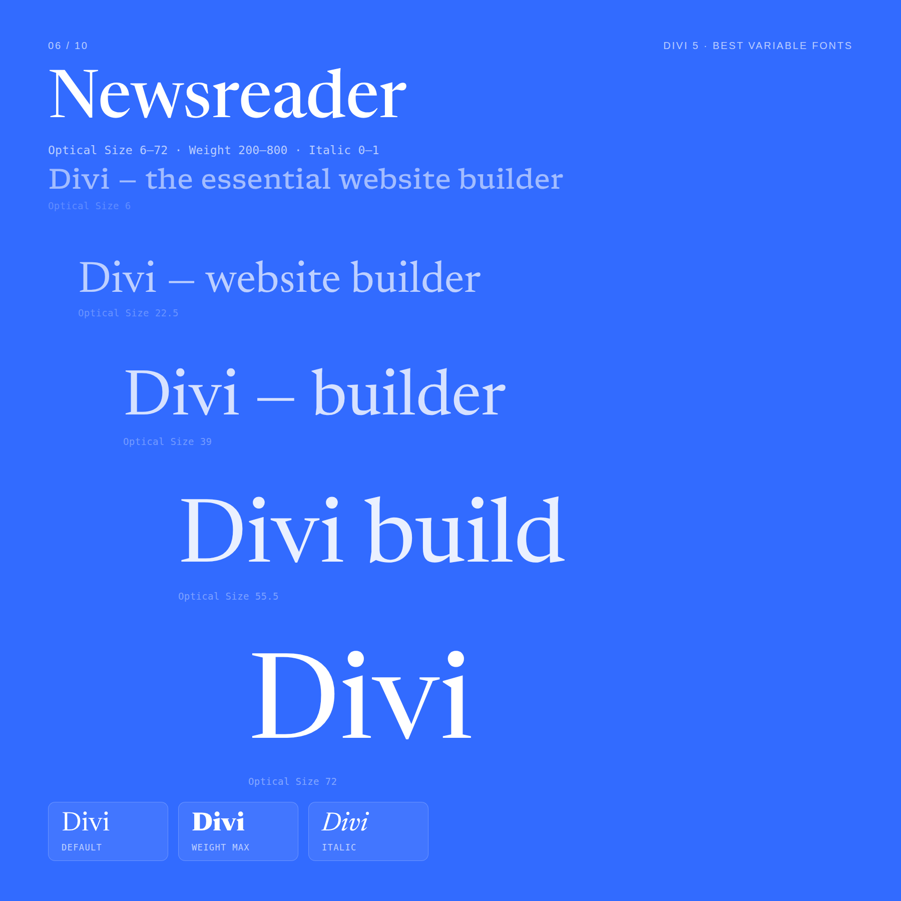
Two axes matter most:
- Optical Size: 6–72
- Weight: 200–800
Optical Size is the standout. At smaller values, Newsreader is tuned for comfortable smaller text. At larger values, it gains more display character, making it better suited for headlines.
That means one font can handle article body copy, captions, pull quotes, and larger editorial headlines with better control than a static serif.
Best for: blogs, editorial sites, newsletters, publishing projects, knowledge bases, and brands that want a traditional reading experience.
7. Onest
Onest is a clean sans-serif with a modern, product-focused feel. It is simple enough for interfaces but not so generic that it disappears completely.
If you want a contemporary font that works across a full website without calling too much attention to itself, Onest is a strong option.
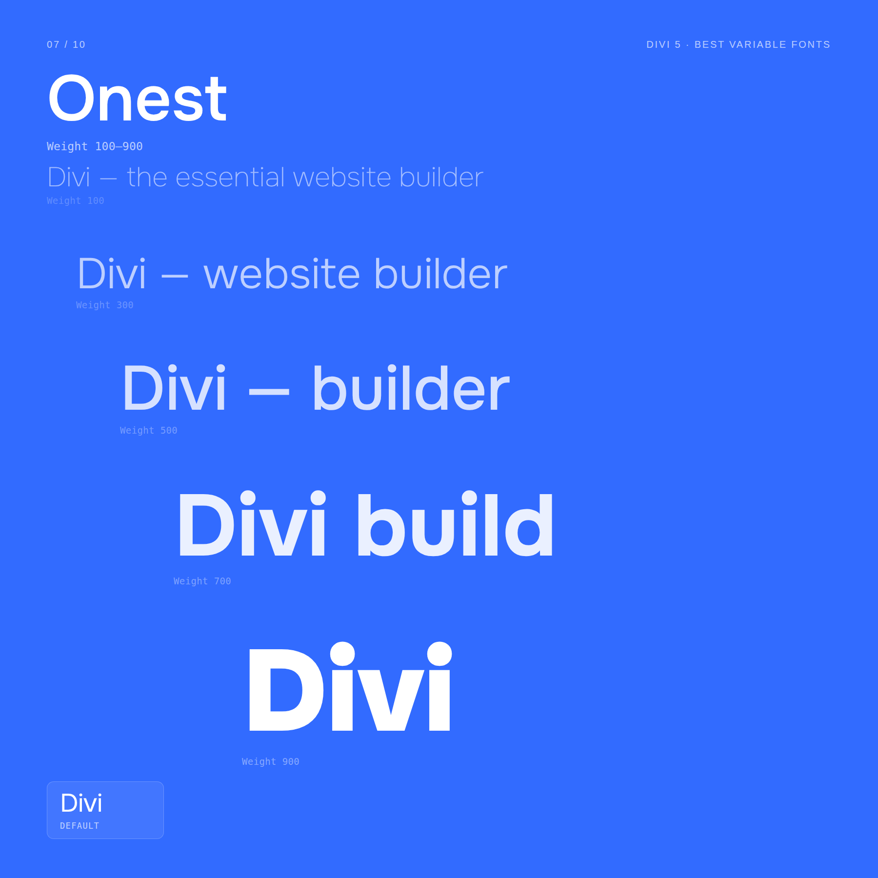
It focuses on one axis:
- Weight: 100–900
A single well-built Weight axis can still do a lot. You can use lighter values for metadata and captions, mid values for body text, stronger values for subheads, and heavy values for hero type.
Because all of those weights come from the same variable family, the system feels cohesive even when the hierarchy changes.
Best for: SaaS sites, agencies, product pages, portfolios, startup brands, and clean business websites.
8. Bricolage Grotesque
Bricolage Grotesque is a display-friendly grotesque with a confident, design-forward feel. It has more personality than a neutral interface sans, but it can still feel polished when used carefully.
It works especially well when large headings need a little more identity.
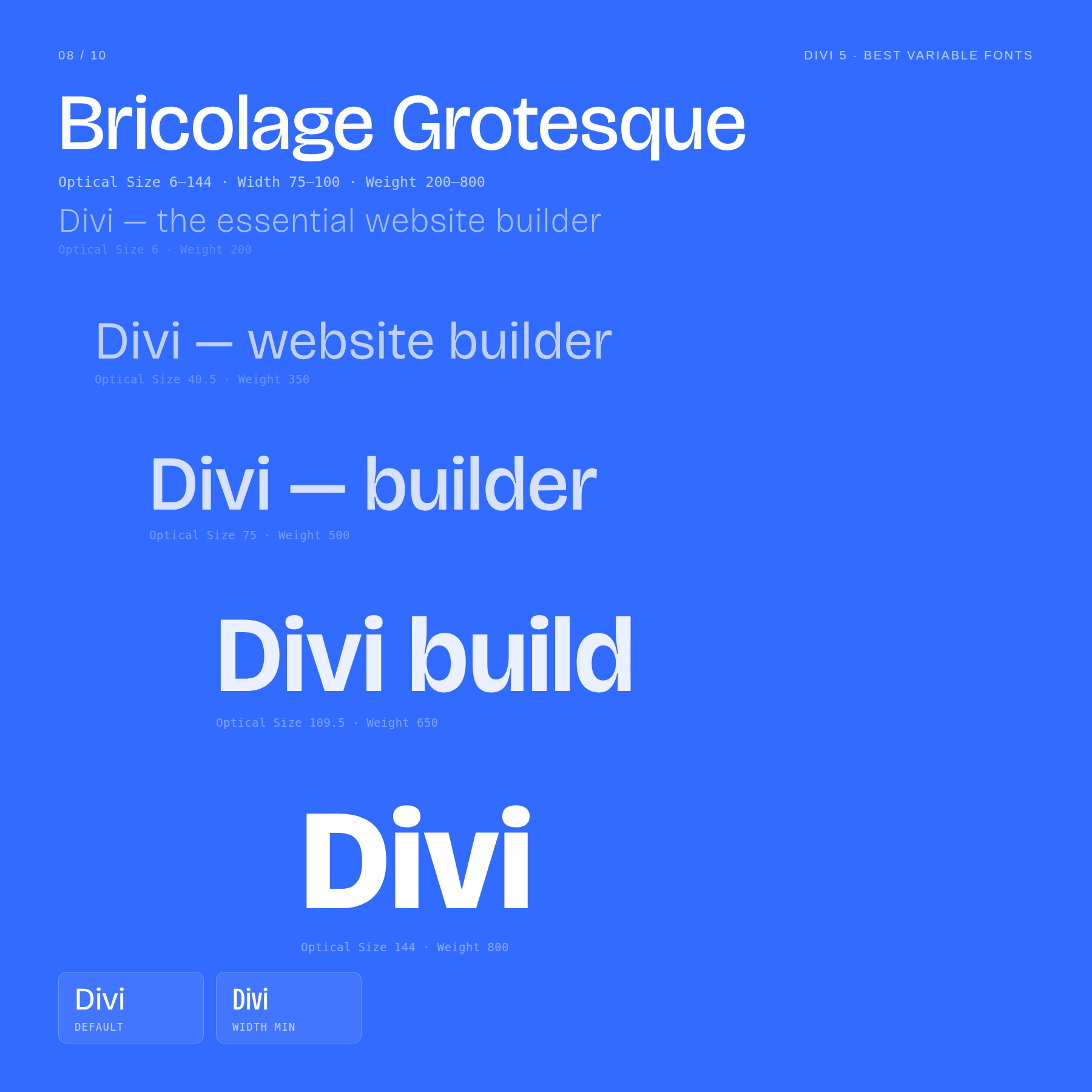
Three axes work together:
- Weight: 200–800
- Optical Size: Adjusts the design for different text sizes.
- Width: Controls how narrow or wide the type feels.
Use lighter weights and wider settings for an airy editorial masthead feel. Use heavier weights and narrower settings for dense, bold headlines.
The Optical Size axis helps the font stay intentional across different uses, especially when moving between display type and smaller supporting text.
Best for: creative agencies, portfolios, bold landing pages, design studios, campaign pages, and hero sections that need a strong typographic voice.
9. Space Grotesk
Space Grotesk has a slightly technical, slightly futuristic tone. It feels modern without being sterile, which makes it popular for web projects that want a subtle tech edge.
It is easier to use than a fully decorative display face but still more distinctive than a basic neutral sans.
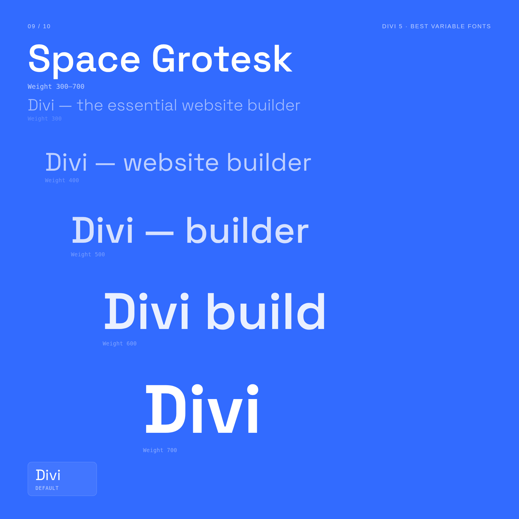
It has one main axis:
- Weight: 300–700
The range is narrower than some fonts in this list, but it covers the values most websites actually need. Use the lighter end for clean body text or labels, and the heavier end for headings, navigation, hero statements, and feature cards.
At heavier weights, Space Grotesk’s personality becomes more obvious, giving headlines a technical character without becoming hard to read.
Best for: tech brands, fintech sites, AI tools, creative portfolios, modern landing pages, and product interfaces that need personality.
10. Instrument Sans
Instrument Sans is a restrained, contemporary sans-serif that works well when you want a clean system font with a little more character.
It is not trying to be flashy. Its strength is that it works across interfaces, marketing pages, body text, buttons, and labels without feeling mismatched.
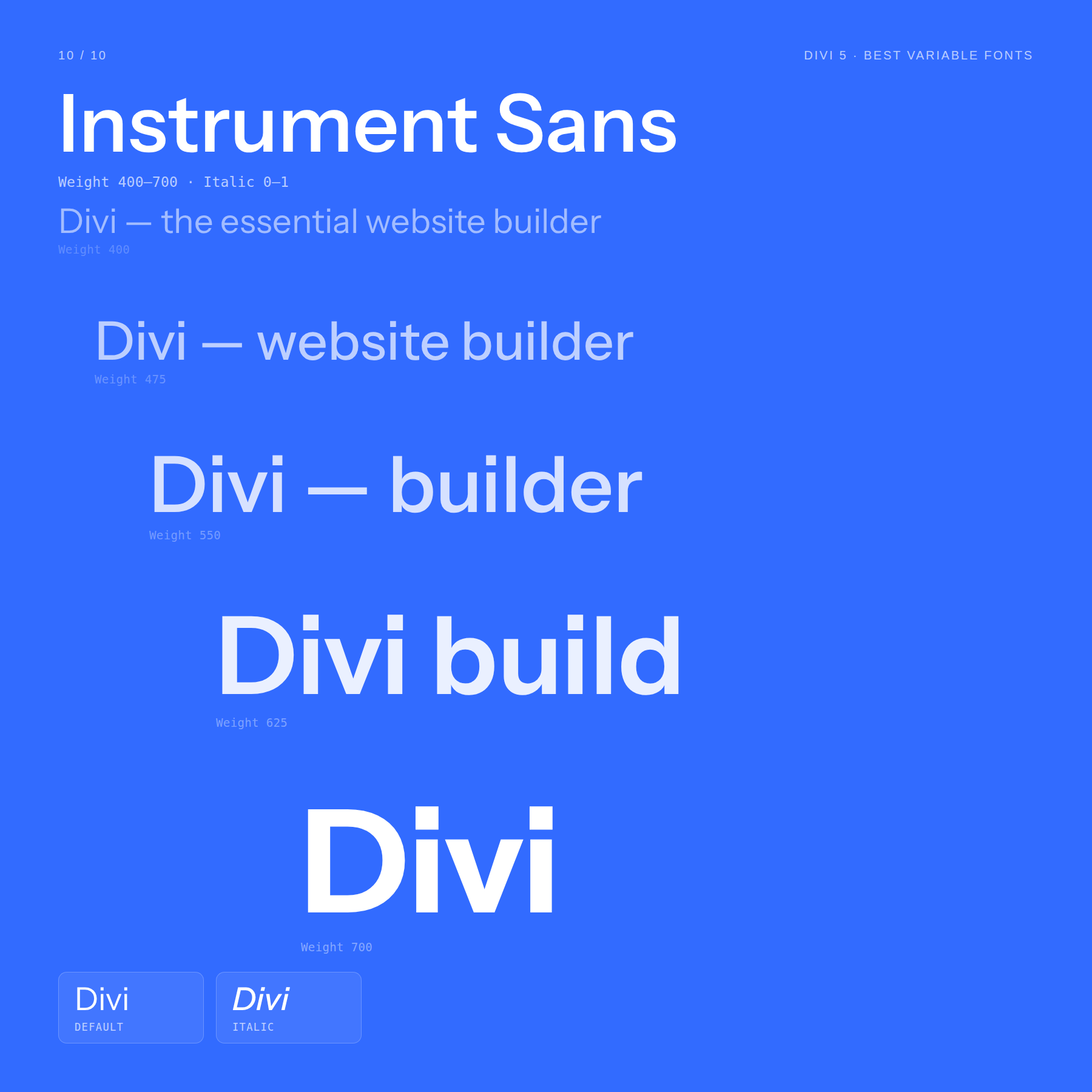
The axes are intentionally focused:
- Weight: 400–700
- Italic: Adds italic styling for emphasis.
Instrument Sans works well when a project needs restraint. Use 400 for body copy, 500–600 for UI labels and subheads, and 700 for stronger headings or CTA text.
The range is not as wide as Roboto Flex or Inter, but that can be a benefit. It gives you enough control for a polished type system without encouraging unnecessary variation.
Best for: design portfolios, creative software sites, personal brands, business websites, simple landing pages, and clean editorial layouts.
What Kind Of Style Controls Do Variable Fonts Offer?
Most variable fonts include registered axes such as Weight, Width, Slant, Italic, and Optical Size. These control familiar typographic properties.
Some variable fonts also include custom axes. These are where variable fonts start to feel more creative, because they can control personality, structure, mood, or fine typographic details that static fonts rarely expose.
Here are a few useful examples.
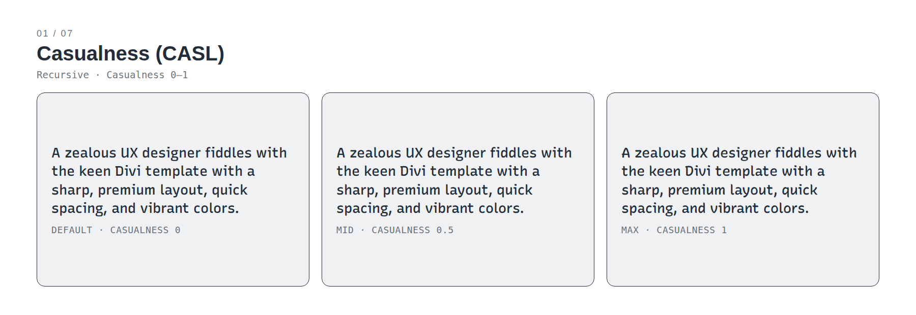
Casualness: Casualness changes how formal or expressive a font feels. Recursive is the clearest example in this list. At lower Casual values, it feels structured and professional. Push Casual higher, and the same typeface becomes looser and more organic.
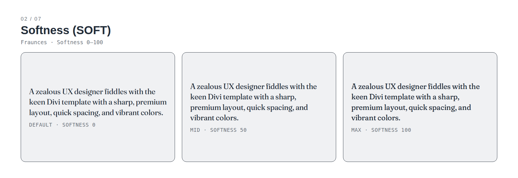
Softness: Softness rounds and softens the edges of a typeface. In Fraunces, this can shift the mood from crisp and editorial to warmer and more vintage-inspired.
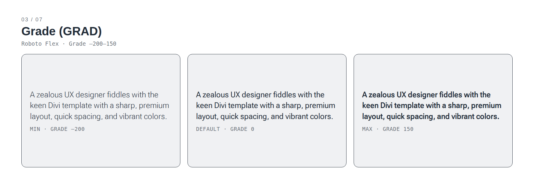
Grade: Grade changes visual density without changing the text’s width. That makes it useful when you want text to appear slightly darker or lighter without triggering a layout reflow. Roboto Flex is a strong example.
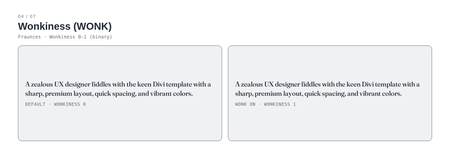
Wonkiness: Wonkiness introduces intentionally irregular shapes. Fraunces uses this to create a more expressive, handmade, or vintage display feeling.
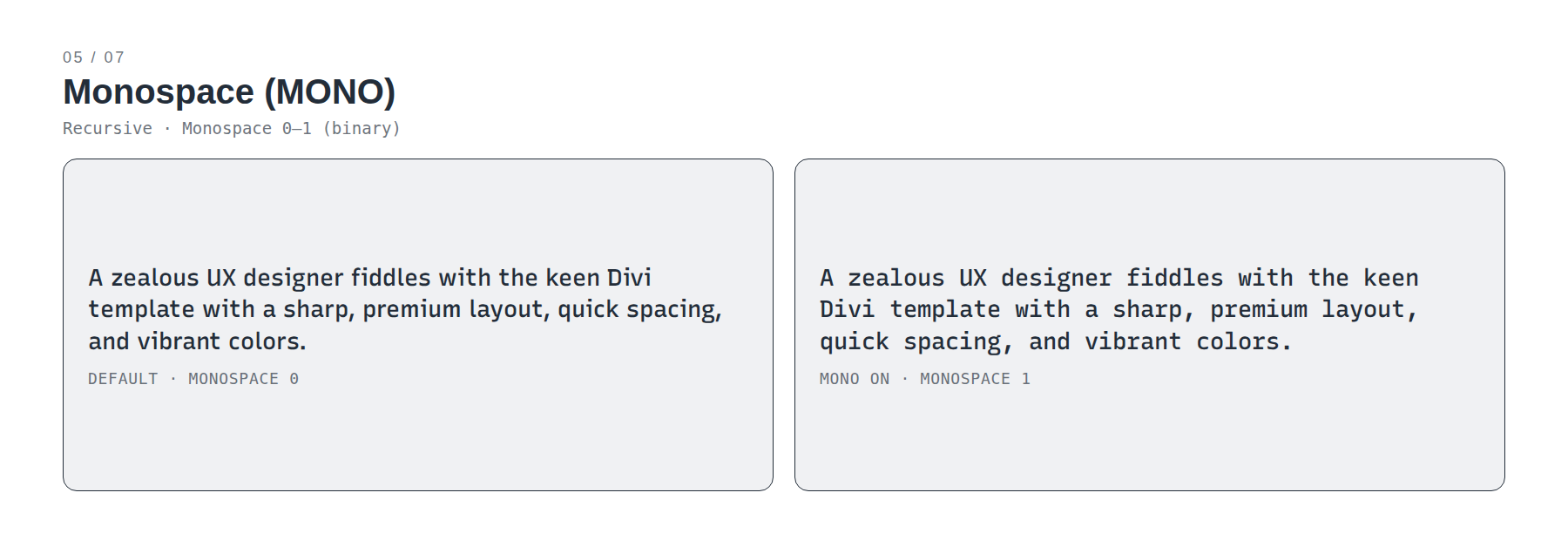
Monospace: Monospace controls whether characters use proportional spacing or fixed-width spacing. Recursive can move between the two, which makes it useful for brands that need both regular marketing text and code-style text.
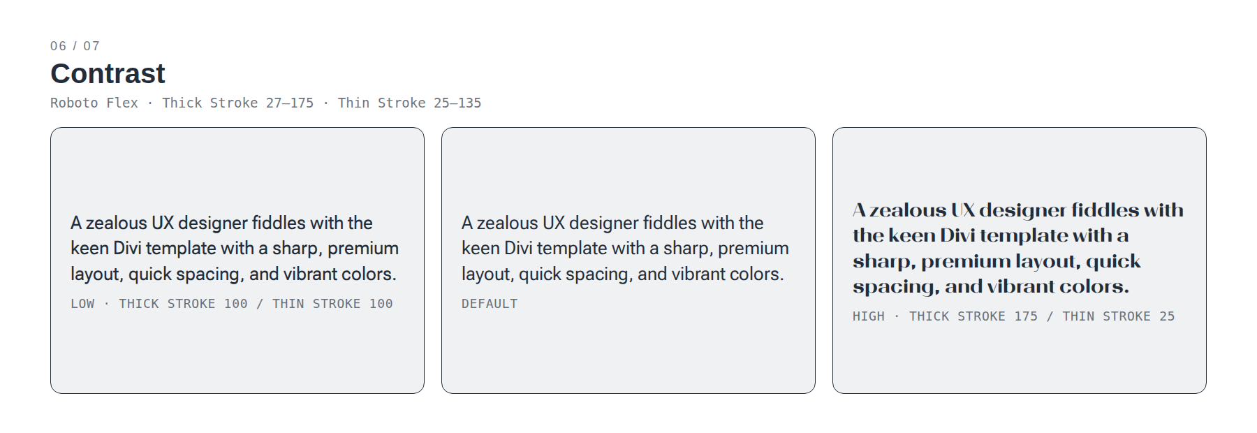
Contrast: Contrast controls the difference between thick and thin strokes. Higher contrast can feel more editorial and elegant. Lower contrast can feel more stable and screen-friendly. Roboto Flex exposes this through parametric stroke controls.
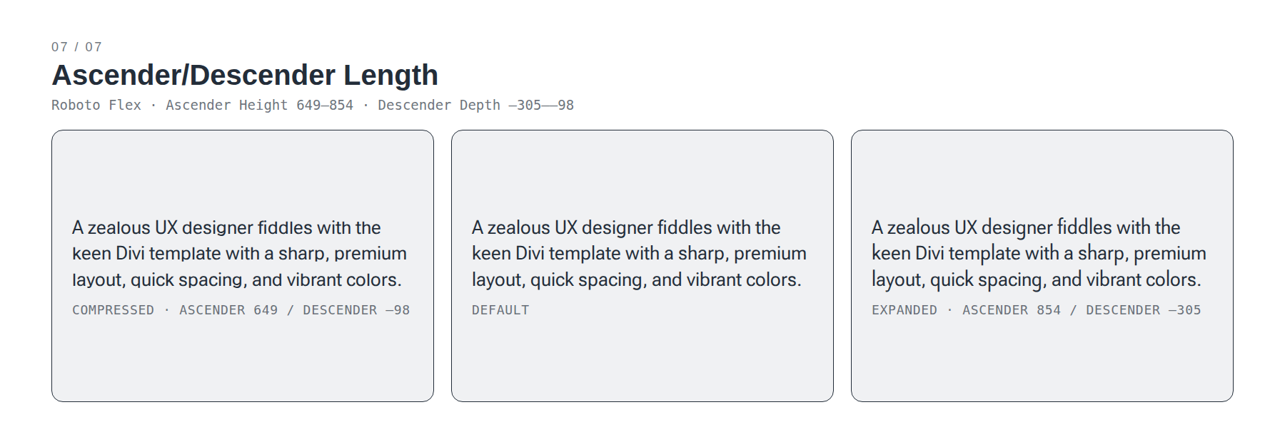
Ascender And Descender Length: Ascenders are the parts of lowercase letters that rise upward, such as in b, d, and h. Descenders are the parts that drop downward, such as in g, j, and p. In fonts that expose these controls, they can affect how open, tight, or expressive a text block feels.
You do not need every axis on every project. In most web design work, Weight, Width, and Optical Size will matter most. Custom axes become useful when the font’s personality is part of the brand system.
How To Use Variable Fonts In Divi 5
Divi 5 supports variable fonts through its updated Google Fonts integration. When you choose a supported Google variable font, Divi exposes the available variable font controls in the Design tab where that font is applied.
The cleanest way to use them is through Font Design Variables.
Open the Variable Manager from the Visual Builder, create or edit a font variable, and choose the typeface you want from the font picker. Once that font variable is applied to a text option group, you can adjust the available variable font axes as part of your typography styling.
From there, treat variable fonts as part of your design system.
Use a font variable for your heading font and another for your body font. Then use presets to control how that font behaves in different contexts: hero headings, blog titles, product cards, buttons, captions, and navigation.
For example, you might use:
- Inter for body text and interface labels.
- Fraunces for editorial hero headings.
- Roboto Flex for a dense product interface that needs grade and optical-size control.
- Bricolage Grotesque for a bold portfolio heading system.
The key is to avoid treating axes as random effects. Decide what each axis does in your system, save those decisions in presets where possible, and keep your typography consistent.
How To Choose The Right Variable Font
The best variable font is not always the one with the most axes.
A font with one excellent Weight axis can be more useful than a font with ten controls you will never touch. Start with the job the font needs to do, then choose the axes that support that job.
Use this quick guide:
- For clean UI and SaaS layouts: Inter, Onest, Roboto Flex, or Instrument Sans.
- For editorial layouts: Source Serif 4, Newsreader, or Fraunces.
- For expressive hero headings: Fraunces or Bricolage Grotesque.
- For technical or developer-facing content: Recursive, Space Grotesk, or Roboto Flex.
- For ecommerce and product pages: Inter, Onest, Instrument Sans, or Bricolage Grotesque.
- For one-font systems: Inter, Roboto Flex, Recursive, or Newsreader.
Also think about restraint. Variable fonts make it easy to fine-tune typography, but they also make it easy to over-style. A good system usually uses a few deliberate axis values repeatedly instead of a different value on every module.
Build A Better Type System With Variable Fonts
Variable fonts give you more control without forcing you to manage a pile of separate font files.
In Divi 5, that control now fits into the Visual Builder workflow. Choose a supported variable font, save it as a Font Design Variable, adjust its available axes, and use presets to keep those decisions consistent across your site.
Start simple. Pick a reliable body font, choose a heading font with the right personality, and define a small set of axis values for common roles. From there, you can use variable font controls to fine-tune hierarchy, improve readability, and give your design system more flexibility without losing consistency.
The result is typography that feels more intentional, more adaptable, and easier to manage inside Divi 5.





now i will search google fonts for variable fonts. But you could have given me a headstart on the search.. just even a tiny hint would have saved me some time. You were already using your research to find them… . As a pat on the back, yes i found your article helpful
For most websites, a shortlist of high-quality and feature-rich Google Fonts variable fonts would be the following:
Inter – best general UI font
Roboto Flex – maximum design flexibility
Manrope – modern and polished
DM Sans – clean but less generic
Open Sans – highly dependable body font
Roboto Serif – best editorial pairing
Nunito Sans – friendly and highly configurable
Plus Jakarta Sans – modern agency/SaaS aesthetic
Hope this helps! 😊