

A heading can look right on its own and still feel out of place on the page. Add a different font weight to the next section, tighten the body copy somewhere else, and the small decisions start pulling against each other. Typography becomes easier to manage when those decisions share a structure.
Divi 5 gives you several ways to build that structure. Variables hold reusable values, text settings shape individual roles, and presets carry those combinations across your site. You can start with readable headings and paragraphs, then add responsive sizing, variable font controls, and text effects where they serve the design.
Begin with your text roles, connect them to variables, and save the combinations you want to repeat. The steps below take you through that setup and show what to check before using it across your site.
- 1 How Typography Guides Readers
- 2 How Divi 5’s Typography Tools Work Together
-
3
Build A Typography System In Divi 5
- 3.1 Plan Your Typography Roles
- 3.2 Set Your Heading And Body Font Variables
- 3.3 Generate And Save A Responsive Type Scale
- 3.4 Configure Heading, Body, And Link Colors
- 3.5 Add Text And Set Meaningful Heading Levels
- 3.6 Apply Variables And Refine Your Text Styles
- 3.7 Adjust Responsive Values And Optional Text Effects
- 3.8 Save And Reuse Your Typography Presets
- 4 Check Your Typography Before Reusing It Site-Wide
- 5 Keep Your Typography Consistent As Your Site Grows
How Typography Guides Readers
Typography gives a page its reading order. A clear heading tells visitors where a section begins; consistent body text lets them settle into the explanation. Font choice, spacing, and contrast influence how comfortable that reading experience feels.
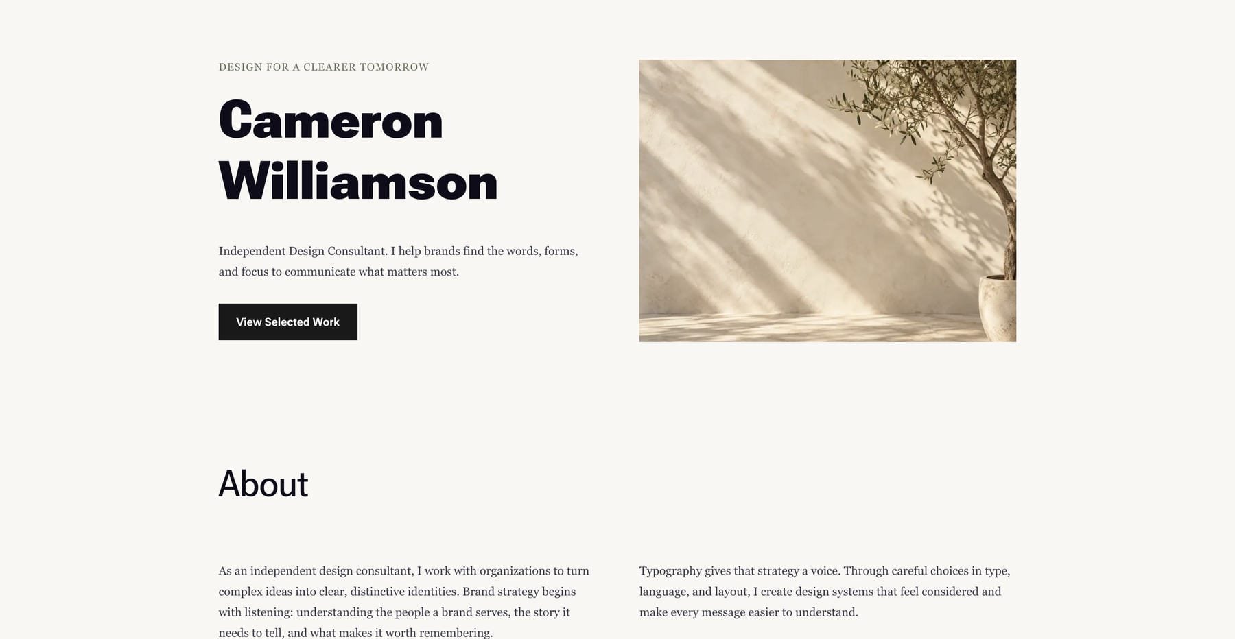
Consider the consultant layout below. The name carries the most visual weight, the section heading introduces the next topic, and the supporting text occupies a separate role. Those differences help readers understand the page without making every line compete for attention.
When similar headings change size between pages, readers have to interpret the hierarchy again. Consistent styles give them familiar cues as they move through the site.
Screen size introduces another constraint. A long heading needs room to wrap on a phone, while a wide paragraph needs a controlled reading width on desktop. Changing font size alone may leave awkward line breaks or cramped spacing. A useful typography system considers the text and its container together.
How Divi 5’s Typography Tools Work Together
Divi’s typography workflow connects shared values with reusable combinations of settings. Understanding those layers helps you choose where each decision belongs.
Design Variables store named values that you can reference in compatible fields. Open the Variable Manager from the Visual Builder‘s left sidebar to manage them.
For typography, the most useful types are Fonts, Numbers, and Colors. A font variable holds the family, a number variable can hold a size or other numeric value, and a color variable holds a shared color. Divi also supports variables for other design and content values, including gradients, images, text, and links.
A variable affects the fields that reference it. Creating a heading-size variable makes the value available; assigning it to a heading connects that heading to future changes. Presets help you repeat those assignments across compatible elements.
Static Fonts And Variable Fonts
A static font supplies distinct styles, such as Regular, Bold, and Italic, commonly in separate files. When a requested weight is unavailable, the browser follows font-matching rules to select an available face. Browsers can also synthesize bold or oblique treatments when allowed. Check that your intended faces are available and preview the result in the browser.
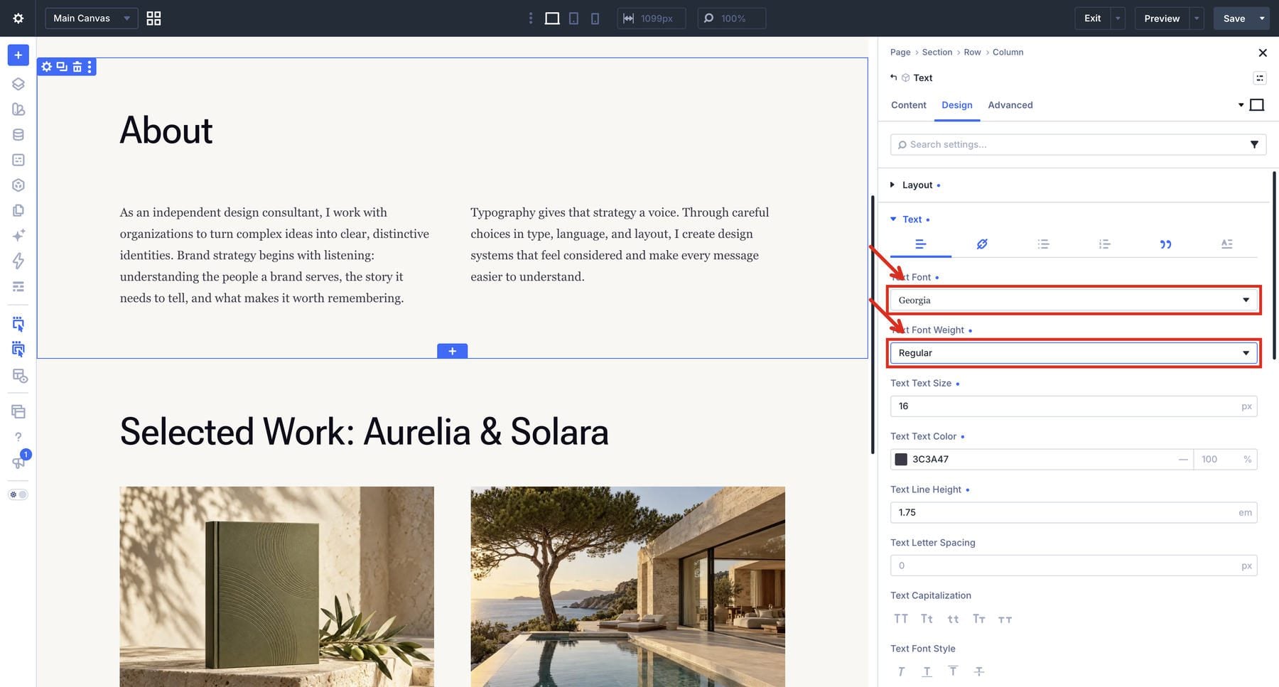
Variable fonts contain variation data that supports a range of styles in one font resource. An axis controls an aspect of that variation, such as weight or width. Intermediate values are calculated from the font’s designed data, allowing finer adjustments within its supported range.
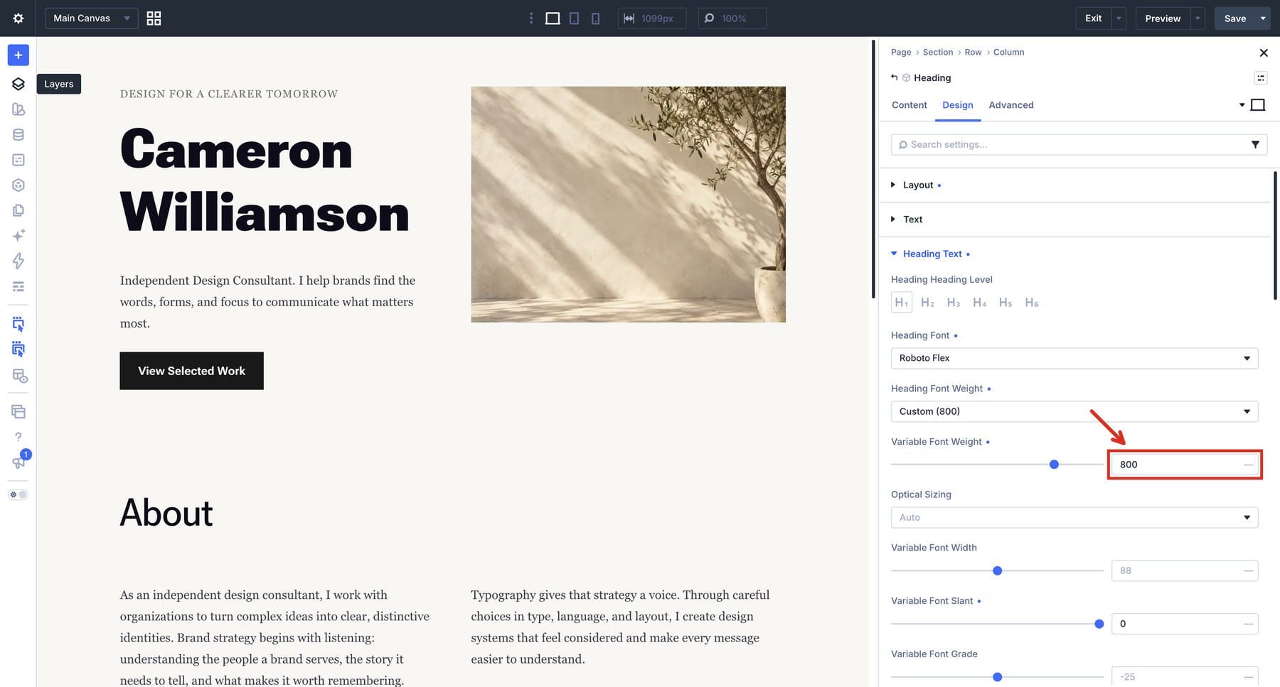
The available axes depend on the typeface. One font may offer weight alone; another may include width, slant, optical size, grade, and additional controls. In Divi 5, choosing a supported Google variable font exposes its applicable controls in the module’s text settings.
The clip below changes the consultant heading’s Roboto Flex Weight from 800 to 400, then restores 800. Other fonts can expose different axes and ranges.
Text Layout, Flow, And Effects
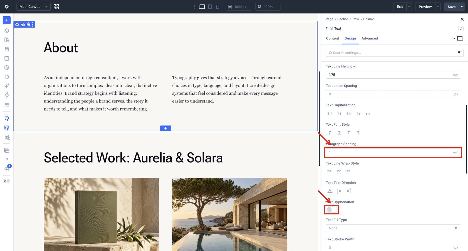
Font settings determine the appearance of letters. Flow controls determine how those letters occupy the available space. Divi’s relevant text groups include options for columns, wrapping, direction, hyphenation, and paragraph spacing. Body text also supports drop caps.
These controls suit different roles. Balanced wrapping can help a short heading, while a longer article may benefit from paragraph spacing and carefully chosen column widths.
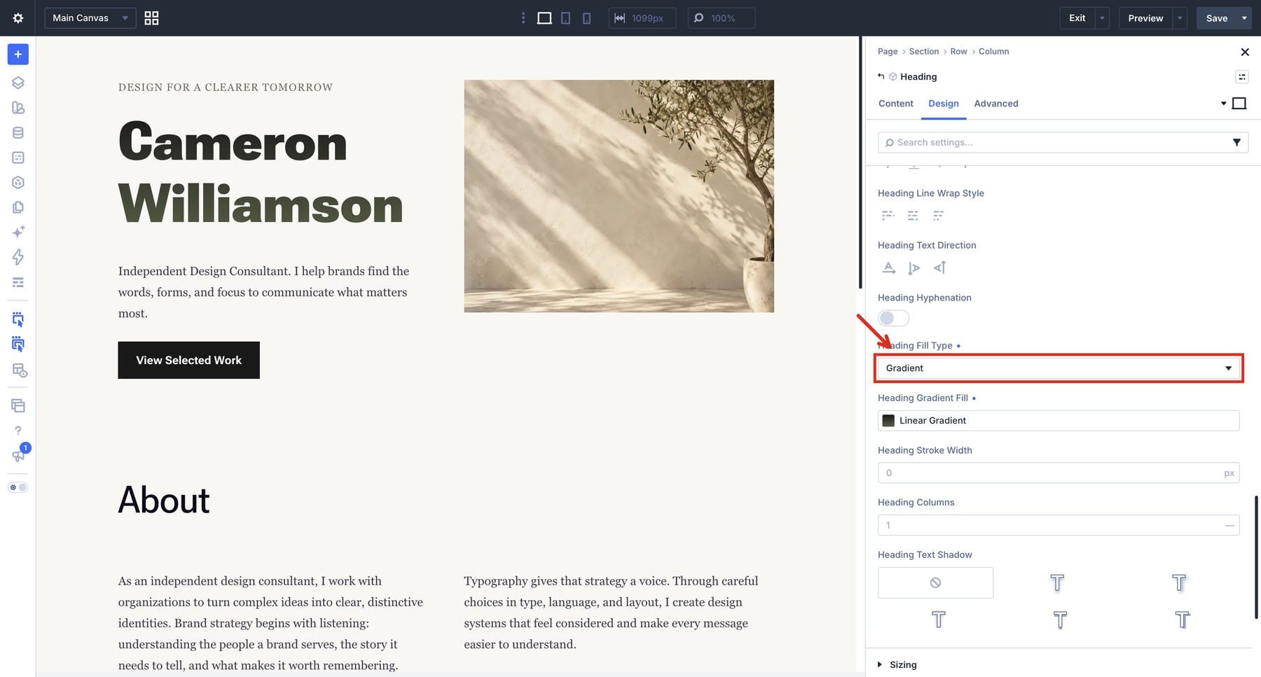
The clip below turns on a gradient fill for the consultant heading, showing one display effect in the same layout.
For display text, Divi also offers gradient and image fills, transparent fills, and strokes. A gradient variable can connect a heading’s fill to other uses of that gradient. The heading remains editable text.
Option Group Presets And Element Presets
Option Group Presets save settings from a compatible group, such as heading typography. That preset can combine a font reference, a size reference, weight, line height, and letter spacing into one reusable treatment.
Element Presets collect the styling of a particular element type. A Text module preset can include its heading and body typography treatments alongside spacing and other settings. It becomes available to other Text modules; a different element type has its own presets.
Editing a shared preset updates connected elements, subject to their other presets and local overrides. Variables hold values, settings reference those values, and presets distribute the combinations you want to repeat.
Build A Typography System In Divi 5
Start with the text roles your site needs, then create shared values and apply them to representative content. The consultant layout gives us a useful mix of display text, section headings, descriptions, and supporting details. It uses native Divi settings throughout.
Plan Your Typography Roles
Choose a manageable set of roles before adjusting individual modules. A portfolio might need a display heading for the person’s name, section headings for experience and projects, body copy for descriptions, and smaller text for dates or contact details.
Give each role a purpose. H1 identifies the main page heading; H2 introduces a major section; H3 introduces a subsection. Use further levels when the content structure requires them. Choose the semantic heading level for its place in that structure, then style its visual size separately.
One font family can cover several roles. A second family may provide a useful contrast between headings and body copy. Begin with the smallest selection that gives your content a clear hierarchy, then test it with real text.
Set Your Heading And Body Font Variables
Open the Variable Manager and expand Fonts. The screenshots use Heading and Body variables, pairing Roboto Flex for headings with Georgia for body copy. Choose the family for each role, click Save Variables, then confirm Apply Changes.
On an established site, check where an existing font variable is used before changing it. Add separately named variables if this typography system should remain independent of the site’s current styles.
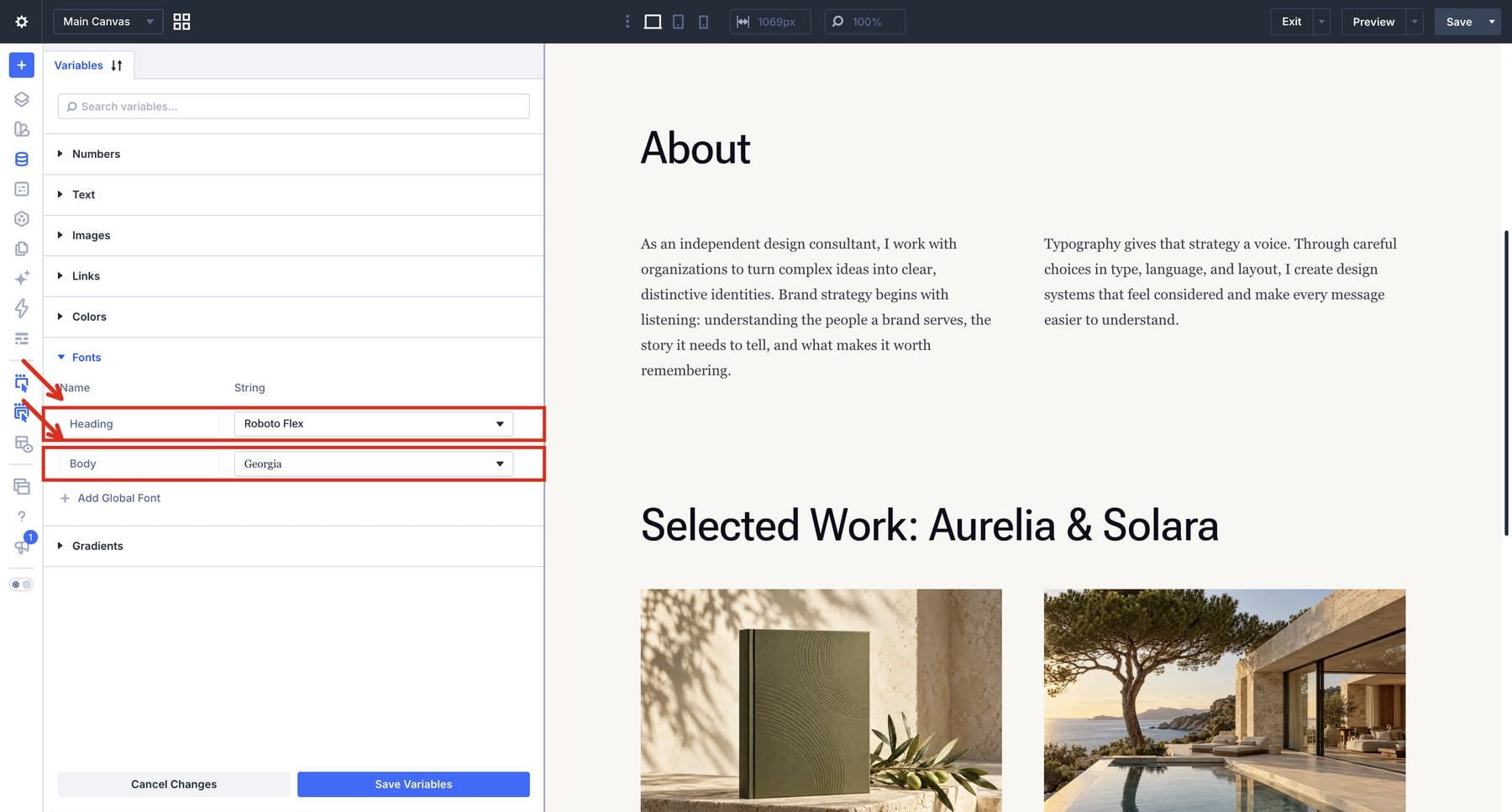
The font picker provides access to Google Fonts and any custom fonts available on your site. Choose a supported variable font when you want to use its axis controls. You will configure those controls in the module’s relevant text group after selecting the family.
Keep the variable names tied to roles. Heading and Body remain understandable if the chosen typeface changes later. A font variable establishes the family; the rest of the typography treatment comes from settings and presets.
Generate And Save A Responsive Type Scale
A type scale establishes sizes for your text roles, with smaller and larger steps built around a base value. Open the Numbers group in the Variable Manager, hover over its heading, and choose Generate Fluid Sizing Variables. In the Variable Generator, set Variable Type to Font Size.
Choose how those sizes should adapt using Scale Type. Divi offers three options:
- Fluid Scale (CSS Clamp): Uses clamp() values to scale between defined bounds as the viewport changes.
- Fixed Scale (Responsive): Creates separate sizes for the configured breakpoints.
- Fixed Scale (Single): Creates values that stay the same across screen widths.
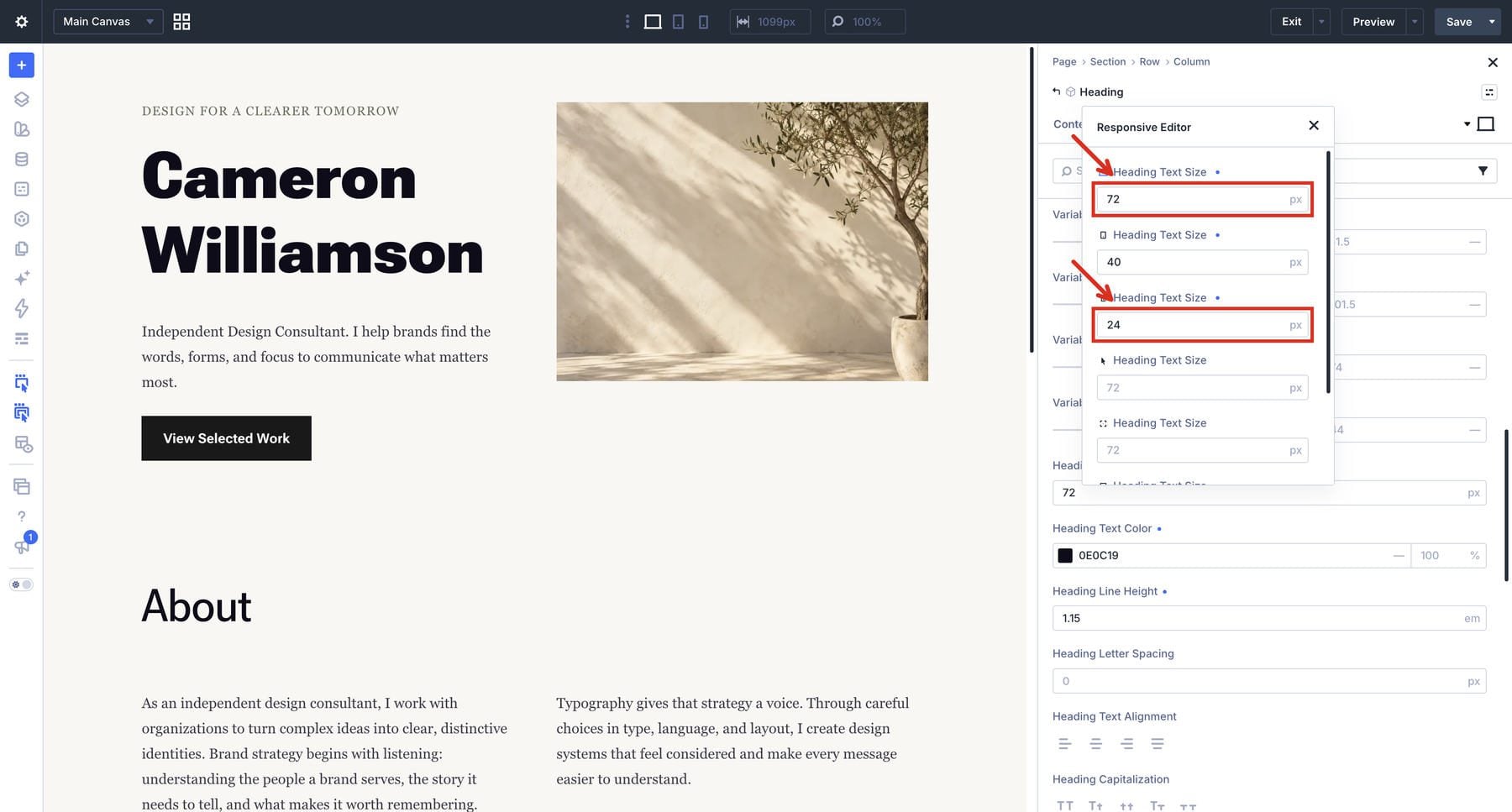
Start with a fluid scale when headings should grow smoothly with the layout. If a design calls for an exact size at a particular breakpoint, use fixed responsive values and set those changes explicitly. The fixed-size example below uses 72px for desktop, 40px for tablet, and 24px for phone. The clip opens those values in the heading’s Responsive Editor.
Review the base sizes, ratios, and viewport range in the generator. Set the Variable Prefix to text-. Use a 1.125 minimum scale and a 1.25 maximum scale, with a 360px viewport lower limit, an 80% desktop row width, and a 1080px desktop row maximum. Keep rem units with 1rem equal to 16px. With a base minimum of 16px and a base maximum of 18px, text-m spans 16–18px, while text-xl spans approximately 20.25–28.13px.
Adjust the base size or ratios and the values change, so the same variable name can represent different sizes on another site.
Choose each step by its actual size and intended role. You might use text-m for body copy, a larger step for section headings, and another larger step for display text. The labels describe scale steps, so check the actual range before assigning a role. Reserve smaller values for supporting content only when they remain comfortable to read.
Click Add Variables To My Site when the scale looks suitable. Review the imported values in Numbers, then click Save Variables and confirm Apply Changes. The sizes are now available for assignment in compatible fields. Creating the scale leaves the choice of which step belongs on each heading to you.
Configure Heading, Body, And Link Colors
Expand Colors in the Variable Manager. The example contains Primary Color, Secondary Color, Heading Text Color, Body Text Color, and Link Color. Set Heading Text Color to a value that works against your intended background. The screenshot uses #191919.
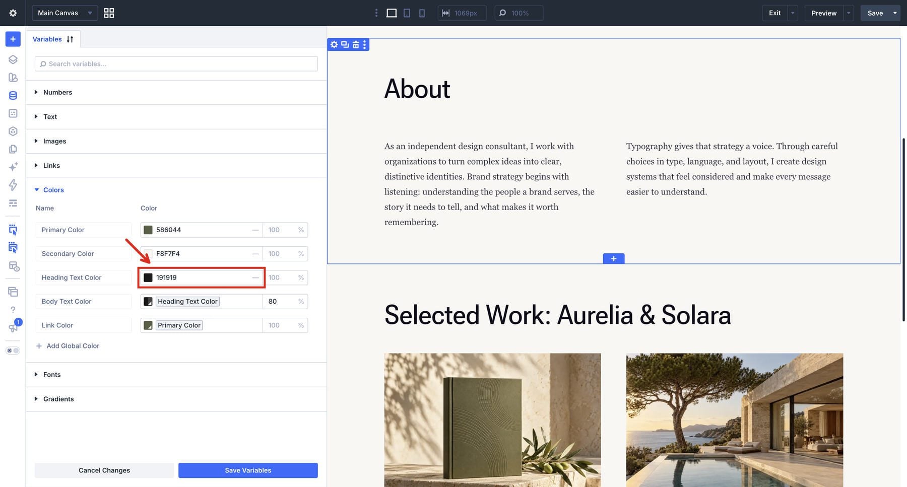
For a related body color, open the Body Text Color picker and select Heading Text Color under Global Colors. The field should show the named color as a chip. Set its opacity to 80%, save the variables, and confirm Apply Changes.
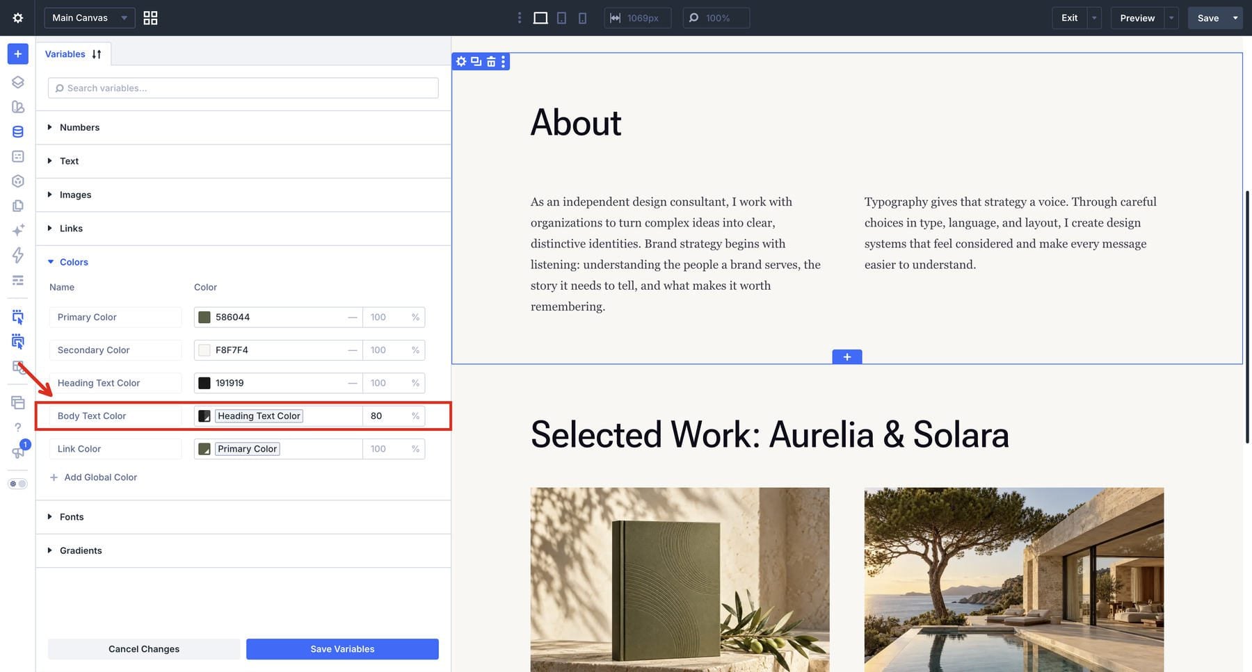
Typing the same hex value creates an independent color; selecting the global color keeps the relationship. Changing Heading Text Color then changes its derived body color. At 80% opacity, the foreground is twenty percent transparent.
Treat that opacity as a design example. A translucent foreground combines with the background beneath it, so the result needs checking on every surface where it appears. Normal text generally needs a contrast ratio of at least 4.5:1; qualifying large text needs at least 3:1 under the WCAG minimum contrast criterion.
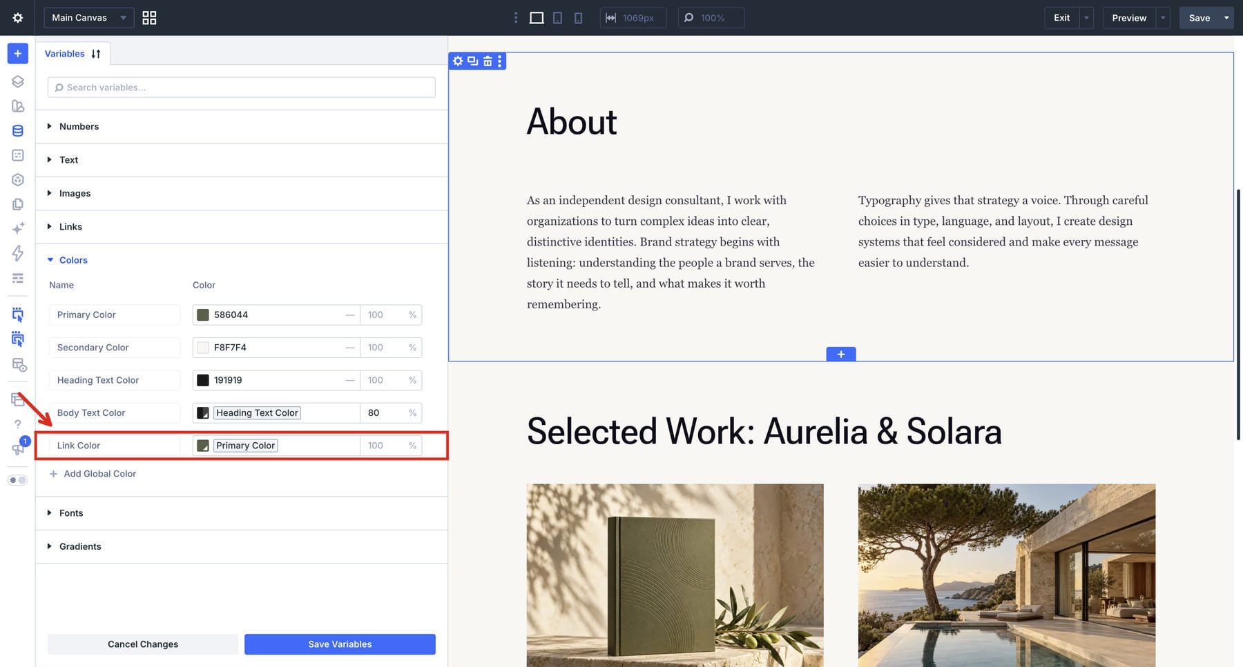
For links, select Primary Color as the reference for Link Color if it gives suitable contrast. Assign that link-color variable to the module’s link-color field and enable an underline in the Link tab. Check the result against its background and surrounding text. Add a separate light-text variable when the design needs one for dark sections.
Add Text And Set Meaningful Heading Levels
For a passage with headings and paragraphs, use the Text Module. Its rich text editor also handles lists. Add the module to your layout and enter enough copy in the Content tab to judge the spacing between complete paragraphs.
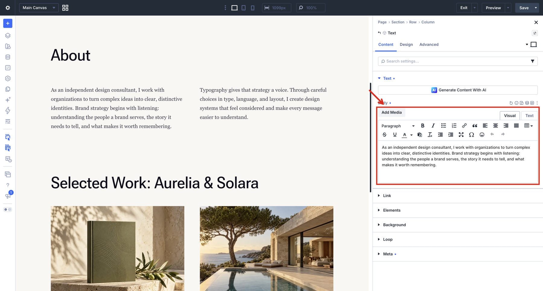
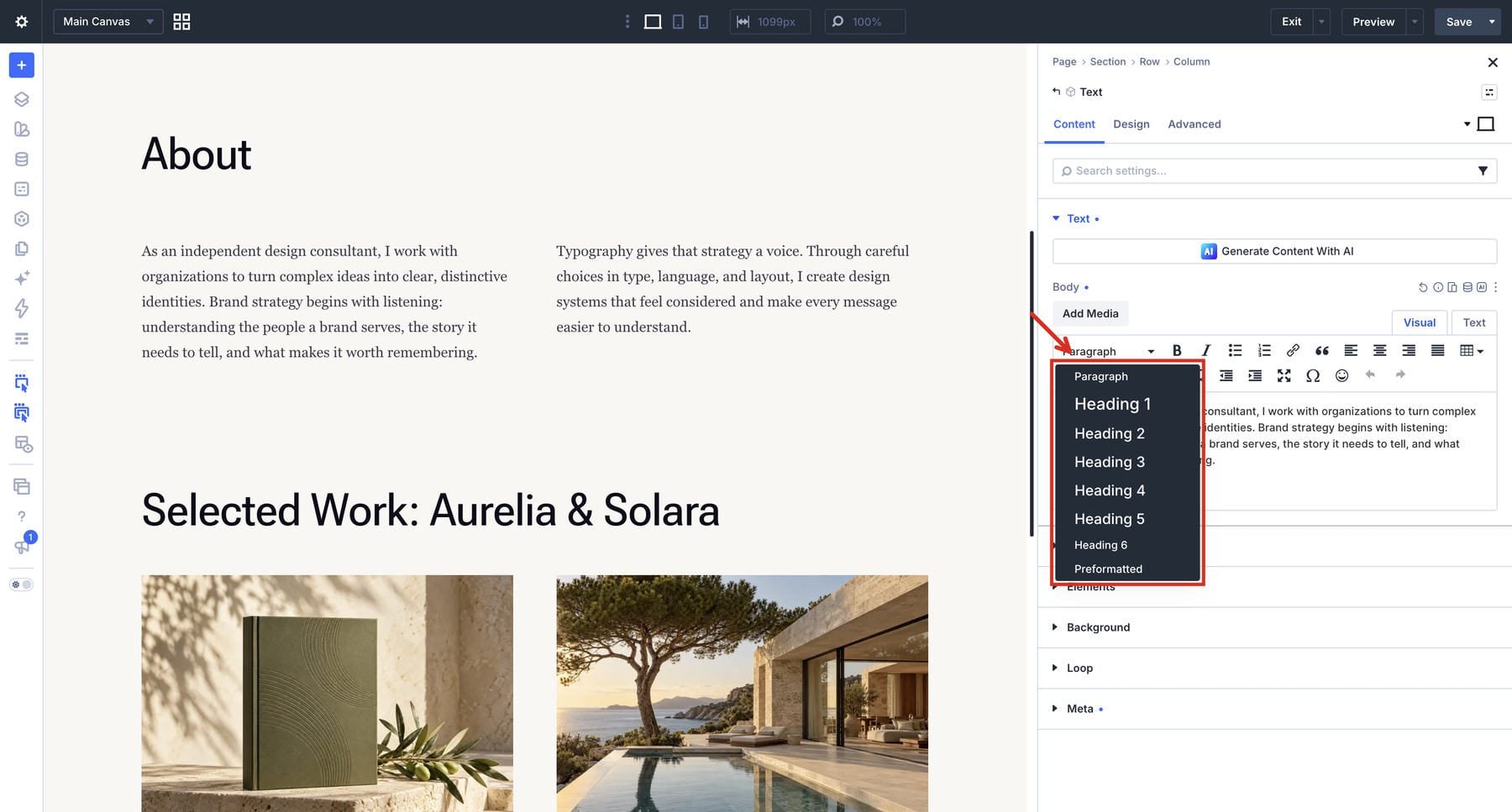
Select the relevant text and choose its heading level from the editor’s formatting menu. The heading and its supporting paragraphs can stay together in one module.
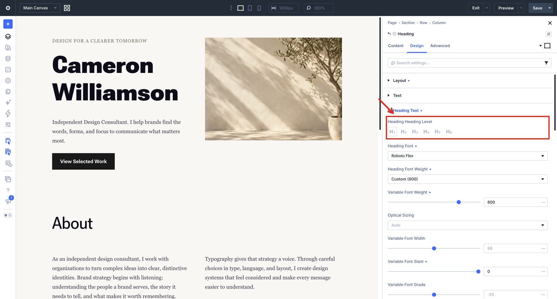
The Heading Module is useful for a standalone heading. In its Design tab, open Heading Text and use Heading Heading Level to select H1 through H6. Choose the level that fits your page structure; its visual size can be configured separately.
Choose other modules when the text needs a surrounding structure. A Blurb pairs it with an image or icon, while a Call To Action brings a heading and body copy together with a button. Apply your styles through the text groups each module provides.
Apply Variables And Refine Your Text Styles
Open the module’s Design tab and the text group for the content you want to style. The Heading module uses Heading Text; the body controls shown in our Text-module example are under Text.
Use the variable or dynamic-content icon beside a supported field to select its shared value. Assign the heading or body font variable to the font field, then choose the corresponding number and color variables for size and color.
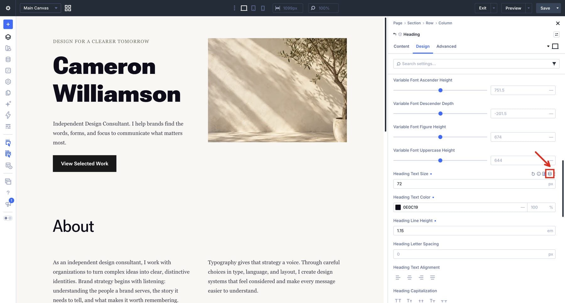
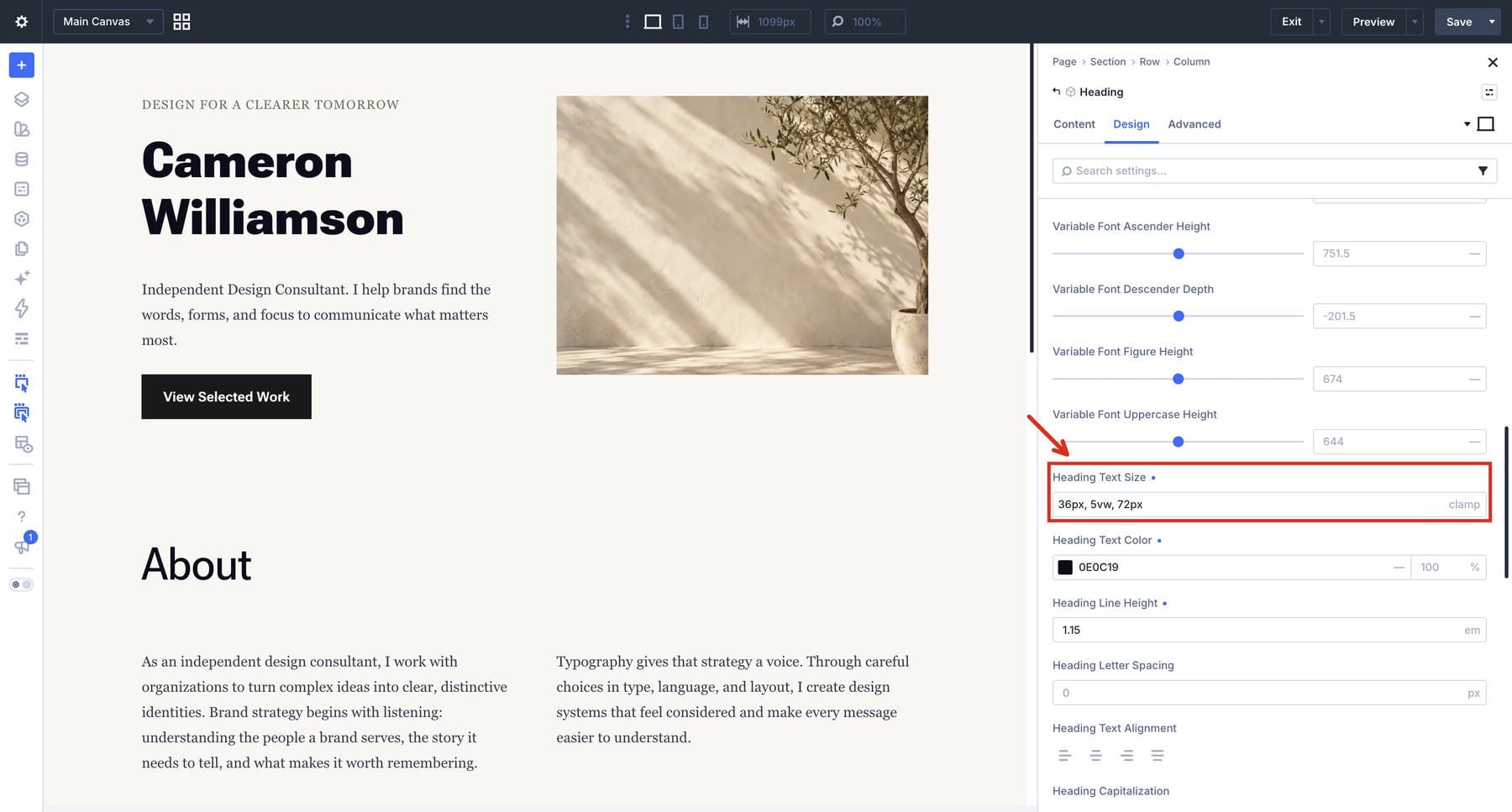
You can also enter a fluid expression directly in the size field. Below, Heading Text Size contains a clamp() expression. For a reusable system, select the named number variable so this role stays connected to the shared scale. A direct expression is useful for a local example, but it is not linked to a number variable.
Size is one part of readability. Adjust Line Height while reading a complete paragraph, and give adjacent paragraphs enough space to remain distinct. Body copy often benefits from a line height around 1.5 as an initial design choice; test the actual typeface, size, and line length before settling it.
Keep the paragraph’s container narrow enough that your eye can find the next line comfortably. Long desktop lines may need a smaller content width. Tight mobile layouts may need more available width, fewer columns, or a different heading size. Use letter spacing carefully, especially on small body text.
Refine Supported Variable Font Axes
With a supported variable font selected, Divi exposes its applicable controls beneath the standard font settings. Adjust one control at a time while looking at the text in context.
- Weight: Changes stroke weight along the font’s supported range, giving a section heading more presence even when its size stays the same.
- Width: Changes the letterforms’ proportions. Check long headings and button labels after adjusting it.
- Slant: Adjusts the angle of the forms. True italic can involve different glyph designs, so choose an appropriate italic face or axis when that is the intended style.
- Optical Sizing: Allows supported fonts to adapt details for their display size. Auto is a useful starting point; judge the result with your content.
- Grade: Changes stroke density while preserving character advance widths, helping you adjust visual weight without the same spacing changes a weight adjustment can introduce.
In the following example, Roboto Flex’s Weight stays at 800 while Grade changes from -25 to 100 and back. Adjust one axis at a time, inspect the rendered heading, and restore the value if the change does not help the role.
Some fonts expose additional axes for features such as roundness, stroke proportions, or letter heights. Use the controls that serve a repeatable role in your design. A body paragraph and a display heading can share the same family while using different axis settings.
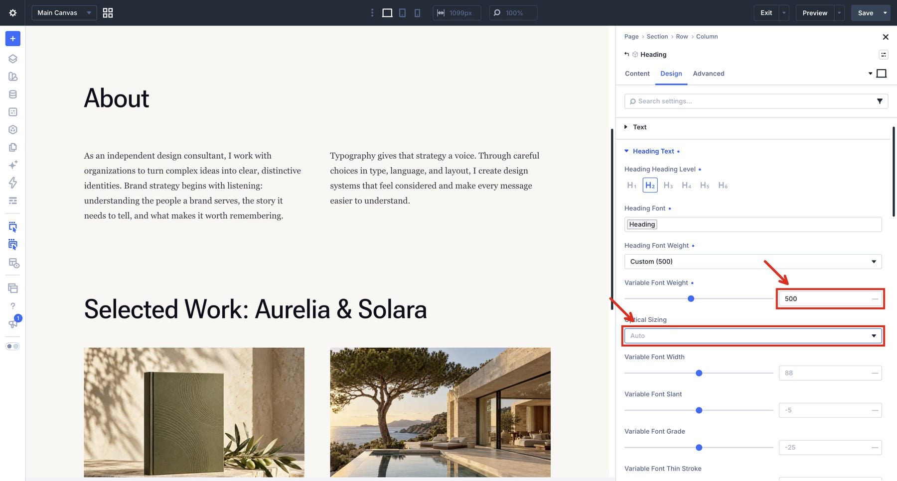
Below, the About section heading uses Roboto Flex with a Weight of 500 and Optical Sizing on Auto. Read the heading at its intended size before adopting those values. The demo keeps Georgia for its body copy.
Adjust Responsive Values And Optional Text Effects
A fluid variable changes size within its configured range. Inspect the result at intermediate widths as well as your main device views. Long names, narrow cards, and unexpected line breaks may require an adjustment to the scale or a local override.
The Responsive Editor lets you inspect available responsive values together. Click the Edit Responsive Values icon beside the font-size field to open its panel.
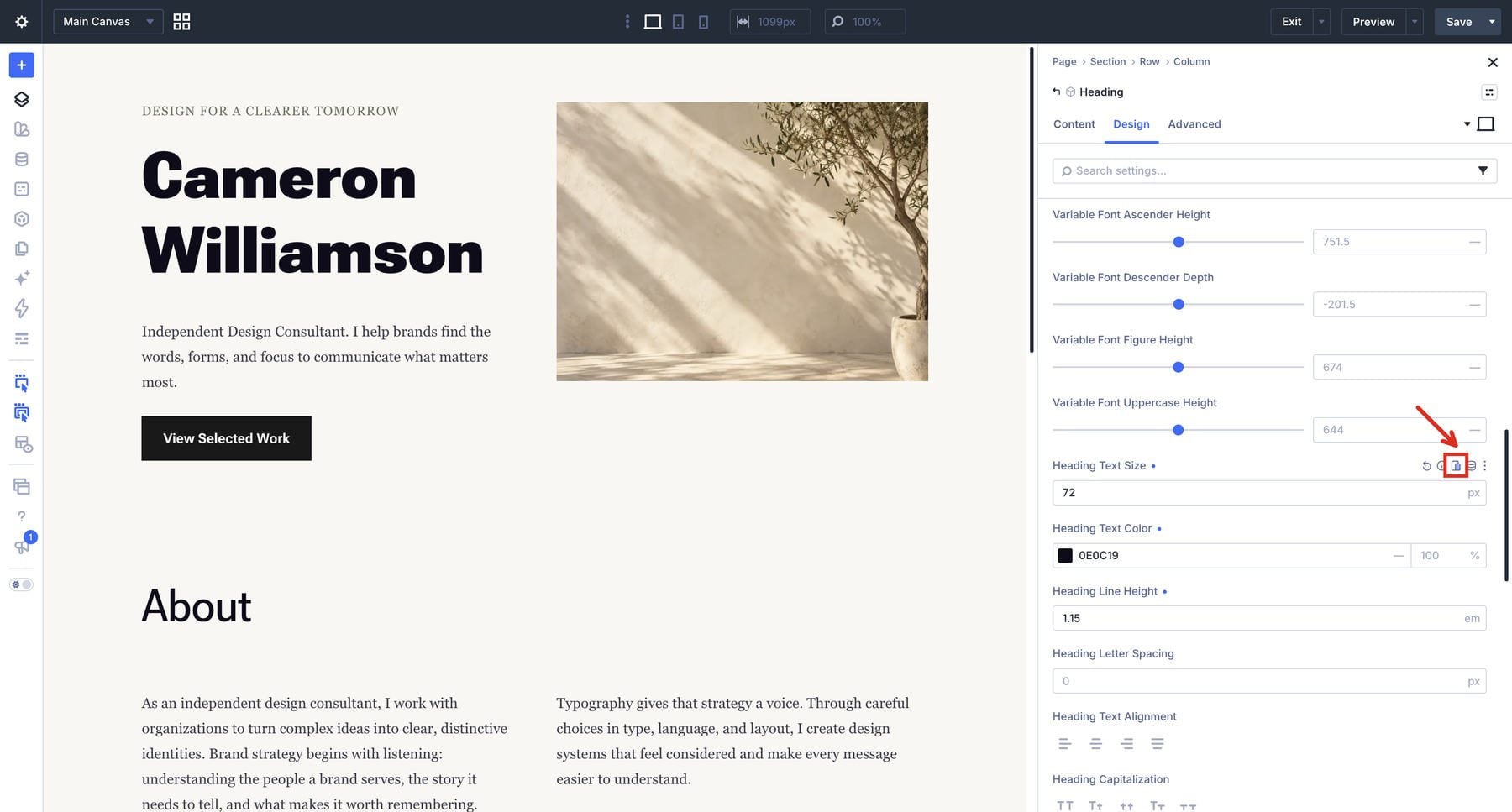
For a separate fixed-size example, the panel below shows a 72px desktop heading, a 40px tablet heading, and a 24px phone heading. The Responsive Editor also includes interaction-state rows; distinguish those from the device rows. Enter a value in the breakpoint row you want to override. A blank field follows the applicable inheritance chain, which can include another breakpoint’s override. Check the displayed inherited value before assuming it still uses your original fluid size. Reset an unwanted breakpoint override if that row should inherit again.
Shape Text Flow And Add Display Effects
For longer passages, text flow controls give you more ways to shape the reading experience. Choose them for the content they help organize:
- Text Columns: Flows content through CSS columns. Keep the columns wide enough to read, and reduce their count when the layout becomes narrow.
- Drop Caps: Enlarges an opening letter, with surrounding text flowing around it. Check the first paragraph on a phone, where the letter occupies more of the available width.
- Line Wrap Style: Balanced wrapping helps distribute heading lines. Pretty wrapping can improve paragraph endings, depending on browser behavior.
- Hyphenation: Can help break words in narrow measures when the document language is set correctly and the browser supports hyphenation for that language.
- Text Direction And Capitalization: Provide treatments for labels and other display text. Keep longer reading passages easy to follow.
Add A Drop Cap
To create the opening drop cap, open the Text module’s Design tab, expand Text, and select the Drop Cap tab. Set Drop Cap Line Size to 3 and Drop Cap Spacing to 8px. Choose the drop cap’s font and color to suit the opening paragraph, then check its spacing on a narrow screen.
Adjust Paragraph Flow
Return to the body-text tab for paragraph spacing, line wrapping, direction, hyphenation, and columns. Try Pretty wrapping on a paragraph and compare its line endings. Hyphenation needs an appropriate document language and browser support. Set Text Columns to 2 only when the content area gives both columns enough width; return to one column on narrower layouts.
Text direction controls reading direction, including right-to-left content. Capitalization changes the visual case. Choose the direction that matches the content and use capitalization for the intended visual treatment.
Style Display Text
Choose the heading’s Fill Type and configure the gradient or image field that appears. Open the gradient picker, then add the background gradient and color stops. To repeat the treatment, reference a gradient variable so related headings stay connected when you adjust its colors.
For outlined text, choose Transparent fill and set a nonzero Stroke Width. Start with a 2px stroke and adjust it to suit the text size. Stroke color and position controls appear once the stroke has a width. Choose a visible color and use Stroke Position for centered or outside placement.
Transparent fill without a visible stroke can make the letters disappear. Keep these effects selective and check legibility against the actual background, especially where gradients introduce lighter areas. Use responsive values only on fields that expose that capability.
Save And Reuse Your Typography Presets
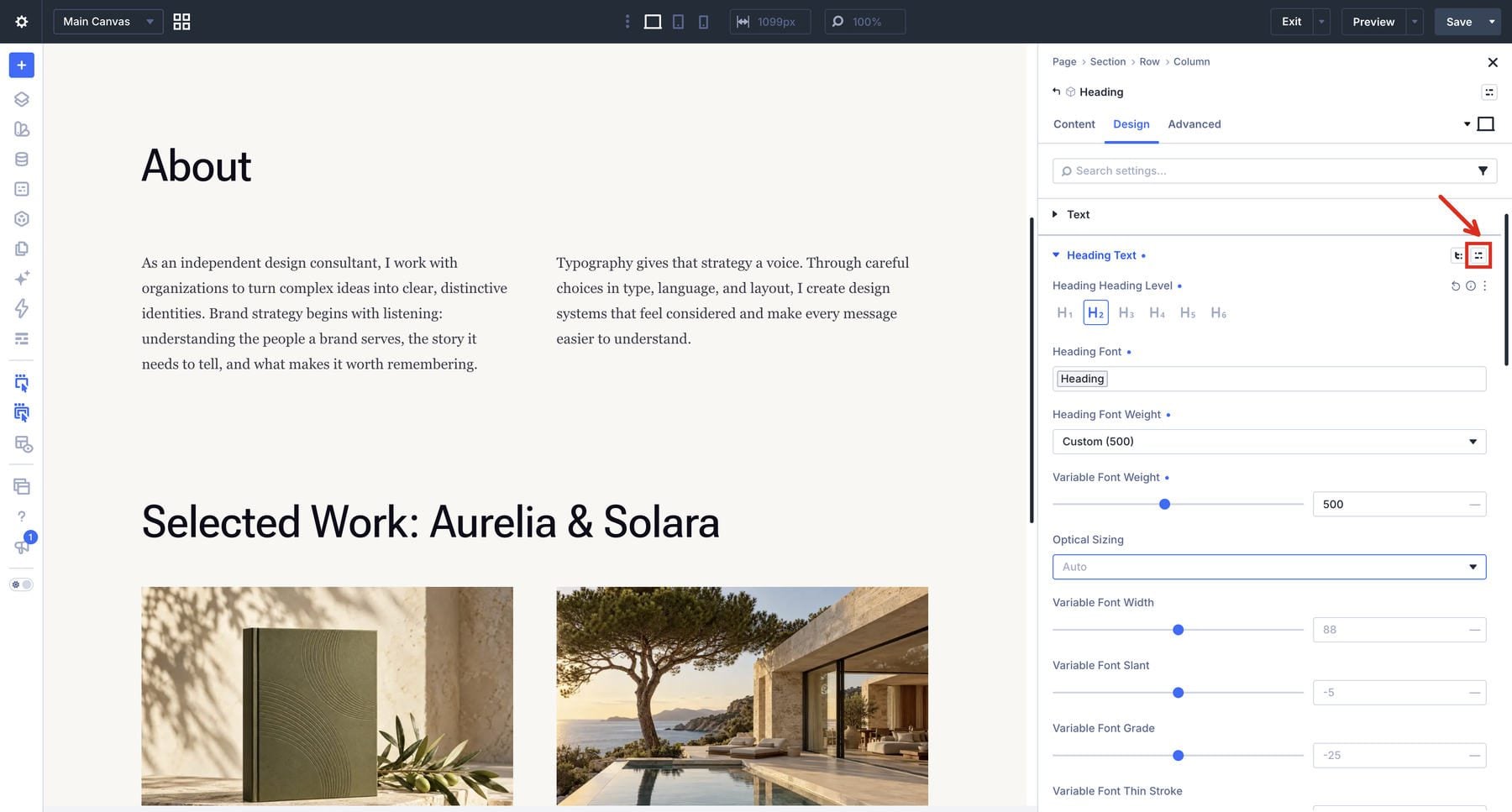
Once a role works with representative content, save its settings as a preset. In Heading Text, hover over the group title and click the Assign Presets icon.
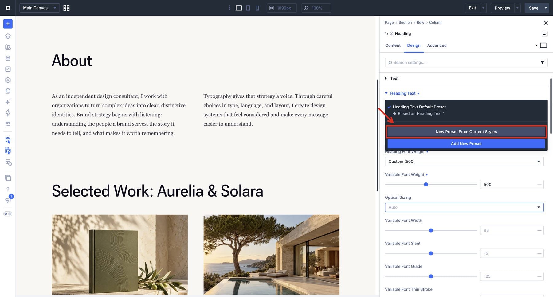
Choose New Preset From Current Styles, give it a role-based name such as Heading H2, review the included settings, and save the preset. Repeat for other roles that recur across your site.
To reuse it, open the compatible text group on another element and select the saved preset. Review the heading level alongside the visual styling. A local heading level or size can take precedence over the assigned preset, so applying a preset does not guarantee that an existing module will adopt every value.
The video below selects Heading H2 — Editorial for the About heading in the consultant layout.
Set a preset as the default when it should be the base treatment for that compatible group. Existing elements inheriting the default can change too. Local values and other assigned styles may take precedence, so check representative instances after changing a default. Select the appropriate preset for each role and check its heading-level setting.
For a reusable Text module configuration, combine the relevant text presets with its other shared styling. Click the Element Preset icon at the top of the module settings panel, create a preset from the current styles, name it, and save it. The Heading-module screenshot below shows the element-level control in the module header.
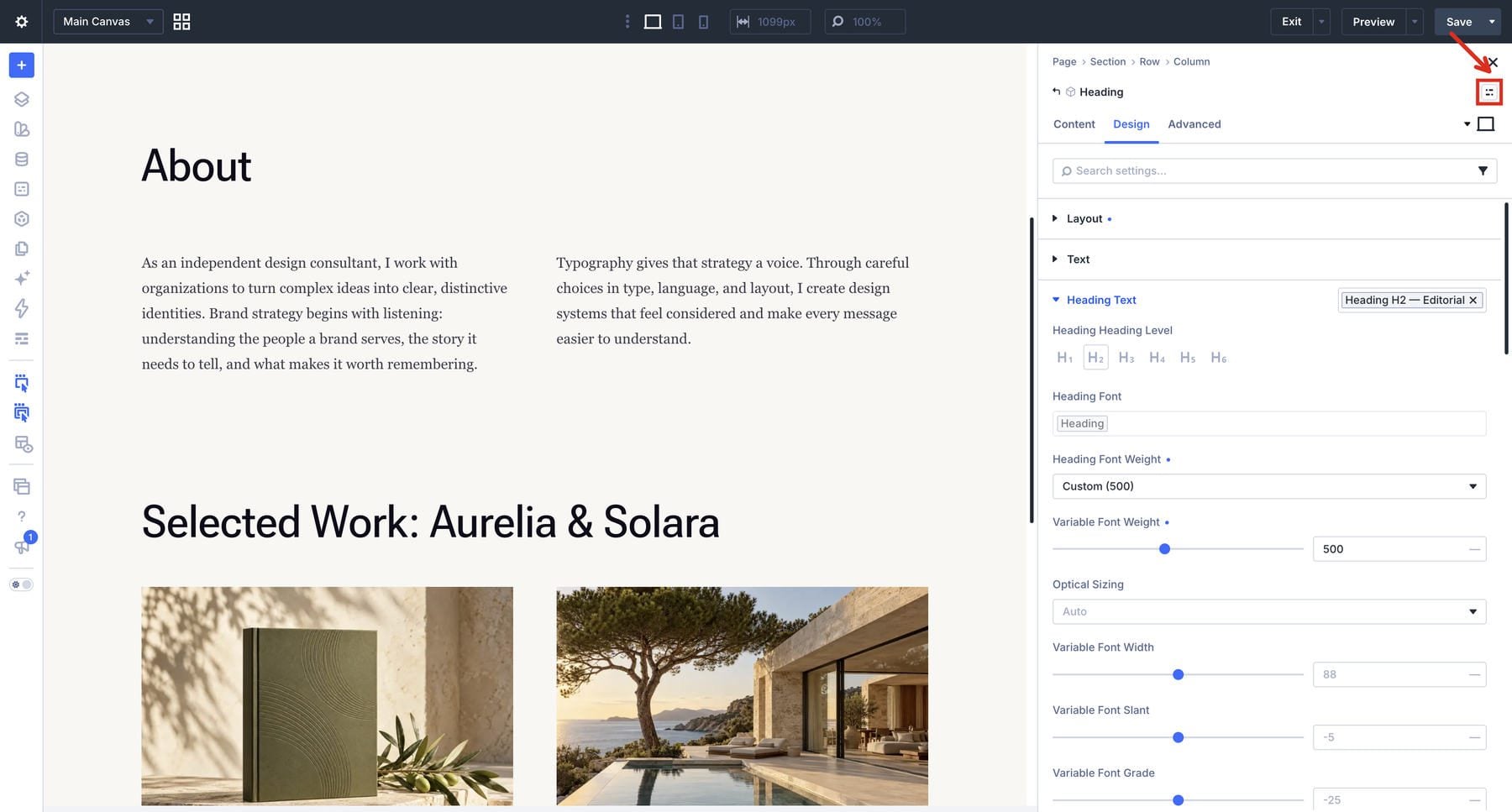
The two layers remain connected when an Element Preset references Option Group Presets. Edit the shared text preset to adjust its connected uses, or change a referenced variable when the underlying value should change. Review any local overrides that make an instance behave differently.
Check Your Typography Before Reusing It Site-Wide
Give the system a small set of representative content before applying it broadly. Include a short heading, a long heading, several paragraphs, a list, a link, and a caption or supporting detail. Check both light and dark sections if your site uses them.
Inspect the rendered page as well as the builder’s previews, moving through intermediate widths between desktop and phone. A heading may fit at either end but break awkwardly between them. Look for clipped letters and paragraphs that become difficult to track.
Check the page after its web fonts finish loading, then compare it on the devices your readers use. System fonts such as Georgia depend on local availability; a fallback can change line breaks and spacing. A saved font-family setting does not guarantee identical letterforms on every device.
Try enlarging text to 200% and confirm that content and controls remain available. The WCAG resize-text guidance explains that requirement. Fluid sizing still needs this check because changing viewport width and enlarging text can interact.
User spacing adjustments need room too. WCAG’s text-spacing criterion checks whether content remains available when readers increase line and paragraph spacing, along with the spaces between letters and words. Those override tests assess the layout’s flexibility; you can choose different values for its default appearance.
Troubleshoot Styles That Do Not Update
When a style behaves differently from the rest of the system, inspect its connections first:
- A size stays unchanged: Check whether the field references your number variable or holds a separate static value.
- Preset changes are missing: Confirm the element’s assigned preset, then inspect its local values. A local setting can take precedence over the preset.
- Axis controls are absent: Check that the selected font supports the axis and that you are viewing the relevant text group.
- Mobile text uses an unexpected size: Inspect the Responsive Editor for inherited values and explicit breakpoint settings.
- Body text loses contrast: Check its opacity and resulting color against the actual background.
These checks help uncover practical problems in your typography system. They are part of a wider accessibility review that also considers navigation, controls, content structure, and other page behavior.
Keep Your Typography Consistent As Your Site Grows
A useful typography system gives each decision a clear home. Font, color, and size variables hold shared values. Text settings define readable roles. Presets let you carry those roles into the next page without rebuilding every combination.
Start with a few roles your content needs in Divi 5, test them across screen sizes, and save the combinations that work. As the site grows, update those shared values and presets, then check representative pages for overrides and unexpected wrapping. That routine keeps everyday typography changes manageable while leaving room for a distinctive display treatment when the design calls for one.











Leave A Reply