")
Divi 5 helps you remember and reuse your design decisions. Using presets, you can set your brand colors, button styles, heading sizes, and spacing once, and every new element you add can automatically follow those rules. This transforms your styling into a reusable system that maintains consistency without the repetitive work of styling each element individually.
Stacked and Nested Presets take that system further. You can now layer styles on top of each other, build variations without duplicating work, and build layout patterns that adapt as your design evolves. This post guides you through how presets work together and demonstrates how to create a design system that scales with your site. Let’s get to it!
Divi 5’s Preset-Based Design System At A Glance
When you style a button with specific colors, shadows, and spacing, you can save those exact settings as a preset. Once saved, you can apply that preset to other buttons, and they instantly inherit the same look.
This means you design the button once and reuse it everywhere, so when you change the preset, every button using it updates automatically across your entire site. To make this work at scale, you need to understand where presets can be applied.
Divi’s layout structure flows from large containers down to individual design choices. Sections contain Rows, Rows contain Columns, Columns contain Modules, and Modules have Option Groups (like Typography, Spacing, Borders). Because presets can be applied at any of these levels, you get to control exactly how much stays consistent and how much stays flexible.
Here’s how the different preset types work together:
1. Element Presets
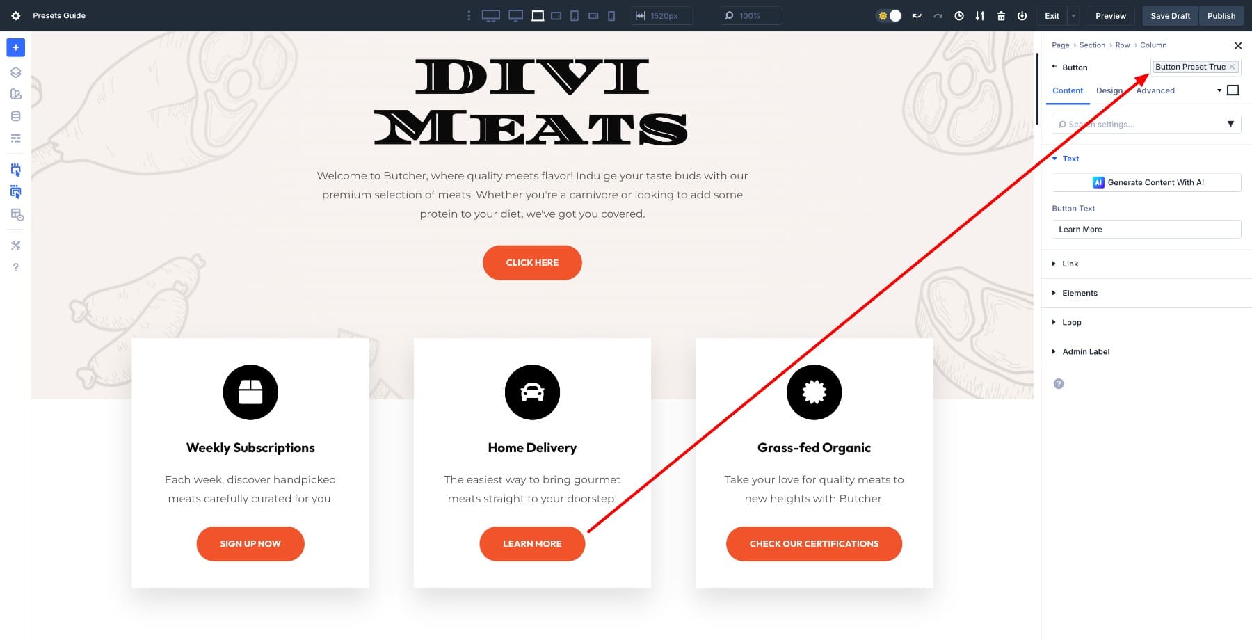
These are saved styles for specific elements, such as Button, Blurb, or Image modules. When you create a Button preset, it saves every modified setting for that button, and that preset only works on other Button modules. This keeps your design organized by element type. You’ll apply an Element Preset at the element level in the settings.
2. Default Presets
Every module type has a default preset that determines its appearance the moment you add it to your page. You assign it by clicking the star on a preset. Once you edit the default Button preset, every new button you create will start with those settings, which means you’re defining your site’s baseline design from the start.
You can even design your entire site using just default presets.
3. Option Group Presets
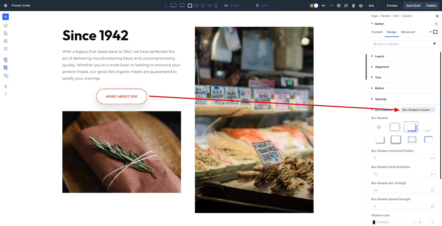
These presets are scoped to specific design categories (Typography, Spacing, Borders, Shadows, and Transforms), and unlike Element Presets, they work across any element type. Save a shadow configuration as an Option Group Preset, and you can apply it to buttons, images, columns, or sections.
This lets you reuse one aspect of styling without saving entire modules. You’ll apply OGPs inside the relevant Option Group’s settings. Learn the difference between Element and Option Group Presets.
These three preset types work together to give you flexibility at every level. Defaults set the baseline, Element Presets package up complete modules, and Option Group Presets let you reuse individual styling decisions anywhere.
Introducing Stacked & Nested Presets
Divi’s preset-based design system already saved time, but it was incomplete. You could create presets for modules and option groups, but mixing variations or building reusable components with internal styling still required a lot of manual work. Stacked and Nested Presets complete the system by making presets behave more like actual design system layers.
Subscribe To Our YouTube Channel
1. Stack Multiple Presets On Top Of Each Other
Stacked Presets allow you to apply multiple presets to the same element and layer them, enabling Divi to combine their styles. For example, you can have a Default button preset and other specific ones for alignment and shadows. To give your hero button the emphasis it needs, apply all three presets to the same button.
The button gets everything from the base preset, plus the modifications from each variant stacked on top. This means you no longer need ten separate button presets to cover every scenario because your base design stays intact while you add adjustments for specific situations.
When you need a light-text version for dark sections, you stack a “Light Text” Option Group Preset on top of your base button. When you need an oversized hero button, you stack the “Hero Size” preset. The base never changes, but the variations layer cleanly on top of it, so you’re working with a core set of base styles plus controlled variations that appear exactly when and where you need them.
Note: When two Stacked Presets define the same property, the last one applied wins. Order matters. This is similar to the CSS cascade: later rules override earlier ones when they target the same property. Except you’re doing it visually without touching the code.
2. Nest Option Group Presets Inside Element Presets
You can now nest Option Group Presets inside Element Presets. When you apply the Element Preset, it automatically includes all the Option Gropu Presets nested within it, and those nested presets stay linked to their source.
Say you create an Element Preset called Column Preset that defines a column with a border and other settings. Then you create a shadow option group preset. Add that option group preset while editing the column preset, and any new elements that use it will also inherit the shadow.
Because they inherit from the nested preset rather than copying it, updating the OGP later updates all instances across your site simultaneously.
You manage small design decisions once (like a shadow effect) and embed them into larger presets. Your modules become actual components that follow internal design rules automatically. The shadow preset doesn’t just apply to one card. It’s a reusable token that can be nested inside any preset that requires it, across all module types.
This turns your preset library from a flat list of one-off styles into a structured, token-based system where small decisions propagate through larger patterns.
How Stacked And Nested Presets Work Together
These two features work in tandem to create a complete design system.
- Nested Presets handle the internal logic of a component. They define what a card is by controlling its spacing, typography, shadow, and border radius. These are the consistent, structural rules that remain unchanged regardless of context.
- Stacked Presets handle variation. They define how the same card adapts to different contexts, such as applying a darker background for hero sections, tighter spacing for sidebars, or inverted colors for testimonials. These are contextual overrides that layer on top without breaking the base structure.
Together, this combination gives you several advantages. Components remain consistent across your site because their internal presets are nested and linked, which means variations don’t duplicate work, as they stack on top of base styles rather than replacing them. Because of this structure, global design settings update everywhere when you change them once, giving you control over both structure and flexibility at the same time.
Learn Everything About Stacked Presets In Divi 5
Your Divi 5 Design System Starter Plan
Now that you understand how presets work together, you can build a simple design system that keeps your site consistent without locking you into rigid structures. You don’t need twenty presets to get this right. A handful of thoughtful decisions that flow across your pages will work when you’re starting out.
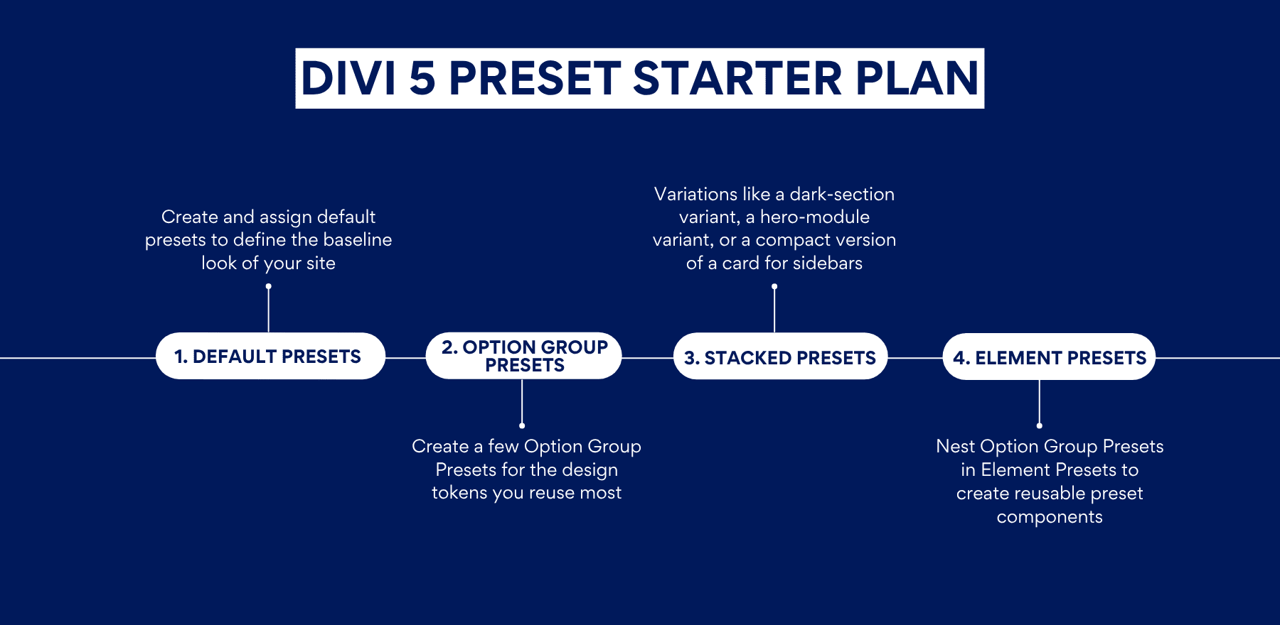
1. Begin With Your Default Presets
Before creating any layouts or components, set your baseline. Default Presets define how new elements look the moment you add them to the page, so locking these in first means everything you build afterward starts from a consistent foundation.
Start in the Variable Manager and define your global Design Variables. Set your brand colors, choose your fonts, and establish a basic typography scale for body text and headings. These variables form the foundation that every preset draws from, keeping future changes centralized in one place.
Once your variables are in place, create a single, clean “base” preset for each module you use most frequently. Style these presets using your variables, because this keeps them tied to your central design system. Keep them simple. They’re the default versions you’d want to use in most situations, so they should be neutral enough to work across different contexts.
After testing each preset by adding a fresh module to the page, assign the most frequently used one as the default. To do so, hover over the preset you want to assign as default and click on the star icon.
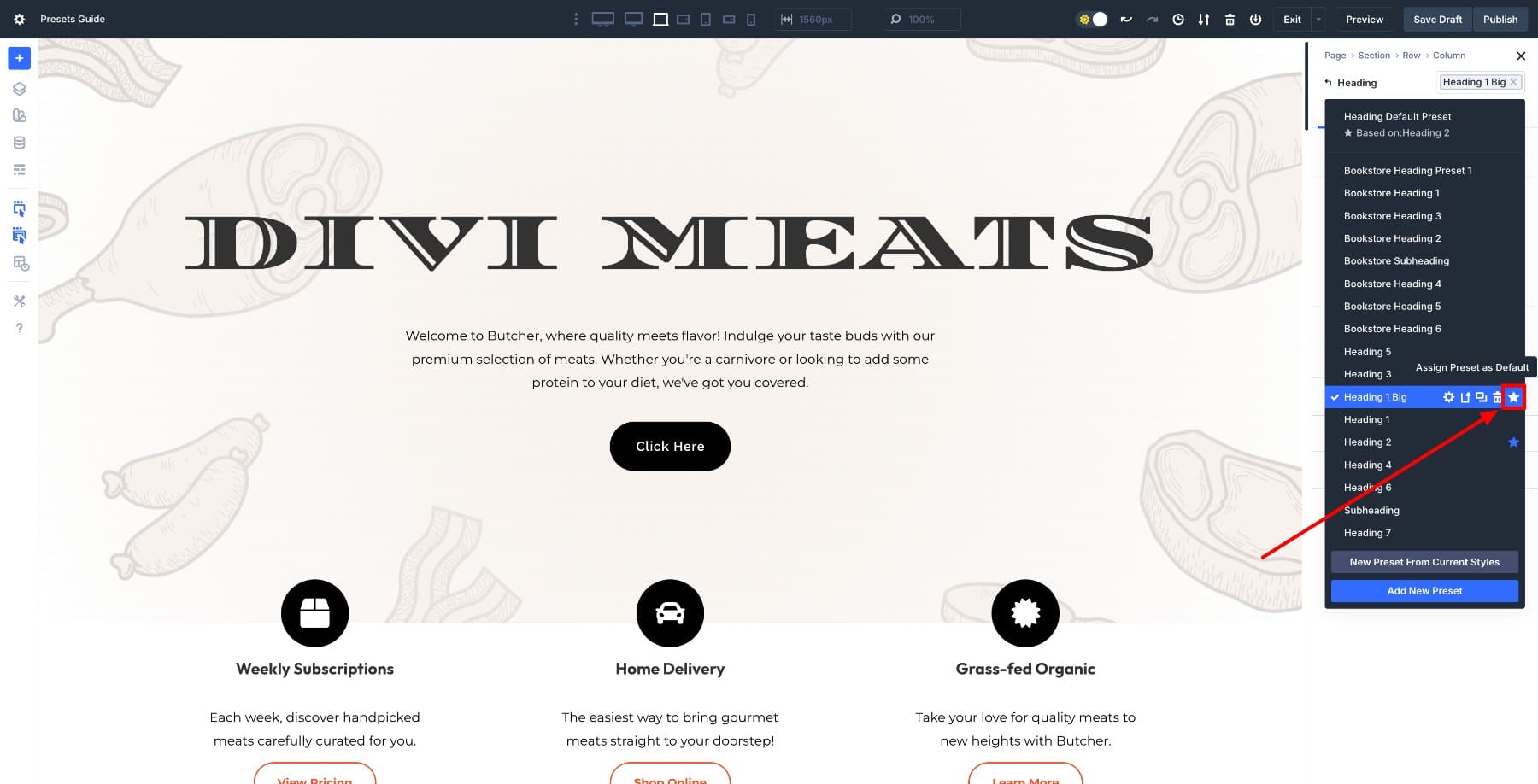
From this point on, every new heading you add will inherit the styles from your default preset, which means you’re starting with your core design already applied.
Do this for other base elements, such as buttons, containers, or text blocks. That single step eliminates the need to restyle the same elements repeatedly as you build, because the defaults handle the repetitive work for you.
2. Create Option Group Presets For Your Reusable Design Settings
Once your default presets are set, the next step is breaking your design into reusable parts, which is where Option Group Presets come in.
Instead of thinking in terms of full modules, pick one commonly used container and analyze how it’s built. A Row is a good starting point because it usually carries multiple design decisions at once, such as background color, padding, border radius, and shadow.
Open a Row and style it the way you usually would. Set the background, adjust the padding, add rounded corners, and apply a shadow. Now, instead of saving this entire configuration as one preset, split each design decision into its own Option Group Preset.
For example:
- Save the padding as a Spacing Option Group Preset
- Save the shadow as a Shadow Option Group Preset
- Save the border radius as a Border Option Group Preset
- Save the background style as a Background Option Group Preset
Each preset represents a single, reusable rule, which means you’re no longer saving a row’s Element Preset but rather different Option Group Presets that define how rows behave across your site.
The advantage becomes clear immediately. That same padding preset can be applied to sections, columns, or modules, and the same shadow can be reused on cards, images, or callouts. You’re building a shared design language rather than duplicating styles in multiple Element Presets, so each design decision becomes a reusable token that can be applied anywhere.
At this stage, focus on identifying patterns. If you apply the same padding, shadow, or border radius in more than one place, it deserves its own Option Group Preset, as these presets will later combine and layer cleanly, giving you flexibility without compromising consistency.
3. Nest Your Option Group Presets Inside Element Presets
Once Option Group Presets are in place, they can be combined to form structured, reusable components through Element Presets. This is where individual design decisions begin to work together as a cohesive system, rather than existing as separate settings.
A common example is the design of your row containers. The same spacing, border radius, and shadow Option Group Presets can be nested inside multiple Row Element Presets, ensuring that these structural rules remain consistent everywhere they’re used.
What changes between presets is not the structure, but the context. For instance, one Row Element Preset can nest a light background Option Group Preset, while another nests a dark background preset. Both share identical padding, corners, and shadow behavior, but visually adapt to different sections of the site because the background layer changes while the structural layer stays the same.
This approach works especially well for light and dark layouts, where the underlying component remains the same and only the surface styling shifts. Because these presets inherit from the same Option Group Presets, updates stay synchronized.
Adjust the spacing or shadow once, and every light and dark container updates together without losing its intended contrast or role, so you maintain both consistency and variation simultaneously.
Nesting Option Group Presets this way turns Element Presets into actual components. They carry internal design rules automatically, while still allowing you to create purposeful variations by recombining the same design settings in different ways.
4. Create Variation Layers Using Stacked Presets
Once your base components are defined through Nested Presets, Stacked Presets become a way to adapt those components to different contexts without changing their structure.
For example, the same container row preset can be used across most of the site, but stacked with a variation preset when the context changes. A container placed in a hero section might require larger padding, so you stack a different padding preset on top of the base component.
The same container inside a sidebar might stack a compact spacing preset, and in a dark section, it might stack a light-text or inverted-color preset. The underlying component remains untouched because its internal spacing, border radius, and shadow continue to come from the same nested Option Group Presets. The stacked preset simply layers contextual adjustments on top, so you’re modifying only what needs to change for that specific situation.
This is especially useful for patterns like light and dark sections, hero layouts, or featured content blocks. Rather than creating separate Element Presets for each scenario, you stack small, focused presets that override only what needs to change in that moment, which keeps your preset library manageable while still covering all your use cases.
Stacked And Nested Presets Complete Divi’s Design System
Divi 5 transforms presets into a comprehensive design system. With defaults, Option Group Presets, and Element Presets in place, every new module starts with a plan in place.
Stacked and Nested Presets complete that workflow by letting you nest design settings inside components and stack variations on top when context requires it. This means you can update entire patterns with a single edit. Start by defining a few solid defaults and build a small preset library around them. Your pages will come together more quickly and remain consistent as your site grows.


Leave A Reply