
With Divi 5, dark mode doesn’t have to be a fragile set of overrides. You can design light and dark layouts side by side, using the same structure and a shared color system that stays easy to adjust.
We’ll start with a light-mode layout, then build a dark mode palette for it. We’ll build a dark mode version inside a Canvas, and apply the palette using Divi 5’s Color System and Design Variables. At the end, we’ll adjust a few HSL values and watch both layouts update instantly, without touching individual modules.
A Practical System For Building Light & Dark Mode Layouts In Divi 5
Divi 5 makes it easier to manage color decisions at the system level, rather than updating modules one at a time. You can define a small set of rules, apply them consistently, and adjust them later without hunting through a layout.
That approach is especially useful when light and dark modes need to coexist. In this walkthrough, we’ll build a dark mode palette that stays in sync with the light layout and remains easy to refine.
We’ll use three features together to do this.
The Color System For Defining Color Roles
The Color System lets you assign clear roles to your colors. You can define a primary color, a secondary color, heading text, and body text. Once defined, those colors can be applied consistently across modules, sections, buttons, borders, and icons.
Subscribe To Our YouTube Channel
What makes this useful is that once a color is set, it can be reused throughout your layout. Update it later, and every element that uses it updates automatically. Your design stays consistent without manual rework.
Learn Everything About Divi 5’s Improved Color System
Design Variables To Store Colors Globally & Create Automatic Variations
Design Variables are where global colors live. They store your global color values and make them available everywhere in the builder. Presets can pull from them. Canvases can pull from them. Any module can pull from them.
Variables also support relative colors, which makes the system more flexible. You don’t have to create separate hex values for text, backgrounds, and accents. You can derive them from a base color using Hue, Saturation, and Lightness controls. Change the base color, and all derived colors adjust accordingly. The relationships stay connected.
Learn Everything About Divi 5’s Design Variables
Canvases To Design Alternate Layouts Without Duplicating Content
Canvases give you a separate design area that sits alongside your main page layout. They’re often used for off-canvas menus or overlays, but they work just as well for managing alternate design versions.
We’ll place the dark mode version of the layout inside a Canvas. The light layout stays in the main builder, and both versions share the same color variables. You can design them side by side, compare them directly, and adjust both modes without duplicating content.
Learn Everything About Divi 5 Canvases
By combining the Color System, Design Variables, and Canvases, we can build light and dark layouts side by side using a single color structure. The palette stays centralized, both layouts stay in sync, and changes remain easy to test and refine.
The Light-Mode Layout And Its Color Structure
Before building dark mode, we start with a light-mode layout that already has a clear and balanced color structure.
On a new page, import the layout.
This layout uses a simple palette built around two core colors. The primary color handles emphasis, and the secondary color supports it.
The heading and body text colors don’t have to be independent choices. They’re derived from the same primary and secondary colors using relative values. Headings come out darker and more prominent, while body text stays softer and easier to read over long stretches. They stay visually connected because they’re derived, not separate decisions.
This structure makes the layout a good candidate for dark mode. The hierarchy is already clear, and color roles are well defined. Nothing relies on hard-coded values that would break when the background changes.
Building A Dark Mode Color Palette With Divi 5
Dark mode depends on strong contrast. When the background becomes darker, every other color needs a clear role so the design stays readable and structured.
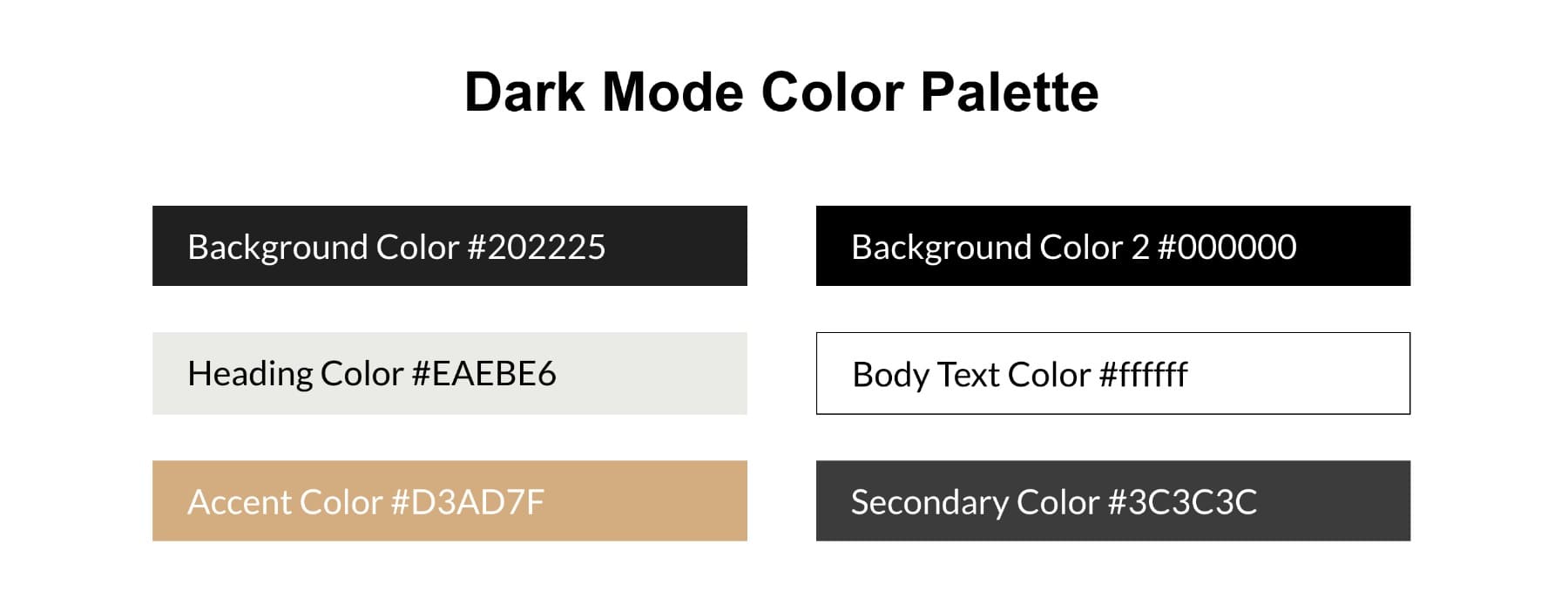
A dark palette usually only needs a few key colors. The background sets the overall atmosphere. Primary and secondary colors become your highlights. Heading and body text colors control readability. Accent colors handle borders, outlines, and small UI details.
Here’s the palette we’ll build:
We’ll save these as Design Variables, which makes every color available across every page, module, and preset in your site.
1. Create A New Canvas For Dark Mode
We’ll place the dark mode version inside a Canvas. This keeps the light layout intact while giving us a separate space to apply and test a dark palette.
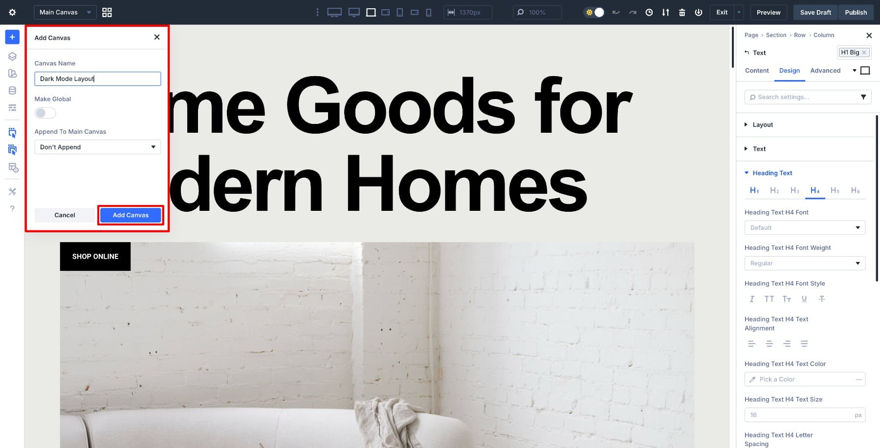
In the Visual Builder, open the Main Canvas dropdown from the top bar and click Add Canvas.
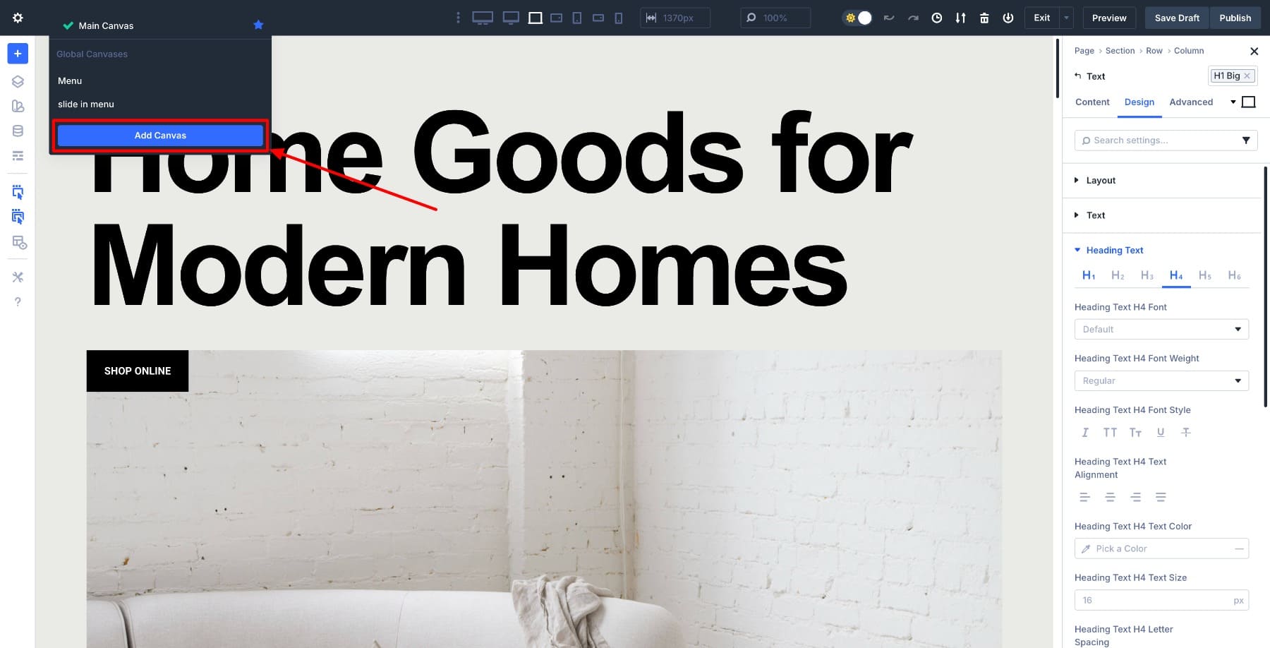
Give the Canvas a clear name, such as Dark Mode Layout.
Do not append the Canvas to the page layout. Leaving it unappended keeps the dark layout completely separate from the light version. The Canvas exists alongside the page.
Once the Canvas is created, Divi automatically switches you into the Canvas view. You’ll see a blank workspace where we’ll recreate the same layout structure and apply the dark mode color palette using variables.
Nothing on the front end has changed at this point. The light-mode layout remains unchanged. The Canvas gives us a parallel design space where we can work on dark mode without affecting the original page. Now, import the light mode layout again so all we have to do is switch colors.
2. Add Primary & Secondary Colors
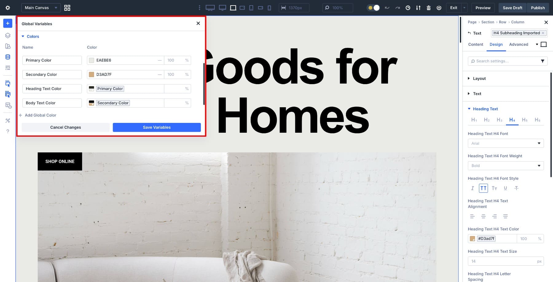
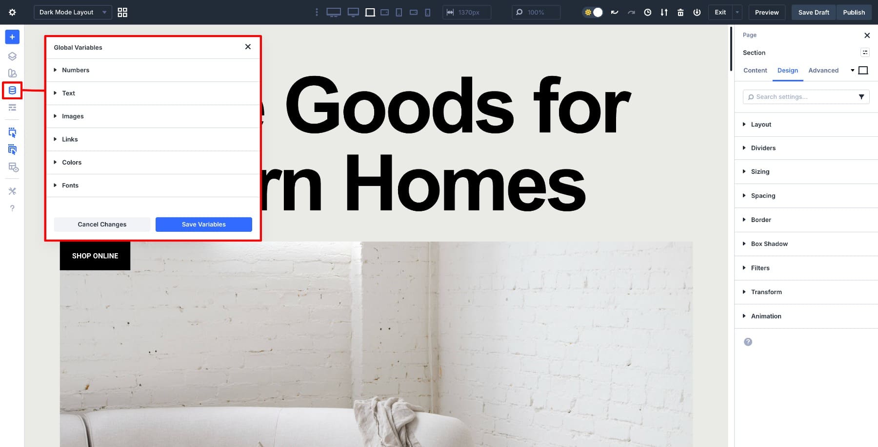
Once you’ve uploaded the layout to your new Canvas, open the Variable Manager inside the Visual Builder (left sidebar). This is where you create and manage all of your global design variables.
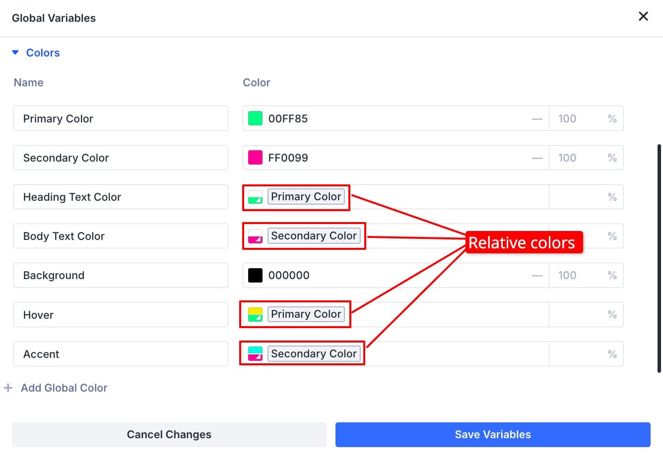
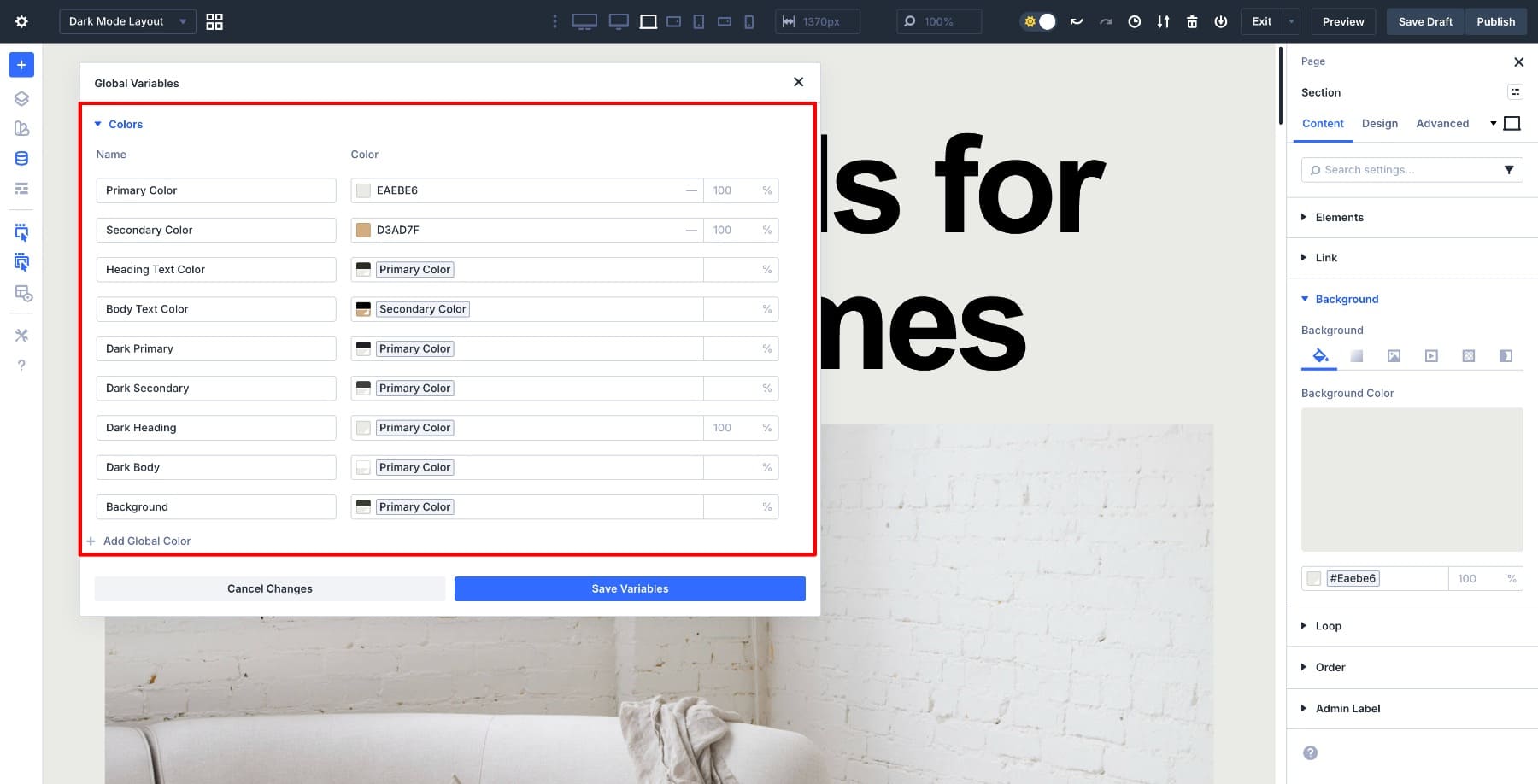
Open the Colors tab. The four primary, secondary, heading, and body text colors from the light mode layout are already defined.
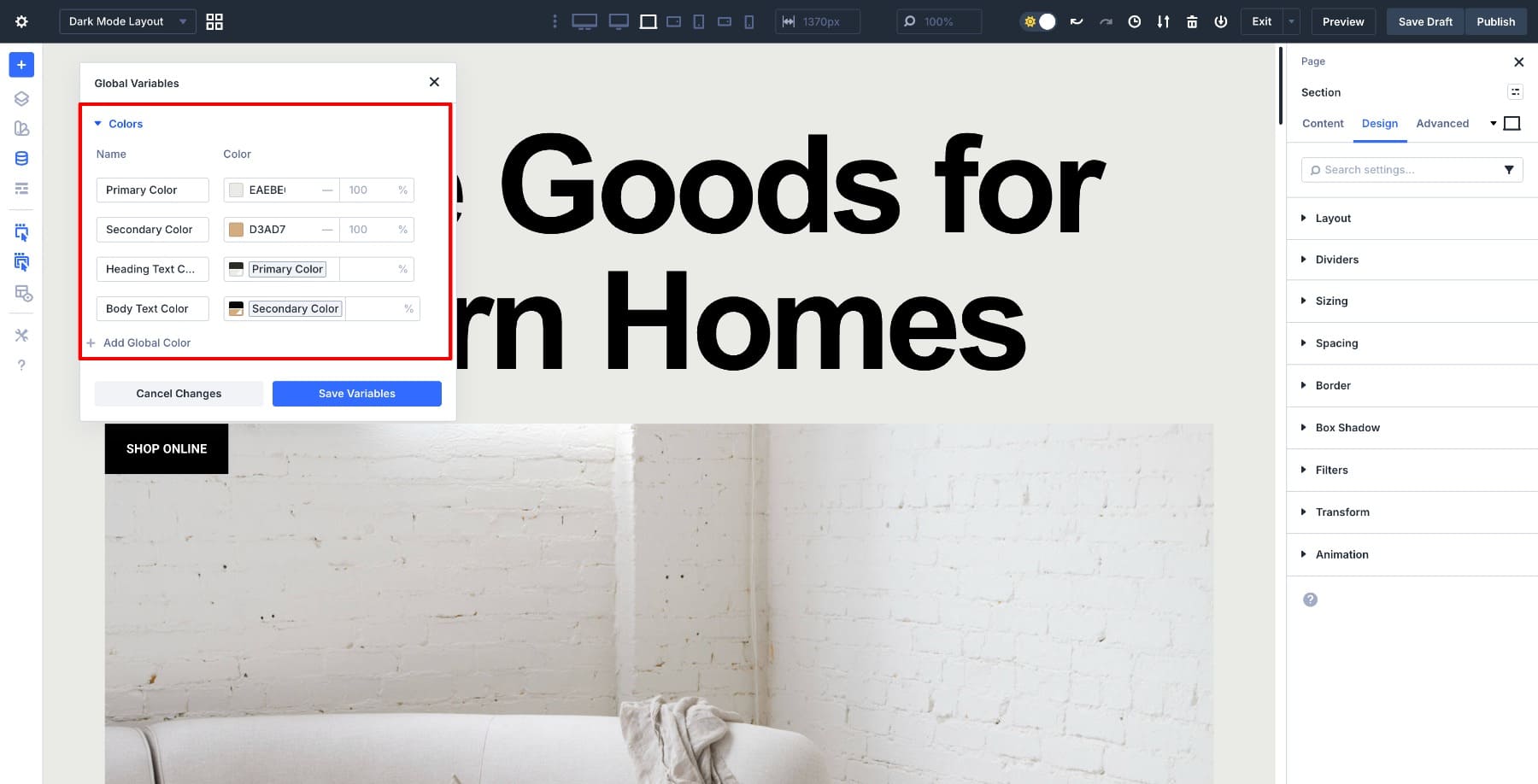
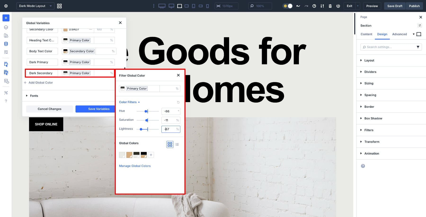
We won’t replace these colors. Instead, we’ll keep them as the base colors and create dark-mode variations from them using relative HSL. Click Add Global Color, name it Dark Primary, and create the color variation. First, select the Primary Color to connect the two colors. Then adjust the HSL values to 153 (Hue), -3 (Saturation), and -78 (Lightness), respectively.
Next, create a Dark Secondary color by adjusting the HSL values to -66 (Hue), -11 (Saturation), and -67 (Lightness).
After saving, both variables will appear in the dynamic color picker anywhere you can apply color inside Divi.
These two colors become the base for all the related colors we’ll create next.
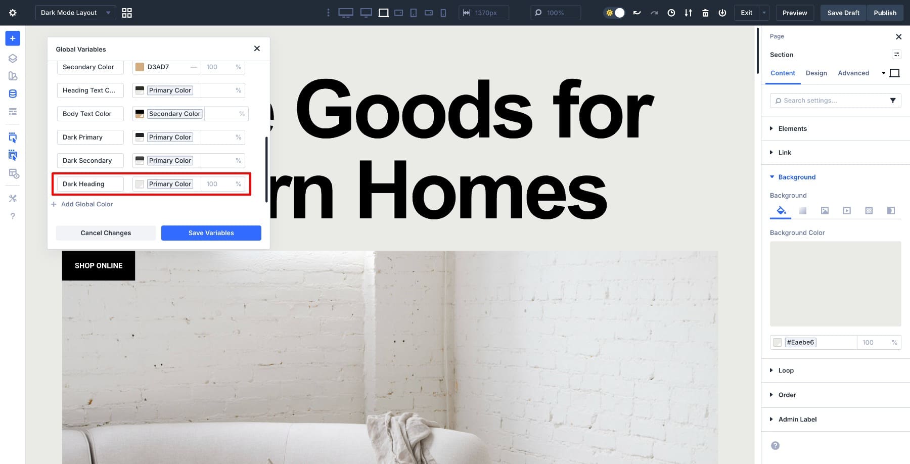
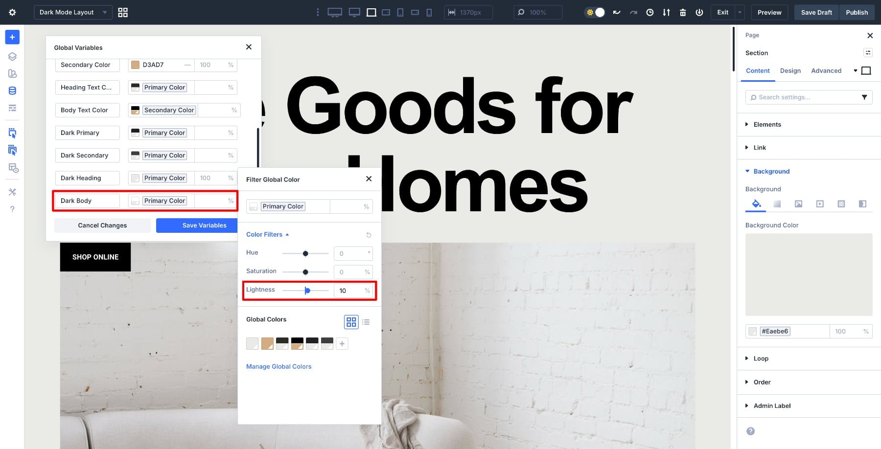
3. Create Relative Colors for Heading & Body Text
Create the text colors as relatives of your primary and secondary colors. Start with a Dark Heading color and select the Dark Primary swatch as the base. We’ll use this variable as the heading color so headings stay linked to the dark-mode palette.
Now create Dark Body Text as a relative color based on Dark Primary. Increase Lightness until the text is comfortably readable on the dark background, then save the variable.
Save Variables to confirm both text colors.
4. Create A Background Color
Create the Background color as a relative color of the Primary variable to keep it connected to the system. Click Add Global Color and name it Background Color. Select the Primary Color swatch, then click it again to open the Filter Global Color panel.
Use the Lightness slider to reduce Lightness until the result is near-black (or as dark as your design needs). Since this is a relative color, it stays tied to Dark Primary, even if the result appears to be standard black.
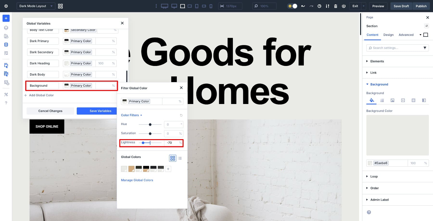
Save Variables to confirm the background color. The layout now has a dark foundation that works with the heading, body, primary, and secondary variables you already created.
This approach keeps your background tied to the palette. If your primary color ever changes hue or tone, the background adjusts with the same filter tools without breaking the system.
You can reuse your existing Secondary Color in dark mode, or create a Dark Secondary variation. In this example, we created a Dark Secondary.
Why This Palette Works
The dark mode palette is ready to use. It uses only two independent colors: primary and secondary. Every other color connects to one of these two, which means you can update the entire palette by changing just the base colors.
The primary and secondary colors define the design’s personality. All text, accent, and background colors stay linked to them through relative filters, including the black background. The palette stays consistent, and adjustments remain simple without redoing any part of the layout.
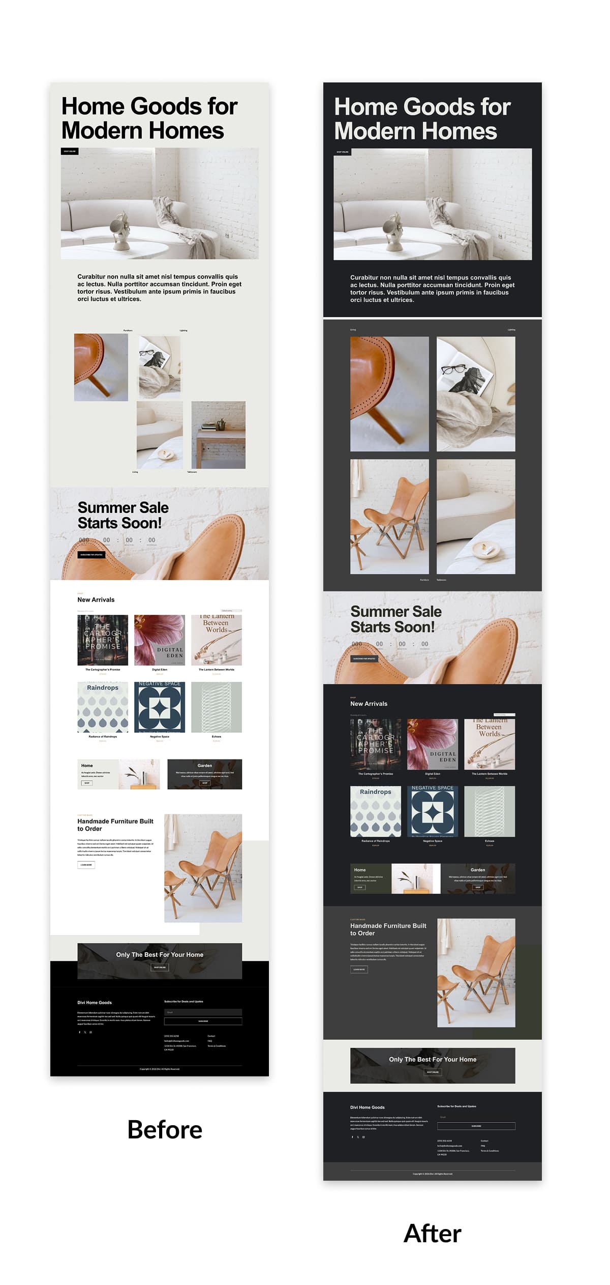
Now we can test the palette on a layout. Every heading, paragraph, border, and button will pull color from the system we just created.
Testing The Dark Mode Color Palette
At this point, the dark mode palette is fully defined using variables, and the layout inside the Canvas is already connected to those values. Now we’ll verify that everything works as a system.
Using The Inspector To Apply Variables Quickly
The layout inside the Canvas still uses its default colors. We’ll use the Inspector to apply the dark mode variables in one pass.
Select elements directly on the Canvas and use the Inspector to update their color properties. Headings, body text, buttons, icons, and borders can all be connected to Design Variables from the Inspector panel without opening full module settings.
This makes it easy to work top-down. Click through the layout, assign variables where needed, and move on without breaking your flow. Once an element connects to a variable, it automatically stays in sync with the rest of the color system.
Using the Inspector this way keeps the setup fast and intentional. You’re wiring the layout to the system that controls it, not styling modules individually. Once done, here’s how the layout will look:
Updating The Entire Layout By Changing One Color
Now for the real test. Open the Variable Manager and update the Primary color. We’ll leave every other variable untouched.
As soon as the primary color changes, the entire dark layout updates automatically. Headings, body text, background, accents, and UI details all adjust together because they’re derived from the same base color using relative HSL values.
Nothing else needs to be edited. This is what makes building dark mode with variables and relative colors worthwhile. You’re adjusting the rules behind the layout, not restyling it. The Canvas updates instantly, the light layout remains untouched, and both modes stay perfectly in sync.
Divi 5’s Color System lets you style the rules behind the design, not individual modules. Dark mode, light mode, and full brand shifts become much easier to manage.
Try Divi 5’s Advanced Color System Today!
With Divi 5, dark mode doesn’t need duplicated layouts or fragile overrides. By combining the Color System, Design Variables, and a Canvas, you can build light and dark versions side by side using the same structure and shared rules.
Once your palette is defined as variables, apply it quickly with Inspector and stress-test it by adjusting a single base color. The dark layout updates instantly. The light layout stays untouched. Both modes remain in sync. The same approach works for brand refreshes and long-term design maintenance.


While these relative colors seem great – but many of my projects are simper of my projects the main color palette is generated from the Brand’s logo colors – main logo color as the primary color often backgrounds and header text, the secondary logo color is often the accent color, borders and buttons on hover etc, these colors often from the second logo colors, then I sometimes branch out and add other colors to the palette. Can I still just define my colors that simply without this relative stuff kicking in? I guess I can, as my 1st build was in December before you had this info out. And I just built a regular global palette I think.
Relative colors assume that there are some base colors set. So, absolutely, you can create Color Design Variables from simple hex or RGB values and call that a day. But if want color variations, you can use those base colors (primary, secondary, and others you may create) to create other colors relative to them. Hope that clears it up.