 In Divi 5")
Content needs boundaries. Without them, paragraphs stretch across 3000px-wide monitors, and line length turns into a chore. So you set a max width, test a few screens, and call it done.
Then the in-between devices show up. Tablets, small laptops, and everything that sits between your breakpoints. The layout is technically responsive, but the text feels either too wide or too cramped. You add another breakpoint to patch it, and suddenly, a simple content wrap has four different width values to manage.
That is where clamp() helps. In this guide, we will build responsive content wraps with clamp() in Divi 5 so your layouts remain readable across all screen sizes.
Why Fixed Container Widths Can Create Problems Across Devices
A 1200px container width looks clean on desktop monitors. Open that same page on a tablet, and the numbers don’t line up anymore. Your max width is set to 1200px, but the viewport is only 1024px. Something has to give.
Most builders solve this with breakpoints. Desktop gets 1200px. At your tablet breakpoint, you drop to 900px. Mobile devices under 768px get full width. Three breakpoints, three values, problem solved.
Except tablets don’t all measure 1024px.Some iPads are 810px wide in portrait, and iPad Minis can be narrower. Mid-sized screens land between breakpoints. Smaller laptops often max out at around 1280px. Your three breakpoints cover the theoretical ranges but miss the actual devices.
The ranges between breakpoints become problem zones. Anything in that range gets whichever breakpoint it’s closest to, regardless of whether that size actually works. An 850px screen might display tablet styles designed for larger tablets. A 950px screen might get tablet styles that still feel too wide or too tight. Neither looks right.
Adding more breakpoints just moves the problem around. Four breakpoints mean four gaps. Seven breakpoints mean seven gaps. Each one needs testing, maintenance, and separate values for every section that uses the max width.
How clamp() Helps With Adaptive Design
clamp() is a way to make an element’s size respond to screen width without breakpoints. Instead of setting a container to 1200px on desktop, 900px on tablet, and full width on mobile, you write one value that calculates itself based on the current viewport.
The function needs three numbers: a minimum, a preferred value, and a maximum. The preferred value uses viewport units to achieve responsive behavior. Write clamp(320px, 80vw, 1200px) and your container width becomes 80% of the screen width, but only within those boundaries.
On a 900px tablet, 80vw calculates to 720px. That falls between 320px and 1200px, so the container gets a width of 720px. On a 400px phone, 80vw equals 320px, which also falls within range, so the container gets 320px. On a 1600px monitor, 80vw calculates to 1280px, but that exceeds 1200px, so the container stops at 1200px instead.
Every viewport width gets its own calculated size. An 850px screen gets 680px. A 1050px screen gets 840px. A 1280px screen gets 1024px. Each calculation occurs automatically based on the 80vw middle value, filling in all the sizes between your breakpoints without requiring manual definition.
Building Content Wraps In Divi 5 With clamp()
Content wraps need consistent widths, but managing them manually across dozens of sections becomes tedious fast. Divi 5 gives you a system to set this up once and reuse it everywhere. Let’s take a look!
Deciding On Your Content Wrap Values
Three numbers form the foundation of every clamp() width formula. The minimum handles mobile screens. The maximum caps desktop width. The middle value creates the scaling behavior between those boundaries.
Start with your maximum first. Text heavy content stops around 800px to keep reading comfortable. Layouts with images and sidebars push to 1200px. Pick what matches your content type.
Your minimum works with small phones. Most sites use 320px. Some bump to 360px if they skip older devices. The middle percentage comes from simple division.
Say you want a 1200px maximum. Most containers reach their maximum around a 1600px viewport width. Divide 1200 by 1600. You get 0.75. Convert that to viewport width by moving the decimal two places to the right. That gives you 75vw.
An 800px maximum works the same way. Divide 800 by 1600. That equals 0.5, which becomes 50vw. The formula stays consistent. Maximum divided by target viewport, then convert to vw.
Your final clamp() looks like clamp(320px, 75vw, 1200px) or clamp(320px, 50vw, 800px). The vw percentage always comes from that division. Change your target viewport, and the percentage changes too. Using 1920px instead means dividing by 1920, which gives different numbers.
Creating Max-Width Variables In The Variable Manager
Divi 5 includes Design Variables, a system that stores reusable values throughout your site.
Design Variables are containers that hold specific numbers, colors, or text strings. When you change a Design Variable once, every element using that variable updates automatically.
The Variable Manager holds all your Design Variables. Number variables specifically store numeric values, such as widths, spacing, and font sizes. You can save clamp() formulas as number variables and apply them anywhere Divi accepts width settings.
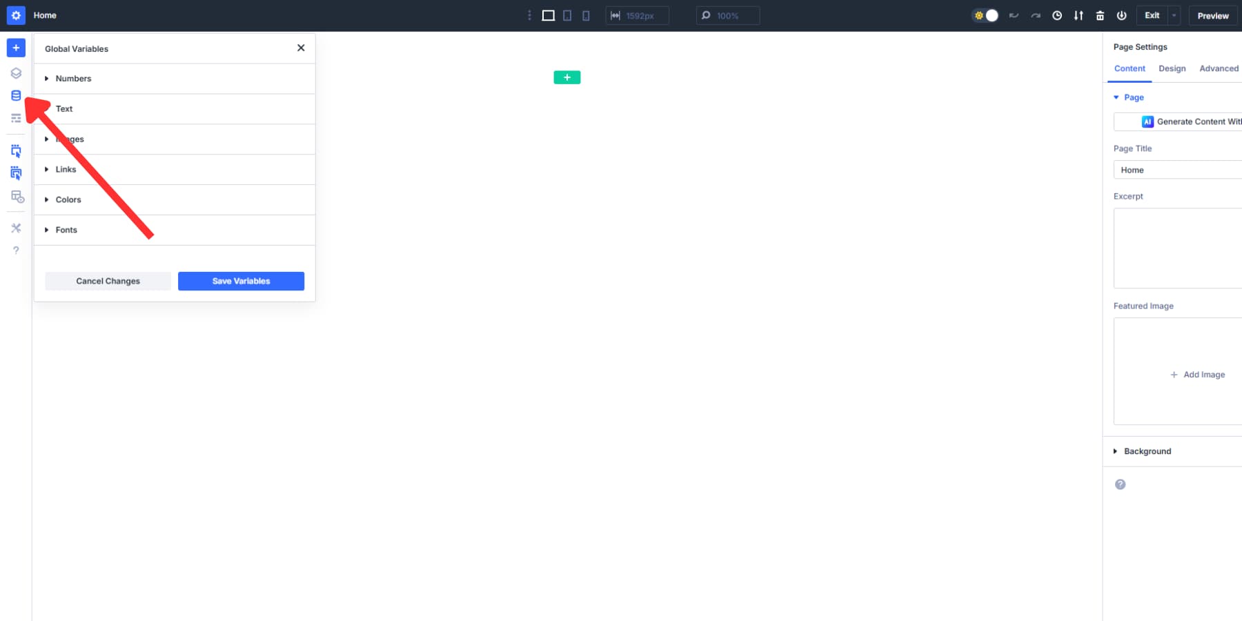
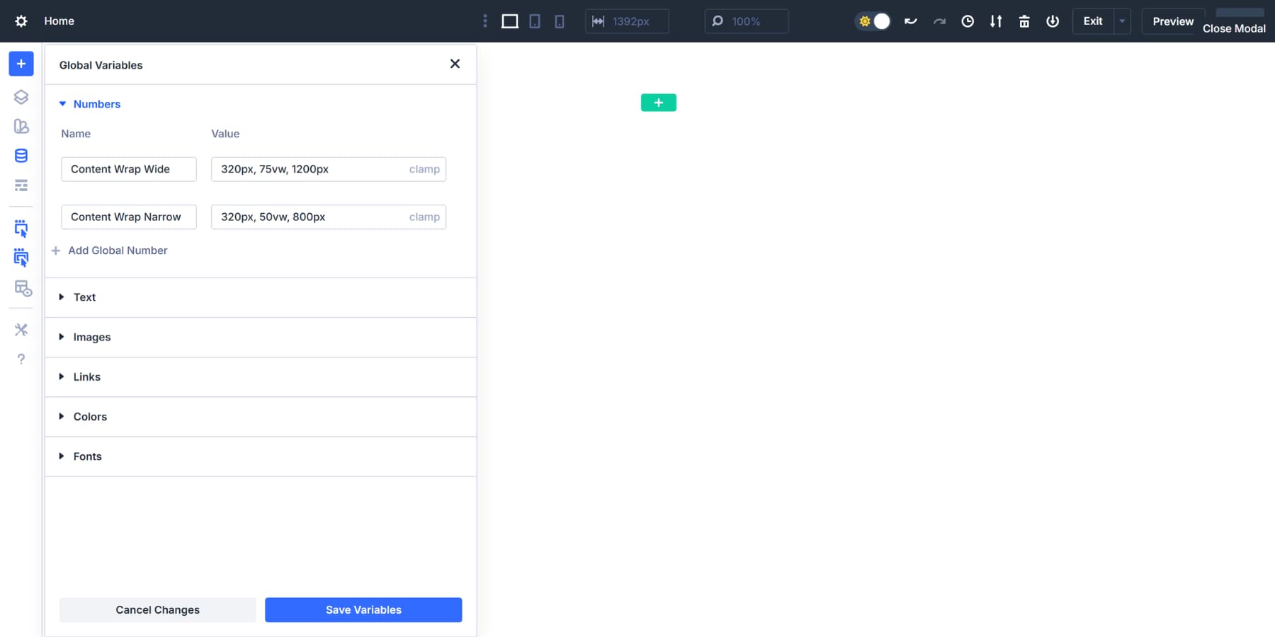
Click the Numbers tab. This tab stores all numeric values, including clamp() formulas for widths, spacing, and font sizes.
Create your first width variable:
- Click the plus icon to add a new number variable
- Name it Content Wrap Wide
- Type clamp(320px, 75vw, 1200px) into the value field
- The 320px handles mobile phones
- The 1200px caps desktop width for comfortable reading with images
- The 75vw comes from dividing 1200 by 1600, targeting typical desktop viewports
Create a second variable for text heavy content:
- Add another number variable
- Name it Content Wrap Narrow
- Type clamp(320px, 50vw, 800px) into the value field
- The 800px maximum keeps line length readable
- The 50vw comes from dividing 800 by 1600
You can skip this step and type clamp() formulas directly into width fields as you build, as Divi 5 supports Advanced Units. But storing them as number variables changes the workflow. Every width setting across the entire site gains instant access to those values. More importantly, updating a variable once propagates that change everywhere it appears.
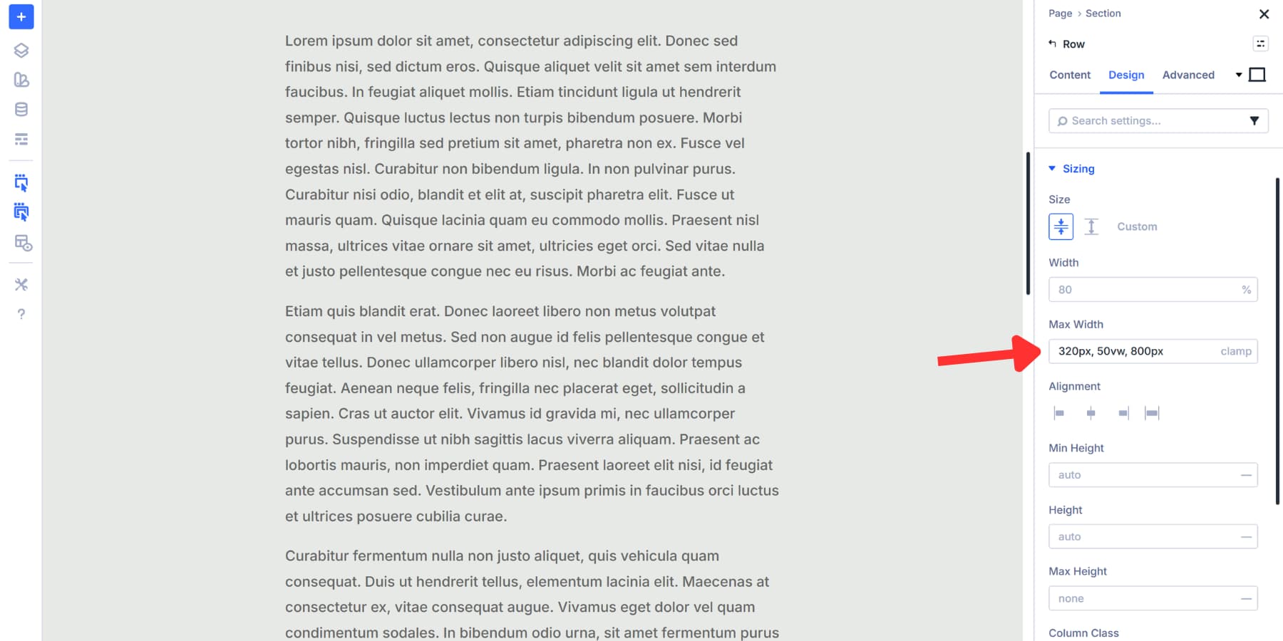
Applying clamp() To Row Max-Width
Rows wrap all your content, making them the perfect starting point for width control. When a row has a defined max width, everything inside it follows that boundary. Set it once at the row level, and your columns and modules inherit that container size automatically.
Click any row on your page to open its settings panel. Navigate to the Design tab, then find Sizing. The Max Width option appears near the top of this group.
Click the variable icon next to the field. A dropdown shows all your saved Design Variables. Select Content Wrap Wide for rows containing images, buttons, and mixed content. The 1200px maximum keeps these layouts balanced and readable.
Choose Content Wrap Narrow for text heavy sections like blog posts, descriptions, and articles. The 800px cap prevents long line lengths that strain the reader’s eyes.
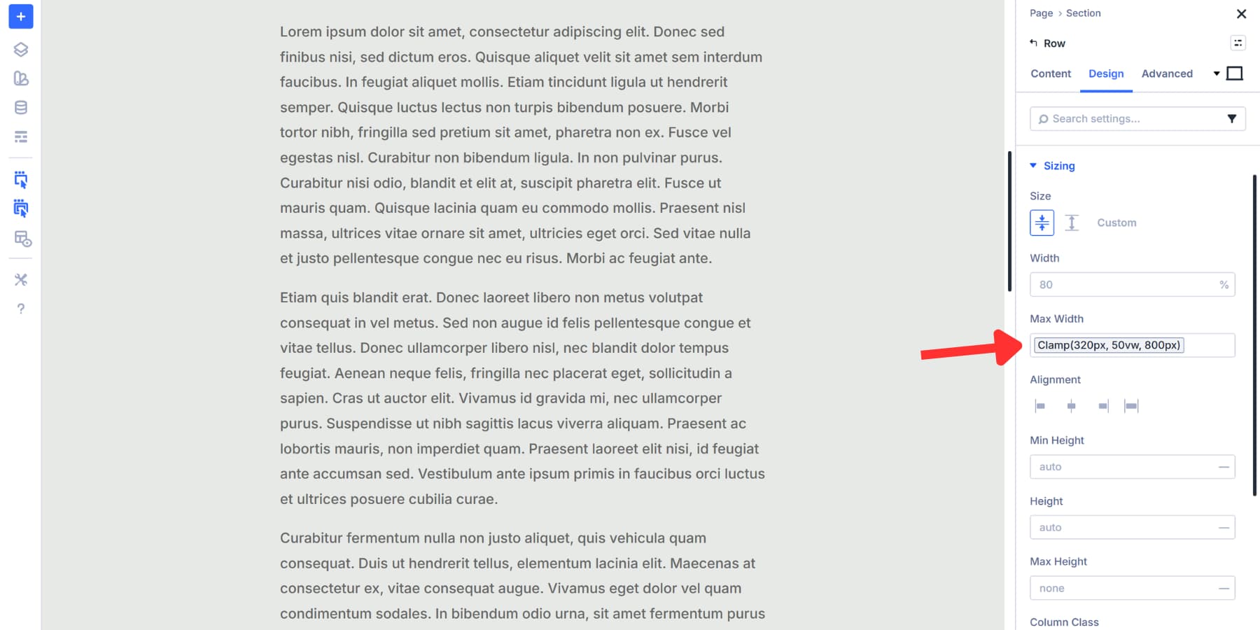
The row applies the new width immediately. The clamp() formula handles all viewport sizes automatically. Desktop displays the full width. Tablets scale proportionally. Phones hit the 320px minimum.
If you aren’t using Design Variables, you can directly input your clamp() values in this field.
Testing Out And Adjusting
Your clamp() values should work correctly from the start when you calculate them properly in the first step. Divi 5 includes seven customizable breakpoints for previewing your design across different screen widths.
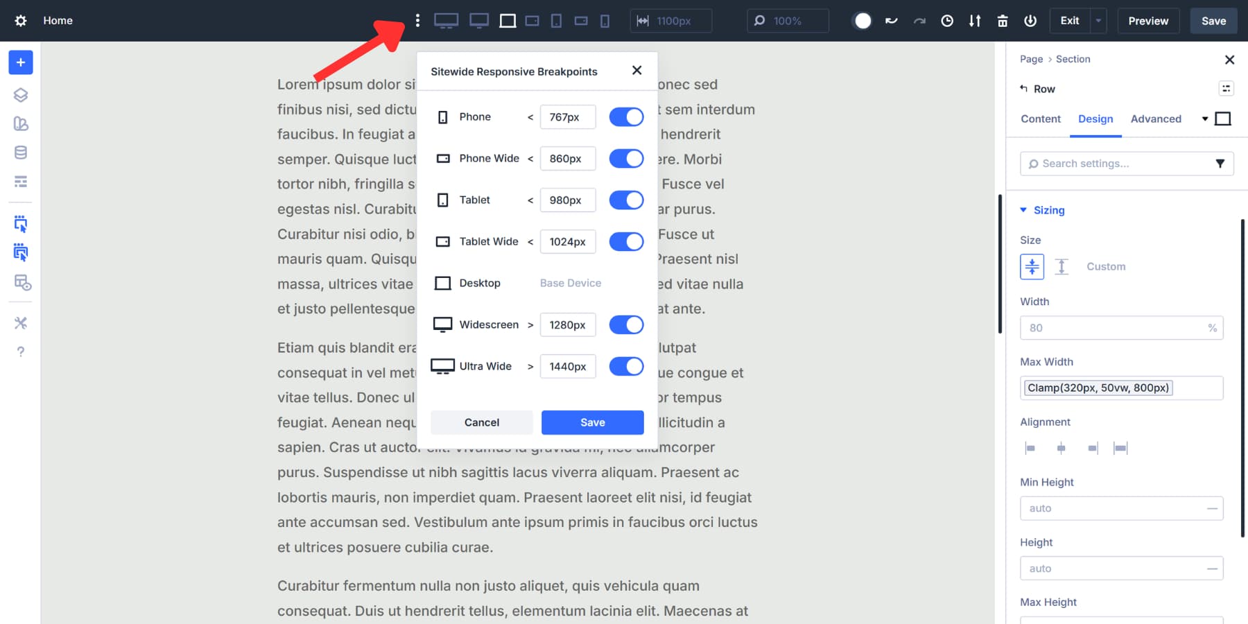
Click through each one in the Visual Builder to see how your content wrap scales at different breakpoints.
Alternatively, when you pull on the edge of the canvas, it resizes fluidly as it passes through each breakpoint.
The middle value in your clamp() formula handles the calculations automatically at each viewport. Every screen width between your minimum and maximum gets its own proportional size, eliminating the need for manual adjustments.
If something needs adjustment after previewing, adjust the Design Variable accordingly. Every section and row using it updates automatically. You edit one value, and the changes appear everywhere that value was applied.
Creating Element Presets
Element Presets in the Divi 5 bundle complete styling packages for sections, rows, columns, and modules. After setting up a section with the clamp() width variable, you can save all the settings applied to that section as a single reusable preset.
Open any row with your content wrap width applied. Click the preset icon in the top right corner of the row settings. Select New Preset From Current Styles. Name it something clear, like Hero Section Wide or Text Content Block. Save it.
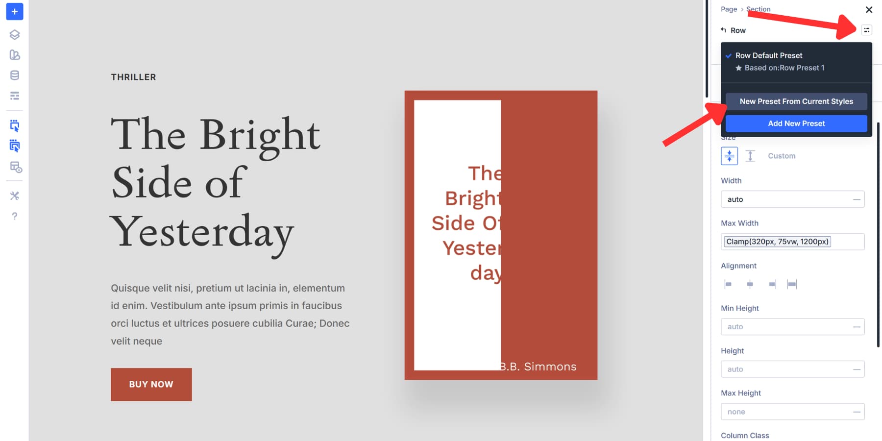
That preset appears in every row’s dropdown menu. When adding a new section anywhere on the site, click the preset dropdown and select your saved preset. The section adopts the width, padding, background, borders, and every other setting you included. The preset stores the reference to your Design Variable, not a fixed pixel value.
Change the Design Variable once, and every section using that preset updates automatically across the entire site. Change the value in the Design Variable, and all presets adapt accordingly.
This makes Divi 5 a solid web design tool with Design Variables, Presets, and Breakpoints working together, so you’re building a maintainable design framework instead of just placing elements on a page.
Try Out clamp() In Divi 5 Today!
Breakpoints worked when screens came in three sizes. Now they come in hundreds. Trying to catch every device with manual width is laborious and no longer makes sense.
clamp() handles the entire range automatically, allowing you to focus on the design itself. Divi 5 provides the infrastructure to implement this approach site-wide, without requiring you to code.
Every width setting you save now propagates instantly across dozens of sections. Your layouts work seamlessly on every device, eliminating the need for constant back-and-forth adjustments. Download Divi 5 and see how much faster building becomes when your containers handle themselves.


Excellent tutorial – thank you.