
WooCommerce category pages often look the same out of the box, but Divi 5 changes that. With the Loop Builder, you can redesign how products appear, using dynamic content that pulls product data like titles, featured images, and prices for every item in a category. Pair it with Divi 5’s CSS Grid, and you get full control over the layout.
In this tutorial, you’ll learn how to create a custom category page that automatically updates with products from the right category, no code or extra plugins required beyond WooCommerce.
How To Create A WooCommerce Category Page
If you’ve ever set up a WooCommerce store, you already know what the default category pages look like: products arranged in a basic grid with an image, name, price, and Add to Cart button, all following the same template no matter which category you’re viewing.
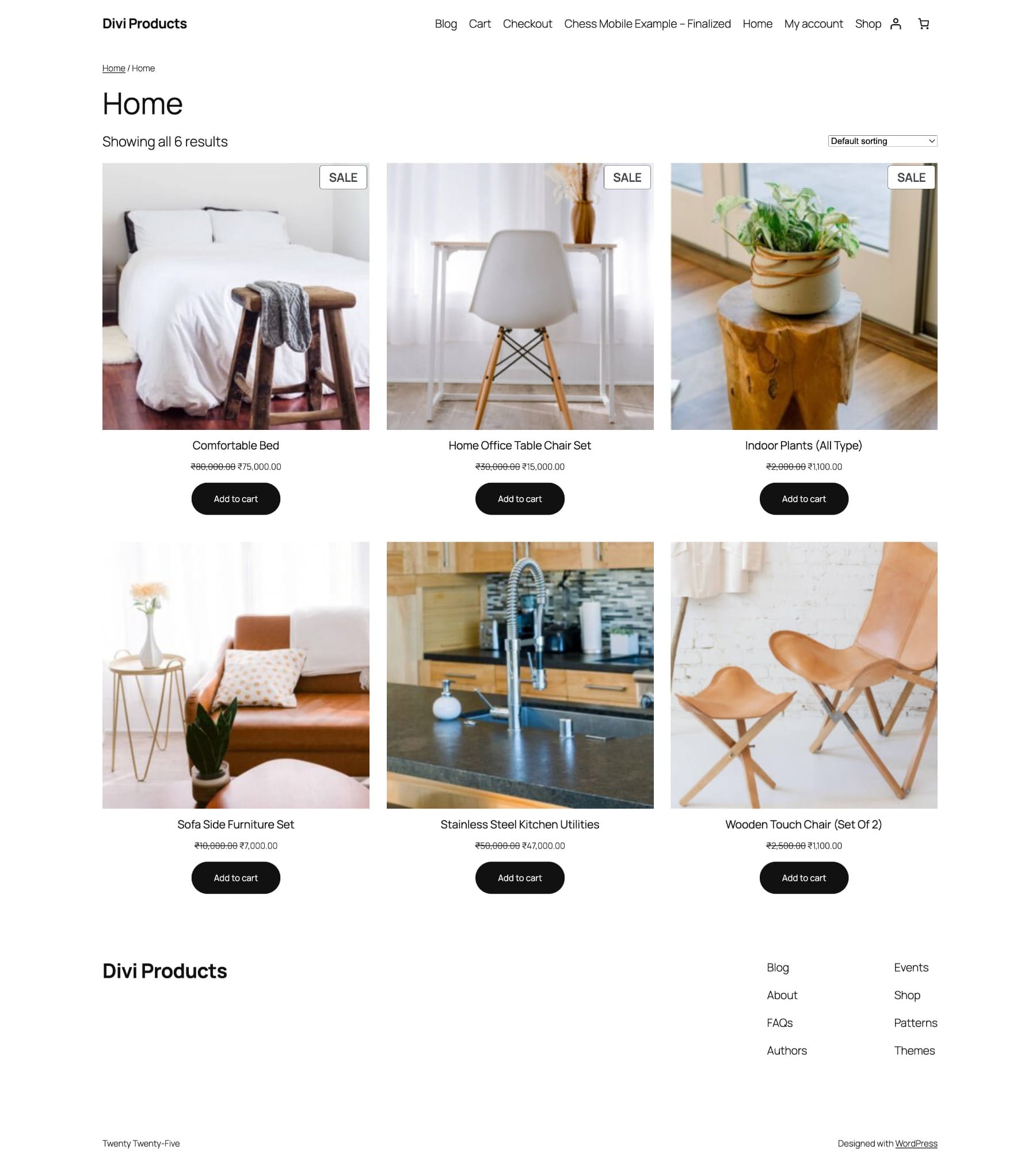
Switch themes, and the structure barely changes. Your “New Arrivals” category looks identical to your “Sale” category, which looks identical to “Accessories,” even though each category serves a completely different purpose in your store.
It’s functional enough to get a store running, but it doesn’t give you the design flexibility you need for a branded shopping experience. You might want your New Arrivals category to feel editorial, with large product images and generous white space, while your Sale page prioritizes discounts with a tighter layout that puts pricing front and center.
These creative decisions usually require custom code or a developer who can modify your theme files, turning what should be a design task into a technical project. Divi 5 includes two features that work together to help you to design category pages visually: the Loop Builder and CSS Grid.
Use CSS Grid To Control The Layout
CSS Grid gives you control over how products are arranged on the page. You define the number of columns in your layout, the spacing between rows and columns, and how the structure adapts across different devices.
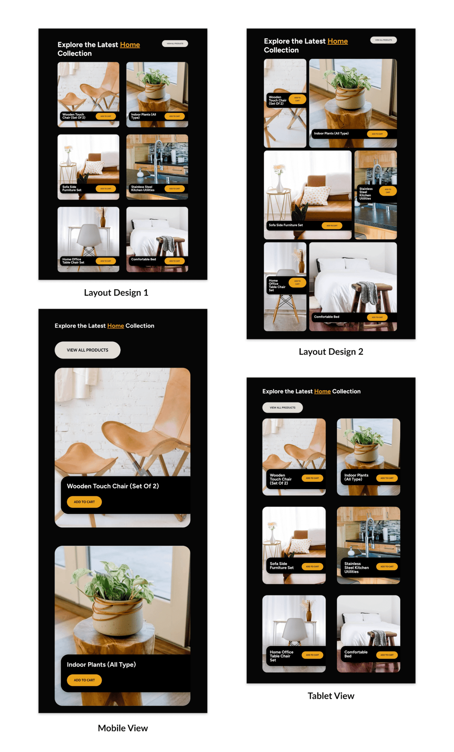
You might set up four columns on a desktop for a browsable grid view, drop that to two on tablets where screen space is tight, and go to a single column on mobile for easy thumb scrolling. All of this gets configured in one place rather than writing separate layouts for each device.
Adjust the gaps between items to create an airy feel, or tighten them up for a compact, catalog-style presentation. You can even offset certain product cards using Grid Offset Rules to create magazine-style staggered layouts that break up the monotony of a perfect grid.
Grid handles the spacing, rhythm, and responsive behavior, so you can build everything from minimal editorial layouts to dense sales pages that pack in products while maintaining visual hierarchy.
Learn Everything About Divi 5’s Grid System
Use The Loop Builder To Build Custom Category Pages
The Loop Builder populates your CSS Grid layout with actual product content and makes it work across different categories. It acts as a template engine. You design one product card layout (the image, name, price, and button arrangement), and Divi automatically repeats that design for every product in the category the visitor is viewing.
When someone lands on your Shoes category, the Loop Builder pulls in all the shoe products and displays them using your card design. When they switch to Accessories, it does the same with accessory products, without you building separate layouts for each category.
This transforms your Grid layout into a dynamic system. You’re not manually placing individual product boxes into your structure; you’re creating a template that responds to your store’s live inventory and updates automatically whenever products are added, removed, or modified.
Learn Everything About Divi 5’s Loop Builder
Build Your Dynamic Category Page (Step By Step)
We’ll build a WooCommerce category layout that looks like this: a modern grid of products under a bold title, with each item styled as an individual card featuring rounded corners, clean typography, and bold CTA buttons.
In the steps ahead, you’ll design a single loop layout for your product card, wrap it in a responsive grid, and assign it to your WooCommerce category template so it automatically populates for every category.
1. Set Up Your WooCommerce Category Template
Start by creating a dedicated template for your WooCommerce category pages. From your WordPress dashboard, go to the Divi > Theme Builder and click Add New Template.
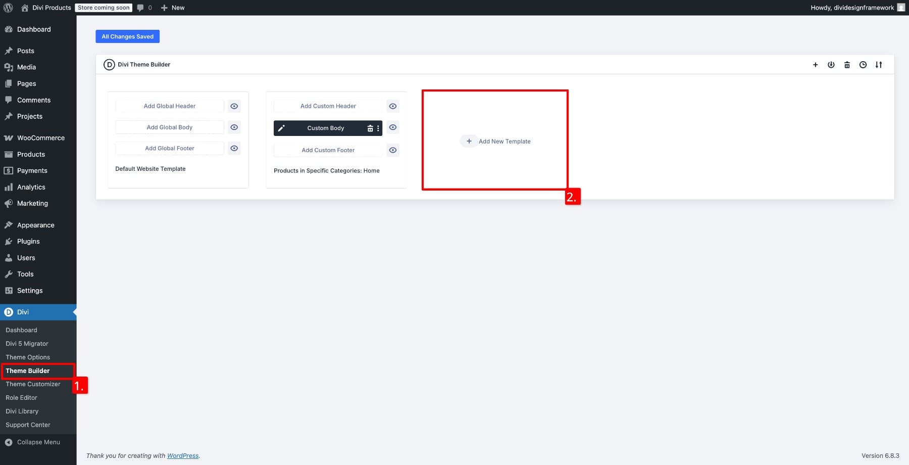
Choose Build New Template.
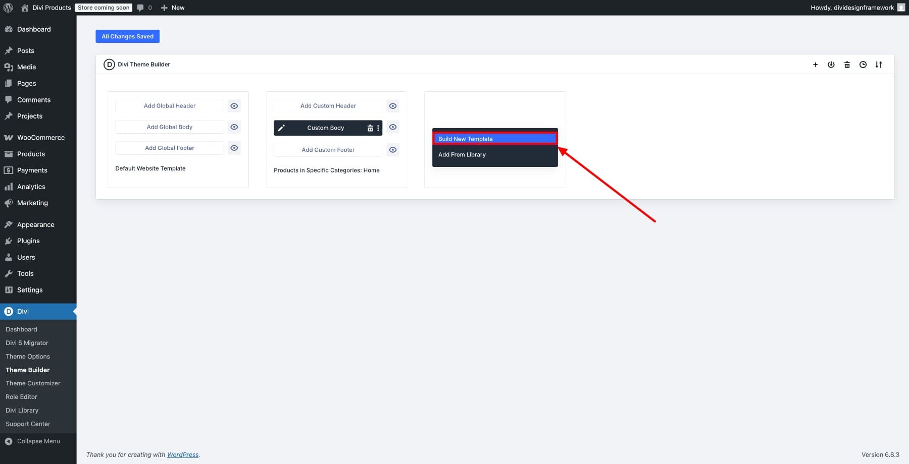
Select Products in Specific Categories and choose the category you want to display your layout in (these are your WooCommerce product categories).
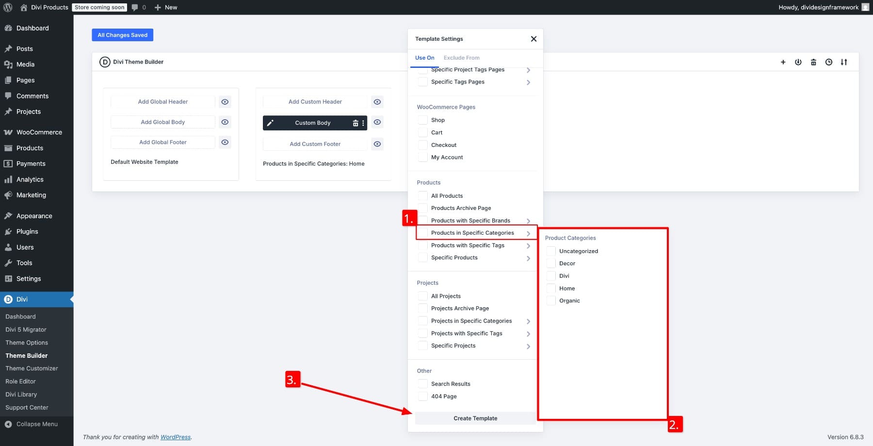
Once the template appears in the builder, click Add Custom Body and select Build Custom Body.
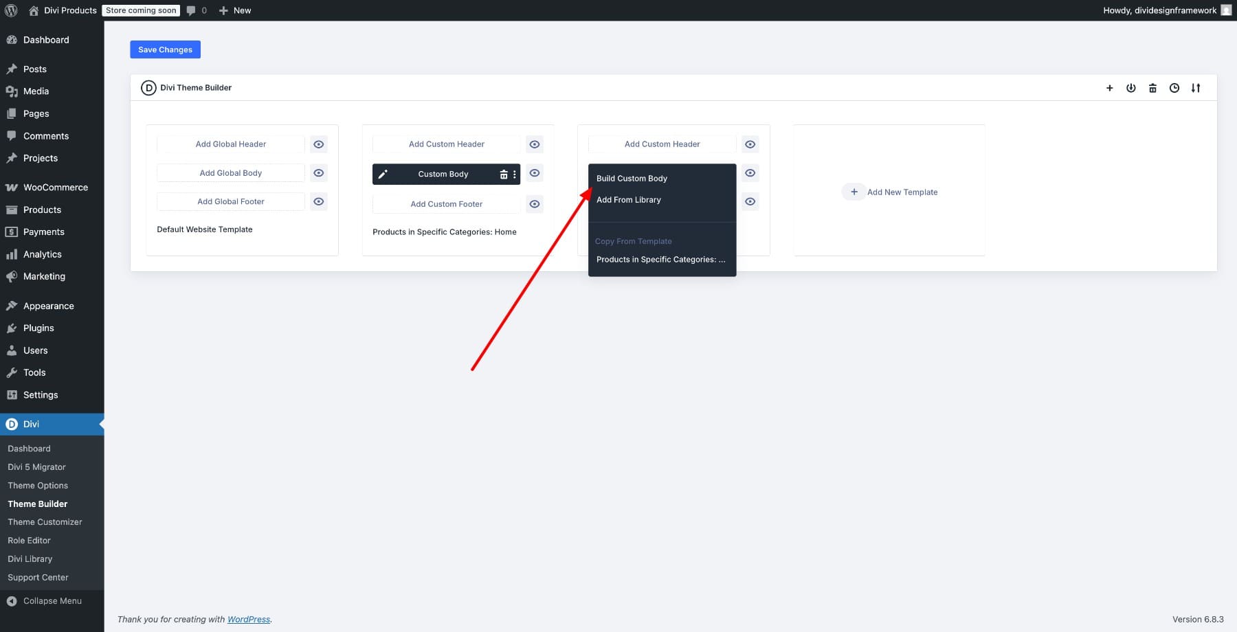
This opens the Visual Builder, where you’ll design the layout.
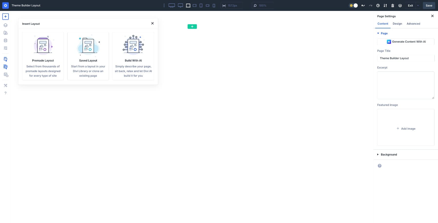
2. Add A Grid Structure For Your Products
The template starts blank. Let’s import a pre-designed category page layout to speed up the process. Search for Product and choose from various product templates:
Add a new 2-column Multi-Row.
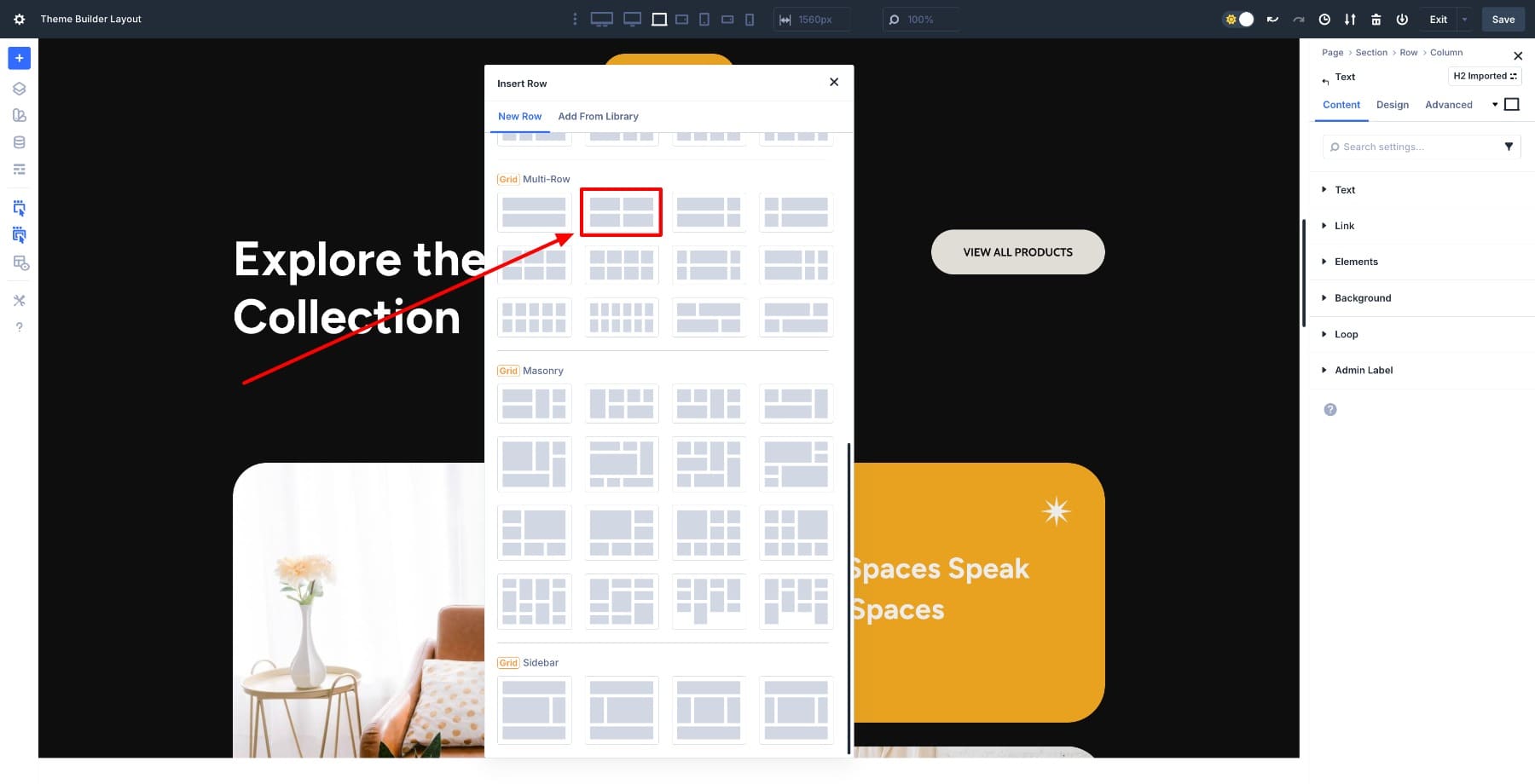
Define the number of columns you want on desktop. You can also change the structure template to try other layouts.
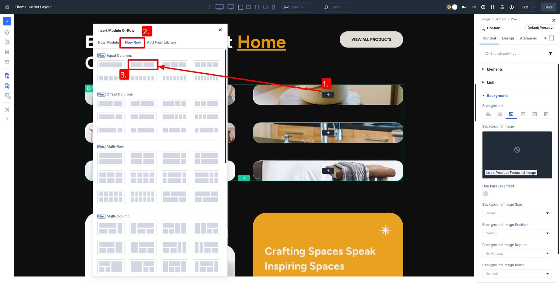
3. Turn The Grid Into A Dynamic Product Loop
Now that the grid structure is in place, turn this layout into a dynamic product listing. Delete the extra columns and leave a single column. This column becomes your product card template from which the other cards inherit their designs.
Select the Column inside your Grid and open its settings. In the Content tab, go to Loop and enable the toggle. Choose Products as the Post Type, then pick your product category under Only Include Posts With Specific Terms.
This tells Divi to repeat the content of this column for every product returned by your loop query.

At this point, the loop is active, but nothing appears yet because the column remains empty. In the next step, you’ll design the product card (the template that repeats for every item in the category).
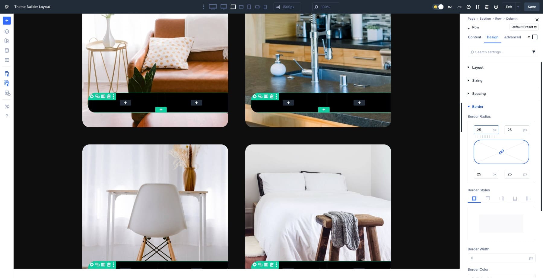
4. Style The Product Card Template
Begin by adding a 25px Border Radius to the column.
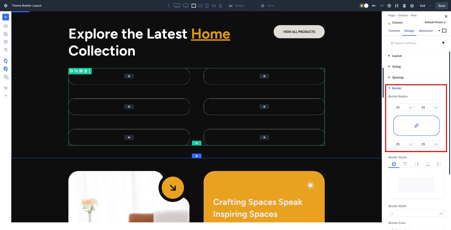
All the other items in the loop update automatically. You design once, and all style modifications apply to others automatically.
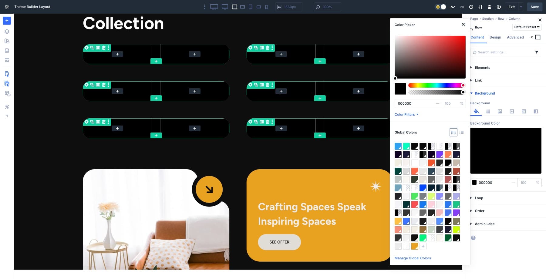
Add Product Featured Image
Next, loop the product image in the background to give our card structure. Go to Content > Background > Image and hover over and click on the Dynamic Content option. Click and choose Loop Product Featured Image.
Only the images of products from the Home category will populate. Now, add a 2-column Row inside the column.
Add a black background color to highlight the row.
Add 80% top and 10% bottom Margin and 20px left and right Padding. These spacing values ensure the product image remains clearly visible within the rounded card and prevents it from touching the edges, especially on darker backgrounds.
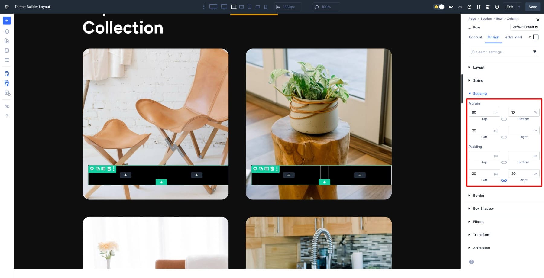
Add 25px Border Radius to the Row to give it a consistent appearance.
Add Product Title
Next, add a Heading module in the first column inside the inserted row and loop the product’s title in it. First, customize the Heading module. We also added 12px top and bottom Padding.
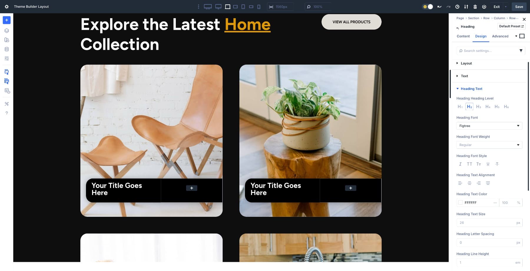
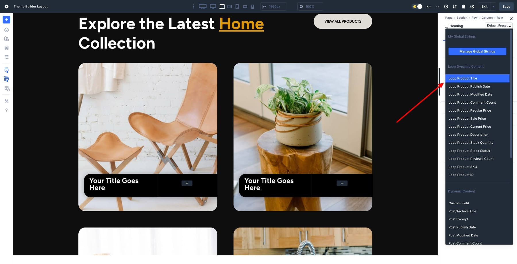
Loop the Product title. Go to Content > Text and hover over the Heading field. Click on the Dynamic Content icon and select Loop Product Title.
The relevant product titles within respective fields populate automatically.

(Divi also lets you loop more than just the title. You can pull in dynamic fields like price, sale price, stock status, ratings, short description/description, custom fields, and more. This lets you create detailed product cards that automatically update whenever the product data in WooCommerce changes. You can loop more fields; for our layout, we’ll keep it simple.)
Add An Add To Cart Button
Add a Button module in the right column and style it to match the design.
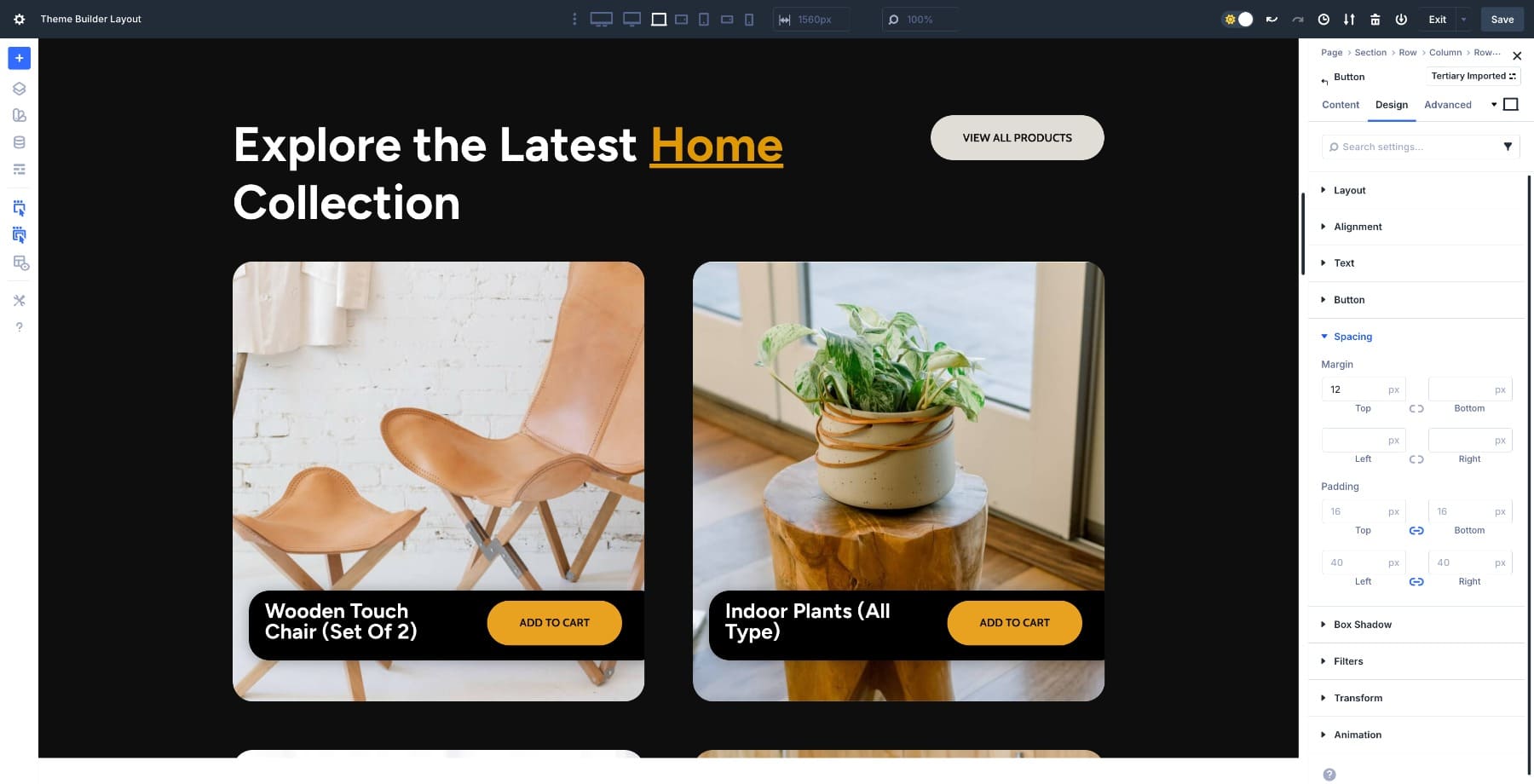
To make it dynamic, open Content > Link, click the Dynamic Content icon, and choose Loop Product URL. This connects the button directly to each product in the loop. We also looped the product link to the Heading module.
Now, every card includes a button that links to the product page, eliminating the need for manual updates when your products change.
5. Customize The Grid Structure
The category page is ready. To add a bit of style to how your cards appear on screen, switch to any other pre-designed Grid row structure.
Or use the Grid Offset editor to add a custom rule. Go to Design > Layout > Add Offset Rule. Here, we added a Column Span rule targeting every third item in the grid.
If you want to design your own Grid structure, watch this video:
Subscribe To Our YouTube Channel
6. Test Responsiveness And Publish
Make sure your product cards look good on desktop, tablet, and mobile. Grid settings are responsive, so check that the spacing, text size, and buttons feel natural on smaller screens.
If everything looks right, return to the Theme Builder and click Save. Exit, and confirm you see All Changes Saved before leaving the builder.
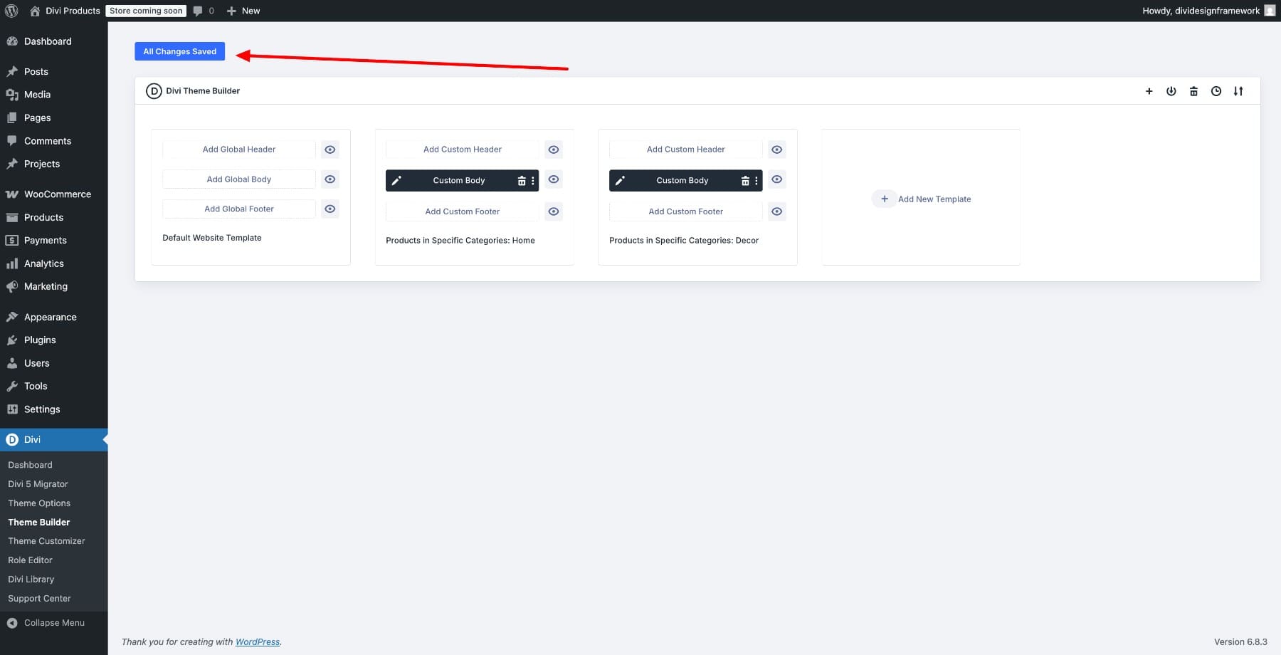
Your custom category page is now live, and WooCommerce will automatically populate it with products from the category you assigned. Whenever inventory changes, the layout updates on its own.
Try The Loop Builder In Divi 5 Today
A default WooCommerce category page is functional, but it rarely feels custom. By combining Divi 5‘s Loop Builder with CSS Grid, you’ve created a layout that looks custom, works on every device, and updates itself as inventory changes. The product card, spacing, and button styling are yours, but the content stays dynamic.
From here, duplicate the layout for other categories, adjust the grid presets for different aesthetics, or add more dynamic fields like sale price, ratings, or stock badges.


Are you sure this is the right video at the begining of th article ?
The loop builder is great but my understanding is rather than selecting a specific category to filter, you should be able to use the ‘Posts for current page’ option on post type, but this seems to break the layout for me on the front end 🙁
Indeed, I just found that out the hard way. Why doesn’t the loop include the current product category option like the posts type does?