
Divi 5 improves color management for WordPress websites by introducing a variable-based color system designed for modern, scalable workflows. At its core is a redesigned Color Picker integrated with Design Variables, leveraging HSL (Hue, Saturation, and Lightness) and Relative Colors to create dynamic, interconnected palettes that update seamlessly across your entire site.
In this post, you’ll learn how to build, manage, and optimize scalable color systems in Divi 5. From understanding HSL basics and setting up global variables to creating nested relative colors and following best practices, we’ll guide you step-by-step to mastering this new feature and elevating your designs to a professional level.
Let’s get started.
Understanding The Basics: HSL Color Model
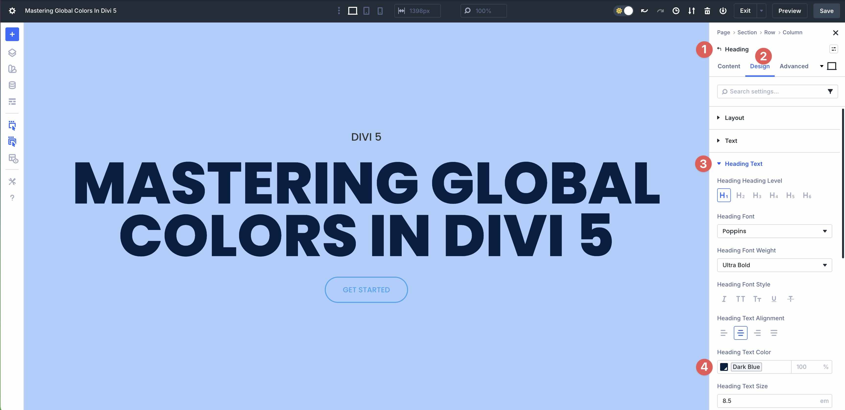
Before diving into Divi 5’s Global Colors and Relative Colors features, it’s important to understand the HSL color model, which forms the backbone of this dynamic system. HSL provides an intuitive way to define and manipulate colors, making it perfect for scalable, harmonious palettes.
Subscribe To Our Youtube Channel
What Is HSL?
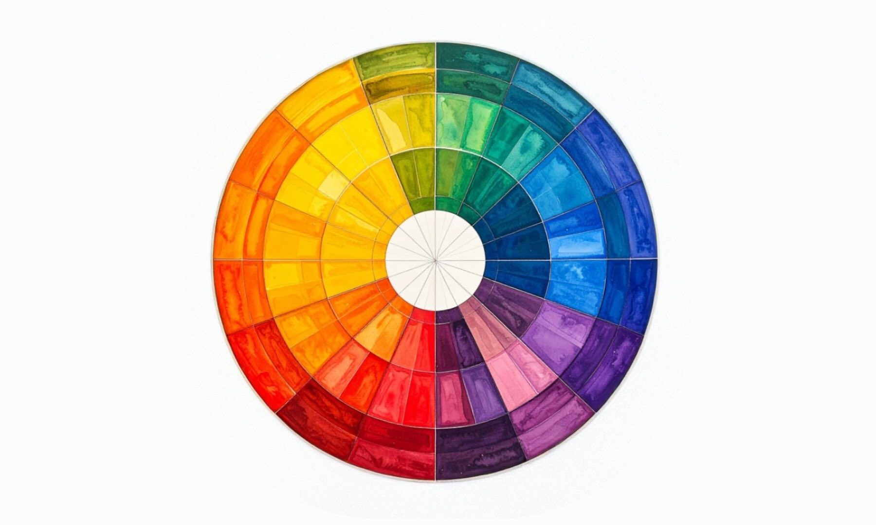
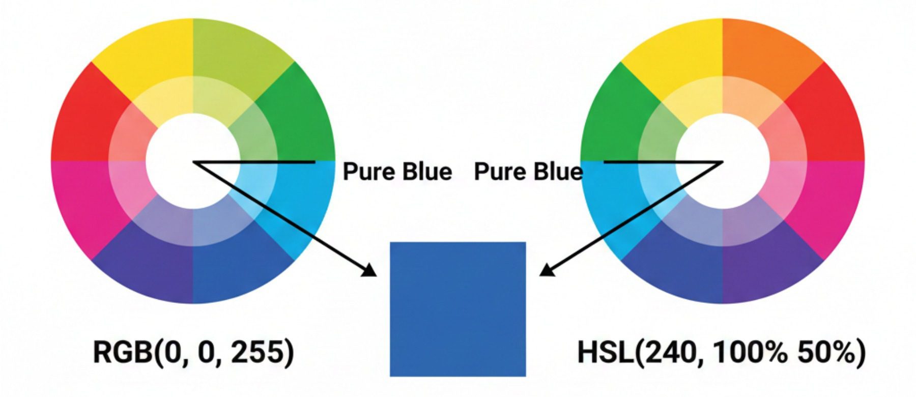
HSL stands for Hue, Saturation, and Lightness. It’s a cylindrical color model that represents color more closely to how people tend to think about color adjustments.
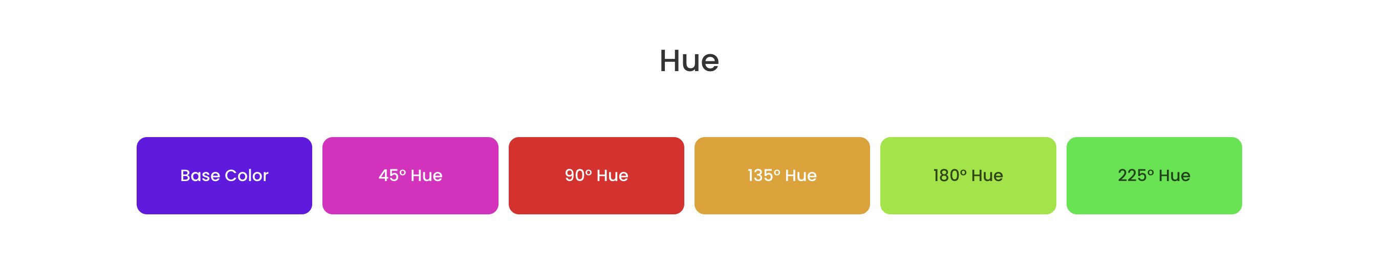
Hue: This is the base color itself, measured in degrees on a color wheel from 0° to 360°. For example, 0° (or 360°) is red, 120° is green, and 240° is blue. Shifting Hue lets you easily create complementary or analogous colors — add or subtract 180° for a direct opposite.
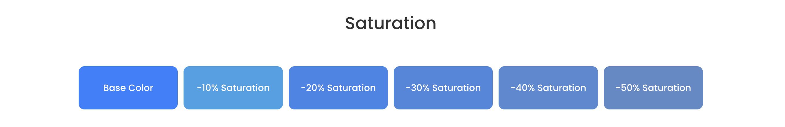
Saturation: A percentage from 0% to 100% that controls the color’s intensity or vividness. At 100%, the color is fully saturated and vibrant. At 0%, it’s completely desaturated, resulting in a grayscale effect.
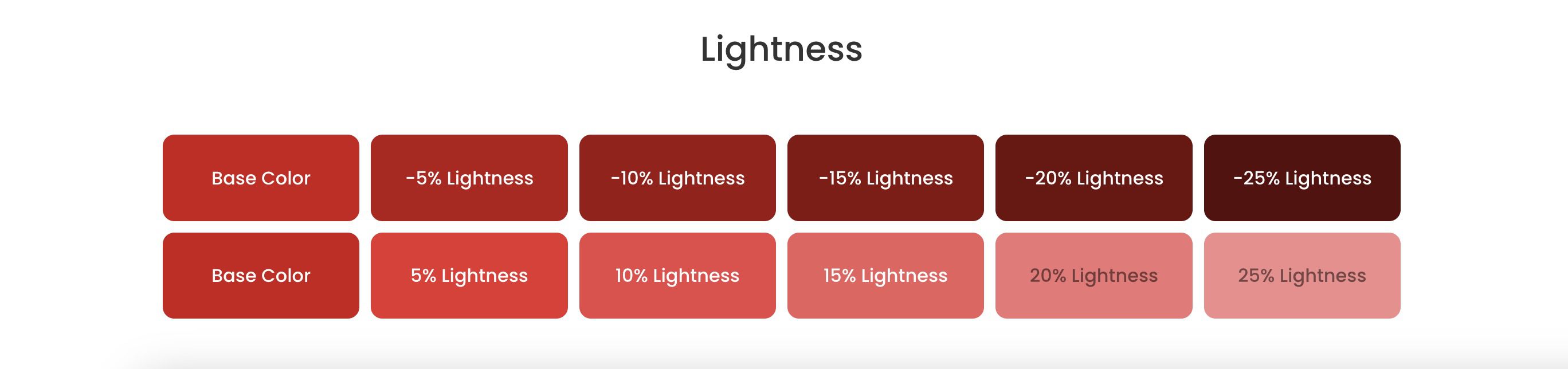
Lightness: Also a percentage from 0% to 100%. It determines how bright or dark the color appears. 0% is pure black, 100% is pure white, and 50% shows the Hue at its fullest strength without any black or white overlay.
Together, these components allow precise control. For instance, HSL (240, 100%, 50%) is a pure blue.
Why HSL Over HEX Or RGB?
Traditional color formats, such as HEX and RGB, are absolute and precise but not intuitive for design work. They treat colors as fixed values, requiring manual calculations or external tools to derive variations. Adjusting a HEX or RGB value to create a darker shade might involve trial-and-error math. Finding complementary colors or ensuring accessibility often means converting to another model anyway.
HSL shines for relative adjustments:
- Shades and Tints: Simply adjust lightness while keeping Hue and saturation constant.
- Complements and Accents: Shift hue by fixed degrees.
- Muted Tones: Reduce saturation for subtle variations.
- Accessibility: Easily tweak lightness or saturation to meet contrast ratios without breaking harmony.
This makes HSL ideal for building professional, scalable palettes where everything relates back to base colors.
How Divi 5 Leverages HSL For Precise, Relative Modifications
Divi 5 expands the color workflow with HSL support and Color Filters, making it easier to create relative, connected color variations (while still supporting hex and RGB input). It transforms colors into a smart, mathematically consistent setup where everything is connected, rather than individual colors. You use one base Global Color and create color variables, such as a button hover color that’s 20% darker or a background color that’s 30% less saturated, simply by using Color Filter sliders.
Because variations stay tied to the base color, adjusting the base later can automatically update related shades and tints wherever they’re used.
Global Colors In Divi 5: The Foundation
Global Colors in Divi 5 are the bedrock of the advanced color system. The latest version is fully integrated with Design Variables, a centralized hub for managing reusable values such as colors, fonts, numbers, text, images, and links. This elevates Global Colors from a standalone palette to part of a comprehensive, dynamic design system.
Differences From Divi 4 Global Colors
In Divi 4, Global Colors were a powerful but isolated feature: a set of fixed hex values you could apply site-wide, with updates propagating automatically. However, they were limited to static colors, and creating variations required manually defining separate colors with no parent-child relationships to keep them in sync.
Divi 5 reimagines this by embedding colors directly into Design Variables:
- Colors are now variables that can be base or relative (derived via HSL adjustments).
- The old Global tab evolved into a Dynamic Variable icon that connects directly to Divi’s variable system.
- Relative Colors allow nested relationships, where changing a base color cascades updates to all derivatives.
- The system encourages scalable palettes, making it easier to build professional, maintainable design systems.
This integration makes Divi 5’s colors more flexible, relational, and future-proof.
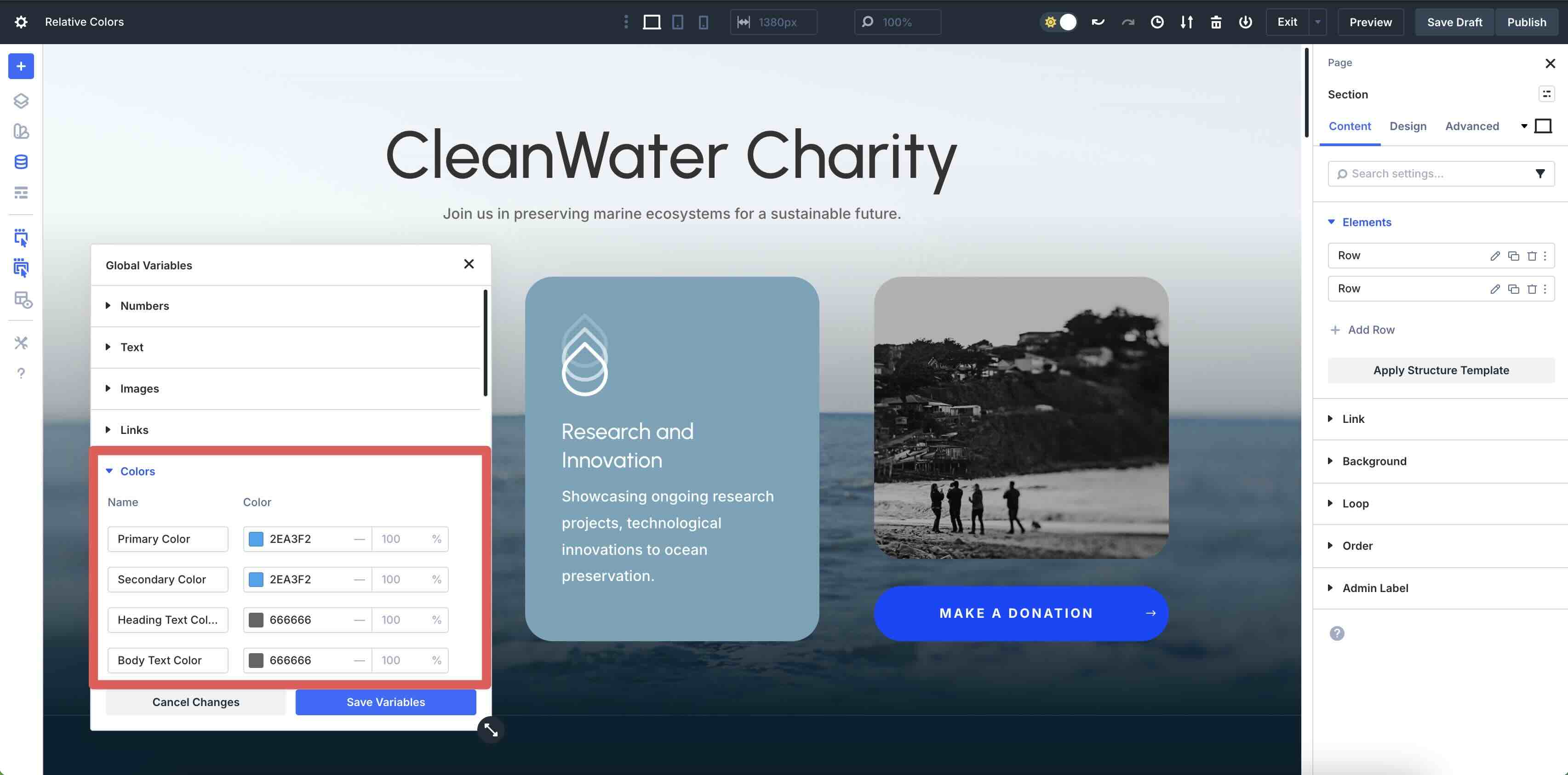
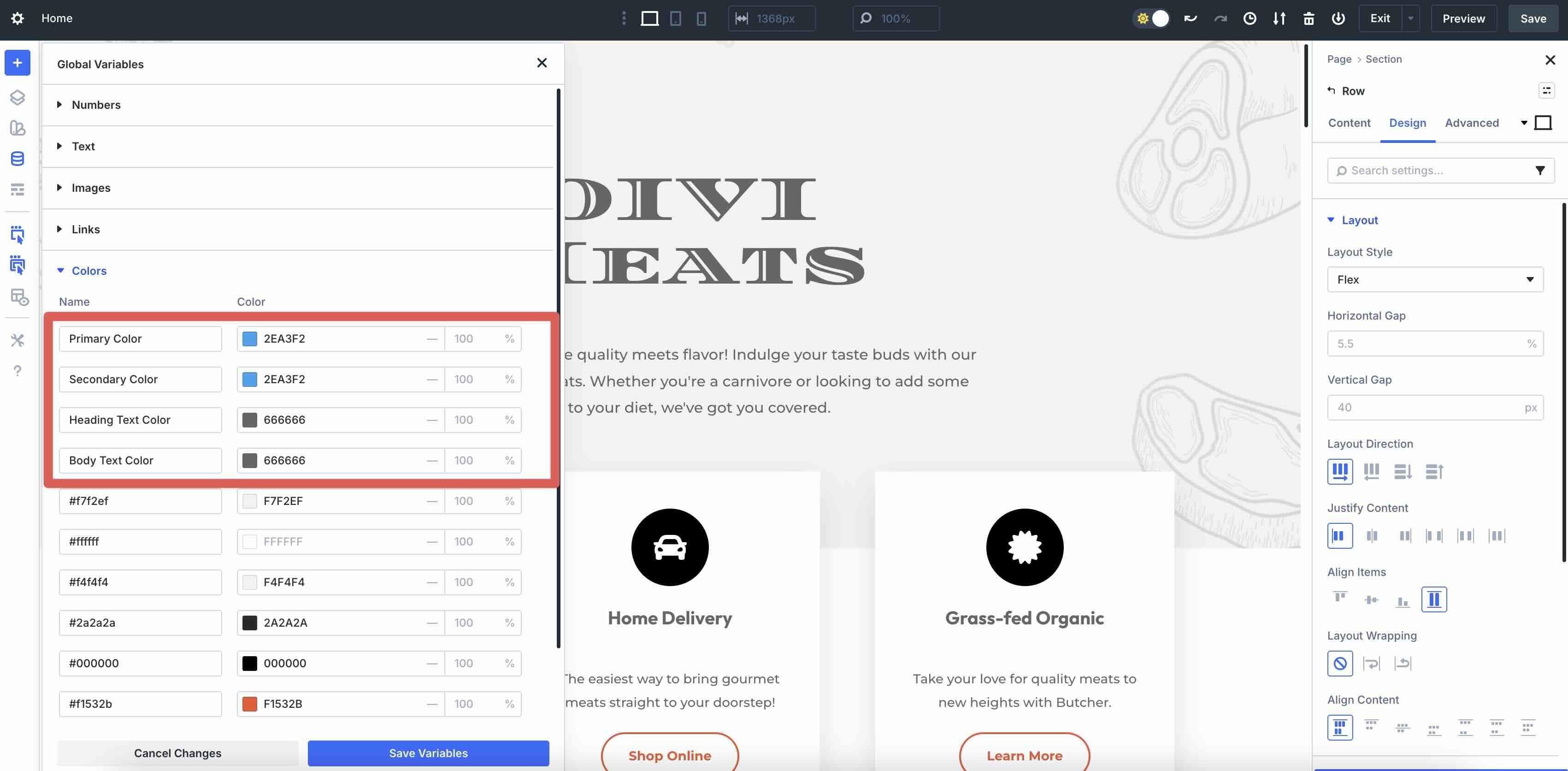
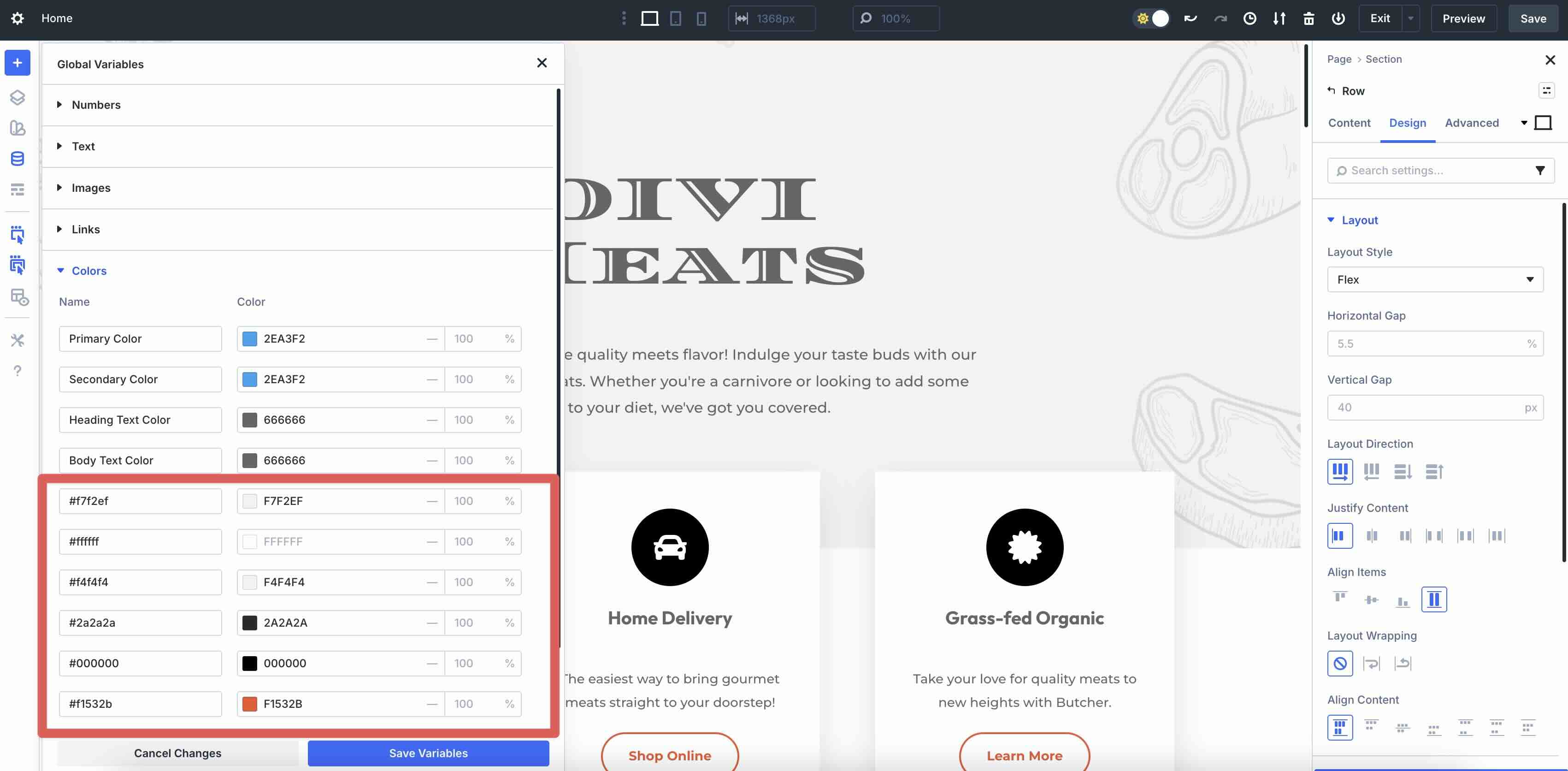
Accessing The Design Variable Manager
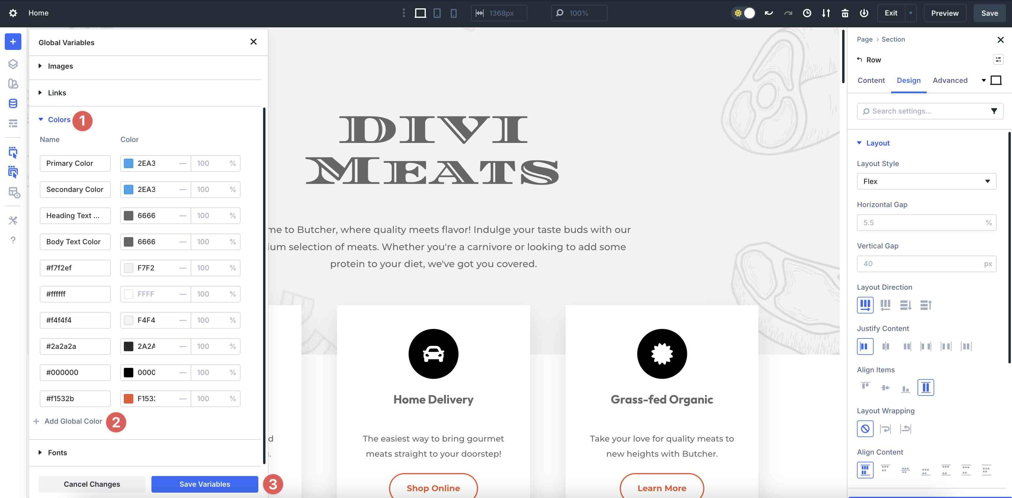
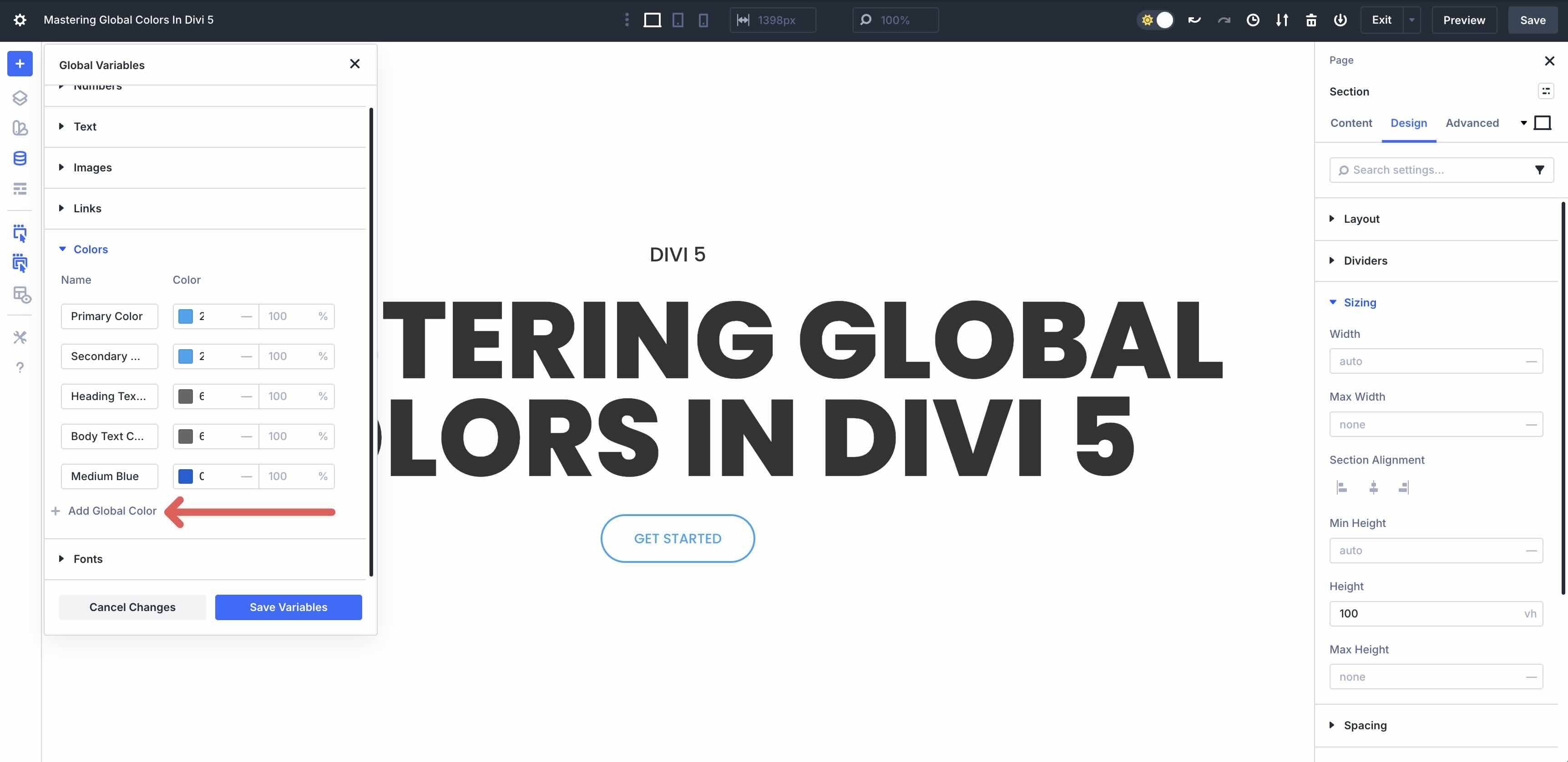
To manage Global Colors, click on the Variable Manager icon in the Visual Builder.
![]()
Navigate to the Colors tab and expand it. Here, you can view, edit, or add a new color by clicking the + Add Global Color button. To save the colors, click the Save Variables button.
Default Global Colors
Divi 5 starts you off with four default Global Colors:
- Primary Color: Typically, your main brand color is perfect for buttons, links, and accents.
- Secondary Color: A complementary or supporting brand color.
- Heading Text Color: Default for headings (H1-H6).
- Body Text Color: Default for paragraph and body text.
If you import a Layout Pack or generate a Starter Site, Divi adds the associated colors to the Variable Manager for you.
These colors provide an immediate foundation, and the defaults give you a solid starting point. You can apply them consistently across modules for a cohesive look.
Site-Wide Application And Dynamic Updates
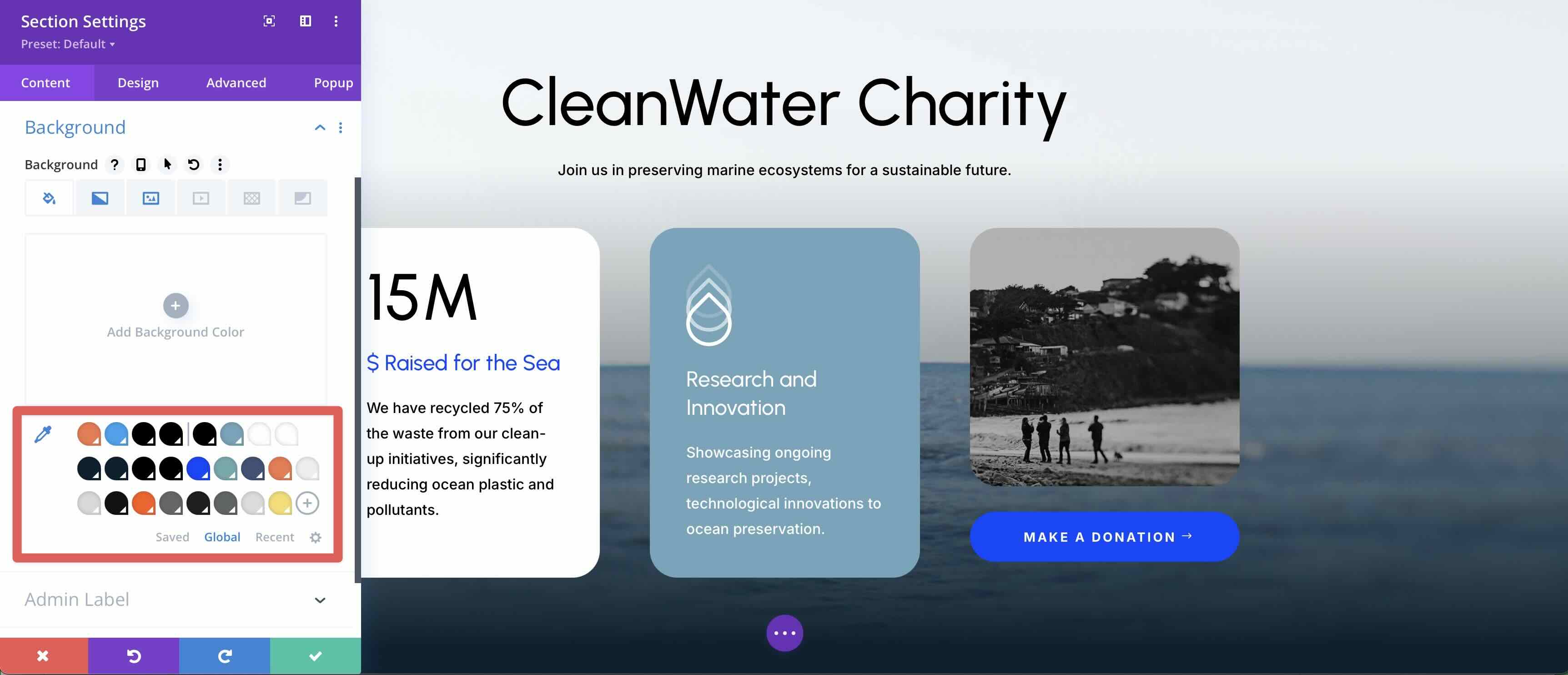
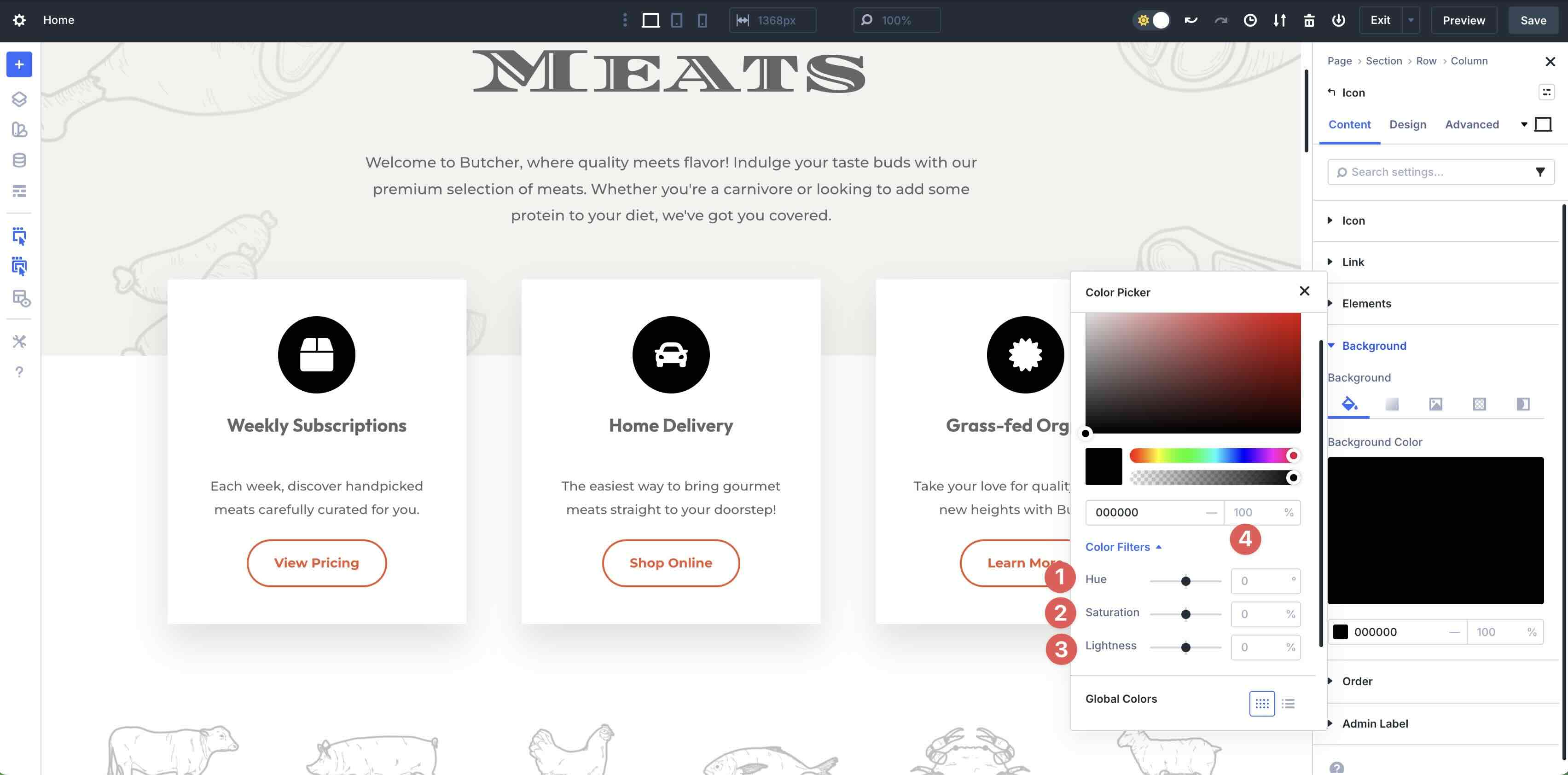
Once defined, Global Colors are applied effortlessly. For example, if you want to update an Icon Module’s color in your layout, click on the Module, go to the Design tab, and expand the Icon menu. Click the color swatch in the Icon Color field.
![]()
This will launch the Color Picker modal, where you can choose one of your established Global Colors.
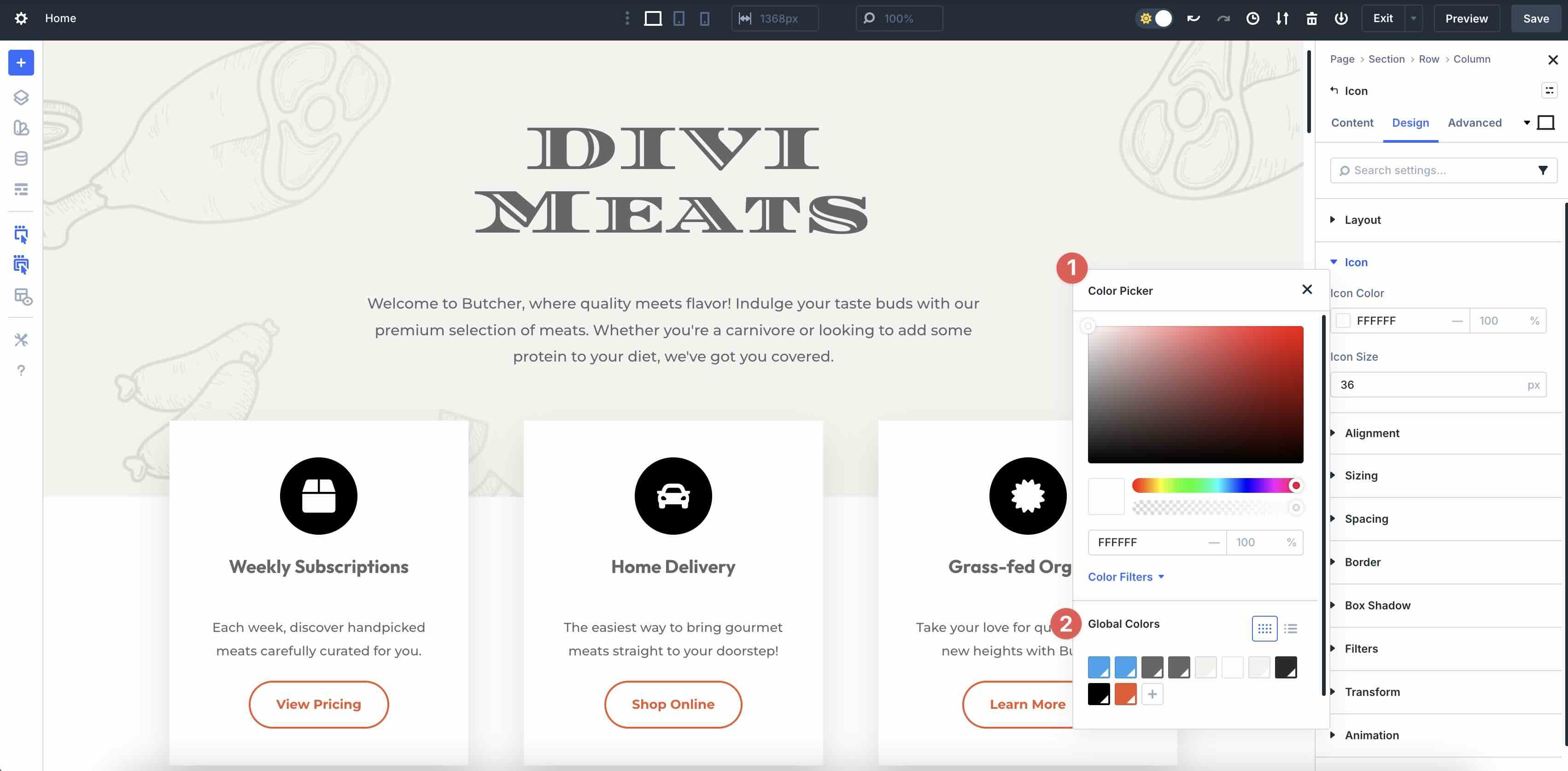
Once a Global Color is defined, you can easily change it in the Variable Manager. As you update the color, every instance is updated instantly. This enables site-wide updates, allowing for branding changes to be made with just a few clicks.
Introducing Relative Colors
Relative Colors are one of the best new features in Divi 5. They enable you to create color variants tied to a parent (base) Global Color, ensuring perfect harmony and effortless updates across your site.
What Are Relative Colors?
A Relative Color is a new Global Color variable that starts from an existing parent Global Color and applies modifications to derive a variant, such as a lighter tint, darker shade, or semi-transparent overlay. Instead of defining a completely independent fixed color, you build on a base, preserving a live relationship. This turns your palette into a true, interconnected system, where variants are always relative to their parent.
How Relative Colors Work
First, you create a child color based on a parent. For example, you can make a light variation derived from a Global Color by increasing the lightness.
When you edit the base color, every nested and chained relative update automatically propagates changes down the entire chain. This maintains mathematical consistency without requiring manual fixes, thereby saving design time and revisions.
Integration With HSL Filters
Relative Colors are powered by HSL filters in the redesigned Color Picker:
- Hue: Adjusts in degrees, with negative values supported. Add or subtract for accents or complements.
- Saturation: Percentage adjustment (0-100%). Reduce this for muted/grayscale tones.
- Lightness: Also a percentage adjustment. Increase for tints, decrease for shades.
- Opacity: Control transparency. Ideal for overlays, shadows, or hover effects.
These sliders allow precise color modifications directly on the base color. The result can be saved as a new relative variable, preserving the filter adjustments so the relationship stays dynamic.
Creating And Managing Relative Colors
Creating Relative Colors in Divi 5 is straightforward. Let’s walk through the process together. I’ve already touched on creating Global Colors, so we’ll focus on Relative Colors in this section.
Create Color Variables Adjusting The Lightness Filter
In Divi 5, the Lightness slider acts as a primary tool for creating depth. By setting a global color as your base, you can generate tints by moving the slider to a positive percentage (adding white) or shades by moving it to a negative percentage (adding black). This approach is often more consistent than manual color picking because it ensures that the DNA of your base color remains intact.
We’ll demonstrate how to create shades and tints using the Variable Manager and Divi 5’s Color Filters.
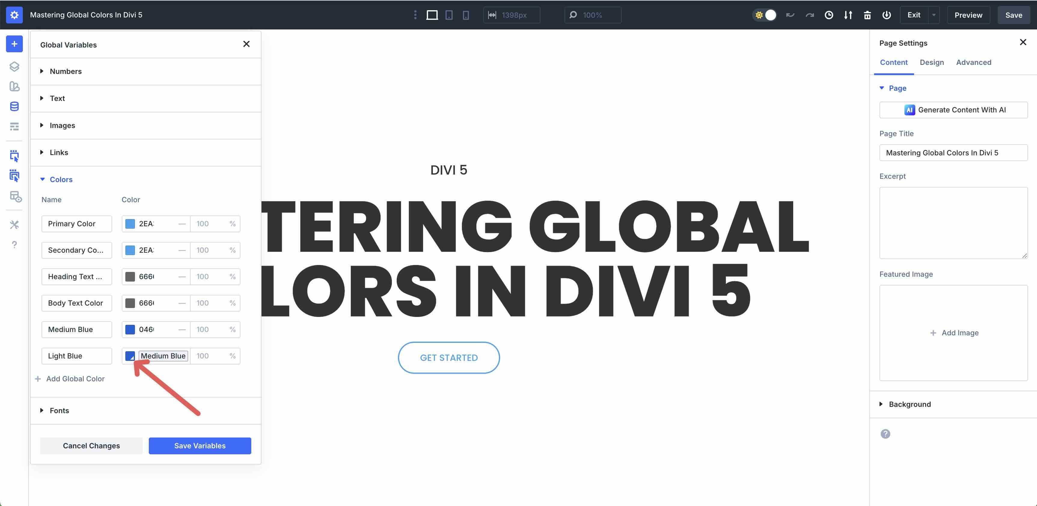
First, create a new page in the Visual Builder. Create a new Color Variable (global color) and add it to the Variable Manager.
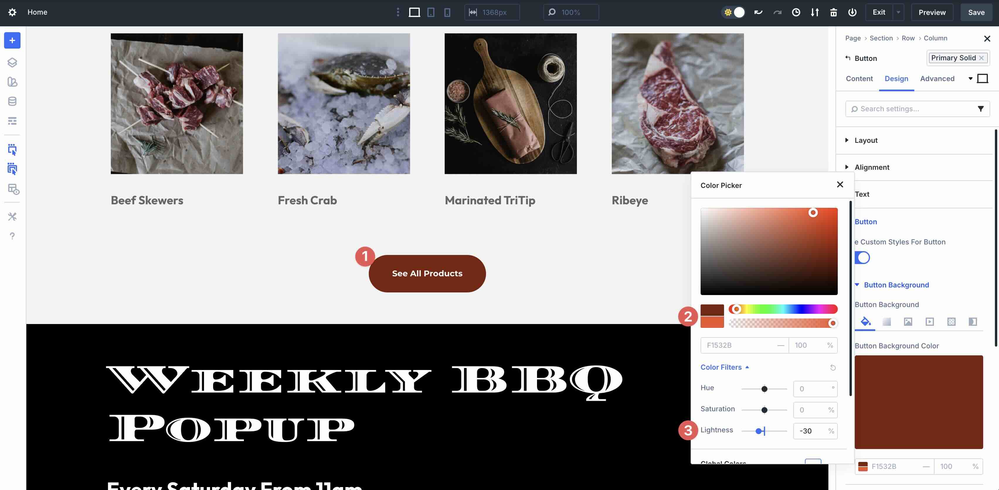
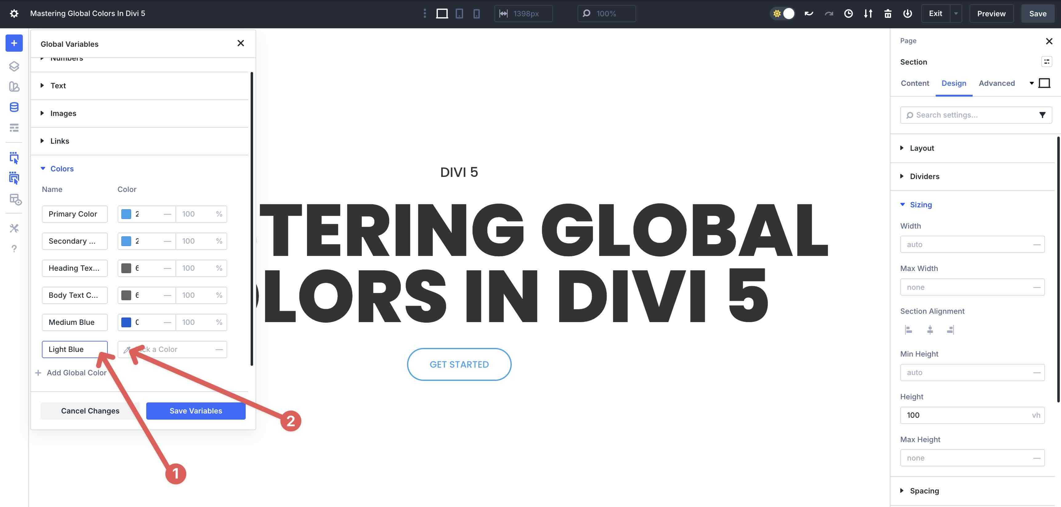
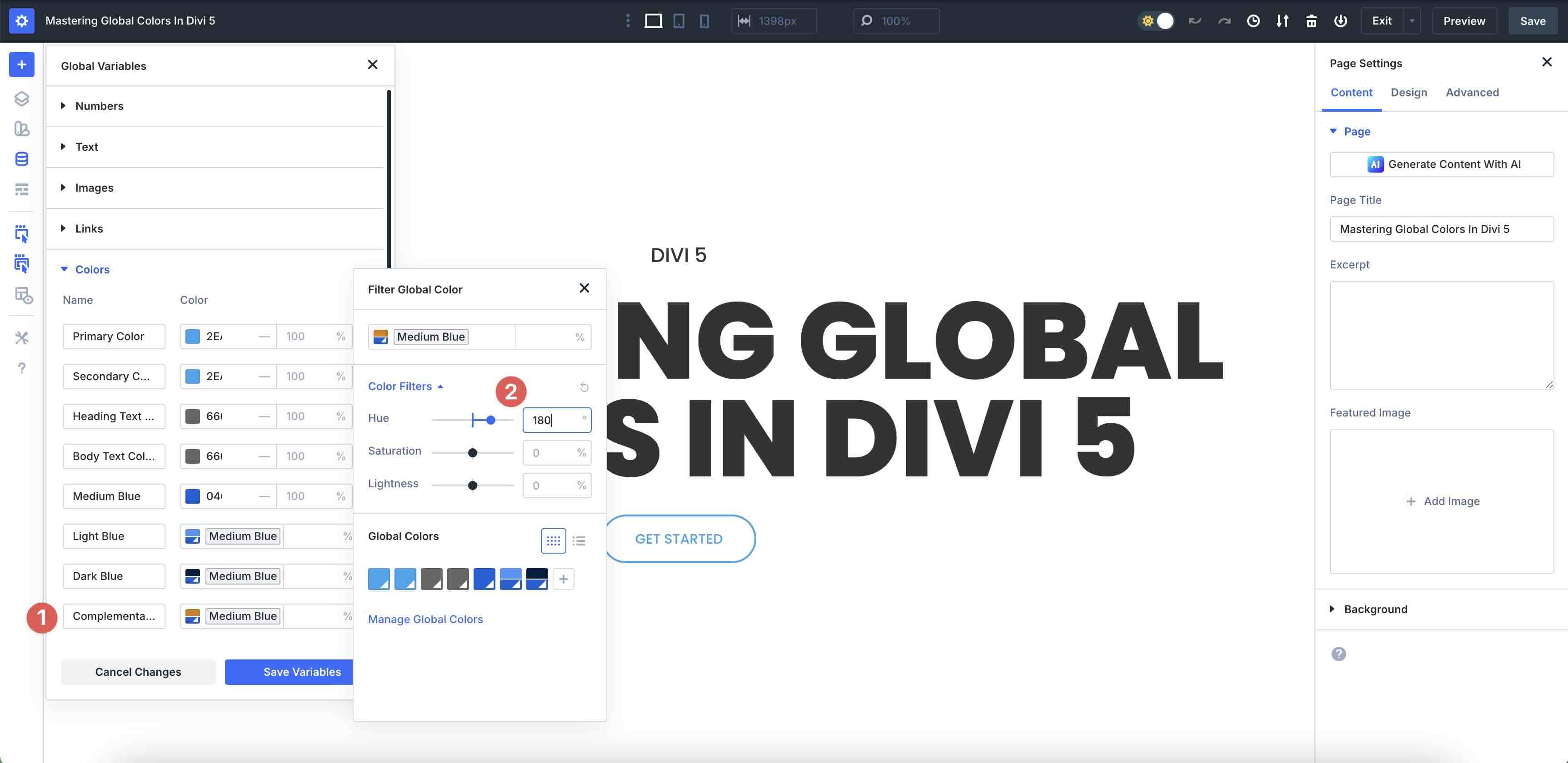
Next, we will create a child color that utilizes your base color and applies a Lightness (L) adjustment. First, we’ll create a shade of the medium blue (#0460d9) we made. With the Variable Manager open, click + Add Global Color to add a new color variable.
Give your new color a name, then click the Color Picker icon to add it.
When the Color Picker modal appears, select the Global Color we created (#0460d9).
Next, click the Color Swatch in the Color field.
When the Filter Global Color modal appears, click to expand the Color Filters dropdown menu.
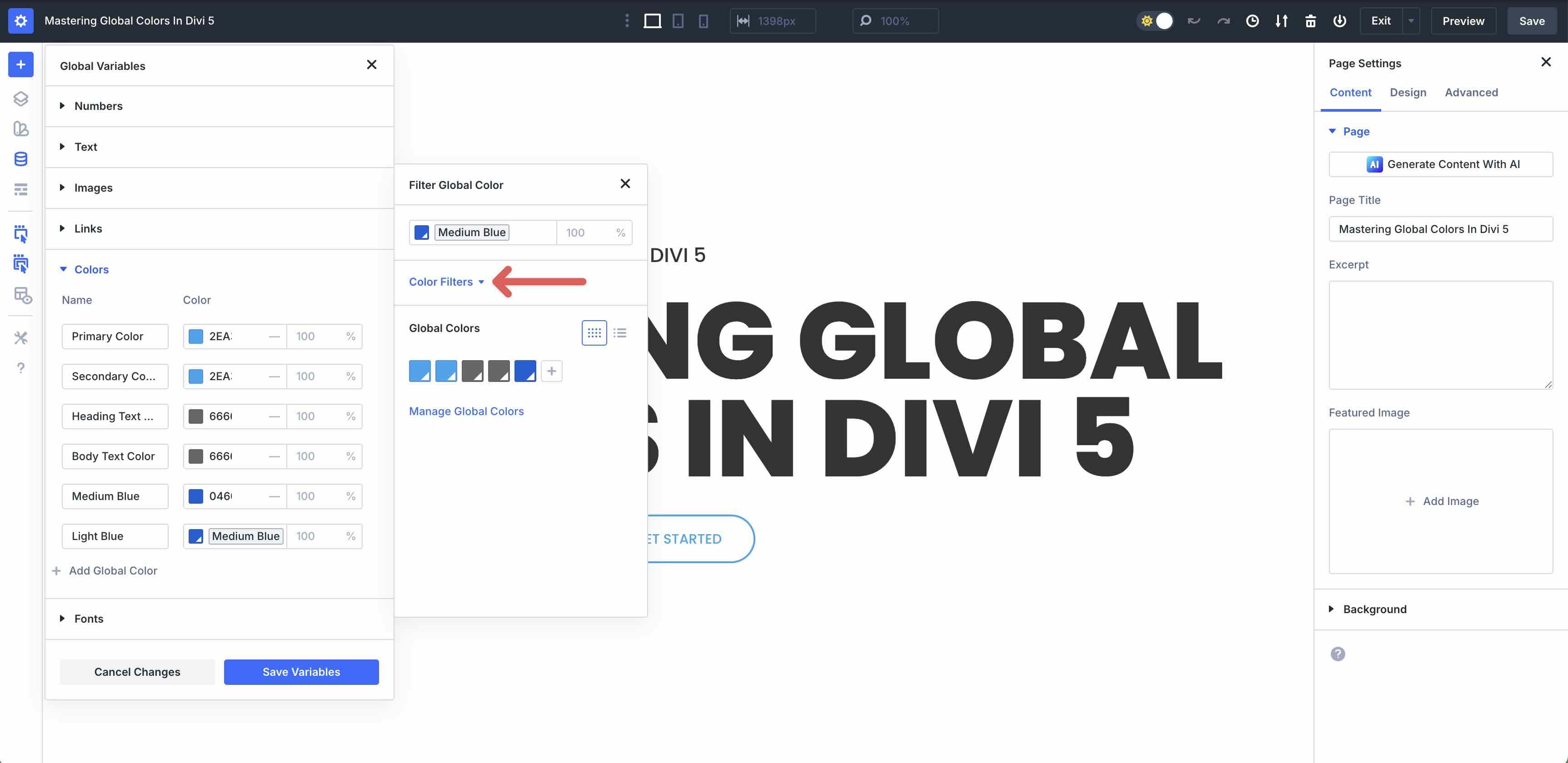
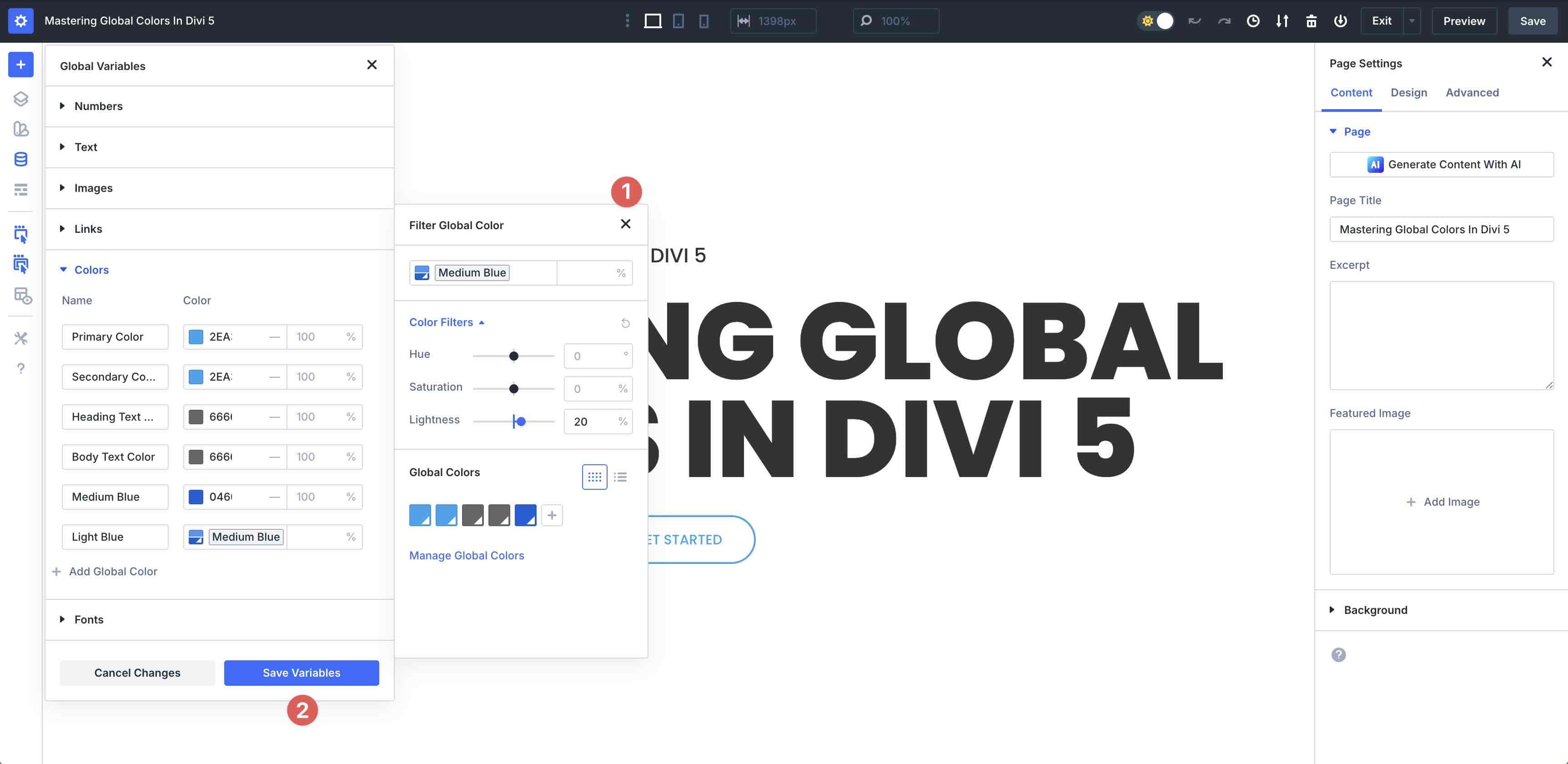
Locate the Lightness slider. Adjust the value to +20%. This will create a slightly lighter tint of our Global Color.
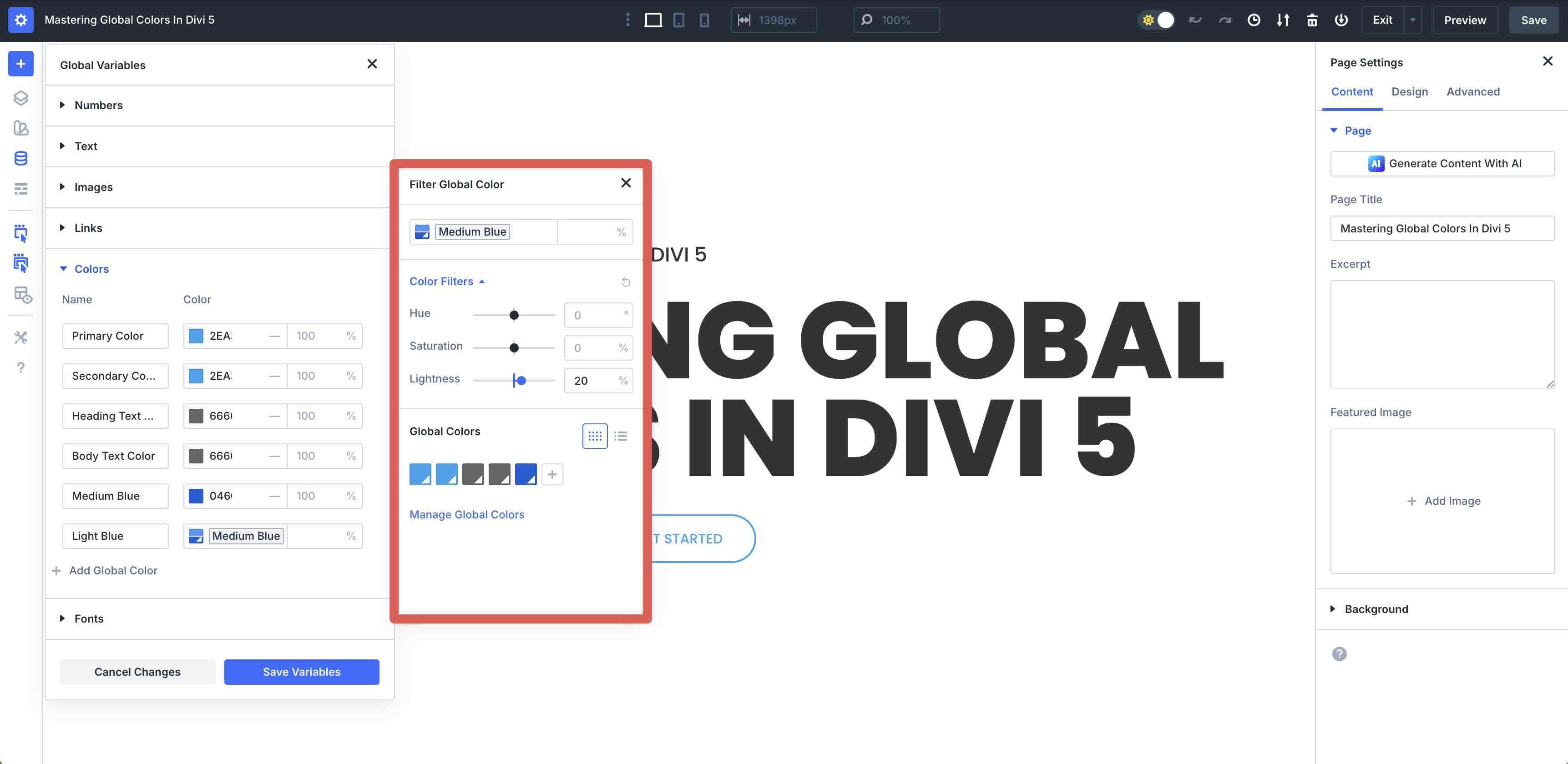
Close the modal and click the Save Variables button.
To create a darker blue (shade), you can adjust the Lightness slider to a negative percentage. Click to add a new Global Color. Select the base color (#0460d9) and apply a -30% Lightness filter. This will give you a darker shade of the base color.
Create Color Variables Adjusting The Hue Filter
Adjusting the Hue filter allows you to create complementary or accent colors by shifting the hue value by degrees. In the HSL model, Hue is represented as a color wheel spanning 360 degrees. Because complementary colors are defined as being exact opposites on that wheel, you can find a perfect complement for your base color by adding or subtracting 180° from your base. With that in mind, let’s create a hue of our base color (#0460d9) in the Variable Manager.
Click to add a new Global Color. Select the base color (#0460d9) in the Color Picker. Expand the Color Filters dropdown menu, then enter 180 in the Hue field. This will create a color value that is the direct opposite of our base color.
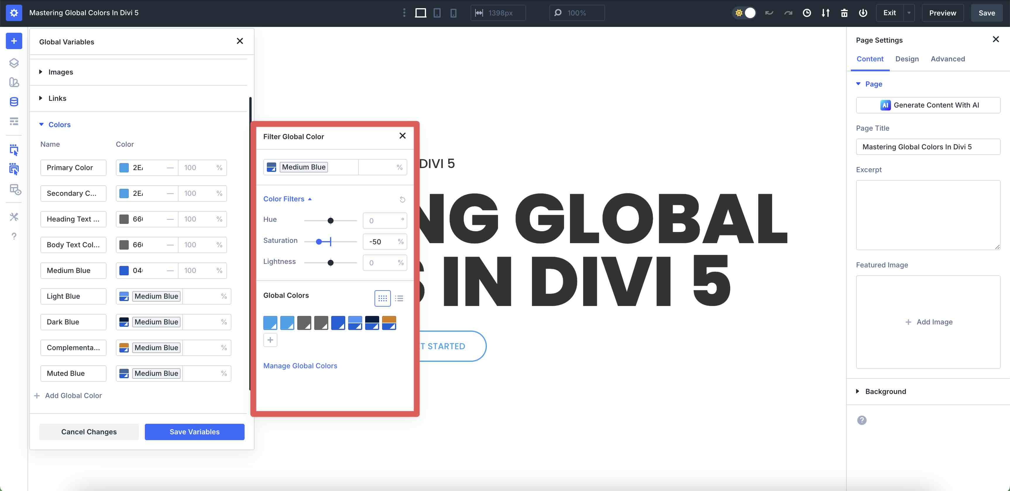
Create Color Variables Adjusting The Saturation Filter
Creating a muted version of a color by lowering the saturation is a technique used to establish visual hierarchy. In UI design, if every color is 100% saturated, they all scream for attention simultaneously, leading to user fatigue and a cluttered interface.
When you move the Saturation slider to a negative value in Divi 5, you are essentially adding gray to the color. While your primary headings should be high-contrast and vivid, secondary text should take a step back. A quick way to accomplish this is to take your base color and drop the saturation by -30-50%. Let’s walk through how to achieve this.
Create a new Global Color using the base color we created (#0460d9). In the Color Filters, adjust the Saturation to -50% on the slider.
Apply The New Global Colors
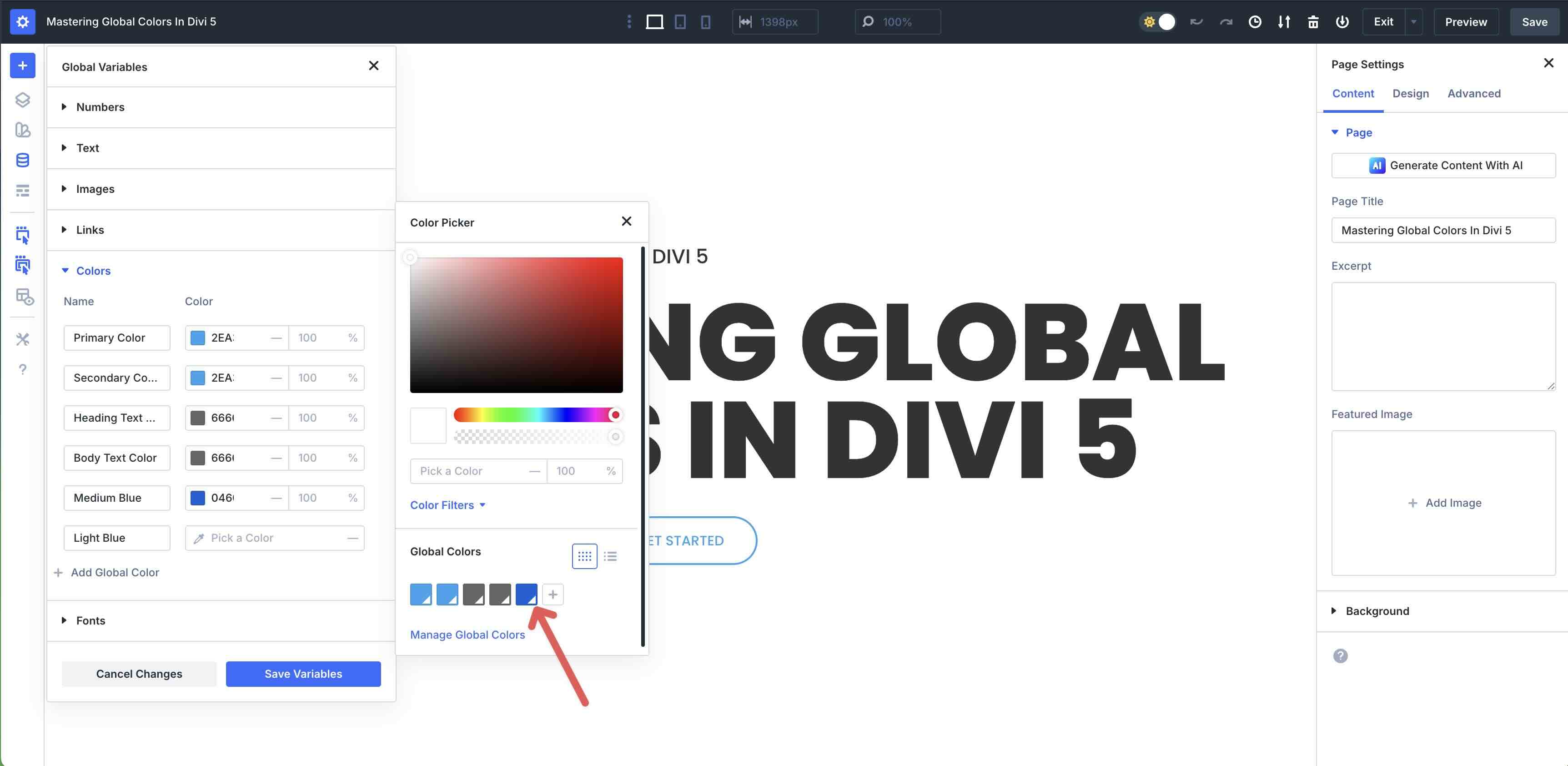
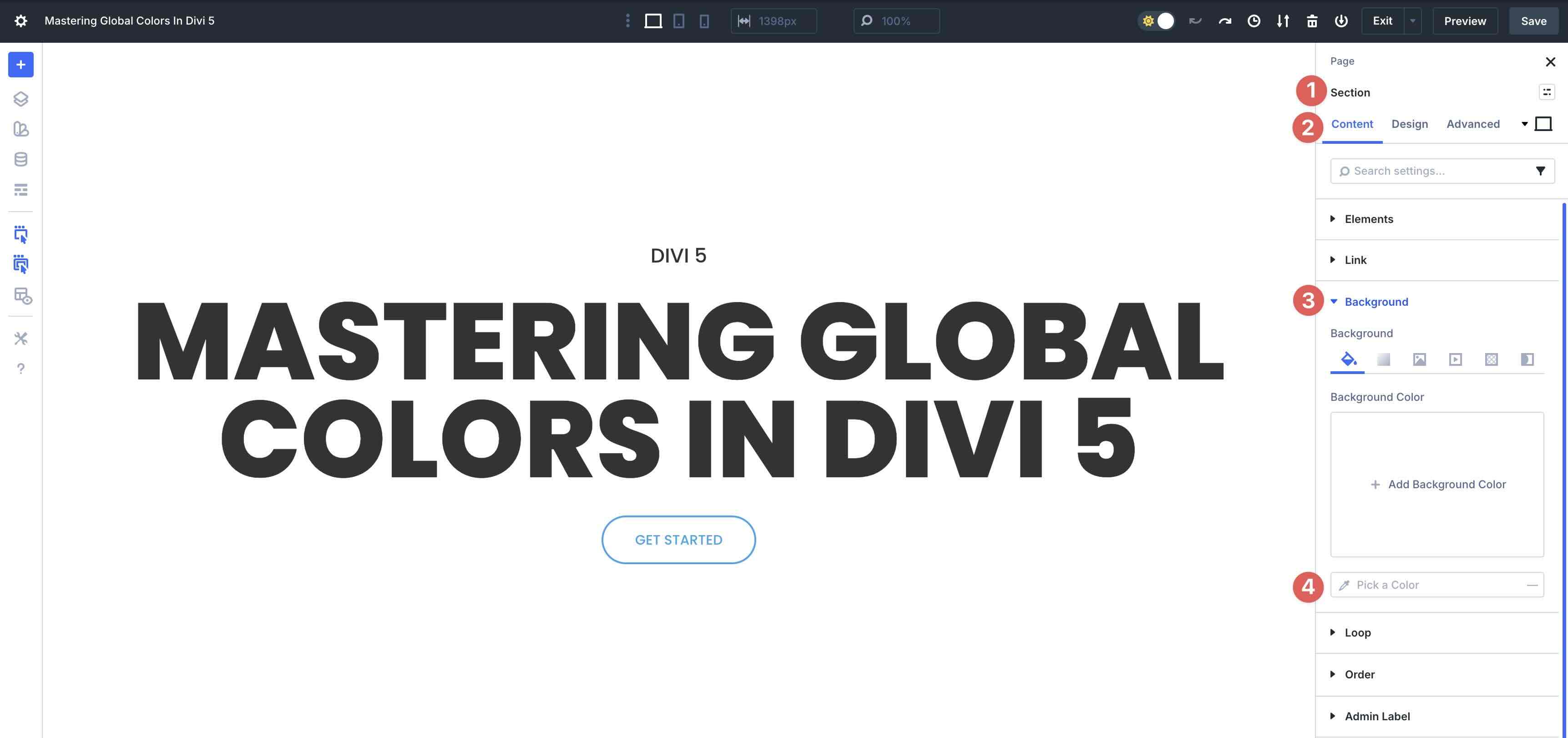
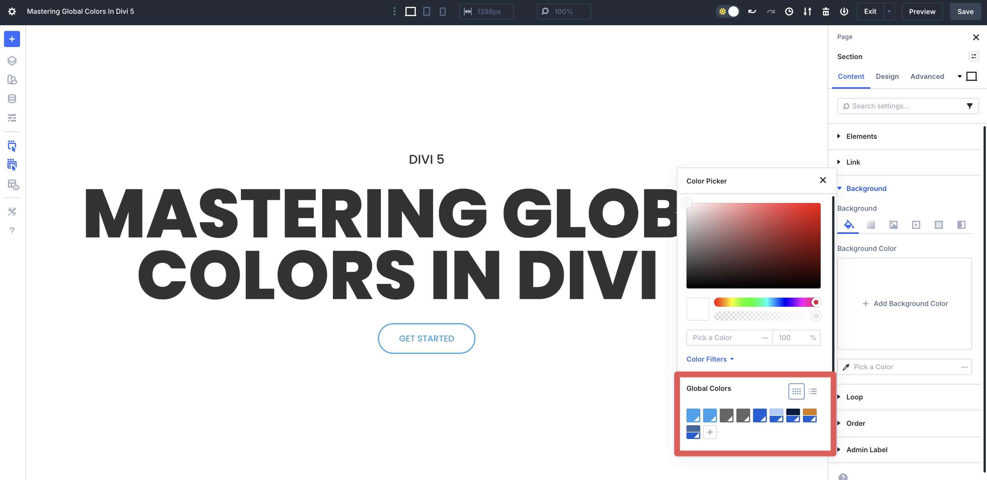
With our new Color Variables in place, we can apply them to a layout with ease. To add a Global Color to a Section’s background, open the Content tab, expand the Background dropdown menu, and click the Color Picker icon.
A list of Global Colors will appear at the bottom of the Color Picker.
To apply a Global Color to a Heading module, go to the Design tab and expand the Heading Text dropdown menu. In the Heading Text Color field, click the Color Picker icon and select a Global Color from the options.
Apply the Complementary color we created to a Button module.
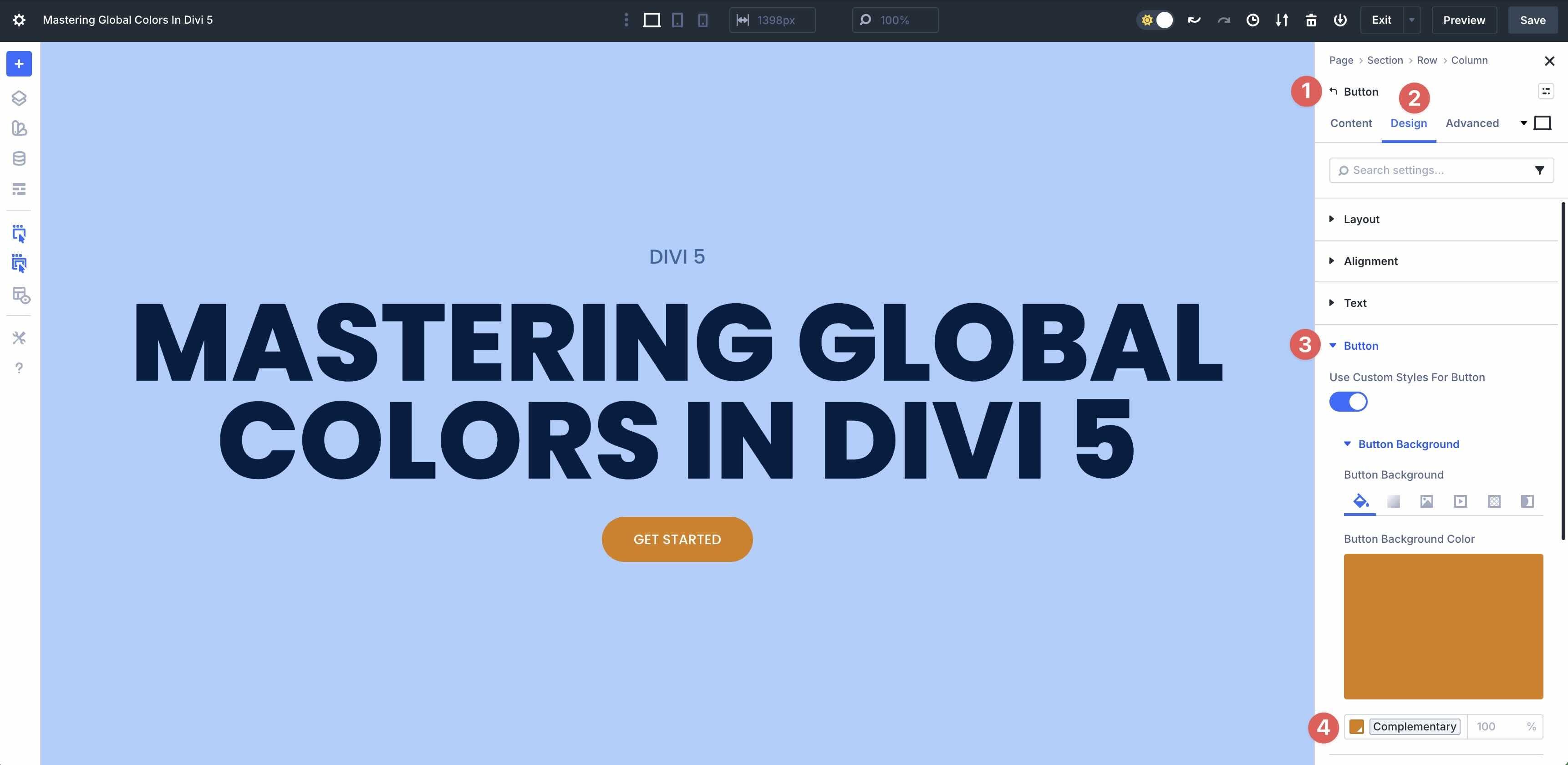
With our Global Colors in place, you can make quick changes to the entire color scheme simply by editing the base color. For example, if we want to switch from a blue theme to a green one, we simply have to edit the base color in the Variable Manager to change the entire look in one step.
Best Practices And Tips
Mastering Global Colors and Relative Colors in Divi 5 is about more than just using the tools. It’s about adopting a strategic approach that ensures long-term consistency, scalability, and efficiency. Here are some best practices and tips to help you along the way.
Plan Your Color Palette First
Before you jump into the Visual Builder and start adding colors, take a moment to play things out. A little preparation up front will save you time and frustration later. Start by reviewing your brand guidelines. Pull together your main brand and accent colors to use as your Global Colors in Divi. If you’re starting from scratch, get inspiration from helpful tools like Adobe Color to find a scheme you love. Plan how your color variants will connect to the base colors. For example, decide on the colors for all button states (like active and hover). Having a plan before building will streamline the process, leading to a faster build.
Organize And Name Your Colors
Good naming makes your Variable Manager feel like a pro-level design system, rather than a random list. Take a little time to do this, and you’ll make designing your site a lot easier. Here are a few naming patterns that keep your Variable Manager easy to scan:
- Go Semantic When It Makes Sense: Use clear, role-based names that explain the color’s purpose. For example, use terms like Brand Primary, Access Success, Text Heading, or Buttons. This is especially useful when building a website is a team effort.
- Group Related Colors Together: Add simple prefixes like Primary Base, Primary Light, Primary Dark, or Primary Hover. This keeps families of colors close when browsing.
- Keep Names Short And Clear: Don’t write a novel, but don’t be cryptic either. Clarity is important, especially when working with others.
Avoid Common Pitfalls
Even with a strong variable system, a few missteps can mess up your color system. Here’s how to spot and avoid the most common ones:
- Random Adjustments: Don’t tweak lightness or saturation just because it feels right in the moment. Stick to consistent steps, like always changing by 10-20%, so your scales stay predictable and harmonious.
- Creating Too Many Colors: It’s tempting to make a variable for everything, but try to keep it to 10-15 colors at most. Too many options lead to decision overload, making it easier for users to choose inconsistent shades.
- Skipping Accessibility Checks: Never forget contrast. Utilize those relative lightness adjustments to your advantage, as they make it easier to iterate toward WCAG contrast targets as you adjust your base colors.
By following these practices, your Divi 5 color system will be robust, maintainable, and truly professional, all while saving time delivering cohesive designs.
Try Divi 5’s Color System Today!
Divi 5‘s color management system marks a significant leap forward for WordPress designers, transforming static Global Colors into a truly dynamic, interconnected palette powered by HSL and Relative Colors. By building nested relationships, where shades, tints, and accents all derive mathematically from a single base color, you gain ultimate control, consistency, and efficiency. Changing one color now cascades updates across your entire site, eliminating the need for manual tweaks and ensuring harmony, regardless of how complex your design becomes.
Now it’s your turn to dive in, experiment with HSL Filters and Relative Colors, and build custom palettes that reflect your unique style. We encourage you to download Divi 5 and get started today!


Leave A Reply