
Divi 5 is here, and to make the most of its best new features, it helps to approach the builder a little differently than before. This is not just a faster version of Divi or a visual refresh. It is a rebuild that changes how layout, styling, and structure work together.
Many of Divi 5’s biggest improvements become more useful when you use them as part of a system instead of feature-by-feature. Things like Flexbox, CSS Grid, Nested Rows, Canvases, Design Variables, and Presets are powerful on their own, but they really shine when your workflow starts with structure and builds outward.
In this post, we’ll look at the mindset and workflow shifts that help you get more value from Divi 5’s best new features.
- 1 Divi 5 Is Built For Structural Freedom
-
2
Where Divi 5 Starts Changing Your Workflow
- 2.1 1. Start Defining Your Design System From The Beginning
- 2.2 2. Turn Your Variables Into Reusable Components
- 2.3 3. Make Your System Fluid Across Screen Sizes
- 2.4 4. Scale Design Changes Across Your Pages
- 2.5 5. Design Variations Without Affecting Your Main Layout
- 2.6 6. Add Interactions After Structure Is Stable
- 2.7 7. Audit Your Layout Structure Before You Ship
- 3 Start With A Real Divi 5 Design System (Free Download)
- 4 Start Building In Divi 5 Today!
Divi 5 Is Built For Structural Freedom
Divi 5 was rebuilt from the ground up, and that rebuild was not cosmetic. It was structural. The goal was not to add more options on top of an aging system, but to replace the foundation entirely so the builder could operate with the same logic and flexibility as modern front-end development.
Starting with structure is now the default, not a workaround. The builder rests on a cleaner technical base designed to support intentional hierarchy, predictable behavior, and long-term scalability.
Where previous versions relied heavily on column-based layouts, Divi 5 introduces a system built around Flexbox and CSS Grid. These were not added for parity. They exist because modern layout control demands container-based logic, deliberate alignment, and structural clarity.
Divi 5 adopts those standards so your page hierarchy reflects decisions made upfront rather than adjustments made later.
Nested Rows extend that structural flexibility further. They remove artificial layout limits created by predefined patterns, which means complex compositions no longer require bending structure into place. The structure adapts to the design.
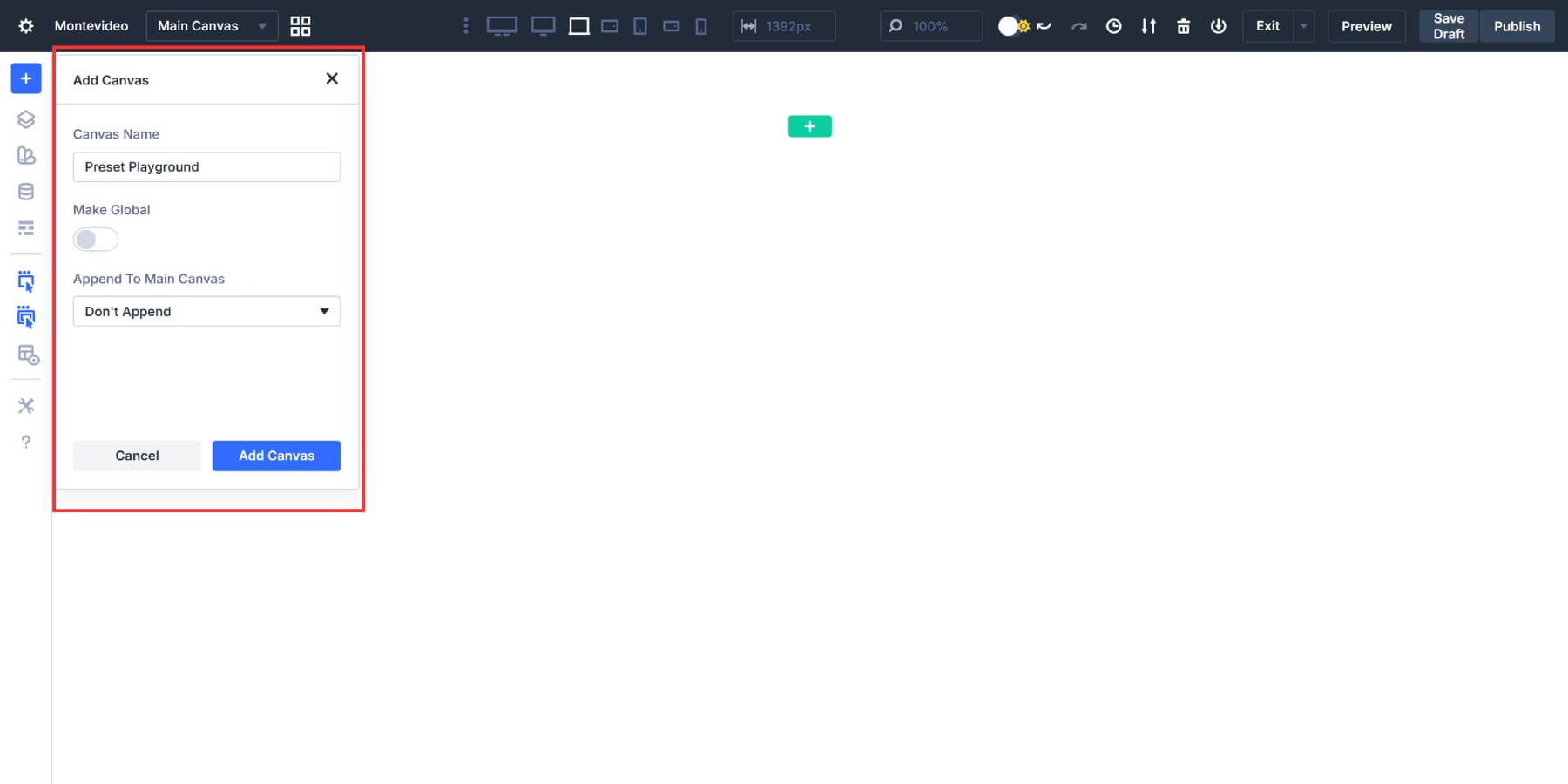
Canvases take a different approach entirely. They separate interface layers from document flow, so overlays, slide-ins, and advanced UI elements no longer have to live inside the same structural container as page content. They operate independently, bringing architectural clarity that was previously difficult to maintain. They also give you space to experiment, a controlled environment where layout logic and interaction patterns can be explored without destabilizing the page underneath.
Together, these additions reflect a deliberate move toward structural freedom. Divi 5 rewards builders who think in systems, define hierarchy intentionally, and treat layout as architecture rather than decoration.
How To Approach Divi 5 Properly
Divi 5 gives you more structural freedom than previous versions, but that freedom only becomes meaningful when you give yourself time to understand how it behaves. The instinct to open a new page and start designing immediately is familiar and comfortable. It worked before because the system let you compensate for structural decisions later. Divi 5 rewards a different mindset.
Spend time observing how the structure responds before committing to finished layouts. Notice how alignment behaves inside containers, how hierarchy influences every layer beneath it, and how decisions made early shape the clarity of everything that follows. When structure becomes your starting point rather than a supporting detail, the builder begins to feel more predictable than reactive.
Canvases are particularly useful at this stage. Because they operate independently from document flow, they give you space to explore ideas, test interaction patterns, and refine composition without touching your main layout. Over time, that habit encourages cleaner thinking and reduces the need for later structural revisions.
The broader shift Divi 5 asks for is treating the builder as a system rather than a collection of tools. Its capabilities were designed to work together, and the workflow rewards sequencing and intentional decisions made at the right stage. When you understand how the foundation connects, scaling becomes smoother, and adjustments feel deliberate rather than corrective.
Where Divi 5 Starts Changing Your Workflow
What follows is not a fixed formula. The best Divi users develop their own rhythm over time, and the workflow that works for one project may not fit another. But a few habits tend to make the biggest difference early on, and understanding them gives you a strong foundation to build on.
Before anything else, get comfortable with how Flexbox, CSS Grid, and Nested Rows behave together. Your confidence with layout structure will determine how efficient everything else becomes, because these three define how your pages scale, align, and adapt long before styling enters the picture.
1. Start Defining Your Design System From The Beginning
Most people jump into building pages immediately, making color and spacing decisions on the fly as each module gets styled. It feels productive in the moment, but those small inconsistencies accumulate quietly. A button shade drifts, a heading size shifts on another page, section padding falls out of rhythm, and by the time you notice, the fixes are scattered across every page you built.
The habit worth developing early is defining your system before you build anything. Set your brand colors, establish spacing values you plan to reuse, and lock in your global typography scale. Design Variables make that possible by giving every module a single source to reference. When these variables are in place from the start, a brand update becomes a single variable change rather than a page-by-page correction.
For light and dark mode variations, define alternate color variables and let the system swap them across backgrounds, text, buttons, and accents all at once. The dark mode color palette example shows exactly how that works in practice.
2. Turn Your Variables Into Reusable Components
With your variables defined, the next instinct is to start styling modules one by one as you build. That still works, but it keeps you working at the wrong level. Every button, card, and testimonial styled from scratch is another decision that has to be remade, and another place where subtle variations can quietly creep in.
A more durable habit is to style one component intentionally, save it as a preset, and let that become your standard. Every instance of that module then follows the same structure, spacing, typography, and color logic without having to repeat the setup. As your preset library grows, the Preset Manager lets you preview, edit, and assign defaults without opening every page that uses them, keeping your component system organized on larger projects.
The real payoff shows up over time. When a brand adjustment requires tighter spacing or a refined button treatment, you update the preset once and every connected instance reflects that change. Because presets can reference your design variables directly, a single variable update cascades through your entire component system without manual edits. And when you move to a new project, you can export your preset system, import it into the next build, and start with a structured foundation already in place.
3. Make Your System Fluid Across Screen Sizes
Responsiveness is easy to leave for later. You finish a section, it looks good on desktop, and mobile becomes something to sort out once the layout is complete. The problem is that the approach tends to produce corrections rather than decisions, and corrections made after the fact rarely feel as deliberate as the original design.
The better habit is to review responsiveness as you define components, adjusting spacing, typography, and layout behavior at each breakpoint so your presets scale cleanly from the start. The Responsive Editor fits naturally into this stage, making it practical to weave responsiveness into the build rather than tacking it on at the end.
For most layouts, breakpoint adjustments are enough. But when you want the system to feel truly fluid, advanced units like clamp(), calc(), min(), and max() give you proportional control over typography, spacing, and widths across screen sizes.
With fluid typography, for example, headings scale smoothly based on viewport width rather than jumping between fixed sizes at set breakpoints. The same logic applies to padding and layout spacing, so your entire design system adjusts as one cohesive structure.
4. Scale Design Changes Across Your Pages
As your build progresses, refinements are inevitable. Spacing tightens, typography evolves, and section rhythm improves as you go. The real question is whether those updates require manual corrections across every page or whether your system can absorb them cleanly.
Getting into the habit of making structural changes at the source rather than chasing them across pages is what keeps larger projects manageable. Extend Attributes makes that practical. You adjust a source element and extend selected properties like spacing, typography, or borders across a defined scope.
During a rebrand or layout refinement, that precision makes a measurable difference. Increase vertical spacing once and extend it across sections, adjust heading scale, and propagate it where needed; what could take hours of repetitive edits becomes a structured update that preserves consistency throughout.
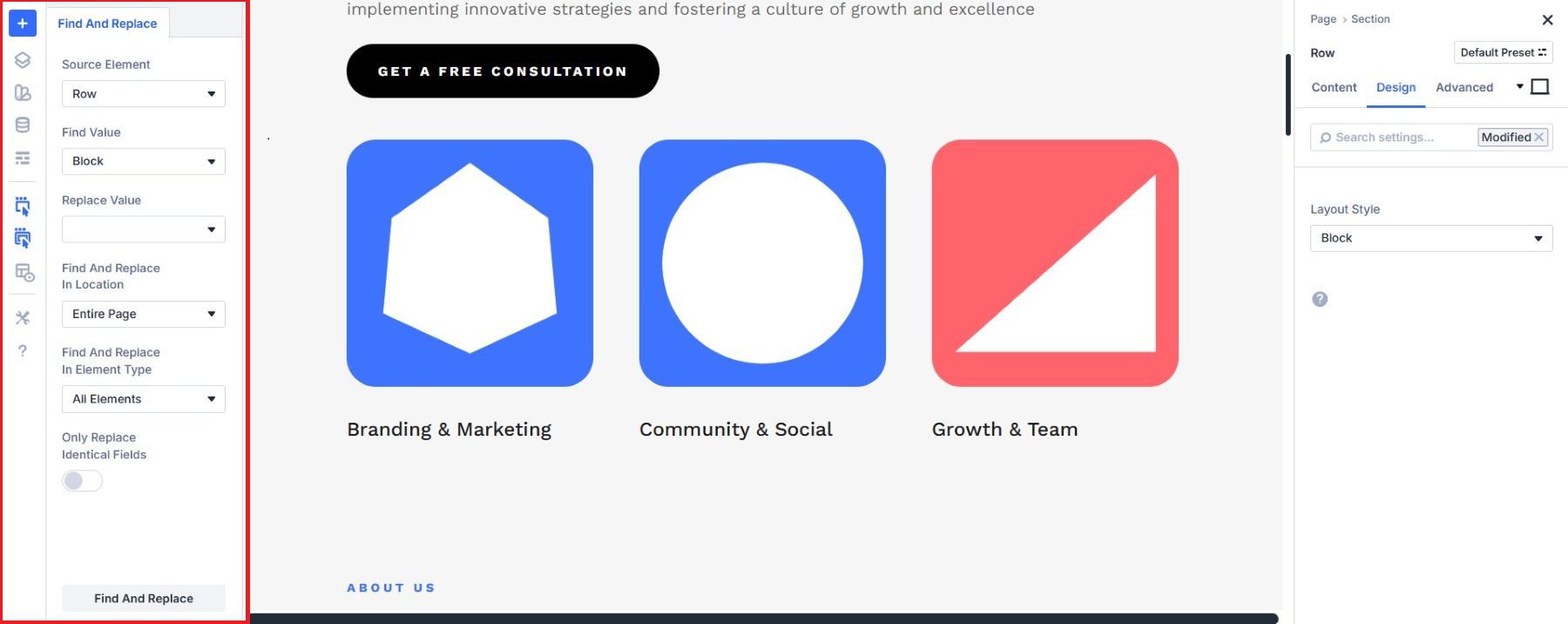
For more focused value-level updates, Find & Replace lets you swap a specific setting across your layout in one step, keeping color variable or font-size changes contained and controlled.
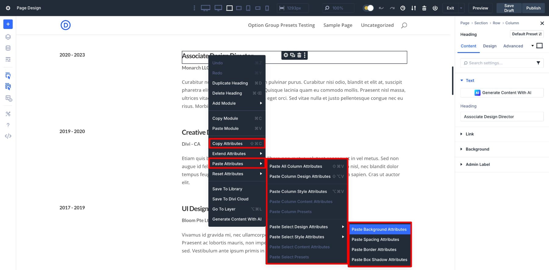
And while building individual sections, Copy/Paste Attributes lets you transfer styling between modules quickly, catching subtle inconsistencies before they settle into your layout.
5. Design Variations Without Affecting Your Main Layout
The further you get into a build, the more ideas surface. A different section composition, an alternate layout structure, or an interaction pattern you want to try. The risk is testing those ideas directly on your live pages, where one structural experiment can quietly unsettle what was already working.
Keeping a canvas open as a dedicated space for exploration solves that. Canvases operate independently from document flow, so you can refine ideas, prototype structures, and test interaction patterns in isolation before deciding what belongs in your live pages. Over time, that habit leads to cleaner decisions and fewer structural revisions.
6. Add Interactions After Structure Is Stable
There is a natural temptation to add motion early, especially once a layout starts looking good. The problem is that interactions added before the structure is solid often create dependencies that make later adjustments harder than they need to be.
Treating behavior as the final layer, something you add once the layout feels settled, keeps things clean. Divi 5’s Interactions system lets you define click, hover, scroll, and state-based triggers directly inside the builder.
At this stage, the goal is reinforcement, using interactions to reveal content intentionally, trigger canvases, or guide user flow between sections. Even more advanced effects like cursor-based triggers land better when the structure underneath them is already solid.
7. Audit Your Layout Structure Before You Ship
Visual scanning feels reliable right up until it is not. A layout can look finished and still carry inherited spacing conflicts, misaligned containers, or padding that drifted from its intended source. By the time those issues show up in a browser, tracing them back takes far longer than catching them during the build.
The habit of doing a structural audit before publishing is what separates a polished build from one that just looks polished. The Inspector makes that audit practical, letting you trace spacing back to its source, confirm how sections and modules are nested, and validate that inherited padding and alignment reflect the logic you originally intended.
Most layout inconsistencies do not live where they appear, and a parent container often holds the real cause. During pre-launch checks, you are no longer designing. You are confirming that the system you built holds together as planned.
Start With A Real Divi 5 Design System (Free Download)
If you want to put this workflow into practice without starting from a blank canvas, we also released a free, production-ready Divi 5 Design System you can import into a new site. It is built to show how Design Variables, Presets, page layouts, and Theme Builder templates work together as one connected system.
Instead of learning each feature in isolation, you can explore a complete example, trace how variables power presets, see how presets carry consistency across layouts, and then customize the system to match your own brand.
This is one of the fastest ways to understand the structural mindset that Divi 5 rewards.
Start Building In Divi 5 Today!
Divi 5 is built for builders who are willing to think structurally, and approaching it as a system rather than a collection of features changes what it can do for you. The workflow outlined here is not a rigid formula. It is a starting point that shifts as your projects do. When the habit of defining relationships early, letting variables shape presets, and auditing structure before shipping becomes second nature, the builder stops feeling complex and starts feeling controlled.
The advantage does not come from using every feature. It comes from understanding how they support each other and how this rebuild was designed to align with how modern layout systems actually work. Divi 5 officially launched on February 26 as a regular Divi update, marking the end of the beta label. The best way to improve your results is not to memorize features, but to spend time inside the system and start thinking in structure. Once that shift happens, the workflow becomes yours.


Leave A Reply