
The default WooCommerce cart works, but it is not always easy to shape around your brand, your products, or the way your customers make decisions. That is where a custom cart page can make a real difference.
With Divi 5, you can build a cart page visually using native WooCommerce modules, rather than relying on a generic layout or custom code. In this guide, we will show you how to create a custom WooCommerce cart page in Divi 5, style the cart products and totals, add trust signals, include optional cross-sells, and refine the layout for mobile.
Why You Should Customize WooCommerce Cart Pages
Most store pages have one job: move shoppers to the next step. Product pages push visitors toward the cart. The cart page pushes them toward checkout. By the time someone reaches the cart, they have already said yes to something. The remaining job is to make the next step feel clear, safe, and easy.
WooCommerce’s default cart page gives shoppers the essentials: cart items, quantities, totals, and a checkout button. For some stores, that is enough. For many others, it leaves too much of the buyer’s final decision unsupported.
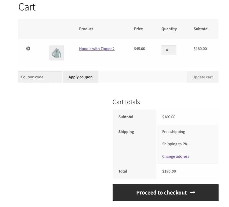
Image by WooCommerce Documentation
This matters because shoppers abandon carts for practical and trust-related reasons. Baymard cart abandonment research reports that 19% of shoppers abandon because they do not trust the site with their credit card information, 14% leave because they cannot see or calculate the total order cost up front, and 10% leave because there are not enough payment methods.
A custom cart page helps you address those concerns before checkout. You can make the order summary easier to scan, keep totals visible, match the page to your brand, add payment and policy reassurance near the checkout button, and keep the next action obvious.
A good cart page does not need to be complicated. It needs to be clear, trustworthy, and consistent with the rest of your store.
WooCommerce And Divi 5 Work Better Together
Divi 5 gives you visual control over WooCommerce layouts by turning key WooCommerce areas into modules you can place, style, and arrange inside the Visual Builder and Theme Builder.
Before building the cart page, it helps to understand the Divi 5 tools that make this workflow possible.
Loop Builder
WooCommerce stores products, categories, and product data in WordPress. The challenge is deciding how that data should appear on the front end. Loop Builder helps solve that by letting you design a layout once, connect it to a query, and repeat that design for matching content.
For WooCommerce sites, that means you can build custom product grids, category sections, promotional product rows, and upsell-style layouts without being limited to a rigid product listing design.
Change the query, and the content changes. Change the card design, and every repeated item using that design updates with it.
Woo Product Modules
WooCommerce product pages usually follow a familiar structure: image, title, price, description, add-to-cart controls, reviews, and related product sections. Divi 5 breaks that structure into dedicated Woo modules so you can place and style each product element independently.
Divi 5’s Woo Product Modules include modules for key product page elements such as product images, product title, product price, product rating, product reviews, product gallery, product stock, product tabs, product information, related products, and more.
Because each part is its own module, you can style the product experience around how your customers shop. You can move the add-to-cart area higher, give reviews more emphasis, or create a layout that feels more like a branded product landing page than a default WooCommerce template.
Woo Cart And Checkout Modules
The cart page is where shoppers review what they are about to buy. Divi 5 gives you three Woo Cart modules for that part of the experience:
- Woo Cart Products: Displays the products currently in the customer’s cart, including product names, images, prices, quantities, and totals.
- Woo Cart Totals: Displays the cart subtotal, shipping options, fees, and final total.
- Woo Cross Sells: Displays products that you have linked as cross-sells inside WooCommerce.
Divi 5 also includes checkout modules for the next step in the purchase flow:
- Woo Checkout Billing: Displays and styles the billing details form.
- Woo Checkout Shipping: Displays and styles the shipping details form.
- Woo Checkout Information: Displays the additional information or order notes field.
- Woo Checkout Details: Displays the order details during checkout.
- Woo Checkout Payment: Displays the payment method selection and payment details.
Together, these modules let you create cart and checkout pages that feel like part of the same store instead of a handoff to a generic WooCommerce template.
Other Divi 5 Features That Help
The Woo modules handle the ecommerce data, but the rest of Divi 5 helps you turn that data into a polished cart experience.
- Design Variables: Store reusable colors, fonts, numbers, images, and other values so your cart page uses the same design system as the rest of your site.
- Presets: Save styled modules or option groups and reuse them across your store for consistent buttons, tables, cards, and text styles.
- Interactions: Add click, hover, scroll, and timed interactions directly in the Visual Builder when they support the buying experience.
- Canvases: Build off-canvas elements such as slide-ins, pop-ups, or promo panels and trigger them with interactions.
- Responsive Breakpoints: Fine-tune the cart layout across up to seven breakpoints so the page remains usable on smaller screens.
Use these features to support the checkout flow, not distract from it. On a cart page, clarity matters more than decoration.
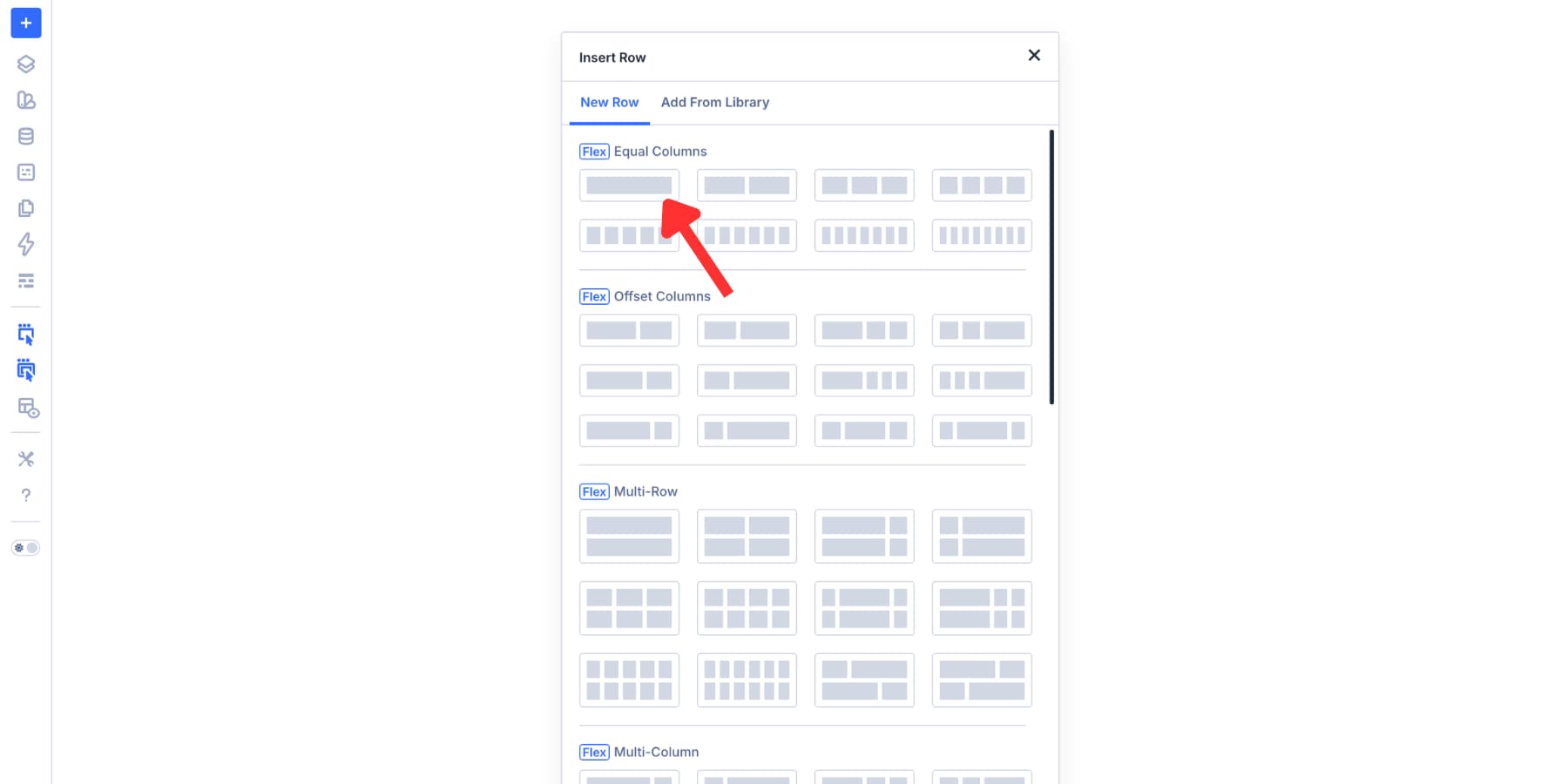
Building A Custom Woo Cart Page In Divi 5
Now let’s build the cart page. The workflow starts in the Theme Builder, then moves into the Visual Builder where you can add the cart modules, style them, and test the layout across breakpoints.
Create A Cart Page Template
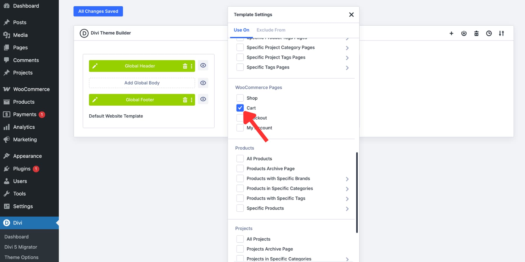
Go to your WordPress dashboard, then open Divi > Theme Builder. Click Add New Template, choose Build New Template, and select the display condition for the WooCommerce Cart page.
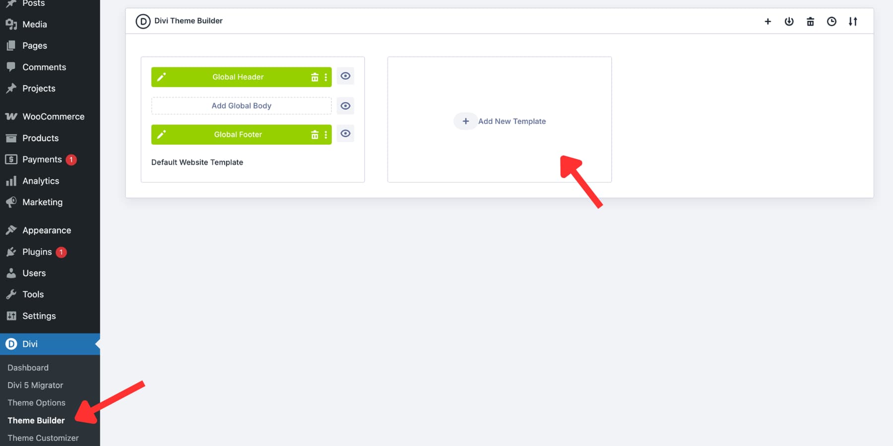
Set the display condition to the WooCommerce Cart page, then confirm the template.
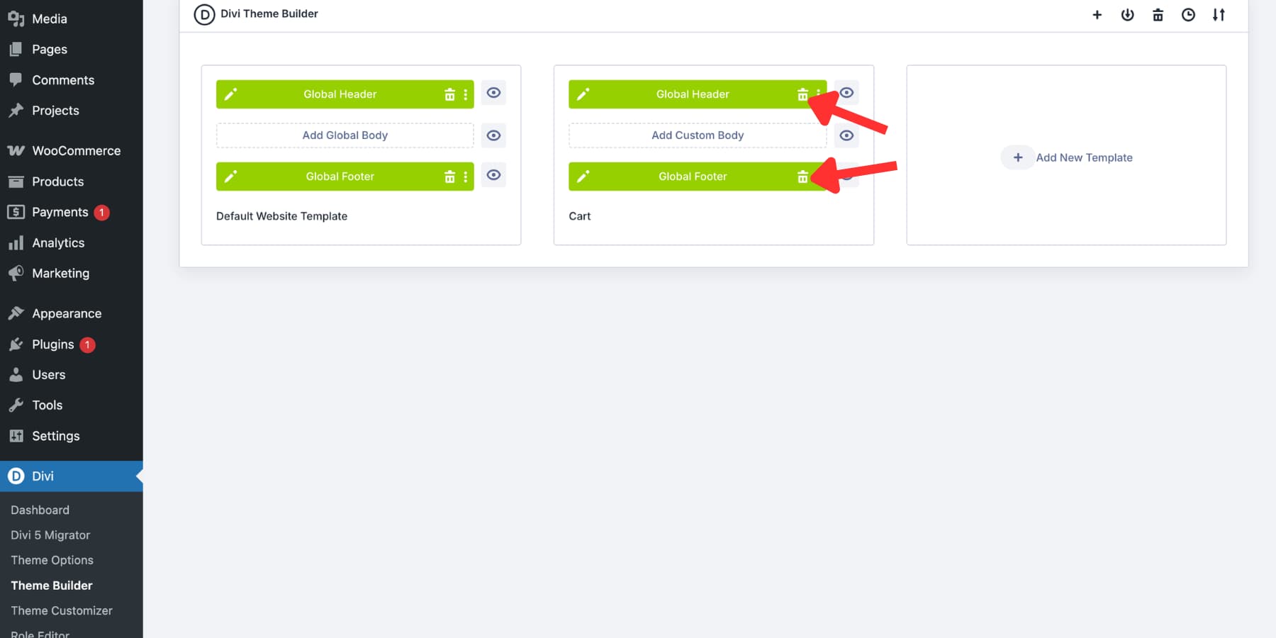
Your new template card will include a Body area. For this example, we removed the global header and footer from the cart template so the page could use a more focused checkout-style layout.
This is optional. A simplified cart header can work well because it reduces distractions, but you should still give shoppers enough context to know they are on the same trusted store. A logo, short progress indicator, and secure checkout message are often enough.
Click Add Custom Body. Divi opens the Visual Builder for the cart page template. Anything you build in this template applies to the cart page condition you selected.
Add A Base Layout For Your Cart Page
The Visual Builder opens with a blank section. Start with a clear structure before adding modules. For this layout, we first added a full-width row for the cart page header.
Then, in the same section, we added a nested row with a wider main column and a narrower sidebar column.
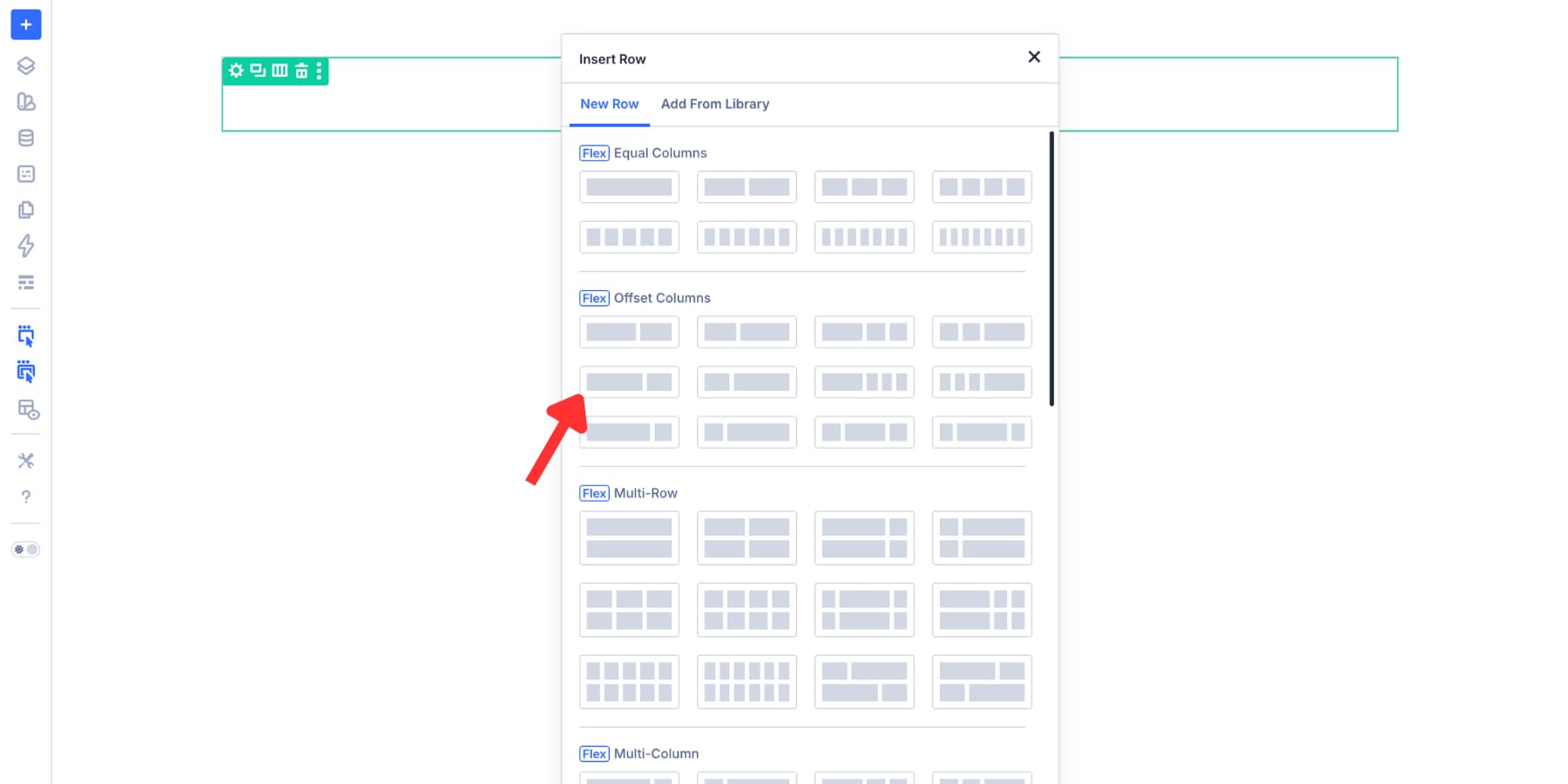
This creates a familiar cart structure: products on the left, order summary and checkout action on the right. You can also use Grid layout options if your design needs more control.
Add And Configure The Woo Cart Modules
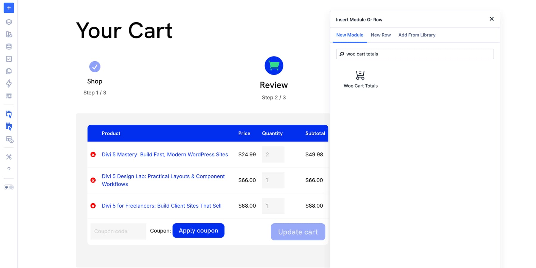
With the base layout in place, add the modules that make the cart functional. The key modules for this page are Woo Cart Products, Woo Cart Totals, and, optionally, Woo Cross Sells.
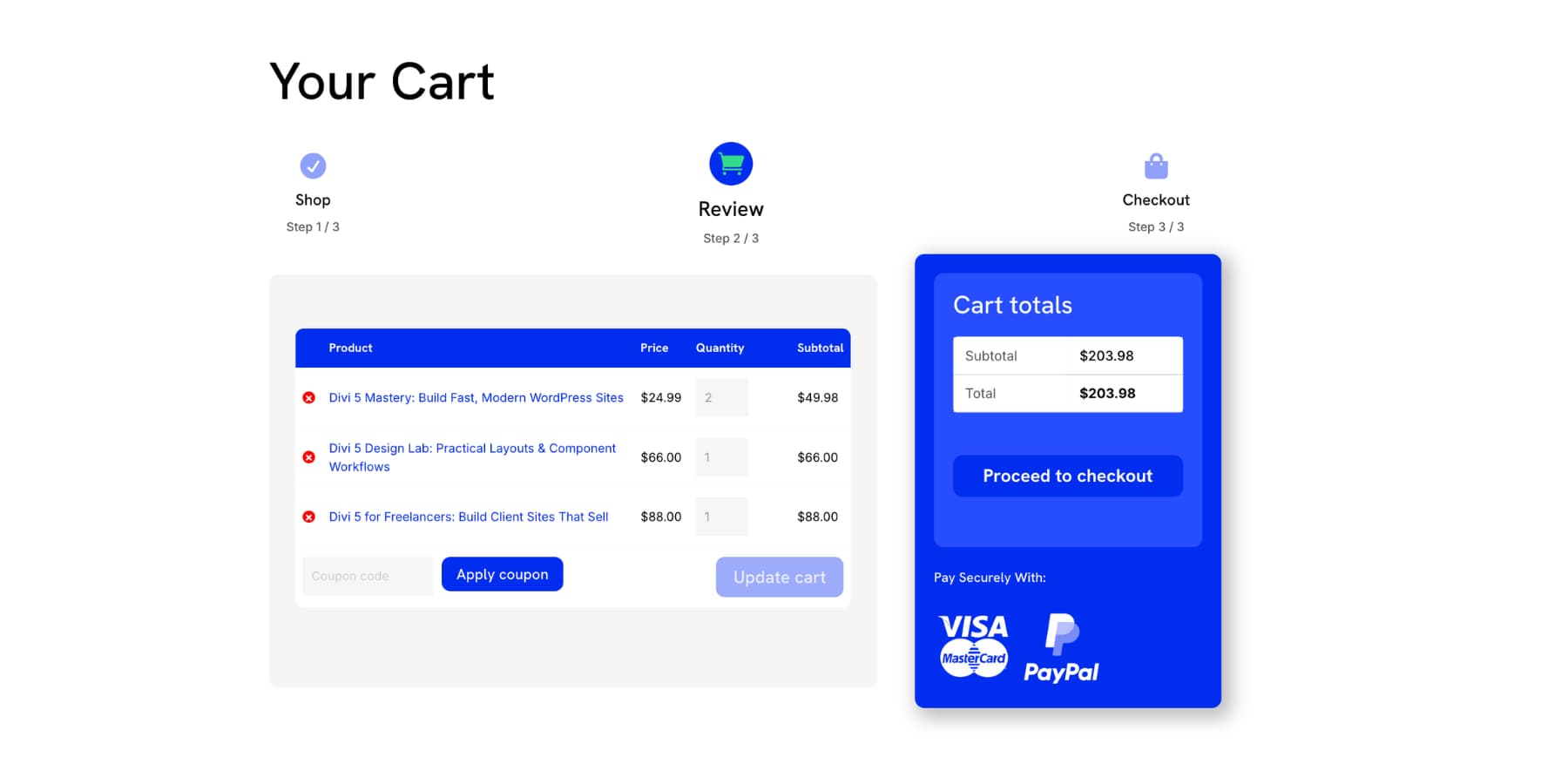
Build The Cart Header
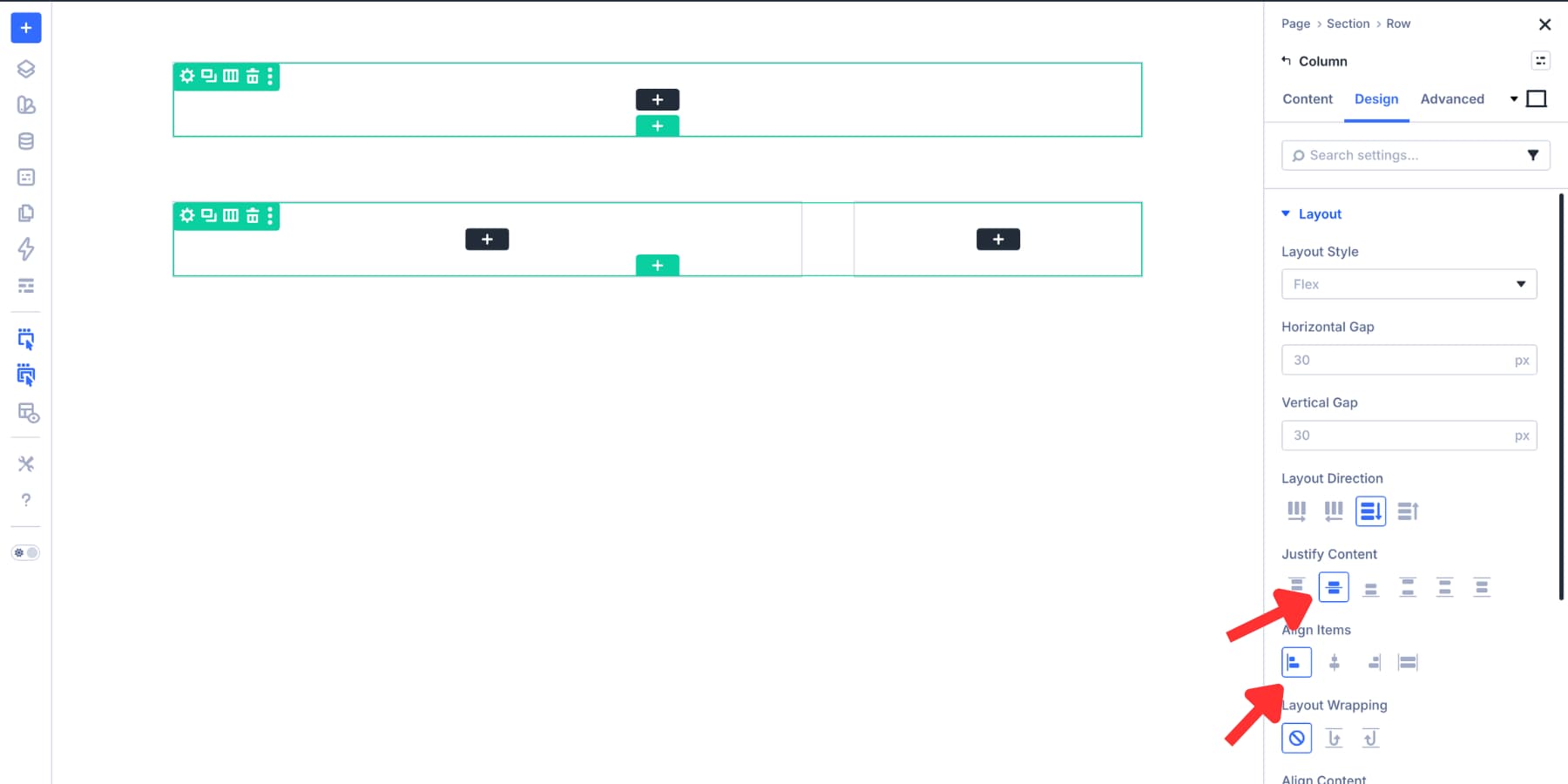
Cart pages do not need a heavy header. In the full-width header column, open Design > Layout and set the alignment and justification for the content.
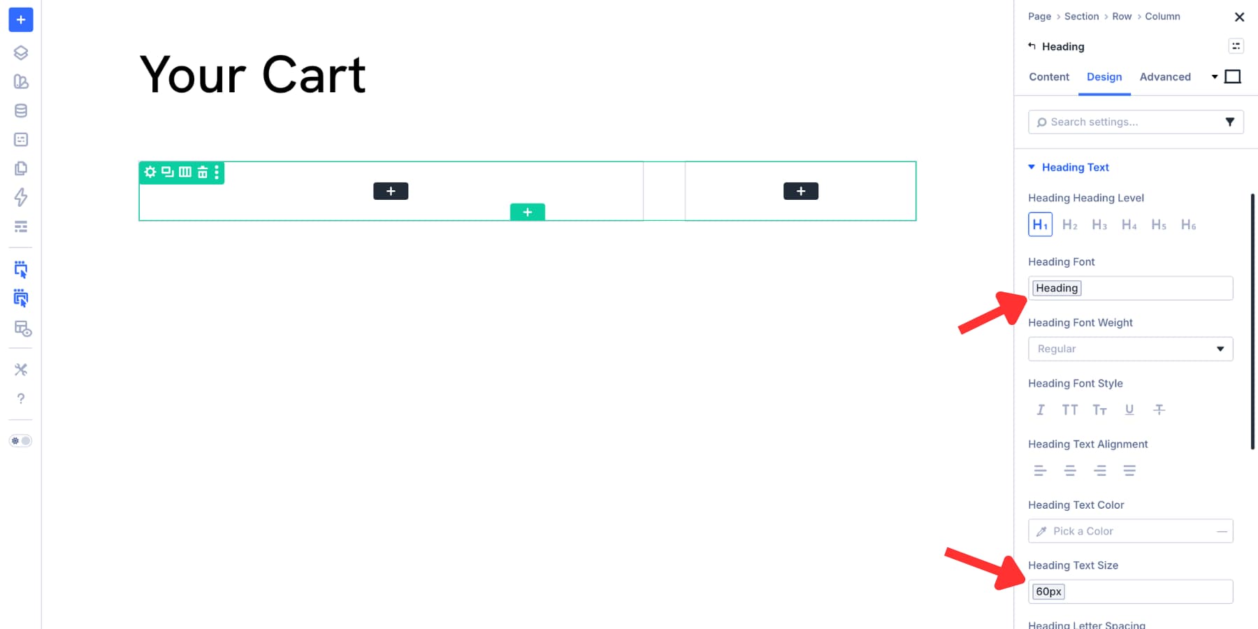
Add a Heading module and write a clear page title, such as Your Cart or Review Your Order. Style the heading with your Design Variables so it matches the rest of your store.
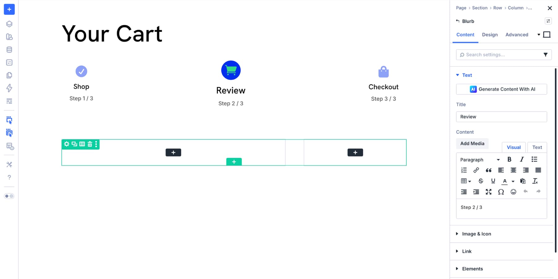
Next, add a Group Module below the heading. Set its layout direction to row, set the justification to space between, and add three Blurb modules inside it.
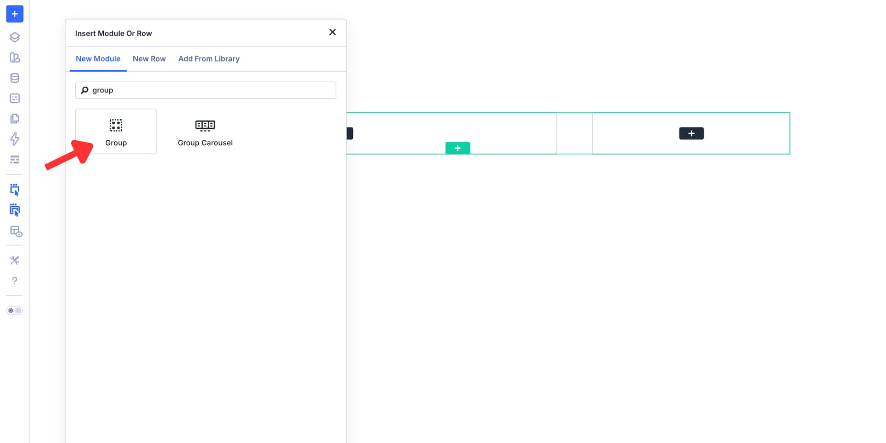
Use the blurbs as a simple progress indicator for the purchase journey. For example, you could show Shop, Cart, and Checkout, then highlight the cart step so shoppers know where they are.
Build The Main Cart Area
The two-column row is where the main cart experience happens. Use the wider column for cart products and the narrower column for totals, checkout action, and trust signals.
The Main Cart Column
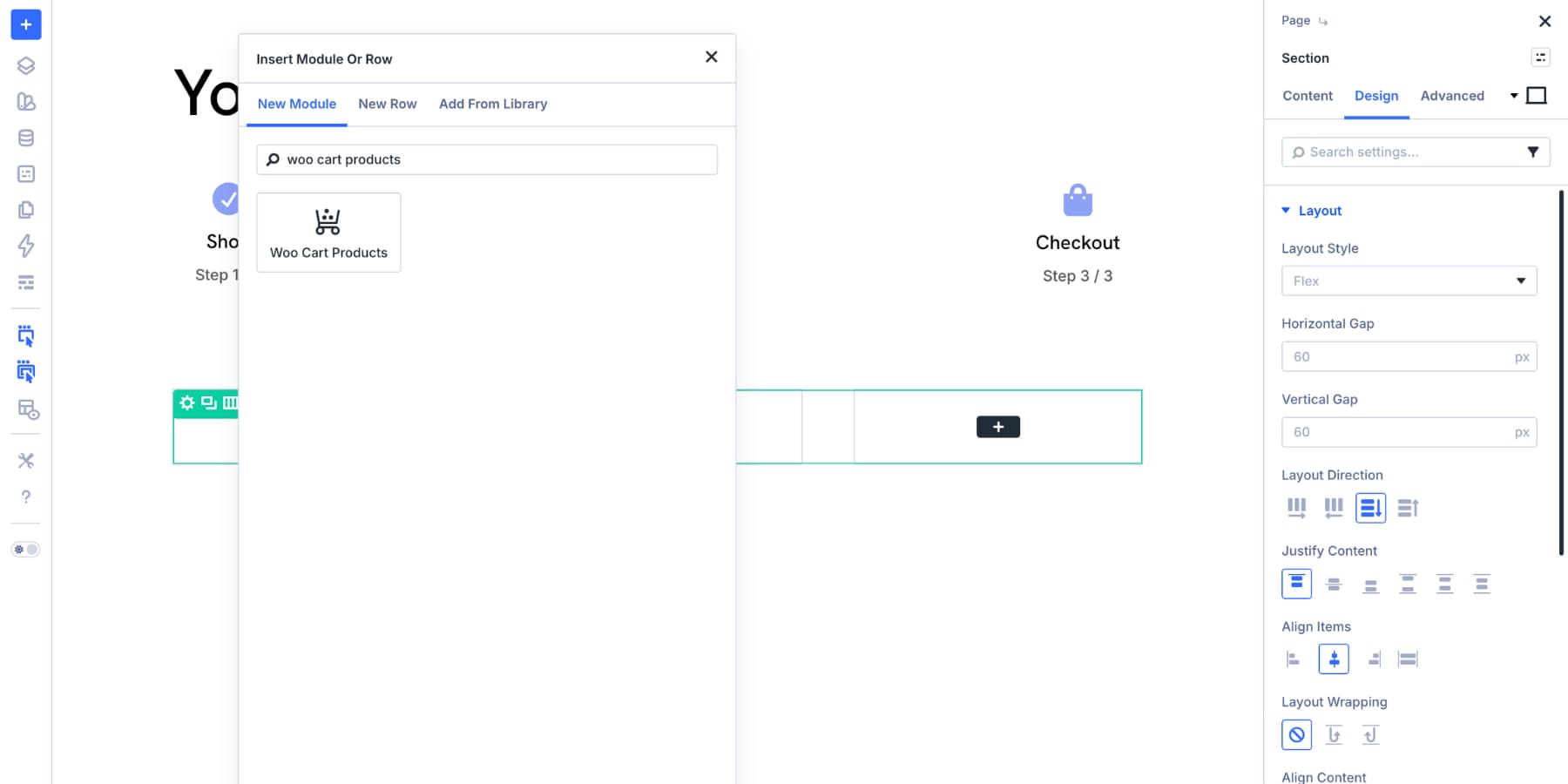
Add the Woo Cart Products module to the wider column. This module displays the products currently in the customer’s cart, including names, images, prices, quantities, and totals.
Start in the Content tab. The Elements settings include four useful toggles:
- Show Product Image: Shows or hides each product’s featured image.
- Show Coupon Code: Shows or hides the coupon form.
- Show Update Cart Button: Shows or hides the Update Cart button.
- Show Remove Item Icon: Shows or hides the remove item icon.
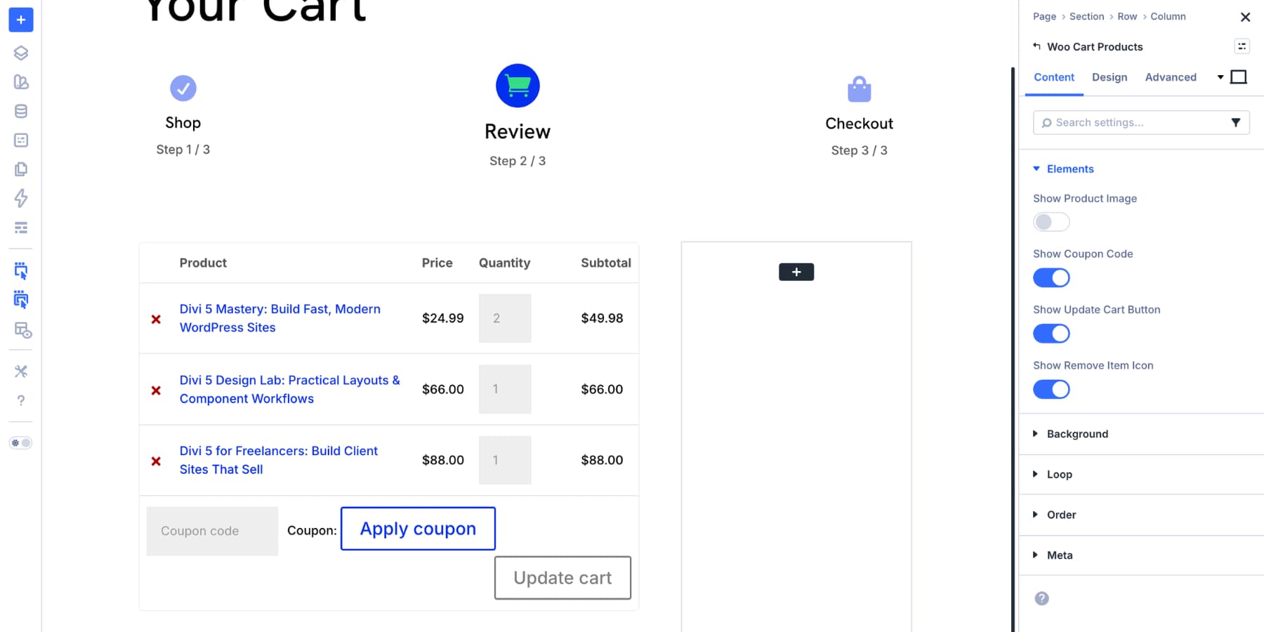
For this example, we hid product images because the cart contains digital products and the product names are enough. If you sell physical products, keep images enabled so shoppers can quickly confirm they added the right item.
Keep the coupon field visible if this is the only place in the layout where shoppers can apply a discount. Hide it only if you have a clearer coupon workflow elsewhere.
Keep the Update Cart button visible when shoppers can change quantities. They need a clear way to apply quantity changes before moving on to checkout.
The remove item icon is also worth keeping. Removing an item is part of normal cart management, and making that action visible can reduce frustration.
After the content settings are in place, move to the Design tab.
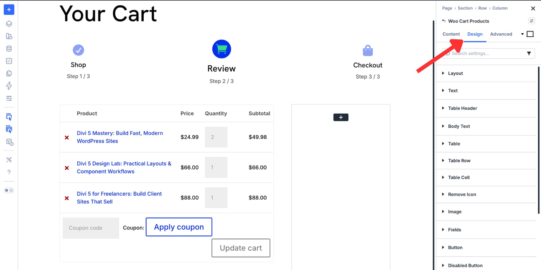
Use the Layout setting to choose how the cart rows display. Horizontal is the default and works well for wider screens. Vertical can be useful for tighter layouts because each element appears on its own row.
Then style the table, table header, body text, table rows, table cells, remove icon, fields, buttons, and disabled button state. If you already use Design Variables for brand colors and typography, apply them here so the cart table stays connected to the rest of your store.
The image settings are useful if product images are enabled. Match the thumbnail radius, border, and spacing to the product cards or product pages elsewhere on the site.
Once the Woo Cart Products module is styled, style the column around it. A soft background, generous spacing, and a consistent border radius can help the cart content feel like a deliberate card rather than a default table.
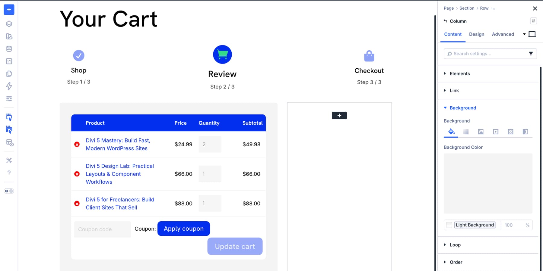
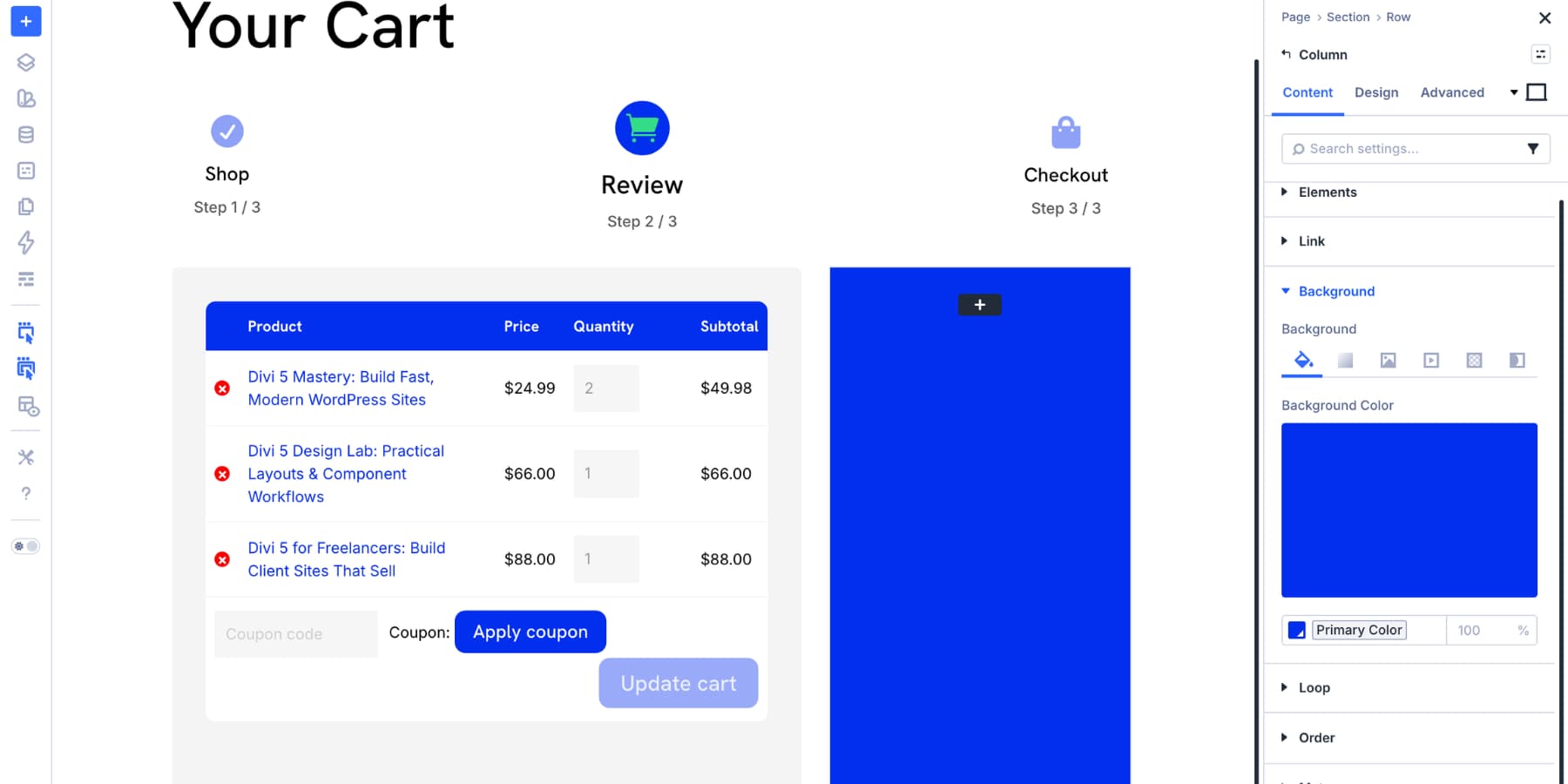
The Cart Sidebar
The right column holds the order summary and checkout action. To make it easy to find, give the column a background color that contrasts with the main cart area while still matching your brand.
Add padding and border radius to the column so the totals area feels contained.
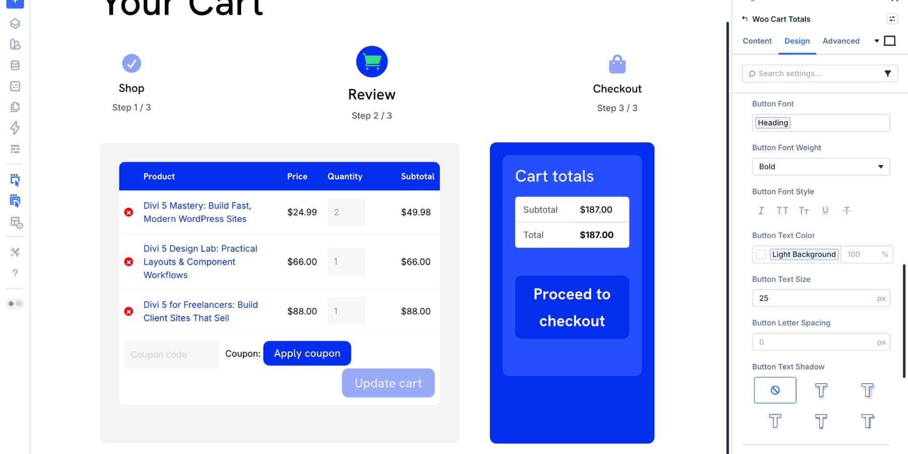
Next, add the Woo Cart Totals module. This module displays the cart subtotal, shipping options, fees, and final total from WooCommerce.
The Woo Cart Totals module is mostly about design and placement. Open the Design tab to style it.
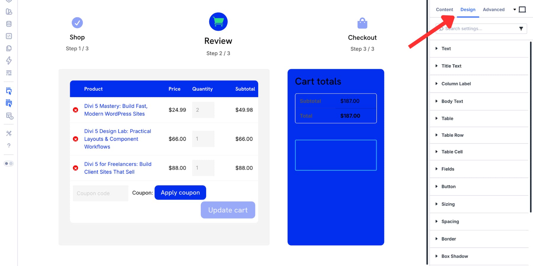
Use Title Text to style the Cart Totals heading. Use Column Label for labels such as Subtotal and Shipping. Use Body Text for the values on the opposite side.
The Table, Table Row, and Table Cell settings let you match the totals table to the cart products table. The Fields settings style the Calculate Shipping or Change Address fields when they appear. The Button settings control the Proceed To Checkout button.
That button deserves extra attention. It is the primary call to action on the cart page. Make it visually clear, give it enough size and spacing, and use the same button style shoppers see elsewhere in your store.
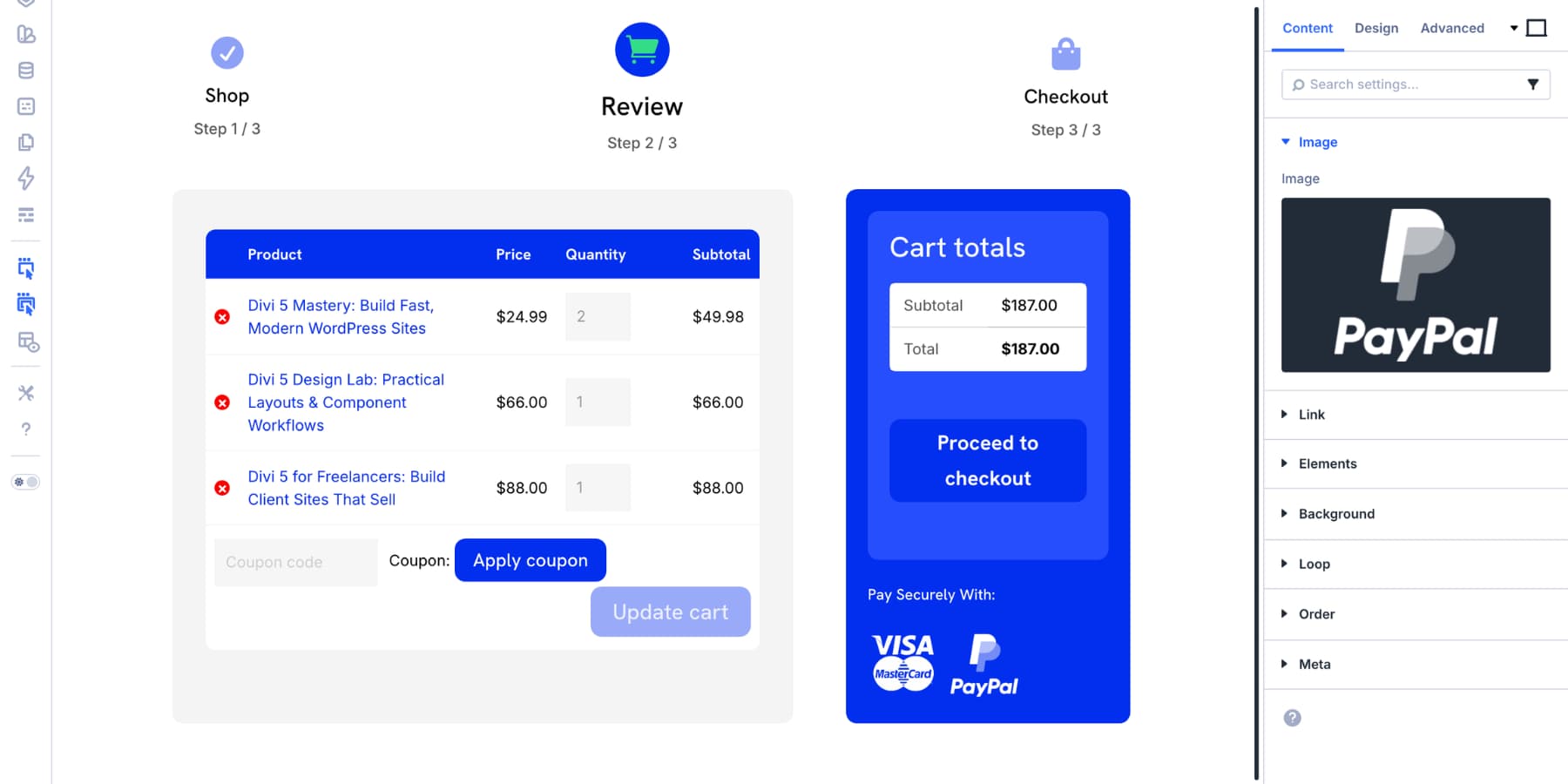
Build Trust Around The Checkout Button
The space near the Proceed To Checkout button is valuable. Shoppers are close to paying, and this is where final doubts often appear. Use this area to reinforce trust without cluttering the page.
Trust signals can include payment logos, security notes, return policy reminders, delivery information, customer support links, or guarantee statements.

For this example, add a short label such as Pay Securely With:, then add a Group module set to row layout with Image modules for payment methods such as Visa, Mastercard, and PayPal.
You can also add more trust indicators depending on your store:
- Policy callouts: Use an Icon List module for short lines such as 30-day returns, Secure checkout, Instant download, or Free shipping over $50.
- Support reassurance: Add a small contact link or chat trigger for shoppers who need one last answer before checkout.
- Review snippets: Add a short testimonial near the cart summary if social proof is important for your product type.
Keep this section short. Trust signals should reduce doubt, not compete with the checkout button.
Add Final Visual Emphasis
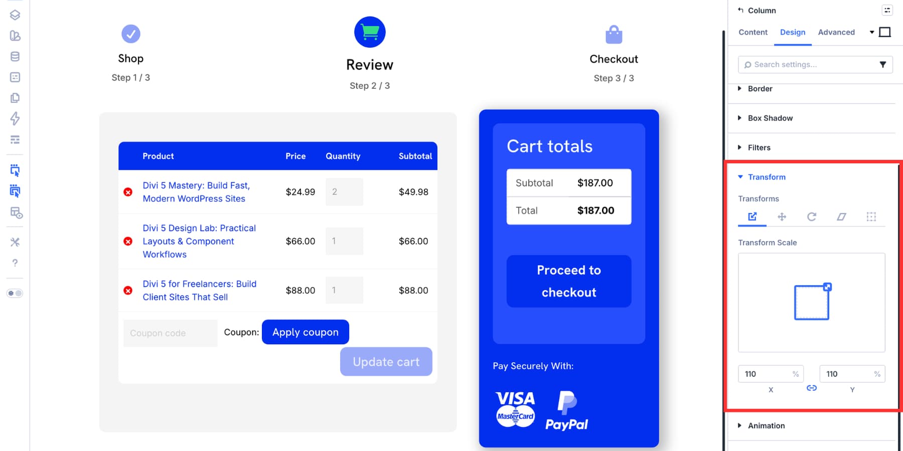
To make the cart totals column stand out, add a subtle box shadow. This gives the checkout area a little depth without making the layout feel busy.
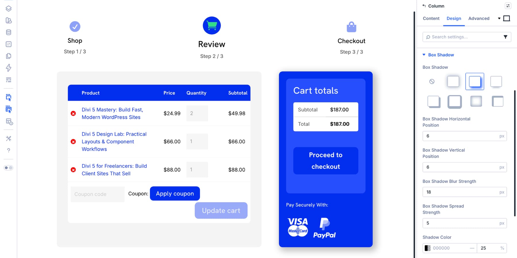
You can also use the Transform settings to scale the sidebar slightly. Use this carefully. A small increase can help the checkout area stand out, but a large scale can create spacing issues, especially on tablets and phones.
At this point, the core cart page is complete. It uses Divi 5’s native Woo Cart modules, keeps the cart contents clear, makes the checkout action obvious, and adds trust signals near the decision point.
Because the layout is built from Divi modules, you can continue adjusting the structure visually. Move the progress indicator, add dividers, change column spacing, or save parts of the design as presets so the cart page stays consistent with the rest of your WooCommerce store.
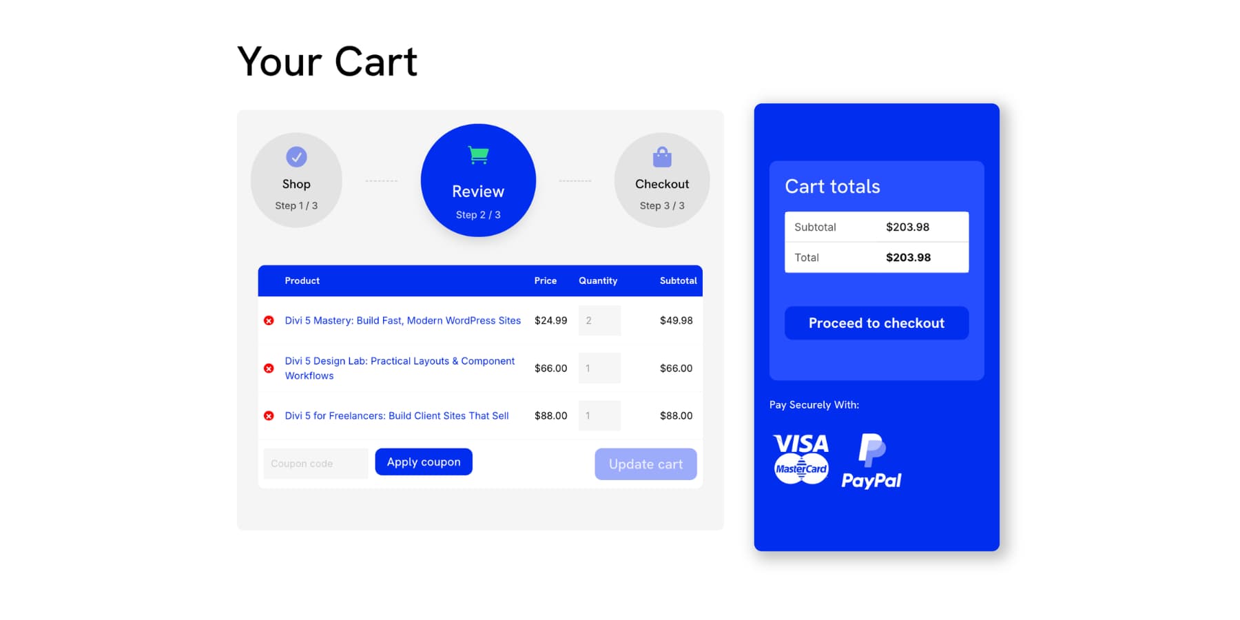
We moved the progress indicator into the cart column and added two Divider modules inside the group to show the purchase path.
Optional: Add Cross-Sells
The cart page can be a good place to suggest complementary products, especially when the add-ons are genuinely useful. This should feel like a helpful recommendation, not a distraction from checkout.
Divi 5 includes a Woo Cross Sells module for this purpose. It displays products you have linked as cross-sells inside WooCommerce. You can place it anywhere in the cart layout, control how many items appear, adjust the column structure, and style the section to match your store.
Add the Woo Cross Sells module below the main cart area or in a full-width section under the cart products and totals. Then style the title, price text, spacing, border, and background so the section feels connected to the rest of the page.
If you want a more custom product carousel instead, you can use a Group Carousel with Loop Builder. Add a Group Carousel module, design one product card inside the group, enable the loop option, set the query to products, and filter by a category that makes sense for your store.
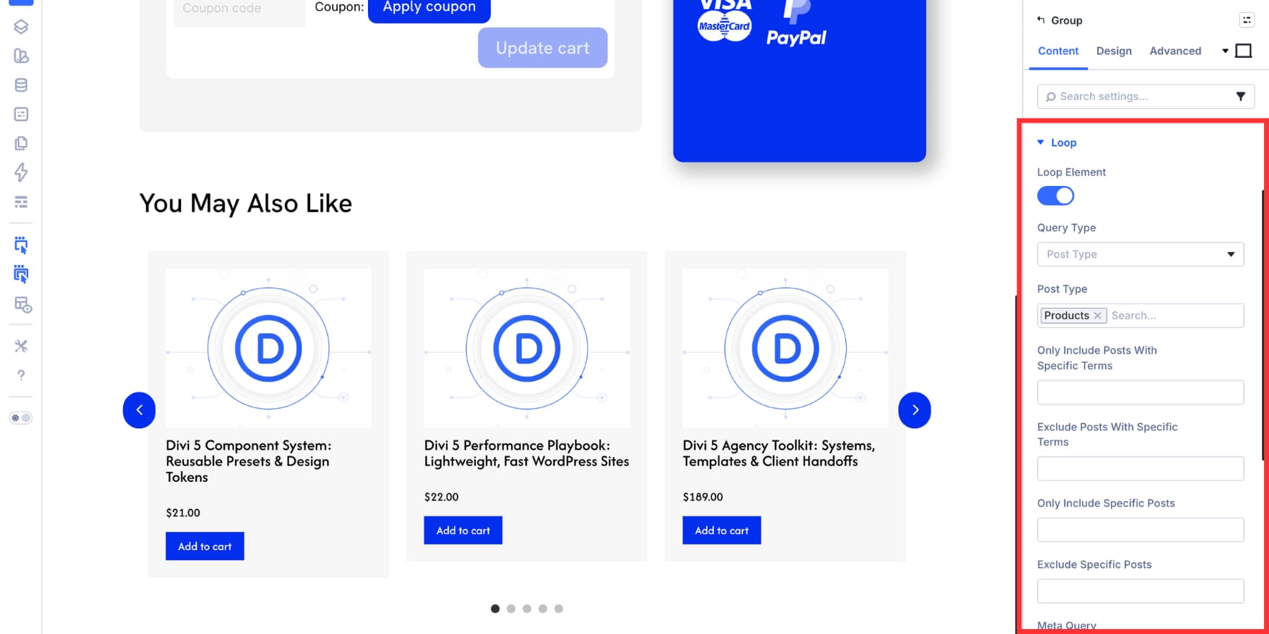
Then connect the card elements to WooCommerce data using dynamic content.
![]()
Use this only when the recommendations are relevant. A focused cart page is often better than a crowded one.
If you want to learn more, we cover building a product carousel with the Loop Builder in detail in this guide.
Optimize The Cart Page For Mobile
Before publishing, test the cart page across Divi 5’s responsive breakpoints. The desktop layout may look strong, but cart pages often need extra mobile attention because tables, totals, buttons, and trust signals can become cramped.
Use the breakpoint controls in the top toolbar to switch views and make adjustments for smaller screens. For example, we hid the blurb progress indicator on tablet and phone because it took up too much vertical space.
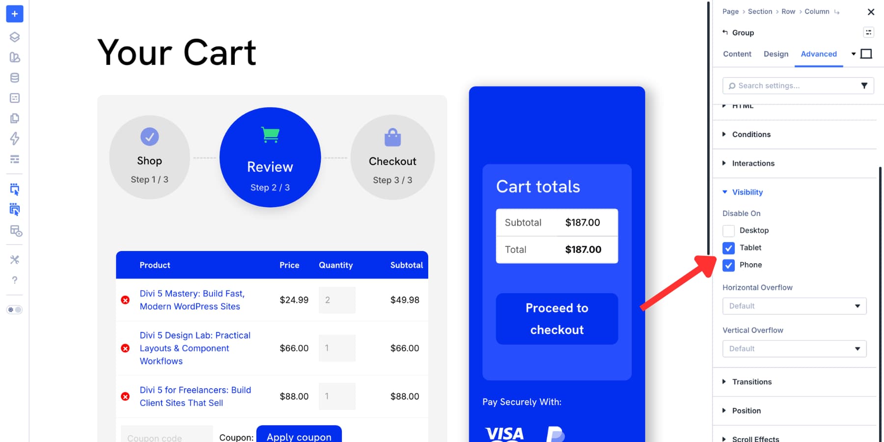
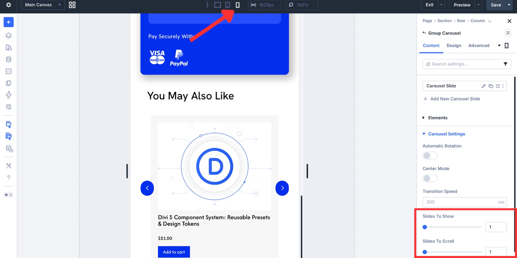
If you add a carousel, adjust it for smaller screens too. At the mobile breakpoint, setting Slides To Show to 1 keeps the carousel readable and easier to swipe.
Check these mobile details before you publish:
- The cart products are easy to read and edit.
- The checkout button is visible and easy to tap.
- The cart totals do not feel buried below too much content.
- Coupon fields and quantity controls are usable on smaller screens.
- Trust signals support the checkout button without pushing it too far down the page.
Divi 5 supports up to seven responsive breakpoints, so keep refining the layout until the cart feels clear on every screen size your customers use.
Start Building Your WooCommerce Store With Divi 5!
A strong cart page keeps shoppers focused, reassured, and ready for checkout. It does not need to be flashy. It needs to show the right products, make the totals clear, keep the checkout action visible, and answer the doubts shoppers often have before paying.
Divi 5 gives you the tools to do that visually. With Woo Cart Products, Woo Cart Totals, Woo Cross Sells, Design Variables, Presets, responsive controls, and the Theme Builder, you can replace the default WooCommerce cart with a page that feels like a natural part of your store.
Build the page once, save the styles you want to reuse, test it across breakpoints, and keep the experience focused on the next step: checkout.


Leave A Reply