

Footers often get built after the rest of the page is done, and that usually shows. Columns stop lining up, spacing feels inconsistent, and the layout starts to fall apart as soon as you check it on smaller screens.
Divi 5 gives you a better way to build footer layouts with its Flexbox controls. Instead of fixing alignment with one-off margins and padding, you can decide how footer sections stretch, stack, align, and reflow directly inside the builder.
In this tutorial, we’ll build a responsive footer with a CTA block, newsletter signup, navigation links, social links, and a copyright bar. We’ll use Design Variables for reusable styling and Flexbox for the structure, so the footer stays easier to adjust across desktop, tablet, and mobile.
- 1 Why Build A Flexbox Footer In Divi 5?
- 2 What We’re Building
- 3 Step 1: Open The Global Footer In Theme Builder
- 4 Step 2: Create The Design Variables
- 5 Step 3: Build The Main Footer Structure
- 6 Step 4: Apply Flexbox To The Main Row
- 7 Step 5: Apply Flexbox To The CTA Block
- 8 Step 6: Style The CTA Block
- 9 Step 7: Apply Flexbox To The Newsletter Block
- 10 Step 8: Style The Newsletter Block
- 11 Step 9: Create The Footer Navigation With Loop Builder
- 12 Step 10: Apply Flexbox And Style The Navigation Group
- 13 Step 11: Add The Copyright Text
- 14 Step 12: Optimize The Footer For Responsive Screens
- 15 Download 20 Flexbox Footers For Divi 5
- 16 Download For Free
- 17 Build Better Footer Layouts With Flexbox In Divi 5
A footer might look simple, but it usually contains several different content types: calls to action, menus, signup forms, social icons, legal text, and sometimes contact details.
That mix can get messy fast. One column has more content than another. A form needs more space than the link list beside it. Social icons need to sit close together, but the whole group still needs to align with the rest of the footer. In older workflows, the fix often involved stacking manual margin and padding values until the footer looked right in one viewport. Then you checked tablet or mobile, and the layout needed another round of adjustments.
Divi 5’s Flexbox layout system handles those relationships at the container level. Instead of treating every module as an isolated object, you control how items behave inside Sections, Rows, Columns, and Module Groups. Three Flexbox controls do most of the work in this footer:
- Align Items: Controls how flex items align across the cross axis. In this build, Stretch helps columns fill the available height so the two sides of the footer stay visually balanced.
- Gap: Controls the spacing between flex items without relying on separate margin values on each module.
- Layout Direction: Controls whether items flow horizontally in a row or vertically in a column.
This footer also follows the same system-first approach we use across Divi 5 builds. Design Variables define repeated values, such as colors, spacing, and fluid font sizes. Flexbox controls the layout relationships between those styled elements.
That combination gives you a footer that is easier to maintain. If the accent color changes, update the variable. If the spacing needs more breathing room, adjust the shared spacing value. If the layout needs to stack differently on smaller screens, update the Flexbox settings instead of rebuilding the whole section.
Learn Everything About Divi 5’s Flexbox
What We’re Building
Before we start building, here’s a look at the finished footer.
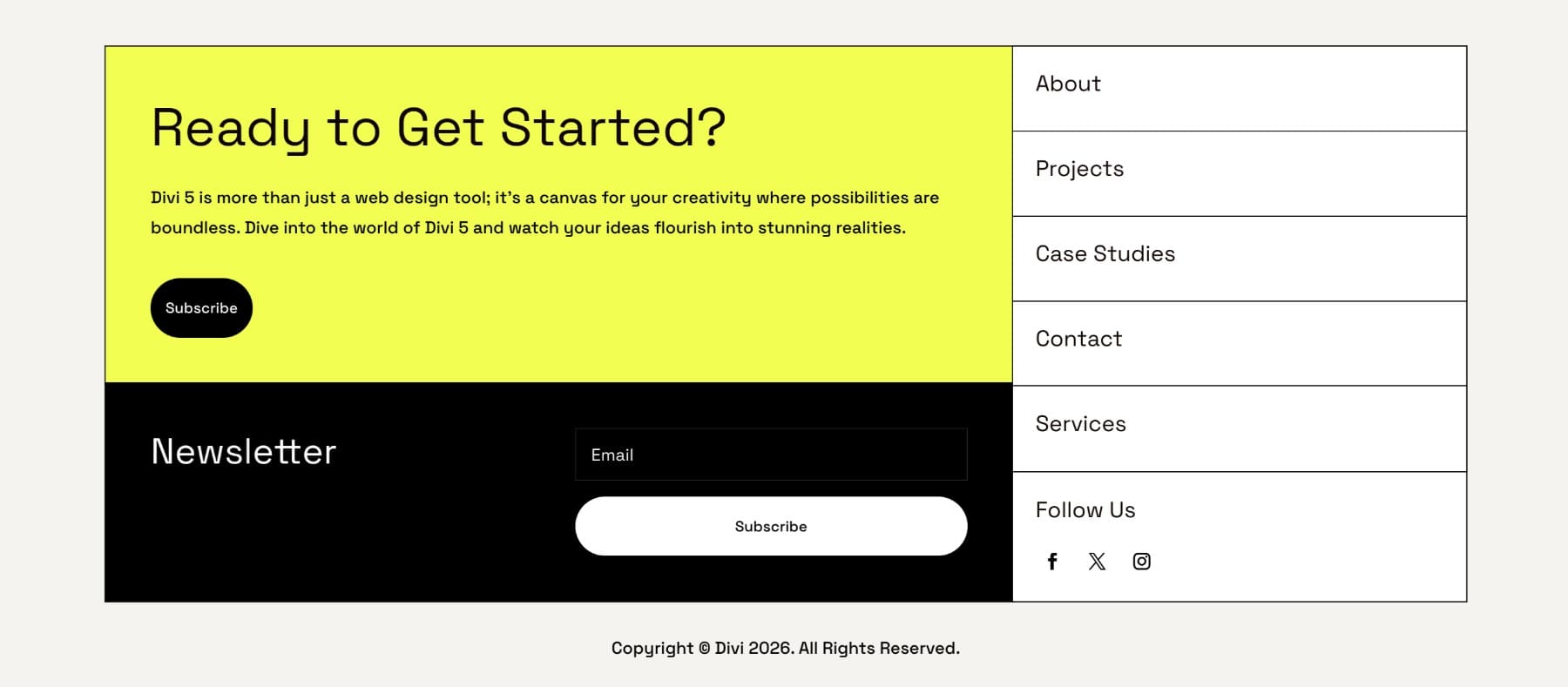
The footer has one main two-column layout. The left side contains two stacked blocks:
- A yellow CTA block with a heading, supporting text, and button
- A dark newsletter block with an Email Optin module
The right side contains two matching white blocks:
- A navigation link group
- A Follow Us group with social icons
Below the main row, a separate full-width copyright row closes out the footer. This structure gives us a good reason to use Flexbox. The left and right sides contain different kinds of content, but they still need to align cleanly as one footer system.
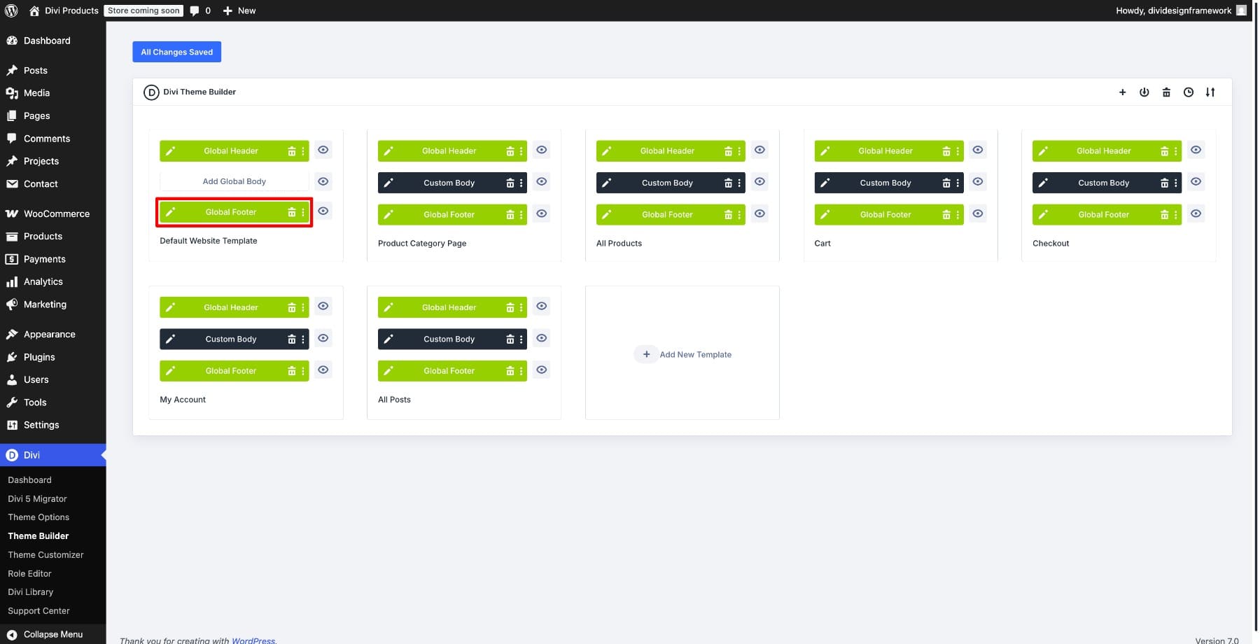
Go to Divi > Theme Builder. In the Global Template, click the pencil icon next to the Global Footer area to edit it.
The footer opens in the Visual Builder, where you can build the layout using Divi 5’s row, column, module, and Flexbox controls.
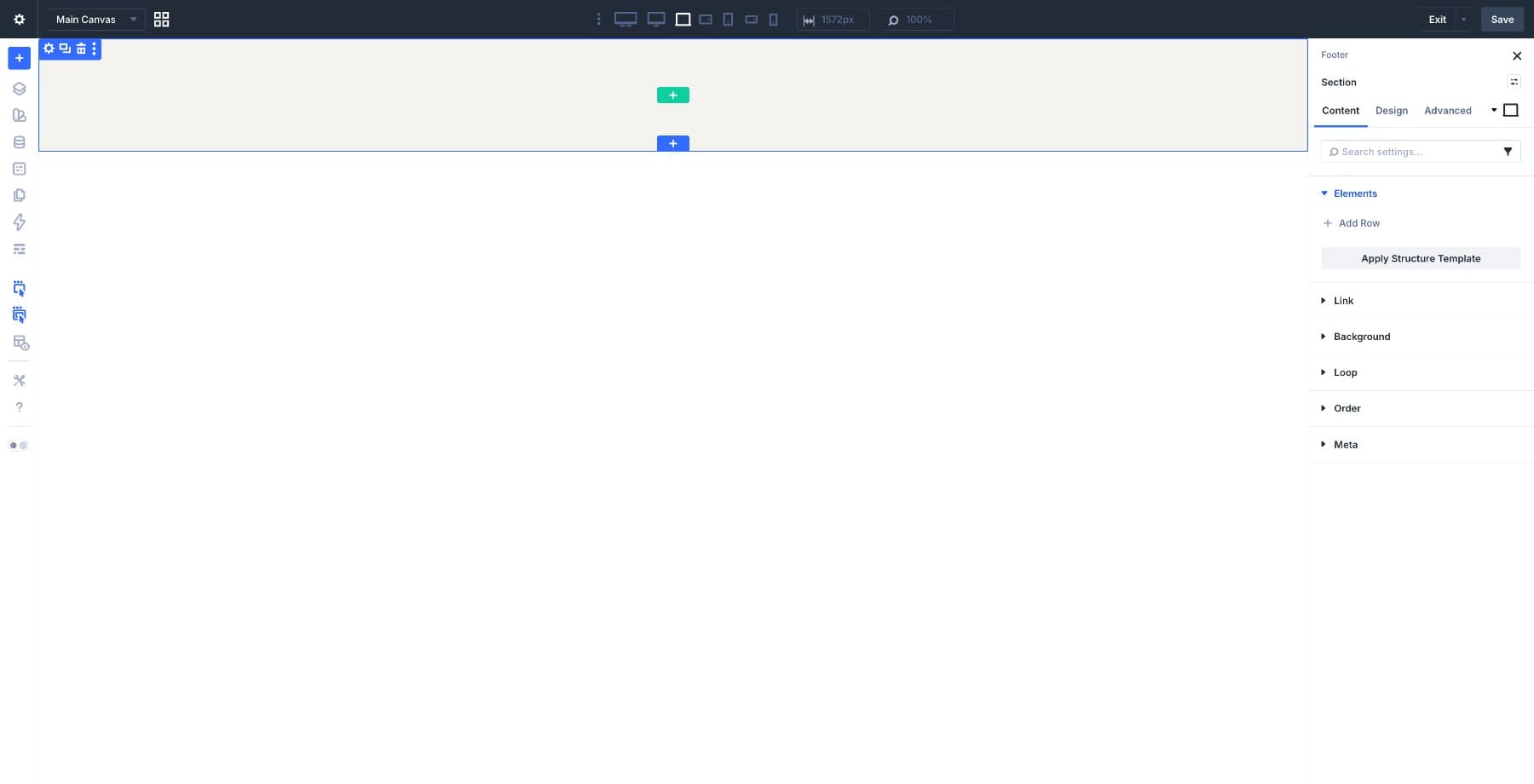
If your site already has a footer, you can adapt the same process to the existing structure. If you are starting fresh, begin with a blank footer canvas.
Step 2: Create The Design Variables
If your site already uses Design Variables, you can reuse your existing color, font, and spacing system. If you are building this footer as a standalone exercise, create a few variables first.
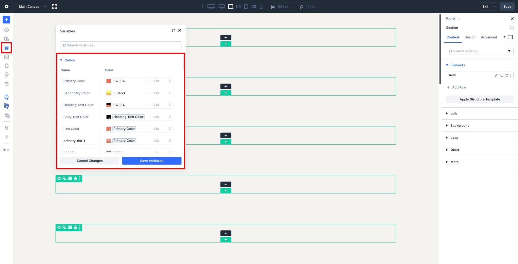
Open the Design Variables panel and start with colors. Create or update variables for:
- Footer Accent: The yellow accent color used in the CTA block
- Footer Dark: The black or dark background used in the newsletter block
- Footer Light: The white background used in the right-side blocks
- Footer Muted Text: A softer text color for secondary footer text
Name variables by role instead of by value. Footer Accent is easier to maintain than a name based on the current hex code, because the role can stay the same even if the color changes later.
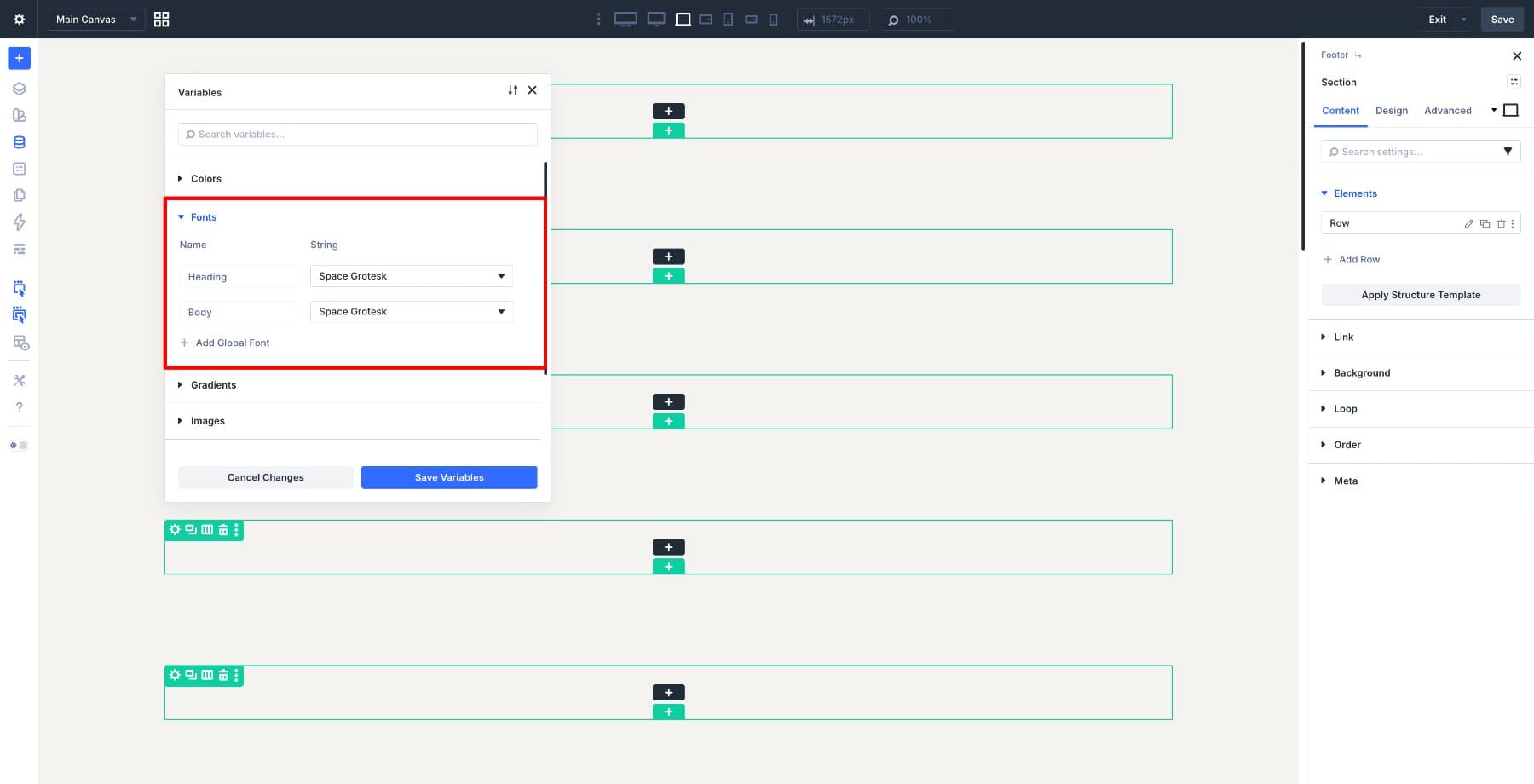
Next, set up a font variable if the footer uses a typeface different from your site’s default body font.
Create a Number Variable for repeated spacing. Name it Footer Spacing and set it to 5%. We’ll use this for padding inside the footer blocks so the spacing stays consistent.
Finally, create a Number Variable for fluid footer text. Save it as Footer Font – Fluid and set it to:
clamp(16px, 1rem + 0.4vw, 21px)
This lets footer text scale more smoothly between smaller and larger screens without setting separate font sizes for every breakpoint.
The goal is not to create variables for every possible value. The goal is to create variables for values you expect to reuse.
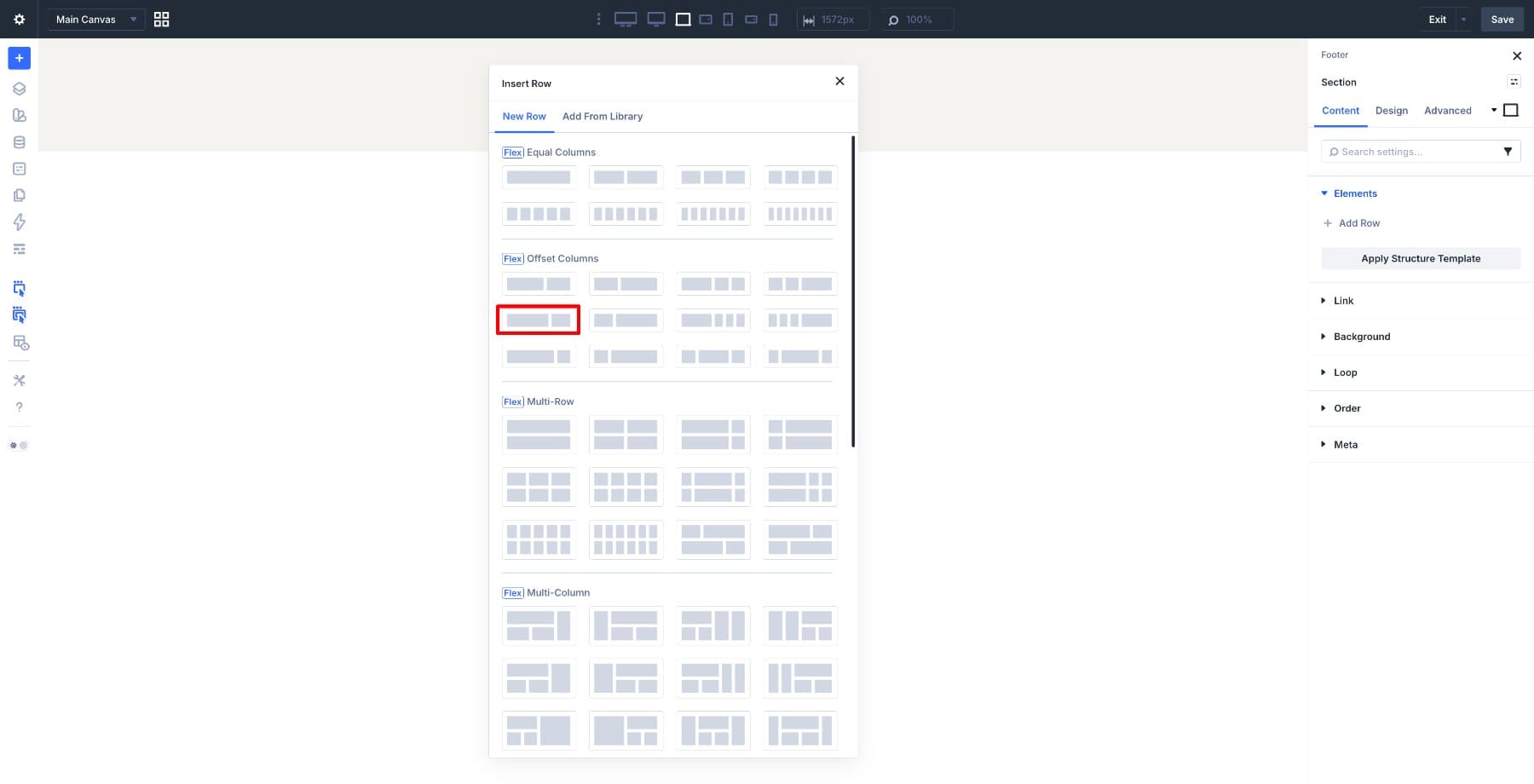
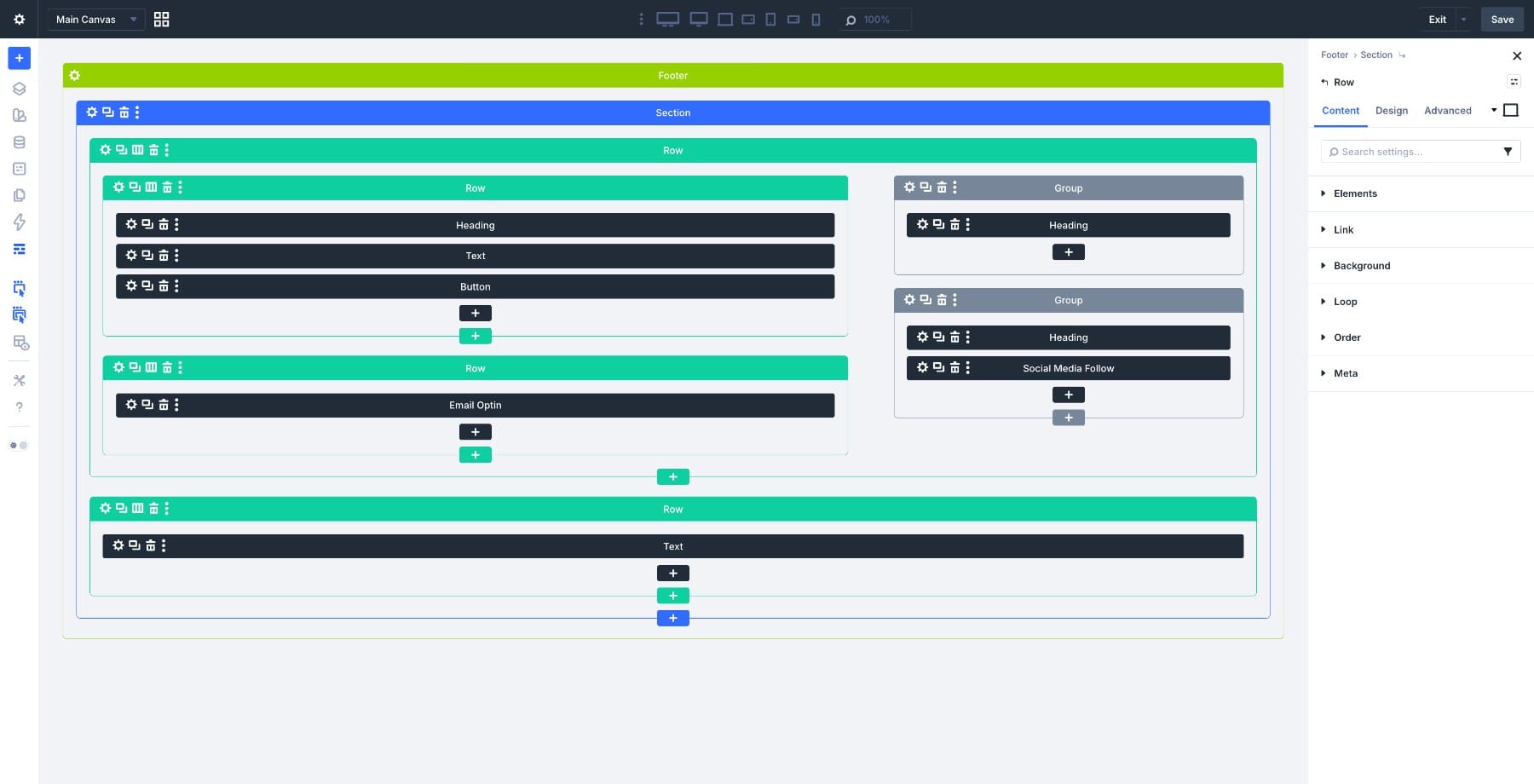
Inside the footer section, insert a Flex Offset 2-column row. This will be the main row that holds the left stack and the right stack.
Open the Row settings and go to Design > Sizing. Set:
- Width: 90%
- Max Width: 1280px
- Alignment: Center
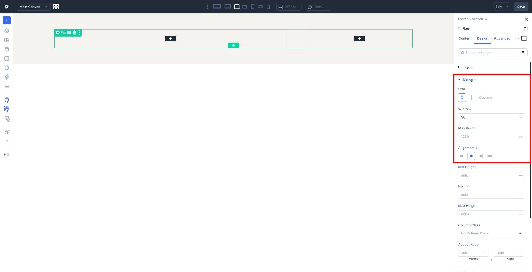
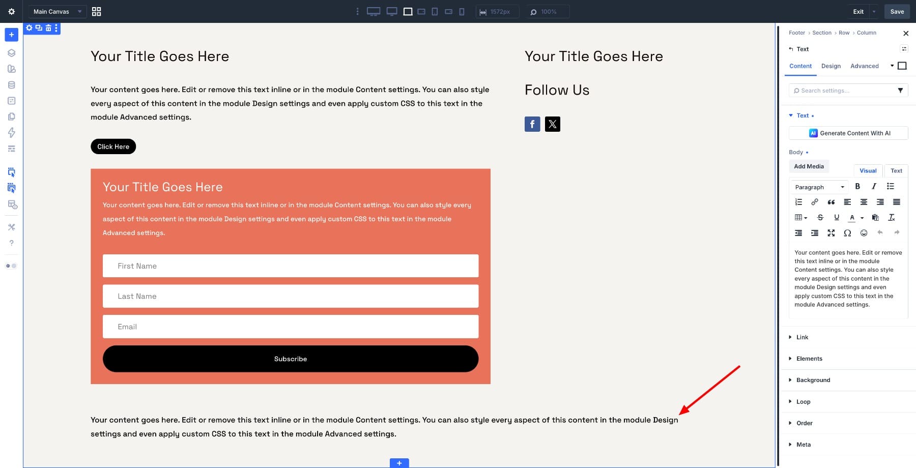
This keeps the footer content centered and prevents it from stretching too wide on large screens. Inside the left column, add a nested one-column Row. This row will hold the CTA content. Add these modules inside it:
- Heading module: CTA headline
- Text module: Supporting copy
- Button module: CTA button
Below that CTA row, add another one-column Row for the newsletter signup. Place an Email Optin module inside it.
In the right column, add a Group module for the navigation links. Place a single Heading module inside it. We’ll use Loop Builder later so this one module can repeat for each page in the query.
Below that, add another Group module for the social section. Inside it, add:
- A Heading module with the text Follow Us
- A Social Media Follow module with your chosen platforms
Finally, add one more row below the main two-column row. Use a single-column row and add a Text module for the copyright line.
Here is the footer structure in Wireframe view.
Step 4: Apply Flexbox To The Main Row
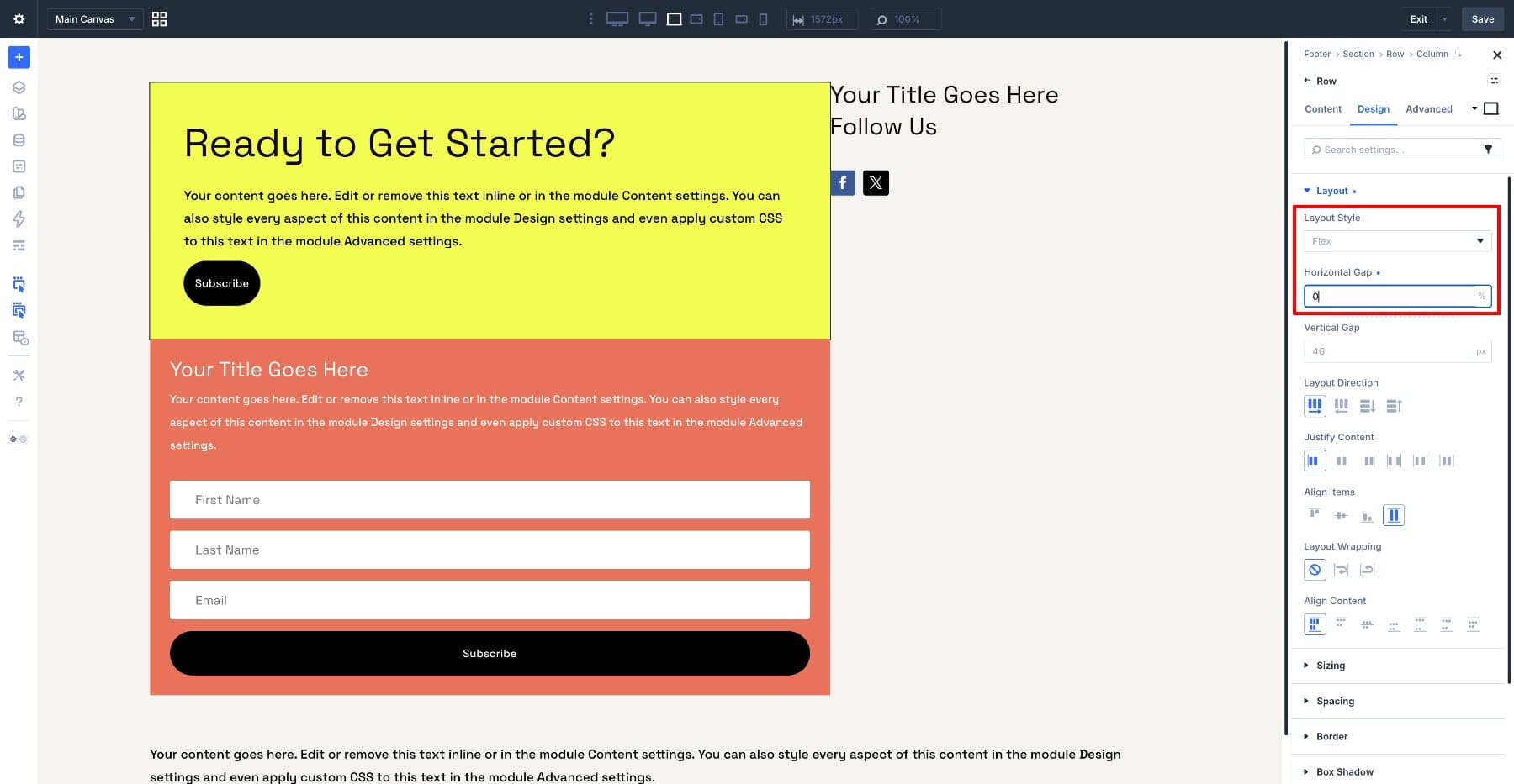
Now that the structure is in place, use Flexbox to control how the two sides align. Open the main two-column row settings and go to Design > Layout. Confirm Layout Style is set to Flex. Then set:
- Layout Direction: Row
- Horizontal Gap: 0
- Vertical Gap: 0
- Align Items: Stretch
- Layout Wrapping: No Wrap
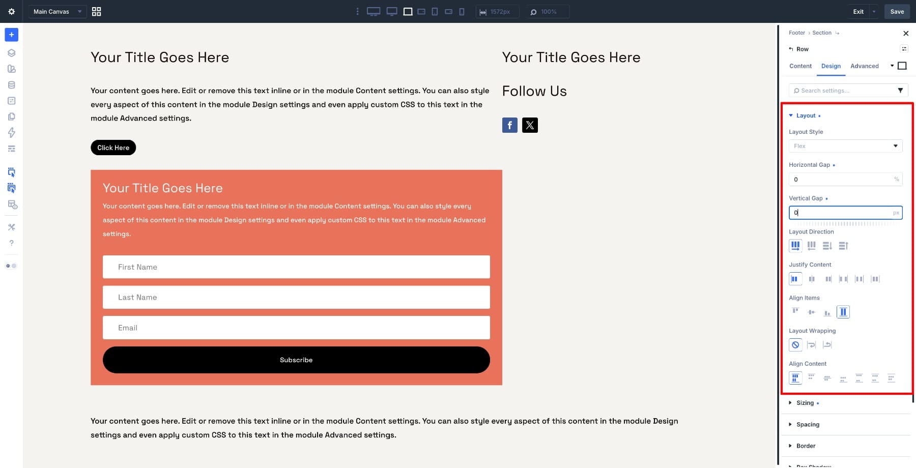
The row direction keeps the two main columns side by side. The zero gaps keep the blocks flush against each other. Align Items: Stretch helps the columns fill the available height, which keeps both sides visually aligned.
Keep Justify Content and Align Content at their defaults for this layout. Align Content only becomes relevant when wrapping creates multiple lines of flex items, and this row is set to No Wrap. Next, open each of the two child columns. In both columns, go to Design > Layout and set Vertical Gap to 0.
This keeps the CTA and newsletter blocks touching in the left column, and the navigation and social blocks touching in the right column.
Step 5: Apply Flexbox To The CTA Block
Open the nested CTA row, the one containing the Heading, Text, and Button modules. Go to Design > Layout and confirm Layout Style is set to Flex. Set Horizontal Gap to 0.
Then go to Design > Sizing and enable Stretch to Fill. This helps the CTA row fill the available height inside the left column instead of leaving awkward empty space below the button.
Now open the column inside this CTA row. Go to Design > Layout, confirm Flex is enabled, and set Vertical Gap to 10px.
Then go to Design > Spacing and set the column padding to the Footer Spacing variable.
The gap controls spacing between the modules. The padding controls the space inside the CTA block. Keeping those jobs separate makes the layout easier to adjust later.
Step 6: Style The CTA Block
Stay inside the CTA column and go to Design > Background. Set the background color to your Footer Accent variable.
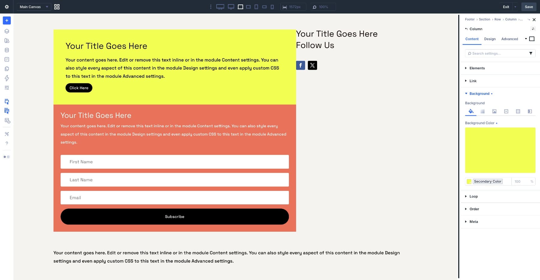
Next, go to Design > Box Shadow. Select Preset 4. Leave every value at 0 except Spread, which should be set to 1. Set the shadow color to #000000 at 100% strength.
This creates a thin, flat edge that reads more like a border than a traditional drop shadow. Open the Heading module and add the text: “Ready to Get Started?”. Then, apply the following settings:
- Tag: H2
- Font Size: 50px
- Line Height: 1.3em
- Layout Style: Block
Setting the Heading module to Block keeps it behaving like a normal block element inside the flex column.
Move to the Text module. Set the text color to black or your dark footer text variable, set Font Size to 16px, and set Layout Style to Block.
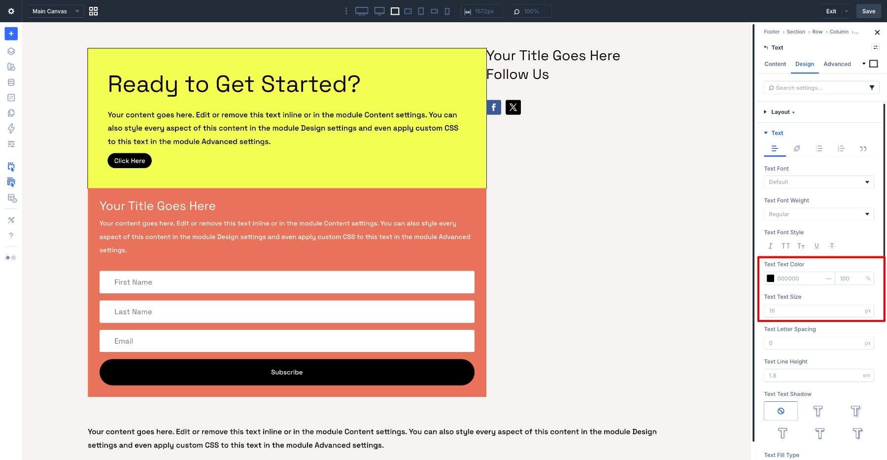
Finish with the Button module. Set the background color to black and the text color to white. Then go to Design > Spacing and set the top and bottom padding to 16px.
Now repeat the layout setup for the newsletter row.
Open the nested row that contains the Email Optin module. Go to Design > Layout and confirm Layout Style is set to Flex. Set Horizontal Gap to 0.
Open the column inside that row. Confirm Flex is enabled under Design > Layout, then set Vertical Gap to 10px.
Go to Design > Spacing and set the column padding to the same Footer Spacing variable.
This keeps the newsletter block aligned with the CTA block above it and uses the same spacing system.
Open the newsletter column settings and go to Design > Box Shadow. Match the CTA column:
- Preset: Preset 4
- Spread: 1
- Other values: 0
- Shadow Color: #000000 at 100%
Inside the Email Optin module, type Newsletter as the title. Turn off any fields you do not need, then connect your email provider and email list.
Go to Design > Background and set the module background to your Footer Dark variable.
Under Design > Layout, set Layout Direction to Row and Vertical Gap to 0. This keeps the form elements tighter inside the dark block.
Style the title next. Set the title text color to white and the Font Size to 34px. Then customize the input fields:
- Input Background: Black or Footer Dark
- Placeholder Text: White
- Input Text: White
- Border Width: 1px
- Border Color: Transparent or subtle light value
Customize the label text as well, using white or your light footer text variable. If your optin form uses checkbox or radio fields, review those styles too so they match the dark layout.
For the Email Optin button, set the background to white and the text color to black. Then go to Design > Spacing and set:
- Top Padding: 16px
- Bottom Padding: 16px
- Left Padding: 32px
- Right Padding: 32px
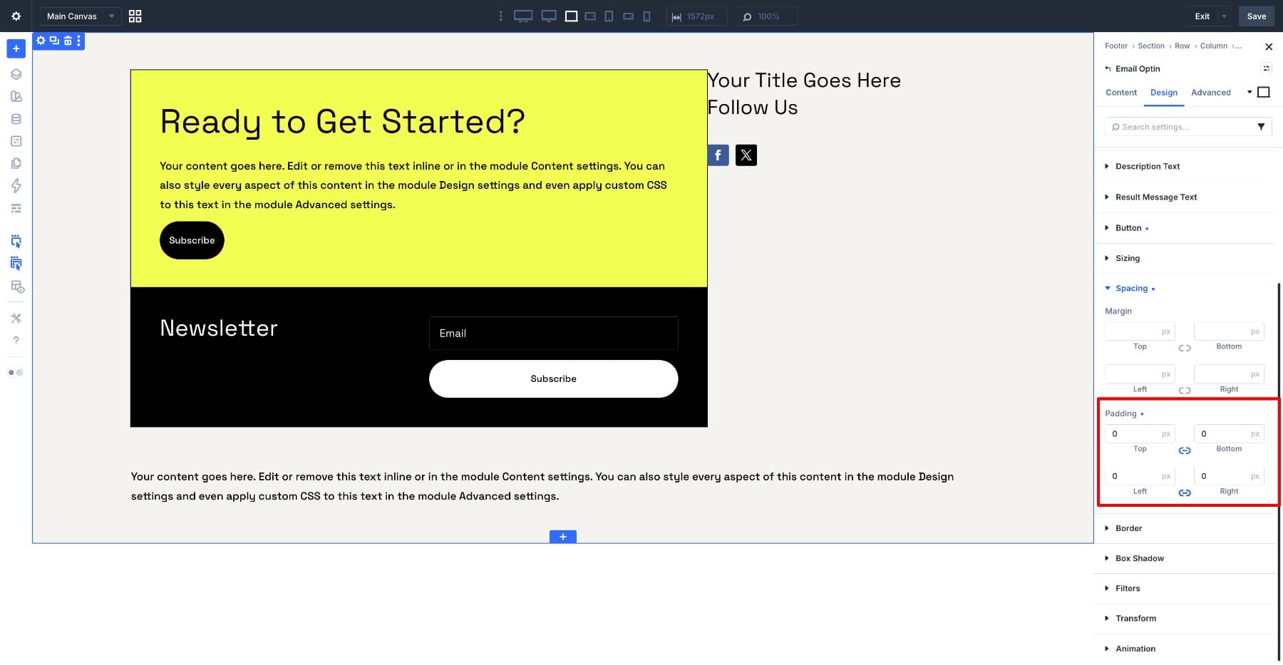
Finally, open the Email Optin module’s spacing settings and set its padding to 0 on all sides. The outer column already handles the spacing, so the module itself does not need extra internal padding.
Now turn the Heading module inside the navigation Group into a repeating element. Open the Heading module and go to Content > Loop. Toggle Loop Element on.
Set Query Type to Post Type, then set Post Type to Pages.
This pulls page content into the loop. For a production footer, review the query settings carefully so the loop only includes the pages you want in the footer. This is not the same thing as automatically outputting your WordPress navigation menu; it is a looped page list that you can style and control inside the builder.
Next, go to Content > Text > Heading. Click the dynamic content icon and select Loop Title. The Heading module now displays the title for each page returned by the loop query.
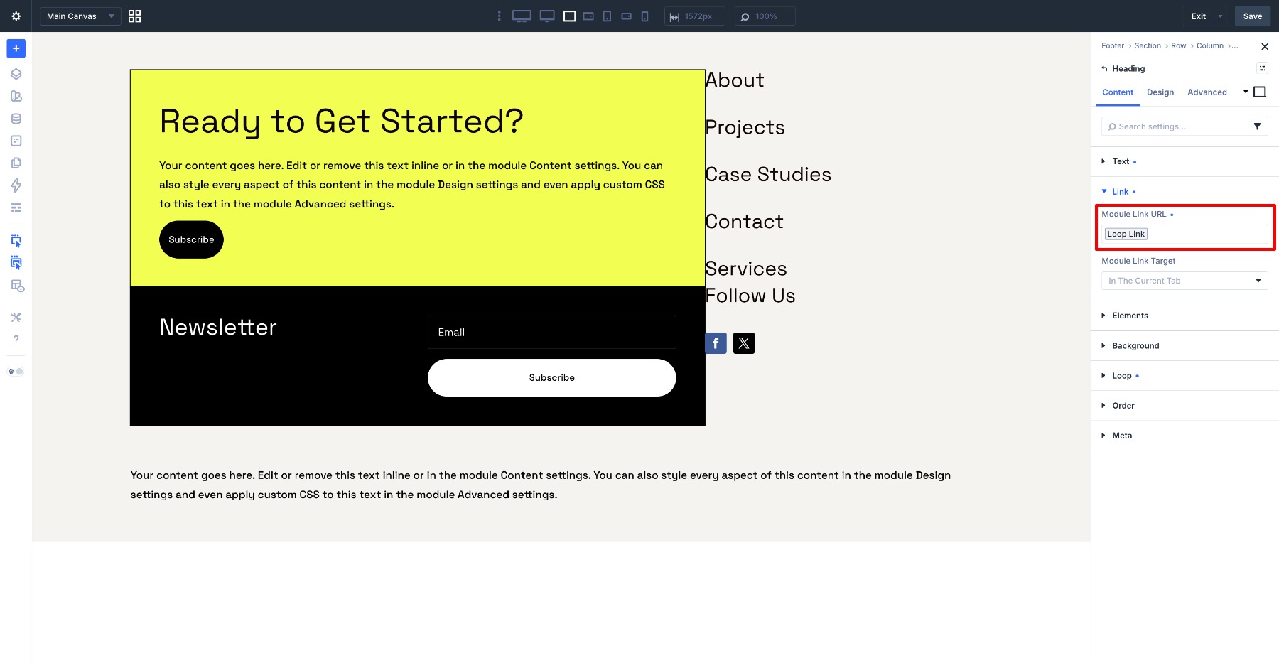
Then go to Content > Link. Click the dynamic content icon on the URL field and select Loop Link. Each looped heading now links to its corresponding page.
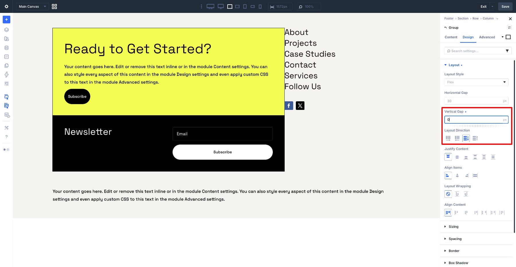
Open the Group module that contains the looped Heading. Go to Design > Layout and set:
- Layout Direction: Column
- Vertical Gap: 0
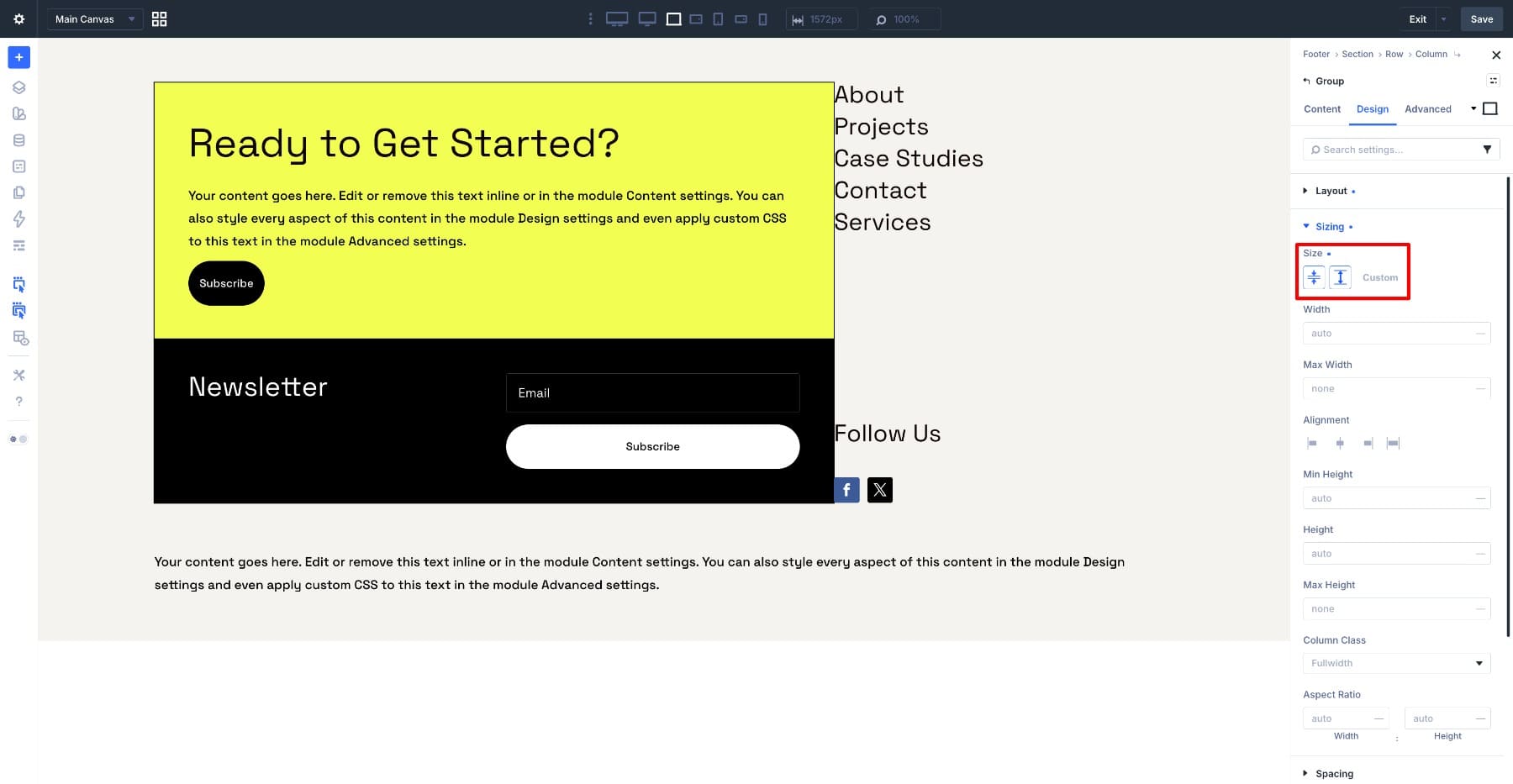
Then go to Design > Sizing and enable Grow to Fill. This lets the navigation group take up the available height in the right column.
Now style the looped Heading module inside it.
Go to Design > Background and set the background to white. Set Layout Style to Block and the heading tag to H4.
For Font Size, use the Footer Font – Fluid variable. Set Line Height to 1.3em.
Go to Design > Sizing and enable Grow to Fill here as well, so each looped heading can stretch evenly inside the group.
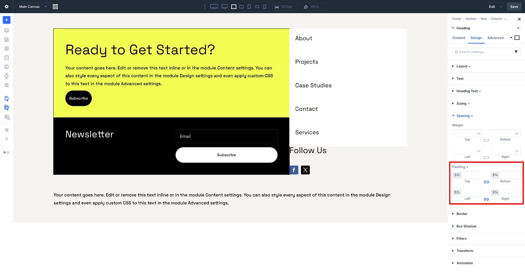
Go to Design > Spacing and set the module padding to the Footer Spacing variable.
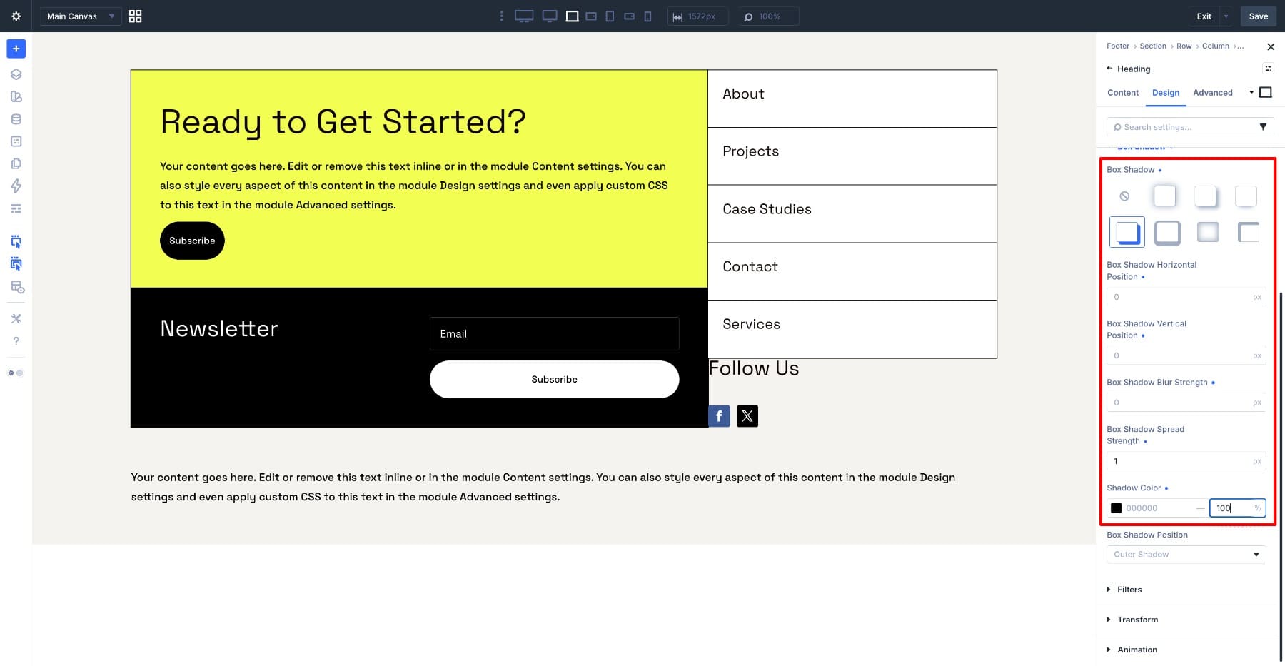
Under Design > Box Shadow, use the same flat edge treatment:
- Preset: Preset 4
- Spread: 1
- Other values: 0
- Shadow Color: #000000 at 100%
Repeat the same visual treatment for the Follow Us group so the right column feels consistent.
Step 11: Add The Copyright Text
Open the Text module in the copyright row. Click the dynamic content icon and select Current Date. Set Date Format to Custom and enter:
Y
This outputs the current year only, so the footer does not need a manual year update each January. In the Before field, type:
Copyright © Divi
In the After field, type:
. All Rights Reserved
Then go to Design > Text and set Text Alignment to Center.
Switch to tablet and mobile view using the responsive toolbar.
Much of the layout should already behave well because the structure is based on Flexbox relationships instead of fixed manual spacing.
The main settings to review are:
- Column stacking: Confirm the left and right footer stacks appear in the right order.
- Layout Direction: Adjust direction on specific rows or groups if content needs to stack differently on smaller screens.
- Gap: Check whether the spacing between stacked items still feels intentional.
- Grow to Fill and Stretch to Fill: Make sure these settings help the layout instead of forcing awkward heights on smaller screens.
- Email Optin layout: Confirm the input field and button have enough room once the layout narrows.
- Navigation loop: Make sure the looped links do not feel too cramped on mobile.
- Social icons: Review icon size and spacing.
- Copyright text: Make sure the final line stays readable.
The fluid text variable helps here because the footer text scales between its minimum and maximum values. You still need to review responsive views, but you should need fewer manual breakpoint fixes.
Save the footer and preview it across desktop, tablet, and mobile.
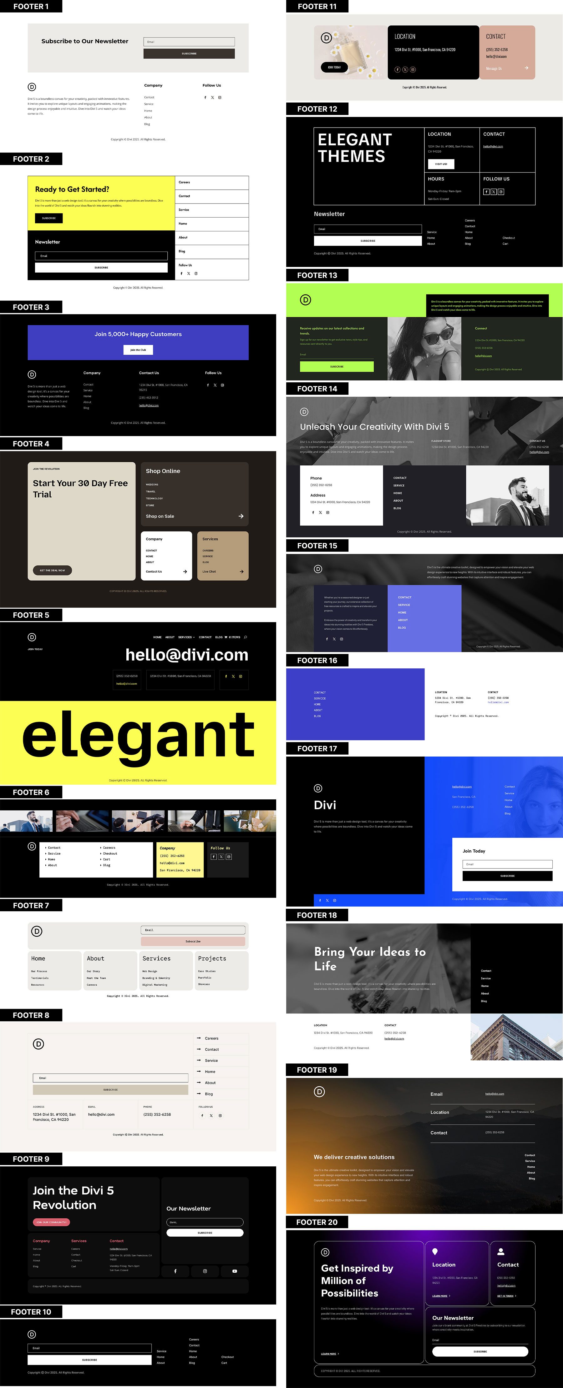
Get all 20 Flexbox footers for free, including both Default and Prestyled versions. Each footer is ready to import into your Divi Library and use in the Theme Builder. Just download and start building.

You just built a responsive footer in Divi 5 without writing custom CSS.
Design Variables handled repeated colors, spacing, and fluid text sizing. Flexbox handled the structure: stretching columns, controlling gaps, stacking content, and keeping related elements aligned.
The larger takeaway is that this workflow is not limited to footers. The same Flexbox controls can help with headers, pricing tables, card layouts, feature rows, optin sections, and any layout where multiple pieces need to stay aligned as the screen changes.
Once you understand how Align Items, Gap, and Layout Direction work together, you can build layouts that need fewer one-off fixes and hold up better across screen sizes.




Leave A Reply