
Flexible and responsive websites are crucial, especially in the fast-evolving world of WordPress. Modern websites must adapt seamlessly across various screen sizes, from widescreen desktops to compact mobile screens. Divi 5 is a complete core rewrite of Divi 4, designed with speed, performance, and flexibility in mind.
At the heart of this transformation is Divi 5’s Flexbox Layout System, a new feature that allows Divi users to build complex, responsive layouts with ease. In this post, we’ll dive into what makes Flexbox a great addition to Divi 5.
Let’s get started.
What Is Flexbox?
Flexbox, or the Flexible Box Layout, is a CSS layout model designed to arrange elements in rows or columns, allowing them to flex, shrink, or expand to fit available space.
Subscribe To Our Youtube Channel
Unlike traditional layout methods, Flexbox simplifies the creation of dynamic, responsive designs by providing intuitive controls for alignment, spacing, and ordering. Its one-dimensional approach makes it ideal for building flexible layouts across devices.
Divi 5’s Integration Of Flexbox
Divi 5 integrates Flexbox directly into its core, replacing outdated layout systems like specialty and full-width sections. By embracing Flexbox, Divi 5 offers a modern, efficient system that supports infinite nestability and more advanced layout possibilities without needing custom code.
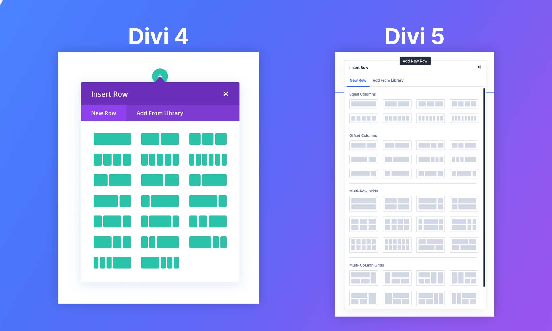
Divi 4 vs Divi 5
While functional, Divi 4’s grid system was constrained by column structures and limited nestability. For example, reordering columns for mobile devices required either duplicating the section and hiding it on smaller screen sizes or adding custom CSS.
Divi 5’s Flexbox System eliminates these limitations, offering a better way to build Divi websites. This overhaul makes Divi 5 a more flexible and future-proof solution.
Key Features Of Divi 5’s Flexbox Layout System
Divi 5’s Flexbox Layout System has features that redefine how designers approach building websites. Users can unlock a powerful, intuitive set of tools for creating dynamic and responsive designs by enabling the Flex option. Here’s a breakdown of its core capabilities:
Any Layout, No Limits
With Divi 5, you can create virtually any layout using Flexbox. Although it has various layout options, you aren’t constrained to them. With Flexbox, you can build anything with precision. The system supports unique designs for different devices, ensuring layouts look stunning on desktops, tablets, and smartphones.
Designers can tweak module placement and styling to suit specific screen sizes.
The system supports unique designs for different devices through Customizable Responsive Breakpoints. Using options like Layout Direction and Layout Wrapping, designers can control module placement, column arrangements, and styling to ensure layouts look stunning on any device.
Advanced Positioning & Alignment
The Justify Content and Align Items controls make vertical and horizontal alignment intuitive. Whether centering content vertically with Align Items set to end or distributing elements with Justify Content set to Start, Divi 5 provides user-friendly settings to achieve pixel-perfect results without custom CSS.
Divi 5 addresses Divi 4’s mobile stacking issues with custom column ordering. Designers can rearrange elements for mobile and desktop views using responsive controls in the Visual Builder, ensuring modules appear in the desired order without duplicating sections.
Enhanced Control Over Spacing & Wrapping
Divi 5’s Sizing Tab offers options like Grow to Fill, Shrink to Fit, and Custom, giving designers intuitive control over element sizing and spacing.
The Layout Wrapping control allows elements to wrap to new lines or stay in a single line, adapting to container sizes. For example, enabling Wrap ensures items move to new lines instead of overflowing, while Shrink to Fit prevents elements from exceeding their container’s bounds, creating clean and adaptable layouts.
Integration With Other Divi 5 Features
- Synergy With Nested Rows and Module Groups: The Flexbox Layout System works seamlessly with Divi 5’s Nested Rows and Module Groups, enabling more complex layout options. This integration allows Divi users to manage modules within columns as cohesive units.
- Support for the Loop Builder: The system also lays the groundwork for the upcoming Loop Builder, enhancing dynamic content display, such as blog grids or product listings.
- Interactions for Dynamic Elements: Divi 5’s Interactions feature, which supports popups, toggles, mouse-over movements, and scroll-based effects, pairs perfectly with Flexbox, allowing Divi users to create engaging, interactive layouts.
From Block To Flex
The Flexbox Layout System in Divi 5 is a clear upgrade from the block-based layout model in Divi 4. Block layouts stack elements in a fixed order, which makes even simple adjustments harder than they should be.
Flexbox gives you more control. You can easily align, space, and reorder content across any screen size, with fewer workarounds and cleaner results.
How To Use Divi 5’s Flexbox Layout System
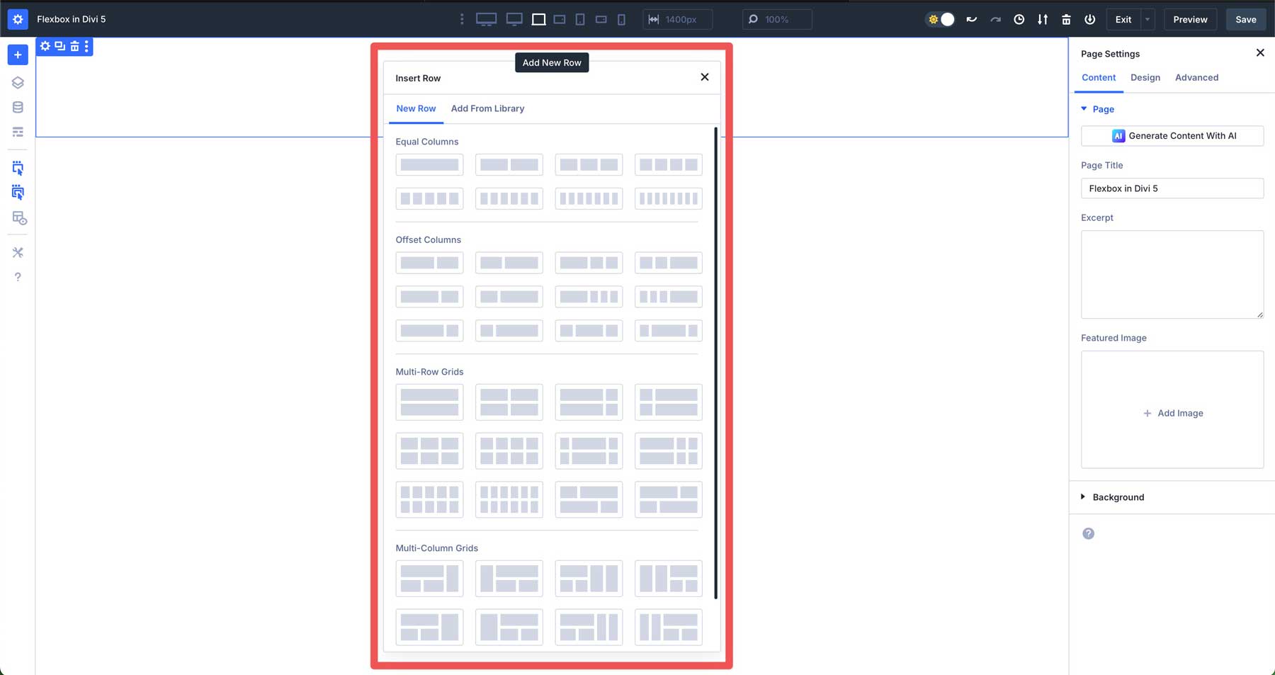
Divi 5 makes Flexbox a breeze to use. It works exactly as in Divi 4, just with more options. You can choose a row with equal columns, offset columns, multi-row grids, or multi-column grids.
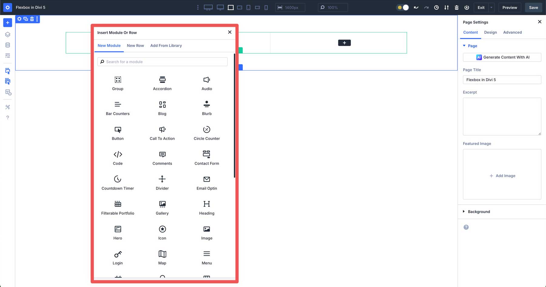
As in Divi 4, select a module to place in the first column.
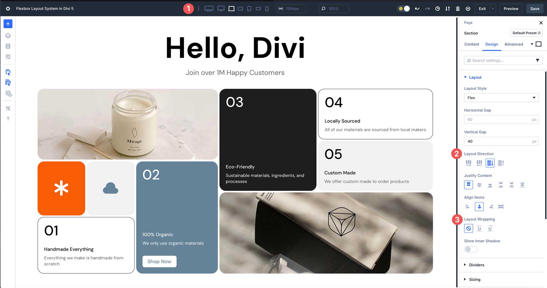
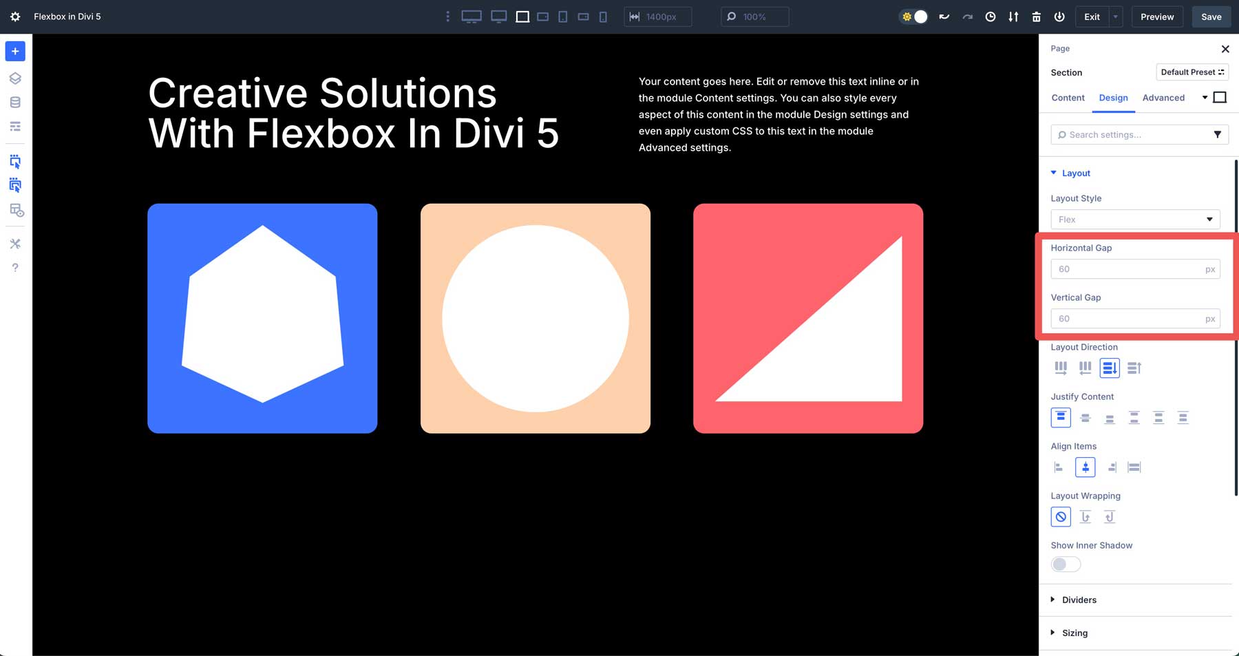
After adding your modules, click the settings icon of the row you added and navigate to the design tab. Under the Layout menu, you’ll find all of Divi 5’s Flexbox controls. By default, Flex is selected under Layout Style.

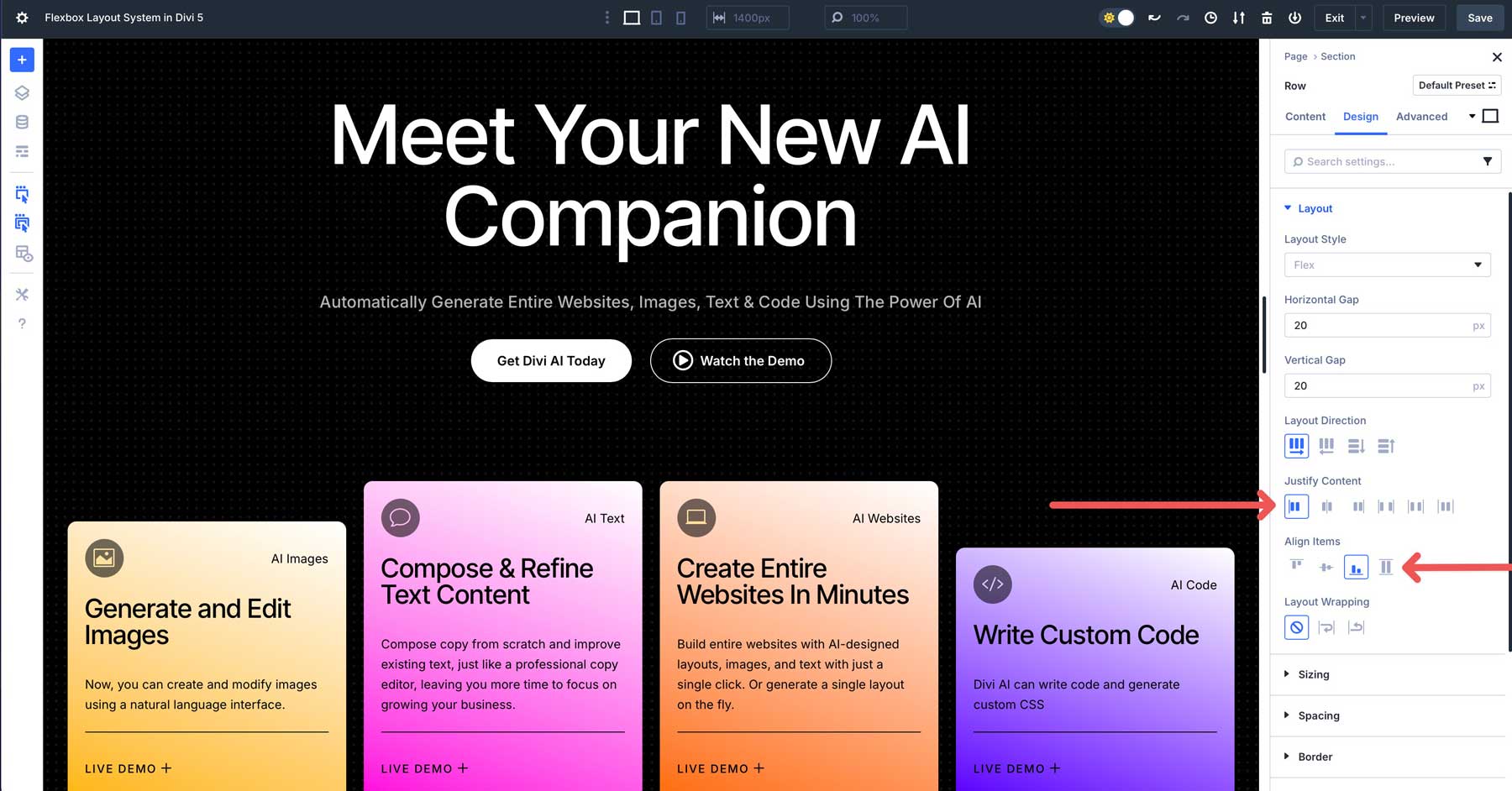
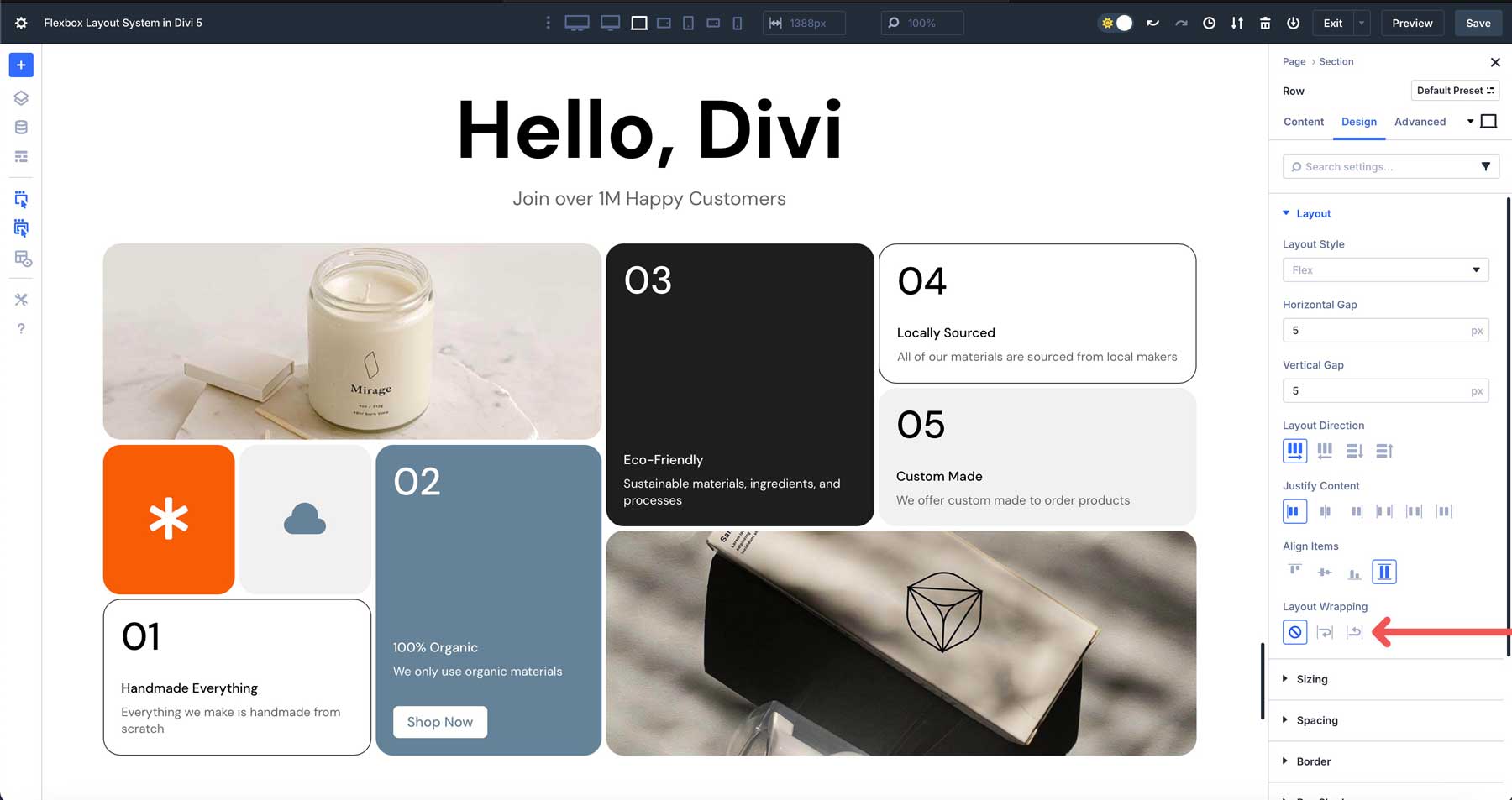
You can control the spacing between columns by adjusting the horizontal and vertical gap.
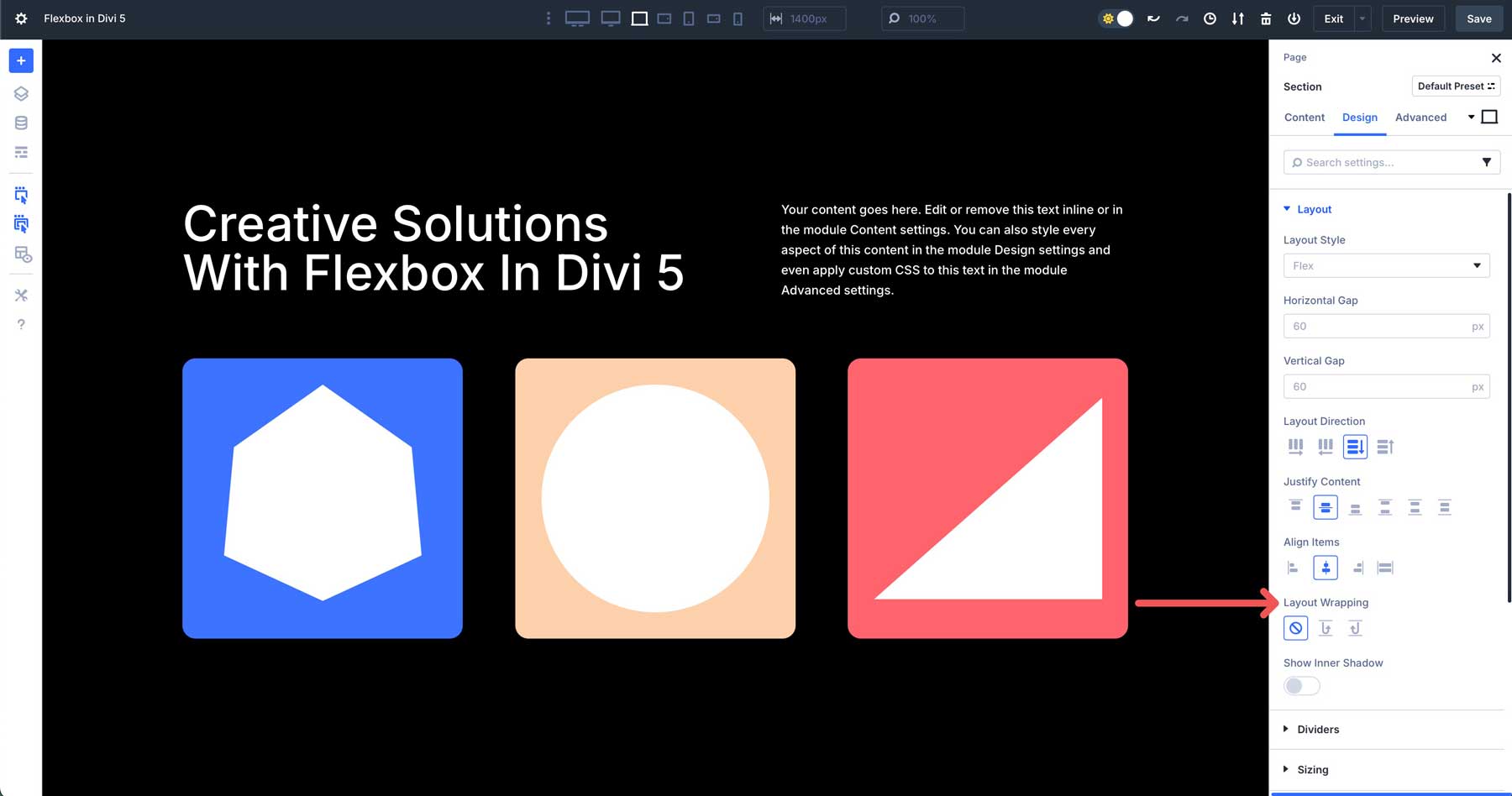
In the Layout Direction field, you can choose to display the contents of the row from left to right (row), right to left (row), column (default setting), and reverse column.
Justify Content controls the alignment and distribution of flex items within the section or row. They can be aligned from the start (top), the middle, the end (bottom), the space between, the space around, or space them evenly.
Align Items controls the alignment of flex items inside the section or row. You can align items at the start of the section, center, end (right), or stretch them across the container.
Lastly, Layout Wrapping (flex-wrap in CSS) gives you direct control over how your sections, rows, and columns behave. Wrap tells the browser to allow the items in a container to move to a new line if there isn’t enough horizontal space to fit them into a single line. Reverse Wrap does the same thing, but reverses the order of the items.
Divi 5’s Flexbox Layout System gives you the tools to arrange elements exactly how you want without having to struggle with code.
Benefits For Web Designers & Developers
Divi 5’s Flexbox Layout System offers several advantages for every Divi user. It makes creating complex, responsive layouts easier with less effort.
1. Building Complex Layouts With Ease
Building complex layouts with Divi 5’s Flexbox Layout System is more intuitive than previous versions of Divi. It makes creating layouts easier and less reliant on rigid row structures. You can position, space, and organize design elements with a few clicks.
Additionally, you can easily change the column structure for smaller screens, adjust spacing on the fly, and build complex designs without hiding rows on certain breakpoints or using custom CSS.
2. Enhanced Responsiveness
Divi 5 excels in creating responsive designs that adapt seamlessly across devices. With Customizable Responsive Breakpoints, Divi users can adjust layouts for specific screen sizes, ensuring a polished look. Divi 5 addresses Divi 4’s mobile limitations by introducing custom column ordering.
This feature allows you to rearrange columns for mobile views without suplicating sections or using custom CSS.
3. Creative Freedom
Flexbox allows users to push creative boundaries by supporting unique and complex layouts, from grids to dynamic content, all without coding. Integration with Divi 5’s Interactions feature makes adding engaging elements like popups, toggles, and scroll-based effects easy.
The system’s interface makes professional design accessible to anyone, while advanced controls offer precision for more advanced users.
4. Performance & Scalability
Flexbox generates cleaner, lighter CSS than Divi 4’s shortcode-based framework, resulting in faster site performance and better SEO performance. This optimized code enhances maintainability and helps websites load quickly, providing a better user experience for your visitors.
Flexbox’s forward-thinking design supports upcoming features like the Loop Builder, making Divi 5 a scalable solution for building blog grids or product listings.
The Flexbox Layout System Redefines What’s Possible With Divi
The Flexbox Layout System redefines web design in Divi 5, combining flexibility, responsiveness, and ease of use. Divi 5 offers intuitive alignment and spacing controls, making it easy to build any layout. The feature integrates with Nested Rows, Module Groups, and the upcoming Loop Builder, allowing you to group and nest modules and rows for even more flexibility. Divi 5 offers cleaner code than Divi 4, faster performance, and limitless design possibilities. These features ensure that Divi 5 is a future-proof solution for building responsive websites.
Are you ready to build your next masterpiece? Try the latest Divi 5 Alpha and join our community to share your feedback.


Hey there, would it be possible to download the layout (the one with the numbers 1, 2, 3, 4 etc..) to understand how it’s built please ?
Thank you for your interest! These specific layouts are not currently available for download, but our content team is working on tutorials and examples based on our Flexbox feature. We’ll be publishing these on our blog soon to help you understand how to build similar layouts. Stay tuned!