

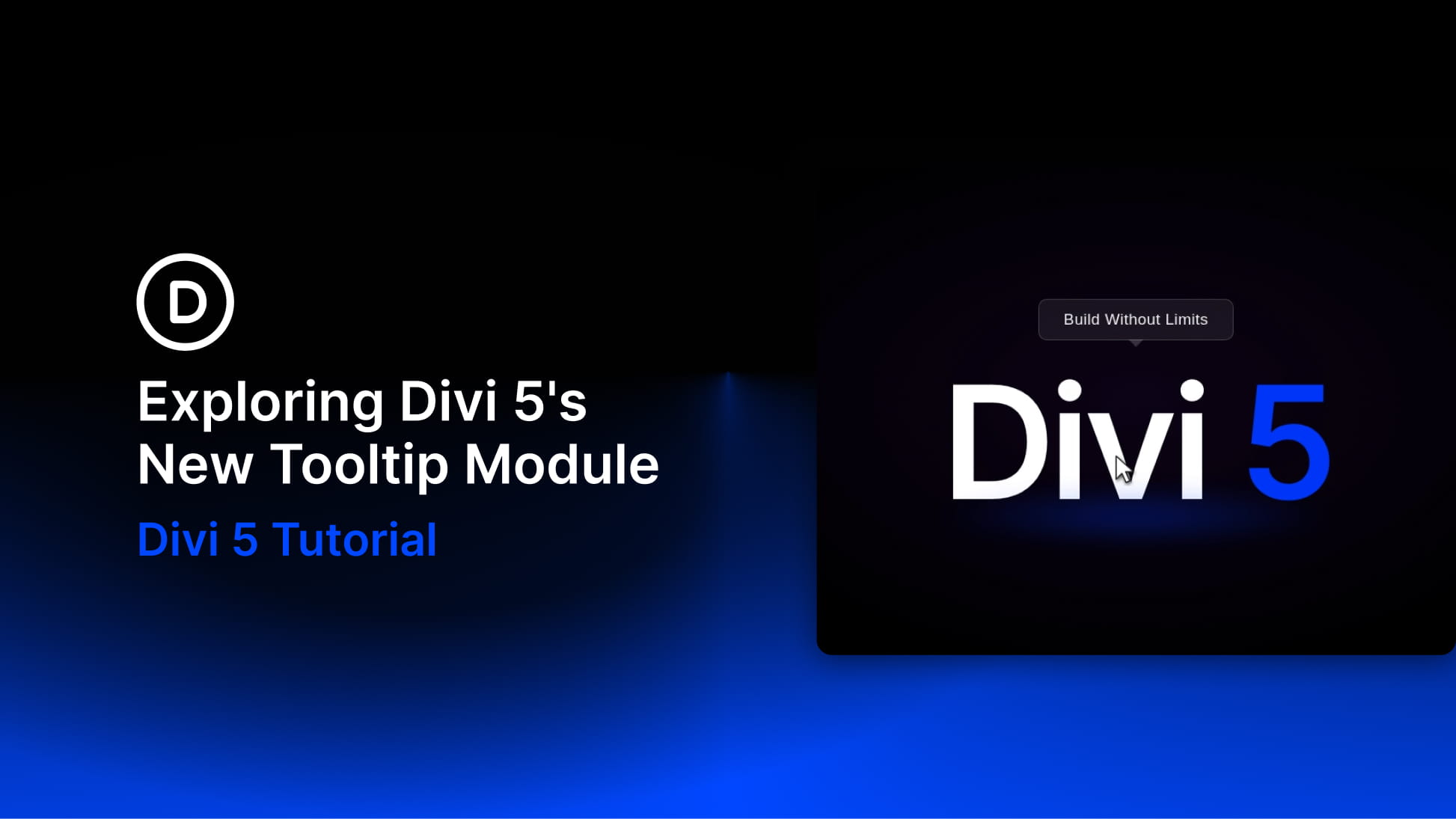
Divi 5 keeps turning common custom-code workflows into native builder features, and the new Tooltip module is a good example. It lets you add a floating popup panel beside another element and control its content, trigger, position, movement, arrow, timing, and styling visually.
Instead of wiring up a tooltip library by hand, you can place a Tooltip module inside the element it describes, add text or nested modules, and decide whether the tooltip appears on hover, on click, or always.
That makes it useful for short hints, feature explanations, product details, icon labels, mini promo cards, looped content, and contextual callouts that need more flexibility than a basic browser tooltip.
In this post, we’ll look at what the Tooltip module is, how to add it, how its settings work, and where it can improve a Divi 5 layout without adding clutter.
What Is The Tooltip Module In Divi 5?
The Tooltip module is a nestable content container that appears beside a parent element. The parent element becomes the tooltip’s anchor, and the Tooltip module holds the popup content.
In practical terms, you add the Tooltip module as a child of the element it should describe. That parent element might be a button, icon, image, text module, pricing feature, product card, or any other element that needs extra context.
By default, the tooltip shows on hover, appears near the top center of its anchor, and uses a small arrow to point back to the element it describes. While you are designing, you can turn on Force Visible in the Meta option group so the tooltip stays visible on the canvas.
This is different from a browser title attribute or a simple text-only hint. The Tooltip module can contain rich text and nested modules, so the popup can be as simple as one sentence or as rich as a small card with text, an icon, an image, a button, or other Divi content.
That flexibility is useful, but it should be used carefully. A tooltip should add context, not hide information the page needs to make sense.
How To Add A Tooltip Module
Start by deciding which element should trigger or anchor the tooltip. The Tooltip module should be placed inside that element so it knows what to point to.
You can add it in either of these ways:
- Right-click method: Right-click the element, choose Add Element, then choose Add Inside.
- Settings panel method: Open the element settings, go to Content > Elements, then click Add New Element.
Search for Tooltip and add the module.
Once added, the Tooltip module is tied to its parent element. That parent acts as the anchor, while the tooltip content floats beside it according to the settings you choose.
This is similar in spirit to creating a tooltip with Divi 5’s Interactions, but the Tooltip module handles the common tooltip behavior for you. You do not need to manually set up separate interaction triggers, target elements, positioning, and show/hide effects for a standard tooltip.
Understanding The Tooltip Module Settings
The Tooltip module settings are organized into the standard Divi tabs: Content, Design, and Advanced.
The Content tab handles the tooltip content and standard module options. The Design tab controls behavior and styling. The Advanced tab handles attributes, conditions, visibility, interactions, position, and other advanced controls.
Content Tab
The Content tab is where you add the content that appears inside the tooltip. The main option groups include:
- Text: Add and edit the tooltip’s rich text content.
- Link: Make the tooltip module link to a page, section, or external URL.
- Elements: Add nested modules inside the tooltip.
- Background: Set a background color, gradient, image, or video for the tooltip.
- Loop: Repeat tooltip content from a data source when used in dynamic layouts.
- Order: Control module order when content is generated dynamically.
- Meta: Rename the module in the builder and turn on Force Visible while designing.
Force Visible in the Meta settings is especially useful. Since the tooltip is hidden until triggered on the front end, turning on Force Visible lets you see the panel while you style it in the Visual Builder.
Show Tooltip On
The first major behavior setting, which you can find in the design tab’s Tooltip option group, is Show Tooltip On. It controls how the tooltip appears.
You can choose from:
- Hover: Shows the tooltip when the visitor hovers over the parent element.
- Click: Shows the tooltip when the visitor clicks the parent element.
- Always: Keeps the tooltip visible without requiring hover or click.
Hover works well for short, purely informational hints on desktop. Click is usually better when the tooltip contains interactive content, such as a link or button, or when the experience needs to work better on touch devices. Always is useful when the tooltip is being treated more like a permanent callout or label.
Tooltip Movement
Tooltip Movement controls whether the tooltip stays anchored or follows the cursor.
The two movement options are:
- Anchored: Keeps the tooltip positioned relative to the parent element.
- Follow Cursor: Makes the tooltip follow the visitor’s cursor while interacting with the parent element.
Anchored is the best default for most real builds because it keeps the layout predictable. Follow Cursor can work well for playful hover states, interactive graphics, maps, product callouts, or visual elements where cursor movement is part of the experience.
Tooltip Position
Tooltip Position controls where the tooltip appears in relation to its parent element.
The position grid lets you choose the edge and alignment. For example, you can place the tooltip above the trigger, below it, to the left, to the right, or aligned along one of those edges.
This gives you common tooltip placements without writing positioning CSS. If the tooltip needs to avoid nearby content, fit inside a card, or point toward a specific part of the trigger, start with the position grid.
Tooltip Skid And Tooltip Distance
After choosing the main position, you can refine the placement with Tooltip Skid and Tooltip Distance.
Tooltip Skid shifts the tooltip along the edge of the parent element. If the tooltip sits above or below the trigger, skid moves it horizontally. If the tooltip sits to the left or right, skid moves it vertically.
Tooltip Distance controls the gap between the parent element and the tooltip. Increase it when the tooltip needs more breathing room. Decrease it when the tooltip should sit closer to the trigger.
Open And Close Delay
The Tooltip module also includes delay controls for opening and closing.
Tooltip Open Delay controls how long the module waits before showing the tooltip. A small delay can prevent tooltips from appearing every time a cursor briefly passes over a trigger.
Tooltip Close Delay controls how long the tooltip stays visible after the trigger is no longer active. This can make the interaction feel less twitchy, especially when the tooltip contains content the visitor may want to read or move toward.
Use delays subtly. Long delays can make a tooltip feel unresponsive, while no delay can make a page with many triggers feel too busy.
Tooltip Arrow
The tooltip arrow helps visually connect the popup to the element it describes.
Turn on Show Tooltip Arrow to display the pointer. Then adjust:
- Tooltip Arrow Color: Match it to the tooltip background so the arrow feels attached to the panel.
- Tooltip Arrow Placement: Choose which side of the tooltip the arrow appears on.
- Tooltip Arrow Position: Move the arrow along that side.
- Tooltip Arrow Size: Control how large the arrow appears.
A small, color-matched arrow usually feels modern and clean. A larger arrow can work for a more playful speech-bubble style.
Style The Tooltip Panel
Beyond the Tooltip behavior group, the Design tab includes standard styling groups for the panel itself. You can adjust:
- Layout: Control how nested modules inside the tooltip are arranged.
- Body Text: Style the tooltip text.
- Sizing: Set the tooltip width, max width, height, and alignment.
- Spacing: Adjust padding and margin.
- Border: Add border styles and rounded corners.
- Box Shadow: Add depth around the popup.
- Filters: Apply visual filter effects.
- Transform: Scale, rotate, move, or skew the tooltip.
- Animation: Add motion when the tooltip appears.
For most designs, start with width, padding, background, border radius, text styling, and a subtle shadow. Tooltips work best when they feel lightweight and easy to read.
Build Examples
The Tooltip module is most useful when it reduces visible clutter while still keeping helpful information close to the element that needs it.
Pricing Table Feature Clarifiers
Pricing tables often need short explanations without turning each row into a paragraph. Add a small info icon next to a feature label, or use the feature text itself as the anchor, then place a Tooltip module inside it.
The tooltip can explain what a feature includes, define a limit, clarify billing terms, or surface short fine print without making the whole table taller.
Keep pricing tooltips concise. If the explanation needs several paragraphs, it probably belongs in the page content or a dedicated FAQ section instead.
Icon Labels And Image Hotspots
The Tooltip module works well for icon-based interfaces and image callouts. Add a Tooltip module inside an icon, button, hotspot marker, or image element to reveal a short label or explanation. Use this for:
- Feature diagrams
- Product details
- Map points
- Portfolio annotations
- Dashboard-style layouts
A cursor-following tooltip can feel engaging for visual diagrams, while anchored positioning is usually better for clean product or feature explanations.
Tooltips Inside A Loop
Tooltips can also be useful inside looped layouts. A loop can render posts, products, team members, portfolio entries, locations, or other repeated content, and each item can include its own Tooltip module.
A blog card, for example, can show the featured image, title, author, and date, while the tooltip reveals tags, categories, reading time, or a short excerpt. A product card can use a tooltip for specs, availability, shipping notes, or quick details.
The benefit is that you design the tooltip once inside the loop item, then let dynamic content populate the repeated instances.
Best Practices For Tooltip Design
Tooltips are useful because they stay out of the way until needed. That also means they should be selective, clear, and easy to trigger.
- Use hover for short hints: Hover works well for simple desktop-only explanations.
- Use click for interactive content: If the tooltip contains a link, button, or nested module, click is usually a better trigger.
- Keep content concise: Tooltips should explain or clarify, not replace main page content.
- Use a visible cue: Icons, underlined terms, badges, or hotspots help visitors know a tooltip exists.
- Do not hide essential information: Critical disclaimers, navigation, pricing conditions, or instructions should not live only inside a tooltip.
- Check mobile behavior: Hover does not translate cleanly to touch devices, so test tablet and phone views.
- Preview while designing: Turn on Force Visible in the Meta option group so you can style the tooltip on the canvas.
- Match the arrow and background: A color-matched arrow usually makes the tooltip feel more polished.
- Keep spacing generous: Enough padding and line height make small tooltip panels easier to read.
Accessibility And SEO Notes
Tooltip content is usually hidden until triggered. That makes it a poor place for anything the visitor must understand before taking action.
Use tooltips as progressive enhancement. The page should still make sense when every tooltip is closed. A tooltip can add helpful context, but the main content, navigation, pricing, and required instructions should remain visible or accessible through a more reliable pattern.
For accessibility, avoid relying on hover alone for important information. Make sure the trigger is clear, test keyboard and touch behavior, and use click triggers when the tooltip includes interactive content.
For SEO, do not place content you need indexed only inside a tooltip. If a paragraph matters for search, page structure, or user understanding, keep it in the visible page content.
Try The New Divi 5 Tooltip Module Today!
The Tooltip module in Divi 5 removes a common need for custom tooltip libraries, snippets, or extra plugins. It gives you a native way to add contextual floating content with visual controls for triggers, placement, movement, delay, arrows, content, and styling.
Use it for short hints, pricing clarifiers, form notes, image hotspots, looped cards, and compact promo panels. Keep the content selective, choose the right trigger, and test the experience across devices.
Done well, tooltips make a layout feel cleaner without making important information harder to find.










Can it be used for a piece of text inside a text module?
Hi Jurrie,
Not directly in the sense of selecting only a few words inside a Text Module and attaching the Tooltip Module to that inline text.
The Tooltip Module is added as its own module and is designed to show a floating tooltip next to another element when triggered by hover, click, or page load.
It can only be used inside an entire module/container. Not to a specific part of a module. Hope that helps.
If you are wanting something to work inside the text module, switch the module’s text editor to ‘Code’ and wrap your text in a span tag using this title attribute: title=”This is the native tooltip text!”
This will give you a simpler, browser native tooltip for you single word/phrase.