
In Part 2 of our Mastering Flexbox series, we showed you how to create equal-height cards with aligned buttons using Align Items > Stretch, Justify Content > Space Between, and Grow To Fill. In this third installment, we’ll focus on one of the most important structure decisions in Divi 5: Layout Wrapping.
Layout Wrapping controls whether flex items stay on one line or move onto additional lines when there isn’t enough room. Choosing between No Wrap, Wrap, and Wrap Reverse affects how many rows you need, how your layout responds across breakpoints, and how much manual structure you have to manage.
In this post, we’ll compare No Wrap and Wrap structure templates, explain when each option makes sense, and show how supporting controls like Column Class, Align Content, and Display Order help you build cleaner responsive layouts without custom CSS.
Let’s dive in.
- 1 Understanding Layout Wrapping In Divi 5
- 2 No Wrap Structure Templates
- 3 Wrap Structure Templates
- 4 Mastering Align Content For Multi-Line Layouts
- 5 Wrap Reverse And Display Order
- 6 Responsive Best Practices & Pro Tips
- 7 Download And Install The Files
- 8 Download For Free
- 9 Wrap vs No Wrap: Building Better Layouts In Divi 5
Understanding Layout Wrapping In Divi 5
In Divi 5, Layout Wrapping controls whether direct child elements inside a Flex container stay on a single line or wrap onto additional lines when they run out of space.
This is important because wrapping only affects the direct children of the container you’re editing. For example, if you’re editing a Row, wrapping affects its Columns. If you’re editing a Module Group, wrapping affects the modules or groups inside it.
The Three Layout Wrapping Options
Divi 5 gives you three Layout Wrapping choices:
No Wrap
No Wrap keeps all direct child items on a single flex line. If there isn’t enough room, items may shrink, overflow, or create horizontal scrolling depending on their sizing and other layout settings.
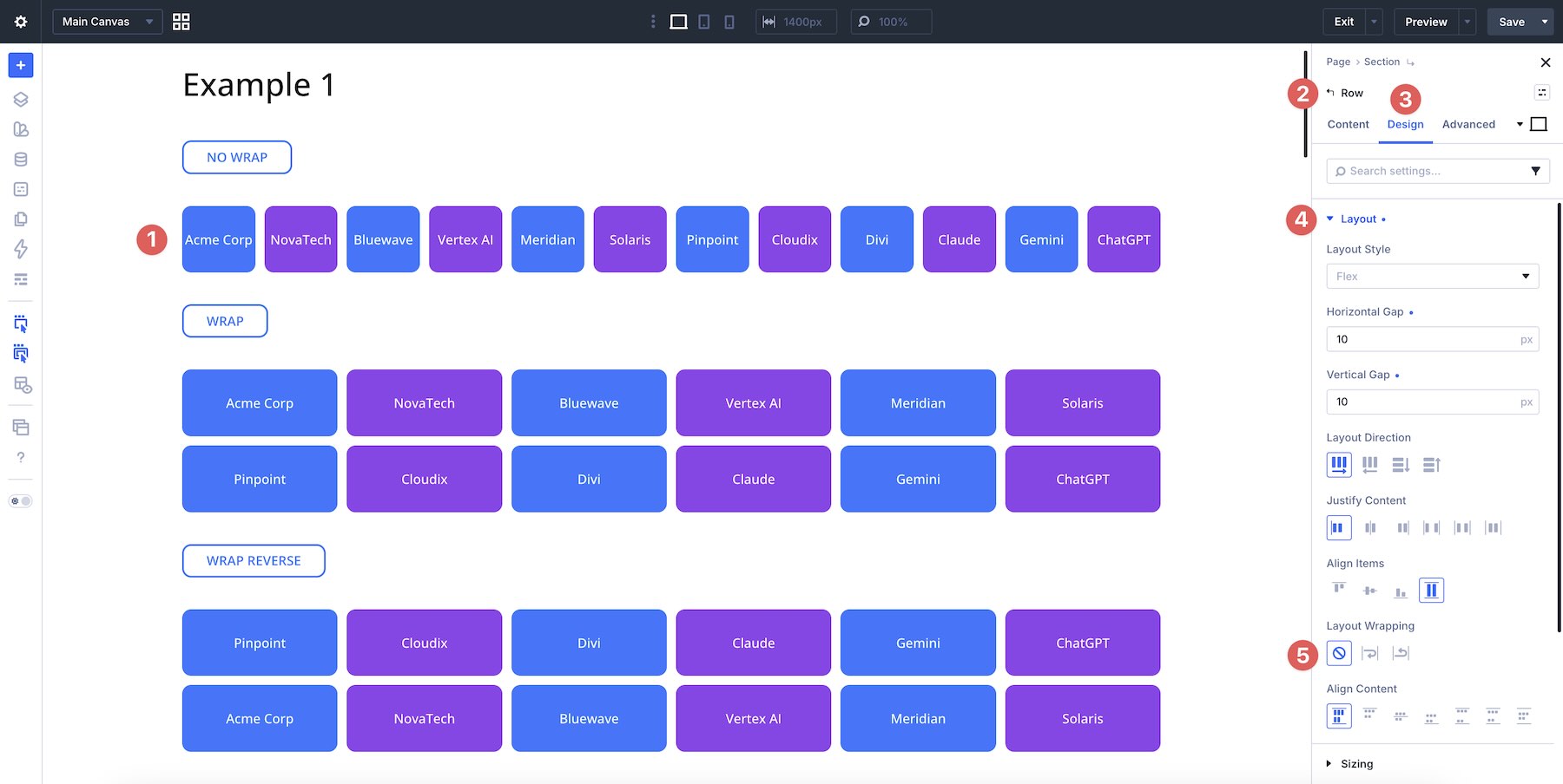
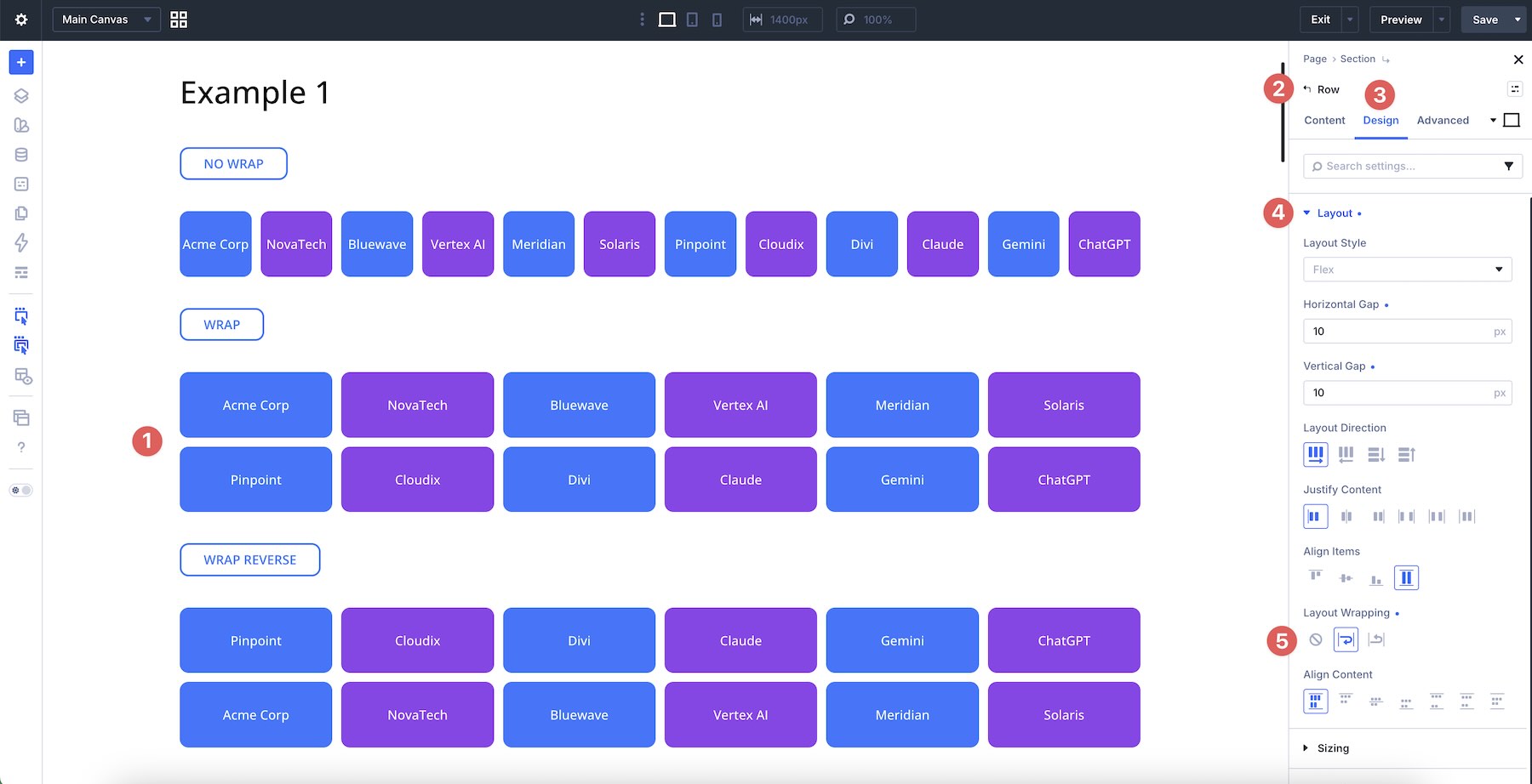
Wrap
Wrap allows items to move onto additional lines when they no longer fit inside the parent container. This is the foundation for many responsive card grids, galleries, feature sections, footer layouts, and multi-column content blocks in Divi 5.
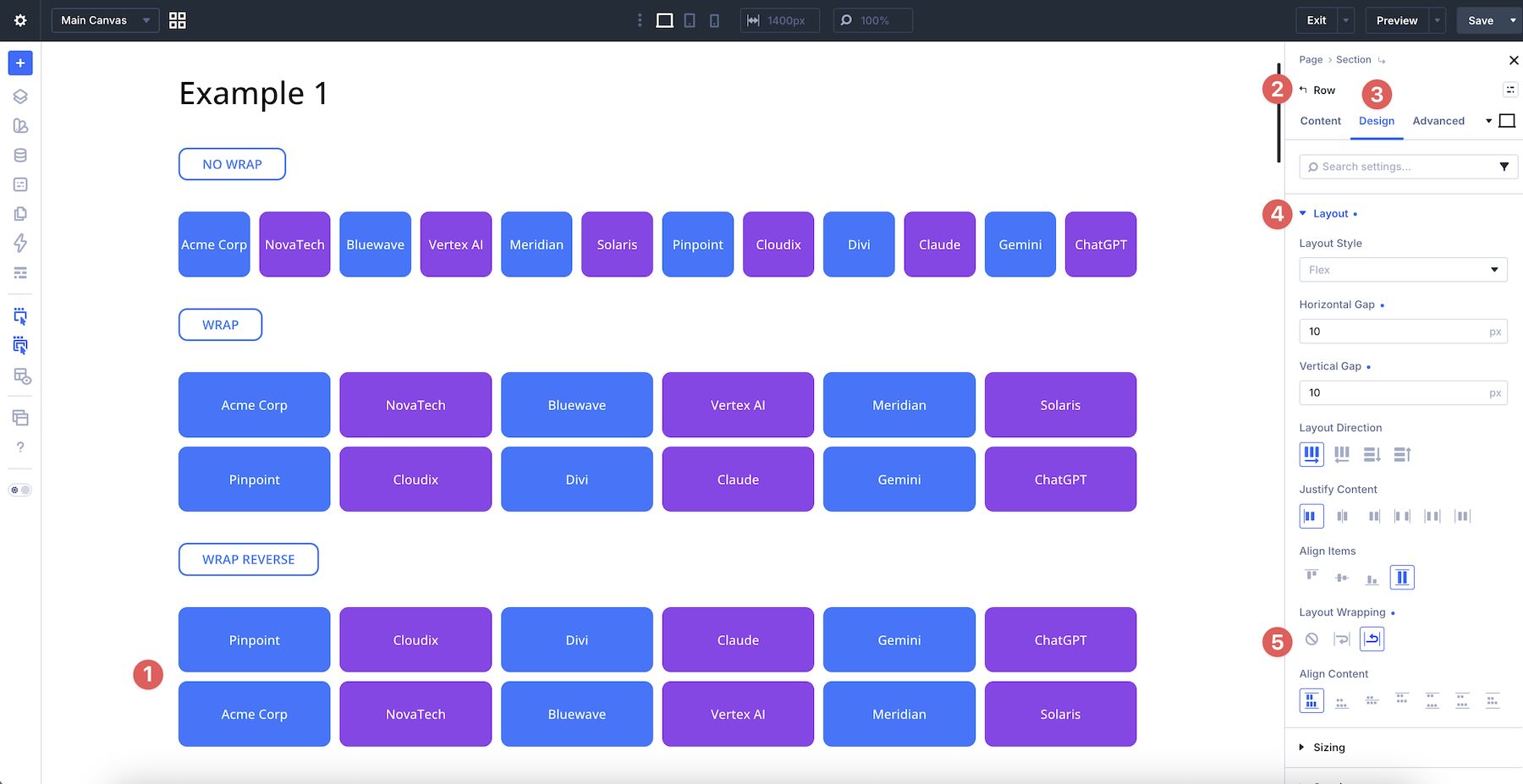
Wrap Reverse
Wrap Reverse also allows items to wrap, but it reverses the direction in which new flex lines are placed along the cross axis. It does not reverse the order of every individual item. Instead, it changes where wrapped lines appear.
This can be useful when you want wrapped lines to stack in the opposite direction at a specific breakpoint. For precise item-by-item reordering, use Display Order.
When To Use Each Option
Use No Wrap when you intentionally want elements to stay on one line. This works well for compact navigation patterns, button groups, logo rows, or any layout where automatic line breaks would disrupt the design.
Use Wrap when you want a layout to adapt across available space. This is the most useful option for feature cards, pricing tables, team grids, galleries, blog post layouts, footer groups, and other multi-line structures.
Use Wrap Reverse when you want wrapped lines to stack in the opposite direction. It can help with specific responsive patterns, but for detailed mobile ordering, combine it with the Display Order field at the Column or module level.
How Wrapping Interacts With Layout Direction
Layout Wrapping changes based on the container’s Layout Direction.
With Row direction, items flow horizontally. When Wrap is enabled, overflowing items move onto a new line below. With Wrap Reverse, the new wrapped line is placed in the opposite cross-axis direction.
With Column direction, items flow vertically. When Wrap is enabled, overflowing items can move into a new column along the cross axis.
For Column wrapping to be visible, the parent container usually needs a defined height. If the container height is set to Auto, there may be no constrained vertical space that forces items to wrap into another column.
Align Content becomes useful when wrapping creates multiple flex lines and the parent container has extra cross-axis space to distribute.
Because Divi 5’s Flexbox controls are responsive, you can adjust Layout Wrapping, Layout Direction, gaps, and alignment settings separately at different breakpoints.
No Wrap Structure Templates
When Layout Wrapping remains set to No Wrap, all direct children stay on a single flex line. This is familiar behavior for many Divi users and works well for simple row structures. However, when you need multiple lines, No Wrap usually means creating and managing multiple rows.
Example: Feature Cards With No Wrap
To create a two-row grid of six feature cards with No Wrap, you need two separate rows, each with three columns.
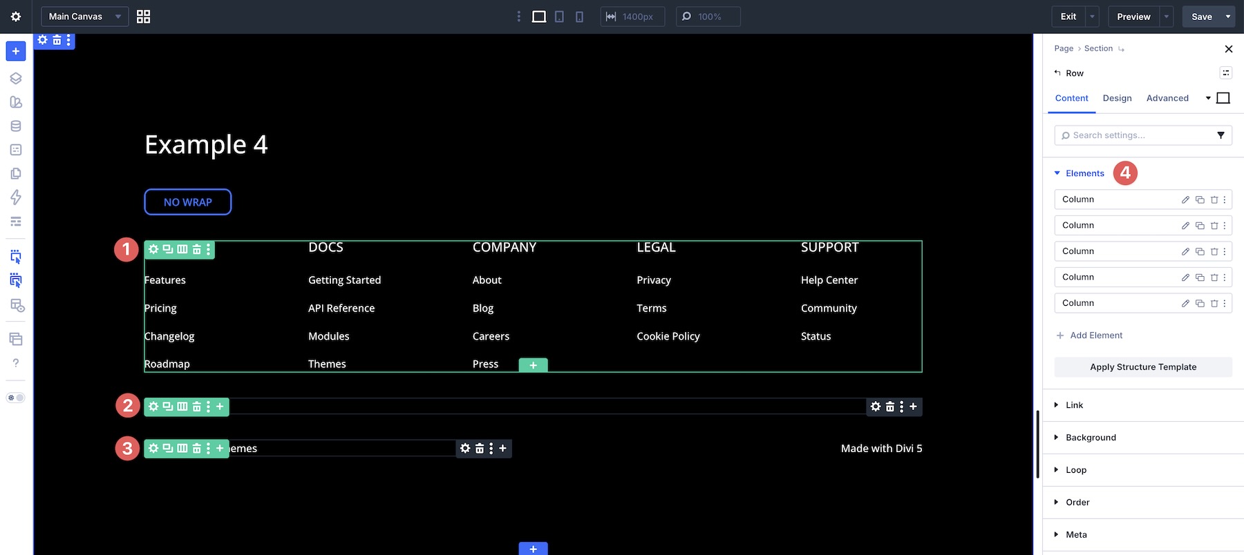
In the example below, the footer layout requires multiple rows to create separate desktop lines: one row for five columns, one row for a full-width area, and another row for two columns.
The limitation of No Wrap is structural. It can be predictable, but anything beyond a single line often requires extra rows, more duplicated structure, and more breakpoint management.
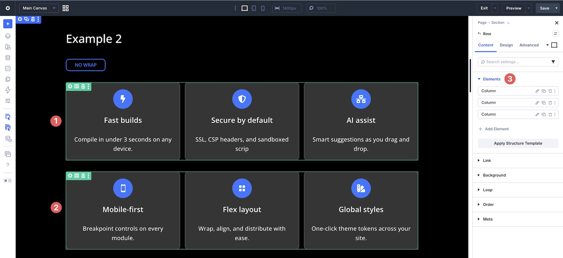
Wrap Structure Templates
When you enable Layout Wrapping > Wrap, the same layouts become more flexible. Instead of manually creating separate rows, you can often use one parent row and allow its child columns to wrap naturally.
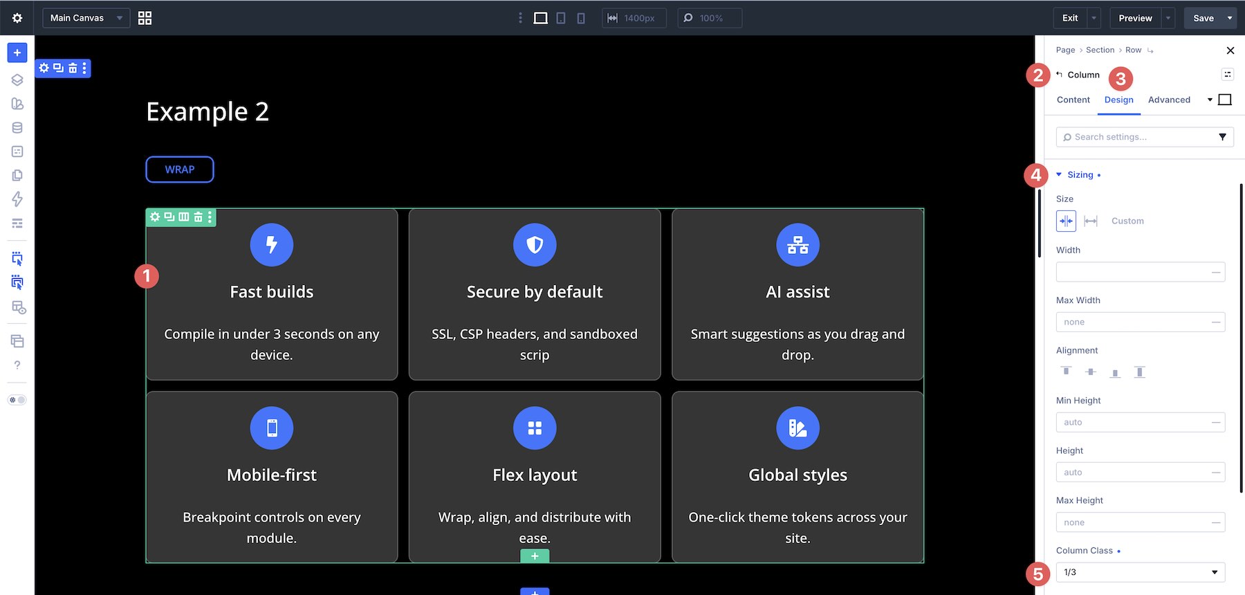
For example, the same six-card layout can be built with one row and six columns.
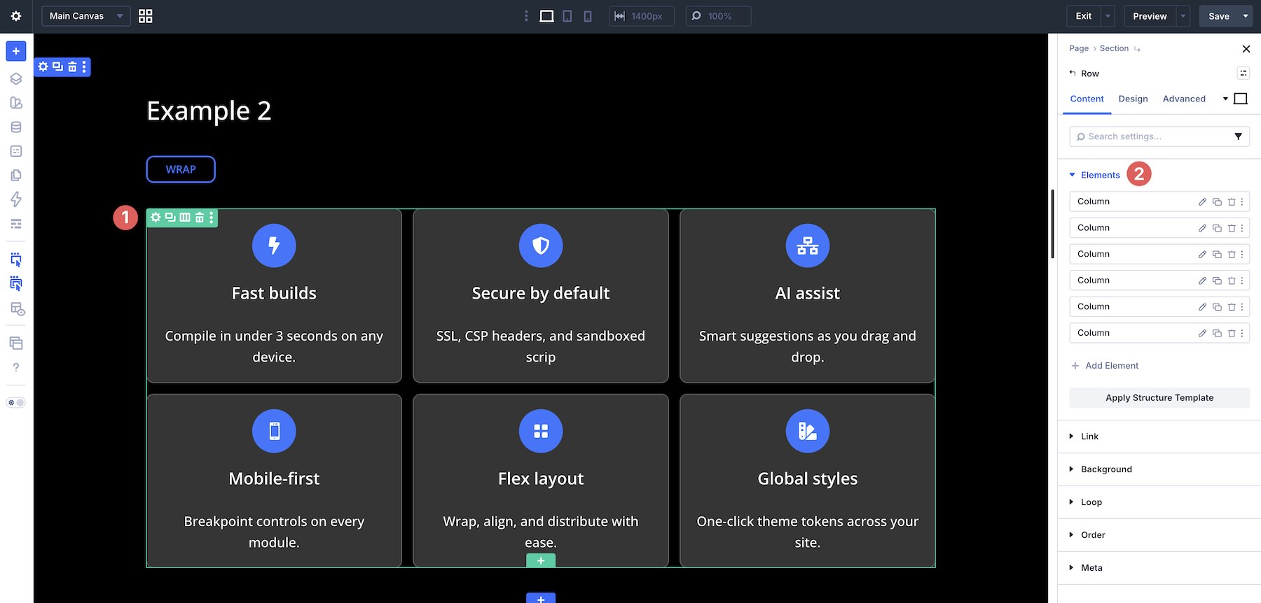
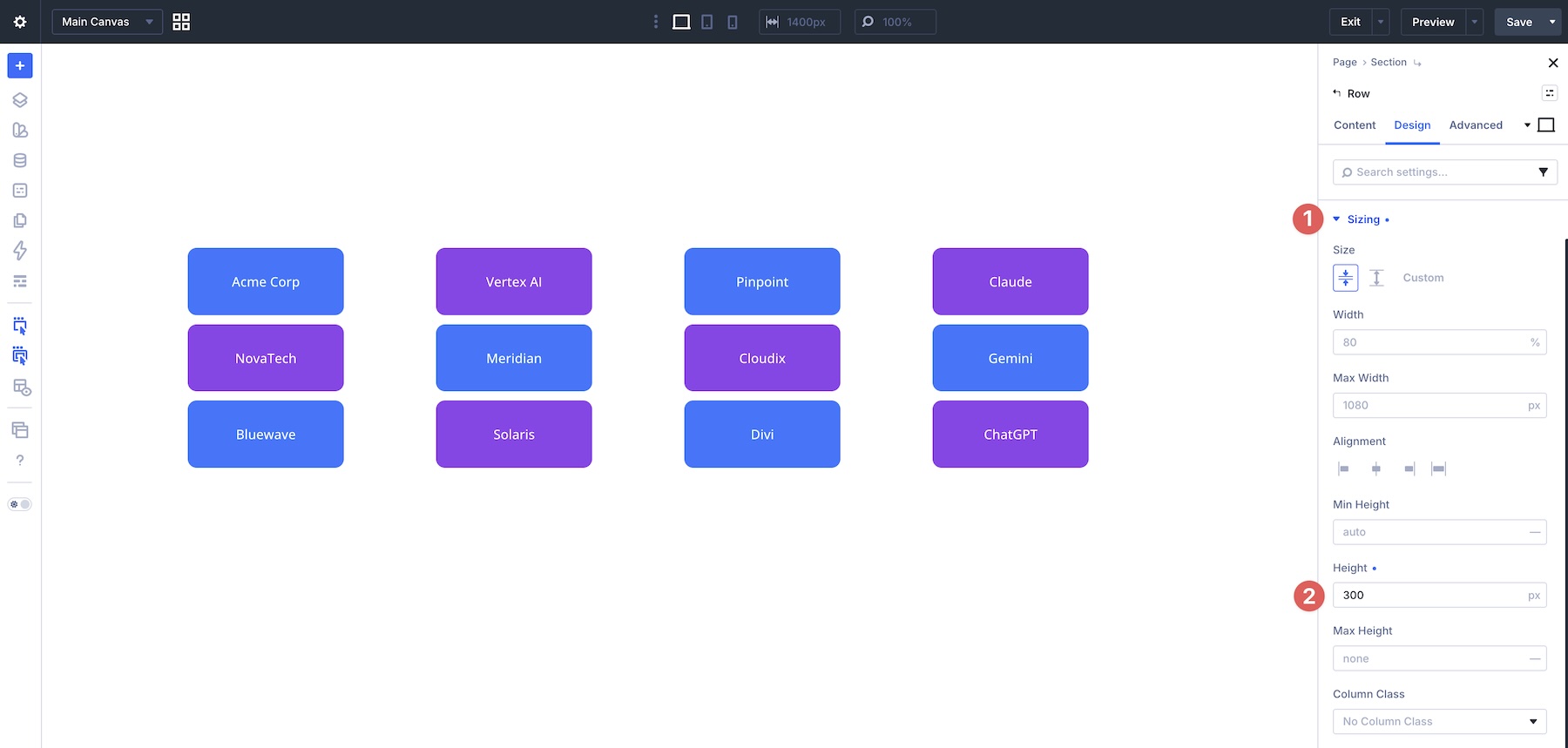
With Wrap enabled, the cards flow into multiple lines. To create the three-column desktop structure, set each column’s Column Class to 1/3 in the Design tab under the Sizing option group.
In the Wrap version of the footer layout, a single row can contain multiple columns with different Column Class settings. The first five columns are set to 1/5 width, placing the main link groups side by side on desktop. The sixth column is set to Fullwidth, and the remaining columns are set to 1/2 width.
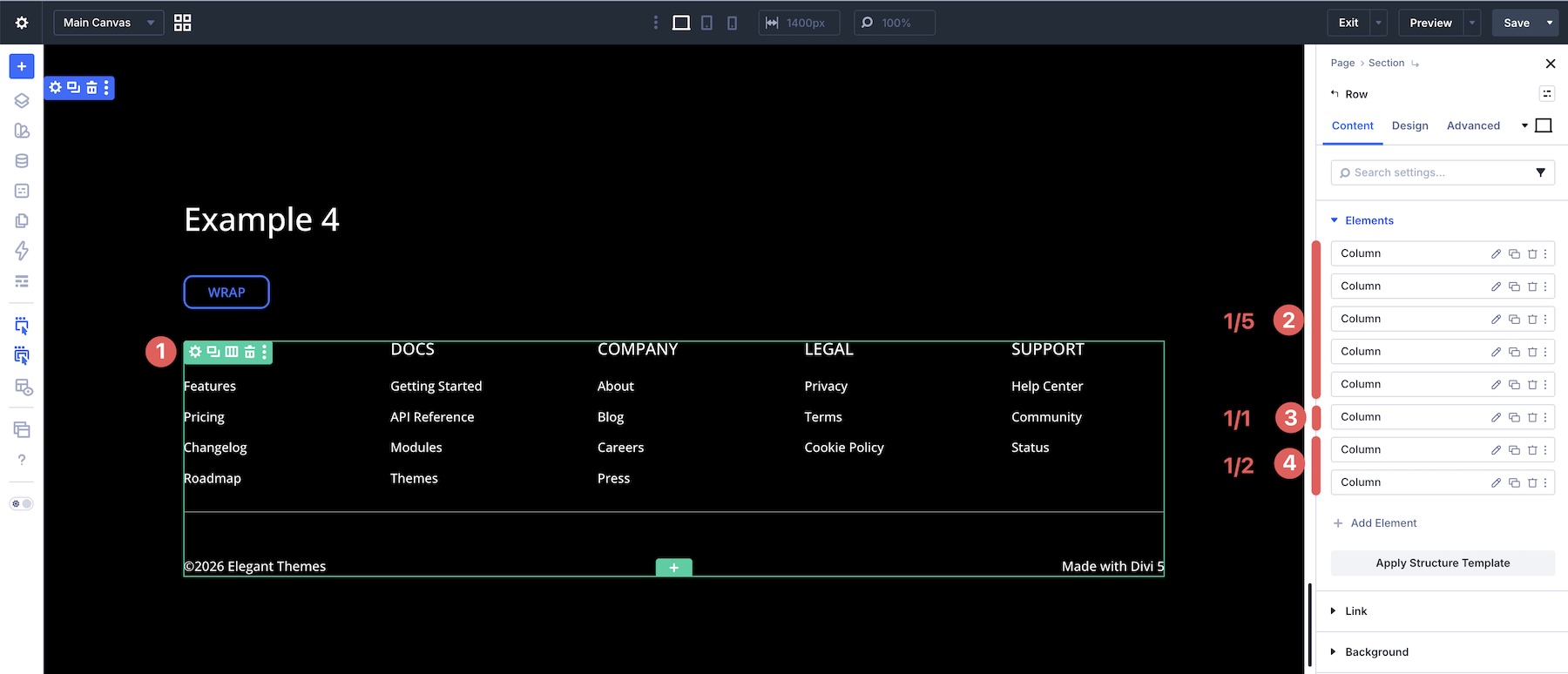
This lets one flexible row handle a more complex desktop structure while still adapting more cleanly at smaller breakpoints.
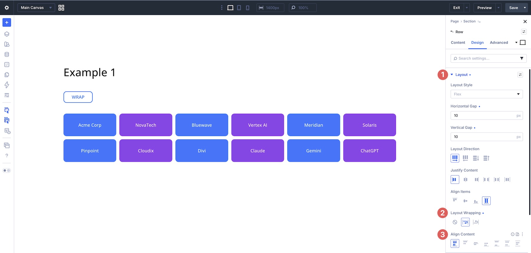
Mastering Align Content For Multi-Line Layouts
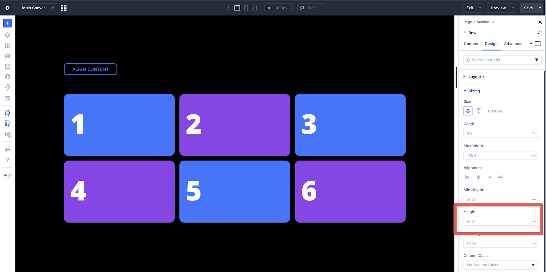
Once you enable Wrap or Wrap Reverse and your content flows onto multiple lines, Align Content controls how those wrapped lines are distributed along the cross axis. This is different from Align Items, which aligns individual items inside each line.
Important note: Align Content only has a visible effect when there are multiple flex lines and the parent container has extra cross-axis space. If the row height is set to Auto and the container only grows to fit its content, Align Content may appear to do nothing.
Align Content vs Align Items
Align Items aligns individual flex items within each flex line along the cross axis. It affects the items themselves, not the group of wrapped lines.
Align Content aligns the wrapped lines as a group within the parent container’s available cross-axis space.
The simplest way to remember it:
- Align Items: Aligns items inside each flex line.
- Align Content: Aligns the flex lines themselves when wrapping creates multiple lines.
Wrap Reverse And Display Order
While Wrap is the option you’ll use most often, Wrap Reverse gives you another way to change how wrapped lines stack. It can be helpful for specific responsive patterns, but it should not be treated as a replacement for Display Order when you need precise item-level control.
Example: Featured Pricing Card
When creating multi-column pricing tables, a Featured card can end up on the second wrapped line on smaller screens, causing it to appear lower than the surrounding plans.
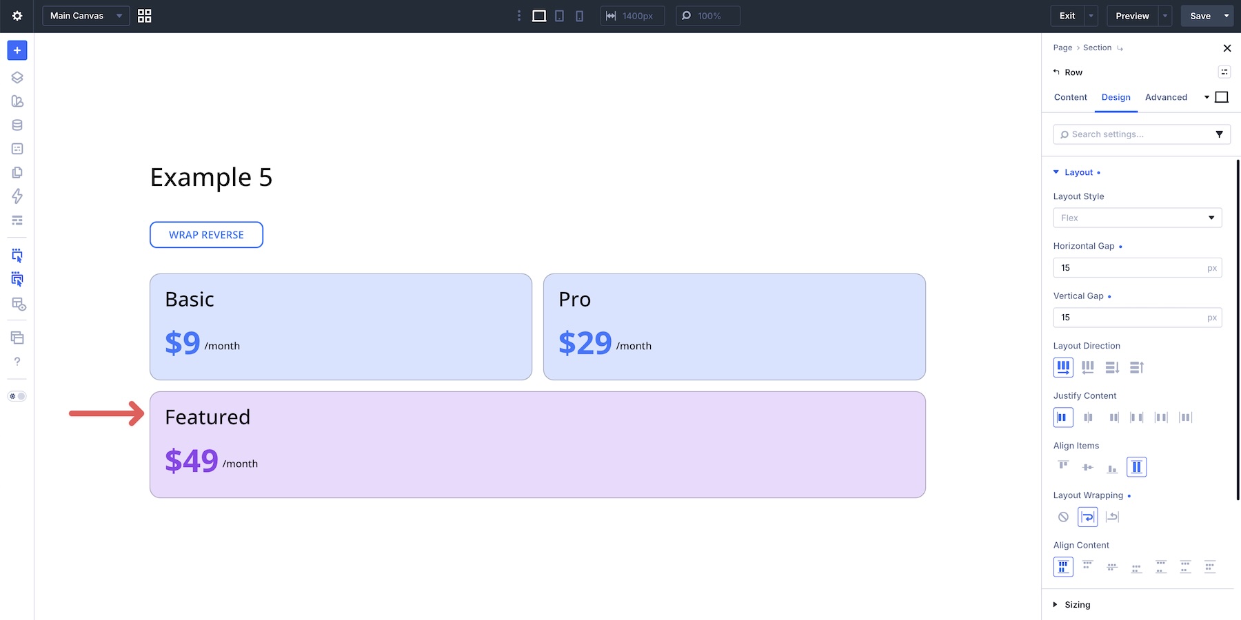
By enabling Wrap Reverse at Tablet and Phone breakpoints, you can change where the wrapped line appears and bring that Featured card higher in the visual flow.
In more complex layouts with multiple columns, Display Order becomes the better tool. This example uses a three-row alternating image-and-text layout. On desktop, the structure works well. On mobile, the natural source order can stack images together, creating an awkward flow.
How Display Order Works
You don’t need to set a value on every column. Adjust only the columns that need to move out of their natural source order. Columns left blank keep their default order value and maintain their relative position among other unchanged items.
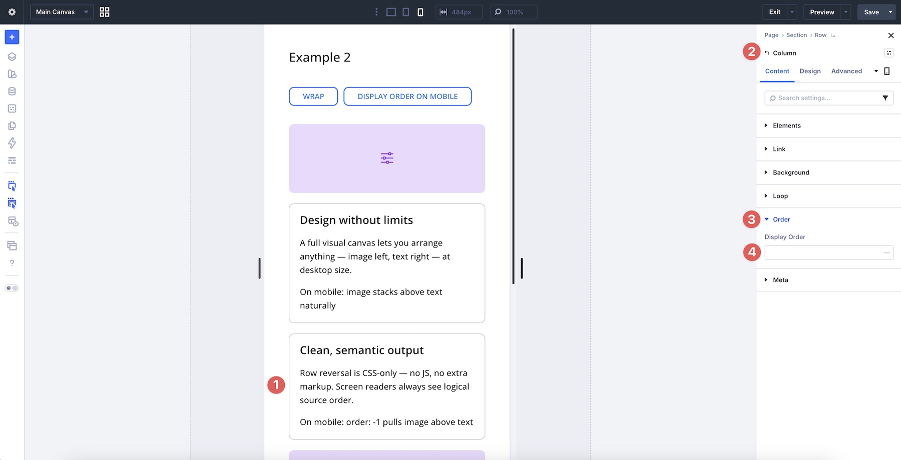
In this layout, only three columns need to change on the Phone breakpoint. Select the third column, go to the Content tab, expand the Order option group, and set Display Order to 2.
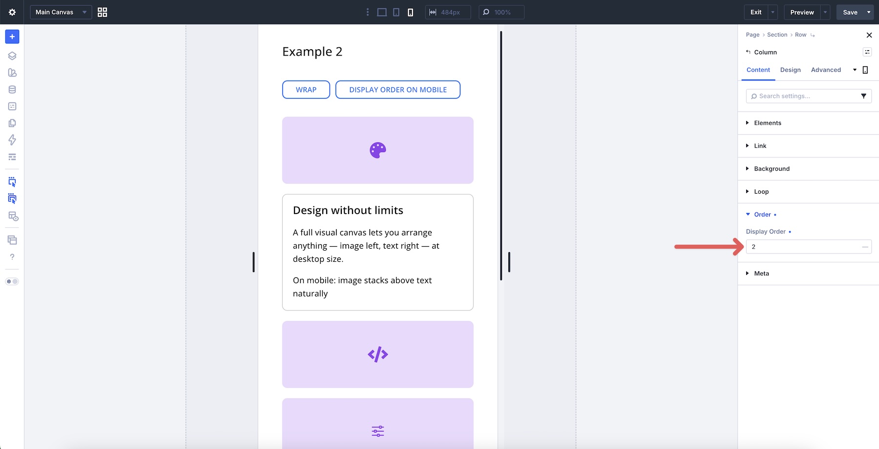
Next, set the fifth column to 3 and the sixth column to 4.
The result is a cleaner alternating pattern of images and text on mobile, with only a few targeted order changes.
Pro Tip: Use Wrap Reverse for line-level stacking changes and Display Order for item-level reordering. Combining both at specific breakpoints lets you keep the desktop structure clean while improving the mobile flow.
Responsive Best Practices & Pro Tips
Divi 5 gives you responsive control over wrapping behavior. Here are a few practices that help you get better results.
Use Divi 5’s Responsive Tools
Always preview layouts at Desktop, Tablet, and Phone breakpoints. Use the Responsive Editor and Customizable Responsive Breakpoints to adjust Layout Wrapping per device when needed.
For example, you can keep No Wrap on Desktop for a horizontal logo bar, then switch to Wrap on Tablet and Phone so the logos can move onto additional lines.
Combine Settings For Efficiency
Pair Wrap with Column Class settings to create responsive layouts using fewer rows. Combine Wrap and Align Content when you need better distribution across multiple lines, and use Display Order only on the columns that need to change position at smaller breakpoints.
Common Issues To Avoid
Forgetting to set a defined height or minimum height on the parent container is a common reason Align Content appears to do nothing. If the row height is set to Auto, there may be no extra cross-axis space for Align Content to distribute. Add a minimum height, such as 500px or 60vh, when the layout needs visible multi-line distribution.
Avoid overusing No Wrap for content-heavy sections. It can force you to manage extra rows that a single wrapping Flex row could handle more efficiently.
Review Wrap Reverse and Display Order at smaller breakpoints when the natural stacking order creates unexpected visual results.
Test With Real Content
Test your layouts with real content of varying lengths. Placeholder content can hide alignment and wrapping issues that appear with actual copy, image dimensions, button labels, or link groups. Pay special attention to how wrapped lines behave on Tablet and Phone, then adjust gaps, Column Class values, Layout Wrapping, and alignment settings as needed.
Download And Install The Files
To help you understand Wrap vs No Wrap, we’ve created section layouts that demonstrate No Wrap, Wrap, and Wrap Reverse. Each layout is labeled so you can inspect the structure and settings inside the Visual Builder.
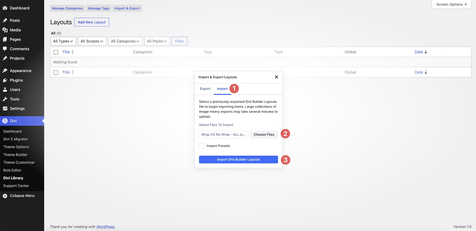
To access them, fill out the form below and download the zipped Wrap vs No Wrap file to your computer. Then go to Divi > Divi Library and select the Import & Export button.
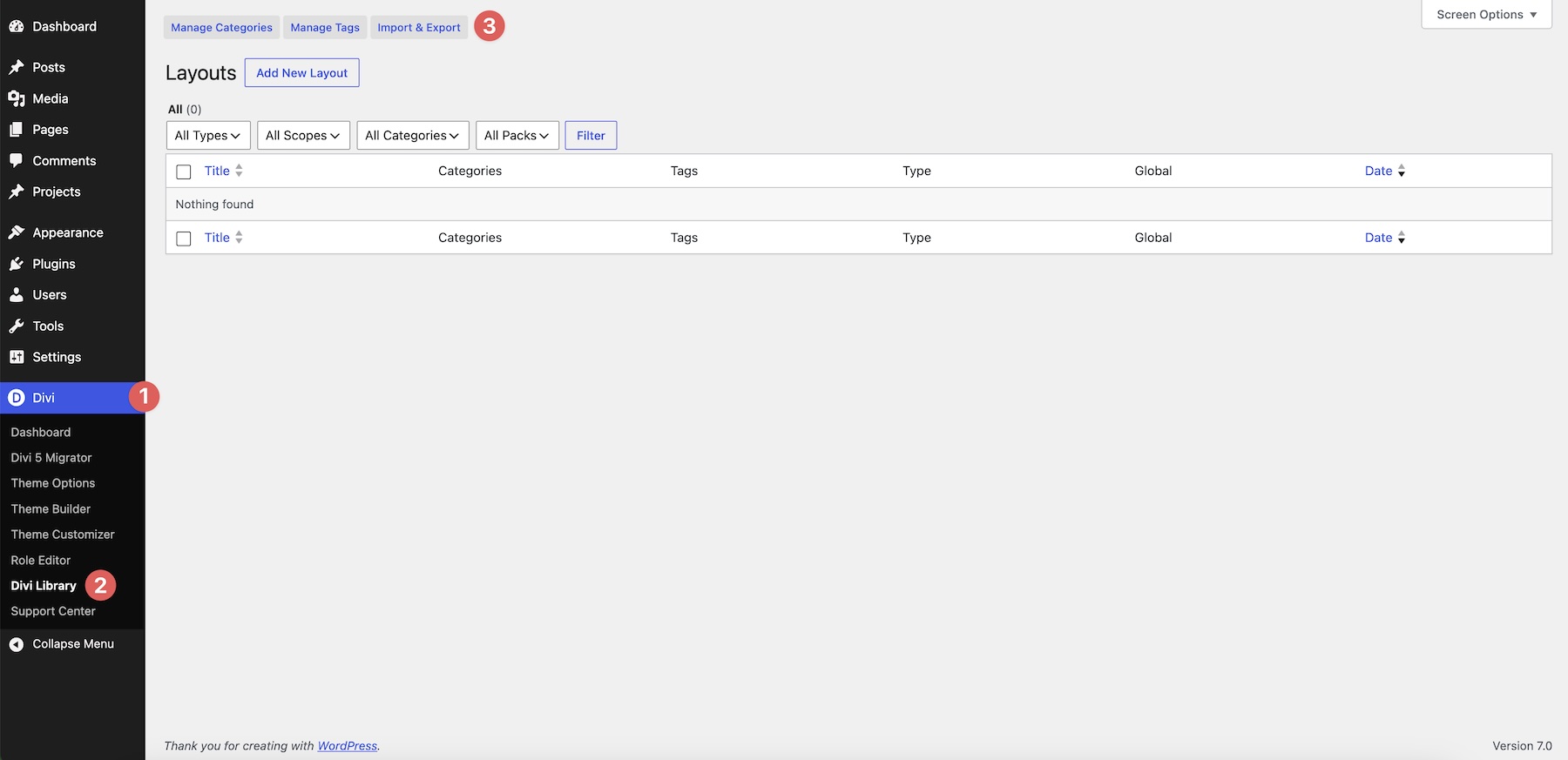
Choose the Import tab, select the section you’d like to import, or choose the Wrap VS No Wrap – ALL.json file to import all layouts. Once you’ve made a selection, click Import Divi Builder Layouts.
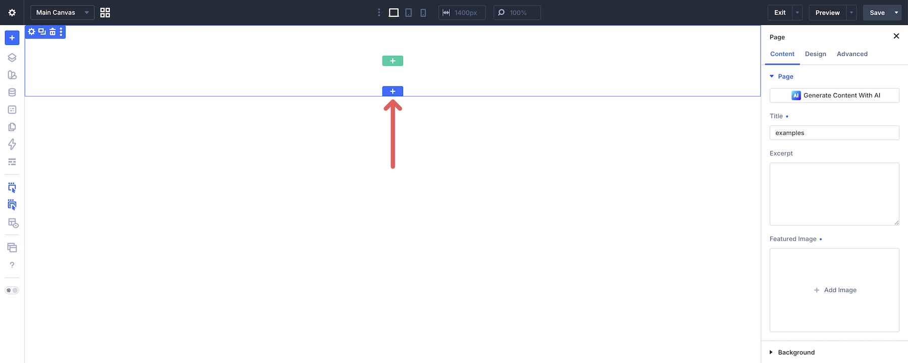
Next, create a new page or open an existing one in the Visual Builder. Click to add a new section to the page.
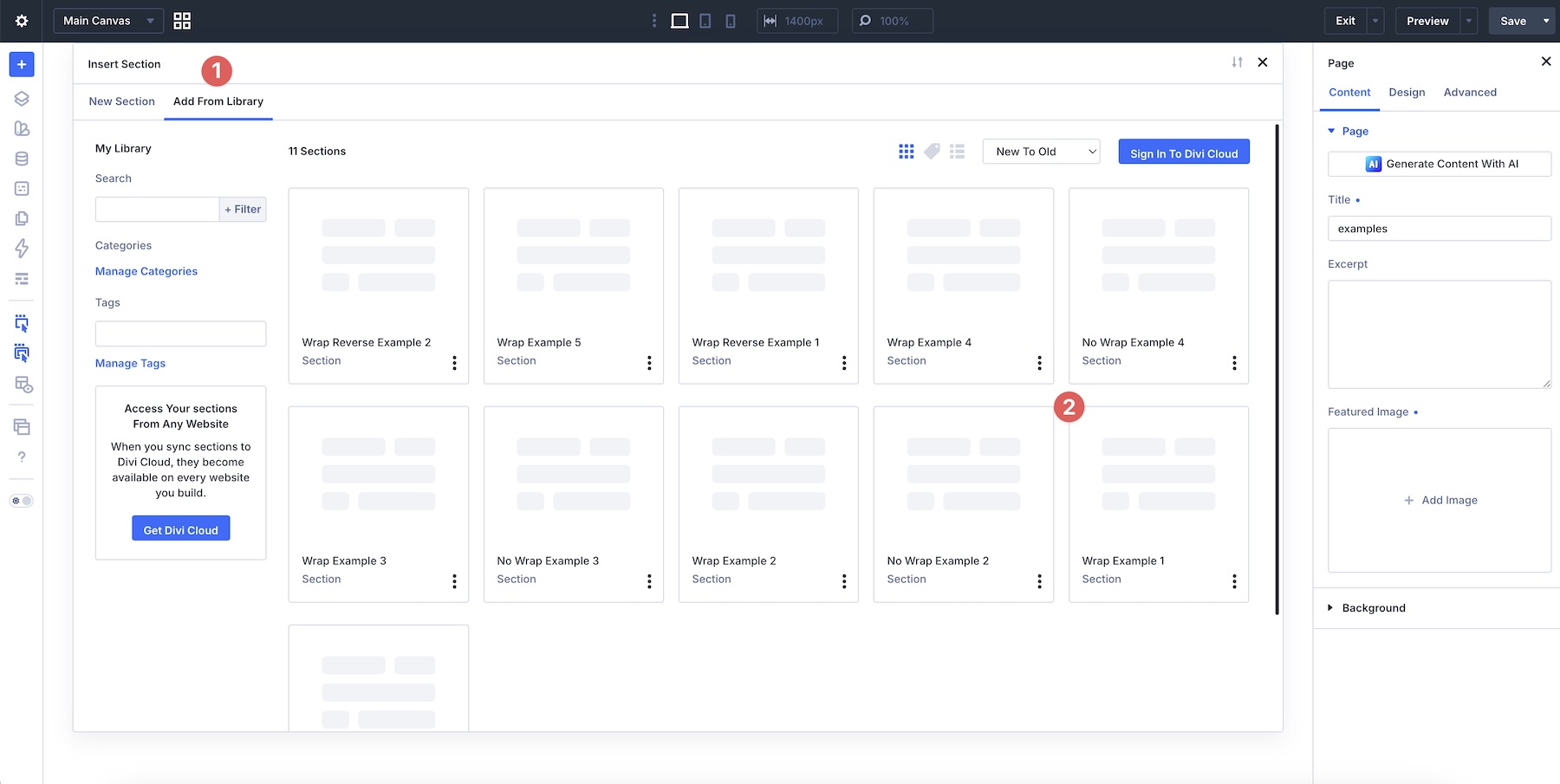
Select the Add From Library tab and choose the layout you’d like to import.
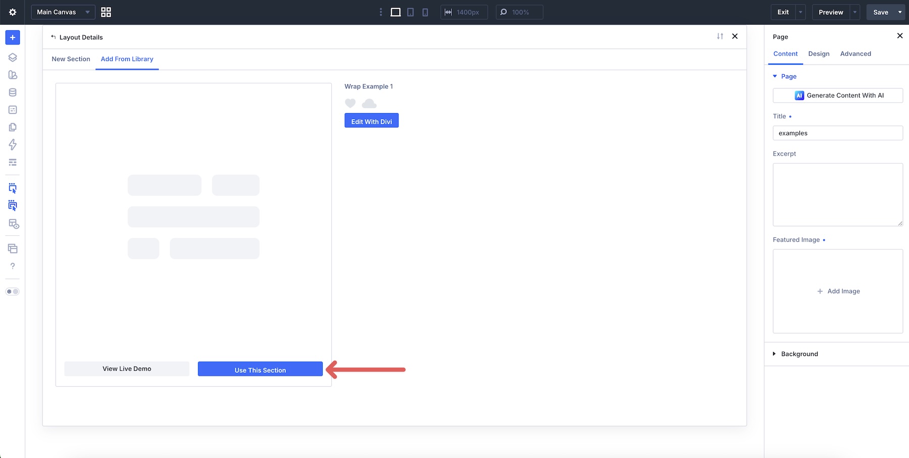
Finally, click Use This Section to load the section onto the page.

Wrap vs No Wrap: Building Better Layouts In Divi 5
With a clear understanding of No Wrap, Wrap, and Wrap Reverse, you can build cleaner and more efficient layouts in Divi 5. No Wrap keeps structures predictable on a single line. Wrap lets one parent container handle multi-line structures with fewer rows. Wrap Reverse gives you another option for controlling how wrapped lines stack at specific breakpoints.
The real power comes from combining Layout Wrapping with Column Class, Align Content, responsive controls, and Display Order. Together, these settings help you build layouts that adapt across screen sizes while keeping the structure easier to manage.
In Part 4 of Mastering Flexbox in Divi 5, we’ll show you advanced alignment techniques that reduce the need for manual spacing and custom code.
Download the example templates, experiment with the different wrapping options in your projects, and let us know in the comments which technique you’re most excited to try.


Leave A Reply