
In Part 1 of our Mastering Flexbox in Divi 5 series, we explored the core settings in the Layout option group when using Flex as the Layout Style. Now it’s time to put those controls to work on one of the most common layout challenges in web design: building card sections where cards share a consistent height and buttons stay aligned, even when content lengths vary.
This hands-on guide will show you how to create balanced card layouts using native Divi 5 Flexbox controls. By the end, you’ll understand how to combine parent-level stretching, internal card spacing, and Grow to Fill sizing to build feature cards, testimonials, pricing tables, blog cards, gallery cards, and more.
Let’s dive in.
Why Equal Height Cards Matter
Cards are one of the most common design patterns on modern websites. You’ll find them in feature sections, testimonial rows, pricing tables, blog grids, product showcases, service lists, and many other layouts.
The challenge starts when content lengths vary. One card may have a short headline and two lines of text, while another has a longer heading, a longer description, or a larger feature list. Without the right layout structure, some cards become taller than others, buttons sit at different heights, and the whole section feels uneven.
Key Benefits Of Equal Height Cards
- Visual Harmony: Cards feel polished, intentional, and easier to compare.
- Better Readability & UX: Consistent heights and aligned CTAs make sections easier to scan.
- Clearer Calls To Action: When buttons share the same visual baseline, visitors can compare options and act more quickly.
- Responsive-Friendly Structure: The same Flexbox pattern can be adjusted across desktop, tablet, and mobile breakpoints.
Mastering this technique will improve almost every multi-column section you build in Divi 5.
Core Flexbox Techniques For Equal Height Cards
Creating equal-height cards with aligned buttons in Divi 5 is straightforward once you understand the parent-child relationship. In most cases, you’ll use two core Flexbox settings and one supporting Sizing setting.
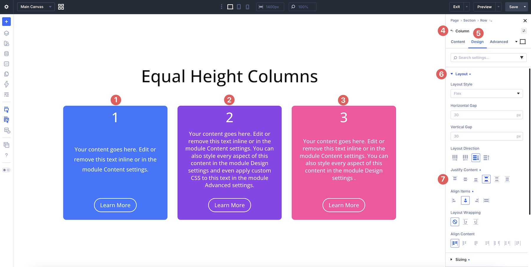
1. Parent Container: Equal Heights With Align Items > Stretch
At the parent level, usually a Row or Module Group, set Align Items > Stretch.
This tells Divi to stretch direct child items across the cross axis when their sizing allows it. In a horizontal row, that means the cards can stretch vertically to match the row height. In a vertical column, Stretch affects the horizontal axis instead.

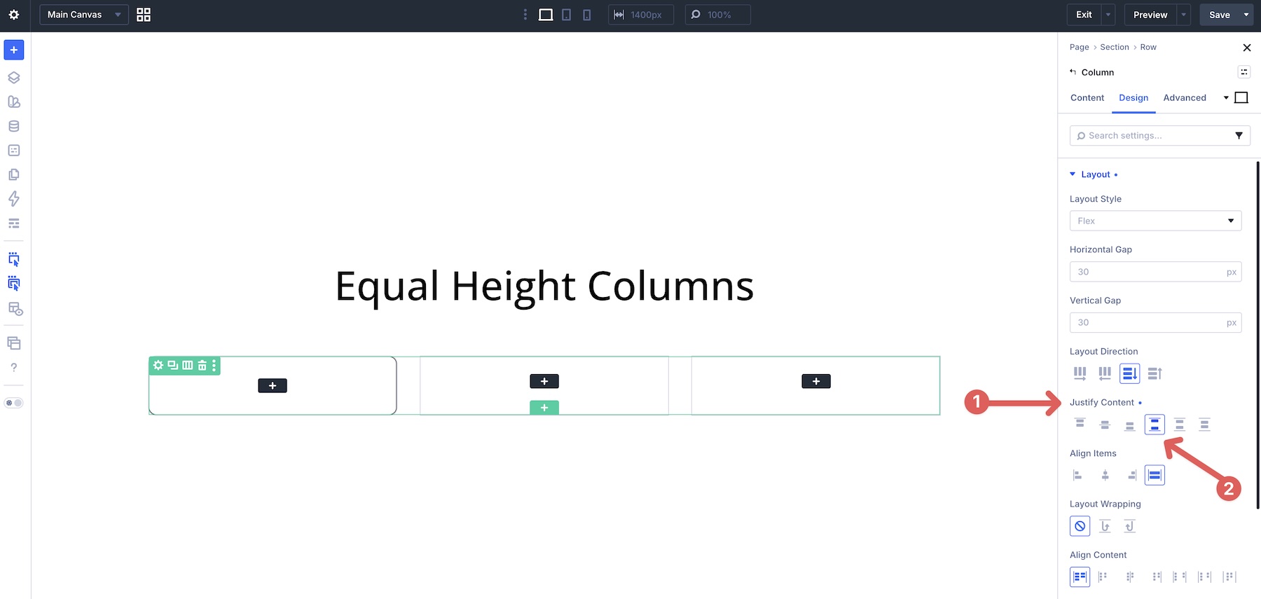
Inside each card, usually a Column or Module Group, set the card’s Layout Direction to Column, then apply Justify Content > Space Between.
Justify Content distributes child items along the main axis. When the card uses a Column direction, the main axis runs vertically. With Space Between, the top content stays near the top while the button or CTA can sit at the bottom of the card.
3. Supporting Setting: Sizing > Size > Grow To Fill
In many real layouts, Justify Content > Space Between gets you close, but it may not solve every alignment issue by itself. Long quotes, uneven feature lists, variable excerpts, and nested content groups can still create awkward spacing inside the card.

This is where Sizing > Size > Grow To Fill becomes useful.
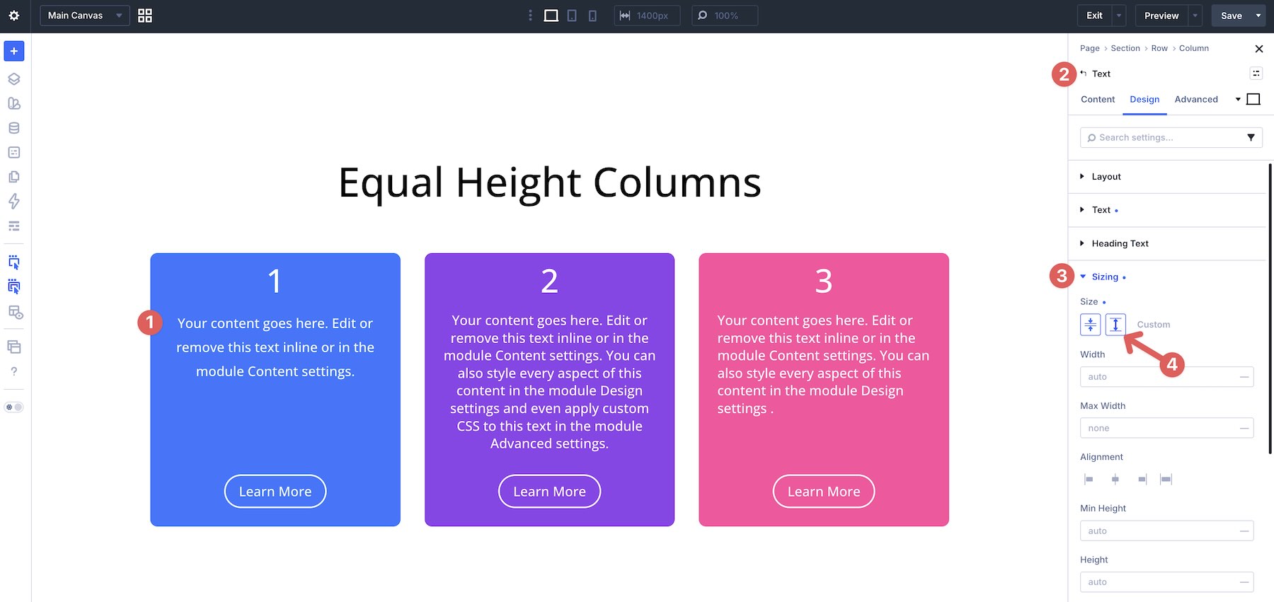
In the example below, Grow To Fill is applied to the Text module inside each column. The selected element expands into the available space, which helps push the content below it toward the bottom of the card while keeping the text aligned from the top.
When these three tools work together, you can build professional card layouts visually and avoid custom CSS for most equal-height card patterns.
Real-World Examples
Let’s look at five practical examples that show how the core techniques work across different types of content. Each example includes a before-and-after view and the exact settings used.
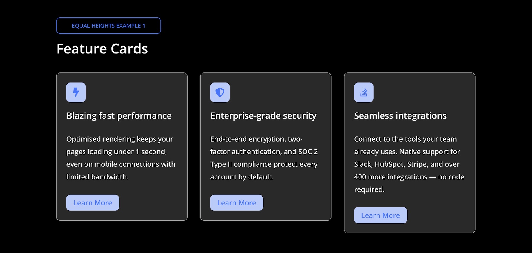
Example 1: Feature Cards
Before: The cards share the same overall height, but the buttons sit at different positions because each card has a different amount of text.
After: The button sits at the bottom of every card, even when the card copy varies. This is achieved by setting the parent row’s Align Items option to Stretch and each column’s Justify Content option to Space Between. The Module Group containing the icon, heading, and text stays at the top, while the Button module outside that group is pushed to the bottom.
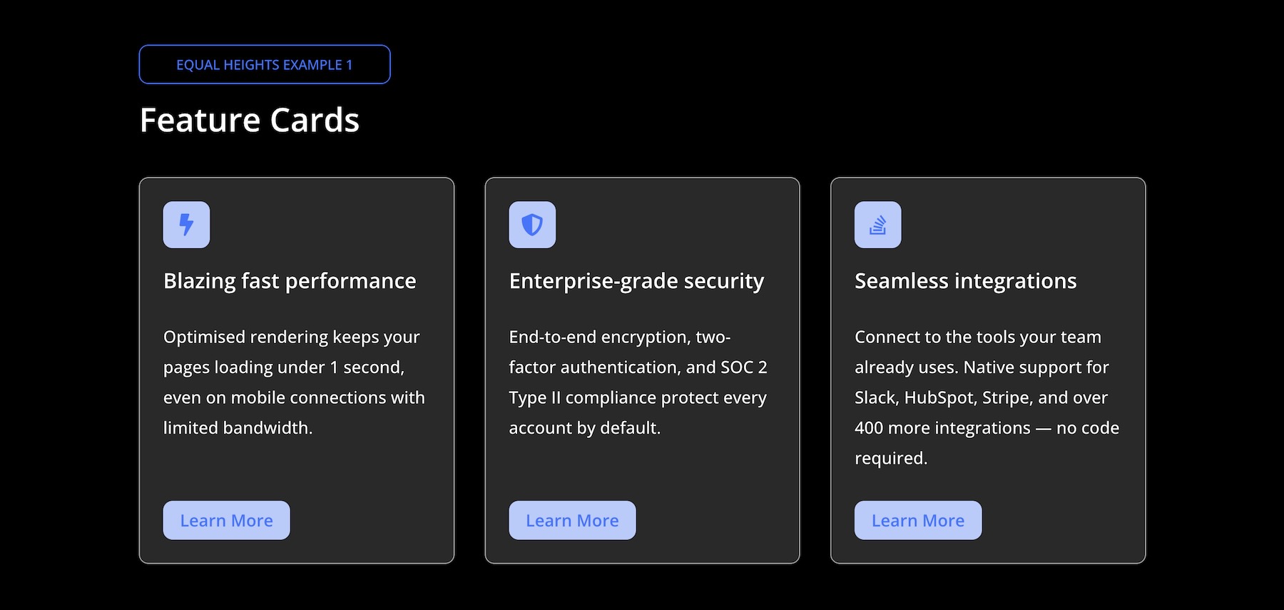
Key Settings:
- Parent Row: Align Items > Stretch
- Each Column: Layout Direction > Column + Justify Content > Space Between
- Module Group: Wraps the Icon, Heading, and Text modules
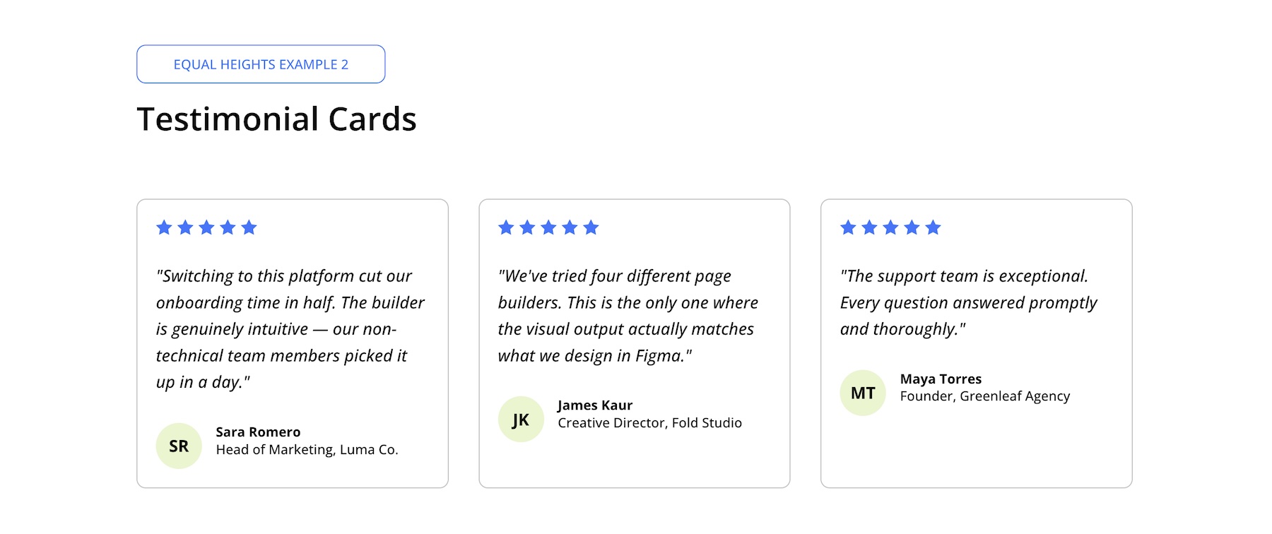
Example 2: Testimonial Cards
Before: The parent row has Align Items > Stretch applied, so the cards share a consistent height. However, without Justify Content > Space Between inside each card, the author blocks sit wherever the quote ends. Longer quotes push the author information into different positions, creating visible misalignment across the row.
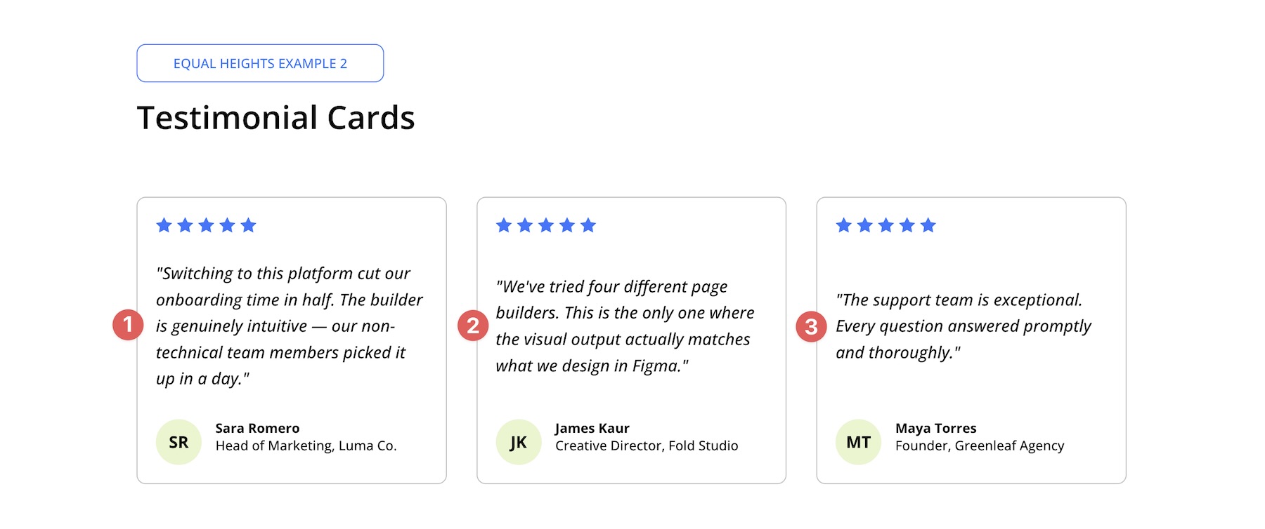
Intermediate Step: After setting each column to Justify Content > Space Between, the star ratings stay at the top and the author blocks move to the bottom. However, the quote text may still sit awkwardly in the remaining space.
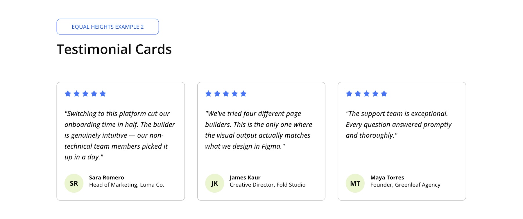
After: Quotes vary in length, but the author block stays anchored at the bottom of every card. The row uses Align Items > Stretch so all columns share the same row height. Each column uses Justify Content > Space Between to separate the top rating from the bottom author block. To fix the quote spacing, enable Sizing > Size > Grow To Fill on the quote Text module. This allows the quote area to absorb available space from the top, pushing the author block down while keeping the rating pinned above.
Key Settings:
- Parent Row: Align Items > Stretch
- Each Column: Justify Content > Space Between
- Quote Text Module: Size > Grow To Fill
Example 3: Pricing Cards
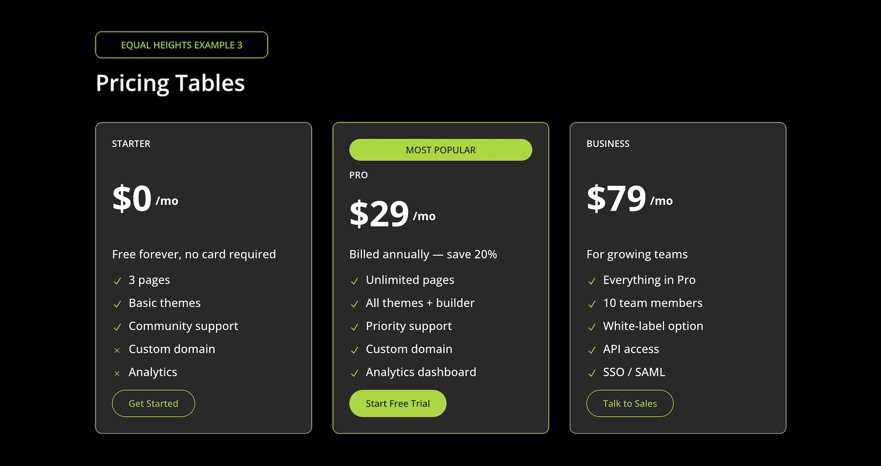
Before: The parent row has Align Items > Stretch applied, which gives the pricing cards a consistent outer height. Each column also uses Justify Content > Space Between. However, because the feature lists vary in length, the pricing information and buttons still don’t align consistently across every plan.

After: The parent row’s Align Items > Stretch setting keeps the card heights consistent. Each column uses Justify Content > Space Between so the CTA buttons share the same baseline. To solve the remaining unevenness caused by different feature list lengths, enable Sizing > Size > Grow To Fill on the Module Group that contains the pricing information, such as the “$X/mo” section. This lets the pricing area absorb extra space and pushes the lower content into a more consistent vertical rhythm.
Key Settings:
- Parent Row: Align Items > Stretch
- Each Column: Justify Content > Space Between
- Pricing Module Group: Size > Grow To Fill
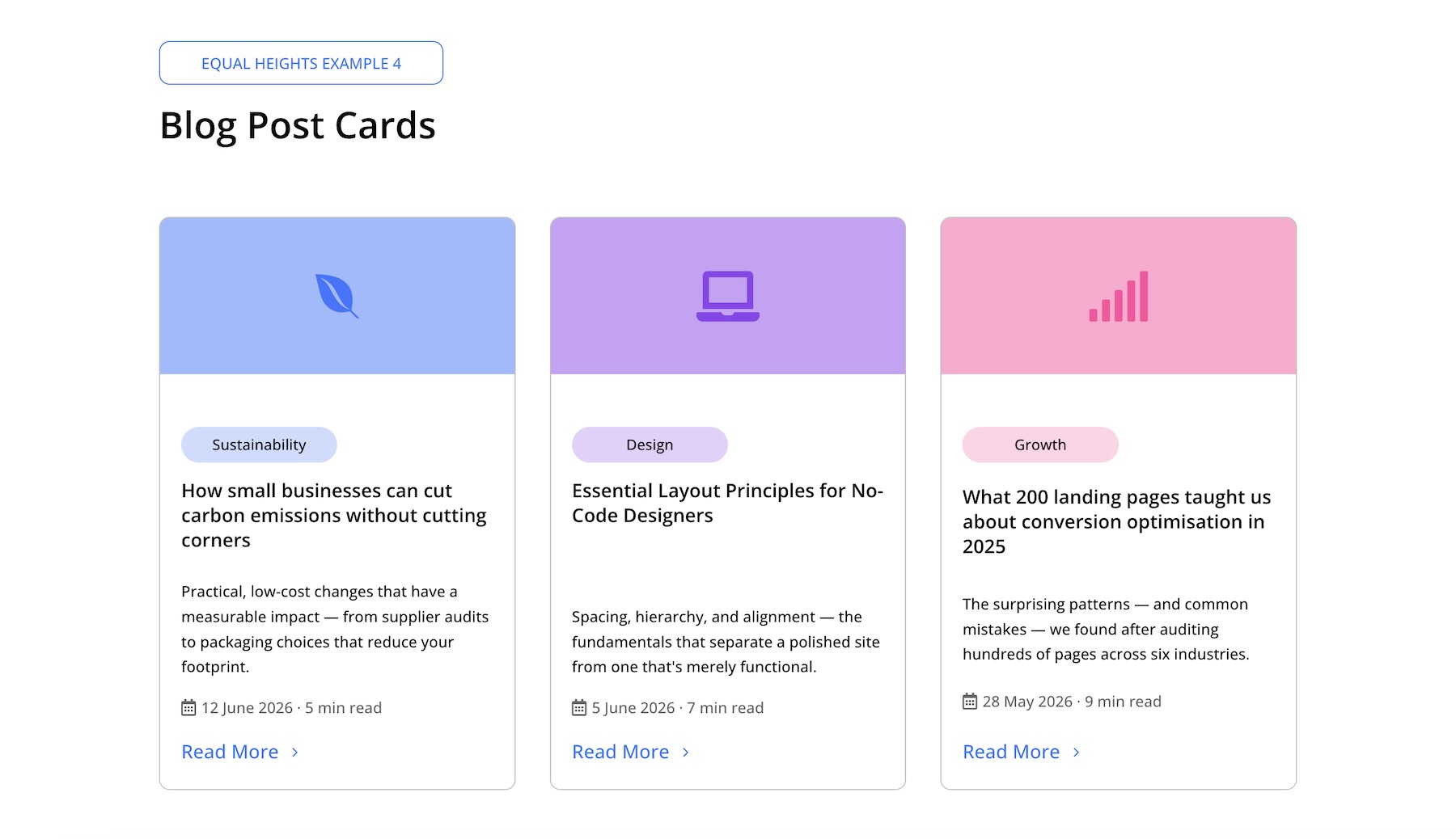
Example 4: Blog Post Cards
Before: The cards have equal outer height thanks to Align Items > Stretch on the parent row, but the titles and excerpts vary in length. This causes the metadata and Read More links to sit at inconsistent positions across the cards.
After: Even though the article titles and excerpts vary, the Read More link appears at the same level across all three cards. The parent row uses Align Items > Stretch. Inside each column, the colored header icon is wrapped in one Module Group, while the main content, including the category label, heading, excerpt, metadata, and button, is wrapped in a second Module Group.
The second Module Group uses Justify Content > Space Between, and the column-level Vertical Gap is reduced to 0. Finally, Grow To Fill is enabled on the excerpt Text module. This allows the excerpt area to absorb available space and push the metadata and Read More link to the bottom of each card.
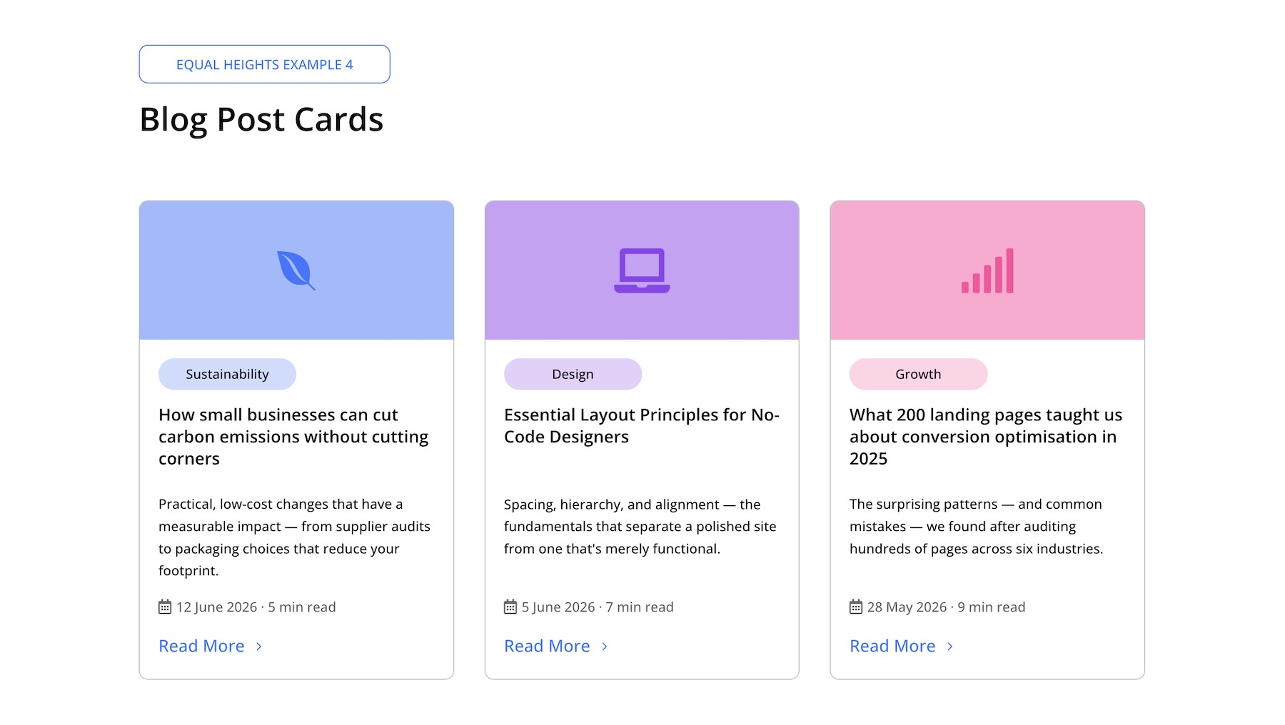
Key Settings:
- Parent Row: Align Items > Stretch
- Each Column: Vertical Gap > 0
- Second Module Group: Justify Content > Space Between
- Excerpt Text Module: Size > Grow To Fill
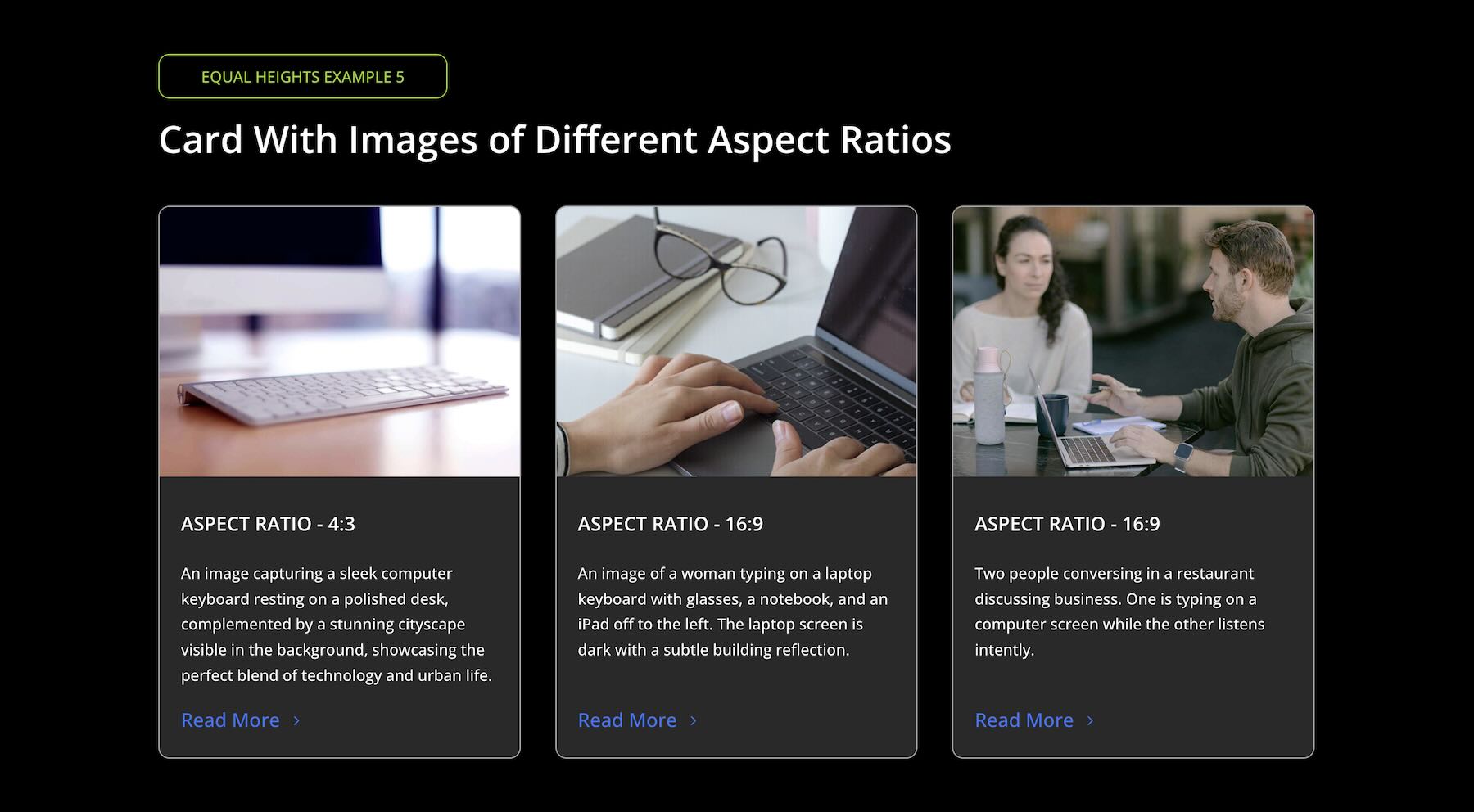
Example 5: Gallery Cards
Before: Each image has a different native aspect ratio, such as landscape, portrait, or square. Divi 5’s Aspect Ratio and Image Framing features make it easier to standardize image framing, but the content below each image still needs a strong Flexbox structure to align consistently.
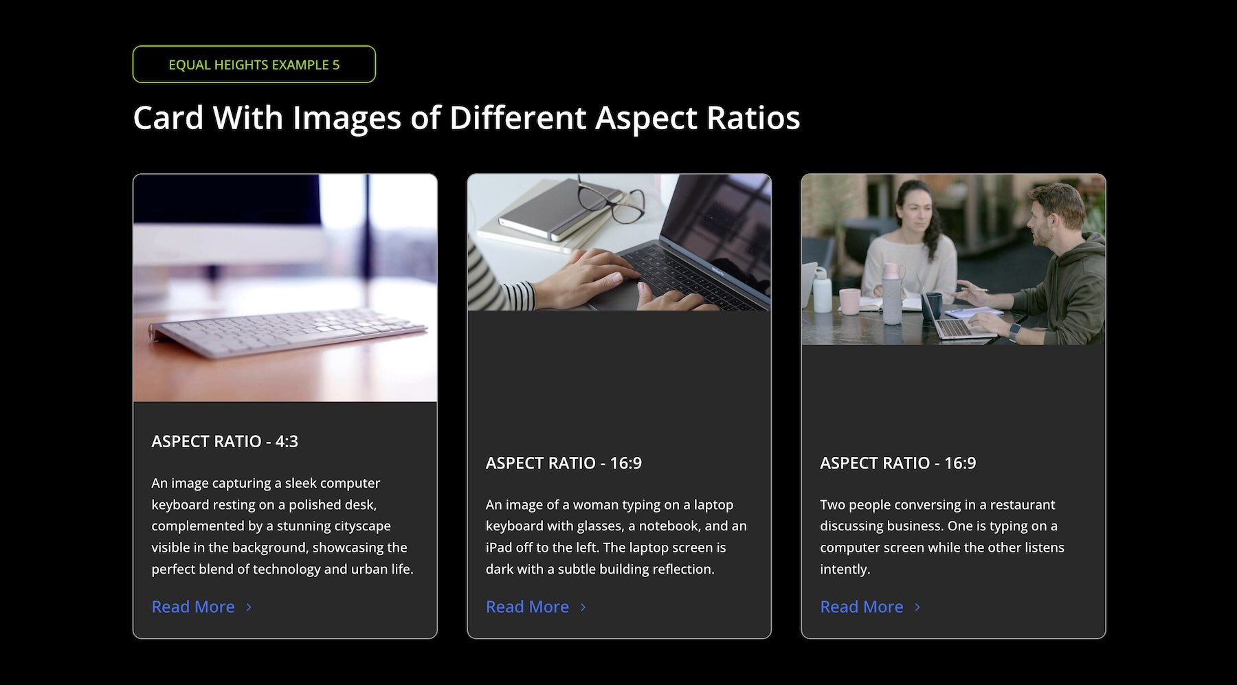
Each image is set to a consistent 4:3 aspect ratio in the Sizing option group.
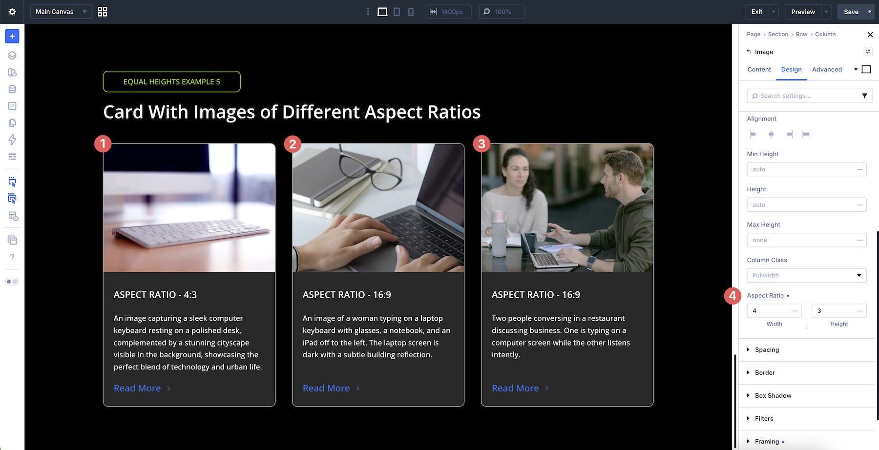
Then, the Framing settings are adjusted to control how the image sits inside that frame.
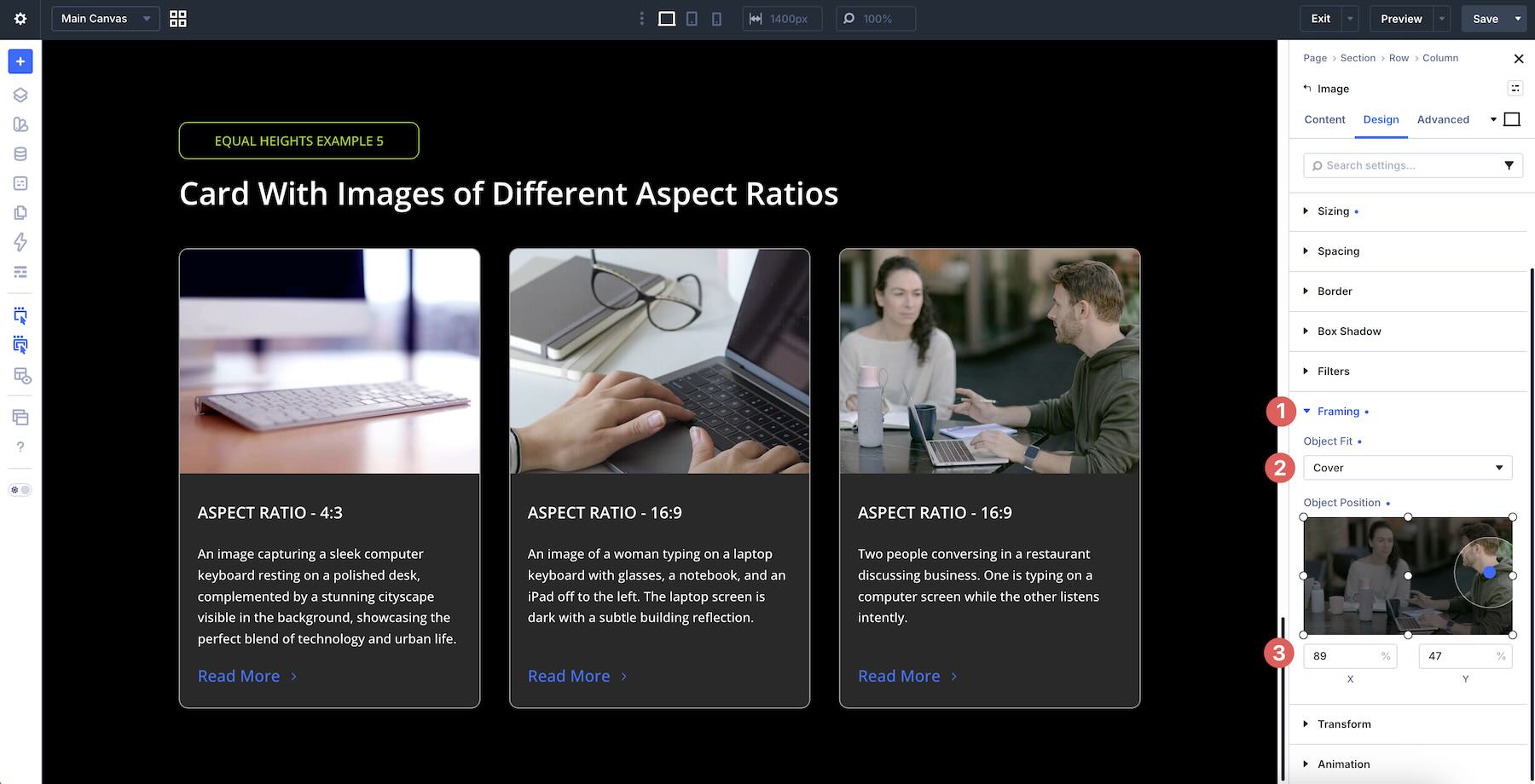
After: For the final result, the heading, text, and button modules are wrapped in a Module Group, and Grow To Fill is enabled on that group. This allows the content area below each image to expand into the available space, pushing the button to the bottom and creating consistent vertical alignment across the cards.
Key Settings:
- Parent Row: Align Items > Stretch
- Image Module: Aspect Ratio > 4:3 + Framing adjustments in the Sizing option group
- Module Group: Wraps the heading, text, and button modules + Size > Grow To Fill
Full Step-By-Step Card Build Walkthrough
Here’s how to build a three-column feature card layout using the techniques covered above.
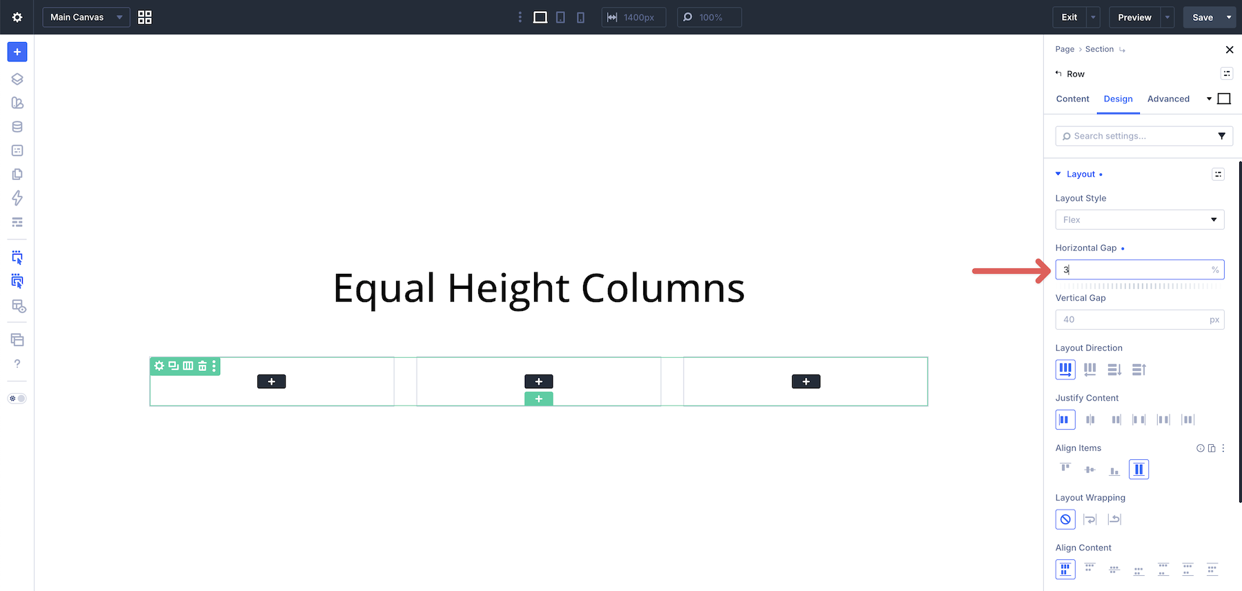
Add a new three-column Row to a page in the Visual Builder. In this workflow, Flex is selected as the Layout Style.
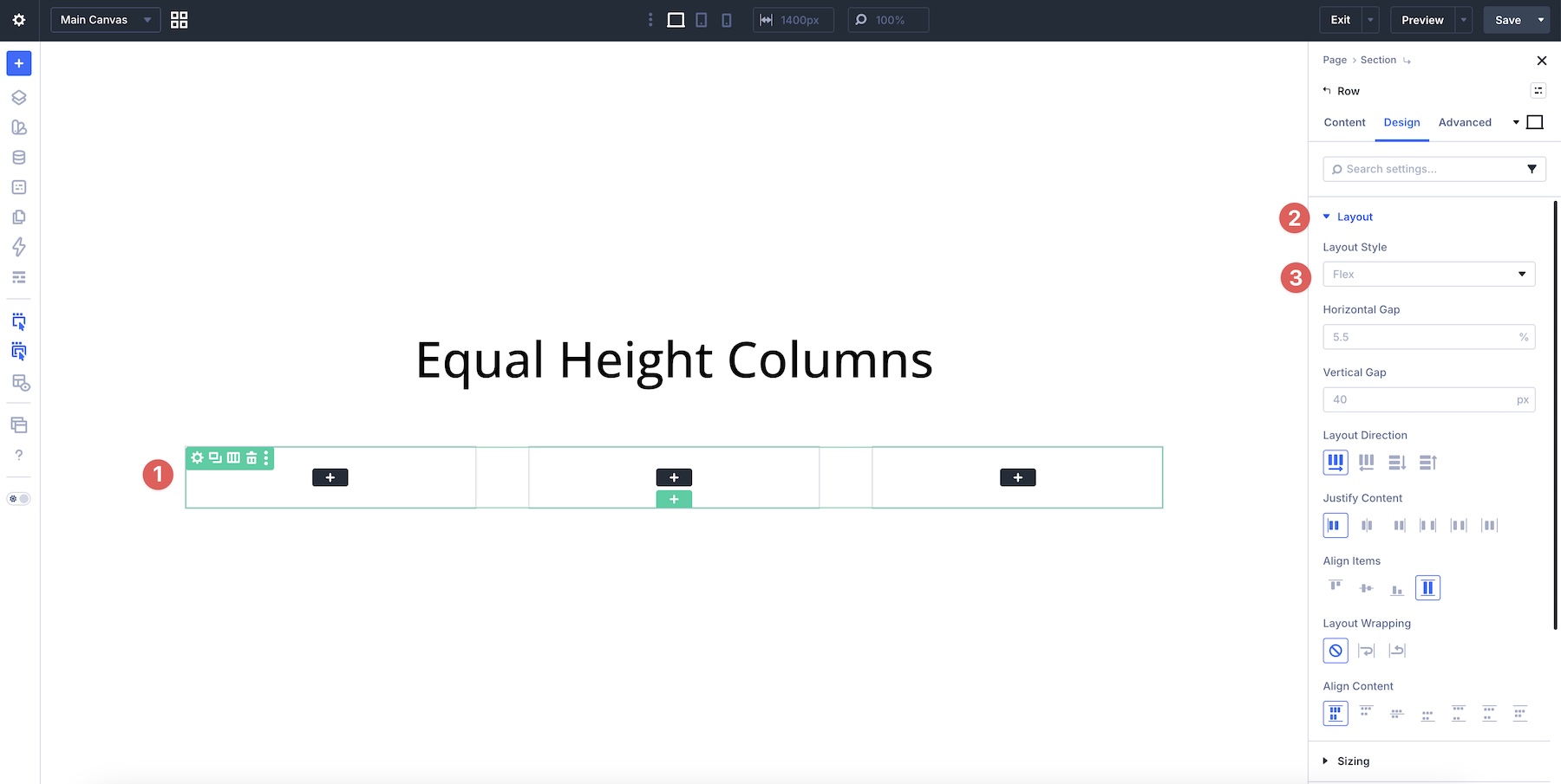
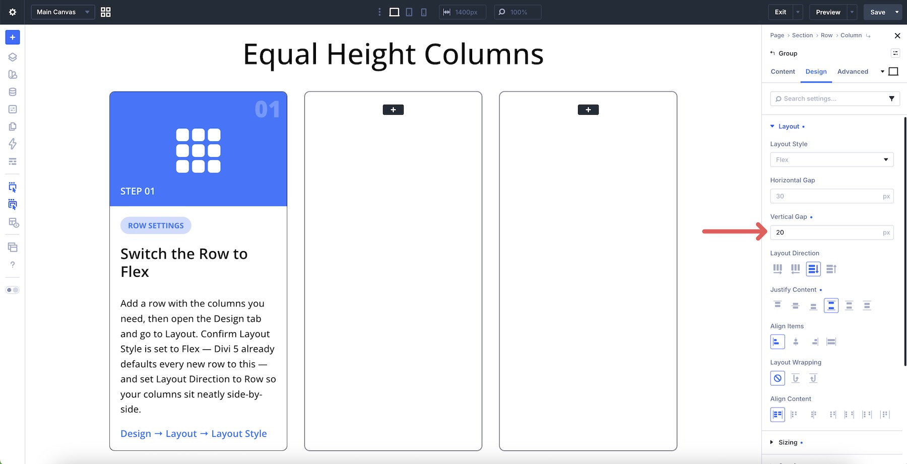
In the row’s Layout option group, set the Horizontal Gap to 3%. This decreases the horizontal space between columns and gives the cards a cleaner layout rhythm.
Next, edit the first column. Use the Design tab to add your Spacing and Border styles. With the first column selected, open the Layout option group and set Justify Content to Space Between.
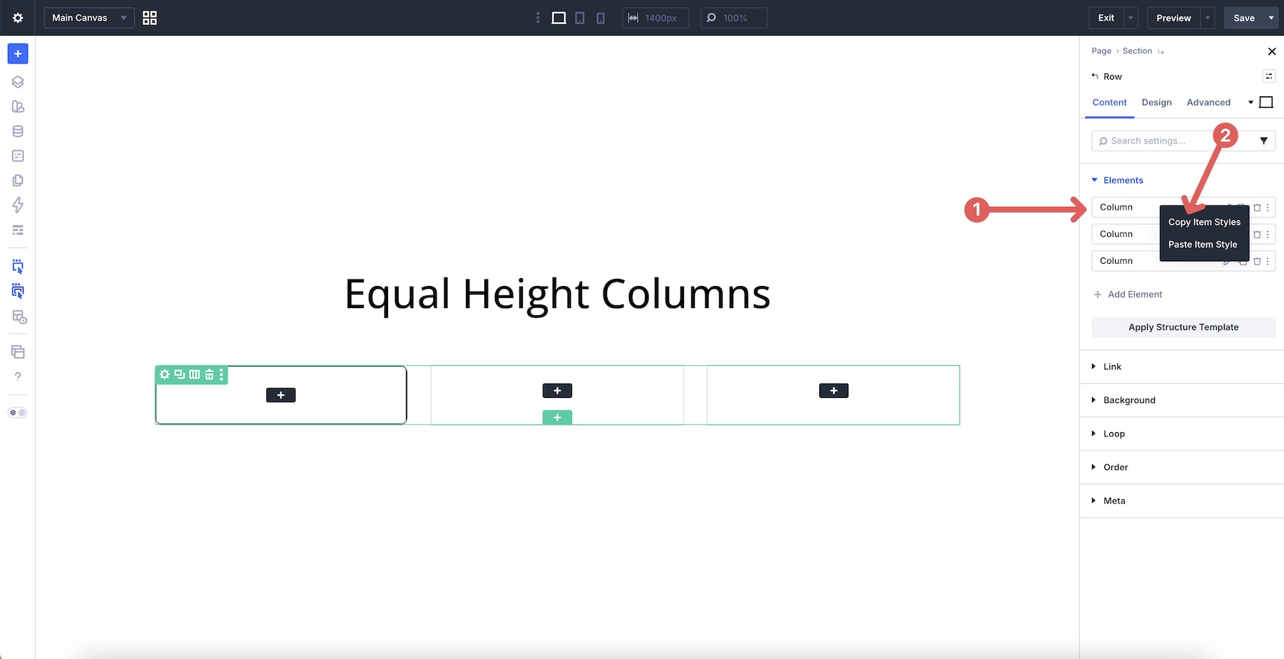
Return to the row level, then right-click the first column in the Elements option group and select Copy Item Styles. This gives you a quick way to reuse the same column styling and layout settings.
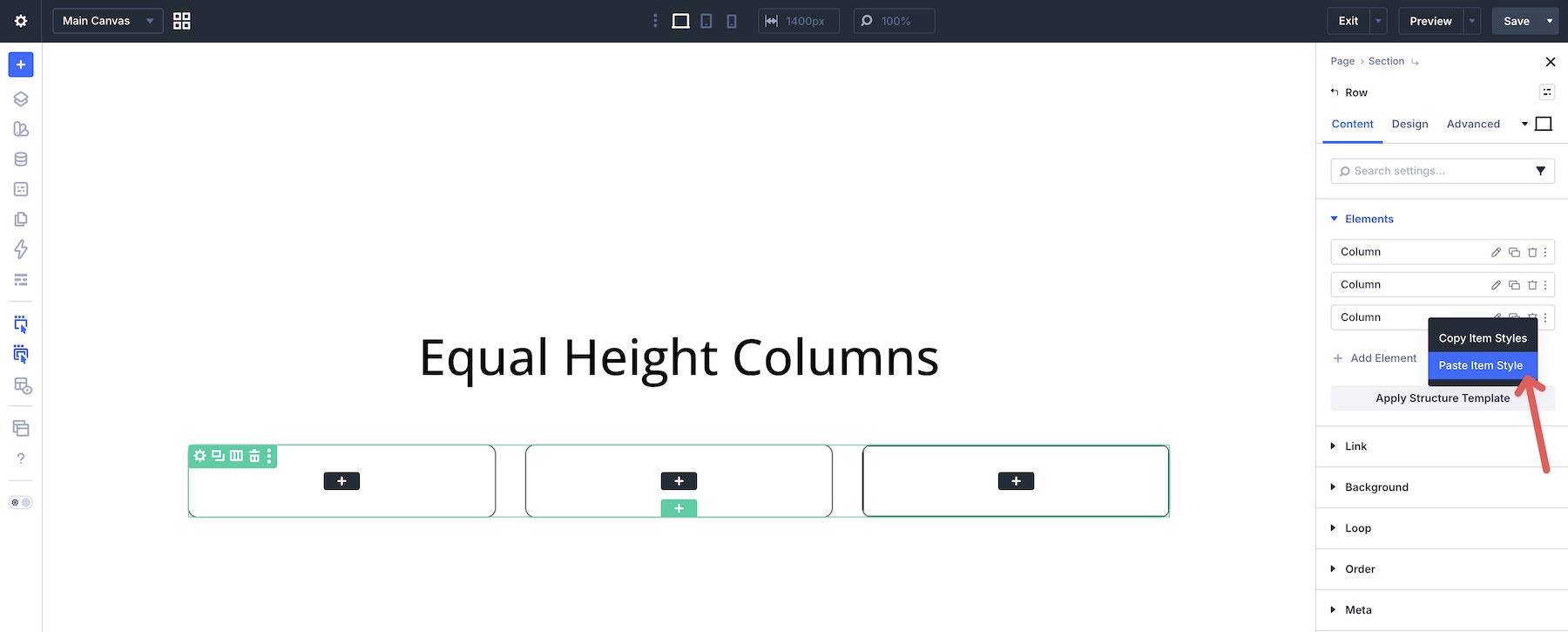
Right-click the second and third columns and choose Paste Item Style.
Add Module Groups And Content To The Column
Start by adding a Module Group to the first column. Inside it, place three additional Module Groups for your content. On the main group, set the Vertical Gap to 0px, Justify Content to Space Between, and Align Items to Stretch.
Add a Heading module to the first Group, an Icon module to the second Group, and another Heading module to the third Group. Style them as needed.
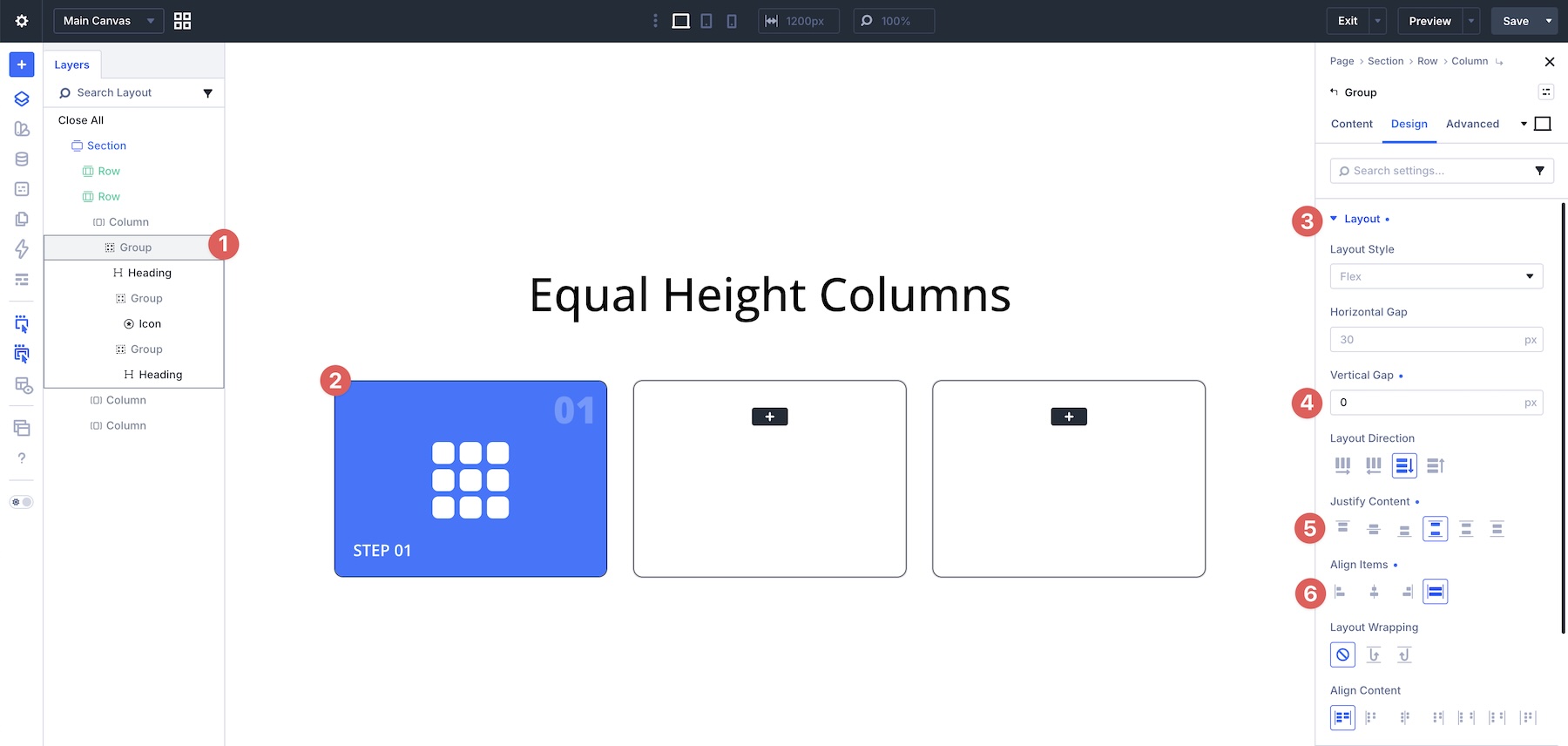
With the nested Module Group selected in the Layers panel, right-click to open the quick actions menu. Select Add Element > Add Element Below. This lets you place another element into the column below the nested group structure.
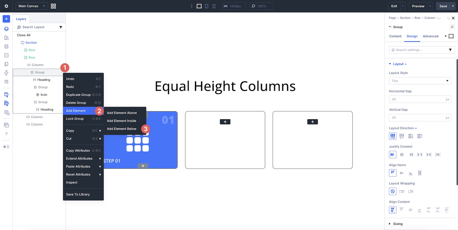
Choose a Module Group, then add a Text Module inside it.
Add padding to the new Group, such as 25px on all sides. Then add a Button, Heading, and two Text modules, and style them as needed. Once the content is added, adjust the Vertical Gap to create the right amount of spacing between modules.
Add content to the remaining columns, copying and pasting content and styles as needed. Once all content is added, you may notice that shorter columns leave the bottom text or CTA misaligned. To correct this, use Grow To Fill on the element that should absorb the available space. For reusable card designs, apply this consistently to the same element type across each card.
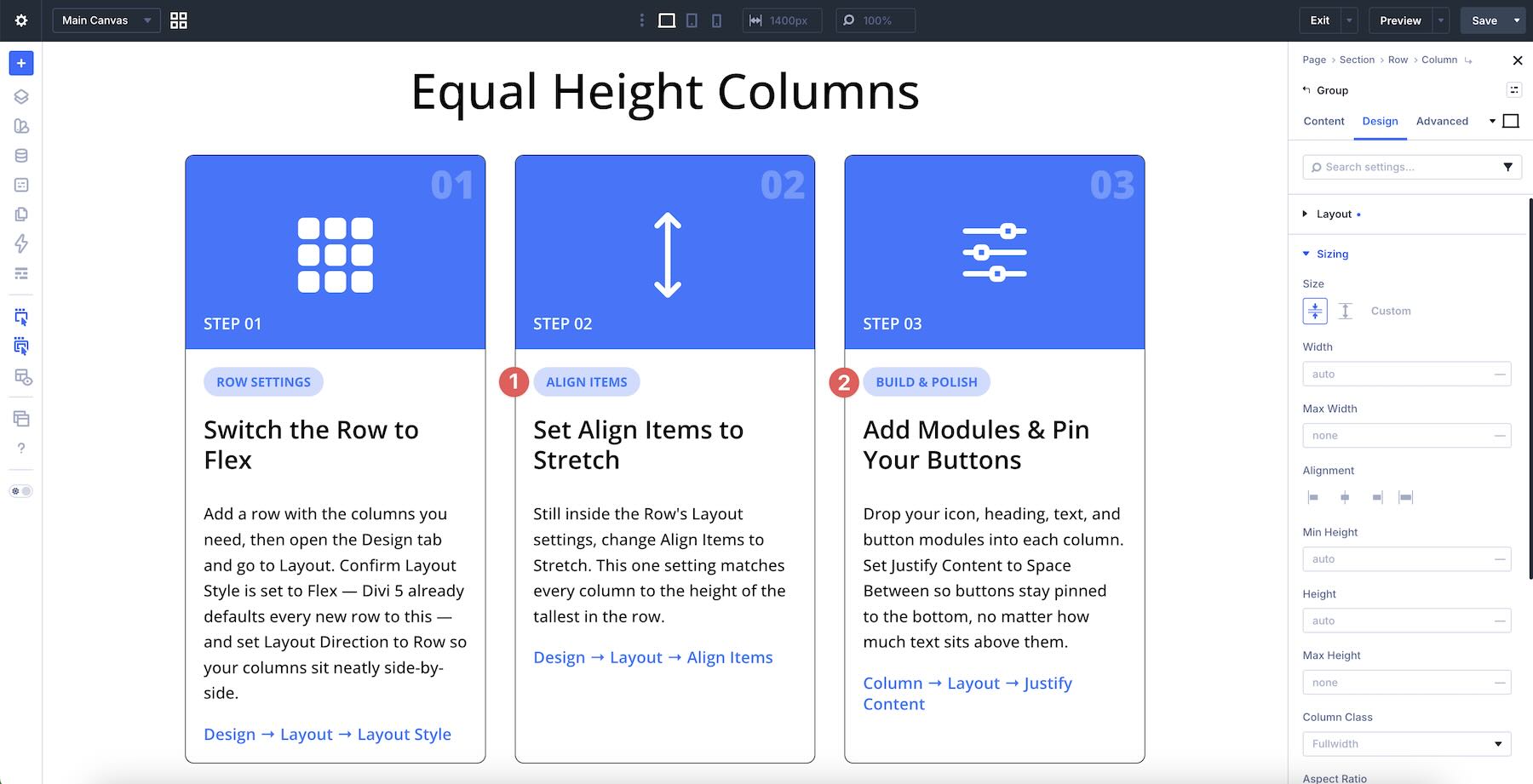
Select the matching second Group in the card columns, expand the Sizing option group, and enable Size > Grow To Fill.
Next, apply Grow To Fill to the Text modules that need to absorb extra space inside the second and third columns.

Once applied, the lower text and button content align more consistently across the columns.
Responsive Behavior & Best Practices
Control Responsive Layouts With Layout Wrapping
Divi 5 gives you breakpoint-level control over how Flex layouts behave. For card rows, Layout Wrapping > Wrap is especially useful because it allows cards to move onto additional lines when there isn’t enough horizontal space.
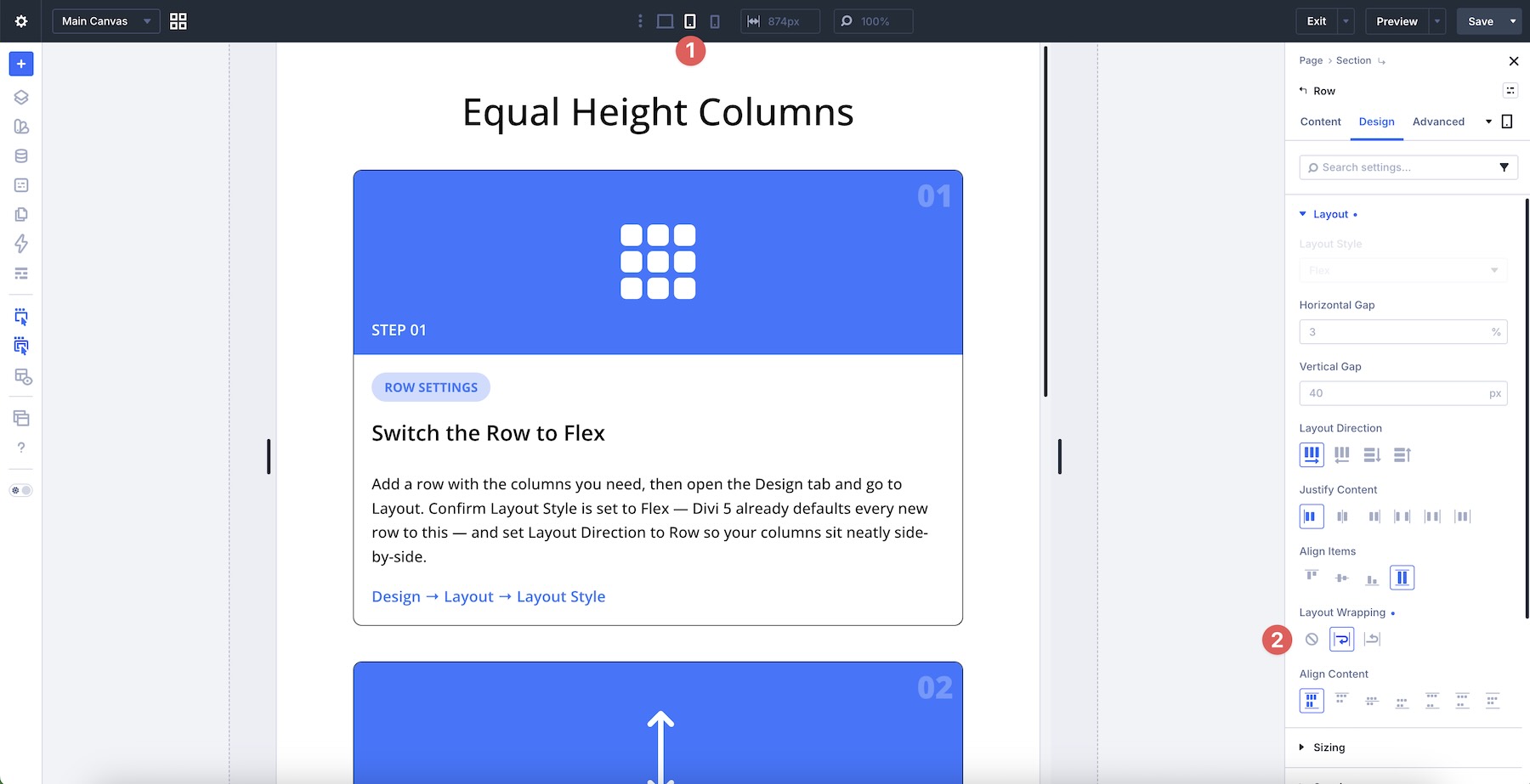
Once wrapping is active, cards can stack or wrap more naturally on smaller screens. Combine this with per-breakpoint adjustments using the Responsive Editor when you need tighter control over tablet and mobile layouts.
Use Display Order For Better Mobile Flow
The visual order that works well on desktop may not always be ideal on smaller screens. Use the Display Order setting in the Content tab of columns or modules to reorder elements at specific breakpoints. This is especially useful for alternating text/image layouts or when you want certain cards to appear first on mobile without duplicating content or writing custom media queries.
Save And Reuse Your Card Layouts
Once you’ve built a card design you like, right-click the parent Row or Module Group and save it to the Divi Library. You can also save layouts to Divi Cloud for access across multiple sites. This turns your complete Flexbox card structure, including nested groups and layout settings, into a reusable component you can insert into future pages.
Test With Real Content Variations
Always test card layouts with short, medium, and long content. The real test of a strong equal-height card system is how it behaves when content lengths differ dramatically. Use placeholder content of varying lengths during development to make sure your Grow To Fill, Space Between, and Stretch settings remain reliable across real-world scenarios.
Download The Layouts
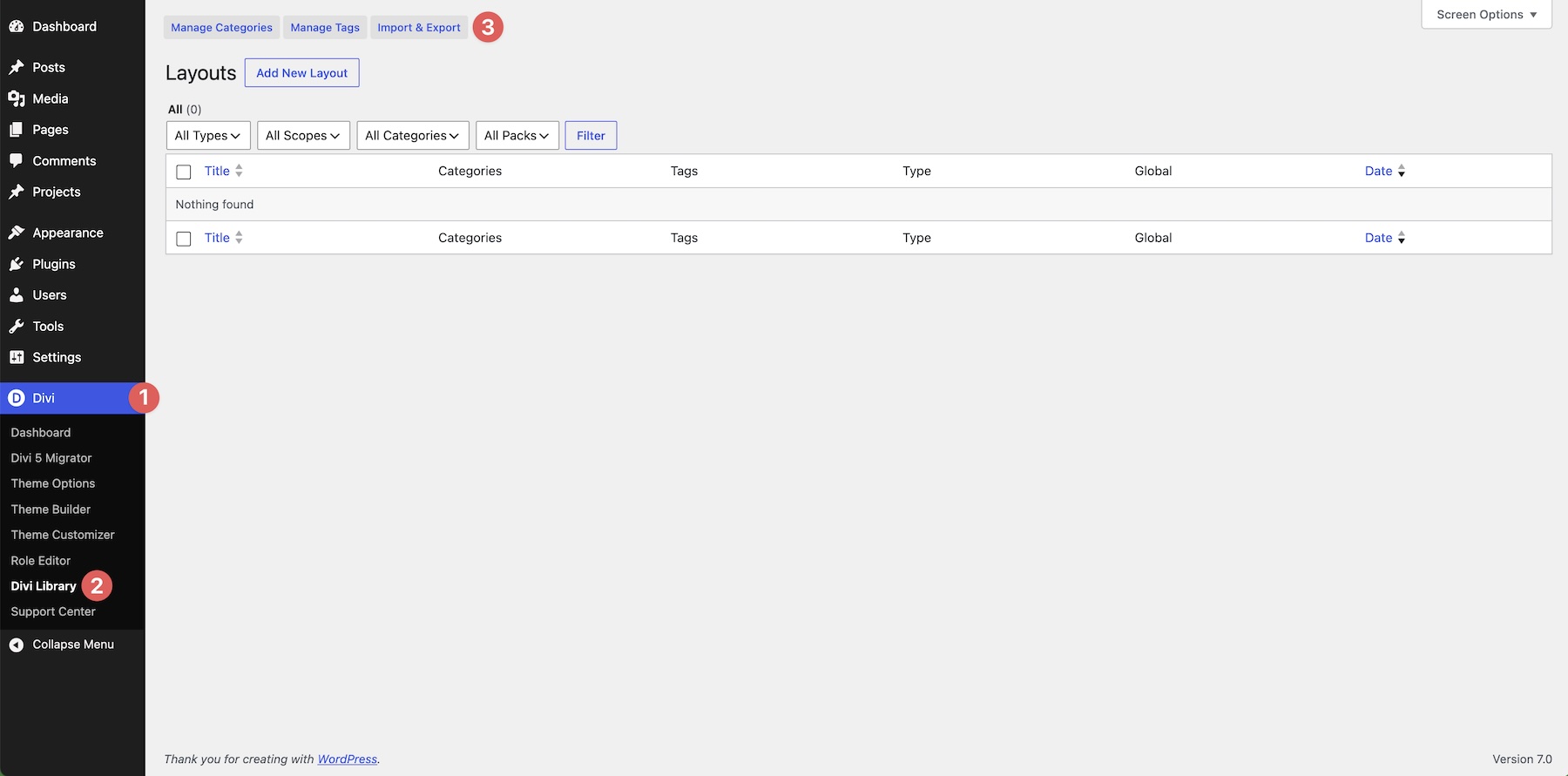
To help you get started, we’ve created a JSON file containing the example layouts from this post. To use them, navigate to Divi > Divi Library and click the Import & Export button.
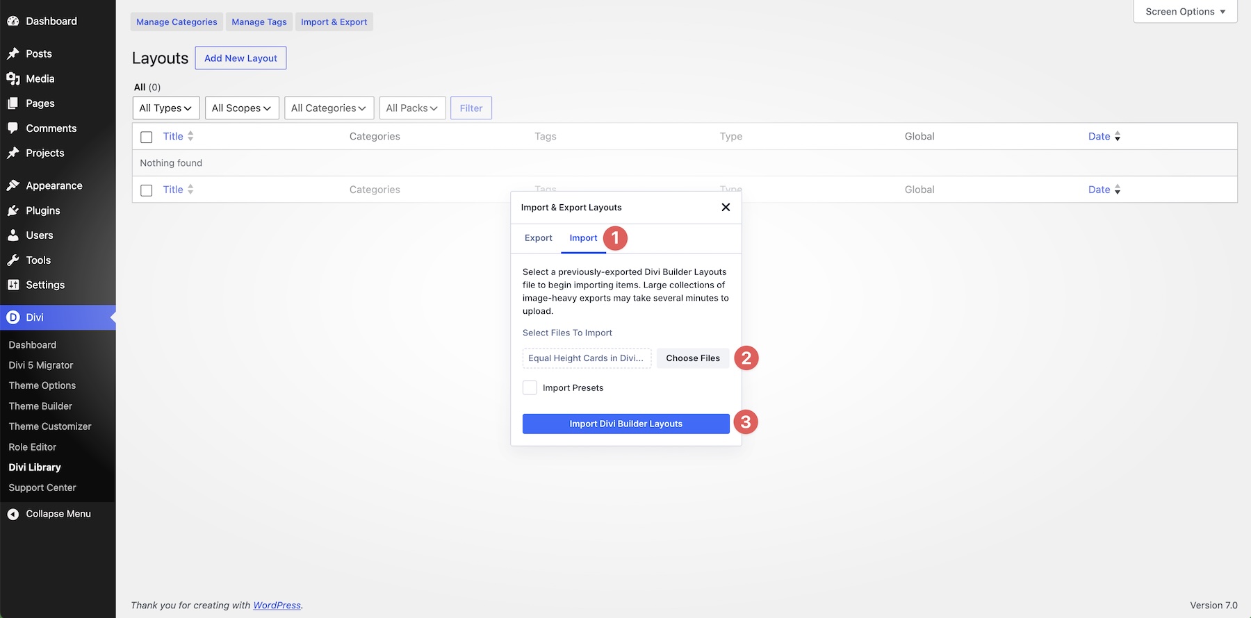
Select the Import tab, load the Equal Height Cards in Divi 5.JSON file, and click Import Divi Builder Layouts.
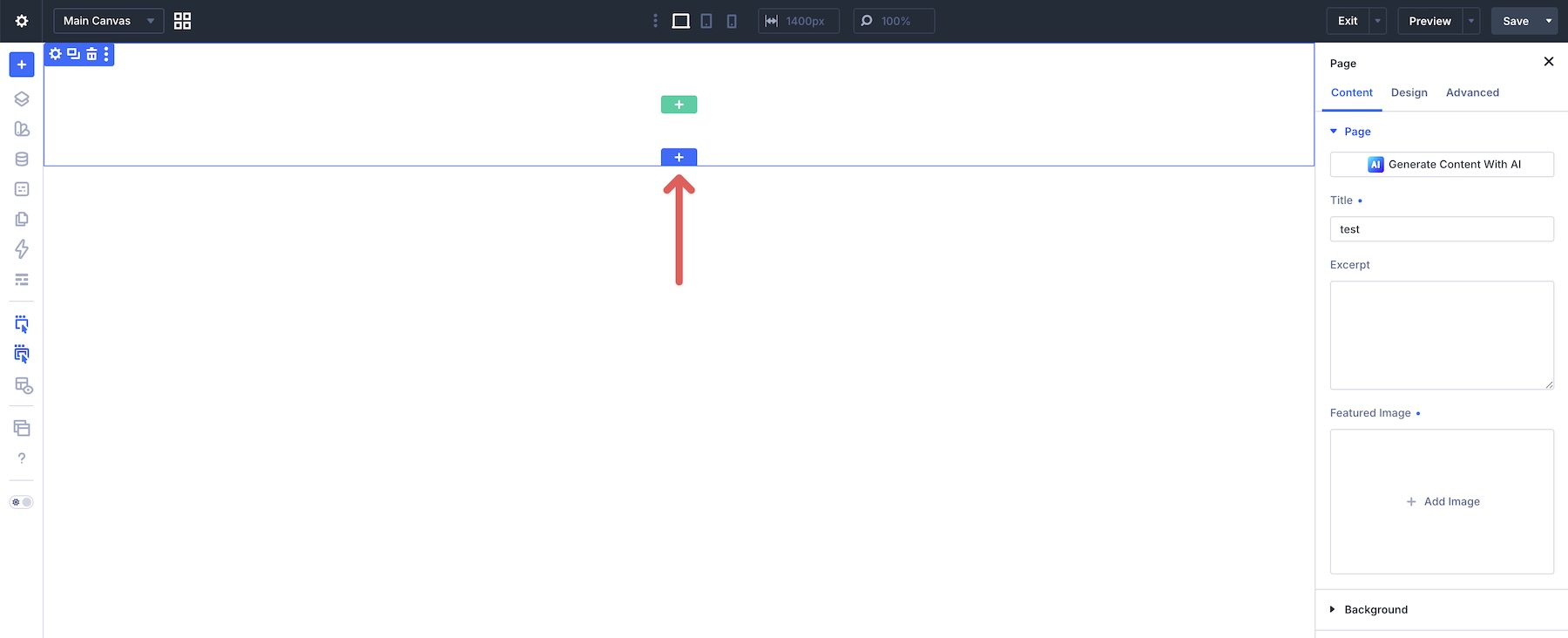
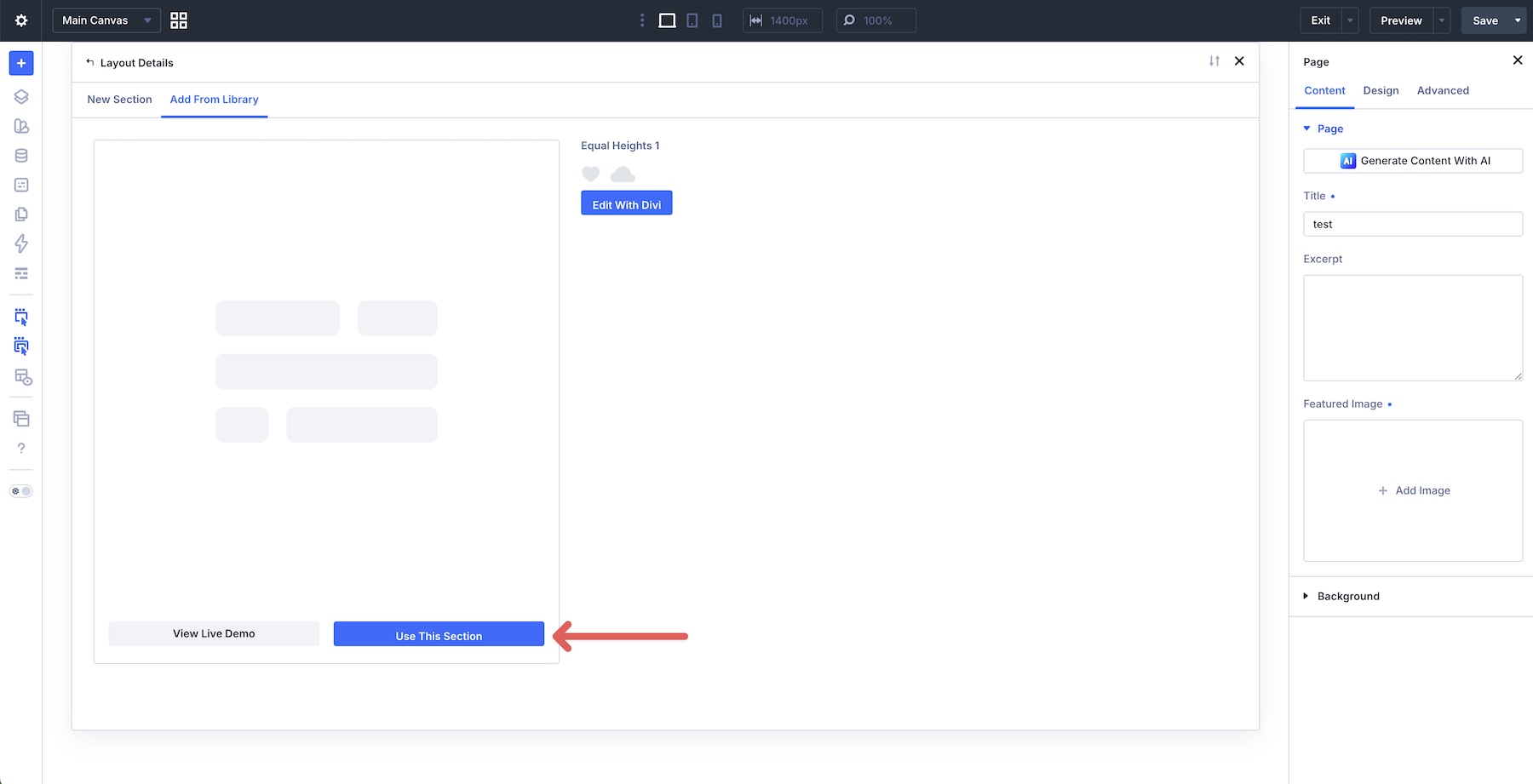
Once the files are imported, create a new page or open an existing one in the Visual Builder. Click to add a new section.
Select Add From Library and choose a layout section.
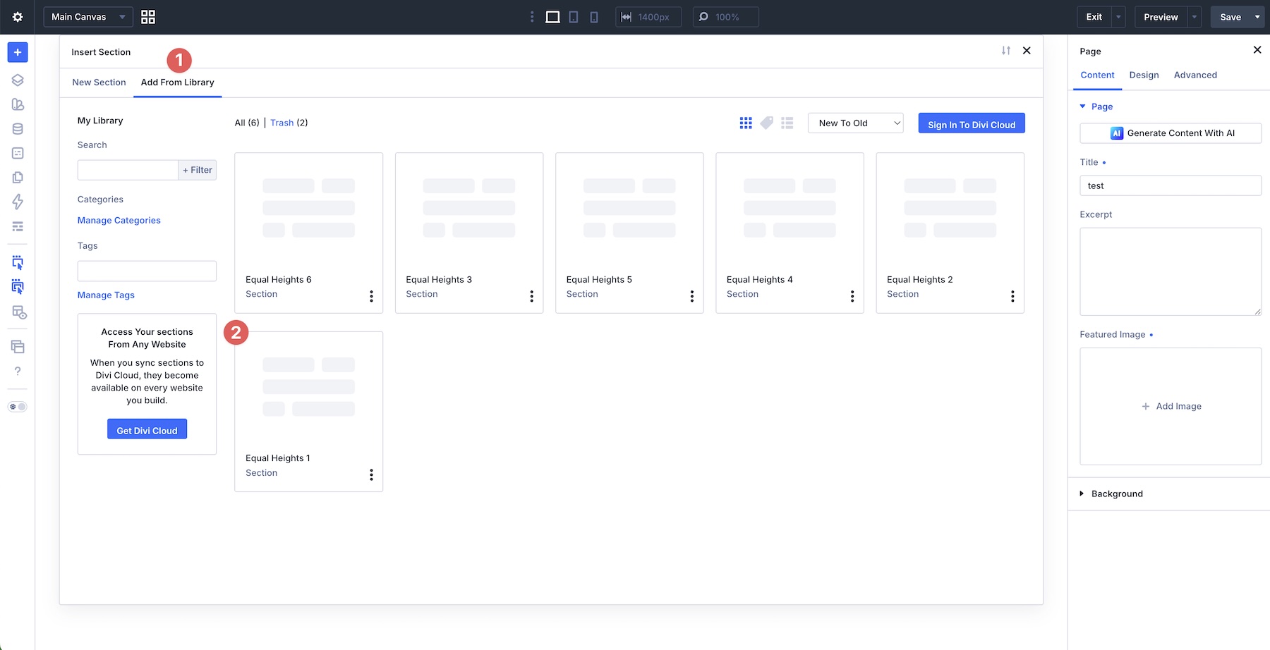
Finally, select Use This Section to load it onto the page.

Master Equal Height Cards With Flexbox In Divi 5
With three core tools, Align Items > Stretch on the parent, Justify Content > Space Between inside each card, and Grow To Fill where needed, you can create clean, consistent equal-height card layouts in Divi 5 without custom CSS.
The examples in this post show how flexible Divi 5‘s Flexbox Layout System can be when you combine parent-level alignment with internal card structure. Once you understand this pattern, you can apply it to feature rows, testimonials, pricing tables, blog cards, galleries, and other multi-column sections.
In Part 3 of our Mastering Flexbox series, we’ll explore advanced Layout Wrapping strategies, including when to use Wrap vs. No Wrap, how Align Content affects multi-line layouts, and how to apply these controls to more complex responsive structures.
Now it’s your turn. Download the example layouts, experiment in the Visual Builder, and try building your own card sections. Let us know what you think in the comments below.


Leave A Reply