


In Part 7 of our Mastering Flexbox series, we focused on building flexible button, menu, and link rows. We used Layout Direction, Justify Content, Align Items, Gap, and Module Groups to create compact, responsive horizontal groups that can adapt across breakpoints.
In Part 8, we’re focusing on one of the biggest workflow shifts in Divi 5: controlling spacing with Gap instead of relying on margin for every spacing adjustment.
Many Divi users are used to spacing elements with individual margins. That habit can still work in specific cases, but it often creates extra cleanup when items wrap, stack, or change direction across breakpoints. In Divi 5, Horizontal Gap and Vertical Gap give you a cleaner way to control spacing between direct child elements from the parent container.
In this post, we’ll show you how Gap works, where to apply it, when margin still makes sense, and how to use Gap to create cleaner spacing systems for rows, columns, Module Groups, Nested Modules, buttons, cards, vertical lists, CTAs, and footers.
Let’s dive in.
Why Some Divi Users Struggle With Spacing In Flexbox
If you’ve ever built a layout in Divi 5 and wondered why spacing still appears after resetting margins or padding, the issue is usually not one single setting. Spacing can come from the parent container, the child elements, the layout direction, default gap values, or nested structures.
Many designers still add margins to individual modules, buttons, columns, or links out of habit. That can be useful for one-off adjustments, but it is not always the best way to create consistent spacing between a group of related items. When content wraps onto additional lines, margin-based spacing can create uneven gutters, extra edge spacing, or breakpoint-specific cleanup.
Another common source of confusion is where spacing should be applied. Should it go on the Section, Row, Column, Module Group, nested element, or module itself? If you apply Gap to the wrong container, nothing may appear to change because Gap only affects the direct children of the container you’re editing.
Headers, button groups, card grids, icon lists, tag clouds, and footer link groups make this especially noticeable. They often contain several nested layers, so the right spacing control depends on which elements need space between them.
How Gap Changes The Workflow
Divi 5’s Horizontal Gap and Vertical Gap controls let you add space between direct child elements at the parent container level. Instead of pushing each item away from the next item with margin, you define the spacing once on the container.
This gives you:
- Cleaner spacing logic: One parent setting controls the spacing between related items.
- More consistent wrapped layouts: Horizontal and Vertical Gap can handle spacing between items and wrapped lines.
- Easier responsive adjustments: You can adjust one parent value at a breakpoint instead of editing every child element.
- Fewer margin resets: You do not need to remove margin from the first or last item just to avoid extra edge spacing.
Gap does not replace margin in every situation, but it should usually be your first choice when the goal is to space items inside the same Flex container.
Understanding Gap Vs. Margin In Divi 5
To understand why Gap is so useful, it helps to separate two different spacing jobs. Margin creates space outside an individual element. It is useful when one specific module needs a custom offset, when you need space around the outside of a container, or when you want to create an intentional overlap or special effect.
Gap creates space between direct child elements inside a parent container. It is a container-level spacing control, which makes it ideal for button groups, card grids, vertical stacks, link rows, icon lists, and nested Module Groups. Horizontal Gap controls the horizontal spacing between items when they sit side-by-side.
Vertical Gap controls the vertical spacing between stacked items or wrapped lines, depending on the container and layout direction.
Gap does not add space to the outer edges of the container. It adds space between the direct children. That difference is what makes it cleaner for repeated elements: you get consistent spacing without first-child or last-child margin cleanup.
Key Differences Between Gap And Margin
Let’s use a row of buttons as an example. With margin, you might add a 20px right margin to each button except the last one. That can look fine on Desktop, but once buttons wrap or stack, you may need separate mobile rules to fix uneven spacing.
With Gap, you set a 20px Horizontal Gap and 20px Vertical Gap once on the parent container, such as a Column or Module Group. The buttons stay evenly spaced whether they remain on one line or wrap onto additional lines.
Where To Apply Gap
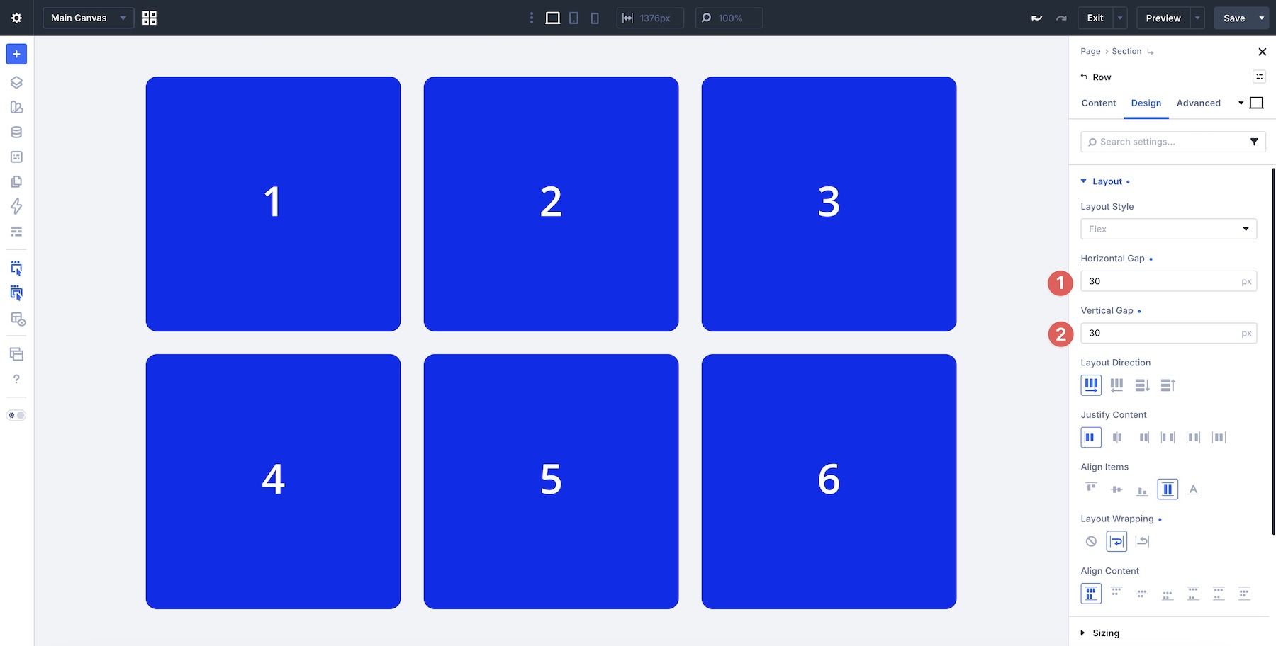
Gap only affects the direct children of the container you’re editing. That means the correct place to apply it depends on which elements you want to space. Use Gap controls on Sections when you want to control spacing between Rows inside that Section.
Apply Gap to a Row when you want to control spacing between Columns.
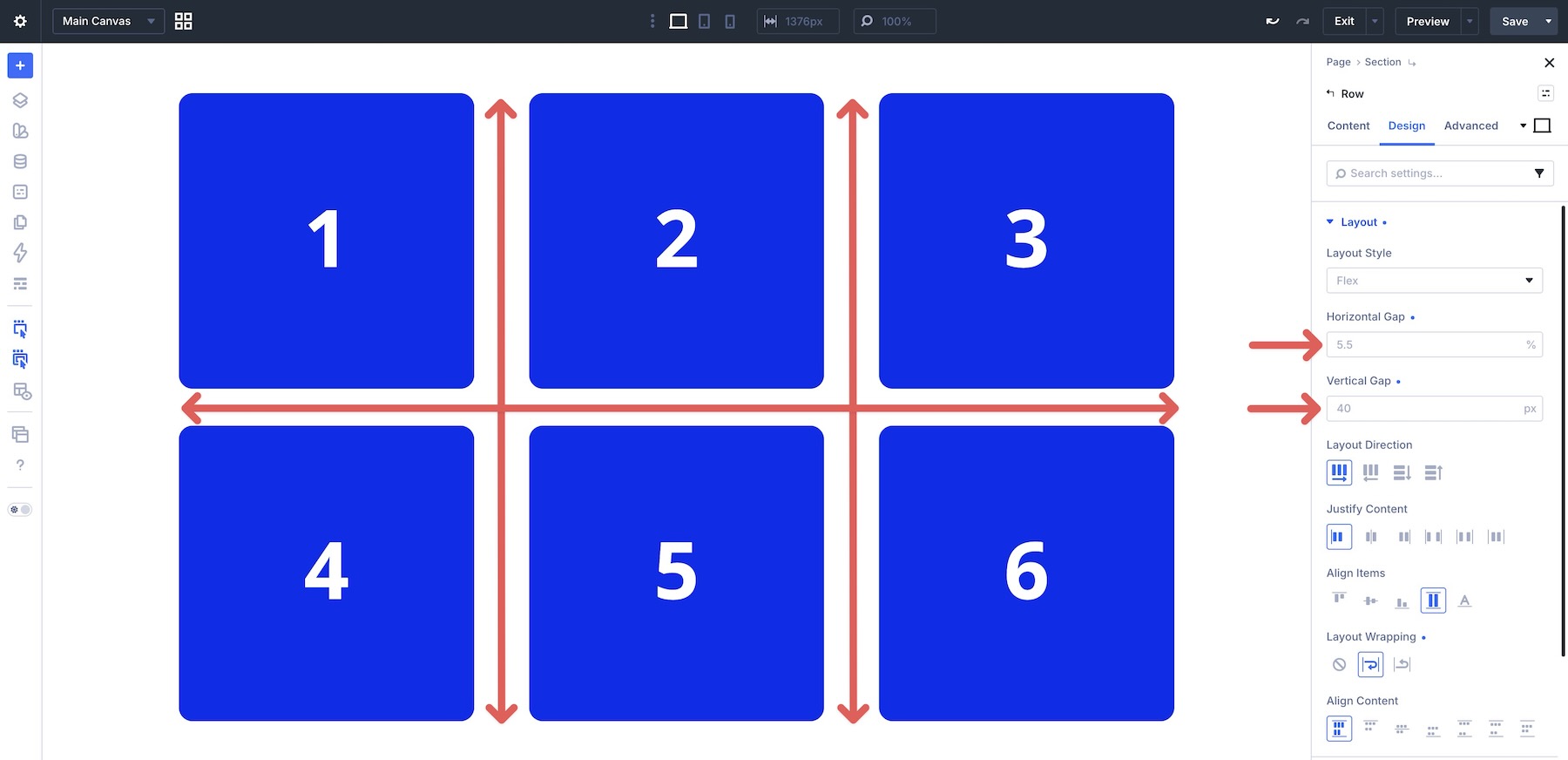
Apply Gap to a Column when you want to control spacing between modules inside that Column.
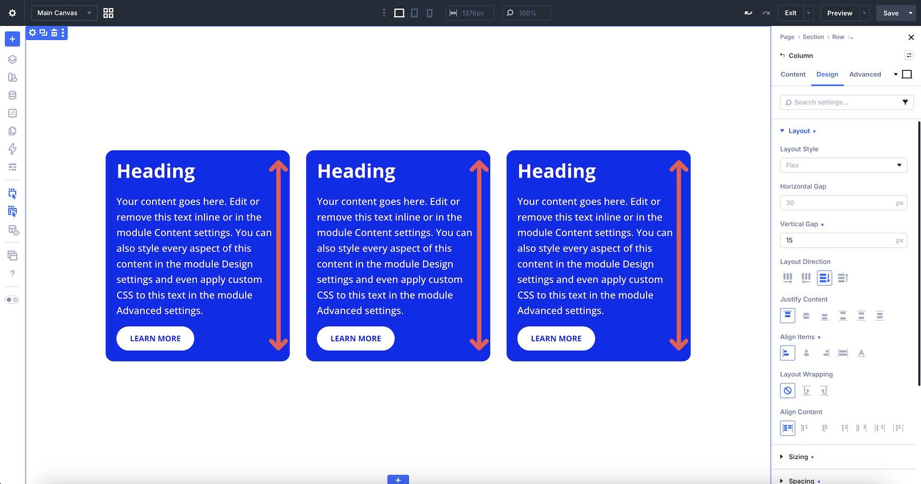
Apply Gap to a Module Group when a nested group of buttons, links, icons, or text elements needs its own spacing system.
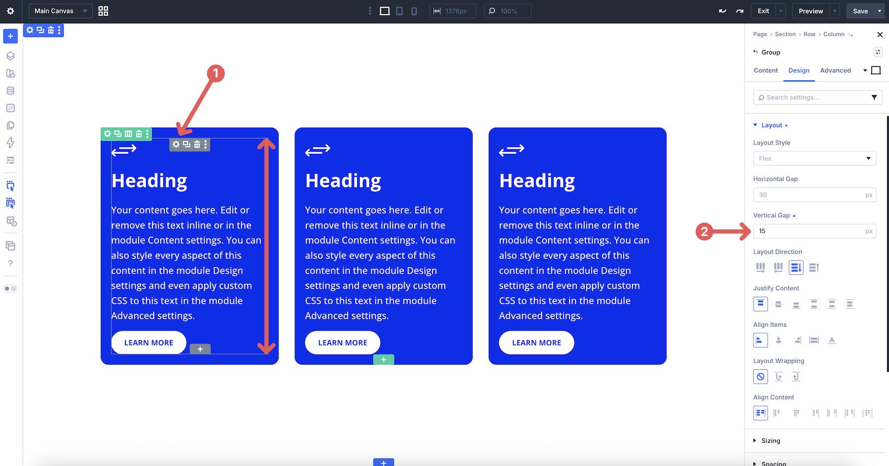
Apply Gap to Nested Modules when the parent module contains nested elements that need their own spacing, such as a Text module nested inside a Heading module.
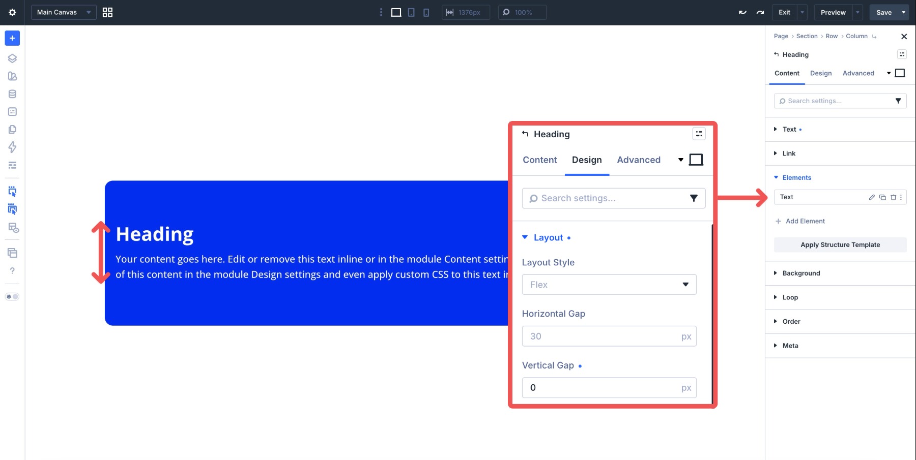
You can also use Gap inside modules that contain multiple internal elements, such as an Icon List, Blurb, Call To Action, or another module with multiple layout items.
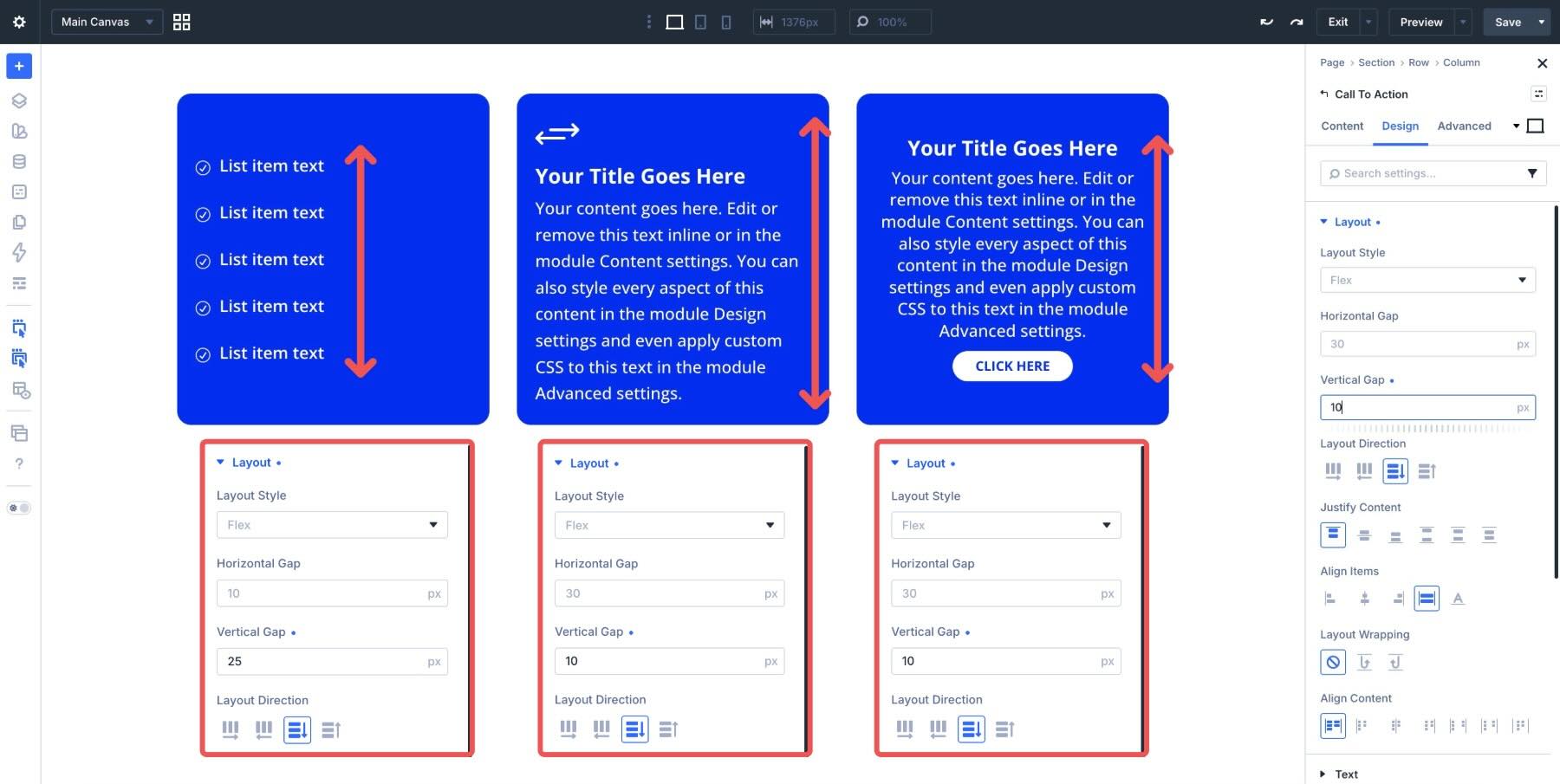
Default Gap Behavior
When you add new Flex containers in Divi 5, some default Gap values may already be present. These defaults help create initial spacing, but you should adjust them based on the layout you are building.
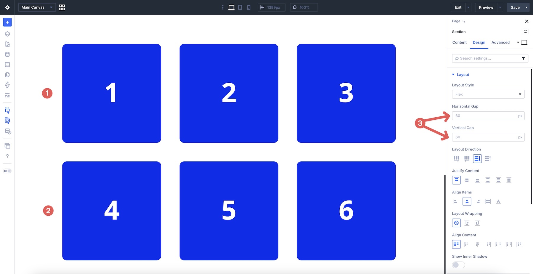
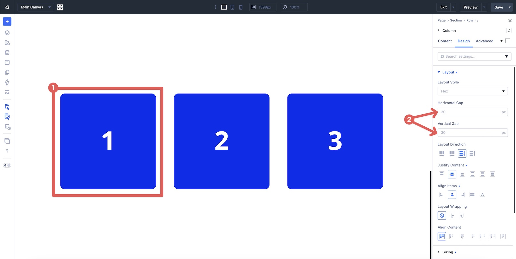
When you add a new Flex Section to a page in the Visual Builder, the default is set to 60px for both Horizontal Gap and Vertical Gap. To change those values, open the Section’s Design tab, expand the Layout option group, and adjust the Gap controls.
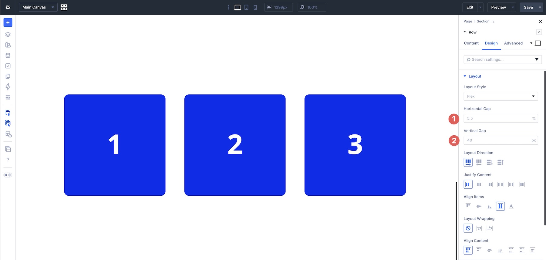
New rows in Divi 5 start with a 5.5% Horizontal Gap and a 30px Vertical Gap.
At the Column level, 30px Horizontal Gap and 30px Vertical Gap are the defaults.
You can still use small, targeted margins when needed, such as when you want to create an overlap effect, offset one module, or fine-tune spacing outside a container. For repeated spacing between related items, Gap is usually cleaner and easier to maintain.
Divi 5 also supports Advanced Units, including values such as px, %, rem, vw, clamp(), and calc(). You can combine those with Design Variables to create more consistent spacing systems across a site.
Practical Examples
Now that you understand how Gap works and when it is usually better than margin, let’s put it into practice. Below are five layouts that show how to apply Horizontal Gap and Vertical Gap at different levels, from button groups and card grids to vertical lists, CTAs, and mixed-column footers.
Example 1: Hero Section
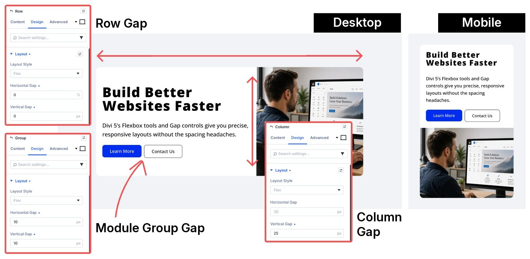
This is one of the most common layouts on modern websites. A hero section usually needs spacing between the main columns, spacing between stacked text elements, and spacing between CTA buttons. Gap lets you control each of those areas from the right parent container.

Using Margin: You might add right margins to buttons, bottom margins to headings or text modules, and separate responsive tweaks when the layout stacks. This can work, but it spreads spacing decisions across multiple child elements.
Using Gap: A two-column Row with an inner Module Group keeps spacing centralized. The Row controls spacing between columns, the Column controls spacing between text elements, and the Module Group controls spacing between buttons.
Settings Used: The parent Row has both Horizontal Gap and Vertical Gap set to 0px. Inside the left Column, a 25px Vertical Gap creates consistent rhythm between the headline, supporting text, and button group. The Module Group wrapping the two buttons uses Layout Direction > Row with a 10px Horizontal Gap and 10px Vertical Gap for spacing between the CTAs.
Example 2: Feature Card Grid
Feature cards are a great use case for Gap because they need consistent gutters between cards and predictable spacing inside each card.
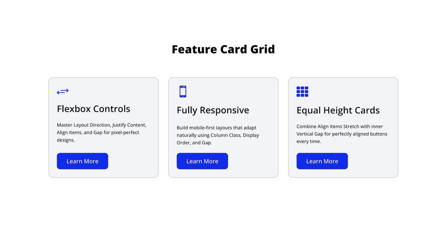
Using Margin: You might start with a prebuilt three-column row and then add margins inside each card to adjust the space between the icon, heading, body text, and button. When the cards stack or wrap, those margins can become harder to manage across breakpoints.
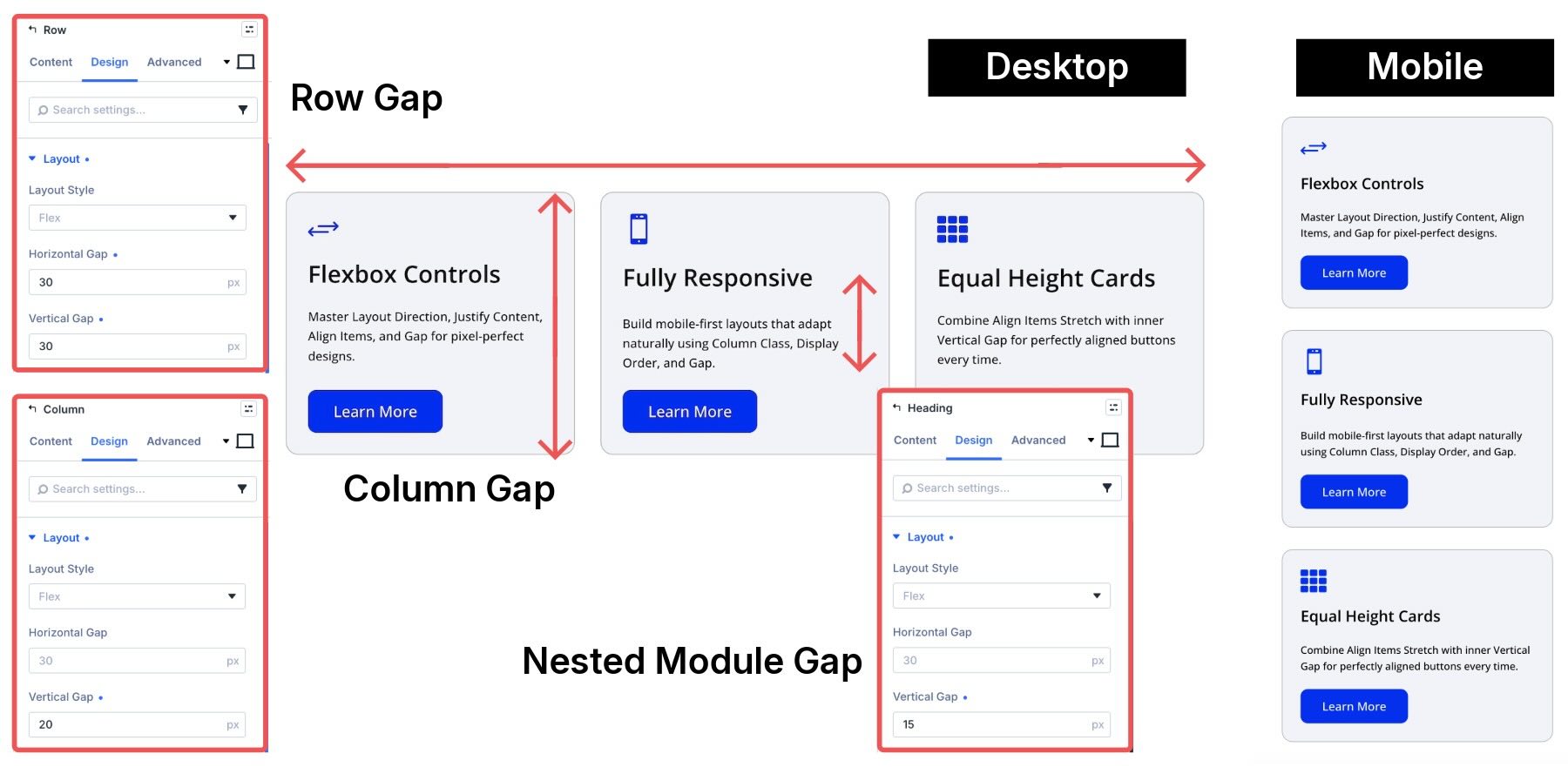
Using Gap: A single Row with Horizontal Gap and Vertical Gap controls the gutters between cards. Inside each card, Column-level Gap controls the vertical rhythm between the internal modules.
Settings Used: The parent Row uses a 30px Horizontal Gap and 30px Vertical Gap. Each Column has a 20px Vertical Gap to control spacing between the icon, heading, text, and button inside the card. The Heading module nests a Text module through the Elements option group in the Content tab, with a 15px Vertical Gap to control the space between the heading and supporting text.
Example 3: Vertical Feature List
Many sections use a vertical list of features or benefits. This example shows how row-level and column-level Gap can work together in a split layout.
Using Margin: You might add bottom margins to each module and then use additional margins inside each Blurb to adjust the relationship between icons, headings, and text. That approach becomes tedious when the layout changes across breakpoints.
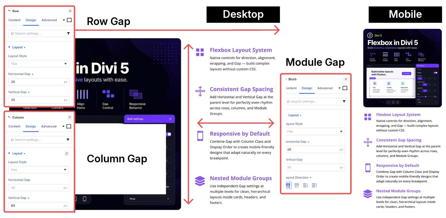
Using Gap: Row-level Gap controls the spacing between the main columns, while Column-level and module-level Gap controls the rhythm of the feature list.
Settings Used: The parent Row uses a 25px Horizontal Gap and 25px Vertical Gap. The right Column uses a 60px Vertical Gap on Desktop, reduced to 25px on smaller breakpoints. Each Blurb module in the right Column uses Layout Direction > Row with a 20px Horizontal Gap to control the spacing between the icon and text.
Example 4: Call To Action
This pattern is useful when you want to present multiple action options while keeping one button visually prioritized.
Using Margin: You might place several Button modules in a row and manually add right margins to each one except the last. When the buttons wrap or stack, those margins often need breakpoint-specific adjustments.
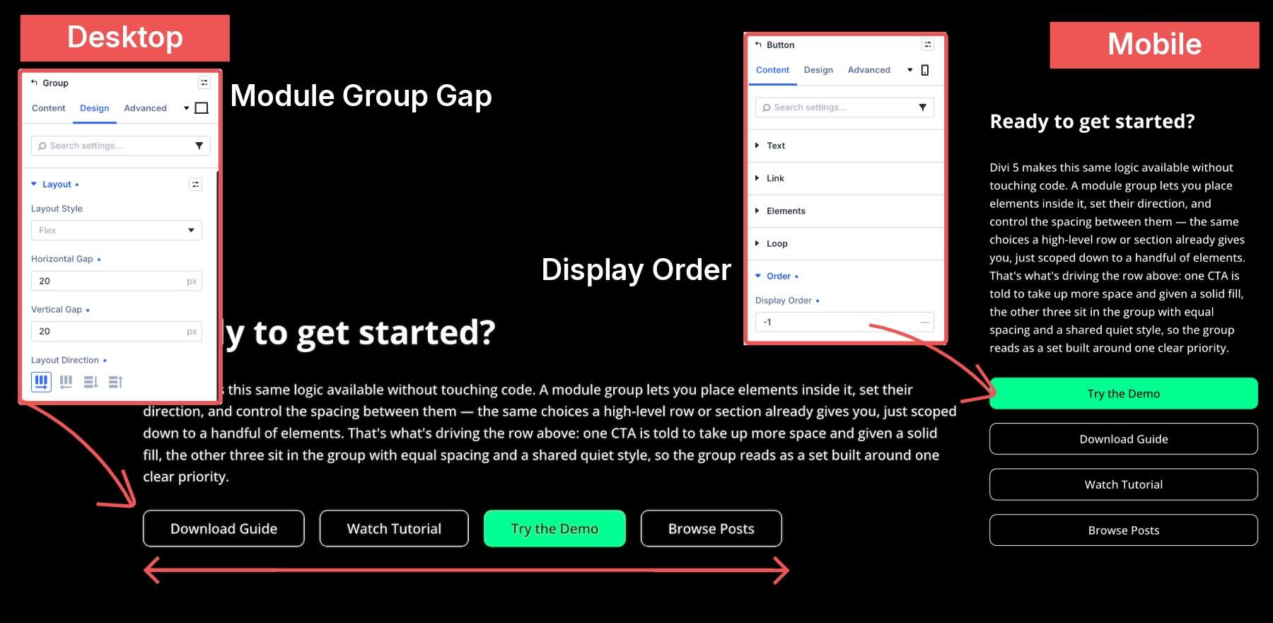
Using Gap: A single Module Group with Layout Direction > Row and Gap creates consistent spacing between buttons. On Phone, you can adjust button widths in the Sizing option group and use Display Order if the primary action needs to appear first.
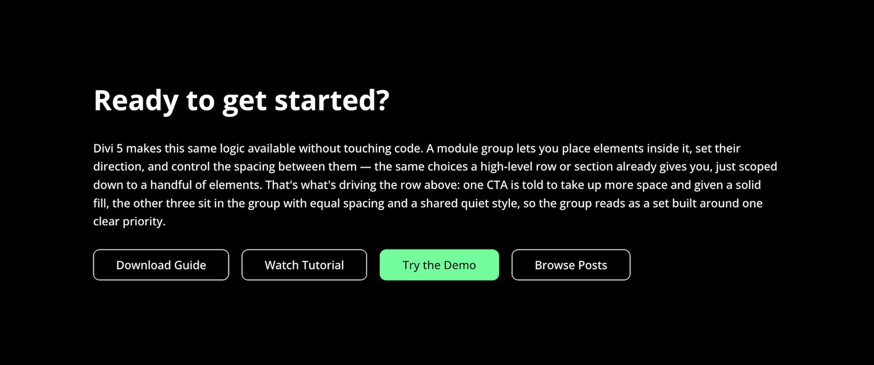
Settings Used: The parent Module Group uses Layout Direction > Row with a 20px Horizontal Gap and 20px Vertical Gap. The primary Book A Demo button uses a solid fill for emphasis, while the other buttons use a quieter outlined style. This creates visual hierarchy while keeping spacing controlled by the parent group.
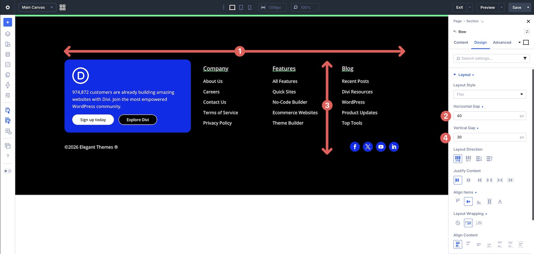
This footer combines a wider branding and CTA area with several narrower link columns, which makes it a strong example of spacing at multiple layout levels.

Using Margin: You might start with a prebuilt row template, adjust gutter width, add margins inside each column, and use extra rows for the lower footer content. That can make the structure harder to maintain as the footer changes.
Using Gap: A single Flex Row can use row-level Gap for spacing between columns, while individual Columns use Vertical Gap for their internal content. This keeps the spacing system easier to understand.
Settings Used: At the Row level, apply a 40px Horizontal Gap and a 30px Vertical Gap on Desktop and Tablet.
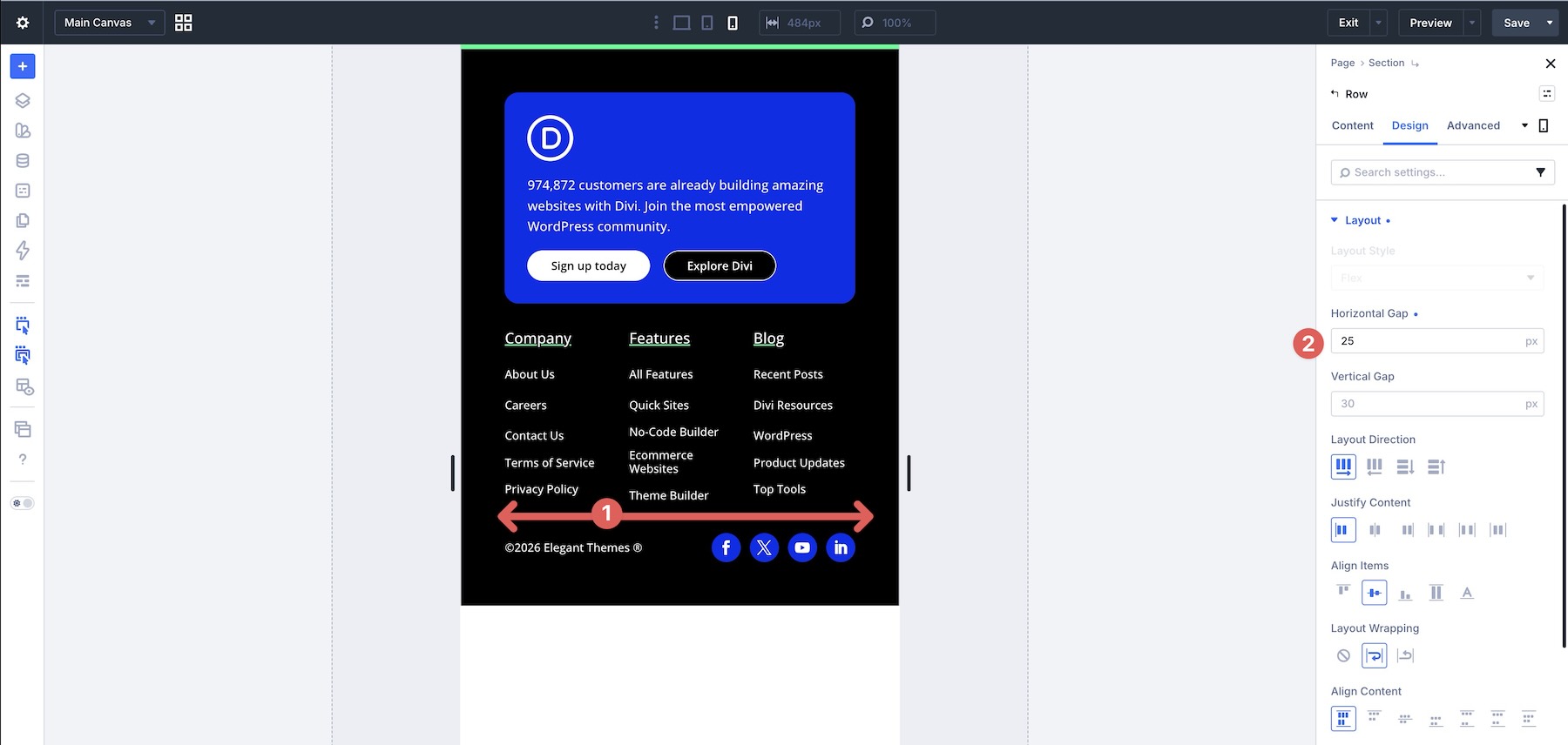
Then reduce the Horizontal Gap to 25px at the Phone breakpoint.
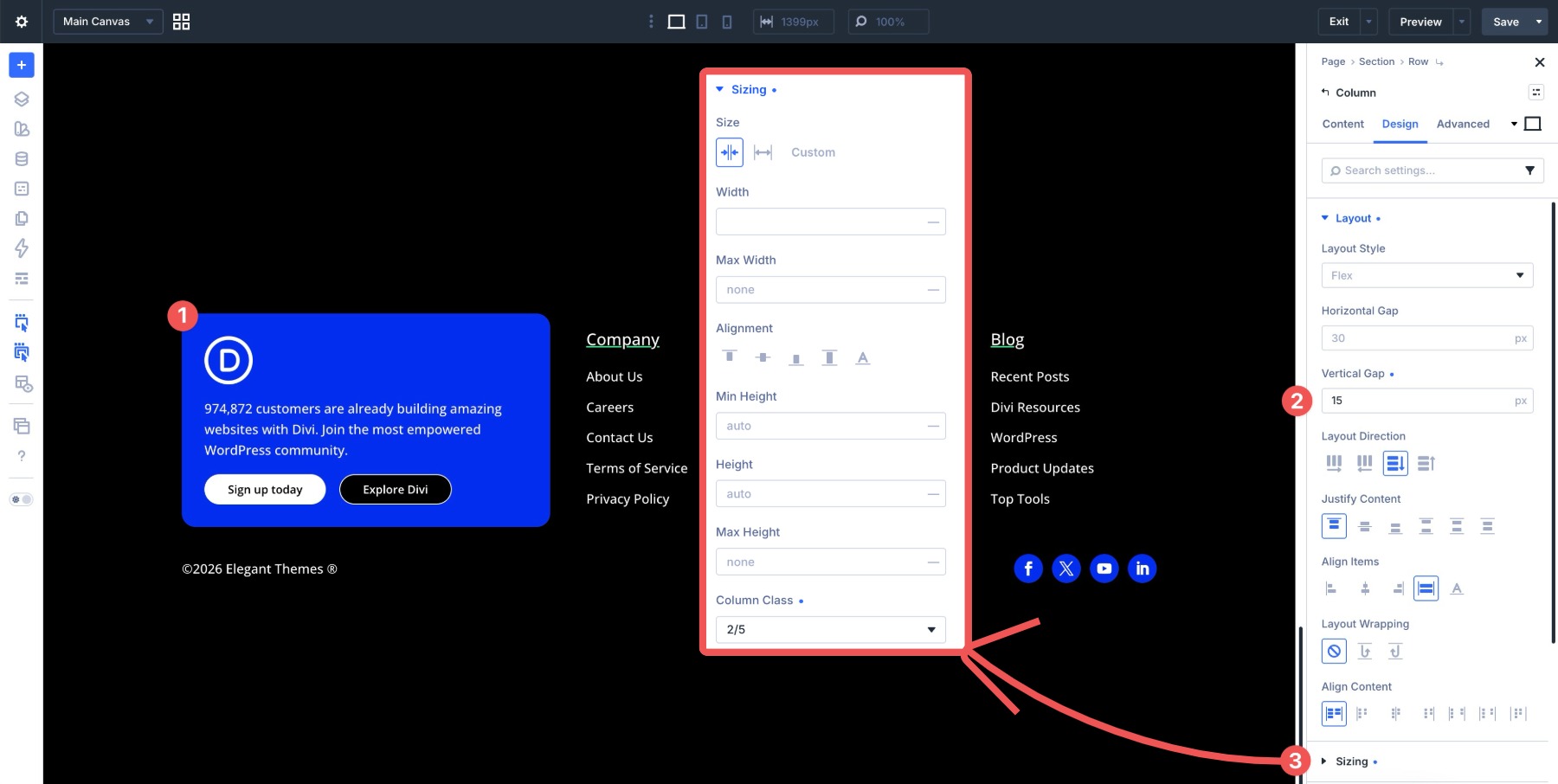
The footer contains six columns with different Column Class settings. The first Column uses Column Class > 2/5 and has a 15px Vertical Gap on all breakpoints.
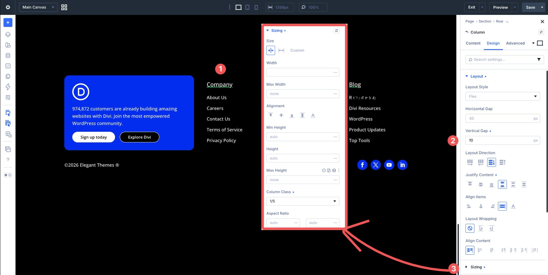
Columns two, three, and four use Column Class > 1/5 and a 10px Vertical Gap on all breakpoints.
The final two columns use Column Class > 1/2 and a 15px Vertical Gap.
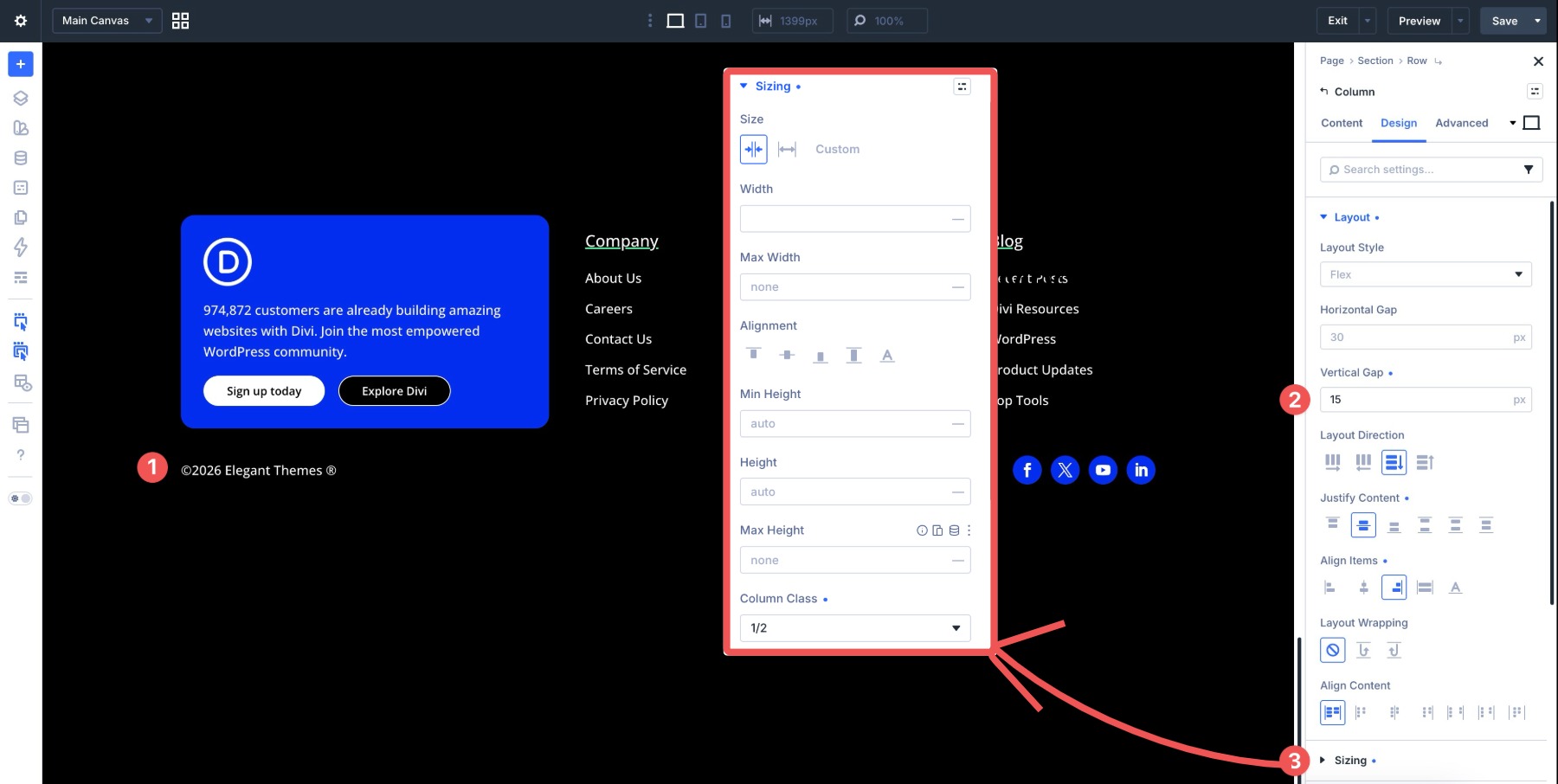
These examples show how Gap solves common spacing challenges in Divi 5. The main principle is simple: control spacing from the parent container whenever you are spacing a group of related child elements.
Common Issues And Best Practices
Even with Gap, a few common issues can still come up. Here’s what to check first:
- Gap is not appearing: Make sure the container is set to Layout Style > Flex. Gap applies to the direct children of the container you’re editing. Nested elements deeper than one level need Gap applied to their immediate parent.
- Spacing feels too large on mobile: Check the Tablet and Phone breakpoints. Reduce Horizontal Gap and Vertical Gap values when stacked content starts to feel too spread out.
- Borders or box shadows feel too separated: Gap creates space between elements, while borders and shadows stay attached to the elements themselves. If the design feels too loose, reduce the Gap or adjust internal padding.
- Content still looks uneven: Gap keeps spacing consistent, but content length still affects visual balance. Test with realistic headlines, button labels, descriptions, and link counts.
Pro Tip: Start with Gap for spacing between related items. Use small, targeted margins when you need outside spacing, an intentional overlap, a single-module adjustment, or a special effect that Gap cannot create on its own.
Download The Files
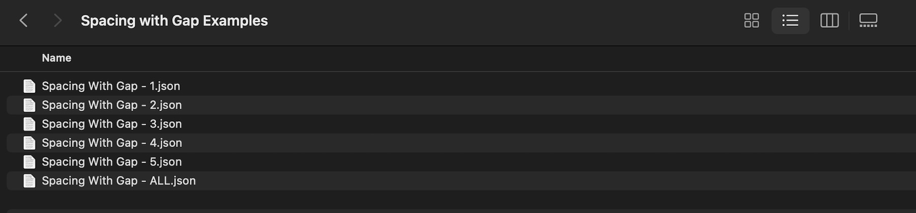
Want to explore these layouts yourself? Download the pre-built Divi 5 layouts used in this post and open them in the Visual Builder to see how the Gap settings are applied. There are six files in total, including individual section JSON files and a Spacing With Gap – All.json file that contains all sections.
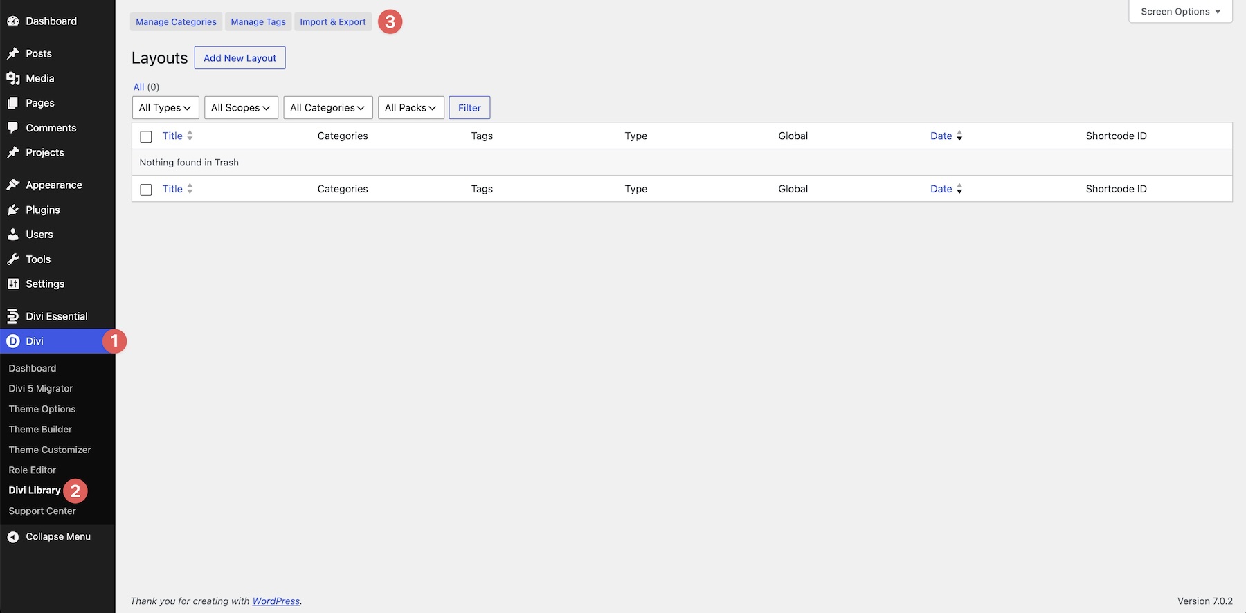
To use them, navigate to Divi > Divi Library in the WordPress dashboard and click the Import & Export button.
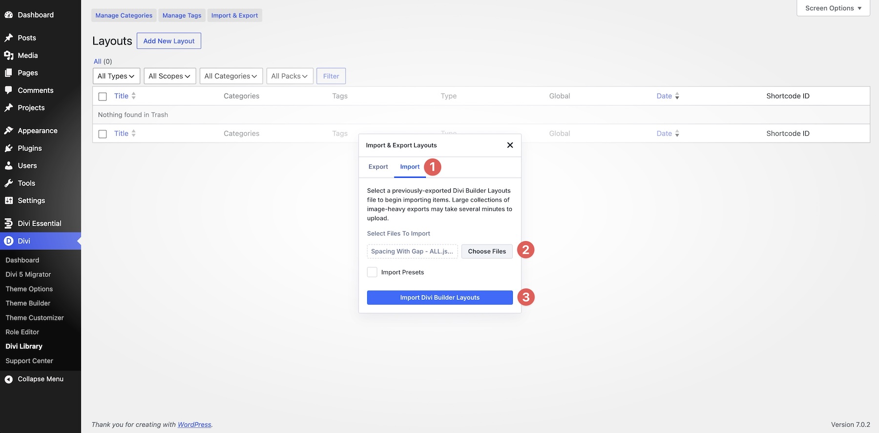
Click the Choose Files button, upload the Spacing With Gap – All.json file, and select Import Divi Builder Layouts.
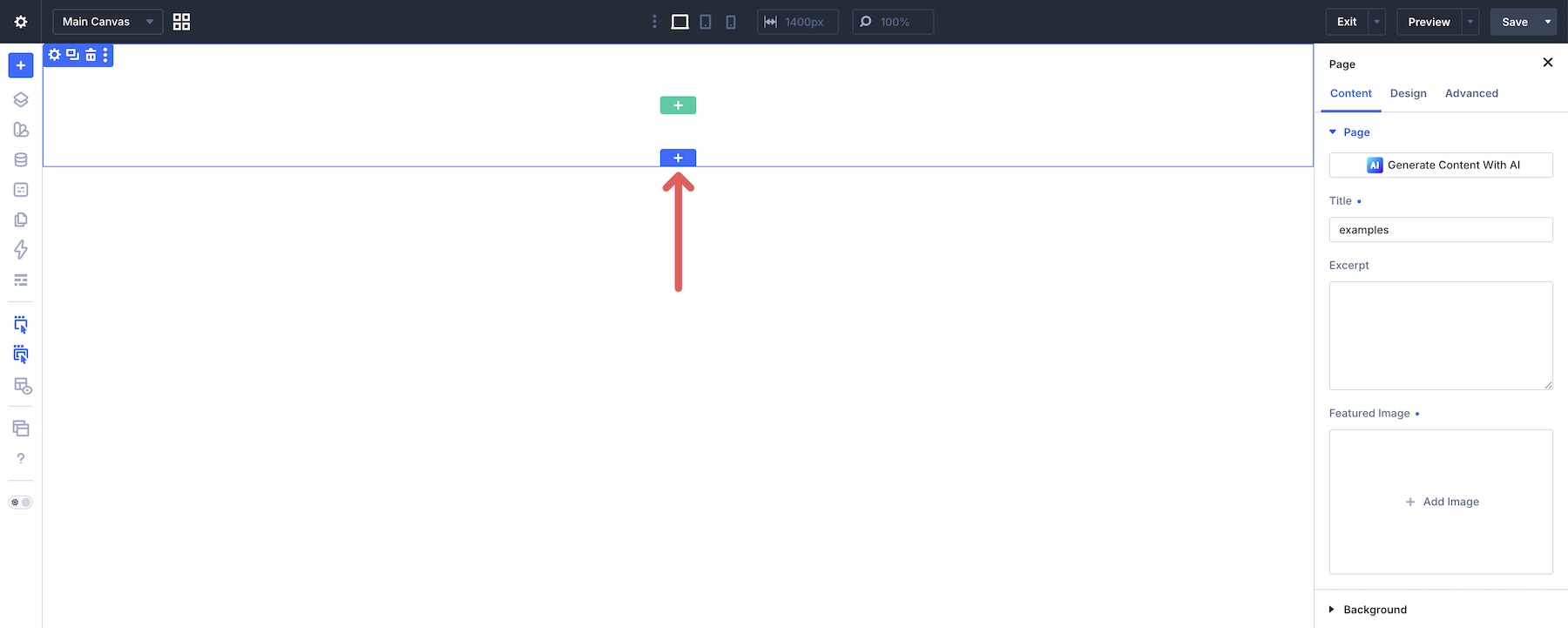
Next, create a new page or open an existing one in the Visual Builder. Hover over the Canvas and click the blue + icon to add a new section.
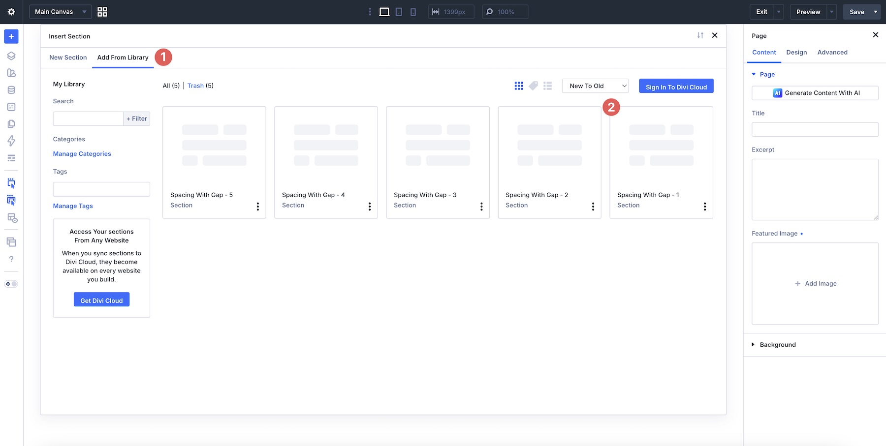
Choose the Add From Library tab and select a layout to load it onto the Canvas.

Build Cleaner Layouts Start With Flexbox Gap In Divi 5
Gap is one of the most useful spacing tools in Divi 5‘s Flexbox system. By moving spacing control to the parent container, you can avoid uneven gutters, last-item margin resets, and many of the responsive spacing issues that come from using margin for repeated layout patterns.
Whether you’re building button rows, feature card grids, vertical lists, CTA groups, or mixed-column footers, Gap gives you a cleaner way to manage spacing between related elements.
In the next installment, Part 9 Of Mastering Flexbox: Creating Responsive Columns Without CSS Grid, we’ll show you how to combine Flexbox with Column Class to create responsive column layouts without leaving the Visual Builder.
Download the files from this post, experiment with the Gap controls, and start applying them to your own layouts. Once you start moving repeated spacing decisions to the parent container, your Divi 5 layouts become easier to adjust, reuse, and maintain.












Leave A Reply