
One of the most valuable improvements in Divi 5 is its native Flexbox support. It gives you clean, visual control over layout structure directly inside the Visual Builder, reducing the need for custom CSS, duplicated sections, or manual spacing workarounds.
This is the first part of our Mastering Flexbox series. Throughout the series, we’ll introduce Flexbox in Divi 5, explore its settings in detail, and show how different controls work together to create functional, responsive designs. In Part 2, we’ll show you how to create equal-height cards with aligned buttons.
In this first part, we’ll focus on the settings available in the Layout option group when Flex is selected. These controls affect how child elements flow, wrap, align, and distribute space inside a parent container, making them some of the most important layout tools you’ll use in Divi 5.
Let’s dive in.
What Is Flexbox In Divi 5?
Flexbox (Flexible Box Layout) is a CSS layout model designed to arrange, align, and distribute space between items inside a container, even when those items have different or dynamic sizes.
Before Divi 5, creating balanced layouts in Divi often meant relying on the traditional section > row > column structure, then fine-tuning spacing with margin, padding, or custom CSS. That approach worked, but it could make responsive alignment harder to manage across breakpoints.
Divi 5 changes this by bringing native Flexbox controls directly into the Visual Builder. Instead of writing CSS for common layout behavior, you can manage direction, spacing, wrapping, alignment, and ordering visually.
Key Benefits Of Flexbox In Divi 5
Visual Layout Controls: Flexbox controls are located in the Layout option group in the Design tab. Depending on the element you’re editing, you can use them on sections, rows, columns, and modules that act as containers.
Responsive Layouts Without Custom CSS: You can adjust Flexbox settings across desktop, tablet, and mobile breakpoints, helping layouts adapt naturally without duplicating content or writing custom media queries.
Works Across Containers And Modules: Flexbox isn’t limited to rows and columns. You can apply Flexbox behavior to supported elements throughout the Visual Builder, including Module Groups, Blurbs, Buttons, and other module-based layouts.
An Overview Of Flexbox Settings In Divi 5
Most Flexbox controls live in the Layout option group, but two companion features outside that group are especially useful when building responsive Flex layouts:
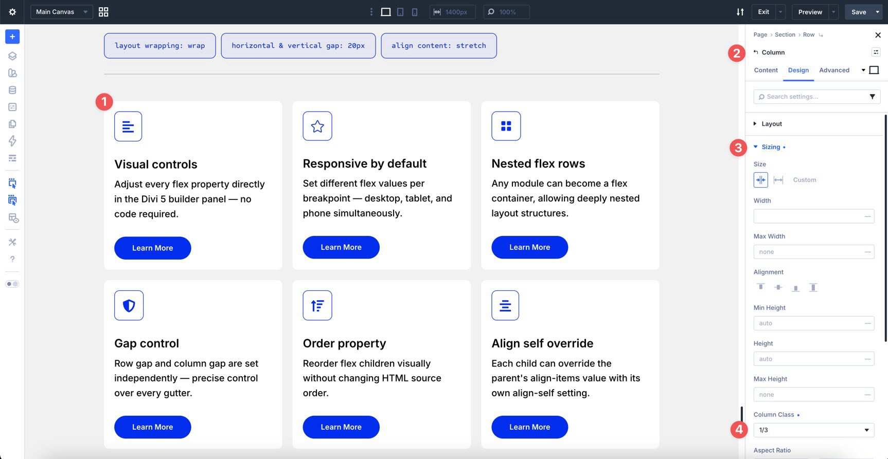
Column Class
The Column Class dropdown inside the Sizing option group lets you control individual column widths inside a Flex row. For example, you can set a column to span 1/3 width on desktop, 1/2 width on tablet, and full width on mobile.
Display Order
Divi 5 includes visual ordering controls inside the Order settings of an individual column’s Content tab. This helps you control responsive stacking patterns without duplicating sections.
For example, alternating desktop sections such as Text-Image / Image-Text can stack awkwardly on smaller screens, sometimes placing images back-to-back.
By adjusting the numeric Display Order sequence per breakpoint, you can control the visual stack while keeping one clean layout structure.
Below is a breakdown of the major Flexbox settings in the Layout option group, with explanations and practical examples.
Layout Option Group
The Layout option group is where you’ll spend most of your time when working with Flexbox in Divi 5. Once you select Flex as the Layout Style, the builder reveals controls that map to native CSS Flexbox behavior.
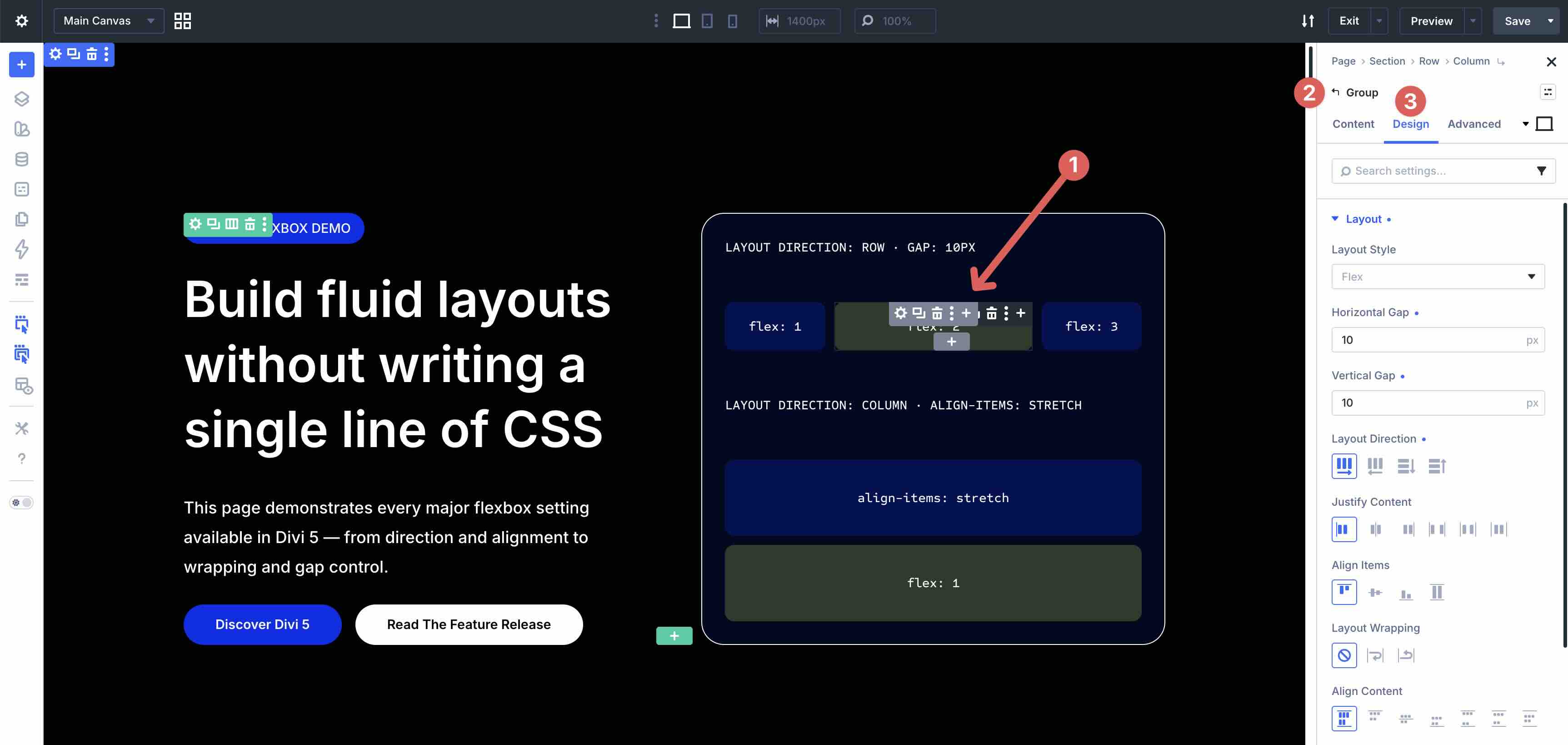
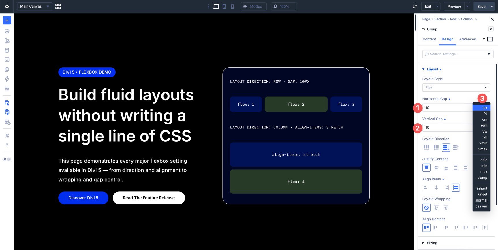
Horizontal & Vertical Gap
Gap is the cleanest way to add consistent space between flex items. Instead of adding margin to each item individually, you can apply spacing once at the parent level.
Horizontal Gap controls the horizontal space between flex items.
Vertical Gap controls the vertical space between stacked items or wrapped lines.
You can use Divi 5’s Advanced Units, including px, %, em, rem, vw, clamp(), calc(), and more, to create fluid, responsive spacing values.
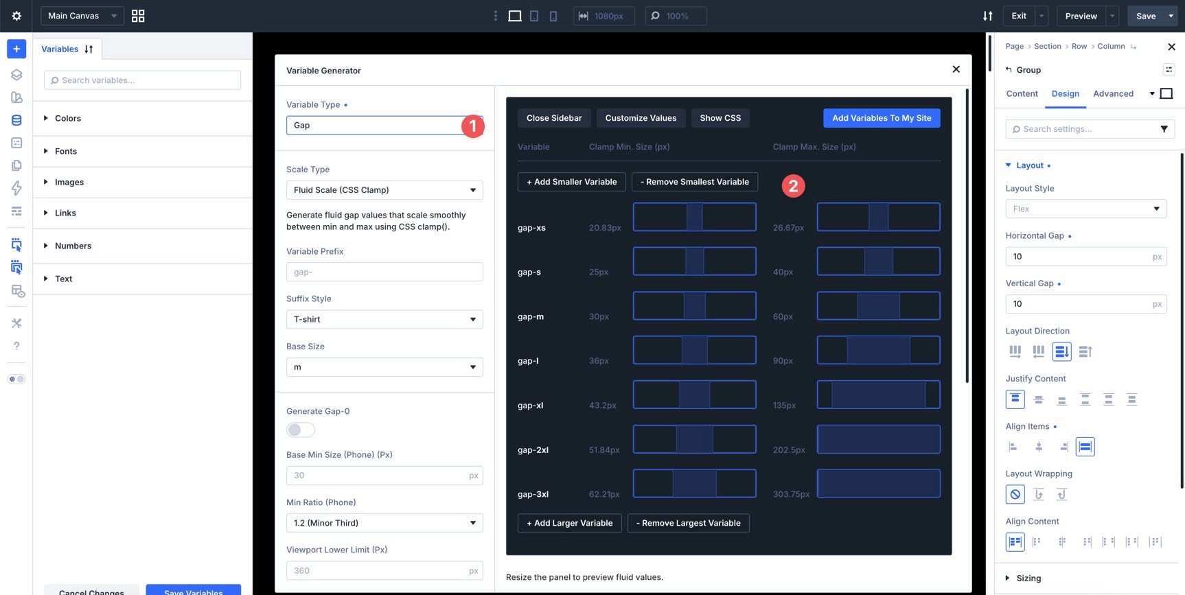
You can also use Divi 5’s Variable Generator to create a fluid sizing system. That makes it easier to reuse consistent spacing values across gaps, padding, margins, and other numeric design settings.
Tip: Start with small gap values and increase them live in the builder. You’ll see how quickly consistent spacing improves the rhythm of a layout.
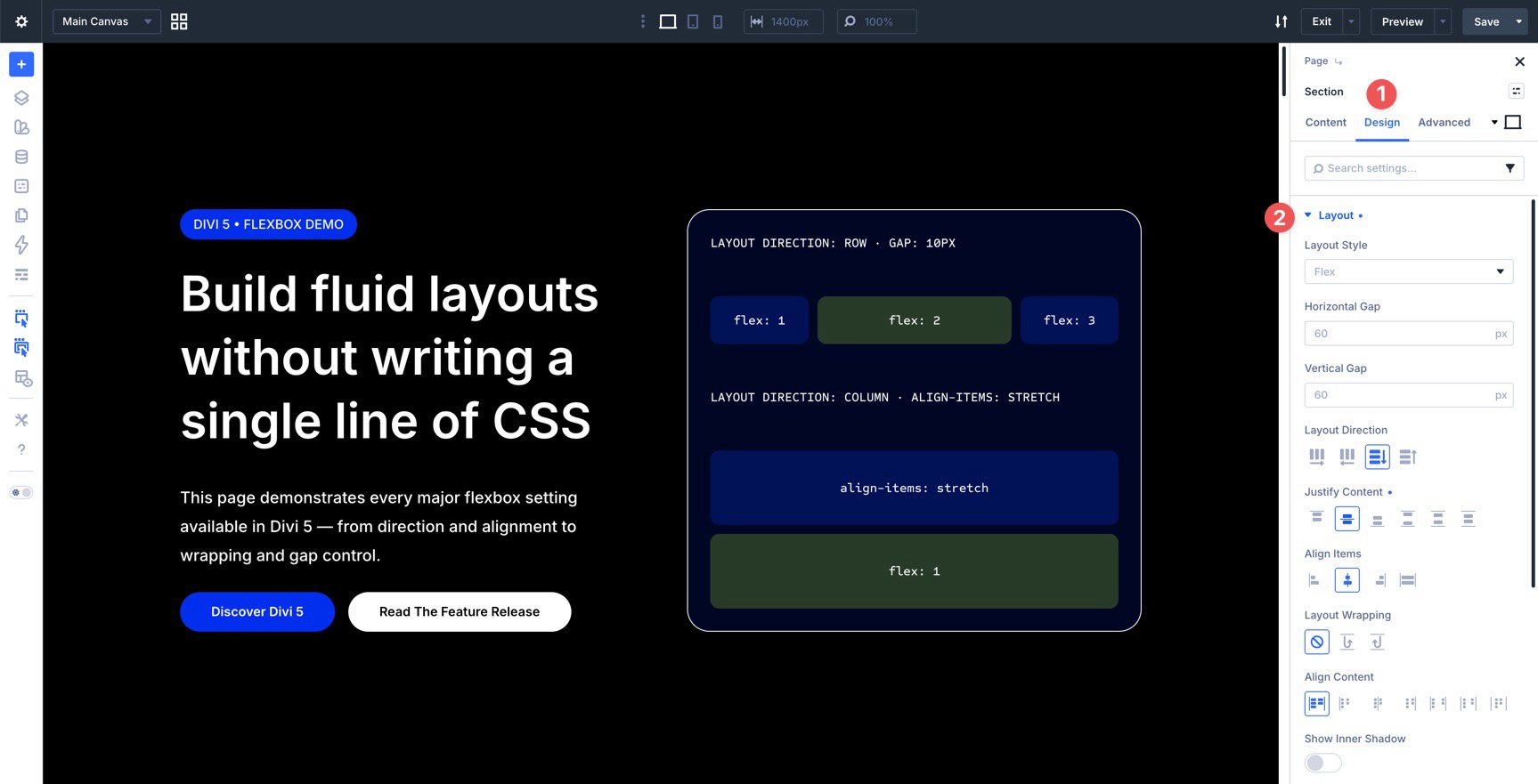
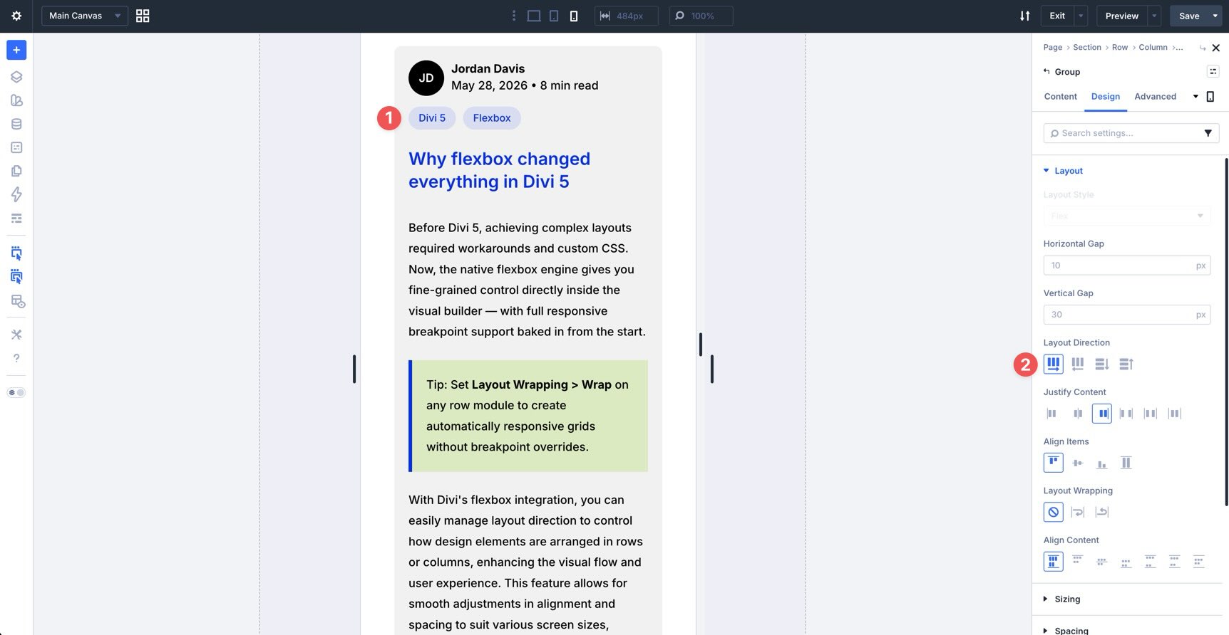
Layout Direction
Layout Direction determines the direction in which child elements flow inside a flex container. Under the hood, this maps to the CSS flex-direction property.
Row and Row Reverse allow items to flow horizontally.
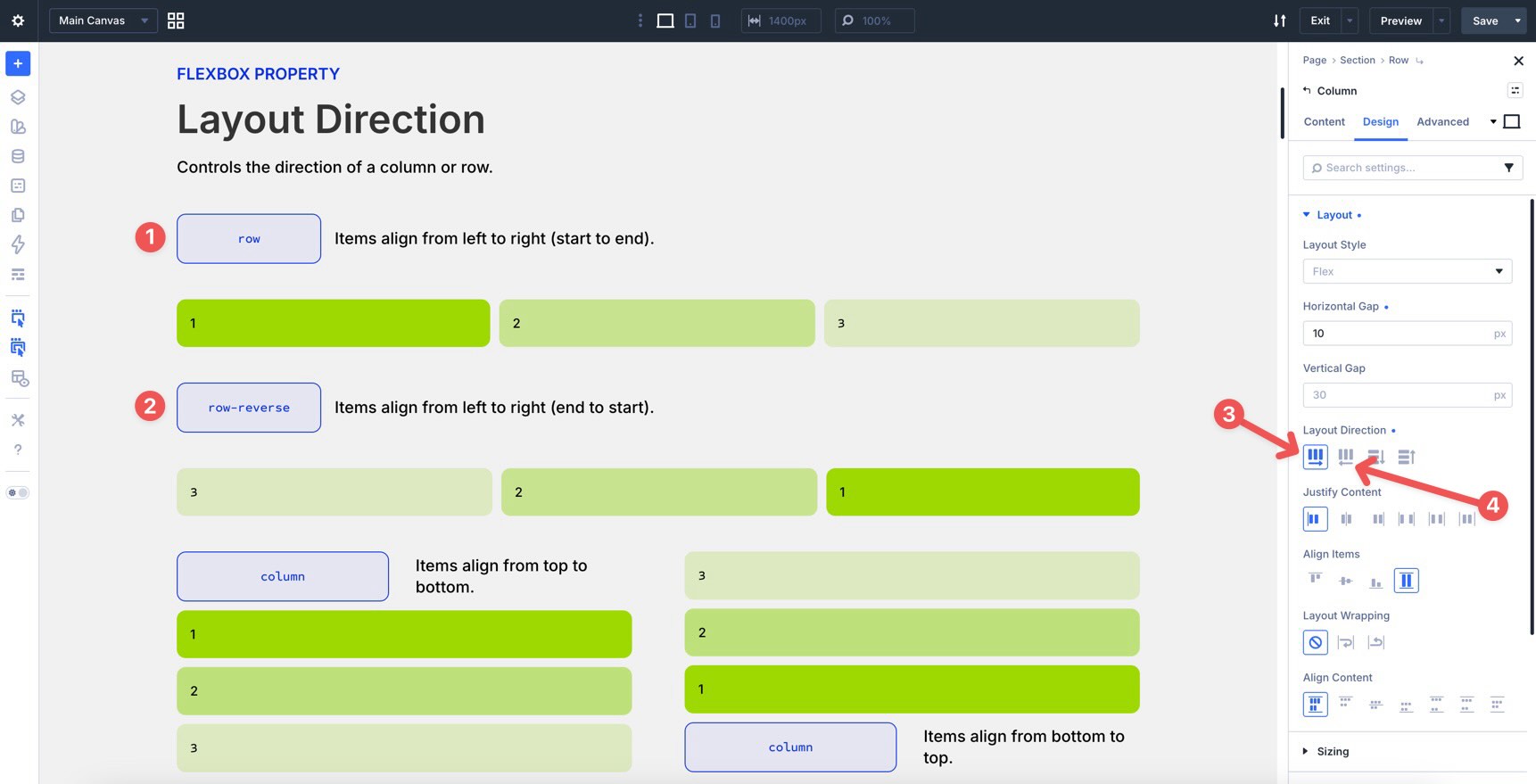
Column and Column Reverse allow items to flow vertically.
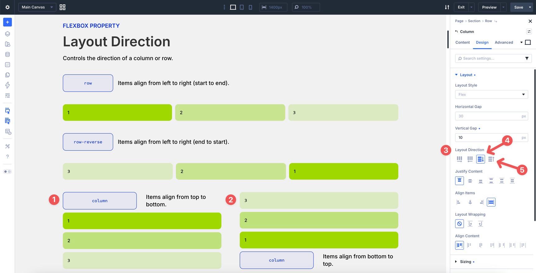
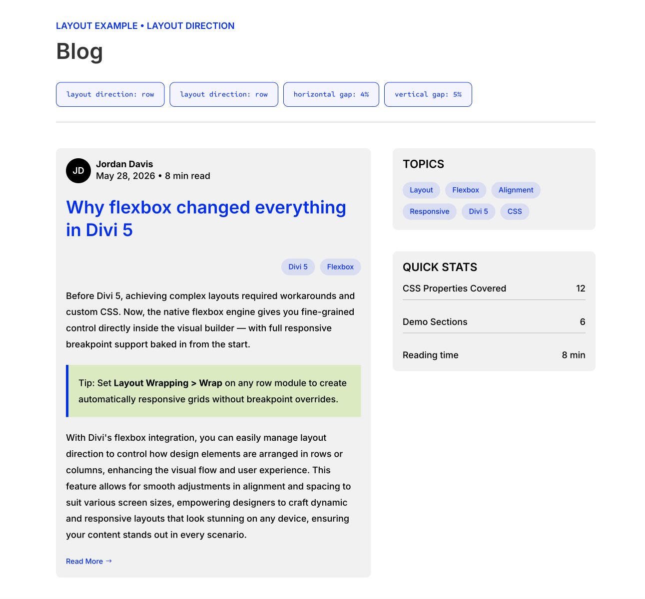
Changing the layout direction also changes how alignment settings behave, because the main axis and cross axis change with it. You can adjust Layout Direction per breakpoint, which is useful when you want a horizontal desktop layout to stack vertically on mobile.
For example, many mobile layouts should stack vertically. However, some small elements, such as blog post category tags or social media icons, often work better when they remain horizontal.
As seen in the screenshot below, setting the parent Group module to maintain a horizontal Row direction at the mobile breakpoint keeps post tags aligned side-by-side instead of stacking into a vertical list.
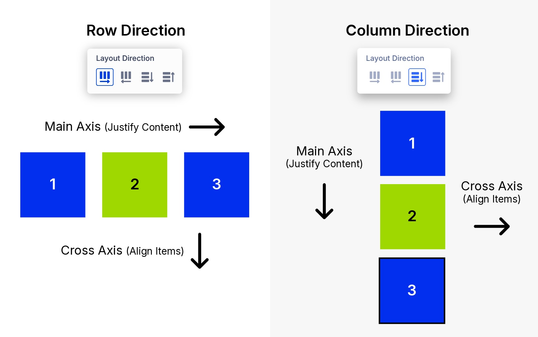
Understanding The Flexbox Axes
Before you adjust alignment, it helps to understand one core Flexbox concept: the main axis and cross axis change when you change direction.
In a Row, the main axis runs horizontally, so items flow left to right by default. In a Column, the main axis runs vertically, so items flow top to bottom by default.
To make this completely visual, look at how the flow of elements changes between the two primary directions:
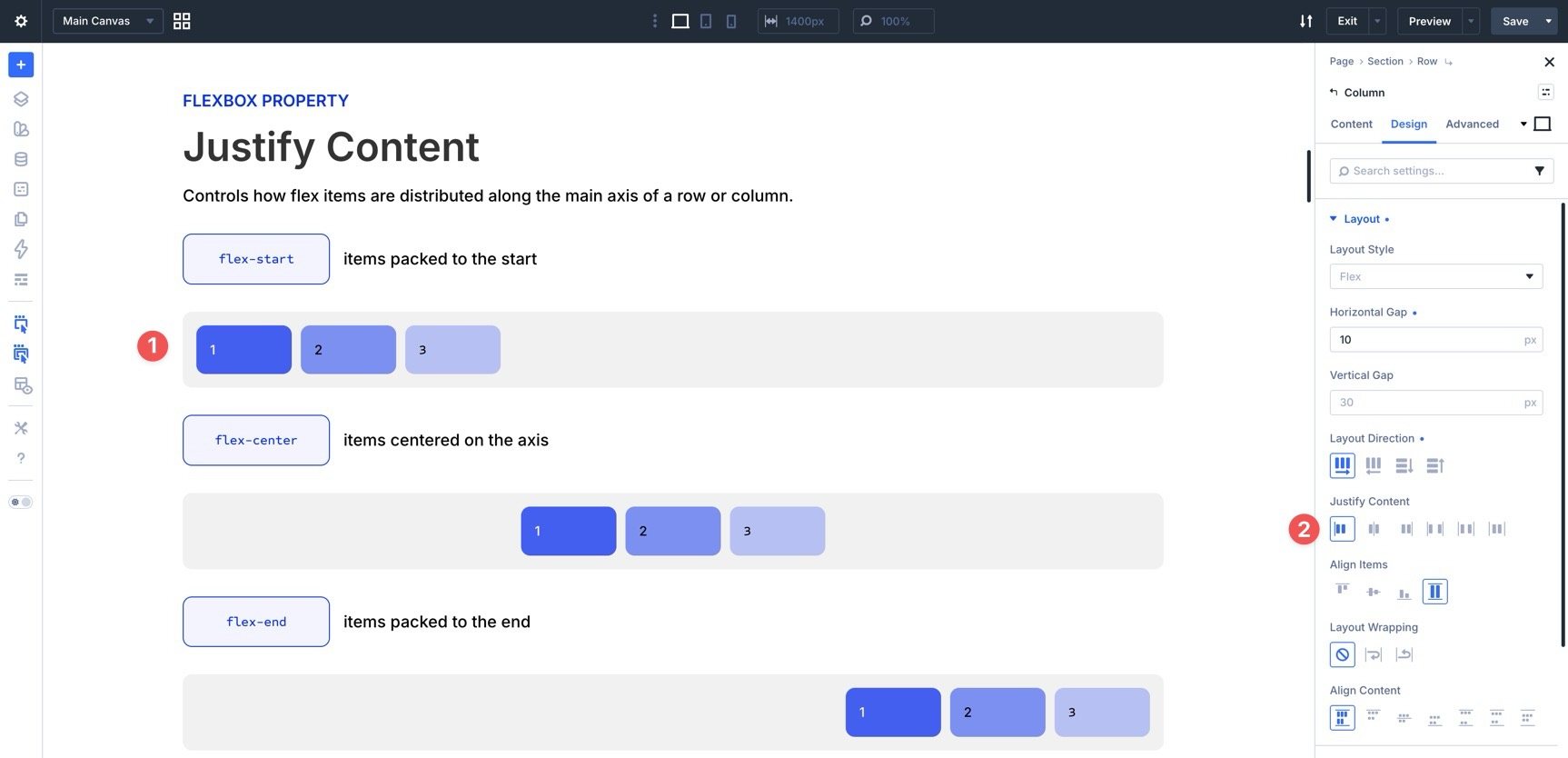
Justify Content
Once you’ve chosen a direction, Justify Content controls how items distribute along the main axis.
Start
This option places items at the beginning of the main axis. In a Row layout, content starts on the left in a standard left-to-right layout. In a Column layout, items start at the top. Use this as a baseline for standard text blocks, blog feeds, and simple content groups.
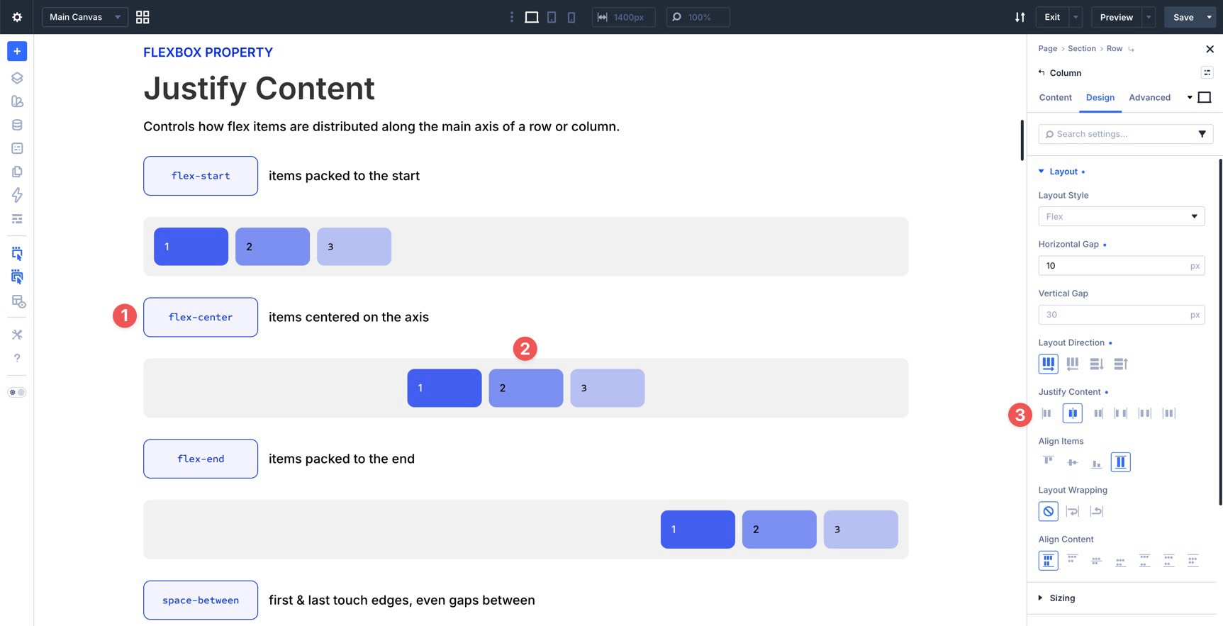
Center
This option gathers items toward the center of the main axis, leaving remaining space on both sides. It works well for hero content, centered calls to action, and logo or icon rows.
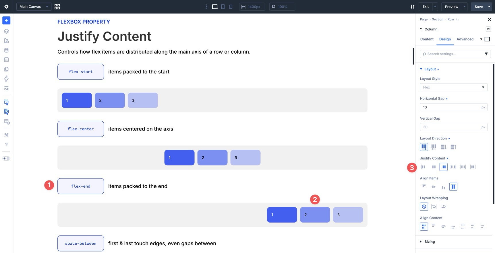
End
This option places items at the end of the main axis. In a horizontal row, items move toward the right edge in a standard left-to-right layout. In a vertical column, items move toward the bottom. Use it for right-aligned button groups, compact navigation layouts, or footer content that needs to sit at the end of its container.
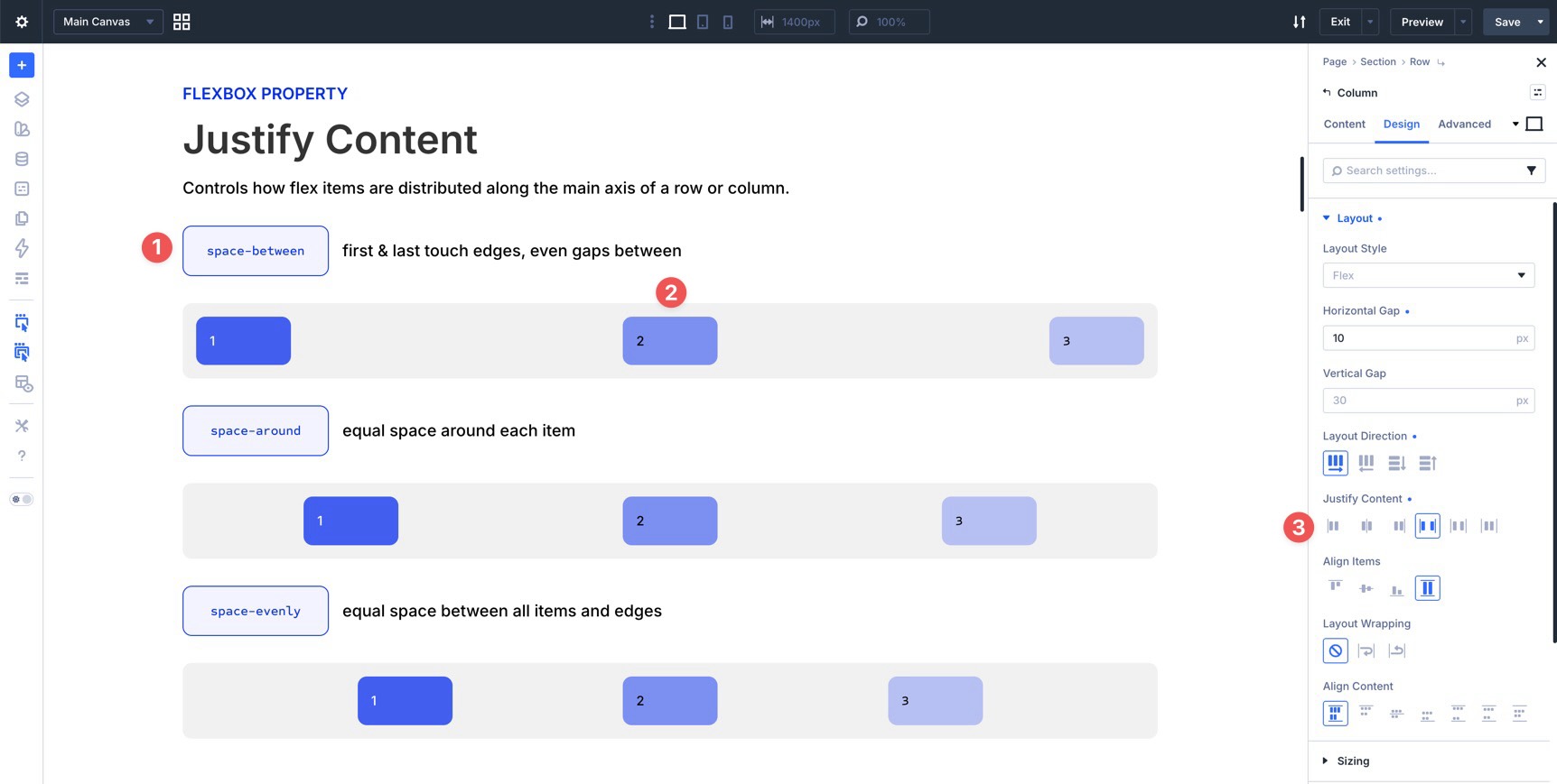
Space Between
This option distributes items from edge to edge. The first item sits at the start of the container, the last item sits at the end, and the remaining space is distributed between the items. It is especially useful for header menus and layouts where opposite ends need to stay anchored.
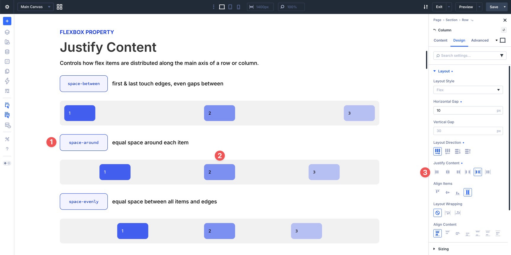
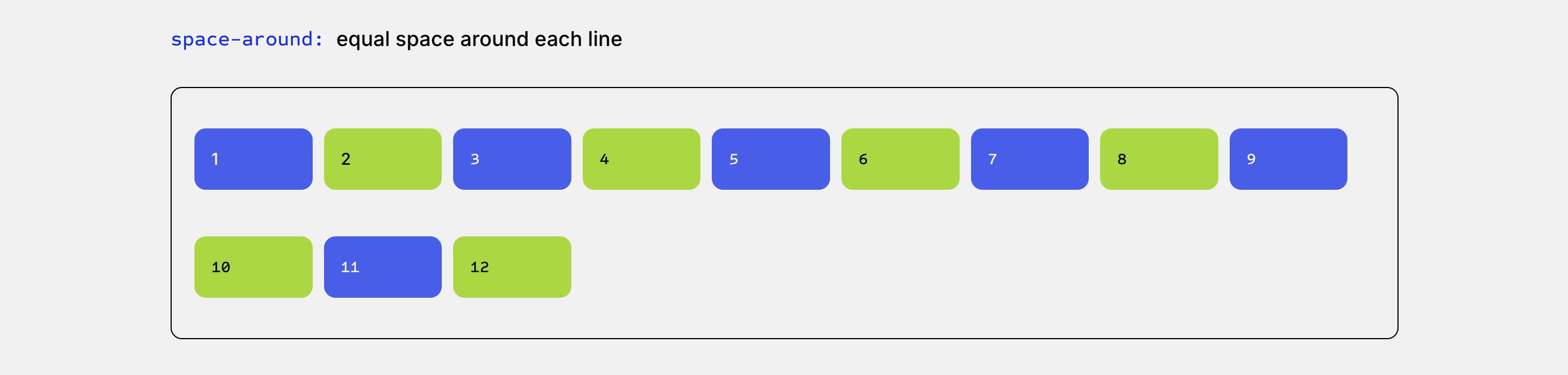
Space Around
This option adds space around each item. Because each item receives space on both sides, the gaps between inner items appear larger than the space at the outer edges. Use it when you want a looser, more open layout.
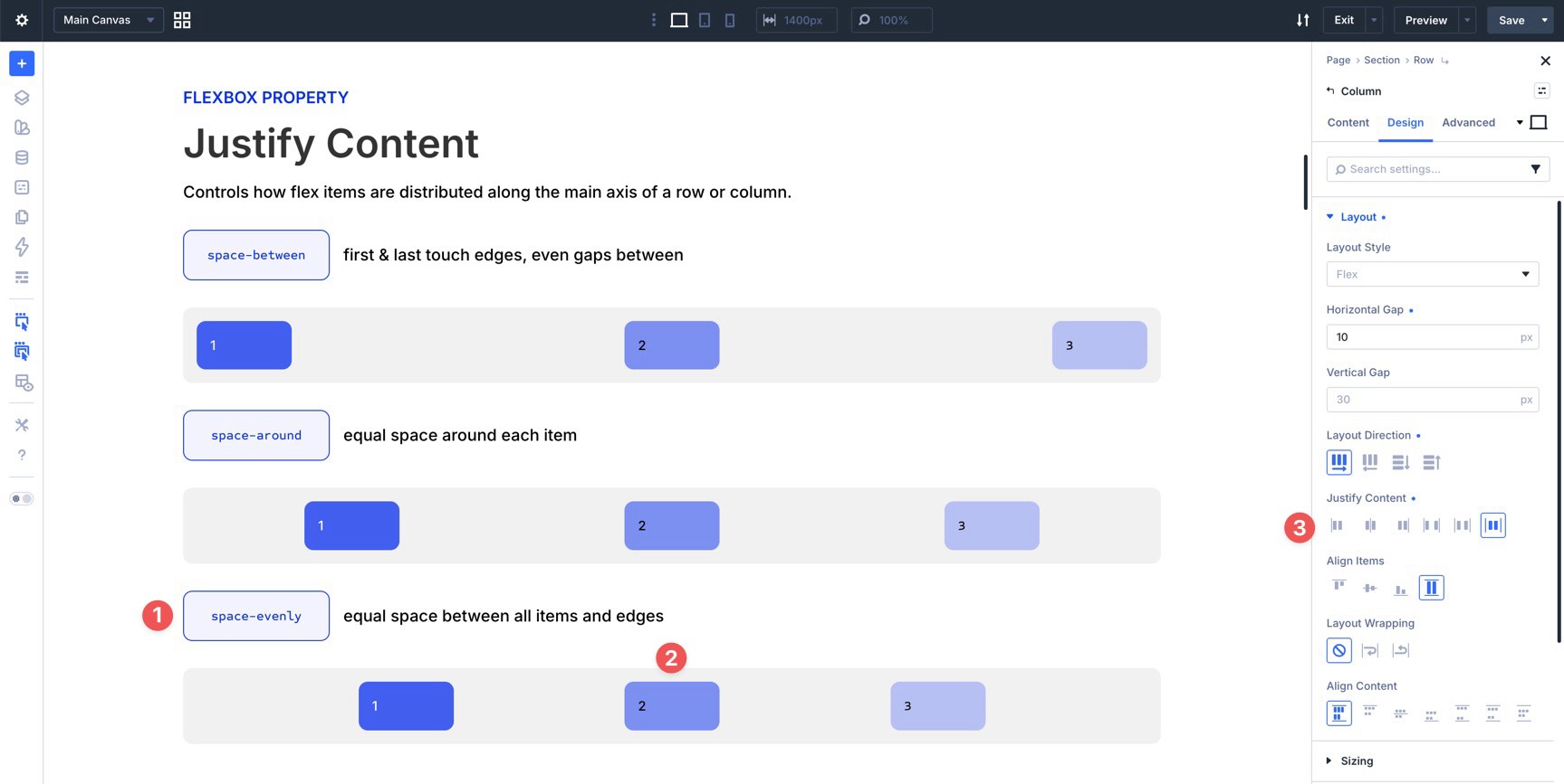
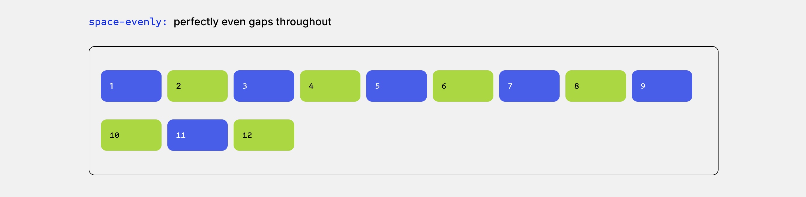
Space Evenly
This option creates equal space between all items and the outer edges of the container. Unlike Space Around, the outer edge spacing matches the spacing between items. Use it for balanced icon rows, feature lists, or evenly distributed navigation items.
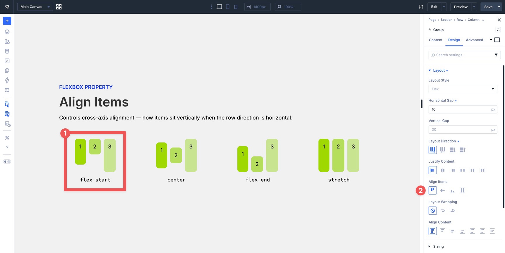
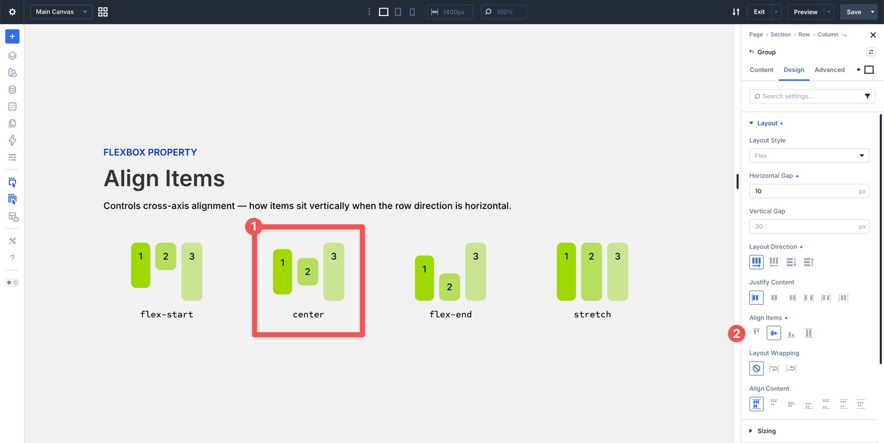
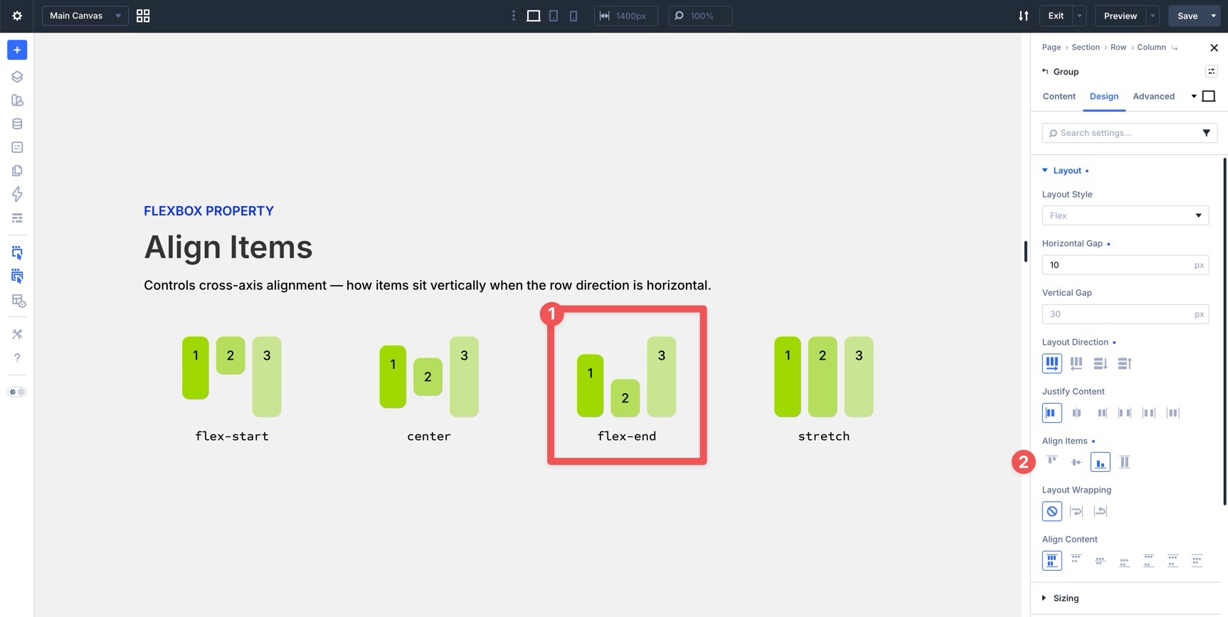
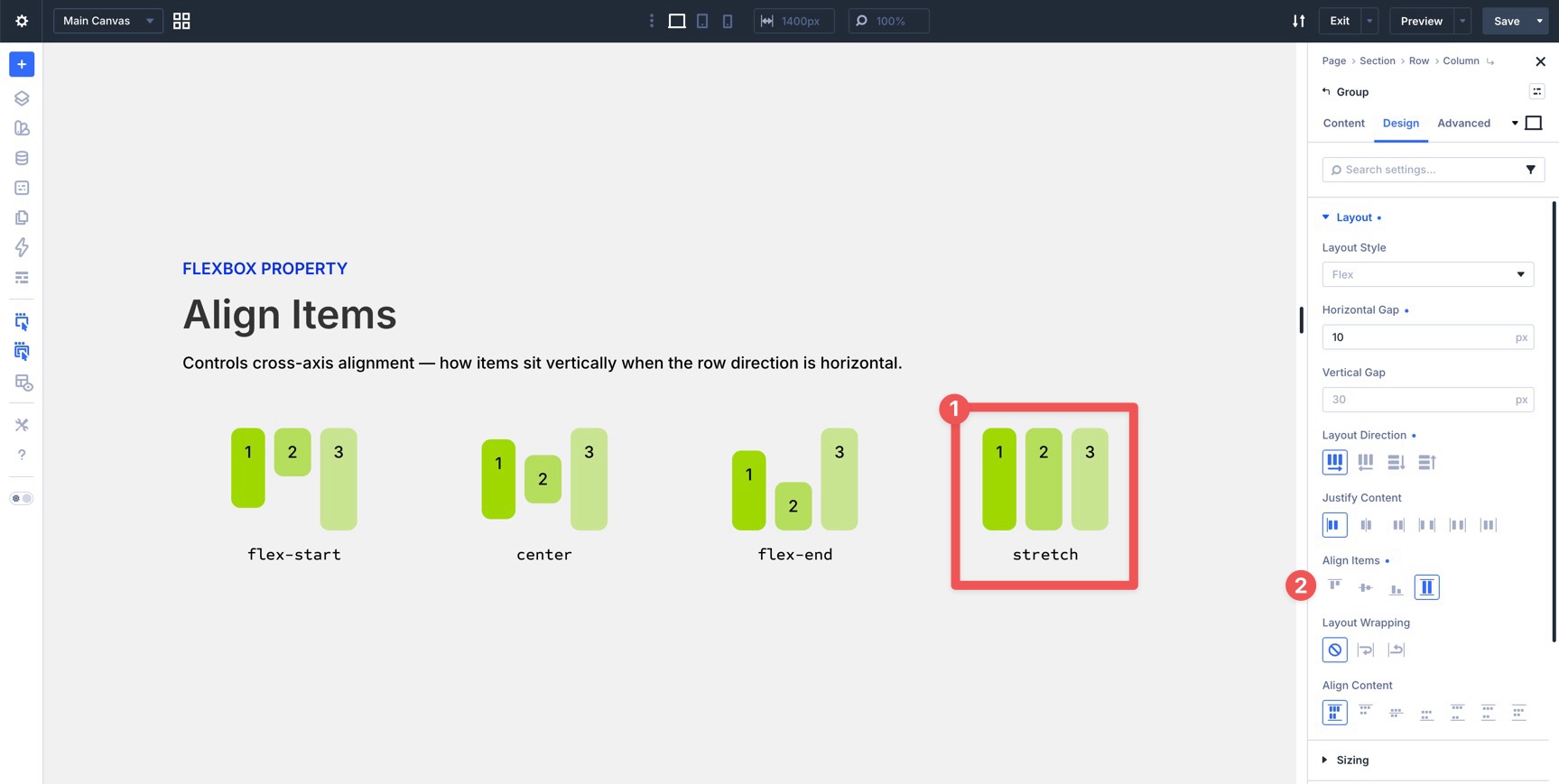
Align Items
While Justify Content controls alignment along the main axis, Align Items controls alignment along the cross axis. In a Row layout, that usually means vertical alignment. In a Column layout, that usually means horizontal alignment.
Start
This option aligns items to the beginning of the cross axis. In a standard horizontal row, items line up along the top edge of the container. Use it for text-heavy layouts or mixed-media grids where a consistent top baseline matters.
Center
This option centers items along the cross axis. It is especially useful when aligning an image next to text, centering buttons beside copy, or balancing mixed-height modules within the same row.
End
This option aligns items to the end of the cross axis. In a horizontal row, items align along the bottom edge of the container. This is useful when multiple items need to share a grounded visual baseline.
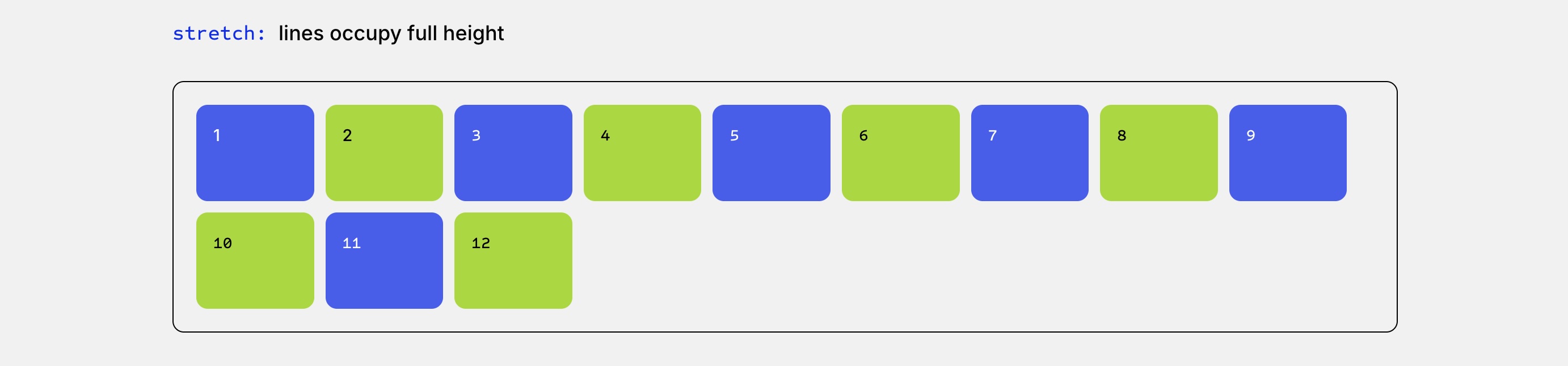
Stretch
This option stretches flex items across the available cross-axis space when their size allows it. It is useful for card grids, pricing sections, and layouts where columns or cards need to appear visually equal in height.
The key difference between Justify Content and Align Items is that Justify Content works along the main axis, while Align Items works along the cross axis. The visible result changes depending on whether your Layout Direction is Row or Column.
Tip: Use Stretch when you want cards or modules to share a consistent height. Use End when items need to align along the bottom edge. For pricing tables with buttons aligned at the bottom, combine equal-height cards with internal Flexbox settings inside each card.

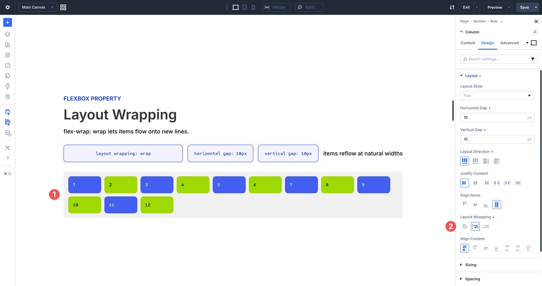
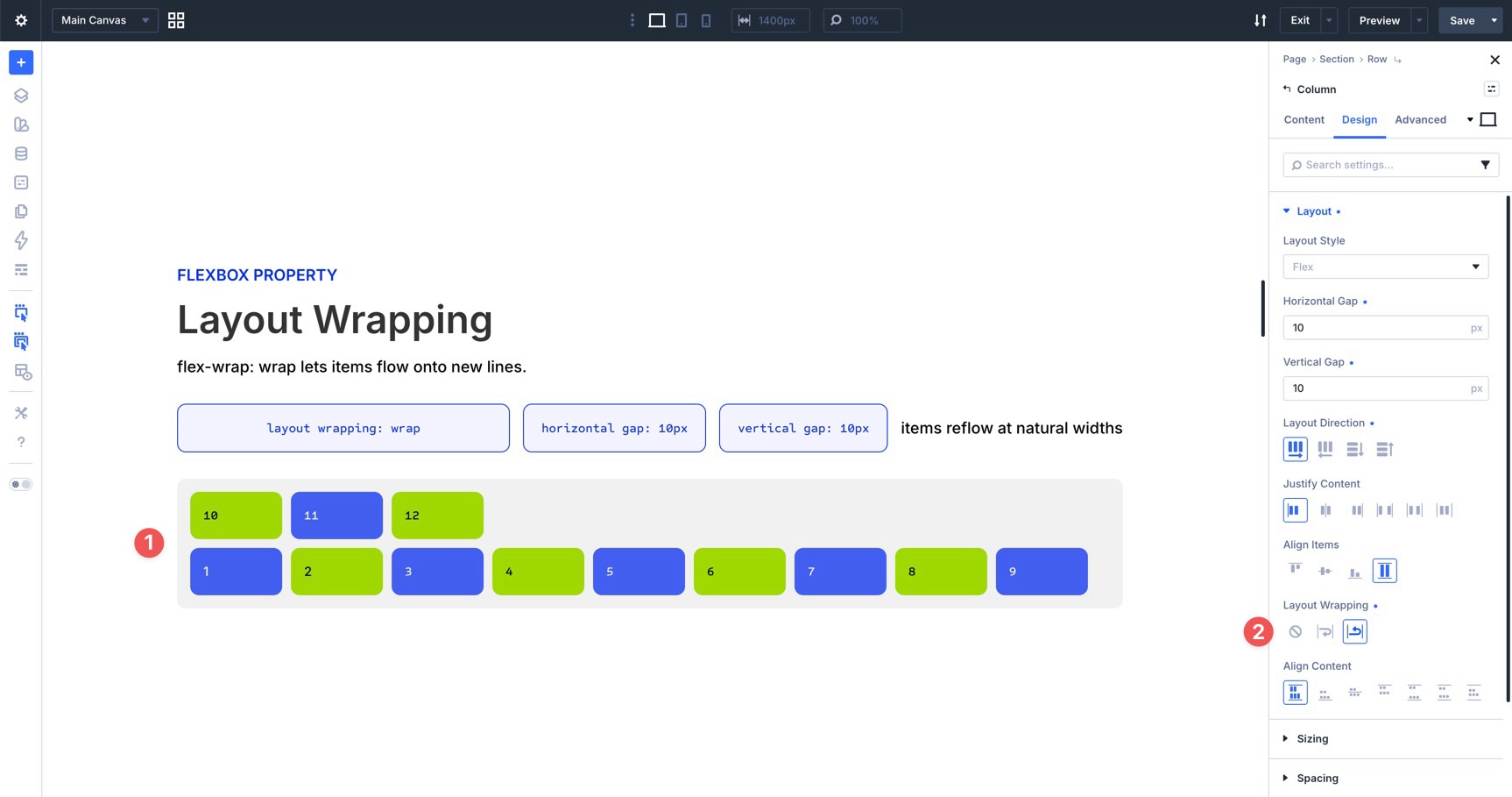
Layout Wrapping
Layout Wrapping controls whether flex items stay on one line or move onto additional lines when there isn’t enough room.
No Wrap
This default behavior keeps all items on one flex line. Depending on the item settings and available space, items may shrink, overflow, or become too compressed. Use No Wrap intentionally for compact button bars, horizontal toolbars, or layouts that should remain on a single line.
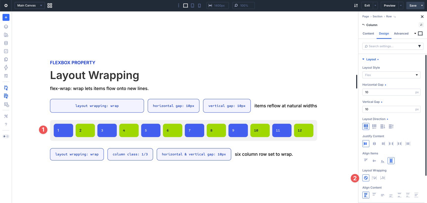
Wrap
This option allows items to move onto a new line when they outgrow the available width. It is one of the most useful settings for responsive card grids, testimonial sections, feature rows, and tag clouds.
Wrap Reverse
This option allows items to wrap, but reverses the direction in which new flex lines are placed along the cross axis. It does not reverse the order of every individual item; instead, it changes where the wrapped lines appear. Use it when you intentionally need wrapped lines to stack in the opposite direction.
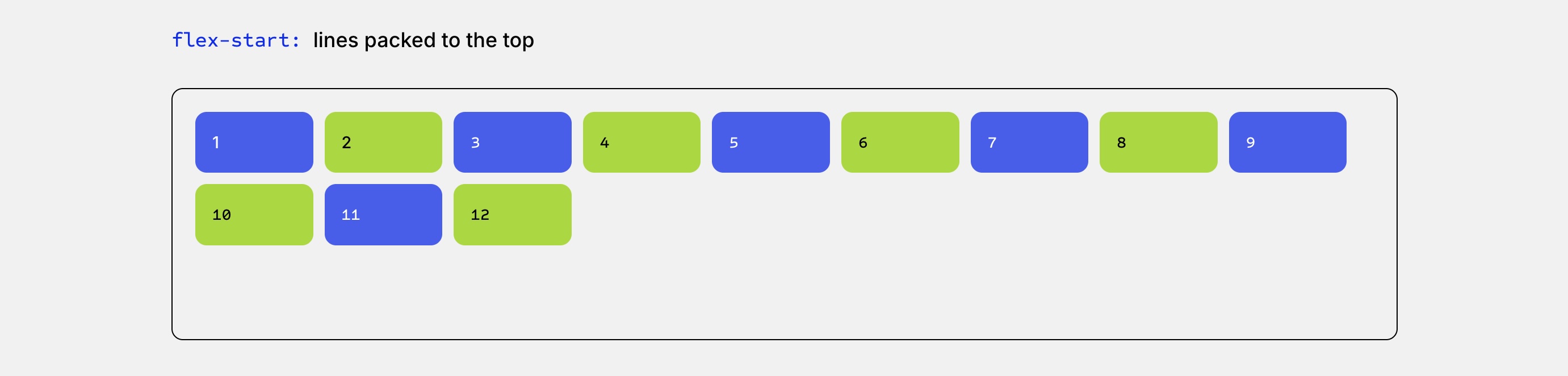
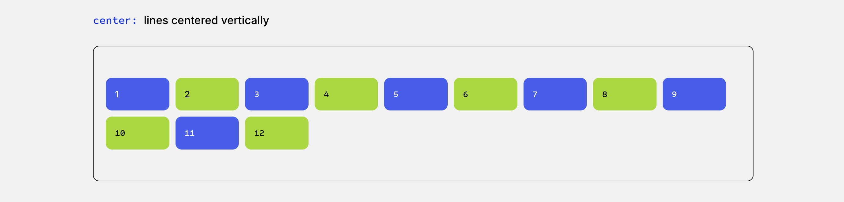
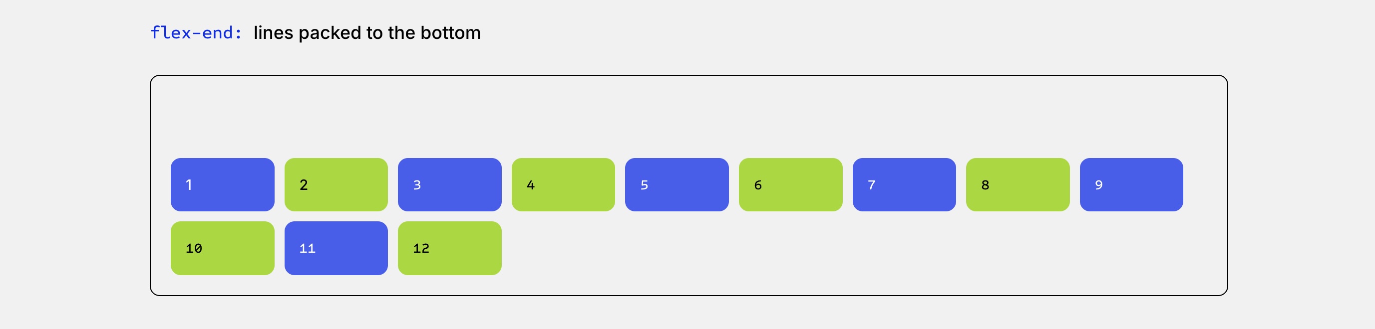
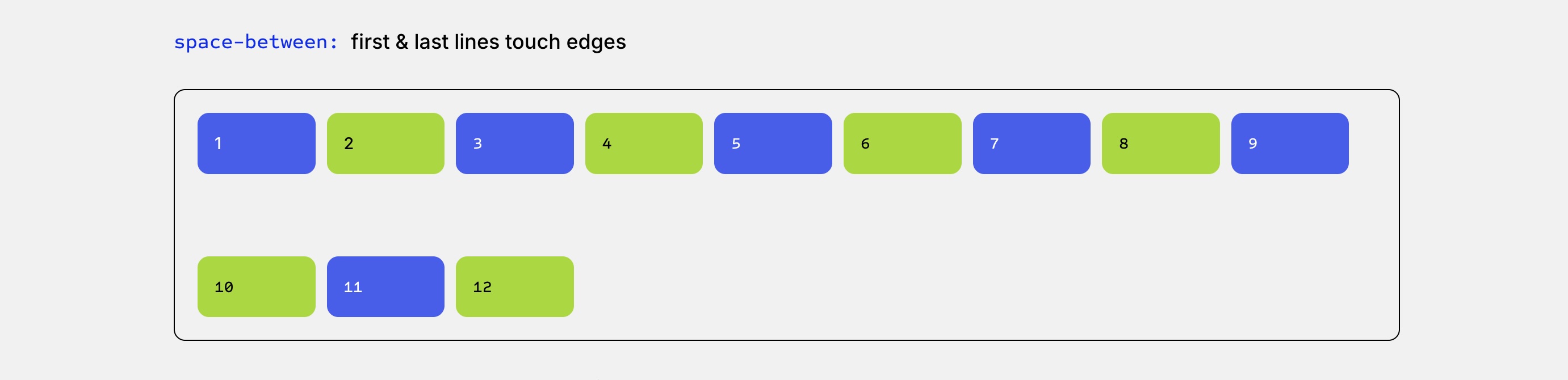
Align Content
Align Content controls how multiple flex lines distribute along the cross axis. This setting only has a visible effect when Layout Wrapping is enabled, the items wrap onto multiple lines, and the container has extra cross-axis space.
The available options mirror your core distribution settings but apply to entire lines instead of individual items.
Stretch
This option stretches wrapped lines to fill available cross-axis space. Use it when you want multi-row card grids or wrapped layouts to feel more evenly distributed.
Start
This option groups wrapped lines at the beginning of the cross axis, leaving extra space at the end. It is useful for standard multi-line grids where content should stay anchored near the top.
Center
This option centers the wrapped lines inside the available cross-axis space. Use it when a wrapped layout needs a balanced presentation inside a taller container.
End
This option places wrapped lines at the end of the cross axis, leaving extra space before them. It works well for bottom-aligned layout sections or structural footer elements.
Space Between
This option places the first wrapped line at the start, the last wrapped line at the end, and distributes the remaining space between the lines. It is useful when you want wrapped rows to occupy the full height of a container.
Space Around
This option adds space around each wrapped line. The space between inner lines appears larger than the space at the outer edges because each line receives space on both sides.
Space Evenly
This option creates equal spacing between every wrapped line and the outer edges of the container. Use it when your layout needs consistent, symmetrical spacing from top to bottom.
Simple distinction:
- Align Items aligns individual items within each flex line.
- Align Content aligns the flex lines themselves when content wraps onto multiple lines.
In the example below, Layout Wrapping is enabled with Align Content set to Space Between.
How These Controls Work Together
Understanding each Flexbox setting individually is helpful, but the real power comes from combining them. Flexbox is best for one-dimensional layouts, where you primarily control items along a row or a column. For strict two-dimensional layouts that require detailed row and column placement at the same time, CSS Grid may be a better fit.
Below are five practical examples that show how Divi 5 Flexbox settings work together in real layouts.
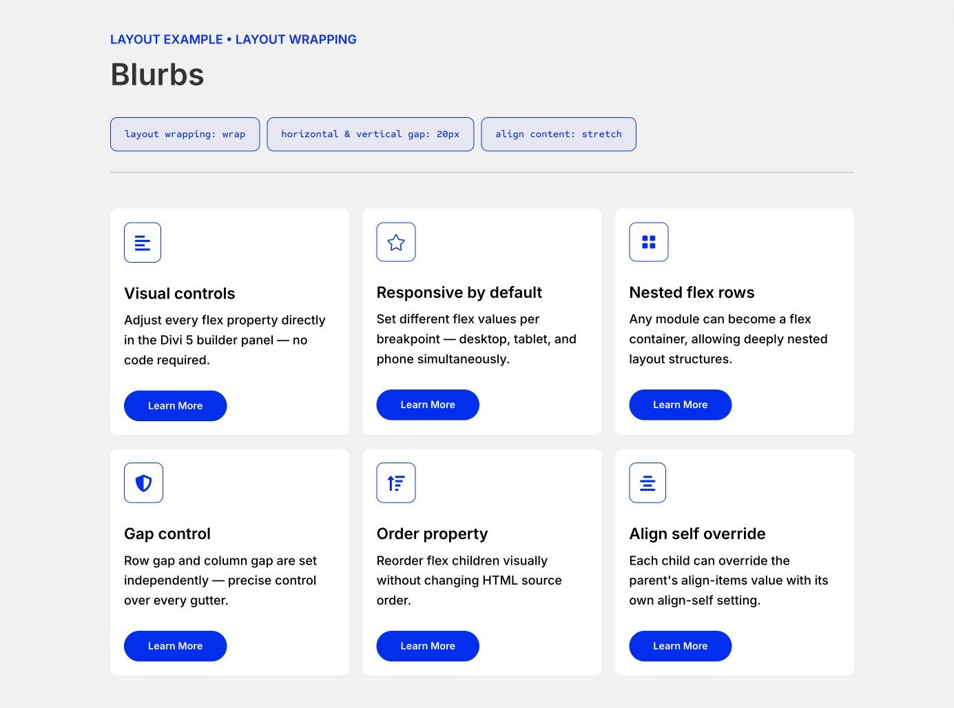
1. Simple Horizontal Card Row
A common use case for Flexbox is creating rows of feature cards, testimonials, pricing tables, or blurbs.
In this example, the parent row uses a Horizontal Gap and Vertical Gap of 20px to create consistent space between the cards. Layout Wrapping is set to Wrap, so cards can move to new lines when there isn’t enough space. Align Content is set to Stretch to help the wrapped rows fill the available space more evenly.
At the column level, each card uses the Column Class setting: 1/3 on desktop for three columns, 1/2 on tablet for two columns, and Fullwidth on mobile for a single-column stack.
This combination creates a clean, balanced, and reusable responsive card layout.
This two-column layout features a narrower sidebar on the left and a wider content area on the right, which works well for blog posts, documentation pages, and resource layouts.
The main row uses a percentage-based horizontal gap and switches from Row to Column on smaller screens for a natural stacked experience. The sidebar uses nested Module Groups with Row direction and small Horizontal Gaps to organize text links and buttons. One button group uses Justify Content: End to push the buttons to the far edge of its container.
The main content column uses Vertical Gap settings and nested Groups with wrapping rows of buttons and content blocks. This shows how Flexbox can be applied at multiple levels, from row to column to module group, to create organized layouts without custom CSS.
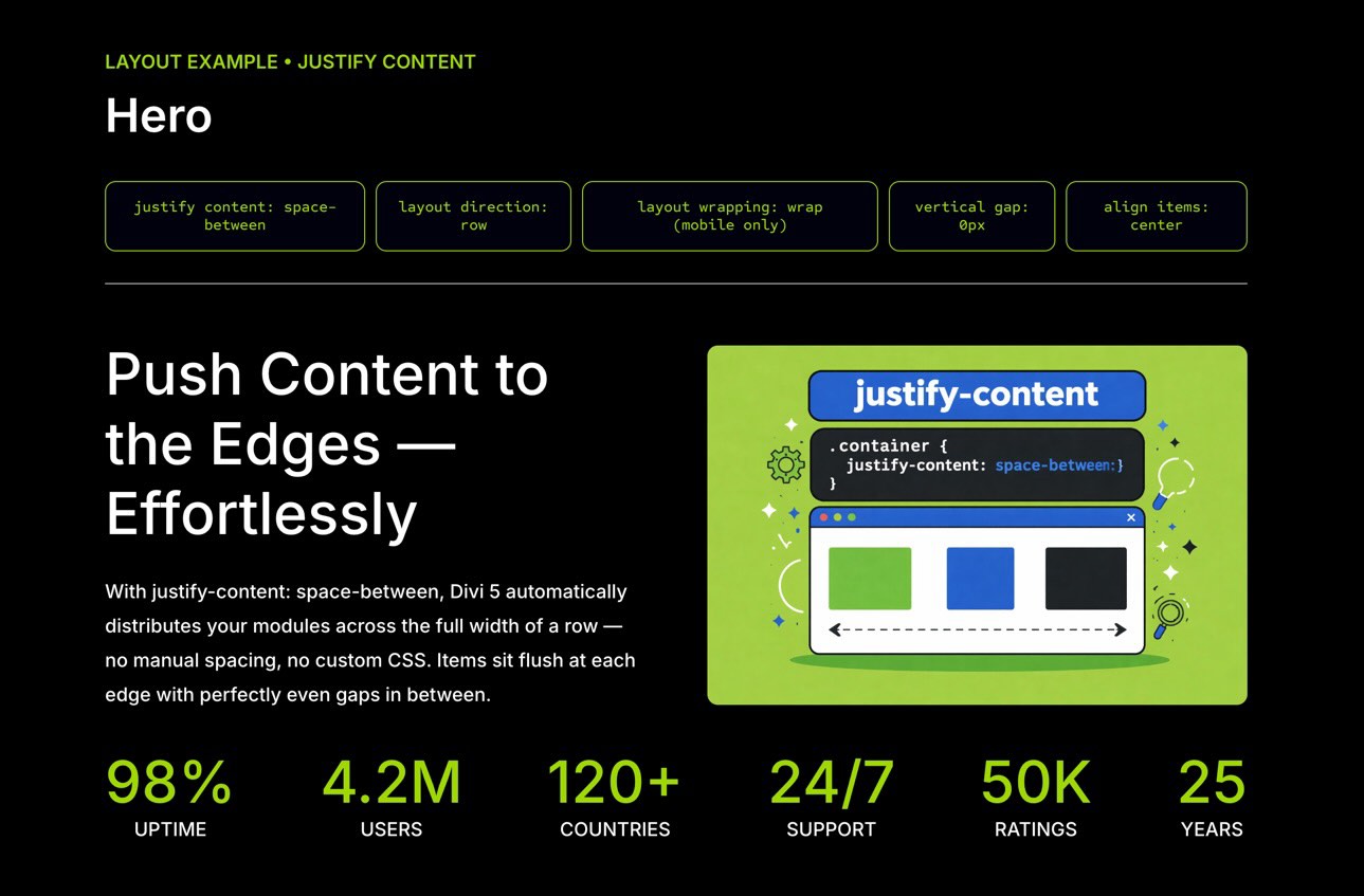
3. Hero Section
Hero sections are one of the most important parts of a homepage, and Flexbox makes it easier to balance text, buttons, imagery, and supporting stats.
This example uses two stacked rows inside a section. The first row contains two columns and uses Align Items: Center so the text and visual content align vertically. The left column also uses a 15px Vertical Gap to create consistent spacing between the heading, copy, and buttons.
The second row contains six Number Counter modules. On desktop, the column uses Layout Direction: Row and Justify Content: Space Between to spread the counters across the available width. On smaller screens, Layout Wrapping allows the counters to wrap into multiple lines while maintaining balanced spacing.
The result is a hero layout with centered content, consistent spacing, and responsive statistics that remain easy to scan.
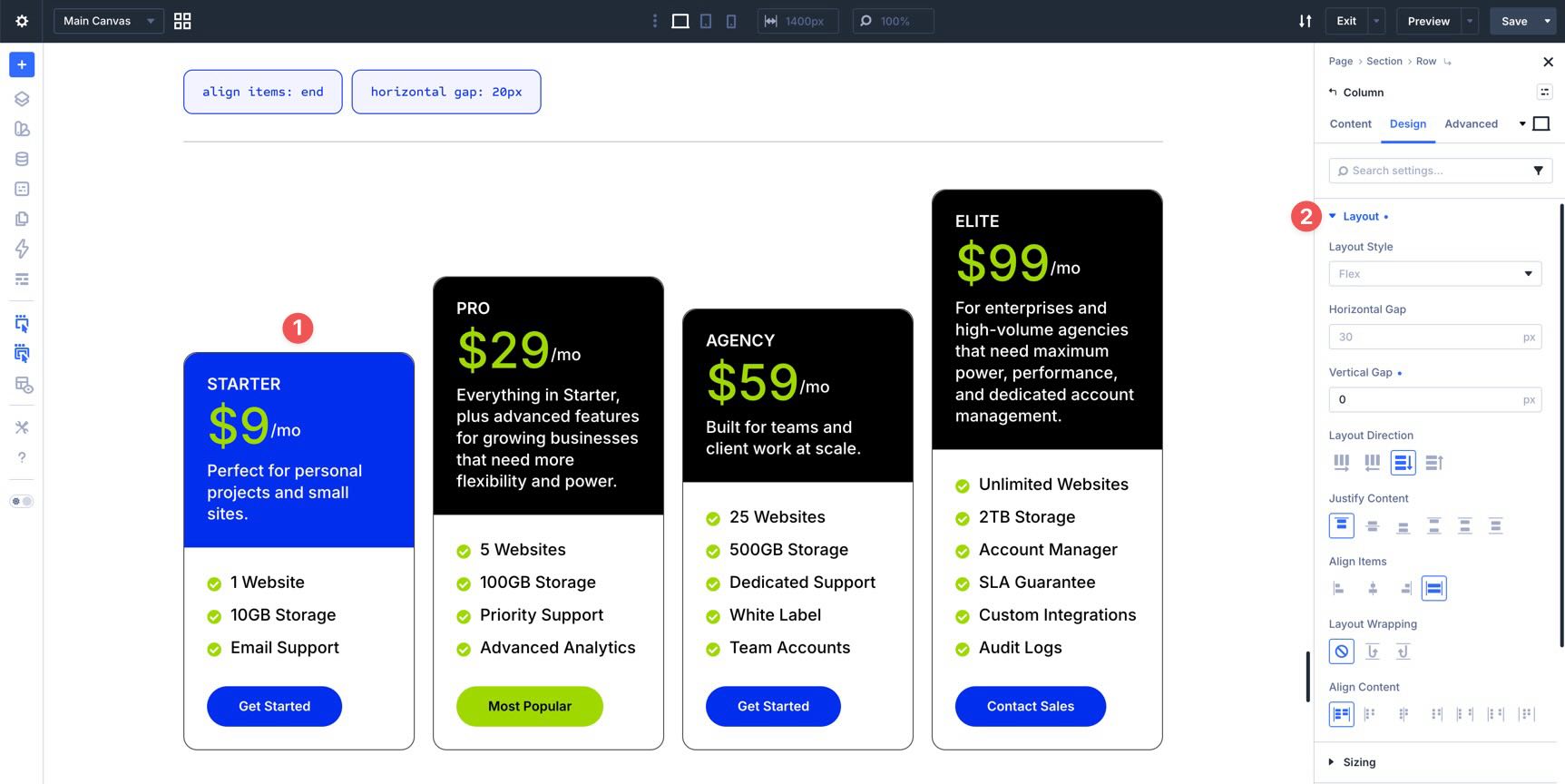
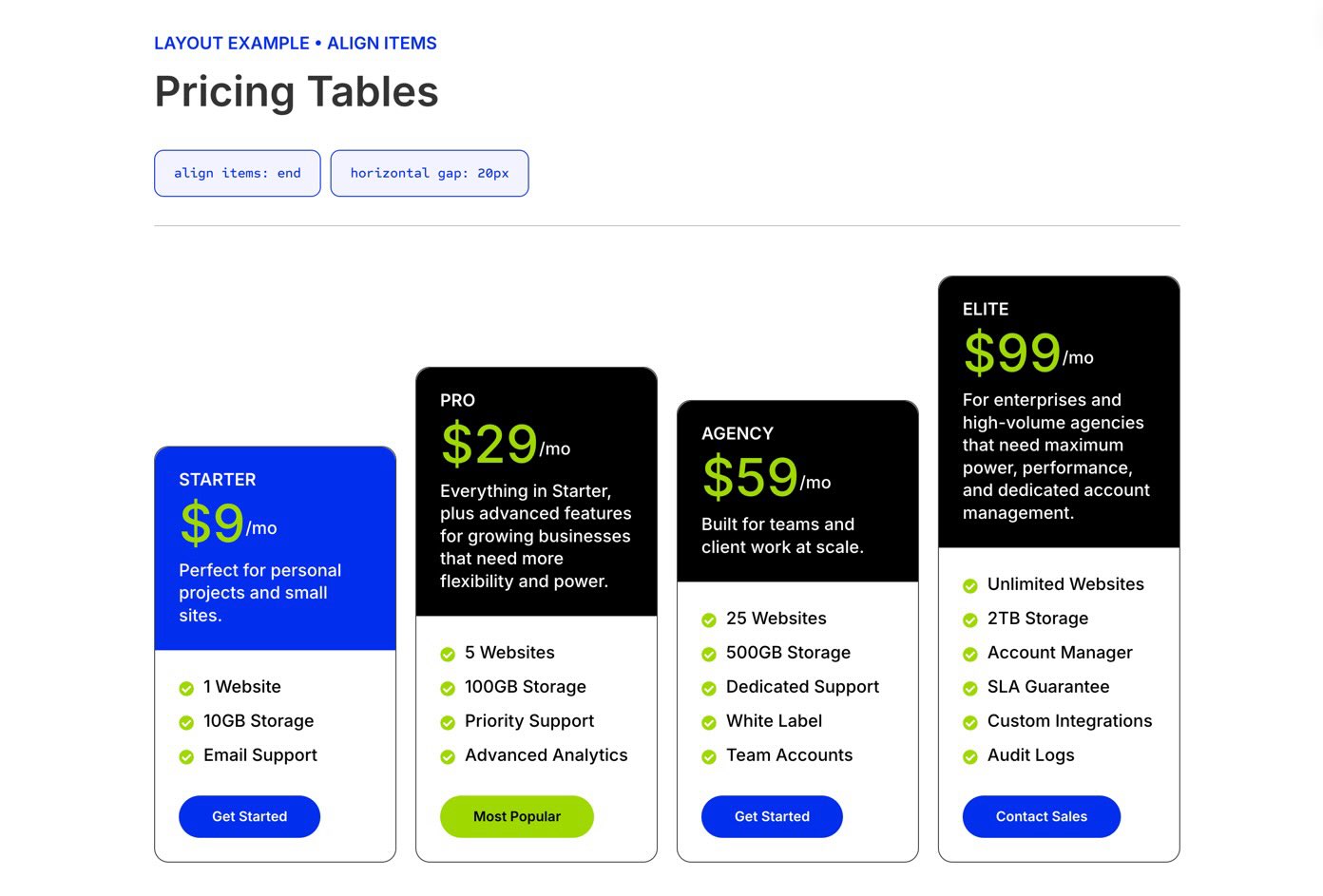
4. Pricing Tables
Pricing tables are a strong Flexbox use case because they often need equal-height cards, aligned content, and consistent spacing between plans.
In this example, a single row contains four pricing columns. At the row level, a 20px Horizontal Gap creates clean separation between cards, while Align Items: Stretch helps the columns share a consistent height when their settings allow it.
Inside each pricing column, nested Module Groups handle the internal layout. The top group uses a small Vertical Gap for the plan name and price area. The price section uses Layout Direction: Row and Align Items: Center to align the currency symbol and price on the same line.
To keep buttons aligned at the bottom, use an internal vertical layout inside each card and distribute the card content intentionally, rather than relying only on the parent row. This keeps each pricing plan balanced even when feature lists have different lengths.
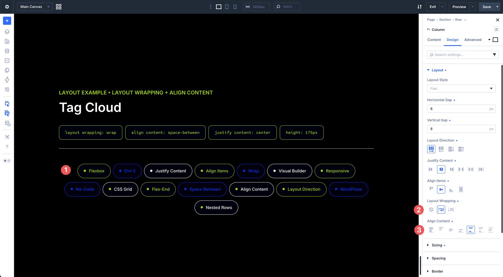
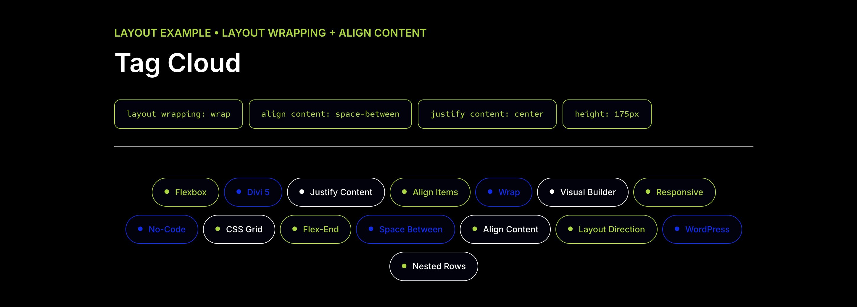
5. Tag Cloud
Tag clouds are a great way to display many links or topics in a compact, visually engaging format.
In this example, a single column contains 15 Text modules styled as colorful tags. At the Text module level, each tag uses Layout Direction: Row Reverse, Justify Content: Center, and a small 10px Horizontal Gap. This keeps the tag label and icon aligned as a compact horizontal unit.
At the Column level, a tight 8px Horizontal Gap and 8px Vertical Gap are applied, with both Justify Content and Align Items set to Center. Layout Wrapping is enabled so the tags can flow onto multiple lines, and Align Content is set to Space Between to distribute the wrapped rows inside the available space.
The result is a dynamic tag cloud that wraps cleanly and avoids awkward gaps.
Download And Install The Files
To help you understand everything covered in this post, we’ve created a handy Flexbox settings guide you can reference. It presents the Flexbox settings visually and includes a few section layouts to help you get started.
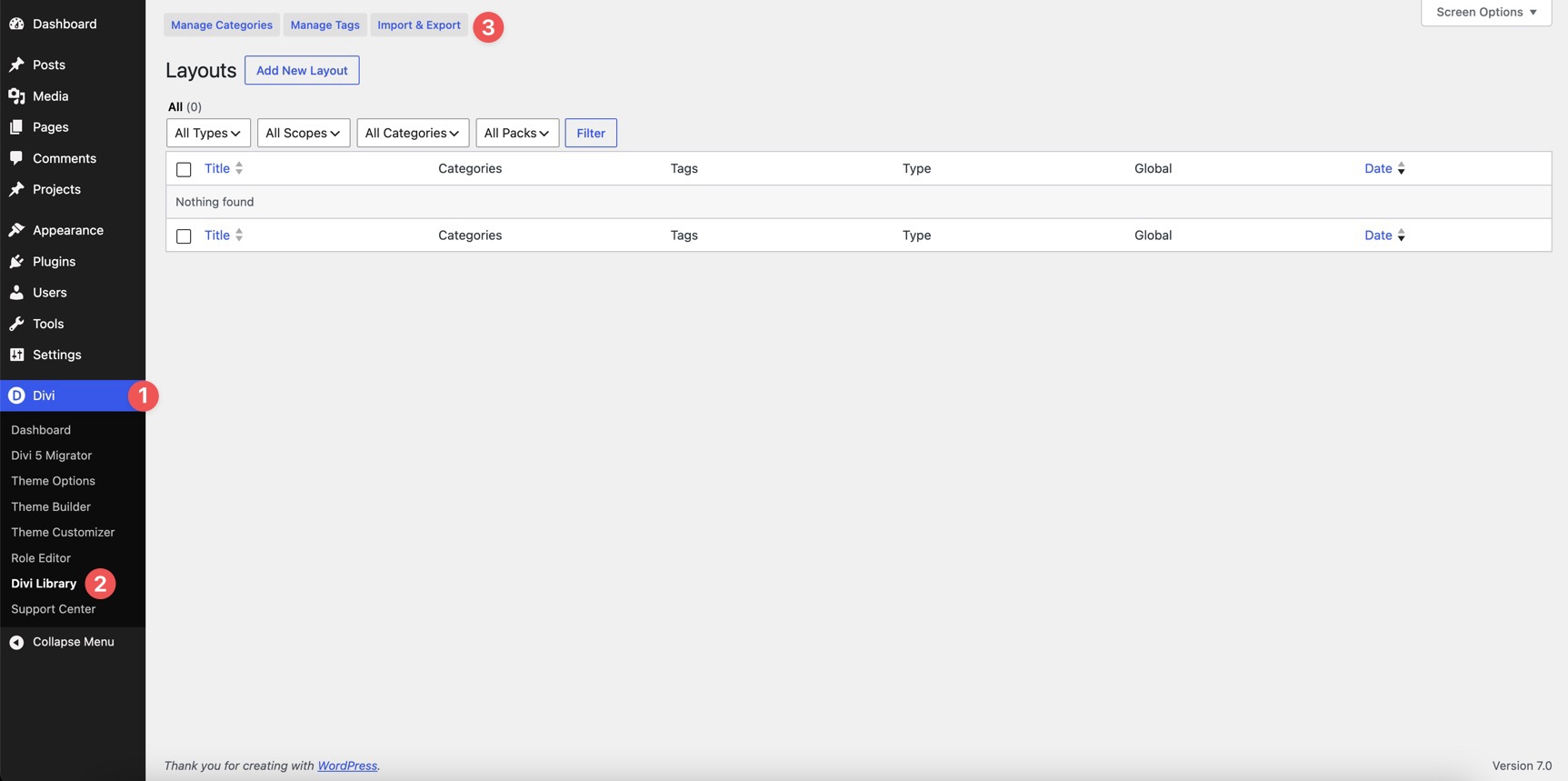
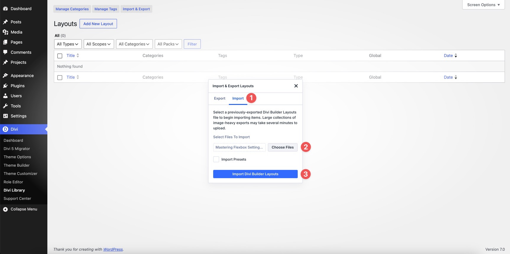
To use the files, fill out the form below to download the ZIP file. Once downloaded, go to the WordPress dashboard, click Divi > Divi Library, and select the Import & Export button.
Click the Import tab, locate the Mastering Flexbox Settings JSON file on your computer, and select Import Divi Builder Layouts.
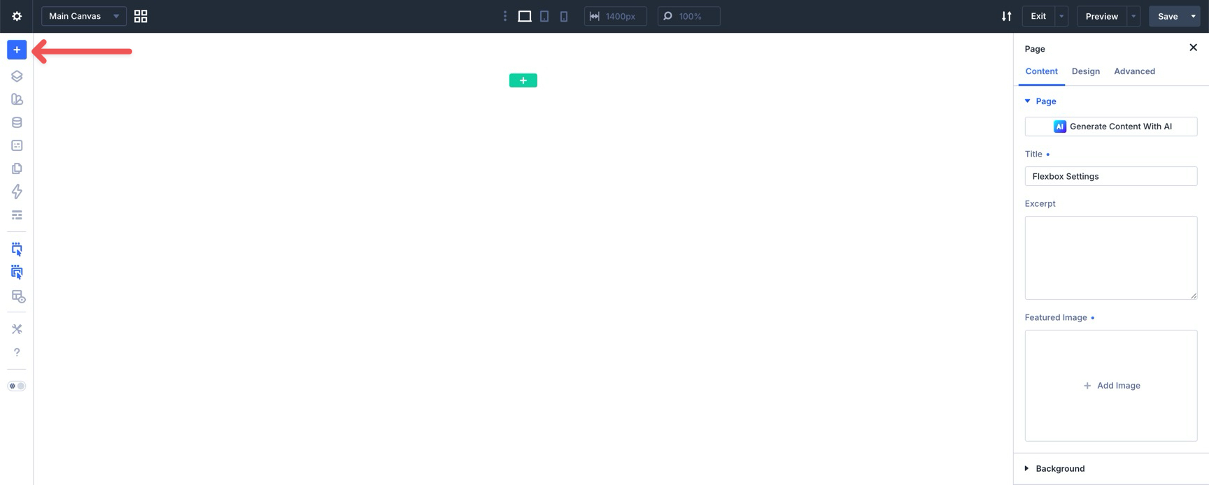
From there, create and open a new page in the Visual Builder. Click the blue + icon at the top of the Builder Bar in the left sidebar.
When the Insert Layout modal appears, select Saved Layout from the available options.
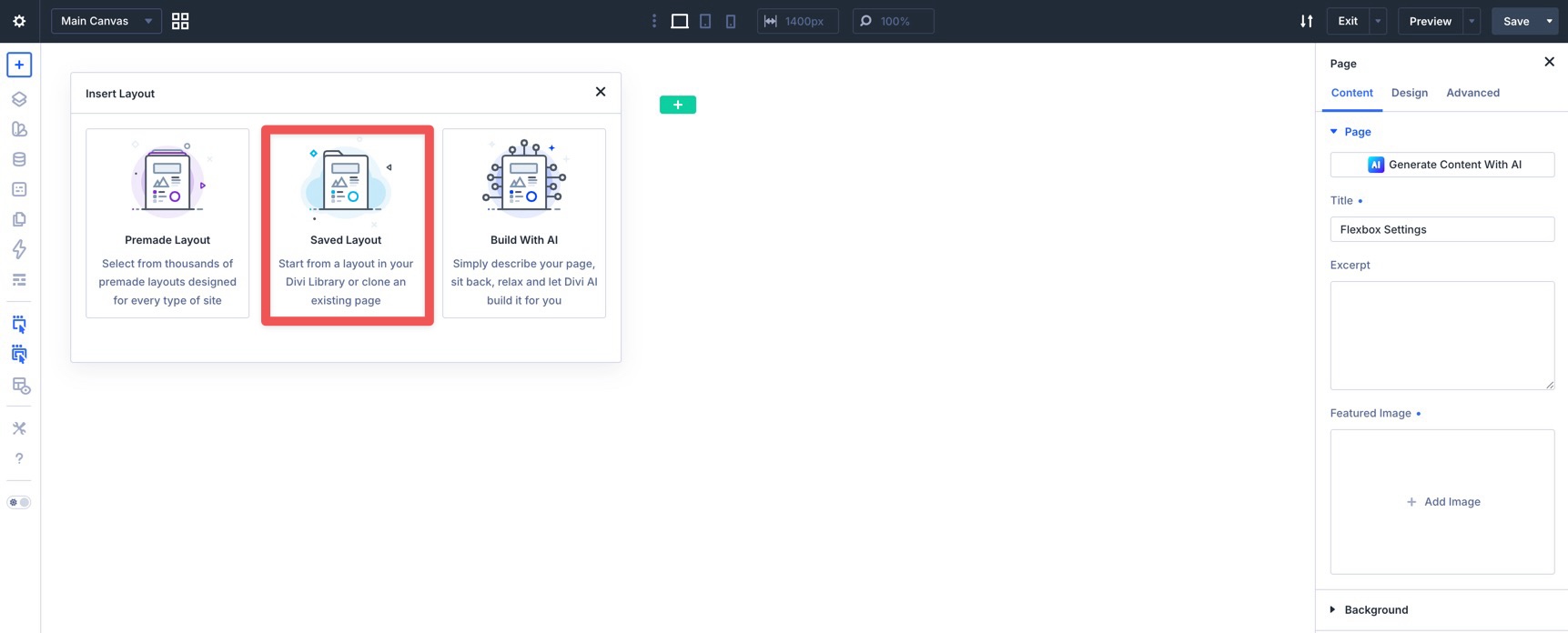
Choose the Mastering Flexbox Settings layout to import it into the Canvas.

Get Started With Flexbox In Divi 5
With a clear understanding of the core Flexbox settings in Divi 5, you can build cleaner, more responsive layouts directly inside the Visual Builder. By combining Layout Direction, Gap, Justify Content, Align Items, Layout Wrapping, Align Content, Column Class, and Display Order, you can create everything from simple card rows to advanced nested layouts.
If you’d like to take your Flexbox skills further, continue with Part 2 of our Mastering Flexbox series. We’ll show you how to create polished card layouts where content and buttons align consistently across every card.
If you haven’t already, download the latest version of Divi 5, import the Flexbox settings guide, and start experimenting with Flexbox in your own projects. The more you use these controls, the more natural they’ll feel. Drop a comment below or reach out to us on our social media channels to let us know which Flexbox setting you’re most excited to use.


Leave A Reply