

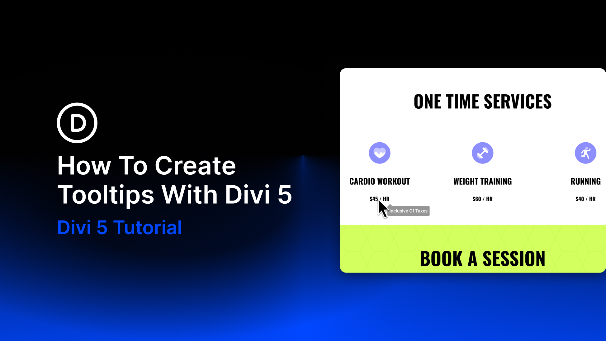
Clean pages and informative pages often pull in opposite directions. Add every detail a visitor might need, and the layout starts to feel crowded. Remove too much, and visitors may not have enough context to understand what they are looking at or what to do next.
Tooltips sit right in that gap. They let you keep the page clean while still making extra context available when someone needs it.
Divi 5 now includes a dedicated Tooltip module that makes this workflow native. You can add a tooltip to an icon, button, text element, pricing feature, image, or any other element that needs a little more explanation. The tooltip stays tied to its parent element, and you control the trigger, movement, position, arrow, timing, content, and styling visually.
In this tutorial, we’ll look at what tooltips are, where they work best, and how to create them with Divi 5’s Tooltip module.
- 1 What Are Tooltips?
- 2 Build Tooltips Natively With The Divi 5 Tooltip Module
-
3
How To Create A Tooltip In Divi 5
- 3.1 Step 1. Nest The Tooltip Module Inside A Trigger
- 3.2 Step 2. Add Tooltip Content
- 3.3 Step 3. Force The Tooltip Visible While Designing
- 3.4 Step 4. Set The Trigger, Movement, And Timing
- 3.5 Step 5. Position The Tooltip
- 3.6 Step 6. Add Or Style The Tooltip Arrow
- 3.7 Step 7. Style The Tooltip Panel
- 4 Best Practices For Using Tooltips
- 5 Adding Context Should Not Mean Adding Clutter
What Are Tooltips?
Screen space is limited, and not every detail needs to sit directly on the page. A tooltip is a small floating panel that appears near an element to provide extra context.
You have probably seen them around icons, form fields, pricing tables, dashboards, and app interfaces. Hover over an icon, and a short explanation appears. Click a small information marker, and a note opens beside it. That is the basic idea.
Tooltips are useful because they support progressive disclosure. The page stays simple by default, but extra information remains available when it becomes relevant.
That does not mean every hidden explanation should become a tooltip. Tooltips work best when the content is short, helpful, and supplementary. If visitors need the information to complete a task, it usually belongs in visible page content instead.
Where Tooltips Work Best
The best places for tooltips are the small moments where visitors might pause, hesitate, or need one extra piece of context. Common use cases include:
- Icons: Icons save space because they remove visible labels. A tooltip can bring the label or explanation back on hover or click.
- Pricing tables: Short phrases like “priority support” or “advanced reporting” may need a little more explanation before someone chooses a plan.
- Jargon and acronyms: A short definition can keep visitors from leaving the page to look up unfamiliar terms.
- New features: A tooltip can point out something new or easily missed without adding a permanent block of text.
- Form hints: Short guidance can help explain a field, format, or optional input when the visible label is not enough.
- Image or product details: A tooltip can reveal a caption, specification, or small note without interrupting the visual layout.
Each of these examples earns a tooltip for the same reason: something on the page raises a small question, and a few words of extra context can answer it.
Build Tooltips Natively With The Divi 5 Tooltip Module
The Tooltip module is a native Divi 5 content container. It is added inside the element it describes, and that parent element becomes the tooltip’s anchor. For example, if you add a Tooltip module inside a button, the button becomes the anchor. If you add it inside an icon, the icon becomes the anchor. The tooltip then floats beside that anchor and appears based on the trigger you choose.
What makes the Tooltip module more flexible than a basic browser tooltip is what it can contain. You are not limited to plain text. The Tooltip module can include rich text, nested modules, icons, images, buttons, and other Divi content. That means a pricing tooltip can include a short explanation and an icon, while a product tooltip can include a small image, label, or supporting action.
The module settings cover the full tooltip experience:
- Trigger: Show the tooltip on hover, click, or always.
- Movement: Keep it anchored to the element or let it follow the cursor.
- Position: Place it above, below, left, right, or along different alignment points.
- Spacing: Use Skid and Distance to control the exact placement.
- Timing: Add open and close delays.
- Arrow: Show a pointer back to the anchor and style its placement.
- Design: Style the panel with sizing, spacing, background, border, box shadow, and text controls.
Everything happens in the Visual Builder, using the same Divi tabs and option groups you already use elsewhere.
How To Create A Tooltip In Divi 5
The steps below follow a practical build order: choose the trigger element, nest the Tooltip module, add content, preview it in the builder, set the behavior, position the panel, and style the result.
Step 1. Nest The Tooltip Module Inside A Trigger
The Tooltip module should be nested inside the element it describes. That placement tells Divi what the tooltip should attach to. Open the trigger element’s settings. This could be a Button module, Icon module, Text module, Blurb module, pricing feature, or any other element that needs extra context.
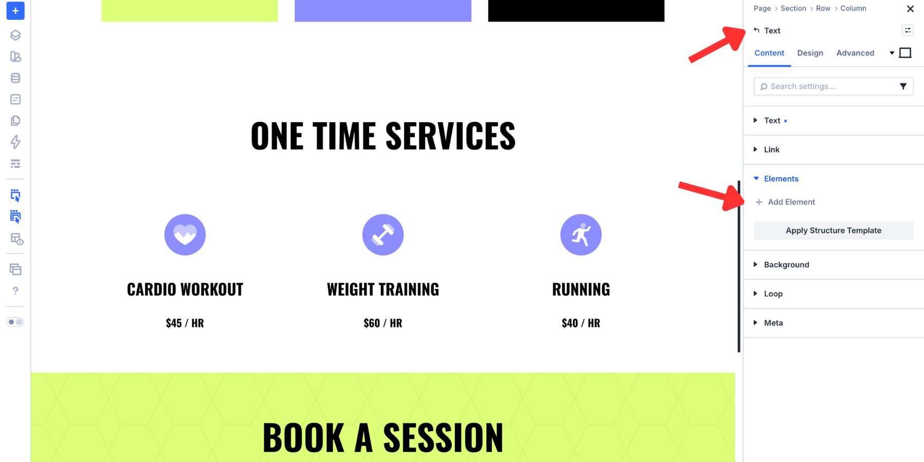
Go to Content > Elements and click Add New Element.
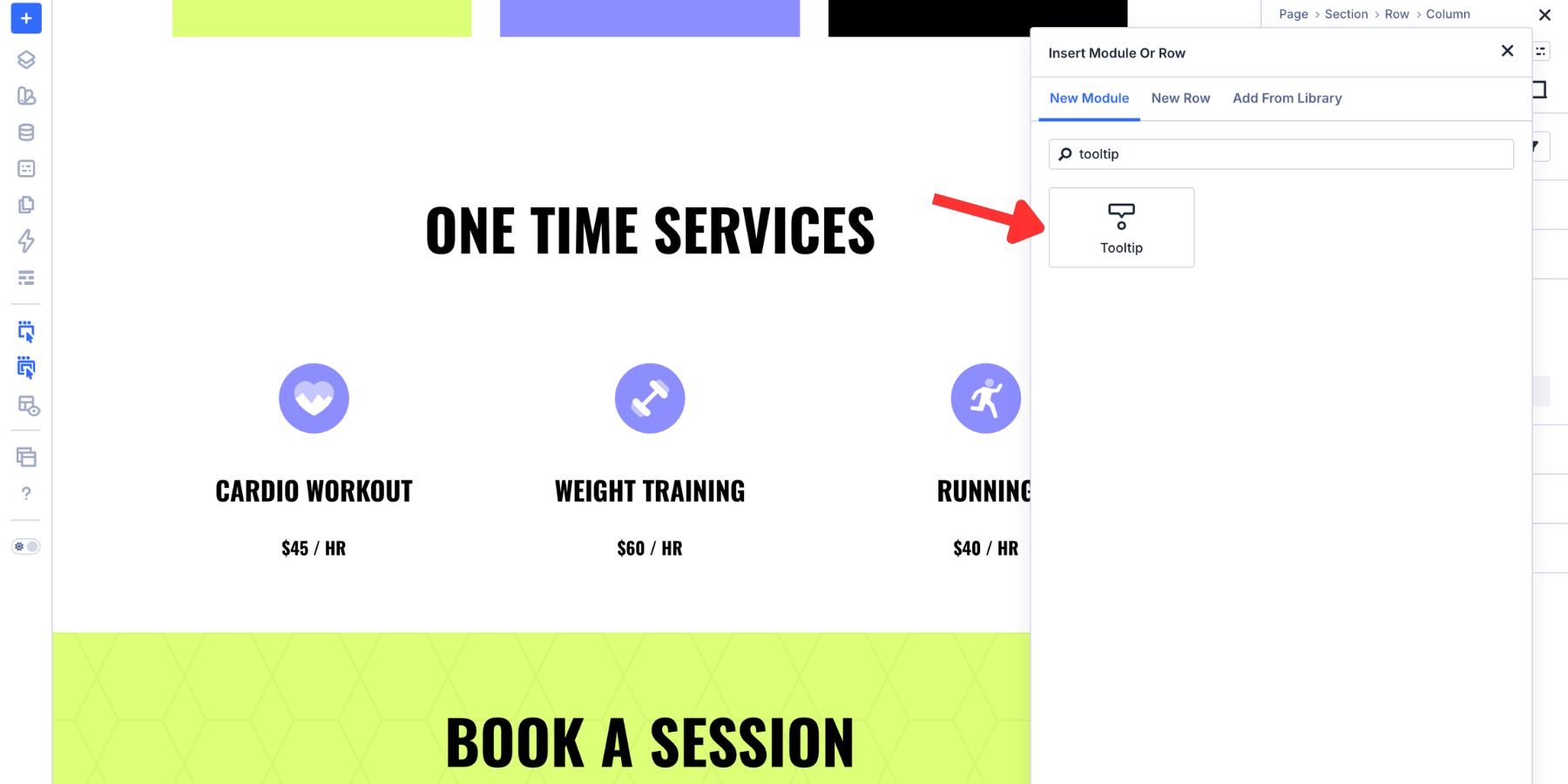
Then select the Tooltip module.
Once the Tooltip module is nested, the parent element becomes the anchor. The tooltip will position itself relative to that parent element.
Step 2. Add Tooltip Content
With the Tooltip module open, use the Content tab to add the content visitors will see. For a simple tooltip, use the Text option group and add a short line of helpful copy.
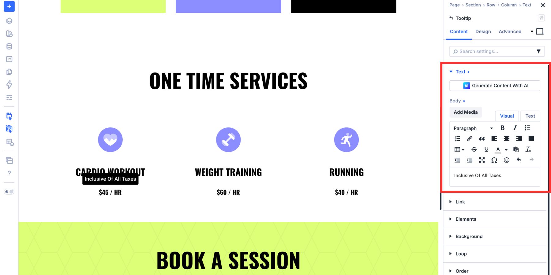
Keep the copy direct. A tooltip should answer a quick question, not become a second paragraph hidden inside the interface. For a richer tooltip, use the Elements option group to add nested Divi content inside the tooltip panel.
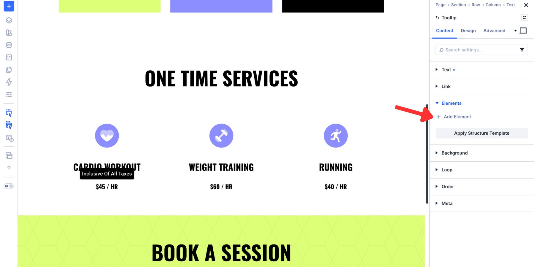
You can add elements such as an Icon, Image, Button, or another small piece of content. Use this carefully. Rich content is useful for mini cards, product notes, or onboarding hints, but most tooltips should still stay compact.
Step 3. Force The Tooltip Visible While Designing
Tooltips are usually hidden until a visitor hovers, clicks, or triggers them. That can make them harder to style while you are working in the Visual Builder. Use the module’s visibility or preview-related settings to keep the tooltip visible while designing. That lets you see the panel on the canvas as you adjust its position, spacing, background, border, and text.
Once the design is finished, return the tooltip to the trigger behavior you want visitors to experience.
Step 4. Set The Trigger, Movement, And Timing
Open the Design tab and expand the Tooltip option group.
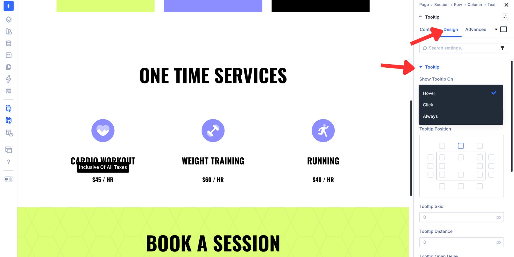
Start with Show Tooltip On. Divi gives you three main choices:
- Hover: Shows the tooltip when a cursor passes over the trigger.
- Click: Shows the tooltip when the visitor clicks or taps the trigger.
- Always: Keeps the tooltip visible without requiring hover or click.
Hover works well for desktop icon labels and quick explanations. Click is often better for mobile and touch-heavy audiences. Always can work for guided callouts, feature highlights, or small notes that should remain visible.
Next, set Tooltip Movement. Anchored keeps the tooltip in place beside the trigger element.
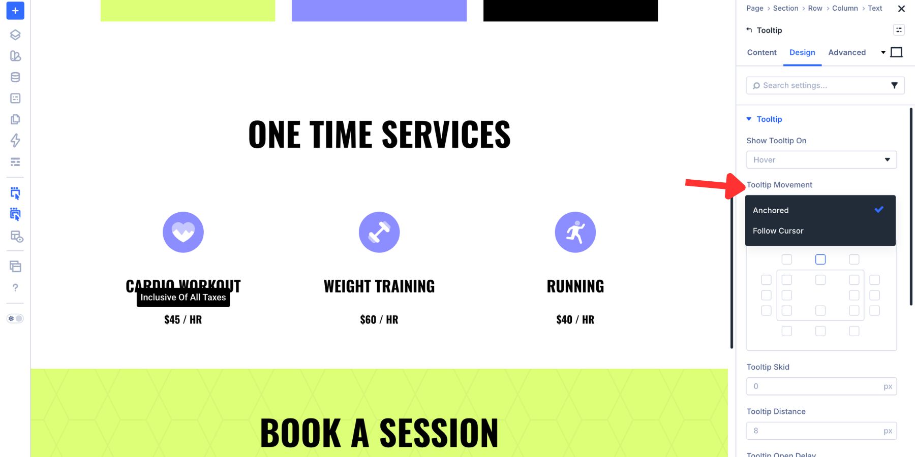
Follow Cursor lets the tooltip move with the cursor over the trigger.
Anchored is the safer choice for most content because the panel stays predictable. Follow Cursor can feel more interactive, but it is better for lightweight labels than rich content. Then set the timing.
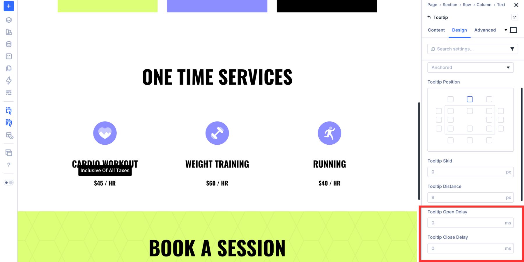
Tooltip Open Delay controls how long Divi waits before showing the panel. A short delay prevents the tooltip from flashing every time a cursor passes over the trigger by accident.
Tooltip Close Delay controls how long the tooltip stays visible after the trigger becomes inactive. This is especially useful when the tooltip contains a link or button, because visitors need enough time to move into the panel.
Step 5. Position The Tooltip
Tooltip position depends on the space around the trigger.
A tooltip above a centered button may have plenty of room. A tooltip attached to an icon near the top of the viewport may need to open below. A tooltip inside a narrow pricing card may need a smaller width, shorter distance, or different alignment so it does not collide with nearby content.
Use the position grid inside the Tooltip option group to choose where the panel appears relative to the trigger.
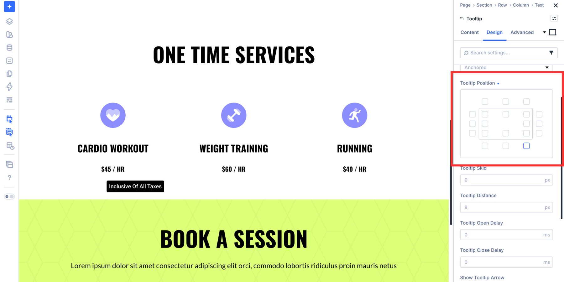
Choose the side with the most available room: above, below, left, or right. Then choose the alignment along that side. After choosing the general position, refine it with Tooltip Skid and Tooltip Distance.
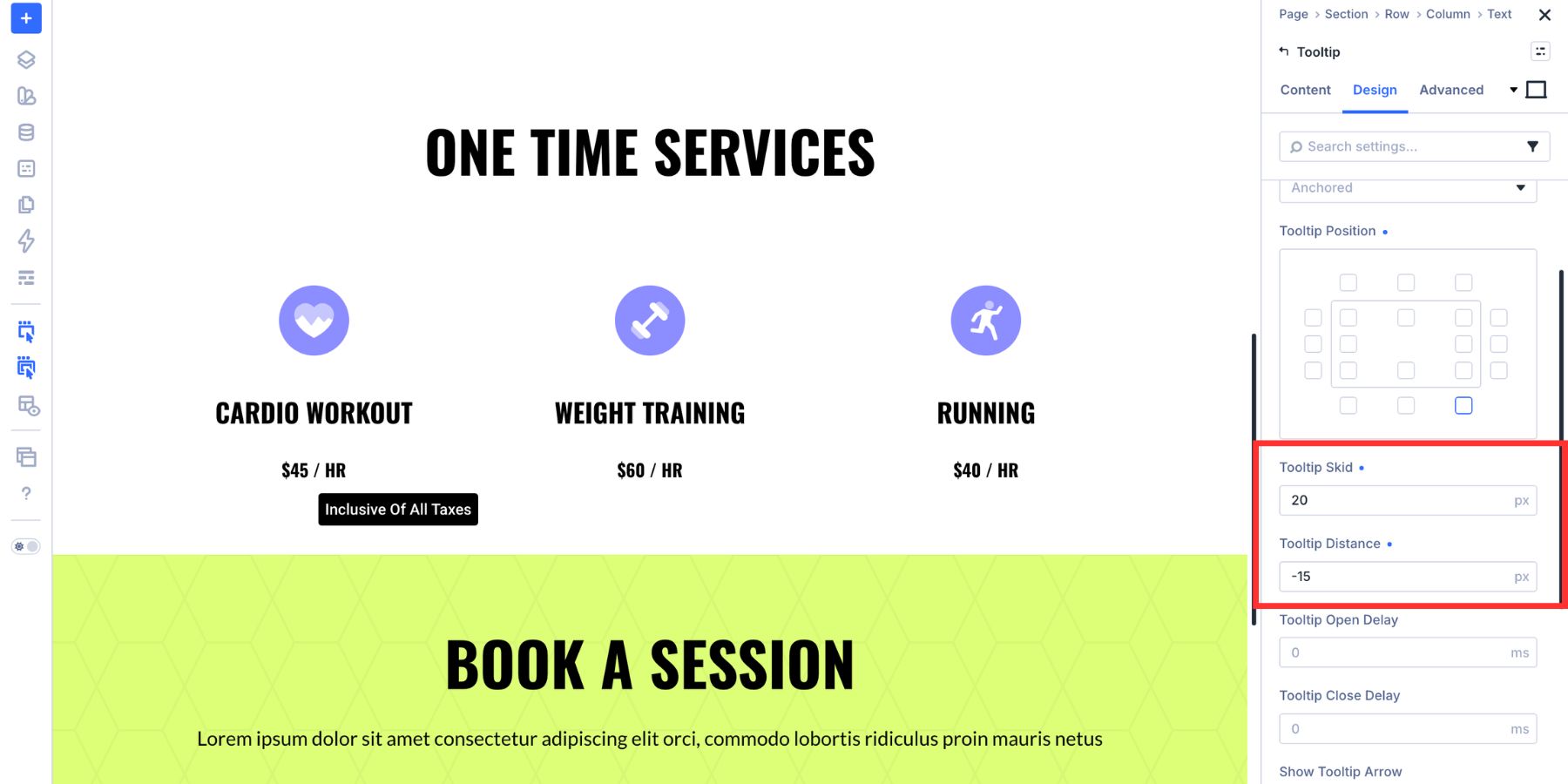
Tooltip Skid shifts the panel along the edge you selected. For tooltips above or below the trigger, it moves the panel horizontally. For tooltips on the left or right, it moves the panel vertically.
Tooltip Distance controls how far the panel sits from the trigger. Lower values feel more connected. Higher values create more breathing room.
Together, Skid and Distance help you fit the tooltip into tight layouts without changing the trigger element itself.
Step 6. Add Or Style The Tooltip Arrow
The arrow visually connects the tooltip panel back to the element it describes. Use Show Tooltip Arrow to enable or disable it. Then adjust the arrow’s color, side, position, and size.
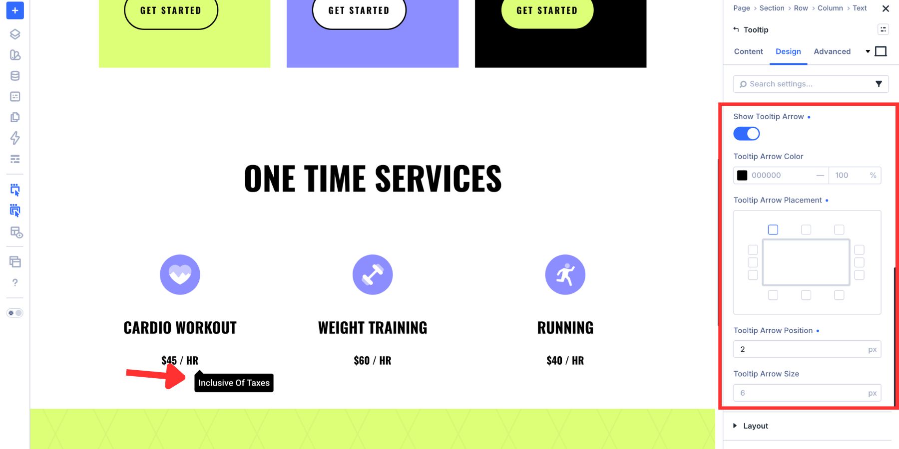
Arrows are helpful when the tooltip floats farther from the trigger or when several nearby elements could be confused as the anchor. If the tooltip already sits very close to the trigger, you may not need an arrow. Keep it only when it makes the relationship clearer.
Step 7. Style The Tooltip Panel
A newly added tooltip can be simple by default, which is often enough for short labels. But if you want the tooltip to feel like part of the design, style it the same way you would any other Divi element. Start with Sizing. Tooltips can become too wide when the content is long, so setting a max width usually gives the panel a cleaner shape.
Then open Spacing and add padding inside the panel. Even a small amount of padding makes tooltip text easier to read.
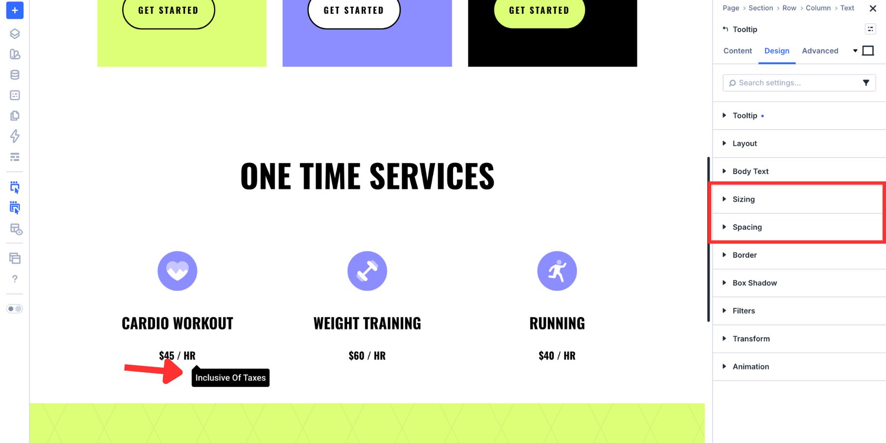
Use Border for rounded corners, Box Shadow for depth, and Body Text for typography. Then set the background. The Background group supports colors, gradients, images, and video. For most tooltip designs, a solid color or subtle gradient works best because the content needs to stay readable.
If your site uses Design Variables, use a Color Variable for the tooltip background or text color. That keeps the tooltip tied to the rest of the design system.
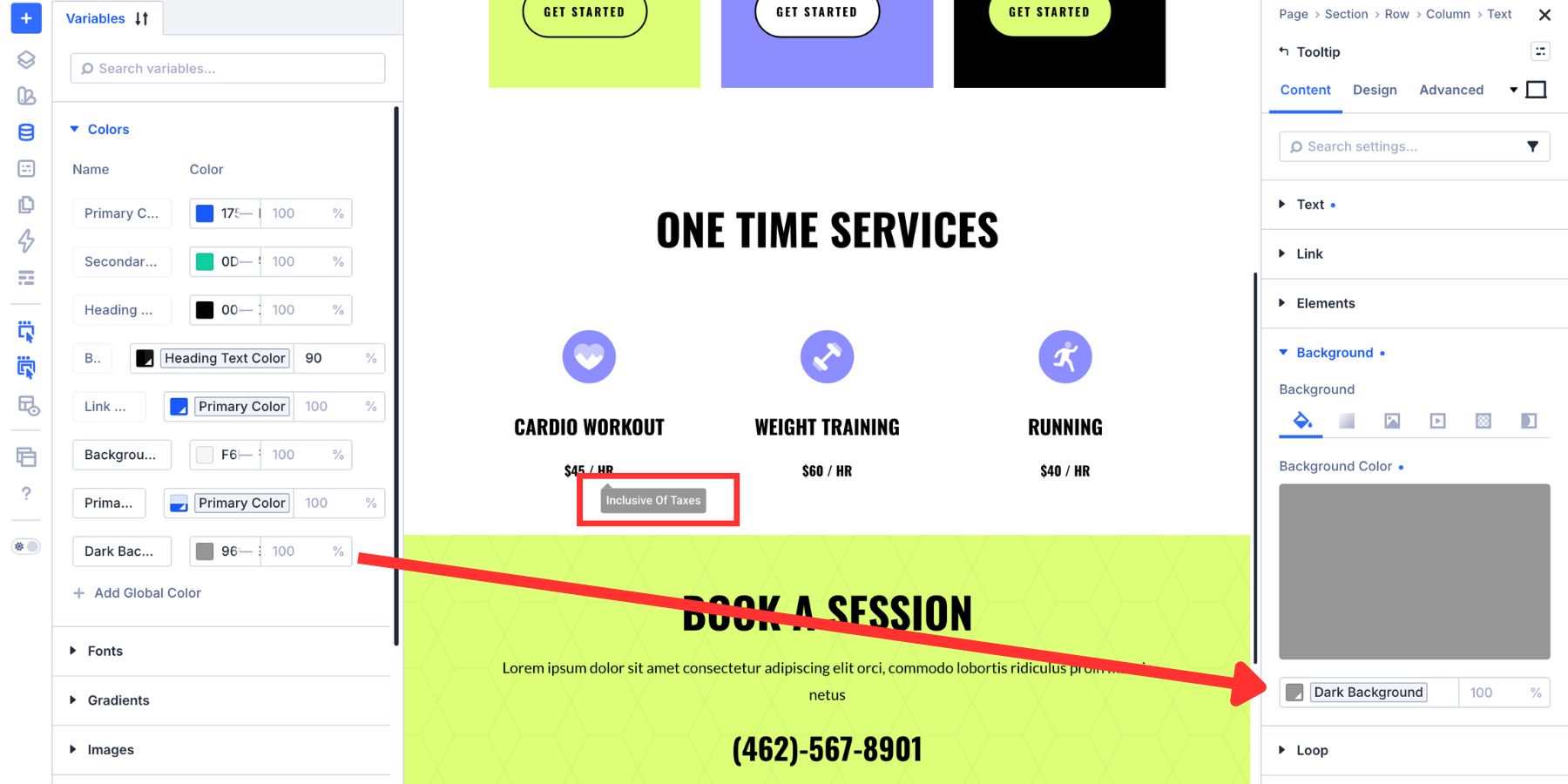
Once the tooltip style works, save the relevant design settings as an Option Group Preset. That way, future tooltips can use the same background, spacing, border, shadow, and text treatment without rebuilding the style manually.
Best Practices For Using Tooltips
Tooltips work best when they solve a small user problem. They become frustrating when they hide information people actually need, repeat what is already visible, or appear in places where the visitor cannot easily trigger them. Keep these best practices in mind.
Keep Tooltip Content Supplementary
Do not hide essential instructions inside a tooltip.
Password rules, form errors, required field instructions, pricing limitations, and legal details should usually be visible on the page. A tooltip can add clarification, but it should not be the only place visitors can find information required to complete a task.
Use tooltips for helpful context, not critical content.
Do Not Repeat The Label
A tooltip should not repeat what the visitor can already see. If a button says Delete Account, a tooltip that also says Delete Account adds nothing. A better tooltip might explain what happens next, such as whether the action is permanent or whether the visitor will see a confirmation step.
The same applies to icons. If the icon already has visible text beside it, the tooltip should add context rather than duplicate the label.
Keep The Copy Short
Tooltips are small by design. Keep the copy short enough to scan in a second or two.
Use direct language. Avoid long paragraphs, multiple ideas, and dense explanations. If the tooltip needs more than a sentence or two, the information may belong in visible page content, an accordion, a modal, or a dedicated help section.
Choose The Trigger Based On The Device
Hover works well on desktop but is not always reliable on touch screens. If a tooltip needs to work well on mobile, consider using Click instead of Hover.
Click also works better when the tooltip contains interactive content, such as a link or button, because visitors have more control over when the panel opens and closes.
Check The Position In Context
Do not position tooltips in isolation. Check them inside the actual layout.
Look for clipping near the viewport edge, overlap with nearby cards, crowded pricing rows, and mobile layouts where the panel may take up too much space. Adjust the position grid, Skid, Distance, width, and trigger behavior until the tooltip feels intentional at each breakpoint.
Make Tooltips Accessible
Tooltips should not be available only to mouse users. If the tooltip supports an interactive element or important explanation, test the experience with keyboard navigation and screen readers. Make sure visitors can reach the trigger, understand what it does, and access the information without relying only on hover.
Divi 5’s Custom Attributes system can help when a tooltip needs additional HTML attributes. For example, you may use attributes such as role, aria-label, or aria-describedby where the markup needs clearer meaning. Use ARIA carefully. Native labels and visible helper text are often better for essential instructions. Attributes should clarify the experience, not patch over content that should have been visible in the first place.
Adding Context Should Not Mean Adding Clutter
Tooltips are small, but they can make a layout feel much more considered. A good tooltip answers a question at the exact moment someone has it. It explains an icon, clarifies a pricing feature, defines a term, introduces a new feature, or adds a small note without forcing more text into the main layout.
Divi 5’s Tooltip module gives you a native way to build that experience visually. Add the module inside the element it describes, choose the trigger, control the movement and timing, position the panel, style the design, and save the result as a reusable preset when it becomes part of your system.
Use tooltips where they add real context, keep them short, and make sure they work for more than just mouse users. That is how a page stays clean without leaving visitors guessing.










Thank you for this interesting and well-explained explanation.
This new feature for Divi 5 is really great!
Is it possible to have the tooltip triggered when hovered over a specific word or phrase in a body of text instead of being triggered by the entire module?
The simplest method is to use the global HTML title attribute on the specific word or phrase. The browser will automatically display the attribute’s value as a basic, unstyled tooltip on hover.
So in a Text Module, in the Code view, you’d add a span tag around the word(s) with the title attribute like this example.
Good article, Christopher. Thank you.
I second James’ question about tooltip trigger on text hover. This is a common function and one that I would have thought the Divi 5 module should manage straight out of the box?
I used the tooltip module for the first time today and it’s great apart from a couple of things.
If the tooltip is positioned above the trigger I couldn’t move it down enough so the end of the arrow is over the center of the trigger.
Would also be nice to be able to set the width and height of the arrow to be able to do different shapes.