

Editing repeated elements individually takes time, especially when they need the same design adjustments. Divi 5’s Multi-Select and Bulk Editing let us select several elements, change their settings together, and apply actions to the selection.
We’ll explain how selection works, what Mixed values mean, and how bulk settings behave when different module types are selected. Then, we’ll work through a conference agenda example, updating its backgrounds, spacing, and responsive settings without editing each session individually.
- 1 What Are Multi-Select And Bulk Editing In Divi 5?
- 2 How Multi-Select Works
- 3 How Bulk Settings Handle Different Values
- 4 Where Else Can We Use The Selection?
- 5 Download The Example Layout
- 6 Download For Free
-
7
How To Use Multi-Select And Bulk Editing
- 7.1 1. Import The Starter Into A New Page
- 7.2 2. Select The First Session Row
- 7.3 3. Add A Nonadjacent Row
- 7.4 4. Select A Range And Inspect Mixed Values
- 7.5 5. Apply One Background Color
- 7.6 6. Adjust The Rows’ Padding Together
- 7.7 7. Add Phone-Specific Padding
- 7.8 8. Select Different Module Types Together
- 7.9 9. Test A Setting Shared By Both Module Types
- 7.10 10. Select The Elements In A Container
- 7.11 11. Reset A Shared Setting And Undo It
- 7.12 12. Open Actions For The Selection
- 7.13 13. Duplicate The Selected Rows Together
- 7.14 14. Save And Check The Responsive Result
- 8 What To Keep In Mind When Bulk Editing
- 9 Make Your Next Divi Edit A Bulk Edit
What Are Multi-Select And Bulk Editing In Divi 5?
Multi-Select lets us select several elements in the builder. Bulk Editing lets us edit settings across that selection or perform actions on its elements together. For example, we can select three Rows and give them the same background color. We can also adjust their padding, add phone-specific values, or duplicate the selected Rows together.
The selection doesn’t create a permanent relationship between those elements. Once we clear it, we can continue editing each element independently. Bulk Editing is useful for making changes together now; presets and Components serve different purposes when we want reusable styling or connected elements.
How Multi-Select Works
We can build a selection on the canvas or in the Layers panel. Layers is particularly useful when we need to select a specific Row, Column, or nested module without accidentally selecting its parent.
- Ctrl-click on Windows or Cmd-click on Mac: Add individual elements to a selection. Repeat the modifier-click on a selected element to remove it.
- Shift-click: Select a range of sibling elements. These are elements that share the same parent.
- Ctrl/Cmd+A: With the pointer over a module on the canvas, select the elements in its container. This doesn’t necessarily select the entire page.
- Ctrl/Cmd+D: Clear the multi-selection.
Use these builder shortcuts while working on the canvas. If a text field is focused, a shortcut such as Ctrl/Cmd+A can act on the text inside that field instead.
How Bulk Settings Handle Different Values
Selected elements don’t need identical settings before we edit them together. When their values differ, a supported control can display Mixed. Mixed isn’t an error. It tells us that the selection contains more than one value for that setting. Entering a new value applies it to the selected elements that support that control.
We can also select different module types together. Their combined settings can include controls that apply to both types and controls that apply to only part of the selection. A setting specific to one module type doesn’t become applicable to every other selected module.
This makes it important to distinguish between changing a design setting and changing content. Updating a background doesn’t replace the selected elements’ titles or descriptions. Editing a content field in bulk can replace that content on the elements targeted by the field.
Where Else Can We Use The Selection?
The settings panel is one part of the workflow. Our selection also works with these tools:
- Presets: Assign or remove presets across compatible selected elements. Element presets apply to their matching module types; option group presets target elements with that group.
- The Inspector: Open the Inspector from the builder toolbar to examine the selected elements and their children. Edits stay within that selection.
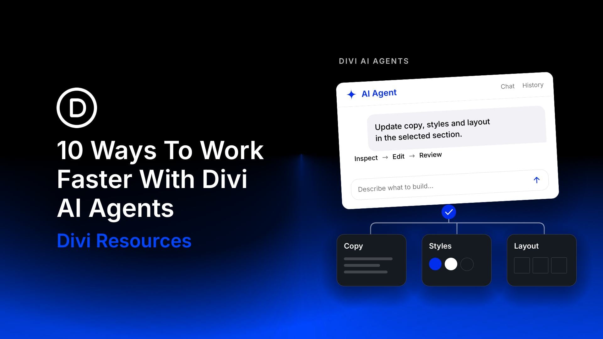
- The Divi AI Agent: Selected elements appear as scope chips above the message box. We can ask for an adjustment across those elements in one request.
- Moving And Grouping: Drag selected elements to a compatible destination. To wrap selected modules in a Group module, use Ctrl/Cmd+G; this grouping shortcut is for modules.
The Multi-Select and Bulk Editing documentation covers these additional workflows and their restrictions. Our example below concentrates on selection, shared settings, and actions we can inspect directly.
Download The Example Layout
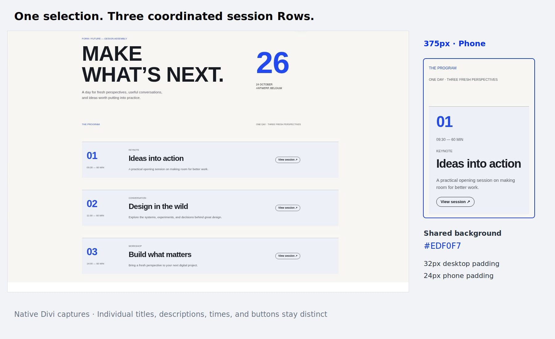
We’ll use a conference agenda with a typographic header and three session Rows. Each session contains its own number, time, title, description, and button. The starter gives the session Rows different backgrounds so we can see the Mixed state before applying a shared value. The download also includes the completed result for comparison.

Extract the ZIP before importing a layout. Use the starter JSON to follow the tutorial, or the result JSON to inspect the completed styling.
How To Use Multi-Select And Bulk Editing
1. Import The Starter Into A New Page
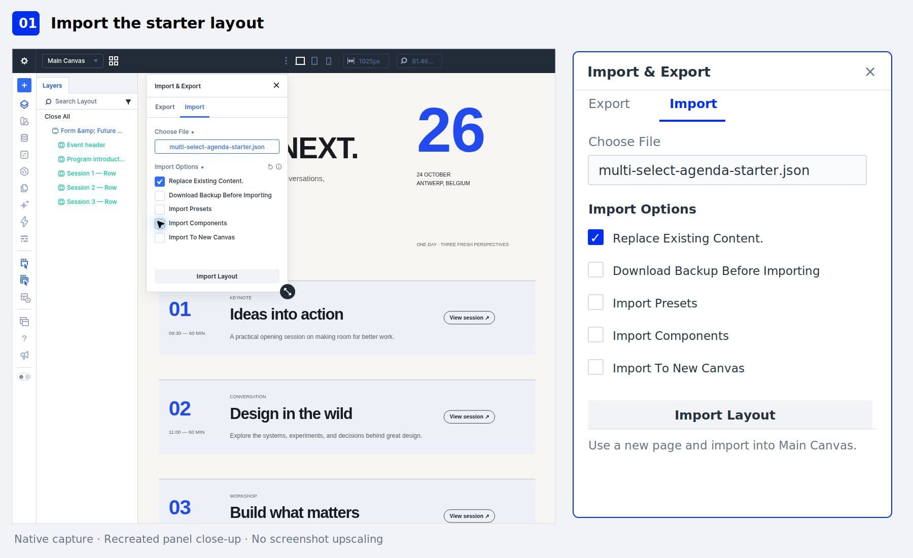
Create a new WordPress page and give it a title. In the page settings, choose the Blank Page template if you want the example to appear without the theme’s standard header and footer. Then, open the page with Divi. Open the Page Menu in the upper-left corner of the builder and select Import. Click Choose File and select the starter JSON from the extracted download.
On this new page, keep Replace Existing Content enabled. Leave Import Presets, Import Components, and Import To New Canvas disabled. This example uses ordinary Divi elements and doesn’t require those additional imports.
Click Import Layout and wait for the agenda to appear.
2. Select The First Session Row
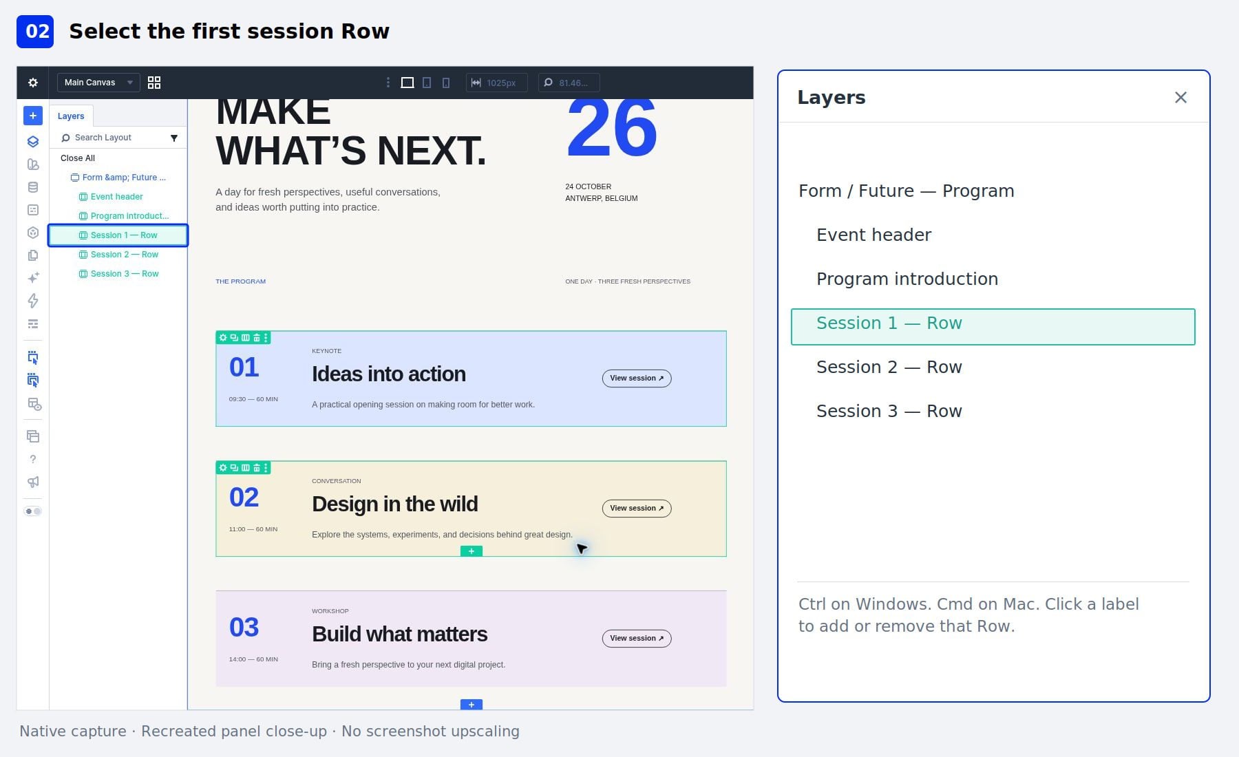
Open Layers from the builder’s left toolbar. Expand the agenda section using its disclosure arrow. Inside the section, locate the three layers named Session 1 — Row, Session 2 — Row, and Session 3 — Row. These are the repeated Rows we’ll edit.
Hold Ctrl on Windows or Cmd on Mac and click the Session 1 — Row label. Click the label rather than its disclosure arrow, which expands or collapses the Row’s children. The Row becomes selected, and its settings appear in the settings panel.
3. Add A Nonadjacent Row
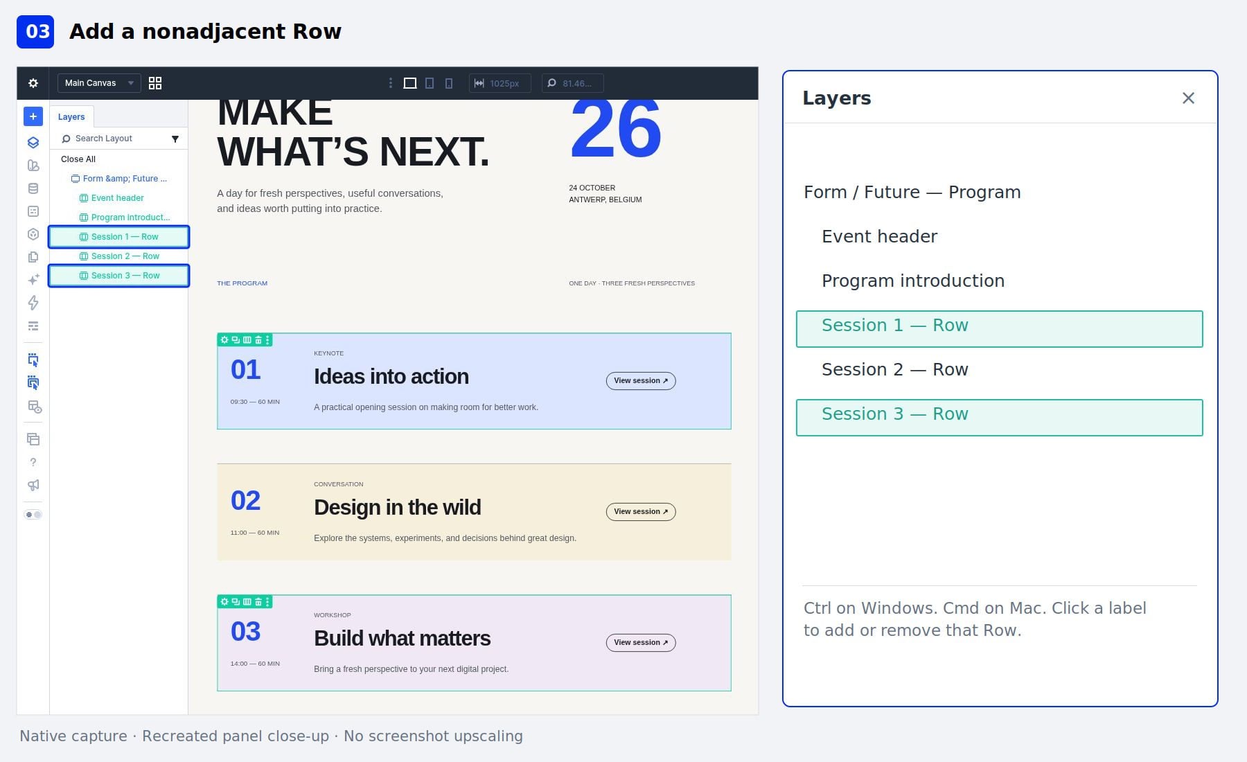
Keep the first session Row selected. Hold Ctrl/Cmd and click Session 3 — Row. The first and third Rows are now selected together, while the middle Row remains outside the selection. This is useful when we want to edit elements that aren’t next to each other.
To remove the third Row, hold Ctrl/Cmd and click its label again. Leave only the first session Row selected for the next step.
4. Select A Range And Inspect Mixed Values
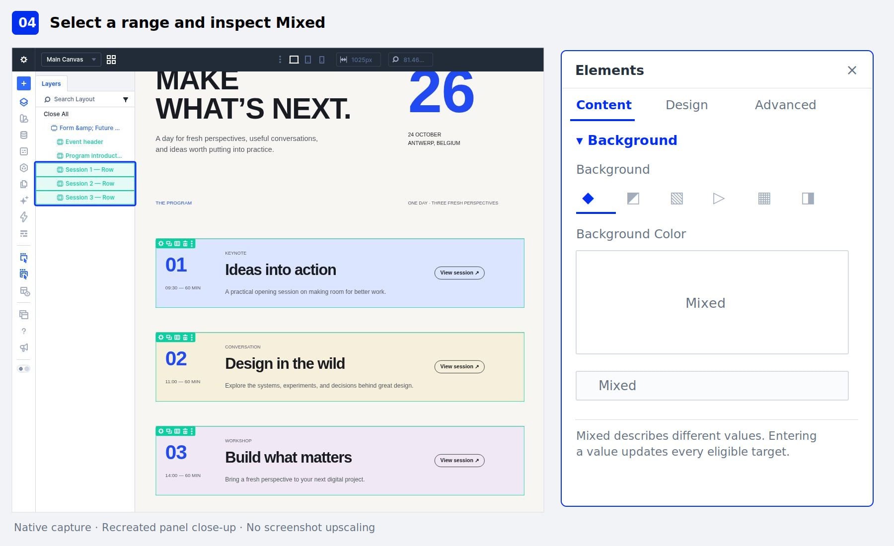
Clear the current selection with Ctrl/Cmd+D. Hold Ctrl/Cmd and click Session 1 — Row to start a fresh selection. Then, hold Shift and click Session 3 — Row. All three session Rows should now be selected. Shift-click includes the sibling Row between the starting element and the element we clicked.
In the settings panel, open Content > Background. Because the starter uses different session backgrounds, Background Color displays Mixed. Before changing a value, check the selection in Layers. The event header and program introduction should remain unselected.
5. Apply One Background Color
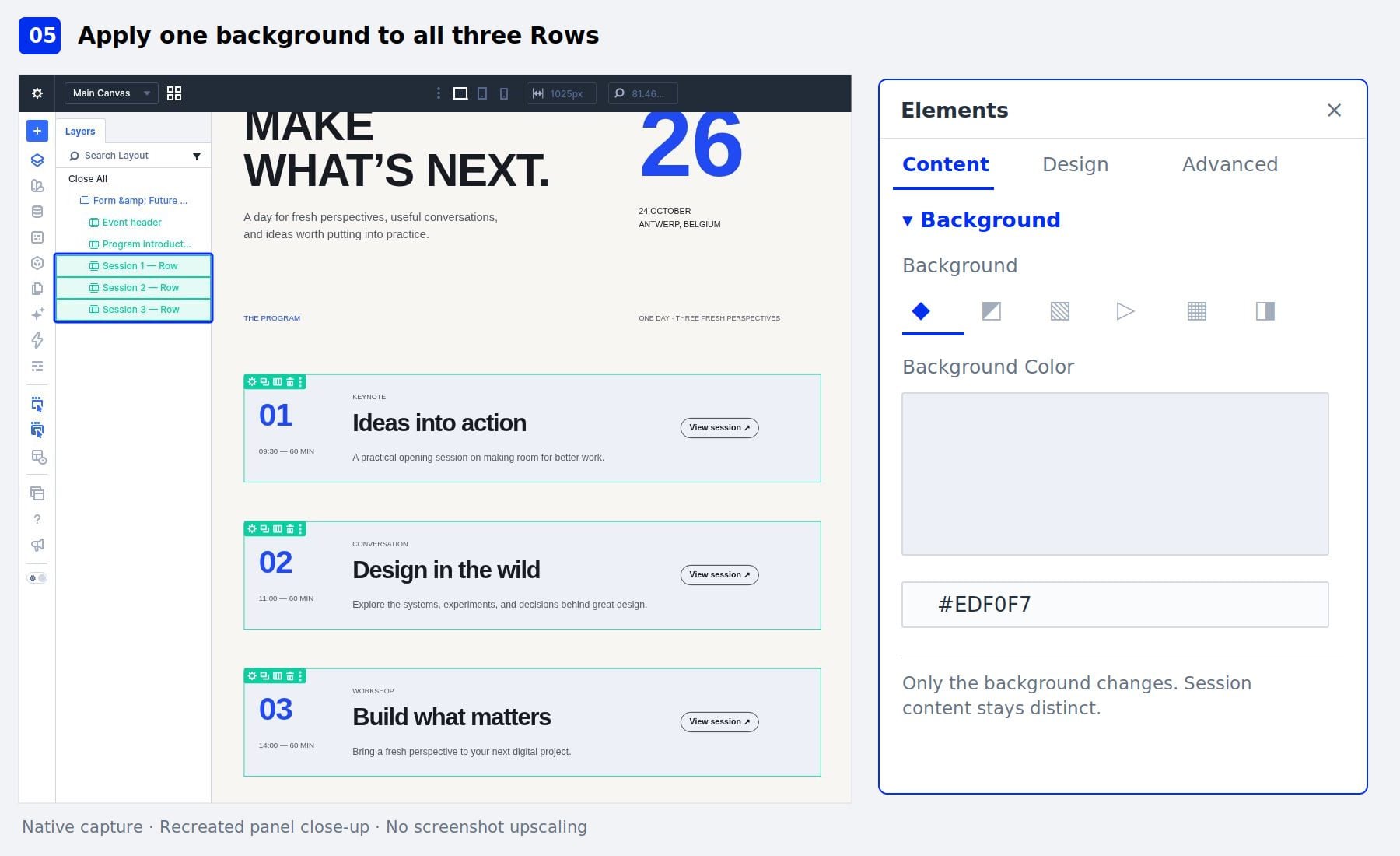
Keep all three session Rows selected. In Background Color, enter #EDF0F7. The three Rows receive the same background, and the control now displays the shared color instead of Mixed.
Check each session on the canvas. Its title, description, time, and button should retain their individual content. We changed the Row backgrounds, so the modules inside them keep their existing content.
6. Adjust The Rows’ Padding Together
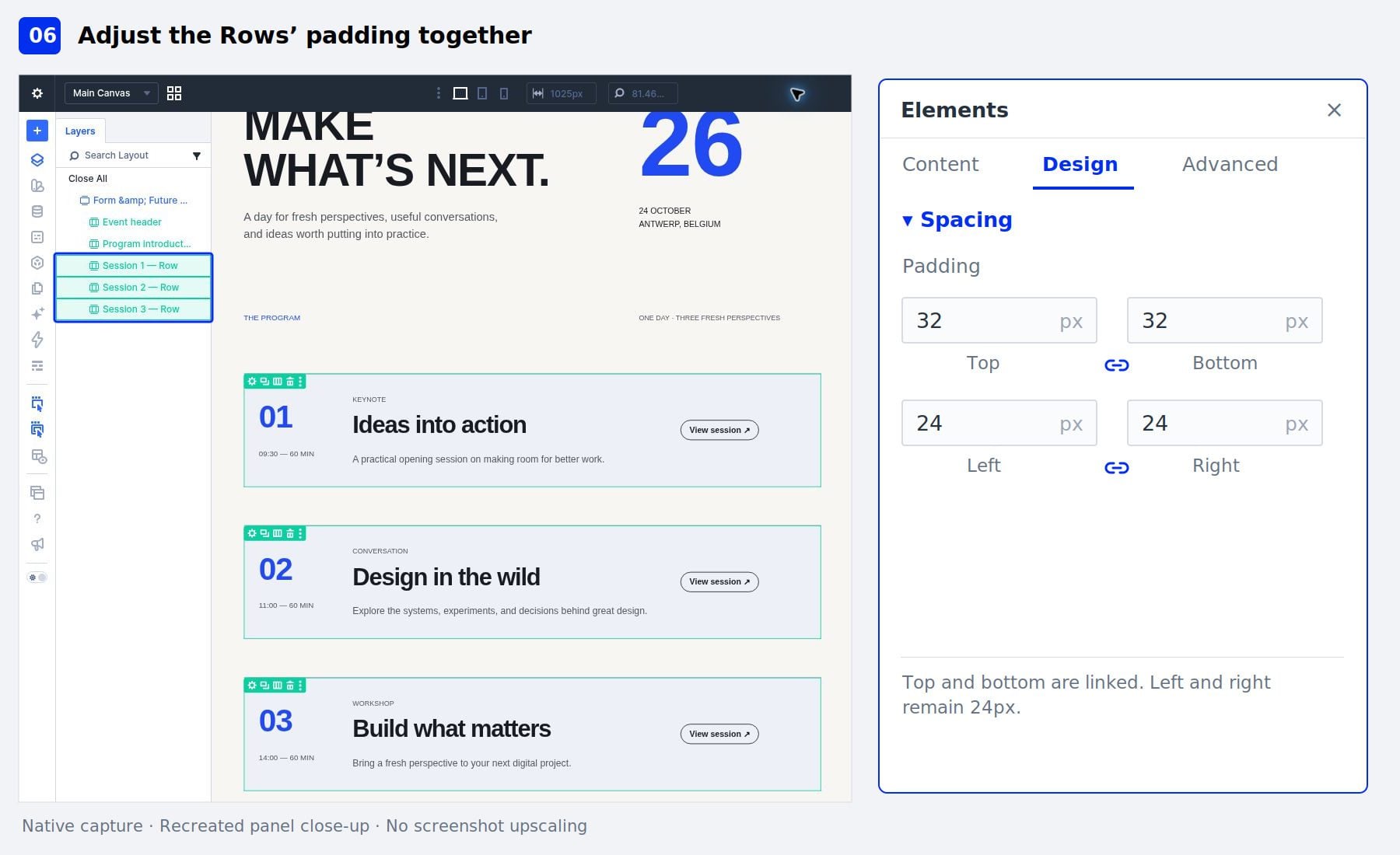
With the three Rows still selected, open Design > Spacing and locate Padding. The starter uses linked top and bottom padding. Check that the vertical link is enabled, then change the top padding to 32px. The linked bottom value should also become 32px.
Leave the left and right padding at 24px. Verify that all three session Rows receive the spacing change. If top and bottom aren’t linked, either enable the link before editing or enter the value in both fields.
7. Add Phone-Specific Padding
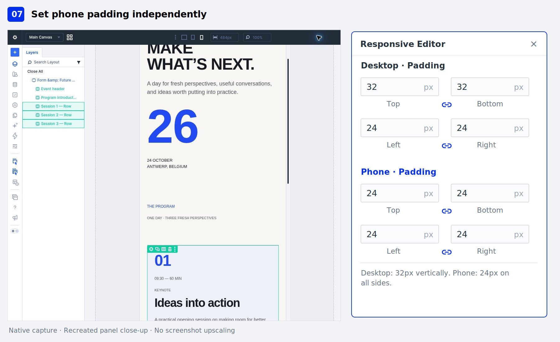
Keep the Rows selected. Hover over the Padding label to reveal its field controls, then click the responsive editing icon to open the Responsive Editor. Find the phone padding controls. You may need to scroll inside the Responsive Editor to reach them. Set the linked phone top and bottom padding to 24px. Keep the horizontal padding at 24px as well.
Close the Responsive Editor and return to the desktop preview. The desktop top and bottom padding should remain 32px, while the phone values use 24px.
8. Select Different Module Types Together
Next, we’ll explore a selection containing a Heading module and a Text module. Clear the Row selection with Ctrl/Cmd+D. On the canvas, hold Ctrl/Cmd and click the title module inside the first session. While holding the same modifier, click that session’s description Text module.
Check Layers to confirm that the Heading and Text modules are selected, rather than their containing Column or Row. Open the Design tab. The combined settings include groups relevant to the selected module types, along with shared controls such as Spacing.
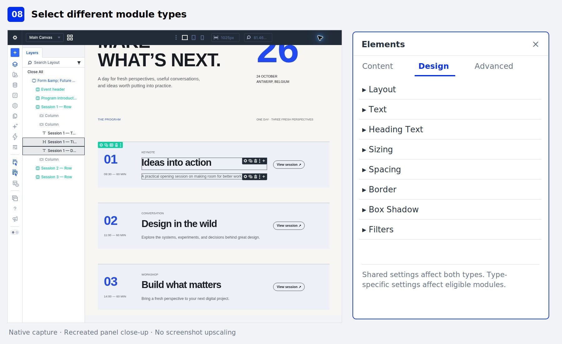
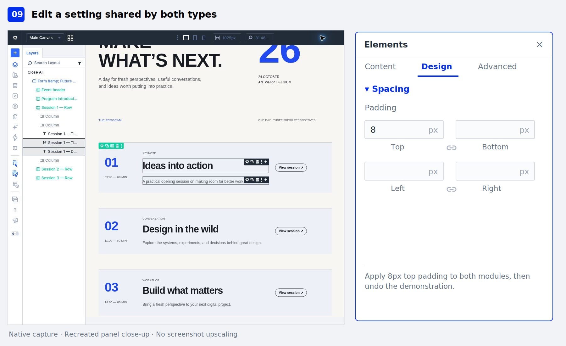
With the Heading and Text modules selected, open Design > Spacing. Enter 8px in the top padding field. Both modules should receive the padding because this setting applies to both selected module types.
This is a temporary spacing test. Click outside the field, then press Ctrl/Cmd+Z to undo it before continuing. Clicking outside the field returns the shortcut to the builder. When working with different module types, check which elements a field affects instead of assuming that every control applies to the whole selection.
10. Select The Elements In A Container
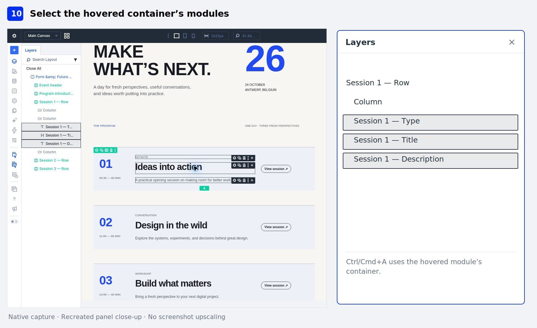
Clear the current selection with Ctrl/Cmd+D. Move the pointer over the first session’s title module on the canvas, then press Ctrl/Cmd+A.
In this example, the session type, title, and description become selected because they share the same Column. The shortcut uses the hovered module’s container; it doesn’t select every element on the page. Inspect the selected layers, then press Ctrl/Cmd+D to clear them before returning to the Row-level example.
In Layers, locate the three session Rows again. Collapse their children if necessary to make the Row labels easier to find. Ctrl/Cmd-click the first session Row, then Shift-click the third to select the range. Open Content > Background.
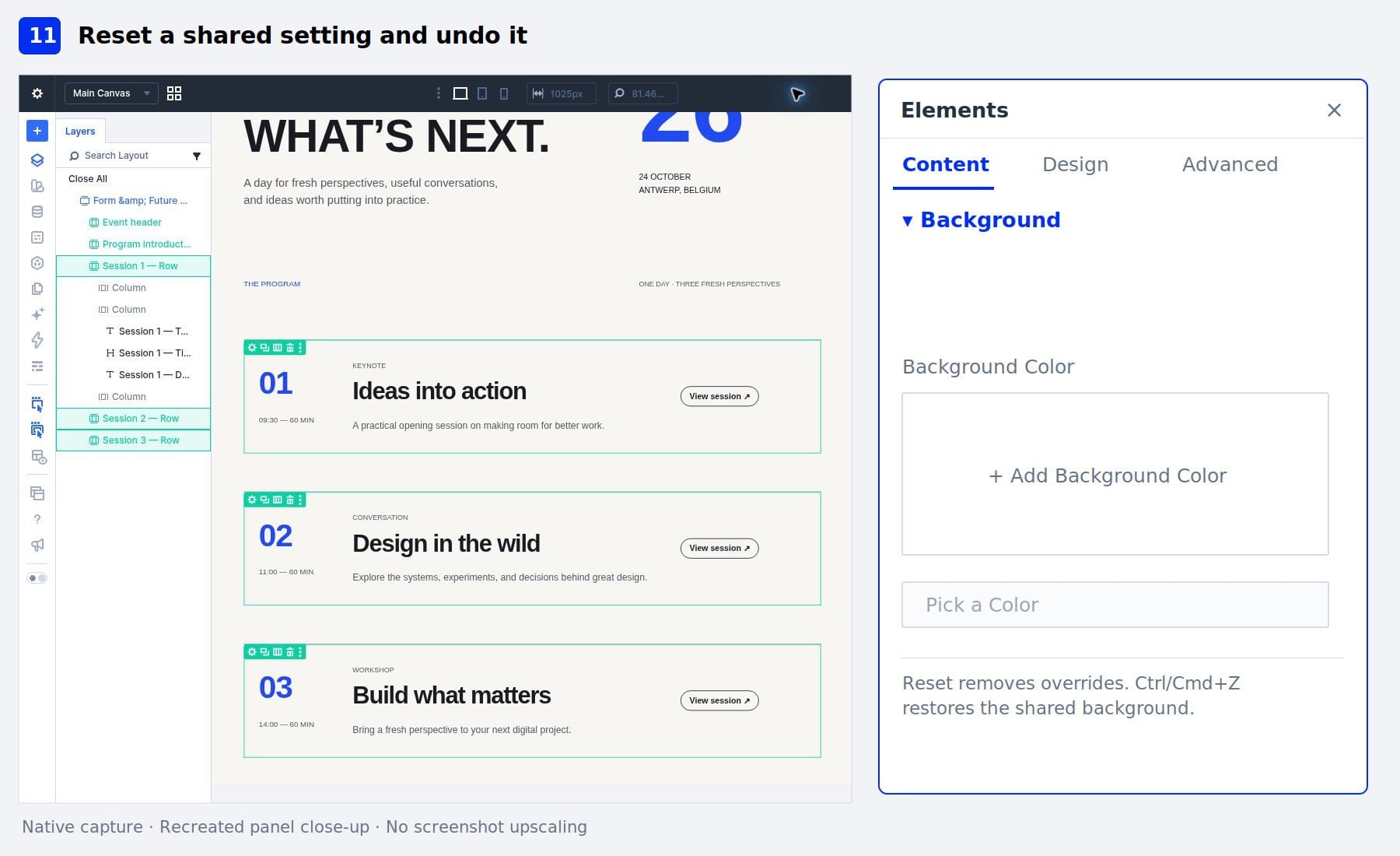
Hover over Background Color and click its reset control. The explicit background colors are removed from the selected Rows. Resetting a setting doesn’t mean returning to the different colors we had before the bulk edit. It removes the relevant overrides and allows the applicable defaults or inherited values to take effect. Press Ctrl/Cmd+Z to undo the reset and restore the shared background color.
12. Open Actions For The Selection
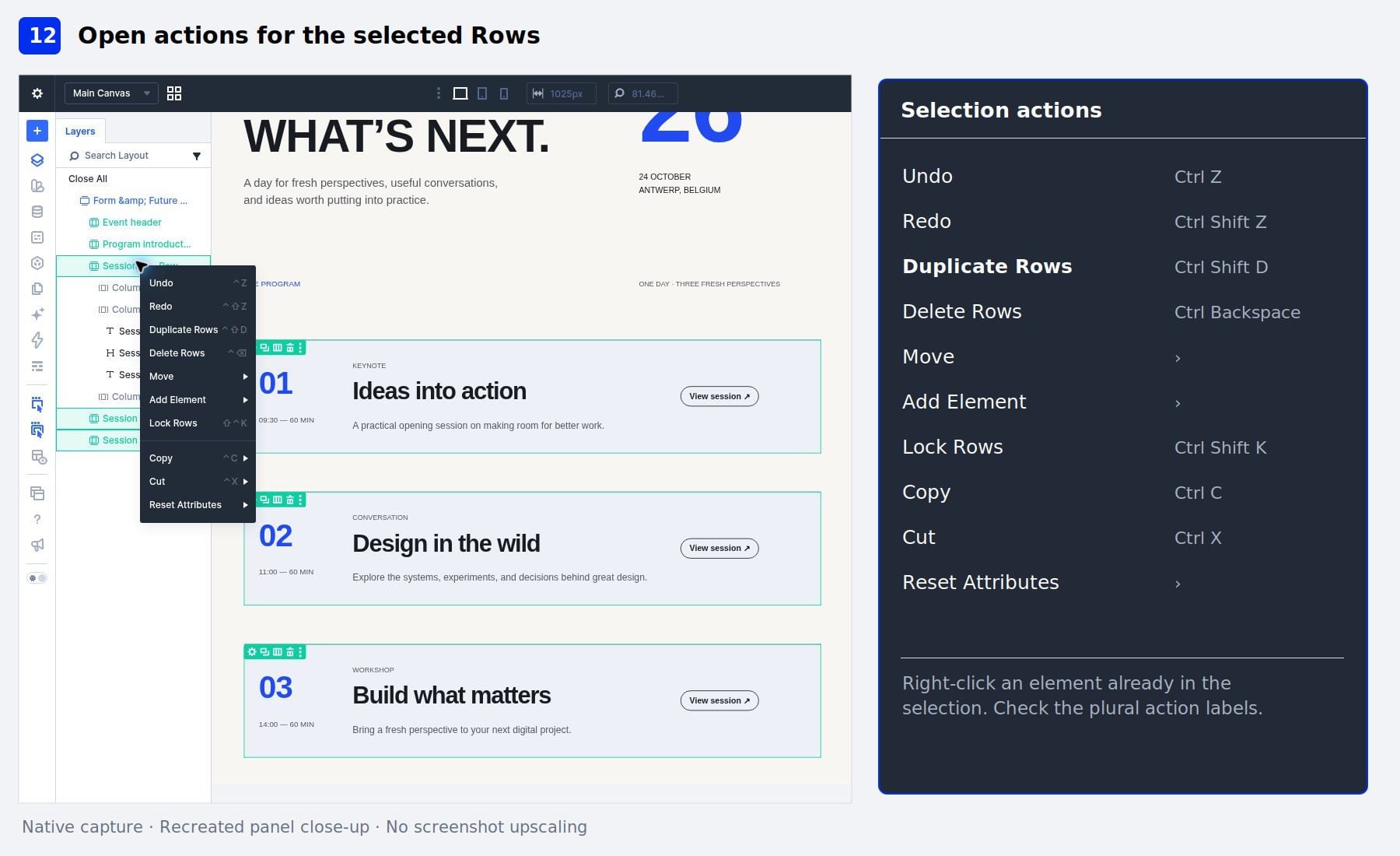
Keep the three session Rows selected. Right-click a Row that is already part of that selection. The context menu includes actions such as Duplicate Rows and Delete Rows. The plural labels help confirm that these actions target the selected Rows.
We can also move, lock, copy, or cut the selection when those actions are available. The elements and editing context determine which actions appear. Check the target before choosing an action. Right-clicking an element outside the selection can target that element instead.
13. Duplicate The Selected Rows Together
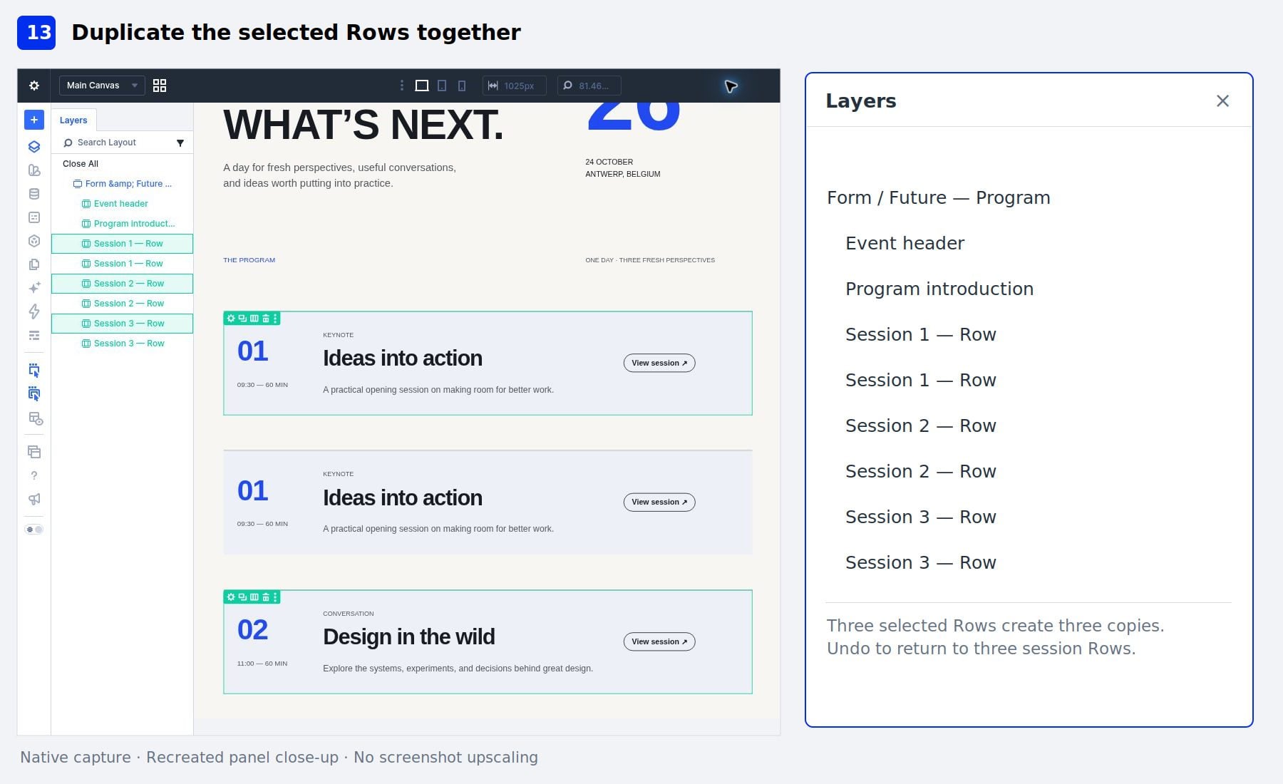
Choose Duplicate Rows from the selection’s context menu. Inspect Layers. Each selected session Row should have a copy, giving us six session Rows in total. The event header and program introduction remain separate.
Press Ctrl/Cmd+Z to undo the duplication. Confirm that the agenda contains the original three session Rows before saving. Using Undo here keeps the demonstration focused while allowing us to inspect the result of a structural action.
14. Save And Check The Responsive Result
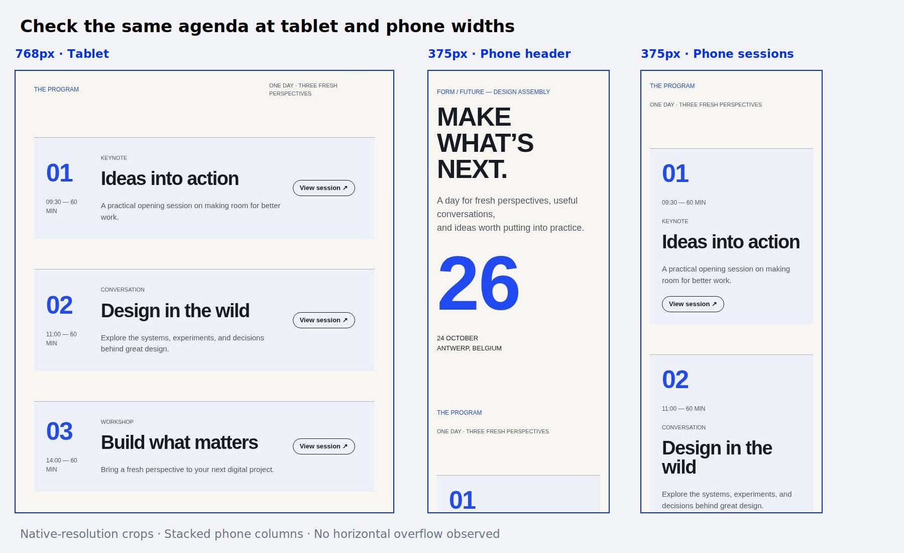
Clear the selection and save the page. Use the builder’s desktop, tablet, and phone preview controls to inspect the layout. For a narrower check, enter 768px for the tablet canvas width and 375px for the phone width.
On tablet, check that the session details and buttons remain readable without overlapping. On phone, confirm that the session columns stack, the titles wrap comfortably, and the buttons remain accessible beneath the content. Also check that the page doesn’t develop horizontal overflow. A bulk setting can affect several elements successfully while still requiring adjustments at smaller screen sizes.
What To Keep In Mind When Bulk Editing
Multi-Select makes repeated changes easier, but the selection still needs deliberate review before we apply a setting or action.
- Check the editing level. Selecting a Row changes the Row’s settings. Selecting a module targets that module. Layers helps distinguish nested elements.
- Mixed describes the current values. Choosing a new value replaces that setting across the eligible targets in the selection.
- Different module types have different controls. A shared control can affect several types, while a type-specific control applies only where supported.
- Responsive values have their own scope. Check the active breakpoint before editing, and inspect the result at other screen sizes.
- Reset and Undo serve different purposes. Reset removes overrides. Undo returns to an earlier editing state.
- Locks and permissions still apply. Locked elements are skipped by bulk edits, and a selection containing a locked element cannot be dragged.
- Not every option group shows Mixed values. Attributes, Interactions, and Conditions can reflect only one selected element. Edit these individually when their settings differ.
- Bulk editing doesn’t create ongoing synchronization. Use presets or Components when the goal is reusable styling or connected elements beyond the current selection.
For content changes, take particular care with fields that target multiple selected modules. We can keep each session’s wording distinct while adjusting its design, but changing a shared content field can replace the targeted content.
Make Your Next Divi Edit A Bulk Edit
Divi 5’s Multi-Select and Bulk Editing make repeated adjustments easier to manage. We can build a selection, inspect its values, update shared settings, and apply actions without repeating the same work on every element.
Try the starter layout, experiment with the selection methods, and check how each setting affects the selected elements. Once those controls become familiar, we can use the same workflow for repeated sections, Rows, and modules throughout our designs.







Leave A Reply