

Presets are useful on their own. You save a style, apply it to an element, and avoid rebuilding the same design by hand. But once a site grows, isolated presets are not enough. A button preset, a border preset, a spacing preset, and a color value may all be related, but if they are not connected, every design change still creates extra work.
That is where Divi 5’s multi-level preset system becomes important. Design Variables, Option Group Presets, Element Presets, Composable Settings, and Nested Option Presets can work together as connected layers.
Instead of saving disconnected styles, you can build a system where variables feed presets, smaller presets sit inside larger presets, and Element Presets bring those decisions together into reusable components. Stacking then lets you layer contextual variations without creating a separate preset for every possible use case.
In this guide, we’ll walk through how the system works, where Nested Option Presets fit, why Composable Settings matters, and how to build a preset structure that becomes easier to maintain as your site grows.
- 1 How Divi 5’s Multi-Level Preset System Works
- 2 The Behaviors That Make Presets Multi-Level
- 3 Why Preset Order Matters
-
4
How To Build A Multi-Level Preset System In Divi 5
- 4.1 Step 1: Define Your Design Variables
- 4.2 Step 2: Create Your Core Option Group Presets
- 4.3 Step 3: Use Composable Settings For Sub-Elements
- 4.4 Step 4: Apply Nested Option Presets
- 4.5 Step 5: Build Element Presets That Include Your Preset System
- 4.6 Step 6: Apply Stacked Presets For Variations
- 4.7 Step 7: Test The System With A Global Change
- 5 Managing Your System With The Preset Manager
- 6 Best Practices For A Multi-Level Preset System
- 7 Build A Preset System That Scales With Your Site
How Divi 5’s Multi-Level Preset System Works
Divi 5 presets started as a way to save and reuse styles. Now they can work more like a connected design system. The idea is simple: each layer should reference the layer below it.
A color, font, spacing value, or radius starts as a Design Variable. That variable gets used inside an Option Group Preset. That Option Group Preset can be used on its own, stacked with other Option Group Presets, nested inside another Option Group Preset, or included inside an Element Preset. The Element Preset then becomes a complete reusable component.
When the foundation changes, the connected layers can update with it.The newest piece of this system is Nested Option Presets. The name can sound like a separate preset type, but the idea is more specific than that: a Nested Option Preset is still an Option Group Preset at its core. It becomes “nested” when it is applied to an option group inside another option group or inside a module sub-element.
That matters because many important design decisions live below the top-level module. A Call To Action module has a button. A Blurb has an image and title. A Contact Form has fields and a submit button. With Composable Settings, those sub-elements can expose additional option groups such as Border, Background, Spacing, Sizing, Transform, or Animation. Once those nested option groups are available, they can use presets too.
This creates a real chain of reusable decisions. For example:
- Design Variable: Radius Large
- Option Group Preset: Border: Pill
- Option Group Preset: Button: Primary
- Nested Option Preset: Border: Pill applied inside the Button option group
- Element Preset: CTA: Promo Card
If the radius changes, you can update the variable or the Border preset once. Every connected Button preset, nested button border, and CTA preset can follow. That is the difference between saving styles and building a system.
The Main Layers In A Divi 5 Preset System
A strong Divi 5 preset system has three main layers. Composable Settings and Nested Option Presets extend how deeply those layers can reach.
1. Design Variables
Design Variables sit at the foundation. They store reusable raw values such as colors, fonts, numbers, text, links, and images. Examples include:
- Primary Color
- Heading Text Color
- Body Font
- Spacing Medium
- Radius Large
- Shadow Blur
Variables should describe the role of a value, not only the value itself. A variable called Primary Color still makes sense if the brand color changes later. A variable named after a hex code does not.
Variables are the least visible part of the system, but they carry the most weight. If your presets use variables instead of hardcoded values, global updates become much easier.
2. Option Group Presets
Option Group Presets save one group of settings, such as Border, Box Shadow, Spacing, Background, Text, Button, Sizing, or Image.
They are more flexible than Element Presets because they are not tied to one module type. A Border preset can be applied to any element that exposes the Border option group. A Spacing preset can be reused across Sections, Rows, Columns, Groups, and modules where that option group is available.
Option Group Presets can also be stacked. That means you can apply more than one preset to the same option group when you need a base style plus a contextual variation. With Nested Option Presets, an Option Group Preset can also contain another Option Group Preset. That is what gives this layer more depth than a simple saved setting.
3. Element Presets
Element Presets save the full design of a specific module or element type. A Button Element Preset applies to Button modules. A Blurb Element Preset applies to Blurbs. A Contact Form Element Preset applies to Contact Forms. Each Element Preset can include multiple Option Group Presets inside it, so the full component still stays connected to smaller reusable decisions.
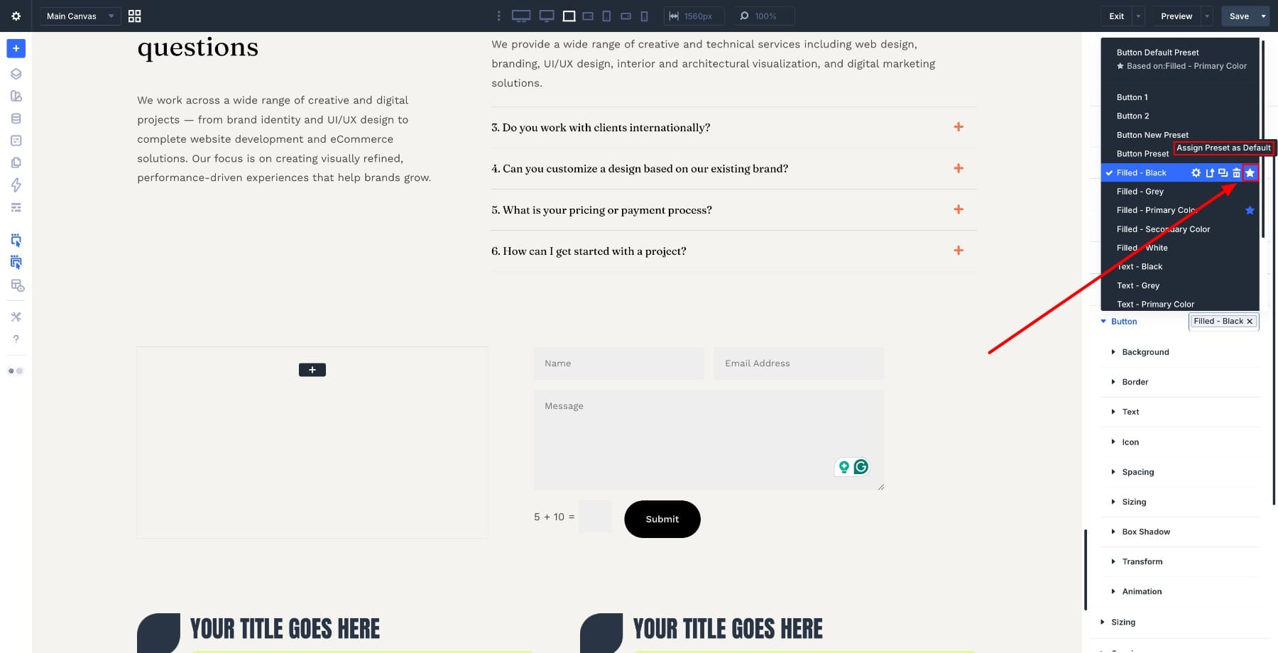
Element Presets can also be stacked. This is useful when a module needs a base component style plus one or more contextual variations.
Element Presets are also where defaults become useful. Every module type can have a default preset. When a default is assigned, new instances of that module start with the preset styling already applied. That means a new Button, Blurb, Form, or Group can arrive closer to your design system without manual styling every time.
The Behaviors That Make Presets Multi-Level
The layers matter, but the system becomes powerful because of how those layers behave together. Four behaviors do most of the work: Nesting, Stacking, Composable Settings, and Nested Option Presets.
1. Nested Presets
Nested Presets let one preset live inside another preset while staying connected to its original source. For example, a Button Element Preset might include:
- Text: Button Label
- Spacing: Button Padding
- Border: Pill
- Box Shadow: Subtle
Each of those smaller Option Group Presets can still be edited from its own source. If you update Border: Pill, every Button preset using that border can update with it.
2. Stacked Presets
Stacked Presets let you apply more than one preset to the same element or option group. This helps you avoid creating too many variations. Instead of building separate presets for every possible context, you can keep one base preset and layer focused variations on top.
For example, a Text module might use:
- Text: Body Base
- Text: Tag
- Text: Light
The base preset controls the main typography. The tag preset adds the label treatment. The light preset changes the text color for a dark section. Stacking keeps your preset library smaller. You can reuse one base style and apply only the contextual difference when needed.
3. Composable Settings
Composable Settings lets you enable additional design option groups for module sub-elements.
This is important because many modules are made of smaller parts. A Blurb has an image, title, and body text. A Call To Action has a button. A Contact Form has fields. Without Composable Settings, some of those smaller parts may not expose the design controls you need.
With Composable Settings, you can toggle on additional option groups for those sub-elements. For example, you can enable:
- Border for a Blurb image
- Sizing for a CTA button
- Background for body text
- Transform for an icon
- Animation for a nested image
Composable Settings can also be used inside presets. If you enable specific nested option groups inside a preset, those groups can appear automatically when that preset is used. That keeps the design panel cleaner while still giving reusable access to deeper styling controls.
4. Nested Option Presets
Nested Option Presets are where Composable Settings and presets meet. After Composable Settings exposes a nested option group, that option group can use a preset. For example, if you enable Border controls for a CTA button sub-element, you can apply the same Border: Pill preset you use elsewhere.
This is the key distinction: a Nested Option Preset is not a random extra layer floating outside the system. It is an Option Group Preset being used inside a nested option group. That means the same reusable decision can reach more places.
Why Preset Order Matters
A multi-level preset system works best when it is built from the bottom up:
- Step 1: Define Design Variables.
- Step 2: Create core Option Group Presets that use those variables.
- Step 3: Enable Composable Settings where sub-elements need reusable controls.
- Step 4: Apply Nested Option Presets to those nested option groups.
- Step 5: Build Element Presets that include your Option Group Presets and Nested Option Presets.
- Step 6: Use stacking for contextual variations.
- Step 7: Test the system with global changes.
This order keeps the system connected. If you skip the foundation, your presets may still save time, but they will not update as cleanly later.
How To Build A Multi-Level Preset System In Divi 5
Now let’s walk through the process from the foundation up.
Step 1: Define Your Design Variables
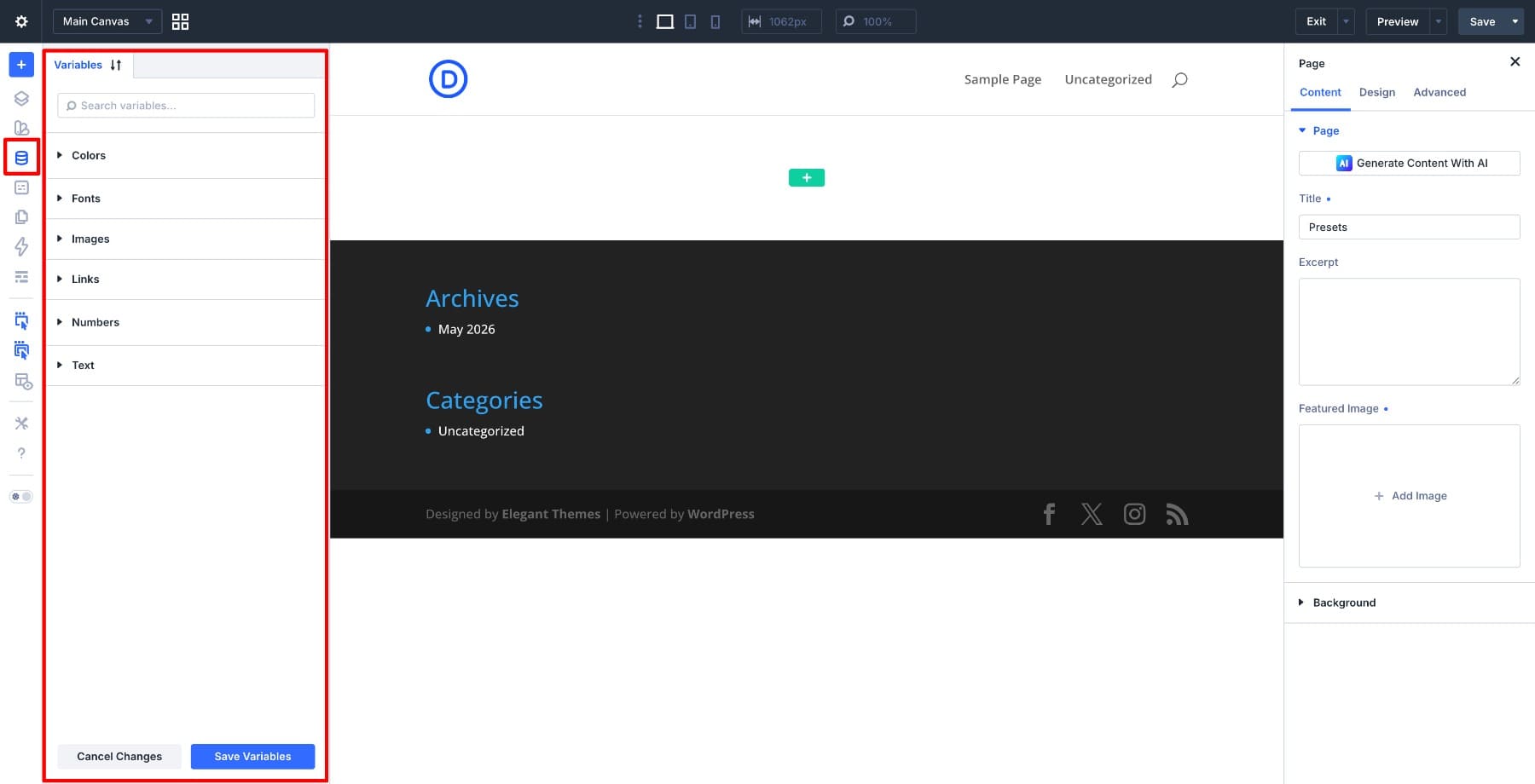
Open the Variable Manager from the left sidebar of the Visual Builder. This is where your reusable values live. Divi supports variable types such as Colors, Fonts, Numbers, Images, Text, and Links.
Start with role-based color variables. Divi includes default colors such as Primary, Secondary, Body, Heading, and Link. Update those values to match your brand before creating extra variables.
If the design needs more colors, add them with names that describe their role. Examples include:
- Accent
- Surface
- Muted Text
- Border Light
- Success
- Warning
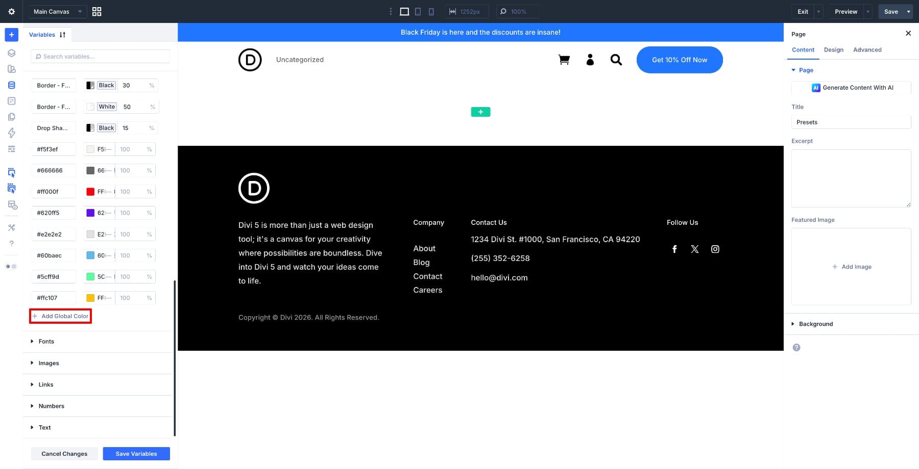
Then define the values you know will repeat across the site. Under Fonts, set your Heading and Body fonts. Under Numbers, add spacing values, radius values, widths, and other reusable measurements. Keep this list focused. Variables are most useful when they represent values you will use repeatedly across presets.
The goal is to create a reliable source of truth before building presets on top of it.
Step 2: Create Your Core Option Group Presets
After variables are in place, create the Option Group Presets you will reuse most often. These may include:
- Text: Heading Large
- Text: Body Regular
- Button: Primary Filled
- Button: Secondary Outline
- Spacing: Section Large
- Spacing: Card Padding
- Border: Card
- Border: Pill
- Shadow: Subtle
- Background: Surface
To create an Option Group Preset, open an element in the Visual Builder and go to the Design tab. Find the option group you want to save, hover over its label, and click the preset icon. Choose Add New Preset if you want to build it from scratch, or New Preset From Current Styles if the current element already has the style you want to save.
The important part is how you set the values. When a field should stay global, reference a Design Variable instead of typing a static value. For example, a heading preset might use a Font Variable, a Number Variable for size, and a Color Variable for text color.
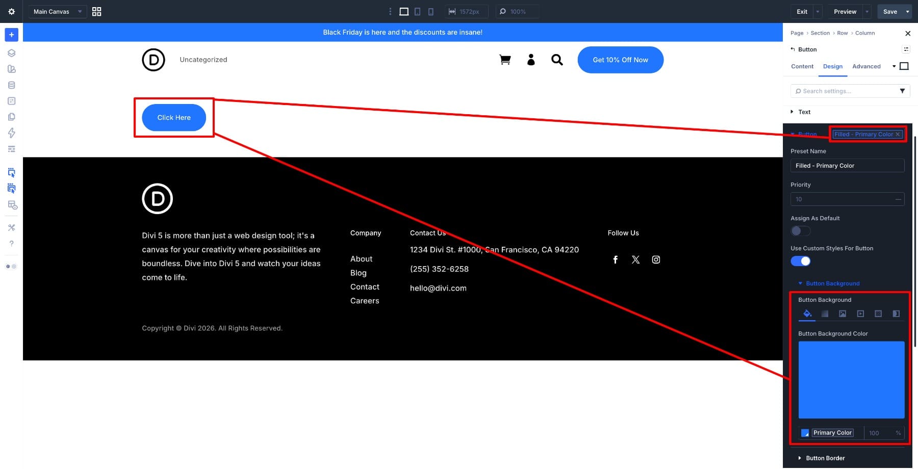
A Button preset might use the Primary Color variable for its background.
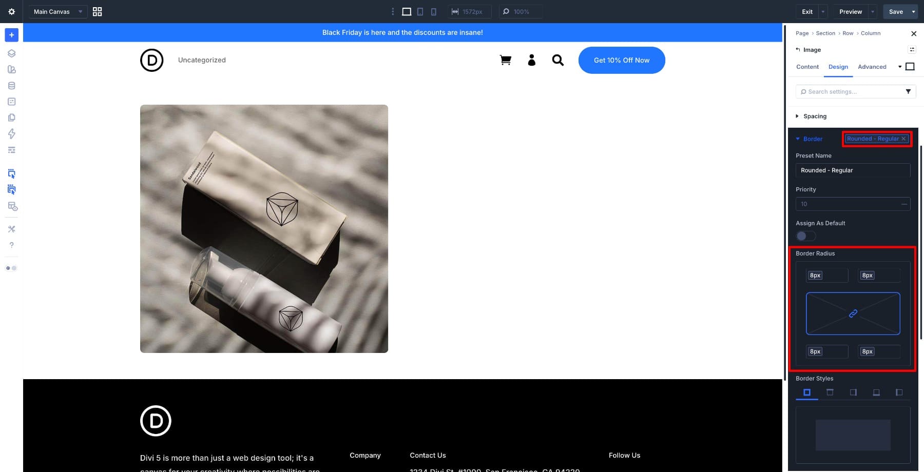
A Border preset might use a Number Variable for radius.
This is what makes the system maintainable. The Option Group Preset does not just store a value; it stores a connected decision.
Step 3: Use Composable Settings For Sub-Elements
Next, decide which module sub-elements need deeper styling controls.
For example, inside a Blurb module, you may want more control over the image, title, icon, or body text. Inside a Call To Action module, you may want to style the nested button with the same presets you use on standalone buttons. Inside a Contact Form, you may want field borders, spacing, or focus styles to follow the same system as the rest of the site.
Composable Settings lets you expose those additional option groups. To use it, open a module, go to the Design tab, hover over the sub-element option group, and click the Toggle Options icon. Then enable the option groups that sub-element needs. For example:
- Enable Border for a CTA button.
- Enable Sizing for a Blurb image.
- Enable Spacing for a nested title.
- Enable Background for a form field group.
- Enable Transform or Animation for a visual sub-element.
Only enable the option groups you actually need. The point is not to make every sub-element show every possible setting. The point is to expose the controls that should participate in your design system.
Step 4: Apply Nested Option Presets
Once Composable Settings exposes a nested option group, apply your existing Option Group Presets to it. For example:
- Apply Border: Pill to a nested CTA button.
- Apply Border: Card to a Blurb image.
- Apply Spacing: Compact to a sub-element container.
- Apply Text: Heading Small to a nested title.
At that point, those presets function as Nested Option Presets because they are being used inside nested option groups.
This keeps sub-element styling connected to the same system as the rest of your site. A border preset can control a standalone Button, a nested CTA button, and a form field border. A spacing preset can control a module wrapper and a nested sub-element. The reusable decision stays in one place.
Step 5: Build Element Presets That Include Your Preset System
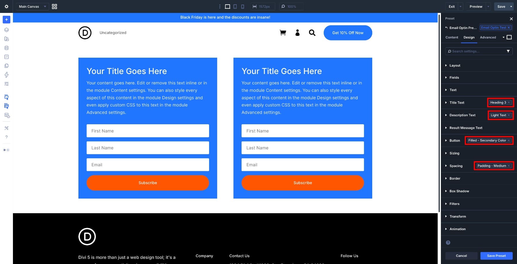
Once the core Option Group Presets and Nested Option Presets are ready, use them inside Element Presets. Element Presets turn smaller styling decisions into complete reusable components. For example, an Email Opt-In module might use:
- Spacing: Card Padding
- Background: Surface
- Text: Heading Medium
- Text: Body Regular
- Button: Primary Filled
- Border: Card
- Shadow: Subtle
Open the module, apply the relevant Option Group Presets across its Design tab, enable any needed Composable Settings for sub-elements, apply Nested Option Presets where needed, then save the module as an Element Preset from the preset menu in the top-right corner of the settings panel.
Choose New Preset From Current Styles.
The Element Preset now carries those smaller preset decisions with it.
A Blurb Element Preset follows the same logic. Apply the right Title Text preset, Body Text preset, Spacing preset, Border preset, and any nested presets needed for the image or title, then save the Blurb as an Element Preset.
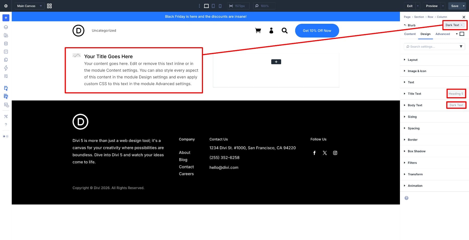
When you edit one of the nested Option Group Presets later, every Element Preset using it can reflect that change.
The same approach works for Contact Forms, Call To Action modules, Pricing Tables, Groups, Images, and any other module you use often.
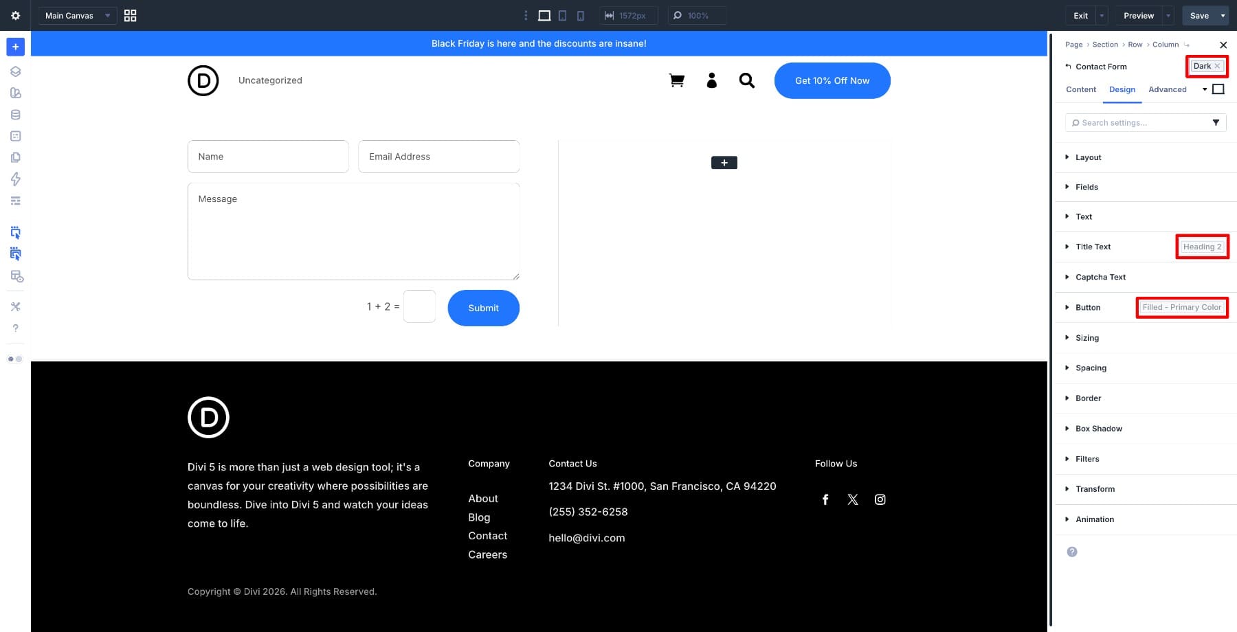
After your core Element Presets are ready, open the Preset Manager and set defaults for the module types you use most. That way, every new instance starts closer to your system.
Step 6: Apply Stacked Presets For Variations
Not every design variation needs its own full Element Preset. A better approach is to create a base preset, then stack smaller presets on top when the context changes.
For example, a Text module could start with a base text preset. Then you could stack a tag-style preset and a dark-section color preset when needed.
Use stacking for focused variations such as:
- Light text on dark backgrounds
- Larger spacing in hero sections
- Compact spacing in sidebars
- Accent borders on featured cards
- Alternative button sizes
- Special hover treatments
Stacked presets help you avoid creating a bloated library of nearly identical styles. The base preset stays shared, while the variation handles only the difference.
Use the same logic with Option Group Presets. If a base Button preset handles the main button style, a second Button preset can layer on a size variation, a dark-section variation, or a hover treatment. If those presets overlap, the later preset controls the overlapping value.
Step 7: Test The System With A Global Change
After the system is built, test it. Open the Variable Manager and change a value that multiple presets reference. For example, change the Primary Color, a spacing value, or a radius value.
Then review your page. Elements using presets connected to that variable should update. You can also test at the preset level. Edit a core Option Group Preset, such as Border: Card or Button: Primary Filled, and check where that change appears.
If something does not update, that usually means one of three things:
- The value was hardcoded instead of connected to a variable.
- The element is not using the expected preset.
- A local override is taking priority over the preset value.
That is not a failure. It is an audit. It shows where the system still has gaps.
Managing Your System With The Preset Manager
The Preset Manager is the central place to manage your preset system.
Open it from the left sidebar of the Visual Builder. From there, you can create, edit, duplicate, reorder, delete, import, export, and assign default presets without opening each module one by one.
When editing a preset used across many elements, use the Preset Preview panel. It gives you a safer place to adjust the preset before saving changes that may affect the site globally. The Preset Manager is also useful for keeping your library clean. Remove presets you no longer use, duplicate presets when you need a controlled variation, and reorder important presets so they are easier to find.
Export Variables And Presets For Future Projects
Once your system is complete, export it so you can reuse it on future builds. Design Variables and Presets can be exported from their respective managers. The Variable Manager exports your variables, while the Preset Manager exports your presets. Together, those files carry the reusable foundation of your design system into another Divi 5 site.
This is especially useful for agencies, freelancers, and teams that want every new build to start from the same design foundation, rather than rebuilding variables and presets from scratch.
Best Practices For A Multi-Level Preset System
A preset system should make design work easier, not harder to manage. Keep the structure clear from the beginning.
- Name by role: Use names like Primary Color, Border: Card, and Button: Primary Filled instead of names tied to one page.
- Build from the bottom up: Start with variables, then Option Group Presets, then Element Presets, then layouts.
- Keep presets focused: One preset should have a clear job. Avoid creating several presets that only differ by one hardcoded value.
- Use stacking for context: Stack small variation presets instead of creating a new full preset for every context.
- Use nesting for structure: Let smaller Option Group Presets feed larger Option Group Presets and Element Presets.
- Use Composable Settings intentionally: Expose sub-element option groups when they need to participate in the design system.
- Treat Nested Option Presets as connected OGPs: Use them to bring the same preset decisions into nested option groups instead of styling sub-elements by hand.
- Set defaults for repeated modules: Default presets reduce manual styling when adding new modules.
- Audit local overrides: Use overrides when needed, but avoid turning them into hidden one-off design systems.
- Export your system: Save variables and presets so your design foundation can travel to future projects.
Build A Preset System That Scales With Your Site
The real value of Divi 5’s multi-level preset system is not just speed. It is consistency.
Variables define the values. Option Group Presets turn those values into reusable design decisions. Nested Option Presets bring those same decisions into nested option groups. Element Presets turn connected decisions into complete components. Stacked Presets handle context without bloating the library. Composable Settings lets deeper module parts join the same workflow.
When those layers are connected, your site becomes easier to update because the system knows where each decision lives. That means a color change, spacing adjustment, border update, or button refresh can move through the design from one source instead of becoming a module-by-module cleanup job. Build the system once, keep it organized, and every page after that becomes easier to design, update, and maintain.




This is what I have been waiting for to start efficiently with Divi 5 using the Great Design System 👏👍
From my Point of view this Information is absolutely necessary to start with Divi 5. No expensive additional Software.