
Divi 5 continues to add features that make it easier to design right inside the builder. The Group Carousel Module is one of them. It lets you build swipeable carousels that slide smoothly into your layouts.
You can use it to showcase products, highlight testimonials, or even create a fullscreen hero slider. In this tutorial, we’ll walk you through the step-by-step process of creating a product carousel.
What Is The Group Carousel Module?
The Group Carousel Module is a container in Divi 5 that lets you line up multiple modules side by side and scroll them horizontally. Instead of stacking everything in a static grid or a long list, you can create a row of content that visitors can swipe or click through at their own pace.
Think of it as a flexible frame made up of three core parts:
- Group Carousel: The parent container that controls how the scroll works and holds everything inside.
- Child Items (Groups): The actual content in each slide, such as product cards, testimonials, images, or any other module you want to showcase.
- Navigation: The controls that let people move through the carousel, like arrows, dots, or autoplay.
What makes this different from a grid or a slider is that you’re not limited to one type of content. A carousel can carry anything you drop inside: a single image, a full product card with price and button, or even a testimonial module with styled text.
For example, if you’re building a shop page, you can place product cards inside the Group Carousel. Each card can show a product image, name, price, and a button. The carousel then scrolls smoothly through them, giving you a row of products that feels interactive.
You can also fine-tune your Group Carousel based on how many slides appear on different responsive breakpoints. So, a common setup can be five slides on desktop, three on tablet, and one on mobile. That way, the carousel always adapts to the screen size without breaking your design.
How It Works
When you add content to a row in the Divi Builder, the Group Carousel appears as one of the modules.
Click to add it, and you’ll see its customization options.
From here, you set how the carousel behaves, things like automatic rotation, how many slides appear at once, or whether the slides move one by one or in groups.
In the Design tab, you’ll see the Groups and Active Groups options among others:
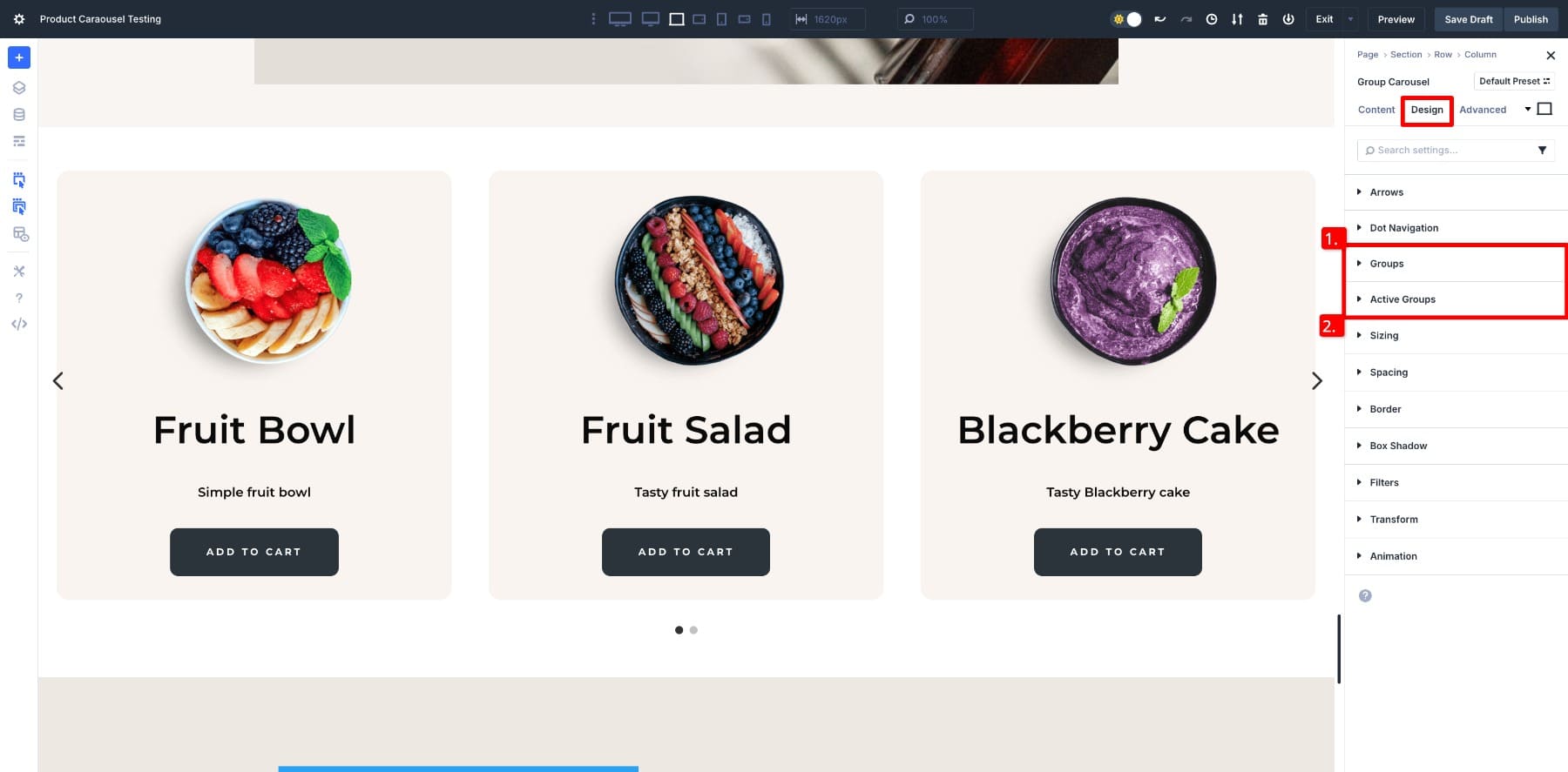
- Active Groups are the slides currently in view (or the center slides). These can be styled differently to draw attention.
- Groups allow you to customize the shared styling for all carousel items, covering aspects such as spacing, alignment, and fonts.
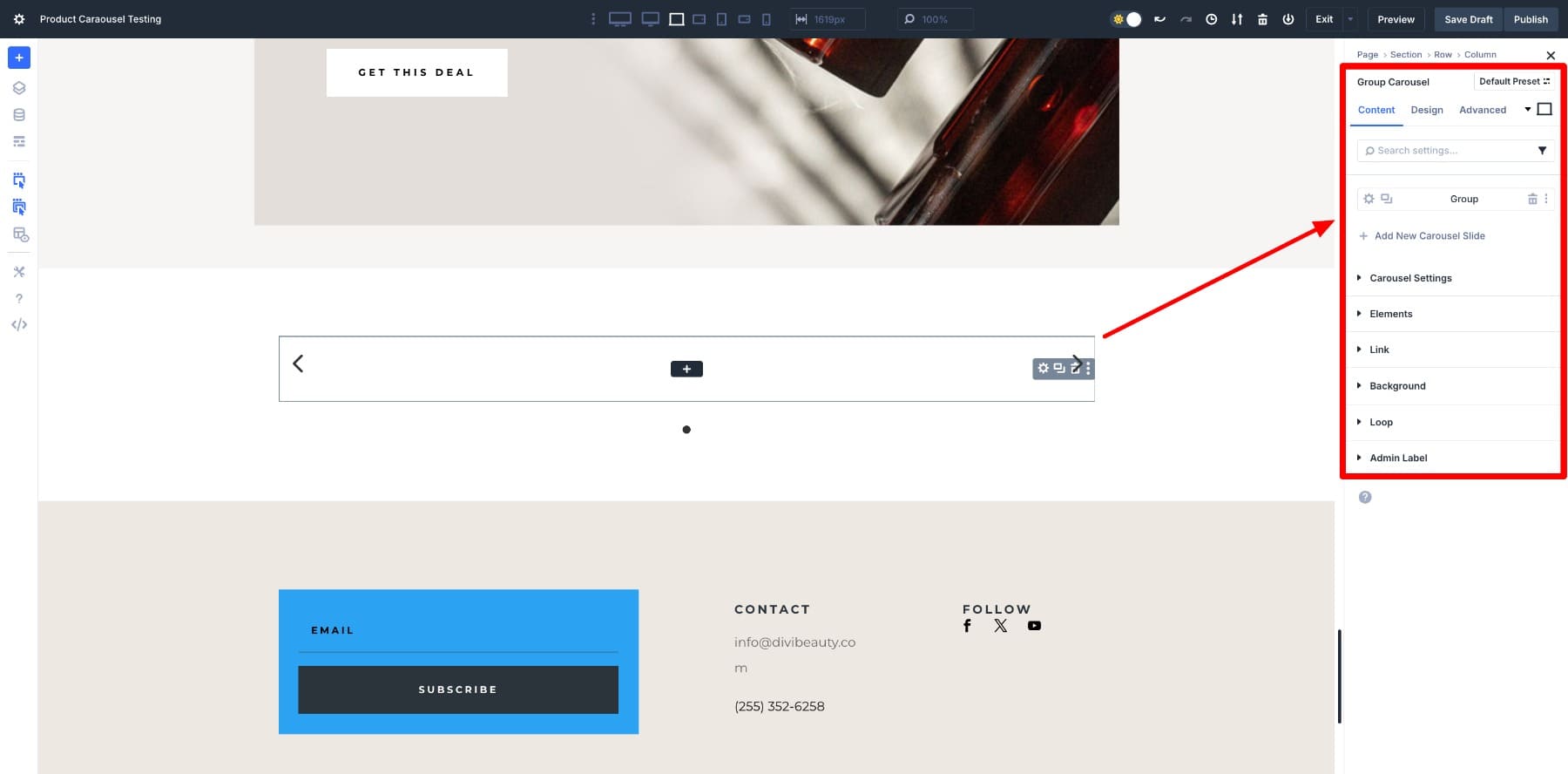
Finally, you drop in any modules you want inside the Group and watch them flow into a carousel.
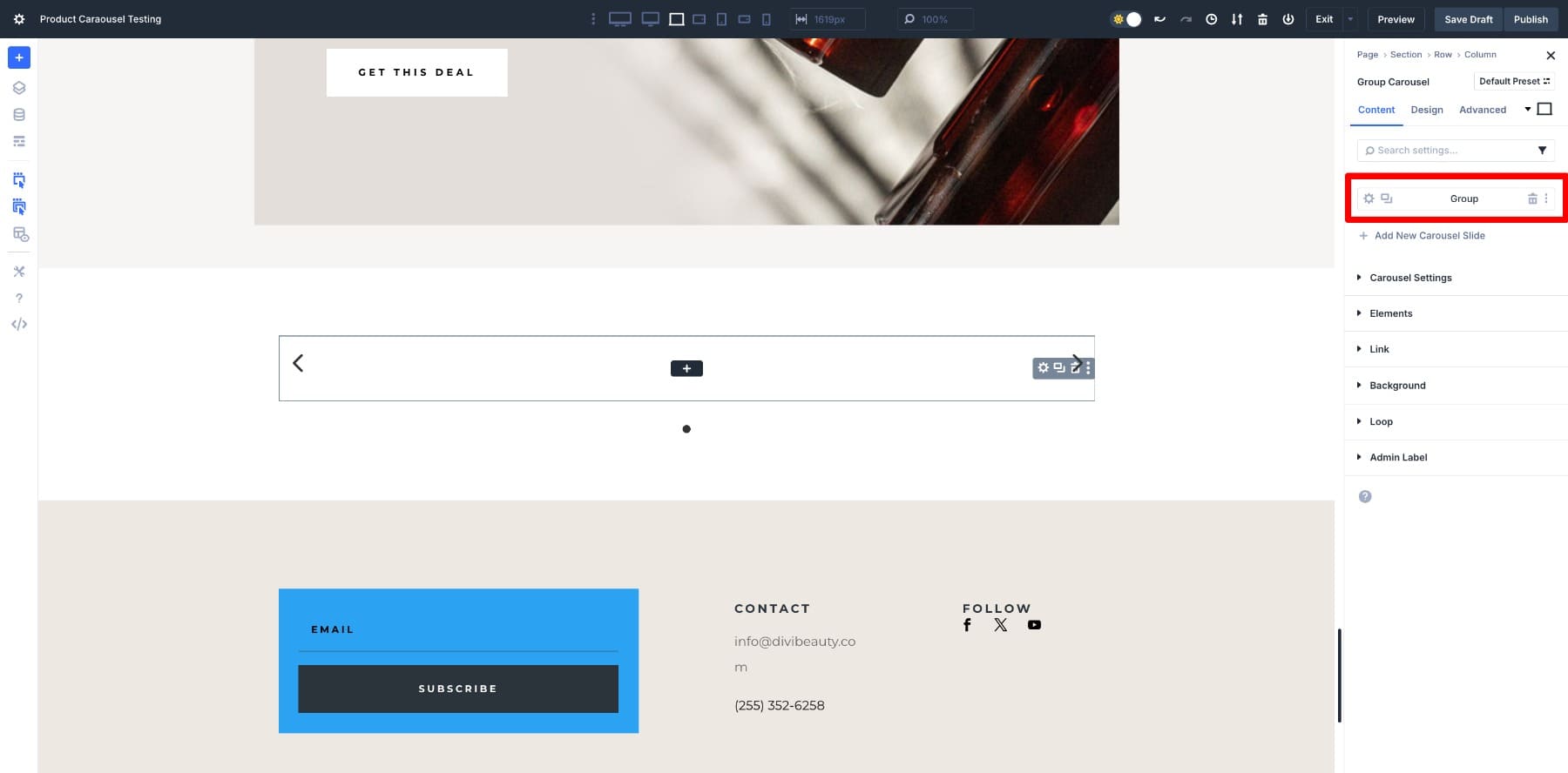
After you add groups to your carousel, you can click on the settings (gear) option to customize its content and design.
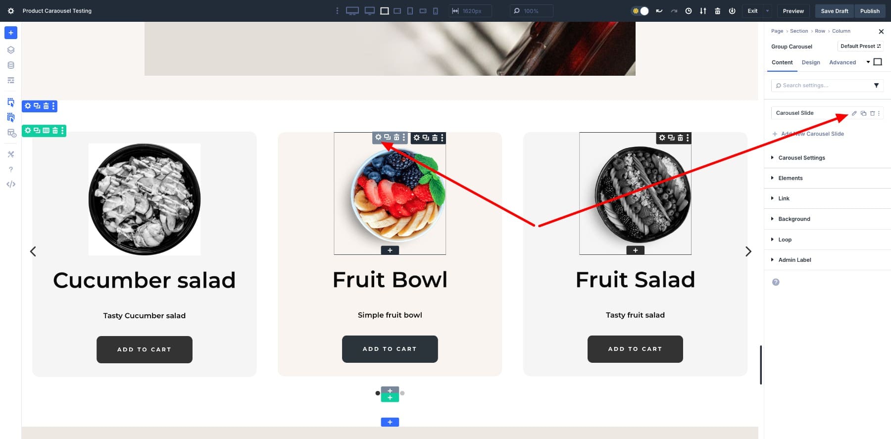
Each Group can then be customized through its own settings, just like any other Divi module, so you have full control over design and content.
Learn Everything About Divi 5’s Group Carousel Module
Using The Group Carousel Module With Divi 5’s Loop Builder
The Group Carousel Module can hold any modules you drop inside, which means you could hand-build each product card if you wanted full control. However, for a shop with dozens of items, that quickly becomes extra work.
That’s where the Loop function comes in.
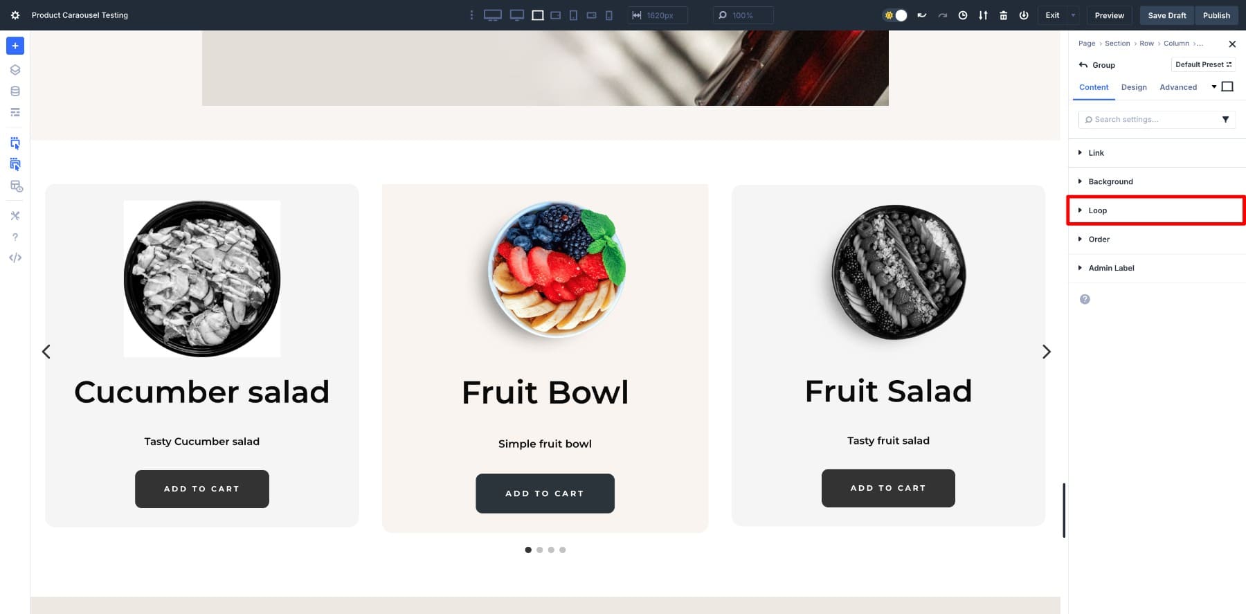
With the Loop, you design a single product card and then switch on the Loop option. Divi automatically repeats that card for every product in your catalog.
When you place a Loop inside the Group Carousel, it becomes a fully dynamic product carousel that updates automatically as your catalog changes. You design a single card once, and Divi keeps every slide consistent and up-to-date.
Building A Product Carousel In Divi 5
Now that we’ve looked at what the Group Carousel Module does and how it works with the Loop function, let’s put it into practice. Here’s the design we will create in the steps below:
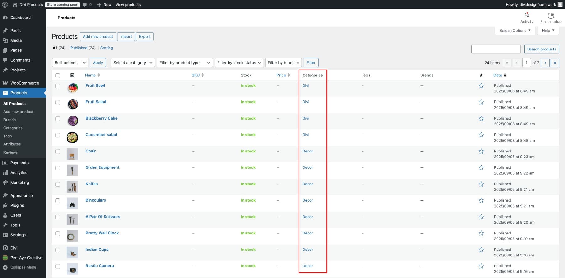
👉🏻 Make sure you’ve listed and categorized products in your WooCommerce store. If you’re starting from scratch, here’s a guide to help you.
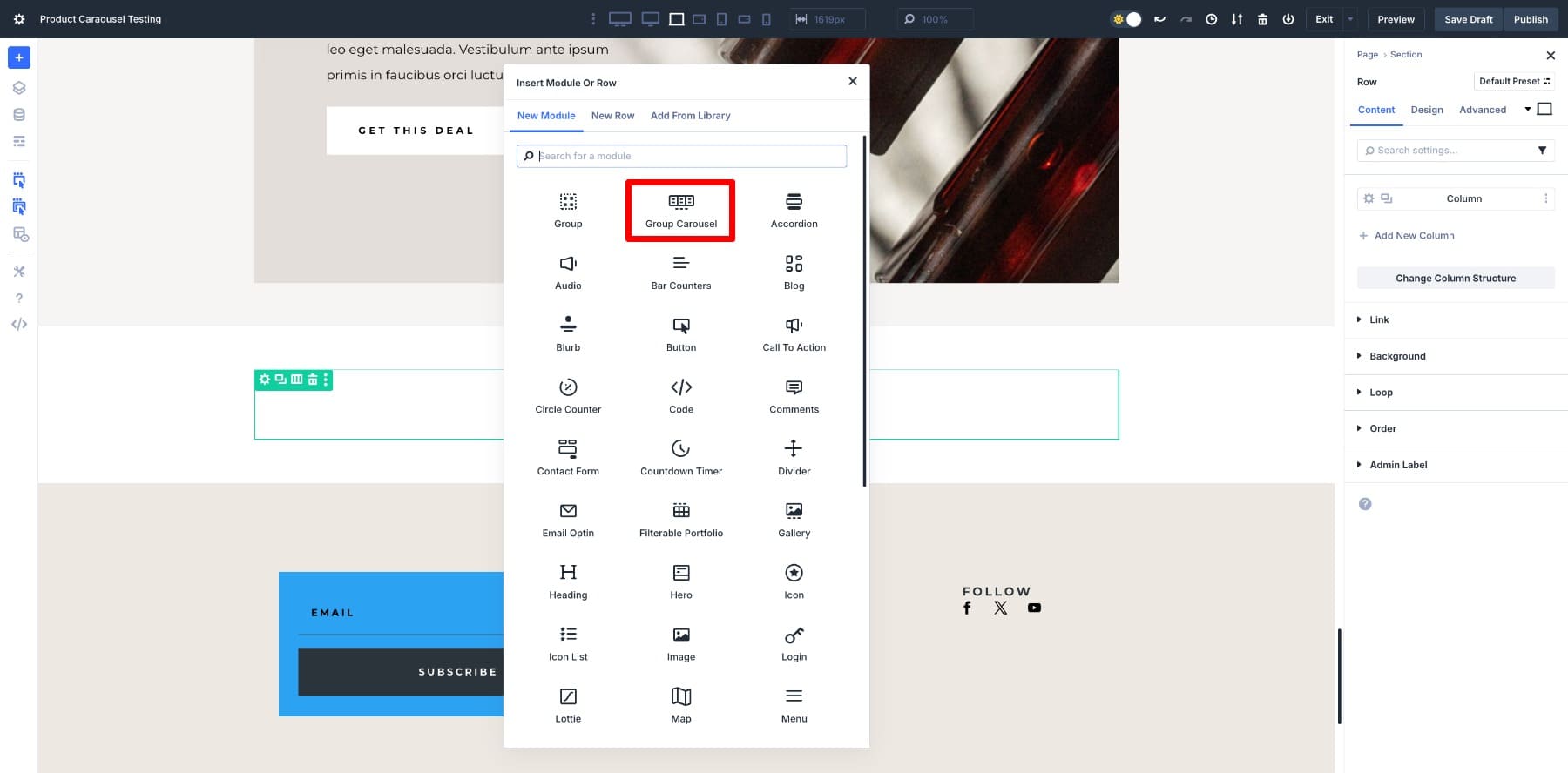
1. Add The Group Carousel Module
Start by adding a new Row to your layout. Since most product carousels look best at full width, we’ll also modify the Row’s Width settings. Set Width and Max Width to 100%.
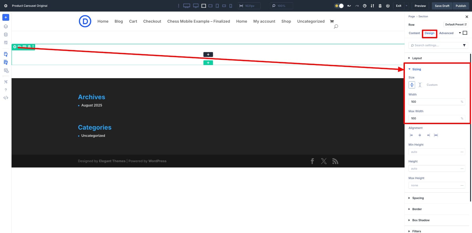
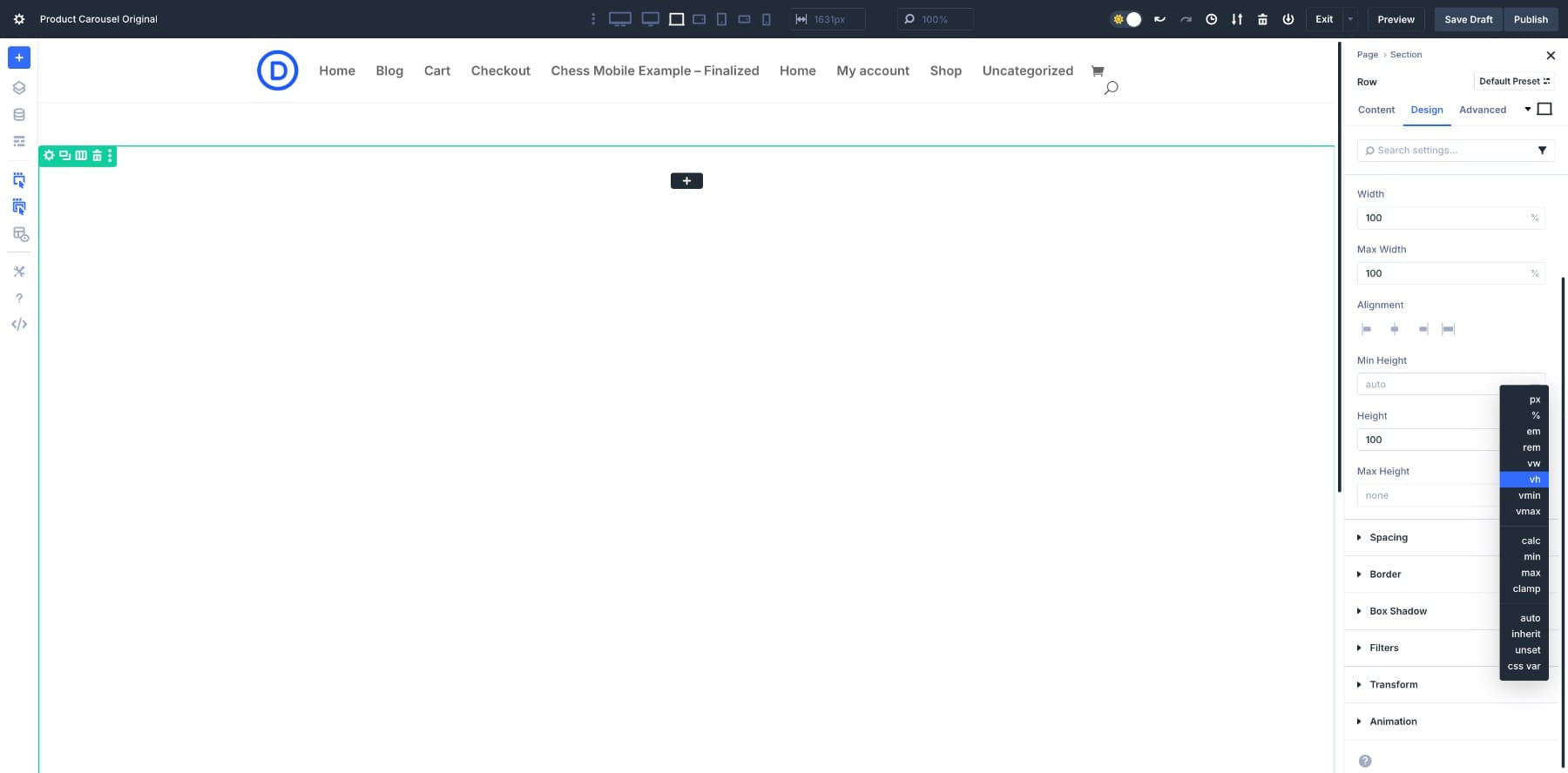
Next, you can decide to set the Height to 100vh to make sure your carousel takes up the entire screen. (Click the minus sign in the Height field to access the units list.)
Once the Row is ready, open the module list and add the Group Carousel module.
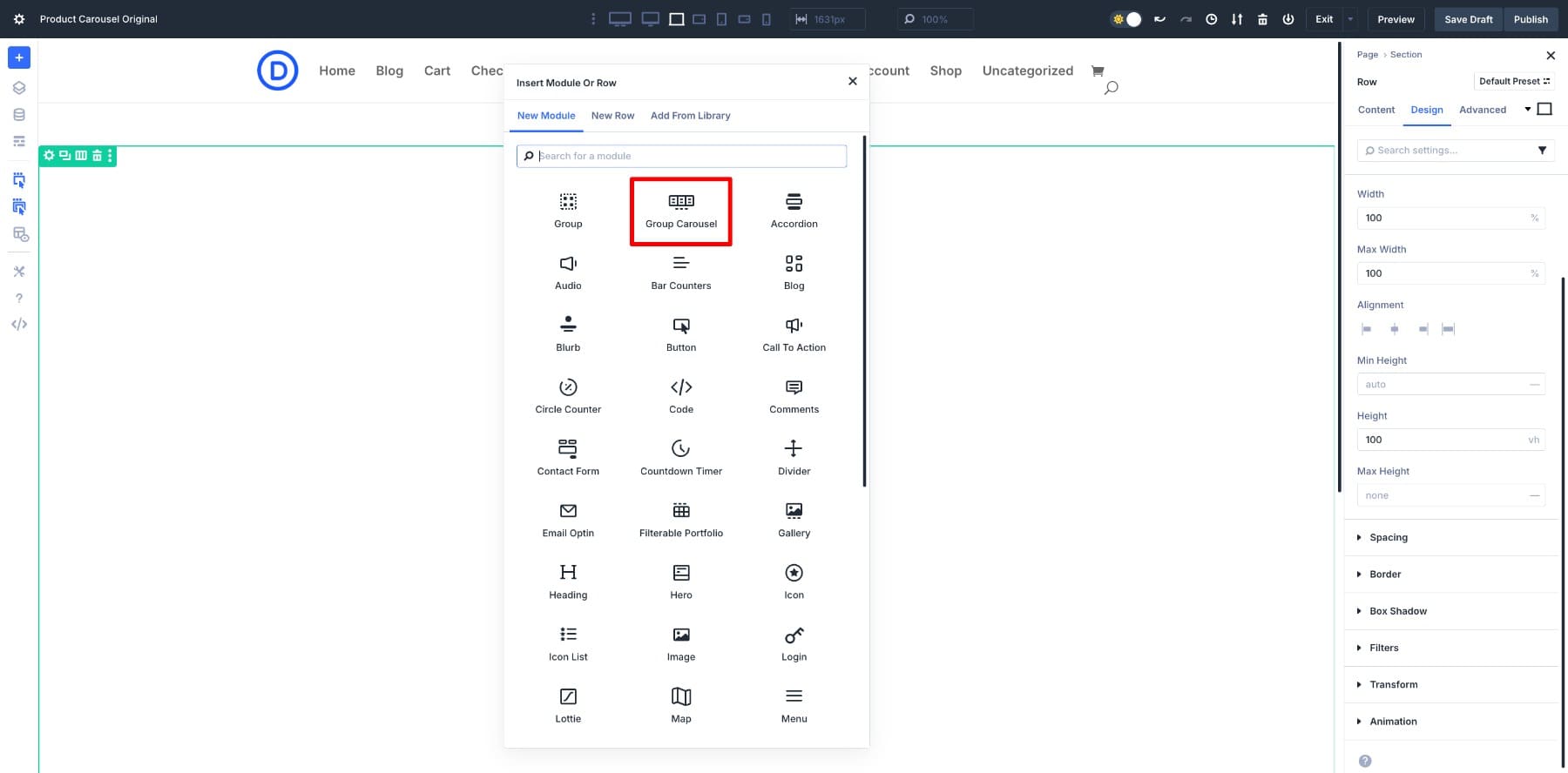
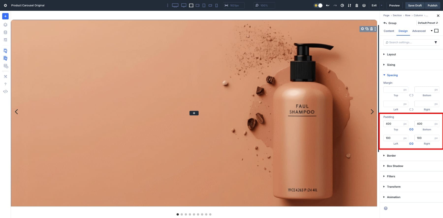
This creates the container that will hold all of your product slides. You can clear the default padding values Divi adds to the container row’s column to remove the extra white space from all corners.
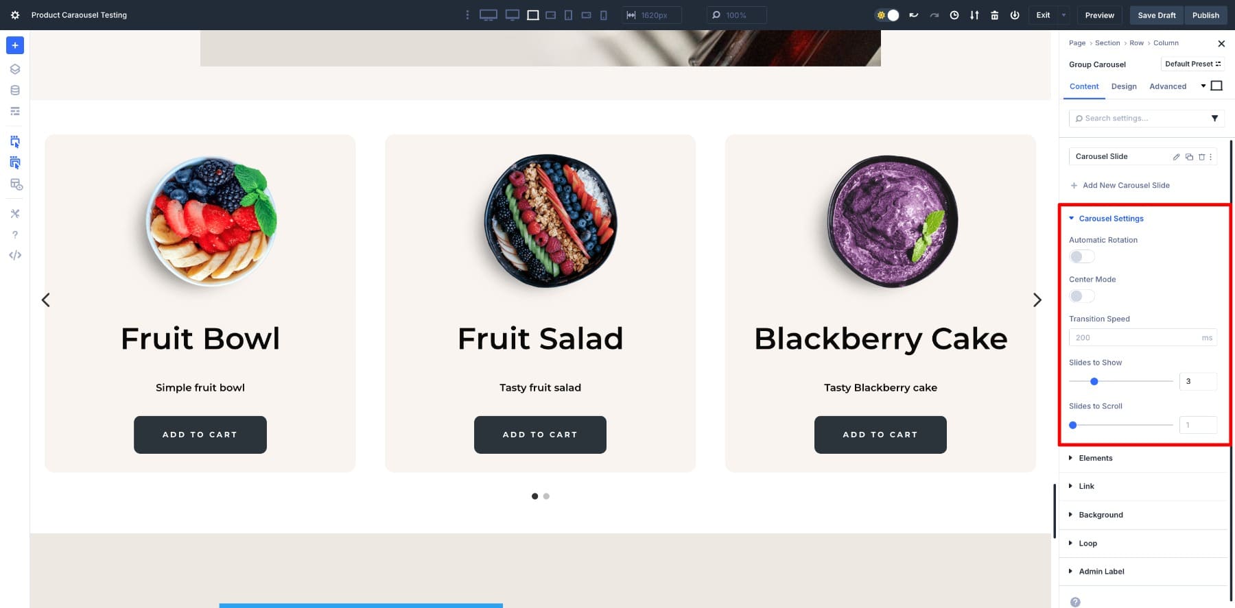
2. Modify The Group Carousel Settings
The next step is to fine-tune the Carousel’s behavior. Open the module settings and go to Carousel Settings.
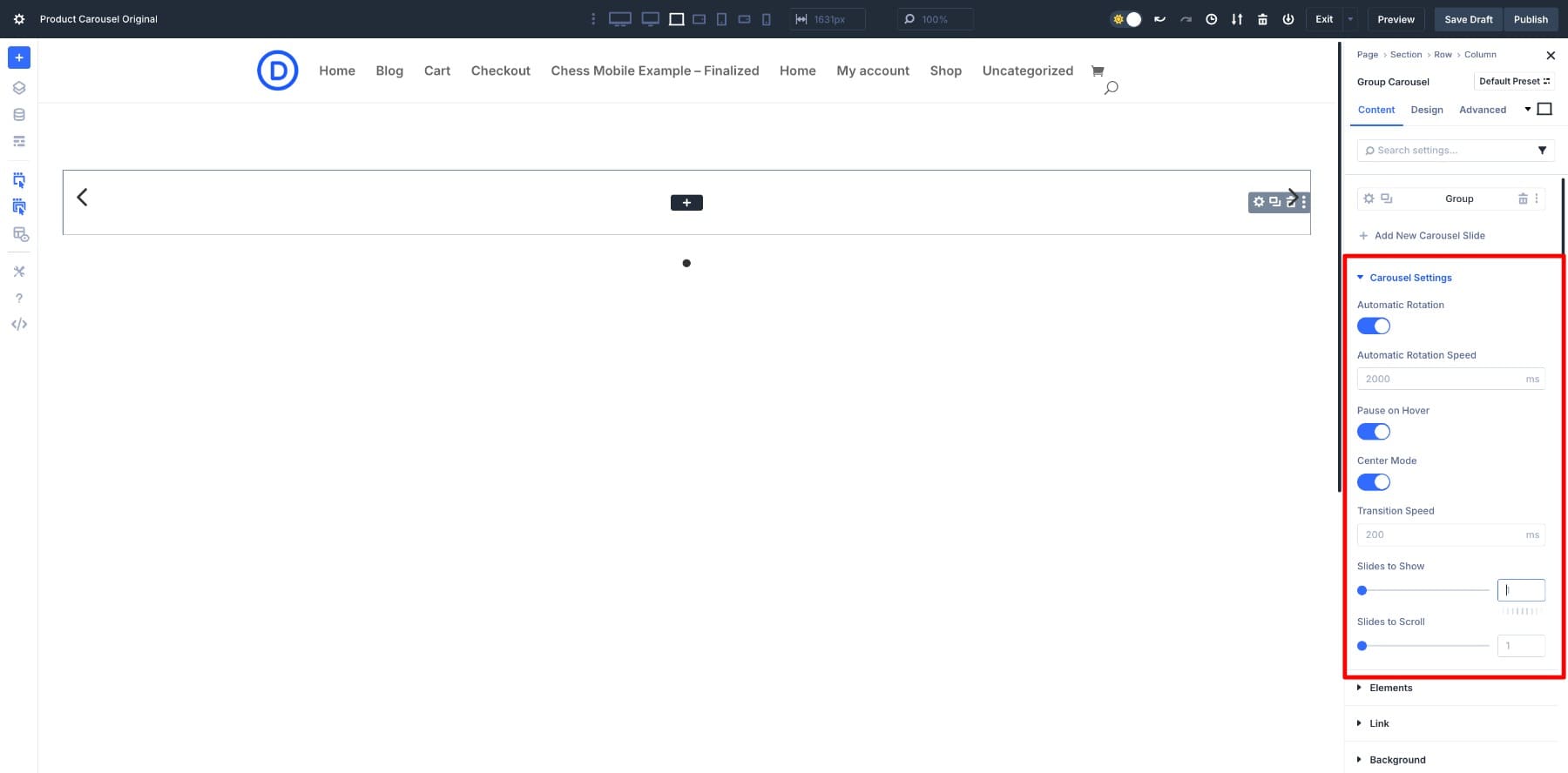
We’ve set the carousel to rotate automatically, so the slides will continue to move without user input. Additionally, if you enable the “Pause on Hover” option, the carousel stops rotating as soon as a visitor hovers over it. This gives them time to look at a product without it sliding away.
Turn on the Center Mode, so the active slide stays centered while the next and previous slides peek in from the sides. Finally, since we want to showcase one product at a time, we’ve kept the Slide to Show and Slide to Scroll as default values (1), which is ideal for a fullscreen, hero-style carousel.
3. Enable Loop Function
Before adding the design, we’ll first enable the Loop function so that when we loop dynamic content, we can see if it’s working properly.
Since we want the slides to loop automatically, we’ll enable the loop at the Group level, and not the entire Group Carousel. That way, only the product card design is repeated, while the carousel itself stays intact.
Go to the Group option and turn on the Loop in its Content tab.
Here are all the configured Loop settings to make sure it pulls the right product catalog to display:
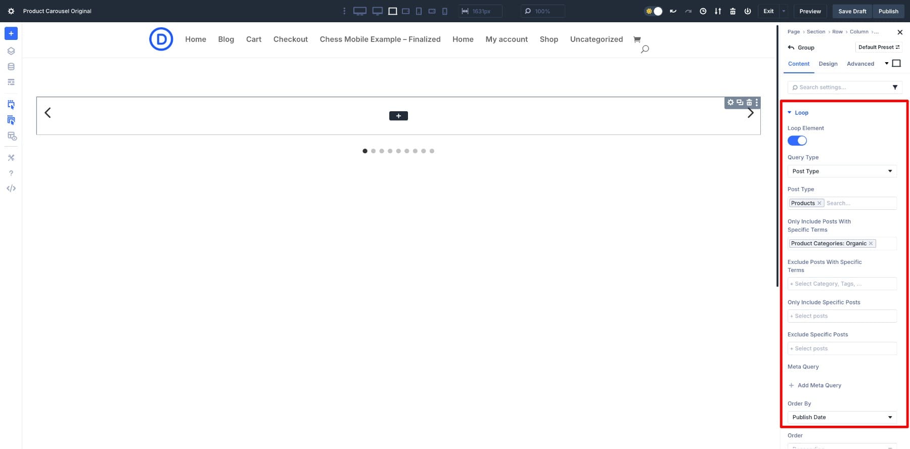
The Query Type is set to Post Type, and we have selected ‘Products’ as the post type. To keep the carousel focused, we narrowed it to a specific Product Category (Organic).
If needed, you can further filter your Loop using options such as excluding certain categories, including only specific products, or excluding selected ones. Finally, we set the carousel to Order By Publish Date, so the newest products always appear first.
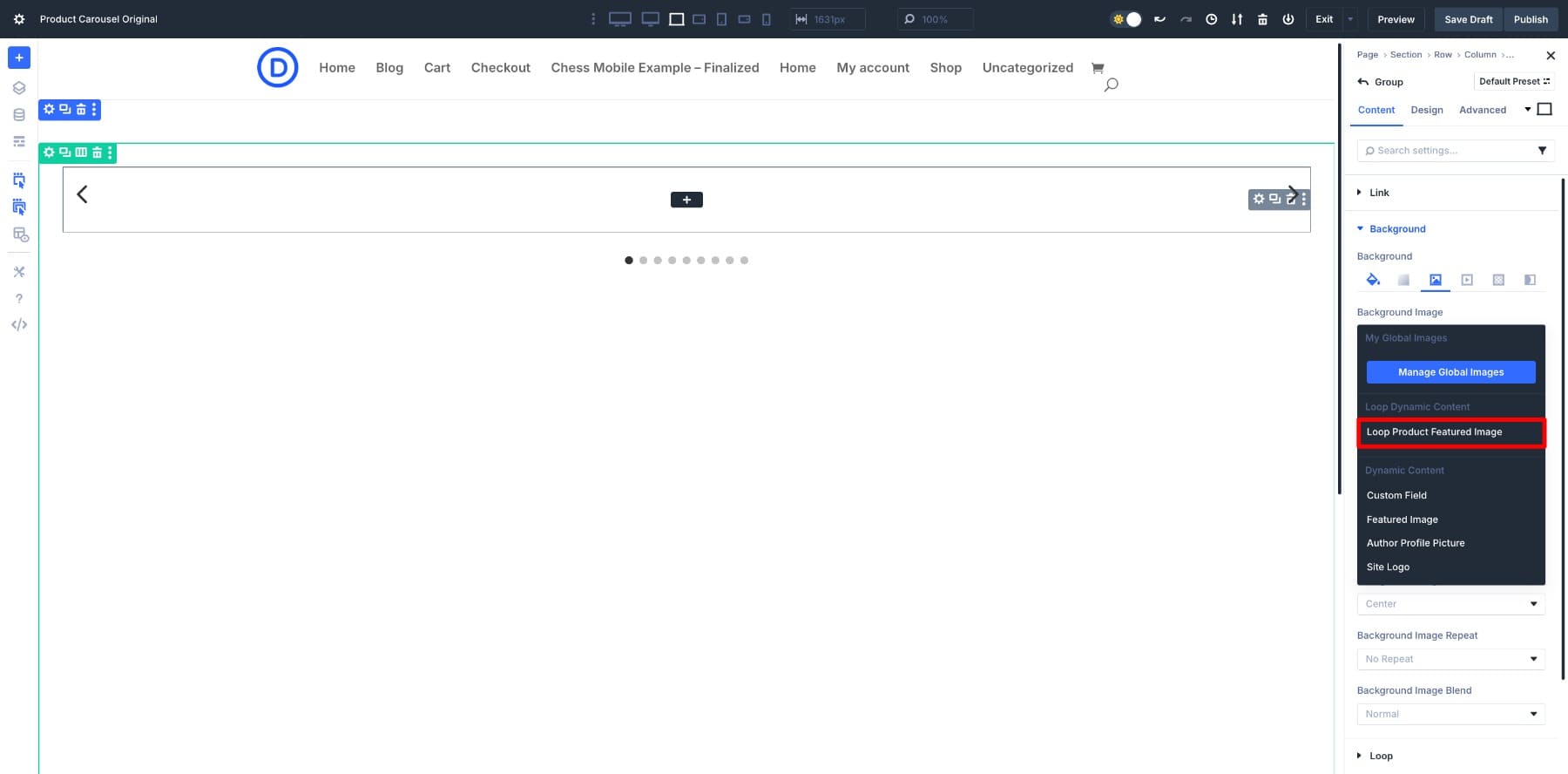
4. Design Your Product Card
We’ll begin by looping the product featured image as the Group’s Background Image. This will give our card immediate structure.
To do so, go to Group > Background Image and hover over it to locate the Dynamic Content option.
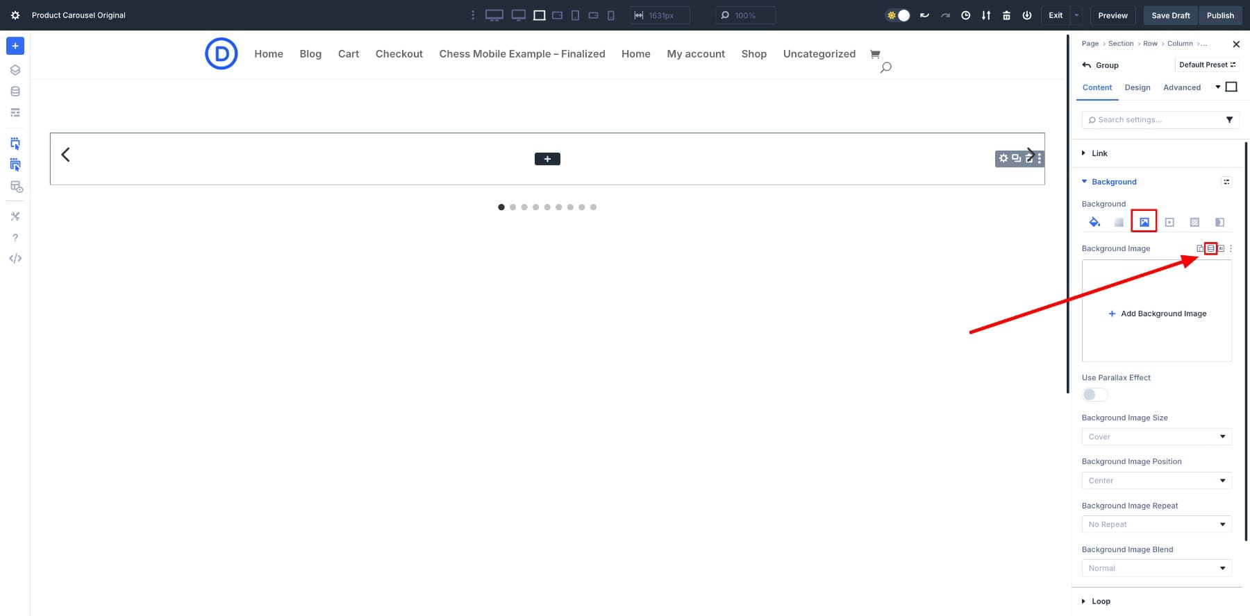
Clicking on it will populate a list of all the elements you can use. Select Loop Product Featured Image.
This will automatically create the carousel. All the featured images from the Organic product category (we selected earlier) will be added as slides.
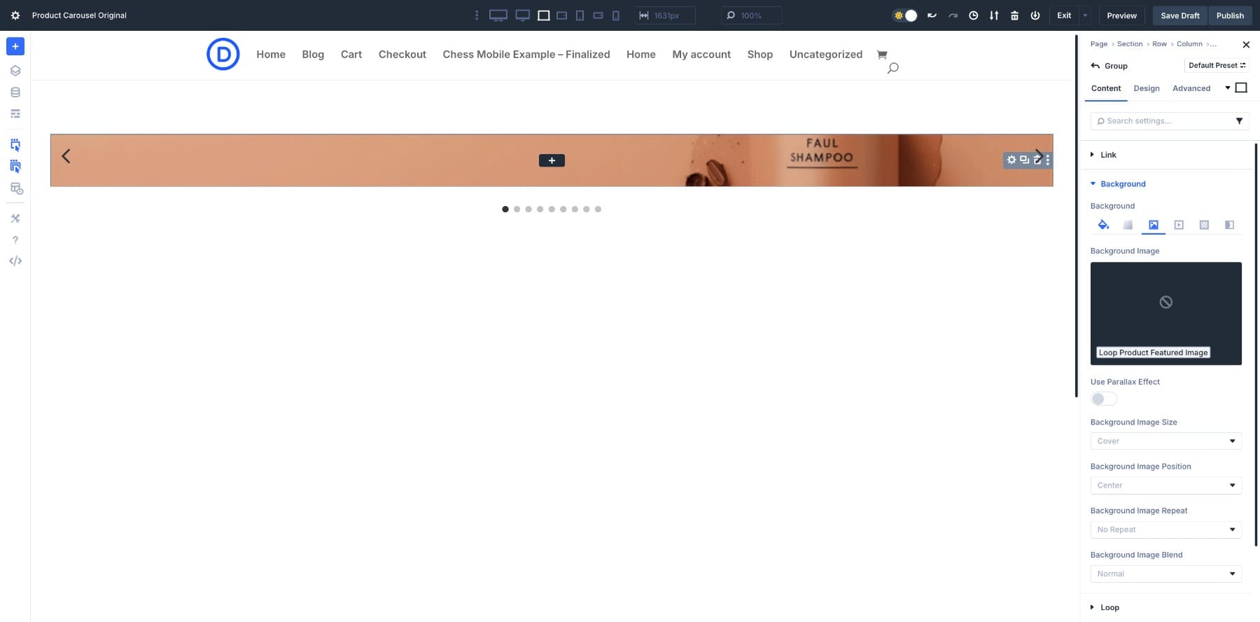
Since we’ve added it as the Background Image, we need to adjust the Spacing > Padding to make sure it’s visible.
Here’s how to do it step by step:
Let’s add Heading, Text, and Button modules to build our product slide.
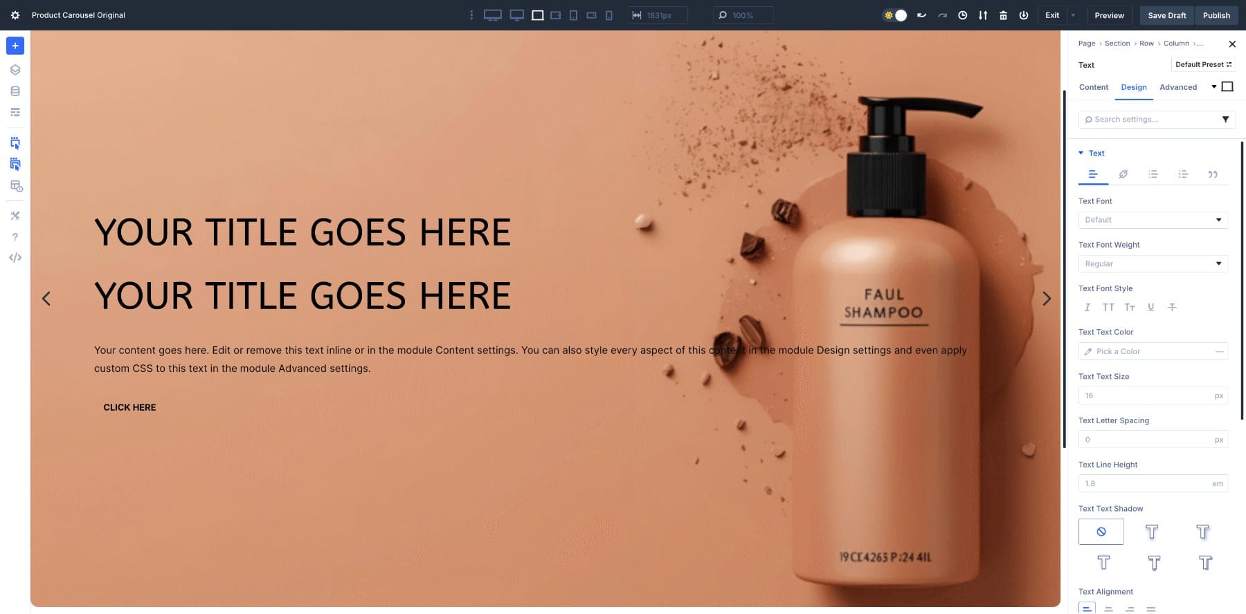
Next, customize the design as you see fit.
5. Loop Dynamic Content
Now that the card structure is ready, it’s time to pull in dynamic content from your product catalog. This way, each card will automatically display the correct product information without requiring you to manually build every slide.
Start by editing the modules you added inside the Group — Heading, Text, and Button. Hover over each module’s content field and click the Dynamic Content icon.
- For the Heading module, select “Loop Product Title” and “Loop Product Current Price”.
- For the Text module, select “Loop Product Description.”
- For the Button module, set the link to “Loop Product URL” so visitors can click through directly to the product page.
Once these are connected, the carousel updates itself automatically. Each slide now displays the correct title, price, and button link for every product in the Organic category we previously set.
Notice that when you click the Dynamic Content icon, Divi reveals the full set of loop-specific fields you can pull into your card. This means that you’re not limited to just titles, images, and prices; you can also bring in publish dates, sale prices, product descriptions, stock status, SKUs, and even review counts.
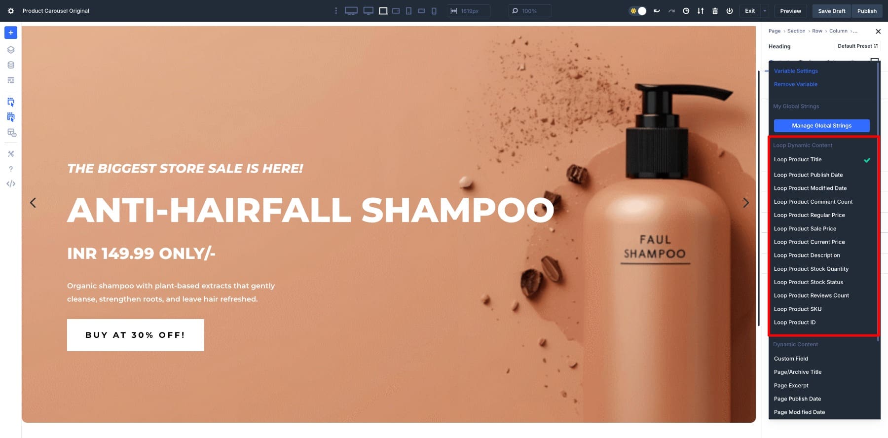
This way, Divi gives you the power to shape your product card however you like. You can keep it minimal with just an image and title, or build a rich layout with detailed product info, or even highlight niche fields like stock quantity or custom attributes.
Once your carousel layout is ready, decide how visitors will move through it. In Elements under the Content tab, you can enable arrows and dot navigation.
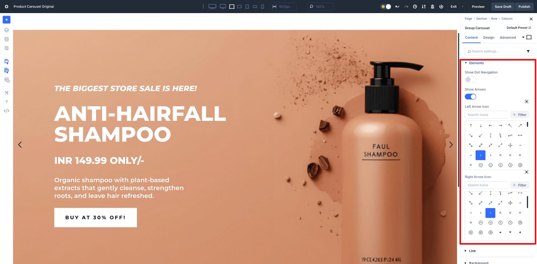
Since a full-width carousel will take the entire screen, we’ve disabled the Dot Navigation. Dots work well to show position for shorter product rows, but in this case, they’ll be below the fold (hidden from the viewport), so we’ve disabled them.
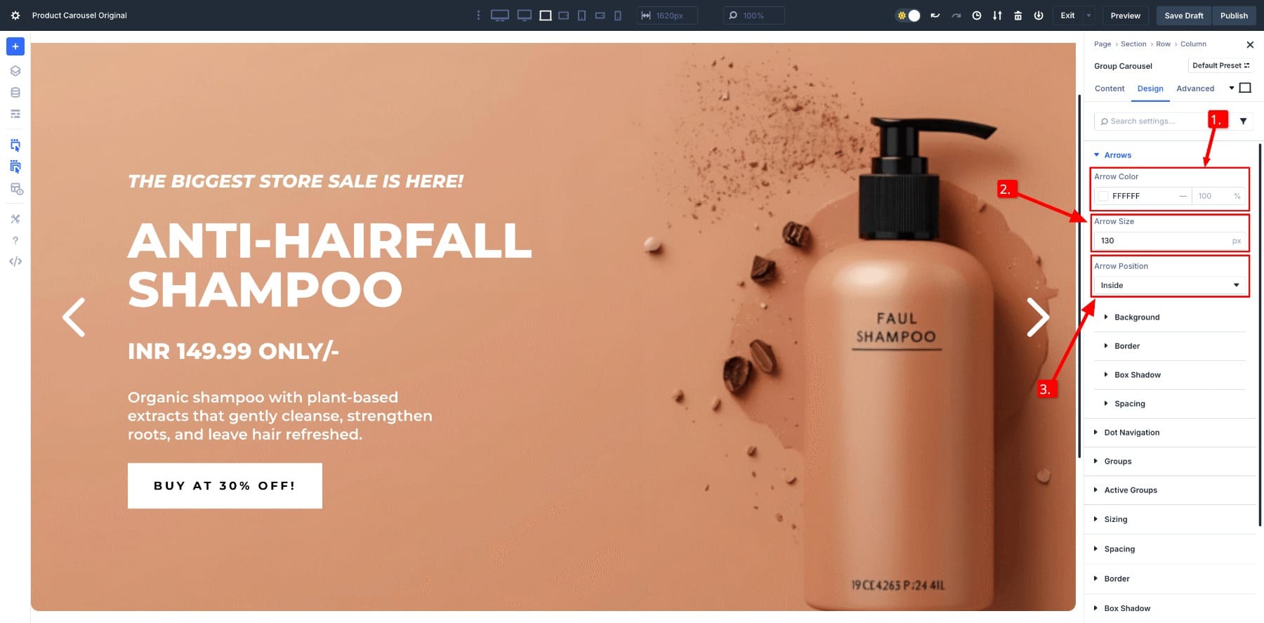
Let’s now customize the arrows since they’re barely visible. Switch to Design > Arrows.
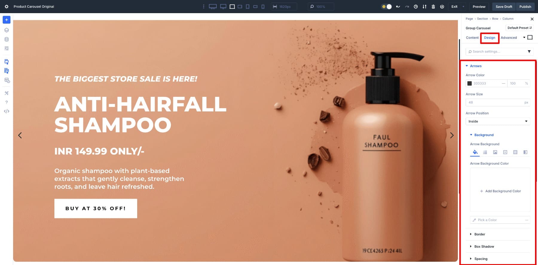
We’ll change the Arrow Color to White to match the rest of the design, increase the Arrow Size to 130px (adjust to 50px for tablet and mobile sizes), and set the Arrow Position to Inside.
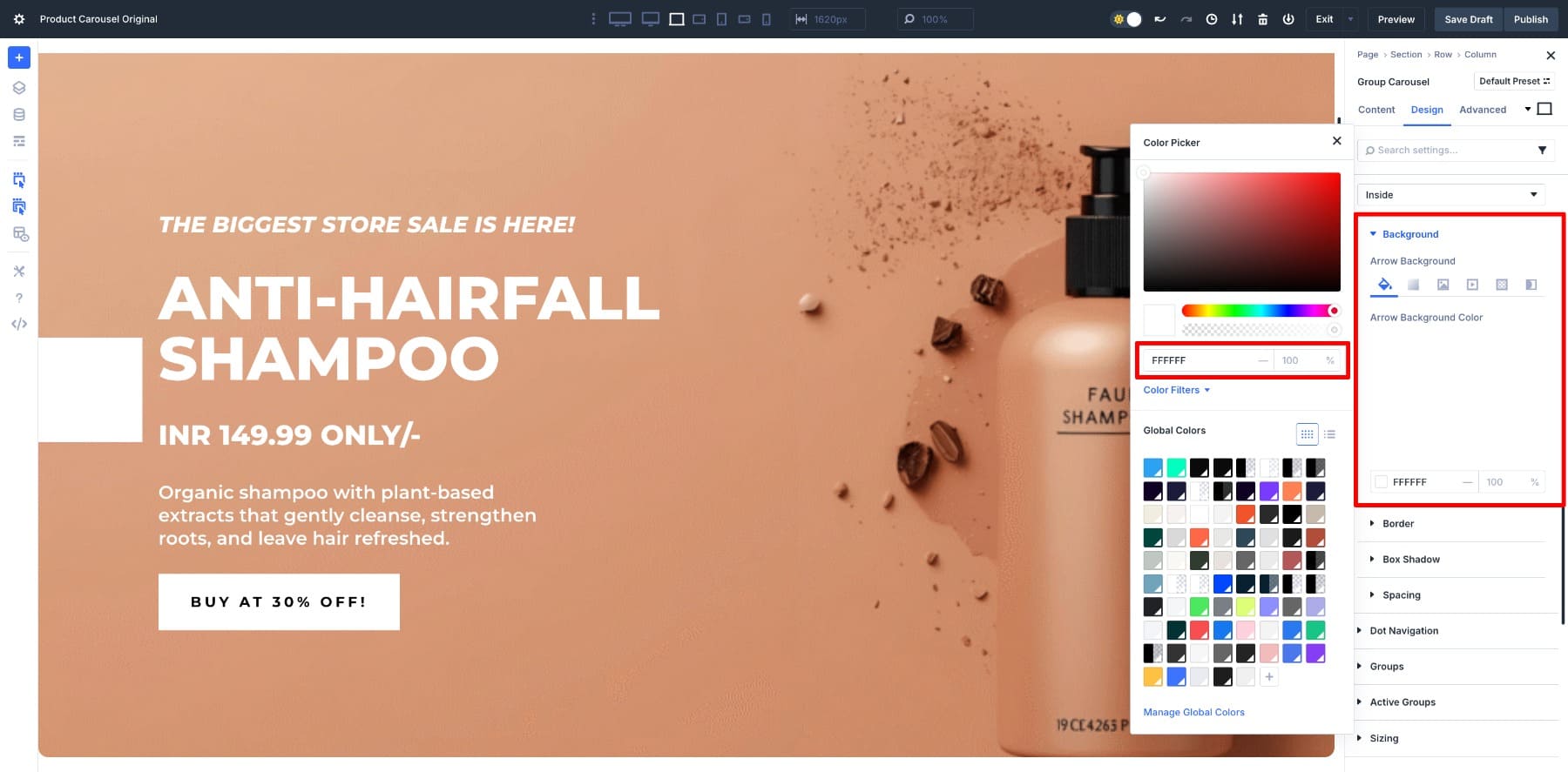
We’ve added a light White shade in the Background to highlight the arrows. Divi 5’s new Color System makes this easy. First, choose #FFFFF (primary white color of the arrows) as the Arrow Background.
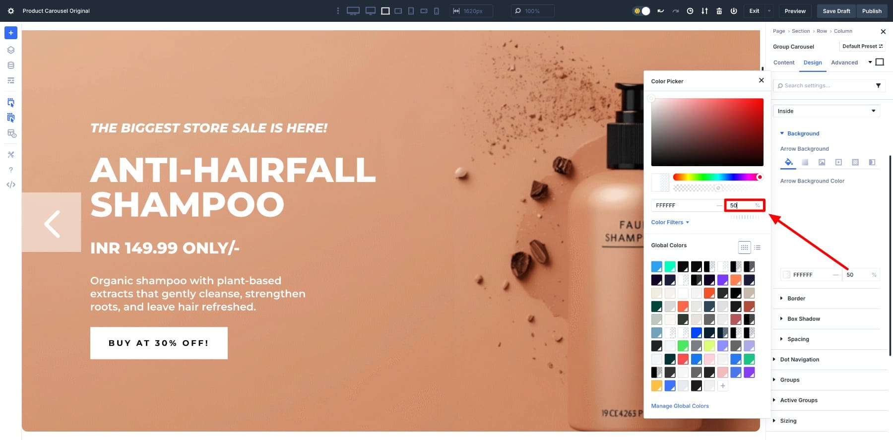
As you may have noticed, the arrows are no longer visible, so we need to reduce the intensity of the background color. To do so, change from 100% to your preferred value. We changed it to 50%.
7. Preview Your Group Carousel
Once your design is in place, it’s time to preview how the carousel feels in action. Notice the pacing of the slides, how the arrows look against your background, and fine-tune other things.
As you review, keep accessibility in mind. Carousels can be tricky for users, so ensure that the arrows have sufficient contrast, navigation is easily accessible with a keyboard, and the movement doesn’t feel too fast. If you want to go further, you can add ARIA labels or extra attributes through Divi 5’s Custom Attributes to give screen readers better context.
Build Product Carousels With Divi 5 Today
The Group Carousel paired with the Loop Builder in Divi 5 gives you more than a slider; it creates a system that runs itself. Design a single product card, drop it into a carousel, and Divi takes care of the rest as your catalog grows.
It’s a straightforward way to showcase products in a format that feels modern, interactive, and always up-to-date. Ready to design your first product carousel?


please give us an option for smooth continous scrolling in different directions. Then this module will be perfect. Thank you, I am in love with Divi 5.
This was exactly what I was looking for. Appreciate the effort!
As Frank mentioned above, we need to have transition options such as those found in the ‘animation’ options. This will allow for fade, slide, bounce, etc., for each slide in group carousels. Divi 5 is a game changer and my company could not be more excited! Thanks Elegant Themes!
This was well written and very useful. Appreciate the effort you put into it.