
With Divi 5, responsive editing gets simpler. The new Responsive Editor puts device, hover, and sticky states in one panel so you can see and adjust everything in context and at a much faster pace.
In this post, we’ll explore how the Responsive Editor works and how it benefits your workflow. Let’s dive in!
What Is The Responsive Editor?
The new Responsive Editor in Divi 5 significantly improves how you view responsive design. It manages and centralizes changes automatically as you switch between devices. This feature helps improve your design process by eliminating unnecessary clicks and helping you keep a clear overview of your responsive values.
Subscribe To Our Youtube Channel
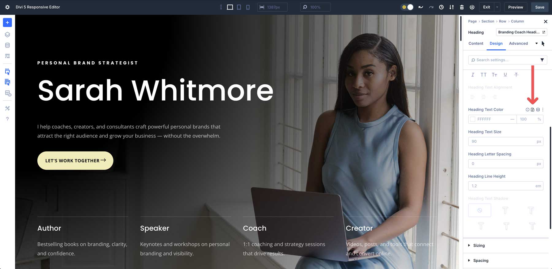
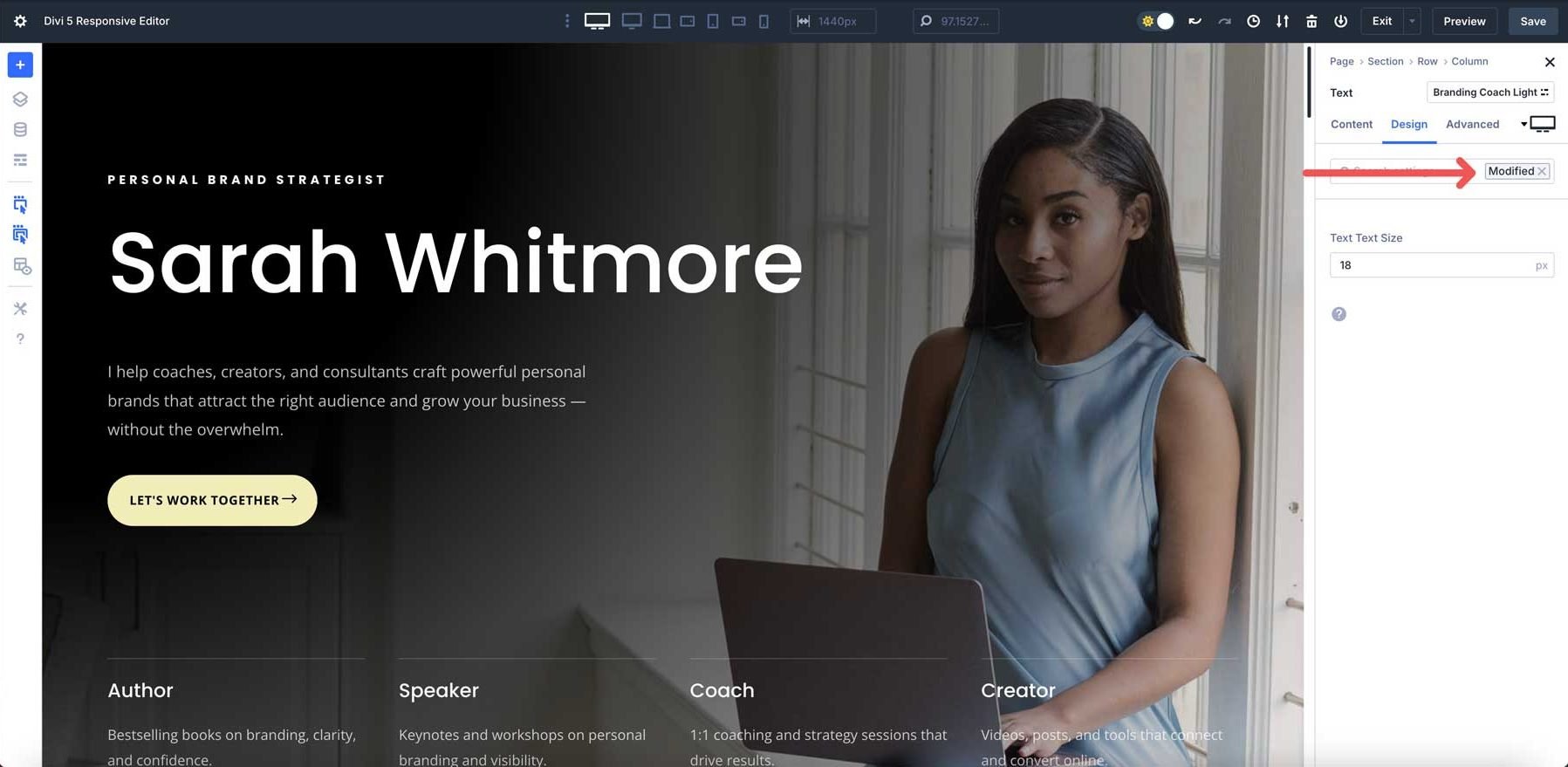
A new Responsive Editor icon dynamically turns blue when a setting has a modified value in an alternative view mode, providing a helpful visual cue. Clicking this icon opens a panel that allows you to adjust values across all view modes simultaneously, without constantly switching between them. This helps you quickly identify and modify or reset values, giving you more control over your designs.
The Responsive Editor Is A Result Of Your Feedback On Divi 5
Divi 5‘s development, including the Responsive Editor, thrives on active community involvement. This feature, in particular, was highly requested amongst early adopters of Divi 5. User suggestions are vital for refining features, addressing pain points, and ensuring that Divi 5 meets our users’ needs while anticipating future challenges.
Your feedback helps us shape Divi 5 into a user-driven solution, offering fresh perspectives we might not have considered. We encourage you to keep sharing your thoughts through comments on our blog, social media channels, and through our support chat. We value every insight and will use it to shape Divi’s future!
Key Features Of Divi 5’s Responsive Editor
The Responsive Editor isn’t just a single feature. It’s a collection of tools that work together to make responsive design much easier and more intuitive.
Streamlined Breakpoint Control
The Responsive Editor puts device, hover, and sticky states in one clean panel, reducing clicks and making responsive design more intuitive.
Edit Multiple Devices At Once
One of the Responsive Editor’s standout features is its ability to simultaneously edit values across multiple responsive states in a single panel. Whether adjusting font sizes, padding, or other properties, you can modify settings for desktops, tablets, and phone views without switching modes.
Changes are automatically applied to the current view mode, saving time and ensuring consistency across devices.
How To Edit Responsively In Divi 5
Divi 5 offers a more streamlined and intuitive approach to responsive design, with several ways to edit for different devices.
Direct Editing Within View Modes
Click the device icons at the top of the Visual Builder to switch your canvas view between Desktop, Tablet, and Phone.
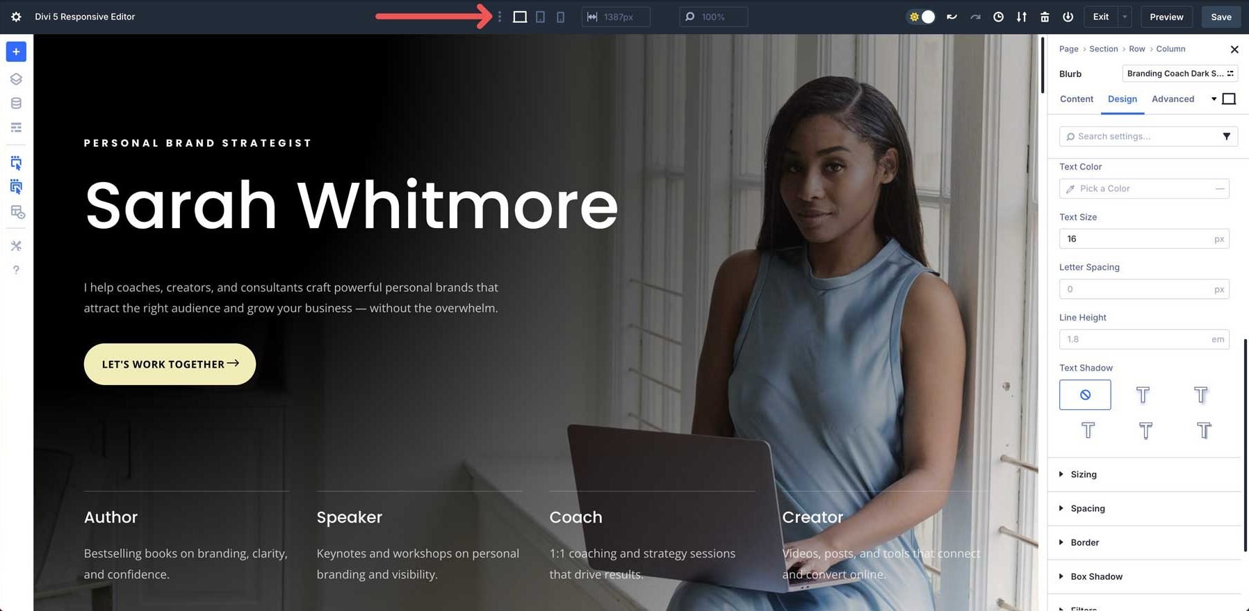
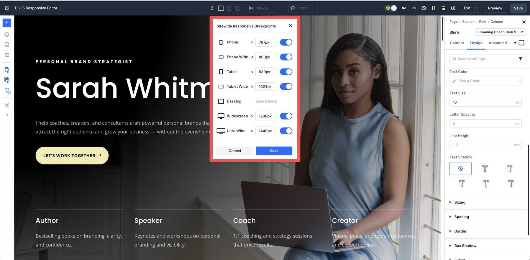
Three breakpoints are enabled by default: desktop, tablet, and phone. However, you can enable all of Divi 5’s Customizable Responsive Breakpoints for greater control.
The main value always starts on a desktop level and is inherited by other breakpoints. However, when you edit any element in another specific view mode, Divi 5 automatically applies those changes only to that device. You no longer need to manually enable responsive editing for each setting.
Using The Responsive Editor Panel
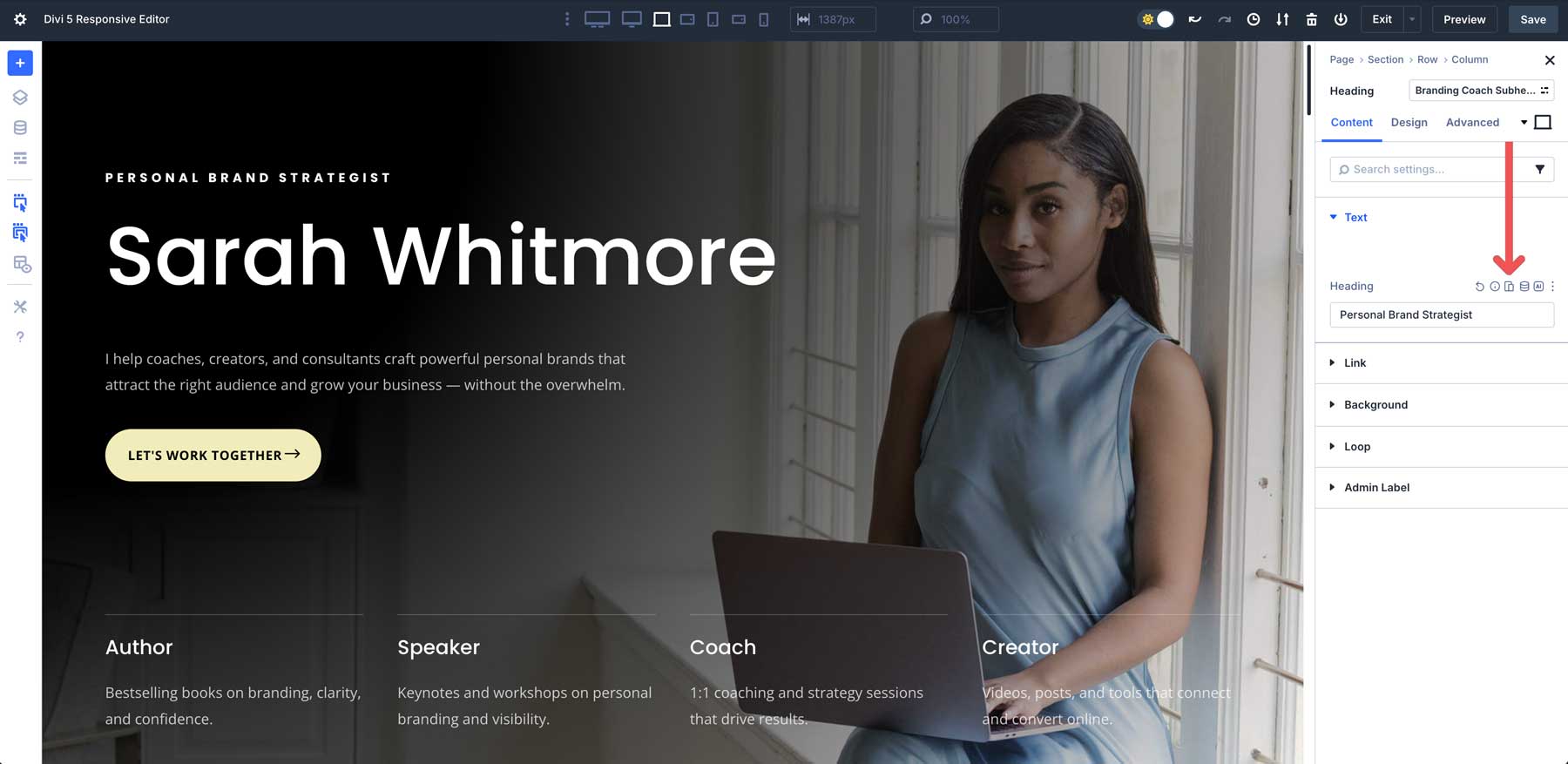
Click on any design element you want to edit to open its settings panel.
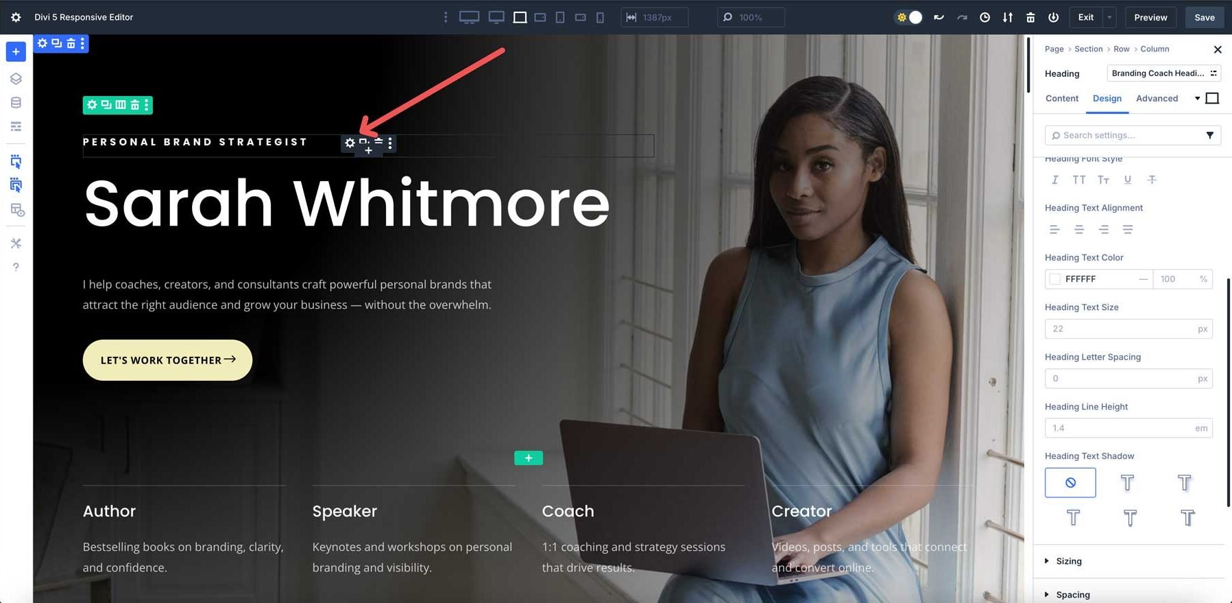
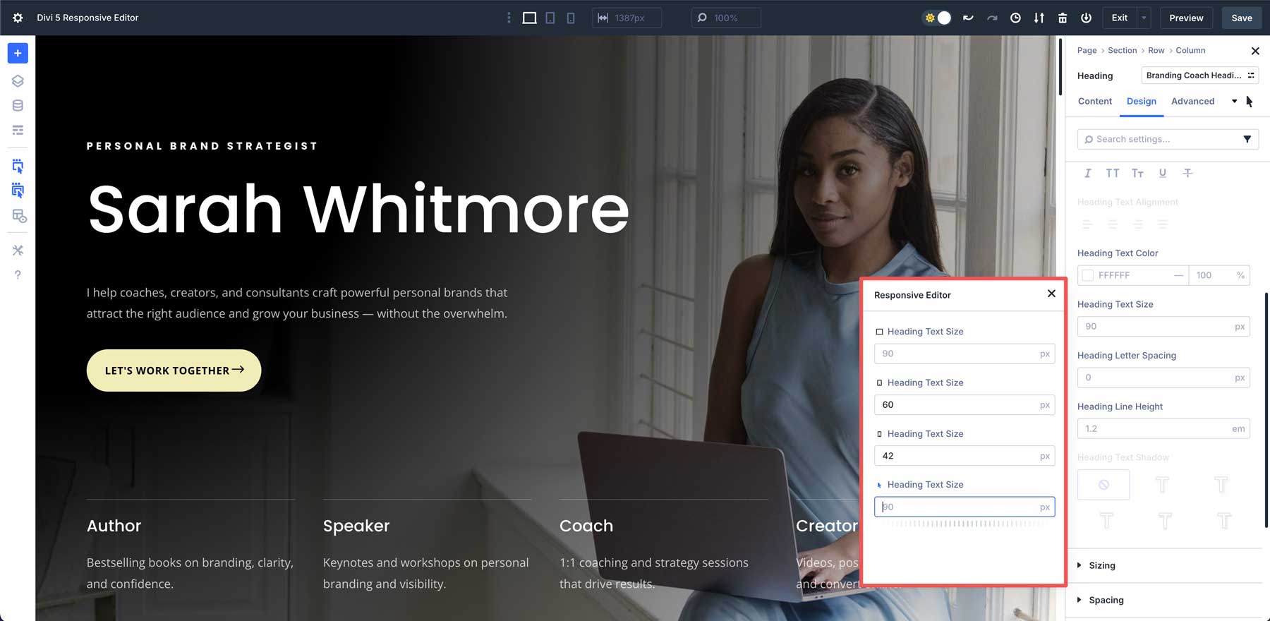
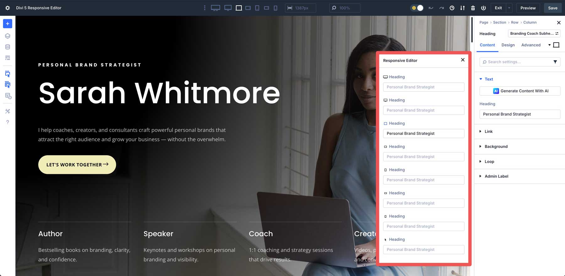
Responsive settings can be found in any element tab, including Content, Design, or Advanced. In a heading module, for example, you can adjust settings responsively for the Heading’s title or background. Locate the Responsive Editor icon and click it to open the responsive settings panel.
The Responsive Editor panel appears, revealing options for every breakpoint. In this example, we can change the title text across all seven breakpoints and in the hover view.
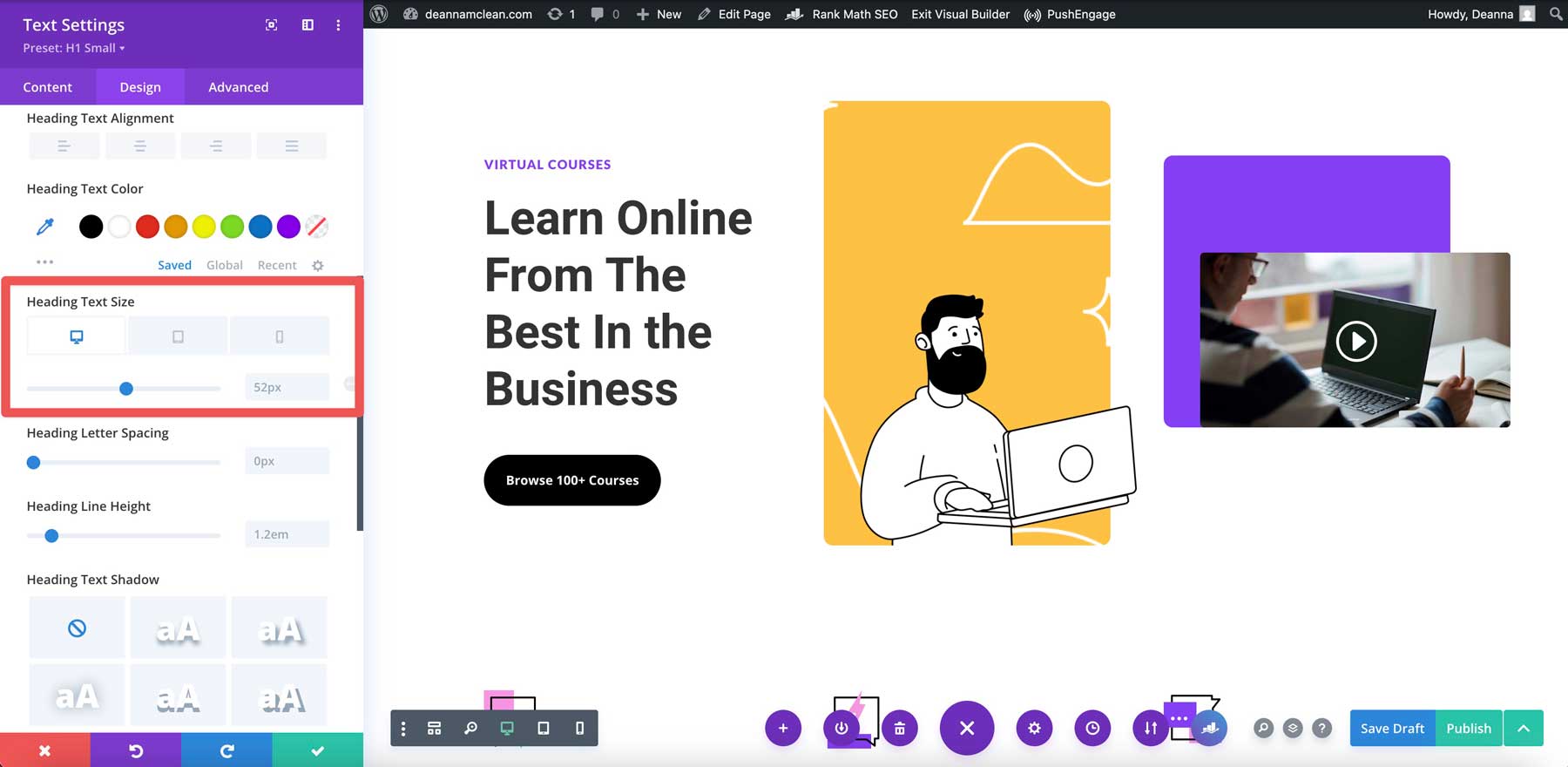
In the Design tab, you can control nearly every value of the Heading module, from its font to padding and everything in between.
As you change each breakpoint, the Visual Builder swaps view modes so you can view the changes in real time.
The Responsive Icon will appear blue for a quick overview of all the changes you’ve made. This allows you to view the settings changed from their default values, making it easy to identify and correct any responsive inconsistencies.
Why The Responsive Editor Beats Divi 4
Divi 5’s Responsive Editor transforms how you design responsive websites, offering clear advantages over Divi 4:
Pro-Level Precision
The Responsive Editor greatly improves productivity. In Divi 4, users had to switch between view modes repeatedly to adjust settings for different devices.
In Divi 5, the Responsive Editor allows users to manage desktop, tablet, and phone states from a single panel. This eliminates constant mode switching, allowing you to design faster.
It’s Beginner-Friendly
By consolidating all responsive, hover, and sticky state adjustments into one place, the Editor simplifies the user experience. This makes it more approachable for beginners tackling responsive editing and more efficient for pros who demand a fluid experience.
Broader Compatibility
Built to integrate seamlessly with Divi 5’s Design Variables, the Responsive Editor supports global styling, making it ideal for complex, responsive websites. This compatibility allows users to apply consistent styling across multiple elements and view modes simultaneously.
Faster Workflow
The Responsive Editor is a huge time saver for developers, enabling them to quickly identify inconsistencies across devices. Integrating Divi 5’s Settings Search and Filtering allows users to pinpoint altered values without sifting through unchanged defaults, ensuring they can fine-tune design settings more efficiently.
Try The Responsive Editor In Divi 5 Today
Divi 5’s Responsive Editor sets a new standard for responsive web design, replacing Divi 4’s clunky tabs with a streamlined, intuitive panel. Whether you’re a beginner crafting your first site or a pro building complex layouts, this feature saves time and boosts precision. As Divi 5 evolves in its Public Alpha phase, your feedback can make it even better.
We encourage you to dive into Divi 5, explore the Responsive Editor, and share your insights!


Leave A Reply