 In Divi 5")
Fixed spacing values have become second nature in web design. Your website looks great on your laptop, but when someone views it on a larger monitor, everything falls apart. You adjust spacing for various breakpoints, but you are still guessing.
There’s a better way: fluid spacing ramps. These scales proportionally across every screen size, keeping your design balanced without manual tweaking. In this guide, we’ll show you how to build such a fluid spacing ramp in Divi 5. Here’s what you need to know.
What Is A Fluid Spacing Ramp And What Does It Do?
A fluid spacing ramp is a systematic set of spacing values that scale proportionally across screen sizes. Most designers use fixed values: 16px padding on mobile, 24px on tablet, 32px on desktop.
These create visible jumps when the viewport hits each breakpoint. It also doesn’t account for device sizes between these breakpoints, such as a smaller tablet or phones in landscape, which results in awkward gaps.
Fluid spacing ramps eliminate those jumps. They use the CSS clamp() function to define three values: a minimum size, a preferred (fluid) value, and a maximum size.
Clamp() ensures that spacing remains fluid and proportional, regardless of whether someone views your site at 375px or 2560px. This prevents awkward gaps on ultrawide monitors and cramped layouts on odd tablet sizes.
This also eliminates decision inertia. Instead of defining spacing at multiple breakpoints, you define it once with clamp(). The function handles the rest.
How Divi 5 Makes Fluid Spacing Ramps Possible
Divi 5 brings a complete overhaul to responsive design. We’ve expanded from three breakpoints to seven customizable ones, giving you control over how sites look on everything from compact phones to ultrawide monitors. However, a key component that enables fluid spacing ramps to work is Advanced Units.
This feature enables the full range of modern CSS units and functions to be used directly within the Visual Builder. Custom code stays in the drawer. Numeric input fields in Divi 5 now accept viewport units like vw and vh, relative units like rem and em, and functions like calc() and clamp().
Click into a spacing or sizing field, and you’ll see a dropdown with all available units. Select clamp(), enter your minimum, preferred, and maximum values, and watch your spacing adapt in real time. The Visual Builder shows you exactly how it looks as you build.
The workflow shifts completely. Instead of setting fixed values at multiple breakpoints, you define fluid spacing once. A padding value of clamp(20px, 3vw, 40px) scales automatically across every screen size. Combined with Design Variables, you can create an entire spacing system that stays consistent and adapts without manual adjustments.
Creating A Fluid Spacing Ramp In Divi 5
The Visual Builder, Design Variables, and Advanced Units all work together to support fluid spacing. But having access to these features doesn’t automatically create a spacing system. So, let’s take a look at how you can build a fluid spacing ramp in Divi 5.
Figure Out Your Spacing Values
Start by determining your minimum and maximum boundaries. Your minimum values define the spacing at mobile widths, typically ranging from 320px to 480px. For mobile, margins might range from 16px to 24px, while tighter padding sits around 8px to 16px. These keep layouts compact without feeling cramped.
Maximum values apply at desktop widths, usually 1200px and above. Desktop screens could use margins of 80px to 120px, with padding scaling proportionally. Content-heavy blogs need generous desktop spacing between sections, so plan maximums around 64px to 80px. This gives text room to breathe.
Portfolio sites work differently. You want more content visible, so maximum values stay tighter at 32px to 48px. eCommerce sites balance between these. Product grids require sufficient separation to feel distinct, but not so much that fewer items are visible above the fold.
Plan and note down five to seven spacing tiers. Label them simply: space small, space medium, space ample. Small may range from 8px to 24px. Medium scales 16px to 48px. Large runs 32px to 80px. Decide on these ranges before opening Divi.
Set Up Design Variables
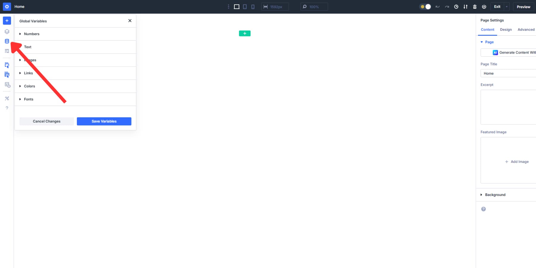
Open the Visual Builder and locate the Variable Manager icon in the top toolbar. Click it to access the location where all Design Variables are stored and managed. This is where those spacing tiers you planned earlier become reusable values across your site.
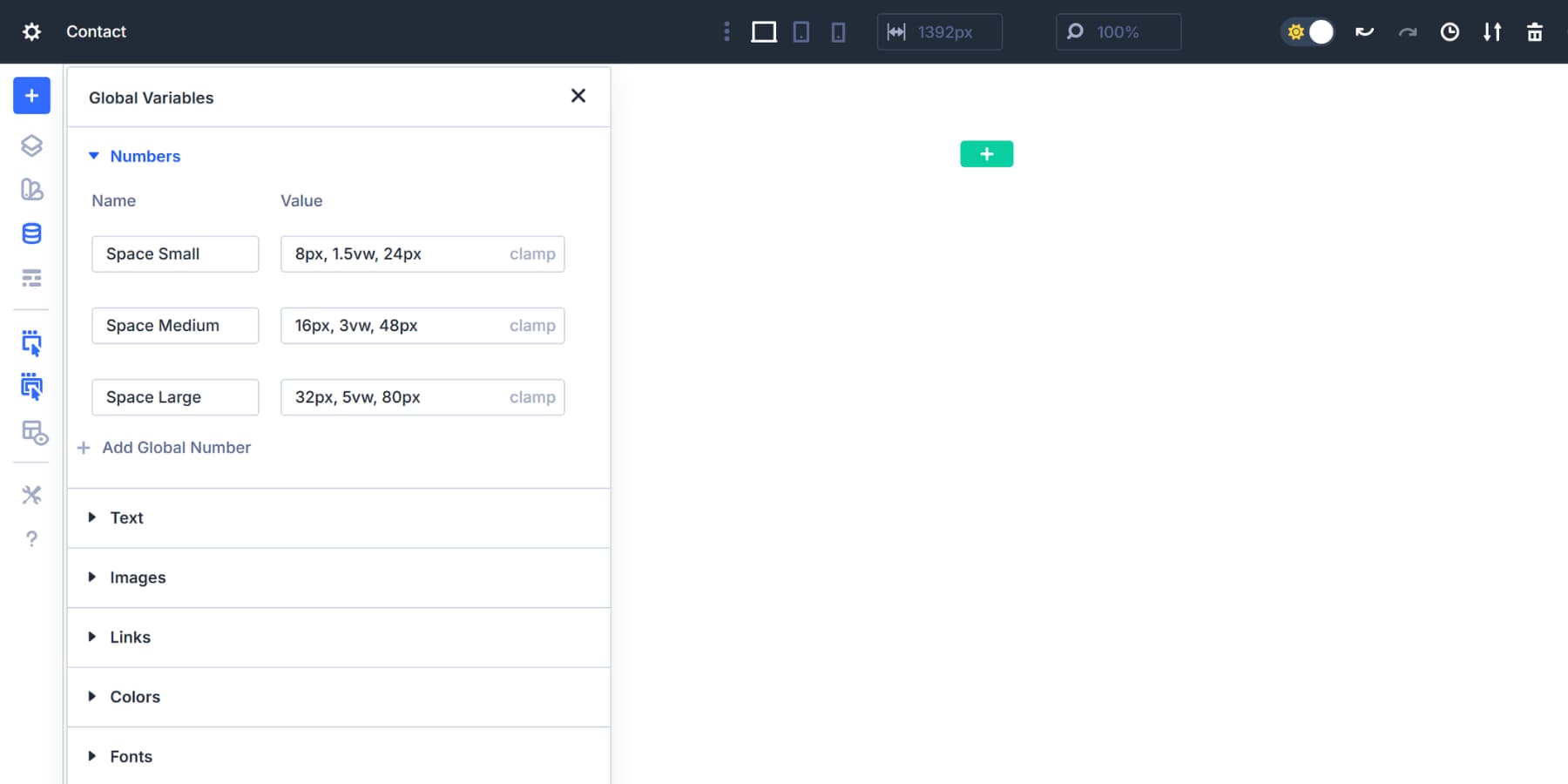
Inside the Numbers tab, click to add a new variable. Now, take those ranges you mapped out and convert them into clamp formulas. Each tier becomes one variable. You should name variables clearly. Anyone opening your site later should understand what the space medium does without having to make an educated guess:
Space Small
Value: clamp(8px, 1.5vw, 24px)
This scales from 8px at mobile to 24px at desktop. Use it for padding inside buttons, gaps between icons, or breathing room around small text elements. The 1.5vw scaling keeps growth gentle and controlled.
Space Medium
Value: clamp(16px, 3vw, 48px)
Starts at 16px, scales at 3% of viewport width, caps at 48px. Perfect for padding inside cards, spacing between paragraphs, or margins around images. The doubled scaling rate from space small creates a clear visual hierarchy.
Space Large
Value: clamp(32px, 5vw, 80px)
Handles bigger gaps between content blocks, section padding, or margins that separate distinct page areas. The 5vw rate keeps proportions right even on ultrawide monitors.
Space XS (optional)
Value: clamp(4px, 0.5vw, 12px)
Micro spacing for tight situations. The gap between an icon and its label, padding in compact UI elements, or space around inline content. The 0.5vw rate prevents these details from growing too much.
Space XL (optional)
Value: clamp(48px, 6vw, 96px)
Generous breathing room for major page sections or hero area padding. The 6vw scaling creates substantial desktop spacing without crushing mobile layouts.
Space 2XL (optional)
Value: clamp(64px, 8vw, 120px)
Maximum impact for homepage heroes or major landing page divisions. Use sparingly. The 8vw rate makes these sections dramatic on large displays while staying reasonable on phones.
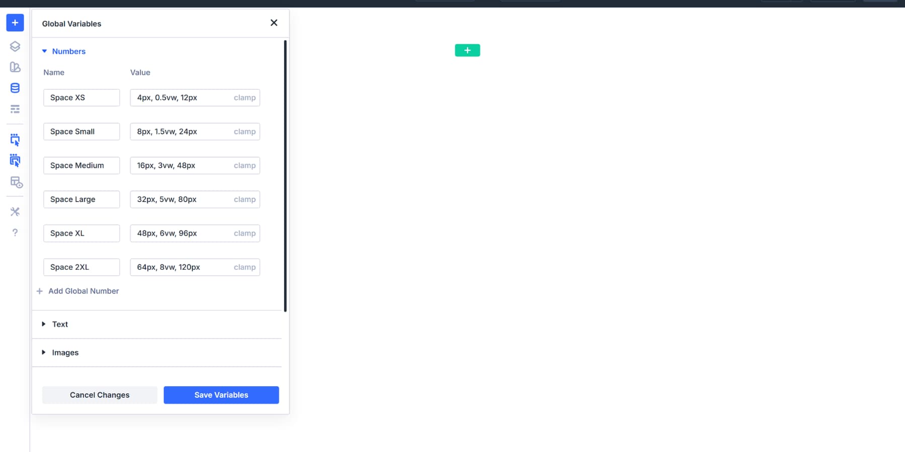
Each clamp formula follows the same structure. The first number is your mobile baseline. The middle value with vw controls how fast spacing grows. The final number is your desktop ceiling. These match the ranges you determined in your planning phase.
The minimum and maximum values in each clamp formula come directly from your planning work. When you decide the space should range from 8px to 24px, those exact numbers become the first and last values in the formula.
The middle vw value controls how smoothly you move between them. If you want the value to reach its maximum around a specific viewport width, base your preferred value on your chosen min and max viewport widths. A clamp calculator can help you generate accurate values.
This helps you tune when the spacing approaches its maximum on larger screens. Different site types use different scaling speeds based on what you planned: content-heavy blogs might push maximums higher and use faster vw rates, while minimal portfolios keep them tighter for subtler growth.
Add Them To Sections And Modules
Once you’ve created spacing variables, they need to be applied throughout your site. The Visual Builder makes this straightforward through the dynamic content system, but knowing where to apply which spacing values makes the difference between a cohesive design and a scattered one.
You can add these variables via the Insert Dynamic Content button. This icon appears next to every spacing field, revealing a dropdown of your saved variables when clicked.
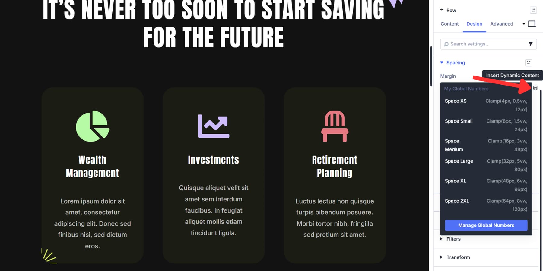
This works for every aspect. Sections, rows, columns, and modules all use the same dynamic content system. You don’t need to memorize different interfaces or workflows for other element types.
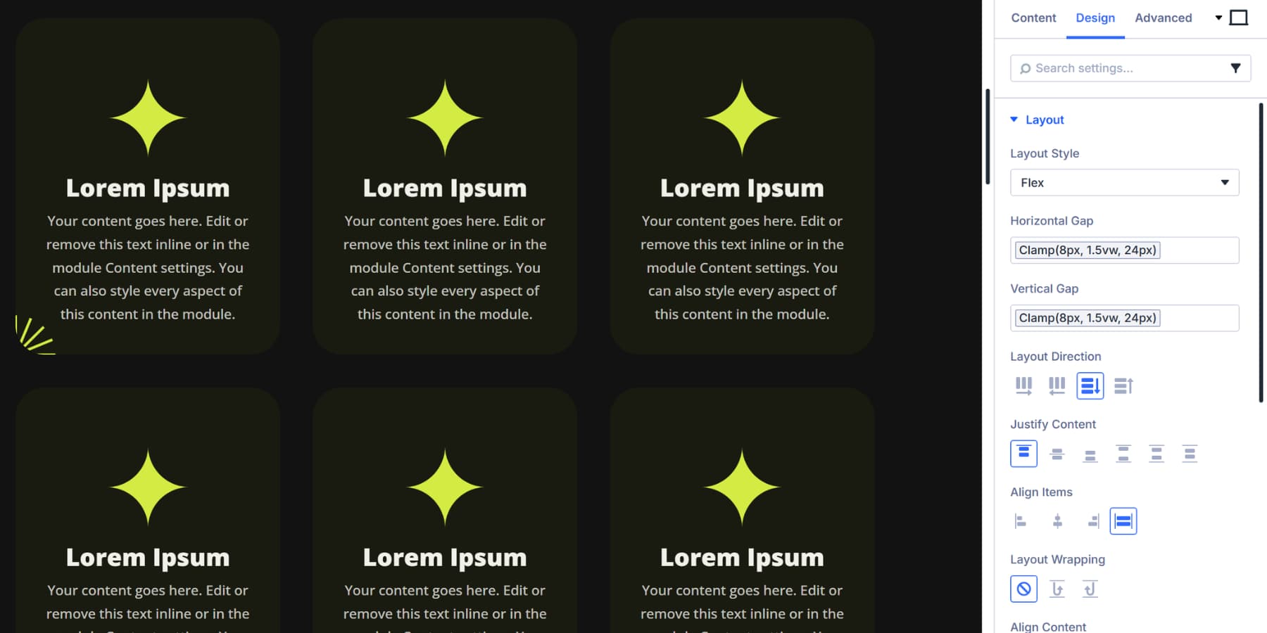
Apply Gap Spacing To Flexbox Layouts
Set your section or row’s Layout Style to Flex to enable gap controls. You’ll find Horizontal Gap and Vertical Gap fields under the Layout settings.
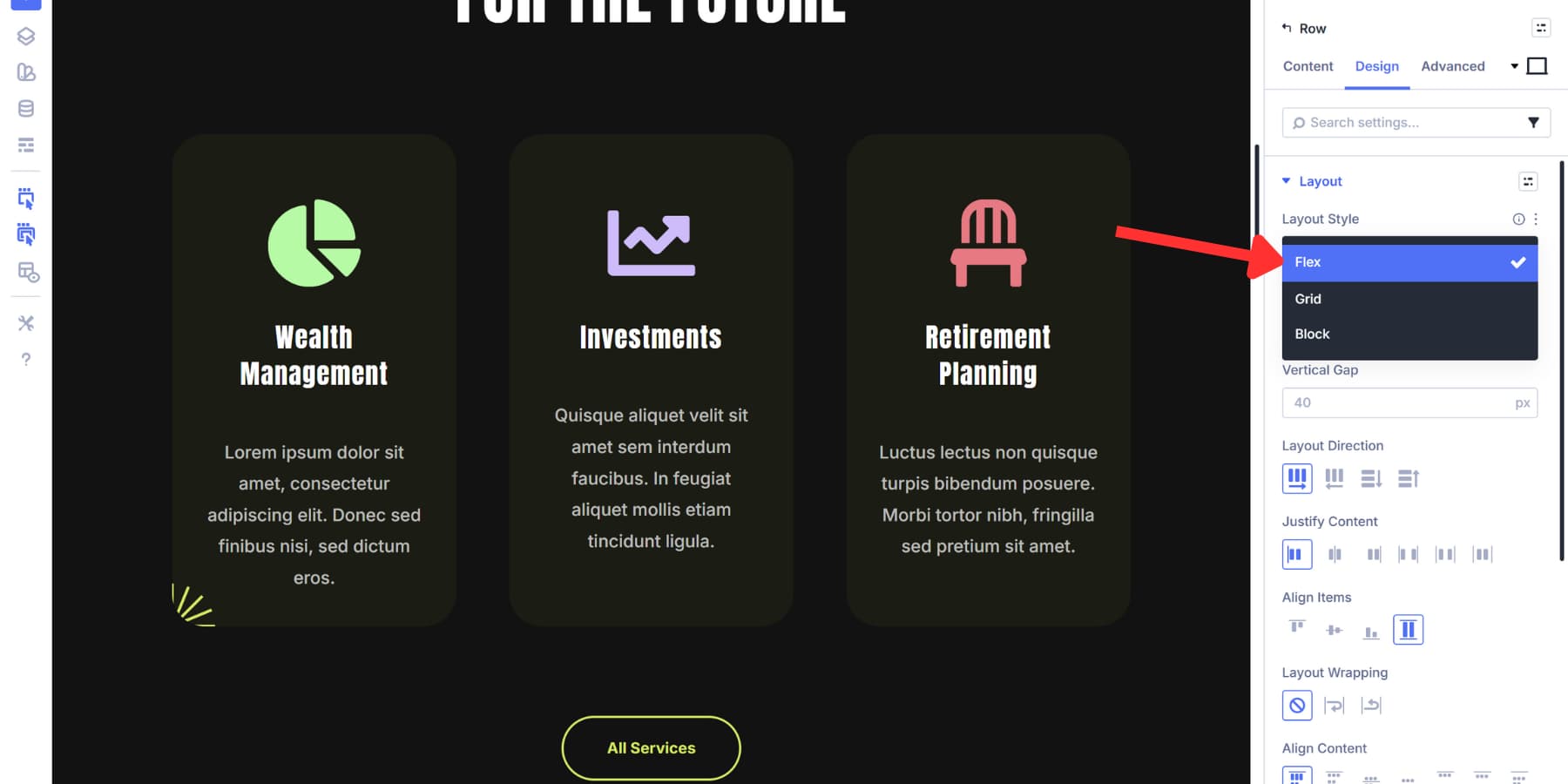
Horizontal gap spaces elements side by side. Vertical gap spaces stacked elements. Click the Insert Dynamic Content icon and select your spacing variable. Space medium works for most column spacing.
Space large creates more breathing room for text-heavy layouts. Sections with multiple rows benefit from space large or XL on vertical gap. This separates major content areas cleanly. Rows containing columns typically use space medium to large on horizontal gap, depending on content density.
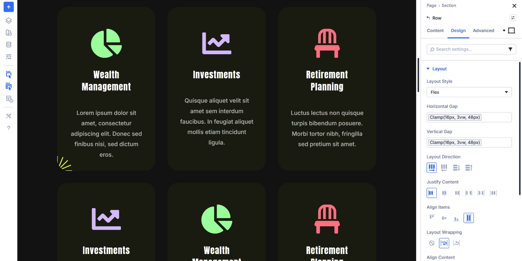
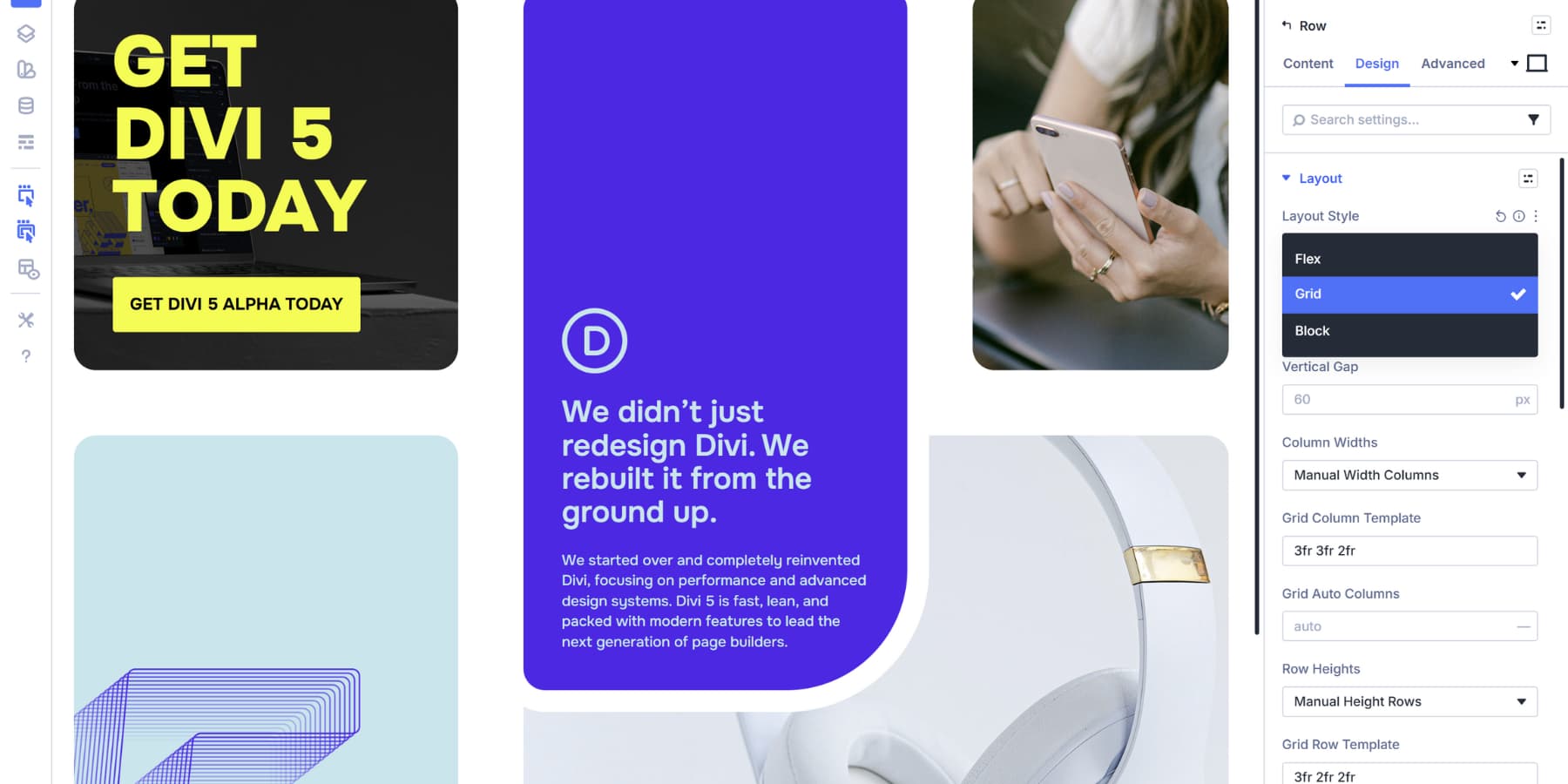
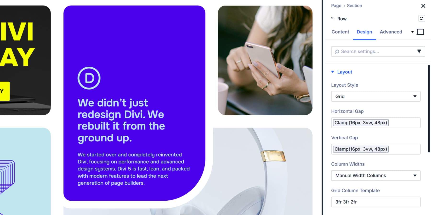
Apply Gap Spacing To Grid Layouts
Grid layouts handle spacing differently because they control rows and columns simultaneously. Set Layout Style to Grid to access gap controls.
Horizontal gap creates consistent vertical lines of space between all columns. Portfolio grids might use space small for tight, gallery style layouts. Feature grids with cards often need space medium or large for readability.
Vertical gap creates horizontal bands between rows. Blog grids typically work with space medium. Product grids might use space small to fit more items above the fold.
Grid gap spacing eliminates the need to calculate margins or handle edge cases. Set gaps once using your variables, and every grid item gets consistent spacing automatically.
Apply Spacing To Modules
Modules in Divi 5 can function as containers through Nested Modules. A blurb can hold a heading, text, and button inside it. A tab can contain entire rows. Any module can become a flex or grid container.
Open a module’s settings, navigate to the Design tab, and set Layout Style to Flex or Grid. This enables gap controls within that module. Blurbs set to Flex with a vertical gap of space small keeps its icon, heading, and text properly spaced.
An accordion set to Grid with horizontal gap of space medium displays feature cards side by side.
These nested gap controls work identically to section and row gaps. Click the Insert Dynamic Content icon and select your spacing variable. Use space XS for tight relationships. Most nested content works well with space small to medium. Dramatic separation needs space large.
Modules sometimes need traditional margin and padding for outer spacing. Text modules use space small on bottom margin when stacked. Buttons need space XS for internal padding.
However, when modules are placed inside flex or grid containers, let the gap spacing handle separation instead of adding individual margins.
Preview And Fine-Tune If Needed
Once your spacing variables are applied, use the responsive preview to check how they scale across screen sizes. With Divi 5, you can enable seven breakpoints and even customize them as per your preferences.
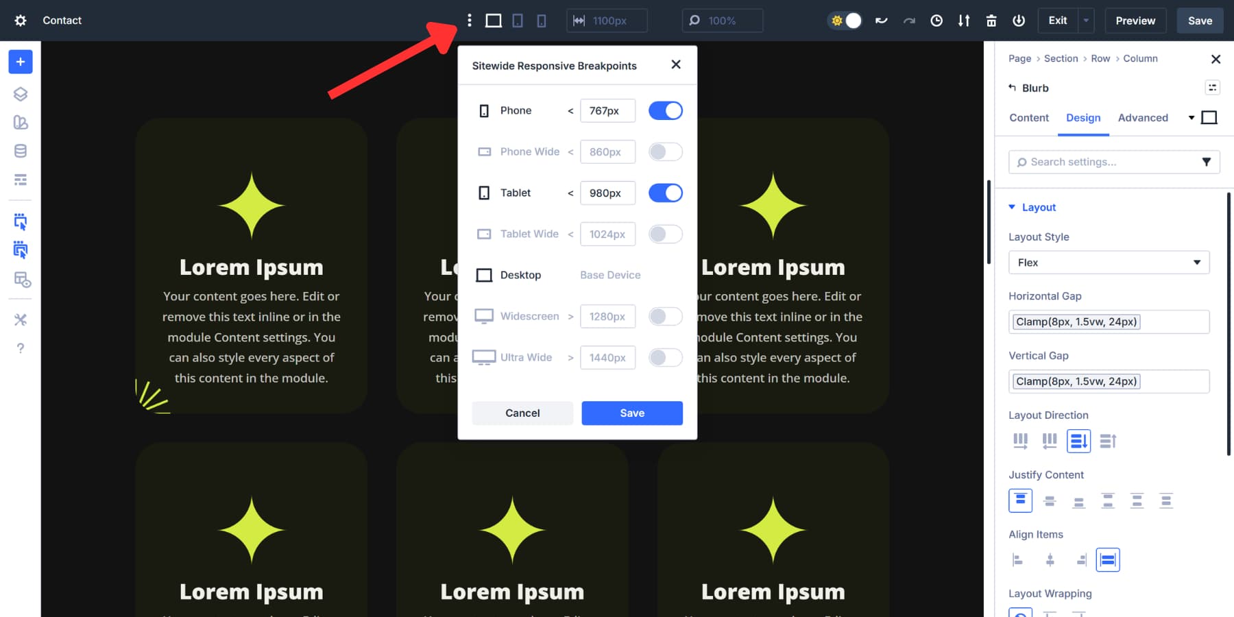
Click on the device icons in your editor and toolbar to cycle through and notice how your spacing scales smoothly without any input at each breakpoint.
You can even drag the canvas edge to see how it scales smoothly between every breakpoint.
Watch how space small transitions from 8px on mobile to 24px on desktop. Check that space medium maintains clear visual separation from space small at all widths. Look for spots where spacing feels cramped or excessive.
If adjustments are needed, open the Variable Manager and modify the clamp formula in the variable itself. Changing clamp(16px, 3vw, 48px) to clamp(16px, 2.5vw, 48px) slows the growth rate across every instance where that variable appears. One edit updates your entire site.
Lock It In With Presets
Your spacing variables are set. Element Presets package them into reusable modules and sections that you can deploy anywhere. Style a blurb module and click the preset icon in the top right corner of the module settings panel. Select New Preset From Current Styles.
Name it Feature Card and save.
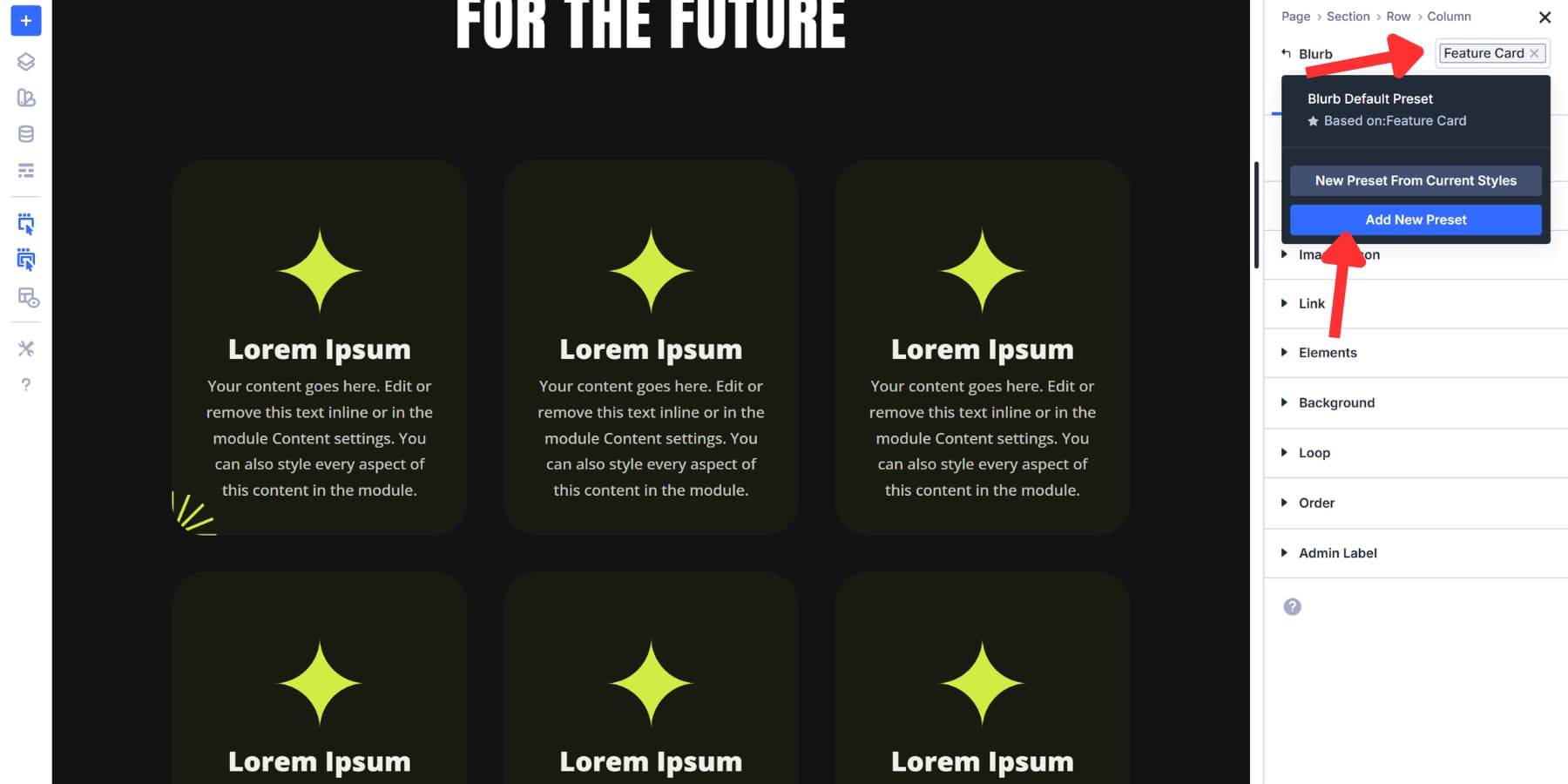
Open the preset dropdown on any new blurb. Select Feature Card. The spacing applies instantly. The variables are already attached to the preset.
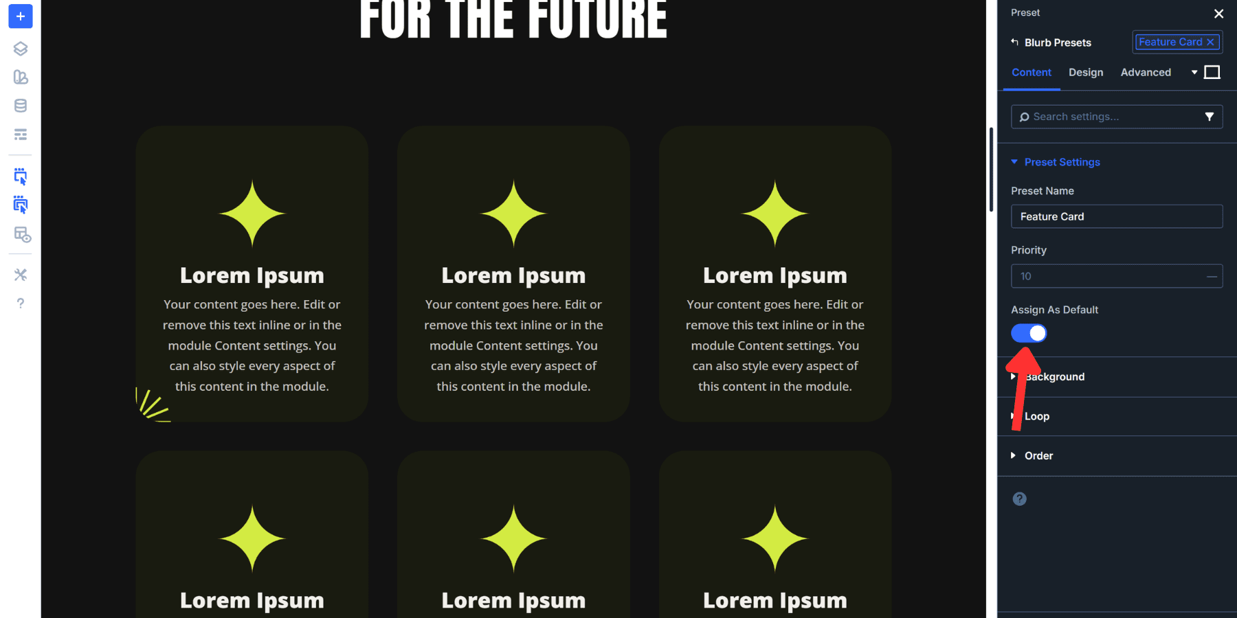
To make Feature Card your default blurb style, open the preset dropdown and hover over the settings icon of the Feature Card and enable Assign As Default. Save your changes. Every new blurb you add automatically adopts this spacing without extra clicks.
You can also stack presets. Apply your Feature Card Element Preset to a module, then add a Dark Background Option Group Preset on top of it. Both presets work together on the same element. One handles spacing, the other handles background colors.
Try Fluid Spacing In Divi 5 Today!
Divi 5 puts fluid spacing right inside the Visual Builder. Click a field, select clamp(), enter your values, and watch your spacing adapt in real time. You’re not writing code. You’re designing with tools that understand modern CSS.
Sites look good at every screen size when spacing scales correctly. That’s what this system gives you. Build it once in the Variable Manager, apply it through your layout, and then proceed with the actual design work.
Use Divi 5 and see how much faster responsive design becomes when your spacing is optimized.


Maybe I missed it somewhere, and a silly question, but once added to Divi, are we able to export these variables and import them into another Divi 5 website?
Yesm Divi 5 now lets you export Variables and import them into another Divi 5 site. 👍
Variables can be exported as a JSON file from the Variable Manager and then imported on the new website. 😊