

In Part 3 of our Mastering Flexbox series, we explored Layout Wrapping, the differences between Wrap and No Wrap, how Align Content affects wrapped multi-line layouts, and how Wrap Reverse and Display Order can improve responsive flow.
In this fourth installment, we’ll focus on one of the most common layout challenges in web design: aligning content without relying on hidden spacers, manual spacing hacks, or custom CSS.
Before Divi 5, designers often used empty Divider modules, manual padding, margins, or custom CSS to push content into place, create visual balance, or force elements to align inside equal-height containers. Those methods worked, but they added extra structure, required more breakpoint-specific cleanup, and made layouts harder to maintain.
Divi 5 gives you a cleaner visual workflow. With Flexbox controls such as Justify Content, Align Items, Align Content, and Gap, plus supporting tools like Grow To Fill, Module Groups, and Nested Modules, you can align content directly in the Visual Builder with far less custom code.
Let’s dive in.
Why Traditional Alignment Methods Fall Short
Before Divi 5, precise vertical or horizontal alignment often required workarounds. Some of the most common techniques included:
- Using hidden Divider modules to push content down or create artificial space.
- Adding custom CSS to vertically center or bottom-align content inside equal-height columns.
- Relying on manual padding and margin values that needed constant adjustment across breakpoints.
Those approaches could solve the immediate visual problem, but they also made layouts more fragile. If a headline changed, a button label wrapped, or a section switched to a smaller breakpoint, the layout often needed another round of spacing adjustments.
With Divi 5’s native Flexbox Layout System, alignment can be handled at the container level. Tools like Justify Content, Align Items, Gap, and Grow To Fill help you create balanced layouts that respond more naturally to real content.
Core Alignment Tools You’ll Use Most
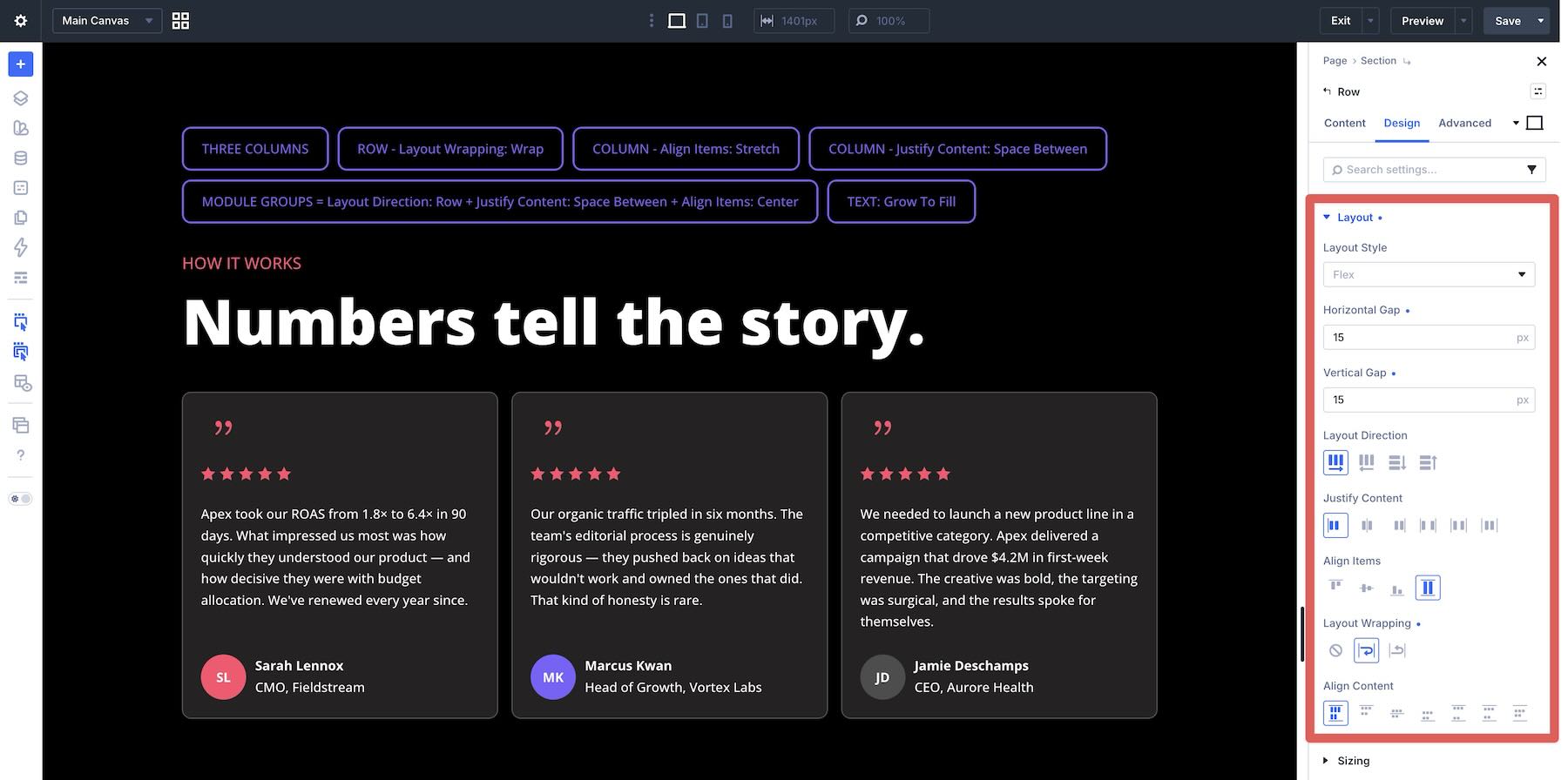
Most Flexbox alignment controls live in the Layout option group. The most important ones to understand are Justify Content, Align Items, Align Content, and Gap.
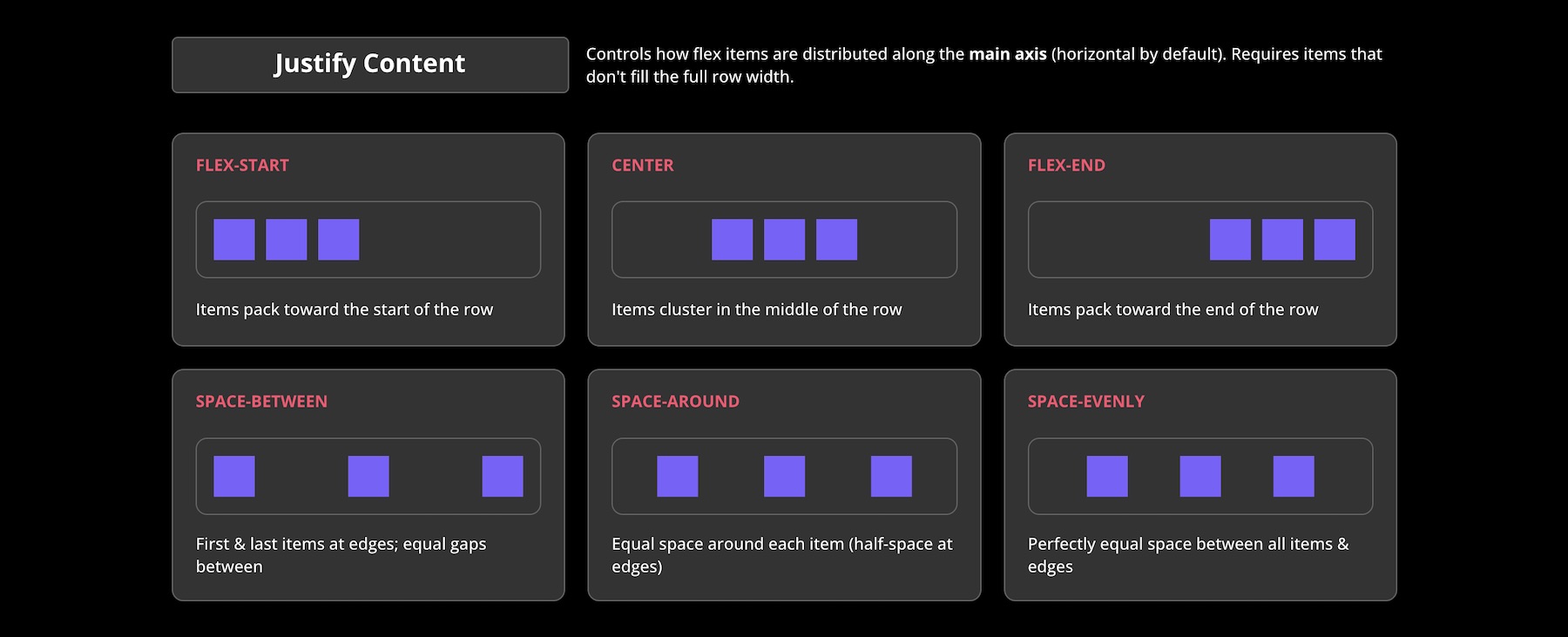
Justify Content distributes child elements along the main axis. In a Row direction, that usually means horizontal distribution. In a Column direction, that usually means vertical distribution. Its options, including Start, Center, End, Space Between, Space Around, and Space Evenly, help you control how content is positioned inside its parent container.
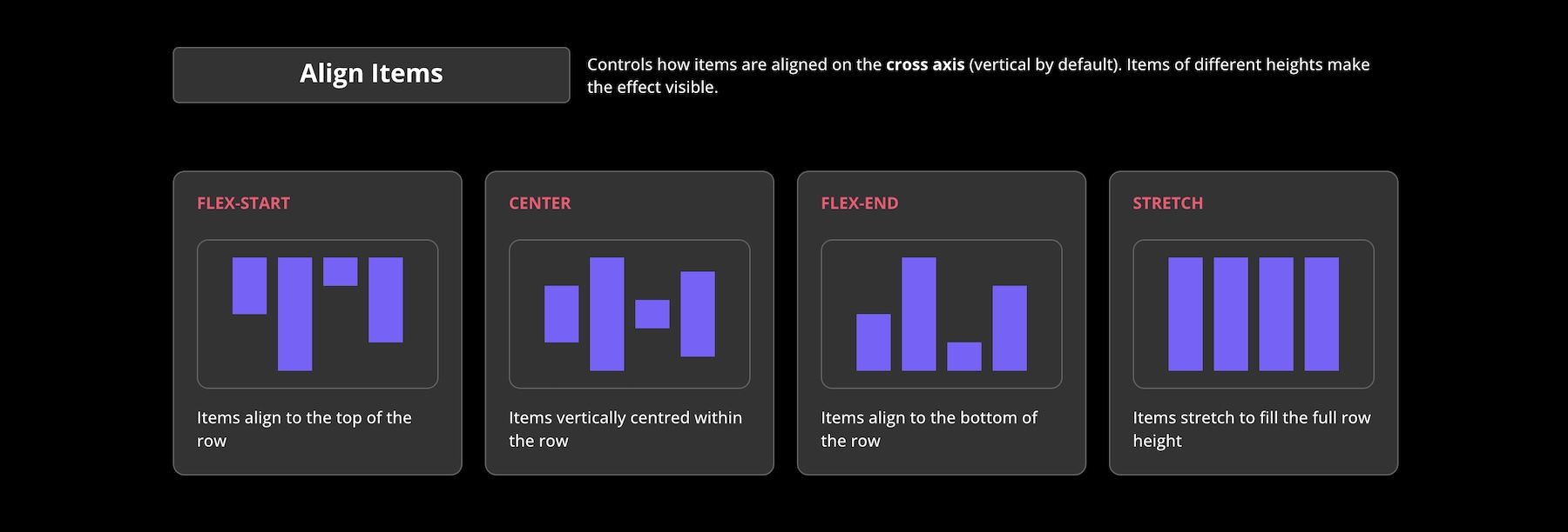
Align Items controls alignment along the cross axis. In a Row layout, this usually affects vertical alignment. In a Column layout, it usually affects horizontal alignment. The available options, Start, Center, End, and Stretch, are useful for centering items, aligning edges, or stretching items when their sizing allows it.
When Layout Wrapping is enabled and content flows onto multiple lines, Align Content controls how those wrapped lines are distributed along the cross axis. This setting only has a visible effect when there are multiple flex lines and the parent container has extra space to distribute, such as a defined or minimum height.
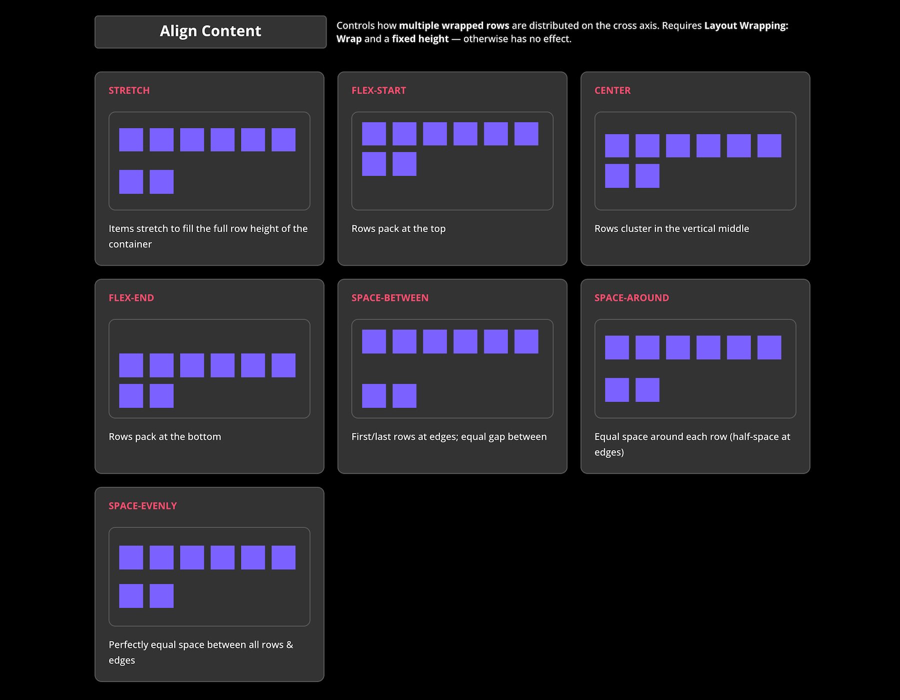
These alignment tools become even more powerful when combined with Horizontal Gap and Vertical Gap for consistent spacing, Grow To Fill in the Sizing option group for flexible item growth, Module Groups for grouping related modules, and Nested Modules for creating independent alignment contexts inside modules.
Alignment Examples Built With Divi 5
To show how these tools work together, let’s walk through a few practical alignment examples and the settings used in each one.
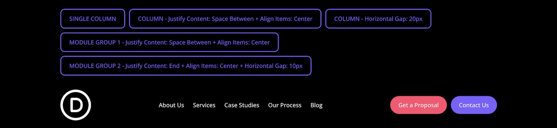
Goal: Build a header navigation where the logo and menu links sit on the left, the CTA buttons sit on the right, and everything stays vertically centered.
Settings Used: The layout uses a single-column row. At the column level, Justify Content is set to Space Between, Align Items is set to Center, and the Horizontal Gap is set to 20px. The first Module Group, containing the logo and navigation links, uses Justify Content > Space Between and Align Items > Center. The second Module Group, containing the two buttons, uses Justify Content > End, Align Items > Center, and a 10px Horizontal Gap so the buttons sit neatly side-by-side.
This combination creates a balanced navigation header without hidden spacing modules or manual margin adjustments between every element.
2. Hero Section
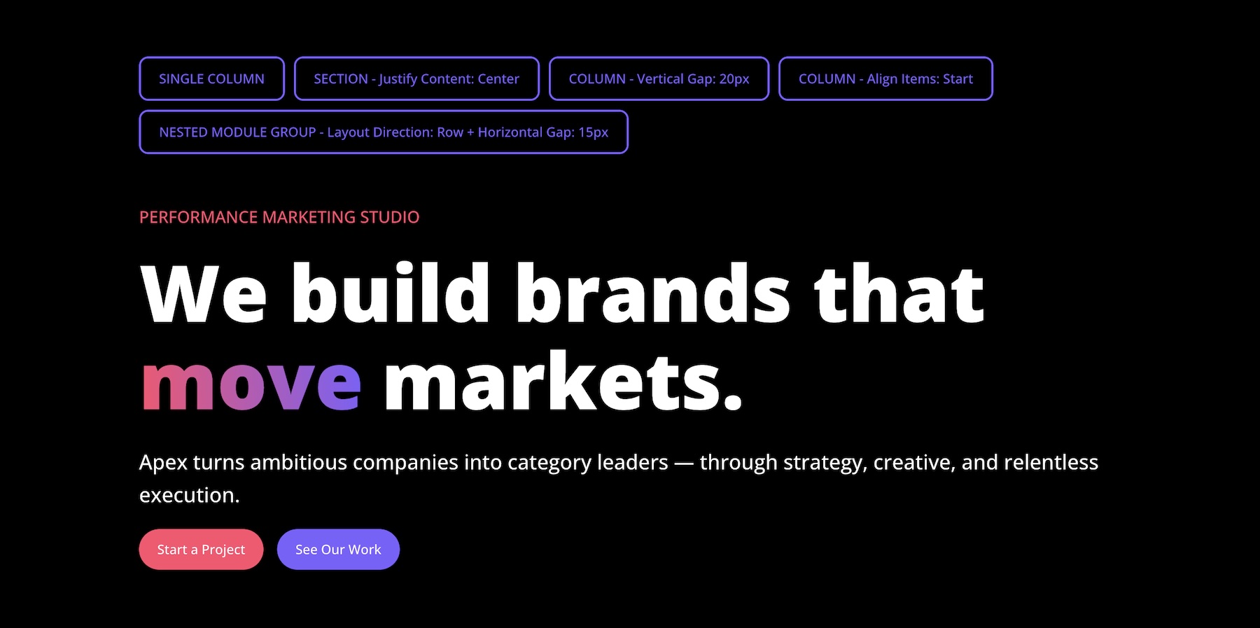
Goal: Create a clean hero section where the content stacks vertically, spacing stays consistent, and the two CTA buttons sit side-by-side.
Settings Used: The parent row uses Align Items > Stretch. At the column level, Align Items and Justify Content are both set to Start, with a 20px Vertical Gap applied between child elements. A Module Group wraps the two buttons using Layout Direction > Row and a 15px Horizontal Gap, keeping them aligned horizontally with consistent space between them.
This approach gives you predictable spacing from the parent container instead of relying on extra Divider modules or one-off padding values.
3. Statistics Grid
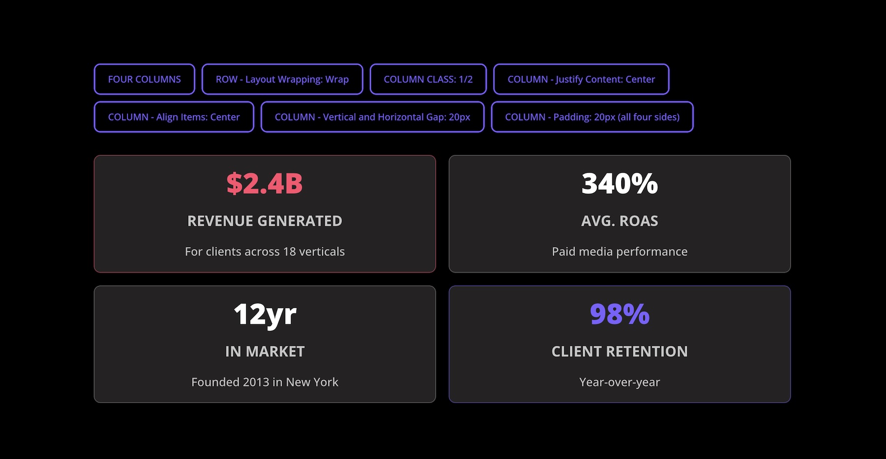
Goal: Display four key metrics in a responsive grid where each stat card feels centered, balanced, and easy to scan.
Settings Used: This section uses a four-column row with Layout Wrapping > Wrap and Column Class > 1/2 on each column, creating a two-by-two grid. The row uses 20px Horizontal Gap and 20px Vertical Gap to control spacing between the cards. At the column level, Justify Content and Align Items are both set to Center. Each column also uses 20px Padding on all four sides in the Spacing option group to create breathing room inside each card.
Gap handles spacing between cards, while padding handles spacing inside each card. Keeping those two roles separate makes the layout easier to adjust across breakpoints.
4. Service Cards
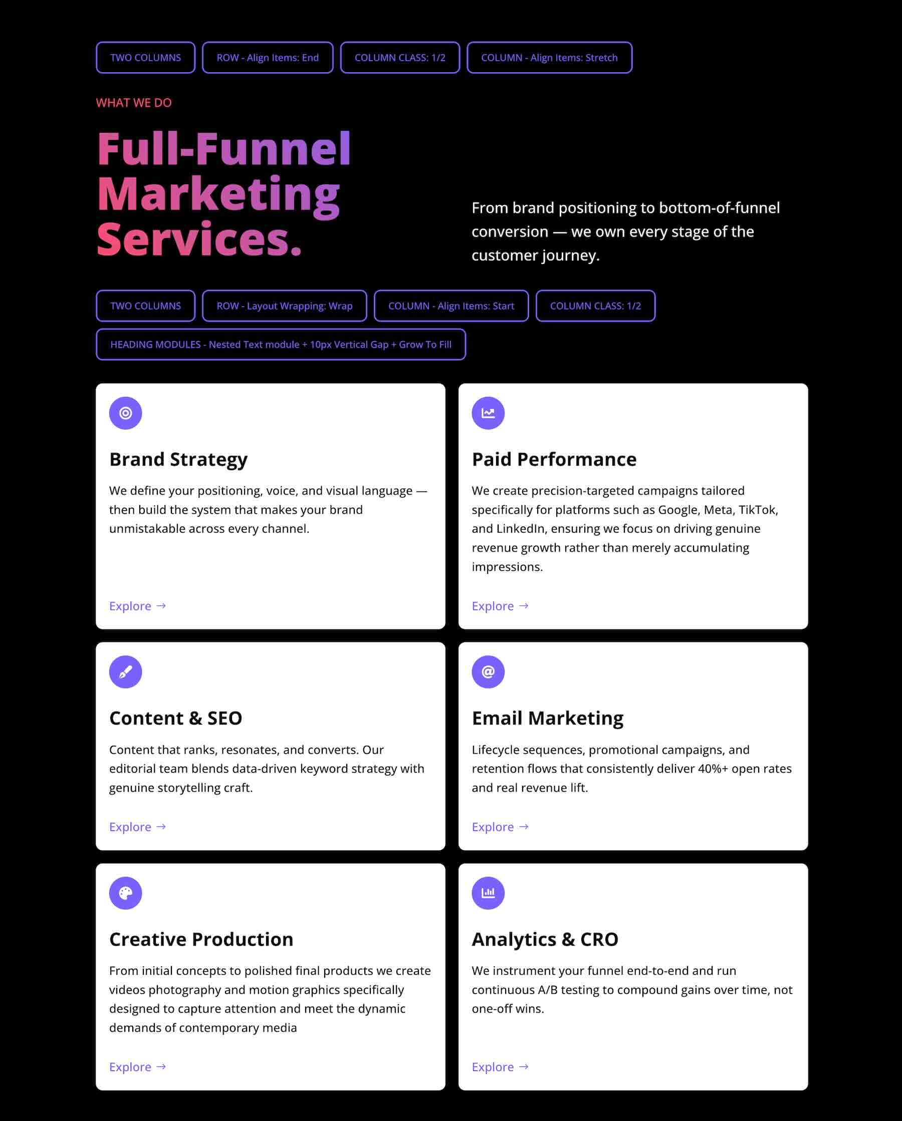
Goal: Create a service section where the headline row aligns cleanly and each service card keeps its button positioned consistently, even when text lengths vary.
Settings Used: The top row uses two columns with Column Class > 1/2 and Align Items > End at the row level to align the content toward the bottom edge. Each column also uses Align Items > Stretch so its internal elements can fill the available width.
The second row contains six columns with Layout Wrapping > Wrap and Column Class > 1/2. The row uses Align Items > Start. Inside each service card, the Heading module uses a Nested Module for the supporting text, paired with a 10px Horizontal Gap for spacing. Grow To Fill is enabled where the content area needs to absorb extra space, helping the button stay aligned near the bottom of each card.
This technique is useful for card layouts where text lengths vary but the CTA position needs to remain consistent.
5. Mixed-Width Highlight Section
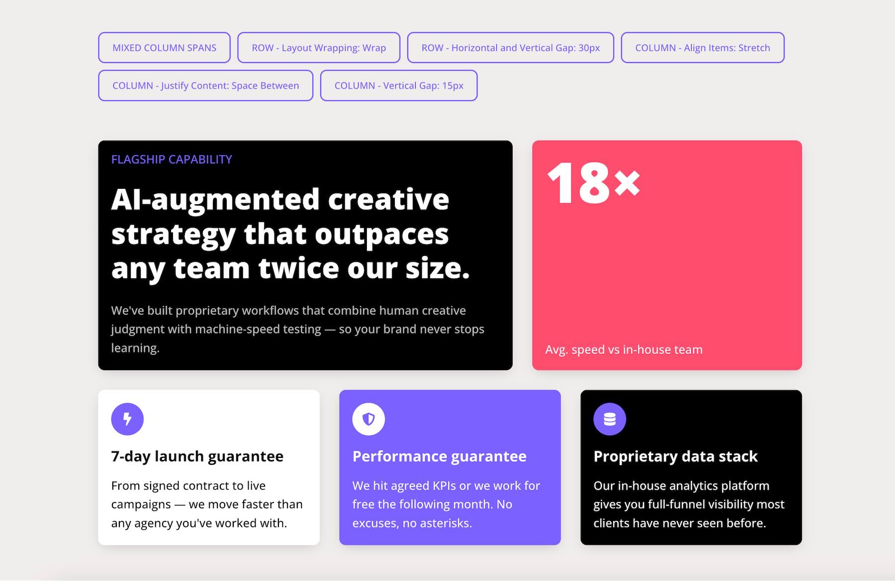
Goal: Build a highlight area that combines a large featured content block, a statistic card, and smaller supporting boxes while keeping the layout visually balanced.
Settings Used: This section uses a row with mixed column spans and Layout Wrapping. The row has both Horizontal Gap and Vertical Gap set to 30px. At the parent level, Align Items > Stretch helps columns share a consistent row height when their sizing allows it. One column uses Justify Content > Space Between to distribute its internal content from top to bottom, while the other columns use Start. A 15px Vertical Gap on each column controls spacing between modules, and each column also applies 20px Padding on all four sides for internal breathing room.
This combination creates a more dynamic layout while keeping spacing, alignment, and internal structure easier to manage.
6. Process Steps
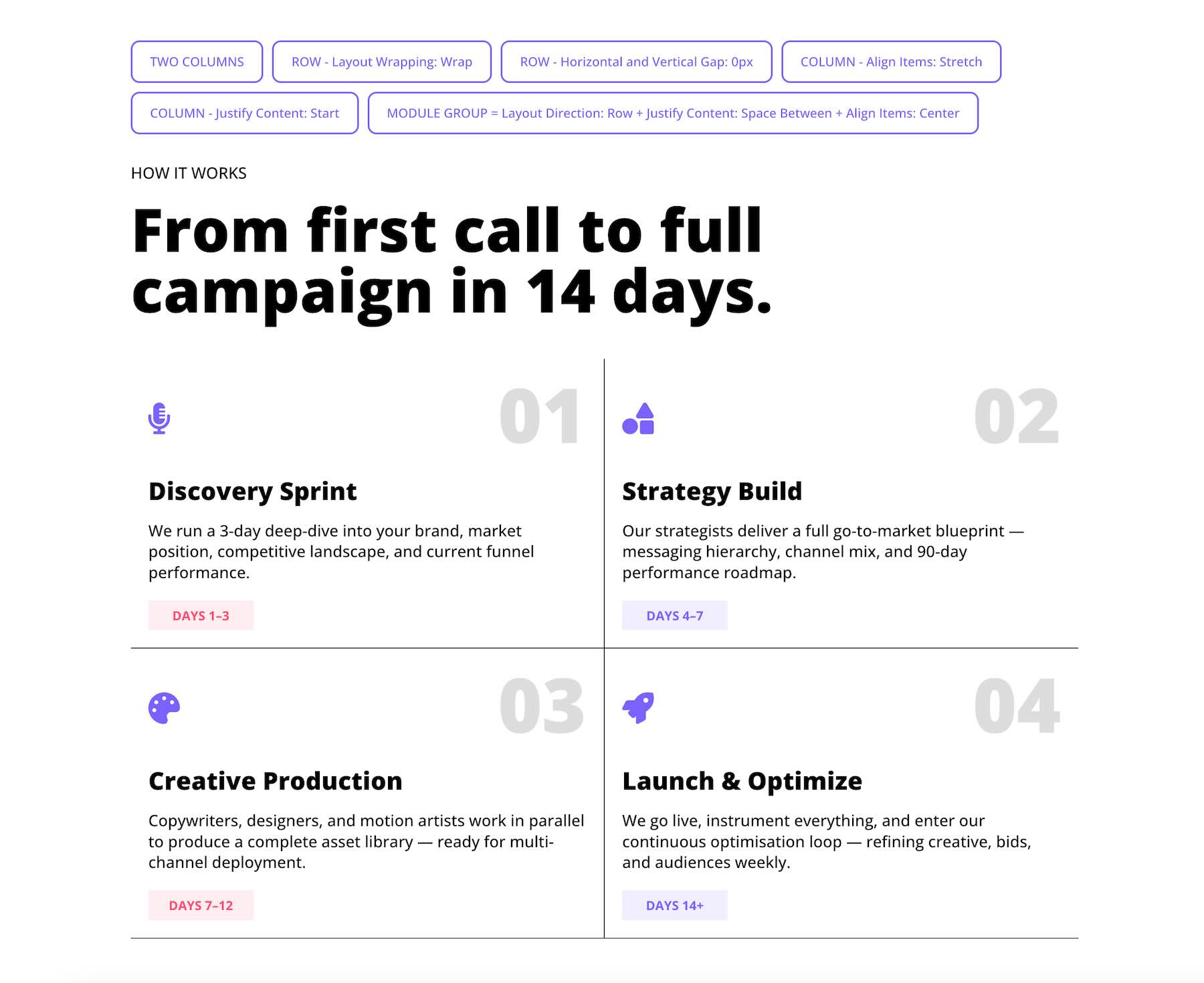
Goal: Build a four-step How It Works process layout where icons, step numbers, headings, and supporting text stay structured and aligned across columns.
Settings Used: This section uses a two-column row with Column Class > 1/2 and Layout Wrapping > Wrap enabled. Each column has 10px Padding on all four sides for internal spacing. At the column level, Align Items > Stretch and Justify Content > Start are applied.
Inside each column, a Module Group wraps the icon and step number. This group uses Layout Direction > Row, Justify Content > Space Between, and Align Items > Center, keeping the icon and large number aligned on the same horizontal line.
This setup creates a structured process section without extra spacer modules.
Step-By-Step Build Walkthrough
Let’s walk through how to build a three-column team member card section using native Flexbox alignment tools, with Spacing used only where it supports internal padding or visual breathing room.
Step 1: Create The Parent Row
Add a new three-column row. Select Flex as the Layout Style if it isn’t already selected. Set the row to Layout Wrapping > Wrap if you plan to add more than three team members later. This allows additional columns to move onto new flex lines instead of requiring extra rows.
Next, set the Horizontal Gap and Vertical Gap to 20px for consistent spacing between columns.
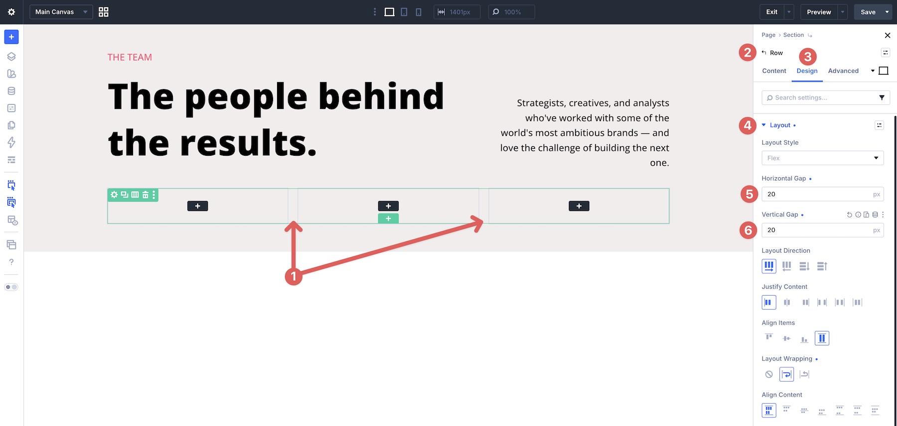
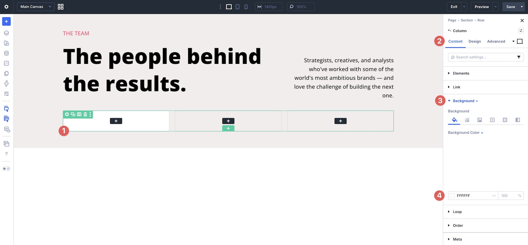
Open the first column’s settings. In the Content tab, assign a Background Color.
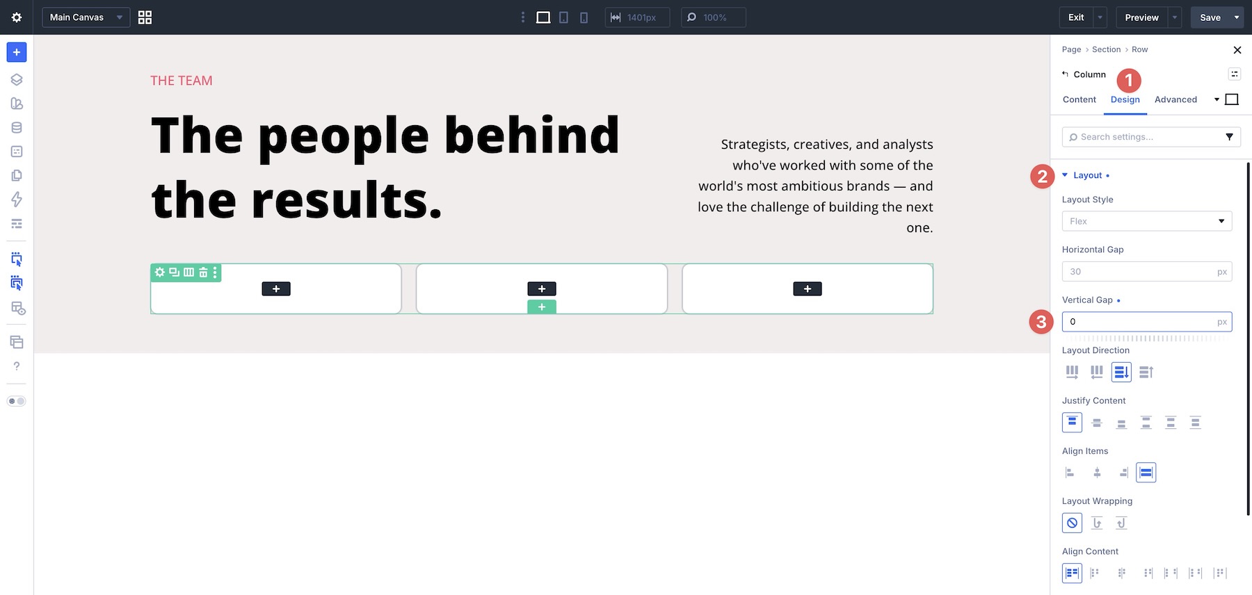
In the Layout option group, set the Vertical Gap to 0px. This removes automatic spacing between the column’s direct child elements so the card structure can be controlled more intentionally with internal Module Groups.
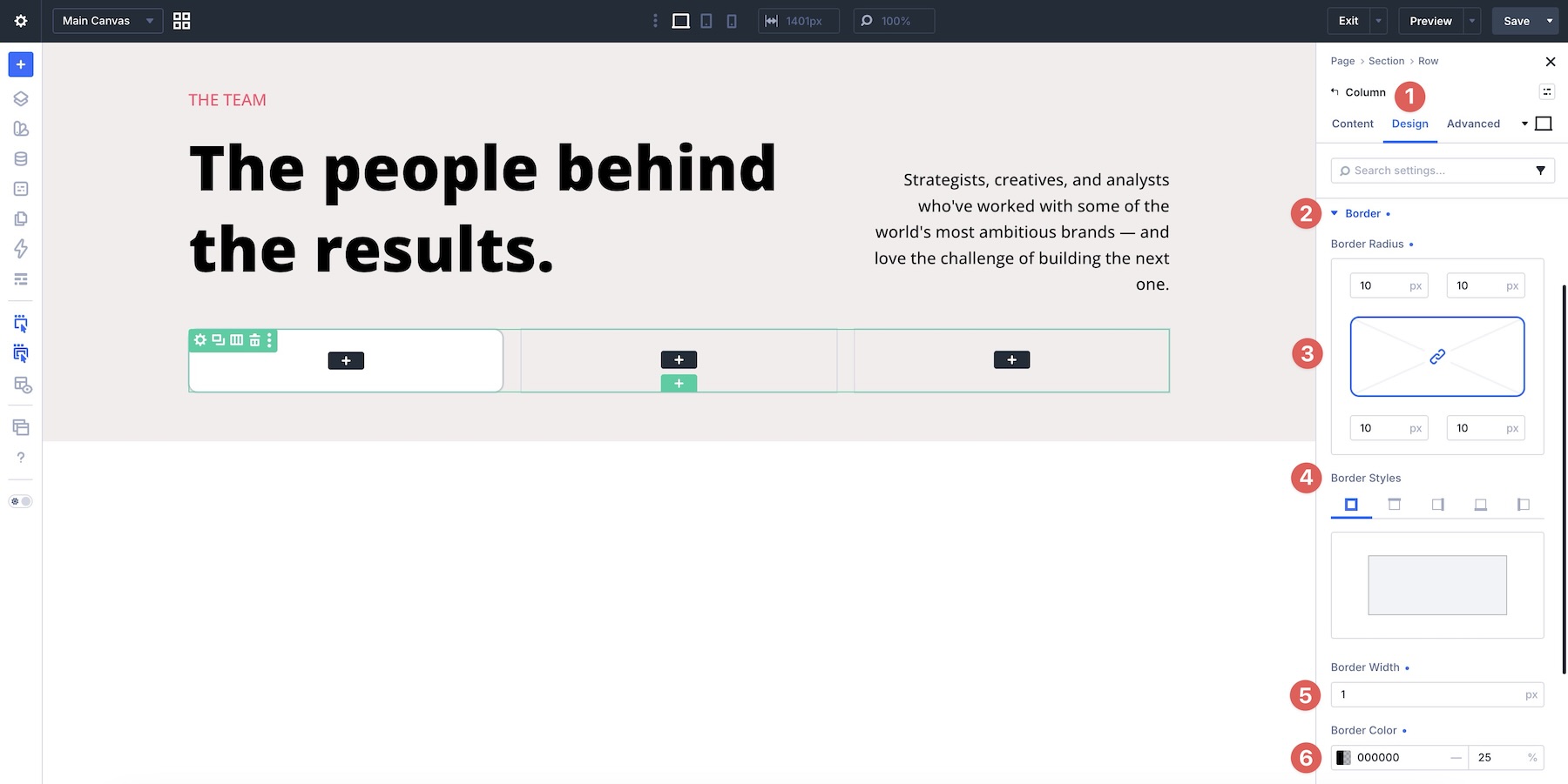
Use the Border option group to add a Border Radius, Border Style, Border Width, and Border Color to the column.
Return to the row and select the Content tab. In the Elements option group, right-click the first column, copy its item styles, and paste those styles onto the remaining columns.
Step 2: Add The Content
Add an Image module to the first column. In the Design tab, expand the Sizing option group and set the Aspect Ratio to 1:1. This frames the image as a square.
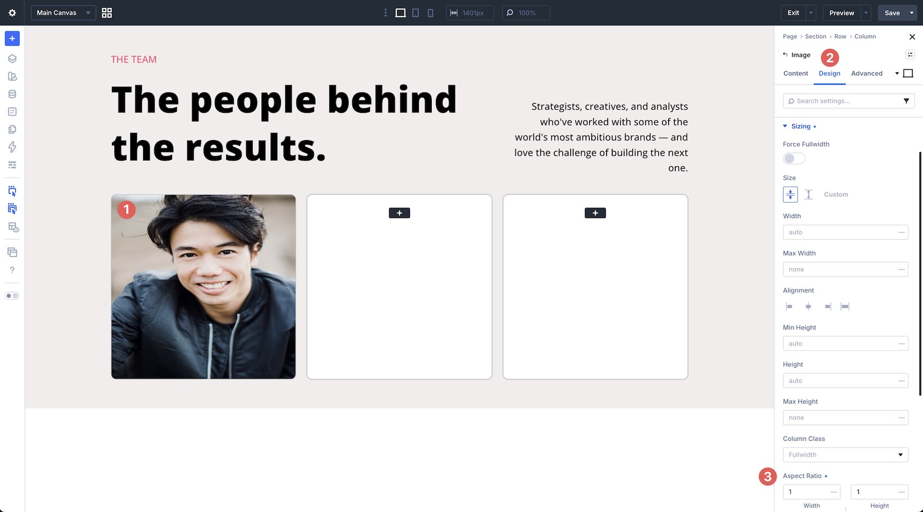
Next, expand the Framing option group. Change Object Fit from the default Fit option to Cover. Use the Object Position picker to choose which part of the image should remain visible inside the square frame.
Next, add a Module Group and a Heading module to the first column.
In the Group’s Design tab, open the Layout option group and set a 15px Vertical Gap. Then open the Spacing option group and add 20px Padding to all four sides.
Add a Text module as a nested element inside the main Heading module.
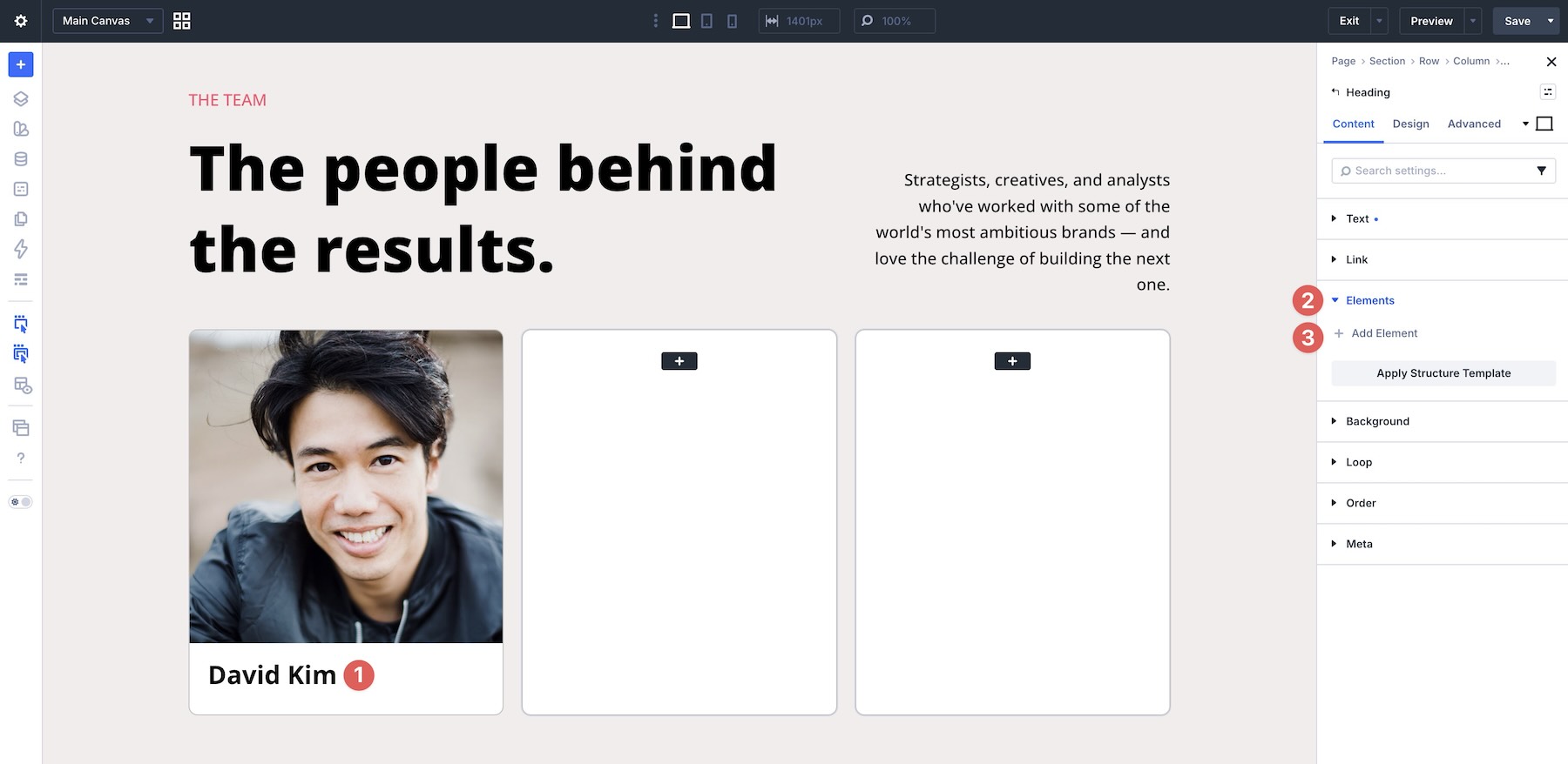
Nested Modules let you place modules inside other modules, turning the parent module into a layout container. This gives you another level of control over alignment, spacing, and internal structure.
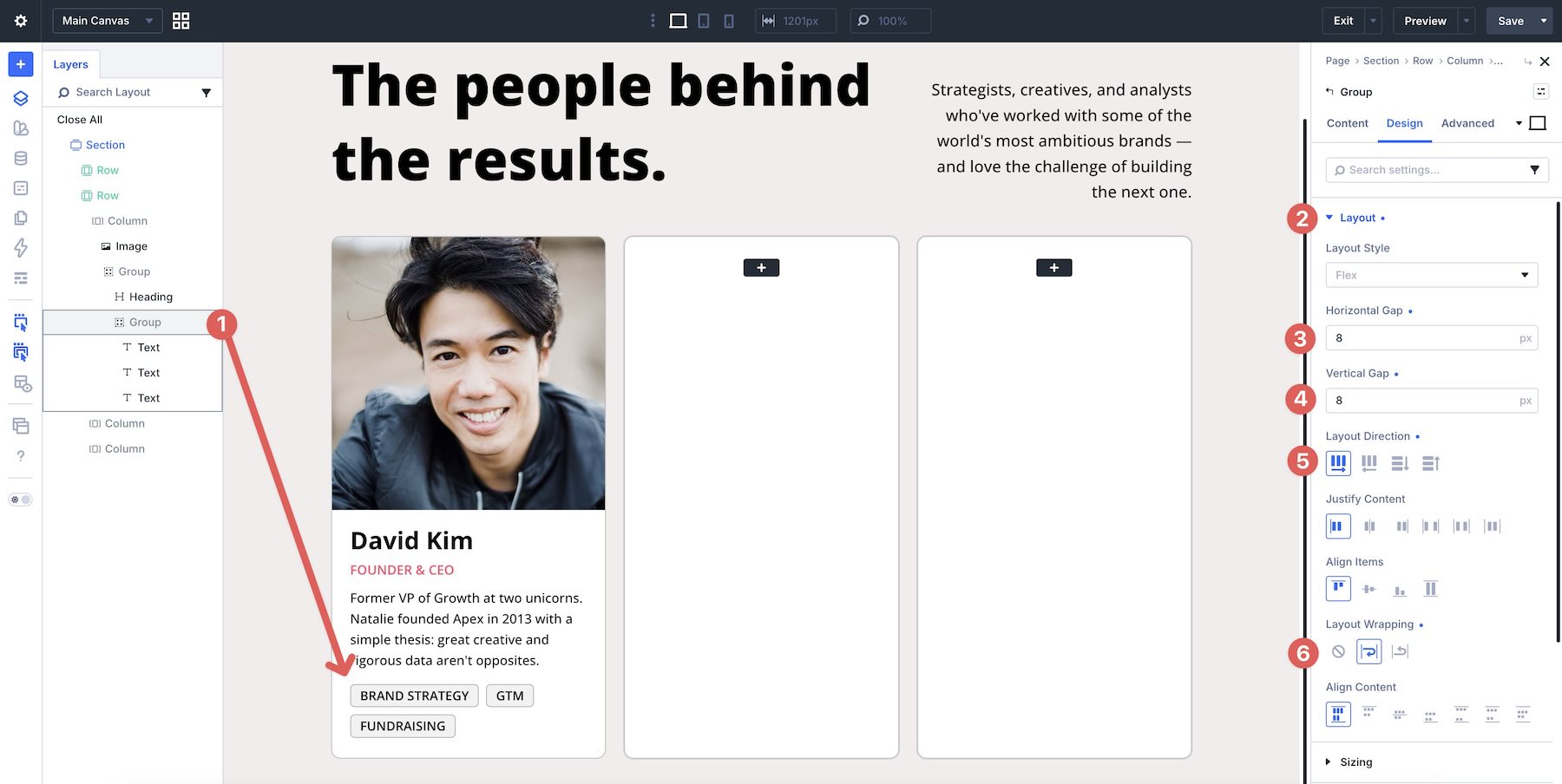
Next, add a new Module Group with three Text modules below the other modules in the column. Style them as needed, then adjust the Group’s Flexbox settings. In the Layout option group, set the Horizontal Gap and Vertical Gap to 8px. Use Row for the Layout Direction and enable Layout Wrapping so the tags can flow onto additional lines when needed.
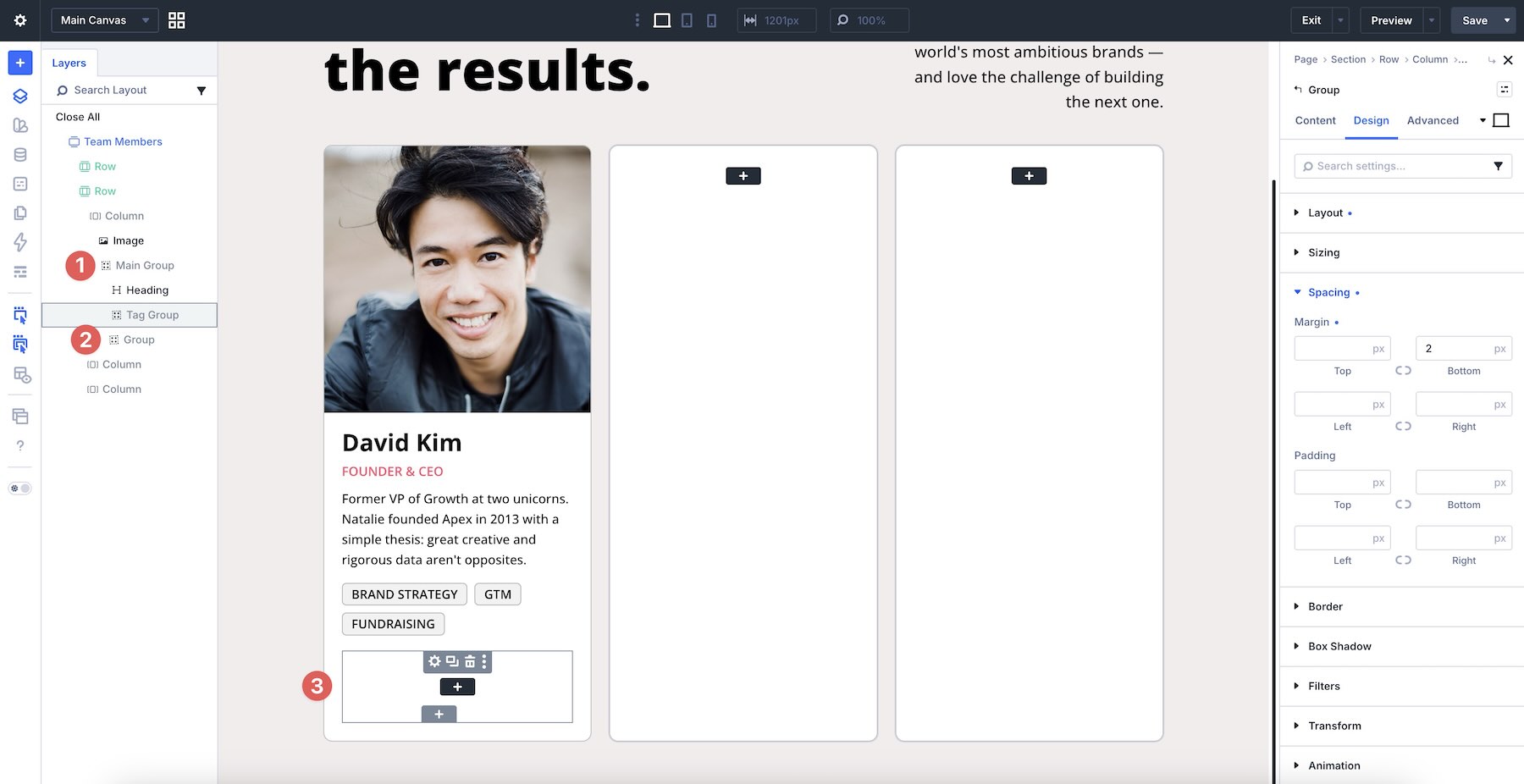
To finish the column, add another Module Group. Use the Layers panel to make sure it is nested within the Main Group.
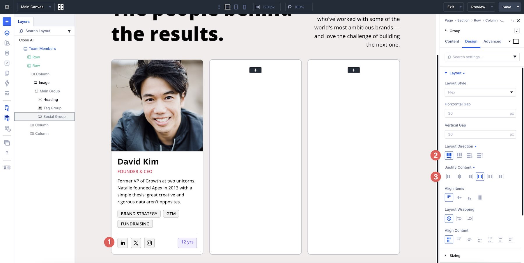
Inside the last Group, add a Social Media Follow module and a Text module, then style them. Set the Group’s Layout Direction to Row and Justify Content to Space Between.
Alignment can be controlled at the module level, too. In the Text module’s Layout option group, set both Justify Content and Align Items to Center.
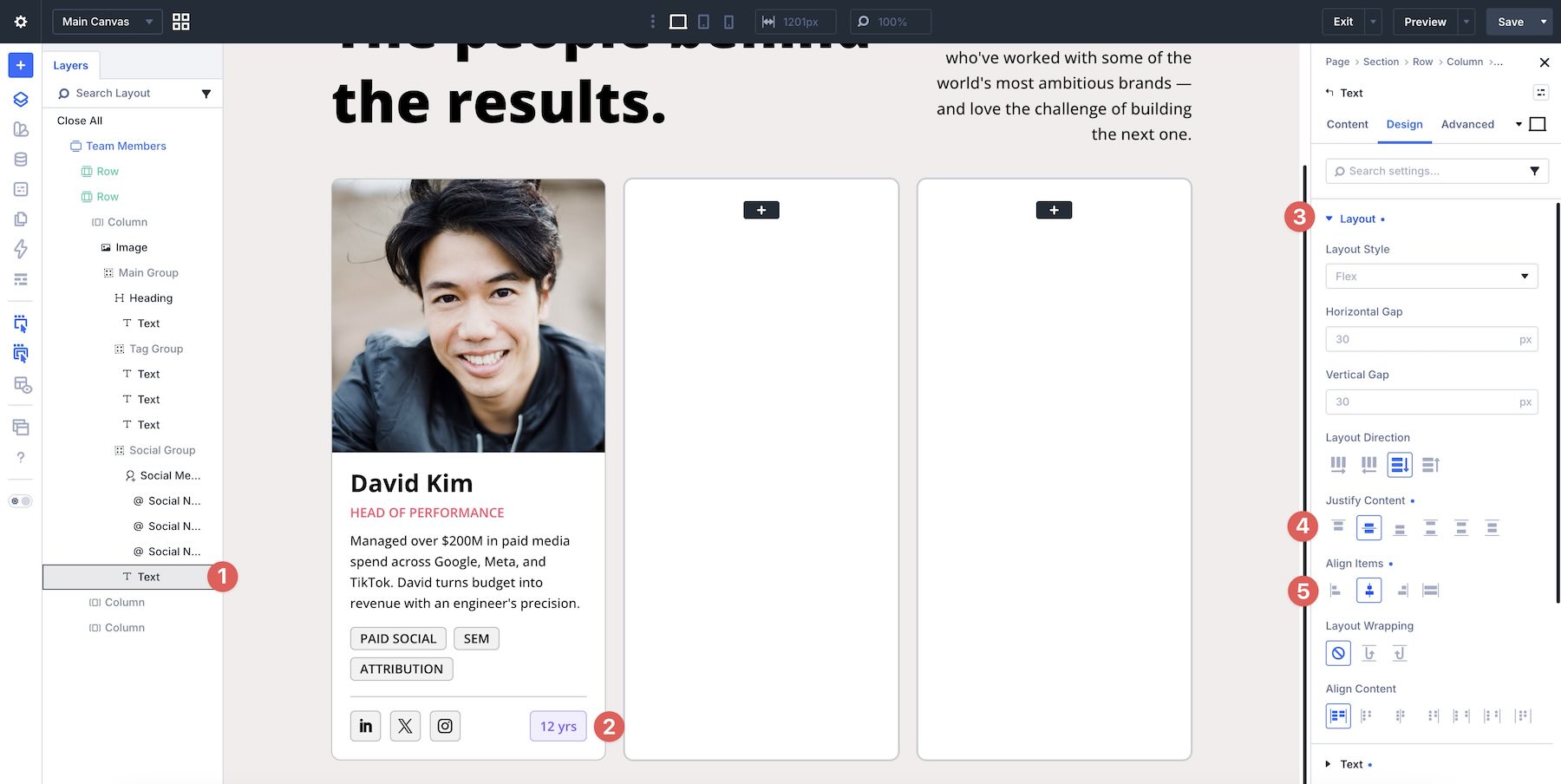
Fill the remaining two columns with content to finish the initial design.
Step 3: Make Alignment Adjustments
Depending on the length of your content, such as the bio text or the number of skill tags, you may notice small alignment shifts.
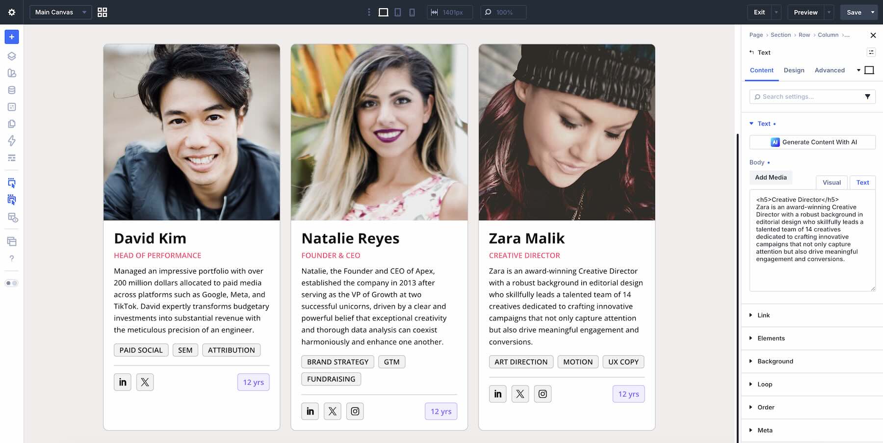
To keep the layout balanced as content changes, make a few targeted Flexbox and Sizing adjustments with Justify Content and Grow To Fill.
Although it might be tempting to set Justify Content > Space Between only at the column level, that does not solve every internal alignment issue. It separates the first and last direct child elements, but middle content such as bios and tags may still shift depending on its length.
A more reliable approach is to set each Column and main Module Group to Justify Content > Space Between, then use Grow To Fill on the content area that should absorb the remaining space.
Next, select the main Module Group. Open the Sizing option group and enable Grow To Fill.
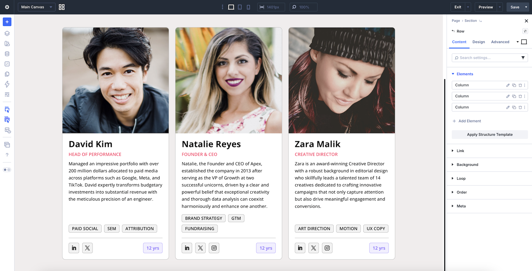
This allows the main content group to expand inside the card, helping the bottom Social Icons group stay aligned near the end of the card across different content lengths.
To keep the Tag Group aligned above the Social Group, enable Grow To Fill on the Heading module as well.
This lets the heading and bio area absorb extra space, keeping the tag group and social row in a more consistent position as content changes.
Step 4: Use Divi 5’s Responsive Tools
Flexbox helps layouts adapt across breakpoints, but you should still review tablet and phone views. Use Divi’s Customizable Responsive Breakpoints to preview the layout on smaller screens. Switch between breakpoints to spot alignment or spacing issues, then apply targeted adjustments with per-breakpoint Flexbox settings, Column Class values, or Structure Templates when needed.
Step 5: Edit, Duplicate, Or Delete Columns
Once your team member card works across breakpoints, adding more team members is simple. Open the row settings, then go to the Elements option group. From here, you can edit, duplicate, or delete any column.
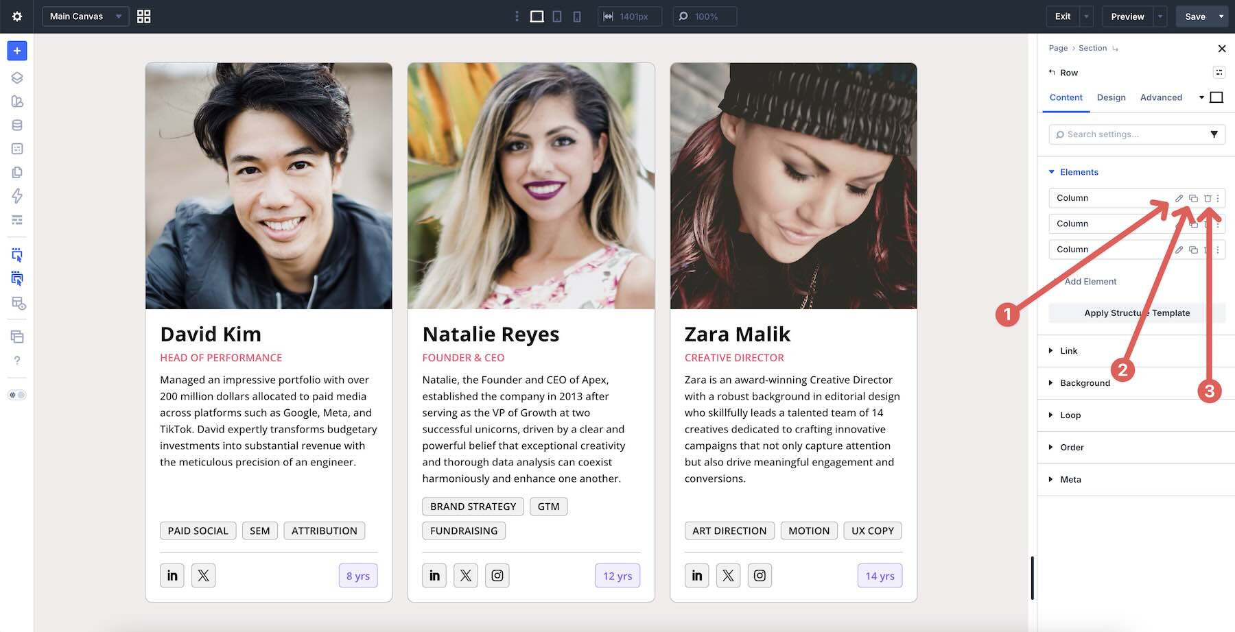
Duplicating a column copies the column styling, Flexbox settings, padding, borders, and nested modules. Update the content in the new column, then review the layout at each breakpoint. Because Layout Wrapping is enabled on the row, additional cards can flow onto new lines instead of requiring new rows.
Best Practices And Pro Tips
Now that you’ve seen Flexbox alignment in action, here are a few practical tips to help you build cleaner, more maintainable layouts.
Adjust Alignment Per Breakpoint
You don’t have to use the same alignment settings across every device. For example, you might use Center alignment on mobile for better visual balance while keeping Start alignment on desktop. Divi 5’s Responsive Editor and Customizable Responsive Breakpoints make these changes easier to manage.
Combine Alignment With Layout Direction
Switching between Row and Column direction at different breakpoints changes how Justify Content and Align Items behave. Use this intentionally when a horizontal desktop layout needs to become a stacked or centered mobile layout.
Use Height When Working With Align Content
Align Content only has a visible effect when wrapping creates multiple flex lines and the parent container has extra cross-axis space. Adding a height or minimum height, such as 600px, gives Align Content room to distribute those wrapped lines.
Always Test With Real Content
Placeholder content can hide alignment issues. Test with short, medium, and long copy, different button labels, varying tag counts, and real images early in the process so you can catch layout issues before publishing.
Download The Layouts
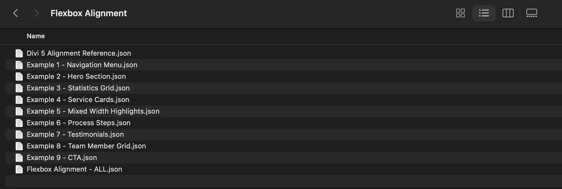
To help you practice everything covered in this post, we’ve prepared a zipped file called Flexbox Alignment. It includes the example layouts shown above, built with Flexbox alignment patterns you can inspect and reuse. You can import any layout individually or upload the Flexbox Alignment – ALL.json file to import them all at once.
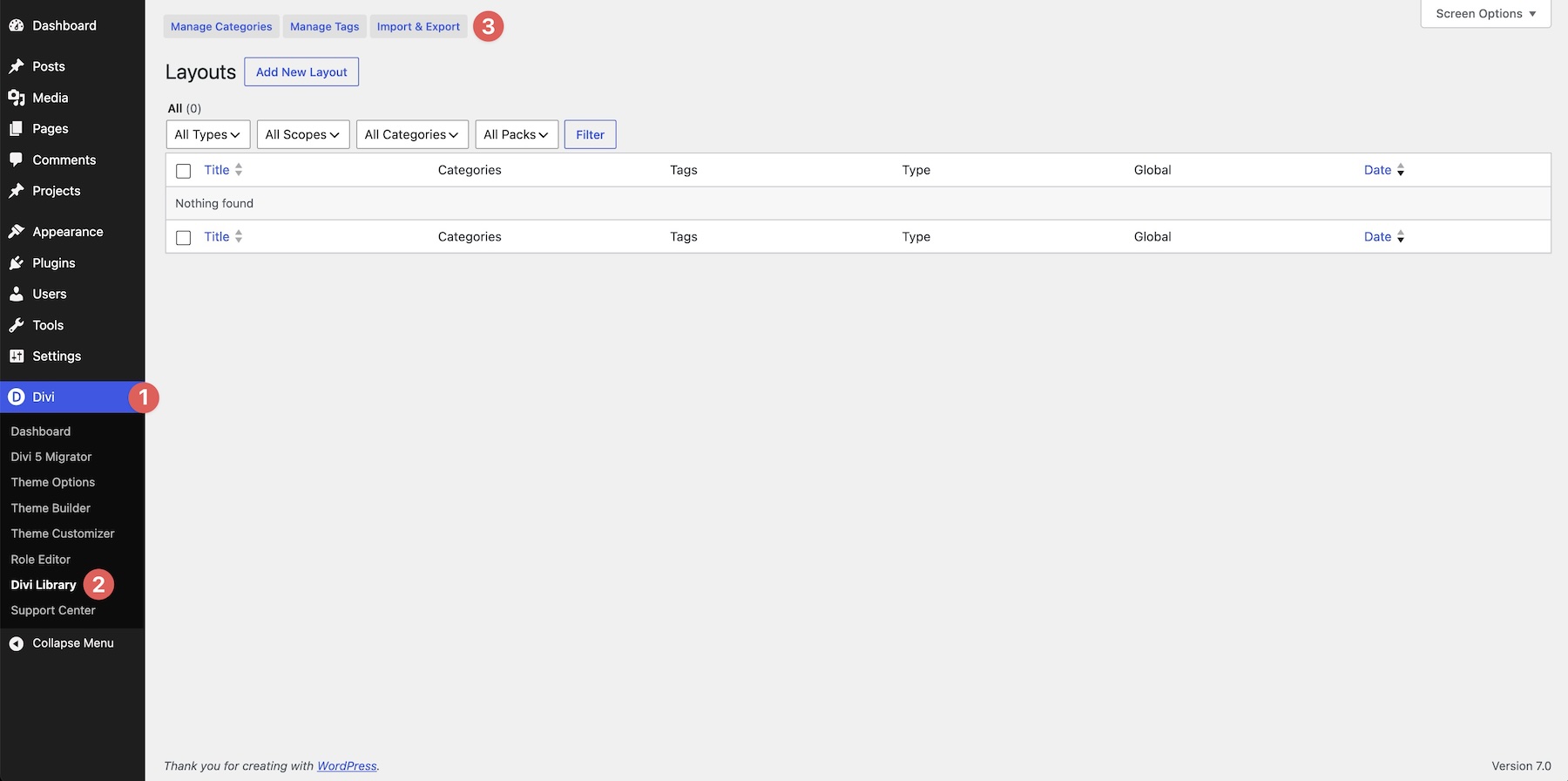
To import them, go to your WordPress dashboard and navigate to Divi > Divi Library. Click the Import & Export button at the top.
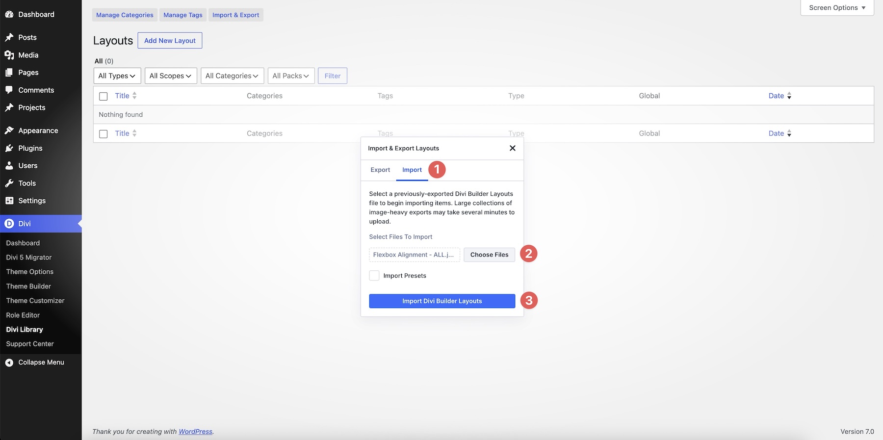
Switch to the Import tab, select a JSON file, and click Import Divi Builder Layouts.
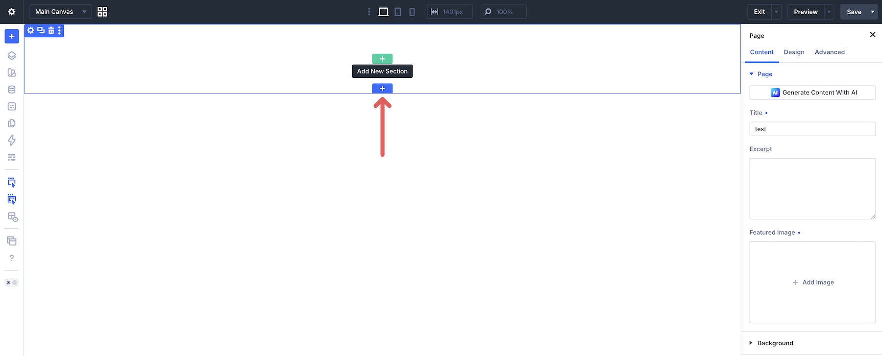
Once imported, open a page in the Visual Builder or create a new one. When the Builder loads, click to add a new section to the page.
Select the Add From Library tab, choose a layout, and click Use This Section to load it onto the page.

Master Alignment With Flexbox In Divi 5
For many common alignment patterns, you no longer need hidden Divider modules, spacing hacks, or custom CSS. Divi 5‘s Flexbox tools give you visual, content-aware controls for positioning, spacing, and aligning elements across responsive layouts.
In Part 5 Of Mastering Flexbox: Reordering Content For Better Mobile Layouts, we’ll show how to combine Display Order, Flexbox direction changes, and Wrap Reverse to create better mobile flows without duplicating content.
Download the example layouts, experiment in the Visual Builder, and start building cleaner, more maintainable pages. Drop a comment below and let us know which alignment technique you’re most excited to try.










Leave A Reply