
Styling a form well takes effort. You choose the colors, adjust the borders, refine the spacing, and eventually the form looks right. But that is only the resting state: the version visitors see before they interact with it.
The moment someone clicks or tabs into a field, the focus state takes over. If you have not designed that state, the browser fills in the gap with its own default outline. Sometimes that default is visible enough. Often, it is too thin, too low-contrast, or out of place with the rest of the design.
Divi 5 gives you visual control over form focus states without custom CSS. With the new form field options, Focus mode, Design Variables, and Presets, you can build focus styles that are clearer, more consistent, and easier to reuse across your site.
- 1 Why Focus States Matter For Accessible Forms
- 2 What Makes A Good Focus State?
- 3 How Divi 5 Handles Form Field States
- 4 Use Custom Attributes Carefully
- 5 How To Build Better Focus States In Divi 5
- 6 Add ARIA Only When It Improves The Markup
- 7 Save Your Focus Styles As Presets
- 8 Test The Form Before Publishing
- 9 Try Styling Your Forms In Divi 5 Today!
Why Focus States Matter For Accessible Forms
A focus state shows which field or control is currently active. This matters for anyone using a keyboard, switch device, voice control, screen reader, or other assistive technology. It also helps mouse and touch users understand where they are when a form becomes complex.
Default browser focus styles vary. One browser might use a blue outline. Another might use a dotted border. The thickness, contrast, and offset can change across browsers and operating systems. Those defaults are better than no focus indicator, but they rarely match your brand or your page background.
The goal is not to remove the default outline and replace it with something prettier. The goal is to create a focus state that is easy to see, works across different backgrounds, and still fits the design.
What Makes A Good Focus State?
A good focus state should make the active field easy to spot. This is especially important for keyboard users, screen reader users, and anyone navigating a form without a mouse.
WCAG requires visible focus indicators for keyboard navigation. It also expects important non-text visual cues, such as focus borders and outlines, to have enough contrast against nearby colors. You do not need to turn the form into an accessibility spec sheet. A practical focus state should do three things:
- Stand out clearly from the resting field style.
- Use enough contrast to remain visible against the field and page background.
- Keep field text and placeholder text readable in both default and focused states.
In practice, that usually means using more than color alone. A stronger border, a subtle background change, or a visible outline can help users understand exactly which field is active.
How Divi 5 Handles Form Field States
Divi 5 gives form styling a more consistent structure across form-based modules. Instead of relying on one broad Field group, form field design is split into dedicated Input, Checkbox, and Radio option groups.
These groups include design controls for field text, labels, placeholders, backgrounds, borders, spacing, and related styling. They also support state editing, so you can style fields differently when they are focused, checked, or in their default state.
Focus mode works much like Hover mode. Switch to the Focus state, adjust the field design, and those styles apply only when the field receives focus. For checkboxes and radio buttons, the Checked state gives you the same kind of control when an option is selected.
This shared structure makes it easier to reuse the same form logic across Contact Forms, Email Optins, Login forms, Comments, Contact Form 7 forms, and WooCommerce forms. It also means focus styles can become part of your broader Divi 5 design system, not a one-off adjustment.
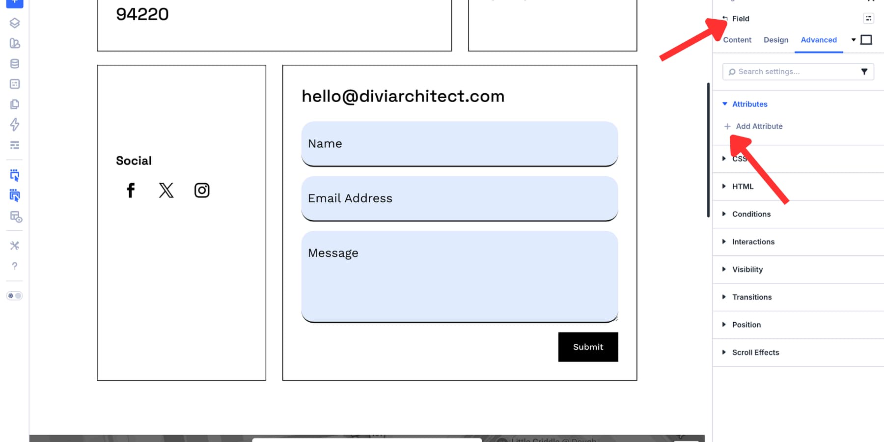
Use Custom Attributes Carefully
Good visual focus states help sighted users. Screen readers use a different layer: the HTML and accessibility tree. That means visual styling and semantic information both matter.
Divi 5’s Custom Attributes feature lets you add attributes such as aria-label, aria-describedby, aria-invalid, and other HTML attributes from the builder. This can help when a field needs extra context that is not already present in the markup.
Use ARIA as a supplement, not as a replacement for good form structure. Visible labels, meaningful field names, clear helper text, and native form attributes should come first. Add ARIA only when it improves the information assistive technology receives.
How To Build Better Focus States In Divi 5
Now let’s build the focus state. The example uses Divi’s Contact Form module, but the same principles apply to other Divi form modules that use the new Input, Checkbox, and Radio option groups.
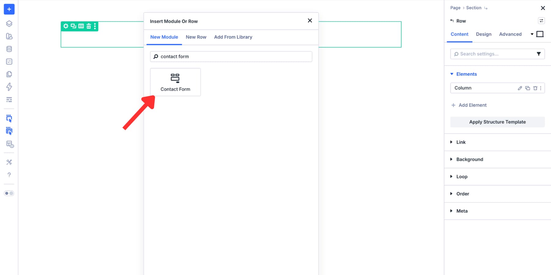
Step 1: Add A Form
Open a page in the Divi Visual Builder. Add a Section, add a Row, and click the plus icon inside the column to open the module picker.
For this walkthrough, add the Contact Form module.
Once the module is on the canvas, style the resting state first. Set the field background, text color, borders, spacing, labels, placeholders, and button design before moving into Focus mode.
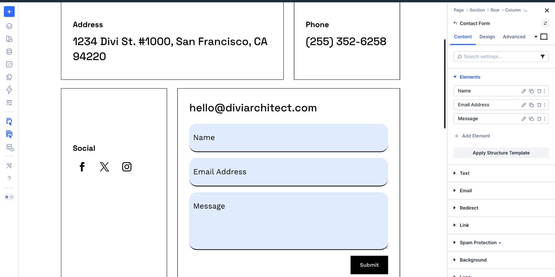
The resting state becomes your baseline. The focus state should feel related to it, but clear enough that users can instantly see which field is active.
Step 2: Set Up Design Variables
Design Variables make focus styling easier to manage. Instead of choosing static colors for every form, save your key colors and spacing values as reusable variables.
You can create those variables manually, or use the Variable Generator to turn one brand color into a broader palette of tints, shades, tones, and transparent variants.
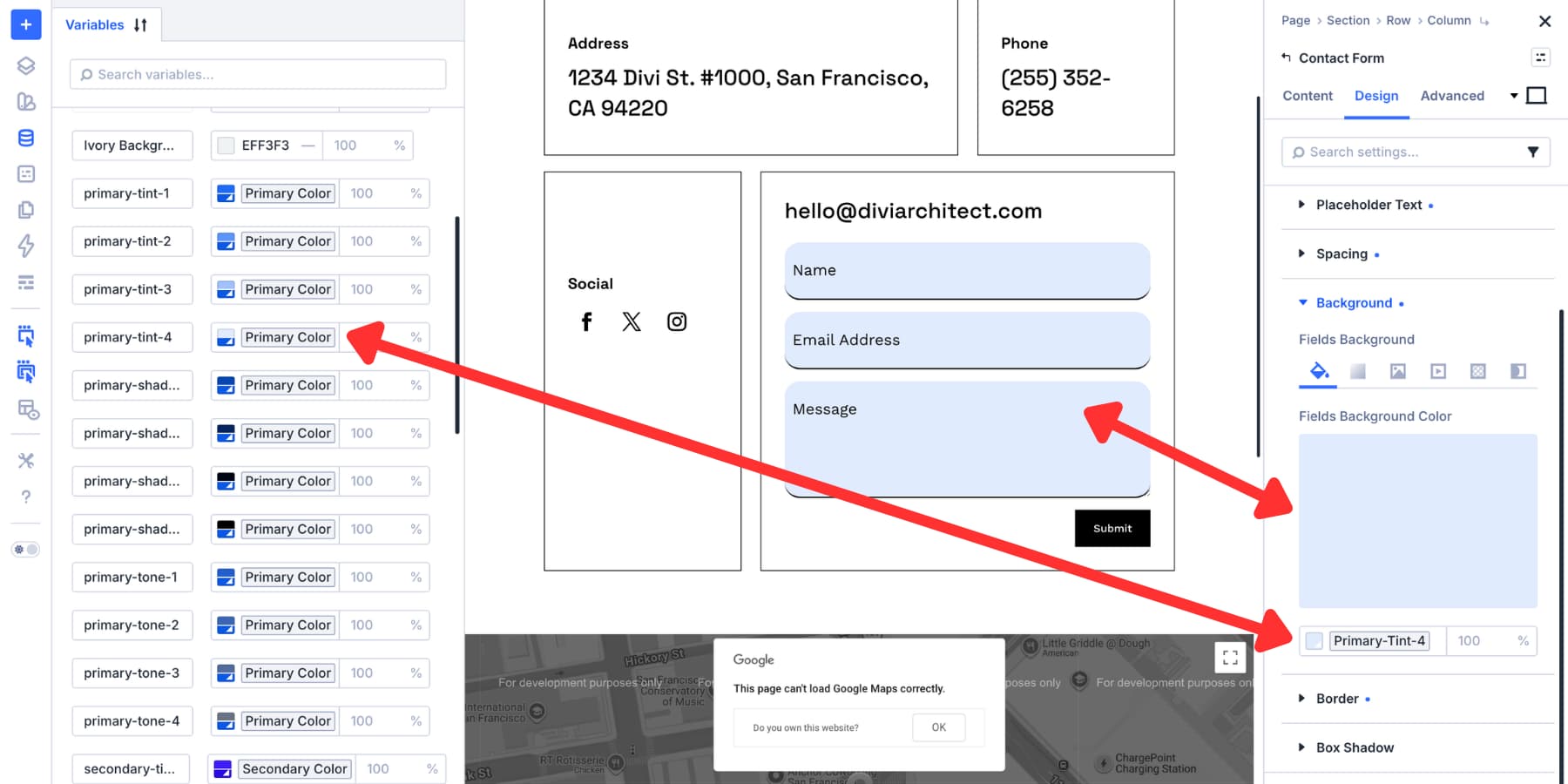
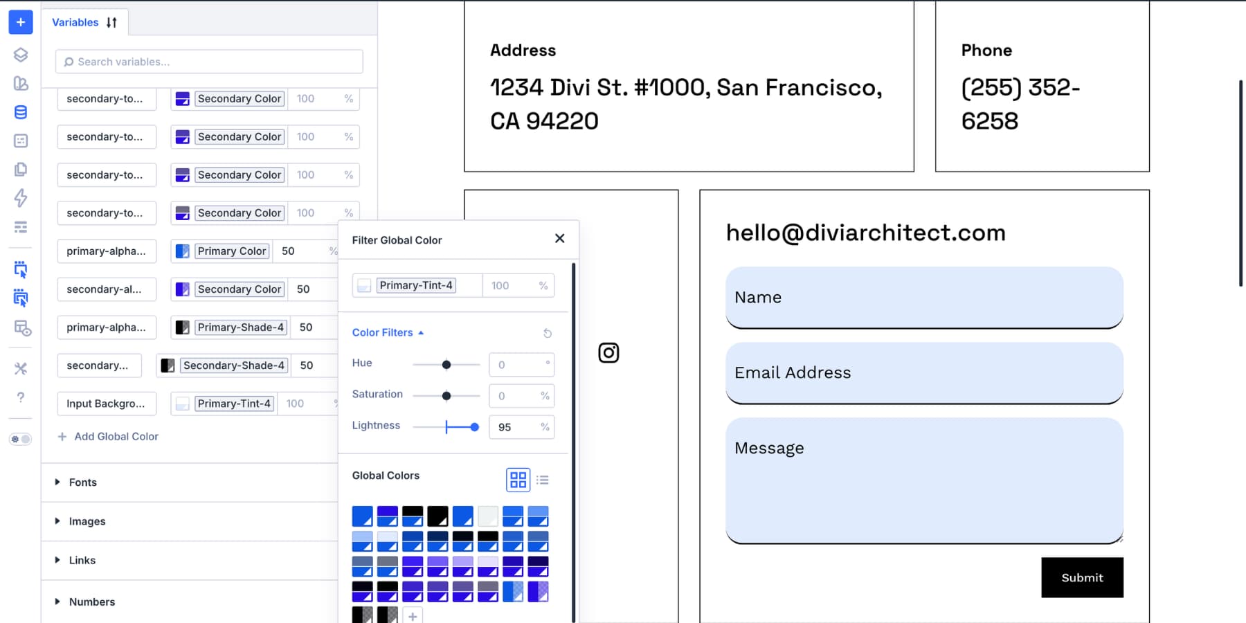
To generate color variables, open the Variable Manager, hover over the Colors group, and click the palette icon.
Divi can generate light tints, darker shades, muted tones, and transparent variants from your primary color. Those lighter tints often work well for focus backgrounds, while stronger shades or brand colors can work well for focus borders.
If you already have a field background variable, you can also create a relative color from it. Choose the field background as the base, increase the lightness for a focus tint, and save it with a clear name such as Input Focus Background.
For text, use a high-contrast color that remains readable in every field state. If your resting field text uses a softer shade, the focus state can use a stronger version of the same text color.
Step 3: Open Focus Mode
Select the form module on the canvas and open its settings panel. Go to the option group you want to style, such as Input, then switch from the default state to Focus.
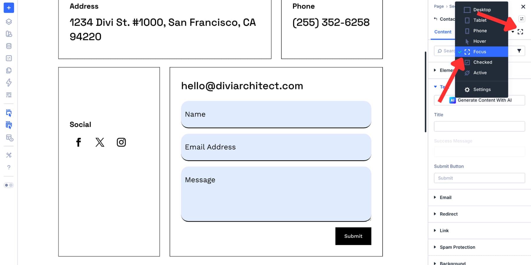
Any change you make in Focus mode applies only when the field receives focus. If the canvas does not immediately show the focused design, preview the page and click or tab into the field to test it.
Step 4: Change The Focus Background And Text Colors
The focused field should look active without becoming distracting. A subtle background shift can help, especially when combined with a clear border.
In Focus mode, open the field background settings and choose your focus tint variable. Then set the field text color to a strong, readable color.
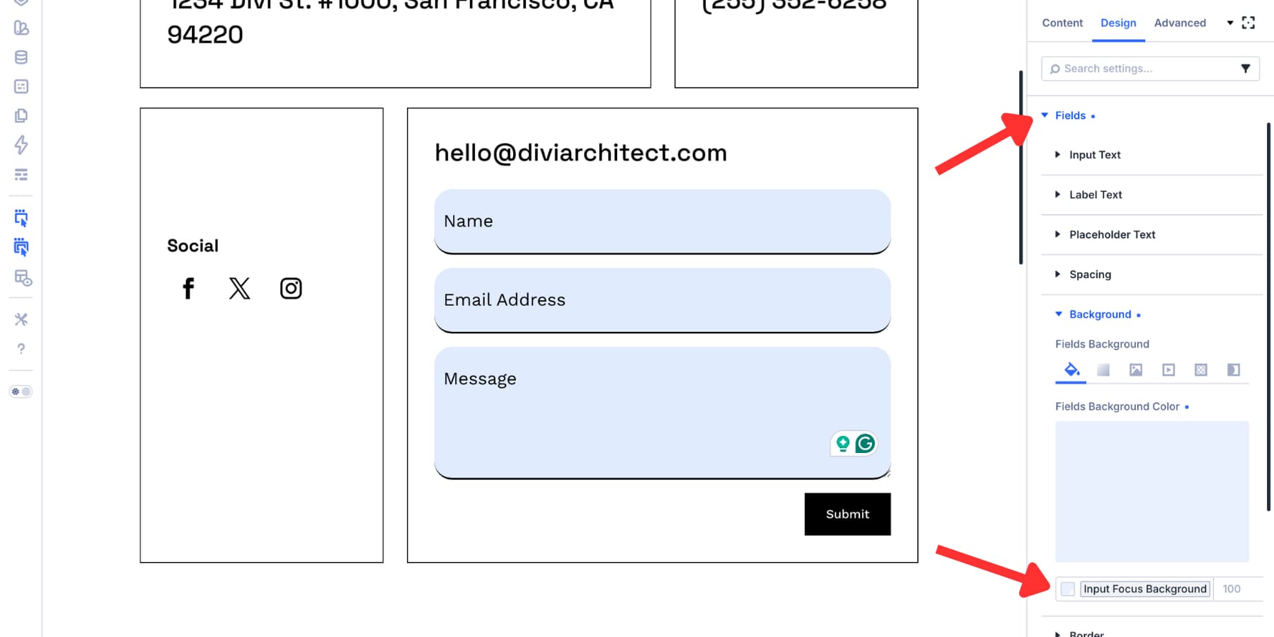
Check two things before moving on. First, the focused state should be visually different from the resting state. Second, the text inside the focused field should still pass contrast requirements against the new background.
Do not rely on HSL lightness values alone. They are useful starting points, but actual contrast depends on hue, saturation, and the surrounding colors. Use a contrast checker for important field text, placeholder text, buttons, and error messages.
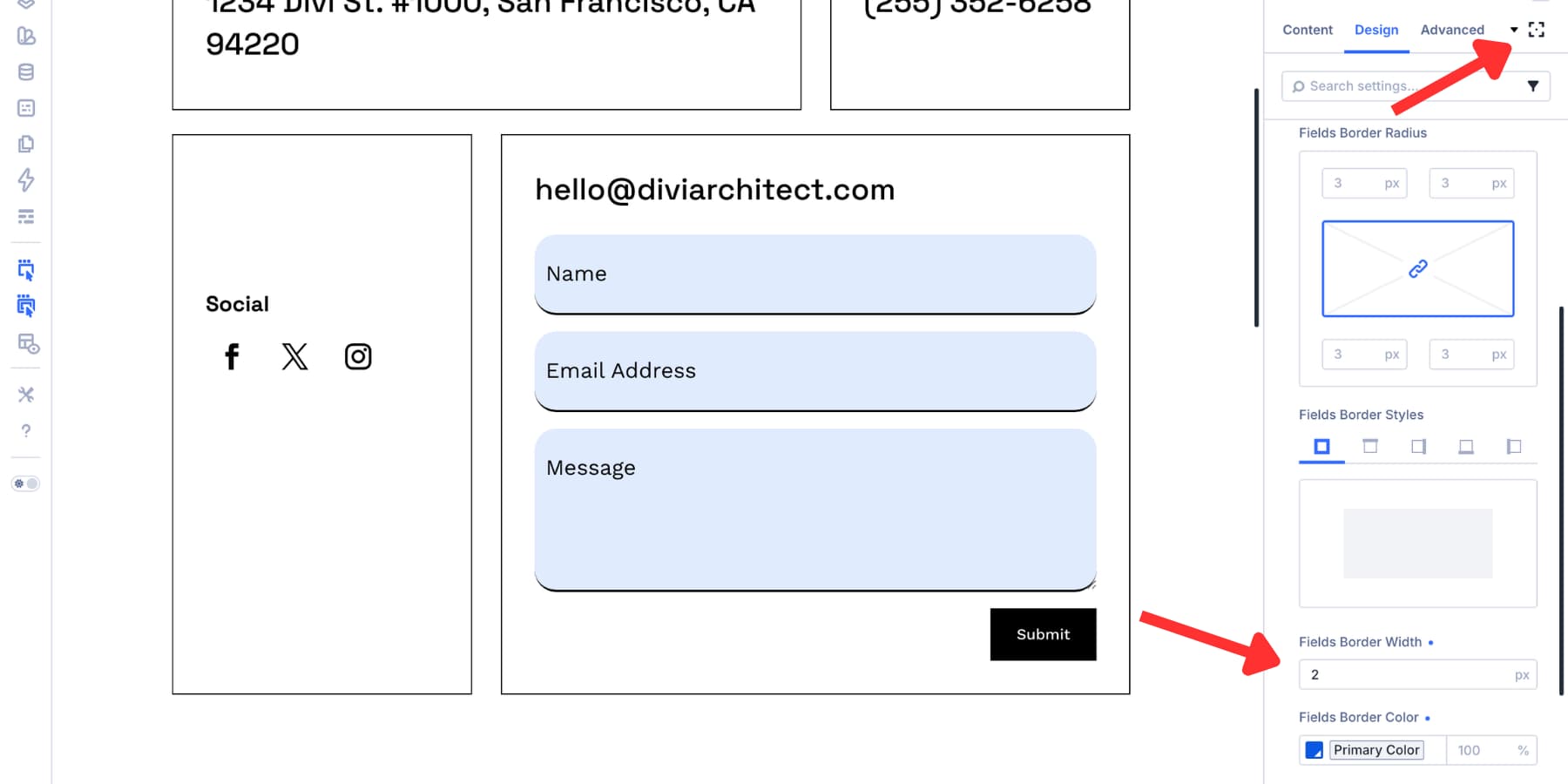
Step 5: Add A Strong Focus Border
A background change helps, but a border or outline usually makes the focus state easier to spot. Still in Focus mode, open the Border settings inside the Input group.
Set the border width to at least 2px. This is a practical target because WCAG’s stricter Focus Appearance guidance uses the area of a 2 CSS pixel perimeter as its minimum area reference.
For the border color, choose a brand color or shade that has strong contrast against both the field background and the page background. A solid border is usually easier to see than a dotted or dashed border at small sizes.
Now preview the page and test the form with your keyboard. Use the Tab key to move through the fields and confirm that the active field is obvious at every step.
Text inputs are only part of the form. If your form includes checkboxes or radio buttons, style their focus and checked states too.
Open the Checkbox or Radio option group. Use Focus mode to make the active option easy to find with a keyboard. Then use Checked mode to make the selected option clear after it has been chosen.
A good pattern is to use a visible focus outline for the active control and a separate checked style for the selected control. This helps users understand both where they are and what they have selected.
Add ARIA Only When It Improves The Markup
Custom Attributes can help, but ARIA should be used carefully. The first rule is simple: use native HTML and visible labels when they already provide the right meaning.
In Divi, start with the built-in field settings first. Add visible labels where possible, mark required fields with the module’s required setting, and write clear helper text near fields that need extra explanation.
Use Custom Attributes when you need to add information that is not already available in the markup.
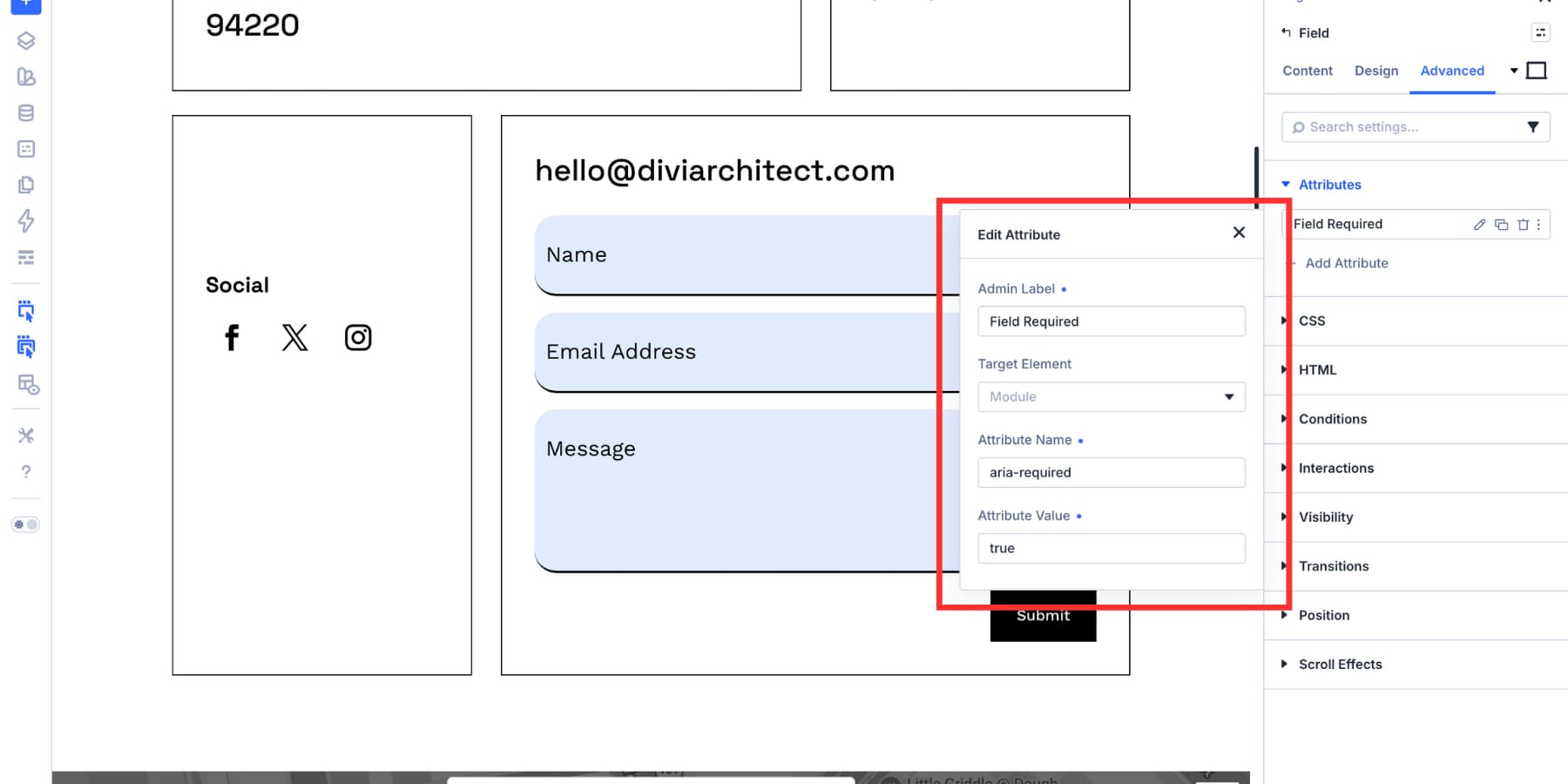
Use aria-required Carefully
The aria-required attribute tells assistive technology that a field is required. However, native HTML’s required attribute already communicates required status for standard form controls and also supports browser validation.
If Divi’s Required Field setting already adds the native required attribute, adding aria-required=”true” may be redundant. Use it only when the field or control needs the extra ARIA state and native markup is not already doing the job.
If you do need to add it, add the attribute to the specific field, not the entire form module.
Use aria-required as the Attribute Name and true as the Attribute Value. Then test the field with a screen reader or accessibility inspector.
Use aria-label Only When There Is No Visible Label
The aria-label attribute gives a field an accessible name. Use it when a field has no visible label and no other suitable accessible name.
Do not add aria-label just because you can. If a visible label already describes the field, keep the visible label and skip aria-label. If both are present, aria-label can override the visible label as the accessible name, which may create a mismatch between what sighted users see and what screen reader users hear.
Placeholder text should not be the only label for an important field. It disappears or becomes less useful as soon as someone starts typing.
Use aria-describedby For Helper Text
Some fields need extra instructions. For example, a password field might require a minimum length, a number, and a special character. A phone field might need a specific format.
Add a Text module near the field and write the helper text there. Then open that Text module’s Advanced tab, add an id attribute, and use a clear value such as password-requirements or phone-format.
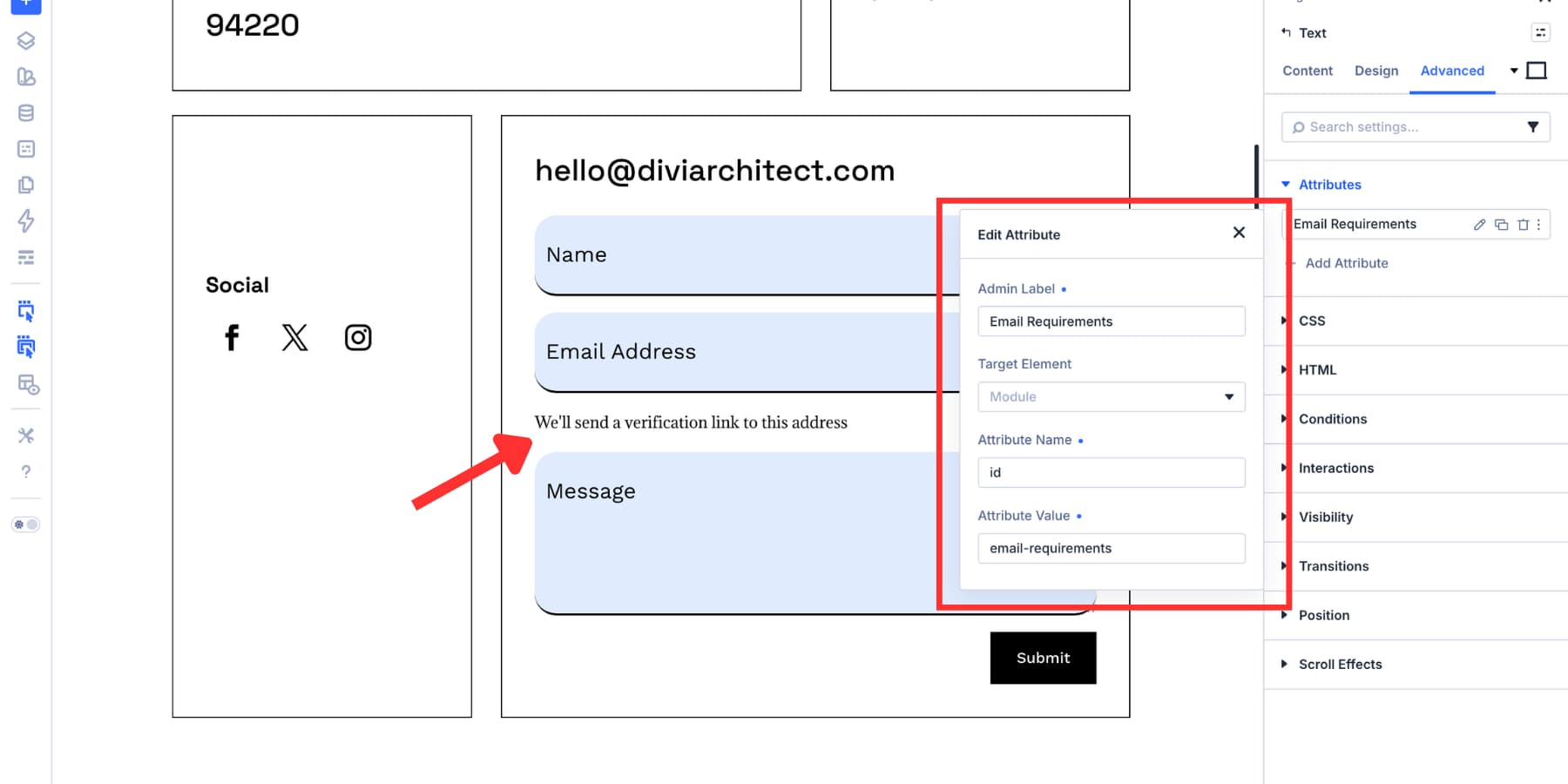
Next, select the related form field and add aria-describedby as a custom attribute. Use the same ID as the Attribute Value.
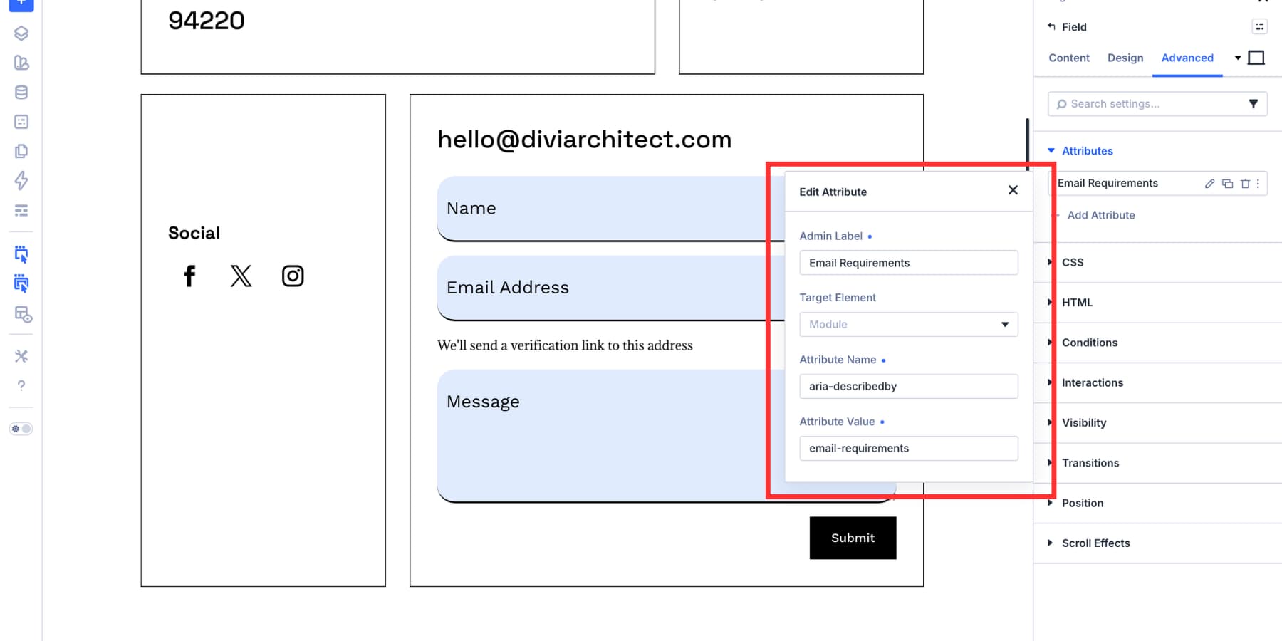
This connects the field to the helper text so assistive technology can announce the additional context along with the field.
Use aria-invalid For Custom Error States
If you display a custom error message for a field, consider adding aria-invalid=”true” to the field while the error is active. Pair it with aria-describedby so the field points to the error message.
Do not mark fields as invalid before the user has a chance to complete them. Apply invalid states after validation, then remove them once the issue is fixed.
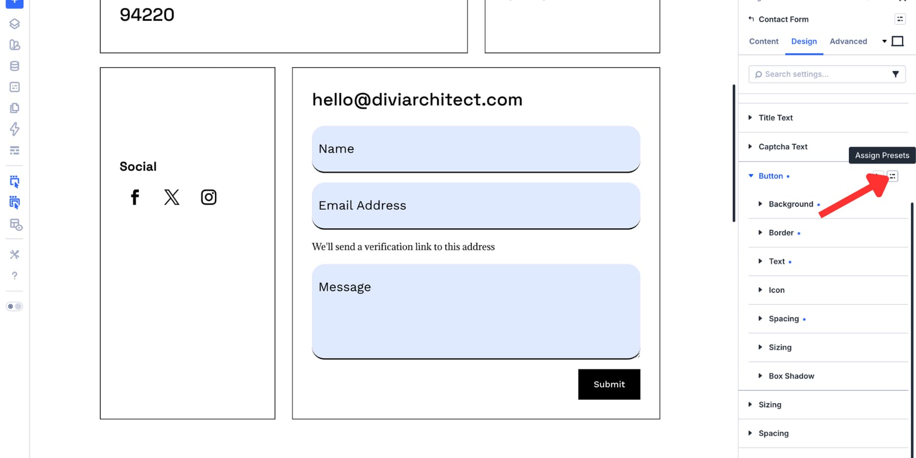
Save Your Focus Styles As Presets
After building the focus state, save the styles so you do not have to recreate them for every form.
An Option Group Preset saves one option group, such as Input, Checkbox, Radio, Border, Spacing, or Sizing. This is useful when you want the same field styling across different forms.
To create one, open the option group you want to save, click the preset icon, choose New Preset From Current Styles, name the preset, and save it.
Element Presets save a fuller module-level design. Use them when you want a complete Contact Form, Email Optin, Login form, or WooCommerce form style to start from the same design system.
Keep accessibility attributes in mind when using presets. Visual styles can be reused broadly, but ARIA attributes should still be checked field by field. A helper text ID, error message ID, or field-specific label may not apply to every form.
Test The Form Before Publishing
Do a quick accessibility pass before the page goes live.
- Tab through every field and make sure the focus state is easy to see.
- Check that the focus border or outline has enough contrast against nearby colors.
- Confirm typed text and placeholder text remain readable in both default and focused states.
- Test checkboxes and radio buttons in both Focus and Checked states.
- Make sure required fields are clearly identified.
- Check helper text and error text with aria-describedby when needed.
- Test the form on mobile and at different responsive breakpoints.
A strong focus state should not depend on color alone. Use border width, background change, spacing, or another visual cue so the active field remains clear for more users.
Try Styling Your Forms In Divi 5 Today!
Most form styling stops at the resting state. Better form design goes further. It includes visible focus states, readable text, clear labels, helpful instructions, and reusable styles that stay consistent across the site.
Divi 5 gives you the tools to build that system visually. Use Focus mode to style the active field, Design Variables to keep colors consistent, Custom Attributes when markup needs extra context, and Presets to reuse the work across future forms.
The result is not just a better-looking form. It is a form that works more clearly for keyboard users, screen reader users, mouse users, and anyone trying to complete the form without guessing where they are.


Leave A Reply