
Divi 5 gives designers a more systematic way to build responsive websites. Instead of manually adjusting the same padding, font size, gap, or border radius across desktop, tablet, and phone views, you can define reusable sizing variables once and apply them throughout your site.
The new Variable Generator makes that process faster. It can generate a complete fluid sizing system with clamp()-based variables for typography, spacing, gaps, widths, border radius, border widths, and more. When combined with Presets, those variables become the foundation for a consistent, scalable design system across your entire website.
In this post, we’ll walk through how Divi 5’s sizing system works, how to generate fluid variables, when to customize them, and how to apply them across your site.
- 1 What Is Divi 5’s Sizing System?
- 2 Accessing The Fluid Sizing Variable Generator
- 3 Why clamp() Matters In Divi 5
- 4 Generating A Fluid Typography System
- 5 Understanding Advanced Settings In The Variable Generator
- 6 Other Variable Types
- 7 Applying Sizing Variables Across Your Site
- 8 Tips And Best Practices
- 9 Divi 5 Makes Creating A Sizing System Easier
What Is Divi 5’s Sizing System?
Divi 5’s sizing system is built on Design Variables, reusable values that you create once and use anywhere across your website. While Design Variables can store many types of values, including colors, fonts, images, links, numbers, and text, this post focuses on number-based variables that control your site’s visual scale.
That includes font sizes, spacing, gaps, widths, border widths, border radius, and other numerical values that shape the layout and rhythm of your design.
Divi 5 also supports Advanced Units such as clamp(), calc(), vw, rem, and more. These units help you create fluid values that respond smoothly as the viewport changes, reducing the need for repetitive breakpoint-by-breakpoint edits.
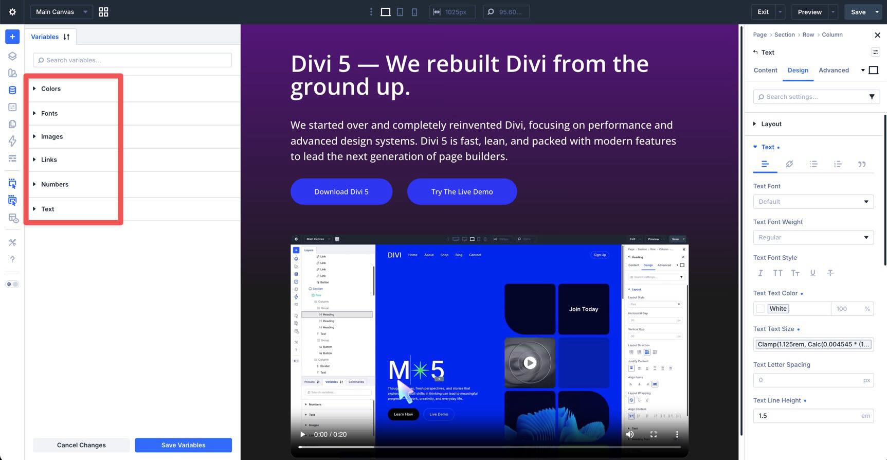
All of these variables are managed in the Variable Manager. Variables are grouped by type, making it easier to manage global design values from one place instead of hunting through individual modules, rows, or sections.
Why Use Sizing Variables?
Compared to static pixel values, Divi 5’s sizing variables give you a more flexible and maintainable way to design.
- Fluid scaling: Generated sizing variables use clamp() by default, giving each value a minimum size, a preferred fluid value, and a maximum size.
- Less responsive editing: Once your variables are set, values can scale automatically across screen sizes without requiring manual edits at every breakpoint.
- Site-wide consistency: When the same variable is used across your site, updating that variable updates every connected design value.
- Easier maintenance: You can adjust your site’s spacing, typography, or layout rhythm by editing a small set of variables instead of dozens of individual module settings.
- Better preset workflows: Sizing variables pair naturally with Divi 5 Presets, allowing you to create reusable design patterns that stay consistent over time.
Accessing The Fluid Sizing Variable Generator
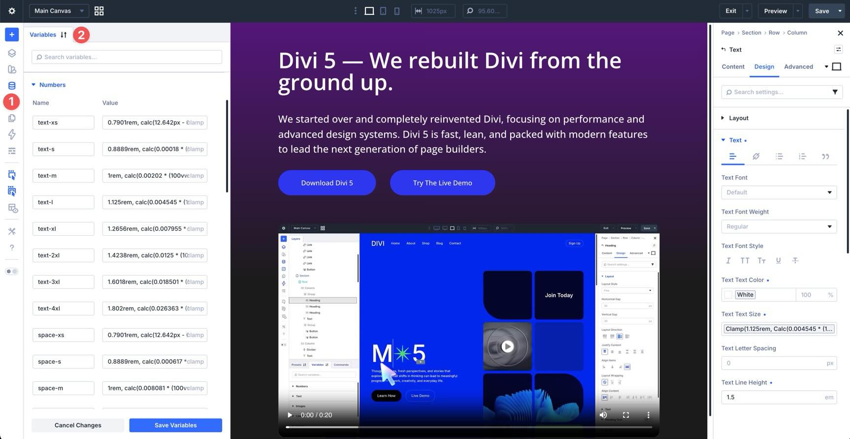
You can generate sizing variables directly inside the Visual Builder. Open a page in the Visual Builder. In the left sidebar, click the Variable Manager icon.
In the Variable Manager, hover over the Numbers group.
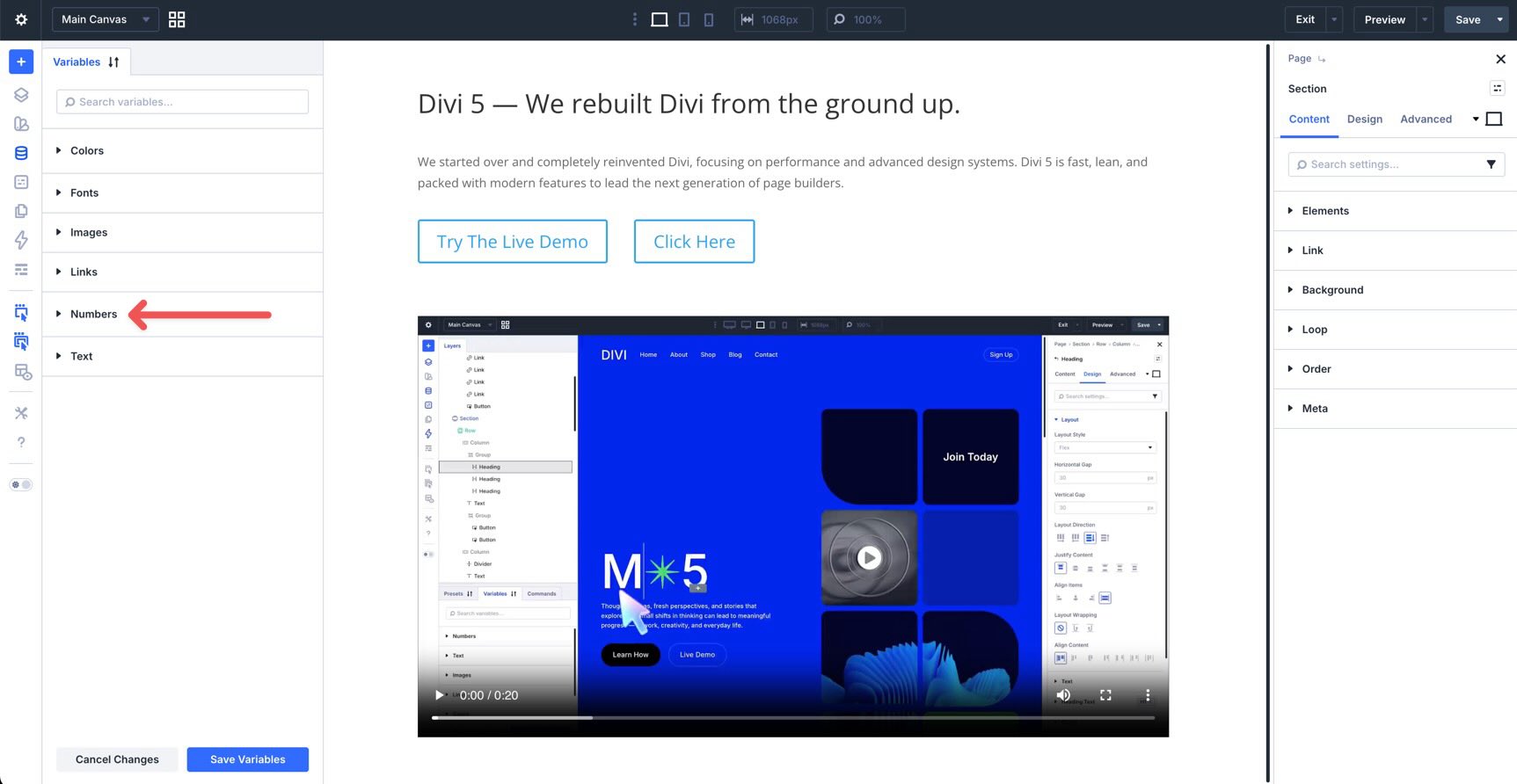
Click the Generate Fluid Sizing Variables icon to open the Variable Generator. The generator includes configuration controls and a live preview so you can review your system before adding variables to your site.
Choosing A Variable Type
The sizing generator can create different systems for different parts of your design. With the generator open, choose a Variable Type from the menu at the top.
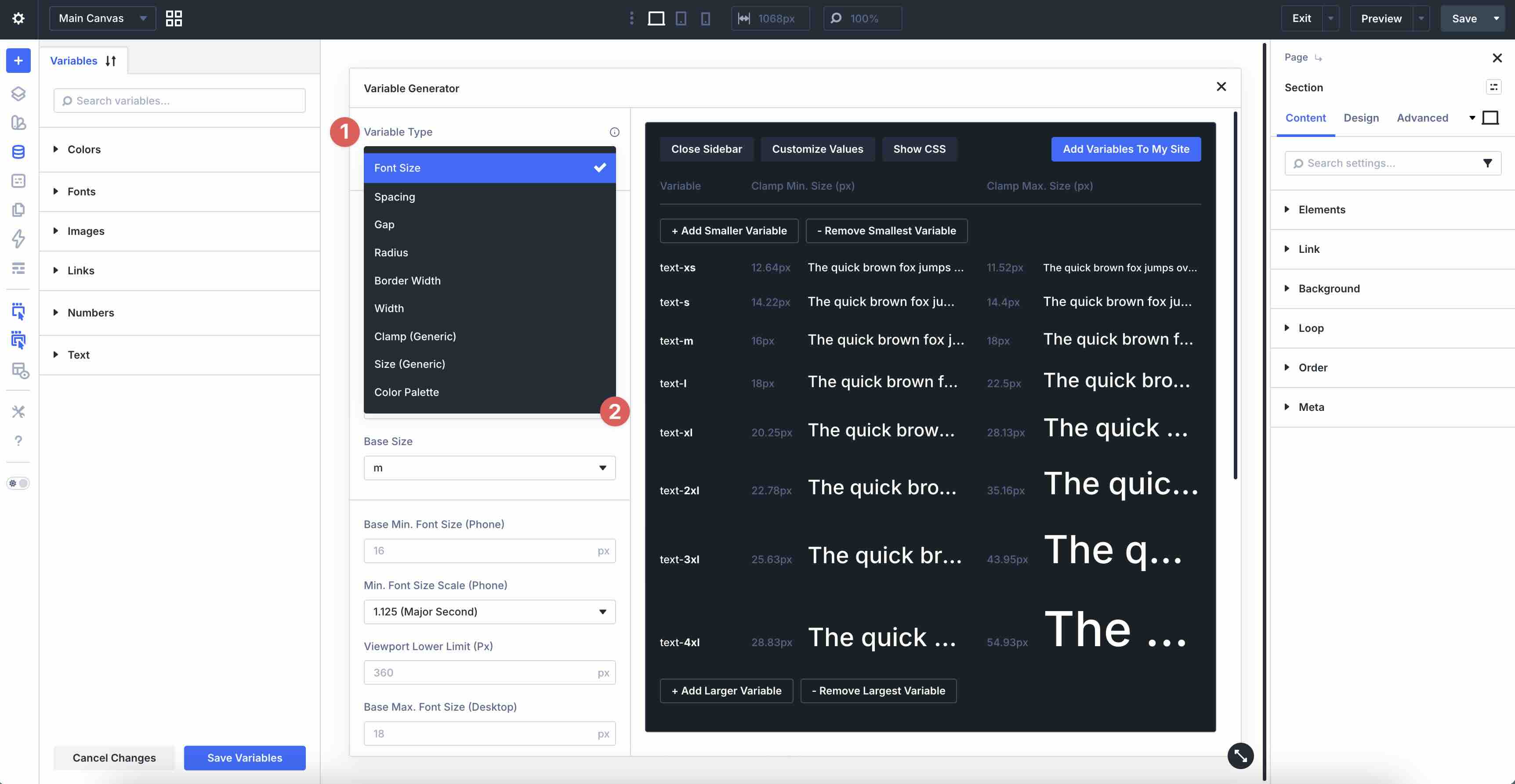
- Font Size: Creates a scalable typography system for headings, body text, and other text elements.
- Spacing: Creates reusable values for margins and padding.
- Gap: Creates values for horizontal and vertical gaps in flex and grid layouts.
- Radius: Creates border-radius values for buttons, images, cards, and containers.
- Border Width: Creates consistent border thickness values for outlines, dividers, buttons, and decorative elements.
- Width: Creates reusable width values for layout elements such as rows, columns, cards, sidebars, and containers.
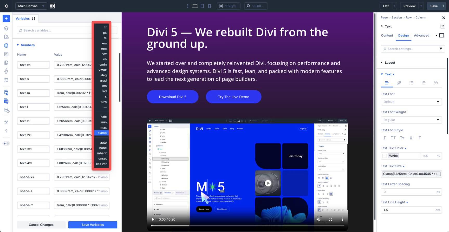
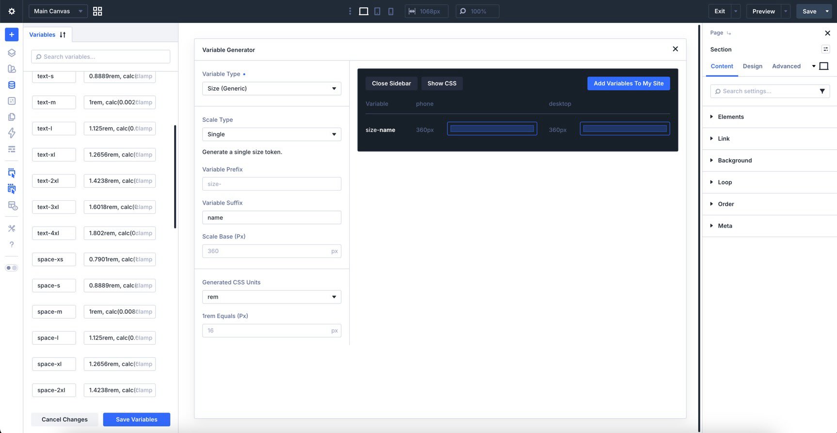
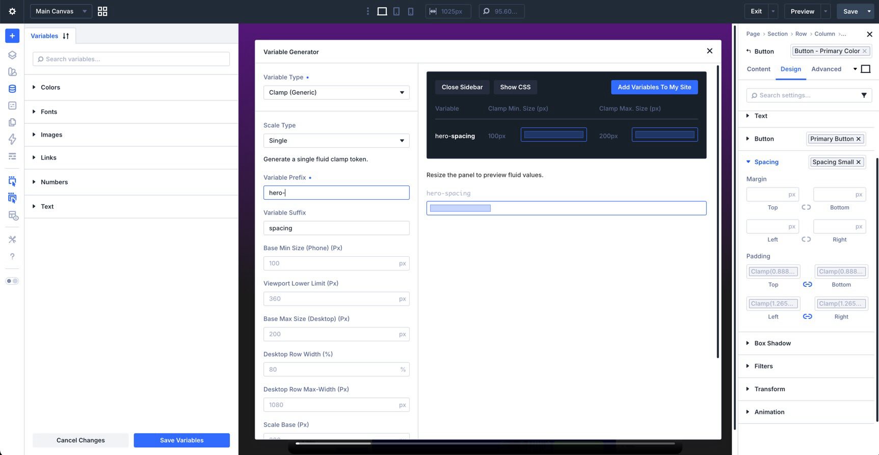
- Clamp (Generic): Creates custom clamp()-based variables that do not fit into a predefined sizing category.
- Size (Generic): Creates generic size variables for one-off or custom sizing needs.
The Color Palette Generator is part of the same Variable Generator feature set, but it is launched from the color group instead of the Numbers group. Since this post focuses on sizing, we’ll cover color variables only briefly later in the article.
Why clamp() Matters In Divi 5
By default, Divi 5’s generated sizing variables use CSS clamp(). This is what allows a value to scale fluidly between a minimum and maximum size without requiring separate responsive values for every breakpoint.
How clamp() Works
The clamp() function uses three values:
- Minimum size: The smallest allowed value.
- Preferred size: The fluid value that changes with the viewport.
- Maximum size: The largest allowed value.
A heading variable might look like this:
clamp(1.25rem, 4vw + 0.5rem, 3.5rem)
In this example, the heading will never be smaller than 1.25rem or larger than 3.5rem. Between those limits, it scales fluidly as the viewport changes. Divi handles the clamp() calculation for you, which makes fluid design more approachable even if you do not want to write the math manually.
Generating A Fluid Typography System
Let’s use font sizes as an example.
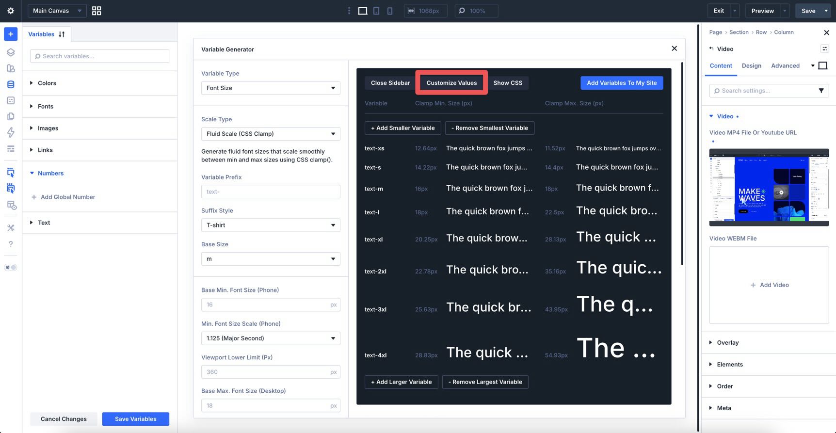
Click the Generate Fluid Sizing Variables icon next to the Numbers group, then choose Font Size as the Variable Type. Keep Fluid Scale (CSS Clamp) as the Scale Type, review the preview, and click Add Variables To My Site.
Click the X in the top-right corner of the generator to close it.
To view your new variables, expand the Numbers group. To save them, click Save Variables, then click Apply Changes.
Understanding Advanced Settings In The Variable Generator
The default generated systems are useful out of the box, but Divi 5 also gives you detailed control when you want to customize your variables before adding them to your site.
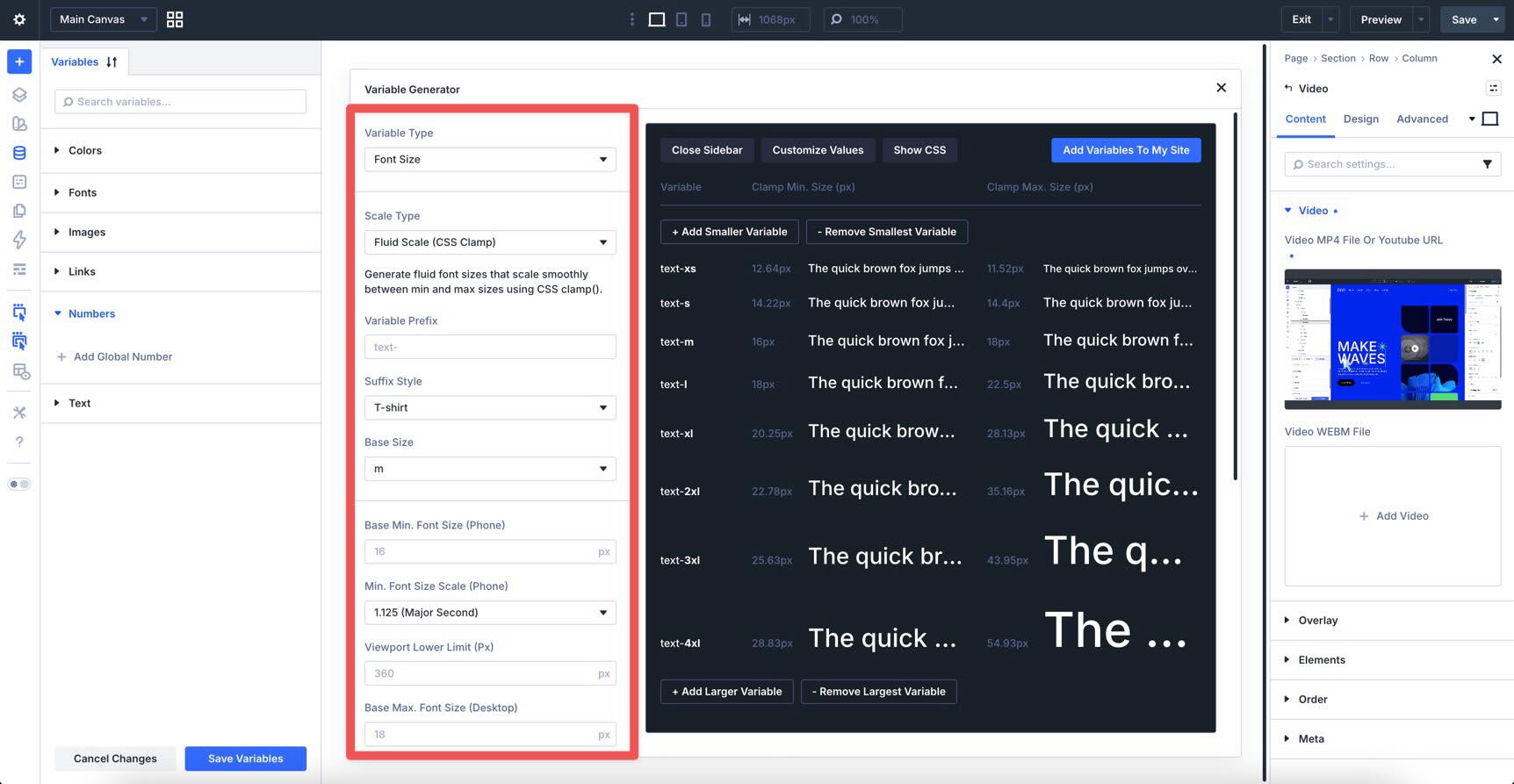
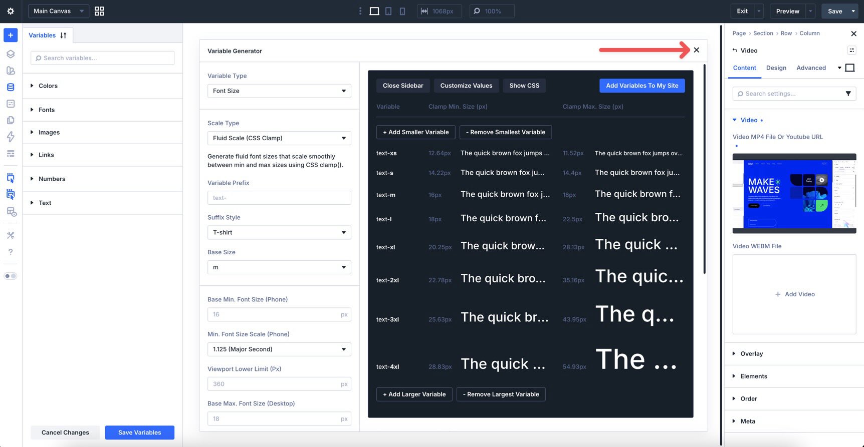
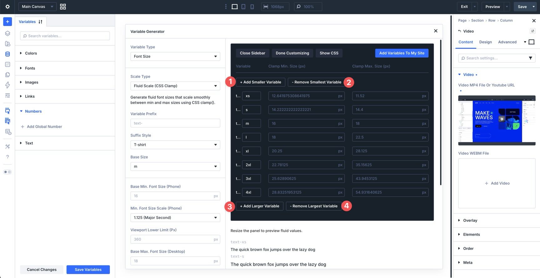
After choosing a Variable Type, click Customize Values to open the advanced panel.
You can add smaller or larger variables, edit individual values, and adjust how the entire scale is generated before you save it.
Key Customization Options
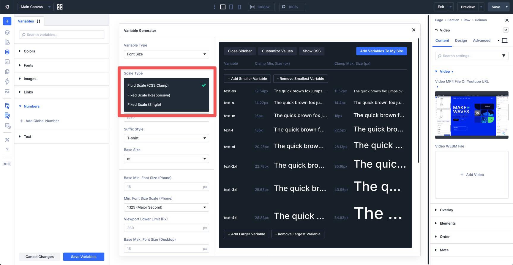
Scale Type
The Scale Type determines how Divi generates the values in your system.
Fluid Scale (CSS Clamp) creates responsive values that scale between minimum and maximum sizes. Fixed Scale (Responsive) gives you separate values across responsive breakpoints. Fixed Scale (Single) creates static values that do not scale fluidly.
Modular Scaling Ratios
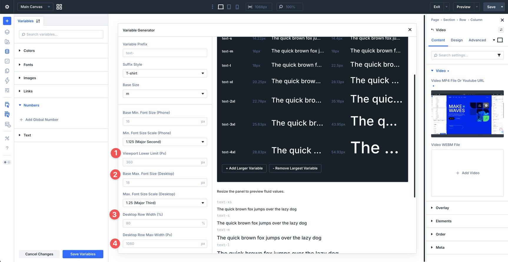
For fluid scales, you can define different scaling ratios for smaller and larger screens. For example, the phone scale can stay more restrained while the desktop scale grows more dramatically. This helps you create a balanced visual hierarchy across viewports.

Website And Viewport Settings
Website and viewport settings help Divi tailor clamp() values to your layout. You can define viewport limits and layout width values so generated variables scale in a way that fits your site’s real design constraints.
Individual Variable Editing
You can manually edit each variable in the preview area. Depending on the scale type, you can adjust names, units, minimum sizes, maximum sizes, and generated values. You can also add smaller or larger variables to expand the system.
Additional Controls
Additional controls let you refine how your system is named and generated. These include generated CSS units, root font size settings, variable prefixes, suffix styles, and base size options.
Other Variable Types
Font size variables are only one part of Divi 5’s sizing system. The Variable Generator can also create dedicated systems for spacing, gaps, radius, border width, width, and generic size values.
Spacing Variables
Spacing variables are best for margins and padding. They help create consistent breathing room between sections, rows, modules, and content blocks while allowing that spacing to scale across screen sizes.
Their settings can include options such as a zero-spacing token, separate base sizes for smaller and larger screens, scaling ratios, and layout-aware width settings.
Gap Variables
Gap variables are designed for the space between child items in flex and grid containers. They are useful for galleries, card grids, navigation layouts, feature lists, and other layouts where the space between items should remain consistent.
Unlike spacing variables, gap variables affect the internal spacing between items rather than the outer margin or padding around a container.
Radius Variables
Radius variables create reusable border-radius values for buttons, cards, images, columns, and other design elements. You can use them to keep rounded corners consistent across your site instead of manually entering radius values in multiple places.
Border Width Variables
Border width variables create reusable thickness values for outlines, dividers, buttons, cards, and decorative borders. Since borders are usually subtle, these variables are especially useful for keeping small visual details consistent across your design.
Width Variables
Width variables create reusable width values for structural elements such as rows, columns, cards, sidebars, and containers. They are useful when you want layout elements to follow a consistent width system instead of relying on unrelated custom values across the page.
Clamp (Generic) Variables
Clamp (Generic) variables are useful when you want to create a custom fluid value that does not belong to one of the predefined systems. For example, you might use a generic clamp variable for an icon size, a custom height, or a unique layout measurement.
Size (Generic) Variables
Size (Generic) variables are useful for custom sizing needs that do not require a complete scale. Use them for utility values, fixed dimensions, or custom tokens that do not fit into the more specific variable types.
Color Palette Variables
Although this post focuses on sizing, the Variable Generator also includes a Color Palette Generator. Instead of launching it from the Numbers group, you access it from the color group in the Variable Manager.
The Color Palette Generator can create a global color system from your site’s primary color. It can generate related colors, light-to-dark variations, and transparent color options, and those colors remain connected through Divi’s relative color system. When the primary color changes, related colors can follow that relationship.
Applying Sizing Variables Across Your Site
After generating variables, the next step is using them in your design. The real value of Divi 5’s sizing system comes from applying variables consistently across modules, presets, and layouts.
Assigning Variables In The Visual Builder
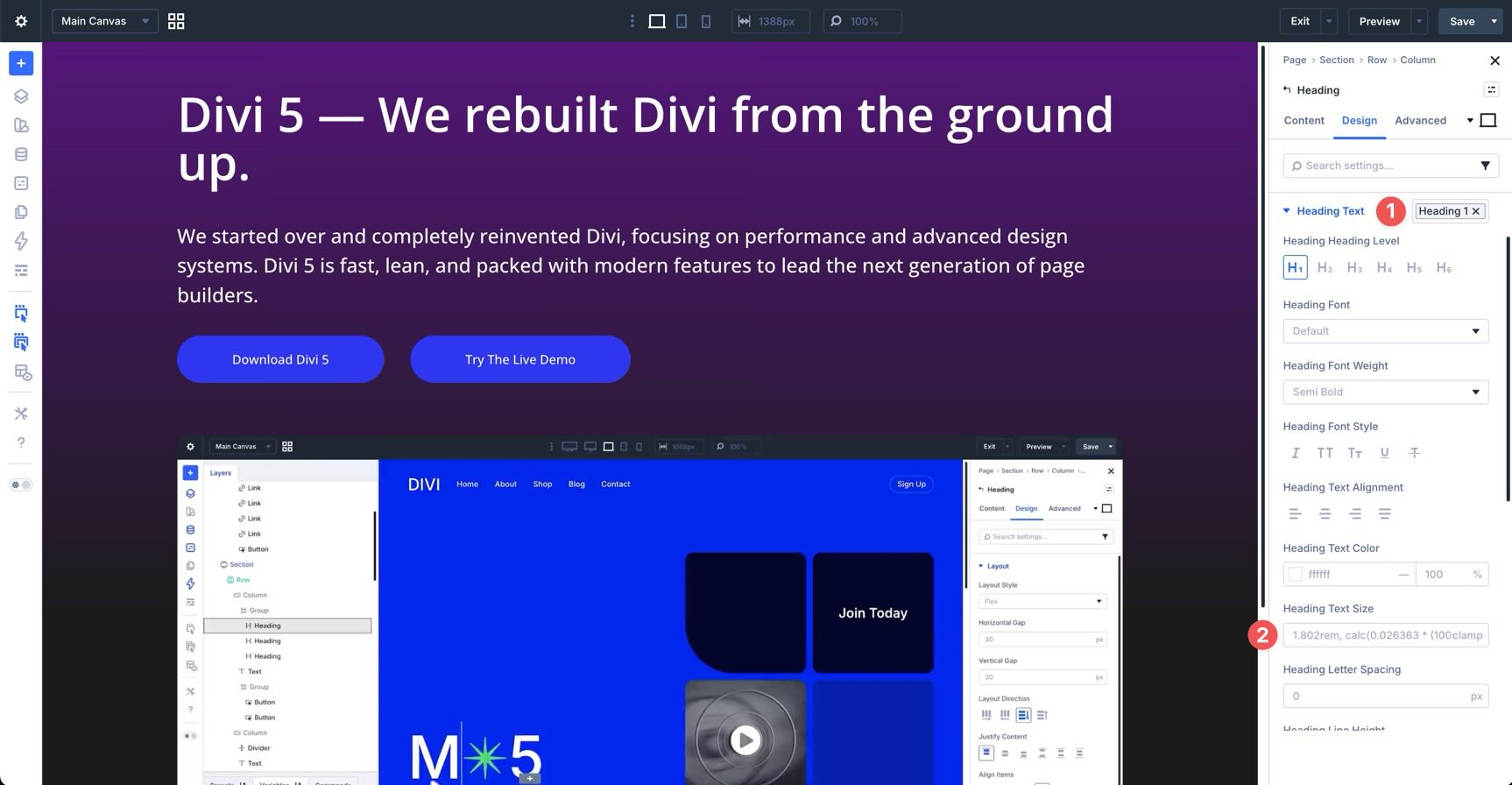
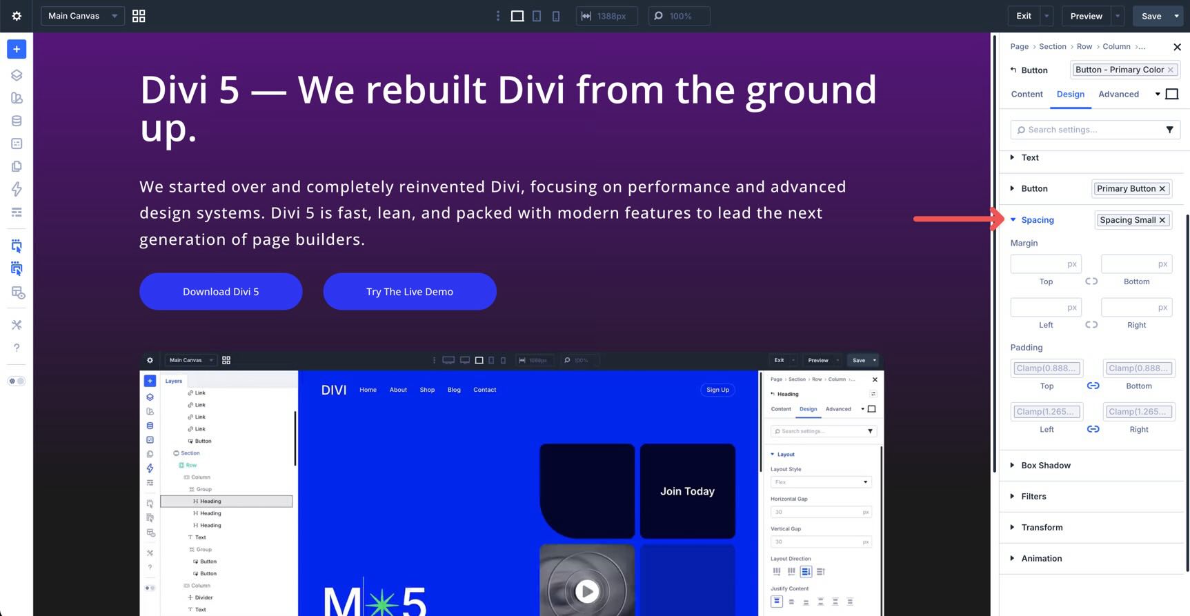
Anywhere the Visual Builder accepts a supported sizing value, such as font size, padding, margin, width, gap, border width, or border radius, you can insert a variable instead of typing a static value.
Look for the Insert Dynamic Content icon next to the field.
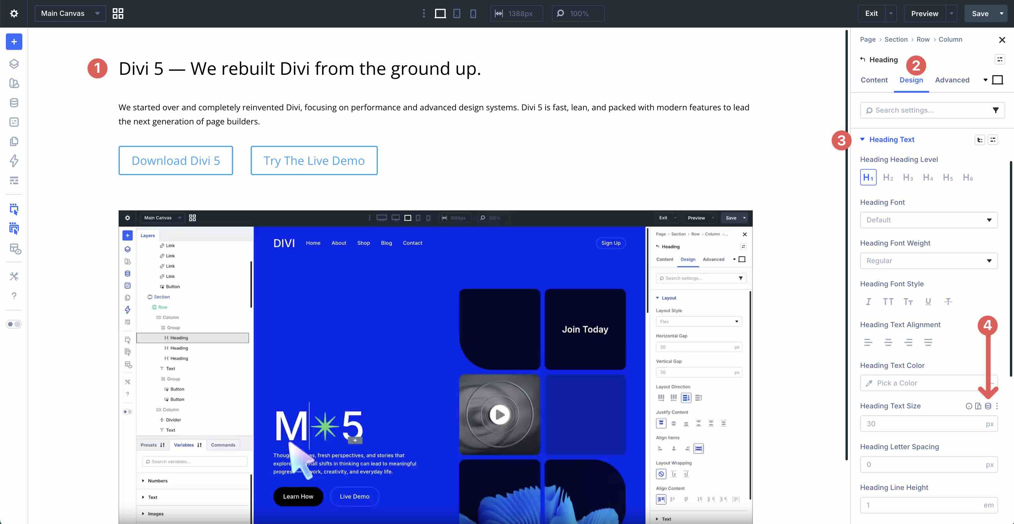
Click the icon, search or browse your available variables, and select the value you want to use. A clear naming structure makes this step much easier because variables are faster to identify and reuse.
Once selected, the field uses the variable instead of a static value. If you update that variable later, any connected field updates with it.
You can use sizing variables in many Design tab settings that accept number values, including typography, spacing, borders, sizing, Flexbox, and CSS Grid layout settings.
Creating Presets With Sizing Variables
Sizing variables become even more powerful when combined with Presets. Instead of styling one module at a time, you can build reusable design patterns that reference your global variables.
For example, you can style a Button module using spacing, border, radius, font size, and color variables.
Then, you can save those styles as Option Group Presets.
You can also nest Option Group Presets inside broader Element Presets.
From there, you can apply the same preset system to other modules with just a few clicks.
This is where variables and presets work together. Variables define the values. Presets apply those values consistently across your design.
Tips And Best Practices
Use Variables For Reusable Design Decisions
Use sizing variables for values that will appear across multiple sections, modules, or templates. Typography scales, section spacing, card gaps, button padding, border widths, and corner radius values are all good candidates.
For one-off values that will not be reused, a static value or Size (Generic) variable may be more appropriate.
Name Variables Clearly
Clear naming makes variables easier to find and reuse. Use names that describe the role of the value, not just the number. For example, a variable named spacing-section-lg is more useful than a variable named 80px because it communicates where the value belongs in your design system.
Start With The Default Scale, Then Customize
The generated sizing systems are designed to work well out of the box. Start with the default output, review how it behaves across screen sizes, and customize only where your design needs more control.
Pair Variables With Presets
Variables are most effective when they are not applied randomly. Pair them with Presets to create reusable systems for buttons, cards, sections, pricing tables, testimonials, and other repeated design patterns.
Check For Static Overrides
If a value is not updating as expected, check whether the field is still using the variable or whether it has been replaced by a static value. This is one of the most common issues when working with design variables.
To test fluid values, resize the canvas or use Divi 5’s Customizable Responsive Breakpoints.

Know When To Use Fluid Or Static Values
Use fluid clamp() values for design elements that should scale across screen sizes, such as headings, section spacing, layout gaps, and container widths.
Use static values when a size should remain fixed, such as a small icon, a thin divider, or a specific utility value that should not change with the viewport.

Understand The Difference Between Spacing And Gap
Spacing variables are best for padding and margins around elements.
Gap variables control the space between child items inside flex and grid containers.

Generic Clamp and Size variables give you flexibility for values that do not fit neatly into those categories.
Divi 5 Makes Creating A Sizing System Easier
Divi 5‘s Variable Generator turns responsive sizing into a reusable system. Instead of relying on scattered static values, you can generate fluid variables, customize them, save them globally, and apply them throughout your site.
With clamp()-based sizing, advanced customization options, and deep integration with Presets, Divi 5 makes it easier to build websites that stay consistent across pages, modules, templates, and screen sizes.
Open the Visual Builder, launch the Variable Generator, and start with a simple typography or spacing system. Once your core variables are in place, combine them with presets to create a design system that is easier to update, easier to scale, and easier to maintain.
We’d love to hear your thoughts. Leave us a comment below or reach out on our social media channels to let us know how you plan to use the Variable Generator.


Leave A Reply